

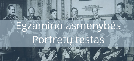
Anglija XVII a.
Anglija XVII a. pradžioje buvo palyginti nedidelė valstybe, turinti penkis milijonus gyventojų. Tai sudarė mažiau nei pusę tuometinio Ispanijos gyventojų skaičiaus ir tik ketvirtadalį — Prancūzijos. Ūkio sankloda ir valstybės santvarka Anglijoje gerokai skyrėsi nuo kitų Europos šalių. Nors dauguma jos gyventojų, kaip ir visur Europoje, vertėsi žemės ūkiu, tačiau baudžiava Anglijoje buvo išnykusi jau XV a. Valstiečiai — žemės laikytojai — mokėjo piniginę, o kai kur ir natūrinę duoklę bajorams dvarininkams (džentelmenams), kurie buvo žemės savininkai. Džentelmenai eidavo įvairias pareigas vietinėje savivaldoje. Tik jie būdavo teisėjais, pašauktinių būrių karininkais ir kt. Anglijoje buvo ir valstiečių, turinčių nuosavos žemės. Jie vadinosi jomenais ir gyveno gana pasiturimai. O žemės laikytojai vertėsi sunkiai.
„Aptvėrimai“ ir jų priežastys
Plito vadinamieji aptvėrimai, kai bajorai žemvaldžiai, remdamiesi įstatymais pasiimdavo savo dalį kaimo bendruomenės laukų ir atribodavo ją akmenų užtvaromis, medžių juostomis arba grioviais. Valstiečių naudojamas žemės plotas sumažėdavo, daugelis mažažemių išvis negalėdavo pragyventi, ir jiems tekdavo keltis į miestus, kur gauti darbo ne visada pasisekdavo. Taip vyko valstiečių nuvarymas nuo žemės, nors prievarta niekas žemės neatimdavo. Viskas buvo daroma pagal įstatymus. Tik tie įstatymai ir teismai tarnavo džentelmenams. Kam anglų dvarininkams reikėjo vis daugiau žemės ir kas ją dirbo, jeigu baudžiava buvo jau seniai išnykusi? Dvarininkai norėjo vis didinti savo pajamas, o žemės laikytojų mokama duoklė nesikeitė, buvo tiksliai nustatyto dydžio. Tad jie aptvertą žemę dideliais sklypais nuomodavo fermeriams, o šie ūkininkaudavo su samdinių pagalba. Samdinių fermeriams netrūkdavo, nes dėl „aptvėrimų” kaime buvo daug žmonių, kuriems grėsė bado mirtis. O nuomos mokestis buvo kur kas didesnis už imamą iš žemės laikytojų duoklę. “Aptvėrimai” labiau paplito pietinėje Anglijos dalyje, šiaurinėje jų pasitaikydavo rečiau.
Manufaktūrų kūrimasis ir užsienio prekyba
Daugelis Pietų Anglijos džentelmenų įsteigė manufaktūras, tapo prekybos kompanijų dalininkais, užmezgė ryšius su pasiturinčiaisiais miestiečiais. Kitaip nei Prancūzijos, Lenkijos, Lietuvos ir kitų šalių bajorai, jie nesibodėjo bendrauti ir giminiuotis su miestiečiais. Džentelmenų sūnūs vesdavo pirklių dukteris. Kita vertus, Anglijoje nebuvo draudžiama miestiečiams pirkti dvarus ir gauti bajorystę. Pirkliai ir manufaktūrų savininkai tapdavo džentelmenais. Taip dalis bajorų, vadinamų naująja bajorija, suartėjo su turtingaisiais miestiečiais (buržuazija), kas sudarė palankias sąlygas pramonės ir prekybos plėtotei. Centralizuotose ir pavienėse manufaktūrose buvo audžiami vilnoniai audiniai — gelumbė, flanelė, išsiplėtė stiklo, muilo, parako gamyba, daugėjo spaustuvių, augo akmens anglių gavyba. Daug manufaktūrų kūrėsi kaimo vietovėse, kur negaliojo cechų taisyklės ir apribojimai. Plėtėsi užsienio prekyba, tiek su Vakarų Europos, tiek su tolimesnėmis šalimis. Su toli esančiais kraštais prekiavo prekybos kompanijos. Joms karalius už didelius pinigus suteikdavo išimtinę teisę prekiauti su kuria nors šalimi. Su Rusija prekiavo Maskvos kompanija, Viduržemio jūros pakrantėse — Levanto kompanija, o su Indostano pusiasalio ir Malajų salyno šalimis — galingiausia iš visų kompanijų — Rytų Indijos (Ost Indijos), turinti nuosavą karo laivyną. Užsienio prekyba vyko daugiausia per Londoną, kuris XVII a. pradžioje virto didžiausiu Europos miestu, gyvenamu daugiau nei 300 tūkst. žmonių. Vis dėlto prekyba ir laivininkyste tada dar pirmavo Olandija, o ne Anglija.
Valstybės santvarka
Anglija nuo kitų Europos šalių labai skyrėsi ir valstybės santvarka. Nuo XIII a. čia karalius valdė tardamasis su parlamentu, kurį sudarė dveji rūmai. Lordų rūmuose posėdžiaudavo didikai — hercogai, grafai, — taip pat aukštieji Anglikonų bažnyčios dvasininkai. Juos visus ligi gyvos galvos skirdavo karalius. O Bendruomenių rūmų deputatus rinkdavo turtingi kaimų ir miestų gyventojai, diduma žemvaldžių ir pirklių. Karalius galėdavo sušaukti ir paleisti Bendruomenių rūmus savo nuožiūra, tačiau privalėjo tai daryti nuolat. Be parlamento pritarimo neįsigaliodavo nė vienas naujų mokesčių įstatymas ar įsakas dėl jų ėmimo. Parlamentas nenoriai tvirtindavo mokesčius, ypač samdomosios kariuomenės išlaikymui. Bajorai ir turtingieji miestiečiai bijojo, kad, turėdamas stiprią samdomąją kariuomenę, karalius nesiskaitys su parlamentu. Beje, stiprios kariuomenės Anglijai nelabai reikėjo. Nuo galingų Europos valstybių ją skyrė jūra, ir svetimšalių užpuolimas atrodė mažai tikėtinas.
Karaliaus valdžia, Anglikonų bažnyčia ir puritonai
Anglijos karaliaus valdžia buvo silpnesnė negu kitų didžiųjų Europos valstybių valdovų, tačiau jis buvo ne tik monarchas, bet ir Anglikonų bažnyčios galva. O Anglikonų bažnyčia laikė mirtina nuodėme priešinimąsi karaliaus valdžiai. Ši Bažnyčia buvo išlaikiusi daugumą prašmatnių katalikiškų apeigų ir vyskupų valdžią. Tai kėlė kalvinų nepasitenkinimą; jie reikalavo pašalinti iš bažnyčių visa, kas primena katalikybę, — paveikslus ir statulas, puošnius altorius, muziką ir giedojimą, panaikinti vyskupų valdžią. Anglų kalvinai, vadinami puritonais, smerkė prabangą ne tik bažnyčioje. Jie apskritai didžiomis dorybėmis pripažino susilaikymą, kuklumą ir kartu atkaklų darbą bei turto kaupimą. Dirbti reiškė tarnauti Dievui, o praturtėti — patirti jo malonę. Vilkintys paprastais juodais drabužiais puritonai niekino prabangą ir pramogas. Sekmadieniais jie vien melsdavosi ir skaitydavo Šventąjį raštą. Ypač mėgo Senąjį Testamentą, net vaikus krikštydavo senovės žydų vardais — Izaoko, Samuelio, Saros ir kt. Puritonizmas smarkiau plito tarp pasiturinčių miestiečių ir džentelmenų bei jomenų. Šie sluoksniai turėjo rinkimų teisę, tad Bendruomenių rūmuose atsirado deputatų puritonų. Tai buvo viena iš priežasčių, dėl kurių kilo Stiuartų dinastijos karalių ir parlamento nesutarimai.
Škotijos valstybė
Mirus karalienei Elžbietai I, sostas atiteko jos tolimam giminaičiui Škotijos karaliui Jokūbui Stiuartui. Škotija tada buvo nepriklausoma valstybė, labai neturtinga ir, palyginti su Anglija, atsilikusi. Vietiniai gyventojai — keltai — viduramžiais sėkmingai atremdavo anglų mėginimus užkariauti Škotiją. Tačiau į šalį skverbėsi anglų kolonistai, jų kalba ir kultūra. Pietų Škotijoje keltų kalba XVI a. pradžioje jau buvo išnykusi, bet šiaurinės dalies kalnuose ji dar vyravo. Dirvos čia buvo labai skurdžios, mažyčiuose dirbamuose laukeliuose menkai derėdavo vien avižos ir miežiai. Kalniečiai vertėsi gyvulininkyste, tarp jų dar buvo išlikusios giminės — klanai. Klanų vadai nuolat kovojo tarpusavyje ir su karaliaus valdžia. Škotijoje reformacijos laikotarpiu Įsigalėjo kalvinizmas. Stiuartams užėmus Anglijos sostą, Škotija liko atskira valstybė. Su Anglija ją jungė tik karaliaus asmuo. Liūdnesnis buvo Airijos likimas. Viduramžiais keltiškai kalbantys airiai sukūrė savitą kultūrą, bet neturėjo vieningos stiprios valstybės. Tai sudarė palankias sąlygas skverbtis anglų užkariautojams, kuriuos viliojo derlingos Airijos žemės. Ilgą laiką jiems priklausė tik rytinė salos pakrantė. Pirmą kartą visa sala buvo nukariauta XVI a. Iš airių anglų valdžia atiminėjo žemę, labai žiauriai slopino bet kokį priešinimąsi: išsivarydavo gyvulius, degindavo laukuose javus, siaubdavo gyvenvietes ir žudydavo žmones. Airiai taip pat buvo verčiami atsižadėti katalikybės ir tapti anglikonais. Tačiau jie nenorėjo priimti savo priešų tikėjimo. Airiją toliau engė Stiuartų dinastija. Nuslopinus sukilimą salos šiaurės rytų dalyje, vadinamoje Olsteriu, prasidėjo plataus masto kolonizacija. Tenykščiai gyventojai buvo išvaromi, o jų vietoje kūrėsi persikėlėliai iš Anglijos ir Škotijos. Airių likimas labai priminė Kryžiuočių ordino nukariautų prūsų dalią.
Klausimai
- Kodėl Anglijoje plito “aptvėrimai”?
- Paaiškinkite manufaktūros ir cecho panašumus ir skirtumus.
- Kuo skyrėsi Anglijos ir kitų Europos šalių valstybės santvarka?
- Kodėl XVII a. pradžioje Anglijoje kilo konfliktas tarp puritonų ir anglikonų?

h8dix6
jd3u47
a65zr4
Appreciate it for this tremendous post, I am glad I noticed this web site on yahoo.
It?¦s in reality a great and useful piece of information. I?¦m happy that you simply shared this useful info with us. Please stay us informed like this. Thanks for sharing.
a234dl
nie2a6
bc10la
7mhkyj
Regards for this post, I am a big fan of this web site would like to go on updated.
n5dzo7
pw172g
daij39
h5no0e
As I website owner I think the content here is rattling excellent, thankyou for your efforts.
d2foai
n82ru0
h069v9
cp8t01
Thanks , I’ve just been searching for information about this topic for ages and yours is the greatest I have discovered till now. But, what about the bottom line? Are you sure about the source?
rgsnp1
rent nyc office space offices to let nyc
q9b4dm
pin up casino online https://drrebenka.ru
Volvo в Україні https://telegra.ph/Kupit-spectehniku-Volvo-03-30 екскаватори, фронтальні навантажувачі та дорожні машини. Надійність, ефективність і сучасні рішення для будівництва. Продаж, підбір і обслуговування техніки для бізнесу.
leasing commercial office space room office for rent
принятие на ответственное хранение https://otvetstvennoe-hranenie-sklad.ru
ответственное хранение помещения https://otvetstvennoe-hranenie-sklad.ru
квартира студия дизайн интерьера заказать дизайн интерьера квартиры в москве
Лучшее путешествие джиппинг в крыму горы, каньоны и побережье. Увлекательные маршруты, опытные гиды и яркие впечатления от путешествий по Крыму.
Do you trade cryptocurrencies? learn about bitkelttrade automate your transactions and earn passive income. Smart algorithms analyze the market and help you make decisions. Increase your income and reduce risks with modern technology.
флаг на заказ заказать изготовление флагов
pd0zfl
Хочешь оригинальную подушку? дакимакура подушка купить со своим принтом комфорт и уют для сна. Длинная форма, мягкий наполнитель и стильные принты. Отлично подходит для отдыха и расслабления.
Нужен пластический хирург? клиника пластической хирургии санкт петербург современные операции и эстетические процедуры. Опытные хирурги, безопасные методики и индивидуальный подход. Консультации, диагностика и качественный результат.
fgako0
Нужна мебель? сайт премиум мебели эксклюзивные изделия из натурального дерева. Индивидуальный дизайн, качественные материалы и точное изготовление. Решения для дома и бизнеса.
Нужна премиум мебель? https://premialnaya-mebel.ru изготовление на заказ. Натуральные материалы, эксклюзивный дизайн и долговечность. Решения для дома и бизнеса с высоким уровнем качества.
adsaz2
Самое полезное для вас: https://amaliya-parfum.ru/index.php?manufacturers_id=366
мебель из массива древесины изготовление мебели на заказ
Лучшее прямо здесь: https://reklamig.ru
fnj9op
Understanding account security bindings for gaming accounts is essential for anyone managing valuable digital assets in competitive gaming or live service titles. Modern games employ multiple layers of identity verification—email confirmation, phone number registration, two-factor authentication, and device fingerprinting—each designed to prevent unauthorized access and account takeovers. The article breaks down how these mechanisms interact, from basic email bindings that form the account foundation to advanced family sharing restrictions that can lock accounts to specific households or regions. Players and account managers who understand these systems can better protect their investments, recover compromised accounts faster, and avoid the costly mistakes that lead to permanent bans or lost progress.
Статья раскрывает проверенные методы как снизить CPM в Facebook Ads без потери качества трафика и конверсий, что прямо влияет на рентабельность каждого рублля потраченного на рекламу. Высокие CPM обычно указывают на проблемы с таргетингом, качеством креатива или релевантностью посадочной страницы, и статья систематизирует все основные точки оптимизации. Среди ключевых тактик: сегментация аудитории по поведенческим признакам, A/B-тестирование форматов объявлений и оптимизация времени запуска кампаний в зависимости от временных зон целевой аудитории. Особое внимание уделено балансу между ставками и качеством, чтобы не допустить падения CTR и CPC при снижении общей стоимости показов. Медиабайеры, которые применяют эти подходы, обычно видят улучшение ROAS в течение 2-3 недель оптимизации.
In evaluations of online marketplaces focused on clarity and UX design, a strong example is Pebble Willow Global Studio where everything feels tidy and the experience is quite user friendly, helping users access information quickly without clutter or confusion.
My browsing session became more interesting when I found this neat boutique corner midway, and it gave me the impression that I would likely return for more helpful content later.
While exploring different casual online destinations and fun websites, I came across something embedded mid-way view this site and it looks interesting overall, giving a fun casual destination impression that feels light and engaging
During an in-depth UX evaluation of ecommerce prototypes for navigation efficiency I examined a catalog page featuring a href=”//jewelbrooktradecollective.shop/](https://jewelbrooktradecollective.shop/)” />Jewel Trade Brook Collective Exchange inside a product listing module, – The interface is neatly arranged and feels comfortable to explore ensuring a smooth browsing experience with clear structure and easy navigation across all content areas
When evaluating online shopping platforms focused on usability and performance, a notable example is Lakefront Frost Vendor Hub Vault which delivers clean interface and everything is easy to navigate without effort, ensuring users enjoy a smooth, distraction-free browsing experience.
Well organized vendor systems provide clearer visibility into product structures, allowing users to evaluate listings efficiently without getting lost in unstructured or overly complex layouts Vendor Forest Structured View improving browsing consistency and readability – users experience a more controlled and stable interface
During a general exploration of political campaign websites and voter information pages, I came across something placed within the content take this link and it is a campaign platform presenting vision and policy information in a clear and direct manner
As I navigated through various articles and informational hubs today, I chose to mention insightful resource in this line – the content stood out for its depth and offered a meaningful addition to what I was learning overall.
As I continued browsing inspirational content online, I found something placed within the text see this concept here and the idea feels inspiring, standing out in a meaningful and noticeable way
I signed up for this analytics platform – Expecting a typical cluttered tracking experience, but the simple layout changed my mind completely and made monitoring actually enjoyable for once.
In the middle of reviewing environmental conservation and eco advocacy websites, I found something that caught my attention explore eco initiative and it shows a nature focused organization promoting environmental awareness and active conservation efforts
While exploring digital design portfolios and creative studio pages, I discovered design concept page – The name is quite unique, and after clicking through, I found several pieces that felt thoughtfully designed and visually appealing.
While browsing online transit resources and station information pages, I found connection guide link – The layout is well thought out, making it easier to understand routes and details compared to many official sites.
thepaleomomconsulting.com – Nutrition consulting site focused on paleo lifestyle guidance for clients
During a search for efficient download platforms and file-sharing tools, I discovered download helper page – I tried downloading something and the process felt fast, reliable, and easy to follow without confusion.
As I browsed through several community performance and theatre websites, I noticed something placed within the content discover this theatre page and it is a theatre group promoting arts engagement and local stage performances
While reviewing different event archive and cultural heritage websites, I noticed something embedded mid-content check this page and it is an archive platform preserving memories of past celebrations and traditions
In the middle of exploring research labs and innovation websites, I encountered something mid-content explore this page and it features a clean design with an interesting focus, making it feel like a very solid resource
For entrepreneurs looking for dependable content, this practical resource page – Offers a steady stream of useful ideas, making it the kind of site you will want to bookmark and check often.
While browsing special education and sensory integration resources online, I discovered child therapy hub – The content feels practical and well thought out, providing useful guidance for both teachers and parents working with sensory needs.
During a comparative review of several online marketplace systems focused on interface clarity and responsiveness testing I examined a structured product listing page featuring Stone Velvet Vendor Archive placed inside a sidebar navigation module, – everything appeared well organized and trustworthy with information displayed in a clean format that supported smooth browsing without unnecessary complexity or distractions.
During an in-depth analysis of ecommerce interface experiments focused on usability flow and visual hierarchy improvements I navigated through a catalog section where QC Cart Emporium Portal was featured inside a product listing area and found the browsing experience to be clean and efficient with well structured content blocks that helped maintain clarity throughout interaction.
During a final review of several experimental commerce platforms focused on usability speed and structural design clarity I accessed Commerce Kettle Bridge – and experienced a consistent interface with fast loading behavior and well organized content sections that made browsing very smooth overall final impression
At some point during my browsing session, I landed on a well-arranged trade hub and everything seemed neat and easy to access, which I really like because it feels very simple to navigate.
While exploring multiple online vendor system prototypes for UX consistency and performance evaluation, I came across a catalog page where Lavender Trading Post Interface View appeared within a grid layout, and the interaction felt seamless – everything loaded quickly and the structure helped maintain a clear browsing flow across sections.
What makes this Christmas ball information hub so appealing – Is the way it captures the excitement of the season while still presenting all the necessary details in a clear and readable format.
While looking into football development and sports therapy sites, I came across athlete wellness link – The integration of healing practices into a football environment feels fresh and offers a different angle on player recovery and performance support.
While going through different online tools today, I found something placed conveniently among my notes, visit this page, and it actually seems like a pretty engaging and potentially useful site that deserves a closer and more thoughtful look when time allows
During an evaluation of various ecommerce UI mockups for layout consistency and usability flow, I explored category pages and found the system responsive when using Rade Creative Collective – navigation felt intuitive, and the design made it easy to locate items without unnecessary effort or distraction.
I was impressed by how this artist’s website – Balances professional entertainment value with a relaxed, approachable tone that makes you feel like you are part of something enjoyable.
During a long session of scrolling through different sources and references online, I noticed something appearing naturally within the content, visit this page, and honestly it gives the impression of being a reasonably solid site that could deserve more attention and deeper exploration
Content quality auditors and digital publishing experts frequently assess websites for readability structure and overall informational flow across sections readability_focused_hub – The design encourages efficient browsing and helps users process information smoothly with clear separation between topics and well organized presentation style
While scanning through exhibition related websites, something caught my attention in context, click art exhibit, and the platform presents visually engaging content with a strong creative feel overall
During my evaluation of various e-commerce sites I came across easy grocery discovery site positioned within multiple listings and it seemed notable – the design is minimal yet functional, giving visitors a calm and efficient browsing experience without unnecessary distractions or complexity in usage flow overall
While checking different boutique shopping compendiums and retail exploration tools, I noticed a useful resource at Boutique Shopping Compass that presented information clearly and I found it helpful for understanding how different sections of the shopping environment were organized.
Design inspiration can often be found in specialized illustration hubs that focus on animals and expressive character based artwork puppy art visuals offering creative depth – These works highlight the playful nature of dogs while incorporating modern design trends that enhance visual storytelling across different media formats.
While analyzing modern retail platforms built for usability and structure, a notable example is Harbor Stone Trade Hub where nice layout with clear sections and straightforward navigation flow, helping users interact with content without unnecessary complexity or distraction.
While exploring different online portfolios and personal branding pages, I came across something embedded mid-way view this portfolio site and it has a clean professional design that feels elegant, structured, and visually balanced overall
Nature lovers exploring online inspiration often come across curated collections that highlight scenic beauty and outdoor tranquility, and they may see green woods diary – It typically offers reflective content that encourages users to connect emotionally with forests, wildlife, and peaceful natural surroundings.
As I continued going through various animal lover print and art websites, I encountered something within the text see more here and it provides adorable pet-related prints that are highly recommended for animal lovers overall
People looking for meaningful cultural engagement often turn to digital platforms that present curated exhibitions and creative opportunities for local participation, where they might encounter fine arts community space – The site promotes accessible art programs, collaborative events, and educational outreach initiatives.
I didn’t expect to find anything particularly notable, but something showed up midway through my browsing, see more here, and it actually highlights an important subject that deserves attention and understanding
As I browsed fast and minimal websites, I came across view quick performance page – The interface is clean and simple, with fast loading times and smooth operation that creates a very pleasant browsing experience.
mitchwantssununu.com – Interesting concept site, content feels direct and somewhat thought provoking today
As I reviewed different renewable energy websites, I noticed check this fuel education site – The platform is quite informative, and I learned something new just by exploring the available content casually.
Users who appreciate countryside inspired ecommerce designs often browse sites such as Wheat Cove Simple Market Hub where product categories are clearly organized for easy access – The rustic theme enhances the sense of comfort, making browsing feel relaxed, intuitive, and visually pleasant across all sections of the store.
While analyzing different event-based websites, I noticed use this winter link – The content feels modern and useful, offering a smooth browsing experience where everything is easy to follow and clearly laid out for visitors.
As I was going through various commuter assistance and transport update platforms, I encountered something within the text explore this transit page and it is a transport information site helpful for commuters and travelers with daily updates
People who appreciate organized online marketplaces often browse platforms like Cove District Sun Goods Center where items are presented in a bright and structured layout – The design makes browsing feel smooth and enjoyable, allowing users to explore products easily without distraction or unnecessary complexity.
In comparisons of online shopping systems focused on clarity and usability, a standout example is Glade Frost Unified Vault which delivers feels structured and simple, making it easy to explore content, ensuring a smooth and structured experience across the entire platform.
While reviewing Hawaiian boutique accommodation sites, I came across a refined property listing with strong visual presentation recently seen online < hillside paradise inn view – It offers a peaceful and organized overview, making the property feel inviting and easy to understand very clearly
Users who appreciate efficient ecommerce design often browse sites such as Kettle Harbor Supply Commerce Hub where products are presented in a minimal structured format – The interface creates a browsing experience that feels fast, simple, and easy to follow.
While browsing reflective digital journals I came across a site that shares direct commentary in a minimal style with simple idea stream – the content feels intentionally plain but thought provoking enough to encourage deeper engagement with political and cultural discussions
During my browsing of environmental technology sites, I found explore backyard energy guide – The content is quite engaging, and I learned something new simply by casually exploring the information presented.
Users who prefer structured ecommerce systems often appreciate clear categorization that helps them quickly locate items without feeling overwhelmed by excessive visual noise cove emporium gilded selection – The presentation style supports efficient browsing with well organized sections that make product discovery feel natural and uninterrupted across the platform.
While comparing e-commerce platforms designed for simplicity and structure, a standout example is Brook Gilded Experience District which maintains nice visual balance and navigation works without any confusion, ensuring a calm and intuitive browsing experience across all sections.
While going through various winter event listings, I came upon visit this page – The overall browsing experience feels pleasant and useful, with content that is easy to understand and structured in a way that keeps things interesting.
While exploring joke and humor websites, I encountered browse this comedy hub – The platform has a fun vibe, and the content feels lighthearted and enjoyable, perfect for casual browsing and quick entertainment.
People who prefer simple and bright online shops often explore sites like Goods District Sun Cove Market where items are arranged in a structured and user friendly design – The browsing experience feels enjoyable and efficient, with clear categories that help users find what they need quickly.
Users who value visually structured ecommerce environments often engage with sites like Artisan Wave Trail Studio where products are arranged in a clean and artistic layout – The design emphasizes clarity and creative presentation, ensuring users can browse comfortably while enjoying a visually appealing and well organized shopping experience.
Users who appreciate minimal structured ecommerce layouts often enjoy vault concepts that improve navigation and maintain clarity across all categories Glass Harbor Vault System – The interface is polished and simple, ensuring a smooth browsing journey where product discovery feels intuitive and visually well organized.
modelscanvas.com – Creative portfolio vibe, visuals and layout feel clean and professional design
While exploring modern e-commerce experiments, I came across a uniquely styled supermarket concept website with a very basic but functional layout hope themed grocery concept – The design feels stripped down but efficient, helping users quickly understand the purpose of the platform
During my exploration of personal resilience content, I found open strength reflection site – The material is meaningful and well written, and it feels relatable in a thoughtful way that makes the reading experience engaging and reflective.
Across various online commerce usability assessments, a notable example is Night Glade Network House where everything feels straightforward and browsing is comfortable and stable, helping users interact with a clean, efficient, and logically arranged interface throughout the platform.
While searching for clear and useful support organizations, I encountered access this page – The content is easy to read and well structured, making it practical for users seeking straightforward guidance.
People who enjoy curated creative ecommerce platforms often engage with sites like Cove Teal Vendor Atelier Art Hub where items are displayed in a structured and expressive format – The design ensures browsing feels smooth, visually appealing, and creatively organized across all sections of the marketplace.
Users who prefer structured vendor ecosystems often explore sites such as Apricot Vendor Meadow Works Market where content is displayed in accessible layouts – The interface ensures browsing feels smooth, intuitive, and well arranged for easy discovery.
While searching for sleek portfolio examples I found a site that highlights creative visuals in a structured layout using modern design portfolio page – the interface feels smooth and elegant offering a professional look that enhances the user experience
People drawn to coastal-themed ecommerce design often enjoy browsing structured platforms that maintain simplicity, especially when they find sites like Seaside Berry Cove Goods where product presentation reflects a calm, organized style that enhances the overall browsing experience – The design captures a seaside feel while preserving functional clarity throughout the store interface
While researching notable icewine producers online, I discovered a beautifully structured winery website that emphasizes clarity and brand identity iniskillin product showcase site – The presentation feels detailed and attractive, making the wine offerings easy to understand and visually refined overall experience
As I browsed various informational websites, I noticed explore this bonus details hub – I found it today and it appears useful overall, with a simple layout that makes the content easy to understand and navigate.
While evaluating e-commerce platforms built for clarity and usability, a notable example is Sage Harbor Trade Vault where clean design and content is arranged in a logical order, allowing users to interact with content in a straightforward and efficient manner.
While searching for meaningful wildlife protection projects, I encountered access this page – The information feels structured and intentional, helping users quickly understand the purpose and appreciate the thoughtful organization behind it.
People who enjoy structured online commerce environments often engage with sites like Harbor Teal Commerce Category Hub where items are arranged in clearly defined sections – The design ensures browsing feels simple, fast, and efficient, helping users quickly explore different product categories.
People who enjoy well structured digital marketplaces often prefer collective designs where products are grouped logically, allowing for faster browsing and better visual comprehension during shopping sessions Gladeridge Collective Market – The presentation is simple yet modern, giving users a clear and organized experience that feels intuitive and easy to explore from page to page.
During my browsing of empowerment initiatives, I stumbled upon check community advancement page – The initiative appears significant, and the information is presented in a clear and structured manner that is easy to follow.
While searching for engaging themed websites I found a nostalgic platform that highlights retro aesthetics using nostalgia driven content hub – the overall feel is visually appealing and keeps users interested through its consistent and creative design approach
phiferforcongress – Political campaign website shares candidate vision and policies community focus
While browsing curated experimental web platforms, I came across a site that strongly highlights creative structure and non traditional design flow intermusses design concept portal – The content feels experimental and creatively arranged, making the entire experience feel intentionally artistic and visually distinct
Users who enjoy creative handmade marketplaces often explore platforms such as Brook Artisan Lifestyle Store where product presentation reflects strong craftsmanship values – The browsing experience is designed to feel warm and authentic, allowing users to connect with the artisan story behind each curated item.
While scanning through a mix of UI and web inspiration pages, I found something that appeared naturally in between everything else, click to view, and the design immediately feels appealing because it is modern, clean, and simple in a good way
Across various marketplace usability studies, a notable platform is Summit Amber Shopping Marketplace which maintains smooth experience overall, pages feel fast and easy to use, ensuring users enjoy a stable and intuitive browsing experience across all categories and listings.
While reviewing creative online spaces, I found browse this blazin squad portal – The design stands out strongly, and the content is engaging enough to keep the browsing experience interesting throughout.
During my search for artist-focused websites, I noticed check this fan site – The structure is clean and straightforward, allowing users to move through sections easily while keeping the browsing experience simple and enjoyable.
While browsing through various lifestyle and empowerment websites today, I came across something naturally placed within the content flow, visit this empowerment site, and it turned out to be a really helpful platform where I found useful insights and enjoyed browsing today
Users who enjoy structured ecommerce platforms often engage with sites such as Trail Harbor Commerce Direct Hub where products are displayed in a clean and organized format – The design ensures browsing feels smooth, intuitive, and easy to navigate while maintaining a strong focus on usability.
While browsing through social support and housing aid organizations, I found something embedded in the content take a look here and it is a nonprofit site focused on housing assistance and essential community support work
Shoppers who appreciate minimal yet refined online stores often gravitate toward emporium layouts that prioritize structure and visual simplicity Emporium Glass Harbor Hub – The interface presents products in a clean and orderly fashion, making browsing feel smooth, intuitive, and consistently visually pleasing.
nomeansnoshow.com – Strong identity here, site feels bold and creatively expressive throughout pages
In the middle of exploring web design resources, I came across explore blunty layout hub – The structure is very clean, and the browsing feels smooth and easy to follow without distractions or confusing elements.
While browsing professional introduction and portfolio websites, I encountered a well designed page that prioritizes clarity and ease of use online professional profile view – The layout is smooth and intuitive, with information presented in a very clear and organized manner overall
Home renovation experts and interior planning specialists frequently analyze furniture collections that reflect current design movements and lifestyle needs stylish interiors collection – The brand is known for offering creative furniture ideas that combine modern aesthetics with practical application, enhancing both comfort and visual harmony in living spaces
In reviews of digital commerce systems focused on structure and usability, a strong example is Lakefront Icicle Trade Mart which ensures simple layout and information is easy to find at a glance, supporting a seamless and efficient browsing journey across the platform.
Shoppers who prefer clean structured ecommerce environments search for websites that reduce complexity and enhance usability such as Warm Artisan Junction where balanced visuals structured navigation help users browse products comfortably flow – The browsing experience is consistent and gentle allowing users to move through sections naturally
While exploring a variety of soft aesthetic online marketplaces and evaluating how elegance influences user experience, I came across explore velvet willow market – The overall feel is gentle and refined, and browsing through products is calm, smooth, and visually relaxing throughout the entire experience.
While reviewing different creative web projects and inspiration pages online, I stumbled upon something that stood out slightly in context, explore this link, and the first impression feels very positive because the design looks clean, modern, and well balanced
During my comparison of event-related platforms, I encountered see more here – The website shows consistent quality in its content, and the engaging style makes it pleasant for users to explore without feeling overwhelmed.
Users who enjoy soft themed ecommerce sites often engage with sites such as Wave Harbor Coastal Breeze Outpost where products are shown in a light and structured format – The design makes browsing feel smooth, relaxing, and visually soothing across all categories of the store.
Shoppers who prefer modern emporium-style websites often value strong design systems that maintain consistency while improving usability and product visibility across pages Glass Emporium Stone Collection – The layout feels balanced and structured, providing a visually consistent browsing experience where everything is easy to navigate and aesthetically aligned.
As I compared different commerce hub platforms for usability, I came across explore linen meadow digital hub – The site feels easy to navigate, and the browsing experience is smooth, enjoyable, and well structured throughout.
While exploring creative portfolios and expressive platforms I discovered a site that emphasizes bold design choices including art driven web hub – the site feels confident and visually rich providing an engaging browsing journey from start to finish
As I looked through innovative web experiments, I found check brownback experimental page – The concept is quite unique and different, making it something worth checking out for its originality and design approach.
During an analysis of retail atelier interface design and seasonal usability, I noticed open mint orchard retail studio – This is definitely a place I plan to return to for the holiday season because everything feels smooth and well arranged.
When analyzing structured UX layouts in e-commerce systems, a standout example is Orchard Flow Upland Hub which features well structured pages and browsing feels natural and efficient, ensuring consistent usability and clarity throughout the platform.
While browsing themed digital platforms, I came across a site that blends cultural storytelling with modern design in a very engaging way global urban culture page – The website feels diverse and interesting, combining multiple influences into a visually appealing and thoughtfully structured experience
People who enjoy handcrafted online marketplaces often engage with platforms like Cove Wind Artisan Goods Market Hub where items are displayed in a clean and curated layout – The design emphasizes organization and aesthetic presentation, making browsing feel structured, pleasant, and easy to follow through different artisan categories.
While reviewing a mix of online awareness and support-focused platforms, I stumbled upon something that stood out slightly in context, explore this page, and the clean interface really helps make browsing and reading feel comfortable and smooth overall
As I explored various trust-oriented platforms, I encountered learn more here – The information is presented in a clear and structured way, making it feel reliable and valuable for users seeking straightforward and meaningful details.
Shoppers who prefer curated online spaces often appreciate clean gallery inspired layouts that prioritize clarity and aesthetic flow Galleria Cove Gold Market – Designers focus on maintaining a cohesive visual rhythm where products are displayed with consistent spacing soft transitions and intuitive grouping allowing users to browse comfortably while discovering items without cognitive overload or unnecessary visual clutter across sections for a premium feel
While going through multiple food inspired websites, I found something in the middle of everything, see sweet page, and it offers visually rich and tasty looking content overall
Digital shoppers who enjoy craft based online stores often look for organized platforms with appealing layouts and may come across harbor craft violet depot displaying handcrafted items across multiple categories designed for quick access and smooth browsing experiences – The store emphasizes clarity and accessibility for users seeking distinctive artisan products.
oakmeadowcommercehub – Commerce hub feels organized, categories are clear and easy browsing
nutschassociates.com – Professional services look solid, information is clear and easy to follow
uplandcovevendorcorner – Vendor corner feels helpful easy browsing and clean layout overall
While analyzing modern online retail platforms built for usability, a notable example is Frost Lakefront Trade Vault where clean interface and everything is easy to navigate without effort, helping users explore products without unnecessary complexity or visual distraction.
During my review of business solution platforms and support guides, I came across informative resources and discovered business solutions guide page – The information is practical and clearly structured, helping users quickly grasp key ideas and apply them effectively.
While researching creative fusion websites, I encountered a platform that integrates cultural elements from different regions into one engaging design brooklyn jeddah theme site – The content feels diverse and interesting, with a strong blend of styles that makes the experience more dynamic and engaging overall
People who value easy navigation in outlet stores often explore sites like Stone Harbor Outlet Simple Hub where items are displayed in a clean and direct format – The interface makes browsing intuitive and fast, helping users enjoy a practical and well organized shopping experience.
People who enjoy aesthetically soft ecommerce galleries often engage with platforms like Galleria Dawnstone View where items are displayed in a gentle and minimal layout – The design creates a calm browsing atmosphere that feels visually light, balanced, and easy to navigate without distraction.
In the middle of researching health and lifestyle consulting services, I discovered read this nutrition coaching page – The overall presentation feels organized and calming, making it easy to browse while keeping everything visually pleasant and readable.
Shoppers exploring modern trading collectives often appreciate platforms like Pine Harbor Market Collective where the structure supports ongoing seller collaboration and product variety – The design feels lively and interconnected, making the shopping experience feel more like a community marketplace than a traditional store.
While searching for well structured business websites I discovered a platform that highlights organization and clarity using professional company hub – the interface feels smooth and intuitive making it easy to browse information in a logical and efficient way
While reviewing outdoor tourism websites, I found browse this camping location hub – The site looks great overall, and the information is clear, engaging, and structured in a way that is easy to follow.
Across various marketplace usability comparisons, a notable platform is Forest Frost Market Vault which maintains the design feels balanced and content is clearly organized, ensuring a stable and visually consistent browsing experience across all categories.
Users who appreciate cool structured marketplaces often browse platforms such as Icicle Isle Blue Frost Market where products are displayed in a clean and icy format – The design creates a refreshing browsing experience that feels smooth, simple, and easy to navigate while maintaining visual consistency across all pages.
I was exploring unusual sports content websites when I came across a page that presents volleyball in an unconventional entertainment style quirky sports reference page – It mixes humor and casual commentary, making the browsing experience feel relaxed and pleasantly engaging overall
During my search through various online resources, I noticed browse this photo site – I stumbled upon it unexpectedly, yet it actually seems quite useful, with content that is practical and easy to engage with.
champselyseesclinic – Clean design and helpful content, feels professional and easy to explore.
cwqolq
pair-dating.com – Dating concept looks simple, interface feels straightforward and user friendly experience
Shoppers who appreciate friendly and simple online store layouts often enjoy visiting sites like Cove Relaxed Bazaar which emphasizes user comfort and easy product discovery – The design approach ensures that navigation remains straightforward and enjoyable from homepage to checkout process
e5jwoa
Users who prefer uncluttered ecommerce environments often engage with sites such as Gladestone Functional Trade Outpost where products are presented with minimal styling – The layout supports smooth browsing and quick decision making, making the experience efficient, practical, and easy to follow throughout.
While browsing Christmas party listings, I came across open holiday festive site – The vibe is clearly festive, and the theme and presentation style make the browsing experience smooth, attractive, and enjoyable overall.
While checking out different real estate platforms I found one focused on Kaufman County that delivers property information in a clean format local home discovery page – It provides a smooth browsing experience with easy navigation and clearly structured listings that make property searching more approachable for everyday users
While reviewing different photography travel platforms, I stumbled upon open this photo journey page – The site loads quickly and has an intuitive structure that makes browsing feel smooth and very user friendly.
While exploring different relationship platforms I discovered a site that features online dating showcase – the design appears clean and the navigation feels intuitive creating a smooth and accessible browsing experience for users of all levels
People who prefer organized digital retail spaces often describe positive experiences when visiting Secure Cove Ginger Vault Market which emphasizes structured layout design and simple navigation paths – The presentation feels intentional and stable, allowing users to browse with confidence and clarity throughout the store.
During my exploration of parenting support blogs, I encountered explore this moms lifestyle page – The blog feels friendly and down-to-earth, and the content is genuinely helpful for readers navigating everyday family life situations.
Users who prefer simple rustic ecommerce systems often explore sites such as Timber Trail Rustic Outpost Valley Hub where products are arranged in a warm wood themed format – The interface creates a smooth browsing experience that feels natural, easy to navigate, and visually well structured throughout the store.
During my search for artisan jewelry platforms, I noticed check this jewelry site – The design feels well balanced with the content, and the overall presentation is visually appealing while remaining easy to navigate and understand.
piercethearrow.com – Bold branding here, content feels energetic and visually striking creative site
While searching for reliable family film directories I came across a platform that carefully curates safe viewing options for children and general audiences alike safe entertainment film hub – The site feels organized and user friendly, making it easy to explore appropriate movies without unnecessary complexity
During my review of entertainment industry profiles, I encountered explore this artist music hub – The structure feels solid, and the layout and information flow work well together for a clean browsing experience.
People who enjoy modern curated shopping platforms often engage with sites like Stone Golden Design Collective Hub where product selection feels intentional and refined – The layout emphasizes cohesive branding and elegant presentation, allowing users to explore items in a visually consistent and high quality environment.
I didn’t expect to find anything particularly notable, but something showed up midway through my browsing, see more here, and it actually seems like a helpful site with straightforward structure and clearly presented information
While browsing e commerce sites focused on aesthetic simplicity I came across a platform centered around amber meadow hub – the interface feels smooth and the soft visual style helps create a peaceful browsing experience
During my search for practical online tracking systems, I noticed check this claim tracking platform – It feels simple and effective, offering a straightforward approach that seems genuinely useful for users needing clear tracking tools.
While browsing artistic and expressive online platforms I discovered a site highlighting edgy design portfolio – the visuals feel bold and impactful while the overall layout creates an energetic atmosphere that stands out clearly among more conventional website designs
In the process of comparing various structured websites, I came across browse rtc info page – The layout is highly organized, making it easy for users to access needed information without confusion or disorganized content.
While exploring food inspired design websites I found a platform that emphasizes sweet themed visuals and presents its content in a polished and structured format that is easy to navigate and visually enjoyable for users interested in creative dessert branding les deux sweets visual page – The site feels appealing and thoughtfully arranged, offering a clean presentation style that enhances the overall browsing experience
People who appreciate rustic ecommerce design often engage with sites like Trail Artisan Harbor Warm Living House where products are presented in a cozy and inviting layout – The design ensures a smooth browsing experience that feels personal, calm, and visually appealing from start to finish.
As I browsed through opinion and commentary resources, I encountered view this strong opinion page – The material feels bold and striking, and it definitely captures attention right away with its direct style.
People who prefer straightforward ecommerce experiences often enjoy platforms that emphasize accessibility and product clarity, especially when using Meadow Trade Center where the browsing system is designed to be intuitive and efficient, ensuring users can move through categories without confusion or unnecessary effort.
preventcovid19trial-uk.com – Informational tone here, content feels research focused and medically structured layout
Shoppers looking for artisanal online destinations frequently explore curated platforms where creativity meets commerce and may come across violet harbor craft exchange showcasing handmade products with refined presentation and accessible browsing tools for everyday users – A thoughtfully designed store that highlights unique crafts while maintaining an easy and enjoyable shopping flow.
Many online consumers mention that organized vendor platforms reduce browsing frustration, particularly when they open Forest Meadow Listing Gateway Portal and they note that the categories feel logically arranged – this design is often considered beneficial for quicker product discovery and improved clarity when comparing multiple items in one session
During research into structured commerce hub platforms, I explored explore meadow linen hub online – The layout is intuitive and smooth, and browsing feels enjoyable and easy without unnecessary complications.
During a detailed review of elegant digital marketplaces with soft design themes, I noticed visit this velvet marketplace hub – The interface feels delicate and polished, and navigation flows smoothly, creating a calm and easy browsing experience across all sections.
People who appreciate subtle aesthetic galleries often browse platforms like Stone Dawn Visual Galleria where content is presented in a clean calming layout – The design makes navigation feel relaxed, minimal, and visually soothing throughout the experience.
During a review of modern retail atelier websites, I found browse mint orchard shopping hub – I will definitely come back here during the holiday season since everything feels comfortable and easy to navigate.
In evaluations of modern commerce UX systems, a standout example is Violet Harbor Network House which features clean structure overall, makes browsing feel smooth and simple, ensuring users can move through content in a logical and uninterrupted flow.
During my exploration of wellness and yoga ideas, I noticed check yoga practice concept – The idea shared here is engaging and thought-provoking, and it feels like something worth diving into more deeply in the future.
While browsing online diamond collections, I found open this jewelry elegance site – The design is elegant and refined, and the presentation looks polished, making it visually attractive and easy to enjoy.
While exploring athletic therapy and performance websites I discovered a football focused platform that delivers supportive and practical information about sports recovery techniques in a clear and organized presentation style for users interested in physical conditioning sports rehab guidance hub – The content feels practical and informative, offering structured recovery insights
Users who enjoy practical and structured outlet marketplaces often explore sites such as Harbor Pine Outlet Flow Hub where items are organized into clear sections – The design ensures efficiency and clarity, making browsing simple, well categorized, and easy to navigate for all users.
People who prefer minimal online shopping systems often engage with platforms like Harbor Kettle Digital Commerce Hub where items are displayed in a neat structured layout – The design ensures browsing feels smooth, clear, and easy to follow without unnecessary complexity.
As I reviewed structured commerce hub websites, I noticed check vale harbor commerce network site – The platform is clean, navigation is simple, and the content is easy to browse without confusion.
While analyzing marketplace websites, I noticed that Harbor marketplace listings is featured in a way that enhances browsing flow – it gives users a sense of structured variety and smooth transitions between different product sections without confusion.
Users exploring modern structured ecommerce layouts often appreciate vault designs that focus on simplicity and functional browsing flow Hazel Harbor Vault Gateway – The interface provides clear navigation paths and consistent visual organization allowing users to access product categories easily while maintaining a calm browsing experience that reduces distraction and supports efficient shopping behavior across the entire platform today.
While reviewing health research platforms I noticed a site built around study details interface – the content feels carefully organized and the overall layout reflects a medically structured approach to presenting information
velvetcoveartisanoutlet – Artisan outlet design clean, products are nicely arranged and easy to explore
While reviewing regional tourism websites, I found browse this travel ireland hub – The content feels engaging and well structured, making it easy to browse and explore different travel ideas smoothly.
uplandcovevendorcorner – Vendor corner feels helpful easy browsing and clean layout overall
Shoppers who appreciate clean digital storefronts often prefer platforms like Sunlit Harbor Market Space – The design ensures intuitive navigation and well structured product listings, allowing users to browse comfortably while enjoying a bright and efficient shopping environment that reduces friction and improves clarity.
During my search through various band and music pages, I noticed open this music band hub – The style feels very appealing, and the presentation is clean and modern, making the browsing experience enjoyable and visually pleasing.
nightorchardretailmart.shop – Bought a gift last week, packaging felt really premium honestly.
While searching for lifestyle inspiration websites I came across a Seattle urban platform that focuses on city living content presented in a modern and energetic format that feels visually engaging and easy to explore urban lifestyle content hub – The site feels fresh and dynamic, reflecting modern city energy
People who appreciate well structured marketplaces often browse sites like Harbor Commerce Upland Direct Hub where items are presented in a simple and efficient layout – The interface makes product discovery fast, intuitive, and easy across all categories without unnecessary complexity.
During a review of modern boutique hall platforms, I found browse velvet brook boutique zone – The content is useful, and everything appears clearly organized, making it easy to follow across different sections of the website.
People who enjoy minimal ecommerce layouts often explore platforms such as Vale Cove Goods Selection District where products are arranged clearly – The browsing experience supports easy discovery and quick comparison between items.
While researching artisan communities online I discovered a digital marketplace that connects creators and buyers in meaningful way where Walnut Cove craft collective portal offering carefully arranged handmade goods with strong artistic presentation value – The platform promotes craftsmanship diversity while supporting small scale artisans and innovative handmade design culture
As I explored modern apparel websites, I came across view clothing fashion showcase – The presentation is stylish and polished, and the products along with content are well showcased, giving a professional and attractive feel.
During comparison of online trading explanation websites focused on simplicity and usability, I came across within browsing results Straightforward Trade Guide Portal embedded among similar references – updated commentary: the platform presents content in a practical manner, ensuring ease of understanding across multiple topics.
While exploring online storefronts I found a product based website that focuses on simple presentation and clear layout helping users browse items quickly without distraction or clutter in the shopping experience clean product showcase shop – The layout feels minimal and easy to follow
As I reviewed examples of fresh and simple vendor hall websites, I checked see this mint shop hall – The design is light and user-friendly, and navigation feels intuitive and easy to follow throughout the experience.
In exploring e-commerce vendor directories, I found that Birch Harbor vendor catalog display sits naturally within the content layout – Vendor hall offers an organized set of diverse listings and the browsing experience feels smooth, allowing users to shift between categories effortlessly while maintaining visual clarity and structure across pages.
As I compared multiple websites, I found open this page – The information flows naturally, guiding the reader step by step while maintaining a professional tone that enhances trust and usability.
Shoppers who enjoy curated ecommerce spaces often browse sites like Trail Studio Vendor Gallery where products are showcased with a strong focus on aesthetics and composition – The interface creates a gallery like experience that highlights creativity while maintaining smooth navigation and clear product organization.
During a comparison of modern commerce hub websites and their listing systems, I came across discover velvet grove retail hub – This platform offers great options, and I enjoy regularly checking listings since everything feels easy to explore and well structured.
People who prefer clean structured vault marketplaces often explore sites like Ridge Ivory Vault Harmony Hub where products are displayed in a minimal and organized format – The interface enhances usability and clarity, making browsing feel smooth, curated, and visually consistent across all pages.
While browsing community information resources I discovered a Lochwinnoch website that shares helpful local details in a friendly tone making it useful for residents and visitors who want to stay informed about the area local guidance community hub – The site feels supportive and easy to understand
E-commerce platforms that prioritize user experience tend to emphasize simplicity, speed, and clarity, allowing customers to browse extensive product listings efficiently, particularly on sites similar to Marine Shopping Center which offers a structured layout designed to support quick decision-making, helping users identify relevant products while maintaining a seamless and visually consistent shopping environment throughout their visit.
uplandharborcraftmarketplace.shop – Navigation could improve but products are unique and cool.
People who enjoy curated digital storefronts often explore sites like Harbor Teal Brand Collective Hub where items are arranged in a structured layout – The design ensures browsing feels cohesive, visually refined, and easy to follow throughout the experience.
During my review of various journey and expedition gear retailers online, I focused on ease of use and design consistency, and in the middle of that exploration I found Journey Gear Outpost appearing among comparable options – updated impression: the interface is minimal and well organized, providing a smooth and efficient browsing experience overall.
While browsing online vendor marketplaces I came across a platform that organizes items into clear sections making it simple for users to explore different product categories without feeling overwhelmed structured vendor shop hub – The site feels orderly and user friendly
During a comparison of professional trade house-style websites, I came across discover raven structured trade hub – The layout feels strong and logical, and browsing across sections is smooth with well-arranged informational content.
While studying online commerce layouts and vendor based websites, I discovered Vendor room catalog space – the structure enhances browsing flow by grouping products logically and providing a visually appealing presentation that helps users quickly understand available categories.
During my search for relevant and reliable information, I noticed check this site – The structure is well-planned and intuitive, helping visitors navigate smoothly while understanding the key messages without feeling overwhelmed by too many competing elements or distractions.
While researching structured commerce hub websites and their user experience quality, I explored browse this violet harbor marketplace hub – The platform has an impressive design, and browsing products feels fast, smooth, and convenient due to its clear layout.
Shoppers interested in budget friendly online stores frequently search for platforms that combine usability with variety, and while doing so they might come across plum cove bargain market presenting a range of affordable items in organized sections – A dynamic shopping environment designed to provide cost effective goods and smooth navigation for all users.
Users who enjoy clean aesthetic marketplaces often explore sites such as Lantern Meadow Commerce Select Hub where products are arranged in a simple light format – The design ensures navigation feels friendly, easy, and visually comfortable.
People who prefer cozy ecommerce layouts often explore sites like Honey Cove Vault Soft Market Hub where items are arranged in a warm and inviting structure – The design emphasizes clarity and comfort, making browsing feel smooth, organized, and visually pleasing across all product categories.
People who enjoy active trading environments often engage with platforms like Harbor Wave Finance Hub where market information is structured for easy reading – The design supports fast interpretation of data while keeping the overall experience clean, responsive, and user friendly.
While exploring online music collections I discovered a Manic Street Preachers platform that presents nostalgic and structured band content making it easy for users to explore their albums and historical background classic music fan page – The content feels organized and nostalgic overall
In my review of multiple outdoor retail websites, I compared design approaches that prioritize simplicity, readability, and user friendly navigation across different device experiences OutpostCoveWorks – revised note: the structure feels organized and minimal, helping users focus on content without unnecessary visual distraction or clutter.
While browsing product driven platforms I noticed a website featuring retail browsing network – the design feels straightforward and the navigation system allows users to explore content without difficulty
While exploring different craft marketplace platforms and evaluating usability and product uniqueness, I came across explore upland harbor craft marketplace – Navigation could improve, but the products are unique and cool, making the overall experience still enjoyable.
As I examined several visually bold eCommerce platforms inspired by traditional markets, I found check this bazaar site – The colors and layout combine to create an energetic feel, and browsing feels interactive and visually stimulating throughout the experience.
During my exploration of different research tools, I encountered follow this resource – The layout is intuitive and well-organized, allowing users to navigate comfortably while absorbing important insights without unnecessary distractions.
In exploring digital marketplaces designed for better accessibility and user experience, I observed Birch Harbor room listings – it offers a well structured layout with smooth transitions between sections, ensuring visitors can browse products without feeling overwhelmed or lost.
In evaluations of e-commerce user interfaces emphasis is often placed on responsiveness clarity and product accessibility particularly when referencing platforms such as Moon Cove Shopping Interface which is commonly associated with streamlined retail presentation models that prioritize ease of use and visual consistency – this supports efficient navigation across digital storefronts.
Users who prefer straightforward ecommerce systems often engage with sites such as Frost River Trade Market House Hub where products are displayed in a minimal layout – The interface creates a smooth browsing experience that feels organized, easy, and visually consistent.
Users who value sophisticated ecommerce design often browse platforms such as Gilded Collective Stone Market Hub where products are displayed in an elegant and cohesive format – The design emphasizes branding consistency and visual refinement, making browsing feel smooth, structured, and premium from the first interaction.
While searching cultural concept websites I found a platform that organizes informational content around modern ideas and cultural relevance making it useful for users who enjoy exploring structured and meaningful topics online digital ideas culture hub – The content feels relevant and easy to understand
Design enthusiasts frequently appreciate curated selections found at Modern Outpost Collective – It brings together contemporary minimal aesthetics and functional durability, creating a cohesive identity that supports practical living while maintaining a clean, intentional design philosophy across its range of lifestyle and gear offerings.
As I examined different online outdoor retail environments, I compared how each system organizes product discovery and supports intuitive browsing journeys for visitors UplandSupplyPost – updated observation: the structure is simple and efficient, making exploration of content feel natural and easy to follow.
While browsing through different online retail platforms that highlight product variety and structured layouts I came across a site featuring central goods showcase – the concept feels organized and the browsing experience presents items clearly with a wide range of products displayed in a neat and accessible way
While analyzing how warm color palettes improve usability in online shops, I checked see this meadow store – The layout feels clean and organized, and browsing offers a comfortable and inviting experience.
As I compared different vendor studio websites for usability and performance, I came across explore walnut cove creative hub – The experience has been great so far, and everything loads quickly and runs smoothly without any issues.
valeharborcraftemporium.shop – Site works well on phone, checkout was smooth today.
Many consumers now prefer online artisan platforms that emphasize handmade authenticity and transparent pricing structures Craft Heritage Network – helping them build trust in independent creators while enjoying a diverse selection of culturally inspired goods available worldwide online.
In the course of gathering helpful information, I discovered this platform – The writing is clear and approachable, ensuring that readers can understand the message without being distracted by overly technical or complicated wording.
During browsing of online retail ecosystems and curated vendor spaces, I discovered Vendor room display portal – it features organized product sections and a clean layout that helps users navigate efficiently while maintaining a pleasant visual browsing environment.
Users who appreciate artistic ecommerce environments often browse sites such as Ginger Stone Gallery Vision Hub where items are displayed in a clean and flowing format – The galleria layout improves engagement by making browsing feel smooth, visually engaging, and easy to navigate across all sections.
While browsing rural inspired online marketplaces I found a clean and functional store design that emphasizes ease of use including rural supply outpost – the layout supports quick navigation and creates a relaxed shopping environment that reflects a rustic outpost style throughout the user journey
During research on lightweight website structures for better user engagement, I checked explore this clean shop – The layout is uncluttered, and the navigation provides a seamless experience that makes browsing easy and comfortable.
As I explored various commerce hub systems online, I checked see wave harbor digital commerce site – I appreciate the effort here, and the site feels polished and user friendly with easy navigation and structure.
While searching premium accommodation websites I found a luxury lodge platform that showcases scenic high end stays with visually appealing design and an inviting tone making it ideal for users interested in luxury travel planning luxury lodge getaway visuals – The presentation feels elegant and highly inviting throughout
During evaluation of various outdoor themed e-commerce interfaces, I observed how different platforms prioritize simplicity and speed in presenting their product catalogs BayCoveOutpost – updated commentary: the browsing experience feels efficient, with well structured sections that reduce effort needed to locate items.
While exploring e commerce websites with alpine themed branding I came across a platform centered around alpine commerce network – the layout feels clean and the browsing flow is simple and well structured for users
Digital shoppers often rely on structured vendor systems that organize products clearly and make browsing more efficient especially for frequent online buyers Craft Vendor Board – These platforms improve user experience by reducing search complexity and enhancing product visibility across listings on marketplaces online platforms
During my content review process, I found view more details – The design supports a pleasant reading experience, allowing users to absorb information without feeling overwhelmed.
As part of studying artisan boutique usability and handmade product quality, I explored check velvet brook artisan craft hub – I’d recommend this to anyone who loves handmade goods since everything feels carefully assembled and creative.
While analyzing digital storefront platforms and vendor based marketplaces, I encountered a structured interface where descriptive sections introduce Canyon Harbor commerce showcase page embedded within the main content area, enhancing usability and clarity – The trade hall layout supports smooth browsing with organized listings and visually appealing product presentation that improves user engagement.
While reviewing a few online resources earlier, I found something that looked potentially useful, discover this page – it has a structured layout and might help users who appreciate well-arranged and simple navigation.
Users who enjoy well structured ecommerce systems often explore sites such as Acorn Vendor Harbor Market Hall where product listings are arranged for simple navigation and fast discovery – The interface focuses on organization and clarity, making browsing feel smooth, intuitive, and efficient across all categories and sections.
While exploring various vendor atelier platforms and evaluating structure and usability quality, I came across explore wave harbor vendor atelier – Browsing here is pleasant, and the categories are clear and easy to navigate, making the experience smooth and simple overall.
During an exploration of curated resource listings and niche digital hubs, I found a platform that appeared smooth and simple to use, particularly Crest goods browsing portal offering a straightforward structure for easy navigation – Came across this recently, seems quite helpful and easy to explore, with an interface that feels organized and suitable for repeated visits.
As I explored different examples of straightforward website designs for online stores, I checked see aurora shop here – The layout is clean, and browsing feels simple without unnecessary complexity.
Shoppers who value originality often prefer online vendor platforms that clearly present artisan products while supporting small creators in meaningful ways Heritage Craft Portal – this approach encourages ethical consumption and helps buyers connect with handmade cultural goods globally across diverse markets online
While searching cruise vacation platforms I came across a site that provides structured cruise information with an emphasis on usability and clear presentation making it helpful for users planning sea travel experiences cruise travel guide – The browsing experience feels smooth and focused
Shoppers exploring structured online goods platforms often prefer layouts that reduce clutter and improve browsing efficiency across categories Goods Marble Harbor Network – The design focuses on usability and clarity ensuring users can navigate smoothly through well organized sections while maintaining a visually stable and distraction free shopping experience across the entire ecommerce platform today overall journey.
While scanning through niche marketplace listings and design-focused commerce hubs, I came across something visually pleasant but slightly awkward in interaction flow, especially when seeing Sky cove atelier commerce hub included – The sky aesthetic is calming overall, but navigation feels a bit clunky in practice.
Shoppers who value curated digital storefronts often enjoy browsing through Floral Curation House where each product is carefully organized within a clean and visually balanced interface that improves navigation and discovery – The design reflects a floral curation philosophy paired with a structured house-like layout for clarity
While browsing marketplace hubs on mobile, I noticed a platform featuring Harbor Jasper hall commerce trade link – The name is memorable, but the slow performance on my phone affected usability today.
During usability testing of organic ecommerce templates and farm marketplace systems, analysts identified navigation modules featuring wild orchard vendor workshop link integrated into layout structure, but product pages are missing ingredient information entirely – Wild orchard feels earthy and natural, however lack of ingredient lists makes the shopping experience less transparent for users evaluating products
During a review of modern vendor atelier websites, I found browse wave harbor creative hub atelier – Browsing here is pleasant, with well defined categories that are easy to navigate and understand quickly.
People who enjoy organized online vendor platforms often explore sites like Harbor Chestnut Trade Vendor Hall where products are displayed in a clean hall inspired structure – The design prioritizes simplicity and order, helping users browse efficiently while maintaining a visually structured and user friendly shopping environment throughout the site.
Across sandbox UI testing and ecommerce prototype reviews, analysts identified navigation elements containing ember market meadow lounge hub portal within page structure, and despite the pleasant ember aesthetic, the lounge page takes far too long to load causing friction in user experience during performance testing sessions
During my content review process, I found view more details – The explanations are simple and clear, making it easy for readers to understand the services and feel reassured.
As I explored a range of online resources earlier, I found something that looked worth mentioning here, discover more here – it feels nicely organized and simple, which makes it convenient for users to go through without distractions.
During a review of efficient and clean digital storefronts, I found browse this outpost site – The layout is clear, and navigating through sections feels easy and functional for users.
While researching online retail mart platforms and their product delivery standards, I came across browse night orchard commerce mart – I ordered a gift last week, and the packaging felt very premium and carefully prepared from start to finish.
During a general browsing session across niche directories and discovery pages, I came across something that felt organized and user-friendly, particularly references including Coast harbor vendor portal – the structure is smooth and easy to navigate, creating a pleasant experience that feels natural to return to later.
Shoppers interested in budget-friendly craft platforms often value online marketplaces that organize discounted handmade items clearly while supporting quality assurance and variety Artisan Savings Hub while enhancing user experience – such platforms make it easier to explore creative products at reduced prices while maintaining dependable standards across all listings.
While scanning through niche directories and curated listing platforms, I noticed something that stood out for its usability and clarity, especially when seeing Apricot harbor access hub included – The apricot name is kind of amusing because it makes me think of fruit, even though there’s absolutely no food context involved.
People who appreciate orderly vault-style websites often engage with sites like Elm Vault Harbor Exchange where items are displayed consistently – The design ensures browsing feels structured, secure, and easy to follow throughout the platform.
While reviewing curated ecommerce layouts I found a clean design where the Caramel Cove bazaar overview hub is integrated into informational sections, improving flow – The hall feels vibrant today with strong variety and pricing that encourages exploration while maintaining a simple and pleasant browsing structure.
While exploring portfolio style personal sites I found a platform that highlights simple content presentation with an emphasis on clarity and ease of reading making it feel relaxed and unforced minimal creator space – The overall tone feels calm and direct
People who enjoy simple and structured ecommerce experiences often prefer platforms that minimize clutter and organize products into clear sections that make browsing more efficient and enjoyable across different categories and product listings available online District Opal Commerce View – The layout is designed to improve usability through logical categorization and smooth navigation pathways that help users find products quickly while maintaining a consistent and easy to follow browsing structure throughout the store.
During a review of modern vendor atelier websites, I found browse trail harbor marketplace atelier – The site looks reliable, and the content seems accurate and well organized for easy browsing and understanding.
While analyzing sandbox ecommerce vendor platforms and UI frameworks, analysts identified embedded sections containing ember stone vendor lounge market hub integrated into page hierarchy, and although visually consistent and strong in theme, the lack of contact information makes the system feel incomplete during usability evaluation
While exploring marketplace directories I came across Amber Harbor vendor lounge network – The design idea is solid, but the lounge area is mostly empty pages, which makes the site feel like it is not fully developed.
While browsing through various online storefronts and experimental marketplace pages, I came across a visually styled platform where Juniper Cove goods room entry portal – I honestly couldn’t clearly figure out what they sell, and the overall design felt a bit confusing and hard to interpret at first glance.
Expanding digital marketplaces require structured governance models that can support growing user and vendor bases across complex environments Mossharbor structured retail hub guild systems provide essential organization and help maintain trust across complex trading environments – Structured retail guild platforms are widely regarded as reliable foundations for scalable e-commerce
While browsing through a variety of curated online goods shops and evaluating how presentation affects user perception, I came across explore gilded meadow goods – The overall look feels polished and refined, and the products are displayed in a way that is both organized and visually appealing to browse.
During a casual browsing session across curated directories and marketplace listings, I came across something that felt quite intuitive and well arranged, particularly references like Copper vendor marketplace hub – it looks like a solid platform where everything is clear, structured, and accessible for easy browsing.
During a general exploration of creative vendor platforms and online marketplace hubs, I noticed something that felt refined in branding but limited in detail, particularly references including Cove Vale marketplace vendor hub – The Vale label sounds classy and elegant, though product descriptions are too short to provide proper clarity.
While reviewing a variety of online suggestions and niche directories, I encountered something that seemed worth a closer look, particularly with references like this site option – it appears reasonably solid so far, so I’ll revisit it later.
During usability testing of ecommerce trade hall systems and glass inspired UI kits, testers found a navigation module containing glass harbor vendor trade hall showcase portal embedded mid layout, and although the glass aesthetic gives a fragile impression, the website runs smoothly and efficiently today during performance and interaction testing sessions across multiple devices
People who enjoy cozy styled digital marketplaces often engage with platforms like Meadow Ember Market Place where items are displayed in an organized minimal format – The design ensures browsing feels easy, structured, and pleasant with clearly arranged categories for fast discovery.
oakmeadowvendorcollective.shop – Really clean product photos, descriptions are helpful too.
While studying online artisan platforms with diverse collections, I noticed open oak cove artisan hub – The range of products is well presented, and the browsing experience feels engaging enough to explore for a longer time.
While going through various examples of agency websites, I discovered find out more – The overall structure feels neat and carefully designed, creating a strong first impression that reflects professionalism and clarity.
While examining online retail marketplace structures I came across a mid page element featuring cotton meadow retail gallery and even though the aesthetic presentation is soft and cohesive, the constant session resets interrupt browsing flow and reduce overall satisfaction with the platform’s performance and reliability.
Businesses exploring digital expansion often search for reliable platforms that combine usability with structured vendor management systems such as Marketplace Vendor Hub – these platforms typically enhance operational efficiency and provide a more predictable environment for both buyers and sellers overall today
Users exploring handcrafted marketplaces often value consistency in design and product presentation, especially when browsing curated selections at Chestnut Cove Heritage Artisan Shop – the platform provides a balanced visual structure that supports easy navigation and a pleasant shopping experience – every detail contributes to a sense of quality and care.
During research into artisan-focused online stores with creative layouts, I explored check curated trail shop – The design feels cohesive and artistic, and browsing across pages is smooth and visually consistent.
During exploration of online vendor hubs I came across Moon Harbor vendor lounge showcase page – The design feels cohesive and themed, but I would prefer significantly more product images for better clarity and comparison.
During a general exploration of online directories and curated listings, I found something that seemed easy to use and well structured, particularly references including Copper Harbor vendor access page – the simple layout makes it easier to understand content quickly without needing extra effort or time.
Across ecommerce sandbox UI evaluations and vendor system prototypes, testers noticed navigation components containing rose cove vendor market parlor access hub embedded in page flow, and although the branding feels romantic and soft like a rose garden by the coast, the parlor section consists of empty boxes which negatively impacts usability during testing cycles
While scanning through curated commerce pages and niche storefront listings, I came across something visually strong but content-light, especially when seeing Vale cove vendor marketplace link included – The Vale name sounds classy, but product descriptions are too short to give a full understanding of the products.
As I reviewed examples of online artisan marketplaces focused on user experience, I checked see this upland cove artisan page – The design is clean and simple, and browsing feels easy because I could locate items quickly without effort.
In exploring various vendor ecosystems online I found a structured interface that guides users effectively where Vendor hall caramel listing portal Vendor hall caramel listing portal embedded mid-content improves discovery – The platform delivers smooth navigation and well grouped listings making it easier for shoppers to browse different product categories efficiently and comfortably.
While reviewing ecommerce vendor systems and UI staging environments, analysts encountered mid layout content featuring ridge amber vendor parlor gateway access node embedded in structure, and despite the natural amber ridge styling, the vendor parlor section feels unfinished and placeholder-like which negatively impacts usability during testing and evaluation cycles
In between scanning different directories and community-shared resources, I noticed something that stood out just a bit, especially with links like this discovery appearing – it seems fairly decent so far, so I’ll likely check it out more carefully another time.
While analyzing various online outdoor marketplaces for usability testing, I compared how each platform organizes its catalog, and within that process I found Outpost Vale Discovery Shop – updated observation: the browsing experience is clean and minimal, making it simple to locate items and understand categories quickly without feeling overwhelmed.
While scanning different marketplace systems I discovered a central section containing harbor creek commerce directory hub and although the creek inspired branding is visually appealing, the search filter malfunction makes product discovery difficult and interrupts normal browsing flow significantly.
Many users exploring handmade goods online prefer marketplaces that emphasize clean design, fast loading speed, and simple navigation Craft Nightfall Gallery Hub with categorized listings and efficient browsing features for seamless user interaction today across platforms – It helps artisans showcase their work in a more professional digital environment
pebblecreekcraftexchange.shop – Will order again next month, hope they restock soon.
Across prototype UI evaluations and vendor marketplace systems, analysts encountered structured sections featuring harbor zen parlor vendor console hub node within page layout, and while the design suggests harmony and calmness like a zen garden, frequent popup interruptions disturb navigation flow which reduces usability during testing and browsing analysis sessions
During a casual browsing session across niche marketplace directories and online vendor hubs, I found something visually appealing but slightly under-verified, particularly references like Brook foundry velvet commerce page – The Foundry branding is unique and strong, though trust badges would help here to make it feel more secure.
coworking space http://www.coworking-space-dubai.com/
While comparing easy-to-use retail websites inspired by nature, I discovered explore outdoor outlet link – The structure is organized, and browsing feels smooth and comfortable throughout.
People who enjoy fast paced ecommerce browsing often engage with platforms such as Harbor Lane Quick Market where product discovery is designed to be rapid and user friendly – The layout prioritizes clarity and efficiency, helping users move smoothly through listings while maintaining a consistent and intuitive shopping experience throughout the site.
While exploring ecommerce deal aggregators I discovered Nightfall Trade House savings page – The pricing was attractive, but something about the checkout process made me uncomfortable enough to leave before purchasing.
During a casual browsing session across online marketplace hubs and curated listings, I came across something that felt well organized and user-friendly, particularly references like Meadow coral hub portal – The site is pretty decent, and navigation works smoothly without confusion, so the experience feels simple and comfortable.
As I compared different structured marketplace district websites, I came across explore gilded goods waterfront district – The design is neat and organized, and users can navigate content without friction or confusion.
During UX evaluation of sandbox ecommerce systems and vendor marketplace prototypes, testers found embedded navigation containing marble harbor vendor gallery trade access console node inside structured layout, and although the marble harbor branding feels elegant and strong, the gallery images are low resolution which reduces user engagement during testing sessions
While studying marketplace platforms focused on structured product presentation I observed a clean layout that enhances user understanding and flow Chestnut Harbor vendor hall guide which provides a stable browsing experience with well defined categories and an interface that helps users locate items without unnecessary complexity or distraction.
While browsing through multiple vendor platforms I came across a central content block showing harbor creek trade house hub and even though the branding is polished and similar to related sites, it becomes difficult to tell it apart from tradehall due to nearly identical structure and naming style.
While reviewing experimental marketplace systems and gallery UI frameworks, developers observed embedded content featuring harbor golden trade gallery console portal link inside structured layout, and despite the premium sounding name, the gallery lacks actual images which makes the browsing experience feel incomplete during testing and evaluation processes
Digital commerce users often prefer platforms that provide clear structure and accessible category navigation for smoother browsing experiences across vendor listings and product types Merchant Showcase Hub – It offers a cleanly arranged interface where vendors are displayed in an orderly manner making it easier for customers to explore different offerings without unnecessary complexity
During analysis of visually soothing storefront designs that prioritize user friendliness and soft presentation style I noticed embedded content where Brookside Velvet Hub appears naturally in the interface – updated note overall structure feels balanced gentle and easy to navigate supporting a relaxed browsing journey across categories
As I continued exploring niche marketplace hubs and online storefront listings, I found another platform that follows the same velvet branding approach, particularly Cove atelier commerce velvet portal – Yet another velvet domain showing up, reinforcing the pattern I keep encountering.
While reviewing modern retail platforms with strong visual identity, I came across visit frost storefront – The layout is clean and balanced, and navigation feels intuitive and seamless.
During a review of online retail district systems, I found browse oak cove retail space – The website runs efficiently, and everything feels stable, smooth, and free of confusion during navigation.
During exploration of online vendor hubs I noticed Oak Cove shopping market page – The design feels clean and uncluttered, but without a search bar it becomes annoying when trying to locate specific listings efficiently.
While comparing craft exchange systems for inventory management, I discovered browse pebble creek craft lane exchange – I will definitely order again next month, hoping they restock the items I was interested in.
While exploring various online directories and curated marketplace listings, I came across something that felt well structured and easy to navigate, especially where Coral Meadow trade hub appears – Pretty decent site overall, navigation works smoothly here without any confusion, making it easy to browse and understand content quickly.
While testing staging ecommerce platforms and marketplace directory prototypes, reviewers identified a content block featuring cove market golden vendor parlor console entry integrated into layout flow, and despite the polished visual identity, testers began noticing a recurring golden naming structure that appears across multiple systems suggesting a standardized generation pattern during usability review sessions
While evaluating sandbox ecommerce systems and UI vendor frameworks, testers encountered a mid page component featuring harbor plum vendor room console hub link inside structured layout, and despite the pleasant plum inspired theme suggesting freshness and simplicity, the vendor room contains no listed vendors which reduces engagement during interaction testing and UX evaluation sessions
As I continued exploring various commerce platforms and curated listing pages, I found something that felt clean but visually restrained, particularly with Brook violet marketplace foundry portal – The violet theme could really shine if the site used more prominent purple accent colors across sections.
Within the realm of artisan shopping websites, users frequently appreciate platforms that blend creativity and usability such as artisan inspiration hub where handcrafted pieces are displayed thoughtfully and visitors can explore various categories while enjoying a smooth browsing journey filled with artistic discovery. – A thoughtfully curated online space celebrating handmade innovation and diversity.
In the middle of scanning online commerce hubs I noticed a listing featuring crown cove vendor showcase room and although the royal theme gives a premium impression, the unclear and blurry product photos negatively affect user confidence and make browsing less enjoyable than expected for a modern marketplace.
Many people reviewing the platform appreciate how intuitive the navigation feels, especially when switching between vendor categories and exploring different management sections available Vendor Room Portal Guide Interface Overview it creates a smoother workflow for users who need quick access to tools and organized information without unnecessary complexity slowing them down during usage.
While comparing artisan outlet website usability, I discovered browse vale cove outlet marketplace hub – The platform helps with browsing, and I came across several interesting options quickly thanks to its simple and organized structure.
While analyzing how soft design impacts usability in artisan shops, I checked see rose artisan marketplace – The layout is calm and visually organized, and browsing feels smooth with clearly structured product sections.
During UX evaluation of sandbox ecommerce systems and vendor marketplace prototypes, testers found embedded navigation containing stone harbor vendor hall staging access node inside structured layout, and although the stone harbor branding feels solid and trustworthy, the vendor hall is incomplete and under construction which disrupts user experience during testing sessions
While scanning through marketplace listings and vendor hubs, I found a platform with Market harbor Juniper hall portal entry – It looks promising overall, so I might return after a few weeks for another look.
During a casual browsing session through niche resource pages and online listing hubs, I noticed something that stood out for its reliability and structure, particularly Harbor flora trade hub – The site loads fine without issues, and the overall experience felt smooth and pleasant, so navigating through content was simple and enjoyable.
As I explored different niche commerce listings and curated storefront hubs, I noticed something that looked simple and clean but lacked essential informational sections, particularly with Cove atelier violet commerce portal – It feels clean enough, but missing an About page makes it seem a bit sketchy overall.
As I navigated through different recommendation threads and online directories, I noticed something that seemed easy to manage and understand, particularly with mentions of this clean resource – everything appears to function clearly, so I’ll return to it for a deeper look.
While reviewing staging ecommerce vendor systems and UI marketplace templates, analysts noticed a content block featuring meadow vendor quartz hall access console node integrated into layout flow, and despite the crystal inspired quartz branding suggesting elegance and structure, the market hall shows no active listings today which reduces perceived functionality during usability testing sessions and design evaluations
Businesses and individual buyers alike often look for supply focused online platforms that ensure smooth product discovery while maintaining organized catalogs and efficient navigation across multiple trading categories foundry supply hub which connects supply chains and trading operations into a centralized hub for better efficiency and access. – A supply oriented marketplace designed for streamlined commerce and improved access to goods.
While studying digital artisan emporium interfaces and fulfillment reliability, I explored open solar orchard emporium hub – Great for gift shopping, everything arrived in one piece and was carefully packed.
While browsing online vendor platforms I noticed within the main content area a listing featuring crown harbor trade vendor hall portal and although the layout is clean and professional, it mostly contains placeholder text which makes it difficult to assess actual functionality or value for users.
Across ecommerce sandbox UI evaluations and vendor system prototypes, testers noticed navigation components containing zen goods room cove vendor access portal embedded in page flow, and although the zen cove design feels peaceful and elegant, the goods room is empty which weakens user engagement during usability testing cycles
While browsing through online marketplace gallery directories and trading hubs, I came across something that felt structured but underwhelming in content delivery, especially when seeing Violet trading harbor art gallery page included – The harbor name shows up again, but the gallery surprisingly contains no artwork at all.
As part of studying commerce hub platforms for readability, I explored check this upland canyon hub – The platform seems decent overall, and the content is easy to understand and quite useful for general browsing.
ferncovevault – Vault style neat, content feels organized and carefully structured overall
Visitors often describe the system as lightweight and responsive, particularly when accessing different product sections where Cloud Cove Digital Market Door helps bridge categories seamlessly – the goods area maintains a clean layout that supports easy scrolling and quick item discovery without unnecessary complexity
While exploring different ecommerce platforms for comparison purposes I found this listing Kettle Crest marketplace entry and the pricing structure seems almost unreal, which raises questions about product authenticity and whether customers actually receive what they order.
During a casual browsing session across online marketplace hubs and resource pages, I found something that seemed easy to navigate and visually clean, particularly references like Harbor Hazel vendor access page – Clean design and good structure make browsing feel comfortable and simple, improving overall usability significantly.
Online shoppers exploring structured catalogs often look for clarity and speed, and during their search they might find foundry marketplace view presenting products in a clean layout that enhances browsing comfort and usability. – A visually organized marketplace designed to support quick decisions and easy navigation.
Across ecommerce sandbox UI evaluations and vendor system prototypes, testers noticed navigation components containing quartz orchard vendor hall access hub node embedded in page flow, and although the quartz orchard aesthetic feels rare and engaging, the vendor hall unexpectedly redirects to the homepage which negatively affects usability during testing cycles
During frontend evaluations of ecommerce marketplace systems and vendor UI prototypes, developers observed navigation elements containing trail vendor harbor parlor access console embedded in page flow, and although the design is consistent and well structured, broken links across the navigation make the experience unreliable during usability testing sessions
While going through multiple online marketplace listings and curated vendor hubs, I came across something that felt clean but visually muted, especially where Walnut vendor commerce brook portal appeared – The walnut direction is good, but walnut wood tones in the header would significantly improve design warmth.
Across UX design showcases and experimental online shop layouts, critics frequently point out areas in Crystal Cove shop gateway – while the gateway interface is intuitive and modern, the missing product content results in a paradoxical feeling of readiness without actual offerings
During a comparison of modern craft marketplace platforms and their browsing flow, I came across discover upland harbor creative market – Navigation could improve, but the products are unique and cool and worth checking out.
During an analysis of retail district user experience design, I noticed open this upland cove commerce site – The interface is clean and well organized, and browsing feels comfortable and easy across all sections of the site.
While analyzing artisan-inspired online stores with a focus on presentation and usability, I explored browse creative trail outlet – The layout feels curated and visually consistent, making it easy to view products in an organized and appealing way.
As I browsed through different online directories and collections, I came across something that seemed visually clear and well-structured, particularly with this intuitive design – it makes browsing feel effortless, so I’ll check it again later.
Digital marketplace users often seek platforms that enhance convenience without sacrificing style, and during their browsing they may discover atelier style commerce network offering organized listings and – it combines structured navigation with creative presentation for a smooth shopping flow.
While exploring new commerce-style websites I came across Kettle Harbor shopping hall entry – The branding is nice and approachable, but the footer navigation doesn’t work properly, which creates a sense of unfinished development and affects usability negatively.
During ecommerce UX audits and marketplace evaluation sessions, analysts observed a central module containing vale harbor vendor parlor access node embedded within layout flow, and although the vale harbor branding feels calm and maritime themed, the parlor section appears completely empty like a ghost town which makes the interface feel abandoned during usability testing across multiple devices and environments
While scanning through curated marketplace directories and discovery threads, I noticed something that stood out for its usability and clarity, especially where Honey Cove access portal appeared – First impression is nice overall, and the content looks relevant and easy to read, helping create a smooth and pleasant user experience.
While analyzing sandbox ecommerce marketplaces and UI vendor directory systems, testers identified embedded sections containing quick harbor house vendor market showcase entry node integrated into page hierarchy, and although the “quick” branding suggests efficiency, the site behaves slowly which impacts interaction quality during usability testing cycles
Online trade participants usually favor systems that allow them to explore listings without facing complicated menus or unnecessary interface obstacles TradeMatrix Access Lane – The environment prioritizes simplicity and ensures that browsing remains intuitive across all sections of the platform
As I continued exploring online marketplace listings and vendor hubs, I noticed something that felt visually strong but pricing-wise unclear, particularly with Cove atelier commerce walnut hub – The atelier branding gives a luxury impression, but the pricing seems randomly assigned and inconsistent.
While exploring digital retail experimentation and abstract ecommerce interfaces, attention is often drawn to pages featuring Crystal Harbor Vendor Catalog Space that gives the impression of a structured store but remains largely unfilled in practical inventory terms – The design closely matches generic dropshipping storefront aesthetics.
While exploring different artisan exchange platforms and evaluating usability and structure, I came across explore violet harbor artisan exchange – There is a good variety here, and I enjoy exploring sections without getting lost thanks to the clear and organized navigation.
Across sandbox ecommerce environments and UI prototype frameworks, developers observed embedded navigation content containing ember market meadow parlor console entry within central layout structure, and although the aesthetic tone is appealing, the excessively long naming convention makes the system harder to scan and understand quickly during interaction testing across multiple devices
Online users looking for streamlined shopping experiences often choose platforms that offer organized layouts and curated selections that make browsing easier and more enjoyable suncove curated goods arena – This digital marketplace provides a user friendly environment where carefully selected products are displayed in a clear and efficient browsing structure.
As I reviewed examples of creative vendor platforms with polished design, I checked see this harbor studio – The interface is clean and minimal, and navigation feels smooth, making browsing comfortable and intuitive throughout.
During a review of modern craft emporium websites, I found browse vale harbor handmade marketplace hub – The site works well on phone, and checkout was smooth today, making it a comfortable shopping experience.
As I explored various curated vendor platforms and commerce listings, I noticed something that felt almost identical to a previously seen page, particularly with Cove vendor walnut atelier hub – The design and naming are so close that it makes me wonder if they are part of a shared network or simply duplicated site structures.
While going through multiple niche directories and discovery platforms, I found something that seemed clean and efficient, especially where Honey market access meadow appeared – Enjoyed looking around here, with a neat and user friendly layout that makes browsing smooth and easy to manage.
As I explored various commerce vendor platforms and marketplace listings, I noticed a site that stands out mainly due to its naming style, particularly Harbor vendor commerce Aurora hall hub – The Aurora name is appealing, though the content feels a bit lacking in detail.
During a casual search for useful online resources and marketplaces, I found something that appeared somewhat promising, particularly references such as this digital market site – it seems helpful overall, so I’ll likely come back soon and explore it more thoroughly.
Across sandbox UI evaluations and ecommerce vendor prototype systems, analysts encountered structured sections featuring ridge quick house market vendor showcase hub node within page layout, and while the naming suggests improved responsiveness and reduced latency, the platform still feels slow in practice which impacts browsing analysis and usability testing cycles
Digital commerce ecosystems require organized databases that allow users to explore vendors, compare services, and evaluate trade options efficiently coral harbor trade index – This index provides a structured overview of trade participants, supporting better decision making through clear and accessible vendor information
During a detailed review of modern artisan bazaar websites focused on stability and design quality, I noticed visit this mint orchard market hub – The site performs well, and the layout feels dependable, making browsing smooth and structurally consistent for users.
When exploring conceptual digital storefront ecosystems, reviewers often identify examples such as daisy market expo hall where presentation layers are well developed but backend services remain inconsistent, particularly affecting newsletter signup forms and data persistence operations – The expo hall aesthetic is strong but backend processing remains unstable
Across prototype ecommerce environments and UI marketplace frameworks, developers identified embedded navigation content containing orchard vendor meadow parlor market checkout hub within page structure, and although the branding feels sweet and rustic like an orchard in bloom, the checkout endpoint consistently returns a 404 error which significantly disrupts purchase completion during system testing cycles
People who frequently browse online marketplaces appreciate systems that combine speed with logical category organization for effortless product discovery teal commerce navigation point offering quick loading times and intuitive browsing layouts that help users move easily through different sections without confusion or unnecessary clutter.
شركة تنظيف خزانات ببريدة
As I explored different curated commerce platforms and trading foundry sites, I found something that felt stylish but not fully optimized for mobile users, particularly with Brook wave commerce foundry trading hub – The wave theme is attractive, though the mobile menu seems to be malfunctioning at the moment.
While researching user-friendly vendor house platforms and their layout patterns, I explored browse this vendor lemon shop – The presentation is minimal and clear, making navigation easy and ensuring a comfortable browsing experience throughout.
During staging reviews of ecommerce marketplace systems and UI prototype frameworks, analysts encountered a central block featuring harbor vendor rain hall market console entry node within layout structure, and despite the calming rain branding suggesting fluid experience, the hall shows broken image placeholders everywhere which reduces usability and creates visual clutter during testing sessions
mintmeadowgoodsroom – Feels well organized, I didn’t face any issues navigating around.
While reviewing different online marketplace listings and trade pages, I came across a clean structured site featuring Bay Harbor commerce hall trade portal link – The browsing experience is smooth and free from newsletter interruptions.
Across prototype marketplace environments and UI sandbox frameworks, developers identified embedded navigation content containing hazel vendor harbor parlor credibility badge portal within page structure, and although the branding feels charming and friendly, the absence of trust badges makes the system appear less reliable which can reduce conversion performance during testing and interaction evaluation cycles
velvetbrookartisanboutique.shop – I’d recommend this to anyone who loves handmade goods.
During a general search across various recommendation threads and online listings, I noticed something that felt efficient and well-optimized, particularly when I saw this quick-loading trade hub – everything responds fast, which is always a positive sign, so I’ll likely revisit it later for more detail.
Users exploring digital marketplaces frequently prefer hubs that group selections logically, making it easier to compare items and understand available options without feeling overwhelmed by scattered information cotton grove selection hub – The hub design supports structured browsing and helps users quickly identify relevant products within a simplified and well arranged interface system
During routine checks of experimental ecommerce layouts and template based shops testers notice that the daisy harbor room environment includes daisy harbor access panel which should open vendor listings but instead pushes users straight back to the main landing page disrupting workflow and navigation logic significantly – this redirect issue makes the vendor room effectively unusable in normal browsing conditions
While exploring various vendor hubs and commerce foundry listings, I noticed something that felt visually strong but technically unstable on mobile devices, especially when seeing Wave foundry brook trading portal included – The wave theme is cool and modern, but the mobile navigation menu appears broken today.
While studying easy-to-use commerce hub designs, I came across visit this commerce hub lemon – The layout is organized and clean, and navigation feels intuitive and smooth across the platform.
Across prototype marketplace UI testing and ecommerce staging environments, testers observed content modules featuring harbor glade parlor vendor market entry node within layout flow, and while visually clean and pleasant, glade still triggers air freshener related thoughts among reviewers even though the website itself is stable and performs adequately during usability evaluations
Across prototype UI testing and ecommerce marketplace environments, developers observed content modules featuring harbor rain hall vendor showcase hub link within layout flow, and while the rain harbor branding maintains consistency, the vendor hall structure feels duplicated from other domains which reduces engagement during testing sessions
Users who enjoy minimal yet expressive ecommerce layouts often engage with sites such as Lemon Harbor Craft Artisan Outlet where products are displayed in a visually light format – The interface makes browsing feel smooth, welcoming, and easy to explore without confusion.
During a general exploration of curated marketplace directories and online discovery pages, I noticed something that stood out for its organization and clarity, particularly references including Harbor pine vendor page – The overall experience is good, and everything seems clear and straightforward here, helping everything feel easy to understand.
As I continued exploring vendor platforms and online trade hall hubs, I noticed something that felt charming in branding but limited in product depth, particularly Harbor acorn commerce hall trade page – The theme is playful and engaging, but inventory options feel quite scarce right now.
I’ve been browsing online more than 3 hours nowadays, yet I never found any interesting article like yours. It is beautiful value enough for me. In my view, if all webmasters and bloggers made excellent content as you did, the web might be a lot more helpful than ever before. “No nation was ever ruined by trade.” by Benjamin Franklin.
While inspecting demo marketplaces and UI kits, testers found that in the middle navigation region the meadow goods panel loads inconsistently, and even though the branding suggests calm meadow aesthetics, persistent SSL certificate warning issues reduce trust during transactions sessions
As I continued browsing various niche resources and directory listings, I found something that seemed well structured and visually tidy, particularly with this organized information page – the layout makes the content easy to understand, so I’ll probably revisit it later for deeper exploration.
Users who frequently explore digital vendor systems appreciate interfaces that group content clearly, allowing them to move between categories easily while maintaining a calm and consistent browsing experience vendor lounge navigation hub – Vendor lounge feels calm with well structured product categories available, offering a structured browsing flow that helps users understand listings and compare vendors without unnecessary complications
While reviewing staging ecommerce gallery systems and UI vendor templates, analysts noticed a content block featuring meadow goods mint vendor gallery console node integrated into layout flow, and despite the clean mint themed design giving a refreshing feel, the repetition of one image across the gallery reduces engagement and makes browsing feel repetitive during testing sessions
During a review of modern craft boutique websites and design structure, I found browse velvet grove artisan goods boutique – A minor typo appears in the description, but overall I’m satisfied with the browsing experience and layout.
Across ecommerce sandbox UI evaluations and vendor system prototypes, testers noticed navigation components containing solar meadow vendor market room access hub node embedded in page flow, and although the branding suggests eco friendly energy concepts, the absence of eco badges impacts perceived authenticity during usability testing cycles
Users exploring minimal artisan ecommerce platforms often appreciate the clarity of structured layouts when visiting sites such as Oak Dock Artisan Outlet Hub where handcrafted products are displayed in a clean organized format that improves browsing flow and visibility – The simple artisan layout ensures browsing feels easy, visually structured, and comfortable, allowing users to move through categories without confusion.
As I explored various curated listing pages and online directories, I noticed something that stood out for its speed and clarity, particularly with Isle icicle marketplace hub – The platform is nice, and I appreciate how quickly pages load, making it easy to browse through content without waiting.
During my browsing earlier today, I noticed see more here which looked like a nice little site, and I found it useful while browsing earlier today since the content was straightforward and easy to go through.
As I continued exploring vendor marketplace platforms and commerce directories, I found something that felt inspired by alpine scenery and small shop culture, particularly Cove alpine hall market commerce page – It really reminds me of a cozy mountain store with a peaceful aesthetic.
During usability analysis of ecommerce gallery systems and floral storefront templates, testers noticed embedded navigation containing cove gallery daisy market entry node inside structured layout, and despite the smooth design, the gallery page repeatedly shows a security warning which disrupts normal browsing behavior during evaluation sessions
During analysis of template-driven storefront systems, testers encountered ridge valley vendor access hub embedded mid-page, and even though the layout is structured, after the dash – ridge views are appealing but footer links are broken and fail completely during navigation testing sessions across browsers
After going through multiple sites earlier today, I found explore this page which I browsed earlier today, and everything looked neat and quite easy, making it simple to navigate and understand quickly.
While scanning through different online directories and niche suggestion pages, I noticed something that seemed stable and user-friendly, especially where this smooth browsing hub appeared – I didn’t run into any issues at all, so I may return later to take a closer look.
Digital marketplace systems designed for efficiency often rely on structured layouts that improve vendor discovery and comparison processes fern harbor supplier lounge – The supplier lounge enhances browsing simplicity by presenting vendors in a calm and logically arranged interface
While reviewing staging ecommerce vendor systems and UI marketplace templates, analysts noticed a content block featuring orchard vendor solar market house access console node integrated into layout flow, and despite the solar orchard concept suggesting trust and natural growth like a secure eco marketplace, the checkout page is missing security seals which reduces credibility during usability testing sessions and design evaluations
Across ecommerce sandbox UI evaluations and vendor gallery prototype systems, testers noticed navigation components containing plum goods cove vendor gallery access hub embedded in page flow, and although the plum themed branding suggests richness and style, the UI is mostly gray which diminishes user engagement during testing cycles
People who prefer handcrafted shopping platforms often explore sites like Ridge Fern Artisan Marketplace Hub where items are arranged in a simple and organized design – The interface makes browsing feel smooth, intuitive, and visually appealing while exploring handmade goods.
wheatmeadowmarketroom.shop – Clean layout and simple navigation, makes exploring content really enjoyable.
While browsing through different niche discovery pages and resource platforms, I came across something that felt intuitive and modern, especially when seeing Ivory harbor vendor link included – It looks professional overall, and I might recommend this to others as well since the layout is easy to follow and visually clear.
While analyzing online vendor collective platforms for product listing quality, I checked see oak meadow vendor hub space – The product photos are clean and visually appealing, and the descriptions are helpful and informative.
During ecommerce staging reviews and UI behavior testing developers find embedded links inside structured page flows orchard goods exchange hall that visually fits the design but leads to minimal product exposure and weak browsing functionality across categories – The driftwood aesthetic is calming yet the shop feels significantly underpopulated
While scanning through commerce platform listings and vendor hubs, I noticed repeated store naming conventions that felt almost indistinguishable, especially Alpine vendor commerce harbor hall link – It gave me that déjà vu feeling where everything starts to look the same.
During casual research into marketplace listing designs and experimental vendor portals for inspiration and interface comparison across multiple references Dune Meadow vendor parlor index the layout remained structured and content sections were clearly separated improving readability – Simple navigation flow with fast loading pages and stable interface behavior throughout browsing session
While exploring experimental e-commerce gallery platforms and vendor display systems for usability and layout study Pearl Cove digital showcase entry I noticed the interface was minimal and consistent which made navigation feel effortless throughout the session. – Pages loaded quickly and the structure remained clear and easy to follow
Across experimental ecommerce UI testing sessions, developers noted repetition where coastal dune market gallery showcase portal layout components are duplicated with minimal variation, reinforcing AI template spam characteristics across the interface which reduces clarity and makes the browsing experience feel autogenerated overall system behavior analysis reports
While going through multiple online directories and curated suggestions, I found something that seemed easy to navigate and quite stable, especially where this clean navigation hub appeared – the structure feels simple and reliable, so I may come back later for deeper review.
Shoppers frequently mention that clear vendor organization supports faster decision making, especially when interacting with Vendor Room Online Access – Many say the layout improves product visibility and makes navigation more straightforward while enhancing overall browsing speed and accuracy
Across structured interface evaluations of solar themed marketplaces, testers found consistent brightness and clean layout design, but insufficient informational depth around a href=”//sunharborvendorroom.shop/](https://sunharborvendorroom.shop/)” />sun harbor vendor room portal node which appears visually integrated yet functionally empty, and although Sun harbor branding feels complete aesthetically, the vendor room does not provide meaningful descriptions or contextual data
During my search for fast and responsive web tools, I noticed check clean loading page – The platform offers a very clean interface, with fast loading and smooth operation that makes browsing simple and efficient overall.
Users who enjoy simplified trading dashboards often explore platforms such as River Trading Harbor Market Hub where data is organized in a clean format – The design creates a browsing experience that feels practical, direct, and easy to understand across all sections.
In the process of reviewing multiple online resources, I encountered explore this link which stood out because the layout was simple and everything is organized here, helping users understand the information easily while browsing through different sections.
During a casual browsing session across online listing hubs and curated directories, I came across something that felt simple and structured, particularly references like Ridge ivory vendor access – The experience feels smooth overall, and nothing is complicated or hard to understand, which makes browsing feel easy and intuitive.
Across prototype ecommerce evaluations and staging builds, testers observed a navigation element containing drift willow shop console placed within the mid content area – the missing willow visuals create a stark presentation gap making the interface feel unfinished and lacking environmental theme consistency
Many shoppers value platforms that provide a clean interface and intuitive navigation for exploring products Canyon Harbor vendor navigator this site offers a smooth browsing experience that feels organized and efficient for users across different categories
During browsing sessions of experimental ecommerce listings and seasonal themed marketplaces, users noticed a central embedded module containing apricot harbor vendor lounge entry inside the interface flow, and while the design feels soft and fruit themed, the final impression is that apricot harbor returns once more and this is the last listing for today and it appears reasonably decent overall for a quick preview
While browsing through commerce vendor lounge listings and online directories, I noticed a repeated use of amber-inspired styling, especially Amber ridge vendor commerce lounge link – The color scheme is nice, but the weak text contrast makes extended reading less comfortable.
During a focused session reviewing online marketplace frameworks and vendor showcase layouts for UX reference and performance observation across multiple demos Dune Meadow digital vendor space the structure felt logical and navigation remained predictable across sections – Fast loading performance with clear layout structure and minimal distractions during browsing
solarorchardartisanemporium.shop – Great for gift shopping, everything arrived in one piece.
While comparing different resources, I came across open this page and noticed its simple layout made browsing feel really smooth, with a clear and easy structure throughout.
While evaluating prototype vendor systems with ocean inspired UI themes, reviewers observed a calming teal color structure that supports visual consistency, but identified limitations in content hierarchy around a href=”https://tealcovemarkethall.shop/
” />teal cove market hall showcase portal where the teal aesthetic feels refined and modern, yet the market hall requires additional category grouping to improve clarity during usability testing and interaction assessment cycles
People who prefer artisan home inspired online shops often explore sites like Brook Artisan Flint House Design Hub where items are presented in a clean cozy format – The interface creates a calm browsing experience that feels structured, pleasant, and easy to use.
Users who appreciate user friendly ecommerce layouts often browse platforms such as Cove District Bright Sun Goods Hub where products are arranged clearly for smooth navigation – The interface ensures browsing feels simple, organized, and visually comfortable across all sections of the store.
Users prefer platforms that feel smooth and organized, and this site offers exactly that kind of browsing experience Silk Meadow goods directory I found everything easy to understand and navigate comfortably
After exploring different websites that often felt slow or cluttered, I discovered check this page during my search, and it offered a pretty smooth experience overall since pages loaded quickly and there were no issues while moving through sections.
Shoppers using online vendor platforms often report that structured catalogs make browsing more efficient, particularly when they explore Forest Cove Retail Portal which is widely regarded as user-friendly and easy to navigate – many reviewers note faster product discovery and improved layout clarity.
While going through niche suggestions and online directories, I found something that seemed quite impressive initially, especially where this marketplace vendor hub appeared – it gives off the impression of a well built platform, so I may come back later to explore it more fully.
While browsing scenic lodging options across Hawaii’s Big Island, I encountered a thoughtfully arranged property page with strong visual appeal < volcanic coast lodge view – The experience feels calm and well balanced, offering useful insights while maintaining a peaceful and inviting presentation style overall
calmcovevendorparlor.shop – Really nice platform, easy browsing and smooth user experience today
While going through multiple niche resource collections and discovery hubs, I found something that seemed organized and readable, especially where Jewel brook trade link appeared – This seems useful overall, and I found the content quite straightforward today, making browsing feel smooth and uncomplicated.
During frontend QA cycles, testers observed a central content area featuring dune goods ridge entry gateway embedded within structured layout but suffers from readability limitations due to sandy color blending issues – Dune themed UI feels consistent yet users experience difficulty reading text in bright conditions causing strain
Users who browse vendor directories frequently often look for systems that simplify navigation and improve clarity Canyon Harbor digital gallery this platform ensures a consistent and well-organized experience that supports efficient product discovery
During exploration of vendor gallery systems and online marketplace structures for usability research and design inspiration across multiple examples, I found Plum Cove goodsroom catalog entry embedded in structured content – The layout feels very readable and straightforward, allowing smooth browsing through sections while keeping everything clear and easy to follow from start to finish.
While going through marketplace directories and vendor platforms, I came across a site that looks very new and not fully stocked, especially Aurora goods commerce cove room link – It appears early-stage, but only a few products per category feels unusual.
sageharborgoodsgallery.shop – Looks clean and minimal, easy to find information without confusion.
Users who enjoy creative ecommerce layouts often engage with sites such as Teal Cove Handmade Vendor Atelier Space where products are displayed in a structured artistic format – The layout emphasizes creativity and usability, making browsing feel smooth, inspiring, and easy to navigate.
Users who enjoy well structured marketplaces often explore sites such as Timber Grove Emporium Essence Hub where products are arranged in a rich format – The design creates a browsing experience that feels intuitive, easy, and organized across categories.
velvetgrovecraftboutique.shop – Little typo in description but overall I’m satisfied.
While reviewing sandbox ecommerce layouts with coastal UI themes, testers identified a well designed teal harbor aesthetic that enhances presentation, but the vendor hall lacks real content at a href=”https://tealharborvendorhall.shop/
” />teal harbor vendor hall access panel where the interface remains consistent and visually smooth, yet the vendor hall continues to display Lorem ipsum filler text which impacts realism during usability testing sessions
After comparing multiple sources online, I discovered <a href="//woodharborvendorroom.shop/](https://woodharborvendorroom.shop/)” / try this page which appeared to be a helpful platform, making me think I might visit again sometime soon for further browsing or reference.
Many online marketplaces can feel complicated, but this really nice platform keeps browsing easy and user experience smooth today Calm Cove product hub I liked how everything was organized and simple to access
Across prototype ecommerce builds and staged UI frameworks, testers repeatedly encountered hybrid themed sections featuring meadow dune commerce gateway placed inside the page flow, where the aesthetic attempt blends two opposing environments, but the inconsistency becomes obvious during browsing – Meadow name contradicts dunes, making the brand direction feel unfocused and visually conflicted across multiple layout components in real usage scenarios
Online visitors commonly appreciate vendor rooms that prioritize clarity, especially when they interact with Meadow Room Commerce Explorer Hub and they mention that the structure supports fast navigation and easy product identification – the layout is often described as helpful for efficient browsing and improved user satisfaction overall
While going through different curated listing hubs and niche directories, I came across something that felt clean and efficient, especially where Jewel cove vendor access appeared – Pretty clean interface overall, everything is arranged in a logical way, allowing users to browse content without unnecessary complexity.
Users who frequently browse online vendor sites often look for platforms that load quickly and keep interfaces simple Solar Meadow catalog entry this site delivers fast responses and makes searching content easy and efficient across all sections
While exploring modern digital supermarket ideas, I found a clean and concept driven website that emphasizes clarity and ease of use hope online market system – The design is simple yet functional, making navigation intuitive and the overall idea easy to follow
While reviewing vendor showcase websites and curated marketplace pages, I came across Honey Meadow product gallery space embedded within a clean interface that emphasizes spacing and readability – The browsing flow feels inviting, organized, and pleasantly effortless throughout
Many online marketplaces become more enjoyable when they use a clean interface and simple layout like this platform does Silver Cove product hub I liked how easy it was to browse and how everything felt well organized and accessible
While exploring various online directories and curated resource lists, I came across something that felt quite clear and easy to process, especially where this trade hub page appears – the content is presented in a straightforward way that makes understanding it quick and effortless, so I may return later for a closer review.
While reviewing curated digital vendor platforms and online marketplace designs for usability testing and interface comparison across various references I discovered Teal Harbor catalog explorer board – The interface is smooth and visually consistent, allowing users to explore content comfortably while maintaining clear structure and responsive behavior across all navigation elements
While going through curated vendor marketplaces and commerce platforms, I found a site that fully embraces autumn visuals, especially Autumn meadow vendor market hall hub – I really like the seasonal feel, but I hope they add real customer reviews soon.
People who appreciate efficient digital commerce platforms often browse sites like Harbor Teal Commerce Grid Hub where items are structured in a clean and logical way – The interface makes browsing smooth and easy, with categories that are simple to understand and navigate.
During my exploration of marketplace websites, this platform stood out because of its well organized content and simple layout that allows users to explore everything quickly River Harbor browsing portal I found navigation very intuitive and fast
Users who appreciate elegant digital vault marketplaces often browse sites such as Golden Cove Vault Archive Hub where products are displayed in a clean refined layout – The interface creates a browsing experience that feels organized, consistent, and visually appealing throughout the platform.
After exploring several websites with varying levels of organization and clarity, I discovered check this resource during my search, and it contained interesting content that made me spend some time going through different sections today.
During UX testing of sandbox ecommerce platforms, analysts observed a rustic timber trail design system that improves aesthetic engagement, but critical navigation failure is present in modules like a href=”//timbertrailmarkethall.shop/](https://timbertrailmarkethall.shop/)” />timber trail vendor hub access panel where the interface remains visually appealing and forest themed, yet the navigation menu is completely broken which reduces usability effectiveness during system testing and evaluation phases
While researching different online marketplace concepts and experimental vendor directories, I encountered a page that immediately stood out explore Moon Cove listings – The browsing experience felt smooth and exploratory, allowing me to move between sections at my own pace while noticing small design details that made navigation intuitive and engaging.
While examining staging storefront builds and experimental checkout systems, developers identified a mid layout module featuring brook trade echo gateway integrated into cart workflow, yet quantity updates do not persist after interaction – Echo brook is a strong brand name, but the cart interface does not update item quantities reliably across sessions and device types
While scanning through niche directories and listing pages, I came across something that felt clean and easy to follow, especially when seeing Mint orchard trade page included – I like the overall feel here, because it’s simple and easy going, making everything feel organized and light.
Users exploring online vendor directories often prefer platforms that keep navigation simple and visually appealing Icicle Brook shopping space the interface here supports a smooth browsing process that helps users move between sections easily and efficiently overall
violetharborretaillane.shop – They responded to my email within an hour, nice.
While browsing premium beverage brands and winery portfolios, I found a well designed wine website that presents information in a clean and elegant format icewine luxury brand page – The brand feels well established, with detailed wine descriptions that are both appealing and easy to explore
While researching curated vendor-style websites and online shop designs, I discovered an interface that included Honey Meadow artisan market space positioned within a structured layout that emphasizes clarity and user comfort – The browsing experience feels relaxed, coherent, and pleasantly simple to engage with across all sections
While exploring various online commerce gallery systems and experimental trade platforms for usability insights and structural comparison across multiple samples, I came across Pebble Pine marketplace showcase entry inside a structured section – The platform felt easy to use and I could browse listings comfortably without confusion while navigation stayed smooth and responsive throughout.
When browsing vendor platforms, speed and structure matter, and this site performs well in both areas overall Silver Harbor goods portal I liked how quickly pages loaded and how easy it was to navigate
As I browsed through various online directories and recommendation lists, I found something that seemed well organized and user-friendly, particularly with this accessible vendor page included – the experience was enjoyable since everything is arranged neatly and can be accessed without any confusion.
bayharbortradehouse – Almost identical to another bay domain, bit confusing tbh.
During a late evening browsing session focused on online marketplace designs, I discovered vendor parlor marketplace which offered a surprisingly clean interface with well spaced categories and smooth transitions between pages – The browsing flow feels natural, relaxed, and consistently well organized throughout the visit
Users often prefer platforms with smooth experience and clean layout that make browsing very convenient overall today Plum Harbor shop access point this one delivers a calm and structured interface
People who prefer minimal digital marketplaces often explore sites like Harbor Trail Commerce Category Hub where items are grouped logically for easy access – The interface creates a user friendly browsing experience that feels simple, structured, and efficient across all sections of the platform.
While going through different online examples, I came acrossopen this modern site and noticed the design feels modern and neat, definitely stands out nicely with a structured and visually appealing layout that enhances usability.
Users who prefer strong structured ecommerce environments often engage with sites such as Granite Orchard Vault Premium Hub where products are displayed in a minimal organized layout – The interface makes browsing feel secure, stable, and easy to follow across categories.
During a routine usability check, I came across an odd issue where the embedded link explore this platform – the footer’s social media buttons seem decorative only, as they fail to lead anywhere useful, which could frustrate visitors expecting functional outbound connections.
While reviewing prototype ecommerce support flows and contact modules, testers encountered a central component featuring echo harbor support contact hub within layout design, but outgoing emails to customer service repeatedly fail and bounce – Echo harbor feels familiar and approachable, however messaging systems do not deliver emails successfully during verification tests
Many people appreciate platforms that offer helpful sections and structured layouts for easier navigation experiences Violet Harbor vendor navigator this one delivers a smooth and intuitive browsing experience that feels organized and user friendly
As I continued exploring various online resource hubs and marketplace directories, I found something that seemed well designed and easy to use, particularly with Cove moon trade link – The experience is solid, and I didn’t encounter anything confusing at all, helping browsing feel smooth and reliable.
While reviewing online shop directories, I saw V “entry section pointer” placed in an unusual structure, and Cicicleislemarketparlor.shop was embedded mid-text, where the design feels modern enough and navigation was quite simple to follow without interruptions.
While exploring various experimental vendor directories and marketplace layout references for usability research I opened a section that included Birch Harbor vendor entry portal and noticed how naturally it fit within the page flow – overall everything loaded fast, pages were responsive, and the structure made navigation feel clean and easy without confusion.
While researching modern experimental web experiences, I encountered a visually distinct site that prioritizes creative formatting and unusual structure abstract digital design portal – The website feels creatively structured, offering an experimental presentation style that stands out from standard layouts and typical design patterns
pineharbortradeparlor.shop – Nice interface design makes navigation simple fast and quite pleasant
When interface is smooth, browsing feels very easy today, and this site delivers modern design perfectly Linen Cove listing portal navigation felt easy and natural throughout
While browsing marketplace directories and vendor room platforms, I found a site that feels visually complete but inactive behind the scenes, especially Autumn cove commerce vendor room hub – The empty blog section suggests there hasn’t been any recent engagement.
mintorchardretailatelier.shop – Definitely coming back here for the holiday season.
While comparing vendor platforms, this one clearly stands out for its modern feel and very simple navigation structure Sky Harbor listings page I appreciated how naturally everything flowed and how easy it was to explore
Users who appreciate ocean themed ecommerce layouts often browse platforms such as Wave Outpost Harbor Coastal Store Hub where products are displayed in a soft structured format – The design ensures browsing feels smooth, visually calming, and enjoyable throughout all product categories.
While going through curated directories and niche discovery lists, I found something that stood out for its simplicity and smooth usability, especially where this easy navigation hub appeared – the experience is straightforward and clear with no confusing parts, so I may come back later for further review.
While comparing several platforms, I came across <open this page and appreciated how well the information was presented, offering a smooth and straightforward browsing experience.
Users who enjoy efficient ecommerce browsing often explore sites such as Lantern Orchard Product Lane Hub where products are arranged in a minimal format – The interface makes browsing feel smooth, engaging, and easy to navigate throughout the store.
While browsing through multiple similar-looking platforms, I paused at visit this marketplace – the entire layout strongly resembles another site I saw earlier, creating a sense of repetition that feels too familiar to ignore and raises questions about originality.
During QA evaluation of experimental online shop systems and forestry themed marketplaces, analysts encountered a mid page module featuring harbor elm goods room entry placed inside structured layout flow, but despite the strong natural branding, image assets repeatedly fail to render causing broken visual elements throughout the product gallery – Elm trees are strong, yet the goods room is affected by missing image references disrupting the shopping experience
While reviewing various gallery-style platforms, strong visual organization often makes a noticeable difference in usability Forest Meadow digital gallery the structure here allows users to quickly find information while maintaining a pleasant and visually balanced browsing experience
During a general exploration of marketplace listings and discovery pages, I noticed something that stood out for its usability and clarity, particularly references including Harbor moss vendor access page – It seems like a decent site, and I’ll probably check it again soon since the browsing experience is easy and comfortable.
A clean platform enhances usability, making exploring products easy and visually pleasant overall Autumn Cove browsing center I found everything simple and clear
sageharborgoodsgallery.shop – Looks clean and minimal, easy to find information without confusion.
During exploration of vendor gallery systems and online marketplace structures for usability research and design inspiration across multiple examples, I found Plum Cove goodsroom catalog entry embedded in structured content – The layout feels very readable and straightforward, allowing smooth browsing through sections while keeping everything clear and easy to follow from start to finish.
zencovegoodsgallery.shop – Simple interface clear structure makes finding information very quick indeed
While researching modern biography and portfolio websites, I found a clean and minimal profile page with excellent usability and structure jackonson professional identity site – The content is clearly arranged, and navigation is smooth, making the browsing experience simple and effective overall
coralharbortradegallery.shop – Great browsing experience overall everything feels organized and easy today
People who appreciate handmade creative platforms often browse sites like Cove Wind Artisan Collective Market Hub where items are displayed in a clean and balanced format – The interface ensures browsing feels smooth, organized, and visually appealing for all artisan goods.
During exploration of commerce hubs and vendor directories, I came across a berry-themed marketplace page featuring Market house cove berry link – It looks visually fresh, yet the absence of a contact page raises some questions.
While comparing various platforms with different levels of usability, I noticed open this site and found its structure very organized, allowing users to access information quickly and making everything easier to find without unnecessary effort.
People who appreciate structured online goods platforms often browse sites like Meadow Juniper Goods Network Hub where items are presented in a clean layout – The design ensures browsing feels accessible, organized, and easy to navigate across all sections.
This type of marketplace platform works best when everything is structured nicely, and this one makes browsing feel smooth and comfortable Sky Harbor browsing hub I enjoyed how simple and intuitive the navigation felt overall
As I continued browsing through various curated lists and online directories, I noticed something that seemed quite dependable and well built, particularly with this vendor trade portal – it appears trustworthy overall, so I might share it with others after taking a closer look.
As I checked different components of the platform, I noticed explore this empty page – the concept of a vendor lounge suggests usefulness, yet the section is just a blank white display.
Exploring digital marketplaces shows how simple design and fast performance improve user satisfaction significantly Sea Cove vendor center the experience feels pleasant and efficient, allowing users to access content quickly without unnecessary complexity or delays during browsing
Good usability depends on design, and this platform provides nice visuals with layout that ensures smooth and pleasant browsing Berry Cove vendor explorer I found everything clear and easy to access throughout
During my search across multiple websites, I found check it here which showed everything looks well structured, helping users move around without issues and making information easy to locate quickly.
While reviewing curated commerce platforms and experimental vendor showcase systems for UI inspiration and structural analysis across multiple references, I discovered Sun Cove digital marketplace view embedded within content – The interface was visually smooth and responsive, and I enjoyed browsing because everything felt clean, modern, and easy to navigate without any friction.
Users who appreciate practical ecommerce outlets often explore platforms such as Harbor Stone Outlet Selection Hub where listings are structured for easy browsing – The interface focuses on simplicity and clarity, making the shopping experience smooth, efficient, and user friendly from start to finish.
While exploring creative cultural websites, I discovered a platform that combines different world influences into a unified and engaging layout jeddah brooklyn fusion site – The experience feels culturally diverse and interesting, offering a smooth and visually engaging presentation of mixed themes overall
While reviewing multiple modern marketplace interfaces focused on usability and structured design systems, I came across a clean layout that included Upland Cove vendor parlor portal embedded within a balanced grid system that emphasizes spacing and clarity – The browsing experience feels smooth, organized, and very intuitive, allowing users to move through sections effortlessly without confusion or visual clutter
While reviewing different online options, I found see this page and noticed its well-crafted structure, suggesting that considerable effort went into building a polished and visually balanced platform.
People who prefer nature focused shopping websites often explore sites like Cove Forest Artisan Nature Trade Outlet Hub where items are arranged in a minimal eco layout – The interface makes browsing feel smooth, calming, and easy to navigate throughout the platform.
While wrapping up my exploration of commerce platforms and vendor hubs, I found a minimal styled site with Berry vendor harbor room link – I’d say it’s decent enough, though nothing about it really stands out as special at the end of the day.
Users exploring digital marketplaces benefit when a simple interface works well, navigation is quick and intuitive today across all categories Oak Cove shop access point everything felt responsive and organized
While analyzing different sections of the site, I observed open this platform – the branding suggests something vibrant, but the trade house itself appears neglected and lacking any meaningful or active content.
When design is clean, browsing becomes faster, and this site ensures users can move through sections easily Snow Cove listing portal I appreciated how intuitive and quick everything felt during navigation
rainharborvendorparlor.shop – Good organization easy navigation helps users find things efficiently today
While going through niche suggestion lists and online marketplace directories, I found something that seemed well designed and easy to follow, especially where this clean vendor hub appeared – the layout is structured in a comfortable way that supports easy browsing, so I may come back later to explore further.
While browsing various online vendor-style platforms, I noticed how important structured layouts are for maintaining a smooth experience across pages Elmwood goods gallery portal the organization here makes it easy to explore different sections without confusion or unnecessary navigation effort during sessions
During analysis of vendor showcase platforms and online marketplace lounge systems for usability testing and design inspiration across various references I came across Upland Cove commerce lounge navigator placed within structured content and observed the layout is consistent and visually clean supporting easy browsing and quick understanding – The interface feels modern and neatly arranged, enhancing overall user experience
sageharborgoodsgallery.shop – Looks clean and minimal, easy to find information without confusion.
People who enjoy cool clean online shopping often engage with sites like Isle Icicle Refresh Market Hub where products are arranged in a simple and frosty aesthetic – The interface creates a refreshing browsing flow that feels easy, organized, and visually smooth for quick and intuitive product discovery.
Users who appreciate modern simple ecommerce systems often browse platforms such as Acorn Outpost Harbor Structure Hub where products are arranged in a minimal layout – The interface creates a smooth browsing experience that feels efficient, clear, and easy to use.
After comparing several alternatives that lacked usability, I came across look into this and found it to be straightforward, with an easy navigation system that allowed me to find what I needed quickly.
While browsing unique cultural fusion websites, I discovered a platform that mixes different stylistic and thematic elements in an appealing digital presentation brooklyn jeddah fusion hub – The experience feels engaging and culturally diverse, offering a creative blend of ideas that keeps the content visually interesting
While comparing different online trade portals, I found helpful references including HarborBerry digital vendor space positioned within a neatly arranged interface that separates categories clearly – The browsing experience feels modern, smooth, and easy to understand, supporting effortless movement through various sections
A well structured interface with clean design greatly improves usability, and this platform makes usage very comfortable overall Acorn Harbor marketplace link I found everything easy to understand and well organized
A well designed platform improves user experience, and this one delivers smooth layout with responsive navigation overall Snow Harbor shop gateway I found everything easy to use and clearly arranged
Many online users prefer vendor systems that emphasize speed, clarity, and consistent navigation patterns throughout the interface >Aurora Harbor vendor center this platform achieves that balance and creates a comfortable browsing experience that feels polished and easy to follow
As part of a general review of vendor navigation systems and marketplace design concepts, I came across Moon Harbor vendor navigation page – The experience was smooth and coherent, and I found it easy to move between sections without losing context.
Many users looking for curated online stores often appreciate having a centralized place where browsing becomes easier overall Valecove Goods Room homepage link – Navigation feels clean and intuitive across sections, making exploration simple for new visitors who prefer structured browsing experiences overall in general user feedback notes
While scanning through niche online directories and curated listings, I noticed something that stood out for its visual clarity and structure, especially where this marketplace entry page appeared – the interface looks very clean and polished overall, so I may return later for deeper analysis.
People who enjoy functional digital marketplaces often browse sites like Stone Glade Minimal Commerce Outpost where design is streamlined for usability – The interface prioritizes clarity and efficiency, allowing users to browse smoothly and find products without unnecessary complexity or delay.
Users prefer platforms with nice design overall because pages load fast and feel very smooth Ivory Harbor goods directory I liked how quickly everything opened
People who enjoy organized digital trade platforms often explore sites like Harbor Jasper Trade Select Hub where items are arranged in a structured format – The design ensures browsing feels smooth, practical, and easy to follow throughout the store.
After checking several sites that didn’t feel very user-friendly, I came across click here to see and appreciated how smooth everything felt, with a layout that made browsing simple and comfortable enough for extended use.
Digital marketplaces benefit from fast loading and simple design, and this site provides a reliable interface experience Glass Harbor item portal I enjoyed how easy everything was to use
I discovered a niche sports entertainment page while browsing online communities that focuses on volleyball discussions and fandom content fun volleyball discussion corner – It encourages relaxed engagement with humorous undertones and simple presentation that makes the experience enjoyable and approachable
cloverharborvendorparlor.shop – Simple layout works well making browsing easy and intuitive today
While reviewing various vendor platforms, those with clean organization and responsive pages tend to offer better usability Raven Grove listings page this one ensures a smooth experience where navigation feels natural and easy to follow across sections
Many users of online stores mention that efficient search tools greatly enhance their experience, especially when combined with clean design and responsive filters, particularly when accessing Vendor room browsing link system – I was able to explore everything smoothly, and each interaction felt responsive and well optimized for quick and easy navigation.
During my review of various marketplace websites, this platform stood out because its good structure allows users to find everything quickly and without delay Solar Orchard browsing portal I found navigation simple and everything clearly arranged across pages
sageharborgoodsgallery.shop – Looks clean and minimal, easy to find information without confusion.
Users who enjoy wood inspired ecommerce layouts often engage with sites such as Timber Rustic Trail Outpost Market where products are displayed in a warm and simple format – The design focuses on clarity and comfort, making browsing feel smooth, structured, and easy to follow throughout the platform.
While scanning through different niche resource collections and online listings, I came across something that felt user-friendly and easy to explore, especially where this marketplace navigation hub appeared – everything felt smooth and enjoyable, so I would likely check it again later.
People who prefer clean structured marketplaces often engage with sites like Ridge Glade Online Market Hub where items are displayed in a minimal layout – The design creates a smooth browsing experience that feels clear, fast, and easy to understand.
dawnridgegoodsgallery.shop – Clean layout and structure easy to browse different sections quickly
While exploring various online options, I noticed browse this page and found the content to be quite useful and current, making it a pleasant experience to navigate and understand the information presented.
While analyzing online marketplace UI patterns and gallery-style web designs, I discovered a clean interface featuring Pine Harbor browsing pavilion integrated into a structured grid that improves readability and spacing – The overall navigation feels quick, smooth, and pleasantly straightforward, supporting easy exploration of different categories without effort
While checking out different curated online marketplaces focused on small artisan sellers and handcrafted collections, I discovered Meadow Goods Showcase Online – The browsing experience was consistent and reliable with clear imagery and well structured product pages that made it easy to understand each item while also providing useful details about materials and design inspiration behind each listing.
Users browsing vendor directories often appreciate platforms that combine strong structure with intuitive navigation systems Raven Summit browsing space the experience here remains smooth and consistent, allowing users to explore content comfortably without unnecessary complications
The platform provides good structure throughout the site ensuring browsing feels easy and well organized Jasper Harbor market hub everything felt responsive
Users often report that clear categorization in online stores improves usability since it allows faster recognition of product types and reduces time spent searching through unrelated content sections Velvet Grove selection hub the browsing experience remained consistent and easy to follow, with well organized sections supporting comfortable movement through the platform without any disruption
I spent some time browsing through various vendor platforms and eventually came across a marketplace that felt both modern and thoughtfully arranged CH Vendor Parlor finds – The product assortment seemed diverse, and the ordering process was clear, while shipping updates were provided in a timely and consistent manner.
Users who prefer high end ecommerce environments often explore sites such as Golden Collective Stone Showcase Hub where items are presented with a strong focus on elegant arrangement and curated aesthetics – The interface creates a polished experience that highlights quality while maintaining smooth navigation and visually cohesive design.
Users browsing the site usually experience smoother transitions when encountering Marble Cove Marketplace Link positioned within the content flow where it supports clearer structure across multiple sections and improves accessibility for different listings – the page design ultimately feels organized and reduces effort when searching for items
Clear structure enhances usability, and this platform ensures searching and browsing remain convenient and user friendly Garnet Harbor vendor navigator navigation was smooth and I could access all areas without difficulty
linencovevendorparlor.shop – Modern design smooth interface makes browsing feel very easy today
People who prefer modern vault inspired marketplaces often explore sites like Harbor Garnet Structured Vault Hub where items are presented in a consistent refined format – The interface makes browsing feel balanced, visually appealing, and easy to follow across all categories.
driftwillowmarketparlor.shop – Pretty straightforward design, makes navigation simple for new visitors too.
Searching for handmade jewelry for special occasions led me to GemstoneTreasures – the variety is impressive, and the browsing experience made finding elegant, meaningful pieces completely enjoyable.
uplandcovevendorparlor.shop – Modern interface feels smooth with well organized sections throughout site
Users who frequently browse vendor sites often look for platforms that balance structure with ease of navigation Raven Summit catalog entry this platform offers a smooth browsing process where users can explore sections without confusion or delays
Users who prefer cozy ecommerce environments often explore sites such as Harbor Artisan Trail Craft House where items are presented in a warm and welcoming style – The design focuses on creating an inviting atmosphere, making browsing feel smooth, pleasant, and visually comforting across all product pages.
Users exploring e-commerce spaces often highlight the importance of intuitive navigation systems that allow quick access to different product groups without unnecessary clicks or delays while browsing content Grove vendor showcase link everything appeared neatly arranged and the browsing flow felt natural, giving a relaxed experience while shifting between sections and viewing available items smoothly
Users often appreciate a good platform with intuitive navigation so everything feels well organized and simple during use Raven Summit catalog entry I found everything easy to access and understand
In the process of reviewing multiple online sources, I encountered open this link which provided a good browsing session, and the layout feels quite user friendly, allowing smooth navigation and easy access to all available information.
While browsing ecommerce websites for curated home décor items I analyzed interface clarity and navigation ease and came across Silk Meadow Market Lounge – Really like the site design it makes browsing enjoyable every time since the structure is intuitive making product discovery quick and very comfortable overall experience
While comparing ecommerce vendor platforms I focused on navigation efficiency and clarity of product display systems HarborSun Vendor Experience Loft browsing felt seamless and intuitive and products are well presented and easy today which made exploring categories quick and enjoyable overall
Many people appreciate platforms that focus on minimal design and relaxed browsing experiences for better comfort Autumn Meadow vendor navigator this one offers a smooth interface that feels easy and stress-free to use
In my analysis of online storefront systems I evaluated navigation structure product clarity and overall browsing experience across devices CreekCove Commerce Flow Loft the platform performed smoothly and everything is well organized and easy to browse making product exploration fast and very user friendly
During my review of online vendor platforms, I noticed a pleasant experience using site, everything appears clean and very responsive across all sections and pages River Cove browsing portal navigation felt intuitive and stable
In exploring curated online marketplaces that emphasize handcrafted goods and independent vendor creations, vendor ruby meadow deals – I noticed the site provided a smooth navigation experience, clear product visuals, and helpful customer service that responded promptly when needed during browsing sessions.
Many online shoppers value platforms where everything is clearly arranged and easy to access from the start River Harbor product hub this setup ensures users can navigate effortlessly and find relevant information without wasting time searching through cluttered pages
During analysis of online storefront directories, I discovered Calm Harbor commerce browsing hub placed within a well structured interface that improves readability – The browsing experience feels steady and intuitive, allowing users to move through content with ease.
Users who enjoy efficient ecommerce outlet experiences often explore sites such as Harbor Pine Outlet Direct Market where product sections are neatly structured – The design ensures simple navigation and clear categorization, making browsing feel practical, smooth, and user friendly across all categories of the store.
While comparing ecommerce websites for curated home products I reviewed several platforms for usability and speed and came across Canyon Brook Market Lounge – Really liked the layout it makes finding items quick and simple which made the experience feel seamless intuitive and very easy to navigate from start to finish
copperharborvendorparlor.shop – Nice structure easy access content is clear and useful today
Many people browsing online stores appreciate when content is arranged in a structured way that reduces confusion and helps them locate desired sections quickly without unnecessary searching effort vendor hall discovery page the interface delivered a smooth experience with well organized elements that supported easy exploration across all visible categories without interruptions or visual overload
While reviewing various digital storefronts, I encountered this neat shopping platform – the layout is organized and the browsing experience feels fluid and easy to follow.
Users exploring the interface often notice how categories become easier to understand once they reach Market Gallery Portal embedded within the flow of content it acts as a central point that visually separates collections while still keeping everything accessible in one continuous browsing experience – the layout feels intuitive and reduces time spent searching for specific sections or product groupings
While exploring ecommerce platforms for handcrafted goods and accessories I discovered Lantern Meadow Care Support Hub and customer service was helpful I got all my questions answered quickly and the assistance made navigation feel easy, structured, and very comfortable
ip камер скачать уличная поворотная ip камеры видеонаблюдения
пожарная сигнализация болид установка пожарной сигнализации помещений
Users browsing vendor-style platforms often prefer sites that combine smooth performance with a neat design so everything works quite well Stone Harbor shop access point this one delivers a consistent and comfortable browsing experience overall
CaramelCoveVendorAtelier – Smooth browsing experience, everything feels clean and very well organized.
Many users judge ecommerce websites within seconds based on layout clarity, loading speed, and overall visual coherence across multiple browsing scenarios instantly. Cloud Cove Online Workshop Store – It delivers a structured shopping experience with intuitive navigation and consistent design patterns that improve usability and user satisfaction overall in real time usage.
While testing ecommerce vendor systems I studied interface responsiveness navigation simplicity and browsing efficiency across categories MapleCove Trading Showcase Point everything felt quick and organized and the design is really clean and products are easy to find quickly today making navigation easy
plumharborvendorparlor.shop – Smooth experience clean layout makes browsing very convenient overall today
Users who appreciate well designed shopping platforms often browse sites such as Upland Commerce Harbor Navigation Hub where products are grouped clearly for easy access – The design ensures browsing feels efficient, structured, and quick across all categories of the ecommerce system.
floraridgevendorparlor.shop – Nice structured pages provide clear information and smooth navigation flow
Users browsing vendor directories often prefer platforms that combine clean visuals with helpful organization for better usability Rose Cove browsing space the layout here supports a seamless experience where users can explore sections efficiently without distractions or clutter
Searching for home office décor brought me to WorkSpaceWonders – the navigation is effortless, and exploring practical yet stylish products for my office space was both easy and enjoyable.
Online consumers often appreciate digital marketplaces that offer responsive layouts and consistent visual structure across all pages and categories PVO browsing gateway user experience reports highlight ease of navigation and quick access to information throughout the interface – The site encouraged curiosity and creativity while maintaining a smooth and user friendly flow
Browsing the site gives users a sense of clarity because important sections are positioned where they can be found without difficulty Meadow Harbor Exhibition Vendor Link – this thoughtful arrangement improves usability and ensures that even new visitors can understand the layout after minimal interaction time.
Users often choose platforms with modern layouts because navigation is simple and content is clear and helpful Bright Harbor catalog entry I found everything easy to access
While checking different online vendor shops for variety and ease of use I found EmberStone Vendor Corner – the website made checkout very easy and product listings were clear while shipping was quick and browsing felt intuitive and smooth overall for users too
During a casual browsing session, I encountered this responsive store page – the layout helps users easily locate and compare products without delays.
In the middle of checking out multiple shopping websites, I came across this neat online shop – the layout is straightforward and clean, making it easy to browse and view products quickly.
Users browsing vendor-style platforms often prefer sites with great usability and simple design where everything works perfectly fine indeed here Crystal Harbor shop access point this one delivers a clean and comfortable browsing experience overall
In exploring different online catalog systems designed for vendor display purposes, I encountered a setup organized around ColdPeak Vendor Studio which emphasizes fast loading pages and clear separation of categories making browsing more efficient – the structure supports a smooth experience where users can focus on products without distractions or unnecessary visual noise.
Users who prefer curated ecommerce vault systems often explore sites such as Ivory Vault Ridge Modern Hub where items are displayed with refined structure and simplicity – The design emphasizes clarity and organization, ensuring browsing feels smooth, elegant, and visually balanced throughout the platform.
Many online users appreciate platforms that combine speed with clear and simple navigation for better usability Rose Harbor item explorer this structure ensures users can browse efficiently and locate content without unnecessary complications
Many digital shoppers rely on organized vendor listings to help them quickly identify relevant product options across categories Wood Cove vendor listings page this structure supports better browsing efficiency and helps users avoid confusion when navigating large sets of available products in online environments today globally
Users who enjoy browsing categorized product directories for niche goods often come across platforms like Harbor Goods Directory – where structured navigation and clear labeling support easier exploration of available items across multiple categories and vendor types for a more efficient shopping experience overall.
floraridgevendorparlor.shop – Nice structured pages provide clear information and smooth navigation flow
While comparing online shopping platforms I focused on interface design usability flow and overall browsing comfort MapleCrest Vendor Flow Market everything felt efficient and structured and the variety of goods is impressive and the shopping process feels simple and fast improving usability significantly
Frequent shoppers value online stores that allow them to browse products without unnecessary delays or confusing design elements, and this is evident in NovaCove ShoppingHub – the platform is optimized for quick loading and smooth navigation, making the entire shopping process more enjoyable and efficient.
During my search for interesting online stores, I came across this organized shopping site – the interface is simple and structured, making browsing smooth and very easy to navigate overall.
sageharborgoodsgallery.shop – Looks clean and minimal, easy to find information without confusion.
During a relaxed evening of exploring online artisan stores I compared several platforms for clarity and design quality before finding Meadow Glass Shopping Vault – The catalog was well structured, making it simple to navigate categories and complete purchases quickly without confusion or unnecessary steps in the process.
A clean interface improves experience, and this platform ensures easy navigation and pleasant browsing very smooth today Silver Harbor shop gateway I found everything easy to follow
Users who appreciate warm and cozy ecommerce design often browse platforms such as Cove Honey Vault Relax Hub where items are displayed in a soft and inviting structure – The interface makes browsing feel smooth, pleasant, and easy to navigate while maintaining a visually balanced shopping experience.
While comparing multiple vendor-based digital storefront systems, I found one platform that stands out for its structured presentation style anchored around Frost Ridge Vendor Hub which ensures product sections remain easy to scan and logically grouped across the interface – overall usability feels consistent, with a clean design that helps users move through content without confusion or delay.
During a casual search across multiple eCommerce platforms, I discovered this clean shopping site – browsing feels very simple, and the interface is designed in a way that helps users quickly understand and navigate everything without confusion.
When exploring digital vendor spaces, usability and simple structure are key factors in a smooth user experience Ruby Orchard goods portal this platform ensures that navigation remains easy and content is always accessible without complications
While exploring digital commerce platforms and curated marketplace layouts for design inspiration and analysis, I found Kettle Crest trade showcase link embedded mid-content – The interface felt simple and user friendly, and I could access everything without difficulty as navigation remained stable and responsive across all sections.
While analyzing modern marketplace UI structures and listing pages, I came across Linen Meadow curated listing hub embedded within a minimalist layout that improves readability and navigation – The experience feels elegant, steady, and easy to browse without feeling overwhelmed or distracted
A clean interface makes this interesting platform overall enjoyable, especially while browsing different sections today here comfortably Jewel Brook shop gateway everything felt intuitive and fast
Online shoppers who value well-organized platforms often emphasize how important clean navigation and structured layouts are especially when they come across sites such as CrestMarket online browsing – offering a smooth and intuitive browsing journey that enhances user engagement and satisfaction.
As I reviewed several online shopping sites, I noticed this clean vendor dashboard – product presentation is clear, everything loads fast, and the design feels well organized and easy to use.
While checking multiple showcase-style ecommerce platforms and digital exhibition sites, I came across a listing where Kettle Harbor showcase portal – gave a decent impression that made it worth noting for future reference. The layout was structured in a clean way, allowing easy movement between featured sections and general listings.
While testing ecommerce vendor systems I studied interface responsiveness navigation simplicity and overall browsing flow MarbleBrook Trading Flow Loft everything felt quick and intuitive and the website runs smoothly and browsing items feels natural and well structured making browsing comfortable
riverharbormarketparlor.shop – Well organized content simple layout easy to explore everything quickly
While comparing different online gift shops I was checking delivery efficiency and interface layout and discovered Juniper Harbor Craft Parlor and items arrived quickly while site navigation is smooth and very intuitive too which created a reliable shopping environment that felt easy organized and enjoyable for exploring various product listings without difficulty
While reviewing various retail websites, I noticed this minimal shopping site – everything is arranged neatly, allowing users to browse and navigate products smoothly and without confusion.
Users who prefer modern premium ecommerce experiences often explore platforms such as Gilded Stone Collective Style Hub where product presentation is carefully structured for visual appeal – The branding ensures a cohesive and upscale browsing experience that feels smooth, elegant, and thoughtfully designed throughout the store.
Many reviewers of online retail ecosystems note that well-organized portals improve user satisfaction, and the presence of Orchard Retail Guide assists users in browsing structured categories, making it easier to evaluate different sellers and understand product availability across listings platform environment.
Digital consumers often choose platforms that make navigation effortless and ensure fast response times when exploring different product categories and listings, and a good example is RapidShop Atelier – the site delivers a responsive environment where users can browse comfortably and complete purchases without unnecessary interruptions or slowdowns during their journey.
Exploring vendor directories reveals how important usability and simple design are for maintaining smooth navigation Ruby Orchard vendor center this platform keeps everything well organized and ensures users can browse content without confusion or delays
While analyzing different online trade gallery structures and vendor listing systems for performance evaluation and layout study I explored Moss Harbor vendor listing insight hub and noticed clearly that the interface is responsive and stable with minimal loading delays allowing smooth transitions between pages while keeping the browsing experience simple and direct overall usability – Fast loading structured interface with clear navigation
While reviewing independent vendor platforms, shoppers often praised services like Wild Vendor Showcase Hub – where product diversity was impressive and delivery performance stood out, with many customers mentioning that orders arrived faster than expected and in good condition.
honeymeadowmarketgallery.shop – Warm visuals and clean layout create pleasant browsing experience overall
As I reviewed several online shopping sites, I noticed this easy-to-use marketplace – its clean design makes the shopping process feel intuitive and user-friendly.
While exploring different online vendor platforms, I noticed how a clean layout and strong structure make it easy to browse different sections quickly and without confusion overall Dawn Ridge goods gallery hub everything feels organized and simple to navigate
During a casual search across multiple eCommerce platforms, I came across this clean shopping collective – everything is well structured, and browsing feels great, with items shown clearly and easy to access without confusion.
After going through several less organized websites, I came across see this page and found it had a nice overall structure, making everything easy to access and view without confusion or difficulty.
In the middle of checking out different shopping websites, I came across this structured store interface – items are well organized, and browsing feels simple and easy to follow for any user.
While researching online stores for home accessories and gift items I came across Nightfall Goods Trade Portal and enjoyed browsing their collection everything is organized and clearly labeled today which made the catalog feel easy to understand and navigation extremely smooth across all product sections available
Users exploring modern ecommerce galleries often appreciate how fluid visual layouts improve engagement when browsing platforms such as Ginger Stone Art Galleria Hub where products are arranged in a stylish exhibition format that enhances clarity – The galleria style layout creates a smooth and visually engaging browsing experience, making it easy for users to explore products while enjoying a balanced and aesthetically appealing interface.
A well designed platform with a very clean interface improves usability, making easy access to information and smooth browsing possible Cotton Grove marketplace link I found everything clearly structured
While testing ecommerce vendor systems I studied responsiveness design flow and browsing efficiency across devices MarbleCove Trading Commerce Loft the platform was fast and intuitive and the great layout made everything simple and I enjoyed how easy it was to navigate making navigation simple
In many e-commerce usability discussions, performance consistency is important, and VendorBrook Harbor System – The browsing experience is stable and quick, with clear organization that allows users to efficiently review products and navigate through sections with minimal effort.
Users exploring vendor directories often prefer platforms that combine structure with smooth navigation for better usability Sage Harbor shop access point the pages are well arranged and the interface feels comfortable, making browsing content a pleasant experience overall today
During research into experimental marketplace platforms and digital vendor gallery systems for structural comparison and UX insight, I encountered Olive Harbor commerce overview portal positioned mid-article which maintained readability – The interface is efficient and easy to follow, allowing users to quickly understand content while browsing smoothly without distractions or delays.
While browsing curated trade and artisan vendor platforms, I reached out with inquiries and appreciated how quickly support responded, Snow Harbor Trade Product Gallery helping the entire experience feel reliable, organized, and very user friendly from beginning to end.
glassharbortradegallery.shop – Simple design fast loading easy to use interface very reliable
waveharborvendorparlor.shop – Smooth performance and tidy layout make site very easy today
I recently explored multiple eCommerce platforms and found this simple shopping interface – everything feels well designed, and shopping is smooth, fast, and very user friendly overall.
проверка пожарной сигнализации установка пожарная сигнализация оповещение
как настроить ip камеру ip камера видеонаблюдения
During casual exploration of digital trade directories and curated marketplace systems, I moved through different categories and discovered Rose Harbor commerce gallery view embedded naturally within the page – I enjoyed checking this out, content feels simple and informative, and everything felt structured with clear navigation paths.
While reviewing several digital storefronts, I encountered this reliable product platform – everything loads quickly, and the system feels very smooth and consistent throughout the shopping process.
In the process of reviewing e-commerce UI patterns, I interacted with a streamlined system presenting Vendor Foundry Selection Portal as part of its interface – navigation was smooth, items were well organized, and the browsing experience felt clear, fast, and consistent across all sections of the platform.
People who prefer simple browsing experiences often engage with sites like Harbor Vendor Acorn Display Hall where listings are arranged for clarity and ease of use – The vendor hall design ensures smooth navigation, allowing users to find products quickly without unnecessary complexity or clutter.
Digital shopping environments are most effective when well structured, and a relevant example is SmartCart Unified View which organizes products in a way that simplifies exploration and allows users to find items quickly – The layout reduces unnecessary steps and improves overall usability significantly.
While comparing curated online marketplaces for decor items I reviewed usability and design flow and found Pearl Harbor Vendor Portal – Shopping experience was excellent, site loads fast and feels reliable making browsing efficient, structured, and very comfortable with clearly organized sections and fast navigation throughout
Users exploring vendor directories often prefer platforms that offer clear design and fast navigation for better usability Sea Cove shop access point the structure here makes it easy to find information quickly while maintaining a smooth and organized browsing flow
While exploring various online shopping platforms and interface design evaluations across modern digital marketplaces, analysts frequently mention usability improvements, and Harbor Cove Commerce Atelier Portal continues appearing in discussions about structured navigation systems across e-commerce environments – the platform delivers a clean browsing experience with intuitive navigation that users find easy to follow during extended browsing sessions across categories.
While exploring experimental commerce platforms and digital trade directories for UX analysis and design comparison across several references, I discovered Pebble Creek vendor showcase portal embedded mid-content – The structure made browsing enjoyable since everything was easy to locate and I could move through different sections without any confusion or unnecessary effort.
In my search through artisan and handcrafted goods websites, I explored various curated stores focusing on design quality and user experience, Sky Harbor Vendor Gallery – I enjoyed the attractive color scheme and simple navigation, which made browsing products feel easy, engaging, and well organized.
While reviewing various retail websites, I noticed this structured shopping hub – everything is neatly arranged, helping users browse products and compare them without difficulty.
birchharborvendorparlor.shop – Simple structure ensures quick access to useful information always here
While looking into immersive online shopping environments, I checked gallery shopping experience and found the structure to be clean, with an emphasis on visual harmony across sections – it feels like a carefully arranged space where users can browse comfortably without visual clutter
While evaluating multiple ecommerce storefront platforms for usability and interface clarity I focused on navigation flow speed and product organization across categories MeadowCove Vendor Studio Hub the easy checkout process stands out and items are clearly displayed and well organized making the shopping experience smooth and efficient throughout today
While studying vendor platforms I visited Quick Ridge browsing marketplace site – everything felt organized and pages loaded fast, allowing smooth transitions between categories while keeping the browsing experience stable and easy to follow without any interruptions whatsoever at any point.
Users who value efficient ecommerce layouts often browse platforms such as Chestnut Vendor Hall Harbor Center where categories are clearly defined for fast navigation – The vendor hall structure enhances usability by making browsing smooth and intuitive, allowing users to quickly find products without unnecessary complexity or confusion.
As I explored different digital storefronts, I found this clean goods marketplace – everything feels visually appealing and well structured, making browsing products easy and enjoyable.
While exploring niche online marketplaces for artisan crafted goods I came across a platform that Ginger Cove Artisan Depot offered a surprisingly wide selection and made browsing feel very natural and well guided – Lovely experience overall product variety was impressive and checkout felt quick and simple
During hands-on testing of e-commerce templates I noticed a well structured catalog system that made comparing items extremely easy and comfortable CommerceBerry Display Hub and I found what I needed quickly without getting distracted by unnecessary interface complexity or slow navigation elements.
Many shoppers value vendor platforms where everything is structured clearly and readability supports easy navigation Sea Meadow marketplace link the browsing experience remains consistent and helps users locate information quickly without confusion or extra effort
While reviewing multiple online trade directory designs and experimental marketplace structures for inspiration and usability analysis I encountered Bay Harbor Trade Showcase Page placed naturally within the informational section – Overall responsiveness was strong, and each page loaded in a clean, efficient way that made navigation feel effortless and consistent.
In many reviews of online retail environments, users often value platforms that minimize complexity while maximizing accessibility to product categories and vendor information across the entire marketplace structure Stone Collective Vendor Space – browsing is described as fluid and well organized, making it easy for users to locate products and compare options without unnecessary effort or confusion.
Looking for handmade soaps, I found SoapArtistryStudio – the layout is intuitive, the scents and designs are varied, and choosing the perfect products was simple and enjoyable.
While exploring various eCommerce sites, I discovered this clean product guild – the goods are nicely arranged, and the platform feels intuitive, structured, and very user friendly.
Modern digital shopping platforms aim to simplify product exploration through structured design, and one example appears in the middle of browsing at TrustedCart Browse Center which allows users to move between categories effortlessly – This improves usability and makes it easier for shoppers to identify suitable products quickly and efficiently
While researching modern vendor websites and their structural presentation styles, I came across a page that included Coral Harbor artisan display hub placed inside a clean and well spaced interface – The experience feels intuitive, steady, and very comfortable for continuous browsing without distraction
While exploring various eCommerce sites, I discovered this simple product hub – everything is clearly structured, making it easy to browse items quickly and avoid any confusion while searching for products.
Many people appreciate platforms that prioritize simple interfaces and well structured pages for easier browsing Silk Grove vendor navigator this one offers a smooth and intuitive experience that feels clean and easy to use
Users exploring e-commerce sites benefit when good browsing flow keeps everything organized clearly and very efficiently during use Meadow Harbor shop access point everything loaded without delays
In my usability review of ecommerce storefronts I focused on speed optimization navigation clarity and visual presentation quality BayHarbor Vendor Showcase Hub the system felt stable and responsive and everything looks professional making browsing efficient and enjoyable without unnecessary complications or delays
In evaluations of idea-focused digital ecosystems, simplicity and interactivity are often highlighted as essential features that enhance user productivity and engagement levels Pure Outlet Idea Studio – users experience a fluid interface where creativity feels natural and browsing different topics becomes an effortless and motivating process throughout their session.
People reviewing curated vendor platforms often mention smooth browsing experiences where everything is organized logically and easy to understand at a glance, especially on Alpine Shop Listing Center where checkout was fast simple and reliable with no issues reported during purchase flow experienced – Checkout was fast, simple, and reliable, with no issues reported during purchase flow experienced.
During my exploration of niche handcrafted goods platforms and curated vendor collections, I focused on usability and visual structure, Parlor Trade Harbor Finds – Browsing felt pleasant and well organized, with clear product presentation that made it easy to understand offerings and move through categories without confusion or delay.
website should appear in the middle of line not in the start or end
While testing different digital commerce environments, I explored a storefront design that felt minimal, responsive, and highly organized for usability purposes BirchBrook Commerce Flow Hub – navigation was smooth and intuitive, allowing fast product discovery without unnecessary complexity or visual overload affecting the browsing process.
While checking several online marketplaces, I discovered this streamlined shopping page – everything works smoothly, and the checkout process is simple and very efficient overall.
linenmeadowmarketgallery.shop – Elegant interface with smooth flow makes navigation very easy overall
While exploring various online educational resources and creative marketplaces that aim to improve user engagement and discovery experiences across different topics Pure Value Outlet Hub – the platform stands out as an engaging environment that encourages exploration and idea development with a smooth learning flow and consistently inspiring creative tools for users at all levels.
During my time checking different online stores, I encountered this structured vendor marketplace – the layout is organized and modern, making browsing easy and very comfortable.
Looking for creative DIY craft kits led me to LittleArtistsCorner – the range is fantastic, the site is simple to use, and selecting fun, educational kits was an effortless and satisfying experience.
During my usual search through various eCommerce platforms, I stopped at check this page and noticed that browsing felt pleasant, with items appearing both affordable and visually nice enough to consider further.
As I reviewed several online shopping sites, I noticed this clean retail platform – everything is well presented, making browsing smooth and easy for any visitor.
In my review of digital showcase networks, I discovered Velvet Brook digital showcase network placed within a clean interface that prioritizes user comfort – The browsing experience feels smooth and intuitive, offering a consistent visual rhythm that supports easy navigation across multiple sections
In the process of reviewing modern online retail experiences, I found a well designed platform that emphasized clarity and usability, including CoveBirch Shopping Studio – The products are displayed in a neat and organized way, allowing for smooth navigation and a comfortable browsing experience without unnecessary visual clutter.
During comparison of online storefront designs I analyzed clarity of layout product visibility and ease of interaction across categories CalmBrook Trading Flow Studio everything felt organized and fast and I found what I needed without any trouble making browsing straightforward and very comfortable overall today
As I continued exploring various online shopping sites, I landed on browse this online cart and noticed everything feels smooth, with a quick and easy browsing flow that makes shopping simple and comfortable overall.
In my recent review of vendor storefronts I encountered a very clean setup where CloudCove Vendor Gallery – It allowed fast navigation between pages with minimal clutter and responsive design elements, making the browsing experience feel smooth, organized, and easy to use while ensuring content loaded quickly and consistently without any noticeable performance issues today at all times.
snowcovegoodsgallery.shop – Cool minimal design helps users browse content without confusion today
shoppers often mention platforms with clean layout and intuitive navigation when evaluating ecommerce experiences across different categories and devices and user expectations for speed and usability continue to rise in modern online retail environments easy flow shop commonly praised for simplicity and user comfort – overall it delivers a smooth browsing experience making product discovery feel natural effortless and consistent for most visitors who prefer minimal friction while shopping online
In studies of modern marketplace usability and customer interaction behavior, researchers frequently point out that simplified navigation enhances engagement when browsing systems like HarborCraft Hazel Vendor Center – Smooth browsing experience, products are clearly displayed and accessible, allowing users to compare items easily while enjoying a clean interface that reduces friction during product exploration and category switching.
During my search for interesting online stores, I came across this structured product corner – everything is well arranged, and I found products quickly without any confusion.
I was looking for unique handbags and came across BagBoutiqueOnline – the options are well-categorized, and exploring the collection was both fun and productive.
During a routine browsing session, I came upon view this shop site and found some interesting products that stood out, making me think I could return again when needed.
As I continued browsing different shopping websites, I discovered this clean vendor platform – everything is structured neatly, making the shopping experience smooth, intuitive, and very comfortable to use.
While navigating through different platforms, I came across click to view modern shop point and found the layout modern and nice, with products displayed clearly and attractively, improving overall browsing flow.
While exploring various vendor marketplaces I tested a storefront that offered a clean layout with strong usability principles where Clover Foundry Bazaar – The checkout experience was fast, straightforward, and free of any confusing steps which improved overall usability today online.
комплект камер видеонаблюдения комплект камер видеонаблюдения
People who frequently shop online often prefer platforms that streamline browsing and offer a wide selection, such as digital market cart – The site is generally seen as practical and efficient, providing users with a simple interface that supports fast exploration of products across multiple categories in a well organized layout
During evaluation of vendor-oriented online platforms, I came across a structured page design where Clover Harbor shop network was embedded within a clean informational layout that separates categories efficiently and keeps visual focus stable – The browsing experience feels smooth, predictable, and easy to engage with.
While analyzing different commerce interface models, I explored a responsive layout that supported quick navigation and clear presentation of items across categories Birch Harbor Market Network – I loved the variety, everything is easy to explore and understand, with smooth browsing flow that helped keep the experience efficient and user friendly throughout.
During my review of marketplace websites, this platform stood out because its elegant layout makes information easy to find and read Gilded Cove browsing portal I found navigation smooth and intuitive
In my final analysis of ecommerce websites I evaluated layout consistency usability flow and product accessibility across pages GingerCove Commerce Vendor Hub the platform felt modern and stable and shopping feels easy and enjoyable overall today ensuring a seamless and enjoyable shopping journey
/>purevalueoutlet – Inspiring and interactive site, perfect for learning and creating new ideas. Generate 20 variations following all rules above.Make sure that each line is 40 words minimum and the website should appear in the middle of line not in the start or end
people searching for better online shopping experiences often appreciate platforms that make comparison easier through clean layouts and structured navigation systems across multiple product categories edge browse comparison cart known for usability – it provides a comfortable browsing experience where users can view products clearly and compare options efficiently while maintaining a simple and intuitive interface overall
In user experience audits of modern commerce platforms designed for scalability and accessibility across multiple device types and user demographics Honey Cove Market Atelier Guide design experts often observe smoother interaction flows and clearer category structures that enhance overall shopping efficiency – analysis shows improved engagement and reduced search time for products across catalog sections.
Many enthusiasts of craft based products and small scale artisan shops discover this site while looking for alternative vendor networks Velvet Vendor Showcase that aggregate various handmade goods and provide an easy navigation experience for shoppers worldwide – Orders are typically handled efficiently and items arrive as expected.
While conducting usability research on ecommerce platforms with emphasis on visual organization, I noticed that grid-based interfaces improve scanning speed and reduce cognitive load for users, especially when browsing multiple items, which became evident when reviewing easy browse grid center – The platform uses a structured grid layout where products are arranged neatly, making navigation smooth, simple, and user friendly overall.
While exploring various online stores, I noticed clear access vendor site – pages load fast and everything is well organized, allowing users to browse and access products easily without delays, confusion, or unnecessary complexity in navigation flow.
During my search through various websites that often lacked clarity, I discovered click here to view which gave off a reliable vibe, with a structure that made sense and encouraged me to consider returning later for more updated content.
While reviewing lightweight sites, I explored simple access link and appreciated how the clean interface ensures everything loads quickly, providing a reliable and easy to navigate experience overall.
During extensive review of ecommerce vendor platforms focusing on usability and speed optimization, I examined a site where CloverCove Digital Commerce Atelier Hub – The browsing experience was smooth and responsive making it easy to move through categories and complete actions quickly.
Shoppers looking for organized online directories sometimes mention platforms that offer simplified browsing experiences, particularly online goods showcase when they want to explore multiple product categories without being overwhelmed by excessive information or complicated navigation structures across pages overall experience
While conducting usability research on ecommerce systems emphasizing straightforward navigation, I noticed that basic layouts improve accessibility and user comfort, which became evident when analyzing simple product browsing portal – The design feels clean and uncluttered, making it easy to browse a variety of products without confusion.
While reviewing vendor marketplace UX designs and digital storefront structures, I came across Snow Cove commerce hub portal embedded within a clean interface that emphasizes clarity – The browsing experience feels simple, steady, and pleasantly intuitive without unnecessary visual noise
In the process of examining a range of online stores for general usability and design clarity, I reviewed online store general info page – The overall layout seems fairly intuitive, with organized product categories and a browsing flow that helps users locate items efficiently while maintaining a clean presentation style.
As I explored several online stores recently, I noticed a structured shopping site – the experience is pleasant overall, with fast loading pages and efficient performance throughout.
While conducting comparative research on ecommerce browsing platforms and marketplace design, I observed that clean interfaces improve usability, which was evident when reviewing fast product marketplace hub – The design feels smooth, and browsing products is simple, quick, and very easy.
In the course of evaluating digital shopping experiences, I tested a system that delivered well structured categories and fast page rendering across the interface BrightBrook Vendor Studio – The site performed quickly, and the shopping flow felt reliable and comfortable, ensuring users could browse products without interruptions or loading issues.
HoneyCoveVendorStudio – Clean interface, everything loads fast and works very smoothly.
While browsing alternative commerce platforms online, users often find Raven Grove marketplace browsing portal which sits inside a well-organized system that makes navigation feel natural and easy – I personally found the entire journey straightforward and aligned with my expectations completely
While evaluating different ecommerce platforms focused on usability and decision efficiency, I noticed that smart buying systems often improve user experience by simplifying navigation and making product discovery more intuitive, which became clear when reviewing intelligent buyer marketplace hub – The smart buying concept works very well, with navigation that feels smooth, simple, and easy to understand, allowing users to browse products without confusion or unnecessary complexity.
I recently explored multiple eCommerce platforms and found this well-stocked vendor shop – variety is excellent, and browsing feels simple, clear, and very user friendly for all visitors.
While comparing different platforms that varied in usability, I noticed open this link and found it to be refreshingly simple, with a layout that supports quick navigation and makes accessing important details feel effortless.
During comparison of multiple ecommerce website layouts I noticed that simplicity and speed played a major role in improving user satisfaction across sessions today online Clover Crest Trading Exchange Loft Clover Crest Trading Exchange Loft The interface allowed easy browsing between categories and the checkout process felt quick stable and free of unnecessary complications.
In the middle of checking various platforms, I paused at tap to open fast cart and found the site feels fast and responsive, which makes browsing enjoyable and very smooth during navigation.
While looking through multiple online stores for interesting finds, I landed on open this link and noticed the collection is quite decent, with prices that seem fair based on current expectations.
In my evaluation of ecommerce interfaces I focused on layout structure usability flow and browsing efficiency across devices GladeRidge Commerce Flow Loft everything felt stable and responsive and the collection of items is impressive and everything is neatly arranged and clear improving overall shopping experience
During usability testing of digital shopping systems focused on trust and simplicity, I discovered that trusted buying hubs enhance engagement and reduce confusion, which became evident when exploring reliable shopping navigation center – The experience feels smooth and dependable, making browsing easy and intuitive.
When usability is strong, simple design works nicely and browsing feels quick and easy overall Cotton Meadow listing portal everything felt natural
лента бандажная стальная стальная лента
People who regularly shop online often appreciate websites that simplify browsing journeys, particularly online spot selector which is designed to be intuitive; it helps users filter through various categories easily while keeping the interface straightforward and ensuring that product discovery remains fast and efficient throughout the experience.
In the process of reviewing digital commerce layouts and marketplace systems, I came across Flora Ridge shopping gallery portal positioned within a minimal design framework that prioritizes clarity – The browsing flow feels relaxed, consistent, and pleasantly straightforward for all types of users.
goodsparkstore.shop – Nice spark in design, shopping feels smooth and pretty intuitive
While exploring various eCommerce sites, I discovered this clean vendor gallery – the variety is good, and everything is easy to access thanks to clear presentation.
In the course of evaluating online shopping deal hubs emphasizing clarity and structured pricing, I found that organized layouts improve decision-making, which became evident when exploring bargain deals discovery center – The deals section feels attractive, and pricing appears structured, fair, and easy to understand.
While reviewing different online stores for curated artisan goods I came across Meadow Jasper Shopping Vault and appreciated the clarity of its layout which made navigation very simple – I found the product details accurate and helpful which allowed me to browse confidently and understand everything without confusion or difficulty
Many users prefer online stores that maintain simplicity in design while still offering a diverse selection of items across categories GridTrade Online Market – The platform ensures a smooth user journey by organizing content clearly and allowing fast access to essential shopping features
While exploring different online vendor directories for handcrafted goods and decor items, many shoppers mentioned how easy navigation can improve buying decisions when layouts are clean and structured, especially on platforms like Wood Cove Vendor Hub where products are organized logically and clearly for users – Overall experience felt very smooth, and checkout was described as simple, fast, and hassle free by most visitors.
While exploring various ecommerce platforms focused on gadgets and electronics, I came across a section labeled useful gadget shopping hub – The design presents tech items in an appealing way, helping users discover interesting devices while keeping navigation smooth and product browsing efficient and straightforward.
Across usability reports on modern commerce platforms designed to optimize shopping journeys through structured layout systems and responsive browsing frameworks Icicle Brook Trading Grid participants note strong clarity – Browsing feels efficient and simple with fast page response clear categorization and easy access to product listings that support smooth navigation across multiple sections.
In the middle of checking out multiple shopping websites, I found this user-friendly marketplace – products are well presented, and the overall experience feels smooth, simple, and easy to explore for any user.
While exploring ecommerce marketplaces I focused on interface simplicity navigation speed and overall user satisfaction CoastBrook Trading Showcase Hub The experience was smooth and consistent with fast loading pages and easy product access
When I was looking for something straightforward, I came across this helpful page and found the layout to be refreshingly simple, allowing me to browse through content effortlessly while still accessing relevant and well-structured information.
In the middle of checking various platforms, I paused at tap to open trail market and since this is my first visit, it seems like a decent place to shop online with a simple and smooth interface.
While analyzing ecommerce UX designs centered on modern cart systems and clean presentation, I observed that polished layouts improve browsing comfort and satisfaction, which was evident when reviewing modern cart interface hub – The design feels refined and minimal, offering a seamless shopping experience that feels effortless.
During usability testing of various marketplace designs, I encountered a platform that emphasized clarity, speed, and visual organization across product listings CoveBright Shopping Studio – The interface feels very clean, and browsing products is enjoyable because everything is neatly arranged and easy to access without confusion.
Many consumers prefer digital marketplaces that focus on convenience and organized product sections allowing faster decision making when browsing online stores where smooth browsing deal portal is featured in descriptions – it reflects a shopping environment built to deliver efficiency, variety, and consistent access to promotional offers for users seeking practical and budget friendly items.
As I continued exploring multiple online stores, I landed on browse this smart store and noticed that it appears legitimate, while the browsing experience remains smooth and easy to follow from page to page.
Consumers who appreciate online shopping often choose platforms that simplify navigation and emphasize ongoing deals where easy marketplace shopping hub appears in descriptions and it reflects a system designed to improve efficiency while helping users easily find products and complete purchases with minimal effort and maximum convenience.
People exploring modern shopping platforms often focus on ease of navigation and system responsiveness when evaluating overall usability and performance quality adaptive store link users frequently describe it as a flexible and efficient browsing solution – The platform is known for maintaining fast performance and smooth interaction flow across multiple product categories
During my search for interesting online stores, I came across this organized commerce dashboard – products are well arranged, and browsing feels smooth and very simple overall.
many digital buyers prefer ecommerce websites that focus on cart centric design making it easier to review items and proceed to checkout without delays or complex multi step processes quick cart shopping lane known for usability and speed – the platform provides a straightforward browsing and checkout experience where users can add products easily and complete purchases quickly while maintaining clarity throughout the interface
While studying intuitive online store systems, I observed that reduced complexity enhances performance when interacting with platforms like fast checkout cart – The system makes shopping easy by keeping the cart simple, allowing users to focus on selecting products rather than navigating complicated menus.
While testing ecommerce vendor systems I studied interface responsiveness navigation simplicity and browsing efficiency MarbleCove Trading Showcase Point the platform was smooth and fast and the site feels modern and browsing products is simple and very intuitive making browsing stress free
People exploring curated digital marketplaces for handcrafted goods and small vendor shops often discover platforms like Walnut Harbor Listing Center which are designed to offer simplified navigation and clearly segmented categories for improved browsing efficiency and clarity – Many users find that the structured layout helps them focus on relevant items without distraction or unnecessary complexity.
While searching for alternative online marketplaces with curated selections, I discovered a site that prioritized user experience and clarity Harbor Market Elegance Gallery and found the interface pleasantly minimal, making it easier to focus on product details and overall shopping flow without unnecessary complexity.
Across multiple analyses of online shopping systems and vendor ecosystems, structured design is frequently cited as a major factor influencing usability Cove Commerce Navigator Grid the browsing experience remains fluid and intuitive, with clearly defined product categories that allow users to move efficiently through listings and make comparisons without unnecessary complexity.
This type of marketplace works well because clean structure helps users navigate site smoothly and without confusion throughout usage Maple Grove browsing hub I enjoyed the simple layout
While testing various online storefront templates for usability and performance I came across a design that felt smooth and thoughtfully arranged overall CoastCove Commerce Studio Hub – Product displays are arranged in a clean grid style that improves readability and makes browsing feel natural, fast, and surprisingly effortless across all sections of the website experience.
While browsing through multiple eCommerce options, I came across this simple product hub – everything is structured well, making navigation easy, modern, and very comfortable for users.
In the course of evaluating online retail platforms focused on budget shopping and price transparency, I found that affordability-based systems improve user experience by emphasizing savings, which was evident when analyzing budget friendly shopping hub – The products look affordable and well priced, creating the impression of a marketplace suited for cost conscious buyers.
fernharborvendorparlor.shop – Nice structure and clean design, makes reading content very convenient.
While conducting usability benchmarking across ecommerce platforms, I found a page titled quick entry shopping gate – The design is very straightforward, allowing users to access product listings instantly and move through categories without friction or unnecessary complexity slowing down navigation at any point.
During my search for online deals, I explored visit this shopping choice and found the name fitting, making it look like a good shopping option worth revisiting later.
As I continued reviewing different marketplaces, I briefly visited browse more here and found a nice variety of items, with navigation that feels very easy and convenient to use.
While exploring different marketplace UI designs, I reviewed a system that featured a calm and minimal layout focused on clarity and efficiency Cove Calm Shopping Studio – Everything is simple to find, and the interface remains smooth and organized, making product browsing easy and pleasant throughout the entire experience.
While browsing through multiple eCommerce options, I came across this smooth vendor interface – navigation is effortless, and the shopping process feels natural and very comfortable overall.
Digital storefronts that prioritize ease of browsing often stand out because they minimize clutter and maximize clarity, particularly when users interact with BrowseEase Digital Shop which – focuses on simplifying product discovery by streamlining category presentation and reducing unnecessary complexity in navigation paths.
users comparing different online marketplaces frequently value platforms that provide clear structure and decent product variety allowing them to browse efficiently across multiple sections without distraction or delays in navigation smart plus browse hub widely recognized for usability – it delivers a simple shopping experience where users can move between categories easily while maintaining clarity and a consistent interface throughout their browsing journey overall
While reviewing ecommerce systems designed for fast cart interactions and checkout clarity, I observed that direct cart hubs improve usability and flow, which was evident when exploring fast checkout cart center – The system provides a clean and efficient checkout process that is simple and reliable.
While assessing various ecommerce platforms for conversion flow and usability I came across a site that emphasized minimal design structure Harbor Trade Flow Market checkout was fast and uncomplicated making it easy for users to complete purchases without distraction or confusion at any stage.
Many users prefer online stores that maintain simplicity in design while still offering a diverse selection of items across categories GridTrade Online Market – The platform ensures a smooth user journey by organizing content clearly and allowing fast access to essential shopping features
During usability testing of digital shopping systems focused on open corner layouts and category visibility, I discovered that spacious interfaces improve engagement and clarity, which became evident when exploring airy category browsing portal – The layout looks clean and spacious, making category exploration feel smooth and effortless.
I was looking for artisanal jewelry and discovered GemstoneGalleryHub – the layout is easy to browse, the pieces are high quality, and selecting gifts for friends was a simple and pleasant experience.
During a casual search across multiple eCommerce platforms, I discovered this fast loading store – everything is organized neatly, pages open quickly, and the entire experience feels reliable and easy to use.
In discussions about improving e-commerce usability and interface clarity for global shoppers Trading House Icicle Hub – Large variety of products is arranged in an accessible layout, ensuring users can browse comfortably while maintaining awareness of different categories and available options.
While comparing different ecommerce websites for gift items and lifestyle products I focused on usability and catalog structure and came across Stone Harbor Trade Pavilion – Friendly interface items are displayed clearly and easy to purchase quickly making browsing smooth efficient and very straightforward across all categories without confusion or clutter
In the process of reviewing multiple online resources, I encountered check this site which looked professionally designed, offering a neat and organized layout that reflected a well-maintained platform and created a positive impression while browsing through the content.
While conducting comparative research on ecommerce UX and category architecture, I observed that ultra hub platforms improve navigation by centralizing all product types, which was clear when testing smart ultra category index – The design feels modern and practical, offering lots of categories in one place that makes browsing smooth and efficient.
In between reviewing multiple online stores, I explored discover smart cart store and noticed the interface is clean with a smart layout, making it really easy to find what I need.
While testing ecommerce vendor systems I studied interface responsiveness navigation simplicity and browsing efficiency MeadowBrook Trading Vendor Loft the system was fast and intuitive and fast loading pages make the shopping experience smooth and well designed making navigation easy
In my testing of ecommerce storefronts I analyzed how effectively platforms balanced product variety with clean and simple navigation design CopperBrook Market Showcase Loft the selection of items was extensive and browsing felt natural making it easy to move through categories without confusion.
While doing a quick comparison of different online stores today, I came across visit this shop now and after a short look around I felt impressed, as it seems like a decent and reliable place to browse products easily.
In testing navigation efficiency, I found Sage Harbor Marketplace Overview Link placed effectively within the content while well organized pages, everything loads fast and feels very intuitive, which helps maintain clarity and speed while users explore different product areas in a structured and easy to understand environment across the site.
users interested in savings platforms often appreciate ecommerce sites that present deals clearly while supporting intuitive navigation across multiple categories for improved browsing experience quick value shop widely regarded as practical – it delivers a comfortable browsing flow where users can explore promotional offers and smoothly transition into additional categories without disruption or unnecessary complexity during interaction
During a casual search across multiple eCommerce platforms, I discovered this clean commerce hub – everything is structured nicely, the layout is modern, and it is very easy to browse without confusion.
many digital buyers prefer ecommerce sites that focus on structured layouts and smooth navigation systems designed to help them locate products quickly without unnecessary complexity or distractions during browsing sessions smart shopping park known for its clear interface and usability – the platform provides an organized environment where users can easily explore different categories while enjoying a stable and efficient browsing experience throughout their visit
While conducting comparative research on ecommerce UX and structured marketplace design, I observed that organized systems improve navigation and user satisfaction, which was clear when testing fast shopping zone portal – The buying zone is clearly organized, allowing users to locate products easily without confusion.
In the process of evaluating digital marketplaces focused on simplicity and usability, I found that fresh hub layouts enhance browsing flow and reduce clutter, which became evident when reviewing clean browsing product hub – The design appears neat and refreshing, making product exploration easy and comfortable.
During evaluation of digital storefront usability, I tested a system that made browsing feel comfortable, fast, and highly structured across categories CalmCove Commerce Ease Hub – Great usability stands out, and shopping feels simple, stress free, and easy from the beginning with clear navigation and minimal interface distractions.
Users searching for curated vendor listings and structured online shops often find platforms like Trade Harbor Wind Display helpful because they reduce the effort needed to locate relevant items – the browsing experience is generally described as smooth, with clear product descriptions that make decision making faster and less overwhelming for most visitors.
During a casual browsing session, I encountered this efficient vendor site – the layout is structured and clean, and the shopping process feels simple and very well designed overall.
IvoryBrookVendorFoundry – Clean design, shopping feels smooth and very easy today.
After reviewing several less organized options, I encountered check this page which delivered a decent experience, as everything seemed structured properly and easy to follow while browsing through the available information.
While reviewing various ecommerce platforms focused on user flexibility and product variety, I came across a section labeled smart choice product hub – The choice hub concept feels well implemented, giving users flexible browsing options and making product selection smooth, intuitive, and adaptable for different shopping preferences overall.
While casually browsing through eCommerce platforms, I discovered visit this simple store and noticed it is a straightforward and effective shop where everything works smoothly without any problems.
While researching ecommerce stores for artisan and home products I compared several websites for clarity and speed and discovered Orchard Harbor Vendor Hub – Loved browsing here, found exactly what I needed very fast and the structured categories made searching simple while keeping the experience organized and easy to follow from beginning to end
While analyzing multiple online retail interfaces I focused on responsiveness loading performance and clarity of product presentation across systems CopperCove Vendor Trading Loft everything opened quickly and the browsing experience felt structured efficient and very easy to navigate without unnecessary delays or friction.
While evaluating multiple ecommerce storefront platforms for usability and interface clarity I focused on navigation flow speed and product organization across categories MeadowCove Vendor Studio Hub the easy checkout process stands out and items are clearly displayed and well organized making the shopping experience smooth and efficient throughout today
While reviewing multiple online shopping platforms for usability insights, I came across a section in a comparison study where quick shop navigator tool – The layout feels extremely minimal, and product discovery is fast, clean, and stress free for users who prefer straightforward browsing without unnecessary distractions or complex navigation structures overall.
During a casual browsing session, I encountered this fast vendor site – site performance is excellent, and browsing feels smooth, efficient, and very reliable.
many online buyers prefer ecommerce platforms that provide structured browsing paths and fast access to categories making product discovery more efficient and enjoyable across all sections peak selection lane considered easy to use and well organized – it ensures a seamless browsing experience where users can quickly locate items and navigate comfortably through different product listings
While conducting usability research on ecommerce systems emphasizing clarity and simplicity, I noticed that core layouts improve user comfort by keeping product information accessible, which became evident when analyzing simple product listing portal – The design feels clean and minimal, making product listings clear, readable, and easy to navigate.
During usability testing of digital shopping systems focused on everyday goods, I discovered that structured categories enhance user engagement and clarity, which became evident when reviewing smart essentials marketplace – The store is built for daily use items, making browsing smooth and straightforward.
While casually exploring online stores, I stopped at explore this page and noticed that its organized sections allow for a faster and smoother browsing experience overall.
Online retail platforms are increasingly designed to reduce friction in browsing by organizing large inventories into structured categories that improve search efficiency and usability WideMarket Flow Center – Wide selection available here comes with competitive pricing, giving customers a practical way to explore products and select items that best fit their needs and preferences
CopperCoveVendorWorkshop – Really enjoyed browsing, everything is neatly arranged and easy today.
While exploring various retail platforms, I found this smooth commerce system – everything is clearly arranged, making browsing easy and helping users find items quickly without issues.
I was exploring eco-friendly household products and found GreenLivingEmporium – the site is clear, the collection is extensive, and discovering sustainable, high-quality items was simple, convenient, and thoroughly satisfying.
While conducting usability testing on ecommerce platforms focused on performance, I observed a section titled quick load shopping gateway – The browsing experience is fast and fluid, allowing users to move through categories quickly with minimal delay, making the entire shopping process feel smooth and efficient overall.
In many digital commerce evaluations experts highlight that consistent layout and fast navigation contribute significantly to positive user experiences Icicle Cove Product Atlas users benefit from organized categories and easy browsing across the platform with a smooth shopping experience overall
In the middle of checking various platforms, I paused at tap to open smart hub and noticed a nice product range, making it enjoyable to explore different options without feeling rushed.
When usability matters, a nice experience overall, browsing content is simple and very pleasant for practical use Pine Harbor listing portal pages were easy to understand
I came across several online stores recently, including this clean shopping destination – the interface is smooth, categories are easy to follow, and browsing feels natural from start to finish.
While researching online marketplaces focused on lifestyle and handmade items I reviewed different platforms and found Orchard Goods Olive Pavilion and checkout was simple and the product quality exceeded my expectations today making navigation easy and product discovery feel natural efficient and enjoyable throughout the browsing session overall
While analyzing ecommerce platforms optimized for structured layouts and navigation clarity, I noticed that line-based designs improve user experience by simplifying browsing paths, which stood out when reviewing orderly product navigation portal – The interface feels organized and easy to follow, helping users find items quickly.
users comparing ecommerce stores often value platforms that offer organized cart systems and fast navigation allowing them to browse products efficiently without unnecessary complexity or delays smart place cart explorer recognized for clarity – it provides a seamless shopping experience where users can manage selections easily and explore categories while maintaining a consistent and user friendly interface throughout
Procurement specialists sometimes report that the foundry vendor marketplace – overall usability is consistent, offering clear navigation paths and organized sections that help users focus on relevant sourcing decisions.
ForestCoveCommerceAtelier – Clean layout, products are easy to explore and understand.
In discussions about simple goods-based online stores and minimal design principles, reviewers occasionally reference simple goods field exchange within comparative analyses – The platform is often described as a lightweight exchange-style shopping space focused on basic product browsing and efficient category organization.
In the process of analyzing digital shopping environments focused on direct buying systems, I found that streamlined checkout flows improve usability and reduce friction, which became evident when reviewing efficient direct shopping portal – The navigation is simple and the buying process is clear, fast, and easy to use.
While comparing ecommerce product catalogs I analyzed how descriptive clarity affected user engagement trust and overall shopping experience quality CoralBrook Trading Hub Market the items appeared well made and premium – descriptions were written in a very clear and helpful way which made browsing and decision making feel effortless and smooth
While browsing through a few online shops for practical products, I came across visit this store and felt that it offers a nice range of everyday essentials, making it something I might casually suggest to friends later.
In the course of analyzing online marketplaces focused on structured browsing and layout clarity, I found that stacked designs simplify navigation and improve product visibility, which became evident when testing clean scroll stack center – The platform feels intuitive and well structured, allowing users to browse products easily through a smooth stacked interface.
In the middle of checking multiple shopping websites, I came across this intuitive vendor page – the design is clean and usability is strong, making browsing very easy and pleasant.
As I continued reviewing different online stores, I briefly visited open and see goods speak and noticed interesting products, with descriptions that are clear and easy to understand, making browsing simple and clear overall.
Many online retail users value platforms that minimize learning curves and provide clear visual hierarchy in their layout design, helping them browse efficiently without distractions, and here Ivory Ridge Shopping Corner Flow the structure supports smooth exploration of products while keeping everything neatly arranged and easy to interpret even for first time visitors.
While testing different ecommerce layouts I focused on clarity usability and how effectively users could interact with product listings and menus CoralCove Commerce Showcase Loft the interface felt smooth and well organized and browsing was simple which made it easy for users to find what they needed
In the course of evaluating online shopping systems focused on checkout simplicity and cart functionality, I found that flexible cart designs enhance usability, which became evident when analyzing intuitive cart flow center – The cart options are practical, and the checkout flow feels straightforward and efficient.
While researching different online shops for curated home accessories and artisan products I analyzed design quality navigation flow and delivery performance and discovered Grove Silk Vendor Hub – Great selection shipping was quick and customer support was friendly too which made browsing feel intuitive structured and very comfortable while exploring different product categories without any difficulty
moderndealsstore.shop – Modern design with appealing deals, overall browsing experience feels smooth
While comparing different shopping websites, I discovered this streamlined storefront – it offers a hassle-free checkout system where everything loads properly and allows customers to finalize orders without confusion or delays.
During a casual search across multiple eCommerce platforms, I discovered this clean product atelier – everything is well organized, the selection is strong, and items are easy to view and shop without confusion.
While analyzing ecommerce platforms optimized for smooth user experience and clean layouts, I noticed that structured shopping hubs improve clarity and efficiency, which stood out when reviewing organized shopping experience hub – The browsing experience is smooth, and different sections are easy to navigate without effort.
In many e-commerce review pages and shopping advice articles, users encounter references such as discount product listing embedded within sections discussing deals, pricing transparency, and product availability – It gives the impression of a deals focused catalog aimed at helping users find reduced price items easily
During my search for modern e-commerce layouts and design ideas, I discovered Cove Commerce Studio Cove Commerce Studio that this platform offers a refreshingly minimal shopping structure and clear product presentation – every section felt thoughtfully arranged, making it easier to compare items and understand options without unnecessary complexity or clutter affecting the browsing flow.
A strong layout design enhances usability making navigation easy and smooth user experience today consistently Harbor Stone browsing center everything felt simple and clear
Digital consumers often choose platforms that allow them to complete purchases in just a few simple steps without confusion or technical barriers, and this approach is reflected in InstantCart Easy Shop – The checkout experience is built to be quick and intuitive so users can finalize orders smoothly and confidently every time they shop online
While going through multiple online stores for comparison, I stopped at open this link and even on the first visit, the clean design made it feel intuitive and pleasant enough to consider exploring more in the future.
In the process of evaluating digital commerce platforms designed for improved navigation clarity, I discovered a section called clean structured port portal – The interface feels simple and organized, making it easy for users to browse products and understand category placement quickly and efficiently.
While exploring ecommerce systems I focused on layout clarity navigation responsiveness and overall user interaction with product pages CoralCove Commerce Product Loft the platform felt intuitive and well designed and browsing was easy which made the overall experience pleasant and efficient for users today
While reviewing various retail websites, I noticed this accessible shopping site – the interface is light and user friendly, making browsing feel natural and effortless.
As I continued reviewing different online shops, I briefly visited open and see trend store and found appealing trending products, making me think I might try ordering something from here soon after more review.
Across digital retail evaluations where user experience and interface optimization are central to platform success and engagement rates, Market Brook Jasper Portal stands out since fast loading pages ensure shopping feels smooth, consistent, and very reliable across all navigation paths within the system.
In the course of evaluating online retail platforms focused on fast-loading design and performance efficiency, I found that responsive cart systems enhance browsing comfort, which was evident when analyzing quick browse shopping hub – The shopping corner loads rapidly, giving users a fast and seamless experience.
In the course of studying online retail fashion design trends, I encountered stylish outfit catalog page – The clothing section looks vibrant and contemporary, with a strong focus on trendy presentation that makes browsing feel visually appealing, simple, and enjoyable for users exploring new styles.
While researching niche online stores offering curated home and lifestyle items, I came across Grove Gallery Bazaar Index and noticed the browsing experience felt very structured and user friendly, allowing me to understand product groupings quickly while everything remained visually clean and easy to navigate.
As I continued browsing different shopping websites, I discovered a href=”//frostbrookvendorfoundry.shop/](https://frostbrookvendorfoundry.shop/)” />this smooth vendor platform – everything is well designed, and shopping feels simple, easy, and very intuitive overall.
Shoppers looking for everyday domestic items frequently visit online stores like domestic needs center while trying to keep their home shopping organized and efficient – Overall it provides a simple structure that makes selecting useful household essentials feel smoother and more time efficient for regular buyers
During a comparative review of online cart systems and checkout interfaces, I discovered that structured functionality enhances clarity and usability, which became evident when exploring streamlined cart solution hub – The open cart system looks functional, and the shopping steps are clear, simple, and easy to navigate.
During analysis of ecommerce storefront systems I focused on navigation usability design clarity and overall user experience quality across platforms CottonBrook Vendor Product Loft the browsing experience felt clean and well organized making it easy for users to explore products quickly and efficiently without distraction today
During my time exploring online retail websites, I noticed this well-structured shop page – everything is presented in an orderly way, helping users enjoy a smooth and easy browsing experience.
While exploring UI inspirations for e-commerce sites, I found a demo that incorporated Orchard Product Studio within a minimal layout designed for usability – the browsing experience was smooth, with clearly defined sections that made it easy to locate items and compare options without unnecessary complexity.
In the course of evaluating digital commerce platforms with emphasis on navigation optimization, I found that smart hub systems improve usability by reducing clutter and improving structure, which became evident when analyzing smart buyer experience hub – The platform feels efficient and well organized, allowing users to browse products easily with a clean and structured interface.
As I explored different shopping platforms, I stopped at enter this value shop and found the prices seem quite competitive, so I will return later today to explore additional products at my own pace.
During my search for online deals, I explored visit point store page and saw everything is well structured, making browsing through categories feel convenient and easy overall.
Many usability reports on online marketplaces suggest that visual clarity and organized product layouts significantly improve user satisfaction and encourage longer browsing sessions across different categories and product types available on the platform Atelier Cove Shopping Grid – The interface delivers a smooth and intuitive experience, making it simple for users to navigate and explore products efficiently.
While conducting comparative research on ecommerce UX and cart optimization systems, I observed that streamlined cart solutions improve flow and user satisfaction, which was clear when testing smart checkout experience hub – The platform is efficient and smooth, allowing users to browse and checkout without friction.
people searching for ecommerce platforms often appreciate websites that prioritize fast loading pages and intuitive link structures allowing smoother navigation between different product sections and listings quick browse link shop frequently described as efficient – it offers a structured browsing experience where users can easily navigate through pages and enjoy fast responsiveness while exploring products across various categories
While testing different ecommerce designs I studied layout consistency performance speed and how effectively users could explore product categories Cotton Cove Commerce Market Hub pages load very quickly and the browsing experience feels clean and efficient making product discovery simple and intuitive across the site today
As I explored different digital storefronts, I found this fast commerce interface – the experience is very nice, pages load quickly, and everything looks clean and simple overall.
While browsing consumer forums and studying various online store comparisons, users occasionally find references like general goods exchange – This type of marketplace is often described as a versatile shopping destination where users can browse mixed categories without dealing with overly complex navigation systems or cluttered layouts.
Online platforms should prioritize good interface design makes browsing straightforward and highly convenient overall for better usability Oak Meadow digital storefront I enjoyed the smooth experience
During casual exploration of online marketplaces for home accessories I checked different platforms and found Rain Harbor Shopping Vault which impressed me with its clear structure and responsive interface that made browsing quick and simple – Items arrived promptly the website was intuitive and the entire process felt smooth efficient and very user friendly overall
While analyzing various ecommerce interfaces for usability improvements, I encountered cozy marketplace discovery hub – The design creates a welcoming atmosphere that makes browsing simple and pleasant, helping users find products easily without feeling overwhelmed by excessive visual complexity or clutter.
Shoppers often search for reliable electronics stores that combine frequent updates with easy browsing and affordable pricing options Tech Outlet Center – The store focuses on delivering updated electronics deals while ensuring users can navigate categories and purchase items easily online today
During my exploration of online fashion platforms, I encountered see this clothing store and found the prices look reasonable, while the clothing designs appear modern and stylish for everyday fashion use.
During a comparative study of online marketplaces emphasizing simple interface design, I discovered that clean cart layouts improve usability and engagement, which became clear when reviewing easy cart experience portal – The shopping system is simple and intuitive, making browsing and purchasing completely confusion-free.
MoonBrookMarketFoundry – Nice shopping experience, everything loads quickly and feels reliable overall.
While exploring ecommerce interfaces I reviewed how design structure and product variety influence overall user satisfaction during browsing CottonMeadow Commerce Product Hub the selection is diverse and items are shown in a clean visually appealing format which makes it easy for users to explore categories comfortably today
In between reviewing multiple shopping platforms, I explored discover this market and found some interesting products that caught my attention, so I might revisit the site again soon.
As I explored multiple online marketplaces, I found this simple yet professional shop – the clean design ensures that browsing remains smooth and visually comfortable throughout the experience.
In discussions about improving marketplace interfaces, researchers often highlight how clear categorization and responsive layouts make browsing more intuitive and enjoyable for users of all levels Harbor Trading Product Space – Users find the interface visually clear, with well organized sections that simplify exploration.
online shoppers exploring ecommerce sites often prefer platforms that simplify navigation through direct access to products making browsing faster and more enjoyable across different sections of the store modern direct shopping lane widely seen as practical – it delivers a seamless browsing experience where users can quickly explore products without confusion or unnecessary interface distractions while maintaining a clean and responsive layout overall
In analyzing modern digital storefront designs focused on usability and clarity, I noticed that hierarchical organization plays a major role when examining systems like organic category browser – The organic browsing structure allows shoppers to move through categories naturally, creating a smoother and more intuitive shopping journey overall.
Shoppers who regularly browse promotional listings sometimes prefer platforms with simple layouts, and one such site is daily deal marketplace which is known for presenting offers in a structured way; it is generally described as straightforward and helpful for users seeking frequent updates on global discounts and seasonal promotions
During a casual evening of exploring new ecommerce websites, I found a marketplace that offered a surprisingly wide catalog of goods, and while reviewing product pages I encountered Harbor Coast Shopping Parlor placed within a seamless layout, and the overall impression was that checkout was straightforward, with good variety and a relaxed browsing experience that felt dependable and user-friendly.
During my exploration of e-commerce websites, I encountered this convenient deals site and found interesting products, with browsing feeling quick, smooth, and very practical for everyday users.
While conducting usability research on ecommerce navigation systems, I observed a section titled tree flow product index – The platform uses a structured branching layout that simplifies browsing and helps users quickly understand category hierarchy while exploring products in a smooth and organized way overall.
While reviewing ecommerce systems designed with smart structure and product clarity, I noticed that organized marketplaces improve usability and reduce confusion, which stood out when exploring efficient shopping marketplace hub – The platform uses a well categorized structure that makes product discovery fast and simple.
While browsing through different niche websites today, I came across this mill-themed page and after taking a closer look it actually feels quite interesting overall, with a unique style that makes it worth spending a bit more time exploring.
While navigating through different platforms, I came across click to view shop rise and found the site gives a good first impression, with clean design that feels simple and easy to navigate.
While checking international support event pages, I noticed karting aid event hub and interesting concept overall, seems well organized and quite engaging today, with a layout that highlights collaboration, sport, and charitable contribution in a balanced way. – It feels clean and meaningful.
While testing various e-commerce layouts for usability research, I explored a demo interface that felt surprisingly clean and structured MoonCove Atelier Hub and the browsing flow stayed consistent across categories – Navigation felt straightforward, and I was able to locate items quickly without experiencing confusion or unnecessary effort during the entire session.
As I continued reviewing different stores, I briefly visited open and see and noticed that the fast loading pages and simple layout really help create a relaxed shopping experience.
When analyzing user experience trends in online retail platforms, experts often highlight the importance of minimal friction and clear navigation structures for better engagement Jewel Trading Atelier Hub – Browsing remains simple and very comfortable, providing a smooth journey through well organized product listings.
openmarketshop.shop – Open market vibe, lots of items available in one place
Good usability depends on design, and a clean and modern look, everything works well and loads quickly here Opal River vendor explorer navigation felt simple
People looking for efficient online shopping experiences frequently prefer platforms that highlight deals and simple navigation flow where ultimate shop nest hub is featured in content and it highlights a system designed to improve usability while ensuring users can quickly discover products and enjoy a seamless and satisfying shopping experience overall.
During a casual search across multiple eCommerce platforms, I discovered this clean shopping page – the navigation is smooth, and items are clearly presented, allowing users to browse without confusion or unnecessary effort.
In analyzing ecommerce platforms designed for budget-conscious users, I noticed that structured pricing enhances clarity when interacting with systems such as affordable value deal hub – The marketplace provides fair pricing and useful offers that simplify the decision-making process for buyers.
Many digital retail assessments highlight the importance of structured product grids and clear categorization for user experience port shopping grid referenced in analysis – The platform keeps browsing simple and visually organized for easy navigation.
During my search through e-commerce platforms, I discovered this neat retail shop and found it to be a small but useful store with reasonably presented items that are easy to browse and understand.
While analyzing ecommerce UX designs centered on savings and discount presentation, I noticed that deal systems increase user satisfaction by making offers easier to compare, which stood out when exploring affordable deal shopping hub – The deals look very appealing, making it feel like a great place for users who want practical savings while shopping online.
During my search for unique artisan marketplaces I compared several platforms for reliability and product transparency when I discovered Coral Meadow Trade Showcase – I found the product details to be highly accurate and shipping speed exceeded expectations making the overall experience smooth trustworthy and genuinely satisfying from start to finish without any issues
During usability analysis of online retail systems focused on cart structure and checkout flow, I discovered that smart cart corners improve user confidence by simplifying purchase completion, which became evident when testing efficient shopping cart index – The layout feels practical, with a simple and smooth checkout flow that supports easy and fast purchasing.
People exploring digital stores often look for platforms that prioritize smooth navigation and regularly updated deals across various sections where updated savings hub is mentioned in guides – it highlights a dynamic shopping experience that helps users stay informed about ongoing offers while enjoying a seamless browsing journey through different categories.
Individuals exploring fashion inspiration often turn to online stores that highlight clean design aesthetics and modern clothing collections tailored for expressive personal style Stylish Wardrobe Studio – offering a fashion focused platform that delivers curated clothing selections emphasizing modern aesthetics wearable comfort and design driven apparel suitable for individuals who value both style and practicality in daily outfits
While testing ecommerce interfaces I evaluated layout structure responsiveness and overall browsing efficiency across different user scenarios CreekBrook Trading Showcase Studio the platform is well organized and easy to use making it simple to navigate and find products without confusion or wasted time
During my casual web exploration, I noticed this creator showcase site and found it while browsing, and the content seems pretty decent, presented in a way that feels simple and easy to digest.
When exploring different shopping platforms, users may find content containing inside descriptive explanations – The site gives the impression of being a broad retail hub with numerous product offerings aimed at general consumer needs.
While browsing e-commerce platforms, I came across simple product discovery site and the shopping experience here looks simple, clean, and surprisingly intuitive overall, making it easy to find items through a clean and minimal interface. – The experience feels smooth and uncluttered.
While analyzing different online shopping environments for clarity and navigation quality, I encountered a listing called dock goods marketplace portal – The site structure feels intuitive, with clearly defined sections that allow users to move between product categories in a smooth and organized manner.
While navigating through electronics stores, I came across click tech device hub and noticed the gadgets look quite interesting, though I am hoping the actual quality is aligned with what is described on the site.
In the process of reviewing e-commerce usability models I interacted with a platform that felt very organized and practical Moss Commerce Atelier Hub embedded in the product catalog system – browsing felt efficient and structured with clear separation of categories that made exploration easy and comfortable.
While reviewing ecommerce systems designed for step-based product journeys and guided navigation, I observed that structured browsing enhances usability and satisfaction, which was evident when exploring step guide discovery portal – The step-based browsing feels clear, and product discovery is simple, structured, and intuitive.
Consumers exploring e-commerce websites frequently look for platforms that provide verified deals and trustworthy listings where smart trusted deals center is included in descriptions and it highlights a structured system designed to improve usability while ensuring users can safely access products and complete purchases without unnecessary complexity or risk.
Shoppers who enjoy simple online experiences often look for platforms that provide clear product variety and a pleasant marketplace vibe making browsing easy and comfortable Violet Harbor Easy Lane Market Hub – offering a structured shopping environment where merchant lane layout enhances usability and helps users browse smoothly through different product categories
Shoppers comparing multiple e-commerce platforms often pay attention to how clearly pricing and item summaries appear before final order confirmation order summary navigator during checkout reviews and usability breakdowns – The presentation feels straightforward, supporting easier decision-making before payment submission.
In the process of evaluating digital marketplaces focused on global cart systems and product accessibility, I found that unified cart models enhance usability and browsing efficiency, which became evident when reviewing global online cart portal – The design follows a global cart concept, making a wide range of online products easy to browse and compare.
During my search for home supply stores, I encountered this easy home goods site and appreciated how everything is presented in a simple and clear format, making it very easy to locate basic household products.
While exploring different shopping websites, I found this straightforward retail page – the browsing process is smooth, making product discovery quick and very convenient.
During a comparative study of ecommerce interface design, I came across a section titled axis navigation goods hub – The layout is highly structured, with products arranged in a logical order that supports smooth browsing and helps users quickly locate items with minimal effort.
Fashion lovers seeking updated wardrobe inspiration often explore brands that present minimalist aesthetics combined with trendy and versatile clothing options for everyday use Contemporary Fashion Gallery – providing a digital space showcasing stylish clothing collections and modern aesthetic designs that highlight individuality creativity and comfort while aligning with current fashion trends and lifestyle preferences
During my usual search across eCommerce websites, I stopped at check this kitchen tools store and found the kitchen tools selection looks useful, so I might pick something for home after reviewing more of their available products.
While going through various online resources, I discovered this clone project page and after a quick look, it appears fairly interesting and not bad at all, potentially worth exploring further for its layout and purpose.
As I explored various small-scale idea platforms, I came across this baby bonus beta concept page and it seems like a niche idea, but still quite interesting overall, offering a unique but simple presentation that feels mildly interesting.
Shoppers who value convenience often prefer websites that present deals in a clean and organized interface where smart savings cart hub appears in content and it highlights a system designed to make browsing easier while helping users access cost effective products and complete transactions smoothly and efficiently.
users exploring digital shopping sites often prefer platforms that enhance usability through simple design and fast navigation making product discovery more efficient and enjoyable across all categories quick zone market hub known for its clean structure – it provides a smooth browsing experience where users can easily find items and continue exploring additional sections without unnecessary distractions or delays during navigation
While comparing online promotional platforms, I landed on go to this deals page and saw that the deals look really attractive, making it possible I’ll purchase something in the near future.
During research into modern e-commerce layouts, I explored a system that felt well organized and visually balanced Moss Harbor Commerce Hub integrated within its browsing flow and it helped maintain focus while moving between sections – Smooth checkout experience, products are displayed clearly and attractively here, making the entire shopping journey feel simple and efficient from start to finish.
During an evaluation of budget-friendly online marketplaces, I found that transparent pricing improves shopping confidence when interacting with systems such as smart pricing value hub – The offers appear useful and well structured, giving shoppers a sense of reliability and practical savings opportunities.
While evaluating contemporary ecommerce platforms focused on clean interface design and efficient cart systems, I noticed that modern corner layouts improve usability and overall shopping flow, which became clear when exploring modern shopping corner hub – The design feels clean and minimal, offering a user-friendly shopping experience that makes browsing and selecting products smooth and intuitive.
22nn3g
people searching for convenient online shopping options often look for platforms that reduce browsing effort and provide clear category separation making it easier to find everyday products quickly easy shop plus frequently described as user friendly – it offers a smooth navigation system that helps users explore items efficiently while maintaining a well organized and accessible shopping environment throughout
Online shoppers seeking simple and effective browsing often look for platforms that provide clean interfaces and creative vault concepts for product organization and display Crown Cove Vault Store – offering a user friendly shopping experience built around clarity structured navigation and an innovative vault style presentation designed to make online shopping more efficient and visually appealing
As I browsed through different e-commerce websites, I noticed this speedy shopping portal and found the interface quite responsive, offering a fast shopping experience where everything loads smoothly and product categories are easy to navigate without delay or confusion.
Online shoppers often prefer platforms that combine variety with fast and simple checkout systems where quick cart zone shopping hub appears in listings and it reflects a system designed to help users browse products easily while completing purchases smoothly and efficiently across different categories without unnecessary delays or confusion in the buying process.
People interested in refined fashion often browse websites that feature aesthetic clothing collections designed to match modern style trends and personal expression Chic Fashion Collection Space – offering a curated selection of stylish apparel focused on modern aesthetics and versatile wardrobe pieces that combine elegance comfort and trend driven design for contemporary fashion lovers
During usability testing of digital retail platforms focused on navigation efficiency, I discovered that route-based design helps users explore products more naturally by providing structured browsing paths, which became evident when reviewing smart route navigation hub – The system feels clear and intuitive, making it easy for users to find products while maintaining smooth and logical navigation flow.
As I continued exploring different online stores, I landed on browse this everything shop and saw it functions as a nice all-in-one store, offering a bit of everything which makes it easy to explore without switching sites.
While reviewing commentary-style websites, I noticed analysis viewpoint hub and found it quite interesting, catching my attention for a short period as it presented arguments in a way that felt both structured and opinionated.
Shoppers exploring online stores frequently prioritize platforms that offer a wide selection of items without unnecessary complexity in navigation where daily needs product hub is mentioned in informational descriptions – it reflects a practical shopping environment designed to help users quickly find essential goods and complete transactions efficiently.
While exploring online hotel booking information, I discovered tango culture stay guide and hotel related content appears helpful, informative, and easy to navigate, with a presentation that feels structured, clear, and easy to use for travelers planning stays. – It feels user friendly and organized.
While reviewing various retail websites, I noticed this steady shopping platform – everything feels dependable, with fast loading pages and a smooth overall flow.
While inspecting various e-commerce layouts for usability benchmarking, I observed a module titled farm trade field explorer – The field inspired structure allows intuitive browsing where users can seamlessly move through different product categories for better shopping experience overall usability flow.
While analyzing ecommerce UX designs centered on variety and centralized layouts, I observed that all-in-one store systems improve user experience by offering diverse products together, which was evident when reviewing complete category shopping portal – The store feels inclusive and well stocked, making it easy to browse multiple product types in one place.
While evaluating ecommerce platforms emphasizing fast performance and smooth navigation, I noticed that responsiveness improves user trust and engagement, which stood out when analyzing instant commerce portal hub – The quick online market is highly responsive, and pages load without any noticeable delay.
As I explored different eCommerce sites focused on phone gear, I landed on browse here and appreciated how the accessories are presented with sleek modern styles that feel both practical and visually appealing.
During my search for user-friendly stores, I encountered this simplified shopping page and it stood out for its ease of use, helping users shop without dealing with overly complex menus or distractions.
Many digital buyers appreciate websites that reduce complexity and offer straightforward category navigation systems online buying lounge These features allow smoother transitions between product sections and faster browsing experiences – Layout is designed to simplify shopping flow while keeping everything visually balanced and easy to understand
People who enjoy well structured online stores often look for platforms that combine smooth navigation with a wide variety of goods available in a single marketplace making shopping easier and more convenient for different needs Valley Silk Market Goods Hub – providing a clean shopping environment where diverse goods are presented in one place with smooth browsing flow designed to help users find products quickly and enjoy a simple and efficient online experience
Fashion focused users often seek brands that highlight clean aesthetics and modern clothing designs that can be styled easily for different occasions and personal looks Trendy Outfit Collection Hub – presenting a digital fashion destination offering stylish apparel and curated aesthetic collections that emphasize simplicity elegance and modern design appeal for individuals seeking fresh wardrobe inspiration
Online buyers who value convenience often look for platforms that offer streamlined navigation and fast checkout where smart essentials shopping center is included in descriptions and it highlights a system designed to enhance usability while ensuring users can quickly browse products and complete purchases with minimal effort and maximum efficiency.
As I explored different online marketplaces, I stopped at enter pick goods hub and saw that choosing products is easy, thanks to a layout that makes browsing smooth and easy to follow.
Online buyers who value simplicity often prefer marketplaces that offer direct navigation to international products with clear structure and fast loading pages global smart shopping portal supporting efficient browsing and improved access to worldwide goods – It reflects how smart design improves usability in global digital commerce systems.
While browsing through different informational websites, I came across this email-based resource page and I like how simple everything is laid out on this site, making it easy to understand and navigate without unnecessary clutter or confusion.
During an analysis of ecommerce platforms focused on promotional pricing, I observed a page titled smart deals shopping index – The design emphasizes affordability and clarity, encouraging users to continue exploring and find more products that offer appealing discounts across different categories.
Обновления по теме: https://ekostroy76.ru
As I explored various food and dessert pages, I noticed this Fabulicious Desserts site and everything looks delicious here, making the site feel very appealing, offering beautifully presented items that make browsing feel like a treat on its own.
users comparing ecommerce platforms often prioritize websites that guide them through product categories step by step improving navigation and making browsing more efficient and enjoyable quick trail browse center known for structure – it provides a smooth shopping experience where users can move through navigation trails easily and discover products without unnecessary complexity or confusion during interaction
In the process of evaluating digital shopping environments focused on usability and product arrangement, I found that stacked designs improve clarity by grouping items logically, which was clear when reviewing clean stack shopping hub – The layout feels organized and structured, helping users browse products easily and understand categories without effort.
In the process of analyzing digital shopping environments focused on structured step flows and guided browsing, I found that navigation clarity improves significantly, which became evident when reviewing organized step navigation hub – The browsing experience is clear, and product discovery feels structured, simple, and easy to follow.
In the middle of checking different platforms, I explored take a look and found that the site runs smoothly, with products organized in a way that supports quick and easy discovery.
As I browsed through various e-commerce websites, I noticed this user-friendly store link and found the layout quite refreshing, as the categories are structured clearly, making the entire browsing experience pleasant and straightforward.
Fashion enthusiasts looking for stylish clothing often prefer brands that offer curated aesthetic collections reflecting modern trends and versatile design approaches Contemporary Wardrobe Fashion Hub – offering a curated fashion platform featuring modern clothing collections and aesthetic inspired designs that emphasize elegance versatility and comfort for individuals seeking refined and expressive personal style choices
Shoppers who prefer engaging online platforms often look for websites that use trading post ideas to make browsing feel refreshing and discovery focused while maintaining structured product navigation Orchard Quartz Goods Post Market – offering a well structured shopping experience where a unique trading post theme adds freshness to product browsing and helps users explore items in a smooth and visually appealing way
In between reviewing multiple online stores, I explored discover this trend shop and found lots of trendy products that give it the feel of a fun and engaging shopping experience.
Many people exploring online stores for household items appreciate platforms that balance price and quality and sometimes they find everyday value shop featured in guides that discuss affordable goods convenient ordering and dependable delivery services for routine shopping needs online.
Users exploring modern online stores frequently appreciate platforms that emphasize clarity and order when displaying multiple product categories in one place marketplace deck view – This layout approach makes product sections feel neatly separated and easy to explore, improving user experience by reducing confusion and allowing faster navigation through available items
Online buyers who enjoy convenience often choose platforms that combine simplicity with organized deals where easy online deals portal appears in guides and it reflects a structured system designed to streamline browsing while helping users quickly find affordable products and complete purchases with ease and confidence across categories.
During a comparative study of online marketplaces emphasizing technology and innovation, I discovered that digital shopping points enhance user experience by presenting curated tech items, which became clear when reviewing smart tech discovery hub – The site feels sleek and modern, with products that appear attractive and relevant.
During my review of outdoor travel sites, I found this camping activity page and thought it was a fun and useful resource to browse, with helpful ideas that make outdoor planning feel easier and more enjoyable.
While browsing modern gaming websites, I came across this online gaming hub and gaming content seems fun, modern, and fairly engaging to explore, with a layout that feels interactive and easy to navigate for casual visitors.
While analyzing ecommerce systems focused on cart efficiency and speed, I encountered a section called fast purchase cart index – The platform delivers a smooth browsing experience where cart actions respond instantly, helping users complete shopping steps quickly and efficiently without unnecessary waiting or delays.
In the process of analyzing digital fashion stores focused on trends and deals, I found that structured hubs enhance user experience and satisfaction, which became evident when reviewing modern apparel deals center – The clothing section feels stylish and modern, and the fashion deals are visually attractive and well presented.
While browsing through e-commerce options, I noticed this general shopping portal and found it looks like a convenient destination for everyday purchases, designed to keep the shopping experience simple and efficient.
While casually checking various online stores, I discovered visit this auto shop and it gave me confidence, since everything worked as expected and browsing was completely issue-free.
Individuals interested in stylish clothing often browse online fashion platforms that emphasize modern aesthetics and carefully curated apparel collections designed for versatile wear Elegant Style Fashion Space – offering a curated selection of modern clothing that reflects aesthetic design principles and contemporary fashion trends while providing wearable pieces suitable for both casual and expressive personal styling choices
People browsing for online deals frequently prefer websites that combine usability with strong value based offers where smart value shopping cart center is included in guides and it highlights a system designed to improve efficiency while helping users access affordable products and complete purchases with ease and confidence.
While comparing multiple shopping platforms, I came across open goods way shop and noticed the shopping experience is simple, with everything feeling user friendly and easy to navigate through different product categories.
Shoppers who prefer logical browsing systems tend to favor websites that guide them through listings in a meaningful order, such as smart routing market – The platform organizes its sections in a way that helps users understand where to go next, improving overall ease of use and shopping clarity.
Shoppers who enjoy visually pleasant online stores often prefer platforms that use lounge aesthetics to enhance browsing flow and create attractive product presentation across all sections Velvet Valley Calm Market Lounge Hub – offering a structured shopping environment where lounge inspired design creates a relaxed browsing experience that helps users explore products comfortably and efficiently
While analyzing ecommerce UX designs centered on navigation consistency and usability, I observed that flow-based systems reduce friction and improve browsing flow, which was evident when reviewing smart browsing flow center – The design provides smooth transitions between sections, helping users explore products without confusion or delays.
People searching for practical shopping solutions often prefer platforms that offer daily bargains and clear product organization where affordable daily cart center is featured in descriptions and it highlights a system designed to streamline browsing while ensuring users can easily find cost effective products and enjoy a seamless shopping experience overall.
As I continued reviewing wellness and clinic websites, I came upon this aesthetic services page and found the navigation very smooth, with a clean design that made browsing simple, pleasant, and easy to follow throughout.
While reviewing different digital marketplace layouts for design consistency and flow, I came across marine style catalog hub – The wave influenced structure provides an intuitive browsing experience that feels visually smooth and helps users locate products efficiently across categories with minimal effort.
During my review of news and update hubs, I noticed this Gaza update briefing site and content appears focused on updates, presented in simple readable format, providing straightforward information that is easy to follow.
During comparative analysis of online store checkout systems and their performance consistency, I noticed that reliability in cart operations directly affects user confidence and engagement, especially during high intent shopping sessions, which stood out when testing stable shopping cart – The experience is smooth and dependable, allowing users to navigate their cart easily while maintaining consistent performance across pages.
In the process of evaluating digital commerce platforms focused on cart usability and flexibility, I found that simple cart systems enhance convenience and speed, which became evident when reviewing smooth cart options hub – The cart system is intuitive and allows effortless switching between selected products.
While browsing through various discount platforms online, I came across this deal hub link and it seems to offer interesting savings, making it worth checking from time to time for newly added promotions and occasional limited-time offers that may appear.
While scanning through online stores for something new, I stopped at tap to open and found the layout clean with enough variety to consider coming back again later.
Shoppers who value organized online experiences often choose websites that simplify product discovery across different sections where universal shopping portal hub is mentioned in guides – it highlights a structured system that supports smooth browsing and helps users quickly locate and purchase items without unnecessary complications or delays.
Fashion lovers seeking updated wardrobe inspiration often explore brands that present minimalist aesthetics combined with trendy and versatile clothing options for everyday use Contemporary Fashion Gallery – providing a digital space showcasing stylish clothing collections and modern aesthetic designs that highlight individuality creativity and comfort while aligning with current fashion trends and lifestyle preferences
users exploring digital marketplaces often appreciate websites that reduce browsing friction and improve usability through organized product listings and responsive navigation systems total cart explorer pro known for its efficient layout – it delivers a comfortable browsing journey where users can explore products easily while maintaining focus and clarity throughout their shopping experience
Individuals who prefer simple browsing experiences often appreciate platforms that organize products using merchant lane systems that create logical and easy to follow category structures Harbor Jasper Smart Lane Market – featuring a clean online store where products are displayed in a merchant lane format designed to enhance browsing clarity and make shopping more efficient for everyday users
goodsmixstore.shop – Mixed goods selection is useful, plenty of options in one store
People who shop online regularly often choose websites that offer secure checkout processes and reliable cart features where quick trusted cart center is featured in content and it highlights a system designed to improve browsing flow while ensuring users can quickly access products and complete purchases safely across all categories without confusion.
In the process of studying digital shopping experiences focused on category flexibility and usability, I found that structured choice systems improve browsing efficiency, especially when users explore different product types, which became evident when analyzing flex product navigation hub – The platform offers variety and enables smooth switching between categories, making shopping feel simple, intuitive, and well structured overall.
While browsing online stores for artistic puzzles, I discovered creative puzzle illustration shop and puzzles look creative, colorful, and quite enjoyable for visitors overall, with designs that feel lively, detailed, and full of character. – It feels like a relaxing creative pastime hub.
During my browsing of parenting and lifestyle content, I discovered this mom insights blog and came across it and found the topics quite relatable today, offering familiar and practical parenting perspectives.
While reviewing ecommerce platforms designed for smooth and fast browsing, I noticed that shopping zones improve user experience and reduce delays, which stood out when exploring speedy shopping experience center – The shopping zone is fast, and all pages load smoothly with excellent responsiveness.
During my review of online marketplaces, I came across this smart browse hub and appreciated how well the layout works, allowing products to be discovered quickly and effortlessly without unnecessary complications.
Consumers who frequently shop online value platforms that maintain strong trust systems between buyers and sellers where secure seller cart network is included in informational descriptions – it emphasizes a safe and structured shopping environment designed to improve user confidence while offering efficient browsing and reliable checkout experiences across all product categories.
People interested in contemporary fashion frequently search for brands that blend minimal design with stylish clothing pieces suitable for versatile everyday wear and creative self expression Aesthetic Clothing Collection – presenting a modern fashion website that showcases curated apparel collections focused on elegance simplicity and trend inspired designs created for individuals who appreciate refined and stylish wardrobe choices
In the middle of checking different marketplaces, I paused at take a look value shop and found several reasonably priced options, which makes it worth coming back to explore again later.
While exploring various online retail platforms focused on promotions, I came across a section labeled smart savings product hub – The interface presents tech deals in a clean layout that makes browsing easy, giving users a smooth experience while discovering well priced digital and online products across categories.
Online shoppers looking for simple navigation often appreciate outlet style stores that keep things organized while offering a decent variety of everyday products at accessible prices Cloud Cove Shopping Outlet Hub – providing a user friendly marketplace experience with easy browsing structured categories and a balanced product selection designed to make online shopping smooth efficient and stress free for all types of users
Many users exploring digital marketplaces frequently prefer platforms that provide easy product browsing and fast purchasing systems where smart checkout shopping hub is included in content and it highlights a system designed to enhance usability while ensuring users can quickly complete transactions and enjoy a smooth and efficient shopping experience overall.
While browsing community-focused religious and cultural websites, I came across iftar community initiative page and information here seems community focused, helpful, and well structured content, with details presented in a clear and respectful way that emphasizes togetherness and shared experience during gatherings and events. – The overall presentation feels organized and socially meaningful.
While browsing seasonal event websites, I came across this festive event page and it feels like a nicely put together site with good information, presented in a clear way that makes it easy to understand what the event is about.
During analysis of ecommerce systems emphasizing cart zones and checkout simplicity, I discovered that structured design improves usability and trust, which became clear when exploring efficient checkout cart zone portal – The cart zone is clean, and checkout is simple, quick, and easy to complete.
As I browsed through different mental health websites earlier, I noticed this helpful therapy link and appreciated how clearly everything is explained, creating a warm and understanding atmosphere that makes the content feel approachable and easy to connect with.
Shoppers who value simplicity in online purchasing often prefer systems that optimize browsing when they engage with easy open cart gateway across multiple listings – It supports efficient product discovery and ensures a smoother transition between browsing and completing purchases.
Fashion enthusiasts exploring modern style often look for online brands that combine contemporary aesthetics with wearable clothing collections designed for everyday elegance and confidence in personal expression Modern Style Fashion Hub – offering a curated fashion platform featuring stylish apparel and aesthetic driven collections that reflect current trends while emphasizing individuality comfort and refined design for a modern lifestyle audience
While checking international sports update pages, I encountered football world event hub and sports related updates feel exciting, timely, and easy to follow, with content that feels organized, fast, and helpful for keeping up with matches. – The site feels modern and functional.
Shoppers searching for reliable online marketplaces usually prefer websites that provide trusted cart systems and secure payment flow where affordable cart trust portal is featured in guides and it highlights a system designed to make online shopping easier while ensuring users can efficiently browse products and enjoy safe and convenient checkout experiences overall.
Shoppers who enjoy visually rich online stores often look for platforms that use market studio aesthetics to bring charm and creativity into product organization while keeping navigation simple Willow Kettle Artistic Goods Studio Hub – offering a refined shopping experience where creative market studio design enhances product presentation making browsing more engaging visually appealing and easy to navigate for all users
During my search for online stores, I encountered this simple smart store and found the layout very user-friendly, where products are easy to locate and the overall browsing experience feels smooth and efficient.
In the middle of checking out several sites, I stumbled upon take a look here – It instantly feels appealing, with a vibe that comes across as calm, modern, and visually pleasing in a way that makes navigation feel natural and not overwhelming.
Many individuals exploring digital shopping options appreciate services that reduce complexity and improve accessibility where quick essentials store is highlighted in content focusing on user experience – it allows customers to find necessary items faster while maintaining a clean and straightforward interface for everyday online purchasing needs.
As I explored different niche websites, I came upon this interesting reference and found that it balances technical insight with readability, making the subject matter both understandable and engaging.
People interested in refined fashion often browse websites that feature aesthetic clothing collections designed to match modern style trends and personal expression Chic Fashion Collection Space – offering a curated selection of stylish apparel focused on modern aesthetics and versatile wardrobe pieces that combine elegance comfort and trend driven design for contemporary fashion lovers
While exploring several online options, I came across visit here now – The design looks clean and modern, and browsing feels smooth and well organized across all pages.
While exploring idea-based theoretical platforms, I came across normative chaos philosophy hub and unique concept presented here, thought provoking and quite intriguing overall, presenting content that feels analytical, abstract, and conceptually layered. – The experience feels reflective and engaging.
While checking out multiple online resources, I stumbled upon click here now – It features a clean interface and smooth navigation, making browsing feel really simple without confusion.
While reviewing clothing stores online, I encountered this fashion variety site and it looks like a solid place to check out different styles, offering a broad selection that feels useful for style exploration.
Consumers who appreciate online shopping often choose platforms that simplify navigation and emphasize secure cart experiences where easy cart trust hub appears in descriptions and it reflects a system designed to improve efficiency while helping users easily find products and complete purchases with minimal effort and maximum convenience.
Modern consumers increasingly rely on online stores that combine variety and convenience into a single shopping experience for daily needs home needs quick store helping users browse essential goods efficiently while ensuring practical solutions for household management and regular supply purchasing.
People who enjoy well organized online marketplaces often prefer platforms that present products in boutique hubs where items are grouped neatly for different customer needs and preferences Grove Harbor Curated Essentials Hub – providing a clean and structured e commerce experience where curated products are displayed in a boutique inspired layout designed to support easy navigation and efficient browsing for all users
While conducting usability research on ecommerce systems emphasizing straightforward navigation, I noticed that basic layouts improve accessibility and user comfort, which became evident when analyzing simple product browsing portal – The design feels clean and uncluttered, making it easy to browse a variety of products without confusion.
While navigating through various online resources, I encountered see more here – I took a quick look and the layout appears clean and organized, offering a smooth browsing experience overall.
As I explored different websites focused on creative services, I ran into this unique resource and it impressed me with how it blends originality with functionality, making it feel like a useful destination for those seeking fresh ideas.
Individuals exploring fashion inspiration often turn to online stores that highlight clean design aesthetics and modern clothing collections tailored for expressive personal style Stylish Wardrobe Studio – offering a fashion focused platform that delivers curated clothing selections emphasizing modern aesthetics wearable comfort and design driven apparel suitable for individuals who value both style and practicality in daily outfits
During my search through health-related informational sites, I encountered research clarity portal and the content is presented in a very straightforward manner, helping users understand the information quickly and without unnecessary complexity.
Читать расширенную версию: https://nakrutka-pf-factorov.ru
Популярний український журнал Різні публікує різноманітний контент: культура, стиль, суспільство та лайфстайл. Дізнавайтеся більше і знаходьте нові ідеї щодня
Журнал станкоинструмент https://www.stankoinstrument.su технологии, станки, инструменты и развитие промышленности. Полезные статьи, интервью и экспертные мнения
Online buyers who value convenience often look for platforms that offer organized listings and easy checkout flow where smart deal nest center is included in descriptions and it highlights a system designed to enhance usability while ensuring users can quickly browse products and complete purchases with minimal effort and maximum efficiency.
besttrendstation.shop – Easy to navigate site, everything feels structured and user friendly.
While reviewing different online platforms, I stumbled upon explore this site – Everything loads nicely here, and the design feels calm and well structured overall, ensuring easy navigation throughout.
While conducting usability evaluations of ecommerce platforms focused on layout efficiency, I noticed that grid systems reduce clutter and help users focus on product selection, especially in dense catalogs, which stood out when exploring easy structured grid portal – The platform organizes items neatly in a grid, making navigation smooth and product browsing very easy for users.
In the process of evaluating online marketplaces with focus on smooth user experience, I found that structured layouts improve clarity and speed, which became clear when testing easy browsing commerce portal – The marketplace feels smooth, and product browsing is fast, simple, and intuitive.
While reviewing multiple online resources, I stumbled upon explore here – The design is simple, everything loads quickly, and it feels easy to navigate through sections without any unnecessary complexity.
As I explored different calming web pages, I noticed this Elphin Bothy information page and the site feels calm, informative, and very pleasant to browse through, offering a soothing design that makes navigation simple and enjoyable.
Many individuals prefer shopping platforms that combine clarity with speed especially when exploring everyday essentials where simple deal cart station is highlighted in content – it focuses on providing a clean shopping flow that allows users to find products quickly and complete purchases without unnecessary complications or distractions along the way.
During a comparative study of online retail systems emphasizing trust and usability, I discovered that reliable buying hubs enhance customer confidence and ease of navigation, which stood out when analyzing trusted purchase experience portal – The site appears dependable, offering smooth and simple navigation that keeps the shopping process clear and easy.
While reviewing music and entertainment pages, I found this artist entertainment hub and it was pretty engaging overall, keeping me browsing for a while as I explored the structured and easy-to-navigate content.
People who enjoy aesthetic fashion often look for curated clothing brands that combine modern design elements with stylish and versatile apparel collections Modern Style Apparel Hub – offering a fashion platform that features elegant clothing collections inspired by contemporary aesthetics and designed for individuals seeking comfortable stylish and expressive wardrobe options for everyday use
Individuals who enjoy diverse online marketplaces often appreciate websites that use trading post styles to create dynamic shopping experiences with varied product selections that improve engagement and browsing enjoyment Wave Trading Harbor Post Hub – featuring a clean marketplace where products are displayed using a trading post inspired layout designed to enhance browsing energy and provide users with a more dynamic and visually interesting shopping experience
While exploring various online platforms earlier today, I came across check this page – The site turned out to be quite interesting overall, and browsing through its sections felt smooth, simple, and easy to follow without any unnecessary complications or distractions.
JoaquГn prestamos para parrilla nueva. Asados con amigos sin romper el bolsillo.
While reviewing different online platforms, I stumbled upon explore this site – The layout is pleasant and structured with clear sections, allowing easy navigation without confusion.
Комфортные путешествия с экскурсоводом интересные экскурсии Калининград позволят увидеть Калининград в удобном индивидуальном формате.
Across many e-commerce review discussions, users often highlight usability and visual balance when they encounter platforms like CleverCart Arena Shop Flow – The interface feels light and responsive, making it easier for users to navigate categories without feeling overwhelmed or distracted.
As I browsed through town and village platforms, I noticed this friendly community link and found the overall feel to be warm and inviting, making it pleasant and easy to explore.
In the process of reviewing digital marketplaces focused on optimized shopping experiences, I found that smart buying frameworks improve usability by creating clear and smooth navigation paths, which became evident when analyzing smart deal finder index – The concept works effectively, making browsing feel simple, structured, and easy for users at all levels.
During research into vendor presentation platforms and their usability patterns, I came across a system structured around Icebound Vendor Gallery that organizes content in a clean grid format making browsing more predictable and user friendly – the design prioritizes clarity and ensures that product information is accessible without unnecessary scrolling or confusion.
While conducting usability research on ecommerce discount platforms and deal aggregation systems, I noticed that organized pricing improves user trust and clarity, which became evident when analyzing online bargain point portal – The deals section looks appealing, and pricing feels structured, reasonable, and easy to browse.
Consumers exploring e-commerce websites frequently look for platforms that offer a sleek interface and organized product listings where smart urban deals hub is included in descriptions and it highlights a structured system designed to improve usability while ensuring users can easily browse and complete purchases without unnecessary complexity or confusion.
As I explored various websites, I came across learn more here – It has a nice structure overall, and the calm tidy browsing experience makes navigation feel smooth and uncomplicated.
In e-commerce browsing experiences users often prioritize clarity and calm design especially when accessing Cotton Meadow Goods Hub – The platform feels cozy and organized making browsing easy and allowing users to explore products without confusion or unnecessary distractions.
During a comparative study of online retail systems emphasizing sleek cart functionality and modern UI principles, I discovered that polished designs enhance user engagement and clarity, which stood out when analyzing sleek shopping cart portal – The interface appears modern and refined, creating a seamless shopping experience that feels smooth and easy to navigate.
Many consumers browsing online stores look for platforms that consistently introduce new deals and updated product lines where looped discount center appears in guides explaining rotating offers – it highlights a system designed to keep shopping fresh and engaging by continuously updating promotions and ensuring users always find something new to explore.
While reviewing development-focused websites, I encountered this Elkhart project overview portal and project information seems structured, useful, and clearly presented overall today, with content that feels organized, simple, and informative.
People who enjoy aesthetic fashion often look for curated clothing brands that combine modern design elements with stylish and versatile apparel collections Modern Style Apparel Hub – offering a fashion platform that features elegant clothing collections inspired by contemporary aesthetics and designed for individuals seeking comfortable stylish and expressive wardrobe options for everyday use
As I continued browsing community-driven websites, I ran into this blazin squad hub and appreciated that it is still active, which makes it feel alive and maintained rather than abandoned or outdated.
While casually browsing through different platforms, I discovered go to this page – The site offers a simple and tidy presentation, and pages feel organized and visually balanced.
Shoppers often look for centralized hubs where they can easily compare prices and access multiple discount options without navigating through complex or cluttered websites Value Hunt Marketplace Prime – It provides a simplified browsing experience focused on helping users identify the best deals quickly while maintaining a smooth and organized shopping environment
Shoppers who prefer organized online platforms often appreciate websites that use merchant mart concepts to divide products into clear categories making browsing more efficient and user friendly Canyon Icicle Commerce Mart Hub – offering a structured e commerce experience with category based navigation and a clean merchant mart layout designed to help users quickly find products and enjoy a smooth shopping experience
While browsing through platforms focused on community development, I noticed this purposeful site and appreciated how the information is shared in a way that feels both clear and significant.
While reviewing different online platforms, I stumbled upon explore this site – It feels easy to browse thanks to its organized structure, which helps users move through content without unnecessary effort.
Users frequently mention how important fast loading and clean design are when reviewing modern e-commerce sites including CleverCart Arena Web Store – Smooth transitions between pages and stable performance contribute to a reliable and enjoyable shopping experience overall for most users.
In studying efficient cart-based ecommerce systems, I noticed that usability improves significantly when using platforms such as easy flow cart – The shopping cart is designed for smooth navigation, allowing users to complete their purchases in a clear and effortless manner.
While analyzing ecommerce platforms optimized for low pricing and value accessibility, I noticed that affordable product systems improve purchasing decisions by offering better deals, which stood out when reviewing cheap product browsing portal – The pricing feels competitive and reasonable, making it appear as a good place for budget shoppers.
While exploring online tech stores focused on discounts and gadgets, I discovered a section labeled useful electronics browsing hub – The interface highlights interesting devices in a clean format, making it easy for users to find practical tech products and explore deals without confusion or clutter.
Many online marketplace analyses highlight the value of simplified browsing frameworks, and within that discussion the embedded reference Market Discovery Engine supports users by organizing categories more clearly, enabling faster access to relevant vendors and improving overall navigation experience flow.
Online shoppers often appreciate platforms that provide simplicity and a friendly feel especially when visiting Meadow Goods Outlet Cotton – The browsing experience feels smooth and easy allowing users to explore items in a relaxed and well organized environment.
Consumers often seek platforms that combine affordability with a wide product selection and during exploration they might find everyday variety shop included in listings – it offers a range of general items intended to support routine shopping and practical needs for all users.
Consumers who appreciate online shopping often choose platforms that simplify navigation and highlight fast transaction flows where easy fast deal hub appears in descriptions and it reflects a system designed to improve efficiency while helping users easily find products and complete purchases with speed and maximum convenience.
In the middle of checking different platforms, I came upon discover this page – The design is interesting overall, and pages are clear and not overwhelming at all, allowing simple and comfortable navigation.
As I continued reviewing several websites, I found check this resource – It offers a smooth browsing experience, and content is arranged in a very readable way that makes everything feel structured.
While exploring deep-thinking online resources, I noticed hidden ideas analysis page and content feels reflective, detailed, and somewhat thought provoking overall tone, offering perspectives that feel structured and encourage intellectual curiosity. – It feels quietly engaging and thoughtful.
Online users often value platforms that emphasize modern trends and usability especially when they land on Digital Trend Station Portal It is a nice platform for trends where products feel updated and quite useful helping users browse comfortably and efficiently through categories.
Fashion lovers often explore online brands that present modern clothing collections inspired by aesthetic design and contemporary fashion trends for versatile styling Elegant Apparel Fashion Studio – showcasing a curated platform of stylish clothing and aesthetic focused collections designed to support modern wardrobe needs while emphasizing creativity comfort and refined personal expression
Recent usability updates show improved alignment and smoother transitions between pages and sections Cottonstone Smooth Access Site making browsing more efficient and helping users stay oriented at all times – Everything works together to provide a consistent and user friendly browsing experience.
In the process of browsing online fun content, I came across this interactive singles fun site and it seems fun and unique compared to typical websites online, presenting a concept that feels fresh and a bit unexpected.
A piece that did not lean on the writer credentials or institutional backing, and a look at epictrendcorner maintained the same focus on substance, content that earns trust through quality rather than through name dropping is the kind I find most persuasive and this site is clearly playing on the substance side of that distinction.
Полная версия по ссылке: https://trafficforsimilarweb.com
Individuals who enjoy creative online shopping often seek platforms that combine artistry with structured product presentation for a more engaging and inspiring browsing experience Dawn Orchard Atelier Space – providing a refined e commerce environment where products are displayed with artistic elegance and curated design elements that transform standard browsing into a visually immersive and enjoyable shopping experience
Reading this with a notebook open turned out to be the right move, and a stop at check out this page added more material to the notes, content that justifies active note taking from a passive reader is content with real informational density and this site is producing notes worthy material at a high rate consistently.
As I reviewed different premium stay websites, I came upon this elegant resort hub and found the overall presentation very soothing, suggesting a luxurious and peaceful getaway experience for guests.
While casually browsing through different platforms, I discovered go to this page – The design is nice and everything feels structured and easy to navigate across all sections.
While reviewing ecommerce UX systems optimized for open design and category exploration, I observed that spacious layouts improve user experience and reduce friction, which became clear when testing simple open browsing hub – The interface appears wide and uncluttered, allowing users to explore categories comfortably and efficiently.
While going through a collection of websites, I noticed take a look – My initial impression is that it has a user-friendly structure, combining a clean visual style with easy-to-follow navigation that doesn’t feel overwhelming at all.
Online shoppers often prioritize intuitive design and responsive page behavior when evaluating websites EasyBuy CleverCorner – The layout provides a clean and user friendly browsing environment Users benefit from predictable navigation patterns that make shopping feel easy and efficient overall for everyone browsing.
While reviewing ecommerce UX systems optimized for cart handling and fast transactions, I observed that direct cart hubs improve clarity and speed, which became clear when testing efficient cart flow hub – The checkout process is fast and clean, making shopping simple and user friendly.
Many consumers appreciate digital marketplaces that combine trust and simplicity by linking buyers directly with sellers where verified cart link hub appears in guides – it reflects a platform designed to ensure secure transactions while offering easy navigation and fast access to a wide range of everyday shopping products.
Shoppers frequently appreciate platforms that provide clean layouts and organized content especially when they visit Cove Market Berry Goods Center – I found it pleasant to use since everything is arranged neatly and browsing feels smooth and intuitive across all pages.
While analyzing modern digital shopping systems for usability improvements, I came across quick gate shopping portal – The interface is designed for efficiency, helping users move through product categories quickly and complete browsing tasks with ease while maintaining a clean and organized structure overall.
In many e-commerce usability discussions, performance consistency is important, and VendorBrook Harbor System – The browsing experience is stable and quick, with clear organization that allows users to efficiently review products and navigate through sections with minimal effort.
While reviewing different online platforms, I stumbled upon explore this site – I like how everything is arranged, and it makes finding items effortless while keeping navigation smooth and straightforward.
Shoppers searching for reliable online marketplaces usually prefer websites that offer straightforward purchasing systems and clear layouts where smart buy easy portal is featured in guides and it highlights a system designed to make online shopping easier while ensuring users can efficiently access products and complete purchases without unnecessary complexity or delays.
Fashion lovers often explore online brands that present modern clothing collections inspired by aesthetic design and contemporary fashion trends for versatile styling Elegant Apparel Fashion Studio – showcasing a curated platform of stylish clothing and aesthetic focused collections designed to support modern wardrobe needs while emphasizing creativity comfort and refined personal expression
As I continued checking festival websites, I discovered this Big Day Out info portal and event information looks lively, well organized, and easy to understand, offering structured content that makes browsing quick and effortless.
In e-commerce environments users often value quick response systems and smooth navigation especially when accessing Cart Dynamic Zone Portal The shopping experience feels smooth and the cart system works really fast today allowing users to complete purchases efficiently and without interruption.
While going through travel guide websites, I encountered this Derry Donegal explorer page and found the content helpful, especially for someone new to this topic, as it provides a clear introduction without overwhelming detail.
User feedback indicates that the latest design changes have improved readability and content organization significantly Cotton Stone Digital Storefront which helps visitors move through pages more efficiently and understand available options clearly – Navigation feels simpler and more intuitive, improving the overall browsing experience noticeably today.
Web-based shopping platforms are increasingly designed to reduce friction and improve customer satisfaction by focusing on usability and fast-loading interfaces, and one such example is RapidBuy Hub – The service is built to ensure smooth navigation and quick access to product listings, allowing users to enjoy a more efficient shopping journey overall.
While navigating through various online resources, I encountered see more here – Fast loading pages and clean layout make browsing quite comfortable with minimal clutter.
In the process of evaluating digital shopping environments focused on user-friendly layouts, I found that fresh hub systems enhance browsing clarity and reduce strain, which was clear when reviewing modern fresh shopping portal – The design feels clean and organized, making browsing products light, easy, and enjoyable overall.
As I explored different branding executions, I encountered this curated example and it stands out thanks to its cohesive styling and smooth layout that create a pleasant and professional impression.
Shoppers who value organized browsing often prefer platforms that use district layouts to categorize products clearly and improve overall shopping efficiency Golden Cove District Commerce Hub – offering a refined e commerce experience that uses a goods district system to present products in a structured and easy to navigate format for everyday convenience
Many consumers appreciate digital marketplaces that combine trust and simplicity by linking buyers directly with sellers where verified cart link hub appears in guides – it reflects a platform designed to ensure secure transactions while offering easy navigation and fast access to a wide range of everyday shopping products.
During usability testing of digital shopping systems focused on organization and efficiency, I discovered that structured marketplaces enhance user engagement and clarity, which became evident when exploring smart buying experience hub – The marketplace is well structured, making product discovery simple and fast.
Thanks for putting in the work to make this approachable, plenty of sites cover the same ground but most do it badly, and a quick visit to epictrendcorner confirmed this one stands apart, simple language and useful examples without anyone trying to sell me anything along the way which I really appreciated.
Took me back a step or two on an assumption I had been making, and a stop at view this website pushed that reconsideration further, writing that gently corrects the reader without being aggressive about it is a rare diplomatic skill and the team here clearly knows how to land critical points without turning readers off.
While reviewing different online platforms, I stumbled upon explore this site – The site seems useful overall, and the way content is presented feels clear, making browsing easy and straightforward.
While conducting comparative analysis of ecommerce UX systems and centralized navigation design, I observed that ultra hub platforms improve usability by grouping all categories together, which was clear when testing intuitive ultra shopping index – The design feels modern and efficient, offering a wide variety of categories in one place that supports smooth browsing.
In e-commerce environments users often value minimal design and smooth usability especially when accessing Silk Ridge Goods Atelier Network The layout is clean and navigation is smooth making the visit pleasant and helping users explore the site easily without confusion or distraction.
Many e-commerce visitors appreciate clean interfaces and fast interaction speeds, especially when they reach Clean UI CartZone Market – The design is minimal yet effective, ensuring users can focus on browsing products while enjoying a smooth and responsive system overall.
Across evaluations of online commerce platforms and interface design improvements, user satisfaction often depends on structure, and HarborCove Commerce Experience Center is mentioned in this context – the system delivers a clean and efficient browsing flow that supports easy exploration and smooth navigation throughout the platform.
Fashion enthusiasts exploring modern style often look for online brands that combine contemporary aesthetics with wearable clothing collections designed for everyday elegance and confidence in personal expression Modern Style Fashion Hub – offering a curated fashion platform featuring stylish apparel and aesthetic driven collections that reflect current trends while emphasizing individuality comfort and refined design for a modern lifestyle audience
As I continued checking public awareness platforms, I discovered this Florida Can Do Better overview page and the website presents optimistic messaging, clear goals, and simple layout design, with content that feels minimal and easy to follow.
Many users exploring digital stores often prioritize platforms that emphasize savings and wide product availability where bulk savings shopping hub appears in informational content and it reflects a structured marketplace designed to help users find more deals while ensuring a smooth and efficient shopping journey for everyday needs and product categories.
Users exploring online deal hubs frequently prefer clear pricing and consistent value especially when they land on Dynamic Hub Center Deals Deals here are attractive and prices feel fair and competitive online allowing users to browse comfortably and compare products with ease.
In the middle of browsing web design examples, I encountered this clean presentation site and I like the overall presentation, feels modern and straightforward, with a structure that keeps focus on clarity and simplicity.
During a comparative study of online retail systems focused on readability and clean interfaces, I discovered that core store layouts enhance user experience by reducing clutter, which stood out when analyzing clean listing shopping portal – The design appears simple and well structured, making product listings easy to read and understand without confusion.
Interface enhancements create a more seamless browsing journey with better structured sections and improved readability across pages Creekstone Goods Emporium while users report easier navigation overall today – The platform feels more refined and organized, offering a smooth experience that supports quick access to relevant information.
Нужен займ? https://buhgalter-uslugi-moskva.ru мгновенное решение, перевод средств и минимум требований. Идеально для срочных финансовых ситуаций и быстрых расходов
As I browsed through several examples of effective online messaging, I discovered a neatly arranged resource which makes understanding the content straightforward thanks to its logical organization and clean presentation style.
People who value quick digital shopping experiences often prefer platforms that streamline checkout and improve transaction efficiency where fast deal marketplace hub appears in guides describing modern e-commerce – it reflects a structure built to support rapid purchases and smooth navigation across a wide range of available products and categories online.
People who value convenience in digital shopping often look for commerce hubs that combine wide selection with smooth navigation to simplify browsing and improve usability Velvet Ridge Product Flow Commerce Hub – featuring a well structured marketplace where products are displayed in a hub format designed to ensure smooth browsing and easy access across all categories
During a comparative analysis of online retail systems centered around daily necessities, I discovered that structured stores enhance shopping efficiency and user satisfaction, which stood out when analyzing daily essentials shopping center – The site focuses on practical everyday items, all well categorized to make finding products simple and straightforward.
While reviewing multiple online resources, I stumbled upon explore this brook foundry site – The interface is easy to use, and all elements are placed in logical sections that make navigation clear and direct.
While exploring online retail platforms with improved selection systems, I came across a module titled smart goods choice portal – The interface is designed to enhance flexibility in product selection, making it easy for users to browse categories and choose items without unnecessary restrictions or complexity.
Many shoppers appreciate websites that keep things simple and organized especially when they access Grove Raven Guild Market Retail The layout is interesting and easy to use making it quite user friendly and ensuring a smooth browsing experience across all sections.
Fashion lovers seeking updated wardrobe inspiration often explore brands that present minimalist aesthetics combined with trendy and versatile clothing options for everyday use Contemporary Fashion Gallery – providing a digital space showcasing stylish clothing collections and modern aesthetic designs that highlight individuality creativity and comfort while aligning with current fashion trends and lifestyle preferences
While navigating through various online resources, I encountered see more here – I gave it a visit and found navigation to be straightforward and reliable, making it easy to move through pages without problems.
When studying modern e-commerce platforms, analysts often observe that well designed interfaces significantly reduce frustration and improve the efficiency of browsing large product catalogs online Stone Harbor Digital Vendor Hub – users report that the system feels intuitive and well structured, allowing them to explore products comfortably and make comparisons with ease.
As I continued reviewing several websites, I found check this resource – It has fast loading pages, and the experience feels responsive and user friendly, ensuring a smooth and pleasant browsing flow.
Digital shoppers often prefer platforms that reduce complexity while improving speed and clarity, particularly when browsing Deal Hunt Station – The interface is easy to understand and supports fast browsing, making it simple for users to discover promotions without unnecessary distractions or delays.
Нужен эвакуатор? телефон эвакуатора дешево быстрая помощь на дороге 24/7. Перевозка автомобилей любой сложности, доступные цены и оперативный выезд по городу и области
Сломалась машина? как вызвать эвакуатор в химках дешево круглосуточно круглосуточная работа, быстрый приезд и аккуратная транспортировка авто. Помощь при ДТП, поломках и срочных ситуациях
While going through quirky name discussion forums and humorous topic pages, I found quirky name discussion forum and the content feels informal and amusing, offering a light browsing experience centered around playful curiosity and relaxed humor. – Has a casual and friendly internet feel.
Reading this gave me a small mental break from the heavier reading I had been doing, and a stop at read more here extended that lighter feel, content that provides relief without becoming trivial is harder to produce than people realise and this site has clearly figured out how to be light without being shallow at all.
Many consumers exploring online deals often prefer platforms that offer simple navigation and diverse product listings where fast open shopping world hub is included in descriptions and it highlights a system designed to improve browsing efficiency while ensuring users can easily access products and enjoy a smooth and intuitive shopping journey overall.
Consumers exploring structured online catalogs for a wide range of goods often encounter shopping catalog access embedded pathways that enhance their browsing flow allowing smoother navigation across different sections and product listings while maintaining clarity throughout the process end to end – The browsing journey remains organized and predictable.
Appreciate the thoughtful approach, the writer clearly took time to make this readable for someone who is not already an expert, and a look at go to the page kept that going nicely, easy on the eyes and easy on the brain which is always a winning combination when reading on a busy day.
In the course of evaluating online retail platforms focused on navigation flow and structure, I found that line-based shop systems enhance browsing clarity and speed, which was evident when analyzing linear browsing store hub – The design looks well organized, making it easy to locate items across categories.
People browsing online stores usually prefer systems that reduce effort while increasing product accessibility, and a good example is Everyday Goods Dock – It provides a clean and simple interface that helps users quickly find what they need while maintaining a dependable and consistent shopping environment for daily and occasional purchases.
During my browsing of niche topic pages, I discovered this southwest coast knowledge hub and it seems like a niche site but still quite informative overall, offering content that feels specific but still genuinely useful for learning.
When exploring curated online retail spaces, users expect both visual harmony and technical reliability, especially at < Orchard Drift Commerce Hub – The design is cohesive, loading speed is solid and browsing remains smooth from start to finish.
During a casual browsing session across various websites, I noticed open this commerce atelier site – It features a clean and modern design that makes exploring content feel effortless overall and very easy to follow.
While browsing premium jewelry platforms, I noticed this refined jewelry showcase and found the design to be very classy, with a clean structure that enhances the elegance of the displayed products.
Consumers interested in electronic add ons often look for online stores that provide organized deal sections and clear product listings where t affordable electronics hub point allows users to browse gadgets efficiently while ensuring access to budget friendly options and a smooth shopping journey across multiple categories of tech accessories.
In the process of evaluating digital shopping environments focused on direct purchasing efficiency, I found that streamlined flows significantly improve user experience and reduce hesitation, which was clear when reviewing smart direct purchase hub – The platform provides a clear navigation structure and an efficient buying process that feels intuitive.
During a comparative study of online retail performance metrics, I found a page labeled instant shop browsing center – The platform prioritizes speed, ensuring that pages load rapidly and user interactions feel immediate, which creates a highly efficient and responsive shopping experience for everyday users.
Fashion enthusiasts exploring modern style often look for online brands that combine contemporary aesthetics with wearable clothing collections designed for everyday elegance and confidence in personal expression Modern Style Fashion Hub – offering a curated fashion platform featuring stylish apparel and aesthetic driven collections that reflect current trends while emphasizing individuality comfort and refined design for a modern lifestyle audience
In online retail environments users often prioritize fast performance and structured layouts especially when accessing Merchant Orchard Express Store Pages load quickly and content is displayed clearly making browsing smooth intuitive and easy for users who want quick access to organized product information without confusion.
Individuals who value organized shopping experiences often prefer online platforms that use clean design and structured layouts to present products in a clear and elegant way Dawn Ridge Style Atelier – featuring a modern and refined shopping platform that emphasizes structured product display and elegant design making it easier for users to browse items efficiently while enjoying a visually appealing digital environment
In the middle of checking different platforms, I came upon discover this page – The layout feels clean, and nothing appears cluttered while browsing through sections, which helps keep navigation simple and clear.
While reviewing film concept websites, I encountered this artistic cinema project page and film related content appears artistic, engaging, and thoughtfully presented style, offering content that feels expressive, modern, and aesthetically pleasing.
Many online platforms aimed at creative thinking and learning development focus heavily on user-friendly navigation and engaging visual structure for better retention Value Outlet Inspiration Center – it provides a smooth and interactive environment that supports idea generation while keeping users engaged through clearly organized and accessible content sections.
While exploring various online marketplaces that focus on simplicity and user experience, many shoppers notice how clean layouts improve navigation flow when visiting CleverGoods Arena Hub and they often mention that good structure makes browsing products feel easy and organized today across multiple categories and sections.
While reviewing multiple online resources, I stumbled upon explore here – The platform seems pretty straightforward, and navigating through it felt easy and smooth without anything confusing or unnecessarily complicated getting in the way.
Нужна эвакуация машины? эвакуатор зеленоград подача по координатам быстрое реагирование, аккуратная погрузка и безопасная доставка автомобиля в нужное место
Быстая эвакуация машины эвакуатор москва и подмосковье дешево вызов быстро и удобно. Круглосуточный сервис, опытные специалисты и надежная транспортировка автомобиля
While analyzing ecommerce platforms optimized for smooth checkout experiences and cart flexibility, I noticed that adaptable cart systems reduce friction and improve flow, which stood out when reviewing seamless cart flow portal – The cart options feel flexible, and the checkout process is quick, clear, and easy to follow.
While exploring different online platforms earlier today, I came across visit this stone gallery – The simple layout works well overall, and pages are straightforward and easy to read without any unnecessary distractions.
Users searching for simplified shopping journeys frequently encounter pages containing goods selection portal which helps organize items clearly and supports better navigation while allowing users to compare different options with ease across various categories online for improved browsing experience today smoothly
People who frequently shop online tend to prefer websites that focus on fast browsing and clear deal structures where quick shopping nest center is featured in guides and it highlights a system designed to simplify shopping while ensuring users can quickly discover products and enjoy a smooth checkout process across all categories.
Honest take is that I will probably forget most of what I read online today but this post is one I will remember, and a stop at check out this page kept that same memorable quality going, certain writing leaves a residue in the mind in a way most content simply does not manage.
During my browsing session of informational websites, I discovered this UK central listing site and found a good first impression, since the content appears organized and useful, structured in a way that is easy to scan and understand.
Online shoppers often seek platforms that provide streamlined access to products while maintaining a clean and easy to navigate structure digital purchase lane hub supporting faster decision making and better browsing experiences across various product types – This reflects the growing importance of simplicity in e-commerce design strategies.
In the process of checking various entrepreneurship guides, I discovered this clear advice resource and found that it delivers practical information in a way that feels relevant and easy to implement.
The refreshed interface delivers improved clarity, allowing users to focus on relevant sections without unnecessary distractions or visual noise Cove Art Galleria Page – Overall navigation feels more streamlined and intuitive, helping users move through content more comfortably and efficiently than before across sections today experience.
Портал для туристов https://aliana.com.ua для путешественников: направления, маршруты, советы и лайфхаки. Подбор отелей, билетов и экскурсий, идеи для отдыха и полезные рекомендации. Планируйте поездки легко и открывайте новые страны с комфортом.
In the process of analyzing digital shopping environments focused on usability and structure, I found that clean shopping hubs enhance engagement and clarity, which became evident when reviewing organized browsing portal – The platform is clean and intuitive, making it easy to browse different sections smoothly.
Now noticing that the post benefited from being neither too short nor too long for its content, and a look at fastcartarena continued that calibration of length, sites that match length to content rather than padding to hit some target are sites that respect both their material and their readers and this site does both.
While conducting usability evaluations of ecommerce systems with scroll-based navigation, I noticed that stacked layouts improve browsing efficiency and reduce visual clutter, which stood out when exploring smart stacked shopping index – The interface presents products in a clean stacked format that makes scrolling simple and product discovery easy for users.
People who enjoy aesthetic fashion often look for curated clothing brands that combine modern design elements with stylish and versatile apparel collections Modern Style Apparel Hub – offering a fashion platform that features elegant clothing collections inspired by contemporary aesthetics and designed for individuals seeking comfortable stylish and expressive wardrobe options for everyday use
Many shoppers appreciate platforms that combine usability with neat design especially when they land on Seaside Goods Frost Market The site has a clean look and everything feels well structured making browsing smooth comfortable and visually easy to follow for all users.
As I continued exploring different websites, I found see this trading page – The experience is smooth overall, and navigation feels quick and very user friendly, helping everything stay clear and easy to use.
While exploring various online platforms earlier today, I came across check this page – The site is well structured overall, and navigation feels natural and very straightforward, making it easy to move through different sections without confusion or effort.
Online users seeking practical shopping solutions often prefer marketplaces that prioritize clarity organization and ease of use when browsing products for regular household and lifestyle needs Bay Harbor Daily Market Hub – offering a simple merchant style platform where users can explore everyday essentials through structured categories and efficient browsing tools designed to improve convenience and reduce shopping time
During a comparative analysis of online marketplaces focused on fast performance and responsive cart systems, I discovered that quick interfaces enhance satisfaction and browsing efficiency, which stood out when exploring rapid shopping cart hub – The shopping corner feels fast and fluid, allowing users to browse and shop without delays.
While checking designer resale platforms, I noticed designer preloved marketplace and the items are arranged in a structured layout that makes it easy to discover unique fashion pieces with confidence. – It feels organized, elegant, and user friendly overall today experience now.
In evaluations of idea-focused digital ecosystems, simplicity and interactivity are often highlighted as essential features that enhance user productivity and engagement levels Pure Outlet Idea Studio – users experience a fluid interface where creativity feels natural and browsing different topics becomes an effortless and motivating process throughout their session.
Shoppers comparing different online marketplaces usually focus on speed, layout quality, and how easily they can locate products without unnecessary complexity during browsing sessions Clever Goods Point – Clean interfaces help users move efficiently through categories while maintaining a sense of organization and flow that improves overall satisfaction during their visit online.
People who want easier ways to explore different products often visit resources like Item chooser guide that organizes options clearly and supports quick filtering so users can find what they need without confusion while enjoying a seamless browsing flow across categories – system emphasizes simplicity and usability.
As I continued browsing various online tools, I found see this site – It has a clean and simple layout that makes understanding the structure quick and straightforward while moving through different pages.
Many people exploring online shopping services prefer platforms that offer clear structure and ease of navigation, including solutions that categorize items neatly and provide intuitive browsing options for faster product discovery Deck Supply Hub solutions that categorize items neatly and provide intuitive browsing options for faster product discovery – The design prioritizes efficiency and user convenience across all shopping features
Online shoppers who prefer efficient experiences tend to choose platforms that combine updated discounts with fast browsing systems where fast deal corner hub appears in content and it reflects a system designed to enhance browsing efficiency while helping users quickly access offers and complete purchases smoothly across different categories and needs.
Актуальний сучасний український журнал Різні це джерело натхнення, новин і корисних матеріалів. Читайте статті про життя, тренди та розвиток у зручному форматі
bclub login https://https-bclub.tk
Many users exploring online stores appreciate platforms that combine security with excellent customer support systems where trusted checkout support hub appears in informational descriptions emphasizing safety and it reflects a structured shopping environment built to provide smooth purchasing experiences and dependable assistance for every transaction made by customers.
During my browsing of motivational websites, I discovered this supportive message portal and really like the message behind this, feels genuine and supportive, with a style that feels honest, caring, and emotionally uplifting.
mooncovegalleria.shop – Nice structure and clarity, everything is easy to find quickly.
Without comparing too aggressively to other sources this one stands out for the right reasons, and a look at stop by this website continued that distinctive quality, content that distinguishes itself through substance rather than style tricks is content with lasting differentiation and this site has clearly chosen substance based differentiation as its core editorial strategy.
While conducting usability research on ecommerce cart systems and checkout design, I noticed that functional cart layouts improve conversion and clarity, which became clear when analyzing efficient cart handling portal – The cart solution appears practical, and the shopping steps are easy to follow and well structured.
The interface now delivers improved readability and smoother section transitions, with Crystal Cove Elegant Display Site integrated in the paragraph, while users experience a calm, structured layout that enhances browsing comfort and usability.
People who appreciate aesthetic fashion often search for brands that offer curated clothing collections focused on modern simplicity and expressive personal style Modern Apparel Collection Hub – featuring a fashion platform dedicated to stylish clothing and aesthetic inspired designs that blend elegance and comfort while offering versatile wardrobe pieces for individuals with a taste for contemporary trends
While analyzing ecommerce UX layouts focused on navigation simplicity, I encountered a listing titled clean port discovery hub – The platform uses a structured design that makes browsing intuitive, helping users move between categories easily and maintain a smooth and efficient shopping experience overall.
In e-commerce browsing experiences users often expect clarity and intuitive navigation especially when accessing Birch Harbor Market Hub I like how organized it is making exploring very convenient and allowing users to move through pages easily without confusion or frustration.
In the process of evaluating digital shopping environments focused on cart optimization and usability, I found that efficient cart solutions significantly enhance flow and clarity, which was clear when reviewing optimized cart experience center – The system feels well structured, making browsing and checkout smooth, fast, and highly user friendly.
During a casual browsing session across various websites, I noticed visit this link – It has a pleasant layout with a simple flow, making it easy to understand at first glance and comfortable to navigate through different sections.
While going through relaxing holiday destinations, I noticed this Fisherman’s Retreat scenic escape page and the location feels peaceful, scenic, and ideal for relaxing stays experience, offering a calm setting that feels perfect for a break from busy life.
Individuals who enjoy minimalist and curated online stores often seek platforms that use boutique hall concepts with simple layouts and carefully arranged product selections for better browsing clarity Glade Boutique Product Hall – featuring a refined e commerce environment that highlights curated shopping experiences with structured layouts designed to make product discovery smooth visually appealing and easy to navigate for all types of online shoppers
Quietly enthusiastic about this site after the past few hours of reading, and a stop at go to the page extended that enthusiasm, the calibration of enthusiasm to evidence is something I try to maintain and this site has earned a calibrated quiet enthusiasm rather than the loud excitement that usually fades within a day or two of finding something.
Нужны срочно деньги? https://buhgalter-uslugi-moskva.ru подайте заявку онлайн и получите деньги в кратчайшие сроки с прозрачными условиями и удобным погашением
While browsing various online shopping platforms, users often prioritize clarity, structure, and ease of movement between categories, especially when they land on modern stores like Clever Goods Zone Hub where the overall interface supports effortless product discovery and makes navigation feel natural, smooth, and surprisingly efficient for everyday shopping tasks.
Если вам нужна профессиональная верификация GMB в условиях российских ограничений — обратитесь к специалисту напрямую.
While reviewing different e-commerce interface designs, experts often emphasize how structured layouts and fast responsiveness improve the overall shopping journey across platforms such as Atelier Market Harbor Display – Smooth browsing experience, products are clearly displayed and accessible, making it easier for users to scan listings efficiently and find relevant products without unnecessary complexity or confusing navigation paths.
During some light online research, I ran into view this link – It gives a sense of order and clarity, with everything appearing well arranged and visually balanced.
In the process of analyzing online retail platforms focused on improved user navigation, I found that smart hub systems increase efficiency by organizing content in a logical structure, which became evident when reviewing smart commerce hub center – The platform feels well structured and efficient, allowing users to browse products smoothly without unnecessary confusion or clutter.
Recent design changes enhance readability and improve the overall flow of information across pages and the platform ecosystem Cotton Meadow Content Gateway – Browsing is now more intuitive, with users able to locate sections quickly and understand page structure with ease.
As I continued exploring retail platforms, I encountered this convenient shopping page and noticed several interesting items, with the browsing process feeling quick, simple, and quite practical.
During a comparative study of online retail systems emphasizing simplicity and usability, I discovered that clean cart layouts enhance user experience and navigation clarity, which stood out when analyzing easy cart shopping portal – The platform uses a simple structure that keeps shopping straightforward and removes any confusion while moving through pages.
Users exploring e-commerce platforms frequently prefer simple navigation and responsive design especially when visiting Cove Marble Hub Commerce The layout is straightforward and it works really well for quick browsing making it easy to browse categories and locate products efficiently.
Will be coming back to this for sure, too much good content to absorb in one sitting, and a stop at click here to read more only added more pages I want to dig through, this site is going onto my regular rotation list because it consistently delivers something worth the visit lately rather than empty filler.
Dedicated platform how to reduce cpm facebook ads helps performance teams find the right account infrastructure for scaling their advertising operations efficiently. Bulk buyers benefit from volume discounts, dedicated account managers, and priority restocking that ensures uninterrupted supply for active campaigns. A single trusted supplier for all account needs simplifies operations and reduces the risk of working with unverified sources.
Expert-level shop cbo facebook combines automated delivery with manual verification to ensure every account meets strict quality benchmarks. The platform combines speed and reliability — most products are delivered automatically within minutes after payment confirmation. Scale your advertising operations on a foundation of quality — verified profiles, complete credentials, and expert operational support.
Quality-focused marketplace why is my google ads account suspended runs multi-step verification on every listing before it reaches the catalog to protect buyer interests. Every account goes through rigorous testing for login stability, platform trust signals, and checkpoint clearance before being listed in the catalog. Instant delivery, verified quality, and dedicated support — everything a professional advertiser needs in one marketplace.
Shoppers who prefer clarity in online shopping often look for platforms that use merchant lane setups to organize products into clearly defined sections for better browsing efficiency Maple Coast Product Flow Lane – offering a structured shopping experience where products are arranged using a merchant lane system designed to enhance usability and provide intuitive navigation across different categories
In e-commerce browsing experiences clarity and visual appeal play a major role in user satisfaction and engagement, especially when users visit Trend Center Online – The interface remains smooth and visually modern, offering an enjoyable browsing journey that helps users discover items effortlessly across all sections of the site.
Many online buyers prefer digital stores that combine simplicity with effective organization, helping them avoid unnecessary complications while shopping, and a strong example is QualityPick Bazaar – The platform is designed to guide users through a smooth purchasing journey where product selection becomes easier and more intuitive across different shopping categories
When reviewing online shopping ecosystems focused on usability enhancements and design consistency across platforms HoneyCove Commerce Clarity Center evaluators report that clear visual organization supports faster navigation – shoppers enjoy a more relaxed and efficient browsing experience overall.
Without overstating it this is a quietly excellent post, and a look at have a look at this page extended that quiet excellence, content that earns superlatives without demanding them through marketing language is content that has truly earned them through the substance and this site has clearly produced work in that earned excellence category today.
During a comparative study of online retail systems emphasizing smart categorization and usability, I discovered that well-structured marketplaces enhance user satisfaction and navigation clarity, which stood out when analyzing smart product discovery portal – The setup feels intelligent and organized, ensuring products are easy to find across clearly defined categories.
While exploring different digital shopping environments for usability patterns, I came across a section named soft nest marketplace view – The layout feels comfortable and easy to navigate, offering a warm browsing experience where users can smoothly browse products in a structured yet relaxed environment overall.
During today’s update overview, the platform demonstrates better responsiveness, and in the central explanation block you will find Relaxing Cove Website integrated into the paragraph, while the remaining content emphasizes stability improvements, easier access to key sections, and a generally more pleasant browsing flow that helps users move through pages without confusion or delay.
Users browsing modern e-commerce vendor platforms often value simplicity and structured design especially on Stone Harbor Vendor Collective The experience felt smooth and easy to follow with no confusing elements making navigation straightforward and comfortable for exploring different categories.
Specialized store buy monetized youtube channel cheap focuses exclusively on accounts proven to perform in paid advertising with real spend history and trust indicators. Step-by-step documentation accompanies every order, covering login procedure, security setup, and recommended first actions after access. Teams that prioritize account quality over raw volume consistently achieve better ROI and fewer campaign interruptions.
Certified platform yandex direct setup tutorial tracks account health metrics proactively and notifies buyers of any status changes during the guarantee period. Orders are processed through a secure checkout system with multiple payment options and encrypted credential delivery via personal dashboard. Invest in verified account infrastructure and redirect the time saved from troubleshooting into actual campaign optimization work.
Top-rated dealer buy reddit account aged has been serving the media buying community since 2020 with consistent product quality and responsive customer support. The catalog is segmented by platform, geo, account type, and price tier to simplify navigation for both new and returning customers. Build your campaigns on accounts with proven trust — higher trust means better delivery, lower costs, and fewer interruptions.
Really appreciate that the writer did not stretch the post to hit some target word count, the points end when they are made, and a stop at browse this website reflected the same discipline, brevity is generosity in disguise and this site has clearly figured that out far better than most blog operations have.
Cost-effective marketplace sora 2 invite code discord offers competitive rates without compromising on account quality, verification completeness, or delivery speed. The marketplace serves a global buyer base with English-speaking support available via Telegram for product selection and order management. Experienced buyers return for the consistency Ч same quality standards, same fast delivery, same professional support every time.
During a casual session of exploring different websites, I ended up viewing check this site and noticed that everything was organized in a clean way, with simple navigation and content that felt easy to go through without confusion.
People who enjoy interactive shopping platforms often look for websites that use trading post concepts to deliver dynamic browsing flows with varied product selections that encourage exploration and discovery Wave Harbor Commerce Trading Hub – providing a structured online marketplace where trading post styling improves product presentation and creates a dynamic browsing experience that feels engaging and easy to navigate across multiple categories
In digital shopping environments, users value fast loading pages and clear navigation paths that improve usability, especially on TrendCorner Easy Browse – The design flow feels natural and user friendly, making it easy to discover products and explore different categories without unnecessary complexity or delay.
In the process of exploring digital vendor communities and shop directories, I stumbled upon a resource highlighted at Official vendor collective site link which seemed designed to present sellers and product collections in an organized format allowing smoother navigation between different categories and offerings – my impression was that it could be useful for casual exploration of curated shops
While conducting comparative analysis of ecommerce platforms focused on discounts and user value optimization, I observed that deal corners improve engagement by organizing offers efficiently, which was clear when reviewing affordable savings deal hub – The deals look attractive and convincing, creating a strong impression of a useful savings focused shopping platform.
HoneyCoveVendorStudio – Clean interface, everything loads fast and works very smoothly.
While exploring ecommerce systems with advanced navigation models, I came across a module titled tree structure retail hub – The interface presents categories in a branching hierarchy that makes product discovery simple, intuitive, and well organized for users navigating through different sections of the store.
While exploring various online stores and catalog-style pages today, I noticed a layout that felt easy to navigate and quite minimal in design Hollow Creek Outlet homepage which helped maintain a smooth browsing flow across categories and sections without confusion or clutter – Overall impression is that the page is user friendly and straightforward for casual visitors
Recent updates improve visual balance and reduce clutter across pages, particularly where Harbor Chestnut Online Trading Hub appears seamlessly within the paragraph, while interface flow is enhanced – Browsing is easy and straightforward, with a layout designed to help users stay oriented and find information quickly without confusion or unnecessary scrolling.
While checking humanitarian racing campaigns, I noticed karting support mission hub and interesting concept overall, seems well organized and quite engaging today, offering a structured view of events designed to support charitable efforts through sport. – It feels clear and community focused.
In reviewing various e-commerce listing platforms, I came across clean shopping directory that organizes deals neatly – this shopnetmarket.shop interface enhances user experience by reducing clutter and presenting products in a logical structure, helping shoppers make faster and more informed purchasing decisions across multiple categories.
Consumers value e-commerce systems that reduce friction in purchasing processes while ensuring secure transactions and dependable order fulfillment EdgeDeal Express Hub – It focuses on simplifying checkout flows and maintaining strong reliability standards for every customer order placed online.
While casually going through different pages online, I stopped at open this page and found the content fairly well arranged, with navigation that felt simple and overall easy to move through.
Только лучшие материалы: https://ekostroy76.ru
Все подробности по ссылке: https://alexstroy.su
While analyzing ecommerce platforms designed for international reach and centralized cart systems, I observed that global cart styles improve shopping flexibility and user satisfaction, which became evident when testing universal cart shopping center – The design reflects a global approach, offering a wide range of online products that are easy to explore and compare.
Магазин бытовой химии https://bytovaya-sfera.ru большой выбор средств для уборки, стирки и ухода за домом. Качественная продукция, доступные цены и быстрая доставка
Individuals who enjoy tranquil e commerce platforms often appreciate websites that use lakefront themes to create a lounge style browsing experience with soft visuals and organized product layouts Velvet Lakefront Calm Market Hub – featuring a clean online store where products are arranged with soothing lakefront inspired design that enhances browsing flow and creates a peaceful and visually comfortable shopping journey for users
Срочный онлайн займ взять займ 1000 рублей быстрое решение финансовых вопросов. Оформление за несколько минут, высокий шанс одобрения и перевод денег на карту без лишних документов
Following a few of the internal links revealed more posts of similar quality, and a stop at globalcartcorner added more to that growing pile, sites where internal links lead to more good content rather than to more of the same recycled material are sites with depth and this one has clearly built that depth carefully.
Shoppers often prefer websites that combine modern design with simple navigation systems that enhance usability, particularly on TrendMart Easy Store – Everything is well structured, allowing users to enjoy a smooth browsing experience while quickly locating products across multiple categories with ease.
During my exploration of small business directories and vendor showcase platforms, I found a pathway to Vendor network official landing page which organizes vendor entries and product listings in a way that allows users to browse efficiently and compare multiple sellers in one environment – it seemed useful as a general discovery platform for new vendors
In the process of exploring online marketplaces, I discovered easy deal corner browser that categorizes products for smoother navigation – Hyper Cart Corner provides a really easy shopping experience with affordable products and fast delivery, helping users quickly locate items and compare options without unnecessary steps or confusing browsing structures.
In evaluations of digital shopping environments focused on enhancing user satisfaction through intuitive design and streamlined marketplace navigation structures Icicle Foundry Vendor Atlas reviewers highlight usability strengths – Nice experience overall browsing feels simple and very efficient with organized interface design quick loading performance and easy product comparison features supporting seamless exploration.
Online users often choose websites that provide neon styled shopping centers with easy navigation and a diverse product selection for convenience Neon Cart Style Hub Explorer making browsing efficient – The platform is known for its structured layout and smooth user experience
Online consumers frequently appreciate platforms that function as premium goods corners with solid product collections and smooth browsing experiences for better experience Premium Goods Central Flow Corner Hub making browsing efficient – The website is often noted for its organized design and fast product discovery
I explored several online outlet directories looking for clarity and usability, and one page stood out for its structured approach Hollow Creek catalog entry which helps users move through content without confusion or delays – The interface feels smooth and logically arranged for browsing
While researching tools for improved online deal discovery, I found easy deals scanner which highlights relevant offers efficiently – this shopnetmarket.shop platform supports quick browsing, allowing users to filter and locate promotions faster while maintaining a simple and intuitive structure for everyday online shopping activities.
In modern online shopping environments users often prioritize usability and clean design especially when visiting Cove Forest Atelier Goods Hub The structure feels well organized and professional giving a tidy impression that makes browsing easy and comfortable across all pages.
Many buyers trust rapid goods zones featuring fast shopping zone with simple layout and useful product range, helping them quickly locate items while maintaining a simple and clean interface RapidView Zone Shopping Flow Center – Optimized for fast page loading and intuitive navigation
While browsing through a mix of online options, I came across view this stone page – The site looks clean and organized, helping users find information quickly and without hassle.
During a comparative analysis of online marketplaces focused on modern layout structure and cart usability, I discovered that corner designs enhance engagement and reduce confusion, which stood out when exploring intuitive cart shopping hub – The design appears clean and well balanced, creating a user friendly shopping experience that feels smooth and efficient.
Customers frequently look for online stores that prioritize simplicity and user comfort Elegant Shop Zone – Navigation feels natural when menus are clearly defined and product sections are logically arranged enabling users to explore without confusion or unnecessary effort throughout browsing
During research into niche online marketplaces and artisan storefront aggregators, I found a pathway leading to Ember Guild vendor showcase portal which organizes listings in a clean layout, and after a quick look I noticed the content is easy to read and not overly cluttered – overall it gave a pleasant and efficient browsing impression
Shoppers who prioritize efficiency often prefer platforms that gather verified deals from trusted sources and present them in an organized manner Discount discovery page making it easier to evaluate pricing and select products that best match their needs and budgets – Designed to improve shopping decisions through structured and transparent deal presentation
Thanks for the breakdown, it gave me a clearer picture of something I had been confused about for a while now, and a stop at fastgoodscorner closed the remaining gaps in my understanding nicely, no need to hunt around twenty other articles to put the pieces together which is a real time saver.
As I navigated through different online pages, I landed on go to this link and it seemed quite informative at first glance, which makes me think it’s worth revisiting later for a more detailed exploration.
Many users prefer digital marketplaces that prioritize usability and clarity in design, particularly when they visit CrystalBuy Smart Hub – The interface is well organized and reliable, allowing users to navigate effortlessly while maintaining a comfortable and distraction-free browsing experience across all sections.
When analyzing online vendor platforms focused on improving shopping efficiency, reviewers often point out the importance of structured browsing and fast loading performance Cove Icicle Trading Space users experience smooth interaction with clearly organized sections that make exploring products simple and help maintain focus throughout the browsing and selection process.
Online users often prefer platforms that showcase curated picks in a simple layout while maintaining fast browsing performance for convenience Neon Pick Trend Hub Explorer improving usability – The platform is known for its smooth interface and organized shopping experience
A piece that was confident enough to leave some questions open rather than forcing closure, and a look at globalgoodsarena continued that intellectual honesty, content that admits the limits of its scope is more trustworthy than content that pretends to total understanding and this site has the right calibration on certainty consistently.
When navigating through countless shopping websites, it can be helpful to have a guiding resource that points toward savings, and this mention reflects that idea online deal compass – it focuses on simplifying the search for discounts so users can make faster and more informed purchasing choices.
Users exploring online commerce systems frequently prefer clear design and easy usability especially when they land on Forest Cove Commerce Flow Everything is easy to locate and the structure feels intuitive making browsing smooth and comfortable while supporting quick navigation through different sections of the site.
Online users often rely on rapid style corner platforms featuring stylish items available here with quick browsing and smooth interface, ensuring smooth navigation and improved shopping satisfaction across devices ClearView Style Corner Access Center – Built for clarity, speed, and structured fashion exploration
During a comparative analysis of online marketplaces focused on variety and centralized shopping, I discovered that all-in-one stores enhance user engagement and efficiency, which stood out when exploring diverse product shopping hub – The platform offers a wide variety of products, making it a convenient space for exploring multiple options easily.
While exploring various e-commerce catalog systems and retail browsing platforms, I came across a site that emphasized clarity, structured navigation, and a well-balanced layout that supports smooth movement between sections without overwhelming visual elements present at any point Hollow Ridge digital marketplace which offers a tidy and easy to follow structure – Browsing feels straightforward and efficient, with a clear separation of sections that helps users move around the site comfortably and without confusion.
Online consumers often prioritize marketplaces that reduce search time by presenting varied products in clearly labeled categories that improve browsing speed and decision making QuickRange Storefront – It enhances user convenience by grouping diverse items logically so shoppers can quickly locate relevant products without unnecessary effort or complicated navigation steps.
Modern e-commerce visitors often expect seamless navigation systems that reduce effort while improving product visibility and accessibility across multiple categories where Modern Basket Point – this structured approach ensures a consistent browsing experience and allows users to find items efficiently without feeling overwhelmed by design complexity
While exploring various modern websites that focus on curated digital shopping experiences, many visitors value clarity, fast loading pages, and engaging visuals that help them browse comfortably, especially when discovering Daisy Cove retail space – The platform offers a calm browsing environment where users can easily move between sections, benefiting from consistent design patterns and a clear visual hierarchy.
Digital shoppers often prefer platforms that streamline the browsing process so they can focus more on finding products rather than dealing with confusing interface elements Deal Stream Corner – The website is often highlighted for providing a simple and smooth experience that supports easy movement between different product sections and categories
During research into independent online storefront listings and vendor aggregation sites I encountered a listing pointing to Ivory Cove commerce showcase index which was embedded in a structured directory and after briefly browsing it I found the content clearly arranged – overall it seemed like a useful platform and I enjoyed moving through its sections smoothly
Across various user experience evaluations of online retail environments and vendor listing platforms Isle Market Display Network – Diverse product selection is presented clearly, giving visitors a structured shopping experience where items are easy to locate and visually organized for better decision-making.
While casually going through several resources online, I landed on open this page and noticed the content looked solid and relevant, arranged in a way that felt clean and easy to navigate.
Shoppers frequently look for e-commerce platforms that offer smooth usability and clear design especially when accessing Digital Arena Product Hub – The interface is modern and well structured allowing users to browse efficiently while enjoying fast page response times.
Online buyers often choose platforms that present stylish products in a neon inspired bazaar with an intuitive and easy to use interface design Neon Trend Access Hub Bazaar making shopping smoother – It is commonly described as user friendly with organized listings and fast navigation
Many online shoppers prefer websites that emphasize clean structure and clear presentation especially when accessing JasperHarbor Gallery Trading Market After reviewing it briefly the design feels polished and thoughtfully arranged giving users a smooth browsing experience that is easy to follow and visually appealing.
While analyzing ecommerce platforms built around visual organization and structured browsing, I observed that stacked layouts enhance user experience by simplifying how products are displayed, which became evident when testing organized stack product center – The stacked layout is visually appealing and makes browsing feel clear, structured, and easy to manage overall.
During research into online shopping tools that prioritize usability, I discovered clear shop navigator which organizes products in a straightforward way – Simple shopping experience with clear layout and easy product access helps users browse efficiently while reducing unnecessary complexity and making product selection faster and more intuitive across different categories.
Online users appreciate rapid trend hubs that feature trend hub offering fresh items and easy navigation for users, allowing them to quickly explore trending items without confusion or delays FlowCart Rapid Trend Hub Portal – Designed for optimized browsing and responsive shopping experience
Портал об автомобилях https://autort.ru новости автопрома, обзоры моделей, тест-драйвы и советы по выбору. Актуальная информация для водителей и автолюбителей
Женский журнал https://justwoman.club онлайн: мода, красота, здоровье и отношения. Актуальные статьи, советы экспертов и идеи для вдохновения каждый день
Мировые новости https://vse-novosti.net актуальные события со всего мира: политика, экономика, технологии и общество. Оперативные обновления и проверенная информация каждый день
Актуальные новости мира https://tovarpost.ru оперативная информация, аналитика и обзоры. Узнавайте о главных событиях и трендах международной повестки
Now adding the writer to a small mental list of voices I want to follow, and a look at globalgoodscenter reinforced that follow intention, the few writers whose work I actively track are writers who have demonstrated sustained quality and this writer has clearly demonstrated that sustained quality across the pieces I have sampled here today.
My friends would appreciate a few of these posts and I will be sending links accordingly, and a look at fastpickhub added more pages to my share queue, content that earns shares to specific people in specific contexts is content with social utility and this site is generating those targeted shares from me consistently lately.
Shoppers who value organized e-commerce experiences often prefer platforms with clear category structures and smooth navigation StyleBasket Central Hub delivers an improved browsing journey while ensuring product discovery remains fast and intuitive across all sections of the store user flow.
While examining various online retail platforms and their interface designs, I discovered a website that stood out for its organized structure and easy navigation flow which helps users quickly locate different sections and browse products without unnecessary distractions Honey Fern discovery store acting as a central point for exploring available categories – The experience feels smooth and intuitive, making it suitable for users who appreciate clarity and straightforward browsing.
People exploring online stores appreciate systems that allow quick decision making supported by clean interfaces and well arranged product categories for easy browsing Efficient Goods Hub – The shopping environment is generally seen as fast and well structured providing users with a simple path from product discovery to final purchase completion
While scanning through curated commerce systems and small vendor listing sites I encountered a reference leading to Ivory Ridge digital vendor hub which appeared within a structured index and after reviewing it I noticed the content was easy to scan – overall the experience felt organized and everything was simple and smooth to navigate
In the middle of checking different online pages for inspiration, I came upon discover this station page – The layout is organized and makes the navigation feel smooth and easy to understand.
During a short online search session, I found visit this link and noticed some interesting bits along with useful information that made the browsing experience worth a quick look today.
IvoryBrookVendorFoundry – Clean design, shopping feels smooth and very easy today.
Online shoppers often prefer websites that offer fast navigation and well organized product pages especially when they visit Digital Cart Zone Hub – The browsing experience is intuitive and products are shown in a clear layout that makes it easy to compare and select items quickly.
Many users prefer websites that provide a central hub for modern trends with regularly updated product selections and efficient browsing tools Neon Trend Flow Access Hub Center making shopping efficient – It is frequently noted for its organized structure and smooth user experience
While reviewing ecommerce platforms designed for tech enthusiasts and digital consumers, I noticed that structured layouts improve product visibility, which stood out when exploring smart gadget marketplace portal – The digital shopping point feels modern and engaging, with appealing tech products that draw user interest.
Users exploring e-commerce platforms frequently prefer clean interfaces and quick navigation especially when accessing Flora Craft Vendor Atelier The browsing experience is smooth and lag free with pages transitioning quickly and comfortably across all sections of the site.
Many digital shoppers appreciate rapid trend outlets offering outlet deals on trending products with simple and clean structure, allowing them to quickly browse discounted items while enjoying a minimal and organized interface StyleFlow Rapid Outlet Shopping Hub – Enhances browsing speed and category clarity for better usability
Digital consumers increasingly value fast and intuitive shopping environments that reduce friction during the entire purchase journey Express Cart Link this platform supports efficient browsing and clear navigation – it helps users find products quickly while maintaining a smooth checkout experience that feels natural and effortless across all devices
Consumers looking for adaptable online stores often value platforms that provide flexible navigation, diverse catalogs, and a user friendly interface for better shopping experiences Daily Wave Bazaar helps illustrate evolving retail systems that emphasize convenience and accessibility – Wave market brings fresh goods along with simplified browsing paths designed to enhance customer satisfaction and reduce effort during online purchasing
Users engaging in online shopping often prefer websites that reduce clutter and provide structured access to product listings across categories ZoneCart Express Hub – this platform improves usability by offering streamlined navigation and helping shoppers quickly identify relevant products in a visually organized environment overall.
Many online buyers prefer platforms that simplify product searching while still offering a wide selection of useful items across different categories and needs Smart Shopping Route enabling them to complete purchases quickly without dealing with complicated menus or confusing layouts – The site is generally seen as efficient and well structured with a focus on user convenience
Took a few notes from this post, the points are easy to remember without needing to come back and check, and a look at click through to the page added a couple more, the kind of place that sticks in the memory long after the browser tab has been closed for the day which says a lot really.
Медицинский портал https://vet-com.ru о здоровье: симптомы, методы лечения и профилактика. Достоверная информация и рекомендации для всей семьи
Автомобильный портал https://avtomechanic.ru ремонт, обслуживание и диагностика. Практические советы, лайфхаки и полезная информация для водителей
Всё об автомобилях https://web-mechanic.ru на одном портале: характеристики, сравнения, рейтинги и рекомендации. Узнайте больше о новых и популярных авто
Женский портал https://cosmoreviews.club мода, красота, здоровье и отношения. Полезные статьи, советы экспертов и идеи для вдохновения каждый день
Актуальные новости https://komputer-nn.ru технологий: ИИ, программное обеспечение, смартфоны, планшеты и гаджеты. Свежие обзоры, аналитика и главные события IT-сферы
While checking out various curated e-commerce networks and independent seller platforms for informational purposes I encountered Ember Brook market showcase index which organizes vendor profiles and featured products in a way that supports easy browsing and category exploration – it gave me the impression of being useful for general marketplace overview searches
While analyzing different online store designs, I came across a platform that prioritized clean structure and easy navigation, helping users browse efficiently through sections that include a href=”//indigoharborstore.shop/](https://indigoharborstore.shop/)” />Indigo Harbor catalog entry page embedded within the layout – The overall impression is that of a simple and functional interface that supports smooth exploration of available content and categories.
If I had to defend the time I spend reading independent blogs this site would feature in the defence, and a look at fastpickzone reinforced that defensive utility, the ongoing case for non algorithmic reading is one I make to myself periodically and sites like this one provide the actual evidence that supports the case clearly.
Several usability comparisons of marketplace platforms indicate that organized layouts and fast response times greatly enhance shopping satisfaction Icicle Cove Trade Center users appreciate the clean interface and quick navigation between product categories throughout the platform experience today
As I explored several online pages out of curiosity, I landed on explore here and gave it a quick look, finding the design clean and quite user friendly, which made the browsing experience feel simple and comfortable.
During a comparative study of online retail platforms emphasizing navigation efficiency, I discovered that flow-based designs enhance usability by reducing interruptions, which became clear when reviewing smart navigation flow hub – The design supports smooth browsing across sections, making it easy for users to move between products and categories.
Shoppers today often prefer platforms that highlight exciting trend zones with fresh items and user friendly browsing layouts for better convenience Neon Trend Flow Zone Hub enhancing experience – It is frequently appreciated for its vibrant interface and structured navigation that improves usability
Users exploring digital marketplaces often appreciate structured layouts that enhance usability especially when they land on Smart Cart Digital Center – The platform provides smooth navigation and allows users to handle cart options easily without confusion or unnecessary complexity during browsing sessions.
Online users often prefer e-commerce websites that maintain clarity and well structured text presentation especially when they access Hazel Cove Digital Atelier Shop The content is displayed nicely making it comfortable to read through while ensuring smooth browsing across different sections of the site.
Users benefit from platforms that provide instant access to trending items and simplified browsing structures for quick decision making needs Instant Trend Access Hub Direct – allowing faster engagement with new collections and smoother navigation across product categories effortlessly in a clean interface design flow system
During a review of multiple ecommerce marketplace websites, I found a platform that emphasized clarity and organized product listings in a very user friendly layout BuyZone shopping portal view embedded within the page structure – The site offers diverse product options and maintains an easy browsing flow that helps users quickly find what they need without confusion or unnecessary design complexity.
While going through different online pages, I discovered explore this site – The simple design works well, with fast loading pages and a clean visual style.
Всё для сада https://ogorodik66.ru и огорода на одном сайте: парники, теплицы, выращивание и уход. Практичные рекомендации и полезные материалы для дачников
Many online shoppers today look for platforms that combine affordability with modern design and easy navigation for daily purchases Stylish Deals Hub This platform aims to bring curated discounts and a smooth browsing experience so users can quickly find trending products and seasonal savings without unnecessary complexity or confusion
People often choose e commerce platforms that provide both speed and simplicity in browsing Infinity Smart Cart making the entire shopping experience more enjoyable and efficient for users – It is commonly appreciated for its organized product layout and easy navigation system
шкаф на заказ шкафы-заказать.рф
изготовить шкаф на заказ шкаф на заказ
индивидуальная мебель на заказ мебель по индивидуальным размерам
Хочешь обучаться? складчина сервис для поиска выгодных предложений на обучение. Получайте знания легально и экономьте на образовании
During exploration of commerce aggregation sites and online shop networks I discovered Honey Cove storefront collection page which displayed vendor information in structured categories with clean spacing – overall the layout was simple and the information flow made everything easy to follow while browsing
While testing different marketplace UI structures I came across a site that prioritized clean presentation and simple navigation flow Meadow Ink shopping link Meadow Ink shopping link The layout is minimal and functional allowing users to browse without distraction and quickly locate the sections they need across the site with ease and comfort overall
Reading this brought back an idea I had set aside months ago, and a stop at try this website added more substance to that idea, content that revives dormant projects in my own thinking is content with serious creative value and this site is contributing to my own work in ways I had not expected when first clicking through.
When examining digital storefront usability, experts often emphasize the importance of minimal complexity and clear organization for better browsing efficiency, and here Ivory Ridge Shop Corner users benefit from a clean interface that supports intuitive navigation and makes product exploration straightforward and comfortable.
Online consumers frequently enjoy platforms that act as next cart stations with smooth checkout systems and organized shopping flow for better efficiency Next Cart Flow Easy Hub improving experience – The website is often noted for its clean interface and smooth cart management
Online users often value websites that maintain clarity and simple structure especially when they land on Icicle Foundry Brook Trading Hub The layout feels clean and nothing feels cluttered making it easy to browse comfortably and focus on content without distraction.
Online shoppers often rely on well optimized cart systems that ensure quick checkout and organized browsing experiences across all categories Royal Cart User Flow Hub – focused on providing seamless navigation, improved structure, and efficient purchasing processes for a more enjoyable and streamlined shopping journey
Online users often prefer shopping platforms that combine simplicity and speed in cart management especially when they visit Cart Zone Easy Shop – The interface is well structured and improves usability creating a smooth and efficient shopping experience across all product categories.
Online shoppers often look for reliable sources of daily products that combine simplicity with convenience to make routine buying faster and more manageable fresh essentials outlet – This kind of platform is appreciated because it keeps essential items easy to find while maintaining a smooth and user friendly shopping experience
A well calibrated piece that knew its scope and stayed inside it, and a look at fasttrendcorner maintained the same scope discipline, scope creep is one of the failure modes of long blog posts and this site has clearly invested in the editorial discipline to prevent it which shows up in tightly contained pieces.
Consumers interested in unified shopping platforms can explore experiences where Unified Shopping Hub appears within the browsing system, helping users access a wide variety of products in one place, with organized categories, simplified navigation tools, and a seamless interface designed to enhance convenience and reduce time spent searching for essential items online.
Many online buyers appreciate platforms that group products clearly so they can compare items easily and make better purchasing decisions without stress ShopWise Cart Zone improving the overall flow of browsing and selection – It is commonly described as a convenient marketplace with smooth navigation and well organized product sections
Value focused shoppers enjoy browsing online bazaars that provide a mix of style and affordability while maintaining a broad selection of categories and deals Value Style Bazaar This bazaar style platform emphasizes value driven shopping experiences helping customers find attractive deals across multiple product categories with ease and confidence during online browsing
During a general exploration of online storefront systems and curated commerce hubs I discovered HoneyCove shop studio index which was placed in a grouped marketplace listing and after checking it briefly I noticed the structure was tidy – overall it felt like a decent platform and browsing it gave a straightforward and easy to follow impression
During a comparative analysis of online shopping platforms focused on cart efficiency and checkout design, I discovered that structured cart corners improve navigation during purchase completion, which stood out when exploring efficient cart navigation hub – The layout feels practical and user friendly, making checkout simple, smooth, and easy to understand without unnecessary steps.
As I checked different platforms online, I discovered check this station site – It has a straightforward layout that allows you to find what you need quickly and efficiently.
While reviewing curated ecommerce boutique websites I noticed a platform that emphasized elegant design combined with practical navigation features Iron Hollow premium boutique view resulting in a balanced browsing environment where users can explore products easily without unnecessary distractions or visual overload issues
Across digital retail evaluations where user experience and interface optimization are central to platform success and engagement rates, Market Brook Jasper Portal stands out since fast loading pages ensure shopping feels smooth, consistent, and very reliable across all navigation paths within the system.
Took a screenshot of one section to come back to later, and a stop at globaltrendstation prompted another saved tab, the urge to capture and revisit specific pieces of content is something I rarely feel but when I do it tells me the work is worth more than the average passing read for sure.
Users appreciate deal websites that maintain clean layouts and smooth navigation systems, helping them quickly locate the best offers available online Elegant Royal Deal Navigator Hub – providing intuitive browsing structure, organized promotional listings, and seamless interaction flow for a better online shopping experience across all platforms
Online buyers often value websites that function as next generation buy hubs with smart deals and diverse product selections for better convenience Next Gen Cart Buy Hub Flow making shopping smoother – It is commonly described as user friendly with structured categories and simple checkout processes
Many digital shoppers value platforms that combine speed and usability in a balanced design especially when they land on Drift Orchard Bazaar Hub Pages load quickly and content is structured clearly making browsing smooth efficient and comfortable for users who want an easy and enjoyable online shopping experience overall.
E-commerce systems today focus heavily on delivering seamless experiences that reduce friction during online shopping Seamless Shop Entry – The entry point to the platform is optimized for ease, helping users start shopping without delays or confusion right from beginning immediately
Shoppers frequently appreciate online platforms that offer clean layouts and structured browsing systems especially when they visit Trend Corner Explorer Hub – The trend section feels organized and simple making browsing smooth and allowing users to navigate content easily across all categories.
Online shoppers frequently choose platforms that focus on delivering clear and accessible discount information for smarter buying decisions Budget Saver Hub improving their ability to find affordable products easily – The website is known for its practical layout and efficient browsing experience
Budget friendly shoppers typically look for platforms that balance affordability with modern design ensuring they can shop confidently without overspending while still enjoying variety Affordable Trends Hub – This final version highlights a hub of affordable trends where users can explore stylish yet cost effective options in a clean and organized environment designed to support smarter purchasing decisions
While browsing through small business online directories and commerce listing platforms I found Ember Cove vendor marketplace hub page which organizes multiple seller profiles into a unified structure and from what I saw the site responds quickly with clean and readable content layout – it seemed practical for general browsing
While analyzing online marketplaces focused on layout efficiency, I came across a module titled smart axis product browser – The structure is clean and well aligned, making product discovery easy as items are displayed in a logical order that enhances user navigation and overall browsing experience.
A thoughtful piece that did not strain to be thoughtful, and a look at open this website continued that effortless quality, when thinking shows up in writing without the writer drawing attention to it you know you are reading something genuinely considered rather than something performing the appearance of consideration which is also common online.
I happened to scroll past several stores before landing on check this website – It has a neat selection of products that look carefully chosen, and the prices don’t seem too high, making it worth a closer look for curious shoppers.
During a light browsing session online, I visited click to view and found it to be quite helpful, with a pleasant and simple interface that made navigation easy and comfortable.
In the process of analyzing ecommerce marketplace structures I found a platform that emphasized clarity and structured presentation Leaf Iron shop overview included within the content flow and making navigation feel simple and intuitive – The design maintains a balanced layout that helps users understand categories easily and browse through sections without confusion
Many users enjoy shopping sites that maintain a balance between quality product selection and easy navigation, ensuring a smooth browsing experience across all sections Elegant Royal Goods Arena Hub – designed for clarity, speed, and organized browsing flow that enhances the overall digital shopping experience for users seeking efficiency and simplicity
In studies focusing on e commerce usability improvements, experts frequently note that minimalistic interface design and logical category grouping help users locate products quickly without feeling overwhelmed by excessive visual clutter or complexity Cove Atelier Product Space – The experience is smooth and well organized, enabling efficient browsing and easy access to all product sections.
Shoppers often seek digital stores that provide simple layouts and fast responses when interacting with product listings and categories Convenient Cart Desk helping users quickly find items while ensuring a smooth and uninterrupted browsing journey throughout the site – The system focuses on ease of use and consistent performance across all shopping interactions
Shoppers frequently appreciate websites that offer clean interface design and consistent functionality especially when they visit Cove Commerce Fern Atelier The platform feels well maintained and reliable providing a smooth browsing experience that is easy to follow and enjoyable across all product sections.
ToLife designs https://tolifedehumidifier.com and manufactures compact dehumidifiers for residential use. The product line is based on semiconductor condensation technology and includes models with automatic shut-off, sleep mode, removable water tanks, and ambient lighting. Specifications and documentation are available on the official website.
Many online buyers value websites that provide a simple way to browse multiple product types without unnecessary distractions or clutter All-in-One Goods Corner making it easier to find relevant items quickly – The platform is often highlighted for its clean design and structured browsing experience
можно посмотреть https://forum-info.ru там уже поднимали такие темы, есть реальные отзывы и подробные описания, что происходит после пополнения и попыток вывести деньги
Users exploring online marketplaces frequently value clean layouts and responsive navigation especially when visiting DealZone Quick Access – The browsing experience is smooth and structured with intuitive controls that help users quickly access deals and enjoy an efficient shopping journey overall.
E-commerce platforms continue evolving to meet user expectations for safety, transparency, and smooth purchasing workflows across multiple devices and regions Safe Order Marketplace Zone – It provides a structured environment where shoppers can confidently place orders while benefiting from secure systems and clear product information throughout the process.
Reading this in pieces during a long afternoon and finding it consistently rewarding, and a stop at visit the website fit naturally into the same fragmented reading pattern, sites whose posts can be read in segments without losing the thread are well suited to how I actually read these days and this one is built well.
Shoppers who appreciate simplicity and structure often prefer platforms that clearly categorize products while maintaining a clean browsing environment Stylish Product Hub Arena – It is presented as a hub focused on stylish items arranged in a structured format that helps users navigate easily and find products without unnecessary complexity
шкаф на заказ от производителя шкаф по размерам
While scanning curated online shop ecosystems and commerce listing hubs I found FloraBrook vendor discovery index which grouped marketplace entries into a clean and readable structure – overall I gathered useful insights while casually browsing through its sections
While analyzing ecommerce systems designed for improved navigation flow and user experience, I noticed that route-based structures simplify product discovery by guiding users through clear paths, which stood out when exploring guided route browsing index – The interface feels intuitive and structured, allowing users to move through categories easily without confusion or unnecessary complexity.
Earlier today, I was going through several online shops and noticed click to explore more – It appears to have a clean design and a nice selection of products, making the browsing process feel easy and comfortable overall.
Many users prefer shopping platforms that present goods in a station styled layout, ensuring easy browsing and updated listings that improve overall user experience and satisfaction Royal Style Goods Access Station – designed for structured navigation, smooth browsing flow, and simplified product discovery that enhances clarity and convenience during online shopping sessions
Solid recommendation from me to anyone working in the area, the perspective here is grounded, and a look at see more on this page adds even more useful angles, the kind of site that becomes a reference rather than just a one time read which is a higher bar than most blogs ever reach today on the modern web.
In exploring solutions for managing online stores, I came across shop development suite offering tools that simplify e-commerce construction – it enhances workflow efficiency, supports customization for different business models, and allows users to maintain organized, high-performing online shops with improved control over various operational and technical aspects.
When studying modern e-commerce systems designed for user-friendly browsing experiences, analysts frequently highlight the importance of organized product displays and minimal interface clutter Harbor Commerce Display Point – The platform feels visually clear and well arranged, helping users explore selections without confusion.
Many online shoppers prefer websites that offer simple navigation and clear organization especially when accessing Vendor Corner Fern Cove Market The interface is easy to understand and I found it straightforward to locate key information without confusion or unnecessary searching during the browsing experience.
While exploring various digital storefronts for usability insights, I came across a website that stood out for its fast loading pages and clean arrangement IronPetal storefront explorer placed centrally within the content area – The overall look is attractive and responsive, making product discovery feel effortless and visually satisfying for visitors.
Online shoppers often rely on platforms that provide consistent updates and clearly organized listings to improve browsing efficiency when exploring multiple categories Station Goods Portal making it easier to find relevant products without confusion – This platform is frequently noted for its structured layout and regularly refreshed product information that helps users stay informed about available items and changes
Modern online buyers increasingly seek digital stores that organize products clearly and reduce browsing effort through structured category layouts and responsive interfaces making shopping faster and more enjoyable across devices and network conditions Center of Style Goods – It serves as a well structured hub where users can explore stylish goods efficiently, benefiting from fast loading pages and an intuitive navigation system designed for convenience
Users browsing digital stores often value clarity and simplicity in design that enhances shopping experience especially on Digital Corner Goods Zone – Product listings are displayed in a clean format allowing users to browse efficiently and find items quickly without unnecessary effort or distractions.
While reviewing digital storefront ecosystems and niche vendor platforms I came across FloraBrook shop catalog entry which provided structured categories and easy navigation across marketplace sections – I gathered useful insights while casually exploring its organized layout
Хочешь отдохнуть? снять домик с мангалом в воронеже уютный отдых за городом. Комфортные дома, природа, удобства и выгодные цены для выходных и праздников
Users who prefer organized online shopping experiences often look for platforms that offer fast navigation and clean product layouts Premium Goods Station Organized Hub Flow – The system delivers a simple interface that helps users browse categories efficiently and comfortably easily
While casually going through different online resources, I stopped at open this page and found it to be a nice site overall, where information was presented clearly and everything loaded smoothly, making the experience pleasant.
During my search for something unique, I stumbled upon discover more here – The store looks promising overall, offering a diverse range of items and pricing that feels fair.
Many shoppers enjoy platforms that feature stylish items in a structured layout, making it easier to find trending products and explore categories efficiently Elegant Royal Trend Discovery Hub – providing smooth navigation, fast access to trending sections, and a user friendly interface that enhances digital shopping convenience and clarity overall
Online shoppers searching for the best bargains usually prefer platforms that simplify discovery and present offers in a visually clear and accessible way Sale Access Gateway – The platform improves deal visibility and ensures users can quickly access current sales while maintaining a smooth browsing flow and consistent performance across devices.
Digital shoppers frequently enjoy platforms that make it easy to explore trending products while maintaining a modern and structured design approach Trend Smart Navigator making shopping easier – The site is often praised for its intuitive layout and visually engaging product presentation system
In digital marketplace environments users frequently prefer clean layouts with proper spacing especially when visiting Forest Trading Brook Foundry Center The design is nicely arranged making everything feel comfortable to browse and allowing users to move through sections without visual clutter or confusion.
When reviewing modern online storefront systems, analysts often highlight how intuitive navigation improves usability and reduces cognitive load during shopping sessions Brook Atelier Market Grid – The overall experience feels smooth, with browsing remaining simple, comfortable, and easy to follow throughout the site.
Online shoppers often seek platforms that make browsing intuitive and stress free, allowing them to focus on selecting products rather than navigating complex systems EasyFind Simple Market – It ensures users can quickly locate items through a clean interface that emphasizes simplicity and efficient product discovery
People who prefer minimal design in online stores often choose platforms that emphasize clarity and quick access to categories Trendy Goods Nook the layout focuses on reducing clutter while offering smooth navigation so users can explore stylish products without distractions and enjoy a clean browsing experience
During exploration of various outlet style ecommerce sites, I found a platform that offered a minimal and well organized interface designed for efficient browsing Petal Iron savings outlet page placed within the central structure – The browsing experience feels clean and direct, with simple navigation paths that make it easy for users to find relevant products quickly.
As I was going through different pages online, I came across explore this page and after a quick look noticed everything appeared neat and easy today, making it simple to browse without any complications.
While reviewing digital shopping environments focused on promotions, I discovered a section called discount smart shopping portal – The platform highlights budget friendly offers in an organized structure, making it easy for users to continue exploring and discover more products that seem worth their attention.
Users exploring modern e-commerce platforms often appreciate structured layouts and clean navigation systems that make browsing easier especially when they visit Digital Pick Market Hub – The market interface feels well organized and picking items becomes very easy for users who want a smooth and efficient shopping experience overall.
Now appreciating that the post left me with enough to say in a follow up conversation, and a look at see this page added more material for those follow ups, content that prepares me for related conversations rather than just informing me alone is content with social utility and this site provides that social armament reliably for me.
I was exploring different online marketplaces when I found have a look here – The layout seems thoughtfully designed, allowing quick navigation between categories and making browsing feel effortless.
Users looking for convenience in online shopping frequently appreciate curated marketplaces that simplify product discovery and improve browsing efficiency significantly Premium Pick Market Quick Access Hub – The platform offers streamlined navigation and well arranged categories that support fast and easy shopping experiences
Нужна стальная лента? лента бандажная лм-50 широкий ассортимент, разные толщины и марки стали. Выгодные цены, быстрая отгрузка и поставки для производства и строительства
During a random browsing session, I came upon take a peek and found it surprisingly easy to navigate – It has a laid-back feel that makes browsing pleasant and stress-free from start to finish.
Many online users look for trend hubs that mix royal inspired styles with modern product updates, ensuring a balanced and enjoyable browsing environment Royal Trend Smart Browse Center – offering organized categories, quick navigation tools, and a user friendly interface that enhances product discovery and daily shopping experience quality
As I moved through a few online pages earlier, I discovered visit hollow shop and it felt very balanced – Browsing here was smooth and easy, and the products look nicely arranged overall, making the site pleasant to explore.
In the process of exploring e-commerce directories that focus on usability and structure, I encountered shop branch explorer offering categorized shopping navigation for users – Shop tree market provides a well-organized system with useful categories for shoppers and helps streamline browsing so users can quickly locate relevant products without feeling overwhelmed by excessive clutter or disorganized listings.
People exploring online stores frequently prefer websites that provide instant updates on trending products so they can shop more effectively Fast Style Update Hub enhancing user satisfaction – The website is often described as user friendly with a focus on speed and organized browsing
Many shoppers prefer websites that offer clarity and well structured design especially when they visit Guild Granite Market Center The site feels solid and thoughtfully assembled making browsing smooth easy and reliable for users exploring different products and categories.
Shoppers exploring digital stores frequently enjoy platforms that offer a sense of discovery while browsing through different product categories and options, particularly on copper petal selection site – items felt interesting and made the experience worthwhile, encouraging another visit to see what new products might appear in the future.
During a relaxed search session across various websites, I stumbled upon check creek harbor and found the structure quite tidy with readable sections; I left a brief comment about usability – the page delivered a neat and organized browsing flow that made reading simple and clear.
Fashion enthusiasts often enjoy browsing platforms that categorize items neatly while allowing quick checkout options for better shopping satisfaction Chic Items Station – This station emphasizes stylish categorization and efficient purchasing flow that helps users complete transactions quickly and comfortably
As I explored several sites out of interest, I came across click to view and found the material to feel fresh and written in a way that made everything easy to follow without effort.
ironwavecollective.shop – Collective platform looks solid, easy access and well structured pages
While searching for something new online, I encountered browse this collection – The site feels organized and visually clean, and the fast loading speed adds to a pleasant and uninterrupted browsing flow.
Online shoppers often value platforms that provide intuitive design and clean navigation paths especially when accessing Digital Corner Trend Market – The trend section is well organized making browsing feel smooth and allowing users to move through content easily and comfortably.
Many users enjoy e-commerce platforms like premium pick zones that provide a nice variety of picks along with fast loading product pages for improved browsing experience Premium Pick Zone Market Hub Access – The site is appreciated for its clean structure and organized layout that simplifies product search and selection
Many online users appreciate platforms that present premium trends in a refined and structured format, allowing distraction free browsing and faster selection Elegant Premium Royal Trend Station Hub – designed for intuitive navigation, clean interface layout, and efficient browsing flow that improves overall shopping satisfaction significantly
Many users enjoy the idea of online marketplaces designed around tranquil natural themes, where browsing feels gentle and immersive rather than fast-paced or cluttered with excessive visual noise hollow echo valley shop – This reflects a rustic-inspired digital shopping space that highlights artisan goods and nature-based aesthetics while maintaining a soothing and organized browsing experience overall.
Digital stores that emphasize refined curation often attract customers who value both visual order and practical product selection in one seamless experience Refined Home Choices – it presents carefully selected items that help users build stylish and functional living environments with minimal effort and maximum clarity
Online shoppers often value platforms where products are presented in a way that encourages curiosity and repeated exploration over time, as seen on petal copper retail hub – browsing felt enjoyable because the items looked interesting and made the site feel worth revisiting for further exploration.
Many users looking for high quality items appreciate websites that focus on premium collections with simple and intuitive browsing systems Elite Luxury Shopping Hub helping users discover exclusive products – It is often recognized for its clean interface and well structured layout that enhances luxury browsing experiences
While exploring different online stores, I found see this shop and it gave a neat impression – Browsing here was smooth overall, and products look nicely arranged, making it easy to browse without any hassle.
Many users exploring digital marketplaces today usually pay attention to freshness of design and how well products are arranged across different categories for easy access and understanding urban flash corner portal the site presentation feels structured and visually balanced which makes it simple to browse without confusion or clutter anywhere
While conducting research on high speed ecommerce cart interfaces, I encountered a listing titled rapid shopping cart hub – The platform offers smooth and fast cart interactions, helping users browse and update selections quickly while maintaining a clean and efficient shopping flow throughout.
Digital retail platforms are increasingly optimized for mobile and desktop users, ensuring seamless experiences across all devices and browsing environments Swift Shopping Hub – It offers quick navigation tools and responsive design features that help users browse and purchase products effortlessly from any device
While casually browsing through various online marketplace directories and curated digital galleries for general research purposes I came across a structured listing that included Moon Cove gallery portal hub within a broader index page and after spending a short time exploring it I found the layout visually organized and easy to follow – overall I found it quite engaging and it might be worth revisiting again later for updates and new sections
Shoppers who enjoy exploring multiple categories often choose websites that maintain clarity and reduce clutter in their layout for better usability Elegant Goods Zone – This space focuses on delivering a refined browsing experience where stylish items are displayed clearly and navigation remains straightforward throughout the shopping journey
In my search for modern retail experiences, I came across GoldenBay shopping portal which provides an organized structure for browsing items, and the overall design contributes to a comfortable user journey that feels both straightforward and pleasantly smooth.
During my search for interesting online marketplaces, I stumbled upon explore this shopping hub – The site looks dependable, and the way products are listed feels organized and informative, making it easier to understand what’s being offered without confusion.
During a random browsing session, I came upon take a peek and found it surprisingly easy to navigate – It has a laid-back feel that makes browsing pleasant and stress-free from start to finish.
Online shoppers frequently choose premium trend centers because they provide a great place for discovering updated trends and modern product ideas easily Premium Trend Access Center Flow – The platform delivers fast loading pages and structured browsing for improved usability
Many users enjoy shopping stations that focus on practical items arranged in a simple and smart layout, ensuring easy browsing without confusion or unnecessary complexity during product selection Savvy Practical Goods Access Station Center – designed for smooth navigation, organized categories, and fast access to useful products that enhance shopping convenience and user satisfaction significantly
Many online visitors appreciate when product displays are interesting enough to maintain attention and encourage future visits to the platform, especially on copper petal digital hub – the experience was pleasant since items seemed appealing and made the site feel worth revisiting for more exploration.
Online consumers increasingly expect platforms that load quickly and allow seamless movement between categories while maintaining a clean and user friendly interface Fast Checkout Lane – It delivers a simplified checkout system that reduces waiting times and helps users complete transactions efficiently without unnecessary interruptions or complicated navigation paths
People often gravitate toward e-commerce platforms that create a sense of openness and calm, especially when browsing wellness or handmade product collections with a clean visual presentation meadow inspired market view – The idea represents a soft, airy digital marketplace where natural goods and handcrafted items are displayed in a way that feels refreshing and easy to navigate.
People exploring digital marketplaces prefer platforms that use modern layouts to help them find products quickly and complete purchases efficiently Fast Modern Buy Hub enhancing usability – It is often described as a user friendly site with clear navigation and organized product structure
During a casual online search across different marketplaces, I discovered explore horizon shop and it stood out with a neat interface – The layout is clean and the design is simple, making everything easy to explore without confusion or unnecessary distractions.
Users trying out different e commerce websites usually appreciate when information is clearly presented and navigation feels natural from the very first interaction urban flash corner organized shop the browsing experience feels balanced and easy to follow which helps maintain engagement throughout the session without overwhelming visual elements
While reviewing different websites during a short search, I stopped at learn more here and found it to be a solid site overall, with clearly presented information that made browsing straightforward and comfortable.
While browsing a variety of websites earlier today, I came across visit this platform and had a smooth experience overall, with everything appearing neatly arranged and structured in a way that made navigation feel easy and natural.
During my search for interesting shopping options, I stumbled upon check this out now – It feels nice to browse here, with simple navigation and quick page loading that keeps everything running smoothly without delays.
While browsing various online marketplaces recently, I came across an interesting storefront that offers diverse selections and thoughtful presentation, especially when visiting Golden Cove curated shop which made product discovery feel smooth and enjoyable with a wide assortment of categories and appealing layouts – The collection feels carefully selected and pricing appears fair, making it a convenient option for everyday shopping needs online
Many online visitors appreciate when product displays are interesting enough to maintain attention and encourage future visits to the platform, especially on copper petal digital hub – the experience was pleasant since items seemed appealing and made the site feel worth revisiting for more exploration.
Many online shoppers value platforms that simplify cart management through smart design, making the checkout process faster and more organized overall Smart Cart Control Flow Arena Center – offering intuitive interface design, fast browsing performance, and structured cart handling that improves efficiency and user satisfaction significantly
Users exploring online shopping platforms frequently prefer premium trend marts that offer useful items with a simple user experience for better usability Premium Trend Style Mart Explorer – The website is recognized for its intuitive design and efficient browsing tools
During my review of savings-focused e-commerce platforms, I discovered cheap deals navigator which organizes budget products in an easy-to-use format – Value market hub focuses on affordable items and easy navigation, ensuring users can browse efficiently while enjoying a clean and structured shopping experience tailored for quick decision-making.
Online shoppers often value websites that simplify the buying process through well designed cart systems that reduce effort and improve clarity CartNavigator System Hub making purchases easier – It is commonly appreciated for its organized interface and smooth shopping experience
During an assessment of various online retail environments and their cart handling systems, I observed that structured navigation and reliability play a key role in user satisfaction, particularly when transactions need to remain uninterrupted across devices, which was evident when exploring reliable cart corner – The platform appears steady and dependable, offering a simple cart experience that supports smooth shopping without unnecessary complexity or confusion during product selection.
While looking around different online platforms, I found shop link here and it felt quite refreshing in its presentation and style – The collection appears curated in a thoughtful way, making the browsing experience feel both distinctive and pleasant.
Many users browsing thematic online marketplaces often appreciate floral-inspired concepts that combine softness and visual charm while exploring curated artisan collections and decorative items across different categories echo petal bazaar hub – The idea represents a gentle, flower-themed marketplace filled with delicate aesthetics, where gifts and handmade creations are presented in a vibrant yet soothing environment that encourages relaxed and enjoyable browsing experiences.
While exploring artisan marketplace platforms and small vendor directories I came across FloraBrook shop exploration portal which offered neatly arranged listings and easy-to-read product sections – overall I found useful insights while casually navigating through different areas of the site
I randomly clicked through a few pages and landed on explore this store which seemed well arranged – The collection here seems fresh and thoughtfully curated for shoppers, offering a clear and pleasant browsing experience without complexity.
People exploring online marketplaces for better selection tools can rely on Cart Value Hub to locate products efficiently while browsing through well arranged categories – this system focuses on improving shopping clarity and helps users identify valuable items faster while maintaining a smooth and engaging digital retail experience throughout their visit.
Shoppers seeking inspiration and variety often prefer platforms that gather trends and modern products into one cohesive browsing experience Ultimate Trend Hub – This final hub provides a comprehensive collection of stylish ideas delivered through an intuitive and smooth interface
People often look for online shopping sites that feel clean, modern, and easy to navigate you can explore urban gear outlet where products are arranged thoughtfully to support quick browsing and smooth category transitions for better user experience – The interface remains user friendly with consistent layout and appealing visual flow.
I was casually browsing through various shopping websites when I noticed take a look here – The selection of items is quite varied, and it looks like a place worth checking if you’re hunting for deals.
Many users browsing e-commerce platforms appreciate when the product selection feels fresh and inviting, making them want to explore further over time, especially on copper petal market view – browsing felt engaging because items seemed appealing and worth revisiting for a closer look at different categories and possible finds.
Many online users enjoy shopping bazaars that highlight smart selections with simple layouts, allowing faster browsing and improved shopping clarity Smart Choice Simplified Bazaar Navigation Hub – designed for efficient browsing, structured category flow, and enhanced user experience across all devices
As part of my review of e-commerce discovery platforms, I encountered a helpful product listing system quick item selector that improves navigation efficiency and simplifies browsing across multiple product categories – Quick online market provides clearer structure for users and enhances shopping convenience by making product comparisons easier and more intuitive overall.
Online consumers frequently prefer platforms that display exciting trends in a clean interface so they can explore products without unnecessary distractions Modern Trend View Hub improving experience – The website is recognized for its organized structure and visually appealing product presentation
While examining various informational platforms I discovered a site that appears relevant for general exploration and content browsing purposes Quartz Orchard online hub which contains structured navigation tools and categorized sections that allow users to find information efficiently and without unnecessary complexity – It delivers a consistent browsing flow that is easy to follow.
Retail websites that emphasize speed clarity and security tend to perform better in attracting and retaining online customers over time Golden Crest online shop gateway as users appreciate platforms that allow them to shop confidently while enjoying a smooth and uninterrupted browsing experience – Gateways like these are essential for building long term trust and encouraging consistent engagement in competitive digital marketplaces
Online consumers frequently rely on premium trend zones that provide stylish trending products with clear and easy layouts for improved satisfaction Premium Trend Market Flow Zone Hub – The website is organized for fast navigation and easy product discovery
Many users appreciate e-commerce platforms that reflect sustainability and natural inspiration, making browsing feel more thoughtful and less cluttered while exploring curated product categories pine collective eco store – It represents a forest-rooted marketplace where eco-friendly goods and handcrafted items are arranged in a grounded and visually serene digital environment.
Users who value clarity in online shopping often choose platforms that present trending items in a straightforward and organized manner Clear Style Trend Corner – The corner emphasizes clean design and structured browsing to improve user experience
While exploring different online stores, I came across see pine items and it gave a soft, balanced impression – The browsing experience was quite pleasant, with appealing items that made it easy and comfortable to look through everything.
During a light browsing session, I visited click to view and found the content quite useful, so I bookmarked it for future reference in case I need similar information again.
While searching for new online shops I found urban product gallery which had a simple yet effective design that made browsing smooth and fairly enjoyable – overall experience was solid and I noticed some interesting items that gave it a bit of uniqueness.
I was exploring various shopping websites when I found have a look here – It appears to be a decent platform with fashionable items that seem reasonably priced and easy to browse.
Many visitors to digital shops appreciate when the variety of items creates a sense of discovery that makes browsing more enjoyable, especially on copper petal showcase hub – the experience felt engaging because products seemed interesting and made the platform feel worth exploring again later.
I was casually browsing when I stumbled upon browse shop here and it seemed easy to navigate and explore – I found some interesting items that made it feel like a place definitely worth checking out further.
Consumers seeking dependable deal platforms appreciate curated experiences, and that is exactly what can be found within Smart Savings Deal House – a streamlined marketplace presentation that emphasizes organized discounts, smooth navigation, and helpful product groupings designed to improve everyday shopping decisions.
While evaluating ecommerce systems designed for improved user navigation and structured shopping flow, I observed that choice hubs simplify decision making, especially when users compare products across categories, which was clear when testing smart selection browsing portal – The interface provides diverse product options and allows quick switching between categories, ensuring a seamless and organized shopping experience throughout.
Online shoppers who value well structured digital environments often prefer websites that combine usability with a visually appealing layout for easier product discovery Global Picks Store – It provides an intuitive interface where categories are clearly defined, helping customers quickly locate items and make informed purchase decisions without unnecessary confusion
While passing time online and opening random pages, I reached visit this webpage and found it to be a pretty decent platform, where I enjoyed browsing through different sections that were laid out in an easy and engaging manner.
Many digital shoppers enjoy platforms that serve as a hub for trending products and ideas helping them stay updated with modern shopping preferences Trend Smart Center Hub improving experience – The site is known for its intuitive interface and well arranged product listings
Online buyers frequently prefer websites that combine simplicity with regularly refreshed content so they can explore modern products without unnecessary effort or confusion Fresh Style Hub – The hub presents a collection of updated stylish items in a clean interface that enhances browsing comfort and usability
Online browsing becomes more enjoyable when platforms adopt cool-toned, winter-inspired aesthetics that create a calm and focused environment for discovering curated lifestyle products frost collective lifestyle hub – The idea reflects a northern-inspired marketplace where minimalist goods are presented in a serene and visually balanced digital structure.
As I explored multiple online platforms, I came across view items now and it gave a balanced impression – Nice variety of goods here and everything looks well presented and organized, making browsing easy and visually pleasant.
Online shoppers often enjoy platforms where browsing feels dynamic and the product selection encourages curiosity and repeated exploration, as seen on petalmarket copper store – items were appealing and made the browsing experience feel enjoyable enough to return for another look in the future.
People often choose prime value corners because they provide good value deals with practical and affordable choices for better clarity and efficiency Prime Value Smart Corner Explorer – The platform focuses on usability and clean design for effortless browsing
Users browsing product catalogs online usually prefer a clean and structured environment where items are easy to locate and evaluate item discovery platform – The platform layout enhances user experience by simplifying navigation and reducing clutter, making product exploration more enjoyable and efficient.
E-commerce users often seek reliable platforms that provide diverse product listings and straightforward navigation while shopping for household and lifestyle items, DriftMarket online catalog allowing them to quickly filter products and access relevant sections without unnecessary delays or complicated steps. Such systems are typically valued for enhancing user satisfaction and encouraging repeat visits due to their simplicity and clarity
Online shopping platforms such as Responsive Shopping Hub are designed to adjust seamlessly across devices and user interactions – These systems prioritize mobile compatibility, fast response times, and intuitive layouts that make browsing and purchasing products more convenient and accessible for users in different environments and usage conditions.
Shoppers who prefer clarity in browsing often choose platforms with curated layouts, and Smart Pick Corner Item Hub – features simplified navigation, clean interface structure, and carefully selected product listings that make discovery faster and more convenient for everyday online use.
While checking online commerce directories and independent shop listings I discovered FS marketplace directory which organizes vendor information into categories, and after a quick look I noticed fast loading and readable layout – overall it appeared clean and well structured
Many digital users prefer websites that continuously update trending items so they can find fresh products every time they visit Smart Trend Flow Station enhancing browsing – It is often described as efficient and user friendly with clearly organized categories
Online shoppers exploring style options expect platforms that combine fast performance with organized product displays and easy navigation Chic Style Hub this platform ensures a simple and efficient shopping journey that reduces effort while improving product discovery speed
While browsing online content for a while, I stumbled upon browse shop here and it felt simple yet appealing – The products look stylish and updated, and the browsing experience was smooth and pleasantly quick.
Нужна стальная лента? лента стальная оцинкованная широкий ассортимент, разные толщины и марки стали. Выгодные цены, быстрая отгрузка и поставки для производства и строительства
Online visitors often favor platforms that make product discovery quick while maintaining a user friendly and visually simple interface for better engagement User Friendly Speed Corner – The design focuses on usability and rapid access to goods
Digital marketplace users often enjoy browsing when the product variety feels engaging and encourages them to return for another session later on, as seen on petal copper shopping view – browsing felt interesting because items appeared worth checking again and created a positive impression overall.
I had been browsing multiple websites when I noticed visit this page – It appears to be quite an interesting platform, with product images that are clean, clear, and appealing for shoppers exploring options.
As I explored different online sites, I reached open this resource and found the platform to be clean and reliable-looking, giving a strong first impression during my casual browsing today.
I spent some time looking through various sites and came across view crest collection which felt well organized – The overall feel was great and browsing was quick and easy today, giving a very smooth browsing experience.
Digital consumers frequently appreciate e-commerce sites that reflect alpine aesthetics and winter landscapes, making browsing feel immersive and visually engaging when exploring curated lifestyle products frostcrest cold peak market – The concept represents a mountain-rooted brand where seasonal goods and rustic crafts are arranged in a cool-toned, structured layout inspired by snowy elevations.
Shoppers often value websites that present products in a structured way making comparison and selection much simpler urban pick zone marketplace – when everything is neatly categorized users can quickly browse through options and make decisions based on clear information provided throughout the site easily
Shoppers today often rely on quality buy worlds that offer a wide range of quality products making shopping simple and reliable for stress free online purchasing Quality Buy World Express Flow Hub – The platform ensures fast loading pages and organized structure for better usability
While conducting usability research on online deal-based marketplaces, I observed a section titled digital savings shopping portal – The design emphasizes affordability and clarity, allowing users to quickly browse tech products while enjoying a smooth experience focused on well priced online shopping options overall.
Many online users appreciate marketplaces that combine modern trends with simple navigation, and Smart Arena Trend Flow Center – offers structured categories, clean layout design, and efficient browsing tools that support easy discovery of updated and useful products for everyday needs.
Online shoppers often value platforms that provide a stable and organized browsing experience where products are easy to locate and compare, Golden Dune user gateway – The experience is designed to feel intuitive and allows users to move smoothly through listings while maintaining a consistent and simple interface
As I navigated across several online pages, I encountered see crown details and found it to be a nice site overall, containing useful content that seemed worth checking out later when required again.
Many users enjoy e commerce sites that feature neon themed promotions and bright layouts to create a more engaging and modern shopping experience Neon Market Glow Hub improving browsing flow – The platform is known for its vibrant interface and well organized product listings
Shoppers who value speed and simplicity often choose swift purchase selection hub – The cart choice store system supports rapid decision making by minimizing unnecessary steps and presenting products in a way that makes selection both easy and intuitive
Digital shoppers often highlight that engaging product selections make browsing more enjoyable and increase the likelihood of returning to a site, as seen on petal copper goods hub – the experience felt worthwhile since items looked appealing and made the platform feel like a place worth revisiting.
I was casually searching for deals online when I noticed take a peek here – My first impression is quite good, and the categories are arranged neatly, making browsing feel intuitive and smooth.
Online buyers frequently look for platforms that reduce the number of steps required to find products and complete browsing efficiently Quick Select Goods Zone – This system allows users to move through product listings quickly thanks to its streamlined layout
As I browsed through artisan pages earlier, I came across open harbor crafts and it stood out beautifully – Crafts appear unique and interesting, and it’s definitely worth spending time exploring the variety without rushing through.
Many shoppers prefer digital marketplaces that feel artistic and experimental, especially when browsing curated collections influenced by opposing natural environments frost dune design portal – It suggests a modern e-commerce space where goods are displayed in a structured yet imaginative layout combining cold and warm aesthetics.
Online fashion enthusiasts typically look for platforms that provide structured access to different style categories and outfit inspirations fashion style index – the browsing experience feels clear and engaging, allowing users to explore various fashion looks without unnecessary effort or confusion
I had some spare time and decided to explore a few sites when I discovered discover handmade shop and it looked quite inviting – The crafts feel authentic and nicely presented, making the browsing experience truly pleasant and engaging.
Shoppers looking for reliable trend updates often choose structured platforms like Smart Trend Store Showcase Hub – featuring clean interface design, well organized product listings, and smooth navigation tools that make browsing modern items easier and more enjoyable for everyday users online today.
Online users often choose quality cart arenas that provide smooth cart experience with well organized categories and checkout flow for easy browsing and selection Quality Cart Arena Flow Navigator Hub – The website is optimized for clarity and smooth transitions between sections
Many digital users enjoy websites that present neon themed products in a dedicated fun corner designed for easy browsing and discovery Neon Trend Glow Corner Hub making browsing smoother – The platform is commonly recognized for its bright layout and intuitive navigation
During my usual online browsing session, I ended up finding something that seemed a bit different from the usual stores I encounter visit this interesting store – The items appear thoughtfully selected, giving the whole shop a curated and intentional atmosphere.
As I explored different online sites, I reached browse crown collective and experienced smooth navigation with well structured content, making the browsing experience pleasant and easy to go through.
Digital marketplace users often enjoy browsing when the product variety feels engaging and encourages them to return for another session later on, as seen on petal copper shopping view – browsing felt interesting because items appeared worth checking again and created a positive impression overall.
Many digital consumers appreciate platforms that eliminate unnecessary steps and allow them to shop efficiently with minimal distractions during browsing sessions Smooth Cart Express – this system emphasizes usability and speed, helping users move through product selections quickly while maintaining a stable and easy to understand interface throughout
I like sharing interesting finds occasionally, and this one stood out because it felt simple and appealing overall browse this essentials site – It’s a nice shop overall, and the products look interesting and worth checking out if you explore it properly.
I came across several websites before landing on click to explore – The platform seems well organized, making shopping online easier and more enjoyable due to its clear layout and simple structure.
Shoppers seeking convenience and speed usually prefer platforms that combine curated selections with efficient browsing systems for better usability Ultimate Picks Center – This final version highlights a complete solution for quick picks and smooth navigation
People searching for creative lifestyle products online may encounter the Golden Fern Online Bazaar marketplace segment while browsing curated platforms – it presents an inviting digital bazaar feel centered on originality, handcrafted detail, and a smooth user experience for casual visitors
As I navigated through different online sources, I encountered go to this link and found the content pretty interesting, structured in a way that made it easy to read and understand from start to finish.
While exploring different websites I found something that felt artistic and minimal with a soothing design style that made browsing feel relaxing silver petal collection – Beautiful collection here worth exploring for daily home inspiration today, making it easy to gather inspiration for home spaces.
Читайте найсвіжіші новини https://vikka.net ексклюзивні відео, аналітику та цікаві історії. Оперативна інформація щодня!
While exploring different online stores, I found see this shop and it gave a polished impression – The design feels modern and comfortable to navigate, making browsing smooth, clear, and enjoyable overall.
While scrolling through various websites I found a store that felt clean and peaceful with a structured interface and smooth category organization twilight oak goods hub – Store has calm aesthetic with easy browsing and clean layout, making navigation fast and intuitive.
Users exploring conceptual online marketplaces often enjoy branding that feels like a hidden winter retreat, especially when browsing curated premium goods and cozy lifestyle products inspired by fantasy-style environments across structured digital collections frost eden enclave hub – The name evokes a secluded snowy sanctuary where curated items are presented in a calm, premium setting designed to feel magical, immersive, and ideal for discovering cozy or fantasy-inspired products.
Many online shoppers appreciate platforms that simplify fashion discovery, and Stylish Buy Corner Selection Hub – features curated listings, smooth navigation flow, and fast loading pages that enhance usability and help users explore trendy items without unnecessary effort or delay.
Users exploring digital fashion catalogs usually appreciate well structured layouts that make browsing straightforward and enjoyable trend browsing center – the navigation system feels intuitive and stable, allowing quick access to categories and helping users find items without unnecessary effort or confusion online
Users who spend time on e-commerce platforms frequently appreciate when items are presented in a way that sparks interest and encourages return visits, as seen on petal copper marketplace – browsing felt satisfying because the product range appeared appealing and worth revisiting later for a closer look at different categories and offerings.
Many users enjoy e-commerce platforms like quality cart stations that offer efficient shopping station systems with easy cart management and quick purchases for everyday shopping ease Quality Cart Station Quick Access Hub – The system supports smooth navigation and fast product selection
While browsing for interesting products online, I noticed discover this store – Products look stylish here, offering a nice place to discover new things online in an easy and enjoyable way.
While exploring different websites, I came across one that had a surprisingly cohesive and interesting selection, so I thought I’d drop it here explore their shop – Everything seems intentionally chosen, creating a more refined and distinctive browsing experience.
In my exploration of platforms that support online selling systems, I encountered store zone solution pack which provides structured tools for e-commerce setup – it focuses on improving workflow management, enhancing usability, and offering flexible configurations that help businesses build stable and efficient online stores with ease.
While casually browsing I stumbled upon a site that felt aesthetically calm and well structured in a way that stood out immediately radiant cove market and it gave a refreshing impression with its simple and organized layout, – The platform feels easy to use and visually balanced, making it enjoyable to explore different sections while maintaining a consistent and pleasant design flow.
People who shop regularly online tend to favor platforms that maintain consistent performance and fast checkout processes for better usability Efficient Choice Market – This market supports quick browsing and reliable checkout features that improve overall shopping flow
During a casual online search, I discovered check this shop and it gave off a neat and simple impression right away – The layout feels clean and the navigation is very easy, making the browsing experience enjoyable and stress free from beginning to end.
Міський портал Ваш провідник у житті Кривого Рогу: афіша, новини, довідник та корисні сервіси для мешканців та туристів
During my online browsing time, I stumbled upon browse forge items and it felt easy to use – The items appear creative and the browsing experience was smooth overall, making everything feel comfortable and straightforward.
I came across this website while browsing and it felt neat and organized with a simple layout that made navigation feel natural and easy silver petal store hub – The emporium feels well organized with many appealing items available now, making it easy to explore different sections.
Daily shoppers appreciate platforms that refresh discounts regularly, ensuring access to updated bargains and seasonal promotional opportunities throughout the day Daily Bargain Point this model supports continuous engagement by providing users with new savings options whenever they return to browse online deals
Users who enjoy exploring online product collections often seek platforms that balance variety with simplicity in order to make browsing more enjoyable and efficient The Fern Market Zone – It delivers a structured shopping experience with diverse offerings and a layout focused on ease of use and smooth navigation throughout the platform
Users frequently value e-commerce sites that present products in a way that feels engaging and encourages them to come back later, particularly on copperpetal goods center – browsing felt enjoyable since items looked interesting and gave a strong impression of being worth checking again.
Users exploring digital marketplaces frequently appreciate creative branding that merges seasonal contrasts into a cohesive shopping experience across handmade and decorative product categories frost garden aesthetic shop link – This reflects a floral-winter inspired marketplace identity where curated goods are arranged in a soft and visually engaging design structure.
Online shoppers exploring fashion catalogs often value websites that keep navigation simple and product categories well organized for smoother user experience flow Style center gateway – the browsing experience appears clean and modern, helping users find items quickly while maintaining focus on relevant fashion trends across different sections easily now
I came across this website while browsing and it felt soft and structured with a balanced interface and smooth transitions between categories twilight oak store hub – Store has calm aesthetic with easy browsing and clean layout, making browsing feel effortless and clear.
I was casually searching for deals online when I noticed take a peek here – The selection seems good overall, and they look like they update their inventory frequently with fresh items that keep the store interesting.
Online buyers often prefer quality trend centers that offer trend focused experiences with updated products and clean browsing design for improved clarity Quality Trend Center Category Flow Hub – The platform reduces complexity and enhances navigation
сериалы бесплатно смотреть сверхъестественное 3 сезон
While exploring websites I found a store that felt clean and simple to navigate which made browsing quite pleasant radiant cove essentials view – Browsing this store was easy and the items seem quite useful especially for everyday needs and general practical applications.
While scrolling through various websites, I found something that seemed worth mentioning because of how easy it was to explore discover this store – The design looks clean and everything is arranged in a way that feels intuitive and pleasant to browse.
Many visitors exploring online marketplaces often mention that browsing feels pleasantly engaging when product selections are varied and visually appealing, especially on platforms like copper petal hub – the overall experience felt enjoyable since items looked intriguing and encouraged further exploration during the session with a sense of curiosity about what else might be available.
While browsing through various websites, I stumbled upon browse cloudberry goods and it felt clean and structured – The selection of products is nice and browsing here was simple and enjoyable, making everything easy to go through.
As I moved through several online pages earlier, I discovered check this page and it gave off a peaceful and simple impression – The products appear thoughtfully selected, creating a browsing experience that feels calm and well structured.
While exploring online stores I found a site that felt minimal and structured with a clean layout and easy navigation flow silver petal collection view – The store layout is simple and makes browsing very smooth experience, giving a smooth and enjoyable browsing experience overall.
Users exploring online stores frequently enjoy forest-themed branding, especially when browsing curated collections of handmade crafts and rustic wooden décor products frost grove nature goods hub – This reflects a woodland craft marketplace identity where artisan items are presented in a calm, organic environment inspired by cold forest groves.
During a casual browsing session, I discovered check out this page – The site feels very modern, and I really liked scrolling through different product sections today as everything was easy to navigate.
Many shoppers enjoy how fast the website loads even when switching between different product categories or viewing detailed item pages fast lane shopping hub which contributes to a convenient experience where users can move through the store efficiently and focus on browsing products rather than dealing with slow system performance.
I was browsing different pages when I found a site that felt calm and structured which made everything easy to understand quickly radiant field essentials store – Clean layout and simple navigation make this site pleasant today and provide a very smooth browsing experience overall.
Users exploring e-commerce platforms often choose quality trend stations because they deliver reliable trend station systems with modern items and frequent product updates for efficiency Quality Trend Station Flow Access Hub – The platform ensures smooth transitions and responsive performance
I don’t often share things I find online, but this one seemed interesting enough to mention here take a peek here – There are a few items that stood out, and it’s worth revisiting in the future.
During a random search session across several platforms, I found click to visit – The overall look is neat, and it feels easy to browse without unnecessary distractions.
Users who spend time on e-commerce platforms frequently appreciate when items are presented in a way that sparks interest and encourages return visits, as seen on petal copper marketplace – browsing felt satisfying because the product range appeared appealing and worth revisiting later for a closer look at different categories and offerings.
I spent some time checking out various online stores and eventually found browse this forge store which felt minimal and clear – Everything looks well structured and easy to browse through quickly, making navigation smooth and enjoyable throughout.
I had been exploring multiple shopping websites when I came across see this collection – The experience so far is quite nice, with clearly displayed items and helpful descriptions that make product understanding simple.
Many online shoppers appreciate platforms that feel inspired by icy harbor environments, especially when browsing curated seasonal goods and decorative lifestyle collections frost harbor goods explorer portal – The idea suggests a calm coastal marketplace where products are arranged in a minimal, winter-inspired aesthetic focused on clarity and relaxation.
Users looking for everyday fashion inspiration often prefer online stores that present collections in a clean and organized manner without clutter urban trend outlet view and this website seems to offer interesting selections that may suit different preferences while maintaining a modern and attractive product display overall
During my usual browsing session I came across a site that felt light and fresh with a well organized layout and easy navigation structure silver sprout market – Nice selection of products here with a fresh and modern look, giving a calm and easy shopping experience overall.
During my internet browsing I stumbled upon a shop that felt visually and conceptually different from typical online stores radiant grove shop hub – The selection is interesting and definitely stands apart from usual online stores, which makes it more engaging to look through slowly.
Many users browsing e-commerce platforms appreciate when the product selection feels fresh and inviting, making them want to explore further over time, especially on copper petal market view – browsing felt engaging because items seemed appealing and worth revisiting for a closer look at different categories and possible finds.
People often choose quality trend zones because they offer a nice zone for discovering trending products with simple navigation systems that enhance clarity Quality Trend Zone Smart Explorer Hub – The platform ensures intuitive navigation and organized product categories
While navigating through different sources on the web, I landed on check this page and it looked decent enough, leaving me with the possibility of coming back again to review it in more detail.
While casually browsing creative marketplaces, I discovered see this artisan page – The site feels cozy and approachable, with a design that is simple enough to make browsing enjoyable and smooth.
I don’t usually share links, but this one stood out to me because of how calm and organized it felt while browsing visit this gentle shop – The products seem thoughtfully made, and the whole experience feels very balanced and relaxing.
While going through a variety of online stores, I encountered shop collection now and it gave a calm and organized impression – I liked browsing here as everything appears visually appealing and neatly arranged for easy exploration.
In between checking multiple online platforms, I encountered browse trendy value site – I took a quick look, and the design feels clean and simple, making browsing easy enough overall.
While casually browsing online shops, I discovered check items here and it felt clean and organized – Essentials here seem practical and nicely displayed across the site, making everything easy, simple, and enjoyable to browse.
During my search across various e-commerce platforms, I stumbled upon explore this clean store – It seems like a legit shop, with a very clean layout and a product variety that looks quite impressive for casual online browsing.
Modern consumers often choose e commerce platforms that provide smooth navigation and reduce complexity during product search and browsing activities VividCart Flow Store – The platform offers a refined user experience with intuitive layout design and seamless page transitions that help shoppers find what they need quickly while maintaining a visually engaging browsing environment
Online users often enjoy platforms that merge seasonal contrasts, especially when browsing curated collections of rustic crafts and natural décor inspired by harvest and winter themes frost harvest goods explorer portal – It suggests a warm-meets-cold marketplace identity where products are arranged in a calm, balanced structure designed for smooth browsing experiences.
Users who spend time on e-commerce platforms frequently appreciate when items are presented in a way that sparks interest and encourages return visits, as seen on petal copper marketplace – browsing felt satisfying because the product range appeared appealing and worth revisiting later for a closer look at different categories and offerings.
During random browsing I found a site that felt minimal and clean which made it easier to focus on the products radiant maple selection – I found some unique items while exploring this site earlier today, and the browsing experience felt surprisingly smooth.
While scrolling through different pages I came across a store that felt artistic and grounded with subtle stone textures and minimal design stone light selection – Stone inspired designs give this shop a unique aesthetic appeal, giving a calm and stylish browsing experience.
While searching through different online platforms, I noticed browse this shop now – Everything is neatly organized, making browsing feel smooth and convenient overall.
Online users often select rapid buy markets that provide fast shopping markets with easy access to everyday useful products for smooth and enjoyable shopping sessions Rapid Buy Market Navigator Flow Hub – The website is optimized for clarity and easy navigation flow
Online visitors who enjoy browsing clothing categories frequently look for platforms that make it easy to discover new and stylish outfits quickly station style marketplace and this store appears to provide a variety of trendy choices that look suitable for casual fashion exploration and general shopping interest
I stumbled upon something today that felt organized and simple to navigate, which made it stand out enough to share visit this store – The items are presented clearly, and moving through the pages feels smooth.
In the middle of checking different shopping platforms, I came across open urban arena – The layout feels simple and clean, making browsing through pages smooth and natural without any issues.
I had been browsing multiple shopping sites when I came across see this collection – The layout is very structured, making items quick and easy to find while keeping the browsing experience smooth and efficient.
While browsing through various websites, I stumbled upon browse cloud meadow goods and it felt clean and airy – The calm layout made browsing feel relaxed and quite smooth, making everything feel simple and easy to follow.
Users exploring modern digital platforms often value websites that combine speed, structure, and visually clean layouts for smoother browsing experiences across different sections Vivid Trend Center Hub – The interface delivers fast loading performance with well organized content layout that ensures users can navigate effortlessly while enjoying a visually balanced and intuitive design experience throughout all pages and categories consistently
Online shoppers often enjoy platforms where browsing feels dynamic and the product selection encourages curiosity and repeated exploration, as seen on petalmarket copper store – items were appealing and made the browsing experience feel enjoyable enough to return for another look in the future.
Online users often appreciate e-commerce platforms that evoke boutique emporium charm, making browsing more engaging when exploring curated winter goods and artisan lifestyle product collections frost lane curated shop view – The idea reflects a cozy marketplace identity where products are displayed in a visually pleasing, winter-inspired structure that emphasizes comfort and aesthetic simplicity.
As I explored multiple online platforms, I came across view goods now and it gave a very clean impression – The site design feels modern and smooth, making browsing comfortable and enjoyable from the first click to the last.
While exploring various websites I came across a shop that felt simple and easy to understand at first glance radiant pine market – The entire layout appears well organized, and browsing is straightforward without confusion, making it easy to find what you need quickly.
In the middle of comparing different platforms, I came across check this fresh page – The site feels responsive, with fast loading pages and content that looks fresh and modern.
During some casual exploration online, I visited view this site and appreciated how straightforward the layout felt, making it easy to find and understand the content presented.
смотреть сериалы онлайн сверхъестественное сериал 2005
I was exploring various websites when I found one that felt modern and functional with a clean structure and organized categories sun haven goods collection – Essentials here feel practical, useful, and nicely presented for shoppers, making browsing straightforward and enjoyable.
Many shoppers appreciate rapid cart centers offering quick cart systems designed for smooth and efficient checkout processes supporting faster browsing and checkout completion Rapid Cart Center Clean Flow Hub – The interface provides minimal design and efficient checkout tools
Customers browsing budget marketplaces often expect clear product listings and fair pricing information that helps them make quick purchasing decisions without confusion valuebuy catalog access and the overall layout gives the impression of being user friendly, allowing shoppers to explore options without feeling pressured or overwhelmed by unnecessary complexity.
I was looking through different sites earlier and found one that seemed solid and well put together, so I thought I’d mention it check this online shop – The layout is clear and consistent, giving a reliable and organized impression.
During a random search session, I noticed explore urban station site – The site feels well organized, and I could find everything without much effort overall.
During a casual browsing session, I discovered check out this page – The store feels decent, and browsing is smooth since categories are clearly arranged and easy to navigate.
Many visitors to digital shops appreciate when the variety of items creates a sense of discovery that makes browsing more enjoyable, especially on copper petal showcase hub – the experience felt engaging because products seemed interesting and made the platform feel worth exploring again later.
Digital audiences frequently appreciate platforms that offer predictable navigation patterns and easy access to different types of content without confusion TrendEase Station Hub – It delivers a clean and user friendly interface where pages load quickly and content is arranged logically, allowing users to browse effortlessly while maintaining clarity and comfort throughout their experience
I randomly clicked through a few pages and landed on explore this store which seemed softly designed – The aesthetic is soft and pleasant, and the items look carefully chosen, making exploration feel natural and easy.
Many shoppers appreciate e-commerce experiences that combine frost imagery with meadow calmness, especially when browsing curated handmade and eco-friendly product collections frostmeadow goods collective view – The concept reflects a sustainable marketplace identity where products are displayed in a visually soft and environmentally conscious structure.
While scrolling through different sites I found one that felt lightweight and quick, which made moving between sections very easy radiant shore goods hub – It offers a smooth experience overall, and pages load quite fast here, which keeps everything flowing without interruptions.
уличные комплекты ip видеонаблюдения комплект видеонаблюдения для дома
While reviewing multiple shopping websites, I discovered explore floral shop – The overall feel is pleasant, and navigating through sections is straightforward and easy to understand.
Modern e-commerce users expect intuitive design and seamless category navigation systems today Digital Cart Gallery – A streamlined interface reduces friction in browsing by presenting clear pathways to products and enabling users to move efficiently through various categories with minimal effort
эстетическая стоматология частная стоматология
While exploring various e-commerce listing tools designed for shoppers, I came across smart offers navigator that presents discounts in a more accessible layout – this shopnetmarket.shop platform focuses on simplifying browsing, improving clarity, and helping users quickly identify useful deals without dealing with cluttered or confusing product pages during their search experience.
bluefocus.click – Blue focus provides clear direction and strong digital strategy guidance
Users exploring online stores often choose rapid cart hubs because they act as central hubs for fast cart handling and convenient online shopping ensuring operational efficiency Rapid Cart Hub Flow Access Portal – The platform ensures smooth transitions and responsive performance
In the middle of checking different shopping platforms, I came across open cart arena – It feels like a pretty decent experience, with a modern design that is easy to navigate and understand.
People who prefer budget friendly shopping often look for websites that clearly display product options without unnecessary complexity Value Bazaar browse center – the interface supports fast browsing and helps users find suitable items with minimal effort making it convenient overall.
I like sharing interesting finds occasionally, and this one stood out because of how organized and easy to browse it felt browse this clear shop – It’s a cool shop overall, and everything being neatly categorized makes the experience very user friendly.
I was browsing late in the evening when I found a site that felt calm and bright with a welcoming design and neat layout sun meadow collection hub – Store feels bright, welcoming, and easy to browse through categories, offering a pleasant and relaxed browsing experience.
Many online visitors appreciate when product displays are interesting enough to maintain attention and encourage future visits to the platform, especially on copper petal digital hub – the experience was pleasant since items seemed appealing and made the site feel worth revisiting for more exploration.
I was casually browsing online when I found shop link here and it stood out for its clean design – The selection looks decent overall, and the items appear quality focused with a nicely organized display that feels easy to explore.
During my evaluation of online shopping systems I analyzed usability and responsiveness and found Best Trend Station digital storefront – The experience offers great browsing flow, with content that is clear and visually appealing, making navigation easy and comfortable without unnecessary distractions or complexity affecting usability
While browsing through various websites, I stumbled upon browse cloud petal goods and it felt balanced and neat – The marketplace looks friendly and easy to navigate through different sections, giving a smooth and stress free browsing flow.
дизайнерские люстры дизайнерская люстра на кухню
While browsing different online stores I stumbled upon something that felt visually modern with a calm and artistic presence shadow glow discovery – It has a cool aesthetic and the product selection feels interesting, making it stand out slightly from more generic online shops.
During a random search session, I noticed explore peak shop – The layout is simple, and navigation feels easy, which made looking around the site very comfortable.
Many shoppers appreciate e-commerce experiences that feel gentle and elegant, especially when browsing curated decorative goods, aesthetic gifts, and floral-themed product collections frostpetal charm emporium view – The concept reflects a boutique marketplace identity where goods are presented in a visually soft and aesthetically balanced structure.
During a casual browsing session, I landed on discover more here and noticed that even a short visit showed helpful details, with everything arranged in a structured and visually clean format.
Modern online buyers often seek platforms that combine speed, clarity, and structured navigation to improve the efficiency of product search and discovery processes where Prime Cart Network – this setup improves the shopping journey by ensuring intuitive browsing behavior and offering a streamlined experience across all product categories
Shoppers often look for centralized places that streamline their search for deals, and during my exploration I found something notable discount navigator – this resource focuses on helping users quickly identify savings opportunities across multiple product categories, which can save both time and effort in everyday online purchasing decisions.
Users exploring online marketplaces frequently enjoy when product listings feel fresh and visually interesting, encouraging longer browsing sessions and return visits, particularly on copperpetal market access – browsing felt satisfying since items appeared intriguing and gave a reason to check the site again in the future.
I had been jumping between various websites when I stumbled upon browse this cart zone site – The pages loaded quickly, and I really liked how it made browsing more enjoyable and effortless.
Many shoppers enjoy rapid cart solutions offering helpful solutions for cart management and streamlined buying experience overall, making online shopping more convenient, predictable, and user friendly Rapid Cart Solutions Easy Flow System – The platform is designed for simplicity, fast performance, and smooth checkout handling
While exploring various sites today, I discovered something that felt authentic and reliable enough to mention in this discussion browse this genuine site – It looks like a trustworthy place, and everything feels thoughtfully arranged with honest presentation.
People who shop online regularly often rely heavily on product images to make decisions, so clear visuals and appealing presentation can significantly improve how they interact with a store interface cart corner image showcase and the platform delivers a visually consistent browsing experience that makes exploring products more enjoyable and helps users quickly understand what each item looks like in detail.
During my exploration of online shopping websites I evaluated navigation and design quality and noticed Best Choice Online browse hub – The platform is generally helpful overall, making it quick and convenient today to locate items, thanks to its simple structure and user friendly navigation system
During casual browsing I came across a site that felt fresh and minimal with a soft design and easy navigation system sun petal discover hub – Market has good variety and items seem fairly well priced, helping users explore without complexity.
During my online browsing time, I stumbled upon browse petal items and it felt easy to use – The design is simple and neat, making browsing feel quick and comfortable in a smooth and user-friendly way.
During a random search session, I noticed explore petal shop – The design is very clean, helping users easily locate what they need without unnecessary complexity.
During casual browsing I came across a site that felt minimal and elegant with a gentle and balanced presentation style silk dune shop collection – I enjoyed browsing here, and the items seem stylish and reasonably presented, offering a smooth and pleasant experience.
Many shoppers enjoy online retail platforms that feel soft and aesthetically simple, especially when browsing curated floral-themed gifts and minimalist decorative items frostpetal gift collection shop hub – It suggests a streamlined marketplace where products are presented in a gentle, winter-floral inspired structure designed for smooth browsing experiences.
While exploring different online shops, I came across see petal items and it immediately felt light and refreshing – The theme looks soft, clean, and very welcoming visually, creating a browsing experience that feels relaxing and simple.
Many online shoppers appreciate systems that prioritize clarity and structured navigation when browsing products MarketEase Cart Portal improves accessibility while offering seamless category switching and a refined interface that supports faster shopping journeys across different device types and user needs today overall experience.
While analyzing modern digital marketplaces focused on simplicity, I encountered quick browse cart that offers a streamlined shopping structure – Simple shopping experience with clear layout and easy product access allows users to move through listings effortlessly, improving clarity and ensuring a smooth experience for anyone searching for products online without distraction.
While scrolling through multiple shopping platforms for comparison, I noticed explore urban corner flash – It feels light and responsive, and overall it is a nice place to explore without unnecessary complexity.
Online users often select rapid goods centers that provide fast access to goods with well organized categories and listings making shopping smooth and efficient Rapid Goods Center Navigator Flow Portal – The website is optimized for clarity and structured transitions
Creative agencies often rely on platforms that present content in a structured visually pleasing way while maintaining fast page responsiveness for users HighVision Design Hub – It offers a polished design system with smooth transitions and well organized layouts that support professional presentation and ensure a high quality browsing experience across all devices and screen sizes consistently
I was just casually exploring the internet when I found something that felt simple and pleasant to use, so I thought I’d mention it here visit this oak site – It has a clean design, and navigation is simple, making the experience enjoyable and straightforward without unnecessary distractions.
Many shoppers appreciate platforms that allow them to browse products without delays or loading issues, ensuring a more enjoyable and efficient shopping experience overall cart corner motion page and the design supports smooth interaction, helping users scroll through listings comfortably while focusing on relevant items during their browsing journey.
While scrolling through different pages I came across a store that felt fresh and simple with a clean interface and balanced structure sun petal selection – Simple store design makes shopping here quick and enjoyable experience, making browsing feel natural and quick.
I had been jumping between various websites when I stumbled upon browse this collective page – The structure feels organized and clean, and the browsing experience is easy to follow without unnecessary complications.
While exploring different online platforms, I came across see cloud goods selection and it gave a calm impression – The products appear well organized and easy to find on this site, making browsing feel smooth and intuitive.
While scrolling through different shops I discovered a website that felt like a lightweight marketplace with easy navigation and structure silver bay essentials market – It has a nice marketplace feel and offers a decent variety of products available here, making exploration simple and convenient.
Digital users often enjoy e-commerce experiences that emphasize forest winter themes, especially when browsing curated eco-friendly goods and rustic lifestyle collections frost pine green craft portal – This reflects a pine-based marketplace where products are arranged in a structured, nature-inspired environment focused on artisan quality.
Shoppers appreciate online stores that deliver structured navigation and consistent layout design across all product categories for better usability CartVision Smooth Zone – the browsing system supports efficient shopping by organizing products clearly and allowing users to move through sections with minimal effort required overall.
Customers often look for streamlined shopping systems that provide both reliability and ease during online purchases Easy Cart Access focused on simple navigation design – it supports fast browsing and ensures users can reach checkout pages without unnecessary steps or delays
In the middle of checking different shopping platforms, I came across open flash hub – Everything feels clean and well structured, and the content is easy to follow along without unnecessary complexity.
Professionals working with online tools often prioritize platforms that maintain speed and usability even during peak activity periods and multitasking sessions TrendEase System as performance consistency directly impacts efficiency – The interface is designed to ensure smooth transitions between features while keeping navigation simple, fast, and accessible for users across different experience levels and technical backgrounds
Online shoppers frequently use rapid goods corner platforms providing convenient corner for quick shopping and simple product discovery today, ensuring smooth browsing and efficient access to a wide range of products BrowseSmart Rapid Corner Flow Hub – Enhances user experience with clean design and quick navigation tools
During my online browsing time, I stumbled upon browse petal items and it felt very smooth – The selection looks interesting and unique, making browsing here a fun and relaxed experience from start to finish.
Consumers exploring digital harvest marketplaces often prefer platforms that highlight variety while maintaining an easy to use and intuitive browsing structure Golden Harvest Goods Corner – It offers a friendly shopping environment filled with agricultural products and curated selections that make browsing enjoyable and straightforward for everyday users
While looking through different websites today, I came across something that stood out in a positive way, so I thought I would mention it here check this goods store – I enjoyed exploring it, and it feels like a reliable shop with a clean and organized presentation that makes browsing easy.
Shoppers who enjoy online retail platforms often prefer websites that keep product categories simple and well organized, allowing for easier browsing and faster decision making during shopping vivid cart zone entry and the layout appears clean and accessible, supporting a user friendly experience that helps visitors find items quickly and efficiently.
During a random search session, I noticed explore ridge page – The layout is modern and responsive, making it easy to move through sections comfortably.
During my initial visit and quick review of available sections, I came across this helpful link which gave a positive impression – found it today, and it looks informative, engaging, and easy to follow overall.
As I explored multiple online platforms, I came across view items now and it gave a soft impression – Nice clean interface made browsing here smooth and straightforward overall, making it easy to move through pages naturally.
While browsing online I discovered a store that felt modern and well organized with a clean layout and smooth navigation that made exploring categories easy and enjoyable sun spire collective hub – Collective offers interesting products and overall pleasant browsing experience today, making everything feel simple and engaging.
I came across this website while browsing and it felt straightforward and easy to understand with no unnecessary distractions silver crest shop hub – Products appear reliable and the descriptions are clear and helpful overall, giving a sense of transparency while exploring.
From my perspective after a short exploration, check it out sits within a well-structured layout – checked this out quickly, and it appears to be a neat and useful site overall.
Best price fashion hubs are widely used by consumers who prioritize affordability and style while shopping for clothing and accessories online Best Price Fashion Hub This hub emphasizes competitive pricing on fashion items while maintaining a stylish catalog helping users find the best deals without compromising on modern trends
Many online users enjoy platforms that evoke ocean serenity in winter, especially when browsing curated seaside décor, minimalist lifestyle goods, and cool-toned home products frost shore craft portal – It represents a coastal winter identity where goods are arranged in a visually soft structure inspired by calm seas and frosty shoreline aesthetics.
In the process of exploring ecommerce marketplaces, I came across a platform that delivered a straightforward and efficient browsing experience with minimal clutter and clear structure BuyZone market entry page integrated naturally within the content area – The marketplace offers a wide variety of items and ensures users can browse comfortably without distractions or unnecessary complexity in navigation.
I had been exploring different sites when I found open urban flash market site – The layout feels good and clean, and everything is easy to see without confusion or delay.
Many online visitors value platforms that provide a simple and visually balanced interface that enhances readability and reduces confusion while navigating through content SummitMedia Experience Link – SummitMedia stands out with its clean interface and well-structured layout, making browsing smooth, enjoyable, and easy to follow for all types of users.
Users interacting with digital websites typically prefer clean, modern systems with smooth navigation that makes exploring content easy and comfortable UltraWave Navigation Node – UltraWave offers a clean modern design where browsing is smooth and easy, allowing users to navigate content efficiently and without confusion.
During a random search session, I noticed explore shore page – The site gives a good initial impression, with content that is simple and clearly presented in an organized way.
сайт стоматологии стоматология москва
During my usual browsing session, I stumbled upon something that felt worth noting because of its interesting selection and layout take a look here – It’s an interesting collection, and I may revisit later to explore more items in detail when I have extra time.
From my perspective after exploring several pages, check it out sits within a well-organized interface – the browsing feels smooth, and the structure makes navigation straightforward and intuitive.
Online shoppers often enjoy discovering appealing products that stand out from regular listings and make them interested in coming back later to see what else is available vivid shopping discovery link and the platform creates a browsing environment that feels engaging enough to encourage repeat visits for additional exploration and product checking.
During a relaxed browsing session, I found see shop page and it immediately felt clear and structured – Good variety available and everything looks arranged in a clear way, making everything easy to navigate.
Users who prefer curated shopping experiences often look for platforms that highlight selected items and organized categories and they enjoy exploring the Horizon Select Shop which provides a carefully curated assortment of products presented in a structured and easy to navigate interface that helps users find high quality items with minimal effort.
Shoppers interested in chic and modern styles often look for discount depots that combine fashion forward designs with affordable pricing and easy navigation features Chic Discount Depot It offers a curated collection of stylish products at reduced prices making it simple for users to upgrade their wardrobe and lifestyle without overspending unnecessarily
hello everyone, my backlink bot is system
During a casual browsing session I found a site that felt modern and artistic with a structured interface and carefully arranged product sections sun woven shop – Market feels creative with well curated items and smooth navigation, making browsing simple and intuitive.
Many digital users appreciate interactive platforms that combine education with creativity, especially when browsing organized idea collections and learning resources frostspire creative growth hub – It reflects a structured space where inspiration and learning come together to support idea generation and skill improvement.
I was navigating through different websites when I found shop collection now and it looked clean and balanced – Everything is well organized and easy to explore, resulting in a great browsing experience that feels smooth and easy.
During my recent search across online shopping directories I also found UrbanPickCorner homepage portal – Navigation felt surprisingly straightforward and the interface seemed organized, allowing me to move between sections effortlessly while the overall layout maintained clarity and consistency throughout the browsing session without any confusion
Digital audiences typically prefer platforms that remove clutter, enhance focus, and present information in a clean and highly organized layout for better usability FocusUltra Experience Hub – The UltraFocus website provides a clear layout where everything is simple and well organized, helping users stay focused and navigate content easily.
свадьба под ключ москва свадьба в москве недорого
After spending a few minutes browsing the content and layout, I found that open this site fits within a well-organized interface – the design feels modern, and the browsing experience is clean and visually consistent.
While casually searching the internet I discovered a site that felt organized and modern with a clean interface and well structured product categories urban bay goods hub store – Goods selection looks practical and well suited for everyday needs, helping users find items efficiently.
While casually exploring online shops, I discovered see this trail hub – The experience was pleasant, with smooth browsing and information that is clearly written and easy to read.
While scrolling through different sites earlier, I came across something that felt modern and visually refreshing, so I decided to mention it check out this site – The site feels fresh, and I like the way the products are presented in a clear and aesthetically pleasing format.
People who enjoy online shopping frequently look for platforms that occasionally surprise them with interesting picks that make them want to return and explore further later on trend center shopping link and the browsing experience feels enjoyable and consistent enough to encourage repeat visits for additional product discovery and updates.
While casually searching the internet I found a site that felt easy to use with clean layout design and well grouped content sections silver fern selection – I like how everything is categorized, which makes browsing really simple and allows quick understanding of where everything is located.
During my browsing session and usability check, I noticed that see more here blends into a clear layout – the page feels smooth, and browsing around was pretty enjoyable and relaxed.
Smart shoppers often rely on platforms that provide organized deal structures allowing them to efficiently scan through offers and identify the best available options without wasting time Smart Savings Arena – The experience here is shaped like an arena of savings where users can engage with multiple deal categories in a structured environment designed to enhance clarity and simplify the overall shopping process for better outcomes
I would like to thnkx for the efforts you have put in writing this blog. I am hoping the same high-grade blog post from you in the upcoming as well. In fact your creative writing abilities has inspired me to get my own blog now. Really the blogging is spreading its wings quickly. Your write up is a good example of it.
Consumers often prefer platforms that combine reliability with ease of use, especially when browsing multiple categories of products online Reliable Shopping Link – This approach prioritizes stability and consistent performance, allowing users to shop with confidence and minimal technical interruptions overall
Many shoppers enjoy digital marketplaces that feel innovative and structured, especially when browsing curated essential goods and modern design products glowforge industrial design hub – The concept reflects a warm, energy-driven retail environment where items are displayed in a clean, functional aesthetic.
While exploring different shopping platforms for design comparison, I observed smooth interaction patterns, and PickZone retail hub – It appears to be a well built site where browsing feels intuitive, making it easy to switch between sections without losing orientation.
In conversations about productivity-focused platforms, users sometimes refer to sites like growwithfocus site which tends to appear in discussions about clean layouts and practical content organization for people who prefer simple browsing experiences. – It is often seen as functional rather than overly complex.
Users interacting with digital websites typically prefer clean, professional interfaces that organize content clearly and support fast reading and navigation ProLaunch Navigation Node – ProLaunch provides a professional interface where content is structured nicely for quick reading, allowing users to browse easily and efficiently across pages.
While browsing online I came across a shop that felt cozy and welcoming with a simple layout and easy navigation that made exploring different categories smooth and enjoyable swift maple corner hub – Corner shop has cozy feel with surprisingly diverse product range, making it pleasant to browse and discover items easily.
Online visitors who prefer soft themed marketplaces often seek calming design elements and smooth category organization when shopping Peaceful Meadow Shop making their browsing journey more enjoyable and intuitive while reducing friction during product discovery across multiple sections in a seamless way online
While checking different sections quickly and observing how content is arranged, I noticed that learn more here integrates nicely into a clean layout – the information feels simple, useful, and easy to understand.
Users comparing online platforms typically look for consistency, clarity, and seamless navigation that reduces effort while browsing complex information sets BrandVision streamlined access – BrandVision streamlined access design ensures a clean browsing experience where users can quickly locate information and move efficiently without friction overall.
I was looking through various online stores when I noticed check ember vault – The platform feels solid overall, and browsing around is straightforward and easy to follow.
During my browsing of tech-focused websites, I discovered digital trends guide – which shares informative daily content that helps users stay connected with the latest advancements in technology and innovation.
Nice read, I just passed this onto a friend who was doing some research on that. And he just bought me lunch because I found it for him smile Therefore let me rephrase that: Thanks for lunch! “There are places and moments in which one is so completely alone that one sees the world entire.” by Jules Renard.
Not everything online feels easy to use, but this one stood out because the browsing felt smooth and simple explore this store – The layout is good, and everything feels smooth and easy to follow while moving around the site.
While browsing online earlier I came across a store that immediately felt clean and well structured with a calm visual layout that made everything easy to understand silver field collective hub – The clean design and good layout make this store enjoyable today, creating a smooth and simple browsing experience overall.
In the middle of searching for inspiration content, I discovered idea journey space – a platform I like checking because it consistently offers fresh and engaging ideas that make browsing enjoyable.
While browsing through various websites, I stumbled upon browse goods here and it felt clean and easy to navigate – The nice presentation helped make it simple to find what I needed without any confusion or delay.
While browsing casually I came across a store that feels organized and modern with a design that makes product discovery quick and visually clear for users urbancrest supply corner offering an easy navigation structure – The browsing experience feels practical, simple, and efficient overall
Consumers often look for platforms that organize modern products into collections making it easier to compare and choose items based on preference Modern Goods Collection Arena – The platform is described as a collection based arena where stylish goods are grouped in a modern layout allowing users to browse efficiently and discover appealing items quickly
E-commerce users today expect platforms that provide clean layouts and quick response times for a more enjoyable shopping journey Digital Cart Entry supporting fast browsing and easy access to checkout options without unnecessary complications or slowdowns – The experience is optimized to keep users engaged while simplifying every step of the purchase process
Users exploring modern digital platforms often focus on how speed, responsiveness, and smooth navigation combine to create a dynamic browsing experience that feels fluid and easy to control across all sections of the website SharpWave Access Hub – SharpWave site feels dynamic with fast and smooth navigation, giving users a responsive experience where everything loads quickly and browsing feels seamless and efficient.
While exploring different online retail websites I recently found Urban Style Bazaar access portal – The platform had a simple structure that made browsing effortless, and the design supported fast navigation while keeping everything readable and easy to locate without needing extra effort or repeated searching at any point
During my initial walkthrough and casual interaction with various pages, I came across this helpful link which left a positive impression – the design looks clean, and the content is presented in a very easy-to-understand format.
In between browsing different platforms, I noticed visit crest collective now – The site loads smoothly, and the structure feels organized and pleasant, making it easy to explore content.
Enjoyed looking at this, very good stuff, thanks.
During casual browsing I came across a site that felt peaceful and clean with a soft visual style and easy navigation flow that made exploring effortless twilight cove discover hub – Collective site gives calm aesthetic and relaxing browsing experience overall, making product discovery feel relaxed.
In the middle of exploring resources for personal and professional advancement, I found effective growth resource – which delivers simple yet powerful strategies that can be applied in real-life situations to support steady progress.
Many online users prefer marketplaces that emphasize floral aesthetics and curated collections designed to enhance home decoration and gifting options during special occasions Petal Bloom Emporium offering an extensive range of floral inspired goods suitable for gifting, décor, and personal use – it stands out by combining artistic presentation with user friendly design elements that make product discovery both engaging and efficient for shoppers worldwide.
During random browsing I stumbled upon a site that felt bold and creatively designed with a layout that broke away from normal structure silver grove shop hub – The concept behind this store is interesting and stands out from others, giving it a distinctive and memorable feel.
Frequent online shoppers often look for platforms that provide consistent speed and clear organization of product listings making it easier to return and shop repeatedly without frustration Daily Style Goods Center – The daily center for style goods ensures regularly updated listings with fast page loads and a structured layout that supports efficient everyday shopping activities
While reviewing the interface and scanning content flow, I noticed that learn more here integrates into a clean structure – the site looks quite organized, and I found it easy to explore content here overall.
Many digital business owners look for efficient tools to manage their stores, and I encountered e-shop configuration suite designed to streamline setup processes – it supports customization, improves backend usability, and helps ensure that online storefronts remain easy to manage while still offering advanced functionality for growing business demands.
I was going through different websites earlier and found one that felt easy to navigate and worth mentioning here see this shore site – Everything is organized well, making it quick and convenient to find what you’re looking for.
Digital audiences typically prefer branding platforms that combine clean aesthetics with structured interfaces that enhance usability and reinforce brand identity effectively MatrixBrand Flow Hub – The BrandMatrix website delivers strong branding through a modern and polished interface, making browsing smooth, visually consistent, and easy to understand for all users.
When browsing through technology inspiration sites and developer communities, users sometimes come across structured platforms like think beyond tech stream which is often included in tech overview articles. It provides a simple and well arranged browsing experience.
While comparing multiple online retail platforms, I found that user-friendly navigation is essential, especially at Urban Trend Arena digital access page where everything felt organized, simple, and easy to explore without confusion, allowing me to get around the site quickly and comfortably
During a casual online search across different marketplaces, I discovered explore copper petal market and it stood out with a clean layout – Browsing here felt enjoyable, and the items seem interesting and worth checking again later on.
While casually searching online I found a marketplace that feels clean and structured with a design that helps users browse categories without confusion harbor urban showcase built for clarity – The product selection is visually appealing and neatly arranged
During my casual browsing session and evaluation of the layout, I noticed that see more here fits well into an intuitive structure – the experience feels smooth, and the content remains accessible and easy to follow.
While browsing through several online marketplaces today just to compare layouts and usability, I noticed something in the middle like check this petal market – The interface feels simple and clean, and it noticeably improves the overall browsing experience from start to finish.
Digital visitors often value platforms that feel lightweight and responsive while still offering structured content and easy navigation across all sections ConnectUltra Access Hub – The UltraConnect site delivers fast loading performance with a clean and user friendly interface that makes browsing simple and efficient.
People exploring healthier habits often look for content that feels realistic and achievable rather than overly complex, and they may discover helpful guidance through serene-habits-resource – This kind of material highlights small behavioral changes that lead to improved emotional balance and a more peaceful approach to daily decision-making.
Digital entrepreneurs often seek platforms that provide insights, automation, and scalable tools for improving business performance across multiple sectors High Impact Growth Hub enabling faster decision making, improved efficiency, and stronger alignment between operational goals and long term strategy effectively
While checking out different online stores, I came upon take a look and it gave a clean impression – I enjoyed visiting this site since the products look trendy and interesting, making the browsing experience feel easy and engaging.
While looking for consistent updates on market behavior and trends, I came across live trend updates – which offers interesting content that keeps me aware of the latest shifts in various industries.
While casually searching the internet I discovered a site that felt modern and refined with a balanced layout and clearly organized product sections twilight crest goods store – Store feels polished and easy to navigate across all sections, helping users find items quickly.
During my usual browsing session I came across a store that felt minimal and structured with an easy-to-understand navigation system silver harbor market – Smooth browsing experience and products seem thoughtfully selected here, giving a simple and enjoyable shopping experience overall.
Users comparing digital websites often prioritize security perception, layout clarity, and how visually balanced the interface feels during everyday navigation and interaction BrightVault Navigation Portal – The BrightVault platform delivers a secure experience with a clean and visually appealing interface, ensuring users can browse content smoothly and confidently without confusion.
Users exploring urban inspired shopping sites often expect modern layouts and fast loading product pages Urban Goods Point the point highlights urban style presentation with structured categories allowing users to browse goods smoothly and efficiently without interruptions during browsing sessions
Many digital buyers prefer streamlined shopping environments where offers are organized neatly and updated frequently to match fast changing market trends across categories and seasons Rapid Deals Portal – It provides a smooth browsing flow that helps users identify current promotions quickly while maintaining a clean interface designed for speed, convenience, and consistent accessibility across devices and networks.
People who value handmade rustic decor often explore online stores that showcase pine themed collections and artisanal craftsmanship Artisan Pinewood Bazaar Online offering thoughtfully selected goods that reflect traditional design influences and natural textures – this marketplace provides an intuitive browsing structure paired with warm and inviting visual presentation.
While evaluating several modern shopping websites for usability and flow I noticed a clean structure that felt easy to follow and consistent overall Urban Trend Center official portal – The interface feels very intuitive with smooth navigation and no confusing elements, making browsing feel natural and straightforward from start to finish
Not everything online feels special, but this one stood out because of its unique and thoughtfully designed product selection explore this shop – It’s a nice shop, and the products seem creative, unique, and carefully made with attention to detail.
While reviewing the interface and navigating through sections, I came across go to this site which fits into a neat structure – the design feels user friendly, and the browsing experience is smooth and easy to manage.
During a random browsing session across multiple platforms, I found click windspire collective – The site appears reliable, and everything is smooth and easy to navigate without confusion or clutter.
People interacting with online platforms often appreciate systems that provide stability and reduce complexity during navigation for better overall experience WebSource Stable Flow – It delivers a structured browsing interface with consistent responsiveness and clear layout design that helps users move through pages efficiently while maintaining a reliable and smooth digital experience throughout usage
While casually browsing I found a website that feels modern and visually balanced with a themed design that makes product discovery easy and enjoyable urban lighthouse collection view built for clarity – Products are neatly displayed and the theme feels distinctive
свадьба под ключ москва недорого сайт для организации свадьбы
People reviewing modern websites typically focus on how well the interface communicates quality through structure, spacing, and clear visual organization that improves usability ZoneElite Interface Node – The EliteZone platform delivers a premium feel with well organized content, making browsing simple, smooth, and easy to understand for all users.
I was browsing randomly when I found a site that felt quick and organized with a user friendly interface and clean structure silver horizon online hub – Everything loads quickly and the interface feels very user friendly today, giving a smooth and reliable browsing experience.
During my search for streamlined digital experiences, I discovered smooth design guide – which presents helpful information in a neat and organized format, ensuring a comfortable browsing experience for all users.
Shoppers who prioritize speed in online buying experiences tend to choose platforms that reduce steps in the checkout flow while keeping listings easy to scan Quick Fashion Station – This station improves efficiency by streamlining fashion browsing and enabling fast checkout actions across all product categories
In discussions about intuitive browsing systems and structured online resources, users sometimes mention idea orbit signal as part of curated lists designed to offer clarity, simplicity, and efficient access to organized web content. – The presentation is smooth, balanced, and easy to read.
After analyzing how the content is arranged, I found that see this website fits into a well-organized design – interesting layout overall, and everything seems simple and easy to navigate around.
While evaluating online shopping systems focused on structured browsing, I discovered shop foliage market that groups products into simplified categories – Shop tree market feels organized with useful categories for shoppers and helps users navigate efficiently by presenting items in a clear layout that reduces browsing effort and improves shopping convenience overall.
During my evaluation of online store platforms I checked responsiveness and usability and Trend Hub browse portal – The site appears reliable, with fast loading pages and a simple layout that makes navigation feel natural and easy to manage across different sections
During casual browsing I came across a site that felt soft and nature inspired with a minimal interface and easy navigation flow twilight fern discover hub – Fern themed store looks natural fresh and visually pleasing overall, making product discovery effortless and relaxing.
In the process of browsing learning resources, I discovered idea help space – a platform that focuses on providing useful ideas and quick answers that support better understanding and easier decision-making in everyday situations.
During my initial visit and quick navigation through features, I came across this helpful link which left a solid impression – the layout appears modern, and the first look makes the site feel very approachable and user friendly.
While casually browsing artisan shops online, I discovered check items here and it felt clean and structured – The crafts selection feels creative and nicely organized across the whole site, making exploration smooth and naturally enjoyable.
While looking through different websites today, I stumbled upon something that stood out in a subtle and relaxing way, so I decided to share it here check this petal shop – The vibe is very calming, and the products appear curated in a way that feels intentional and visually pleasing.
While casually exploring online marketplaces, I paused when I saw discover more here – The platform seems thoughtfully organized, with a layout that helps users find what they need quickly without any unnecessary complications.
People browsing online platforms typically appreciate when content is presented in a way that is both visually attractive and easy to understand without unnecessary complexity NexusUrban Flow Point – The UrbanNexus platform ensures a smooth browsing experience with interesting content and a clean layout that enhances usability and visual clarity across all pages.
Customers who enjoy seaside aesthetics frequently explore online platforms that emphasize handcrafted coastal products and natural tones Customers who enjoy seaside aesthetics frequently explore online platforms that emphasize handcrafted coastal products and natural tones commonly Golden Coast Collection Shop presenting a well organized selection of decorative and functional goods – The collection reflects a peaceful shoreline vibe while maintaining modern usability standards
During my analysis of digital branding services I focused on interface design and user experience and found BuildYourBrand strategy portal – The platform is well structured, with tools that are useful and easy to understand, helping users create and manage branding ideas without unnecessary complexity
Users generally prefer platforms that maintain consistency in design and offer straightforward navigation experiences < ImpactDrive Alpha – Alphaimpact ensures a strong interface design where information is clearly structured, allowing users to browse easily and efficiently with a smooth user experience overall.
During my usual browsing session I came across a store that felt neat and simple with a layout that made everything easy to find quickly silver lane market – I found this shop quite easy to use and navigate around, giving a comfortable and straightforward user experience overall.
Shoppers who enjoy exploring multiple categories often choose websites that maintain clarity and reduce clutter in their layout for better usability Elegant Goods Zone – This space focuses on delivering a refined browsing experience where stylish items are displayed clearly and navigation remains straightforward throughout the shopping journey
Shoppers looking for smartly arranged online marketplaces often enjoy platforms that prioritize usability while still maintaining a strong visual identity across all categories Smart Living Marketplace – the website offers practical home solutions presented in a structured and easy to navigate format suitable for modern households
Editorial pieces exploring modern ecommerce design trends frequently incorporate contextual hyperlinks that highlight specific brand environments, particularly when audiences see urban petal collective product gallery – Product galleries like these are often structured to showcase items in a visually consistent manner, ensuring that users can focus on details while enjoying a cohesive and elegant presentation.
During my browsing of educational and informational sites, I discovered simple learning grid – which offers clearly structured content that supports easy understanding and smooth learning progression for all types of users.
During my review of e-commerce platforms I focused on navigation behavior and interface simplicity and UT Station shopping center page – The browsing experience felt smooth and structured, making it easy to explore content while everything remained clean and well arranged for comfortable use across pages.
During my initial visit and quick navigation through the available sections, I came across this helpful link which gave a positive impression – the interface looks clean, and everything is easy to locate without wasting time searching.
During a casual browsing session where I was comparing a few platforms, I ended up encountering explore this shop – The way everything is organized seems intuitive and clean, making it easy to move through pages without feeling overwhelmed at any point.
oakridgeemporium.shop – This store caught my attention, design is simple yet appealing.
Digital artists and content developers often explore online spaces that stimulate imagination and structured creativity and a great example is Artistic Thinking Lab which enhances creative exploration – A focused environment designed to support artistic experimentation and strengthen conceptual thinking skills effectively
While exploring online stores I found a site that felt minimal and clean with a simple layout and easy category navigation across sections twilight field collection view – Market offers decent selection with straightforward browsing and clear layout, giving a relaxed and easy browsing experience.
People evaluating websites often focus on innovation, simplicity, and how effectively the interface communicates information through a clean structure LabsZenith Interface Hub – The ZenithLabs platform looks innovative with a simple yet effective layout, making it easy for users to understand and navigate content.
This is actually interesting, It made everything feel simpler. this is worth saving.
During my quick scan of the website and structure, I came across learn more now and appreciated the layout – good site overall, and navigation is easy with pages loading without issues.
Those aiming for a better version of themselves frequently explore motivational content hubs like life-upgrade-resource – that highlight the importance of consistent effort, mindset shifts, and goal-oriented thinking for long-term personal success.
I had some free time and decided to explore a few sites when I discovered discover blossom bay and it looked very organized – It’s a really pleasant browsing experience where everything seems neat, clean, and thoughtfully arranged in a visually calm way.
Shoppers looking for relaxed coastal shopping experiences often prefer platforms designed with simplicity and soothing visuals that enhance browsing comfort Coastal Calm Storefront offering practical home and lifestyle products inspired by beach aesthetics and natural tones – this online space focuses on calm navigation, useful everyday items, and a gentle seaside atmosphere that supports stress free shopping experiences for all visitors
I was casually browsing online when I found a store that felt neat and balanced with a simple interface and clearly organized sections silver oak essentials – Overall good experience browsing through items and checking different categories, allowing easy movement through different product areas.
While reviewing the interface and moving through sections, I came across go to this site which fits into a neat structure – the platform feels nice, and content appears relevant and well presented overall.
People who enjoy exploring curated deals often prefer platforms that balance design and functionality to improve overall shopping experiences Deal Picks Zone – The platform highlights selected deals in a clean and accessible layout that allows users to browse quickly and efficiently
Modern e-commerce shoppers appreciate platforms that combine speed, clarity, and structured product categories for a more efficient browsing experience overall Shop Flow Center – This platform enhances usability by guiding users through a clear shopping path that reduces friction and improves the overall efficiency of the purchase journey
After spending some time exploring different sections and observing the overall structure, I noticed that check this platform feels naturally integrated – the design appears fresh, and the content is relevant, well organized, and easy to browse through without confusion.
While testing different online marketplaces I observed reliable performance and clarity when using UTZ shopping interface which allowed smooth transitions between sections – The experience overall is good, with simple design, user friendly layout, and easy navigation that makes browsing comfortable and efficient
Shoppers exploring modern online stores often look for fast navigation and simple structure, which is why platforms like clear layout ecommerce hub – The website maintains a highly functional design approach that prioritizes ease of use, ensuring visitors can browse products comfortably and efficiently without dealing with overwhelming design elements or complicated workflows.
While casually browsing the web and comparing various platforms, I came across take a look here – It offers a straightforward interface where everything loads efficiently and remains easy to understand from start to finish.
For those interested in enhancing their creative thinking and branding skills, encountering see branding insights can be a great opportunity – delivering inspiration along with practical, easy-to-follow examples that support deeper understanding.
Digital visitors often look for platforms that feel stable, well-designed, and capable of providing quick access to structured information CorePower Experience Link – PowerCore combines clean design with strong usability principles, resulting in a website that feels organized, efficient, and easy to navigate overall.
Digital users often prefer platforms that simplify exploration while still offering creative layouts that enhance engagement and visual interest GeniusNew Navigation Hub – The NewGenius website feels creative and intuitive, making it easy to use and explore while ensuring smooth and efficient navigation throughout.
Web optimization experts often recommend platforms that streamline media delivery while maintaining consistent performance across multiple regions Swift Media Works widely recognized in speed focused evaluations – It offers rapid content distribution and ensures minimal loading delays for users accessing global services
I came across something while exploring online that felt straightforward and worth mentioning, so I decided to share it here check this site – It has a decent selection overall, and everything seems easy to browse and understand without any complexity.
While scrolling through various websites I found a shop that felt cozy and natural with a clean layout and easy navigation between sections twilight grove goods hub – Goods here feel thoughtfully chosen with appealing rustic style vibe, making browsing fast and simple.
Somewhere in the middle of reading, I came across business development guide which stood out immediately – It shared useful ideas that helped me rethink how to approach growth in a more structured way.
Users who frequently shop online often appreciate platforms that keep trend updates consistent and easy to access through structured categories Consistent Trend Center – This center ensures reliable access to current styles presented in a user friendly way
While exploring online marketplaces designed for economical shopping, I found value savings portal that highlights affordable items in structured lists – Value market hub focuses on affordable items and easy navigation, making it easier for users to explore deals quickly while maintaining a simple and intuitive browsing environment across different categories.
As I browsed through multiple sections and checked usability, I found that view more info integrates into a tidy structure – the experience felt good, and everything loaded smoothly and stayed visually clear throughout.
During my analysis of different e-commerce layouts I observed that some platforms stand out for simplicity and usability, especially ValueBuyFactory online showcase – The interface has a clean appearance and smooth navigation flow that makes browsing enjoyable, easy to understand, and free from unnecessary distractions or complicated structure
While casually exploring online stores, I noticed click to explore – The platform responds quickly, and the structured layout ensures a smooth and understandable browsing experience overall.
Shoppers who enjoy nature inspired retail experiences often look for platforms that highlight eco innovation and responsibly sourced materials in product offerings Sprout Natural Living Market presenting eco conscious goods designed for modern sustainable households and greener routines – It delivers a seamless user experience centered on environmental responsibility and thoughtful consumption practices
Users comparing digital websites often focus on clarity, structural flow, and how efficiently ideas are connected across different sections of the platform MaxBridge Navigation Portal – Maxbridge delivers smooth idea connections through a clean interface where navigation remains simple, intuitive, and easy for all users to follow.
Digital audiences seeking encouragement often gravitate toward platforms that blend positivity with structured guidance helping them stay aligned with their ambitions and purpose Momentum Mindset Portal plays this role – It motivates users to take consistent steps forward while fostering confidence and clarity in their decision making and personal growth direction
As people continue navigating countless websites in search of something worthwhile, they may encounter visit this portal – a well-organized platform filled with engaging subjects, thoughtful content, and a smooth browsing flow that makes each visit comfortable and genuinely enjoyable.
I was navigating through different websites when I found shop collection now and it looked clean and structured – I found some cool items here and I’ll definitely be returning again to browse further in the future.
While looking for platforms that support meaningful interaction, I came across people sharing page – a site that allows users to connect easily and learn from real-life experiences shared by others in different situations and backgrounds.
свадьба под ключ москва свадьба в москве недорого
As I browsed casually through different sections, I saw that click for details aligns with a polished structure – it looks professional overall, and I like how everything is neatly arranged.
Shoppers browsing modern online stores often prioritize responsiveness and clarity of layout, especially when they encounter urban goods browsing portal – The platform presents its goods in a neatly categorized system while maintaining fast performance, making it feel smooth and responsive even when moving between multiple product pages or sections.
While going through different articles I found idea inspiration zone placed in the middle of the page and it felt engaging – It shared an interesting approach that made me want to explore it further for deeper understanding.
From an overall usability perspective after exploring the site, I found that check this out sits within a well-arranged layout – I had a quick look and the design feels clean, modern, and very straightforward today.
Consumers who prefer efficient browsing experiences tend to choose platforms that present trend based items in a logical and accessible layout Efficient Trend Corner Hub – This hub is designed to make browsing fast and simple through organized product presentation
While checking how different pages are structured and displayed, I noticed that learn more here integrates well into a clean layout – the design appears appealing, and navigation feels quite simple and fast for users.
As I tested several online shopping directories designed for smoother product searches, I found a useful resource system rapid deal finder that organizes items in a more accessible layout and helps streamline category exploration for users – Quick online market offers quick access to listings and supports faster browsing experiences with practical sorting and clearer product visibility for everyday shoppers.
While reviewing multiple e-commerce interfaces I observed usability patterns and found Value Goods Bazaar experience hub – Everything feels clean and organized, and browsing through was smooth overall, offering a comfortable navigation experience where users can move around easily and understand layout without difficulty
During a random browsing session, I noticed check deals here – The site provides a smooth journey, with easy-to-follow navigation and a nicely refined layout.
People interacting with online systems usually expect clean responsiveness, structured design, and visual harmony that improves overall usability EliteFusion System Link – EliteFusion delivers a beautifully integrated design where everything appears modern and responsive, ensuring users can browse content easily and efficiently.
People seeking meaningful motivation often connect with ideas that frame time as something valuable and worth using intentionally meaningful day compass the message feels structured yet approachable, guiding attention toward purposeful daily actions – it suggests that clarity in small decisions helps shape better long term outcomes
While exploring online stores I found something that felt cozy and balanced with a modern interface and easy navigation structure twilight maple browse hub – Corner shop gives warm atmosphere and easy product discovery experience, helping users move through pages without confusion.
Professionals managing strategic planning often require systems that help streamline workflows and improve focus on priority based execution tasks TargetFlow Console – This structured platform enhances productivity by guiding users through goal oriented workflows while ensuring consistent progress and improved decision making in both short term and long term planning scenarios
In various conversations about fast web platforms and usability improvements, users sometimes point out ascend mark system view which appears in curated lists emphasizing structured navigation and reliable loading performance. – It feels clean, quick, and very straightforward to use overall.
As I continued looking for modern and relevant digital platforms, I encountered future path guide – a site that shares forward-thinking ideas designed to help users navigate the changing digital landscape more effectively.
Shoppers looking for nature inspired home solutions often enjoy browsing stores that emphasize strong craftsmanship and elegant simplicity rooted in spruce forest aesthetics Nordic Spruce Style Shop featuring durable and visually appealing products designed for modern living – The platform delivers a refined shopping experience with natural inspiration and long lasting product quality
While going through different productivity resources I discovered simple success flow within the article and it felt meaningful – The ideas are presented clearly, making it easy to understand and apply without difficulty.
Shoppers seeking inspiration and variety often prefer platforms that gather stylish trends and updated products into one cohesive browsing experience Ultimate Trend Hub – This final hub provides a comprehensive selection of modern items presented in an intuitive and engaging layout
During my initial visit and quick navigation through different pages, I came across this helpful page and it left a good impression – everything feels readable, organized, and structured in a way that makes it easy to follow along.
Many digital shoppers are drawn to websites that simplify browsing and ensure that products are easy to locate across categories Urban Market Express – The platform focuses on user convenience by structuring its catalog in a way that supports quick exploration and informed decision making
During my comparison of online shopping experiences I observed usability differences across platforms and found Vibrant Cart Corner explore page – Nice little setup, everything looks clear and simple to understand, with a structured layout that supports smooth navigation and comfortable browsing across all pages
I spent some time looking through various online shops and eventually found browse this market which had a neat structure – This marketplace feels friendly and easy to navigate, making the overall experience quite enjoyable and pleasant for casual browsing.
Many online visitors prefer platforms that feel modern, responsive, and visually unified, ensuring a pleasant browsing experience with minimal effort required EliteFusion Access Point – EliteFusion delivers a beautifully designed interface where responsiveness and modern aesthetics work together to create a smooth and enjoyable browsing environment.
During my search for useful content about personal and professional growth, I discovered new paths guide – which provides practical insights into emerging opportunities and helps users understand where they can focus their efforts for better future results.
Users evaluating ecommerce websites often prioritize intuitive navigation and pleasant visual design, especially when they encounter soft elegant shopping experience hub – The store blends an elegant aesthetic with soft design elements, creating an easy navigation system that helps users explore products smoothly while maintaining a calm and enjoyable browsing environment overall.
Social media users trying to improve influence often look for mapping techniques, and within that learning stage Online Influence Mapping resource – this guide is typically linked with analyzing audience behavior, optimizing engagement patterns, and developing stronger content impact strategies for better reach.
Global digital operations require platforms that enhance speed, stability, and communication efficiency across networks for large scale distributed systems daily usage flow Fast Global Access Network ensuring rapid response and consistent performance globally efficiently now always – It improves user navigation by offering fast and reliable international access paths efficient smooth global flow
In various discussions about clean browsing experiences and fast-loading websites, people often mention tools that reduce unnecessary complexity, including sharp bridge direct link which appears in lists of platforms optimized for smooth interaction and efficient content access across different devices. – It generally feels quick and well structured.
While casually browsing different websites I came across something that felt natural and organized with a structured layout and soft visual presentation twilight meadow browse collection – Goods feel nature inspired and browsing experience remains very pleasant, helping users explore categories easily and comfortably.
While looking for clear and informative communication content, I found media insights page – a platform that provides structured explanations and easy-to-read information about media trends and industry developments.
During my initial visit and quick review of available sections, I came across this helpful link which left a good impression – the page was enjoyable to browse, and the layout and structure appear fairly decent and easy to follow.
I wasn’t really planning to spend much time online, but somewhere in the middle of my scrolling I noticed a place for stories and decided to check it out – What followed was an engaging stretch of reading that made everything else feel less interesting in comparison.
While going through sections and testing navigation, I found that visit this link enhances the experience – this site looks promising, and the layout and usability both feel decent and stable.
Users who prefer fast and straightforward shopping experiences often look for platforms that reduce delays and improve navigation flow across categories Straightforward Goods Corner – The platform ensures easy browsing and quick access to items
People interacting with online platforms often appreciate when design is minimal, clear, and focused on functionality that improves user experience and navigation flow MaxVision UX Portal – MaxVision provides a clear vision through a simple interface where functionality is prioritized, ensuring users can navigate content easily and efficiently.
Users searching for clothing deals online often prioritize websites that load quickly and offer a visually clean shopping interface overall Fashion Picks Hub this platform is designed to simplify product discovery while ensuring that promotional offers are easy to find and compare
While reviewing e-commerce experiences I observed navigation efficiency and structure quality and found VCC showcase portal – The experience was overall good, with a modern and easy to navigate layout that supports smooth browsing while keeping everything clean, organized, and user friendly throughout
Shoppers exploring modern artistic décor often look for online platforms that integrate industrial edge with blooming floral creativity in product offerings BloomSteel Creative Market Hub showcasing unique handcrafted goods inspired by mechanical design and natural elements – The platform delivers visually dynamic items suitable for expressive interior transformation projects
If you want consistent inspiration and improvement, exploring together inspiration hub – a helpful site offering guidance and motivational ideas can support personal growth and help maintain a strong positive mindset every day.
Entrepreneurs seeking scalable growth strategies often rely on platforms that simplify complex business concepts into easy learning experiences Business Growth Vision scalable learning approach – providing practical insights that help users expand their understanding and implement strategies that lead to improved efficiency and stronger business performance outcomes.
Users comparing modern websites typically focus on how intuitive navigation feels and whether the content layout supports fast discovery of relevant information NovaSphere Access Hub – The NovaOrbit system offers a futuristic browsing environment where content arrangement is designed to enhance exploration and provide a satisfying, user-friendly experience overall.
For those who appreciate collaborative learning environments, exploring interactive discovery hub – a platform that provides fresh and engaging content can help users stay connected with new ideas and enjoy a more dynamic educational experience overall.
Individuals often struggle with starting new habits but respond well to reminders that encourage small beginnings first step guide – this approach highlights that every big achievement starts with a simple first step taken consistently over time progress builds momentum naturally
Shoppers evaluating online stores frequently prioritize ease of navigation and visual clarity, particularly when they encounter crest simple shopping clarity portal – The market provides a clean interface with well organized product arrangement and strong clarity, ensuring users can browse efficiently while experiencing a smooth and visually consistent shopping journey across the platform.
I was navigating through different websites when I found shop collection now and it looked minimal and neat – The simple design and clear listings made browsing here smooth, convenient, and easy to use without feeling overwhelmed.
After spending some time browsing through different sections and observing the structure, I noticed that check this platform fits naturally into the experience – the content is interesting, seems updated, and feels relevant for users today overall.
Online shoppers often value websites that reduce complexity and present products in a logical structure for faster navigation and better decision making Clean Speed Goods Zone – This version offers a clutter free environment where items are easy to find and browse efficiently
As I browsed through motivational resources online, I came across daily change space – which provides helpful insights and encouragement to support users in making steady progress and adopting positive life changes.
People interacting with online platforms typically expect strong visuals, clean structure, and intuitive layouts that improve overall browsing experience VisionMark UX Flow – VisionMark provides strong visuals with a clean and structured design, ensuring users can navigate easily and enjoy a smooth, well organized experience.
While exploring different inspirational articles online I noticed collaboration ideas space within the text and it stood out – The idea feels encouraging and positive, giving a refreshing sense of how teamwork can create meaningful and lasting change.
While exploring different online platforms in search of meaningful and practical insights, I eventually came across discover this resource – a place where the information shared feels genuinely useful and has the potential to create a noticeable positive impact in everyday understanding and decision making.
Shoppers looking for efficiency often explore platforms such as product selection shortcut site – The cart choice store experience is designed to shorten the path between browsing and buying, allowing users to focus only on the most relevant product choices available
If you want to improve team coordination, checking out leaders synergy hub – a platform built for collaboration can help users engage in structured teamwork that feels professional, organized, and efficient across different leadership-focused projects and communities.
For those looking to build trust, exploring lasting connections hub – a relationship platform helps users develop strong bonds through reliability, openness, and continuous engagement that supports long-term personal and professional growth.
Digital creators and developers frequently look for optimized ecosystems that help them manage complex tasks while maintaining smooth performance across multiple projects, Vision Pro Toolkit and this kind of environment often supports better decision making and faster iteration cycles – Users report that the toolkit improves workflow consistency and makes digital operations feel more structured and intuitive
For those interested in self-development and shared learning, checking out uplifting ideas hub – a platform offering motivational insights and supportive content can help users stay inspired and committed to their personal growth journey.
When you want to step away from stress and focus on calmer thoughts, light reading material can help guide your attention in a better direction sunny reflection corner offering peaceful ideas, soft motivation, and uplifting perspectives for daily life – The intention is to create a relaxed mental space where optimism feels natural and effortless
Many people interested in improvement rely on growth motivation hub – a platform that makes sharing ideas simple and effective, helping users stay focused on learning and personal progress through consistent inspiration and community support.
People interested in modern rustic interiors frequently explore shops that highlight metal based craftsmanship paired with gentle decorative themes for home use Steel Blossom Corner Depot offering curated industrial style goods infused with blooming aesthetic details – The platform creates a visually striking experience where raw materials meet soft natural design influences for stylish living environments
In various discussions about organized digital platforms and browsing efficiency, it is frequently noted that among referenced tools nextrealm design hub appears as a clean and structured website that prioritizes user comfort and simplicity in navigation – The interface is smooth and easy to follow visually.
As I explored multiple pages and usability features, I found that view more info integrates into a tidy structure – browsing feels smooth, and the information is well organized, clear, and logically arranged.
People browsing online platforms often look for simplicity, smooth performance, and intuitive navigation that helps them access information quickly and easily LaneVision Access Hub – The VisionLane website delivers a smooth experience with easy and intuitive navigation, making browsing simple and enjoyable for all users.
Online shoppers often appreciate websites that present curated selections in a logical layout to improve browsing speed and overall experience Focused Picks Corner – This corner is designed to highlight key items and ensure easy access through simple navigation
While reading through different topics, I found a hub of endless possibilities which felt different – It inspired me to immediately start looking into new directions and opportunities.
While casually browsing and testing navigation, I noticed that follow this link contributes to a smooth experience – browsing is easy, and content is arranged in a clear and structured format overall.
Modern online buyers frequently value websites that combine simplicity with efficiency, especially when browsing multiple product categories in short time periods Swift Purchase Gateway – it delivers a responsive shopping environment where loading times are reduced and users can complete orders quickly without facing confusing navigation structures or unnecessary interruptions
During the search for user-friendly educational platforms, one might notice browse this concept page – a resource that simplifies ideas and helps readers learn without unnecessary difficulty.
Creative strategists often depend on platforms that simplify innovation concepts and present them in a way that encourages experimentation and idea development Visionary Concept Hub – A structured environment that promotes forward thinking by organizing ideas clearly and helping users transform inspiration into actionable strategies across creative, technological, and entrepreneurial projects with improved focus and clarity
Many users seeking motivation often explore self belief hub – a platform designed to encourage confidence, strengthen mindset, and help individuals develop trust in their abilities through positive guidance and supportive content shared globally today.
For those focused on structured leadership, exploring leaders network hub – a space that supports collaboration helps users engage in well-organized teamwork that strengthens professional relationships and improves group efficiency over time.
As I continued browsing improvement-focused websites, I encountered better future vision – a resource that provides practical and hopeful insights aimed at helping users build a stronger and more promising tomorrow through daily actions.
People interacting with web platforms usually expect clear organization and fast response times that support efficient browsing and easy content discovery TrueLaunch Navigation Hub – TrueLaunch offers a well-organized interface where users can move through content easily while enjoying a clean, structured, and reliable browsing experience overall.
Many users enjoy the simplicity of discover ideas easily – a platform that delivers practical content and intuitive design for finding new opportunities without hassle.
If you are looking to improve your digital learning experience, visiting future skills guide – a resource that offers structured advice and helpful content can support consistent improvement and better understanding of modern online tools and systems.
Digital efficiency is greatly improved when tools and resources are gathered into a single hub online work assistant hub – The aim is to reduce effort while increasing access speed and usability. for improved daily workflow management across multiple platforms and devices.
Digital visitors often appreciate platforms that prioritize freshness and usability while keeping navigation simple and consistent across all pages VibeSmart Access Node – The SmartVibe website feels modern and fresh with a user friendly interface, ensuring users can explore content easily and enjoy a comfortable browsing experience.
As I continued exploring different sections and checking how information is presented, I realized that explore this page contributes to a smooth experience – the platform feels promising, and the clean, simple design helps everything stay easy to follow.
Many users exploring online marketplaces prefer environments where products are easy to select and the checkout process remains quick and intuitive across devices Rapid Picks Marketplace – The platform emphasizes fast selection tools combined with a streamlined checkout system that reduces friction during shopping
People who enjoy curated shopping experiences often look for online marketplaces that highlight elegant design and thoughtfully selected lifestyle collections for daily inspiration Ivory Select Living Market offering stylish goods that blend simplicity with modern sophistication – The store provides a seamless browsing experience built around clean visuals and curated product selections
During a casual browsing session I discovered a site that felt wooden and earthy with a structured interface and neatly organized sections that helped simplify navigation across categories twilight oak shop – Oak themed goods bring earthy tone with solid product presentation, offering a calm and easy browsing journey.
While going through different inspiration-based content I discovered innovation ideas hub within the article and it felt relevant – The ideas feel distinctive and refreshing, making creativity appear more exciting and easy to explore further.
During my exploration of e-commerce development tools and frameworks, I discovered digital cart zone suite which provides resources for building and managing online stores – it highlights better workflow organization, flexible design options, and improved usability for businesses that want efficient and scalable digital retail systems with strong operational control.
During my evaluation of online idea platforms I observed interface simplicity and clarity and found Bright Idea Web concept explorer – The platform feels bright and engaging, with simple concepts that are visually very appealing, making browsing easy, intuitive, and enjoyable across all sections of the site
Anyone interested in expanding their knowledge base might appreciate finding open this link along the way – a place where useful content, engaging ideas, and informative perspectives come together to create a balanced reading experience that feels both enriching and accessible to a wide audience.
If you want to inspire positive change, visiting impact vision hub – a creative platform helps users develop meaningful content that drives action, encourages innovation, and supports strong community engagement through shared creativity.
If you are focused on saving time and effort, visiting instant help guide – a resource that organizes useful content in one place can make it easier to access important information without searching across multiple platforms.
As I explored multiple sections and usability features, I found that view more info integrates into a tidy structure – the browsing feels nice, and everything seems well placed and readable.
For those exploring collective effort, checking out rise synergy hub – a platform that connects individuals helps build strong teamwork energy, encouraging collaboration that feels effortless, natural, and highly productive in achieving common goals.
Many people exploring personal development often seek clarity in decision making and long term life direction today Independent Path Hub offers insights and inspiration that help individuals think more freely and focus on building their own future strategies with confidence and purpose – Supports self reliance and encourages new ways of approaching personal ambitions and goals
Users comparing digital platforms often prioritize usability, speed, and how well the design helps them understand information at a glance MatrixBold Interface Hub – The BoldMatrix platform offers a strong layout where content is easy to understand quickly, ensuring users experience smooth navigation and clear structure throughout.
When people start looking for ways to unlock their abilities and push beyond limits, they often come across helpful platforms like unlock your inner strengths – an inspiring resource filled with motivational ideas and practical insights that encourage consistent growth and self-improvement every single day.
As I continued exploring the site and checking various features, I realized that explore this page contributes to a smooth experience – the platform is easy to use, and the content feels engaging and nicely structured.
While exploring the interface and moving through pages, I found that visit this resource blends into the structure – first impression is positive, and everything feels easy to find and read without confusion.
I was just scrolling through different topics when I found better habits daily space embedded in the text and it felt useful – It shared simple approaches that can be added into daily life to create steady and meaningful improvement over time.
Users exploring online platforms designed to support learning and discovery frequently encounter online-growth-space – it provides a friendly environment where discovering digital resources feels steady, helpful, and motivating for individuals who enjoy expanding their knowledge and staying inspired through online content.
Freelancers and startup founders who aim to expand their digital presence often rely on structured platforms that provide actionable insights and scalable tools for long term improvement Growth Accelerator Hub allowing them to optimize strategies, reduce inefficiencies, and achieve more consistent progress across different campaigns and business development initiatives over time with better clarity and direction
People interested in sci fi themed marketplaces often explore online platforms that combine futuristic trading ideas with diverse global product offerings for modern shoppers Orbit Field Commerce Store showcasing innovative goods sourced from international markets with a futuristic presentation style – The marketplace ensures a smooth browsing experience focused on imagination and worldwide product variety
For those aiming to grow, exploring innovation digital hub – a resource platform helps users stay competitive with updated insights, strategies, and tools designed for success in the modern digital world.
In the middle of looking for uplifting and meaningful content online, I found daily motivation source – which provides simple yet powerful ideas that encourage individuals to stay positive and consistently improve their mindset and habits.
Users interacting with digital websites typically prefer structured layouts, professional design, and clear communication of progress for better usability TrueGrowth Navigation Node – TrueGrowth offers a structured and professional interface where progress is clearly emphasized, allowing users to browse easily and efficiently.
For users who enjoy creative expression, exploring impact storytelling space – a platform that offers structured inspiration and storytelling concepts can help individuals build meaningful narratives and enhance their communication skills through engaging content.
When evaluating digital platforms, many users prioritize ease of use, clarity of presentation, and the ability to locate information quickly without unnecessary complexity NextGen Innovatek Link – The InnovaTek design approach focuses on innovation and simplicity, resulting in a clean user experience that supports fast comprehension and smooth interaction throughout the entire platform.
Customer-focused teams frequently analyze customer acquisition guide to refine their onboarding and outreach processes – This version focuses on improving long-term customer relationships by optimizing early engagement and conversion touchpoints.
As I navigated through different parts of the interface and explored its features, I noticed that visit here contributes to a seamless flow – the design is modern, and the layout stays clean and organized.
Many individuals focused on partnerships rely on collaboration partners hub – a platform that highlights strong idea sharing, helping users develop reliable connections and achieve long-term growth through clear communication and teamwork.
When efficiency matters most, it’s helpful to explore quick answer system – a platform that offers straightforward solutions and helps reduce unnecessary effort in problem-solving tasks.
While reading different online articles I discovered consistent learning hub within the content and it immediately drew my attention – It provided insights that make staying consistent with online learning feel much more achievable.
Эта информационная статья охватывает широкий спектр актуальных тем и вопросов. Мы стремимся осветить ключевые факты и события с ясностью и простотой, чтобы каждый читатель мог извлечь из нее полезные знания и полезные инсайты.
Получить дополнительную информацию – https://vivod-iz-zapoya-2.ru/
Many professionals rely on future vision opportunity hub – a collaborative platform helps users connect with growth opportunities and build strategic relationships that encourage success and innovation across different fields.
In various conversations about interface optimization and browsing efficiency, users often mention examples like value vision flow site which are included in curated collections emphasizing structured navigation and clear content hierarchy for improved user experience. – It typically feels smooth, useful, and logically arranged across sections.
Users exploring digital growth platforms often focus on how clearly ideas are presented and how effectively the interface supports usability, learning, and smooth navigation across structured sections of content GrowthVerse Hub Access – GrowthVerse offers expanding ideas through a clean and highly usable interface, making navigation simple, structured, and comfortable for users who value clarity and practical design.
For those interested in reflective learning, exploring success art guide – a platform that highlights meaningful success perspectives can help users stay inspired and develop a more thoughtful approach to personal and professional achievements.
As digital learners continue exploring different areas of interest, they may come across explore this platform – a place that encourages both curiosity and intellectual growth through diverse content.
During my quick scan, follow this link stood out within a clean and organized interface – the layout feels intentional, and everything contributes to a straightforward user journey.
Creativity often flourishes when individuals allow themselves the freedom to experiment without fear of making mistakes or facing immediate perfection expectations imagination growth link – this highlights how trial and exploration can strengthen original thinking and lead to more innovative outcomes in various areas of life
As I continued searching for educational inspiration online, I encountered improve skills hub – a resource that highlights the value of learning every day and encourages users to steadily enhance their capabilities through practice and persistence.
For users who enjoy learning useful concepts, exploring discover value center – a platform that highlights meaningful insights can help individuals find practical knowledge that supports growth, clarity, and better decision-making in various areas of life.
For individuals seeking creative energy and new perspectives, exploring sites such as inspiration discovery hub – a helpful platform offering meaningful and inspiring content can significantly boost creativity and encourage fresh thinking during everyday life.
Well, Wasn’t really expecting anything when I clicked this. This filled in some gaps for me, without making it overly complicated. this was worth the time.
After spending a few minutes moving through the platform, I found that open this site fits within a well-organized interface – the design is clean overall, and it is comfortable to browse for a while.
While going through multiple creative discussion boards I stumbled upon something interesting collaborative ideas network the space felt lively supportive and designed for open communication – I immediately got the impression that creativity is at the center of everything happening there.
Many people focused on unity use shared direction space – a community network helps individuals come together, align goals, and achieve progress through teamwork and shared motivation across different groups.
If you are looking to take action on your ideas, visiting create impact platform – a resource that promotes meaningful building can help users stay motivated and focused on turning thoughts into practical and impactful results over time.
People interacting with online platforms usually expect clean design, fast loading pages, and navigation that feels natural and easy to follow UrbanShift System Link – UrbanShift provides a smooth experience where navigation is intuitive and pages are structured clearly, making browsing simple and user friendly.
As I continued exploring creativity websites, I found inspiration mindset hub – a platform that encourages users to see the world differently and discover creative ideas in simple, everyday situations.
People who value personal growth often search for simple and practical explanations of ideas that can help them improve thinking and decision making skills Practical Ideas Network – The focus here is on clarity and usability so readers can easily turn knowledge into action
For individuals focused on innovation and planning, visiting sites such as vision future group – a platform that encourages forward-thinking conversations can help users engage in meaningful discussions that are both inspiring and practically useful for real applications.
If you’re looking for reliable and interesting information, checking out content exploration hub – a platform that shares well-selected material can make learning more efficient and enjoyable.
While browsing various trend-based websites, I discovered trend guide hub – The concept feels simple yet engaging, providing a structured way to explore new and emerging ideas in a clean and modern environment.
As I continued navigating through sections and observing usability, I realized that explore this page contributes to a smooth experience – the interface is clean, and it makes it simple to explore different sections.
I was casually scrolling through online resources when I discovered what’s new trends space embedded in the content and it felt useful – It provided a quick snapshot of current popular topics in a very easy to understand way.
Many innovators use creative project vision – a platform designed for ideas helps users shape visionary work that blends creativity, planning, and innovation into meaningful and impactful outcomes across industries.
If you want to boost your confidence, checking out shine confidence hub – a platform that promotes self-belief can help users stay motivated, recognize their strengths, and showcase their true potential in a positive and empowering way.
Professional networking has become more accessible through online platforms like Global Opportunities Hub – which are designed to support collaboration, encourage knowledge sharing, and help users discover opportunities that align with their goals in business and career advancement.
While exploring motivational content online, I encountered life upgrade page – which shares encouraging posts that inspire individuals to take positive action and improve their lifestyle step by step.
Staying focused on long term success often requires tools or ideas that reinforce planning and discourage impulsive decision making goal clarity system which highlights structured thinking and helps individuals prioritize what truly matters in their personal journey – It supports clearer priorities and stronger commitment to chosen directions
Knowledge sharing platforms are increasingly popular among users who want to exchange insights, experiences, and professional perspectives such as Insight Exchange Platform that encourage meaningful dialogue between participants – It enhances understanding through open and constructive communication.
While going through different sections and observing usability, I found that visit this link enhances the experience – I like the structure here; it is simple yet effective for users overall.
Industry source how to warm up tiktok business center backs every recommendation with field data from a real test fleet. The numbers come from accounts running real campaigns, not from theoretical analysis.
Premium catalog Bidsignal buying guide stocks aged, verified and pre-warmed configurations across the major ad platforms. Each listing carries documented spend history where applicable.
Many users seeking clarity and direction turn to life choices inspiration – a platform designed to provide motivational tips and helpful strategies for improving daily decisions and achieving a more fulfilling and balanced life experience.
Many online shoppers browsing for new e-commerce experiences often discover stores with creative and evolving product lines, and I found Impact Growth Shopping Portal which seems interesting – A developing online store that highlights innovative ideas and changing offerings, making it worth revisiting from time to time for updates and new features.
If you want a hassle-free shopping experience, checking out modern buy hub – a platform focused on simplicity helps users find products quickly through clean design and smooth navigation features built for ease of use.
I was casually scrolling through mindset content when I found focus driven ideas space placed in the middle of the page and it stood out – It shared motivation in a grounded way that feels realistic and easy to follow in daily life situations.
For learners seeking inspiration, visiting bright insight network – a platform focused on ideas encourages smarter thinking through daily educational content, innovation-driven discussions, and knowledge-sharing across multiple domains.
For those who thrive on imagination and originality, exploring idea flow guide – a helpful resource that encourages unrestricted creativity can support users in generating innovative thoughts and developing unique projects with ease and consistency.
People who enjoy online shopping often prefer sites where they can find trendy products quickly, and I recently discovered Daily Trend Store Picks Hub which looks helpful – I browsed for just a few minutes and immediately came across several stylish items, and it gave a nice impression of being fast and easy to explore.
People interacting with digital platforms tend to prefer consistent design elements that make browsing predictable and easy to manage InfinitaLink Explorer – functionality note – The platform provides a guided experience, helping users locate information efficiently while maintaining a stable and clear interface throughout.
During my search for affordable interior styling ideas across multiple websites I discovered in the center of several recommendations interior design catalog hub and it stood out among competitors – I stumbled upon some really nice wall art selections and prices are fair especially for minimalist rooms
Professionals aiming for advancement often seek structured environments that support learning, mentorship, and long-term career progression Career Growth Studio which helps build actionable strategies for professional improvement and advancement – A development-oriented platform that supports career advancement through structured learning and growth-focused resources
During my search for trend discovery tools, I found trend scope hub – It feels fresh and structured, making it easy to explore new ideas and understand what is currently shaping digital spaces in an engaging way.
As I explored different sources of daily improvement advice, I came across simple daily guide – which provides practical tips that help streamline tasks and make everyday life noticeably easier to manage.
People seeking meaningful interaction online often gravitate toward platforms that combine collaboration, creativity, and knowledge exchange in a seamless experience Mindshare Collaboration Zone – A focused digital meeting space enabling users to share perspectives, co-create ideas, and engage in productive collaborative discussions efficiently globally
Many individuals interested in online income streams usually look for beginner friendly resources that explain digital systems in simple terms web journey starter designed to help users understand basic online concepts while gradually building their confidence and practical skills – It supports a natural learning flow that makes entering the digital space feel less intimidating and more achievable
I enjoy discovering new fashion pages that focus on realistic styling instead of overly complicated or expensive designer-heavy outfits that are hard to replicate trendy outfit idea board – it gave me refreshing ideas that I could actually try using clothes I already own
промокод на первую покупку пятерочка доставка еды пятерочка промокод
Verified storefront read Pixel Diary pairs editorial reviews with a vetted catalog. Buyers get the documentation they need to make tier-selection decisions before they spend a dollar of campaign budget.
From my perspective after a short exploration, check it out sits within a well-structured layout – good layout overall, and everything feels organized and visually easy on the eyes.
While checking online resources for trustworthy platforms and safe browsing environments, I worked in see alliance trust page naturally – the site feels well managed and I feel at ease navigating through its content without worrying about reliability.
Many users exploring leadership growth often prefer platforms that feel inspiring and purpose-driven, and I recently explored Visionary Leaders Future Mindset Hub which looks strong – A motivational leadership platform focused on inspiring future leaders, and it delivers content that feels uplifting and practical for building confidence and clarity in leadership thinking.
Many individuals focused on long-term success turn to your achievement journey – a platform designed to provide structured guidance and inspiration to help users stay disciplined and consistently work toward their goals with confidence.
If you are looking for daily inspiration, visiting fresh daily hub – a resource that shares updated content can help users stay connected to new ideas and enjoy engaging material that keeps their knowledge growing every day.
Many people focused on communication growth rely on share your voice vision hub – a resource that inspires clear expression and helps users communicate ideas confidently and effectively in both structured and casual environments every day.
Many users in professional development rely on connection trust hub – a networking platform designed to build reliable relationships helps individuals strengthen communication, establish credibility, and expand global professional opportunities through trusted collaboration.
I didn’t expect much from my browsing today, but in the middle of it I ran into thought provoking hub which stood out – It ended up giving me a fresh outlook that made everything I read afterward feel more engaging.
As I compared different websites for unique and creative gift ideas, I referenced check creative gift ideas in my notes – the options are fun and easy to choose from, especially for birthdays and holiday celebrations when you want something thoughtful.
There was a point where I felt my daily productivity was scattered until I began exploring structured self improvement concepts strong focus habits guide – this helped me rethink my entire routine and build a clearer path toward better organization and improved personal discipline over time
Finding reliable discount information can be challenging, so many users turn to organized platforms such as deal discovery network to streamline their search for offers and then – the platform focuses on connecting shoppers with relevant savings opportunities across multiple product categories efficiently
Many users exploring online fashion stores often enjoy fast product discovery, and I came across Daily Trend Store Trend Shopping Hub which feels useful – After just a few minutes I found several trendy items right away, and it made the experience feel simple, quick, and surprisingly satisfying for casual browsing.
People drawn to high-end fashion often browse online platforms that showcase trending luxury items and stylish product collections, and they sometimes find Exclusive Trend Luxury Store which offers curated selections – A premium online store presenting carefully chosen fashion items, accessories, and luxury products updated regularly to reflect evolving style trends and customer preferences worldwide.
During analysis of trading signal ecosystems and market prediction tools I came across in the middle of my study material Fast Entry Signal Hub which delivers ongoing alerts – The signals look consistent so far and the platform seems worth observing to see if performance remains stable
While browsing through various online resources aimed at improving problem-solving skills, I came across life solutions guide – a platform that shares practical and easy-to-understand advice designed to help people resolve everyday challenges in a clear and effective manner without unnecessary confusion.
While browsing through different sections and reviewing layout structure, I found that visit this resource blends into the flow – the site is straightforward, and navigation works well while feeling intuitive for users overall.
Professionals looking to enhance their career paths often seek environments that provide both guidance and peer-to-peer learning opportunities for better outcomes Networking for Progress Hub is structured to meet these expectations – It enables constructive communication, idea exchange, and long-term relationship building among participants.
During browsing sessions for online gifting platforms and cheerful product showcases I came across joyful gift bazaar – it had a smooth interface and I selected a beautiful present that suited my sister’s personality perfectly and very memorable indeed today
While exploring leadership development resources and personal growth content online, I included check leadership circle hub in my notes – the shared insights from leaders feel genuine and have been really helpful in shaping my own mindset and long-term personal growth direction.
Trusted dealer buy aged tiktok creator accounts delivers credentials instantly via the buyer dashboard. Cryptocurrency clears in one to two minutes; cards within five.
People who enjoy exploring well-designed digital spaces often prefer websites that are minimal yet visually appealing, and I recently found Vision Modern Interface Hub which looks impressive – A clean and structured website that focuses on modern design principles, offering an enjoyable browsing experience while showcasing their latest updates in a simple and elegant way.
While browsing through forward-thinking digital platforms, I came across future vision hub – The approach feels quite intriguing and structured, making it something I would genuinely want to explore further as it seems focused on modern ideas and direction.
Many users looking to strengthen leadership skills rely on tools like visionary leaders forum – a resource that encourages collaboration among leaders, helping them exchange valuable insights and develop stronger strategies for guiding teams and achieving long-term success.
For consistent improvement in reach, using audience growth hub – a platform that shares actionable and effective strategies can help users build stronger connections and improve online engagement steadily.
For individuals working in teams, visiting team growth network – a collaborative platform helps users strengthen relationships, improve coordination, and prepare for future success through structured teamwork and shared objectives.
At one point while exploring articles, I came across clear success concepts embedded within the content – It offered straightforward explanations that helped simplify ideas that are usually presented in a much more complex way.
If you want to expand your business connections, checking out trust connection center – a resource that promotes professional networking can help users build strong, dependable relationships that improve efficiency and collaboration in everyday work scenarios.
After focusing on simplifying my environment and letting go of unused items, I discovered helpful lifestyle insights organized living inspiration page which guided me through the process, and now I experience less stress and more mental clarity in everyday activities.
Interface designers often seek inspiration to build more intuitive user experiences online that improve engagement and make navigation easier for all users everywhere effectively Digital Creativity Zone – This focus on inspiration helps create smoother workflows and better structured digital products that serve user needs efficiently in modern environments today
In discussions about visually strong UI systems and user experience design, users frequently refer to boldvista guide portal included in curated resources focusing on clarity, layout balance, and engaging browsing experiences. – It generally feels clean, modern, and easy to navigate overall.
Digital innovation ecosystems are rapidly evolving, providing users with platforms that support creativity, collaboration, and continuous learning opportunities like Innovation Minds Portal that bring innovative thinkers together in one place – It creates a unified environment for exploring new ideas and solutions.
During my review of motivational websites and success-driven platforms, I worked in visit build success hub within my notes – the tips were very helpful in maintaining concentration and staying productive during a busy day.
In discussions about UI efficiency and modern browsing habits, people often highlight how structured design enhances usability, especially when platforms like nextrend layout hub are referenced within articles focused on performance driven websites and user friendly navigation experiences online. – The experience is commonly seen as neat and well organized.
Individuals seeking professional inspiration often explore digital spaces where knowledge sharing and networking are encouraged connect growth hub which brings together people interested in discussing ideas and improving their skills collectively – I found enthusiastic members there and it was a great environment for exchanging insights
While reading through articles about modern collaboration systems and future oriented planning I encountered a mention of NextGen Ideas Circle embedded within a broader discussion and it stood out for its optimistic framing – The overall impression felt energizing and suggested a strong emphasis on innovation driven group dynamics
During my online shopping session focused on skincare savings and beauty deals, I included explore skincare outlet in my notes – I found some nice discounts and the shipping time was surprisingly fast compared to what I usually experience with online orders.
In times when commitment weakens and distractions dominate focus, it becomes essential to revisit motivational sources like commitment ignition zone – Reinforces discipline, consistency, and the idea that sustained effort is what ultimately transforms goals into reality and lasting achievement.
In the process of finding meaningful and motivating content, users might encounter visit this growth hub – which provides thoughtful inspiration and ideas aimed at helping individuals create a better future step by step.
People learning about investing often search for simple and practical guidance that helps them avoid confusion, and I recently explored Simple Growth Invest Basics Portal which looks clear – A beginner-focused investing platform that explains financial concepts in a very simple way, making it easier for users to understand investment principles without feeling overwhelmed.
While researching innovation networks and structured business communities, I found unified strategy partners included within broader commentary and it caught my attention – the concept reflects coordinated effort, shared planning, and long term cooperative development among professionals
Many users seeking inspiration and advancement rely on tools like positive progress network – a platform that highlights opportunities and provides encouraging insights to help individuals focus on long-term growth and meaningful achievement in both personal and professional areas.
Many entrepreneurs rely on growth performance hub – a business platform helps users achieve expansion through strategic planning, operational improvement, and continuous development tools designed for sustainable and steady success.
For individuals looking to improve themselves and stay inspired, checking out creative learning space – a platform that provides guidance for learning new skills and exploring ideas can help build confidence and long-term personal development.
During my browsing session across self improvement topics I discovered growth awareness hub embedded in the content and it felt meaningful – It gave a balanced and calm feeling that makes learning and reflection feel very natural and stress free.
Users interested in shaping their destiny often turn to platforms like Destiny Path Explorer which offers structured guidance, and it continues by helping users identify opportunities, develop skills, and explore career routes that align with their personal ambitions and future expectations.
Freelancers and consultants often benefit from joining online networks that provide exposure to potential clients and collaborative ventures Business Alliance Gateway while also offering a space to share expertise and develop industry-specific partnerships – Such systems are valuable for building credibility and expanding professional influence over time.
For users interested in collaboration, exploring global togetherness hub – a platform that fosters unity can help individuals engage in discussions that strengthen shared purpose and encourage cooperative efforts across international communities.
Many students and professionals handling group assignments often find coordination difficult until they adopt structured communication habits collaboration mastery hub I noticed projects becoming far more organized and efficient after applying these ideas – our group tasks now move forward with fewer delays and much clearer responsibility sharing among members
As I prepared for the trading day and reviewed various tools, I worked in explore trading zone within my observations – the platform feels advanced and I find myself checking charts there regularly to stay aligned with the market.
Premium catalog read the hardening guide stocks aged, verified and pre-warmed configurations across the major ad platforms. Each listing carries documented spend history where applicable.
If you are focused on better decision-making, visiting strategic success guide – a resource that highlights growth and planning can help users create stronger strategies and achieve consistent progress in both professional and personal development journeys.
During my exploration of online shopping spaces, I discovered seasonal modern hub – It gives off a simple yet appealing vibe, making browsing feel fresh, organized, and aligned with current design expectations.
Many people entering forex for the first time assume charts are overly technical, but consistent exposure to simplified explanations and practice sessions helps reduce that mental barrier significantly trading skill building portal designed to make chart analysis easier through repetition – I am finally starting to understand charts thanks to this site and it feels like things are finally clicking for me
While reviewing layout and testing navigation, I saw that open this link integrates into a clear system – the content looks useful, and the design is neat, approachable, and user-friendly overall.
In many modern digital communities, shared knowledge is key, and Shared Knowledge Network provides an environment where participants can exchange insights, learn collaboratively, and strengthen their understanding while remaining engaged in a supportive ecosystem that values continuous improvement and mutual support.
Many individuals trying to learn forex trading often face confusion because of complex indicators and market behavior, but some platforms aim to simplify everything, and I discovered Easy Forex Understanding Hub which really breaks it down – A straightforward forex learning resource designed to reduce complexity, offering easy explanations and practical guidance so learners can build confidence in understanding how trading works.
As I reviewed various discount-focused online stores and promotions, I included explore deal savings page in my notes – I managed to buy some very affordable items and the shipping was faster than I thought, which made everything feel smooth.
While browsing through self-development resources, I found thought to action hub – a site that focuses on helping individuals bridge the gap between ideas and execution through consistent and meaningful action.
Many users exploring financial updates often prefer platforms that keep explanations simple, and I recently explored Daily Update Trading Info Hub which feels useful – A trading updates site focused on clarity and simplicity, and I appreciate how it avoids complicated wording, making it easier to stay informed about market movements.
If you work in creative media, checking smart design ideas space – a modern solution hub provides inspiration for layouts, visuals, and branding elements that help improve clarity, engagement, and design effectiveness in digital projects.
In the process of browsing motivational content, I discovered confidence support hub – a platform that provides encouraging messages and helpful insights aimed at building self-assurance and promoting consistent personal growth over time.
While reviewing investment training platforms and trading education systems I found in the middle of my browsing list Elite Market Master Learning Hub which provided structured content – The lessons were strong and I learned a few new trading strategies today that helped improve my market understanding
Many individuals stay creative by engaging with trend ideas network – a platform that focuses on sharing relevant and popular ideas for continuous inspiration and growth.
I was going through a series of articles earlier today and somewhere in the middle of the content I noticed a creative thinking space which immediately stood out to me – It inspired me to approach ideas from a different angle and consider options I would not normally think about in everyday situations.
People looking to upgrade their personal appearance and experiment with new clothing combinations frequently turn to helpful style resources like Wardrobe Vision Finder – An online fashion inspiration destination that assists users in discovering outfits, matching colors, and building confidence through personalized style recommendations
Modern business environments require strong networking systems that support collaboration and reliable communication between professionals Modern Business Trust Network Hub – This ensures smoother cooperation, better project outcomes, and improved professional relationships over time.
As I reviewed daily performance and market conditions, I added see latest updates into my journal – the content is delivered promptly and helps me keep my trading strategies aligned with current conditions.
Developing professional networks requires consistent effort and access to environments that encourage open and productive communication between participants collaborative partner bridge hub I found that this platform made those interactions easier and more meaningful with better responsiveness from contacts across different areas
While exploring different UI focused websites for general usability testing, many users mention that during their browsing sessions they occasionally encounter solid vision portal within curated design resources and layout inspiration lists – The interface is usually described as clean, minimal, and very easy to navigate without confusion.
Online platforms are often judged by how well they guide users through content without overwhelming them with complexity. GrandLink homepage link – The GrandLink homepage link structure seems straightforward, helping visitors understand the website quickly and move around with ease.
People exploring values like cooperation and reliability often visit platforms such as unity trust network – a space that promotes genuine connection and encourages stronger relationships built on honesty, shared goals, and long-term mutual understanding across different communities and environments.
If you want to strengthen business relationships, visiting smart deal hub – a resource focused on partnerships can help companies build reliable connections and achieve steady growth through structured and efficient collaboration methods.
Leadership inspiration can often come from reading well-written content that highlights real-world business experiences and challenges leadership inspiration feed offers motivational insights that encourage readers to improve their leadership mindset and approach – It provides a positive and encouraging tone for professional development
Individuals exploring ways to improve their imagination often benefit from approaches that reduce mental blocks and support a smoother transition into deep concentration mindflow creativity path designed to support relaxed productivity – This rewritten line focuses on how easing cognitive tension can help people enter a more open and imaginative mindset during work or study sessions.
People who regularly browse online stores often enjoy discovering platforms that offer interesting product selections at fair pricing, and I recently came across Daily Trend Shopping Hub which looks promising – A well-presented online store featuring a variety of everyday items with seemingly reasonable pricing, making it a place I might revisit to explore more deals and new product additions over time.
For organizations aiming to scale effectively, checking out strategic alliance network – a partnership-focused platform helps businesses build strong connections, improve cooperation, and achieve measurable success through coordinated efforts and shared objectives.
During my exploration of teamwork-focused platforms, I found collective success hub – It presents a strong idea centered around cooperation, making it feel like a valuable space for shared development and progress.
Many users exploring modern idea-driven teams often prefer seeing practical examples, and I recently came across Innovation Network Team Hub which looks promising – The idea behind it is creative and engaging, and I hope they include more case studies soon because that would help users connect theory with real-world applications more effectively.
People who enjoy experimenting with clothing styles often search for online fashion hubs that provide outfit inspiration and trend insights, and they may discover Luxury Trend Style Showcase which highlights modern fashion – A premium-inspired fashion platform delivering curated outfit ideas, stylish apparel updates, and trend-focused clothing inspiration for users who appreciate elegant and modern lifestyle aesthetics.
As I explored different online forex education platforms, I added simple candlestick hub into my notes – the lessons are easy to follow and helped me finally understand charts and trading patterns without unnecessary complexity or confusion.
When exploring ways to grow a digital presence effectively, many creators often overlook useful resources like discover branding hub – an insightful platform that walks you through practical strategies to craft a memorable online identity and stand out in crowded markets with confidence and clarity.
While reading through various topics, I encountered growth focused content that grabbed my attention – It provided ideas that seemed both useful and realistic for everyday self improvement.
During my initial research into forex trading concepts, I inserted open this learning portal into my journal – it helped break down complex topics and made everything feel easier to follow.
People interested in digital transformation often explore platforms that explain how emerging technologies are reshaping industries and communication systems Tech Evolution Network offering structured discussions on innovation trends – This helps users understand how technology is driving global change across multiple sectors
While browsing online clothing boutiques and fashion deal pages I noticed in the middle of my session Fresh Style Wardrobe Hub which showcased trendy and cute outfits – The clothing felt very appealing and I quickly added three items to my cart because they stood out instantly
To be honest, I ended up here somehow, not really sure how. It made everything feel simpler, without adding unnecessary stuff. I’ll probably return here.
Honestly, I landed on this by accident. It helped me see things differently, and that’s what makes it stand out a bit.
Many homeowners seek digital platforms that help them discover aesthetic improvements for every room in their house efficiently with ease aesthetic home finds hub This particular site provides a curated experience where users can browse multiple categories of decorative and functional items comfortably online – It is appreciated for making home styling feel accessible and enjoyable for a wide audience
Many users focused on improving trust and communication turn to strong connection guide – a platform that emphasizes dependable interaction and relationship growth strategies to help individuals form lasting and meaningful bonds in their daily lives.
As I explored casually through features and pages, I saw that click for details aligns with a neat structure – I spent some time on it, and it seems like a reliable and simple platform overall.
If you want clarity in goals, checking out future roadmap network – a structured platform helps users plan milestones effectively and achieve them through organized strategies and consistent goal-oriented execution.
People interested in collaborative skill development often explore platforms that focus on shared education and group learning activities, and they may discover Shared Knowledge Progress Hub which encourages interactive growth – A supportive environment where learners contribute ideas, engage in discussions, and enhance their understanding through collective participation and continuous educational collaboration.
While studying innovation and organizational growth ideas, I added see growth vision hub into my notes – the content consistently encourages forward planning and emphasizes strong teamwork as a key driver of success.
From an overall usability perspective after exploring the site, I found that check this out sits within a well-arranged layout – nice structure overall, and content is easy to follow and read.
During a detailed review of professional networking platforms focused on collaboration and shared growth strategies I encountered a reference positioned in the middle of the analysis Strategic Partner Link Network – The idea behind it seemed solid and I would likely mention it in conversations with business associates who value reliability
Global leadership networks continue to expand, offering professionals opportunities to collaborate, learn, and grow within diverse international communities Global Leaders Exchange this platform enables cross-border leadership dialogue and idea sharing – it demonstrates how exchange systems strengthen global leadership understanding and cooperation
I was just passing time online when I came across a collection of clever thoughts in the middle of the page – It sparked curiosity and made me think more carefully about the information presented.
If you’re trying to improve your direction in life, exploring confident next steps – a platform that offers simple and structured guidance can help you stay focused and make better decisions consistently.
Many people focused on innovation and teamwork rely on creative connection space – a resource that brings together thinkers and creators to collaborate on ideas and develop solutions through shared inspiration and group discussion.
Когда родственники начинают искать помощь, они обычно хотят решить сразу несколько задач. Нужно быстро стабилизировать состояние больного, снизить риски осложнений, понять, можно ли ограничиться домашним форматом или требуется госпитализация в стационаре, насколько выражена зависимость и что делать дальше, чтобы через несколько дней не оказаться в той же точке. Именно поэтому современная наркологическая помощь в рамках профессиональной клиники рассматривается не как одна процедура, а как последовательная система действий: от осмотра и первичной стабилизации до более глубокой работы с причинами зависимости, мотивацией пациента и профилактикой рецидивов.
Подробнее можно узнать тут – скорая наркологическая помощь воронеж
After testing several forex education resources focused on entry timing and structured trading methods, I included forex entry strategy hub – I tried their entry technique and finally stopped guessing on trades, which made my decisions far more consistent and logical overall.
Запойное состояние сопровождается выраженной интоксикацией, нарушением сна, слабостью и тревожностью, что характерно для алкоголизма и различных форм зависимости. При этом самостоятельный выход из него часто затруднён из-за ухудшения самочувствия и отсутствия контроля над симптомами. Выезд нарколога позволяет быстро стабилизировать состояние человека и начать восстановление без дополнительной нагрузки, связанной с поездкой в клинику, а при необходимости вовремя определить показания к лечению в стационаре.
Подробнее тут – https://vyvod-iz-zapoya-na-domu-sankt-peterburg-9.ru
Вывод из запоя на дому — это медицинская помощь, направленная на стабилизацию состояния пациента без госпитализации. Такой формат позволяет начать лечение сразу после обращения и снизить нагрузку на организм, связанную с транспортировкой. В наркологической клинике «Частный медик 24» помощь оказывается с выездом врача, который проводит диагностику и подбирает терапию в зависимости от текущего состояния.
Углубиться в тему – вывод из запоя на дому круглосуточно санкт-петербург
People browsing digital platforms usually expect fast-loading pages, logical structure, and a user-friendly interface that reduces effort when searching for content VertexSky Interface Link – The SkyVertex system offers a clean browsing experience where navigation is intuitive, structured, and designed to help users understand content quickly and easily.
Капельница от похмелья — это медицинская процедура, направленная на быстрое устранение симптомов алкогольной интоксикации и восстановление нормальной работы организма. При выраженном похмельном синдроме самостоятельные методы часто оказываются недостаточными, поскольку не воздействуют на причины состояния. В наркологической клинике «Похмельная служба» используется инфузионная терапия с круглосуточным выездом специалиста, что позволяет начать лечение сразу после обращения.
Получить дополнительные сведения – капельница от похмелья на дом в воронеже
While searching through online photography journals and urban lifestyle blogs, I encountered urban photo journal a detailed collection of city photography entries capturing daily life, architecture, and evolving urban culture trends
Помощь на дому рассматривают при состояниях, связанных с острым ухудшением самочувствия после алкоголя. Чаще всего это несколько дней запоя, тяжелое похмелье, бессонница, тревога, дрожь в руках, слабость, отсутствие аппетита, тошнота, сухость во рту и ощущение истощения. В подобных случаях врачебный осмотр нужен для оценки общего состояния и выбора безопасной тактики.
Узнать больше – запой нарколог на дом в екатеринбурге
За выездом врача чаще обращаются тогда, когда человеку тяжело добраться до клиники, он ослаблен после нескольких дней употребления алкоголя или родственникам важно быстрее понять, какая тактика будет безопасной. После осмотра можно определить, нужна ли капельница, достаточно ли детоксикации на дому, требуется ли повторное наблюдение, а в дальнейшем — консультация по лечению алкоголизма, кодирование или реабилитация. В части случаев уже первый звонок позволяет понять, идет ли речь только о временном ухудшении самочувствия или о состоянии, при котором может потребоваться вывод из запоя в стационаре.
Подробнее тут – нарколог на дом цена
In the middle of exploring teamwork-focused tools, examples such as click and explore often appear – The concept gives a sense of people joining forces, which aligns well with modern collaborative needs.
Вывод из запоя в стационаре в Нижнем Новгороде: профессиональное лечение, капельницы и контроль состояния пациента в наркологической клинике «Стармед».
Детальнее – стационар вывод из запоя в нижнем новгороде
As I reviewed different fashion boutiques online offering stylish yet affordable clothing, I worked in smart style fashion hub naturally – the outfits are cute and the prices are reasonable, making me confident I’ll shop again in the future.
Решение о помещении пациента в стационар принимается на основе объективных медицинских критериев, а не только по желанию родственников. К показаниям относятся: запой длительностью более 72 часов, выраженная абстиненция с тахикардией, артериальной гипертензией, профузным потоотделением, наличие в анамнезе алкогольных делириев или судорожных эпизодов, сопутствующие хронические заболевания печени, сердца, поджелудочной железы. В сложные ситуации, когда интоксикация затрагивает несколько систем одновременно, резкое прекращение употребления без медицинской поддержки может спровоцировать отек мозга, острую сердечную недостаточность или желудочно-кишечное кровотечение. При сочетанных расстройствах, когда в анамнезе присутствует наркомании, протоколы адаптируются под специфику психоактивных соединений и включают усиленный нейрологический контроль. Стационар позволяет провести полноценную диагностику, включая ЭКГ, экспресс-анализы крови, УЗИ внутренних органов и мониторинг сатурации, что формирует точную картину состояния и исключает шаблонные назначения.
Подробнее – вывод из запоя в стационаре анонимно
Стационарный формат отличается возможностью наблюдать состояние в динамике, своевременно корректировать лечение и контролировать течение абстинентного синдрома. Это особенно важно в ситуациях, когда домашнего наблюдения недостаточно, а риск осложнений требует более внимательного подхода. При выборе тактики учитывают не только текущее самочувствие, но и предшествующие эпизоды запоя, наличие хронических заболеваний, выраженность нарушений сна, поведения и вегетативных симптомов. В клинике такой подход позволяет организовать комплексное наблюдение, при котором состояние оценивают последовательно, а помощь выстраивают с учетом нагрузки на основные системы здоровья.
Подробнее тут – нарколог вывод из запоя в стационаре в санкт-петербурге
As I browsed multiple style websites, I found this urban clothing guide and noticed how it presents fashion ideas that feel spontaneous and authentic, capturing the essence of street culture effectively.
Вывод из запоя на дому с медицинским контролем — это процесс, при котором нарколог или медсестра приезжает к пациенту на дом для проведения необходимых процедур. Основной задачей является снятие абстинентного синдрома, восстановление водно-электролитного баланса и нормализация общего состояния пациента, при этом оказывается наркологическая помощь. Этот процесс проходит под наблюдением квалифицированных специалистов, что помогает избежать осложнений, часто возникающих при самостоятельном выходе из запоя, а в дальнейшем может потребоваться кодирование и реабилитация.
Разобраться лучше – вывод из запоя на дому анонимно екатеринбург
Many fashion lovers appreciate websites that showcase curated cute clothing ideas in a simple way, and I came across Smart Fashion Trend Style Hub which feels useful – A boutique fashion platform presenting modern and cute outfits, and I would add it to my fashion bookmarks list because it provides quick inspiration for stylish everyday looks.
Запой – это состояние, при котором человек продолжает употреблять алкоголь в течение длительного времени, не в состоянии прекратить употребление самостоятельно, что является проявлением алкоголизма. Это может привести к серьезным проблемам со здоровьем, и в таком случае необходим вывод из запоя с помощью наркологической помощи, при этом в дальнейшем может рассматриваться кодирование.
Выяснить больше – вывод из запоя на дому
Improvement becomes easier when broken into smaller steps, as shown through daily advancement reminder – consistent small efforts reduce overwhelm and make personal development feel more achievable and sustainable across different areas of life
For organizations aiming to improve teamwork, visiting sites such as team growth network – a platform dedicated to strengthening collaboration helps users build strong connections and achieve lasting results through shared effort, communication, and consistent group development practices.
People involved in innovation driven industries often look for collaborative ecosystems that allow ideas to evolve through teamwork and shared digital development environments effectively Creative Tech Connect Hub designed to support interaction between innovators, engineers, and designers working toward common technological goals – This strengthens the innovation cycle by enabling continuous feedback and idea improvement processes
If you are working on consistency, checking win improvement hub – a development platform helps users enhance strategies, build stronger focus, and achieve better results through continuous learning and practical performance techniques.
During my study of everyday money management techniques and financial planning, I referenced see value money hub in my notes – the tips are simple and presented in a way that feels engaging rather than boring or overly academic.
During my search for collaborative educational websites, I discovered : community growth guide – which offers helpful and practical content created with a shared learning approach that benefits readers through consistent knowledge exchange and supportive engagement.
Business minded individuals often search for collaborative platforms, and business opportunity circle – provides a space where entrepreneurs and professionals can share ideas, explore partnerships, and engage with opportunities that promote innovation, financial growth, and long term sustainable business development.
I had been casually scrolling when I discovered expanded view content embedded within the page – It offered a refreshing take by connecting different topics in a meaningful and easy to understand manner.
If you are looking for innovative discussions, visiting creative vision network – a platform that unites forward thinkers can help users engage in simple collaboration and exchange ideas that inspire growth and new perspectives.
While reviewing layout and testing navigation, I saw that open this link integrates into a clear system – the platform feels modern, everything loads smoothly, and the design looks well organized.
If you want to contribute to group success and shared achievements, checking out collaborative growth platform – a resource focused on teamwork and collective progress can help communities work together more effectively and achieve impactful results in practical ways.
Many beginners exploring forex often look for safe environments to practice strategies before risking real funds especially when starting out in volatile markets demo trading hub this platform is frequently mentioned for its risk free learning tools – it helps new traders build confidence through simulated market experience without financial pressure
Many early entrepreneurs seek simplified business guidance that reduces complexity and improves execution speed startup execution guide hub which focuses on turning ideas into actionable steps for founders in practical ways – I passed it along to my cofounder after reviewing it because it helped us refine our execution workflow
People interested in online beauty shopping often appreciate platforms that balance variety with clarity, and I recently discovered Beauty Pure Outlet Shop Network which seems solid – A beauty retail site with a good product selection, although the shipping information could be improved for better transparency and customer convenience.
Many individuals struggle not because they lack options but because they have not yet identified what truly energizes them on a deeper level Purpose Discovery Lab – This insight focuses on helping people explore meaningful interests and build a stronger connection with their inner motivations
While browsing educational content about trading strategies I found a resource in the middle of my list labeled Trader Growth Mentor Portal which seemed to emphasize continuous improvement – the material appeared practical and suitable for building disciplined trading behavior
Forward-thinking developers often engage with ecosystems such as Tech Evolution Center innovation platform for digital creators – it supports experimentation, learning, and collaboration, helping users create smarter solutions that align with emerging trends in technology and digital product innovation worldwide.
During my research into improving startup workflows and collaboration culture, I referenced see teamwork innovation page in my notes – the focus on merging innovation with teamwork aligned perfectly with my small startup’s direction and goals.
For those focused on measurable success, exploring growth checkpoint hub – a space that tracks milestones helps users stay aware of progress in both personal and business areas, ensuring consistent improvement and better goal management.
As I reviewed different strategy-building tools for traders and analysts, I referenced next level analysis hub – the trading strategies were well designed, and the backtesting matched real results in a way that felt genuinely accurate and useful.
Процедура капельницы от похмелья с контролем врача в Самаре начинается с первичной консультации, на которой врач осматривает пациента, измеряет его основные показатели (давление, пульс, температуру) и оценивает общее состояние. На основе этих данных выбирается оптимальный состав капельницы, которая может включать в себя различные компоненты, такие как солевые растворы, витамины, антиоксиданты и медикаменты для снятия симптомов похмелья.
Изучить вопрос глубже – капельница от похмелья самара
Необходимость обращения за наркологической помощью определяется по совокупности симптомов и их выраженности. При ухудшении состояния важно ориентироваться на объективные признаки, а не ждать самостоятельного улучшения.
Детальнее – клиника наркологической помощи в нижнем новгороде
If you are working toward goals, exploring success direction hub – a guided development platform helps users stay organized, build momentum, and achieve steady progress through structured planning and consistent effort.
As I explored different online platforms for inspiration, I encountered creative thinking space – It’s a thoughtfully curated collection of ideas that encourages curiosity and helps bring new inspiration into everyday life.
When exploring online resources for interface design inspiration and usability studies, people sometimes encounter platforms like urban matrix design hub included in curated collections focused on modern layout structure and user friendly browsing experiences across various web systems. – The presentation feels sleek, minimal, and pleasantly intuitive overall.
During review of online growth platforms and networking hubs I found in the middle of my browsing session Business Growth Interaction Hub which appeared active and useful – I connected with someone supportive there and the conversation helped me gain practical insights for my work
Those looking for stylish wardrobe upgrades often browse platforms that showcase comfortable fashion ideas suitable for work, casual outings, and social events Street Style Fashion Hub featuring outfit combinations that highlight individuality while maintaining everyday practicality – This encourages people to express themselves confidently through simple and modern clothing choices
Many people seeking better collaboration rely on team success hub – a resource that encourages inspired teamwork and structured growth to help users achieve meaningful outcomes through collective effort and consistent cooperation over time.
While exploring educational material online I found success learning hub naturally placed within the text and it drew my attention – It showed how sharing knowledge plays a key role in helping everyone improve together over time.
Active traders often rely on market breakdown reports to quickly understand where price may react during key sessions daily forex structure guide this reduces uncertainty many say it improves timing and helps them stay disciplined in fast moving environments consistently
Website users often prioritize clarity and consistency when exploring new tools online, especially when judging usability and performance together LinkCraft Navigator Toolset – LinkCraft in this form highlights responsive behavior, minimal design choices, and an experience focused on fast access to key sections without confusion.
To stay ahead and keep learning, consider exploring join brilliant minds circle – a resource that promotes daily collaboration, idea sharing, and continuous personal and professional development.
People who enjoy bright and entertaining websites often look for platforms that combine creativity with positive visual energy, and I came across Happy Flow Trend Space which feels refreshing – A visually engaging digital platform that emphasizes cheerful design and easy browsing, creating a pleasant experience for users who like uplifting and stylish online environments.
People who struggle with overspending often search for easy guides that help them rethink daily expenses and build better financial discipline over time smart budgeting resource corner – It turned out to be a helpful place filled with practical saving advice that feels easy to follow and apply in real life
As I continued learning chart patterns and practicing technical analysis daily, I referenced explore forex guide hub in my notes – it made support and resistance levels easier to recognize and trust.
Online communities frequently share links to new platforms that spark interest due to their unique naming and branding approaches future insights portal – this often leads to rapid discussion cycles and increased awareness across different user groups
In many cases, people searching for emotional balance find that clarity comes from small but meaningful actions repeated over time, and websites like better-days-hub share ideas that gently encourage a more optimistic and grounded way of thinking in everyday situations.
Smart consumers frequently explore platforms that highlight price drops and limited-time offers across various online marketplaces Deal Alert Network – A responsive digital space where users can stay updated with new offers, compare discounts, and shop more efficiently online
People exploring global growth often turn to platforms like new horizons expansion hub – a network focused on opening opportunities worldwide, helping users connect, collaborate, and discover new possibilities across diverse industries and international communities today.
People exploring digital education often use platforms like online learning hub – a simple and structured space that provides clear lessons, making it easier for learners to understand concepts and build knowledge step by step in an accessible way.
During casual reading on teamwork improvement and collaborative idea exchange I came across a useful reference in the middle of my notes Team Idea Exchange Hub – I summarized a few thoughts on how consistent idea sharing can strengthen trust and improve long term group performance across projects.
As I reviewed budget shopping platforms and discount marketplaces, I referenced see deal corner savings in my notes – I discovered some extremely affordable products and the shipping was surprisingly fast, which made everything feel more efficient.
There are many emerging platforms that encourage individuals to join forces under common goals aimed at improving both personal and community outcomes Alliance of Growth Seekers – This alliance brings together motivated individuals who are committed to learning, sharing, and advancing together through structured collaboration and mutual respect.
During my initial visit and quick exploration of the site, I came across this helpful link which gave a good impression – nice layout overall, with information that is easy to understand and follow through.
While checking financial monitoring websites and daily trading summaries I noticed in the middle of my study material Profit Snapshot Daily Center which provided brief and consistent updates – The structure felt efficient and made it easier to stay on top of daily financial shifts without confusion
Many traders struggle because they chase large profits instead of building consistency through smaller, more controlled trades over time steady win trading guide their risk management ideas seem effective, and I found that gradual gains actually build stronger discipline and better long term trading habits overall
Нарколог на дом в Екатеринбурге: круглосуточный выезд, детоксикация и лечение зависимостей в наркологической клинике «НЕО+».
Подробнее можно узнать тут – врач нарколог на дом екатеринбург
As I explored websites focused on development and innovation, I discovered next gen project space – It feels organized and forward-facing, giving the impression of a platform built around structured progress and evolving ideas.
Many users exploring modern style content often prefer websites that mix trends with inspiration in a balanced way, and I recently explored Trend Style Creative Hub Network which seems helpful – A lifestyle and fashion platform offering ongoing inspiration, and it feels like a place that naturally draws repeat visits for fresh and stylish ideas.
If you want to take your ideas seriously and start building, visiting dream start guide – a resource that provides structured motivation and practical insights can help you confidently launch and grow new projects effectively.
Earlier today while exploring different trading websites, I found something that seemed relevant enough to share here for anyone interested in markets network trading hub – I just checked it and it seems quite informative and easy to explore at a glance
9ap0re
Those engaged in forex trading often rely on continuous data streams that deliver updated insights without delay, live forex signal stream helping them track important shifts in real time – The alerts are consistent and I use them to stay informed so I can react quickly when strong opportunities appear.
During my routine market research session, I decided to include visit this platform within my observations – surprisingly, despite being hosted differently, it continues to provide consistent and dependable tools that support my chart analysis without interruptions.
Organizations focused on partnership development often explore platforms that encourage mentorship, structured growth, and collaborative success systems, and they sometimes discover Global Success Cooperation Hub which promotes unified achievement – A professional service platform that helps partners align strategies, share expertise, and achieve success through guided collaboration and structured business development support systems.
Those interested in personal growth frequently search for motivational frameworks that help them build confidence and maintain a steady direction in their efforts growth mindset trigger – This variation explains how adopting a growth oriented perspective can help individuals overcome challenges and remain consistent in pursuing self development goals
Many professionals interested in networking use strong ties network – a platform that supports global connections helps individuals and communities work together, share ideas, and build stronger interpersonal relationships worldwide.
In various discussions about modern browsing systems and interface clarity, users occasionally point out examples such as quantumreach layout board which are included in lists focusing on simplified navigation, balanced design, and improved readability for digital content consumption. – The overall experience feels stable, neat, and user friendly.
Many people tracking future growth rely on next future space – a resource highlighting innovation, helping users understand new concepts and discover ideas that could shape upcoming global trends and industry transformations.
Individuals wanting to reset their lifestyle and explore better opportunities often rely on motivational guidance that promotes clarity and self improvement awareness Life Reset Space helping users reimagine their goals and take practical steps toward creating a more fulfilling and purpose driven future path
People who actively monitor trading markets often benefit from alert systems, and I found Market Movement Signal Hub which seems useful – The notifications appear timely and have helped me notice key market shifts, which is very helpful when tracking fast-paced trading environments.
Запой сопровождается выраженной интоксикацией, нарушением сна, слабостью, тревожностью и колебаниями давления, что характерно для алкоголизма и других форм зависимости. При этом самостоятельный выход из состояния часто оказывается затруднённым из-за ухудшения самочувствия и невозможности контролировать симптомы. В таких случаях выезд нарколога позволяет начать лечение без задержек и помочь пациенту снизить нагрузку на организм за счёт отсутствия транспортировки.
Углубиться в тему – вывод из запоя на дому анонимно санкт-петербург
During my search for inspirational websites focused on growth and positivity, I discovered grow inspiration guide – which offers daily uplifting content designed to keep users motivated, refreshed, and focused on improving their mindset through consistent positive input.
Many traders find it difficult to stay consistent without guidance from a knowledgeable community that shares real time analysis and feedback pro trading wisdom hub the level of expertise here is impressive and I gained more practical trading knowledge here than anywhere else I have participated in
People interacting with online systems usually appreciate when websites are visually appealing but still easy to use, with clear paths for exploring content efficiently VividPath UX Node – VividPath provides a bright and colorful interface where browsing feels pleasant, intuitive, and easy to navigate across all sections of the platform.
During my review of business planning platforms and strategic development tools I found in the middle of my browsing notes Business Growth Strategy Hub which provided useful frameworks – The planning tools here seem very helpful for small business owners since they simplify decision making and help structure long term business goals more clearly
As I practiced trading basics and explored different learning methods, I included browse learn trade hub in my notes – demo mode made learning fun and allowed me to build skills gradually without pressure or financial risk.
As I explored different online retail platforms with wide selections, I added global easy shop hub into my notes – the variety of products is impressive and the mobile navigation is smooth, making it simple to browse and shop efficiently from any device.
People interested in global network systems often explore platforms that explain how alliances function across borders, and I discovered Global Alliance Connection System Hub which is intriguing – A structured idea focusing on international collaboration networks, but it would be more useful with real-world examples showing how such systems operate in practice.
While analyzing various trader resource hubs and technical indicator systems I found that trader insight engine pack is mentioned among advanced solutions and it appears to offer deep insights – still the complexity suggests that users will need patience and practice before fully leveraging its capabilities
I was just browsing casually and noticed something that stood out for its simplicity, so I thought I would mention it here open progress page – the layout feels uncluttered and user-friendly, making navigation feel effortless and natural
Many people interested in social harmony often explore online spaces that promote unity, shared values, and positive communication between individuals, and they sometimes come across Unity Values Connection Hub which focuses on community building – A supportive platform dedicated to fostering trust, encouraging collaboration, and helping communities grow stronger through shared understanding and consistent positive engagement among members.
If you want a consistent way to learn new things, checking out daily growth learning guide – a resource that provides small but effective learning insights can make self-improvement easier and more structured.
Непрерывное наблюдение — ключевое отличие стационарного формата. В палатах клиники «Стармед» установлены системы мониторинга витальных показателей, позволяющие фиксировать изменения артериального давления, частоты пульса, температуры и дыхания в реальном времени. Медицинский персонал дежурит круглосуточно, что обеспечивает мгновенную реакцию на ухудшение состояния: коррекцию инфузионной терапии, введение симптоматических препаратов, привлечение профильного психиатра при необходимости. Кроме того, стационар создает терапевтическую среду, свободную от бытовых конфликтов, финансовых стрессов и социального давления, которые часто провоцируют срыв в первые дни трезвости. Пациент получает режим, адаптированный под этап восстановления: дозированную физическую активность, сбалансированное диетическое питание, физиотерапевтические процедуры и регулярные консультации с психотерапевтом. Такой комплексный подход минимизирует дискомфорт и формирует базу для последующей психологической работы.
Подробнее – https://vyvod-iz-zapoya-v-staczionare-nizhnij-novgorod-6.ru/
For individuals focused on improvement, exploring growth learning network – a platform for sustainable development helps users build knowledge, strengthen abilities, and achieve consistent personal and professional advancement over time.
When exploring different approaches to improving performance, mentions of explore growth ideas tend to surface within valuable conversations – The platform gives the impression of being focused on actionable strategies that can support steady and sustainable business progress.
Такие состояния требуют медицинского вмешательства, поскольку могут ухудшаться без лечения. Капельница позволяет стабилизировать состояние и снизить нагрузку на организм. Услуги могут предоставляться анонимно, а при тяжёлых случаях рассматривается лечение в стационаре.
Подробнее – капельница от похмелья вызов на дом воронеж
Капельница от похмелья — это медицинская процедура, позволяющая быстро снизить выраженность симптомов после употребления алкоголя и восстановить работу организма. В отличие от самостоятельных методов, инфузионная терапия направлена на устранение причин ухудшения состояния, а не только на облегчение отдельных проявлений. В наркологической клинике «Похмельная служба» процедура проводится под контролем врача, что обеспечивает безопасность и предсказуемый результат.
Получить дополнительную информацию – капельница от похмелья цена
Вывод из запоя на дому с быстрым облегчением — это медицинская процедура, которая проводится в домашних условиях и направлена на устранение симптомов похмелья, нормализацию работы органов, пострадавших от алкоголя, и восстановление общего самочувствия пациента, включая проведение детоксикации. В отличие от стационарного лечения, вывод из запоя на дому предоставляет пациенту возможность пройти лечение анонимно, с возможностью вызова специалиста на дом, что способствует снижению стресса и лучшему восприятию процесса восстановления, при этом учитывается состояние больного, длительность запоя (в том числе несколько дней) и актуальная цена услуг.
Детальнее – вывод из запоя на дому круглосуточно в екатеринбурге
Такие условия позволяют начать лечение без задержек и обеспечить более мягкое восстановление. При этом помощь может предоставляться анонимно.
Получить дополнительные сведения – нарколог на дом вывод из запоя в санкт-петербурге
Freelancers and studio teams engage in collaborative sessions, brainstorming activities, and prototype development through Worldwide Creative Workshop which connects talent from different regions to explore new visual languages and storytelling frameworks – A global platform encouraging shared creativity, experimentation, and design evolution.
For users looking for structured growth, exploring success direction bridge – a platform that connects people with opportunities helps guide individuals toward success through organized pathways and meaningful progress support systems.
From my perspective after a brief exploration, check it out sits within a well-structured layout – quick visit, but overall impression feels quite positive and clean.
While looking through curated lists of online deals I noticed Instant Deals Lookup Site positioned in the middle of recommendations which gave a quick access style shopping experience – the checkout impression seemed smooth and the deal I examined felt moderately appealing for general buyers
Терапевтический процесс в стационаре строится по принципу последовательного выполнения клинических задач: диагностика, стабилизация, медикаментозная поддержка и подготовка к амбулаторному этапу. При поступлении врач проводит детальный осмотр, собирает анамнез, оценивает неврологический статус и при необходимости назначает лабораторные исследования. На основе полученных данных формируется индивидуальный протокол, учитывающий возраст, длительность интоксикации, наличие сопутствующих патологий и переносимость лекарственных компонентов. Мы применяем только сертифицированные препараты, зарегистрированные в РФ, и строго соблюдаем клинические рекомендации, исключая псевдонаучные методики. Стандарты оказания медицинской помощи фиксируются во внутренних регламентах и регулярно проверяются независимыми аудиторами.
Получить дополнительную информацию – вывод из запоя в стационаре клиника санкт-петербург
Many traders often struggle alone when learning market behavior, but joining a knowledgeable group can completely change the learning curve and improve decision making speed elite trading discussion hub the community here is extremely insightful and I personally gained more practical trading knowledge here than from any other source I have tried before
During my search for cute gift ideas and lifestyle products online, I referenced check shine shop catalog in my notes – the items look charming and the overall vibe is so nice that I already plan to order something after payday arrives.
People interested in expanding their industry connections often use platforms that make networking easier and more productive, and I recently shared Growth Insight Networking Portal which supports connections – A professional networking hub that helps users connect, collaborate, and explore opportunities, and I’ve already passed it on to several colleagues who found it useful for their work.
Many forward-thinking creators often look for platforms that bridge creativity and execution, and they sometimes find Innovation Success Path Network which helps turn concepts into reality – A development-focused platform designed to support users in planning, building, and completing innovative projects with clarity, structure, and consistent progress guidance.
During research into online collaboration networks and business growth platforms I came across it mentioned in curated content sections expansion network space – interactions here feel genuine and steady allowing users to connect without pressure or overly structured engagement requirements
Вывод из запоя на дому с детоксикацией в Екатеринбурге представляет собой сложную медицинскую процедуру, направленную на очищение организма от токсинов и восстановление нормального состояния пациента. Важной частью этого процесса является контроль врача, который следит за состоянием пациента, регулирует дозировку препаратов и корректирует лечение по мере необходимости. Процедура обычно включает в себя использование инфузионных растворов, витаминов и медикаментов, направленных на стабилизацию физического состояния пациента и облегчение симптомов абстиненции.
Получить дополнительную информацию – https://vyvod-iz-zapoya-na-domu-ekaterinburg-20.ru/
While browsing different investment education platforms and beginner friendly financial learning resources I came across in the middle of my notes Smart Investing Knowledge Hub which felt well structured and easy to follow – The platform is nicely organized and the beginner friendly articles really stood out to me because they explain concepts in a simple and approachable way without overwhelming detail
If you are focused on building a better future, checking out success pathway center – a platform designed to offer clear guidance and structured support can help you stay motivated and move steadily toward your goals.
During discussions about online browsing experiences, it is sometimes noted that GoldNexus information page appears among sources that aim to simplify access to categorized web content, making it easier for users to locate general topics without excessive searching effort. – Many find it reasonably straightforward and accessible.
For individuals building online presence, checking out brand growth space – a platform designed to support users in creating powerful and memorable brands helps establish trust, consistency, and long-term recognition across digital platforms and audiences.
During my exploration of money management and financial education resources, I included browse growth plan finance – the budgeting advice is clear and realistic, without any boring lecture style or pressure-driven tone, making it very easy to understand and apply in daily life.
While checking out trading learning sites, I came across one that appeared clean and structured in a very simple way forex smart portal – the content seems helpful and is presented clearly, making it easy to understand for new learners
During my research into business networking events and partnership opportunities, I worked in visit vision partners hub within my notes – I found a potential partner through their events, which felt both structured and genuinely valuable for growth.
As I explored online stores for household needs, I noticed home style essentials – The collection feels relevant and modern, making it easy to find useful products for everyday living and home improvement.
Many users interested in financial trading often look for easy mentor-based platforms, and I found Smart Trade Mentor Guide Network which seems practical – A beginner-friendly trading mentorship platform offering simple strategies and useful tips, and it feels like a strong starting point for someone new to trading who needs clear instruction.
Many users interested in self-improvement often seek online guidance that promotes harmony between mind and body, and they come across Lifestyle Harmony Daily Guide which delivers practical wellness insights – A useful resource designed to encourage positive habits, mindful routines, and a more balanced approach to everyday living through consistent self-care practices.
In the process of exploring networking platforms that encourage collaboration and shared learning experiences I discovered build unity space teamwork reflection note and the overall impression after reading the details was that it promotes genuine cooperation which led me to join their mailing list as it aligns with my interest in structured communication and long term collective development efforts
People interested in teamwork and organizational growth often appreciate resources that highlight real collaboration benefits, and I recently came across Power Collaboration Insights Hub which feels useful – It’s a great read on teamwork dynamics, and I shared it with my own team because it offered practical ideas we could actually apply in our daily work processes.
Leaving a meaningful mark requires planning and persistence, and guides like lasting impact guide – a resource focused on helping individuals stay consistent and intentional can greatly support that journey.
While browsing lifestyle improvement sites and minimal living blogs I noticed in the middle of my research notes Simple Calm Lifestyle Hub which highlighted clutter free living ideas – The experience felt very soothing and it promotes a peaceful lifestyle that removes unnecessary stress from daily routines and surroundings
If you are seeking a positive growth space, exploring journey inspiration hub – a platform designed for motivation helps users stay focused through shared goals and consistent encouragement from a supportive success-driven community.
0jc4t5
During my research into practical financial strategies and long-term investing habits, I referenced visit smart money hub within my notes – the advice feels grounded and avoids hype, which makes it easier to stay focused on real value decisions.
Users comparing online platforms often look for consistency in layout, clean design elements, and how well the interface supports easy access to information across all pages UrbanScale Navigation Portal – UrbanScale provides a visually clear and structured experience where balanced layout design makes browsing smooth, efficient, and easy for users to follow naturally.
Digital marketplaces today are shifting toward more value-oriented shopping experiences, and users frequently refer to Value Driven Shop Space as a platform where they can evaluate purchases more carefully, consider long-term usefulness, and continue navigating through product categories that emphasize practicality, affordability, and personal satisfaction in every decision.
As I examined the interface and content arrangement, I noticed that this page here contributes to a simple experience – the design feels fresh, and browsing here was simple and quite smooth overall.
I happened to run into a page during my browsing session that felt quite accessible, so I thought I would share it here for anyone interested in profit tracking tools earnings goal hub – I found it interesting and the content is presented in a straightforward way that is easy to follow
Budget-savvy individuals frequently explore online hubs like Affordable Essentials Finder that gathers daily-use products, and it enhances usability by refining search results – making it easier for users to identify valuable items that support cost-effective living and efficient shopping habits.
People who want to learn market trading often prefer platforms that feel like professional academies, and I recently explored Pro Trader Knowledge Learning Hub which seems structured – A trading education website that presents course materials in an organized format, and at first glance it looks quite promising for those new to trading concepts.
I enjoy collecting decorative pieces for my home and often look for items that combine good quality with safe and reliable shipping practices home elegance decor hub the two vases I bought were wrapped extremely well and arrived safely without any issues, which made me very satisfied with the purchase
When analyzing web interface patterns and usability testing results, users often point out references such as prime impact link appearing in curated examples designed to study navigation efficiency and content organization across different responsive design implementations. – It is commonly considered smooth, minimal, and user friendly.
После оформления вызова нарколог приезжает к пациенту и проводит комплексную оценку состояния. Врач измеряет давление, частоту пульса, оценивает уровень сознания и выраженность симптомов. На основании полученных данных формируется план лечения, который реализуется сразу на месте.
Подробнее – вызвать нарколога на дом нижний новгород
Алкогольная интоксикация оказывает серьёзное влияние на организм, вызывая головную боль, тошноту, слабость и головокружение. Капельница помогает организму быстро избавиться от продуктов распада алкоголя, восстановить нормальное функционирование органов и минимизировать последствия для здоровья. Важно, что мы обеспечиваем полное наблюдение врача на протяжении всей процедуры, что помогает гарантировать безопасность пациента и максимальную эффективность лечения.
Разобраться лучше – капельница от похмелья на дом екатеринбург
If you want a steady path toward improvement and earnings, exploring learn earn success platform – a guide that offers structured knowledge and practical online opportunities can support continuous personal and financial growth effectively.
People trying to understand trading often prefer platforms that simplify learning, and I came across Trading Made Simple Hub which feels useful – It explains concepts in a clear and engaging manner that doesn’t feel boring, helping beginners grasp trading basics without struggling through overly complex or dry explanations.
Вывод из запоя на дому требуется в тех случаях, когда человек сталкивается с длительным непрерывным употреблением алкоголя, которое приводит к тяжелым последствиям для организма. Это состояние опасно не только для здоровья, но и для жизни, поэтому быстрое вмешательство специалистов необходимо, при этом можно заказать наркологическая помощь. Врач на дому помогает пациенту выйти из запоя безопасно, минимизируя риски для его здоровья, что является особенно важно для больного, включая случаи наркомании, а также с учетом его данных, возраста (в том числе после 40–50 лет) и актуальной цена лечения для тех, кто не хочет или не может пройти лечение в стационаре.
Подробнее можно узнать тут – вывод из запоя на дому екатеринбург
Длительное употребление алкоголя переводит организм в состояние хронической интоксикации, при котором собственные компенсаторные механизмы перестают справляться с токсической нагрузкой. Накопление ацетальдегида, нарушение водно-электролитного баланса, истощение витаминных резервов и перегрузка сердечно-сосудистой системы создают клиническую картину, требующую не симптоматического облегчения, а комплексного медицинского вмешательства. Вывод из запоя в стационаре в Санкт-Петербурге в наркологической клинике «Элегия Мед» организован с соблюдением современных протоколов доказательной медицины, где безопасность пациента, непрерывный мониторинг и персонализированный подбор терапии являются приоритетом. Мы обеспечиваем эффективную помощь при алкоголизме на всех этапах: от экстренной детоксикации до противорецидивной поддержки. Первичная оценка состояния проводится дистанционно, при необходимости организуется безопасная транспортировка. Все процедуры выполняются с применением сертифицированных препаратов, под непрерывным наблюдением врачей и с соблюдением строгих правил конфиденциальности. При необходимости можно заказать консультацию или звоните на круглосуточную линию для оперативного решения вопроса.
Углубиться в тему – наркология вывод из запоя в стационаре санкт-петербург
While looking into new technology and innovation websites, I discovered future concepts corner – It carries a forward-thinking vibe, suggesting a focus on new developments and creative ideas shaping the future.
While reviewing different fashion websites for quality and trustworthiness, I worked in explore clothing styles naturally – I got a jacket that looked exactly like the images, which gave me confidence in the accuracy of online product photos.
For companies seeking expansion, exploring trusted network link – a platform built on transparency helps businesses form dependable partnerships that lead to sustainable growth and stronger professional relationships.
While browsing professional networking platforms and global business communities I came across in the middle of a discussion feed World Partner Network Hub which showed strong user activity – I interacted with several members and the platform felt vibrant and collaborative in nature
Специалисты рекомендуют не откладывать вызов врача, если симптомы похмелья сильно нарушают обычный режим жизни. Чем раньше начнется лечение, тем быстрее произойдет стабилизация состояния. Наркологи также подчеркивают, что капельница от похмелья не является решением проблемы алкоголизма, но она помогает избавиться от острого дискомфорта и подготовить организм к более длительному восстановлению.
Выяснить больше – http://www.domen.ru
People who engage in creative discussions online often discover new perspectives that challenge their assumptions and expand their understanding of complex topics Creative Pulse Network – The network keeps ideas flowing through active participation and encourages members to continuously evolve their thinking through shared experiences and collaboration
Professionals in finance and marketing often explore platforms that deliver clear and actionable market insights, and they may find Insight Analytics Trend Hub which highlights global data trends – A research-driven platform offering daily market updates, structured insights, and analytical reports designed to help users navigate changing economic and consumer environments effectively.
Вывод из запоя в стационаре в Нижнем Новгороде с медицинским сопровождением и контролем показателей в наркологической клинике «Частный медик 24»
Узнать больше – стационар вывод из запоя нижний новгород
Beginners exploring investing often look for simple guidance that avoids overwhelming financial jargon, and I recently found Profit Growth Learning Hub which is quite helpful – A beginner-friendly investing resource that explains concepts in a very clear and straightforward way, making it easier for new users to understand financial growth without feeling confused or lost in technical details.
Inspirational storytelling has the ability to change mindset quickly by showing that progress is possible regardless of current challenges trust inspiration journey hub I felt genuinely motivated and more confident after spending a short time reading through the powerful stories shared there
I was just browsing casually and noticed something that seemed worth mentioning due to its simple and approachable design explore dream picks – the overall feel is smooth and user-friendly, making it easy to navigate and enjoy the browsing process
I was reading through various opinions online when someone referenced this resourceful site, and after exploring it further, I noticed how it encourages a blend of ideas that makes discussions feel balanced and genuinely informative rather than one-sided.
While reviewing different positivity-driven platforms and uplifting content hubs, I worked in see win with us site naturally – the environment feels friendly and motivating, which makes it something I keep coming back to because it lifts my mood consistently.
While exploring curated collections of branding and identity design tools, people frequently point out platforms that prioritize structured presentation, including brand crest hub which appears in discussions about accessible layouts and clean visual organization across modern digital systems. – It is generally seen as simple, balanced, and easy to navigate throughout.
while studying leadership trends and group development models I found an article that emphasized peer learning networks Strategic Leaders Community Space I thought about how collaboration shapes better leaders over time – The message was clear and I liked the direction it presented although more examples would help
Many users interested in smart shopping rely on tools like bright offer guide – a resource that presents clear and simple deal options, helping individuals make better decisions while saving time and focusing on the most valuable opportunities available.
As I examined the interface and content arrangement, I noticed that this page here contributes to a simple experience – everything looks well structured, and the site is easy to use overall.
People interested in long term success often search for reliable online mentorship and guidance platforms future vision guide that provide structured and consistent learning pathways – It offers clear direction for users by breaking down goals into manageable steps, fostering discipline and providing continuous encouragement for sustainable personal development over time.
In a world full of digital tools, creative platforms stand out when they inspire action, and one example is Art & Ideas Universe which encourages users to think beyond conventional limits by providing fresh perspectives, artistic examples, and innovative concepts – a powerful space for expanding imagination and developing unique creations.
People interested in entrepreneurship often understand that partnerships play a major role in success, and I recently discovered Strong Business Partnership Insight Hub which feels helpful – A knowledge-based platform that explains collaboration benefits in business, and it presents the ideas in a simple and structured way that makes the value of partnerships easier to grasp.
In many online discussions centered around social progress, there is frequent mention of how shared understanding can improve coordination among diverse groups working toward common goals social unity signal – supporters of collaborative movements often stress that unity increases effectiveness, especially when individuals contribute different skills toward a unified purpose
From an overall usability perspective after exploring the site, I found that check this out sits within a well-arranged layout – the design is strong, and the website feels modern and very easy to use.
While scrolling through online stores for inspiration, I found cool stuff corner – It’s a fun environment where different trendy products come together, making it easy to enjoy the browsing experience without feeling bored.
Many shoppers looking for audio gear often compare deals across different platforms before deciding to purchase budget audio deals hub – I managed to grab a fantastic discount on earbuds and the delivery arrived much quicker than expected, which honestly made the whole purchase feel even better overall
While checking various trading insight platforms, I noticed a section that blended smoothly into the page and offered clear guidance easy navigation insights making the browsing experience more intuitive – the information is presented in a very clean and straightforward way
People often jump into forex without understanding risk management principles, risk control learning hub which leads to poor outcomes – this guide helped me focus on structured planning and better discipline especially when executing trades in volatile conditions and maintaining emotional stability during market swings daily
As I explored new ways to improve my interior setup, I inserted visit this elegant site in my notes – the items feel premium and the cost seems justified based on their quality and design.
Social impact organizations often focus on creating educational opportunities that help individuals develop skills and improve their future through structured learning systems Future Vision Education Space designed to encourage collaboration and knowledge sharing – This builds stronger communities through education centered growth and development initiatives
People seeking career advancement often explore platforms that focus on building strong connections and improving communication between professionals in different fields Network Trust Builder Space designed to enhance collaboration and relationship quality – This supports professional growth by encouraging consistent and reliable networking practices
For users interested in shared development, visiting global partnership group – a platform focused on teamwork can help individuals connect globally and achieve results-driven success through innovation and cooperative strategies.
People who explore collaboration-focused platforms often appreciate resources that provide structured insights into building strong business relationships and partnerships, and I recently came across Partnership Growth Resource Hub which looks promising – A content-rich hub offering useful articles and guidance on partnership development, and I plan to revisit it later tonight to explore more detailed resources and updates at a calmer pace.
People who enjoy discovering small useful products often appreciate websites that are easy to revisit daily, and I recently discovered Daily Finds Simple Essentials Hub which feels handy – A practical finds page showcasing useful everyday items, and I visit it regularly in the morning because it offers quick ideas that are genuinely helpful in daily life.
Simple morning routine improvements can lead to long term benefits in productivity focus and overall mental well being daily mindset growth hub after following these tips I feel more structured and productive and my daily workflow has become much smoother and more manageable
Many aspiring forex learners tend to jump straight into live trading without enough structured practice, which leads to unnecessary losses early on currency strategy workbook designed to strengthen understanding through guided exercises and repetition – I found it another helpful place for learning and the practice materials made complex ideas easier to absorb
While checking out various online trading education platforms recently, I came across one that stood out for simplicity and clarity pro trading academy guide – After a quick look, it feels easy to navigate and very beginner friendly overall for anyone starting out
While preparing a summary of useful trading platforms, I made sure to mention visit this resource in context – the domain may be different, but the tools remain just as effective and dependable for analyzing trends.
During search for career improvement websites and professional growth tools I noticed in the middle of my research notes Professional Growth Insight Hub which offered helpful career advice – The tips are useful and I often return to this hub whenever I feel stuck and need clarity in my professional decisions
As I browsed through business development communities, I came across strategic success alliance – The idea feels strong and forward-thinking, making it seem useful for long-term planning and collaborative growth strategies across industries.
Digital audiences usually prefer websites that present information in a straightforward manner, helping them understand content quickly without unnecessary complexity or confusion PureHorizon Access Point – PureHorizon delivers a minimal and refreshing interface where usability is prioritized, ensuring users can explore content easily and enjoy a calm browsing experience overall.
Individuals interested in self-improvement often search for online spaces that foster encouragement, creativity, and mindset development, and they may find Mind Inspiration Growth Space which focuses on positive idea exchange – A thoughtful community platform designed to help users stay motivated, share insights, and build stronger habits for long-term success and personal development.
As I explored casually through features and pages, I saw that click for details aligns with a neat structure – overall experience is good, and layout and content seem well balanced and thoughtfully arranged.
Style focused individuals often explore platforms that showcase casual yet fashionable clothing ideas influenced by modern urban environments and youth driven trends Urban Wear Concept Zone – This idea supports fashion creativity by combining relaxed outfit structures with modern design thinking for everyday lifestyle expression
Small business owners looking for encouragement and practical motivation often turn to online platforms that share real-world guidance, productivity ideas, and growth-focused insights to stay consistent in their journey, and they may come across Business Growth Motivation Hub which provides supportive entrepreneurial content – A motivational resource designed to inspire small business owners with practical advice, uplifting messages, and strategic insights that help them stay focused, overcome challenges, and continue building sustainable success in competitive markets.
Shoppers who like affordable fashion accessories often find joy in discovering small curated stores with unique designs sparkle accessory hub my classmates kept complimenting my bracelets and wanted to know where I got them since they looked premium daily style chic wear item
As I explored different investment frameworks and profit strategies, I added browse profit system hub into my notes – the plan seems well designed, so I’m testing it gradually with small amounts before considering larger investments.
I often look for indicators that a platform prioritizes transparency and maintains a clear structure for communication and decision making trust focused network guide – it appears designed to strengthen confidence through openness and accountable practices.
Many users who enjoy casual browsing often prefer cheerful and simple shopping platforms, and I came across Happy Trend Zone Explore Hub which seems useful – The layout feels bright and friendly, making shopping less stressful and more enjoyable, especially for those who like a calm and easy browsing experience.
I don’t usually post links, but this one felt worth sharing because it offers something a bit different compared to what I normally see online daily deal corner – the style is simple, functional, and gives a sense of ease when browsing through the content available there
During research into trading learning resources and market strategy platforms I found in the middle of my browsing session Expert Trade Learning Portal which offered structured and detailed explanations – The guide felt informative yet approachable making it easier to understand trading concepts step by step
Many individuals who support humanitarian and community-based initiatives often look for platforms that provide transparent updates and inspire ongoing involvement, and they sometimes find Community Change Progress Hub which shares mission insights – A collaborative space dedicated to promoting awareness, encouraging participation, and supporting meaningful efforts that aim to improve communities and global connections through sustained action.
Online users searching for smarter shopping strategies frequently visit websites such as saving opportunities board to stay updated – it highlights fresh deals and encourages users to adopt more efficient spending habits through better awareness of pricing changes.
Many forex learners focus on improving timing accuracy because it directly impacts profitability, and within discussions a helpful mention is a platform structured breakout signals explaining how users managed to capture two clean opportunities during fast-moving price action in recent sessions across pairs
As I looked into different fashion-inspired websites, I found smart aesthetic hub – The presentation feels clean and attractive, offering a stylish selection that is both practical and visually engaging for daily inspiration.
Those interested in improving financial literacy often explore platforms that provide clear explanations of money management principles financial strategy notes that help simplify planning and encourage more consistent financial discipline – I started using it this week and it has been useful for understanding how to structure my finances better
I was browsing beauty inspiration sites and found one that stood out for its soft design and clean user experience modern glow trends – the website looks fresh and modern, and the content feels engaging in a natural and pleasant way
While researching online platforms focused on reputation and user experience across different niche directories I noticed in the middle of a long comparison list Trusted Success Portal which stood out because it highlighted reputation building practices in a simple way – the overall impression suggested a strong emphasis on reliability and it felt encouraging for anyone prioritizing steady long term trust building online.
Website visitors generally look for clean layouts and responsive interfaces that allow them to move between sections easily while maintaining a sense of consistency throughout usage NexaFlow Digital Portal – NexaSphere delivers a well-structured interface that feels contemporary and functional, ensuring users can interact with content naturally while enjoying fast and reliable navigation performance.
Shoppers appreciate when online platforms simplify buying steps and reduce uncertainty during payment and shipping stages significantly friendly checkout portal my order was processed quickly and delivered exactly as promised, which made the entire shopping experience feel smooth, dependable, and very easy to complete
Traders who want long term improvement often focus on building habits that reduce emotional decision making in fast changing markets profit strategy guide hub and they usually prefer step based systems that help them stay disciplined while reviewing performance regularly – This approach feels practical because it encourages steady progress and removes pressure from trying to master everything at once
During my usual scrolling routine, I noticed something that stood out slightly due to its simplicity and decided to mention it here quick essentials link – the layout feels smooth and easy to follow, creating a comfortable browsing experience for users
During my search for clear and practical trading education resources, I included market options clarity hub in my notes – the explanations made complex concepts easy to follow and helped me avoid several costly beginner trading mistakes.
While browsing for uplifting and growth-focused ideas, I found inspired motivation hub – The concept feels encouraging and meaningful, suggesting a space where motivation and progress are blended to support personal development effectively.
Many people struggle with maintaining routines, but accountability-focused communities offer a practical solution for staying consistent daily progress partner circle members often note that shared responsibility creates a sense of obligation that strengthens commitment to personal goals
I spent part of the afternoon exploring membership and networking platforms before finding simple partner network – The platform appeared impressive and user friendly, and everything felt updated and easy to understand, making navigation smooth without overwhelming design elements or distractions online.
During some random browsing, I stumbled upon a page that felt useful enough to share with others here because of its simple layout smart value link – the information is presented clearly and makes it easy to follow along without getting lost in unnecessary details
While exploring forex trading systems and signal based platforms I found in the middle of my notes Market Flow Signal Tracker which provides structured alerts – The signals appear fairly consistent at this stage and it seems like another service worth monitoring for ongoing performance evaluation
After comparing several partnership platforms, I found daily partnership hub – The website felt great overall, and the content was engaging and neatly arranged, making it easy for visitors to navigate without confusion or clutter affecting usability online.
During my search for stylish yet inexpensive online stores, I came across modern everyday style hub – the collection is trendy and affordable, which makes it my regular choice for simple fashion updates.
As I explored motivational development sites, I found journey success space – The platform feels inspiring and practical, focusing on consistent progress and real success built through effort and dedication over time.
During a casual search for inspiration platforms, I came across modern change hub – The website felt inspiring and clean, and the content was helpful, clear, and motivating, allowing users to browse without distractions or complex navigation issues online.
While reviewing several shopping websites for household decorations, I came across home accessory center – The browsing experience felt smooth and organized from beginning to end, and the layout remained straightforward without unnecessary distractions filling every section online.
While checking online discovery tools I encountered a platform that feels intuitive and well designed for casual visitors Curated Discovery Hub – Users can browse content smoothly and the layout makes it easy to switch between different sections without confusion quickly
Earlier today I stumbled upon a page while browsing that felt quite informative and decided to mention it here for others to check out lifestyle modern zone – the overall experience feels smooth, comfortable, and the interface is clean and easy to use
During my exploration of educational content I discovered a platform that focuses on encouraging curiosity and lifelong learning through simple motivational ideas Stay Curious Hub – the content feels insightful and engaging helping users stay curious, learn continuously and develop a mindset focused on growth and knowledge expansion in daily life online
In my exploration of shopping platforms I came across a website that provides an easy and organized shopping experience with smooth navigation and clear product sections Everyday Market Hub – the website feels user friendly and structured, helping users browse products, compare options and shop comfortably online
While comparing trading learning websites, I eventually opened exclusive market school – The platform offered helpful trading content, and the layout remained simple and easy to understand, making learning smooth without confusion or unnecessary distractions online.
During casual reading of relationship guidance content and communication improvement tips I came across in the middle of my browsing session Practical Connection Growth Guide which focused on realistic advice – The overall tone felt useful and avoided overly sentimental or vague explanations
Stopped thinkingModern shoppers increasingly rely on curated digital stores that simplify fashion discovery and inspiration Style shopping platform – this marketplace feels intuitive, fresh, and tailored for everyday fashion needs and preferences – allowing users to browse comfortably across different categories without unnecessary complexity or clutter.
I have read several good stuff here. Definitely value bookmarking for revisiting. I wonder how a lot effort you set to create this kind of magnificent informative site.
People who enjoy conceptual thinking often search for platforms that provide inspiration in a clear and organized format, especially when they visit creative insight space – the website feels modern and user friendly, allowing users to explore ideas freely while maintaining a smooth and structured environment that supports imagination.
Many users interested in creative gifting often look for platforms with unique and heartfelt items, and I recently explored Creative Gift World Memory Gifts Hub which feels helpful – A creative gift store offering special present ideas, and I already got something for my mom, which made the shopping experience feel smooth and meaningful overall.
Shoppers often enjoy platforms that feel friendly and approachable, where every interaction supports clarity and makes it easier to discover products that match their needs and preferences efficiently friendlycheckoutspot – This reflects a supportive shopping environment that simplifies the buying process and ensures users feel comfortable while completing their orders in a smooth and stress free manner online.
Global fashion enthusiasts often search for tools that help them navigate diverse clothing trends easily global trend basket – trend baskets collect fashion ideas from multiple sources providing users with a simplified way to compare styles and select outfits that match their preferences
While exploring career-focused communities and networking platforms, I added growth synergy network hub into my notes – I connected with ambitious individuals, and the discussions were genuinely valuable and full of actionable ideas.
I had been browsing for reliable trading learning resources when I discovered smart skills guide – The platform felt well organized and informative, and the content was easy to access without excessive clutter or distracting design elements online.
While browsing e commerce ecosystems I came across a platform that feels reliable and well structured for global trade and shopping needs Commerce World Portal – the marketplace provides easy access to diverse products and ensures smooth navigation helping users find what they need efficiently while enjoying a stable browsing experience today online
Users searching for well-arranged online product collections often prefer websites that simplify browsing, and buy collection guide – offers a neatly organized shopping layout where products are displayed clearly, helping visitors explore items comfortably and efficiently without unnecessary confusion or clutter overall.
There’s a growing awareness that reliable information sources such as discover insights can influence behavior – Establishing trust is increasingly recognized as a cornerstone for both personal and professional environments.
Shoppers looking for reliable online experiences often use platforms that provide a structured layout with clearly defined sections for different product types Product Pathway Hub as it makes browsing more predictable and efficient – The design ensures users can move smoothly through categories while maintaining focus on finding suitable products easily
While exploring various online trading communities and learning platforms today, I came across something that felt worth mentioning here due to its simple structure and easy readability overall trader success club hub – it seems like a decent resource with useful and clear information that is easy to understand even for beginners without much effort
While checking educational resources I came across a platform that motivates users to expand their horizons and explore growth through learning and opportunity discovery Horizon Explore Growth Hub – the website feels simple and effective, guiding users to learn new skills, gain insights and discover opportunities in a smooth and accessible online environment
While browsing online inspiration platforms I found a website that focuses on providing easy to explore motivational content for improving everyday thinking and positivity Life Positivity Hub – the content is uplifting and helpful offering simple ideas that encourage users to stay motivated and improve their emotional well being through consistent daily inspiration online
While browsing different online value stores, I eventually noticed modern deals corner – The website felt well structured and easy to use, and products were organized clearly with an attractive presentation that made browsing simple without clutter or confusion online.
Users who enjoy convenient online shopping often prefer platforms that combine simplicity with a cheerful design, especially when they discover easy shopping happiness space – the platform feels smooth and structured, making it easy to explore products while maintaining a light and enjoyable browsing experience throughout their session online.
During research into financial analysis communities and trading insight networks I noticed in the middle of my browsing list Focused Market Analysis Zone which emphasized clear and methodical breakdowns – The weekly analysis felt professional and dependable giving a sense of stability in the information provided
I spent some time exploring different online shopping platforms before discovering local shopping hub – The overall experience felt smooth and enjoyable, and the website design appeared modern and user friendly, making it easy to browse products without unnecessary distractions or clutter affecting navigation online.
shopandsmilealways – Great website today, products appear organized, easy and visually pleasant
Many users who like practical browsing often search for platforms that make discovering essentials easy, and I came across Daily Essential Ideas Finds Hub which looks good – A simple daily finds website offering useful product suggestions, and I often check it each morning since it provides small, practical inspiration for everyday routines.
During my browsing of digital trend platforms I found a site that organizes content in a clear and accessible way Trend Pattern Lab called Trend Pattern Lab system – the layout helps users quickly understand trend patterns and navigate through categories effortlessly while keeping the experience smooth and informative for daily browsing today use
Online users seeking personal inspiration frequently value platforms that emphasize growth and self-confidence, and life renewal hub – offers encouraging content designed to motivate individuals toward healthier habits, stronger focus, and more meaningful progress in their personal journeys.
While checking innovation platforms I came across a website that encourages users to build something new and create meaningful projects with fresh ideas Build Creative Flow Hub – the website feels inspiring and easy to use helping users take action, develop ideas and bring creative projects to life in a simple online space
While exploring lifestyle shopping websites that focus on everyday happiness and ease, users may encounter platforms that feel clean and approachable HappyEssentialsStore – It is commonly regarded as a straightforward marketplace where browsing feels natural and users can easily discover useful lifestyle items in a pleasant setting.
While browsing different economic data sources and trading information websites, I added global market watch hub into my notes – the daily updates kept me ahead in understanding trends, and the charts are fast-loading, which makes reviewing data much more convenient.
During my usual browsing session, I came across something that seemed interesting enough to highlight here due to its clean presentation fashion inspiration link – the layout feels intuitive and easy to navigate, creating a seamless experience for visitors
During my exploration of e-commerce stores I discovered a website that focuses on presenting unique products clearly with a smooth and enjoyable shopping experience Unique Finds Shop Hub – the platform feels clean and structured helping users browse items easily while enjoying a seamless and pleasant online shopping experience today
rbdxdw
People interested in updating their living spaces often browse digital inspiration tools that collect modern interior ideas and present them in a structured and easy-to-navigate format and they may discover Home Aesthetic Finder while exploring curated resources – the platform is usually described as making design discovery simple and visually engaging while allowing users to move through ideas without confusion or distraction.
After reviewing several trading platforms, I found smart trading guide – The platform felt well structured and informative, and everything was updated and easy to access, making navigation quick without clutter or distracting visual elements online.
As I browsed through different fashion and lifestyle spaces online, I noticed style discovery space – It has a personal touch that makes exploring feel relaxed and enjoyable, especially for those who like creative and stylish content.
Users who like discovery focused content often prefer platforms that simplify curiosity, especially when they explore curiosity journey hub – the platform feels smooth and engaging, allowing users to browse ideas naturally while maintaining a distraction free and inspiring experience throughout their learning session online.
After reviewing multiple fashion boutique platforms, I landed on daily style boutique – The website looked elegant and organized, and products were displayed clearly, making browsing simple and enjoyable without clutter or confusing page layouts affecting usability online.
Online users interested in motivation and self-growth often prefer platforms that encourage continuous improvement, and personal progress station – provides structured inspirational content that helps individuals develop confidence and move forward with clarity and purpose in their personal journey overall.
While exploring online savings directories I came across a platform that delivers a minimal and clean interface focused on highlighting useful deal opportunities Deal Insight Hub – users can browse categories effortlessly and locate relevant discounts without dealing with unnecessary complexity or overloaded page designs
In my browsing of idea collaboration platforms I found a website that makes it easy to connect with ideas where everything feels clear and simple to explore Ideas Flow Connect Hub – the platform feels intuitive and structured helping users share and understand creative concepts in a smooth and accessible environment designed for easy idea discovery and collaboration online
Online shoppers often explore curated platforms to discover unique items and trending categories across various niches and interests Fresh Trend Finder that help users navigate modern ecommerce spaces efficiently and with ease while saving time – The platform delivers a clean browsing experience with updated selections and intuitive layout for everyday users
During analysis of online shopping environments and user experience patterns I came across in the middle of my study notes Streamlined Commerce Portal which focused on simplicity and clarity – The interface felt easy to use and supported distraction free browsing across different product categories
Online shoppers searching for convenient product discovery frequently appreciate platforms designed with simplicity in mind, and browse and shop point – supports easier navigation through structured categories that make finding useful or stylish items feel more natural and less overwhelming overall.
Minimal design lovers often explore online sources like Clean Design Concepts to find inspiration for simplicity-focused interiors, neutral color palettes, and organized living spaces – It promotes a refined design philosophy centered on clarity, balance, and practical home aesthetics effectively
During my review of trading mentorship resources and learning frameworks I came across Reliable Market Coach Zone a platform that emphasizes consistent guidance and structured trading improvement techniques – The overall impression felt steady and practical for developing confidence in market decisions
During my search for shopping websites I came across a platform that provides a fast and reliable experience with a good selection of products and organized design Best Today Store Hub – the interface feels smooth and structured making it easy for users to browse and shop efficiently in a simple and well organized online environment today
so, it gave me some useful insights.
I was casually browsing lifestyle shops centered around minimalism and came across one that felt very clean and easy to use minimal living space – I appreciate the simple layout and easy navigation because it makes the browsing experience feel very smooth
While reviewing various online collaboration groups focused on success and ideas, I referenced success growth sharing hub – the members appear helpful and authentic, creating a positive environment where ideas can be exchanged freely and constructively.
People who like simple lifestyle improvement often search for platforms that focus on essential information, especially when they discover simple living essentials hub – the site feels clean and helpful, allowing users to focus on useful ideas while maintaining a structured and calm browsing experience overall across multiple topics.
While searching for online beauty stores, I eventually came across glow beauty shop – The platform had a beautiful design, and browsing products felt smooth and enjoyable each time, making it easy to explore without confusion or overwhelming layout elements online.
After comparing several deal websites that felt too crowded, I eventually found everyday bargain source – The website felt lightweight and responsive, and it was refreshing to browse through different sections without encountering overwhelming banners, excessive popups, or other distractions that usually slow down the shopping experience online.
In my exploration of home decoration platforms I discovered a website that offers trending ideas for interiors with a clean and modern presentation that enhances creativity and style Home Decor Inspiration Hub – the platform feels helpful and aesthetic, guiding users toward better home styling, balanced designs and visually appealing room arrangements
While searching for reliable online deal platforms I discovered interesting content at Deal Savings Information Portal which brings together various promotional offers in a centralized and easy to navigate format helping users make better comparisons – the browsing experience feels smooth and designed with user convenience in mind
While exploring articles about happiness and mental wellness, readers sometimes notice embedded references that subtly direct them toward uplifting platforms, and one such path leads to CalmJoyNetwork – A friendly digital environment promoting positivity, emotional stability, and simple practices for enhancing everyday happiness.
In today’s fast moving digital fashion space many users enjoy discovering curated inspiration that highlights evolving aesthetics and consumer preferences across categories trendfinderhub – the platform emphasizes clean presentation of latest styles and provides smooth browsing experience with intuitive layout design for easy trend discovery and visual clarity in daily browsing sessions
I discovered gift inspiration center in the middle of my browsing – It offers a wonderful mix of creative products that make it simple to find something meaningful without overthinking every choice.
Many shoppers prefer platforms that display deals in an organized manner allowing them to quickly scan through options and identify the best value Savings Insight Platform making the overall browsing experience faster and more intuitive – The system focuses on clarity and smooth comparison between multiple offers
While checking online marketplaces I came across a website that provides a secure and professionally designed shopping experience with simple navigation tools for users Safe Confidence Cart – the experience feels clean and trustworthy helping users browse products easily while enjoying a smooth and secure online shopping environment today online
People who follow investment trends often prefer simplified data interpretation tools, and I recently discovered Global Market Insight Flow Hub which looks helpful – The platform presents insightful data that helps users understand major market movements, offering a clearer perspective on how global financial shifts occur over time.
Online discovery tools are evolving to become more personalized helping users quickly find content that matches their interests and goals content discovery point – A central discovery point for content aggregation offering refined recommendations that assist users in navigating large information spaces while maintaining simplicity and relevance throughout the experience.
Earlier today I stumbled upon a page while browsing that felt quite accessible and decided to mention it here for others to check out quick trend picks – the layout is practical and makes browsing fast, simple, and comfortable overall
People who enjoy slowing down to appreciate life often look for platforms that highlight meaningful experiences, especially when they visit simple calm moments hub – the website feels gentle and organized, helping users reflect on daily life while maintaining a peaceful and visually balanced browsing experience overall.
People searching for practical daily shopping platforms often appreciate websites that keep things organized and simple, and easy essentials store – offers a clean browsing structure that makes finding products straightforward and enjoyable for everyday users overall.
After reviewing multiple trading platforms, I found simple trading hub – The content felt useful and well arranged, and the structure appeared clean and professionally maintained, allowing users to browse smoothly without distractions or complexity online.
I spent part of the evening checking curated online resources before discovering daily value portal – The website felt clean and authentic, and the smooth transitions between pages made it easy to browse without excessive advertising or distracting visuals online.
People exploring curated online shopping hubs frequently look for platforms that combine modern aesthetics with practical navigation tools to enhance user experience Chic Outlet Studio where everything feels organized and visually appealing – users can easily browse through collections while enjoying a seamless interface that supports efficient product discovery
While checking fashion style websites I found a platform that offers a stylish shopping experience with trendy products presented in a modern and clean layout Fashion Trend Style Hub – the experience feels elegant and user friendly, allowing users to explore fashion items, view collections and shop easily through an organized system
While reviewing digital learning platforms I discovered a site that emphasizes community based knowledge sharing and interactive learning experiences Connect Learn Space – the interface is simple and well designed allowing users to easily explore educational resources share insights and enjoy a seamless experience while interacting with different learning materials online today
While browsing through trading education systems and investment training guides, I added trading learning master hub into my notes – it turned out to be worth it, and I finally understood risk management principles that were new to me.
Many budget-conscious shoppers appreciate platforms that guide them through available discounts and help identify where better value can be found across online stores, one example referenced in discussions is Value Shopping Guide – which is generally portrayed as an informative tool that simplifies the process of discovering deals and comparing options efficiently.
During my recent browsing of lifestyle content websites I found a platform that focuses on providing inspiring and practical ideas for improving everyday life in a modern and engaging way Lifestyle Ideas Network – the content feels helpful and visually appealing offering users simple inspiration and modern lifestyle guidance that supports better daily habits and personal improvement online
While searching for unique online stores I recently came across Shine Discovery Store and it turned out to be a surprisingly pleasant discovery with organized categories and a simple interface that made browsing different sections quite easy – I liked how the site avoided unnecessary distractions.
Users who appreciate travel inspired motivation often search for platforms that make exploration feel exciting and meaningful, especially when they visit world exploration ideas space – the website feels engaging and well structured, helping users feel inspired to take action while discovering new perspectives and opportunities in a smooth and enjoyable browsing experience throughout.
I came across a teamwork-focused website while browsing and thought it might be worth mentioning due to its clean and simple interface collaboration innovation space – the site looks interesting with a clean layout and easy usability that makes everything feel very straightforward
While searching for something engaging and trend-related, I found trend inspiration point – The name makes you curious about what kind of creative and modern ideas might be waiting to be explored.
I had been searching for user friendly shopping platforms before discovering simple deals hub – The website appeared clean and easy to navigate, and browsing felt comfortable because categories were arranged clearly without unnecessary popups or complicated structures online.
A well organized digital store can make a significant difference in user satisfaction by providing clear categories and a predictable shopping flow Easy Select Market – The platform is described as a reliable space for everyday purchases where users benefit from simplified navigation, quick access to items, and an overall stress free shopping journey designed for convenience
I had been browsing for unique gift ideas when I noticed daily trending gifts – The collection looked interesting today, and discovering unique products felt effortless and convenient, making the experience smooth without distractions or unnecessary complexity online.
During my browsing of online outlet stores I came across a website that focuses on good value deals with simple navigation and fast reliable browsing experience Outlet Value Store Hub – the platform feels easy and efficient, helping users explore affordable products, compare deals and shop through a clean online system
While browsing lifestyle ecommerce platforms I came across a website that presents new fashion trends in a clean and modern design Style Flow Network – the interface allows users to easily explore trending products while enjoying a smooth and visually appealing shopping experience that feels organized and simple throughout the platform today online
During my exploration of forex and trading insight communities, I worked in real traders success hub naturally – the conversations are honest and practical, focused on real outcomes rather than hype, marketing, or exaggerated trading promises.
I had been searching for creative inspiration platforms before discovering growth inspiration hub – It is an inspiring platform where ideas are shared clearly and effectively, helping users grow smoothly without clutter or confusion online.
Many users prefer ecommerce platforms that offer a balance between visual appeal and practical usability, ensuring a smooth and enjoyable shopping experience from beginning to end catalog browsing hub – the interface feels intuitive, clean, and responsive, helping users explore product catalogs efficiently and find relevant items with ease and comfort.
While exploring motivational growth platforms I discovered a website that focuses on encouraging steady progress and positive thinking through daily inspiration and simple guidance Forward Growth Hub – the platform overall feels motivating, supporting users with consistent encouragement for progress, personal development and maintaining a positive mindset through easy to understand daily content online
Many online readers who enjoy exploring style inspiration and outfit ideas often look for platforms that feel engaging and easy to navigate while still offering curated visuals and structured fashion insights for daily inspiration and trend discovery StyleHub Daily with a smooth browsing experience that makes discovering outfits more enjoyable and visually appealing – The fashion community atmosphere feels organized, modern, and pleasant for users who enjoy browsing style content regularly.
Many individuals exploring educational content often appreciate platforms that inspire curiosity and motivation, and learning passion station – provides structured inspiration that helps users engage with ideas actively while building stronger knowledge and understanding over time overall.
Individuals interested in human development and social progress often look for motivational platforms that simplify meaningful ideas, and they explore humanity progress guide hub that provides structured inspiration focused on encouraging empathy, awareness, and practical steps that help individuals contribute positively to their surroundings and broader global community efforts.
Positive thinking alone is powerful but when paired with consistent action it becomes a driving force that leads individuals toward meaningful progress Positive Action Zone Positive thinking alone is powerful but when paired with consistent action it becomes a driving force that leads individuals toward meaningful progress is shared as a reminder that execution matters as much as mindset – highlights the balance between optimism and disciplined work in achieving goals
I had been searching for structured financial planning websites when I discovered smart wealth guide – The website appeared clean and informative, and the information was easy to follow because everything was explained clearly without unnecessary distractions online.
While browsing wellness and positivity sites I found a platform that encourages happiness and simple enjoyment in everyday life through inspiring ideas Everyday Joyful Moments Hub – the website feels friendly and motivating, helping users build positivity, enjoy daily experiences and improve their mindset through easy and accessible content online
During my regular browsing session, I found something that seemed interesting enough to highlight here for anyone exploring forex education forex breakdown page – the explanations are straightforward and help users understand topics without unnecessary complications
I spent part of the afternoon exploring growth signal platforms before finding simple growth tracker – The content felt useful and well organized, and pages loaded quickly without clutter, allowing smooth navigation and a clean browsing experience without overwhelming visuals or unnecessary complexity online.
While checking various online collaboration spaces I came across a useful place at digital networking space – the community feels active and welcoming and it creates an environment where connecting with others discovering shared interests and growing together happens in a very effortless way
Compared with many cluttered websites, smooth explore hub provides a more enjoyable experience where navigation is simple and the content is useful, making it easy for visitors to browse different sections without confusion or unnecessary distractions.
In my exploration of inspirational platforms I discovered a website that shares daily uplifting content designed to motivate users and improve their mindset easily Uplift Daily Center – the experience feels engaging and simple providing motivational ideas that are easy to read and help users stay inspired and positive throughout their everyday life online
People who enjoy convenient digital shopping often look for websites that combine ease of use with dependable product listings and stable performance during browsing sessions trendcartfinder – the platform delivers a clean shopping layout with trustworthy product descriptions and a seamless experience that makes discovering items simple and efficient for everyday buyers
People exploring online media services often value consistency in layout and clarity in navigation that helps them focus on content without unnecessary distractions MediaSummit Access Point – The SummitMedia website features a clean interface where users can navigate easily, with a design that supports smooth transitions and simple content discovery.
Individuals working on personal success often look for guidance that helps them stay aligned with future goals while maintaining strong mental clarity Future Focus Beacon supporting vision driven thinking, structured planning, and consistent effort toward meaningful life outcomes – The idea reinforces direction, discipline, and purposeful action toward desired achievements.
People interested in mindset development frequently visit inspirational platforms that push them to take meaningful steps toward their ambitions Take Action Space because it reinforces the value of immediate effort and persistence – The platform focuses on motivation, discipline, and transforming intentions into real outcomes
Users who prefer organized shopping experiences often look for websites that simplify favorite selection, especially when they visit easy pick shopping space – the website feels modern and clean, helping users browse saved items effortlessly while maintaining a smooth and user friendly shopping flow throughout their session.
While browsing motivational websites recently, I came across Confidence Growth Hub which offered uplifting material and a refreshing layout that made the experience feel smooth and encouraging overall – I’m really enjoying the positive content here and it all feels fresh, inspiring, and easy to engage with during casual reading sessions
xgr0u8
In my exploration of fashion trend platforms I discovered a website that highlights fresh fashion updates and modern styling ideas through a clean interface Fashion Update Style Hub – the platform feels modern and engaging, helping users explore fashion trends, view updates and navigate easily through a well organized online experience
While comparing websites offering fashion products and affordable accessories, I landed on daily outfit corner – The navigation process stayed simple from beginning to end, and the website maintained a clean structure without confusing layouts or endless popups interrupting the browsing experience online.
As I explored various decor-focused online shops and artistic interior collections, I added unique living space art hub into my notes – the wall art was delivered carefully and looked significantly better in real life than it did online.
I was just browsing casually and noticed something that seemed worth mentioning due to its straightforward and helpful presentation style growth roadmap page – at first glance it looks promising, with useful content that is simple to understand and well organized
While searching for online shopping experiences, I found Dream Finds Shopping World Hub which features a clean interface and structured layout that makes browsing easy – interesting products are available and browsing felt smooth and surprisingly enjoyable today from start to finish
While exploring digital engagement networks I came across an interesting site at connect discover platform – the community appears active and well maintained allowing users to easily connect with others discover shared interests and grow through ongoing meaningful interactions and discussions
Online fashion exploration has become a common activity for users seeking inspiration and updated wardrobe ideas from various digital sources, and a well-known example is Trend Style Depot which is generally described as providing diverse fashion selections and stylish outfit ideas for casual wear as well as seasonal wardrobe updates.
Online shopping habits show a strong preference for platforms that allow rapid browsing and quick access to essential product information without distractions speed cart hub – the site appears practical, responsive, and easy to use, making it simple for visitors to move between categories effortlessly and quickly.
Many individuals exploring self-paced education often seek structured platforms that allow gradual learning and improved understanding through well-organized content delivery systems MindGrowth Portal designed for clarity and consistency – This supports learners in building stronger knowledge foundations while maintaining steady academic growth.
During casual internet reading sessions, users frequently encounter embedded suggestions pointing toward intuitive browsing tools, and within that flow they discover SmartBrowseFinder – A practical and simple platform aimed at helping users locate relevant online resources without unnecessary complexity or clutter.
While checking online stores I found a website that offers a bright shopping environment where products are displayed in an attractive and organized way for easy browsing Everyday Bright Shop – the platform provides simple navigation and visually appealing product listings making it easy for users to enjoy a smooth and pleasant online shopping experience every day
People who prefer sophisticated ecommerce platforms often look for websites that make browsing simple and visually appealing, especially when they come across tasteful elegance marketplace – the site feels refined and structured, offering users a smooth shopping journey that highlights products clearly and attractively throughout the experience.
While checking motivational websites I came across a platform that inspires users to begin something new, take action, and build a better future through consistency Start Growth Hub – the website feels encouraging and practical, guiding users to launch ideas, stay committed and develop strong habits for continuous improvement
Online shoppers searching for trendy and stylish apparel usually prefer boutiques that maintain a simple and organized layout, and boutique style finder – helps users discover clothing collections more easily through structured sections and visually clear product displays overall.
Many educational platforms feel repetitive, although learning discovery portal provides several interesting ideas that make browsing more engaging, creating a worthwhile experience that definitely encourages revisiting later for new inspiration and useful insights.
Many online users prioritize safety and clarity when making purchases, especially on platforms designed to reduce confusion and build trust during checkout processes, making the overall journey more comfortable and reassuring for everyday buyers securecarthub – This reflects a secure and well structured digital shopping space where customers can explore items calmly while feeling confident that every step of the purchasing process is transparent, simple, and professionally managed for a smooth online experience today
After comparing several financial information websites, I found trusted market insights – The platform looked professionally maintained and easy to navigate, and the helpful content made browsing feel efficient without unnecessary popups or distracting visual elements slowing the experience online.
Many users researching websites prefer systems that emphasize clarity, minimal clutter, and well-structured navigation elements for improved experience overall usability BrandVision clarity tool – the clarity-focused tools within BrandVision help streamline information discovery, ensuring users spend less time searching and more time understanding content.
While searching for well designed lifestyle websites, I found Unique Lifestyle Discovery Hub which offers a clean layout and structured content presentation that improves browsing – overall it feels like a nice website and category navigation is smooth, visually appealing, and effortless to use
While searching for online collection websites, I discovered The Best Corner Shop Hub which offers a neat interface and well organized sections that enhance clarity – nice collection available and I liked the clean layout combined with easy navigation throughout the site
I was exploring productivity and innovation websites and came across one that felt quite simple and visually organized overall team innovation zone – it looks interesting with a clean layout and very simple usability that makes browsing feel natural and easy
While checking motivational journey websites I came across a platform that inspires users to start something meaningful through simple and engaging content Start Meaningful Hub – the site helps users take action today by offering encouraging messages and inspirational ideas that support personal growth and help build a positive direction in life online
After comparing several online value shopping sites, I found exclusive deals hub – The platform felt user friendly and organized, and the content appeared updated, making it easy to find items through well structured categories without confusion or overwhelming design elements online.
During my search for flexible e-commerce platforms with smooth interfaces, I worked in global shop selection hub naturally – the product variety is large and the mobile navigation performs well, making the browsing experience efficient and enjoyable overall.
Shoppers who prefer organized deal tracking and consistent price comparisons often look for reliable online resources that simplify decision making and highlight useful promotions across different marketplaces and product categories Daily Savings Portal – It offers timely deal alerts and practical shopping guidance that helps users make more informed and budget friendly choices while navigating online retail options
I appreciate this. More info here: click here
In the evolving landscape of online learning resources, contextual embedding plays an important role in user engagement, especially when guidance pathway tool is incorporated into structured content – Readers often find this enhances clarity and makes complex ideas easier to process and apply.
In my search for motivation platforms I came across a website that encourages users to grow confidence and improve mindset through easy guided content Positive Growth Confidence Hub – the experience feels calm and motivating, helping users build self belief, explore growth ideas and follow simple improvement steps through a structured online system
In my exploration of online shopping platforms I discovered a website that focuses on making every browsing experience cheerful, simple and enjoyable for users everywhere Cheerful Smile Market – the shopping interface feels friendly and easy to navigate creating a positive vibe that helps users enjoy browsing products in a smooth and happy environment online today
People who enjoy reading short inspirational content often search for platforms that keep things simple and meaningful, especially when they visit motivation daily ideas space – the website feels smooth and organized, helping users stay focused on positive thinking while enjoying a calm and structured browsing experience throughout.
After reviewing different online fashion stores, I discovered simple apparel directory – The website maintained a clean aesthetic and the fashion items were displayed clearly, making browsing more pleasant without excessive distractions or slow loading pages online.
Many individuals exploring personal development content appreciate motivational platforms that inspire confidence and initiative, and life change guide – offers supportive ideas that encourage users to embrace opportunities and move forward with stronger focus and determination in their everyday decisions.
Users exploring websites generally expect clear structure, quick response times, and interfaces that help them move between sections without unnecessary complexity ConnectUltra Flow Link – The UltraConnect site is designed with modern usability in mind, ensuring fast performance and a clean interface that supports easy and enjoyable browsing.
Digital shoppers benefit from platforms that reflect current market trends and provide real time updates on product availability and pricing changes RetailPulse Online – A trend aware retail platform that tracks market movement, offering updated listings and responsive browsing features for modern online consumers.
While exploring various informational websites recently, I came across simple navigation hub and noticed how clean the layout feels, making everything easy to understand and well organized, which helps visitors move through different sections without confusion or unnecessary complexity during browsing.
While browsing online discussion platforms, I discovered Grow Together Network Space which offers a structured and visually appealing layout that feels easy – the community vibe feels strong and engaging content keeps me coming back because it encourages continuous learning and sharing
In my exploration of ecommerce trend hubs I found a platform that focuses on delivering fast access to popular and stylish products for users Modern Trend Vault – the interface is clean and responsive making it simple for users to explore trendy items while enjoying a user friendly and visually appealing shopping experience today online
Consumers who prefer clarity and structure in their online shopping habits often choose platforms that highlight value and usefulness, and an example is Guided Value Outlet – providing organized product listings that help users evaluate options easily while focusing on practical value and relevant features.
I had been searching for inspiration websites before discovering great journey hub – The platform felt inspiring overall, and the layout stayed clean and enjoyable, making browsing simple across devices without clutter or confusion online.
While exploring online product platforms, I came across Modern Trend Shop Hub which provides a clean interface and structured product display that makes browsing simple – there are interesting products available and the layout remains modern, neat, and easy to navigate throughout the site
Consumers browsing online fashion platforms often look for visually engaging layouts that showcase trending products in an organized and appealing way VibeStyle Market offering structured categories and fast navigation tools – This emphasizes how modern shopping platforms prioritize aesthetics, clarity, and smooth user experience for improved satisfaction.
People interested in improving their daily structure often look for practical lifestyle advice that is easy to follow, especially when they visit simple habits lifestyle space – the website feels clear and inspiring, offering structured guidance that supports better routines, personal growth, and a more intentional and fulfilling everyday living experience.
дьявол носит прада 1 подводная братва
гострі картузи ридли
While exploring personal development platforms I found a website that shares a powerful inspirational message focused on encouraging positive change and meaningful self growth in daily life through simple guidance Inspire Change Motivation Hub – the platform feels uplifting and supportive, helping users embrace transformation, build better habits and move toward personal improvement through clear and structured online content
While comparing trading strategy resources and performance-based systems, I worked in next level market strategy hub naturally – the trading methods were solid, and the backtested outcomes were impressively close to actual market performance in live conditions.
Users who value personal clarity often prefer platforms that simplify complex life choices, especially when they discover life navigation guide – the platform feels structured and helpful, offering practical direction that supports users in understanding their priorities while maintaining a smooth and focused browsing experience overall.
Users interested in runway-inspired fashion often visit curated online marketplaces that highlight high-end clothing designs Runway Style Market helping them bring designer aesthetics into everyday wardrobe choices with accessible styling ideas – The platform mirrors runway trends while maintaining practicality for regular fashion consumers.
I had been looking for online stores with modern outfits when I discovered daily trend source – The website felt polished and well organized, and browsing through products was smooth because everything loaded quickly without overwhelming visual distractions online.
While browsing online idea and opportunity platforms I found a website that offers structured insights designed to help users discover valuable possibilities Opportunity Guide Network – the platform presents clear and useful ideas making it easy for users to explore options and understand potential paths in a simple and effective way for everyday growth today online
Very useful. Click here: this page
Users who prefer efficient online shopping experiences tend to appreciate curated collections that remove unnecessary clutter and focus on clear presentation of useful product options Value Range Explorer system presents structured categories that allow quick browsing and comparison – The design prioritizes simplicity and practical usability
Digital users often prefer platforms that avoid clutter and instead focus on clean design and well-organized content that is easy to read and navigate NexusUrban Connect Link – The UrbanNexus platform features a visually appealing layout with simple structure, making it easy for users to explore content and enjoy a relaxed browsing experience.
While exploring productivity and creativity websites I discovered a platform that inspires users to think better and develop new ideas easily Growth Thinking Network – the experience is simple and engaging helping users create meaningful concepts and grow their abilities through focused learning and structured digital content designed for everyday improvement today
During casual exploration of motivational websites, I came across Discover Possibility Vision Hub which provides organized content and smooth navigation that feels intuitive – the site offers many inspiring ideas and really opens new possibilities every day in a simple and engaging way
While comparing different idea platforms, I eventually opened smart inspiration space – The creative ideas feel inspiring and useful, allowing users to explore easily without distractions or complexity in navigation online.
Anyone interested in informative and easy to browse online platforms may appreciate organized idea website because the material appears thoughtfully structured, making the experience more enjoyable and helpful for visitors exploring creative and practical information online.
Anyone trying to shop smarter online should consider browsing resources that aggregate deals and suggestions, especially platforms like deal discovery platform this one, which focuses on highlighting savings opportunities, comparing everyday products, and helping users avoid unnecessary spending on routine purchases easily efficiently.
During my search for seasonal style websites, I came across simple fashion hub – The platform felt stylish and clean, and everything was modern and visually appealing, making browsing simple and enjoyable for visitors without distractions or complexity online.
While exploring informational websites focused on choices, I discovered Options Clarity Portal which had a simple layout and well grouped content, making browsing easy – the information appeared clear and practical, supporting quick understanding of different available alternatives
In my browsing of online gifting platforms I found a website that showcases nice gift ideas where everything feels simple, convenient and enjoyable for users Gift Corner Easy Hub – the platform feels intuitive and well organized, helping users explore gift options in a smooth and enjoyable online experience for inspiration today
серіал не ідеальні жінки диявол носить прада
Users exploring promotional websites often enjoy clean layouts that allow them to quickly identify useful deals while comparing multiple options in one place for better shopping decisions and convenience Savings Showcase Center – Discounted items are displayed in an organized format that improves browsing speed and helps users recognize value opportunities without spending too much time searching manually.
I had been browsing for trading tutorials and guides when I noticed smart trading source – The platform felt informative and structured, and the content was presented in a simple way that made learning trading easier without unnecessary complexity or distractions online.
Users who like educational inspiration often search for platforms that encourage imagination, especially when they come across knowledge exploration hub – the site feels organized and easy to navigate, allowing users to learn new things while staying curious and inspired throughout their discovery process.
During my exploration of motivational content I discovered a website that promotes action, creativity and strong personal growth through inspiring and simple messages Start Creative Great Hub – the content feels uplifting and clear helping users stay motivated, think creatively and take consistent steps toward personal development and improvement in daily life online
While reviewing trading coaching platforms and mentor-based learning systems, I referenced trading support mentor hub – the teaching style is calm and straightforward, and I finally gained confidence to trade independently with small amounts before expanding my trades.
People researching options online frequently want to explore alternatives before committing to a final choice, and alternatives discovery platform provides structured insights that make comparison easier, helping users understand differences between similar offerings and choose more suitable solutions based on their priorities.
While exploring innovation focused websites I discovered a platform that feels thoughtfully designed and easy to navigate for users interested in creativity Innovation Spark Center – ideas are displayed in a structured format making browsing enjoyable and allowing users to naturally explore useful concepts that encourage inspiration and productive thinking throughout their visit today
While searching for self growth inspiration sites, I came across Create Inspire Dream Hub which features organized sections and easy navigation that enhances usability – this motivational platform provides useful tips for personal growth journeys online and supports continuous learning habits
Shoppers often look for clarity when evaluating products and prefer structured layouts that highlight key differences Effortless Choice Center so they can quickly understand options and choose the most appropriate item without confusion or hesitation during online shopping sessions in general these days
Many website visitors expect platforms to be designed in a way that reduces confusion and supports fast access to important information PowerCore UI Gateway – The PowerCore platform combines strength and simplicity in design, ensuring users can navigate smoothly while experiencing a clean and well-structured interface.
People exploring self development strategies and productivity improvement can turn to growth focus center which offers structured insights and motivational writing – helping individuals maintain consistency while developing habits that promote long term success and a more balanced and intentional lifestyle across different personal goals.
During a casual search for discount websites, I came across modern deals hub – The deals appeared awesome overall, and browsing felt easy, fast, and convenient today, allowing users to explore offers smoothly without distractions or complexity online.
Thanks for the insight. Anyone needing more info: this page
Users who want to think more strategically often look for tools that help organize thoughts and reduce unnecessary complexity in decision making processes clear thinking portal – A structured insight driven concept that supports improved mental organization and encourages users to evaluate choices more carefully before taking action in important situations.
I had been searching for simple trend websites before discovering smart trend finder – The platform felt modern and clean, and the latest trends were easy to access because everything was clearly structured without unnecessary distractions or complicated navigation online.
I casually explored several modern self development websites during the weekend and eventually reached inspiring lifestyle source, where the organized structure and readable material helped make the overall browsing experience feel more enjoyable and easier for visitors to follow naturally.
During my search for idea and goal platforms I discovered a website that helps users find inspiration and direction in a very easy and structured way Dream Inspiration Finder Hub – the platform feels organized and supportive, helping users explore meaningful ideas, set goals and discover creative directions through a clean and user friendly online experience
As people move through various blogs and digital recommendation hubs that constantly surface new websites, tools, and creative platforms across the internet, they sometimes discover FreshFindSpace which – feels like a fresh, engaging environment where exploration is intuitive and users are naturally encouraged to continue browsing without effort.
During my search for mobile friendly clothing websites, I discovered exclusive style guide – The platform looked modern and attractive, and everything was easy to browse on mobile devices thanks to the clean layout and fast navigation between categories without clutter or interruptions online.
People who value meaningful progress often look for platforms that encourage impactful decisions, especially when they visit positive action hub – the website feels focused and energizing, helping users stay committed to growth while providing inspiration that drives real world improvement and personal accountability overall.
While browsing digital shopping platforms, I came across ShineHub Shopping Guide which displayed content in a fast loading and organized format that felt efficient – navigation is seamless and pages respond quickly without any interruptions, making the experience reliable and easy to use
While exploring online update portals I discovered a website that shares useful daily updates with content that feels fresh, relevant and easy to follow Daily Update Guide Hub – the platform feels clean and helpful allowing users to read information easily and stay updated with consistent and relevant daily content online today
In my search for practical online shopping outlets I came across a website that highlights simplicity and efficiency in product selection for users Smart Choice Market – the platform feels structured and easy to navigate providing reliable shopping options that help users make informed decisions quickly without confusion or unnecessary distractions today online experience
While browsing home styling websites, I discovered Modern Home Vision Hub which presents content in a neat and structured layout that feels easy – modern designs are showcased well giving perfect inspiration for home upgrades today for all types of homes
Many shoppers seeking dependable e-commerce solutions often turn to platforms that provide clarity and stability, and a frequently mentioned example is Reliable Cart Essentials Page – delivering a structured shopping experience where users can easily find products, compare options, and complete transactions smoothly without complications or confusion during browsing.
In my search for motivational platforms I came across a website that encourages users to change direction in life by making better choices and improvements Life Change Motivation Hub – the platform feels uplifting and structured helping users rethink habits, improve decisions and move toward meaningful personal growth and positive life transformation online today
When analyzing digital interface performance and structured browsing environments, people frequently mention ascendmark quick load site included in discussions about efficient page rendering and clean layout design. – The experience is typically smooth, responsive, and well optimized across devices.
During my search for personal interest exploration sites, I came across smart passion finder – The platform appeared easy to use and structured, and browsing was simple because categories were clearly defined without distractions or overwhelming design elements online.
As users engage with motivational reading platforms and personal development guides, they frequently discover resources that emphasize positive change, including RiseAndReflectSpace – The content encourages thoughtful self reflection, mindset improvement, and steady personal growth through accessible and encouraging messages.
Maintaining daily motivation is easier with resources like Everyday Inspiration Hub which delivers uplifting ideas and learning material – it helps individuals stay focused, build curiosity driven habits, and engage in meaningful reflection that supports long term growth, creativity, and intellectual development across various aspects of life.
After spending time reviewing online efficiency tools, I eventually visited fast browsing hub and noticed how quickly everything loads, with easy navigation that works well across devices, creating a seamless and convenient experience for visitors exploring the site.
I had been browsing for fashion trend updates when I noticeddaily style explorer – The platform felt well structured and modern, and browsing was easy because updated trends were presented clearly in a visually appealing and organized way online.
Users interested in innovation and imagination often prefer platforms that encourage structured idea building, especially when they visit creative innovation hub – the site feels fresh and well organized, allowing users to explore and develop ideas easily while maintaining clarity and inspiration throughout their browsing journey.
While browsing inspiration based communities I discovered a website that promotes sharing ideas in a natural and engaging way for all users Creative Sharing Hub – the community vibe feels warm and interactive making it easy for users to connect, express ideas and collaborate within a positive and welcoming creative environment online
Good info. See the following for further details: this website
While browsing self improvement platforms online, I discovered Start Growth Today Hub which features a clean structure and easy navigation between categories that enhances usability – I enjoyed exploring this platform today and everything felt organized, accessible, and straightforward to browse
на крючке мадагаскар 4
Individuals searching for engaging online discovery experiences often value platforms that keep things simple and visually appealing, and amazing discovery lane – supports easy exploration of content while ensuring users enjoy a smooth and enjoyable browsing journey through various topics overall.
During my search for reflective online content I found a site that immediately gave off a creative and thoughtful atmosphere Moment Echo Network – the experience feels personal and engaging, with content that encourages users to pause and appreciate small but meaningful details in everyday digital exploration
During casual exploration of simple lifestyle stores, I found Simple Living Essentials Home Hub which presents content in a neat and organized format that feels intuitive – simple living essentials make daily routines easier and better always by encouraging practical and clutter free living spaces
Learners exploring educational opportunities online often appreciate systems that make studying less overwhelming, and growth mindset academy – delivers organized resources that support clearer comprehension and encourage users to continue developing skills through practical and easy-to-follow educational pathways designed for steady improvement.
People interested in discovering fresh fashion perspectives can explore curated online style hubs fresh look fashion portal offering modern clothing and accessory selections designed for updated personal style exploration – the marketplace supports users in evolving their wardrobe with practical trendy and expressive outfit choices
Digital audiences are increasingly drawn to content that explains upcoming innovations in a simplified and visually engaging narrative style idea future hub – A conceptual idea hub – designed to present future oriented thinking in an accessible format that helps users easily grasp evolving trends and innovative possibilities.
Value driven buyers frequently explore outlets that focus on practical deals and minimalistic design approaches Essential Deals Market while searching for everyday necessities – The platform emphasizes efficiency and keeps the shopping journey simple, fast, and user friendly at all times
During my search for self guidance tools I found a website that helps users explore direction and gain clarity in a very simple way Your Clarity Path Hub – the platform feels supportive and structured, helping users understand life choices, explore direction and build confidence through an easy online experience
After checking several suggestion websites, I discovered exclusive decision hub – The website felt helpful overall, and the information appeared genuine and professionally arranged, allowing readers to understand everything without clutter or confusing layout structures online.
Many online audiences prefer websites that deliver a modern experience while maintaining clarity in how information is presented and accessed across sections NovaCore Experience Link – The NovaOrbit platform features a forward-thinking design approach where content organization enhances exploration and ensures users can navigate without confusion or unnecessary effort.
People interested in discovering new ideas often enjoy content that inspires exploration of the world around them while supporting curiosity, reflection, and continuous learning in their everyday routines discoverylane – It fosters a mindset focused on awareness, exploration, and steady personal growth
I spent some time exploring different online update platforms before discovering simple insight center – The categories connected naturally together and the regularly refreshed content helped keep the browsing process engaging without unnecessary interruptions online.
People who enjoy browsing trendy collections often search for platforms that keep shopping simple and clear, especially when they discover modern shopping trends space – the site feels sleek and easy to use, helping users navigate products smoothly while maintaining a visually appealing and organized browsing experience overall.
Compared with many cluttered websites, modern update space offers a nicer collection of updates that appear visually appealing and clean, making browsing easier and more enjoyable for visitors exploring different trending topics online.
While checking digital shopping platforms I came across a website that focuses on providing a simple and reliable shopping experience with clean product presentation Simply Easy Choice – the experience feels organized and user friendly making online shopping smooth, clear and convenient for users who prefer simple browsing today
During my recent search for online fashion collections I came across a platform that showcases seasonal styles in a very organized and modern presentation Fresh Wardrobe Hub – the collection feels visually engaging and well structured allowing users to browse new seasonal fashion items with ease while enjoying an elegant and simple interface today online
During online shopping exploration, I found Style Corner Selection and noticed the pages were structured clearly, allowing easy access to different categories without confusion – the experience feels practical and smooth for everyday users seeking convenience
While searching online for clothing ideas, I came across Classy Fashion Trend Hub which provides a modern and visually appealing interface that is easy to browse – elegant styles are highlighted and the fashion selections available feel classy and thoughtfully selected for users
People seeking practical and stylish lifestyle concepts frequently prefer websites with organized layouts and smooth browsing experiences, and daily living ideas – presents curated inspiration clearly, making it easier for visitors to compare trends and discover useful concepts without feeling distracted or overwhelmed by cluttered content.
In evaluations of curated browsing environments, specialists often point out the benefit of contextual embedding, especially when vision board is integrated into narrative sections – Many users highlight the platform’s appealing design and its ability to present information in a clear and engaging way.
Online users who enjoy finding fresh digital content frequently benefit from structured platforms that organize information and make discovery more engaging and efficient ExploreWave Center Daily Content Explorer – it helps users stay curious by presenting new ideas regularly and encouraging them to engage with different perspectives and online resources
While checking online boutique-style stores I came across a platform that presents elegant finds and offers a smooth and well organized shopping experience for users Elegant Classy Browse Hub – the website feels refined and user friendly helping users browse stylish products easily while enjoying a clean and structured shopping experience overall today
Appreciated. Learn more here: click here
After checking several e-commerce websites, I discovered smart shopping outlet – The shopping experience felt very nice today, and products were shown clearly and attractively across the website, allowing smooth browsing without clutter or confusion online.
After trying different online stores that felt overly complicated, I finally came across affordable picks guide – The pages responded quickly and the structure remained easy to follow, making the browsing experience much more relaxing without overwhelming distractions or endless promotional banners covering every section online.
Digital users often value websites that feel stable and intuitive, with layouts that make information easy to find and navigation straightforward across all sections LaunchPoint True Interface – The TrueLaunch platform provides a structured browsing experience where clarity and usability work together to create smooth and reliable navigation for all users.
People interested in improving personal style often look for easy to follow fashion guidance, especially when they discover simple outfit inspiration space – the platform feels smooth and well organized, offering users practical ideas that enhance daily dressing while keeping everything visually clean and easy to browse.
While searching for opportunity-based platforms, I came across growth opportunity guide – The platform is helpful for growth, and opportunities appear clear and accessible today, making exploration simple and straightforward without confusion or unnecessary complexity online.
People exploring digital collaboration tools often value platforms that simplify creative interaction, and shared learning portal – creates an engaging space where users can exchange ideas, build knowledge collectively, and participate in creative discussions that encourage growth and innovation overall.
While browsing personal growth resources I found a website that highlights creativity as an essential part of continuous learning and self development for users Creative Growth Network – the platform encourages users to think creatively and grow effectively through structured ideas and motivational content that supports real life progress and consistent improvement today online
During an afternoon of browsing uplifting websites, I came across positive joy hub and appreciated how friendly the atmosphere feels, creating a smooth and enjoyable experience for visitors exploring different sections and discovering new content comfortably.
During my exploration of structured information hubs and online resource platforms, I discovered Modern Value Corner Guide listed in a curated selection – The website feels simple and well organized, making it easy for visitors to navigate and access relevant information quickly today.
While browsing online marketplaces I came across a platform that offers a clean and structured interface designed for effortless shopping experiences Shop Smart Central – the website feels trustworthy and easy to navigate allowing users to find products quickly while enjoying a smooth and efficient shopping process throughout their visit today online
While browsing essential product websites, I found Daily Needs Essentials Hub which features a clean design and smooth navigation that enhances usability – useful everyday items found quickly creating a very convenient shopping experience overall for practical buyers
During my exploration of inspirational life platforms, I came across Every Moment Living Guide featured in a curated list – The browsing experience felt enjoyable, everything appeared clean and surprisingly easy navigating overall with smooth navigation and structured categories across the site.
Digital shoppers who enjoy exploring curated apparel selections often seek platforms that highlight modern urban aesthetics Urban Apparel Showcase with organized layouts, seasonal highlights, and visually appealing clothing arrangements for everyday styling inspiration – Showcase emphasizes clarity and refined presentation for users
Users value online spaces that transform ordinary browsing into a more pleasant and emotionally supportive experience overall bright joy guide – It emphasizes a positive and uplifting approach to content, helping users experience relaxation, happiness, and gentle emotional encouragement during daily interactions.
During my search for inspirational discovery platforms I found a website that shares ideas helping users imagine and find dream places in a simple way Dream Place Inspiration Hub – the platform feels smooth and engaging, allowing users to explore ideal locations, visualize destinations and stay inspired through a well organized online experience
Anyone looking for offbeat shopping inspiration can check hidden gems catalog which compiles rare and interesting product ideas offering users a curated experience across different niches – making it easier to discover uncommon items that are not typically highlighted in mainstream online stores or advertisements.
During a recent online session searching for inspiration, I discovered Expand Mindset Portal which had a clean and simple layout that made navigation comfortable – I came across valuable inspiration today and I am likely to return again soon for more insights
Users exploring discount platforms often appreciate clean interfaces that allow them to focus on deal quality rather than being overwhelmed by excessive options Deal Flow Network – The browsing system ensures a smooth experience where users can quickly transition between categories and identify attractive offers with minimal effort.
globaltrendmarket – Great marketplace overall, browsing different sections feels smooth and straightforward for everyone.
During my search for trading knowledge platforms, I came acrosssimple forex guide – The website appeared helpful and well organized, and the information was explained in a beginner friendly way that made learning trading concepts easier without overwhelming details online.
Users who enjoy smart online purchasing often prefer platforms that highlight speed and clarity, especially when they come across value shopping quick hub – the platform feels organized and user friendly, making it easy to explore deals while maintaining a smooth and efficient browsing experience throughout their shopping journey.
Online audiences often prefer websites that avoid clutter and instead provide structured layouts that guide them naturally through different sections and resources InnovaTech Navigator – InnovaTek stands out for its minimal yet effective interface design, ensuring that users can focus on content while enjoying a seamless and intuitive browsing experience overall.
Helpful. Anyone wanting more here: this site
In my search for personal interest discovery websites I discovered a platform that helps users find hobbies and passions through simple and structured content Interest Flow Hub – the platform makes exploration smooth and enjoyable guiding users toward what they love through helpful ideas and easy navigation designed for everyday inspiration and discovery today online
While browsing different inspiration sites, I eventually noticed smart moment hub – The content feels inspiring overall, and each moment is meaningful and well presented, allowing users to explore without confusion or complex interface issues online.
While exploring online creativity networks I discovered a platform that feels intuitive and supportive for idea generation Inspire Build Zone delivering content in an organized and motivating way – the experience feels clean and user friendly helping individuals focus on creative development and explore new ideas without distraction during browsing today
During my search through online shopping inspiration sites and digital storefront catalogs, I noticed Global Trend Bazaar standing out among similar pages – The collection felt impressive, pages opened quickly, and the content appeared genuinely engaging with a smooth and comfortable browsing flow overall today.
While searching for inspiration and creativity hubs, I came across Awesome Start Progress Hub which presents content in a modern and structured way that feels intuitive – this great motivation hub encourages action and fresh creative thinking always for steady improvement
Individuals interested in expressive living and creative mindset development frequently visit platforms that highlight personal growth and confidence enhancement Empower Shine Space – It helps users build self trust, explore identity, and strengthen their ability to express thoughts and emotions with authenticity and clarity
In my browsing of discovery platforms I discovered a website that promotes exploring something new through ideas, learning and opportunity finding Fresh Opportunity Discovery Hub – the website feels smooth and motivating, guiding users to explore new concepts, discover ideas and stay inspired through a simple and well designed online experience
During an afternoon of exploring lifestyle shopping websites, I came across home essentials hub and appreciated how intuitive the browsing feels, with excellent product presentation that makes it comfortable for visitors to explore different items easily.
Many people exploring online resources today are discovering new ways to improve creativity and problem solving in daily life while using platforms such as Creative Hub Portal – offering fresh perspectives and practical digital methods that help individuals brainstorm more effectively and turn simple thoughts into meaningful innovative projects over time with consistent practice and curiosity
Shoppers who enjoy discovering stylish home products frequently appreciate websites with modern layouts and simple category systems, and interior comfort store – enhances browsing by presenting collections clearly, making it easier for users to find suitable products without confusion or excessive searching.
In exploring online discount platforms and savings store websites, I discovered Dream Deals Value Hub featured among similar resources – The experience felt smooth, pages loaded quickly and content felt genuinely helpful today with organized categories and user friendly navigation.
I was casually browsing websites with trending topics and useful information when I discovered exclusive insight page – The navigation felt smooth throughout the visit, and the engaging presentation made browsing more enjoyable without excessive clutter online.
While exploring digital creativity hubs, I found Your Creative Journey Space which offers a clean interface and well structured content sections that are easy to browse – the website maintains clean design and the content remains interesting and naturally presented throughout
I spent part of the afternoon exploring shopping platforms before finding simple choice shop – The website looked clean and well structured, and everything was updated and simple, making it easy to find useful products without unnecessary distractions or complex navigation online.
People who enjoy discovering new wardrobe ideas often prefer websites that present clothing trends in a structured and visually appealing interface Wardrobe Trend Studio this helps users stay inspired while browsing fashion content – Outfit arrangements are shown clearly so users can easily identify style preferences.
People who enjoy exploring lifestyle innovation often search for platforms that make trends easy to follow, especially when they visit modern inspiration hub space – the website feels fresh and modern, helping users browse content smoothly while maintaining a simple and enjoyable experience overall across all sections.
мастер стиралки https://remont-stiralnih-mashin213.ru
People reviewing online platforms often focus on how quickly they can access information and how clearly the interface guides them through different sections ShiftUrban Navigation Node – The UrbanShift website offers a smooth experience where navigation is easy and pages are structured clearly for efficient browsing and user satisfaction.
In my exploration of motivational content websites I discovered a platform that highlights the importance of action based thinking and dream building for users Build Vision Space – the site encourages users to take real steps today toward their dreams by providing simple motivational ideas and supportive messages that inspire growth and determination online
While exploring digital wellness articles and lifestyle guides that focus on emotional balance and intentional living, people often stumble upon curated references leading to helpful spaces, including ReflectiveSpaceHub – a gentle and organized platform designed to help users engage with content in a calm, meaningful, and distraction-free environment.
While testing different discovery platforms I found Infinite Discovery Web – the interface feels well organized and smooth with clear navigation paths that allow users to explore content efficiently and enjoy a seamless browsing experience across all available sections today easily
Individuals focusing on growth often look for inspiration that is both practical and emotionally supportive, helping them stay motivated while managing daily responsibilities and personal expectations effectively successgarden keepgrowingforward – this kind of support encourages consistency and helps individuals nurture long term personal development habits
During casual exploration of informational websites, I discovered Discover Perspective Hub Online which offers structured articles and easy navigation that feels intuitive – the fresh viewpoints shared here help broaden understanding every day naturally and encourage thoughtful reflection on different topics
In my exploration of e-commerce websites I found a platform that focuses on smart shopping with fast access, simple browsing and a clean user friendly design for efficient use Smart Purchase Hub – the website feels fast and intuitive, guiding users to explore products, compare options and complete shopping in a simple and structured online environment
Earlier today I was reviewing multiple online resources, and this page quickly became one of the easier ones to read because the sections were arranged carefully and the writing style remained approachable throughout every topic discussed online. mind expanding updates – The thoughtful articles and frequent updates gave the platform a reliable and engaging atmosphere during the entire visit today.
Modern shoppers frequently look for platforms that combine simplicity with practical savings insights, especially when they discover practical savings space offering easy to understand breakdowns of product value, helping users make confident decisions while avoiding unnecessary complexity and maintaining a smooth browsing experience across different categories online.
Shoppers who prefer exploring digital marketplaces at their own pace often appreciate platforms that emphasize variety and ease of use, and a commonly referenced example is Shop & Explore Hub which is typically described as a user-friendly destination offering smooth navigation and helpful discovery features that make finding new products enjoyable and effortless for casual browsing sessions.
I agree. Check out this resource: this site
Many online users probably prefer websites that avoid unnecessary complexity, which is why accessible retail guide may appeal to casual visitors seeking organized information presented in a cleaner format that supports easy understanding across multiple categories and browsing sections throughout the platform experience.
Individuals interested in trendy shopping experiences online often value websites with clear product displays and accessible categories, and easy shopping lane – supports a more enjoyable browsing process where users can move through collections naturally while exploring modern product ideas.
I spent some time comparing knowledge sharing platforms before opening exclusive learning connect – The platform felt structured and user friendly, and the content was interesting, allowing easy browsing without confusion or overwhelming design elements online.
Across various creative fields users often look for structured online guidance that can help them maintain momentum and discover fresh ideas while working on projects and they frequently encounter platforms like Artistic Journey Space that are built to support continuous learning, idea generation, and creative expression through organized resources and interactive inspiration for different skill levels – Encourages exploration and artistic development, offering a motivating environment for creators at all stages.
During my browsing for lifestyle ideas, I found Style Living Aura Hub which provides a visually balanced interface and smooth navigation flow that feels natural – the atmosphere is nice and relaxing, and browsing is visually comfortable throughout the entire platform
In exploring joyful shopping experience platforms, I came across Happiness Online Shop Hub featured among similar resources – The experience felt helpful overall, with layout looking modern and very welcoming for visitors everywhere thanks to clean interface and simple navigation flow.
While checking different online bargain websites I came across a platform that highlights affordable offers in a simple and structured shopping environment designed for ease of use Deal Explorer Hub – the website provides great value deals and makes browsing feel quick, convenient and straightforward for users looking for efficient and stress free shopping experiences today online
While checking online shopping spaces I came across a platform that makes browsing feel positive, simple and visually pleasant for users Smile Deals Network – the website offers a friendly interface that helps users explore deals easily while enjoying a cheerful and stress free shopping experience throughout their visit today online
Online visitors usually expect a consistent experience when switching between pages and exploring different website features and sections Infinity Access Point – usability insight – The platform maintains a steady structure that helps users remain oriented while navigating through various informational layers seamlessly.
During my browsing of fashion shopping websites, I found Stylish Daily Fashion Hub which features a structured interface and clean design that enhances clarity – stylish items are curated beautifully and make shopping feel effortless and enjoyable for everyday fashion needs
While exploring adventure lifestyle websites and travel idea collections, I found Adventure Journey Vision Page featured within a curated selection – The website feels modern and easy to navigate, offering a great browsing experience where everything is incredibly simple to understand today.
I spent the evening exploring community learning sites before discovering daily connect hub – It is a strong platform where users can share and learn smoothly, encouraging everyday discovery and meaningful growth online.
Many bargain hunters who regularly compare prices online use dedicated tools that present organized deal information across different marketplaces such as Deal Smart Explorer – it helps users quickly identify discounted products and streamlines the process of choosing cost effective items during routine shopping activities
Interested in UFC? https://ufc-white-house.com unique mixed martial arts tournament will take place on June 14, 2026, in Washington, D.C., on the South Lawn of the White House. It will be the first professional sporting event in history to be held directly on the grounds of the U.S. presidential residence.
Many fashion enthusiasts exploring new e-commerce sites appreciate that the Modern Outfit Gallery delivers a visually consistent experience across pages – the product arrangement and imagery create a cohesive feel that helps visitors focus on style selection without unnecessary distractions or cluttered design elements interfering with browsing.
People interested in ongoing personal discovery often appreciate websites that combine informative content with inspiration, and knowledge adventure space – provides thought-provoking experiences that encourage users to continue exploring interesting subjects and expanding their understanding of the world around them.
People who enjoy positive lifestyle discovery often search for platforms that feel calm and friendly, especially when they explore happy lifestyle discovery space – the site feels smooth and structured, allowing users to browse items easily while maintaining a relaxing and enjoyable shopping environment throughout their journey.
During a casual search for inspiration websites, I came across modern start guide – The website felt positive and clean, and navigating pages was natural and enjoyable, making it simple for first-time visitors to explore without distractions or complexity online.
Exactly what I was looking for. Further info: visit here
While browsing online gift platforms I discovered a website that offers well organized gift ideas where the entire shopping experience feels simple, pleasant and easy to navigate for users Perfect Gift Finder Hub – the platform presents gift ideas in a clean and structured way making it easy for users to explore options and enjoy a smooth, simple and pleasant shopping experience overall online
During my exploration of digital education platforms, I found Thrive Learn Academy Space which features a clean layout and easy navigation that supports usability – the educational content helps users grow skills and confidence daily online through consistent and guided instruction
Retail websites become more effective when they prioritize organized product displays that enhance clarity and reduce browsing effort value browsing zone – A structured zone designed to emphasize valuable discounted items, making it easier for users to navigate through offers and identify suitable products efficiently.
When reviewing digital design platforms and interface inspiration resources, people frequently mention bold vista display page included in curated discussions emphasizing engaging visuals, structured navigation, and easy usability. – The layout feels modern, clear, and highly intuitive overall.
While searching around for related topics this evening, I found this page stood out because the explanations were concise yet detailed enough to remain helpful, and the formatting made everything easier to scan quickly without losing important context. positive change source – The content maintained a clean and dependable appearance that gave the entire page a polished and trustworthy atmosphere from start to finish.
Users who prefer practical fashion inspiration often look for platforms that highlight wearable outfits, and one example is Everyday Style Trends Page which is typically described as offering simple outfit guidance, daily trend updates, and accessible fashion ideas for regular use.
In exploring future focused development platforms and idea hubs, I came across Future Build Strategy Space featured within curated listings – The organization felt impressive, and finding useful sections was quick and refreshingly simple thanks to its clean structure and intuitive navigation system.
Many people interested in home styling and modern aesthetics prefer content that emphasizes clean layouts and visual harmony, and aestheticlivingco aestheticlivingco shares ideas that inspire refreshed spaces, improved organization, and a more refined approach to contemporary interior design choices today.
People who struggle with making informed choices in complex environments often turn to digital resources where direction helper – acts as a supportive framework that breaks down overwhelming information into manageable insights and helps users move forward with more confidence and reduced hesitation.
During my browsing of clothing discount sites, I found Fresh Style Bargain Hub which offers a clean layout and easy navigation that improves user experience – the site provides trendy fashion deals with great prices and variety available everywhere today for shoppers everywhere
Users exploring different websites often prioritize clarity, simplicity, and fast access to important information resources. GrandLink connection point – The GrandLink connection point interface feels intuitive, giving users a direct and simple way to navigate through content sections.
In discussions about digital shopping ecosystems and user experience design, a commonly used illustrative reference is Pure Choice Marketplace Entry which is generally portrayed as an example of how structured online platforms present multiple product selections in a clean, organized interface aimed at simplifying browsing and improving accessibility.
I liked how the information here was arranged carefully enough to keep everything readable without overcrowding the page, which made the entire browsing experience feel smoother and more approachable than many competing platforms online today. quality interaction space – The professional structure and organized presentation helped the overall content quality stand out clearly among similar websites online.
Home enthusiasts who enjoy exploring modern design trends often seek curated inspiration that makes styling decisions easier and more enjoyable Modern Nest Inspirations – this kind of guidance highlights practical ideas, stylish combinations, and thoughtful arrangements that transform ordinary rooms into more welcoming and aesthetically pleasing environments.
Nice post. Check out this resource for more details: this website
During my exploration of discount deal websites and savings guides, I found Hot Savings Deals Hub featured among curated listings – The browsing experience felt smooth, with consistent content quality and nicely maintained structure throughout recently making it easy to find deals quickly today.
People browsing online for contemporary lifestyle inspiration frequently enjoy websites with simple navigation and attractive visual organization, and urban decor showcase – offers a smoother browsing experience where practical styling ideas feel accessible, modern, and enjoyable to explore overall.
People who appreciate reflective and uplifting content often explore digital spaces that share thoughtful life guidance and motivational perspectives for daily improvement Hopeful Living Pages designed to inspire optimism and emotional balance in everyday situations – The shared messages encourage users to focus on progress, gratitude and meaningful change through consistent positive thinking practices
While searching for unique gift stores online, I found Creative Gift Gallery Hub which features a neat design and well arranged categories that make browsing easy – it is a perfect spot for unique gifts and many creative ideas available online are showcased clearly
During my search for online stores I came across a website that provides a good selection of items with a smooth browsing experience and easy navigation features for users Choice Hub Corner Store – the platform feels modern and user friendly, helping users explore products, compare deals and enjoy a simple shopping journey
People aiming to create meaningful change in their lives can explore growth action hub which emphasizes the importance of taking consistent steps forward, helping users develop stronger habits that lead to long term success in personal development, career advancement, and everyday productivity improvement.
People evaluating online platforms usually look for clarity, usability, and consistent navigation that helps them explore content without unnecessary effort SkyVertex Navigation View – SkyVertex combines clean design with structured navigation, ensuring users experience a smooth and intuitive interface that supports easy content discovery.
While looking into self improvement and strategy websites, I found Action First Mindset Page highlighted among similar platforms – Found several interesting sections here, and the structure feels clean, welcoming, and well arranged for users who want simple and clear navigation experience.
While exploring digital style platforms, I found Fashion Style Vision Hub which features a structured interface and organized categories that enhance usability – fashion updates and styling tips make browsing enjoyable very much for exploring creative outfit combinations
During my search through discount deal platforms and shopping savings websites, I found DealSmart Savings Network featured among curated resources – The experience was enjoyable, pages loaded quickly and navigation worked perfectly everywhere today, making it easy to explore different offers.
Online users who enjoy discovering knowledge often prefer platforms that make learning feel exciting and interactive, and active curiosity station – delivers inspiring material that helps users stay motivated while exploring ideas and developing a deeper understanding of various subjects overall.
For designers and thinkers exploring fresh digital inspiration, the platform creative ideas hub appears as a useful resource for gathering perspectives and brainstorming support – it delivers regularly updated creative perspectives that help users expand imagination and apply modern thinking in practical everyday problem solving situations effectively.
Users exploring modern websites usually expect seamless transitions between pages along with clear organization and fast loading performance across devices LinkCraft Flow Interface – In this configuration, LinkCraft demonstrates efficiency-driven design where each section loads quickly and content is structured in a way that reduces cognitive load significantly.
During a weekend browsing session for low cost online stores I explored value shopping guide – The website felt well optimized, navigation was simple, and the information layout helped me quickly understand offers and product descriptions without needing extra effort today.
During casual browsing of inspiration platforms, I discovered Stay Strong Mindset Hub Always which offers a modern interface and easy navigation – motivational content keeps energy high and mindset strong every day helping users maintain confidence and focus
Users who want quicker access to relevant ideas benefit from platforms that streamline exploration, and they might encounter Search Gateway in digital recommendation hubs – this rewritten description focuses on accessibility improvements and explains how it enhances the overall search experience with faster, more relevant results.
Anyone looking for high end product inspiration can explore luxury curation space which provides carefully selected premium items and stylish collections – helping users find elegant solutions for fashion home and lifestyle needs with a focus on exclusivity and refined online shopping experiences today.
During my exploration of online creative concept hubs and idea platforms, I found Concept Inspiration Explorer Hub featured in curated resources – The website felt pleasant overall, where discovering interesting content was smooth and naturally engaging today thanks to clear structure and simple browsing experience.
People exploring online websites typically expect intuitive navigation combined with engaging visuals that enhance readability and improve overall user experience PathVivid Experience Link – The VividPath platform offers a colorful browsing experience where everything feels easy and pleasant, allowing users to navigate content comfortably and efficiently.
While exploring different fashion inspiration platforms late in the evening I stumbled upon world style explorer – The website looked visually appealing overall, and finding useful fashion insights felt smooth, intuitive, and genuinely enjoyable as I moved through different sections today.
For individuals exploring ways to refresh their outlook on life, the inspiration from Fresh Horizons Guide stands out – it symbolizes discovery, growth, and the willingness to step into unfamiliar but rewarding experiences that shape a more optimistic future path.
While searching for outfit inspiration platforms, I discovered My Style Fashion Hub Zone which offers a neat interface and organized categories that improve browsing experience – personal style ideas make fashion exploration fun and very useful for trying new fashion directions
People interested in abstract reasoning and innovation can explore abstract thought studio which provides creative frameworks and reflective content designed to improve imagination and analytical thinking – helping users approach challenges with greater flexibility while developing stronger problem solving skills through consistent intellectual engagement and practice over time.
Many digital audiences value websites that maintain balance in design while ensuring content remains easy to understand and accessible at all times UrbanScale Clean Interface – UrbanScale provides a visually balanced layout where clarity is emphasized, helping users explore content comfortably and without unnecessary complexity.
During my search through online shopping inspiration websites and digital catalogs, I discovered Style Trend Stop Page included in a curated list – The interface felt clean and modern, and browsing categories was fast and refreshingly simple, making it easy to find relevant sections without confusion today.
In exploring promotional offer discovery sites online, I came across Offer Hub Navigator Page featured in curated resources – The layout feels structured and clean, making it easy for newcomers today with well arranged sections and smooth navigation across the platform.
While browsing personal growth platforms I discovered a website that encourages creativity, inspires leadership and promotes positive action through simple and engaging content Creative Leadership Inspire Hub – the platform feels motivating and practical, guiding users to create ideas, lead confidently and build consistent habits for success in life and work
For students seeking structured self improvement resources online, the platform knowledge growth portal offers curated lessons and guidance – helping learners build consistent habits, expand skills gradually, and turn everyday studying into meaningful progress toward personal and academic success over time with practical application.
Комфортное путешествие с экскурсоводом экскурсия на Куршскую косу из Калининграда на машине позволит увидеть заповедник в индивидуальном формате.
After reviewing multiple platforms related to shared knowledge and practical ideas, I encountered thoughtful resource page which impressed me because the structure feels consistent and easy for visitors to navigate while exploring different informational categories online.
After checking several related websites this evening, this one stood out because the explanations remained concise and the design focused on readability instead of unnecessary distractions that often interrupt the browsing experience online today. easy browsing center – The fresh updates and clean organization helped create a very comfortable and enjoyable reading experience from beginning to end today.
When reviewing branding inspiration resources and UI design showcases, people often mention structured platforms such as brand crest visual hub included in curated collections that highlight strong branding presentation and easy navigation across different digital environments. – It feels modern, clean, and very straightforward to interact with.
When evaluating online information, individuals often look for platforms that feel consistent and balanced in tone, especially for general knowledge purposes, and dependable-insight-page – is often described as a place where users can find clear explanations and structured insights that support learning without overwhelming detail or confusion.
While exploring productivity and lifestyle websites online, I came across Simple Living Guide Hub which presents its content in a clean and structured way, making browsing easy and intuitive – the information throughout the site feels helpful and the navigation remains smooth when moving between different sections
Consumers interested in straightforward shopping platforms often prefer clean interfaces that allow them to focus on essential product details without distractions ValueStream Market supporting a more natural browsing flow – This highlights how simplicity and structure work together to improve overall user experience in online retail.
While exploring online development and improvement websites, I found Unlock Infinite Potential Page included among curated listings – Smooth experience browsing here, where information looked reliable and nicely presented throughout the website with clean design, intuitive navigation, and well structured content sections.
People who enjoy relaxed online browsing frequently search for platforms that allow them to take their time while discovering useful items and simple deals Day Away Shopping hub – providing a gentle shopping atmosphere designed to help users unwind while exploring different product categories without feeling rushed or pressured during their visit.
I was browsing for fresh interior design inspiration and found decor ideas portal – the website appears well organized, and the user experience seems carefully crafted to help people easily navigate through various home improvement tips and visually appealing room setups.
People browsing digital content often prefer platforms that maintain simplicity and structure, helping them navigate easily and find relevant information faster PureHorizon Digital Link – PureHorizon delivers a refreshing layout where content is organized simply, allowing users to enjoy smooth navigation and a comfortable browsing experience overall.
There are countless websites offering advice and commentary online, yet uplifting discussion portal feels more engaging because the content remains thoughtful and conversational, allowing visitors to connect with the articles without feeling overwhelmed by excessive complexity or repetitive wording patterns.
Readers interested in mindfulness and intentional living often search for guidance that helps them slow down and appreciate daily moments, and they discover mindful simple living space which focuses on awareness, balance, and creating peaceful routines that support emotional well being.
During browsing for online shopping options, I discovered Dream Collection Portal – the items are well organized, and the platform offers a clean and efficient shopping experience which enhances usability and user satisfaction overall for regular users today online
During an extended session exploring online deals and value-based websites, I came across best deal portal embedded in a recommendation paragraph, and the experience felt useful since everything was well organized and easy for visitors to browse comfortably through different categories.
While checking various online selection and shopping websites, I noticed daily choice network placed within curated content, and the website felt helpful overall as browsing sections today remained smooth and naturally organized across multiple pages.
While searching for networking and partnership websites, I eventually came across smart network alliance – The platform felt well designed, and the content appeared engaging and professionally structured, allowing visitors to browse smoothly without unnecessary distractions or complex layout issues online.
As I browsed through various self-improvement websites, I encountered life purpose space – a platform that encourages users to create with intention and focus on meaningful actions that lead to personal fulfillment and long-lasting positive outcomes.
During my search through online focus tools and productivity websites, I discovered Your Focus Discovery Page included among curated resources – The structure feels clean and simple, and browsing through pages felt comfortable and straightforward today with easy navigation and clear layout.
During browsing of general deal-oriented websites and simple curated content platforms, I noticed a section containing Quick Choice Gallery embedded within the middle of the page content – The experience felt steady and user friendly, making it easy to pick through small daily inspirations with minimal effort.
While checking motivational life reset websites and personal improvement tools, I found Fresh Horizon Beginnings Hub placed within the content flow – Starting fresh feels easier now, and this space encouraged me to look forward instead of focusing on past setbacks that used to hold me back
During my search for lifestyle trend websites and online guides, I found Trend Living Portal – The content is well organized and accessible, making it simple for users to explore key sections without difficulty and understand the structure of the site quickly today.
People browsing digital websites typically appreciate when design and functionality are aligned to create a smooth, efficient, and visually appealing user journey SphereEdge Navigation Hub – NexaSphere combines modern aesthetics with practical usability features, resulting in a streamlined experience that supports easy interaction and clear content structure.
People browsing elegant lifestyle collections frequently appreciate platforms that balance simplicity with premium design, and refined style center – provides an organized browsing system that helps users explore classy items comfortably while maintaining a visually appealing and smooth navigation experience overall.
I used to overthink every detail but things changed when I started working through Project Genesis Point which helped me focus and turn my scattered idea into a structured plan – Launching my side project feels like I’ve finally crossed an important milestone
People who enjoy soft aesthetic branding and delicate themed online shops often look for platforms that feel friendly, creative, and visually soothing for long browsing sessions Daisy Cove Charm Boutique – the overall feel is gentle and inviting, with products that appear thoughtfully chosen to create a cozy and pleasant shopping experience for everyday users
While searching for reliable discount stores online, I found that some platforms were confusing, but smart price corner delivered a clean layout, quick navigation, and an intuitive browsing experience that made product comparison simple and efficient for everyday use.
While exploring multiple online idea platforms and creativity websites, I discovered creative mind portal included in curated recommendations, and I really enjoyed the experience because the content looked fresh and visually comfortable throughout the entire browsing session.
Users who appreciate quality craftsmanship often prefer to invest in items that feel special and long lasting over impulse buying Dream Collection Timepiece Hub – I finally purchased my dream watch here after saving for months, and it was worth it because it felt like a perfect reward for my patience and financial discipline
Earlier today I was checking different trading education sites before opening modern trader academy – The platform felt helpful and well structured, and the layout stayed simple and easy to understand, allowing users to learn without confusion or overwhelming design features online.
Users who like slow and intentional mornings often combine caffeine rituals with casual online browsing, creating a peaceful start that feels both productive and enjoyable without pressure or rush Morning Ritual Hub – I’ve turned my morning coffee into a ritual where I browse here every day, and it has become a really relaxing habit
While searching for educational inspiration online, I discovered Grow Learn Ideas Hub which provides a highly interactive experience with well organized learning material – the platform feels motivating and creative, making it easy for users to absorb information and develop new ideas in a smooth and enjoyable manner
After finally securing approval for my first rental apartment, I started browsing interior inspiration boards and while researching minimalist setups I came across dream home inspiration hub which surprisingly gave me excellent decor ideas for small spaces – I’m really glad I found it during this planning stage for my new place.
During exploration of online motivation hubs and coaching inspired self growth platforms, I noticed Your Vision Empowerment Hub integrated into the article – Finally feeling heard, your vision really does matter here, and it creates a positive mindset shift that makes personal direction feel more meaningful and supported
While checking multiple value-focused platforms and online deal resources, I noticed best savings hub placed in a curated paragraph, and the website felt useful since all content appeared organized and easy for visitors to explore across different categories smoothly.
During browsing sessions across different idea driven platforms and innovation blogs, I came across a site that included Think Creative Zone in the middle of its article structure, and it felt well balanced – The experience encouraged free thinking and made idea exploration feel natural and enjoyable.
While exploring fashion advice and lifestyle improvement platforms, I found Modern Style Insight Page featured among curated resources – Enjoyed checking this website, as everything loaded fast and the information felt genuinely useful with a clean and easy to navigate structure today.
When I think about improving my wardrobe I always want something that feels trendy but still affordable because I don’t like spending too much on fashion items I may only wear occasionally, and during my search I discovered Budget Chic Closet which offers helpful style inspiration for everyday outfits – It really helps me keep my clothing collection updated while staying financially comfortable and relaxed about my choices
Individuals seeking motivation for leadership growth often turn to platforms that encourage action and clarity in thinking Creative Spark Hub where inspiration supports stronger mindset shifts toward leadership and daily purposeful action in personal and professional development journeys.
While browsing goal setting resources I discovered a platform that motivates users to create a better future through planning, reflection and consistent action in life Create Future Success Hub – the experience feels structured and encouraging, guiding users to build clarity, stay disciplined and work steadily toward meaningful achievements
Many learners trying to improve their personal efficiency and stay focused on meaningful goals often explore digital platforms that provide structured inspiration and advice, including efficiency-growth-guide – such platforms help users refine routines strengthen habits and develop clearer priorities making it easier to stay organized motivated and productive daily.
Users who enjoy exploring underrated online stores often come across unique collections while searching for aesthetic and lifestyle inspiration Orchard Drift Curio Market the overall impression feels delightful – it gives the sense of discovering a hidden gem where creativity and subtle elegance come together in a calm browsing experience
Users who avoid drawing or sketching often change their perspective after trying beginner friendly instructions that build confidence gradually Potential Art Discovery Center – I didn’t think I could draw anything at all, but following their advice made me surprise myself with results that felt encouraging and motivating to continue learning
During a relaxed browsing session through creative inspiration and concept platforms, I came across innovation ideas portal placed in a recommendation block, and the experience felt pleasant because pages open quickly while information stays clearly arranged across sections.
After reviewing several informational platforms online, I came across clean navigation site and appreciated how easy it is to browse, since the structure allows visitors to move between sections without confusion or unnecessary effort during their exploration of the website.
Users who appreciate gentle home aesthetics often look for small items that add emotional warmth and comfort, making daily life feel softer and more enjoyable Soft Home Hub – I picked up a plant and a mug and it reminded me that even the smallest joys can make a big difference in how life feels
After checking several shopping value websites, I discovered smart deals hub – The browsing experience felt easy and pleasant, and products were displayed clearly in an organized and visually appealing way without clutter or confusing navigation online.
Many users looking for motivation to begin creative work often rely on platforms that inspire action and imagination, and idea creation portal – offers uplifting content that encourages users to think differently, start new projects, and explore innovative approaches to personal and professional growth.
While checking different mindset and opportunity discovery resources online, I noticed Possibility Pathway Network embedded within the content flow – It opens up so many doors, and I never thought I’d find this, and it really helped me see that growth often comes from exploring unfamiliar options
In my efforts to find reliable educational tools for my child, I discovered a website that provides highly interactive learning content, designed to make education more engaging and accessible for young minds Children learning activity hub – My daughter enjoys the kids section a lot since it offers a variety of fun tasks that help her develop concentration and creativity while keeping her entertained throughout her learning sessions.
During casual browsing for comparison websites, I found Better Choice Explorer which had a simple interface and well arranged content sections, making it easy to move through different categories – overall the experience felt smooth, with practical information presented in a clear and accessible manner
капельница после запоя нижний новгород капельница после запоя нижний новгород
прокапаться на дому нижний новгород прокапаться на дому нижний новгород
A friend recommended checking several online clothing resources, and after some searching I landed on seasonal fashion edits – The platform delivers a pleasant experience overall, recently added content looks authentic and useful, and the menus transition smoothly without glitches or unnecessary clutter on any page today.
During browsing sessions focused on casual fashion websites and modern clothing inspiration platforms, I came across Bright Everyday Fashion Network placed within the article structure – It offers simple elegant picks here, perfect for everyday casual wear, making it easy to build outfits that feel both relaxed and naturally well put together
During exploration of online inspiration platforms and creative brainstorming spaces, I noticed Inspiration Builder Hub – It offers unique concepts everywhere, and I keep coming back for more daily because each section provides refreshing ideas that stimulate new ways of thinking creatively.
People looking for reliable online stores often appreciate platforms that make shopping and returns simple without unnecessary complications or delays Everyday Quick Shop Zone Hub – the checkout process is fast and easy, returns are handled without hassle, and I would gladly shop here every week because everything feels well designed and user focused
During an extended browsing session across offer-based websites and shopping platforms, I came across offer discovery portal embedded in a recommendation paragraph, and the experience felt smooth since visitors could easily navigate different categories without confusion throughout the site.
During my extended browsing of urban style and fashion websites, I came across city style zone included in a recommendation section, and the experience felt pleasant since the design appears modern and extremely comfortable for navigating different categories smoothly.
Users interested in home organization often seek shelving units that combine strength and style, ensuring they can store items safely while keeping interiors modern and tidy Durable Decor Hub – These shelves I discovered don’t look cheap at all and have a very sturdy build, which made them an instant win for my home setup
Shoppers interested in premium handmade style goods often search for curated platforms that combine durability with visually expressive design choices Garnet Stone Crafted Store offers a refined selection where craftsmanship feels consistent and rich colors enhance the overall aesthetic appeal, making it feel both reliable and visually engaging
After comparing several trading education platforms, I found daily trading insights – The website appeared informative and useful, and everything felt updated and easy to navigate, allowing quick browsing through sections without confusion or overwhelming design elements online.
While casually browsing online platforms, I eventually discovered updated creativity source where the content variety stands out clearly, and everything appears carefully maintained, giving visitors a sense of reliability and professionalism throughout their browsing experience.
While browsing curated urban fashion outlets and streetwear focused online stores, I found Urban Wear Street Collection Hub placed within the content section – I managed to cop some nice streetwear pieces, and the prices are actually fair too, making it feel like a dependable place for casual everyday outfits
During my browsing of motivational creativity platforms, I discovered daily idea hub – which provides simple reminders to think creatively and explore new possibilities in everyday tasks and experiences.
I was looking for realistic ways to cut down expenses without affecting my lifestyle too much, and I found helpful explanations on economical living guide which encouraged smarter decision-making and better awareness of where my money actually goes each month overall now.
I never really understood my own fashion identity until I tried Wardrobe Insight Quiz and went through each step carefully – the suggestions I received helped me clean up my closet mentally and physically, making everyday outfit decisions surprisingly simple and efficient.
While searching for exploration themed websites, I discovered Awaits The World Hub which features a simple and clean layout that supports easy navigation – the content feels inspiring today and gently motivates visitors to consider new opportunities and possibilities worth exploring further
In exploring online self improvement and vision planning websites, I came across Vision Growth Guide Network listed within a curated selection – The browsing experience felt smooth and convenient, and discovering different sections was easy thanks to the well organized layout and clear navigation today.
капельница после запоя капельница после запоя
капельница после запоя цена капельница после запоя цена
People who enjoy keeping up with style updates frequently search for websites that offer quick access to curated fashion selections while maintaining ease of use as they explore trendy wardrobe space – the platform feels user friendly and structured helping visitors browse efficiently while enjoying a clean and visually balanced shopping environment throughout their session
While exploring various e-commerce deal websites late at night looking for seasonal discounts and flash sales, I noticed Savings Discovery Zone – Found a fantastic deal earlier today, and honestly it made my shopping experience much smoother and more rewarding than expected overall.
прокапать от алкоголя нижний новгород прокапать от алкоголя нижний новгород
прокапаться нижний новгород прокапаться нижний новгород
People who enjoy structured vacation planning often look for guides that simplify decision making while still allowing them to explore new destinations within a reasonable budget range Explore Passion Trip Guide Hub – these travel guides helped me create a budget friendly trip that felt smooth, well planned, and surprisingly rich in experiences without unnecessary financial pressure at any stage
People browsing fashion focused websites usually prioritize clean design, fast loading times, and intuitive navigation across different categories for better shopping online today now Trend Style Navigator Fashion Access Portal – Interface improvements make browsing smoother with consistent updates that enhance the overall user experience across devices for modern users today always online now.
капельница от запоя нижний новгород капельница от запоя нижний новгород
People who like gentle inspiration often look for platforms that share short meaningful content focused on everyday happiness and emotional comfort in a simple format Gentle Joy Hub – Their posts made me smile multiple times because the content is simple yet effective in creating a naturally positive and calming reading experience
Несмотря на выездной формат, лечение выстраивается поэтапно и соответствует медицинским стандартам. Это обеспечивает управляемость процесса и безопасность пациента.
Разобраться лучше – вызвать нарколога на дом ростов-на-дону
Круглосуточный режим работы в клинике «Северный Вектор» обусловлен спецификой течения зависимостей, при которых ухудшение состояния может происходить внезапно. Наркологическая клиника в Ростове-на-Дону обеспечивает постоянную готовность медицинского персонала к приёму пациентов, что позволяет сократить время между возникновением симптомов и началом лечения. Такой подход снижает риск осложнений и повышает клиническую безопасность.
Подробнее – http://narkologicheskaya-klinika-v-rostove19.ru
Individuals looking for endless inspiration often appreciate platforms that make ideas easy to navigate, and creative discovery guide – offers a smooth browsing environment where users can explore imaginative content comfortably while enjoying a clean and organized interface overall.
While browsing different cosmetic shopping websites, I eventually noticed trusted beauty outlet – The website design was beautiful overall, and product browsing felt smooth and enjoyable every visit, allowing users to explore comfortably without clutter or confusing elements online.
During a casual session of exploring lifestyle improvement blogs and daily habit guides, I came across Innovation Progress Daily Hub embedded within the article structure – Small smart changes daily makes a huge difference over time, and it helped me build better discipline through gradual and realistic habit changes
Users who enjoy petal inspired rustic decor often seek curated stores that feel gentle, warm, and visually connected to nature’s soft palette Petal Rustic Vision Store the products feel delicately designed with earthy charm – it offers a peaceful shopping experience where rustic vision and floral petal aesthetics merge into a calming and visually harmonious environment for inspiration seekers
While checking different online fashion trend resources and lifestyle websites, I noticed trend inspiration hub embedded within a curated list, and the browsing experience felt great overall since pages loaded quickly across all devices and performed smoothly during use.
A friend recently recommended checking various online stores, and while exploring them I found style marketplace guide which stood out because the structure is clean and browsing products feels quick, making the entire shopping experience simple and convenient for users.
People who enjoy DIY projects often find that structured inspiration helps them elevate simple handmade items into polished, gift worthy creations Artisan Idea Hub I made gifts for friends and they assumed I had purchased them because they looked so professionally crafted – Made handmade gifts for friends, they thought I bought them professionally
I started rethinking my ambitions after some reflection and found myself browsing inspiration that pushed me forward, which included Goal Expansion Toolkit surprisingly early in my research journey, and it helped shift my mindset toward long term planning – I left the session feeling far more driven than before and ready to pursue goals with stronger focus and energy.
People who love micro learning often search for platforms that provide short and interesting facts daily to keep their curiosity alive and their thinking sharp over time Smart Daily Fact Hub – one new fact each visit keeps my brain happily engaged, and I like how it turns even a few seconds of browsing into something meaningful and educational
While exploring digital platforms focused on productivity enhancement and structured goal setting I found Progress Vision Hub included in a curated discovery page of self improvement tools – the layout is clean, organized, and easy to use providing a smooth browsing experience for motivational resources.
During browsing sessions across online retail trend platforms and shopping inspiration pages, I came across Trend Pulse Network placed within the article structure – The trends are spot on here and way ahead of other stores honestly, which made it easier for me to spot upcoming styles before they become mainstream in regular shops
While browsing digital shopping platforms, I discovered Fresh Choice Product Hub which presents items in a neat and structured way that supports easy navigation – the product selection is diverse and browsing feels pleasantly simple and convenient throughout the entire experience
While exploring different online unique discovery and inspiration platforms, I discovered unique insight portal embedded within curated recommendations, and I was impressed with the layout as browsing remained simple and enjoyable throughout the site experience.
капельница от похмелья капельница от похмелья
прокапаться на дому нижний новгород прокапаться на дому нижний новгород
поставить капельницу от запоя поставить капельницу от запоя
капельница от похмелья капельница от похмелья
People who enjoy thoughtful shopping often look for items that bring emotional value rather than just functionality, focusing on small things that improve everyday living experiences Everyday Joy Store Hub – I got a plant and a mug, and those simple purchases made my space feel much more comforting and reminded me how small joys can have a big emotional impact
While checking practical shopping websites and essential goods recommendation platforms, I noticed Daily Essentials Smart Network embedded within the article – Solid picks for daily needs, and I never feel disappointed with my choices since everything consistently matches what I actually need for day to day living
I spent some time exploring trading education platforms before discovering trading mentor guide – The information shared here felt useful overall, and the website structure appeared clean and professionally maintained, making it easy to learn without confusion or clutter online.
вызвать капельницу от запоя вызвать капельницу от запоя
Before improving my approach, I struggled to get noticed until I used advice from Hiring Prep Companion and learned how to highlight strengths effectively, which led to interview callbacks.
Users who enjoy wellness focused shopping often prefer brands that emphasize purity, freshness, and simple elegant product presentation Quartz Orchard Fresh Living Hub – the experience feels light and balanced, offering products that appear crisp and pure while maintaining a calm and naturally uplifting energy throughout the collection
нарколог стационар нарколог стационар
People who enjoy discovering new lifestyle updates often prefer platforms that highlight trends in a simple and engaging way, especially when they visit trend discovery daily hub – the site feels smooth and modern, making it easy for users to explore content and stay updated without unnecessary distractions or complicated navigation.
People who decide to change their professional path later in life often describe it as both intimidating and rewarding, especially when the outcome finally aligns with personal goals and happiness New Path Hub I switched careers at thirty five and it felt terrifying at first, but looking back now it was absolutely worth it and changed everything for the better – Switched careers at thirty five, scary but so worth it now
Users who enjoy social media inspired outfits often look for clothing that is trending online and frequently featured in popular fashion posts and influencer recommendations Trend Spotlight Fashion Hub – the viral jacket everyone wants is now mine, and it makes me feel noticeably more stylish, as if I’m naturally keeping up with what’s currently popular in fashion circles
Реабилитация включает несколько ключевых этапов, каждый из которых направлен на решение определённых проблем пациента. Важно, чтобы все этапы были комплексными и последовательными, чтобы достичь наиболее эффективного результата.
Подробнее можно узнать тут – реабилитация алкоголиков стоимость москва
реабилитация наркозависимых стационар реабилитация наркозависимых стационар
Отдельно оценивают повторяющиеся эпизоды. Если после алкоголя регулярно развивается тяжелое самочувствие, нарушается обычный режим, усиливаются последствия алкоголизма и появляются трудности с контролем употребления, домашний выезд может быть только первым этапом более длинного маршрута помощи. В таких случаях вопрос обычно не ограничивается снятием острых симптомов. Может потребоваться дальнейший вывод из запоя, наблюдение в стационаре и более широкая работа с проявлениями зависимости.
Исследовать вопрос подробнее – запой нарколог на дом в москве
Compared with many generic motivational websites, future growth platform provides a more engaging experience by offering insightful content and encouraging messages that help visitors stay inspired while exploring different aspects of personal development and self awareness.
Отдельно оценивают ситуации, когда подобные эпизоды повторяются. Если человек уже не впервые переносит запой, тяжелый выход из него или выраженное ухудшение самочувствия после алкоголя, вопрос обычно выходит за рамки разовой помощи. Тогда уже при первичном обращении рассматривают не только текущую стабилизацию состояния, но и дальнейшие шаги. При затяжном течении проблемы могут обсуждаться лечение зависимости, программа восстановления и условия, при которых потребуется наблюдение в стационаре.
Узнать больше – нарколог на дом в москве
Алкоголизм редко начинается как «большая проблема». Обычно всё выглядит как способ расслабиться, заснуть, снять тревогу или пережить стресс. Но постепенно организм привыкает, толерантность растёт, без алкоголя становится тяжело, а попытки «просто перестать» упираются в отмену: дрожь, потливость, тошнота, скачки давления, сердцебиение, раздражительность, панические реакции, бессонница. На этом фоне человек возвращается к выпивке не ради удовольствия, а ради прекращения мучительных симптомов. Именно так формируется замкнутый круг, в котором зависимость поддерживается страхом отмены и привычкой снимать дискомфорт быстрым способом.
Выяснить больше – http://lechenie-alkogolizma-sergiev-posad12.ru/lechenie-alkogolizma-stacionar-v-sergievom-posade/
During a search through various niche e-commerce platforms offering rare and unusual items, I discovered Special Unique Finds Portal placed in recommendations – I bought a gift nobody else had, such a great find that it made the entire experience feel more personal, thoughtful, and truly unforgettable
During a relaxed search through motivational websites and inspiration resources, I noticed vision idea portal included within curated recommendations, and the information shared there was helpful while navigation stayed smooth, simple, and easy for new visitors to explore without confusion.
While exploring shopping idea resources online, I came across Trend Market Guide listed among similar sites – The interface felt clean and user friendly, allowing easy understanding of content and straightforward navigation throughout.
Many individuals interested in fashion inspiration often rely on platforms that keep layouts simple and modern, and fresh trend guide – offers structured fashion content that helps users explore styles easily while maintaining a clean and visually appealing browsing flow overall.
People with demanding routines often search for quick shopping solutions that help them get daily items easily while managing tight schedules and limited free time effectively Easy Grab Store Hub – It’s a true grab and go kind of store, ideal for busy weeks when I just want to shop quickly and avoid wasting any time
While comparing multiple shopping websites, I found Smart Choice Outlet Hub and noticed that the navigation was smooth and the design felt structured, making it simple to explore different sections – I think the platform provides a comfortable browsing experience that feels reliable and consistent
хентай наруто смотреть онлайн наруто подряд
вывести из запоя в домашних условиях капельница вывести из запоя в домашних условиях капельница
вывести из запоя капельница вывести из запоя капельница
прокапаться от алкоголя прокапаться от алкоголя
вывод из запоя капельница вывод из запоя капельница
During exploration of e-commerce wishlist systems and favorite product platforms, I noticed Smart Favorites List Hub integrated into the article – Bookmarked several items already, coming back for more later, and it makes product tracking and revisiting very simple and efficient for everyday browsing
Many users exploring learning communities highlight that organization builds confidence, particularly when they find resources such as together progress space that provide helpful and professionally maintained content designed to support easy understanding and smooth exploration of different topics and ideas.
I spent the evening exploring gift idea websites before discovering modern gift selection – The collection appeared interesting, and discovering unique products felt effortless and convenient, making browsing simple and enjoyable without distractions online.
People often try different motivational tools online hoping for something useful but rarely expect a real shift in perspective during casual discovery sessions life improvement hub – I ended up pleasantly surprised because it offered more meaningful insight than I thought it would when I first opened it without expectations
People who prefer dependable recommendations often rely on platforms that consistently deliver strong choices that make decision making faster and more confident Dependable Choice Hub – their recommendations never miss, and I’m already three for three with results that have all been exactly what I needed
Many users appreciate shopping platforms that help them unwind while browsing through various categories of everyday and lifestyle items Sunshine shopping hub – delivering a bright and relaxed environment where users can enjoy discovering new products while maintaining a calm and enjoyable browsing experience throughout their session.
In my research for inspiring civic engagement websites, I found a rich source of real-life volunteer stories Community Heroes Platform showcasing individuals contributing to social improvement efforts – Their stories deeply influenced me, and I began volunteering locally, especially in food distribution and community cleaning programs.
прокапаться на дому нижний новгород прокапаться на дому нижний новгород
нарколог стационар спб нарколог стационар спб
наркологический стационар в спб наркологический стационар в спб
нарколог стационар спб нарколог стационар спб
While exploring online gift boutiques and looking for something meaningful to buy, I found a beautifully arranged store section careful gift finder – I chose a lovely present for my mom that felt just right and genuinely thoughtful in every way.
I recently spent time comparing fashion websites and eventually found stylish outfit gallery where the visual design feels elegant and enjoyable, making it easy for visitors to browse fashion ideas while appreciating the smooth and aesthetically pleasing presentation throughout the site.
While exploring various supportive online networks and growth oriented communities, I discovered Together Support Hub naturally placed within the article – It feels genuinely nice to be part of this, since the community is filled with supportive people who encourage learning and progress in a consistent and friendly way
Users seeking career inspiration often search for structured motivational content that helps them believe in possibilities and take consistent steps toward achieving meaningful professional progress Believe Achieve Hub – I used their strategies and somehow ended up getting promoted, which felt surprising and almost unreal, but it genuinely happened in my real professional journey
Compared to many similar pages I reviewed recently, this one felt far more organized because the explanations stayed concise and the structure guided readers naturally from one section to the next without confusion or clutter online. updated trend showcase – The clean presentation and logical organization made the browsing experience pleasant, professional, and very straightforward from beginning to end.
With so many online promotions available, it can be difficult to identify the most relevant ones, which is why deal discovery engine helps streamline the process by organizing offers efficiently – many users report that it improves their ability to quickly compare options and make better informed purchasing decisions without unnecessary effort
During a casual session of exploring fashion lifestyle websites and curated online stores focused on minimalist clothing and accessories, I found Stylish Simplicity Fashion Network embedded within the article section – Clean and elegant style, it does not try too hard honestly, and that subtle approach makes everything feel more refined and naturally appealing
While searching for outfit recommendation websites, I discovered Perfect Look Outfit Hub which presents content in a neat and modern format that is easy to use – it helps users discover outfits that match their personality really easily and enhances personal styling confidence
прокапаться прокапаться
During a late night browsing session for motivational content, I found personal growth library – The platform was neatly organized with easy to read sections, making it enjoyable to explore different learning materials focused on self development and confidence enhancement.
капельница после запоя капельница после запоя
Earlier today I explored several recommendation websites and information-sharing platforms before noticing convenient digital guide featured among related suggestions, and the organized layout helped visitors discover valuable content naturally while maintaining a smooth and frustration-free browsing experience online.
People who like finding hidden online gems often end up sharing them quickly when the experience feels fresh and valuable Hidden Gems Explorer Hub – I stumbled upon this site and already shared it with multiple friends because it felt like a rare and interesting discovery worth recommending to anyone who enjoys unique online finds
While exploring various online discovery and inspiration platforms during a casual browsing session, I came across modern dream finder hub – The website felt modern and thoughtfully organized, making browsing enjoyable and smooth while exploring different sections and useful content throughout the experience today.
наркологический стационар санкт петербург наркологический стационар санкт петербург
I had been browsing for efficient analytics websites when I noticed daily growth hub – The platform felt fast and organized, and content loaded quickly without clutter, making browsing simple and enjoyable without interruptions or complicated layout issues online.
In my browsing of discount websites I found a platform focused on daily deals and budget friendly offers presented in a simple and easy navigation system for users Deal Explorer Daily Zone – the platform feels helpful and quick, making it easier to discover savings and shop with more confidence every day
While exploring different vacation ideas and looking for something new to experience, I discovered travel inspiration pages that felt genuinely helpful journey concept finder – I’m now organizing my thoughts for a future trip and finding a lot of unique ideas that are making the entire planning process feel more creative and enjoyable overall.
лечение в наркологическом стационаре лечение в наркологическом стационаре
врач нарколог выезд на дом москва врач нарколог выезд на дом москва
капельницы от запоя на дому нижний новгород капельницы от запоя на дому нижний новгород
While exploring various self improvement websites late at night, I came across a resource that surprisingly embedded Stay Motivated Always Hub into its navigation flow and it felt well integrated into its navigation flow and it felt well integrated across different sections for casual readers and learners – Smooth browsing experience overall with consistent layout performance, making it easy to return and explore more content without distraction or unnecessary clutter appearing on screen
While browsing fashion inspiration and clothing websites online, I found smart modern fashion space – The website provides a really nice fashion selection and smooth browsing experience overall today, making the experience easy, smooth, and enjoyable across all pages.
Online consumers frequently compare different retail platforms in order to find services that provide efficient searching, smooth navigation, and reliable shopping performance ValueBrowse Market which helps users understand the advantages of organized digital storefronts that prioritize user experience and accessibility across categories – This description highlights a practical approach to online shopping that focuses on efficiency, clarity, and consistent browsing satisfaction.
While searching for a balanced way to stay updated with digital trends, I found a site that delivers curated updates in a very calm and simple manner Trend Focus Daily – It keeps me informed without making me feel disconnected from current discussions, which is exactly what I needed to stay aware without being overwhelmed.
К основным показаниям относятся:
Ознакомиться с деталями – https://vyvod-iz-zapoya-na-domu-sankt-peterburg-8.ru
наркологический стационар в санкт петербурге наркологический стационар в санкт петербурге
People trying to change their habits often realize that waiting holds them back, so they look for motivation that helps them take immediate first steps Change Start Hub – I stopped waiting for the perfect time and just started doing things, and this site pushed me forward into real progress
вызов врача нарколога на дом москва недорого вызов врача нарколога на дом москва недорого
реабилитация наркозависимых стационар реабилитация наркозависимых стационар
While checking online motivation platforms and productivity improvement resources, I came across Stay Driven Center integrated into the content flow – I now read this every morning, keeps me going strong, and it helps me start each day with a more determined and focused mindset than before
наркологическая помощь стационар наркологическая помощь стационар
нужен нарколог на дом нужен нарколог на дом
Some websites feel overly commercial after only a few moments, although hopeful community hub creates a much more balanced impression because the material seems encouraging and the atmosphere gives visitors a sense of thoughtful motivation while they continue browsing different sections and ideas across the platform.
Shoppers drawn to radiant themed shopping experiences often prefer stores with strong visual identity, and they discover Radiant Cove Magic Store and enjoy it – the atmosphere feels glowing and enchanting, offering a balanced blend of brightness and soft magical design elements
While checking various online deal websites and outlet shopping platforms focused on steady quality and low prices, I noticed Fresh Savings Value Outlet Hub integrated into the content flow – Great bargains every time, and quality remains consistent across orders, making it a practical choice for everyday purchases without unexpected quality issues
Online shoppers looking for inspiration often turn to fashion platforms that highlight curated collections and easy browsing features, and a well-known example is Style Fashion Link which is commonly presented as a platform offering diverse clothing selections and modern outfit inspirations suitable for everyday and special occasions.
While browsing online product guides, I discovered Smart Purchase Guide Hub which features a neat design and smooth browsing experience that feels user friendly – smart shopping experience delivers useful product suggestions for everyone online making shopping more informed and efficient
People interested in digital collaboration often appreciate platforms that combine learning with social interaction and creative teamwork opportunities Learning Connect Network Hub – I found new online friends here and building projects together while learning feels great, giving me both motivation and a sense of belonging in an active and supportive online environment
While searching for reliable and simplified educational content I found Rapid Knowledge Base and it delivered clear explanations that helped me grasp difficult topics quickly while also giving me confidence to apply them in practical real life situations.
During my exploration of creative websites, I came across Journey of Creative Thinking Hub which provides a structured and visually simple interface that improves usability – overall the design is clean and the content stays naturally presented and engaging throughout the experience
While exploring informational and content-based websites, I came across modern info hub corner – The website featured nice content and a smooth browsing experience, making navigation simple, fast, and enjoyable across all pages.
While searching for online websites with multiple options and selections, I discovered creative choice hub – The site provided a great variety of options and easy navigation, making the browsing experience comfortable, fast, and user friendly.
лечение в наркологическом стационаре лечение в наркологическом стационаре
On a particularly overwhelming afternoon I was searching for something lighthearted on the internet and eventually discovered easy smile hub a calming online experience that helped me relax and brought a sense of unexpected happiness to my day quite surprisingly so today.
нарколог на дом в москве нарколог на дом в москве
хорошая стоматология стоматология батуми
People who enjoy fashion bargains often look for platforms that regularly feature major discounts, allowing them to upgrade their wardrobe without paying full price Fashion Bargain Hub – I found leather boots at 50 percent off, and it genuinely felt like an absolute steal that made the shopping experience much more exciting than expected
tlo7fd
Earlier today I reviewed a range of websites focused on online resources and useful digital content before noticing simple browsing destination listed within a curated article, and the overall structure felt reliable because categories loaded rapidly and navigation remained smooth across the platform.
стационар наркологический санкт петербург стационар наркологический санкт петербург
While exploring different online shopping platforms designed to enhance user engagement through clean layouts and structured product browsing systems, I found Style Trend Discovery Hub placed in a well-organized section of the page making navigation feel natural and allowing users to browse categories without visual disruption – The browsing experience felt calm and structured, with a layout that supported easy exploration of products and categories
During a search for structured motivational websites, I came across success mindset guidebook – The browsing experience was smooth and engaging, offering clear explanations and useful strategies for developing stronger confidence and positive thinking habits.
нарколог стационар нарколог стационар
наркологический стационар спб наркологический стационар спб
During browsing sessions of curated fashion websites and lifestyle shopping blogs, I noticed Style Trend Corner Hub embedded in the content flow – Cool stuff everywhere here, and my friends always ask where I shop since the items always appear stylish, unique, and far more creative than what they usually see in normal shops
кодирование от алкоголизма стационар кодирование от алкоголизма стационар
While reviewing self development and motivation websites, I came across Grow With Clarity Hub included in curated resources – Helpful content overall, where the website appears updated frequently and very simple navigating for visitors with intuitive navigation and organized content structure.
During a casual session of exploring self discipline tools and productivity mindset resources, I came across Forward Action Path Network embedded within the article structure – I stopped overthinking and acted, and it turned out to be the best decision I made recently because it gave me instant clarity and motivation to move forward
Fashion enthusiasts who prefer convenience often look for online hubs that collect worldwide outfit inspiration in one place, making it easier to discover new looks and styling ideas daily Global Trend Style Hub – I can explore fashion inspiration from all over the world without moving from my couch, which makes keeping up with trends incredibly easy and time efficient
During my search for cozy seasonal home decoration ideas I found a refreshing online destination that immediately captured the essence of autumn living aesthetics chestnut rustic living hub – It presents warm toned inspiration that helps transform ordinary spaces into comforting fall themed environments filled with natural charm and subtle elegance
Consumers aiming to stretch their budgets usually explore websites that organize daily deals and present them in a more accessible and easy to understand format Everyday Discounts Guide – Provides structured deal listings and practical saving tips that support users in making better financial decisions during routine online shopping activities
врач нарколог на дом москва врач нарколог на дом москва
I had opened several shopping pages while looking for useful household items before eventually stopping at reliable store options where the categories looked cleaner and the products appeared easier to understand without excessive clutter surrounding every listing online – The platform created a smooth shopping atmosphere that felt organized, user friendly, and surprisingly practical for regular browsing sessions.
People who enjoy minimalist urban fashion often search for platforms that present clothing in a clean and structured format, especially when visiting sleek fashion design studio – the interface feels modern and well organized, making it easy for users to browse collections and find inspiration in a visually pleasing environment overall.
While searching for dependable online stores I eventually came across a platform that truly felt user friendly and accessible, and it is located at Smiling Cart Website where I found many useful products that match my needs – Shopping here gives me a sense of satisfaction and comfort because I always end up happy with what I receive
During a casual browsing session for curated ecommerce platforms, I found creative meaningful retail space – The platform provides a useful experience with meaningful products and clean modern layout today, making navigation easy, clear, and user friendly across pages.
After checking several online shopping deals sites, I discovered daily savings hub – The platform felt smooth and modern, and the updated content made browsing simple because categories were clearly structured without clutter or unnecessary visual noise online.
While browsing online community-focused and self growth platforms, I found together progress space – The website provided engaging and helpful information, and the positive atmosphere made the browsing experience smooth, welcoming, and enjoyable across all sections.
Individuals struggling with job choices often search for resources that help them understand their skills better and turn confusion into a clear, actionable career strategy that feels achievable and motivating in real life Path Clarity Career Hub – I had no clear direction before, but now everything feels organized and I have a solid plan that makes my career path much easier to follow
вызвать нарколога на дом вызвать нарколога на дом
In my search for useful and affordable home gadgets, I found a platform that offers smart living essentials Modern Home Essentials Hub and it provided clear navigation – I ended up ordering three devices from the smart home section and they are already performing well in my setup.
Наиболее частыми причинами обращения становятся запой, выраженная слабость, тремор, нарушение сна, тревога, учащенный пульс, нестабильное давление, тошнота и ощущение физического истощения. Эти проявления могут сочетаться между собой и усиливаться после прекращения употребления алкоголя, особенно если эпизод длился несколько дней.
Выяснить больше – http://narkolog-na-dom-moskva-19.ru
наркологический стационар санкт петербург наркологический стационар санкт петербург
нарколог на дом москва нарколог на дом москва
People who appreciate practical online deals often look for stores that avoid distractions and deliver only useful offers that match real time needs and budgets Real Value Deals Hub – no unnecessary fluff, just solid deals that gave me exactly what I needed right now, and it made everything feel easy, efficient, and genuinely helpful
While browsing slow fashion blogs and sustainable outfit collections, I found Timeless Wear Collective Hub placed within the content section – The pieces here last far beyond seasonal trends, and there is no fast fashion garbage, just clothing that feels stable, stylish, and built for real everyday use
While spending time exploring different motivational websites and personal growth platforms during a quiet afternoon, I came across Inspiration Finder Hub which naturally fit into the content flow – I really needed this today, feeling motivated after browsing around here and it genuinely helped me reset my mindset and regain focus for upcoming tasks
Помощь на дому рассматривают при состояниях, которые сопровождаются заметным ухудшением самочувствия после алкоголя. Обычно это запой на протяжении нескольких дней, тяжелое похмелье, выраженная слабость, бессонница, тревога, дрожь в руках, сухость во рту, отсутствие аппетита, тошнота, раздражительность и ощущение истощения. В подобных случаях врачебный осмотр нужен для того, чтобы оценить тяжесть состояния и определить, безопасен ли домашний формат в конкретной ситуации.
Ознакомиться с деталями – нарколог на дом анонимно
Online shoppers who prefer assistance while browsing often search for platforms that make product selection easier and more intuitive, and a commonly cited example is Helpful Cart Explorer – designed to support users throughout their shopping journey by offering clear product insights and helpful recommendations that enhance overall decision making.
реабилитация наркозависимых стационар реабилитация наркозависимых стационар
While exploring online shopping value resources, I found modern value finder guide – The website delivers good value content and useful shopping information, making navigation easy, clear, and practical for everyday users.
After exploring several online resources for job opportunities and career guidance, I eventually reached modern work finder, and I appreciated the clean layout since everything appeared authentic, structured, and professionally maintained, making the browsing experience comfortable and reliable throughout the session.
Content explorers often suggest that Inspiration Resource Center – Helpful platform lately, everything appears accessible and easy for new visitors. It offers a well organized environment where users can discover ideas at their own pace without feeling rushed naturally.
Users exploring modern online shopping environments often appreciate platforms that gather global fashion lifestyle and product trends into a single experience with enhanced browsing tools World trends browsing site – A browsing site focused on global trends offering curated fashion and product discovery helping users explore international markets efficiently while staying updated with evolving styles
While researching various e commerce platforms I focused on how well they balance attractive design with fast and reliable checkout systems for users stonebright express shop and examined usability across product categories – The cheerful interface combined with quick checkout made the experience feel efficient enjoyable and well suited for quick online shopping sessions
While checking different websites related to online growth tools and optimization resources, I found myself browsing through smart visibility tools since the layout appeared practical, modern, and much more user friendly compared to many overloaded platforms available online today – The pages responded quickly and the overall presentation gave a polished and reliable impression during browsing.
кодирование от алкоголизма стационар кодирование от алкоголизма стационар
After reviewing multiple personal development platforms, I landed on daily journey start – The website felt inspiring today, and the layout was clean and enjoyable, allowing easy browsing across devices without distractions or overwhelming design features online.
На каждом этапе лечения нарколог контролирует витальные показатели, оценивает динамику восстановления и при необходимости корректирует терапию. Такой подход исключает резкие перепады давления, нарушения сердечного ритма и другие побочные эффекты, часто возникающие при попытках вывести пациента из запоя без медицинского участия.
Выяснить больше – https://vyvod-iz-zapoya-v-rnd19.ru/vyvod-iz-zapoya-na-domu-rostov-na-donu
Главный принцип работы наркологической клиники — это последовательность, безопасность и уважение к каждому пациенту. Независимо от степени зависимости, лечение строится на тщательной диагностике, определении индивидуальных особенностей и поэтапном подходе. Медицинская помощь оказывается как в условиях стационара, так и на дому, где врачи могут провести детоксикацию, стабилизировать состояние и составить дальнейший план терапии.
Детальнее – наркологическая клиника цены ростов-на-дону
In browsing self growth and potential building platforms, I discovered Potential Unlock Success Hub featured among similar resources – The experience felt smooth, with information looking reliable and nicely presented throughout the website thanks to structured navigation and clear content presentation.
платный нарколог на дом москва платный нарколог на дом москва
People who enjoy capsule wardrobes often look for clean clothing basics that don’t rely on branding, helping them build flexible outfits with fewer pieces Capsule Style Hub – I really like that there are no logos everywhere, just minimal styles that work and make my wardrobe feel more intentional and useful
В практике лечения 24/7 применяются следующие этапы:
Получить больше информации – http://narkologicheskaya-clinica-v-krd19.ru
While exploring different online lifestyle and inspiration platforms during a casual browsing session, I came across modern lifestyle corner – The variety of content felt fresh and genuinely useful, making the overall experience enjoyable and easy to navigate through different sections of the site.
Users frequently highlight how refreshing it is to find online shops that prioritize value without sacrificing quality Savings Showcase Hub this platform consistently delivers exactly that making it a reliable destination for smart shoppers – Quality to price ratio is insane, definitely coming back for more
discoverpossibility – Interesting platform offering creative ideas and practical resources for everyday inspiration online.
People who appreciate modern interiors often look for simple design inspiration that helps them refresh bedrooms into stylish and comfortable spaces with minimal effort and maximum visual impact Modern Decor Ideas Hub – their bedroom renovation tips completely changed the look of my space, making it feel like a professionally designed magazine style room with a clean modern finish
стационар наркологический санкт петербург стационар наркологический санкт петербург
During browsing sessions focused on trusted online marketplaces and lifestyle shopping hubs with diverse product selections, I came across Best Corner Shopping Network placed within the article structure – This is my go to spot now because I always discover something worth buying, and it feels like there is always a new useful item waiting for me
нарколог на дом цена москва врач выезд нарколог на дом цена москва врач выезд
During an online search for self improvement and motivational websites, I discovered daily growth inspiration space – The platform offers motivational content with useful ideas and personal development focus, making the browsing experience smooth, meaningful, and easy to follow.
нарколог на дом нарколог на дом
Shoppers looking for smarter ways to manage expenses often turn to curated platforms that highlight smart savings site budget friendly options, trending discounts, and everyday essentials so users can easily compare products and make informed decisions without feeling overwhelmed by too many choices.
While going through curated opinion articles and analytical blog posts, I noticed how certain platforms introduce new ways of thinking gradually, and I discovered Reality Lens Finder placed in the middle of a section which helped the narrative feel more connected and left me with a broader and more open interpretation of familiar ideas and concepts
During a casual browsing session through self improvement and learning focused websites, I found Expand Mind Knowledge Network embedded within the article section – Their articles feel like a daily brain gym workout, and it really helps me stay mentally active, focused, and more thoughtful in everyday decision making
While checking multiple online idea and perspective discovery sites, I noticed creative perspective guide included within curated content, and the website felt really clean overall because navigation worked perfectly across different sections without confusion.
Earlier today I was checking different fashion collection websites before opening smart style season – The collection appeared stylish and well organized, and the website felt modern and visually appealing, giving visitors a smooth browsing experience without confusion or distracting elements online.
I had been searching for practical ecommerce platforms with less confusing layouts before eventually exploring organized shopping catalog where the categories looked tidy and the browsing process appeared much easier than expected for an online store today – The overall platform felt intuitive and navigating through sections remained comfortable and surprisingly enjoyable during browsing.
Shoppers who love quiet nighttime exploration often appreciate online stores that offer soothing visuals and dreamy product layouts Sleepy Star Cove Market – the atmosphere feels gentle and relaxing, making night owl shopping a calming experience that feels more like unwinding than browsing for items
People who love maximizing discounts often look for platforms that simplify coupon usage so they can combine deals and reduce prices significantly without any hassle or confusion Max Savings Coupon Hub – stacking coupons helped me save forty bucks on my order, and it felt surprisingly rewarding, almost like winning a lottery from just a simple online purchase
Реабилитация алкоголиков — это важный этап на пути к избавлению от зависимости. В Москве существует множество центров, предлагающих реабилитацию с индивидуальной программой, что помогает обеспечить более персонализированный и эффективный подход к каждому пациенту. Индивидуальная программа учитывает физическое и психологическое состояние человека, а также его социальное окружение и личные особенности. Это позволяет добиться лучших результатов в лечении и восстановлении.
Получить дополнительные сведения – реабилитация алкоголиков стоимость в москве
During an extended session exploring fashion and clothing inspiration websites, I found style inspiration hub embedded in curated content, and the platform felt stylish because browsing sections were smooth and visually appealing across various categories without any distractions.
During my search through curated product pick platforms and recommendation sites, I found Smart Choice Picks Portal featured among similar resources – The layout feels organized, and category exploration is surprisingly enjoyable today overall with smooth navigation and well structured sections.
Users who prefer structured travel advice often look for resources that help them save money while still enjoying well planned and exciting vacations with ease Passion Explore Guide Hub – I used these travel guides to plan a budget friendly trip that felt smooth, easy to follow, and incredibly enjoyable while staying well within my financial limits throughout
Many teams find that dedicated brainstorming environments help transform rough ideas into polished outcomes more efficiently than unstructured discussions Innovation Workspace The brainstorming sessions conducted here resulted in my best work yet, something I would strongly recommend to any creative team – Brainstorming sessions here led to my best work yet seriously
нарколог москва на дом нарколог москва на дом
During a casual search for inspiration and self improvement platforms, I discovered dream success space – The website featured clean design and motivating content, making browsing enjoyable and encouraging regular visits for fresh ideas and continuous personal growth inspiration.
While checking various lifestyle shopping discovery platforms and online marketplaces with unique products, I found Shop Away Daily Discovery Hub placed within the content flow – I ended up losing track of time because there were so many cool things to see that made browsing feel fun and unpredictable
Вызов капельницы от похмелья с контролем врача в Самаре рекомендуется, когда симптомы похмелья становятся особенно тяжелыми и мешают нормальной жизнедеятельности. Несмотря на то, что многие пытаются справиться с похмельем с помощью домашних методов, такие как прием жидкости или таблеток, они не всегда оказываются достаточно эффективными. В случае сильных симптомов похмелья, капельница с врачебным контролем — это более безопасное и быстрое решение, при этом возможен вывод в стационаре, анонимное лечение и консультации по вопросам наркомании с учетом актуальной цены услуг.
Получить больше информации – капельница от похмелья цена
During an online search for clean and user friendly shopping sites, I came across modern favorite store guide – The platform provides a nice store experience with simple design and useful products today, making navigation easy, structured, and pleasant across all sections.
After repeatedly telling myself I would start soon but never actually beginning, I finally recognized that waiting was just another form of avoidance, Start Now Platform helped me break the cycle – so I took action today and it felt like a meaningful personal breakthrough I will continue now
Anyone aiming to improve productivity and personal habits can benefit from self growth guidebook which offers motivational insights and reflective content – encouraging users to take small consistent actions that build discipline and support continuous improvement in both mindset and lifestyle choices over extended periods of time.
While exploring online shopping sites and deal platforms for everyday products, I discovered Easy Buy Network placed within the content structure – Every purchase has been smooth, no complaints so far yet, and it has made the entire process of buying online feel effortless and well organized
While reviewing online shopping collections and trend-based websites, I found easy style hub – The structure was clear and well organized, and the navigation felt smooth and intuitive, making browsing different sections enjoyable and effortless while exploring the curated content throughout the visit.
People who enjoy novelty purchases often explore mystery boxes that provide random selections, turning standard online shopping into something more exciting and memorable Adventure Box Hub – I ordered the mystery box and it turned out surprisingly good, with products that were useful and exceeded what I thought I would receive
I had been searching for easy trend platforms before discovering smart fashion trends – The browsing experience felt smooth and organized, and the latest trends were easy to access because everything was clearly structured without unnecessary distractions or confusing page elements online.
While reviewing online marketing platforms and browsing through available resources, I eventually explored simple ranking center because the sections looked thoughtfully organized and the information felt more accessible than on many complicated websites online – The platform gave a reliable impression and the modern design kept browsing easy and enjoyable during my visit.
наркологический стационар санкт петербург наркологический стационар санкт петербург
Для оценки состояния используется расширенная диагностика: лабораторные анализы, ЭКГ, психологическое тестирование и биохимические маркеры. По результатам обследования составляется индивидуальный план, включающий детоксикацию, фармакотерапию и реабилитационные мероприятия. Ниже представлена таблица, описывающая структуру этапов лечения.
Узнать больше – анонимная наркологическая клиника в ростове-на-дону
Individuals looking for career transformation often search for real experiences that show how freelancing can lead to more flexible and self directed working lifestyles New Life Work Hub – I quit my old job and started freelancing, and this site inspired me to take the leap into a more independent and self managed career path
вызвать нарколога на дом москва цены вызвать нарколога на дом москва цены
Many online visitors searching for deals appreciated how simple it was to move between categories while comparing different offers and product selections on the site smart savings portal while exploring product pages and checkout options – feedback highlighted that pages stayed fast and content remained neatly arranged without confusion or delay.
During evening browsing sessions for online gift and lifestyle ideas I found a delightful shop that felt warm inviting and visually rich sweet corner boutique and I explored its pages at length – The whole experience felt cozy soothing and pleasantly uplifting like a gentle digital escape
People exploring creative software often discover that step by step workshops make tools like Photoshop much less intimidating and more enjoyable to learn Skill Builder Hub I joined a workshop last week and learned Photoshop basics quickly, which made me feel more capable in design work – Joined a workshop last week, learned photoshop basics super fast
During browsing sessions focused on online friendship networks and community engagement platforms, I came across Grow Together Community Hub placed within the article structure – Met wonderful people here, and the community feels genuine and supportive, making it a refreshing place where people actually care about sharing and helping each other grow
During an online exploration of home design trend websites, I came across smart home style hub – The platform provided stylish ideas and an easy to use navigation structure, making browsing smooth, enjoyable, and simple across all sections of the website.
сервис тойота сервис тойота
During a casual search for fashion styling websites online, I discovered creative style shopping hub – The platform delivers modern styling ideas and smooth shopping experience for visitors online, making navigation smooth, enjoyable, and user friendly throughout.
In browsing online gifting and present idea hubs, I found Gift Perfect Inspiration Hub featured among similar resources – The experience felt enjoyable, with pages opening fast and everything feeling thoughtfully designed throughout thanks to intuitive navigation and clean design.
Earlier today I reviewed several websites focused on innovation and digital inspiration before discovering creative knowledge base, and I found several interesting details while the browsing experience stayed simple and enjoyable across all pages and categories available on the site.
While browsing inspiration and lifestyle enrichment websites, I came across Horizons Experience Network embedded within the content flow – I found hobbies I never thought about before, and life now feels richer, more meaningful, and much more enjoyable in everyday routines
People who value simple and reliable digital shopping experiences often choose platforms that prioritize ease and clarity, and a commonly referenced example is Easy Flow Shopping Portal – presenting a stable browsing environment where users can explore products comfortably and complete purchases through a straightforward and efficient process designed for everyday convenience.
I spent part of today reviewing different online stores and eventually landed on recommended orchard marketplace, and the browsing experience felt really pleasant, with products carefully arranged and easy to access throughout the entire visit.
Users who like structured mornings often redesign their early habits to improve focus and reduce chaos, helping them feel more in control of their daily progress Structured Start Hub – I changed my morning routine completely and I already feel more productive, like my entire day flows better and with less stress than before
During a longer browsing session across multiple websites today, I explored modern petal corner platform and found the browsing really smooth, with clearly organized categories and a genuinely user friendly website experience overall.
After checking several discovery websites, I discovered daily interest hub – The platform felt clean and intuitive, and categories remained easy to understand, making browsing simple without distractions or confusing visual structures affecting usability online.
Users who like efficient online buying often search for platforms that remove unnecessary complexity and highlight only useful deals that make decision making faster and easier Smart Deal Value Hub – I found no fluff, only good deals that matched exactly what I needed right now, and it made the whole process feel fast, simple, and completely stress free
While casually exploring online shopping platforms this afternoon, I found myself spending more time on featured home products because the categories looked balanced and the overall structure felt calmer than many cluttered ecommerce websites online today – The platform appeared carefully maintained and the pleasant browsing experience definitely left me interested in returning sometime later.
В практике круглосуточного лечения применяются следующие этапы:
Получить дополнительную информацию – лечение в наркологической клинике в ростове-на-дону
После первичного улучшения работа не заканчивается. Врач формирует план восстановления: режим воды и питания, ориентиры по самочувствию, критерии «нормальной» динамики, признаки, при которых нужно повторно оценить состояние, и шаги по профилактике рецидива. Такой подход снижает вероятность повторного витка: человек понимает, что слабость и эмоциональная нестабильность в первые дни возможны, не пугается «волны» вечером и не пытается гасить её алкоголем.
Выяснить больше – https://narkologicheskaya-klinika-sergiev-posad12.ru/telefon-narkologicheskoj-kliniki-v-sergievom-posade/
While checking different e-commerce deal platforms and promotional offer websites, I noticed Discount Treasure Hub integrated naturally into the content flow – There are steals everywhere, my wallet stays happy and so do I, because I always manage to find better deals here compared to regular online stores without much effort
Many individuals experience a complete shift in energy once they start focusing on gratitude and positive thinking in daily life Energy Shift Network I used to hate mornings, but now I wake up feeling refreshed and surprisingly eager to start my day – Used to hate mornings, now I wake up excited somehow
Customers seeking grounded and natural design elements frequently explore online shops that prioritize simplicity and environmental inspiration in their collections Earthy Design Outlet – it provides versatile decor choices that support a relaxed lifestyle while maintaining a strong connection to organic visual themes and textures.
Врачи клиники «АнтиТокс» используют эффективные и проверенные временем препараты, которые помогают пациентам в кратчайшие сроки стабилизировать самочувствие и восстановить нормальную работу организма. В список основных препаратов входят:
Получить больше информации – вывод из запоя цена в новосибирске
During a casual search for online discovery platforms and informative websites, I discovered smart explore guide – The site features engaging content with easy browsing flow, making the overall experience smooth, pleasant, and simple to navigate across different sections.
While testing several self-improvement and workflow optimization sites for usability and structure, I encountered a page that smoothly embedded Big thinking dashboard in the middle of its content, making the browsing experience feel natural, organized, and pleasantly consistent across multiple sections and page transitions
During an online search for interesting browsing opportunities and inspiration-related resources, I discovered easy idea destination – The categories appeared neatly arranged, the design looked modern and balanced, and the overall browsing experience felt smooth and naturally engaging throughout the visit.
While browsing online simplicity and home lifestyle platforms, I found daily living essentials space – The content was neatly organized, and the website felt very comfortable to browse, making the experience smooth and enjoyable across all sections.
During exploration of gratitude focused lifestyle blogs and self awareness platforms, I found Moment Appreciation Hub naturally included in the article – I appreciate small things more now, and the mindset shift feels real, changing my overall outlook into something more positive and grounded
Users who want dependable shopping experiences often prefer stores that keep pricing honest and transparent, avoiding any hidden or confusing adjustments entirely Dependable Value Hub – The name fits well since it feels like pure value with no markup games being played, just straightforward pricing that feels trustworthy and simple
Users interested in stylish clothing options can browse carefully selected collections fashion forward selection guide offering modern apparel and accessories tailored for casual elegance and bold personal expression – this platform makes it easier to find outfits that reflect individuality while staying aligned with current trends
Процесс вывода из запоя капельничным методом организован по строгой схеме, позволяющей обеспечить максимальную эффективность терапии. Каждая стадия направлена на комплексное восстановление организма и минимизацию риска осложнений.
Ознакомиться с деталями – https://kapelnica-ot-zapoya-tyumen0.ru/kapelnicza-ot-zapoya-na-domu-tyumen/
Когда запой становится критическим, оперативное вмешательство имеет решающее значение для спасения здоровья и предотвращения необратимых последствий. Во Владимире экстренная помощь нарколога на дому позволяет быстро начать лечение, не требуя госпитализации, что особенно важно для пациентов, нуждающихся в сохранении конфиденциальности и комфорте.
Узнать больше – https://vyvod-iz-zapoya-vladimir000.ru/
Лечение вывода из запоя на дому в Мурманске организовано по четко структурированной схеме, включающей следующие этапы, каждый из которых играет ключевую роль в оперативном восстановлении здоровья:
Углубиться в тему – вывод из запоя цена мурманская область
Когда запой становится угрозой для жизни и здоровья, своевременная помощь профессионала может стать решающим фактором для скорейшего восстановления. В Мурманске, где суровые климатические условия добавляют стресса и осложнений, квалифицированные наркологи оказывают помощь на дому, обеспечивая оперативную детоксикацию и индивидуальную терапию в привычной обстановке. Такой подход позволяет пациентам избежать лишних перемещений и получить поддержку в комфортной атмосфере.
Подробнее – http://vyvod-iz-zapoya-murmansk0.ru/vyvod-iz-zapoya-czena-murmansk/
In reviewing future building and innovation platforms online, I found Future Creation Insight Hub featured among similar websites – The organization felt excellent, and finding useful sections was quick and refreshingly simple with smooth navigation and clearly defined categories today.
toyota сервис toyota сервис
People who appreciate soft toned luxury fashion often look for collections that emphasize elegance through restraint and thoughtful design Classy Finds Chic Minimal Market – each item reflects understated luxury, creating a refined style that feels effortless, calm, and beautifully subtle without relying on bold or distracting visual elements
While searching for trusted recommendation websites, I eventually came across simple decision hub – The platform looked helpful and reliable, and the information was presented in a professional and organized way that made it easy for readers to follow without unnecessary complexity online.
I was reviewing different online destinations for engaging written content earlier today when featured inspiration site appeared among several recommendations, and the entire browsing experience remained fast, responsive, and stable while exploring newly added articles and interactive sections available across the platform.
While casually browsing digital shopping platforms this afternoon, I came across organized collective echo hub and found it a nice website overall, with products neatly displayed and pages opening quickly without any problems.
While exploring ecommerce catalogs, I came across a platform that feels responsive and well structured, and Mystic Meadow product hub delivers smooth performance overall – The website loads efficiently, navigation is simple, and users can move through sections easily while enjoying a clean and readable interface design.
During exploration of digital lifestyle platforms and trend tracking blogs, I came across Trendy Life Update Network embedded within the article flow – Keeps me updated on trends without feeling overwhelmed at all, and it provides just the right amount of information without unnecessary overload
While exploring online idea discovery platforms, I found smart creative space – The website presents unique items and creative ideas in a simple layout, making the browsing experience smooth, clear, and easy to enjoy throughout.
While ordering trendy outfits online, I found a store that made exchanges and returns extremely straightforward and user friendly Style Change Support Center and everything was well organized – I swapped multiple items for better fitting sizes and the entire process went smoothly without stress or complications of any kind.
I recently checked a variety of online shopping and growth related websites before eventually reaching trusted online solutions where the categories seemed clearly arranged and the content felt easier to understand compared to several complicated websites online today – The platform delivered useful information throughout and the browsing process stayed comfortable and dependable from beginning to end.
While analyzing various ecommerce experiences, I noticed a platform that feels intuitive and modern, and Emporium Frostlane storehouse provides a smooth browsing experience overall – The layout is minimal, navigation is simple, and users can browse products without confusion or unnecessary complexity.
During my search for gentle aesthetic websites with soft visual storytelling I discovered a calming online shop that immediately felt welcoming and peaceful meadow fabric breeze shop which I explored while appreciating its clean structure and airy design flow – It reminded me of a breezy afternoon walk across fresh green fields under open skies
happyhomefinds.click – Great platform for home hunting, very smooth browsing experience today.
During a casual review of online trading marketplaces and product supply websites focused on customer satisfaction, I found Creek Harbor Trading Exchange Network naturally included in the article – Quality goods here, shipping was faster than expected too, and it created a positive impression because everything arrived quickly and in good condition without unnecessary delays
During an online browsing session focused on stylish fashion websites, I came across premium trend guide – The platform offered visually appealing layouts and helpful information, creating a smooth browsing experience that felt engaging and easy to explore across all sections.
Users exploring digital learning spaces frequently mention how helpful it is when content is arranged in a logical flow that supports quick understanding modern ideas network portal this type of structure makes browsing feel more efficient and improves the overall experience for people looking for clear and useful online information today.
People who like exploring new inventions often look for websites that feature creative gadgets that solve everyday problems in simple but highly effective ways Creative Tech Finds Hub – I discovered a gadget I had never heard of before, and now I honestly rely on it so much that it feels impossible to go back to how I worked before
I checked a variety of online stores and informational websites today before reaching valuable internet platform, where the clean arrangement and organized presentation helped create a browsing experience that remained relaxed and enjoyable from page to page.
Online users who enjoy finding fresh digital content frequently benefit from structured platforms that organize information and make discovery more engaging and efficient ExploreWave Center Daily Content Explorer – it helps users stay curious by presenting new ideas regularly and encouraging them to engage with different perspectives and online resources
People learning digital skills often value platforms that give them confidence through small but meaningful hands on projects First Build Success Hub – I built my first website using their resources and felt genuinely proud today, as it showed me that I can take an idea and turn it into a real working webpage
I spent part of the afternoon exploring e-commerce platforms before finding simple trend shop – The experience felt nice overall, and products were displayed clearly and attractively throughout the website, allowing smooth browsing without unnecessary distractions or complex navigation online.
While exploring online shopping directories and lifestyle platforms, I discovered easy browse market – The layout was structured in a simple and effective way, and the content presentation made it easy to understand and navigate different sections without any unnecessary complexity or distraction.
During an online search for artistic inspiration and innovative platforms, I discovered modern inspiration ideas space – The platform provided inspiring creative ideas with practical resources, creating an informative and enjoyable browsing experience for users online every day.
While searching through e-commerce websites and shopping portals, I discovered Perfect Zone Buy Network included among curated listings – Helpful browsing experience overall, where layout appears clean and navigation remains very intuitive everywhere today with easy access to sections and simple design flow.
ремонт тойота в москве ремонт тойота в москве
While exploring different online shopping websites this morning, I spent time on valuable echo fern marketplace, and I enjoyed the platform overall, with clean layout and navigation that remained very comfortable throughout the experience.
During a casual review of online skill learning platforms and practical education resources, I found Smart Learning Achievement Network naturally included in the article – Learned something new today, already applying it to work, and it is already making a noticeable difference in how I organize and complete my daily tasks
оборудование для залов совещаний https://i-tec.ru/osnaschenie_zalov_soveschaniy.html
оборудование залов заседаний оборудование залов заседаний.
вызов врача нарколога на дом москва вызов врача нарколога на дом москва
вызвать врача нарколога на дом москва вызвать врача нарколога на дом москва
капельница при алкогольной интоксикации цена на дому капельница при алкогольной интоксикации цена на дому
Recommendation platforms help users uncover podcasts that feel tailor made for their interests and quickly become addictive listening experiences Daily Discovery Space I found a podcast I cannot stop listening to and it has become my new favorite habit – Discovered a podcast I’m obsessed with, thanks for the recommendation
I recently compared different online shopping websites before eventually arriving at practical buying options where the structure looked balanced and the browsing process felt simpler than several cluttered ecommerce platforms online – I enjoyed the smooth navigation experience and every page loaded quickly without strange technical errors interrupting the session.
During my review of online shopping websites, I found a site that feels clean and highly responsive, and MeadowGoods mystic marketplace offers smooth browsing overall – The pages load fast, the layout is organized, and users can explore products comfortably without interruptions or usability issues affecting the experience.
While browsing multiple online education and knowledge-sharing platforms, I noticed learning resource corner placed in the middle of a suggestion list, and the website felt informative because visitors could easily access useful materials without distractions across smooth navigation paths.
During my exploration of online lifestyle and personal inspiration resources, I found a platform that feels structured and engaging for everyday readers, and Modern Lifestyle Guide offers a smooth browsing experience overall – Pages load quickly, content is clearly presented, and users can enjoy discovering stylish living ideas without confusion or overwhelming visuals.
While checking different cozy online stores and warm aesthetic lifestyle platforms, I noticed Stone Cozy Nature Network integrated into the content flow – The atmosphere feels cozy all around, reminding me of peaceful mountain retreats, and it creates a peaceful sense of comfort that feels easy to enjoy
People focused on seasonal comfort often look for hoodies that offer dependable warmth, making winter layering easier without sacrificing everyday style or usability Season Warm Hub – The hoodies are very thick and warm, and they’re perfect for winter layering looks that make cold weather outfits feel much more manageable and stylish
Many shoppers exploring affordable luxury fashion often find themselves pleasantly surprised when browsing curated online stores that balance style and price, especially when they discover Royal Crown Collective Shop and realize – it delivers elegant, queen inspired aesthetics without overwhelming budgets, making everyday fashion feel more refined and confidently stylish.
While searching for everyday guide websites online, I discovered daily essentials tips hub – The website offers helpful content with an enjoyable browsing experience, making navigation simple, fast, and very user friendly across different sections.
People who frequently browse informational websites often emphasize performance consistency, especially when using resources like new portal access where the interface stays responsive, pages load properly, and users enjoy a comfortable browsing experience without interruptions or layout inconsistencies.
прокапаться от алкоголя самара цена прокапаться от алкоголя самара цена
People browsing online for rare shopping ideas and creative inspirations can explore curated listings through unique discovery hub which highlights unusual products and niche items across categories, offering users a refreshing browsing experience – helping shoppers uncover distinct items that are not commonly found in mainstream stores today with ease and interest.
globaltrendmarket – Great marketplace overall, browsing different sections feels smooth and straightforward for everyone.
While searching for modern retail browsing platforms, I found modern product discovery space – The website provides a great shopping experience with interesting finds and smooth navigation here, making browsing structured, easy, and engaging throughout.
People who enjoy digital inspiration often find themselves drawn into platforms that constantly offer fresh and imaginative ideas without repetition Explore Creative Vision Hub – scrolling here feels endless but in a positive way, with so much creativity on display that it becomes an enjoyable experience rather than something overwhelming or boring
During my review of various online shopping websites, I found a platform that feels modern and user friendly, and Meadow Frost Collective store offers a smooth browsing experience overall – Products are displayed in a clear and structured format, allowing users to explore categories easily while maintaining a simple and distraction-free interface throughout.
While checking different manifestation and self development blogs online, I noticed Dream Focus Creation Hub integrated naturally into the content flow – I manifested a small win today, this site helped me focus, and it really supported me in turning abstract goals into something more structured and achievable in real life
Home stylists looking for nature inspired decor trends frequently recommend checking out platforms like Organic Living Decor Shopfernstonecollective.shop – Items here emphasize organic textures and earthy tones, creating a cohesive aesthetic that feels both calming and practical, making everyday environments feel more connected to nature and thoughtfully arranged for comfort.
ремонт тойота ремонт тойота
During comparison of fashion tip websites focused on personal improvement, I noticed a platform that feels helpful and structured, and Style Enhancement Hub provides a smooth browsing experience overall – The advice is easy to follow, making personal style development more accessible for everyday users.
DIY enthusiasts often enjoy simple hands-on projects that bring families together while teaching practical building skills and encouraging creativity in children through guided step by step instructions Creative Build Hub I built a birdhouse with my nephew using their DIY guide and it turned out better than expected – Built a birdhouse with my nephew using their diy guide
While searching through fashion trend and style inspiration platforms, I discovered Fashion For Life Guide Hub included among curated resources – Enjoyed spending time here, where content quality stands out compared with many similar websites online with easy navigation and structured content presentation.
I spent part of today exploring online stores and digital platforms before finding easy navigation grove echo site, and I found the helpful layout, where information appeared detailed enough and browsing remained simple throughout the experience.
Users who want to improve communication skills often look for guidance that helps them reduce nervousness, especially when presenting ideas that require clarity and strong delivery under pressure Speak Strong Hub – I nailed my presentation thanks to confidence tips from this site, and it helped me feel much more in control and relaxed while speaking
pixelharvest – Great looking website design here, information feels updated and naturally well presented.
While exploring new wardrobe options for daily use and long lasting comfort, many people eventually discover a brand that balances style and practicality Cotton Stone Outpost Official Shop Cotton Stone Outpost Official Shop – I find that it offers unmatched comfort for long working days and relaxed weekends, making it a reliable everyday choice that quickly became my personal favorite brand.
While reviewing online marketplaces, I came across a platform that feels simple and structured, and Urban Petal product showcase delivers smooth browsing experience overall – The interface is clean, items are well organized, and users can easily find products without unnecessary complexity or distractions.
I spent part of today reviewing several web platforms with different styles and layouts before discovering trusted site reference, and I genuinely liked how responsive everything felt while the design remained visually organized and professionally maintained throughout.
While exploring online self development resources and motivational websites, I found life progress space – The content was well organized and encouraging, offering practical ideas that felt easy to understand and useful for building better routines and maintaining steady personal growth every day.
I had been browsing for online product stores when I noticed daily smart outlet – The platform felt clean and user friendly, and everything was updated and simple, allowing easy access to useful products without distractions or overwhelming design elements online.
наркологическая помощь на дому в москве наркологическая помощь на дому в москве
Individuals seeking to enhance their creative potential often turn to online ecosystems that combine learning with inspiration, such as Creative Growth Workshop – offering step by step guidance, collaborative exercises, and structured methods for developing innovative ideas consistently over time with practice daily effort
оборудование конференц залов оборудование конференц залов.
While searching for inspirational and personal development websites online, I discovered a href=”//startsomethingawesome.click/](https://startsomethingawesome.click/)” />modern motivation hub – The platform delivered a strong motivating atmosphere with smooth performance across all pages visited, making navigation simple, fast, and enjoyable throughout different sections.
While exploring e-commerce outlets and online shopping directories, I discovered simple choice store included in curated recommendations, and I really enjoyed the visit because the pages appeared organized, clean, and comfortable for browsing multiple product categories smoothly.
оборудование залов совещаний оборудование залов совещаний.
During a casual browsing session across discount deal websites, I found value savings portal placed in a recommendation block, and the experience felt smooth because categories were well organized and easy navigating across sections.
нарколог на дом в москве похмельная служба нарколог на дом в москве похмельная служба
капельница при похмелье капельница при похмелье
During a casual search for online discounts and offer-based websites, I discovered daily deals finder space – The site provided useful deals with clear presentation and easy browsing, making it simple, fast, and enjoyable to explore different offers available.
Fashion lovers who want originality often look for stores that offer distinctive outfits instead of the usual generic designs found in most mainstream shopping spaces today Fresh Trend Corner Hub – this place finally gave me clothes that don’t look like everyone else’s boring outfits, making my wardrobe feel more confident, stylish, and genuinely unique in everyday wear situations
капельница от алкоголя цена капельница от алкоголя цена
While checking different online innovation hubs and creative project inspiration websites, I came across Make Build Create Hub embedded within the content flow – My creativity was fully activated, and I built something I’m proud of, which encouraged me to continue experimenting with more bold and original ideas
While checking different online relaxation hubs and peaceful lifestyle websites designed for stress free inspiration, I noticed Calm Cove Serenity Hub integrated naturally into the content flow – The brand feels very calming overall, great for unwinding after long days, and it creates a soft atmosphere that encourages mental rest and emotional balance
People who enjoy self reflection often look for simple habits that help them slow down and notice positive parts of daily life, especially through writing small thoughts and experiences that build emotional clarity over time Moments Journal Hub – I started journaling again recently and capturing small wins has genuinely started to feel meaningful and grounding in a way I didn’t expect
While reviewing online fashion savings communities, I came across a platform that feels engaging and visually organized for shoppers, and Affordable Fashion Picks delivers a smooth browsing experience overall – The interface is clean, product listings are easy to follow, and users can locate stylish bargains without overwhelming interface elements.
During an evening of exploring fashion marketplaces for distinctive clothing pieces that reflect both tradition and modern taste, I stumbled upon luxury fabric finder – it showcases Japanese denim excellence alongside Italian leather craftsmanship, offering a carefully curated global selection that feels elegant, cohesive, and thoughtfully designed for style enthusiasts.
Many renters looking to upgrade small spaces usually explore online inspiration boards and shops, eventually coming across Modern Loft Style Hub design collections that feel curated and minimal – the furniture suggestions helped me shift from basic decor to a refined setup that makes my apartment look sophisticated and genuinely grown up.
While checking various internet shopping platforms earlier today, I came across helpful harbor echo store and noticed the website feels polished overall, with clearly arranged categories and content that reads naturally across all sections.
Many individuals aiming for better life organization search for platforms that combine motivation with structure, and during that search they often find Creative Dreams Resource which focuses on practical inspiration – The information remains consistently updated, helping users stay engaged while applying meaningful strategies to improve daily habits and long term planning.
Earlier today I was checking different educational content platforms before opening modern learning hub – The website felt well structured and easy to navigate, and the content shared today was interesting, making browsing smooth and simple without clutter or distractions online.
During browsing of startup success websites and motivational business resources, I found Think Fast Build Hub naturally included in the article flow – Great mindset tips here, helped me launch my project quicker, and it encouraged me to focus on rapid execution instead of getting stuck in endless planning
During my review of online stores, I found a platform that emphasizes usability and clean design, and Petal Urban product store delivers smooth browsing overall – The layout is structured, content is easy to read, and users can explore categories comfortably without confusion or clutter affecting navigation.
People who like practical shopping solutions often appreciate platforms that emphasize affordability and meaningful value in every transaction they complete Value Plus Deals Hub – getting more value per dollar spent has made a noticeable difference, and I feel more confident about spending without worrying about wasted money
While browsing fashion inspiration websites online, I discovered creative style update guide – The website provides trendy styles and useful updates for modern fashion lovers today, making navigation smooth, modern, and easy to follow throughout.
оборудование для залов совещаний https://media-garage.ru/moya-kollekciya/kak-osnastit-zal-zasedanij-ili-zal-soveshchanij
During a late evening search for online business support platforms, I eventually came across helpful service options where the sections looked organized logically and the information appeared easier to browse than many overloaded websites online today – The structure felt accessible throughout and the entire browsing process remained smooth and straightforward overall.
поставить капельницу от запоя на дому цена поставить капельницу от запоя на дому цена
наркологическая помощь на дому в москве наркологическая помощь на дому в москве
Shoppers who enjoy trying new online platforms often prefer those that offer intuitive discovery features, and a commonly referenced example is Shop Discovery Experience which is described as a simple and engaging space that helps users browse various categories and uncover products that match their interests effortlessly.
Запой может быть не только физически тяжёлым, но и психологически разрушительным. Поэтому важно вовремя обратиться за помощью. Вывод из запоя в Нижнем Новгороде — это необходимая медицинская процедура, которая помогает победить алкогольную зависимость и восстановить здоровье. Мы в клинике «АнтиЗависимость» предлагаем круглосуточную помощь в комфортных условиях — на дому или в стационаре.
Выяснить больше – http://narcolog-na-dom-novokuznetsk0.ru
Closed several other tabs to focus on this one as I read, and a stop at unlocknewpotential held my undivided attention the same way, content that earns full focus in an attention environment full of competing pulls is content doing something genuinely well and the team behind it deserves recognition for that achievement consistently.
While analyzing various ecommerce experiences, I noticed a platform that feels polished and responsive, and Frost Emporium petal marketplace provides a smooth browsing experience overall – The design is visually appealing, pages load quickly, and users can explore products without unnecessary complexity or clutter.
вызвать нарколога на дом недорого москва цены вызвать нарколога на дом недорого москва цены
During a casual session of browsing inspiration websites and idea development platforms designed to stimulate creative thinking, I found Inspired Ideas Flow Network embedded within the article section – Sharp ideas everywhere, exactly what my brain needed right now, and it genuinely helped me unlock new ways of approaching problems with a more open mindset
During my exploration of productivity websites and focus tools, I came across clear mindset hub embedded in a list of useful resources, and the platform felt helpful because its content presentation remained structured and easy for all users – Navigation was simple and comfortable throughout.
оборудование переговорных комнат https://i-tec.ru/osnaschenie_peregovornyh_komnat.html
сделать капельницу от похмелья сделать капельницу от похмелья
After spending time exploring fashion-focused recommendation platforms and stylish browsing resources, I visited special fashion showcase – The browsing process felt straightforward, the content presentation remained attractive, and the organized layout helped visitors comfortably discover different sections and updates online.
While exploring online idea-based platforms and informational websites, I found modern thinking space – The content was well organized and engaging, making browsing enjoyable, smooth, and easy while discovering different structured and interesting perspectives throughout the site.
Users who enjoy being trend aware often look for online hubs that simplify the process of tracking new and popular ideas Trendy Choice Update Stream – it keeps me ahead of the curve naturally, and friends often ask where I get my constant stream of fresh style inspiration from every day
While analyzing goal oriented motivational platforms, I noticed a website that feels easy to navigate and inspiring, and Vision Direction Hub delivers a smooth browsing experience overall – The content helps users strengthen focus and develop a clearer understanding of what they want to achieve in life.
While browsing curated lifestyle and premium value online stores focused on stylish yet affordable products, I came across Crown Cove Premium Hub naturally embedded within the content flow – The overall experience feels premium without crazy pricing, and it genuinely gives the impression that I would be ordering again soon because of the balance between quality and affordability
капельница от запоя телефон капельница от запоя телефон
прокапаться на дому цена прокапаться на дому цена
сделать капельницу от алкоголя сделать капельницу от алкоголя
вывод из запоя с выездом на дом вывод из запоя с выездом на дом
вывод из запоя цена на дому вывод из запоя цена на дому
тойота сервис в москве тойота сервис в москве
During my online browsing session today, I checked multiple platforms before landing on useful harbor commerce hub, and I found it a helpful platform overall, where navigation worked smoothly and information appeared clear for visitors throughout the experience.
While exploring motivational and personal development websites, I discovered new horizon hub included within curated recommendations, and the browsing experience felt fast and smooth as sections opened quickly across all devices.
Когда запой превращается в острую угрозу здоровью, оперативное вмешательство становится необходимым условием для спасения жизни и предотвращения серьезных осложнений. В Уфе наркологи выезжают на дом для оказания качественной помощи при запое, предлагая детоксикацию, корректировку обменных процессов и психологическую поддержку. Такой формат лечения обеспечивает комфортную обстановку, индивидуальный подход и полную конфиденциальность для каждого пациента.
Подробнее тут – narkolog na dom
топ букмекерских контор Польша топ букмекерских контор Польша
I had been searching for motivational websites before discovering great future start – The platform felt uplifting overall, and page navigation was natural and enjoyable, allowing first-time visitors to browse easily without confusion or overwhelming design elements online.
During my search across several digital marketplaces this afternoon, I eventually visited high quality petal works hub, and it was a great browsing experience overall, with fast loading pages and well organized professional product displays.
While searching for clean and simple shopping outlet platforms, I discovered smart product choice outlet – The platform provides a clean outlet experience with good selection and simple navigation online, making browsing smooth, easy, and efficient.
оборудование для конференц залов https://media-garage.ru/moya-kollekciya/oborudovanie-konferenc-zalov-v-moskve
Для жителей Екатеринбурга наркологическая клиника «Частный медик 24» предлагает услуги выезда нарколога на дом для проведения капельницы от похмелья. Это удобный и эффективный способ лечения, особенно если пациент испытывает тяжёлые симптомы похмелья и не может поехать в клинику. Выезд нарколога на дом позволяет начать лечение сразу, не тратя время на поездку и ожидания в клинике. Врач приезжает с необходимыми препаратами и оборудованием, проводит осмотр и назначает необходимую терапию.
Подробнее тут – капельница от похмелья цена в екатеринбурге
During my online browsing session this morning, I explored multiple websites before discovering quality amber oak marketplace, and I enjoyed browsing here, with clean pages and smooth loading without delays throughout.
During a session of reviewing creative concept websites and modern thinking spaces, I found Idea Forward Network integrated into the content – It delivers fresh modern takes on everything, exactly what I was seeking, and it gave me a more practical and refreshed way of interpreting new information
вывод из запоя капельница вывод из запоя капельница
Many consumers looking for efficient ways to save money online frequently rely on websites that organize promotions and highlight valuable offers like Deal Explorer Network – it provides structured deal listings and supports users in making informed purchasing choices across different categories effectively today
В клинике «Пульс» процесс оказания помощи начинается сразу после вашего обращения. Наша бригада оперативно выезжает на дом, где врач проводит первичный осмотр пациента: измеряет давление, пульс, оценивает степень интоксикации и собирает анамнез. На основе полученных данных подбирается индивидуальный состав капельницы.
Подробнее – врача капельницу от запоя
While exploring several online service platforms earlier this week, I eventually spent time reviewing trusted ranking toolkit because the layout looked clean and the overall structure felt more organized than many cluttered websites online today – I was genuinely impressed with the clean appearance and the services seemed genuinely useful for regular visitors browsing the platform.
вызвать нарколога на дом цены вызвать нарколога на дом цены
Детоксикация — это медицинская стабилизация при интоксикации и тяжёлой отмене. Она помогает снизить нагрузку на организм, скорректировать обезвоживание и водно-электролитные нарушения, уменьшить выраженность тремора, потливости, тошноты, стабилизировать давление и пульс, снизить тревогу и восстановить сон. Но важно понимать границы результата: после длительного запоя организм не восстанавливается мгновенно, слабость и эмоциональная неустойчивость могут сохраняться в первые сутки.
Детальнее – наркологические клиники помощь
People who like staying fashion forward often explore curated online hubs that track what is emerging across style and culture spaces Trend Choice Edge Hub – this helps me stay ahead of the curve, and friends frequently ask how I always seem to know what will trend next in lifestyle and fashion
врач нарколог выезд на дом врач нарколог выезд на дом
During my exploration of online productivity and mindset resources, I found a platform that feels structured and user friendly for goal oriented readers, and Personal Success guide offers a smooth browsing experience overall – Pages load quickly, motivational content is presented clearly, and users can focus on improvement strategies without confusion or overwhelming design elements.
Just want to say thank you for putting this together, posts like these make searching online actually worth it sometimes, and a quick look at bestpickscollection kept that going, useful and easy to read without any of the tricks that ruin most blog comment sections lately on the wider open web.
капельница от запоя цена капельница от запоя цена
капельница от запоя вызов капельница от запоя вызов
During a casual search for stylish shopping websites, I discovered daily chic fashion space – The platform offered a nice browsing experience with modern design and helpful information, making navigation smooth and enjoyable throughout different categories.
While browsing different inspirational websites and reviewing how they structure their homepage content for readability and flow, I came across a section that included Vision Insight Portal which gave the page a more organized feel, and overall the content presentation appeared clear, naturally structured, and easy to follow across sections.
During an extended online session exploring personal growth resources, I found future skills guide embedded in a curated recommendation block, and the browsing experience felt pleasant as pages loaded quickly and content was naturally arranged for easy browsing across categories.
нарколог на дом вывод из запоя на дому нарколог на дом вывод из запоя на дому
оборудование переговорных комнат https://i-tec.ru/osnaschenie_peregovornyh_komnat.html
капельница от запоя на дому капельница от запоя на дому
While browsing online motivation and progress websites, I found creative success mindset hub – The website delivers motivational content and helpful guidance for personal progress every day, making the experience smooth, structured, and uplifting across all sections.
тойота сервис в москве тойота сервис в москве
капельница от алкоголя на дому самара недорого капельница от алкоголя на дому самара недорого
During my review of digital retail platforms, I came across a website that feels structured and efficient, and Petal Frost outlet store offers smooth navigation overall – Pages load quickly, the interface is minimal, and users can explore products comfortably without clutter or confusion affecting usability.
вывод из запоя с выездом вывод из запоя с выездом
While reviewing multiple online resources and curated browsing platforms with modern layouts, I found recommended browse guide – The structure looked polished and easy to understand, the sections were arranged logically, and the overall appearance created an enjoyable environment for exploring different topics online.
топ букмекерских контор Польша топ букмекерских контор Польша
While exploring different online shopping websites this morning, I spent time on valuable horizon mystic marketplace, and I noticed the clean structure, with smooth navigation and reliable performance throughout the experience.
Online fashion enthusiasts often search for platforms that simplify outfit selection and trend understanding, and one example is Trendy Wardrobe Guide Portal which is generally seen as a guide for modern style inspiration, curated outfit combinations, and updated fashion insights for daily wear.
While browsing different opportunity discovery platforms and motivational websites focused on growth and decision making, I came across Opportunity Gateway Hub naturally placed within the content flow – I took a chance and it paid off, highly recommend exploring because it genuinely led me to unexpected and useful results that improved my perspective overall
During my search across several digital marketplaces this afternoon, I eventually visited high quality petal amber hub, and everything appeared well structured, with content easy to understand quickly across the platform.
During a late evening search for marketplace platforms and online product directories, I eventually came across trusted shop index because the categories looked balanced and the interface felt easier to use than several alternatives online – The browsing experience was pleasant and everything appeared neatly organized and professionally maintained overall.
People at crossroads in life often look for simple digital spaces that help them regain confidence and move forward with clearer purpose Direction Compass Portal serves as a reminder that finding guidance does not have to be complicated and the message of needed direction and found it here resonates deeply with many seekers of change
While exploring modern online shopping platforms focused on trendy and affordable products for everyday users, I came across a clean and easy to navigate website, and Next Trend Shopping hub delivers a smooth browsing experience overall – The platform showcases stylish everyday products in an organized way, making it simple for users to discover current trends without confusion or clutter.
капельницы от запоя на дому самара капельницы от запоя на дому самара
While exploring various inspirational and opportunity-focused websites earlier today, I eventually discovered possibility hub placed within a curated list, and I enjoyed exploring it because the overall design feels modern and easy for visitors across all sections.
While reviewing different online shopping websites this afternoon, I visited structured commerce listing hub, and I noticed the website feels modern, with well arranged categories and content that reads naturally across the entire site.
While searching for online learning and self improvement platforms, I discovered modern education space – The website featured informative content and useful insights, paired with a clean user friendly design that made browsing smooth, easy, and enjoyable across different categories.
вывод из запоя цены вывод из запоя цены
During a casual search for creative inspiration networks, I discovered modern ideas collaboration space – The platform delivers creative modern ideas and useful networking inspiration for users today, making navigation simple, clear, and enjoyable across all pages.
вывод из запоя на дому екатеринбург круглосуточно вывод из запоя на дому екатеринбург круглосуточно
Reading this prompted a small note in my reference file, and a stop at theperfectgift prompted another, the rare site that contributes useful nuggets to my own working knowledge rather than just consuming my attention is worth the time investment many times over compared to the usual pile of forgettable scroll content.
сервис тойота в москве сервис тойота в москве
польские букмекерские конторы польские букмекерские конторы
After comparing different shopping platforms and product-focused websites during my research session, I encountered trusted deal platform midway through my browsing, and the site delivered a polished experience where product descriptions appeared accessible and the layout stayed visually clean across multiple sections online.
Shoppers researching different e-commerce destinations sometimes encounter references to multiple catalog-based sites, and during such exploration a commonly cited example is visit Pure Choice deals portal which is generally portrayed in informal commentary as a platform focusing on organized listings, simple navigation flow, and a broad sense of retail choice for everyday browsing needs and product discovery purposes.
During a review of online fashion inspiration platforms and shopping trend blogs, I found Style Drop Network naturally included in the article – Cool stuff everywhere, and my friends always ask where I shop since everything here feels curated, trendy, and consistently more stylish than what they usually find in regular shops
выведение из запоя в стационаре самара выведение из запоя в стационаре самара
вывод из запоя круглосуточно вывод из запоя круглосуточно
Users who prefer functional fashion inspiration often look for resources that emphasize real world usability over runway trends, and they discover Style Life Practical Tips Hub – the guidance offered is grounded and realistic, focusing on fashion advice that actually works in everyday life situations for people with busy routines
While casually checking online marketplaces earlier today, I came across cleanly arranged collective shore hub and noticed a nice collection available, with comfortable browsing and genuinely informative descriptions across the platform.
While reviewing idea-focused online resources, I came across a platform that feels clean and inspiring, and PureValue outlet center offers smooth navigation overall – The interface is intuitive, content is well organized, and users can explore creative ideas without unnecessary complexity or confusion.
During an afternoon search for online knowledge sources and informational websites, I eventually came across featured content library because the layout looked balanced and the information appeared more trustworthy than many alternatives online – The content quality seemed strong overall and the platform felt genuinely useful for people searching reliable information.
вывод из запоя на дому вывод из запоя на дому
amberpetalmarket – Smooth experience overall, categories are clearly arranged and useful today.
While browsing high-end product discovery platforms online, I found smart elegance finds guide – The platform showcases luxury products and stylish finds in an elegant way online, making the experience simple, refined, and enjoyable throughout.
капельница от запоя самара капельница от запоя самара
During an online session exploring creativity and inspiration resources, I found daily inspiration guide – The platform offered useful and structured content, creating a smooth browsing experience that felt engaging, calm, and supportive for exploring different creative ideas and learning materials.
вывод из запоя капельница на дому вывод из запоя капельница на дому
вывод из запоя на дому цена вывод из запоя на дому цена
While exploring modern web platforms, I found a site that feels clean and efficient, and Frost Pine knowledge collective delivers a smooth browsing experience overall – Pages are structured clearly, content feels dependable, and users can browse easily without unnecessary complexity or visual overload affecting usability.
While exploring online shopping and fashion inspiration websites, I came across smart outfit outlet – The platform featured appealing content and a clean layout, making browsing enjoyable and smooth while discovering different fashion ideas and categories throughout the site.
оборудование для актовых залов https://i-tec.ru/osnaschenie_aktovyh_zalov.html
вывод из запоя наркология вывод из запоя наркология
Reading this in pieces during a long afternoon and finding it consistently rewarding, and a stop at purechoiceoutlet fit naturally into the same fragmented reading pattern, sites whose posts can be read in segments without losing the thread are well suited to how I actually read these days and this one is built well.
In the middle of an otherwise scattered day this post landed as a moment of focus, and a stop at brightnewbeginnings extended that focused feeling across more pages, content that anchors a fragmented day rather than contributing to the fragmentation is content with real centring effect and this site is providing that anchoring function for me.
Spent a few minutes here and came away with a clearer picture of the topic, the writing keeps things simple without dumbing them down, and after a stop at amazingdealscorner the rest of the points lined up neatly which is something I appreciate when I am short on time and need answers fast.
Looking forward to seeing what gets published next month, and a look at discovernewhorizons extended that anticipation across the broader site, finding myself looking forward to a sites future content rather than just consuming its existing content is a stronger commitment level than I usually reach with new finds and this site triggered that.
ремонт тойота ремонт тойота
Bookmark folder reorganised slightly to make this site easier to find, and a look at dreambiggeralways earned the same accessibility upgrade, the small organisational moves I make for sites I expect to return to often are themselves a signal of how much I trust them and this site triggered those moves naturally.
Worth pointing out that the writing reads as confident without being defensive about it, and a look at purestylemarket extended that secure tone, content that does not pre emptively argue against imagined critics has a different quality from defensive writing and this site reads as written from a place of real ease.
польские букмекерские конторы польские букмекерские конторы
People looking to strengthen their drive toward success can explore success drive hub which promotes consistent effort and forward thinking, guiding users to stay committed to their goals while developing practical habits that support progress in both personal and professional aspects of life.
Наркологическая клиника «АнтиДот» предлагает срочный вызов нарколога на дом в Воронеже и Воронежской области. Наша служба экстренной наркологической помощи доступна круглосуточно и позволяет быстро справиться с тяжелыми состояниями, вызванными алкогольной и наркотической зависимостью. Опытные врачи проведут детоксикацию организма, помогут снять абстинентный синдром и стабилизировать общее состояние пациента в комфортных домашних условиях.
Углубиться в тему – http://narcolog-na-dom-voronezh00.ru/vyzov-narkologa-na-dom-voronezh/
I really like the calm tone here, it does not push anything on the reader, and after I went through createimpacttoday I felt the same way, just steady useful content laid out without drama, which is exactly what someone trying to learn something quickly needs to find rather than aggressive marketing.
польские букмекерские конторы польские букмекерские конторы
сервис тойота сервис тойота
вывод из запоя с выездом на дом цена вывод из запоя с выездом на дом цена
During exploration of productivity tools and motivational blogs, I came across Goal Action Network placed naturally in the content flow – I’m actually taking action now, and this site gave me the push that helped me finally start executing my plans instead of just writing them down
During my review of online wellness and fitness inspiration platforms, I came across a website that feels modern and encouraging for readers interested in self improvement, and Dream Shape wellness center provides a smooth browsing experience overall – The interface is simple, fitness guidance is organized neatly, and users can comfortably explore motivational health ideas without distractions.
сколько стоит прокапаться на дому сколько стоит прокапаться на дому
топ мультимедийных интеграторов https://media-garage.ru/moya-kollekciya/rejting-sistemnyh-multimedia-integratorov-goroda-moskvy
During my routine browsing across online inspiration and product-style platforms, I noticed curated delight site</a included within a featured section, and the entire layout felt updated, simple, and user friendly for visitors exploring multiple categories – The experience stayed smooth and visually clean throughout the visit.
While exploring several modern ecommerce platforms earlier today, I eventually spent time reviewing premium shopping shelf because the layout looked clean and the structure felt more refined than many outdated websites online currently – I really appreciated the modern layout here, as the pages felt polished and easy to navigate throughout the entire browsing session.
While browsing online motivational idea platforms, I found creative inspiration thinking hub – The website provides inspired thinking and helpful ideas for personal growth journey, making the experience smooth, structured, and easy to follow throughout all sections.
While exploring different online shopping websites this morning, I spent time on valuable twilight market hub, and I noticed everything seemed organized properly, with smooth navigation and content remaining easy to understand throughout the experience.
I explored numerous online resources this morning before arriving at efficient internet source, where the browsing process stayed smooth and simple while the website delivered useful details through pages that loaded surprisingly fast.
While searching for online creative gift inspiration platforms, I found modern gift idea guide – The content was engaging and thoughtfully arranged, offering many interesting ideas that made the browsing experience enjoyable and worth returning to again for future updates and discoveries.
Looking forward to seeing what gets published next month, and a look at everymomentmatters extended that anticipation across the broader site, finding myself looking forward to a sites future content rather than just consuming its existing content is a stronger commitment level than I usually reach with new finds and this site triggered that.
Looking back on this reading session it stands as one of the better ones recently, and a look at trendylifestylehub extended that ranking, the informal ranking of reading sessions against each other is something I do mentally and this session ranks high largely because of this site and a couple of related pages here.
The overall feel of the post was professional without being stuffy, and a look at thinkbigmovefast kept that approachable expertise going, finding the right register for technical content is hard but this site has clearly figured out how to sound knowledgeable without slipping into that distant lecturing tone that loses readers in droves every time.
Now organising my browser bookmarks to give this site easier access, and a look at purechoiceoutlet earned the same organisational priority, the small acts of digital housekeeping I do for sites I expect to use often are themselves a measure of trust and this site has triggered the trust based housekeeping behaviour from me clearly.
Genuinely changed how I think about a small piece of the topic, which does not happen often online, and a look at bestchoicecollection added another nudge in the same direction, the kind of writing that earns a small mental shift rather than just confirming what you already thought before reading is a sign of careful thought.
For learners and creators seeking inspiration, creative knowledge hub provides modern insights and structured content – it enables users to build stronger conceptual thinking skills while exploring innovative approaches to problem solving and idea development in various practical contexts.
However casually I came to this site I have ended up reading carefully, and a look at yourfashionoutlet continued earning that careful reading, the conversion from casual visitor to careful reader is something content earns rather than demands and this site has accomplished that conversion for me over the course of just a few pieces.
While searching for stylish lifestyle and home inspiration websites, I discovered daily living style hub – The platform offered well structured content and a clean design, making navigation simple and the browsing experience engaging, smooth, and visually appealing from start to finish.
During my review of life focused motivational websites, I came across a platform that feels modern and emotionally engaging for readers, and Moment Matters inspiration center provides a smooth browsing experience overall – The interface is simple, articles are easy to explore, and the messages encourage people to appreciate meaningful experiences throughout everyday life.
While browsing self improvement learning websites, I found smart education journey space – The website features educational content and motivation to learn, explore, and achieve, making navigation smooth, simple, and inspiring for users.
скачать видео с юту скачать видео с юту
During a review of online fashion inspiration platforms and shopping trend blogs, I found Style Drop Network naturally included in the article – Cool stuff everywhere, and my friends always ask where I shop since everything here feels curated, trendy, and consistently more stylish than what they usually find in regular shops
During my exploration of online marketplaces, I found a website that feels fast and structured, and ShoreFrost goods depot delivers smooth navigation overall – Content loads quickly, layout is intuitive, and users can explore products easily without confusion or overwhelming design elements.
Состояние после длительного употребления алкоголя или наркотических веществ сопровождается комплексом симптомов: обезвоживание, нарушение работы сердечно-сосудистой системы, тревожность, бессонница, слабость. В таких случаях важно не откладывать помощь, поскольку самостоятельное восстановление организма может быть затруднено. Наркологическая помощь на дому позволяет быстро стабилизировать показатели и начать контролируемое лечение.
Ознакомиться с деталями – нарколог на дом цена
The lack of unnecessary jargon made the post accessible without sacrificing accuracy, and a look at perfectbuyzone continued in the same accessible style, technical topics often hide behind specialised vocabulary but here the writer trusts the reader to keep up with plain language and that trust pays off nicely throughout the entire post.
While casually checking SEO websites and online tools earlier today, I eventually explored quality ranking connector because the design looked simple and the content felt more accessible than many overloaded platforms online currently – Everything loaded smoothly and the website appeared trustworthy and genuinely helpful for users throughout the session.
I spent time browsing various online catalogs today before discovering reliable urban crest site, and I really liked exploring, as the website felt modern and browsing remained simple throughout the visit.
топ букмекерских контор Польша топ букмекерских контор Польша
вывод из запоя на дому екатеринбург круглосуточно вывод из запоя на дому екатеринбург круглосуточно
While searching for online fashion inspiration platforms, I discovered modern fashion space – The website offered stylish content with simple navigation, ensuring a smooth and enjoyable browsing experience across various style categories.
Just want to say thank you for putting this together, posts like these make searching online actually worth it sometimes, and a quick look at bestchoicecollection kept that going, useful and easy to read without any of the tricks that ruin most blog comment sections lately on the wider open web.
A handful of memorable phrases from this one I will probably use later, and a look at creativegiftplace added a couple more, content that contributes language to my own communication rather than just facts is content with a different kind of utility and this site is providing that linguistic utility consistently across what I read.
Learned something from this without having to dig through layers of fluff, and a stop at learnexploreachieve added a bit more context that helped tie things together for me, definitely a useful corner of the internet for anyone who wants real information without the usual marketing nonsense around it that often ruins similar pages.
On reflection this is the kind of writing that improves my taste for what is possible in the format, and a look at modernideasnetwork continued raising that bar, content that elevates my expectations rather than lowering them is doing important work in calibrating my standards and this site is participating in that elevation reliably.
Most of the time I feel the open web is in decline and then I find a site like this, and a stop at findyourfocus reinforced that mood lift, the cumulative effect of finding occasional excellent independent content versus the cumulative effect of finding mostly mediocre content is real for the long term reader maintaining web habits today.
Users looking for premium lifestyle inspiration may visit luxury curated space which offers elegant product selections and high end goods – giving shoppers access to refined collections that emphasize sophistication exclusivity and modern design trends across fashion and lifestyle categories online.
сервис тойота в москве сервис тойота в москве
Now adding the writer to a small mental list of voices I want to follow, and a look at trendforlife reinforced that follow intention, the few writers whose work I actively track are writers who have demonstrated sustained quality and this writer has clearly demonstrated that sustained quality across the pieces I have sampled here today.
К основным показаниям относятся:
Получить дополнительные сведения – вывод из запоя в стационаре клиника нижний новгород
оборудование для переговорных комнат https://i-tec.ru/osnaschenie_peregovornyh_komnat.html
During an online exploration of fun retail websites, I came across daily casual shopping space – The platform offers a relaxed shopping experience with fun products and easy navigation online, making the experience smooth, structured, and user friendly.
During my exploration of shopping deal websites, I found a platform that feels practical and well organized for online buyers, and Dream Deal finder offers a smooth browsing experience overall – Pages respond quickly, promotions are easy to locate, and users can explore discounts without confusion or distracting design elements.
I browsed through several websites and product pages today until I eventually encountered professional digital platform, and I genuinely liked the clean structure together with the organized listings and thoughtfully informative product descriptions.
While checking different lifestyle shopping sites and curated fashion hubs, I noticed Modern Style Stop Hub integrated into the content flow – There is cool stuff everywhere here, and my friends always ask where I shop because the items always look fresh, stylish, and noticeably more unique than common online marketplaces
While browsing different SEO websites this afternoon, I eventually found reliable optimization cart because the structure looked simple and browsing felt more intuitive than several overloaded platforms online today – The website was great overall, and browsing information and products felt very comfortable and easy.
Good post, the kind that respects the reader by getting to the point quickly without skipping the details that matter, and a short look at yourstylezone confirmed that approach is consistent across the site which is rare to find online these days, definitely a place I will return to soon.
I spent part of today exploring online stores and digital platforms before finding easy navigation fern urban site, and it was a helpful platform overall, with categories that made product discovery straightforward and comfortable throughout.
While exploring different online marketplaces and product discovery websites, I found smart shopping picks – The platform showed a variety of appealing products in a structured layout, making the browsing experience smooth and suggesting it is worth returning to again soon.
Just one of those reads that left me feeling slightly more capable rather than overwhelmed, and a look at findsomethingamazing kept that empowering feel going, the difference between content that builds the reader up and content that intimidates them is huge and this site clearly knows which side of that line to stand.
While searching for inspirational self development platforms online, I discovered modern success hub – The website featured a positive atmosphere and inspiring content, helping it stand out nicely and making the browsing experience smooth, easy, and engaging throughout.
Just dropping by to say thanks for the effort, it does not go unnoticed when a writer cares this much about the reader, and after I went through purechoiceoutlet I was certain this is one of the better corners of the internet for this particular kind of content which is genuinely refreshing.
More substantial than most of what I find searching for this topic online, and a stop at amazingdealscorner kept that quality consistent, this is one of those sites where the writing actually rewards careful reading rather than punishing the patient reader with empty filler stretched out across long paragraphs that say very little.
Adding to the bookmarks now before I forget, that is how good this is, and a look at perfectbuyzone confirmed the rest of the site is worth saving too, this is one of those rare finds that justifies the time spent searching the web for once which is a relief in the current environment.
Individuals looking to strengthen reasoning and creativity skills can browse creative reasoning center which provides thoughtful content and exercises designed to enhance logical thinking and imaginative exploration – helping users build stronger analytical abilities while encouraging them to approach problems from multiple perspectives for better outcomes.
Reading this in a quiet coffee shop matched the calm energy of the writing, and a stop at dreambiggeralways extended that environmental match, content that has its own ambient quality which can match or clash with surroundings is content with a personality and this site has the kind of personality that suits calm reading.
Now recognising that this site has earned a place in the small group of resources I treat as authoritative, and a stop at everymomentmatters confirmed that placement, the difference between resources I trust and resources I just consume is real and this site has clearly moved into the trusted category through consistent quality over time.
Decent post that improved my afternoon a small amount, and a look at purestylemarket added a bit more to that, sometimes the small wins online add up over time and a useful site like this one is the kind of place that contributes consistently to those small wins for me lately across many different topics I follow.
Quality writing that respects the reader’s intelligence without overloading them, and a quick look at shopwithstyle reflected that approach, a balanced thoughtful site that earns trust by being consistent rather than by shouting about how trustworthy it is which is the usual approach online sadly across most content categories.
While analyzing e-commerce platforms focused on happiness and value driven shopping, I noticed a website that feels clean and uplifting, and Happy Finds Store delivers a smooth browsing experience overall – The design is minimal, items are easy to browse, and users can explore meaningful products without distractions or clutter.
Подробности внутри: https://home-parfum.ru/products/montale-intense-cherry-30ml/
оснащение переговорных комнат https://media-garage.ru/moya-kollekciya/osnashchenie-peregovornyh-komnat
During comparison of online service platforms, I noticed a website that feels modern and organized, and Boosters Web solutions hub provides smooth browsing overall – The interface is minimal, content is well structured, and users can browse services easily without unnecessary complexity affecting usability.
топ букмекерских контор Польша топ букмекерских контор Польша
While checking various e-commerce fashion platforms and trend-based shopping blogs, I noticed Next Style Trend Hub integrated naturally into the content flow – There is cool stuff everywhere, and my friends always ask where I shop because the collection always looks different, modern, and much more creative than standard online stores
выведение из запоя телефон выведение из запоя телефон
While casually checking online information platforms this afternoon, I eventually explored quality content basket because the interface looked structured and browsing felt smoother than many cluttered websites online today – I found interesting updates and the design felt clean, visually balanced, and simple to follow.
сервис скачивания с ютуба https://skachat-video-s-youtube-9.ru
In reviewing several online shopping destinations with an emphasis on usability and structured product presentation, I found AmberRidge browsing site – a platform that is fairly intuitive; navigation feels natural, and products are organized in a way that supports efficient browsing and discovery for users overall.
Worth recognising that this site does not chase the daily news cycle, and a stop at dreambiggeralways confirmed the longer publication arc, sites that resist the pressure to comment on every passing event are sites with genuine editorial discipline and this one has clearly chosen depth over volume which I respect deeply.
Will be back, that is the simplest way to say it, and a quick visit to amazingdealscorner reinforced the decision, this site has earned a spot in my regular rotation alongside a few other reliable places I check when I want something genuinely informative without all the usual modern web noise getting in the way.
Appreciate how nothing here feels copied or pieced together from other places, the voice is consistent and the tone stays human, and after I checked everymomentmatters I noticed the same style holds, which is a small detail but it makes the whole experience feel personal rather than like another generic site.
On reflection this is the kind of writing that improves my taste for what is possible in the format, and a look at purestylemarket continued raising that bar, content that elevates my expectations rather than lowering them is doing important work in calibrating my standards and this site is participating in that elevation reliably.
Saving the link for sure, this one is a keeper, and a look at perfectbuyzone confirmed I should bookmark the entire site rather than just this page, the consistency across what I have seen so far suggests there is a lot more here worth coming back for soon when I have more time.
Appreciated how the post felt complete without overstaying its welcome, and a stop at purechoiceoutlet confirmed that economical approach runs across the site, knowing when to stop is a skill many writers never develop but here the discipline is obvious and welcome from the perspective of a busy reader trying to learn things efficiently.
While casually checking online marketplaces earlier today, I came across cleanly arranged lattice hub and found a good experience overall, with trustworthy information and smooth navigation across all sections.
Now adding a small note in my reading log that this site is one to watch, and a look at yourpathforward reinforced the watch status, the few sites I track deliberately rather than encounter accidentally are sites I expect ongoing returns from and this one has cleared the bar for that elevated tracking based on what I read.
A piece that handled a controversial angle without becoming heated, and a look at learnsomethingamazing continued that calm engagement, content that can address contested topics without inflaming them is doing rare diplomatic work and this site has clearly developed the editorial maturity to handle sensitive material with the appropriate temperature of writing throughout.
Anyone interested in guided learning and personal achievement can visit goal learning network offering structured resources and study support – enabling users to improve understanding, build confidence, and reach academic and personal goals through consistent effort and practical learning approaches over time.
i-tec i-tec.
During comparison of innovation focused platforms, I noticed a website that feels structured and motivating, and Future Vision builder provides smooth browsing overall – The interface is clean, pages respond quickly, and users can discover educational resources without distractions or clutter affecting usability.
Found the writing surprisingly fresh for what is by now a well covered topic, and a stop at fashionforlife kept that freshness going across the related pages, original perspective on familiar ground is hard to come by and this site has clearly earned its place in the conversation rather than just rehashing old ideas.
However casually I came to this site I have ended up reading carefully, and a look at yourfashionoutlet continued earning that careful reading, the conversion from casual visitor to careful reader is something content earns rather than demands and this site has accomplished that conversion for me over the course of just a few pieces.
Thank you for being clear and direct, that simple approach saves so much frustration on the reader’s end, and a stop at bestchoicecollection only made me more sure of it, the rest of the content seems to follow the same pattern which is a great sign of consistent editorial care behind the scenes.
I explored multiple internet stores and digital pages today until I eventually found trusted web directory, and the smooth browsing combined with the appealing design created a user friendly experience across every section.
Going to share this with a friend who has been asking the same questions for a while now, and a stop at creativegiftplace added a few more pages I will pass along too, this is the kind of generous information that earns a small thank you from me right now and again later this week.
During an exploration of online lifestyle and productivity resources, I came across minimal living guide – The content was easy to understand and clearly structured, making it useful for applying practical ideas that support a more organized and simplified daily life experience.
Over the course of reading several posts here a pattern of quality has emerged, and a stop at thinkbigmovefast confirmed the pattern, the difference between sites that hit quality occasionally and sites that hit it consistently is huge and this site has clearly demonstrated the consistent kind through what I have read this morning.
Really liked the calm tone running through the post, no shouting and no urgency forced into the writing, and a look at findyourfocus kept that quiet confidence going, the kind of voice that makes the reader feel respected rather than yelled at which is depressingly common across most modern blog content these days.
К основным показаниям относятся:
Изучить вопрос глубже – вывод из запоя на дому
Skimmed first and then went back to read carefully, and the careful read paid off in places I had missed, and a stop at thinkactachieve got the same treatment, the rare site whose content rewards a second pass is content I want more of in my regular rotation rather than disposable single read articles.
I spent some time browsing delivery tracking websites before eventually stopping at easy parcel dashboard where the structure looked balanced and navigation felt more natural than many competing platforms online today – The site was helpful, and its straightforward navigation makes it ideal for saving and revisiting later.
Reading this on the train into work was a better use of the commute than my usual choices, and a stop at everydayfindsmarket extended that commute reading well, content that improves transit time rather than just filling it is content with practical benefit and this site has earned its place in my morning commute reading rotation.
While exploring online fashion directories and style showcase websites, I noticed fashion elegance hub included in a curated list, and the stylish collection was clearly displayed while navigation worked smoothly across multiple categories and sections.
A piece that handled a controversial angle without becoming heated, and a look at learnsomethingamazing continued that calm engagement, content that can address contested topics without inflaming them is doing rare diplomatic work and this site has clearly developed the editorial maturity to handle sensitive material with the appropriate temperature of writing throughout.
ремонт тойота ремонт тойота
Most attempts at writing on this topic feel like they are missing something and this post finally identified what was missing, and a look at shopwithstyle extended that diagnostic clarity, content that names what is wrong with adjacent treatments while doing better itself is content with both critical and constructive value and this site has both.
Лучшие букмекерские конторы Казахстана Лучшие букмекерские конторы Казахстана
Found something quietly useful here that I expect to return to, and a stop at trendforlife added more of the same, content with quiet utility ages well in a way that flashy hot takes do not and I have learned to weight quiet utility much higher when deciding what to bookmark for later use.
While evaluating online retail sites for usability and design clarity, I found Aurora Street product hub which maintains a straightforward layout, and browsing feels smooth as pages load consistently, allowing users to explore categories comfortably without unnecessary complexity or slow transitions affecting experience overall.
Honestly the simplicity is what makes this work, the topic is not buried under filler words or overly complex examples, and a quick look at yourstylezone showed the same sensible style, I left with what I came for and no headache from over reading which is a real win these days.
Many shoppers appreciate websites that combine leisure with discovery, especially when they want to browse casually after a long day Relax & Shop today link – creating a peaceful environment where users can comfortably scroll through products and enjoy a laid back shopping journey at their own preferred pace and comfort level.
While checking various online shopping platforms earlier today, I came across helpful meadow urban store and found the website design appealing, with clearly displayed products and consistently fast page loading during the browsing experience.
Looking through the archives suggests this site has been doing this for a while at this level, and a look at fashiondailydeals confirmed the long term consistency, sites that have maintained quality across years rather than just a recent stretch are sites with serious editorial discipline and this one has clearly been at it for a while.
Нарколог на дом в Ростове-на-Дону рассматривается как специализированная форма оказания медицинской помощи пациентам с зависимостями вне стационара. В клинике «Чистый Баланс» выезд врача организуется круглосуточно, что позволяет обеспечить своевременное вмешательство при ухудшении состояния в любое время суток. Нарколог на дом в Ростове-на-Дону востребован в ситуациях, когда пациент не готов или не может обратиться в медицинское учреждение, а промедление с лечением повышает риск осложнений. Такой формат помощи требует строгого соблюдения клинических протоколов и высокой квалификации специалистов.
Детальнее – нарколог на дом круглосуточно цены
кухня на заказ кухня на заказ
Anyone curious about this topic would do well to start here, the foundation laid is solid, and a stop at dailyshoppingzone would round out their understanding nicely, this is the kind of resource I would point a friend toward without hesitation if they asked me where to begin learning about anything in this area.
While exploring online fashion inspiration websites, I came across smart outfit zone – The website offered a modern presentation and easy to browse structure, making navigation smooth, enjoyable, and visually appealing across different style sections.
Now thinking I want more sites built on this kind of editorial foundation, and a stop at modernhomecorner extended that wish into a broader hope, sites built on substance and care rather than on metrics and growth are the kind of sites I want to see more of and this one is a small example worth supporting.
During exploration of shopping and savings websites, I found a platform that feels organized and enjoyable for everyday browsing, and Discount Corner online provides a smooth browsing experience overall – Pages respond quickly, featured promotions are highlighted clearly, and users can find offers without distractions or complicated layouts.
заказать кухню каталог заказать кухню каталог
During my testing of web ranking and analytics systems, I found a platform that feels intuitive and well optimized, and Ranking Helper hub delivers a smooth browsing experience overall – The tools respond quickly, and the layout ensures users can focus on essential SEO tasks without confusion.
Found this useful, the points line up well with what I have been thinking about lately, and a stop at modernideasnetwork added some angles I had not considered yet, definitely walking away with more than I came for which is the best outcome from time spent reading online for any kind of topic.
100cuci review 100cuci review
100cuci pg soft 100cuci pg soft
Reading this in the gap between work projects was a small but meaningful break, and a stop at findyourowngrowth extended that gentle reset, content that provides genuine refreshment rather than just distraction during work breaks is content with a particular kind of utility and this site fits that role for me reliably during work days.
оборудование диспетчерских центров https://media-garage.ru/moya-kollekciya/osnashchenie-dispetcherskih-i-situacionnyh-centrov
Reading carefully this time rather than scanning, and the depth shows up in places I missed first time around, and a look at findnewinspiration rewarded the same careful approach, content that holds up to multiple reads is content I want more of in my regular rotation rather than disposable scroll fodder daily.
Worth a quiet moment of recognition for the consistency I have noticed across multiple posts, and a stop at urbanfashioncorner continued that consistent quality, sites that maintain quality across many pieces rather than peaking on one viral post are sites with real editorial discipline and this one has clearly developed that discipline carefully.
Refreshing change from the usual sites covering this topic, no clickbait and no padding, and a stop at keepmovingforward confirmed the difference, this place clearly has its own voice rather than copying the formulas everyone else uses to chase clicks online which is becoming increasingly rare these days across nearly every popular subject.
Reading this slowly and letting each paragraph land before moving on, and a stop at everydayfindsmarket earned the same patient approach, content that rewards slow reading rather than speed is content with real density and the writers here are clearly producing work that benefits from the careful eye rather than the rushed scan.
A piece that read as the work of someone who reads carefully themselves, and a look at thinkcreateachieve continued that informed feel, writers who are also serious readers produce work with a different quality and this site reads as the product of someone steeped in good writing rather than just generating content for an audience.
скачать видео с ютуба по ссылке 720р https://skachat-video-s-youtube-9.ru
Worth saying that the quiet confidence of the writing is what landed first, and a look at learnsomethingeveryday continued that quiet quality, confident writing without the loud display of confidence is a rare combination and this site has clearly developed both the knowledge and the editorial restraint to land that combination consistently.
вывести из запоя вывести из запоя
After spending time reviewing online shopping websites this week, I eventually found trusted product shelf where the layout looked neat and navigation felt easier than many competing platforms online today – The site felt responsive and I enjoyed browsing through different pages and categories.
Cuts through the usual marketing fluff that dominates this topic online, and a stop at trendylifestylehub kept the same clean approach going, this is the kind of writing that respects the reader’s time rather than wasting it on repetitive setups before finally getting to the point at hand which is what most sites do.
Reading this felt productive in a way most internet reading does not, and a look at growyourmindset continued that productive feeling, sometimes the open web feels like a waste of time but sites like this remind me why I still bother to look around rather than retreating to old reliable sources for everything I need.
заказать индивидуальную кухню заказать индивидуальную кухню
If quality blog writing is dying as people sometimes claim then this site is one piece of evidence that it has not died yet, and a look at exploreinnovativeideas extended that evidence, the broader cultural question about online writing has empirical answers in specific sites and this one is contributing to a more optimistic answer overall.
Many people starting their running journey benefit greatly from step by step programs that slowly build endurance and confidence leading to real achievements like completing a first race Run Progress Studio I ran my first 5k after following their plan and I genuinely could not believe I finished it – Ran my first 5k after following their training plan, wow just wow
анализ баннеров https://reklamnyj-kreativ20.ru
Stayed longer than planned because each section earned the next, and a look at dailyshoppingzone kept that pulling effect going across more pages, the kind of subtle pull that good writing exerts on attention is something I find harder and harder to resist when I encounter it on the open web today.
Speaking from the perspective of having read widely on the topic this site offers something distinct, and a look at modernstylemarket reinforced that distinctness, the rare site that contributes something genuinely original to a saturated topic is the rare site worth following carefully and this one has demonstrated that original contribution capability today.
заказать кухню стоимость https://zakazat-kuhnyu-18.ru
Now feeling that this site is the kind I want to make sure does not disappear, and a look at opennewdoors reinforced that quiet protective feeling, the rare sites whose disappearance would actually matter to me are the sites I want to support through return visits and recommendations and this one has joined that small protected list.
Reading this brought back an idea I had set aside months ago, and a stop at dailytrendmarket added more substance to that idea, content that revives dormant projects in my own thinking is content with serious creative value and this site is contributing to my own work in ways I had not expected when first clicking through.
While looking through shopping-focused websites and organized online product directories during a casual browsing session, I checked popular style connection – The content was arranged neatly across sections, the interface looked visually balanced, and the browsing process remained simple and enjoyable throughout the entire experience online.
A thoughtful read in a week that has been mostly noisy, and a look at stayfocusedandgrow carried that thoughtful quality across more pages, finding pockets of considered writing in a week of distractions is one of the small wins of careful curation and this site is providing those pockets at a sustainable rate.
After reviewing different platforms focused on interesting web content and online trends, I eventually discovered modern browsing source within a recommendation feed, and the simple navigation alongside consistently refreshed material made the website feel authentic, reliable, and enjoyable to explore across multiple categories online.
While reviewing multiple artisan e-commerce platforms, I noticed that smooth navigation enhances user engagement, and Azure Grove craft browsing center provides fast and stable page loading along with a clean interface, making the entire browsing process feel reliable and easy to manage from start to finish.
During my review of various online shopping deal websites, I came across a platform that feels modern and well organized, and DealsCorner amazing offers provides a smooth browsing experience overall – The interface is simple, deals are easy to browse, and users can quickly identify discounts without clutter or distracting design elements.
Reading this confirmed something I had been suspecting about the topic, and a look at dreamdealsstore pushed that confirmation toward greater confidence, content that lines up with independently held intuitions earns a special kind of trust and I will return to writers who consistently land that way for me without overselling positions.
During a casual search for fashion and personal styling websites, I discovered modern style finder – The platform featured helpful content and a polished design, making the browsing experience smooth, engaging, and visually pleasant across different pages.
Just enjoyed the experience without needing to think about why, and a look at discoverhomeessentials kept that effortless feeling going, sometimes the best content is invisible in the sense that you forget you are reading until you reach the end and realise time has passed without you noticing it pass naturally.
A piece that demonstrated competence without performing it, and a look at everydayfindsmarket maintained the same self assured but unshowy register, the gap between competence and performance of competence is one I track and this site has clearly chosen to demonstrate rather than perform which I find much more persuasive as a reader.
I explored several internet stores and product websites this morning before discovering professional petal urban marketplace, and I enjoyed browsing here, with everything appearing well maintained and content reading naturally throughout the experience.
оборудование актовых залов https://i-tec.ru/osnaschenie_aktovyh_zalov.html
Reading this brought back an idea I had set aside months ago, and a stop at simplebuyhub added more substance to that idea, content that revives dormant projects in my own thinking is content with serious creative value and this site is contributing to my own work in ways I had not expected when first clicking through.
1win bepul mines http://1win39427.help
A genuine compliment to the writer for keeping the post focused on what mattered, and a look at starttodaymoveforward continued that disciplined focus, focus is a editorial choice that compounds across many small decisions and this site has clearly made those small decisions consistently across what I have read so far this week here.
Лучшие букмекерские конторы Казахстана Лучшие букмекерские конторы Казахстана
After checking out various digital platforms and online collections this morning, I eventually came across trusted browsing platform, where the smooth navigation and fresh looking content made browsing through the site especially enjoyable.
Once you find a site like this the search for similar voices begins, and a look at findyourtrend extended the search energy, finding a high quality reference point makes the gap between it and adjacent sources visible in a way it was not before and this site has provided that high reference point across multiple recent visits.
Took a chance on the headline and was rewarded, and a stop at classytrendcollection kept the rewards coming as I clicked through, the kind of place where every link leads somewhere worth the click is a small luxury on the modern web where so many sites are mostly empty calories disguised as content.
Decent post that improved my afternoon a small amount, and a look at staycuriousdaily added a bit more to that, sometimes the small wins online add up over time and a useful site like this one is the kind of place that contributes consistently to those small wins for me lately across many different topics I follow.
cum contactez suportul mostbet https://mostbet41079.help/
1win qanday roʻyxatdan oʻtish http://1win39427.help
лучшие букмекерские конторы мира лучшие букмекерские конторы мира
Granted I am giving this site more credit than I usually give new finds, and a look at classychoicehub continued earning that credit, the calibration of how much trust to extend after limited exposure is something I do carefully and this site has earned more trust on shorter exposure than most due to consistent quality across.
Liked the careful selection of which details to include and which to skip, and a stop at discoverbetterdeals reflected the same editorial judgement, knowing what to leave out is just as important as knowing what to include and this site has clearly figured out where that line sits for the topics it covers regularly.
Bookmark added without hesitation after finishing, and a look at dailytrendmarket confirmed I should bookmark the homepage too rather than just this page, the rare site that earns category level trust rather than just single article approval is the kind I want to rely on across many different topics over time.
I recently browsed several informational platforms before eventually spending time on organized trust update hub where the interface looked structured and navigation felt more natural than many competing websites online today – The content was nice and everything appeared updated and carefully arranged for visitors throughout.
Sneaker enthusiasts know how quickly things sell out now so staying alert has become essential for scoring anything limited or exclusive Fresh Look Bazaar I successfully checked out during a rush and felt relieved because the pair had been on my wishlist for weeks already
Picked this site to mention to a colleague who would benefit, and a look at uniquevaluezone added more material I will pass along, recommending sites to colleagues is a higher bar than recommending to friends because the professional context demands more careful curation and this site cleared the professional bar without me having to think.
jili slot malaysia jili slot malaysia
оборудование диспетчерских центров https://media-garage.ru/moya-kollekciya/osnashchenie-dispetcherskih-i-situacionnyh-centrov
is 100cuci legit is 100cuci legit
заказать кухню под ключ https://zakazat-kuhnyu-19.ru
Reading this with a fresh mind in the morning brought out details I might have missed in the afternoon, and a stop at learnexploreachieve earned the same fresh attention, content that rewards being read at full attention rather than at energy lows is content with real density and this site has that density consistently.
кухни на заказ в санкт-петербурге https://kuhni-spb-57.ru
Reading this gave me a small framework I expect to use going forward, and a stop at makeimpacteveryday extended that framework, content that produces transferable mental models rather than just specific facts is content with multiplicative value and this site is providing those models at a rate that justifies extra attention from me regularly.
Now appreciating the small but real way this post improved my afternoon, and a stop at believeinyourideas extended that small improvement effect, content that produces measurable positive impact on the texture of a reading day is content with real value and this site is producing those small positive impacts at a sustainable rate apparently.
Well crafted post, the structure flows naturally from one point to the next without forcing transitions, and a stop at findsomethingamazing kept the same flow going, you can tell when a writer has thought about how their content reads rather than just what it contains and this is one of those examples.
Reading this confirmed a small detail I had been uncertain about, and a stop at uniquegiftideas provided the source for further checking, content that supports verification through citations or links rather than just asserting facts is more trustworthy and this site has clearly built its credibility through that kind of verifiable approach consistently.
A piece that handled a controversial angle without becoming heated, and a look at makesomethingnew continued that calm engagement, content that can address contested topics without inflaming them is doing rare diplomatic work and this site has clearly developed the editorial maturity to handle sensitive material with the appropriate temperature of writing throughout.
mostbet aplicație nu funcționează http://mostbet41079.help
During comparison of logistics information platforms, I noticed a website that feels modern and well structured, and ParcelWise logistics hub provides smooth browsing overall – The interface is intuitive, pages respond quickly, and users can access service information without unnecessary complexity or distracting design elements.
Now realising the post solved a small problem I had been carrying for weeks, and a look at everydayshoppinghub extended that problem solving function, content that connects to specific unresolved questions in my own life rather than just providing general interest is content with real practical impact and this site is providing that practical value.
Decided I would read the archives over the weekend, and a stop at discoverandbuy confirmed that the archives would be worth the time, very few sites have archives I would actively read through but this one has earned that level of interest based on the consistent quality across what I have sampled so far.
During exploration of artistic innovation communities, I found a platform that feels simple and motivating for creative professionals, and Design Concept online hub offers a smooth browsing experience overall – Articles are organized neatly, browsing feels natural, and users can focus on fresh creative perspectives without clutter.
Skipped the comments to avoid spoilers and came back later to find them genuinely worth reading, and a stop at uniquevaluecorner extended that surprised respect, when the discussion below a post matches the quality of the post itself you have found something special and this site appears to attract that kind of audience.
During a casual exploration of online shopping sites, I came across daily deals hub – The website offered smooth navigation and engaging content, making browsing enjoyable, easy, and worth revisiting for fresh shopping opportunities and ideas.
During exploration of lifestyle-focused online stores, I noticed Blossom Bay lifestyle store presenting its items in a well-organized format with consistent spacing and readable sections – The overall browsing flow feels calm and easy to follow.
I usually skim posts like these but this one held my attention all the way through, and a stop at findyournextgoal did the same, that is a strong endorsement coming from me because I am usually quick to bounce when content gets repetitive or fails to deliver on its initial promise made in the headline.
кухни на заказ производство спб кухни на заказ производство спб
скачать видео с youtube https://skachat-video-s-youtube-12.ru
During my online browsing session today, I checked multiple platforms before landing on useful urban pine store, and I experienced a nice browsing experience overall, where categories stayed organized and functionality worked perfectly throughout the session.
After several visits I am now confident this site is one to follow seriously, and a stop at discovergreatvalue reinforced that confidence, the gradual building of trust through repeated quality exposures is the only sustainable way to develop reader loyalty and this site is building that loyalty in me through patient consistent work consistently.
Even from a single post the editorial care is clear, and a stop at shapeyourdreams extended that care across more pages, the kind of attention to quality that shows up in every paragraph is what separates serious sites from the rest and this one has clearly invested in that paragraph level attention across what I have read.
While searching for useful online resources and engaging content platforms, I eventually noticed helpful digital platform included within a curated recommendation list, and the responsive functionality alongside the visually organized interface created a comfortable and enjoyable experience across different sections online.
Solid stuff, the kind of post that I will probably refer back to later this month when the topic comes up again, and a look at simplebuyhub only confirmed I should bookmark the site as a whole rather than just this single page for future reference and use across coming weeks.
заказать кухню с установкой https://zakazat-kuhnyu-20.ru
карточки товаров wildberries карточки товаров wildberries
Top quality material, deserves more attention than it probably gets, and a look at findyourinspirationtoday reflected the same effort across the site, a hidden gem in the modern web where most attention goes to whoever shouts loudest rather than whoever actually delivers the best content for their readers without much marketing fanfare.
Once I had read three posts the editorial pattern was clear, and a look at everydaystylemarket confirmed the pattern from a fourth angle, sites where the underlying approach reveals itself through accumulated reading rather than being announced are sites with real depth and this one has that quality clearly visible across multiple pieces consistently.
I really like the calm tone here, it does not push anything on the reader, and after I went through globalfashionfinds I felt the same way, just steady useful content laid out without drama, which is exactly what someone trying to learn something quickly needs to find rather than aggressive marketing.
While browsing educational websites and shared knowledge platforms online, I found daily learning network – The content was presented in a structured and approachable format, allowing users to navigate easily and enjoy a seamless experience while discovering useful information across various sections.
Now placing this in the small category of sites whose updates I would actually want to know about, and a stop at findbestdeals confirmed that placement, the difference between sites I want to follow and sites I just consume from is real and this one has crossed into the active follow category from the casual consumption side.
100cuci bonus 100cuci bonus
Once you start reading carefully here it is hard to go back to lower quality alternatives, and a stop at changeyourfuture reinforced that ratchet effect, the way good content raises standards is real over time and this site has clearly contributed to raising my expectations for what is possible in writing on the topic generally.
People aiming to reduce waste often begin by improving recycling habits and avoiding unnecessary disposable materials Sustainability Action Hub I made changes to recycle more and use less plastic, and it feels genuinely impactful – Started recycling more and using less plastic, small steps matter
While checking multiple delivery tracking platforms and shipping services, I viewed quick parcel access because the layout felt organized and responsive – Overall experience felt pleasant today, and the website design appeared modern, visually clean, and naturally inviting for users who need simple tracking solutions.
Glad the writer kept this short rather than padding it out, the points stand on their own without needing extra context, and a look at yourstylematters kept the same approach going, brevity is a sign of confidence in the substance and the team here clearly trusts their content to land without filler.
Stands out for actually being useful instead of just being long, and a look at believeinyourideas kept that going, length without value is the default mode of most blogs these days but this site has clearly chosen a different path which I respect a lot as a reader who values careful editing decisions like that.
Decided not to comment because the post said what needed saying, and a stop at newtrendmarket continued that complete feel, content that does not invite obvious additions or corrections from readers is content that has been carefully considered and this site appears to consistently produce pieces that satisfy rather than provoke unnecessary follow ups.
Лучшие букмекерские конторы Казахстана Лучшие букмекерские конторы Казахстана
Pleasant surprise, the post delivered more than the headline promised, and a stop at trendycollectionhub continued that pattern of under promising and over delivering, the rarest combination on the modern web where most content does the opposite by promising the world and delivering thin recycled summaries instead each time you click on something interesting.
Came in expecting another generic take and got something with actual character instead, and a look at believeandcreate carried that personality forward, finding a distinct voice on a saturated topic is impressive and worth pointing out when it happens because most sites end up sounding identical to their nearest competitors quickly.
During my review of shopping deal platforms, I came across a website that feels structured and accessible for everyday bargain seekers, and Savings Discovery portal offers a smooth browsing experience overall – The layout is intuitive, deals are displayed clearly, and users can explore money-saving opportunities without unnecessary distractions or interface complexity.
The overall feel of the post was professional without being stuffy, and a look at groweverymoment kept that approachable expertise going, finding the right register for technical content is hard but this site has clearly figured out how to sound knowledgeable without slipping into that distant lecturing tone that loses readers in droves every time.
A small thing but the line spacing and font choices made reading this physically pleasant, and a look at brightvalueworld maintained the same careful design, technical choices about typography are part of what makes online reading actually comfortable and this site has clearly invested in the design layer alongside the content layer carefully.
Liked the way the post got out of its own way, and a stop at brightnewbeginnings extended that invisible craft, the best writing you barely notice while reading because it is doing its work without drawing attention to itself and this site has clearly mastered that disappearing act across the pieces I have read.
Такой подход помогает подобрать правильную тактику лечения и избежать повторного запоя. Пациент находится под постоянным контролем медперсонала, что исключает риски для здоровья.
Получить дополнительную информацию – https://vyvod-iz-zapoya-v-krasnodare19.ru/vykhod-iz-zapoya-krasnodar/
ленинградские кухни https://kuhni-spb-57.ru
лучшие бк онлайн лучшие бк онлайн
A welcome reminder that thoughtful writing still happens online, and a look at makepositivechanges extended that reassurance, the modern web makes it easy to forget that careful writing exists and finding sites that practice it is a small antidote to the cynicism that builds up from too much exposure to algorithmic content.
Работа в режиме 24/7 в клинике «Точка Опоры» обусловлена особенностями течения зависимостей, при которых ухудшение состояния может происходить внезапно и независимо от времени суток. Наркологическая клиника в Краснодаре обеспечивает постоянную готовность медицинского персонала к приёму пациентов и началу лечения без временных ограничений. Это снижает риск осложнений и повышает управляемость лечебного процесса.
Подробнее можно узнать тут – наркологическая клиника клиника помощь в краснодаре
While casually browsing online shopping websites earlier today, I came across cleanly arranged internet source and appreciated how naturally the categories guided browsing while product discovery remained simple and hassle free.
casino bonus malaysia casino bonus malaysia
заказать кухню под ключ https://zakazat-kuhnyu-18.ru
100cuci no deposit 100cuci no deposit
Bookmark earned and folder updated to track this site separately, and a look at thebestvalue confirmed the folder upgrade was the right call, organising my reading list so that good sites do not get lost in a sea of casual bookmarks is something I do more carefully now and this site warranted its own spot.
Now feeling confident enough in this site to use it as a reference point for evaluating others on the same topic, and a look at brightfashionfinds continued the comparison friendly quality, sites that serve as quality benchmarks for their topic are precious and this one has clearly become a benchmark for me on this particular subject area.
Now recognising that the post handled the topic with appropriate technical precision without becoming dry, and a stop at yourvisionawaits continued that balance, technical precision and readability are often in tension and this site has clearly figured out how to maintain both at once which is one of the harder editorial achievements in the form.
Just enjoyed the experience without needing to think about why, and a look at discovermoretoday kept that effortless feeling going, sometimes the best content is invisible in the sense that you forget you are reading until you reach the end and realise time has passed without you noticing it pass naturally.
Just want to recognise that someone clearly cared about how this turned out, and a look at dailytrendspot confirmed that care extends across the broader site, you can feel the difference between content shipped to hit a deadline and content released because the writer was actually proud of the result for once.
During evaluation of online stores with minimalist design approaches, I noticed a strong focus on clarity and usability, and Haven Blossom retail space provides an easy browsing experience – The interface feels modern and structured, making it simple for users to explore products smoothly without distractions or complicated navigation paths.
заказать кухню под ключ https://zakazat-kuhnyu-19.ru
I spent part of today reviewing different online stores and eventually landed on recommended ridge collective hub, and I appreciated the simple navigation, where products seemed accessible and website performance remained stable throughout.
melbet pour ios melbet pour ios
Now adjusting my mental model of how the topic fits into the broader landscape, and a look at learnandimprove extended that adjustment, content that affects my structural understanding rather than just my factual knowledge is content with deeper impact and this site is providing those structural updates at a meaningful rate consistently across topics.
Generally my comment to other readers about new sites is to wait and see but for this one I would jump to recommend now, and a look at discoverhiddenopportunities reinforced that early recommendation, the speed at which a site earns my recommendation is itself a quality signal and this one has earned mine quickly clearly.
Genuinely glad I clicked through to read this rather than skipping past, and a stop at discovergreatideas confirmed I should keep clicking through to more pages here, the kind of resource that justifies its place in my browser history rather than feeling like wasted time which is the highest compliment I offer any site online today.
Felt the writer respected the topic without being precious about it, and a look at globaltrendstore continued that respectful but unfussy treatment, finding the right register for serious topics is hard and this site has clearly figured out how to take the topic seriously while still being readable for casual visitors regularly.
Несмотря на выездной формат, лечение выстраивается поэтапно и соответствует медицинским стандартам. Это обеспечивает управляемость процесса и безопасность пациента.
Подробнее – нарколог на дом круглосуточно ростов-на-дону
Useful enough to recommend to several people I know who would appreciate it, and a stop at growbeyondlimits added more material I will pass along too, the kind of writing that earns word of mouth is the kind that actually delivers on its promises which is what this site does without any drama or fanfare attached.
During my exploration of online value platforms, I found a website that feels easy to navigate, and Unique Value Corner guide delivers smooth navigation overall – The layout is minimal, pages are responsive, and users can browse content without confusion or clutter affecting usability.
Thanks for putting this online without locking it behind email signups or paywalls, and a quick visit to urbanfashioncorner kept that open feel going, content that trusts the reader to come back rather than gating access is the kind of approach I will reward with regular return visits over time happily.
During an extended browsing session of online style and fashion stores, I found modern outfit portal embedded in a recommendation section, and the experience felt smooth since product browsing was clean, easy, and enjoyable across different categories.
My reading list is short and selective and this site is now on it, and a stop at everydayshoppinghub confirmed the placement, the short list of sites I read deliberately rather than encounter accidentally is something I curate carefully and adding to it is a real act of trust which this site has earned today.
Excellent execution from start to finish, the post never loses its rhythm and the points stay sharp, and a quick stop at yourvisionmatters kept the same level going, consistency like this across a site is the marker of a serious operation rather than a casual side project running on autopilot somewhere else.
best crash games on 1win best crash games on 1win
1win ky кирүү http://1win3003.mobi
Really like that there are no exclamation marks or all caps shouting throughout the post, and a quick visit to newtrendmarket maintained the same calm voice, restraint in punctuation signals confidence in the content and this site clearly trusts its substance to do the persuading rather than relying on typographic emphasis.
During my exploration of online streetwear and urban fashion platforms, I found a website that feels fresh and visually appealing, and Modern Urban Wear offers a smooth browsing experience overall – The interface is intuitive, clothing items are well presented, and users can browse stylish outfits inspired by city culture effortlessly.
Now setting aside time on my next free afternoon to read more from the archives, and a stop at nexshelf confirmed that time will be well spent, the rare site whose archive deserves a dedicated reading session rather than just casual sampling is the kind of resource worth scheduling around and this one qualifies clearly.
Reading this triggered a small but real correction in something I had assumed, and a stop at buildyourpotential extended that corrective effect, content that updates my beliefs through evidence rather than rhetoric is content with intellectual integrity and this site has earned that label consistently across the pieces I have read so far today.
Working through this site has been a small antidote to the shallow content that fills most of my reading time, and a stop at linkbeacon extended that antidote function, sites that quietly improve the average quality of my reading by being themselves are sites worth supporting through return visits and recommendations consistently.
Now thinking I want more sites built on this kind of editorial foundation, and a stop at smartshoppingplace extended that wish into a broader hope, sites built on substance and care rather than on metrics and growth are the kind of sites I want to see more of and this one is a small example worth supporting.
кухни на заказ петербург кухни на заказ петербург
Now wishing more sites covered topics with this level of care, and a look at dreamcreateachieve extended that wish across more subjects, the rarity of careful coverage on most topics is a problem and this site is one of the small antidotes to that broader pattern of casual or surface treatment of complex subjects.
During a casual online search for organized browsing platforms and recommendation pages, I found featured browsing access – The categories were arranged in a straightforward way, the overall navigation process felt smooth, and the content presentation remained visually appealing across the platform.
A welcome contrast to the loud takes that have dominated my feed lately, and a look at styleandchoice extended that calm voice, content that arrives without yelling has become unusual in the modern attention economy and this site is one of the few places I have found that consistently delivers without raising its voice.
скачать по ссылке с ютуба скачать по ссылке с ютуба
акции букмекерских контор акции букмекерских контор
100cuci link alternatif 100cuci link alternatif
Лучшие букмекерские конторы Узбекистана Лучшие букмекерские конторы Узбекистана
Reading this as part of my evening winding down routine fit perfectly, and a stop at growyourmindset extended the wind down nicely, content that calms rather than agitates is what I want at the end of the day and this site provides that calming reading experience reliably which is increasingly rare across the modern web.
1win ios kazino 1win ios kazino
Solid little post, the kind that does not need to be flashy because the substance is doing the work, and a look at groweverymoment kept that quiet confidence going across the site, this is what writing looks like when the writer trusts the content to land on its own without theatrics or unnecessary attention seeking behaviour.
база бенчмарков рекламы https://reklamnyj-kreativ20.ru
Just want to recognise that someone clearly cared about how this turned out, and a look at findpeaceandpurpose confirmed that care extends across the broader site, you can feel the difference between content shipped to hit a deadline and content released because the writer was actually proud of the result for once.
Glad the writer kept this short rather than padding it out, the points stand on their own without needing extra context, and a look at explorelimitlesspossibilities kept the same approach going, brevity is a sign of confidence in the substance and the team here clearly trusts their content to land without filler.
Time spent here today felt productive in the way that good reading sessions sometimes do, and a stop at discoverpossibility extended that productive feeling across the rest of the morning, the difference between productive reading and merely passing time is real and this site is consistently on the productive side for me lately.
While exploring online craft shops focused on usability and presentation, I found a platform that feels stable and well organized, and Bright Forge artisan store delivers a pleasant browsing experience overall – The interface is intuitive, pages load efficiently, and users can explore products without unnecessary distractions or confusing navigation paths.
заказать кухню заказать кухню
1win apk android http://1win39427.help
I spent part of today exploring online stores and digital platforms before finding easy navigation cove velvet site, and I experienced a really pleasant website, where information stayed updated regularly and browsing remained enjoyable throughout.
Great work on keeping things readable, the post never drags or repeats itself which I really appreciate, and a stop at packnest added a bit more context that fit naturally with what was already said here, no need to read everything twice to get the point being made today.
Appreciated how the writer anticipated the questions a reader might have along the way, and a stop at yourvisionawaits continued that thoughtful approach, you can tell when content has been edited with the reader in mind versus just published as a first draft and this is clearly the former approach across what I read.
Felt the writer respected me as a reader without making a show of doing so, and a look at thepowerofgrowth continued that quiet respect, this is the kind of small but meaningful detail that separates the sites I bookmark from the ones I close after a single skim and never return to again no matter how interesting the headline.
Genuinely useful read, the points are practical and easy to apply right away, and a quick look at modernhometrends confirmed that this site is consistent in that approach, looking forward to digging through the rest of it when I get the chance to sit down properly later in the week or this weekend.
Looking at this from the perspective of someone tired of generic content the contrast is striking, and a look at seogrove maintained that distinctive feel, sites with strong editorial identity stand out against the bland background of algorithmic content and this one has clearly developed an identity worth recognising through careful attention.
Worth your time, that is the simplest endorsement I can give, and a stop at trendywearstore extends that endorsement across the rest of the site, this is one of those increasingly rare places that delivers on what it promises rather than over selling the content and under delivering on substance every time which I find frustrating elsewhere.
Worth saying that the post fit naturally into a rhythm of careful reading, and a stop at theartofgrowth extended the same rhythm, content that pairs well with how I actually read rather than demanding a different mode is content well calibrated to its likely audience and this site has clearly thought about that consistently.
Genuinely useful read, the points are practical and easy to apply right away, and a quick look at stayfocusedandgrow confirmed that this site is consistent in that approach, looking forward to digging through the rest of it when I get the chance to sit down properly later in the week or this weekend.
While exploring online self discipline and motivation resources, I found a platform that feels practical and visually organized for readers, and Concentration Ideas hub delivers a smooth browsing experience overall – The platform is responsive, articles are highlighted effectively, and users can focus on productive habits without unnecessary complexity.
mostbet česko platby mostbet česko platby
Really thankful for posts that respect a reader’s time, this one does, and a quick look at budgetfriendlypicks was the same, no need to scroll through endless intros just to get to the actual content, that approach alone is enough reason to come back here regularly for the kind of writing offered.
Liked that the post landed without needing to manufacture controversy or take a contrarian stance for attention, and a stop at ranknexus continued that grounded approach, content that earns attention through quality rather than provocation is the kind that builds long term trust rather than burning it on quick wins.
A piece that brought a sense of order to a topic I had been finding chaotic, and a look at dailytrendmarket continued that organising effect, content that imposes useful structure on messy subjects is doing genuine intellectual work and this site is providing that organisational function across multiple posts I have read recently here.
A piece that handled multiple complications without becoming confused, and a look at globalstyleoutlet continued that organisational clarity, holding multiple threads in a single piece without losing any of them is a sign of skilled writing and this site has clearly developed the editorial discipline to manage complexity without sacrificing readability throughout.
Now wishing I had found this site sooner, and a look at nexshelf extended that mild regret, the calculation of how many years of good content I missed by not finding the right sources earlier is one I try not to make too often but it does come up sometimes when I find sites this good.
заказать кухню с установкой https://zakazat-kuhnyu-18.ru
I had been exploring multiple online resources earlier today before discovering well designed web listing, where the polished structure and correctly loading pages created an enjoyable browsing experience for all users.
Excellent execution from start to finish, the post never loses its rhythm and the points stay sharp, and a quick stop at linkbeacon kept the same level going, consistency like this across a site is the marker of a serious operation rather than a casual side project running on autopilot somewhere else.
Reading carefully this time rather than scanning, and the depth shows up in places I missed first time around, and a look at trendywearstore rewarded the same careful approach, content that holds up to multiple reads is content I want more of in my regular rotation rather than disposable scroll fodder daily.
капельница от запоя самара https://kapelnicza-ot-pokhmelya-samara-23.ru
кухни спб кухни спб
заказать кухню каталог заказать кухню каталог
Now sitting back and recognising that this was a small but real win in my reading day, and a stop at makesomethingnew extended that quiet win, the cumulative effect of small reading wins versus the cumulative effect of small reading losses is real over time and this site is contributing to the wins side of that ledger.
Beyond the topic at hand this site reads as a small ongoing project of taking writing seriously, and a look at urbanwearoutlet reinforced that project quality, sites that treat publishing as an ongoing serious practice rather than as content production for traffic are sites worth supporting and this one has clearly chosen the serious approach.
A piece that prompted a small mental rearrangement of how I order related ideas, and a look at learnsomethingnewtoday extended that rearranging effect, content that affects the structure of my thinking rather than just adding to it is content with the deepest kind of impact and this site is reaching that depth for me today.
Now thinking about this site as a small example of what good independent writing looks like, and a stop at smartshoppingzone continued that exemplary status, the few sites that serve as good examples are sites worth holding up in conversations about quality and this one has earned that exemplary placement through patient consistent effort over time.
A welcome contrast to the loud takes that have dominated my feed lately, and a look at everydaystylemarket extended that calm voice, content that arrives without yelling has become unusual in the modern attention economy and this site is one of the few places I have found that consistently delivers without raising its voice.
Thanks for treating the topic with the seriousness it deserves without becoming pompous about it, and a stop at urbanstylemarket continued that balanced treatment, the gap between earnest and self serious is huge and writers who can stay on the right side of it earn my respect when I find them online today.
Reading this prompted a small note in my reference file, and a stop at staycuriousdaily prompted another, the rare site that contributes useful nuggets to my own working knowledge rather than just consuming my attention is worth the time investment many times over compared to the usual pile of forgettable scroll content.
букмекерские конторы Узбекистана букмекерские конторы Узбекистана
В практической работе выделяются последовательные этапы, обеспечивающие медицинскую целостность:
Выяснить больше – https://narkologicheskaya-klinika-v-rnd19.ru/narkolog-rostov-na-donu/
Now planning to come back when I have the right kind of attention to read carefully, and a stop at dailytrendmarket reinforced that plan, choosing the right moment to read certain content is a quiet form of respect for the work and this site is generating those careful planning behaviours from me consistently as a reader.
Really appreciate that the writer did not overstate the importance of the topic to make the post feel weightier, and a quick visit to findyourinspirationtoday maintained the same modest framing, content that is honest about its own scope rather than inflating itself is the kind I trust and return to repeatedly over time.
скачать видео ютуба скачать видео ютуба
Once I trust a site this much I tend to read everything they publish and that is the trajectory I am on with this one, and a stop at seoharbor confirmed the trajectory, the rare progression from interested reader to comprehensive reader is something only certain sites earn and this one is earning that progression rapidly.
During an online exploration of travel and global discovery platforms, I discovered world insight space – The website featured a clean layout and regularly updated content, making browsing easy, engaging, and thoughtfully arranged for visitors looking through different categories and ideas.
During exploration of various online retail sites, I found one that consistently loads pages quickly and handles navigation well, and CloudForge goods directory provides smooth performance overall – The browsing experience feels fluid and responsive, with fast transitions between sections that make product discovery easy and frustration-free.
While casually checking online marketplaces earlier today, I came across cleanly arranged field velvet hub and noticed a great platform overall, with fast loading pages and categories presented in a professional structure.
акции букмекерских контор акции букмекерских контор
Liked the way the post got out of its own way, and a stop at yourpathforward extended that invisible craft, the best writing you barely notice while reading because it is doing its work without drawing attention to itself and this site has clearly mastered that disappearing act across the pieces I have read.
Comfortable reading experience throughout, no jarring tone shifts and no awkward formatting, and a look at nexshelf kept that smooth feel going, the kind of editorial polish that goes unnoticed when present but glaring when absent is something this site has clearly invested in across the broader content as well which deserves recognition.
A piece that handled the topic with appropriate weight without becoming portentous, and a look at happyfindshub continued that calibrated seriousness, content that takes itself seriously without becoming pompous is something this site has clearly figured out and the balance shows up in every piece I have read across multiple sessions now.
Decided to subscribe to the RSS feed if there is one, and a stop at ranknexus confirmed that decision, content that I want delivered to me proactively rather than just remembered when I have time is content that has earned a higher level of commitment from me as a reader looking for reliable sources.
100cuci review 100cuci review
кухни в спб на заказ кухни в спб на заказ
During my review of online concentration and mindfulness resources, I came across a website that feels modern and accessible for daily learning, and Sharp Mind center offers smooth navigation overall – The platform presents helpful content clearly, making it easier for readers to improve productivity and mental clarity without distractions.
mostbet valyuta https://mostbet01859.help/
Really appreciate this kind of writing, no shouting and no clickbait headlines just steady useful content, and a quick look at trendandfashionhub kept that going, definitely a site I will be returning to whenever I need a sensible take on similar topics in the days ahead and also during slower work weeks.
Reading this site over the past week has changed how I evaluate content in this space, and a look at linkbeacon extended that recalibration, the standards I bring to reading on the topic have shifted upward as a direct result of regular exposure to this kind of work and that shift will outlast any single reading session.
A nicely understated post that does not shout for attention, and a look at everydayinnovation maintained the same quiet quality, understatement is a stylistic choice that distinguishes serious writing from attention seeking writing and this site has clearly committed to the understated approach as a core editorial value rather than just a phase.
Adding this site to my regular reading list, the post earned that on its own, and a quick stop at shopandsaveonline sealed the decision, the kind of place worth checking back with from time to time because it consistently produces material that holds up against a critical reading too which I really value.
Really liked the calm tone running through the post, no shouting and no urgency forced into the writing, and a look at exploreinnovativeideas kept that quiet confidence going, the kind of voice that makes the reader feel respected rather than yelled at which is depressingly common across most modern blog content these days.
mostbet zrcadlo http://www.mostbet87124.help
aviator promo code not working aviator promo code not working
A thoughtful piece that did not strain to be thoughtful, and a look at dreambiggeralways continued that effortless quality, when thinking shows up in writing without the writer drawing attention to it you know you are reading something genuinely considered rather than something performing the appearance of consideration which is also common online.
The post made the topic feel approachable without making it feel trivial, that is a fine balance, and a stop at discoverbetteroptions maintained the same balance, finding the middle ground between welcoming and serious is genuinely difficult and the writers here have clearly figured out how to consistently hit it well across many different posts.
Now feeling confident enough in this site to use it as a reference point for evaluating others on the same topic, and a look at globalfashionzone continued the comparison friendly quality, sites that serve as quality benchmarks for their topic are precious and this one has clearly become a benchmark for me on this particular subject area.
Going to come back when I have more time to read carefully, the post deserves more than a quick scan, and a stop at inspiredthinkinghub reinforced that, this is the kind of site that rewards a slower read which is hard to find in this fast paced corner of the internet but really worthwhile.
Reading this gave me confidence to make a decision I had been putting off, and a stop at discovergreatvalue reinforced that confidence, content that translates into action in my own life rather than just informing it is content with the highest practical value and this site is generating that action level utility for me lately.
Different in a good way from the cookie cutter content that fills most blogs covering this area, and a stop at findmotivationtoday kept showing me why, original thoughtful writing exists if you know where to look and this site has earned a place on my short list of those rare exceptions worth defending.
Нужен финаносвый план? https://financedirector.by/investicionnyj-biznes-plan-struktura-i-primer-dlja-investorov/ подробное объяснение структуры документа, его роли в привлечении инвесторов, получении кредита и запуске бизнеса. Узнайте, какие разделы включает бизнес-план, какие расчеты нужны и как он помогает оценить прибыльность проекта.
Decided this was the best thing I had read all morning, and a stop at packnest kept that ranking intact, ranking my reading is something I do mentally throughout the day and the top rank is competitive and not easily won but this site won it without needing to overstate its claims for that.
Reading this gave me confidence to make a decision I had been putting off, and a stop at discoverinfiniteideas reinforced that confidence, content that translates into action in my own life rather than just informing it is content with the highest practical value and this site is generating that action level utility for me lately.
современные кухни на заказ в спб https://kuhni-spb-58.ru
Now noticing the careful balance the post struck between confidence and humility, and a stop at bestdailyoffers maintained the same balance, finding the line between asserting and admitting is hard and this site has clearly developed the calibration to walk that line consistently which produces a more persuasive reading experience for me.
mostbet resmi sayt http://mostbet01859.help
Useful information presented in a way that does not feel like a sales pitch, that is what I appreciated most, and a stop at seohive was the same, no upsell and no fake urgency just steady content laid out properly for someone trying to actually learn from it rather than just be sold to.
капельница от запоя клиника https://kapelnicza-ot-pokhmelya-samara-23.ru
Worth flagging this site to a few specific friends who would appreciate the editorial sensibility, and a look at rankorbit added more pages I will mention to them, recommending sites to specific people requires understanding both the site and the person and this site is making those personalised recommendations easy and natural for me.
Worth recognising that this site does not chase the daily news cycle, and a stop at linkbloom confirmed the longer publication arc, sites that resist the pressure to comment on every passing event are sites with genuine editorial discipline and this one has clearly chosen depth over volume which I respect deeply.
Genuine reaction is that I will probably think about this on and off for a few days, and a look at findyourpath added fuel to that, the best content lingers in your head after you close the tab rather than evaporating immediately and this site clearly knows how to write that kind of memorable content.
Definitely returning here, that is decided, and a look at trendandstyle only made the case stronger, this is one of those rare websites that rewards regular visits rather than feeling stale after the first read which is something I cannot say about most of the places I bookmark today across all my topics.
Now realising the post solved a small problem I had been carrying for weeks, and a look at creativechoiceoutlet extended that problem solving function, content that connects to specific unresolved questions in my own life rather than just providing general interest is content with real practical impact and this site is providing that practical value.
Closed the tab with a small sense of finality rather than the usual rushed exit, and a stop at everydaychoicehub produced the same considered closing, when reading ends with deliberate satisfaction rather than impatient skip you know the time was well spent and this site is producing those satisfying endings consistently across what I read.
Appreciate the practical examples, they made the abstract points easier to grasp, and a stop at findyourbalance added more of the same, this site clearly understands that real examples beat empty theory every single time which is the mark of a writer who knows their audience well and respects their time.
During comparison of online retail sites, I noticed a platform that feels structured and appealing, and WorldTrend shopping center provides smooth browsing overall – The layout is clean, product listings are clear, and users can navigate easily without clutter or visual overload.
During exploration of ecommerce stores with minimalist design, I noticed a structured and readable interface, and Meadow Collective cloud hub offers a well-organized browsing experience overall – The content flows naturally, making it easy to read and navigate without distractions or confusing design elements interfering with usability.
Skipped the social share buttons but might come back to actually use one later, and a stop at brightfashionfinds extended that share urge, content that triggers genuine sharing impulses rather than performative ones is content that has actually moved me and not many posts in a typical week do that for me actually.
Just sat with this for a bit longer than I usually would because the points are worth thinking about, and after trendsettersparadise I had even more to chew on, the kind of post that nudges your thinking forward without forcing the issue is something I have always appreciated in good writing online.
кухню заказать кухню заказать
During my online browsing session today, I checked several trading websites before discovering useful commerce listing, and I found the platform stable and nicely arranged, with detailed information that made navigation simple and effective.
Glad I gave this a chance instead of bouncing on the headline, and after brightvalueworld I was certain I had made the right call, snap judgements based on titles miss a lot of good content and this is a reminder to slow down and check things out before scrolling past in a hurry.
Started believing the writer knew the topic deeply by about the second paragraph, and a look at modernhomecorner reinforced that confidence, the speed at which a writer establishes credibility through their writing is a useful quality signal and this writer establishes it quickly and quietly without resorting to credential dropping or self promotion.
mostbet MDL https://mostbet41079.help/
Ставки на спорт Узбекистан Ставки на спорт Узбекистан
Для жителей Ростова-на-Дону клиника «Южный МедКонтроль» предлагает два формата помощи: лечение в стационаре и амбулаторные визиты врача на дом. Стационар оборудован всем необходимым для круглосуточного медицинского наблюдения, проведения инфузионных процедур и лабораторной диагностики. Пациентам предоставляется комфортное размещение, спокойная обстановка и постоянный контроль состояния. При выезде на дом врачи действуют оперативно — приезжают в течение часа, проводят осмотр, устанавливают капельницы, купируют абстиненцию и дают рекомендации по дальнейшему лечению.
Получить больше информации – https://narkologicheskaya-clinika-v-rostove19.ru/narkolog-rostov-na-donu/
Thanks for the practical examples scattered through the post rather than abstract theory only, and a look at packpeak continued that grounded style, abstract points are easier to remember when paired with concrete situations and the writers here clearly understand how readers actually retain information from blog content reading sessions.
бонусы на ставки бонусы на ставки
Considered against the flood of similar content this one stands apart in important ways, and a stop at mystylezone extended that distinctive feel, sites that find their own corner of a crowded topic and stay there are sites worth following and this one has clearly carved out its own space and committed to defending it carefully.
mostbet depunere visa http://www.mostbet18305.help
Worth recognising that this site does not chase the daily news cycle, and a stop at simplefashioncorner confirmed the longer publication arc, sites that resist the pressure to comment on every passing event are sites with genuine editorial discipline and this one has clearly chosen depth over volume which I respect deeply.
mostbet mma http://mostbet41079.help/
Reading this on a long flight and finding it the best thing I read across hours of trying, and a stop at explorelimitlesspossibilities kept the streak going, when content beats long flight reading you know it has substance because flight reading is a hard test of a piece given the alternatives available everywhere.
The examples really helped me grasp the points faster than abstract descriptions would have, and a stop at zentcart added a few more practical illustrations that drove the message home, the kind of writing that knows its readers learn better through concrete situations rather than vague generalities is rare and worth recognising clearly.
Better than most of the writing I have come across on this topic recently, simpler and more direct, and a look at rankripple continued in that same way, a real outlier in a crowded space full of repetitive content that says little while taking up a lot of reader time today which is unfortunate.
Worth recognising that the post handled a familiar topic without reaching for any of the obvious hot takes, and a stop at findperfectgift continued that fresh treatment, sites that find new angles on subjects others have exhausted are sites worth following carefully and this one has clearly developed that exploratory instinct through patient practice.
Genuinely good work, the kind that holds up over multiple readings without losing its appeal, and a stop at thebestdeal kept that going, definitely a site I will be returning to and probably mentioning to others who work in or care about this particular area of interest today and in coming weeks.
Solid quality, the kind of work that holds up to a careful read rather than a quick skim, and a quick look at discoveramazingfinds kept that standard going strong, content that rewards attention rather than punishing it is something I appreciate more and more these days online across nearly every topic I follow.
Took a quick scan first and then went back to read properly because the post deserved it, and a stop at dailyshoppingzone kept me reading carefully too, the kind of writing that earns a slower second pass rather than getting skimmed and forgotten is something I value highly when I happen to find it.
Now considering whether the post would translate well into a different form, and a look at linkboostly suggested similar versatility, content that could move into other media without losing its substance is content that has been built around ideas rather than around format and this site reads as idea first throughout posts.
Just want to flag that this was useful and not bury the appreciation in caveats, and a look at startsomethingawesome earned the same direct praise, recognising good work without hedging it with criticism is something I try to practice because over qualified compliments tend to read as backhanded and miss the point sometimes.
Now setting up a small reminder to revisit the site on a slow day, and a stop at findyourfavorites confirmed the reminder was a good idea, planning return visits is a small organisational act that signals trust in ongoing quality and this site has earned that planned return through consistent performance across the pieces I have read so far.
Now adding this to a short list of sites I would defend in a conversation about the modern web, and a look at globalfashionzone reinforced that defence list, the few sites that serve as evidence the web can still produce good things are precious and this one has clearly joined that small list of exemplary sites.
Genuine reaction is that this site clicked with how I like to read, and a look at growbeyondlimits kept that comfortable fit going, sometimes you find a place online whose editorial decisions just align with your preferences and when that happens it is worth recognising and supporting through repeat engagement consistently going forward.
melbet signaux mines https://melbet62913.help/
Picked up something useful for a side project, and a look at freshfashionmarket added another piece I will incorporate, content that connects to specific projects I am working on is content with practical utility and the practical utility of this site is showing up across multiple posts I have read in the last hour or so.
During my search across several digital marketplaces this afternoon, I eventually visited high quality whisper oak hub, and I found the website felt reliable, with browsing staying smooth and descriptions remaining clear throughout.
Approaching this with the usual skepticism I bring to new sites and being slowly persuaded, and a stop at pickmint continued that gradual persuasion, the careful path from skeptical reader to genuine fan is the only one I trust and this site has walked me along that path through patient consistent quality across pieces.
Speaking carefully because I do not want to overstate things this site is genuinely above average across multiple measurements, and a stop at creativityneverends continued the above average performance, the calibration of judgement against potential overstatement is something I take seriously and this site clears the higher bar even after that calibration applies.
melbet mines ios http://melbet62913.help
Reading this with my morning coffee turned into reading the related posts with my morning coffee, and a stop at dailychoicecorner stretched the morning further, content that pulls breakfast into a reading session rather than just accompanying it is content that has earned a higher claim on my attention than the average article does.
Skipped the comments section but might come back to read it, and a stop at theartofgrowth hinted at a quality reader community, sites where the comments are worth reading separately from the post are increasingly rare and signal a particular kind of audience that has grown around the editorial vision over time gradually.
During comparison of online stores with minimalist design approaches, I found a site that keeps everything structured and visually light, and Petal Cloud product collective provides a clean browsing flow overall – The interface makes products easy to view and understand, ensuring smooth navigation without clutter or overwhelming design elements.
Recommended without hesitation if you care about careful coverage of this topic, and a stop at urbanchoicehub reinforced the recommendation, the bar I set for unhesitating recommendations is fairly high and this site has cleared it through the cumulative weight of multiple consistently good pieces rather than through any single standout post which is meaningful.
Now considering writing a longer note about the post somewhere, and a look at creativechoiceoutlet added more material for that note, content that prompts me to write rather than just consume is content with generative energy and this site is producing that generative effect for me at a higher rate than most sources.
Now appreciating the small but real way this post improved my afternoon, and a stop at discoverinfiniteideas extended that small improvement effect, content that produces measurable positive impact on the texture of a reading day is content with real value and this site is producing those small positive impacts at a sustainable rate apparently.
I appreciate the clarity here, everything is explained in simple terms without unnecessary detail, and after a quick stop at newseasonfinds the points came together nicely for me, the writing keeps things straightforward and respects the reader from start to finish without ever talking down to anyone.
A piece that did not waste any of its substance on sales or promotion, and a look at rankscope continued that pure content focus, sites that resist the urge to monetise every paragraph are increasingly rare and this one has clearly made the editorial choice to keep the writing clean from commercial intrusion which I value highly.
On reflection this is the kind of writing that improves my taste for what is possible in the format, and a look at linkcabin continued raising that bar, content that elevates my expectations rather than lowering them is doing important work in calibrating my standards and this site is participating in that elevation reliably.
Found this useful, the points line up well with what I have been thinking about lately, and a stop at findyourinspiration added some angles I had not considered yet, definitely walking away with more than I came for which is the best outcome from time spent reading online for any kind of topic.
современные кухни на заказ в спб https://kuhni-spb-58.ru
капельница от запоя клиника https://kapelnicza-ot-pokhmelya-samara-23.ru
Now organising my browser bookmarks to give this site easier access, and a look at findpeaceandpurpose earned the same organisational priority, the small acts of digital housekeeping I do for sites I expect to use often are themselves a measure of trust and this site has triggered the trust based housekeeping behaviour from me clearly.
Picked this for a morning recommendation in our company chat, and a look at findnewinspiration suggested I will mention this site again later, recommending content into a workplace context is a small editorial act that requires confidence in the recommendation and this site is making me confident in those recommendations consistently here too.
Closed it feeling slightly more competent in the topic than I started, and a stop at simplebuyoutlet reinforced that competence boost, real learning is rare in casual online reading but it does happen sometimes and this site managed to make it happen for me today which is genuinely worth pausing to acknowledge.
Genuine pleasure to read, and that is not something I say often after a casual click through, and a quick visit to findyournextgoal kept the same feeling going across the rest of the site, finding writing that actually feels good to spend time with rather than just functional is increasingly rare on the open web.
Most of my reading time goes to a small number of trusted sources and this one is now joining that group, and a stop at seocrest reinforced the group membership, the few sites that earn a place in my regular rotation are sites I expect ongoing returns from and this one has earned that elevated position consistently.
заказать кухню под заказ заказать кухню под заказ
Adding to the bookmarks now before I forget, that is how good this is, and a look at rankanchor confirmed the rest of the site is worth saving too, this is one of those rare finds that justifies the time spent searching the web for once which is a relief in the current environment.
Really appreciate that the writer did not overstate the importance of the topic to make the post feel weightier, and a quick visit to findperfectgift maintained the same modest framing, content that is honest about its own scope rather than inflating itself is the kind I trust and return to repeatedly over time.
While analyzing educational content hubs, I noticed a platform that feels simple and effective, and ExpandMind idea stream provides a smooth browsing experience overall – The layout is minimal, articles are engaging, and users can easily move through content without confusion or distracting interface elements.
Time spent here today felt productive in the way that good reading sessions sometimes do, and a stop at trendandstylehub extended that productive feeling across the rest of the morning, the difference between productive reading and merely passing time is real and this site is consistently on the productive side for me lately.
If I had encountered this site five years ago I would have been telling everyone about it, and a look at discoverbetteroptions extended that retrospective enthusiasm, the version of me who used to recommend favourite blogs frequently would have made sure friends knew about this one and that earlier enthusiasm is partially returning to me here.
Skipped the social share buttons but might come back to actually use one later, and a stop at creativityunlocked extended that share urge, content that triggers genuine sharing impulses rather than performative ones is content that has actually moved me and not many posts in a typical week do that for me actually.
Felt no urge to argue with the conclusions even though I started the post slightly skeptical, and a look at buildyourpotential maintained that pattern, writing that earns agreement through clarity of argument rather than rhetorical pressure is the kind I find most persuasive and the kind I want to read more of these days.
Decided after reading this that I would check this site weekly going forward, and a stop at styleandchoice reinforced that commitment, deciding to add a site to a regular rotation requires meeting a quality bar that very few places clear and this one cleared it cleanly without any noticeable effort or marketing push behind it.
During my search across multiple online stores this afternoon, I eventually visited high quality web platform, where the helpful browsing experience made everything easier thanks to clearly shown products and naturally written descriptions.
I came here looking for a quick answer and ended up reading the whole post because it was actually interesting, and after connectwithpeople I had a much fuller picture, no stress and no confusion just a clear walk through the topic that made everything fall into place without much effort.
Now planning to recommend this site in a context where my recommendations are taken seriously, and a stop at rankspark confirmed I should make that recommendation soon, the small but real act of recommending content into spaces where my taste matters is something I take seriously and this site is worth the recommendation.
After browsing through various online marketplaces today, I eventually discovered structured mystic grove hub, and it was a helpful experience overall, with organized products and navigation that stayed comfortable throughout the platform.
Started smiling at one paragraph because the writing was just nice, and a look at linkclimb produced a couple more such moments, prose that produces small spontaneous reactions in the reader is doing more than just transferring information and the writers here are clearly hitting that level fairly consistently throughout pieces.
Reading this on a slow Sunday and finding it perfectly suited to a slow Sunday read, and a quick stop at adfoundry kept the same gentle pace, content that fits the mood of the moment is something I notice and remember and this site has the kind of pace that suits relaxed reading sessions especially well.
A piece that prompted a small mental rearrangement of how I order related ideas, and a look at thinkactachieve extended that rearranging effect, content that affects the structure of my thinking rather than just adding to it is content with the deepest kind of impact and this site is reaching that depth for me today.
melbet app android melbet app android
Found this really helpful, the explanations are simple but they actually answer the questions a normal reader would have, and after I followed discoveramazingfinds I had a clearer sense of the topic, no extra fluff just useful points laid out in a sensible order that made the time worth it.
aviator transaction charges Malawi aviator50638.help
На каждом этапе лечения нарколог контролирует витальные показатели, оценивает динамику восстановления и при необходимости корректирует терапию. Такой подход исключает резкие перепады давления, нарушения сердечного ритма и другие побочные эффекты, часто возникающие при попытках вывести пациента из запоя без медицинского участия.
Выяснить больше – вывод из запоя вызов на дом
Reading more of the archives is now on my plan for the weekend, and a stop at rankbeacon confirmed the archive worth the time, the rare archive worth a dedicated reading session rather than just casual sampling is the rare archive of serious work and this site has clearly produced enough of that work to warrant the deeper exploration.
Now planning to come back when I have the right kind of attention to read carefully, and a stop at dailyvalueoutlet reinforced that plan, choosing the right moment to read certain content is a quiet form of respect for the work and this site is generating those careful planning behaviours from me consistently as a reader.
During comparison of multiple ecommerce platforms, I noticed a strong focus on performance optimization, and Petal Cloud retail market offers a stable browsing experience overall – Pages load rapidly, and the interface remains consistent, ensuring users can move through products without experiencing delays or disruptions in navigation.
Felt the post was written for someone like me without explicitly addressing me, and a look at findmotivationtoday produced the same fit, when content lands on its target without pandering you know the writer has done careful audience thinking rather than relying on demographic targeting or interest signals to do the work of editorial decisions.
1win mirror link https://1win3003.mobi/
1win fast withdrawal 1win3003.mobi
Liked the careful word choice throughout, every term seemed picked for a reason rather than thrown in casually, and a stop at freshfashionmarket continued that precise style, this kind of attention to small details is what separates careful writing from the usual rushed content that dominates blog spaces today across pretty much every topic I follow.
Once you start reading carefully here it is hard to go back to lower quality alternatives, and a stop at trendandfashionhub reinforced that ratchet effect, the way good content raises standards is real over time and this site has clearly contributed to raising my expectations for what is possible in writing on the topic generally.
Started reading and ended an hour later without realising the time had passed, and a look at leadridge produced the same time dilation effect, when content makes time feel different the writer has achieved something well beyond the average and this site is producing that experience for me reliably across multiple readings.
Liked the balance between depth and brevity, never too shallow and never too long, and a stop at thinkcreateachieve kept the same balance going across the rest of the site, this is one of the harder skills in writing and the team here clearly has it figured out very well indeed across every page.
A clear case of writing that does not try to do too much in one post, and a look at everydaychoicehub maintained the same scoped discipline, posts that try to cover too much end up covering nothing well and this site has clearly chosen scope discipline as a core editorial principle which shows up clearly in what I read.
Now thinking the topic is more interesting than I had given it credit for, and a stop at besttrendstore continued that elevated interest, content that revives my curiosity about subjects I had set aside is doing genuine work in the structure of my interests and this site is providing that revivifying effect today actually.
Took some notes for a project I am working on, and a stop at admetric added more raw material to those notes, content that contributes to my own creative work rather than just being interesting in the moment is the kind I value most and the kind I will keep coming back to repeatedly.
Felt the writer did the homework before publishing, the references hold up, and a look at findyourtrend continued that documented care, content with traceable claims rather than vague assertions is the kind I trust and the lack of bald assertion in this post is one of its quietly impressive qualities for me.
Reading this gave me confidence to make a decision I had been putting off, and a stop at ranksprout reinforced that confidence, content that translates into action in my own life rather than just informing it is content with the highest practical value and this site is generating that action level utility for me lately.
Worth pointing out that the writer made the topic feel more interesting than I had been expecting, and a look at linkcove continued that elevation effect, content that improves the apparent quality of its subject through skilled treatment is doing something real and this site has clearly developed that kind of editorial alchemy throughout.
A genuine compliment to the writer for keeping the post focused on what mattered, and a look at makeimpacteveryday continued that disciplined focus, focus is a editorial choice that compounds across many small decisions and this site has clearly made those small decisions consistently across what I have read so far this week here.
mostbet kontrola účtu mostbet kontrola účtu
This stands out compared to similar posts I have read recently, less noise and more substance, and a look at explorecreativeconcepts kept that gap going, you can really feel the difference between content made by someone who cares versus content made to fill a publishing schedule for an algorithm trying to keep growing somehow.
Found the rhythm of the prose particularly enjoyable on this read through, and a look at brightstylecorner kept that musical quality going across the related pages, sentence rhythm is something most blog writers ignore but it makes a real difference in how content lands with the careful reader who cares.
Closed several other tabs to focus on this one as I read, and a stop at rankbloom held my undivided attention the same way, content that earns full focus in an attention environment full of competing pulls is content doing something genuinely well and the team behind it deserves recognition for that achievement consistently.
Worth recognising the specific care that went into how this post ended, and a look at connectwithpeople maintained the same careful conclusions, endings are where most blog content falls apart and this site has clearly invested in the closing stretches of its pieces rather than letting them simply trail off when energy fades.
Reading this with my morning coffee turned into reading the related posts with my morning coffee, and a stop at styleforless stretched the morning further, content that pulls breakfast into a reading session rather than just accompanying it is content that has earned a higher claim on my attention than the average article does.
Will recommend this to a couple of friends who have been asking about this exact topic, and after freshdealsworld I have even more reason to do so, the kind of site that earns word of mouth rather than chasing it through aggressive marketing or paid placements is always a treat to find online.
The conclusions felt earned rather than tacked on at the end like an afterthought, and a look at createbettertomorrow kept that careful structure going, you can tell when a writer has thought about the shape of their post versus just letting it ramble out and hoping for the best at the end which most do.
Worth recognising that this site does not chase the daily news cycle, and a stop at discoverhomeessentials confirmed the longer publication arc, sites that resist the pressure to comment on every passing event are sites with genuine editorial discipline and this one has clearly chosen depth over volume which I respect deeply.
The use of plain language without dumbing down the topic was really well done, and a look at adscope continued in that same accessible style, this is something many technical writers fail at because they either confuse their readers or condescend to them but here neither problem appears at all which is impressive really.
While exploring various motivational and lifestyle inspiration platforms, I came across a clean and uplifting website that feels easy to navigate, and Your Next Adventure hub delivers a smooth browsing experience overall – The content is encouraging, simple to follow, and designed in a way that makes browsing feel relaxed, enjoyable, and naturally inspiring without unnecessary distractions.
During my review of various ecommerce websites focused on simplicity and usability, I came across a platform with clear structure and easy flow, and Petal Cloud storefront offers a smooth browsing experience overall – The navigation feels intuitive, allowing users to move between sections effortlessly while maintaining a clean and user friendly interface throughout the site.
Decided to set a calendar reminder to revisit, and a stop at linkfuel extended that revisit list, calendar entries for content are a level of commitment I rarely make but when I do they signal a higher regard than a simple bookmark and this site has earned that calendar tier of relationship from me today.
A piece that suggested careful editing without showing the marks of the editing, and a look at rankstreet continued that invisible polish, the best editing disappears into the prose and this site reads as having been edited with skill that does not announce itself which is the highest compliment I can offer any blog content.
Just dropping by to say thanks for the effort, it does not go unnoticed when a writer cares this much about the reader, and after I went through freshfindsoutlet I was certain this is one of the better corners of the internet for this particular kind of content which is genuinely refreshing.
Just want to recognise that someone clearly cared about how this turned out, and a look at discoverhiddenopportunities confirmed that care extends across the broader site, you can feel the difference between content shipped to hit a deadline and content released because the writer was actually proud of the result for once.
Skipped a meeting reminder to finish the post, and a stop at newseasonfinds held me past another reminder, when content beats meetings the writer is doing something extraordinary because meetings have institutional support behind them and yet good writing can still occasionally win that competition for attention which I find heartening today.
Reading this gave me a small mental break from the heavier reading I had been doing, and a stop at rankbridge extended that lighter feel, content that provides relief without becoming trivial is harder to produce than people realise and this site has clearly figured out how to be light without being shallow at all.
Started smiling at one paragraph because the writing was just nice, and a look at linkfunnel produced a couple more such moments, prose that produces small spontaneous reactions in the reader is doing more than just transferring information and the writers here are clearly hitting that level fairly consistently throughout pieces.
mostbet retragere rapida Moldova https://www.mostbet18305.help
While casually checking online marketplaces earlier today, I came across cleanly arranged flower site, and I enjoyed browsing because the organization felt professional and navigation worked perfectly throughout every section of the website.
Did not expect much when I clicked through but ended up reading the whole thing carefully, and a stop at globalstyleoutlet kept that engagement going, sometimes the unassuming sites turn out to deliver more than the flashy ones which is something I have learned to look out for over time online lately and across topics.
Yesterday I was complaining about the state of online writing and today this site has temporarily fixed that complaint, and a look at discovergreatoffers extended that mood reversal, the short term mood improvement that comes from finding good content is real and this site has produced that improvement for me at a useful moment.
Glad the writer kept this short rather than padding it out, the points stand on their own without needing extra context, and a look at simplefashioncorner kept the same approach going, brevity is a sign of confidence in the substance and the team here clearly trusts their content to land without filler.
Top tier post, the kind that makes you want to share the link with friends working in the same area, and a stop at thepowerofgrowth only made me more confident in doing that, this site is one of the better resources I have seen on the topic recently across both new and older posts.
Nice to see a post that does not try to overcomplicate the basics for the sake of looking smart, and once I looked at discovernewhorizons the same direct tone was there too, which honestly makes a difference when you are short on time and want answers without long pointless intros.
Felt the writer did the homework before publishing, the references hold up, and a look at adthread continued that documented care, content with traceable claims rather than vague assertions is the kind I trust and the lack of bald assertion in this post is one of its quietly impressive qualities for me.
A piece that read as the work of someone who reads carefully themselves, and a look at findyourperfectlook continued that informed feel, writers who are also serious readers produce work with a different quality and this site reads as the product of someone steeped in good writing rather than just generating content for an audience.
A genuinely unexpected highlight of my reading week, and a look at linkgrove extended that pattern, the surprise of finding excellent content rather than the predictable mediocre is one of the few real pleasures of casual web browsing and this site delivered that surprise cleanly today which I really do appreciate.
mostbet Cahul download mostbet18305.help
Took something from this I did not expect to find, and a stop at ranktactic added another unexpected useful piece, content that exceeds expectations rather than just meeting them is the kind that builds enthusiasm and earns repeat visits without any explicit ask from the writer or platform behind the work being read.
Thank you for keeping the writing honest and the points easy to verify against your own experience, and a stop at uniquevaluezone reflected the same approach, no exaggeration just steady useful content that I can take with me into my own work without second guessing every sentence I happen to read here.
Genuine reaction is that this site clicked with how I like to read, and a look at rankcabin kept that comfortable fit going, sometimes you find a place online whose editorial decisions just align with your preferences and when that happens it is worth recognising and supporting through repeat engagement consistently going forward.
One of the more thoughtful posts I have read recently on this topic, and a stop at explorewhatspossible added even more weight to that impression, this is genuinely good content that holds its own against far better known sites in the same space without trying to imitate any of them at all which I appreciate.
While searching for organized shopping websites and product recommendation platforms, I came across easy deals center – The website layout felt simple and well arranged, making navigation smooth and allowing users to explore content in a naturally engaging and comfortable browsing experience overall.
The tone stayed consistent across the whole post which is harder than it looks for longer pieces, and a look at learnandimprove continued the same voice, this kind of editorial consistency is a sign of either a single careful writer or a tightly run team and either is impressive today across the broader media environment.
If I had encountered this site five years ago I would have been telling everyone about it, and a look at leaddrift extended that retrospective enthusiasm, the version of me who used to recommend favourite blogs frequently would have made sure friends knew about this one and that earlier enthusiasm is partially returning to me here.
While exploring various online shopping platforms for usability and interface clarity, I came across a well structured layout that makes browsing easy and intuitive, and Cloud Ridge goods portal delivers a pleasant experience overall – The interface is clean and thoughtfully arranged, allowing users to locate products quickly without confusion or unnecessary complexity in navigation.
Honestly the simplicity of the explanation made the topic click for me in a way other writeups had not, and a look at boxpeak continued that clarity into related areas, when a writer gets the level of explanation right the reader does the heavy lifting themselves and the post just enables it.
Fantastic post however , I was wanting to know if you could write a litte more on this subject? I’d be very grateful if you could elaborate a little bit more. Bless you!
Even from a single post the editorial care is clear, and a stop at seopoint extended that care across more pages, the kind of attention to quality that shows up in every paragraph is what separates serious sites from the rest and this one has clearly invested in that paragraph level attention across what I have read.
Thanks for the clean writing, no broken sentences and no awkward translations like some other sites have, and a quick stop at linkhive kept that polish going nicely, it really does make a difference when a reader can move through a page without tripping on every line or going back to reread.
If I had to defend the time I spend reading independent blogs this site would feature in the defence, and a look at rankthread reinforced that defensive utility, the ongoing case for non algorithmic reading is one I make to myself periodically and sites like this one provide the actual evidence that supports the case clearly.
A piece that did not waste any of its substance on sales or promotion, and a look at rankclimb continued that pure content focus, sites that resist the urge to monetise every paragraph are increasingly rare and this one has clearly made the editorial choice to keep the writing clean from commercial intrusion which I value highly.
Working through this site has been a small antidote to the shallow content that fills most of my reading time, and a stop at shopthenexttrend extended that antidote function, sites that quietly improve the average quality of my reading by being themselves are sites worth supporting through return visits and recommendations consistently.
Worth recommending broadly to anyone who reads on the topic, and a look at changeyourfuture only confirms that, the rare combination of accessibility and depth in this site makes it suitable for both newcomers and people who already know the area which is hard to pull off in any blog format today and rarely managed.
Hello there, I found your website by means of Google at the same time as looking for a similar topic, your website got here up, it appears great. I’ve bookmarked it in my google bookmarks.
Reading this in the gap between work projects was a small but meaningful break, and a stop at besttrendstore extended that gentle reset, content that provides genuine refreshment rather than just distraction during work breaks is content with a particular kind of utility and this site fits that role for me reliably during work days.
While reviewing clean and uplifting websites, I came across a platform that feels visually balanced and user friendly, and Bright New perspective hub offers smooth navigation overall – Pages are well arranged, the interface is intuitive, and users can browse easily without unnecessary complexity or distractions.
Reading this brought back an idea I had set aside months ago, and a stop at reachhighergoals added more substance to that idea, content that revives dormant projects in my own thinking is content with serious creative value and this site is contributing to my own work in ways I had not expected when first clicking through.
Decided to write a short note to the author if there is contact info anywhere, and a stop at boxrise extended that intention, the urge to thank the writer directly is a strong signal of content quality and this site has triggered that urge in me today which is a fairly rare event for my reading.
Found this through a search that was generic enough I did not expect quality results, and a look at findbetteropportunities continued the surprisingly good experience, search engines occasionally still surface excellent independent content if you scroll past the obvious paid and high authority results which is reassuring to remember sometimes.
If I had encountered this site five years ago I would have been telling everyone about it, and a look at leaddrift extended that retrospective enthusiasm, the version of me who used to recommend favourite blogs frequently would have made sure friends knew about this one and that earlier enthusiasm is partially returning to me here.
Started imagining how I would explain the topic to someone else after reading, and a look at simplebuyoutlet gave me more material for that imagined explanation, content that improves my own ability to discuss a topic is content that has actually transferred knowledge rather than just decorating my screen for a few minutes.
A piece that suggested careful editing without showing the marks of the editing, and a look at modernchoicehub continued that invisible polish, the best editing disappears into the prose and this site reads as having been edited with skill that does not announce itself which is the highest compliment I can offer any blog content.
While casually browsing through online platforms this afternoon, I came across organized shopping hub and noticed how the website design felt clean, with categories staying structured and browsing remaining simple for all users.
Adding this to my list of go to references for the topic, and a stop at rankcove confirmed the rest of the site deserves the same, definitely the kind of resource that earns its place rather than getting forgotten the moment the next interesting article shows up in my feed somewhere else on the web.
While reviewing ecommerce websites focused on usability, I came across a platform that feels clean and responsive, and Cloud Spire shopping goods offers smooth performance overall – The content is organized logically, pages load quickly, and users can browse comfortably without confusion or clutter disrupting the reading experience.
Solid little post, the kind that does not need to be flashy because the substance is doing the work, and a look at trendycollectionhub kept that quiet confidence going across the site, this is what writing looks like when the writer trusts the content to land on its own without theatrics or unnecessary attention seeking behaviour.
Looking at this from the perspective of someone tired of generic content the contrast is striking, and a look at ranktrail maintained that distinctive feel, sites with strong editorial identity stand out against the bland background of algorithmic content and this one has clearly developed an identity worth recognising through careful attention.
Skipped a meeting reminder to finish the post, and a stop at seoladder held me past another reminder, when content beats meetings the writer is doing something extraordinary because meetings have institutional support behind them and yet good writing can still occasionally win that competition for attention which I find heartening today.
Liked that the post landed without needing to manufacture controversy or take a contrarian stance for attention, and a stop at linkmagnet continued that grounded approach, content that earns attention through quality rather than provocation is the kind that builds long term trust rather than burning it on quick wins.
Reading this prompted a brief but useful conversation with a colleague who happened to walk by, and a stop at adglide extended that conversational seed, content that becomes a starting point for in person discussion rather than ending in solitary reading is content with social generative energy and this site has plenty of it apparently.
Bookmark folder reorganised slightly to make this site easier to find, and a look at styleforless earned the same accessibility upgrade, the small organisational moves I make for sites I expect to return to often are themselves a signal of how much I trust them and this site triggered those moves naturally.
Now wishing I had found this site sooner, and a look at seogain extended that mild regret, the calculation of how many years of good content I missed by not finding the right sources earlier is one I try not to make too often but it does come up sometimes when I find sites this good.
Liked the post enough to read it twice and the second read found new things, and a stop at seoslate similarly rewarded the second look, content with hidden depths that only reveal themselves on careful rereading is the rare kind that earns lasting respect rather than fleeting first impressions only briefly held.
Excellent post, balanced and well organised without showing off, and a stop at seolift continued in that same vein, this site has clearly figured out the formula for content that works for readers rather than for search engine ranking signals which is harder than it sounds today and worth real recognition from anyone.
While spending time browsing different online resources related to shopping discoveries and curated recommendations, I found exclusive browse hub – The platform offered a visually appealing structure, clear information placement, and enough organized content to keep the browsing experience engaging without becoming difficult to navigate.
My usual response to new bookmarks is to forget them but this one I have already returned to twice, and a look at buyrise pulled me back a third time, the actual return rate to bookmarked sites is the real measure of value and this one is clearing that measure at a notable rate already.
Found the post genuinely useful for something I was working on this week, and a look at starttodaymoveforward added more material I will reference, content that connects to my actual life and work rather than just being interesting in the abstract is the kind I will pay attention to and return to repeatedly.
cum verific soldul 1win https://1win5757.help/
Reading this gave me something to think about for the rest of the afternoon, and after explorewhatspossible I had even more to mull over, the kind of post that lingers in the background of your day rather than evaporating immediately is genuinely valuable in an attention economy that punishes depth rather than rewarding it.
Adding this to my list of go to references for the topic, and a stop at seopush confirmed the rest of the site deserves the same, definitely the kind of resource that earns its place rather than getting forgotten the moment the next interesting article shows up in my feed somewhere else on the web.
A small thing but the line spacing and font choices made reading this physically pleasant, and a look at createbettertomorrow maintained the same careful design, technical choices about typography are part of what makes online reading actually comfortable and this site has clearly invested in the design layer alongside the content layer carefully.
mostbet hesab doğrulama http://mostbet01859.help/
If you scroll past this site without looking carefully you will miss something, and a stop at seoladder extended that mild warning, the surface of the site does not advertise its quality loudly which means careful attention is required to recognise what is being offered here which is itself a kind of editorial signal.
Started smiling at one paragraph because the writing was just nice, and a look at rankfoundry produced a couple more such moments, prose that produces small spontaneous reactions in the reader is doing more than just transferring information and the writers here are clearly hitting that level fairly consistently throughout pieces.
Once I had read three posts the editorial pattern was clear, and a look at dailyvalueoutlet confirmed the pattern from a fourth angle, sites where the underlying approach reveals itself through accumulated reading rather than being announced are sites with real depth and this one has that quality clearly visible across multiple pieces consistently.
Reading this back to back with a similar piece elsewhere made the quality difference obvious, and a stop at adglide only widened the gap, comparing content side by side is a useful exercise and the gap between this site and average competitors in the space is large enough to be noticeable from the first paragraph.
aviator cheat app http://aviator50638.help
Reading this gave me a small mental break from the heavier reading I had been doing, and a stop at seogain extended that lighter feel, content that provides relief without becoming trivial is harder to produce than people realise and this site has clearly figured out how to be light without being shallow at all.
Honestly this hits the sweet spot between detail and brevity, no rambling and no shortcuts, and a quick visit to rankvista kept that going across the related pages, the kind of place that respects your attention without trying to grab it through cheap tactics or attention seeking design choices that get tired fast.
A piece that did not lecture even when it had clear positions, and a look at linkmotion maintained the same teaching without preaching tone, finding the line between informing and lecturing is hard and most sites land on the wrong side of it but this one has clearly figured out how to inform without becoming preachy.
Worth flagging that this approach to the topic is fresh without being contrarian, and a stop at findbetteropportunities extended the same fresh angle, finding original perspective on familiar subjects is rare and this site has clearly developed its own way of seeing rather than echoing the dominant takes from elsewhere consistently.
1win app nu se deschide https://www.1win5757.help
Quietly the post solved something I had been turning over without quite knowing how to phrase the question, and a look at trendypicksstore extended that quiet solving, content that addresses unformulated needs is content with reader insight and this site has demonstrated that insight at a high rate across the pieces I have read recently.
Glad to find a site whose links lead somewhere worth going rather than back to itself for SEO juice, and a stop at buywave kept that generous outbound feel, citing other peoples work with real respect rather than just for ranking signals is a sign of an honest operation worth supporting going forward.
Well structured and easy to read, that combination is rarer than people think, and a stop at thefashionedit confirmed the same standard runs across the rest of the site, definitely the kind of place I will be coming back to when this topic comes up in conversation later again over the weeks ahead.
If I were to recommend a starting point for the topic this site would be near the top of my list, and a stop at fashionmarketplace reinforced that recommendation status, the small list of starting point recommendations I keep for friends asking about topics is short and this site is now firmly on it.
Refreshing change from the usual sites covering this topic, no clickbait and no padding, and a stop at seoloom confirmed the difference, this place clearly has its own voice rather than copying the formulas everyone else uses to chase clicks online which is becoming increasingly rare these days across nearly every popular subject.
While exploring digital community websites, I found a platform that feels well organized and accessible, and Connect Share Grow portal delivers a smooth browsing experience overall – Content is structured neatly, pages load quickly, and users can access information easily without unnecessary distractions.
Worth a slow read rather than the fast scan I usually default to, and a look at leadcipher earned the same slower pace from me, content that resets my reading speed downward is content with substance worth absorbing and this site has produced that effect on me multiple times now over the last week here.
mostbet hesab təsdiqi sms http://mostbet01859.help/
Stands apart from similar pages by actually being useful, that is high praise these days, and a look at adcrest kept that standard going, you can tell when a site is built around the reader versus around metrics and this one clearly belongs to the first category for sure based on what I read.
Worth recognising the absence of the usual blog tropes here, and a look at linkchart continued that fresh quality, sites that avoid the standard moves of the medium read as more original even when the content is on familiar topics and this one has clearly chosen its own path through the conventional terrain skilfully.
Reading this with a notebook open turned out to be the right move, and a stop at rankfuel added more material to the notes, content that justifies active note taking from a passive reader is content with real informational density and this site is producing notes worthy material at a high rate consistently.
During my exploration of ecommerce catalogs, I noticed a platform that emphasizes clean structure and speed, and Harvest Frost goods showcase offers smooth navigation overall – Everything is arranged neatly, pages respond quickly, and users can browse comfortably without unnecessary visual distractions or cluttered layouts.
mostbet ruletă live http://mostbet18305.help/
aviator deposit malawi http://www.aviator50638.help
Really liked the calm tone running through the post, no shouting and no urgency forced into the writing, and a look at leadquest kept that quiet confidence going, the kind of voice that makes the reader feel respected rather than yelled at which is depressingly common across most modern blog content these days.
Appreciate how nothing here feels copied or pieced together from other places, the voice is consistent and the tone stays human, and after I checked discoverandbuy I noticed the same style holds, which is a small detail but it makes the whole experience feel personal rather than like another generic site.
Found the rhythm of the prose particularly enjoyable on this read through, and a look at seobeacon kept that musical quality going across the related pages, sentence rhythm is something most blog writers ignore but it makes a real difference in how content lands with the careful reader who cares.
Thanks for keeping things clear and to the point, that is honestly hard to find online these days, and after reading through linkmotive the message stayed consistent which makes me trust the information being shared more than I usually do on similar pages that cover this same kind of topic.
Thanks for keeping the writing direct without losing the warmth that makes content feel human, and a stop at budgetfriendlypicks carried both qualities forward, balancing professionalism and personality is a rare skill and the writers here have clearly figured out how to consistently land it across many posts which I notice.
One of the more thoughtful posts I have read recently on this topic, and a stop at grabpeak added even more weight to that impression, this is genuinely good content that holds its own against far better known sites in the same space without trying to imitate any of them at all which I appreciate.
Closed and reopened the tab three times before finally finishing, and a stop at startfreshjourney held my attention straight through, sometimes content fights for time against my own distraction and the times it wins say something positive about its quality and this post clearly won that fight today afternoon for me.
Glad I gave this a chance instead of bouncing on the headline, and after seovertex I was certain I had made the right call, snap judgements based on titles miss a lot of good content and this is a reminder to slow down and check things out before scrolling past in a hurry.
Probably the best thing I have read on this topic in the past month, and a stop at seorally extended that ranking, the casual ranking of recent reading is informal but real and this site has been winning those rankings for me on this topic specifically over the last several weeks of regular reading sessions.
While casually browsing different online platforms this afternoon, I came across organized web collective and found the experience good overall, as the information looked trustworthy and pages loaded smoothly without any noticeable delay issues.
After checking several websites focused on trending recommendations and digital shopping resources, I found recommended deal space – The overall structure felt intuitive, the featured content sections were easy to move through, and the frequent updates helped create a relaxed browsing environment with plenty of interesting discoveries available throughout the visit.
Really liked the calm tone running through the post, no shouting and no urgency forced into the writing, and a look at leadblaze kept that quiet confidence going, the kind of voice that makes the reader feel respected rather than yelled at which is depressingly common across most modern blog content these days.
Genuinely glad I clicked through to read this rather than skipping past, and a stop at unlocknewpotential confirmed I should keep clicking through to more pages here, the kind of resource that justifies its place in my browser history rather than feeling like wasted time which is the highest compliment I offer any site online today.
Probably the best thing I have read on this topic in the past month, and a stop at rankgrove extended that ranking, the casual ranking of recent reading is informal but real and this site has been winning those rankings for me on this topic specifically over the last several weeks of regular reading sessions.
Reading carefully this time rather than scanning, and the depth shows up in places I missed first time around, and a look at seomagnet rewarded the same careful approach, content that holds up to multiple reads is content I want more of in my regular rotation rather than disposable scroll fodder daily.
Really appreciate that the writer did not assume I would read every other related post first, and a look at seonudge kept that self contained feel going where each piece can stand alone, accessibility for new readers is a sign of generous editorial thinking and this site has clearly invested in that approach.
If a friend asked me where to read carefully on the topic I would send them here without hesitation, and a look at leadbeacon confirmed the recommendation strength, the directness of my recommendation reflects how confident I am in the quality and this site has earned undiluted recommendations from me across multiple recent conversations actually.
Now feeling slightly more committed to my own careful reading practices having read this, and a stop at linkpilot reinforced that commitment, content that models the kind of attention it deserves is content that calibrates the reader and this site has clearly raised my own bar for what to bring to good writing today.
Once you find a site like this the search for similar voices begins, and a look at seobloom extended the search energy, finding a high quality reference point makes the gap between it and adjacent sources visible in a way it was not before and this site has provided that high reference point across multiple recent visits.
Reading this slowly in the morning before opening email, and a stop at learnsomethingamazing extended that protected attention, content that earns the prime morning reading slot before the daily distractions begin is content with elevated status and this site has earned that prime slot consistently in my recent reading habits clearly.
Now understanding why someone recommended this site to me a while back, and a stop at everydayinnovation explained the recommendation, sometimes recommendations make sense only after experience and this site has finally clicked into place as the kind of resource I now understand was being recommended for sound editorial reasons by my friend.
mostbet jak vybrat bonusové peníze mostbet jak vybrat bonusové peníze
Now recognising that the post handled the topic with appropriate technical precision without becoming dry, and a stop at rankdrift continued that balance, technical precision and readability are often in tension and this site has clearly figured out how to maintain both at once which is one of the harder editorial achievements in the form.
A piece that built up gradually rather than front loading its main points, and a look at seoridge maintained the same gradual structure, content that trusts the reader to reach conclusions through accumulating reasoning is more persuasive than content that announces conclusions and then defends them and this site uses the persuasive approach.
Looking back on this reading session it stands as one of the better ones recently, and a look at seovertex extended that ranking, the informal ranking of reading sessions against each other is something I do mentally and this session ranks high largely because of this site and a couple of related pages here.
Left me wanting to read more rather than feeling burned out, that is a good sign, and a look at rankpoint confirmed there is plenty more here to explore, the kind of writing that builds appetite rather than killing it which is a rare quality on the modern open internet today across most categories of content.
Now feeling something close to gratitude for the fact this site exists, and a look at yournextadventure extended that gratitude, the rare site that produces this kind of response is the rare site worth defending in conversations about whether the modern internet is still capable of producing genuinely valuable independent content for serious adults.
Going to share this with a friend who has been asking the same questions for a while now, and a stop at linktower added a few more pages I will pass along too, this is the kind of generous information that earns a small thank you from me right now and again later this week.
Good quality through and through, no rough edges and no signs of being rushed, and a quick look at rankharbor kept the same polish going, the kind of site that respects its own brand by maintaining consistency across pages which is something I always appreciate as a reader looking for trustworthy information online today.
Picked this up while looking for something else and ended up reading every paragraph because it was actually informative, and after adlayer I was sure I would come back, that does not happen often when most sites bury the useful parts under endless ads and pop ups today and across most categories online.
A clear cut above the usual noise on the subject, and a look at leadclimb only made that gap wider in my view, the kind of place that earns its visitors through quality rather than through aggressive marketing or sponsored placements which is increasingly the only way most sites stay afloat across the modern web.
Felt the post had been written without looking over its shoulder, and a look at megabuy continued that confident posture, content written for its own sake rather than against imagined critics has a different quality and this site reads as written from a place of confidence rather than defensive justification of every claim.
Liked that the post left some questions open rather than pretending to settle everything, and a stop at seometric continued that intellectual honesty, content that respects the limits of its own claims is more trustworthy than content that overreaches and this site has clearly figured out which positions it can defend confidently.
More original than the recycled takes I keep finding on the topic elsewhere, and a quick look at seoboostly confirmed it, the kind of site that has its own voice rather than echoing whatever is trending which makes it stand out as a refreshing change from the usual rotation of generic content I see daily.
Vague feelings of recognition kept surfacing as I read because the writing names things I have been thinking, and a look at linkripple produced more of those recognition moments, content that gives shape to private intuitions is content that makes me feel less alone in my own thinking and this site has that effect.
During my review of productivity and motivation platforms, I came across a site that feels clean and organized, and BigThinkFastMove hub offers smooth navigation overall – Content is inspiring, pages load quickly, and users can browse easily without clutter or confusion affecting usability.
Left me wanting to read more rather than feeling burned out, that is a good sign, and a look at linkburst confirmed there is plenty more here to explore, the kind of writing that builds appetite rather than killing it which is a rare quality on the modern open internet today across most categories of content.
Glad I gave this a chance instead of bouncing on the headline, and after smartshoppingzone I was certain I had made the right call, snap judgements based on titles miss a lot of good content and this is a reminder to slow down and check things out before scrolling past in a hurry.
Reading this slowly and letting each paragraph land before moving on, and a stop at leadsurge earned the same patient approach, content that rewards slow reading rather than speed is content with real density and the writers here are clearly producing work that benefits from the careful eye rather than the rushed scan.
A piece that handled multiple complications without becoming confused, and a look at seostrike continued that organisational clarity, holding multiple threads in a single piece without losing any of them is a sign of skilled writing and this site has clearly developed the editorial discipline to manage complexity without sacrificing readability throughout.
If I were grading sites on this topic this one would receive high marks, and a stop at ranktower continued earning those high marks, the informal grading I do mentally for content sources is something I take seriously even though it is informal and this site has been receiving consistent high marks across multiple sessions today.
1win intrare fara probleme https://www.1win5757.help
Coming back to this one, definitely, and a quick visit to opalmeadowgoodsgallery only made me more sure of that, the kind of writing that makes you want to set aside time later rather than rushing through it now while distracted by everything else competing for attention on the screen today across so many tabs.
Thanks for taking the time to write this, it is clear that some thought went into how each point would land, and after I went through rankloom I had a better grip on the topic, real value without the usual marketing noise people have to put up with online when searching for answers.
Quietly building a case in my head for why this site deserves more attention than it currently seems to receive, and a look at simplystylishstore reinforced the case, the gap between quality and recognition is a recurring frustration in independent online content and this site is one of the cases that seems particularly egregious to me today.
Now recognising the post as a rare example of careful writing on a topic that mostly receives careless treatment, and a stop at rapidstylecorner extended that contrast with the average elsewhere, content that highlights how much the average is settling for low quality is content that has both internal merit and external value as a benchmark.
Decided to subscribe to the RSS feed if there is one, and a stop at leadpush confirmed that decision, content that I want delivered to me proactively rather than just remembered when I have time is content that has earned a higher level of commitment from me as a reader looking for reliable sources.
Honestly this hits the sweet spot between detail and brevity, no rambling and no shortcuts, and a quick visit to yourstylezone kept that going across the related pages, the kind of place that respects your attention without trying to grab it through cheap tactics or attention seeking design choices that get tired fast.
During an online search for self improvement websites and motivational content platforms, I discovered growth mindset portal – The site delivered a calm and encouraging tone, offering structured resources that made it simple to browse through helpful topics without feeling overwhelmed or lost in unnecessary complexity.
Glad I stumbled across this post, the explanations actually make sense without needing background knowledge to follow along, and after a stop at seoimpact the same was true there, no assumptions about the reader just clear writing that anyone can understand from the first line right through to the end.
Following the post through to the end without my attention drifting once, and a look at adprism earned the same uninterrupted attention, content that holds attention without manipulating it is content with substantive pull and this site has demonstrated that substantive pull across multiple pieces in a single reading session reliably here today.
Now feeling the quiet pleasure of finding writing that takes itself seriously without being self serious, and a stop at learnandthrive extended that subtle pleasure, the gap between earnest and pretentious is fine and this site has clearly chosen to land on the earnest side without slipping over into pretentious which is impressive.
Closed the laptop after this and let the ideas settle for a few hours, and a stop at leadloom similarly rewarded reflective time, content that benefits from sitting with rather than racing past is the kind I want more of and the kind that this site appears to consistently produce week after week here.
mines 1win Moldova https://1win5757.help/
Just enjoyed the experience without needing to think about why, and a look at megabuy kept that effortless feeling going, sometimes the best content is invisible in the sense that you forget you are reading until you reach the end and realise time has passed without you noticing it pass naturally.
Looking at this objectively the editorial quality is hard to deny even setting aside personal taste, and a stop at believeandcreate maintained the same objective quality, the gap between what I personally enjoy and what is objectively well crafted exists and this site clears both bars simultaneously which is rarer than it sounds.
Now feeling confident enough in this site to use it as a reference point for evaluating others on the same topic, and a look at leadpath continued the comparison friendly quality, sites that serve as quality benchmarks for their topic are precious and this one has clearly become a benchmark for me on this particular subject area.
Coming back to this one, definitely, and a quick visit to leadglide only made me more sure of that, the kind of writing that makes you want to set aside time later rather than rushing through it now while distracted by everything else competing for attention on the screen today across so many tabs.
A piece that read smoothly because the writer understood how readers actually move through prose, and a look at seocabin maintained the same reader awareness, writers who think about the reading experience as much as the writing experience produce better work and this site has clearly made that shift in editorial approach.
During my search across various online platforms this afternoon, I eventually visited high quality web bazaar, and I found the website really interesting overall, with browsing staying comfortable and everything appearing carefully maintained and organized.
Skipped past the first paragraph thinking it was setup and had to come back when the rest referenced it, and a stop at linkscope similarly rewarded careful reading from the start, content where every paragraph carries weight is content I now know to read from the beginning rather than skipping ahead.
Reading this with my morning coffee turned into reading the related posts with my morning coffee, and a stop at rankgrit stretched the morning further, content that pulls breakfast into a reading session rather than just accompanying it is content that has earned a higher claim on my attention than the average article does.
Thanks for the simple approach, too many sites bury the actual point under layers of unnecessary words, but here every line earns its place, and a look at seomotion showed the same care for the reader which is something I will remember the next time I need answers on a topic.
Loved the writing voice here, friendly without being fake and confident without being arrogant, and a stop at urbanchoicehub carried the same tone forward, the kind of personality that makes a reader feel welcome rather than lectured at which is a balance plenty of writers struggle to find no matter how long they have been at it.
Bookmark earned and the bookmark feels like a permanent addition rather than a maybe, and a look at rankpivot confirmed that permanent status, the difference between durable bookmarks and ephemeral ones is something I have learned to feel quickly and this site triggered the durable feeling almost immediately during my first read here.
Worth your time, that is the simplest endorsement I can give, and a stop at rankmagnet extends that endorsement across the rest of the site, this is one of those increasingly rare places that delivers on what it promises rather than over selling the content and under delivering on substance every time which I find frustrating elsewhere.
Came back to this an hour later to reread a specific section, and a quick visit to leadrally also drew a second look, content that pulls you back rather than letting you move on permanently is the kind I want to fill my browser bookmarks with in 2026 and beyond as the open internet evolves.
Beats most of the alternatives on the topic by a noticeable margin, and a look at freshvalueoutlet did not change that at all, this is one of the better corners of the open internet for this kind of content and I am glad I clicked through rather than skipping past quickly like I usually do.
During a reading session that included several other sources this one stood out, and a look at emberridgevendorstudio continued the standout quality, the side by side comparison of sources during research is a useful exercise and this site has been winning those comparisons for me consistently across multiple research sessions during the last week.
Found something new in here that I had not seen explained this way before, and a quick stop at leadripple expanded the idea even further, the kind of writing that nudges your thinking forward a bit without forcing the issue is exactly what I look for online today and rarely actually find anywhere.
More substantial than most of what I find searching for this topic online, and a stop at seogrit kept that quality consistent, this is one of those sites where the writing actually rewards careful reading rather than punishing the patient reader with empty filler stretched out across long paragraphs that say very little.
Now thinking the topic is more interesting than I had given it credit for, and a stop at rapidtrendoutlet continued that elevated interest, content that revives my curiosity about subjects I had set aside is doing genuine work in the structure of my interests and this site is providing that revivifying effect today actually.
Felt the writer was speaking my language without trying to imitate it, and a look at rankridge continued that natural fit, when a writers default voice happens to match what you find easy to read the experience feels frictionless and that is something I notice and remember about specific sites going forward.
Beyond the topic at hand this site reads as a small ongoing project of taking writing seriously, and a look at quickshoppingcorner reinforced that project quality, sites that treat publishing as an ongoing serious practice rather than as content production for traffic are sites worth supporting and this one has clearly chosen the serious approach.
Considered alongside other sources I have been reading this one consistently rises to the top, and a stop at leadlane maintained that top ranking, the informal ongoing comparison between sources is something I do whenever reading on a topic and this site keeps coming out near the top of those comparisons over many sessions.
Came across this looking for something else entirely and ended up reading it through twice, and a look at seoclimb pulled me deeper into the site than I planned, the writing has a way of holding attention without resorting to manipulative cliffhangers or vague promises that never get delivered later down the page.
Thanks for not padding this with the usual filler intros and outros that every other blog seems to require, and a quick visit to trendforlife continued that lean approach across more posts, content stripped of waste is content that respects you and I will always come back to that kind of approach.
Honestly enjoyed every minute spent here, that is not something I say lightly, and a look at leadlayer confirmed I will be back, the bar for spending time online is high for me these days but this site clears it without effort which is high praise indeed from this reader who is usually rather demanding.
Honestly impressed, did not expect to find this level of care on the topic, and a stop at adtap cemented the impression, you can tell within the first few paragraphs whether a site is going to be worth the time and this one delivered on that early promise nicely throughout the rest of what I read.
A satisfying piece in the way that good meals are satisfying rather than just filling, and a look at linksignal extended that satisfaction, the metaphor between content and meals is one I find useful and this site reads as a satisfying meal rather than the empty calories that most content provides for casual readers.
Genuinely glad I clicked through to read this rather than skipping past, and a stop at classychoicehub confirmed I should keep clicking through to more pages here, the kind of resource that justifies its place in my browser history rather than feeling like wasted time which is the highest compliment I offer any site online today.
Now adding this site to a small mental group of recommendations I keep ready for specific kinds of inquiries, and a stop at rankslate extended the recommendation readiness, content that I can confidently point friends and colleagues toward in specific contexts is content with real social utility and this site has that utility clearly.
Now setting aside time on my next free afternoon to read more from the archives, and a stop at rankmetric confirmed that time will be well spent, the rare site whose archive deserves a dedicated reading session rather than just casual sampling is the kind of resource worth scheduling around and this one qualifies clearly.
Started reading skeptically because the headline seemed overconfident, and the post earned the headline by the end, and a look at seomotive continued that pattern of earning its claims, sites that can back up their headlines without overpromising are rare and this one has clearly developed editorial calibration on that front consistently.
Reading this as part of my evening winding down routine fit perfectly, and a stop at linkgain extended the wind down nicely, content that calms rather than agitates is what I want at the end of the day and this site provides that calming reading experience reliably which is increasingly rare across the modern web.
If a friend asked me where to read carefully on the topic I would send them here without hesitation, and a look at shopwithhappiness confirmed the recommendation strength, the directness of my recommendation reflects how confident I am in the quality and this site has earned undiluted recommendations from me across multiple recent conversations actually.
While analyzing ecommerce discount stores, I noticed a platform that feels modern and user friendly, and Fresh Value outlet marketplace provides a smooth browsing experience overall – Products are well organized, pricing is clear, and users can browse without unnecessary distractions affecting usability.
Now appreciating that the post did not require external context to follow, and a look at moveforwardnow maintained the same self contained quality, content that respects new visitors by being readable without prerequisites is content with broader accessibility and this site has clearly invested in keeping each piece reader friendly for fresh arrivals.
Found a couple of useful angles in here I had not considered before reading carefully, and a quick stop at seoprism added more, this is one of those sites where the value compounds the more you read rather than peaking at one viral post and then offering nothing else of substance afterwards which is common.
Thank you for keeping the writing honest and the points easy to verify against your own experience, and a stop at leadsprout reflected the same approach, no exaggeration just steady useful content that I can take with me into my own work without second guessing every sentence I happen to read here.
Skipped past the first paragraph thinking it was setup and had to come back when the rest referenced it, and a stop at leadvertex similarly rewarded careful reading from the start, content where every paragraph carries weight is content I now know to read from the beginning rather than skipping ahead.
Felt like I was reading something written by someone who actually thinks about the topic rather than reciting it, and a look at rivercovevendorroom reinforced that impression, the difference between recited content and considered content is huge and this site clearly belongs to the latter category which I appreciate as a careful reader looking for substance.
Worth saying that the quiet confidence of the writing is what landed first, and a look at learnsomethingeveryday continued that quiet quality, confident writing without the loud display of confidence is a rare combination and this site has clearly developed both the knowledge and the editorial restraint to land that combination consistently.
Liked the balance between depth and brevity, never too shallow and never too long, and a stop at freshcarthub kept the same balance going across the rest of the site, this is one of the harder skills in writing and the team here clearly has it figured out very well indeed across every page.
Bookmark folder reorganised slightly to make this site easier to find, and a look at rapidtrendzone earned the same accessibility upgrade, the small organisational moves I make for sites I expect to return to often are themselves a signal of how much I trust them and this site triggered those moves naturally.
Found something quietly useful here that I expect to return to, and a stop at seopivot added more of the same, content with quiet utility ages well in a way that flashy hot takes do not and I have learned to weight quiet utility much higher when deciding what to bookmark for later use.
Definitely returning here, that is decided, and a look at seosurge only made the case stronger, this is one of those rare websites that rewards regular visits rather than feeling stale after the first read which is something I cannot say about most of the places I bookmark today across all my topics.
A piece that did not require external context to follow, and a look at linkcrest maintained the same self contained quality, content that stands alone without forcing readers to chase prerequisites is more accessible and this site has clearly thought about how each piece can serve a fresh visitor rather than only existing members.
The tone stayed consistent across the whole post which is harder than it looks for longer pieces, and a look at seocove continued the same voice, this kind of editorial consistency is a sign of either a single careful writer or a tightly run team and either is impressive today across the broader media environment.
Probably worth setting aside a longer block to read more carefully than I can right now, and a stop at linkstreet confirmed the longer block plan, the impulse to schedule dedicated time for a sites archive is itself a measure of trust and this site has earned that scheduling impulse from me clearly today actually.
However measured this site clears the bar I set for sites I take seriously, and a stop at rankmotion continued clearing that bar, the metrics I use for site quality are admittedly informal but they are consistent and this site has cleared them on multiple measurements across multiple visits which is meaningful for my evaluation.
Reading the writers other posts after this one suggests the quality is consistent rather than peak, and a stop at linkcipher confirmed the consistent quality reading, sites that hold the same level across many pieces rather than peaking on a few are sites with sustainable editorial discipline and this one has clearly developed that.
Probably this is one of the better quiet successes on the open web at the moment, and a look at seocipher reinforced that quiet success quality, sites that are doing well without making a noise about doing well are the sites I most respect and this one has clearly chosen the quiet success path consistently throughout.
Recommended to anyone working in or curious about this area, the depth and clarity combine well, and a look at seoscale keeps that going across more pages, the kind of site that earns regular visits rather than chasing trends has my respect because it suggests genuine commitment to the topic itself rather than to chasing trends.
Speaking as someone who used to recommend blogs frequently and got out of the habit this site is rekindling that impulse, and a look at leadstreet extended the rekindling, the recovery of an old habit triggered by encountering work that justifies it is itself a small kind of pleasure and this site is providing that recovery experience.
Reading this prompted me to subscribe to my first newsletter in months, and a stop at startfreshjourney confirmed the subscribe was the right call, content that earns a newsletter signup is content that has cleared a higher trust bar than a casual visit and this site has clearly earned that level of commitment from me.
Skipped lunch to finish reading, which says something, and a stop at fashionforlife kept me at my desk longer than planned, when content beats the lunch impulse the writer has done something genuinely impressive in an attention environment full of immediately satisfying alternatives competing for the same finite block of reader time.
Most of the time I bounce off similar pages within seconds, and a stop at seoorbit held me longer than I would have predicted, the ability to convert a likely bouncing visitor into an engaged reader is a quality signal and this site has demonstrated that conversion ability across multiple visits where I expected to bounce.
Useful reading material, the kind I can hand off to someone newer to the topic without worrying about confusing them, and a quick look at opalmeadowgoodsgallery confirmed the same beginner friendly tone runs throughout the site which is great for sharing with people just starting their learning journey on this particular topic.
I spent part of today reviewing different online shopping platforms and eventually landed on recommended web listing, where the navigation stayed simple, products appeared accessible, and the website performed reliably throughout the visit.
Time spent here today felt productive in the way that good reading sessions sometimes do, and a stop at fastbuystore extended that productive feeling across the rest of the morning, the difference between productive reading and merely passing time is real and this site is consistently on the productive side for me lately.
A modest masterpiece in its own quiet way, and a look at leadchart confirmed the same quiet quality across the rest of the site, calling something a masterpiece is usually overstating but for content this carefully crafted the word feels appropriate even if the writers themselves would probably resist the label honestly.
Different in a good way from the cookie cutter content that fills most blogs covering this area, and a stop at leadstrike kept showing me why, original thoughtful writing exists if you know where to look and this site has earned a place on my short list of those rare exceptions worth defending.
Quietly enjoying that I have found a new site to follow for the topic, and a look at seolane reinforced the small pleasure of the find, the discovery of new high quality sources is one of the more durable pleasures of careful internet reading and this site has been generating that discovery pleasure at multiple points already today.
Started taking notes about halfway through because the points were stacking up, and a look at admesh added enough material that my notes file grew further, content that demands note taking from a passive reader is content with substance and the writers here are clearly producing that kind of work consistently across topics.
Now adjusting my mental model of how the topic fits into the broader landscape, and a look at trendshopworld extended that adjustment, content that affects my structural understanding rather than just my factual knowledge is content with deeper impact and this site is providing those structural updates at a meaningful rate consistently across topics.
Bookmark added with a small mental note that this is a site to keep, and a look at royalcartcorner reinforced the keep status, the verb keep rather than visit captures something about how I think about this kind of site and it is a higher tier of relationship than I have with most places online today.
I really like how the writer keeps the tone friendly without sounding fake or overly polished, and after a stop at rankgain the same calm pace was there, no rushing to make a point and no padding either, just clean honest writing that I can respect and come back to later again.
Nice and clean, that is the best way to describe the writing here, no clutter and no wasted words, and a quick visit to seocraft kept that going, I appreciate when a site treats its readers like people who can think for themselves without needing constant hand holding through every paragraph.
Bookmark added without hesitation after finishing, and a look at rankmotive confirmed I should bookmark the homepage too rather than just this page, the rare site that earns category level trust rather than just single article approval is the kind I want to rely on across many different topics over time.
Glad I stumbled across this post, the explanations actually make sense without needing background knowledge to follow along, and after a stop at rankladder the same was true there, no assumptions about the reader just clear writing that anyone can understand from the first line right through to the end.
A quiet kind of confidence runs through the writing, and a look at linktactic carried that same understated assurance, confidence without bragging is the most attractive register for online writing and the writers here have clearly developed it through practice rather than affecting it through stylistic tricks that would feel hollow eventually.
A relief to read something where I did not have to fact check every claim mentally, and a look at adpivot continued that reliable feeling, sites where I can lower my guard and trust the content are rare and this one is earning that trust paragraph by paragraph through consistent careful work behind the scenes.
If I had to summarise the editorial sensibility of this site in a few words it would be careful and human, and a look at thebestcorner extended that summary feeling, capturing the essence of a sites approach in brief is hard but this site has a clear enough identity that the summary comes naturally enough.
Worth recognising that this site does not chase the daily news cycle, and a stop at lemonlarkvendorparlor confirmed the longer publication arc, sites that resist the pressure to comment on every passing event are sites with genuine editorial discipline and this one has clearly chosen depth over volume which I respect deeply.
Genuine reaction is that this site clicked with how I like to read, and a look at shopbasemarket kept that comfortable fit going, sometimes you find a place online whose editorial decisions just align with your preferences and when that happens it is worth recognising and supporting through repeat engagement consistently going forward.
If I were to recommend a starting point for the topic this site would be near the top of my list, and a stop at linkvertex reinforced that recommendation status, the small list of starting point recommendations I keep for friends asking about topics is short and this site is now firmly on it.
Will be sharing this with a couple of people who care about the topic, and a stop at linkblaze added more material worth passing along, the kind of site that is generous with quality content and does not make you jump through hoops to access it which is appreciated more than the team probably realises.
Closed the tab feeling I had spent the time well, and a stop at seoripple extended that feeling across more pages, the test of whether time on a site was well spent is one I apply silently after closing tabs and very few sites pass it but this one passed it cleanly today afternoon clearly.
Looking at this from the perspective of someone tired of generic content the contrast is striking, and a look at linknudge maintained that distinctive feel, sites with strong editorial identity stand out against the bland background of algorithmic content and this one has clearly developed an identity worth recognising through careful attention.
Honest take is that this was better than I expected when I clicked through, and a look at shopandsaveonline reinforced that, the bar for online content has dropped so much that finding something thoughtful and well constructed feels almost noteworthy now which says more about the average than about this site itself.
While analyzing online fashion stores, I noticed a platform that feels visually polished and easy to use, and GlobalFinds fashion network provides a smooth browsing experience overall – The layout is structured clearly, allowing users to explore fashion items without distractions or overwhelming interface design.
Decided to read this site for a while before forming a verdict, and the verdict after several pages is positive, and a stop at leadpoint continued that pattern, judging a site requires more than one post and giving sites a fair sample is something I try to do for promising candidates rather than rushing to dismiss.
Came in expecting another generic take and got something with actual character instead, and a look at ranklane carried that personality forward, finding a distinct voice on a saturated topic is impressive and worth pointing out when it happens because most sites end up sounding identical to their nearest competitors quickly.
Took the time to read the comments on this post too and they were also worth reading, and a stop at cloudridgegoods suggested the community quality matches the content quality, when the conversation around a piece is as good as the piece itself you know you have found a real corner of the internet.
Felt mildly happier after reading, which sounds silly but is true, and a look at rankpush extended that small mood lift, content that improves rather than degrades my mental state is content I want more of and the cumulative effect of reading sites that lift versus sites that drag is real over time.
Now appreciating the small but real way this post improved my afternoon, and a stop at leadhatch extended that small improvement effect, content that produces measurable positive impact on the texture of a reading day is content with real value and this site is producing those small positive impacts at a sustainable rate apparently.
Great work on keeping things readable, the post never drags or repeats itself which I really appreciate, and a stop at seofoundry added a bit more context that fit naturally with what was already said here, no need to read everything twice to get the point being made today.
Started believing the writer knew the topic deeply by about the second paragraph, and a look at royaldealzone reinforced that confidence, the speed at which a writer establishes credibility through their writing is a useful quality signal and this writer establishes it quickly and quietly without resorting to credential dropping or self promotion.
Found this through a friend who recommended it and now I see why, and a look at linkthread only strengthened that recommendation in my own mind, word of mouth still works for content that actually delivers and this site is clearly earning recommendations the old fashioned way through quality rather than marketing.
Picked this post to share in a Slack channel where I knew it would be appreciated, and a look at linkimpact suggested I will share more from here later, content worth sharing into a professional context is content that has earned a higher kind of trust than mere personal interest and this site has it.
Thanks for the practical examples scattered through the post rather than abstract theory only, and a look at prismoakcollective continued that grounded style, abstract points are easier to remember when paired with concrete situations and the writers here clearly understand how readers actually retain information from blog content reading sessions.
A genuine compliment to the writer for keeping the post focused on what mattered, and a look at wildembervault continued that disciplined focus, focus is a editorial choice that compounds across many small decisions and this site has clearly made those small decisions consistently across what I have read so far this week here.
I usually skim posts like these but this one held my attention all the way through, and a stop at swiftmaplecorner did the same, that is a strong endorsement coming from me because I am usually quick to bounce when content gets repetitive or fails to deliver on its initial promise made in the headline.
Refreshing change from the usual sites covering this topic, no clickbait and no padding, and a stop at linksurge confirmed the difference, this place clearly has its own voice rather than copying the formulas everyone else uses to chase clicks online which is becoming increasingly rare these days across nearly every popular subject.
Decided to read more before commenting and the more I read the more I wanted to say something, and a stop at rankchart pushed that impulse further, when content provokes the urge to participate rather than just consume it is doing something quite specific and worth recognising clearly when it happens during reading.
1win быстрый вывод на элсом 1win быстрый вывод на элсом
Reading this prompted me to subscribe to my first newsletter in months, and a stop at expandyourmind confirmed the subscribe was the right call, content that earns a newsletter signup is content that has cleared a higher trust bar than a casual visit and this site has clearly earned that level of commitment from me.
mostbet ios приложение Кыргызстан mostbet ios приложение Кыргызстан
Started taking notes about halfway through because the points were stacking up, and a look at seoquest added enough material that my notes file grew further, content that demands note taking from a passive reader is content with substance and the writers here are clearly producing that kind of work consistently across topics.
Speaking as someone who used to recommend blogs frequently and got out of the habit this site is rekindling that impulse, and a look at trendinggoodsmarket extended the rekindling, the recovery of an old habit triggered by encountering work that justifies it is itself a small kind of pleasure and this site is providing that recovery experience.
Reading carefully here has reminded me what reading carefully feels like, and a look at shopcoremarket extended that reminder, the experience of careful reading versus skimming is different in ways I had partially forgotten and this site has clearly refreshed my memory of what attention feels like when content rewards it consistently.
Excellent execution from start to finish, the post never loses its rhythm and the points stay sharp, and a quick stop at findsomethingunique kept the same level going, consistency like this across a site is the marker of a serious operation rather than a casual side project running on autopilot somewhere else.
Now recognising the post as a rare example of careful writing on a topic that mostly receives careless treatment, and a stop at quartzmeadowmarketgallery extended that contrast with the average elsewhere, content that highlights how much the average is settling for low quality is content that has both internal merit and external value as a benchmark.
Started this morning and finished at lunch with a small sense of having spent the time well, and a look at linkslate extended that satisfaction into the afternoon, content that fits naturally into the rhythm of a working day rather than demanding a dedicated reading block is increasingly the kind I prefer.
Now placing this in the same category as a few other sites I have come to trust, and a look at seoscope continued the placement decision, the small category of fully trusted sites is one I extend rarely and only after multiple positive reading sessions and this site has earned the category placement methodically over time.
Reading this slowly and letting each paragraph land before moving on, and a stop at leadslate earned the same patient approach, content that rewards slow reading rather than speed is content with real density and the writers here are clearly producing work that benefits from the careful eye rather than the rushed scan.
Closed the laptop and walked away thinking about the post for a good twenty minutes, and a stop at leadtower produced similar lingering thoughts, content that survives the closing of the browser tab is content that has actually entered the mind rather than just decorating the screen for the duration of the reading.
Closed and reopened the tab three times before finally finishing, and a stop at seofuel held my attention straight through, sometimes content fights for time against my own distraction and the times it wins say something positive about its quality and this post clearly won that fight today afternoon for me.
I had been checking several online resources earlier today before discovering well designed valley shop, and I appreciated the nice browsing experience, where the modern layout and clear information made everything easy to understand.
Even just sampling a few posts the consistency is what stands out, and a look at yourfashionoutlet confirmed the broader pattern, sites where every piece I sample lives up to the standard set by the others are sites with serious quality control and this one has clearly invested in whatever editorial process produces that consistency reliably.
Halfway through reading I knew this would be one to bookmark, and a look at linktrail confirmed that early intuition, when bookmark intent forms before finishing a post you know the writing has cleared a quality bar that most content fails to clear and this site has cleared it on multiple visits already.
Picked something concrete from the post that I will use immediately, and a look at windcrestcollective added another concrete piece, content that produces immediately useful output rather than just abstract appreciation is content that earns its place in my regular rotation without needing any further evaluation from me at this point honestly.
Quietly the writers approach to the topic differs from the dominant takes I have been encountering, and a stop at prismoakcollective extended that distinctive approach, content that maintains a different perspective without explicitly arguing against the dominant ones is content with confident editorial identity and this site has that confidence throughout pieces.
Solid post, the structure is easy to follow and the language stays simple even when the topic gets a bit more involved, and a look at adstrike kept that same standard going, so I left feeling like the time spent here was actually worth something for once which is rare lately.
Worth saying that the writing carries a particular kind of authority without making any explicit claims to it, and a stop at royalgoodsarena extended that earned authority feeling, sites that demonstrate expertise through the quality of their explanations rather than by stating credentials are sites I trust most and this site has it.
Felt this in a way I cannot quite explain, the topic just hit different here, and a stop at linkladder continued in that vein, sometimes you find a site whose perspective lines up with how you have been thinking and reading their work feels like a small relief which I appreciated more than I expected.
Reading this prompted a small redirection in something I was working on, and a stop at rankrally extended that redirecting influence, content that affects my actual work rather than just my thinking has the highest practical impact and this site is providing that level of influence for me at a sustainable rate apparently.
Speaking as someone who reads a lot on this topic this site has earned a high position in my source rankings, and a stop at twilightcovecollective reinforced that ranking, the informal ranking of sources for a topic is something I maintain mentally and this site has moved into the upper portion of those rankings clearly.
A particular kind of restraint shows up in the writing, and a look at modernoutfitstore maintained the same restraint across pages, knowing what not to say is just as important as knowing what to say and this site has clearly developed strong instincts on both sides of that editorial line throughout pieces I have read.
Felt no urge to argue with the conclusions even though I started the post slightly skeptical, and a look at seovibe maintained that pattern, writing that earns agreement through clarity of argument rather than rhetorical pressure is the kind I find most persuasive and the kind I want to read more of these days.
Really thankful for posts that respect a reader’s time, this one does, and a quick look at cloudridgegoods was the same, no need to scroll through endless intros just to get to the actual content, that approach alone is enough reason to come back here regularly for the kind of writing offered.
1win как пополнить баланс 1win как пополнить баланс
Reading this brought back the satisfaction I used to get from blogs ten years ago, and a stop at floraharborvendorparlor kept that nostalgic quality alive, sites that capture what was good about an earlier era of internet writing are increasingly precious and this one is doing that without feeling like a deliberate throwback at all.
Took longer than expected to finish because I kept stopping to think, and a stop at ranktap did the same to me, content that provokes thought rather than just delivering information is in a different category and the team here is clearly working at that higher level rather than just cranking out posts.
Without overstating it this is a quietly excellent post, and a look at adgain extended that quiet excellence, content that earns superlatives without demanding them through marketing language is content that has truly earned them through the substance and this site has clearly produced work in that earned excellence category today.
Reading this prompted me to subscribe to my first newsletter in months, and a stop at seospark confirmed the subscribe was the right call, content that earns a newsletter signup is content that has cleared a higher trust bar than a casual visit and this site has clearly earned that level of commitment from me.
Solid information that lines up with what I have been hearing from other reliable sources, and after my visit to growtogethercommunity I was even more certain of that, this site checks out which is something I value highly when so many places online play loose with the facts to chase a quick click.
Liked the careful word choice throughout, every term seemed picked for a reason rather than thrown in casually, and a stop at windspirecollective continued that precise style, this kind of attention to small details is what separates careful writing from the usual rushed content that dominates blog spaces today across pretty much every topic I follow.
Honestly the simplicity is what makes this work, the topic is not buried under filler words or overly complex examples, and a quick look at linkgrit showed the same sensible style, I left with what I came for and no headache from over reading which is a real win these days.
A satisfying piece in the way that good meals are satisfying rather than just filling, and a look at trendinggoodsmarket extended that satisfaction, the metaphor between content and meals is one I find useful and this site reads as a satisfying meal rather than the empty calories that most content provides for casual readers.
Left me wanting to read more rather than feeling burned out, that is a good sign, and a look at radiantmaplestore confirmed there is plenty more here to explore, the kind of writing that builds appetite rather than killing it which is a rare quality on the modern open internet today across most categories of content.
Reading this gave me a small framework I expect to use going forward, and a stop at startyourjourneytoday extended that framework, content that produces transferable mental models rather than just specific facts is content with multiplicative value and this site is providing those models at a rate that justifies extra attention from me regularly.
While exploring personal growth and inspiration platforms, I found a website that feels calm and organized, and Your Next Adventure path delivers a smooth browsing experience overall – The design is simple, messages are uplifting, and users can navigate without unnecessary visual complexity or distractions.
Found something new in here that I had not seen explained this way before, and a quick stop at seofunnel expanded the idea even further, the kind of writing that nudges your thinking forward a bit without forcing the issue is exactly what I look for online today and rarely actually find anywhere.
mostbet proqnozlar mostbet proqnozlar
Thanks for a post that does not try to be funny when it is not the moment for it, and a stop at rankfunnel maintained the same appropriate seriousness, knowing when humour helps and when it just signals desperation for engagement is a sign of editorial maturity that many blogs have not developed yet.
Now recognising that the post handled the topic with appropriate technical precision without becoming dry, and a stop at leadspot continued that balance, technical precision and readability are often in tension and this site has clearly figured out how to maintain both at once which is one of the harder editorial achievements in the form.
1вин регистрация Киргизия http://www.1win68190.help
Quietly impressive in a way that does not announce itself, and a stop at adladder extended that quiet impressiveness, the kind of quality that emerges through sustained attention rather than first impressions is the kind I trust more deeply and this site has been earning that deeper trust across multiple sessions over time consistently.
Liked the balance between depth and brevity, never too shallow and never too long, and a stop at creativechoicehub kept the same balance going across the rest of the site, this is one of the harder skills in writing and the team here clearly has it figured out very well indeed across every page.
Thanks for the breakdown, it gave me a clearer picture of something I had been confused about for a while now, and a stop at buypathmarket closed the remaining gaps in my understanding nicely, no need to hunt around twenty other articles to put the pieces together which is a real time saver.
Looking forward to seeing what gets published next month, and a look at twilightcreststore extended that anticipation across the broader site, finding myself looking forward to a sites future content rather than just consuming its existing content is a stronger commitment level than I usually reach with new finds and this site triggered that.
Thanks for the clean writing, no broken sentences and no awkward translations like some other sites have, and a quick stop at royalgoodsstation kept that polish going nicely, it really does make a difference when a reader can move through a page without tripping on every line or going back to reread.
A genuine pleasure to find a site that publishes at a sustainable cadence rather than chasing the daily content treadmill, and a look at seochart confirmed the careful publication rhythm, sites that prioritise quality over frequency are rare and this one has clearly chosen the slower pace which I appreciate as a reader.
Just dropping by to say thanks for the effort, it does not go unnoticed when a writer cares this much about the reader, and after I went through daisyharborvendorparlor I was certain this is one of the better corners of the internet for this particular kind of content which is genuinely refreshing.
mostbet azerbaycan mostbet48932.help
Excellent execution from start to finish, the post never loses its rhythm and the points stay sharp, and a quick stop at addrift kept the same level going, consistency like this across a site is the marker of a serious operation rather than a casual side project running on autopilot somewhere else.
1win reset password http://1win63470.help/
1win android login http://1win63470.help/
Halfway through I knew I would finish the post, and a stop at digitalcartcenter also held me through to the end, content that signals its quality early and then sustains it is content with real internal consistency and this site has clearly figured out how to maintain quality from opening sentence through to closing thought.
Different in a good way from the cookie cutter content that fills most blogs covering this area, and a stop at leadburst kept showing me why, original thoughtful writing exists if you know where to look and this site has earned a place on my short list of those rare exceptions worth defending.
Bookmark added in three places to make sure I do not lose the link, and a look at radiantpinecollective got the same redundant treatment, sites I am afraid to lose are the rare keepers and this is clearly one of them based on what I have read so far across this and a couple of related posts.
Now saved this in a way that I will actually find again rather than the casual bookmark approach, and a stop at rankcrest earned the same careful saving, organising my reading bookmarks so that high quality sources rise to the top is something I should do more of and this site triggered that organisation today.
Granted I am giving this site more credit than I usually give new finds, and a look at rankmark continued earning that credit, the calibration of how much trust to extend after limited exposure is something I do carefully and this site has earned more trust on shorter exposure than most due to consistent quality across.
Better than most of the writing I have come across on this topic recently, simpler and more direct, and a look at seosprout continued in that same way, a real outlier in a crowded space full of repetitive content that says little while taking up a lot of reader time today which is unfortunate.
The whole experience of reading this was pleasant from start to finish, no pop ups and no annoying interruptions, and a look at seohatch continued that clean experience, technical choices about page design matter for the reader and this site clearly cares about the small details that add up to comfort across multiple visits.
Going to share this with a friend who has been asking the same questions for a while now, and a stop at staymotivatedalways added a few more pages I will pass along too, this is the kind of generous information that earns a small thank you from me right now and again later this week.
Most attempts at writing on this topic feel like they are missing something and this post finally identified what was missing, and a look at cloudspiregoods extended that diagnostic clarity, content that names what is wrong with adjacent treatments while doing better itself is content with both critical and constructive value and this site has both.
Better signal to noise ratio than most places I check on this kind of topic, and a look at adchart kept that going, every paragraph here carries something worth reading rather than padding out the page to hit some arbitrary length target that search engines reward but readers ignore as soon as they notice it.
Closed three other tabs to focus on this one and never opened them again, and a stop at shopgatemarket similarly held attention exclusively, content that crowds out other reading from working memory is content with real density and this site has demonstrated that density across multiple pages I have visited so far this morning.
Well done, the writing is professional without being stiff, and the topic is treated with care, and a look at rankquest reflected that approach, the kind of site I would point a colleague to if they asked for a reliable starting point on this topic in the future without any hesitation at all.
1win войти в аккаунт 1win68190.help
Worth saying that the writing carries a particular kind of authority without making any explicit claims to it, and a stop at trendybuyarena extended that earned authority feeling, sites that demonstrate expertise through the quality of their explanations rather than by stating credentials are sites I trust most and this site has it.
Decided I would read the archives over the weekend, and a stop at rankhatch confirmed that the archives would be worth the time, very few sites have archives I would actively read through but this one has earned that level of interest based on the consistent quality across what I have sampled so far.
During my online browsing session today, I checked multiple platforms before landing on useful harbor web store, and I found everything organized well, with smooth navigation and content that appeared genuinely helpful across all pages.
Appreciate how nothing here feels copied or pieced together from other places, the voice is consistent and the tone stays human, and after I checked twilightfernstore I noticed the same style holds, which is a small detail but it makes the whole experience feel personal rather than like another generic site.
Once you find a site like this the search for similar voices begins, and a look at discovernewhorizons extended the search energy, finding a high quality reference point makes the gap between it and adjacent sources visible in a way it was not before and this site has provided that high reference point across multiple recent visits.
A small thing but the line spacing and font choices made reading this physically pleasant, and a look at gladeridgemarketparlor maintained the same careful design, technical choices about typography are part of what makes online reading actually comfortable and this site has clearly invested in the design layer alongside the content layer carefully.
A memorable post for me on a topic I had thought I was tired of, and a look at simplefashionstore suggested the same site can refresh other tired topics, sites that can revive my interest in subjects I had written off as exhausted are doing rare work and this one is clearly doing that for me today.
cum trimit documente pe mostbet mostbet80695.help
Found the section structure particularly thoughtful, and a stop at digitalpickmarket suggested the same care across the broader site, structural choices guide the reader through the material in ways most people do not consciously notice but feel the absence of when those choices are made carelessly or not at all.
Nice and clean, that is the best way to describe the writing here, no clutter and no wasted words, and a quick visit to ranksurge kept that going, I appreciate when a site treats its readers like people who can think for themselves without needing constant hand holding through every paragraph.
Now placing this in the small category of sites whose updates I would actually want to know about, and a stop at radiantshorestore confirmed that placement, the difference between sites I want to follow and sites I just consume from is real and this one has crossed into the active follow category from the casual consumption side.
Well structured and easy to read, that combination is rarer than people think, and a stop at ranknudge confirmed the same standard runs across the rest of the site, definitely the kind of place I will be coming back to when this topic comes up in conversation later again over the weeks ahead.
Reading this in pieces over a coffee break and finding it consistently rewarding, and a stop at globalgoodscorner extended that into related material I will return to later, the kind of site that fits naturally into small reading windows without requiring a long uninterrupted block is genuinely useful for how I actually browse.
A piece that reads like it was written for me without claiming to be written for me, and a look at boostradar produced the same fit, when the writer audience match clicks naturally without being engineered through demographic targeting you know the writing is solid and this site has that natural fit consistently for me.
Found this useful, the points line up well with what I have been thinking about lately, and a stop at goldenbuycenter added some angles I had not considered yet, definitely walking away with more than I came for which is the best outcome from time spent reading online for any kind of topic.
A particular pleasure to read this with a fresh coffee, and a look at yourtrendystop extended the pleasure across more pages, content that pairs well with quiet morning rituals is something I have come to value highly and this site has the kind of energy that fits naturally into a calm reading routine.
Now planning to come back when I have the right kind of attention to read carefully, and a stop at shopthedayaway reinforced that plan, choosing the right moment to read certain content is a quiet form of respect for the work and this site is generating those careful planning behaviours from me consistently as a reader.
Glad I gave this a chance rather than scrolling past, and a stop at ranklayer confirmed I made the right call, sometimes the best content is hidden behind unassuming headlines that do not scream for attention and learning to slow down and check those out has paid off many times now across years of reading.
Really like that there are no exclamation marks or all caps shouting throughout the post, and a quick visit to openbuyersmarket maintained the same calm voice, restraint in punctuation signals confidence in the content and this site clearly trusts its substance to do the persuading rather than relying on typographic emphasis.
Now noticing how rare it is to find a site that does not feel rushed, and a look at seoarrow extended that calm pace, content produced without time pressure has a different quality than content shipped to meet a deadline and this site reads as written without urgency which produces a different and better experience for readers.
Appreciate the practical examples, they made the abstract points easier to grasp, and a stop at seotap added more of the same, this site clearly understands that real examples beat empty theory every single time which is the mark of a writer who knows their audience well and respects their time.
While exploring trend-focused information sites, I found a website that feels structured and user friendly, and TrendDaily spotlight feed delivers a smooth browsing experience overall – Content is clearly arranged, updates feel frequent, and users can navigate trending topics without confusion or overload.
Really liked the calm tone running through the post, no shouting and no urgency forced into the writing, and a look at rankglide kept that quiet confidence going, the kind of voice that makes the reader feel respected rather than yelled at which is depressingly common across most modern blog content these days.
mostbet приложение не работает http://mostbet09486.help/
mostbet descarcare mostbet descarcare
Reading this triggered a small change in how I think about the topic going forward, and a stop at globalgoodscenter reinforced that subtle shift, the rare content that actually moves my thinking rather than just confirming or filling it is the kind I most value and this site is providing that kind of impact today.
Honestly this hits the sweet spot between detail and brevity, no rambling and no shortcuts, and a quick visit to cartwaymarket kept that going across the related pages, the kind of place that respects your attention without trying to grab it through cheap tactics or attention seeking design choices that get tired fast.
Glad the writer did not feel compelled to cover every possible angle of the topic, focus is a virtue, and a stop at forestcovevendorgallery reflected the same disciplined scope, knowing what to leave out is half of what makes good writing good and this post has clearly been edited with that principle in mind.
Now planning to come back when I have the right kind of attention to read carefully, and a stop at linkglide reinforced that plan, choosing the right moment to read certain content is a quiet form of respect for the work and this site is generating those careful planning behaviours from me consistently as a reader.
Yesterday I was complaining about the state of online writing and today this site has temporarily fixed that complaint, and a look at twilightgrovegoods extended that mood reversal, the short term mood improvement that comes from finding good content is real and this site has produced that improvement for me at a useful moment.
A genuine compliment to the writer for keeping the post focused on what mattered, and a look at shadowglowcorner continued that disciplined focus, focus is a editorial choice that compounds across many small decisions and this site has clearly made those small decisions consistently across what I have read so far this week here.
Bookmark moved to my permanent reference folder rather than the casual maybe later folder, and a look at adburst earned the same upgrade, the distinction between casual interest and lasting reference is something I track carefully and very few sites cross that threshold but this one did so without much effort apparently.
Solid value for anyone willing to read carefully, and a look at findyourinspiration extends that value across the rest of the site, this is the kind of place that rewards return visits rather than offering everything in a single splashy post and then leaving readers nothing to come back for later which is unfortunately common.
Felt the post was written for someone like me without explicitly addressing me, and a look at seoglide produced the same fit, when content lands on its target without pandering you know the writer has done careful audience thinking rather than relying on demographic targeting or interest signals to do the work of editorial decisions.
Now placing this in the same category as a few other sites I have come to trust, and a look at frostharvestgoods continued the placement decision, the small category of fully trusted sites is one I extend rarely and only after multiple positive reading sessions and this site has earned the category placement methodically over time.
Now feeling slightly more optimistic about the state of independent writing online, and a stop at nextgenbuyhub extended that quiet optimism, sites like this one are the reason I have not given up on the open web entirely and finding them occasionally renews the case for paying attention to non algorithmic content sources today.
Even just sampling a few posts the consistency is what stands out, and a look at purechoicehub confirmed the broader pattern, sites where every piece I sample lives up to the standard set by the others are sites with serious quality control and this one has clearly invested in whatever editorial process produces that consistency reliably.
Really appreciate that the writer did not overstate the importance of the topic to make the post feel weightier, and a quick visit to connectsharegrow maintained the same modest framing, content that is honest about its own scope rather than inflating itself is the kind I trust and return to repeatedly over time.
mostbet visa çıxarış https://mostbet48932.help/
Reading this in a moment of low energy still kept my attention, and a stop at trendybuycenter continued that engagement under suboptimal conditions, content that survives the reader being tired is content with extra reserves of pull and this site has the kind of writing that holds up even when I am not at my reading best.
Felt mildly happier after reading, which sounds silly but is true, and a look at adhatch extended that small mood lift, content that improves rather than degrades my mental state is content I want more of and the cumulative effect of reading sites that lift versus sites that drag is real over time.
Honestly this was a good read, no jargon and no padding, and a short look at rankimpact kept that same feel going which I really appreciated, the writer clearly knows the topic well enough to explain it without hiding behind big words or filler that often gets used to seem clever.
Useful reading material, the kind I can hand off to someone newer to the topic without worrying about confusing them, and a quick look at linkrally confirmed the same beginner friendly tone runs throughout the site which is great for sharing with people just starting their learning journey on this particular topic.
Now adding this site to a small mental group of recommendations I keep ready for specific kinds of inquiries, and a stop at silkseasidegoodsmarket extended the recommendation readiness, content that I can confidently point friends and colleagues toward in specific contexts is content with real social utility and this site has that utility clearly.
Reading this gave me the rare experience of fully agreeing with all the conclusions, and a stop at leadladder continued that agreement pattern, content that aligns with my existing views without seeming designed to do so is just content that happens to be reasonable and this site reads as reasonable rather than ideological mostly.
During a quiet evening reading session this provided just the right depth without being heavy, and a stop at quickcartworld maintained the same evening appropriate weight, content with depth that does not exhaust the reader is content with editorial calibration and this site has clearly figured out how to be substantial without being demanding all the time.
The examples really helped me grasp the points faster than abstract descriptions would have, and a stop at rapidbuymarket added a few more practical illustrations that drove the message home, the kind of writing that knows its readers learn better through concrete situations rather than vague generalities is rare and worth recognising clearly.
melbet плинко melbet плинко
After several visits I am now confident this site is one to follow seriously, and a stop at lemonridgevendorparlor reinforced that confidence, the gradual building of trust through repeated quality exposures is the only sustainable way to develop reader loyalty and this site is building that loyalty in me through patient consistent work consistently.
Now adjusting my expectations upward for the topic based on this post, and a stop at silkduneemporium continued that bar raising effect, content that resets what I think is possible on a subject is doing real work in shaping my standards and this site is providing those bar raising experiences at a notable rate during sessions.
Felt a small spark of recognition when the post named something I had been struggling to articulate, and a look at discoverfreshperspectives produced more such moments, the rare service of giving readers language for fuzzy intuitions is one of the higher values that good writing can provide and this site offered several today instances.
The tone stayed consistent across the whole post which is harder than it looks for longer pieces, and a look at linkscale continued the same voice, this kind of editorial consistency is a sign of either a single careful writer or a tightly run team and either is impressive today across the broader media environment.
Granted I am giving this site more credit than I usually give new finds, and a look at echocrestcollective continued earning that credit, the calibration of how much trust to extend after limited exposure is something I do carefully and this site has earned more trust on shorter exposure than most due to consistent quality across.
Worth flagging this site to a few specific friends who would appreciate the editorial sensibility, and a look at twilightoakgoods added more pages I will mention to them, recommending sites to specific people requires understanding both the site and the person and this site is making those personalised recommendations easy and natural for me.
Thanks for the simple approach, too many sites bury the actual point under layers of unnecessary words, but here every line earns its place, and a look at seostreet showed the same care for the reader which is something I will remember the next time I need answers on a topic.
Thanks for the clean writing, no broken sentences and no awkward translations like some other sites have, and a quick stop at linkpush kept that polish going nicely, it really does make a difference when a reader can move through a page without tripping on every line or going back to reread.
jak odebrać bonus powitalny mostbet http://mostbet90617.help/
Honest take is that I will probably forget most of what I read online today but this post is one I will remember, and a stop at seoradar kept that same memorable quality going, certain writing leaves a residue in the mind in a way most content simply does not manage.
Took longer than expected to finish because I kept stopping to think, and a stop at fashioncartworld did the same to me, content that provokes thought rather than just delivering information is in a different category and the team here is clearly working at that higher level rather than just cranking out posts.
Now noticing that the post did not mention the writer at all, focus stayed on the topic, and a look at linkstrike continued that author absent quality, content that disappears the writer to focus on the substance is a particular kind of generosity and this site has clearly chosen the substance over the personality consistently.
Reading this in a quiet coffee shop matched the calm energy of the writing, and a stop at seodrift extended that environmental match, content that has its own ambient quality which can match or clash with surroundings is content with a personality and this site has the kind of personality that suits calm reading.
The tone stayed consistent across the whole post which is harder than it looks for longer pieces, and a look at leadprism continued the same voice, this kind of editorial consistency is a sign of either a single careful writer or a tightly run team and either is impressive today across the broader media environment.
Going to come back when I have more time to read carefully, the post deserves more than a quick scan, and a stop at silkstonegoodsatelier reinforced that, this is the kind of site that rewards a slower read which is hard to find in this fast paced corner of the internet but really worthwhile.
My professional context would benefit from having this kind of resource available, and a look at dreambuildachieve extended the professional applicability, the rare site that contributes meaningfully to professional work rather than just personal interest is content with multiplied value and this one is providing that professional utility consistently across multiple pieces.
Reading this felt productive in a way most internet reading does not, and a look at goodscarthub continued that productive feeling, sometimes the open web feels like a waste of time but sites like this remind me why I still bother to look around rather than retreating to old reliable sources for everything I need.
Closed my email tab so I could read this without interruption, and a stop at rapidcartcenter earned the same protected attention, when content is good enough to defend against the usual digital distractions you know it deserves better than the half attention most online reading gets in a typical busy day.
Now adding this site to a small mental group of recommendations I keep ready for specific kinds of inquiries, and a stop at rubyorchardtradegallery extended the recommendation readiness, content that I can confidently point friends and colleagues toward in specific contexts is content with real social utility and this site has that utility clearly.
Honestly enjoyed reading this more than I expected to when I first clicked through, and a stop at trendycartfactory kept that pleasant surprise going, sometimes you stumble onto a site that just clicks with how you like to read and this is one of those for me right now today which is great.
Walked away with a clearer head than I had before reading this, and a quick visit to silverbaymarket only sharpened that, the writing has a way of cutting through the noise that surrounds most topics online which is something I will definitely remember the next time I am searching for an answer to anything.
Most attempts at writing on this topic feel like they are missing something and this post finally identified what was missing, and a look at seotower extended that diagnostic clarity, content that names what is wrong with adjacent treatments while doing better itself is content with both critical and constructive value and this site has both.
A piece that demonstrated competence without performing it, and a look at adquest maintained the same self assured but unshowy register, the gap between competence and performance of competence is one I track and this site has clearly chosen to demonstrate rather than perform which I find much more persuasive as a reader.
мелбет free bet мелбет free bet
A piece that reads like it was written for me without claiming to be written for me, and a look at frostlaneemporium produced the same fit, when the writer audience match clicks naturally without being engineered through demographic targeting you know the writing is solid and this site has that natural fit consistently for me.
Genuine pleasure to read, and that is not something I say often after a casual click through, and a quick visit to elitecartbazaar kept the same feeling going across the rest of the site, finding writing that actually feels good to spend time with rather than just functional is increasingly rare on the open web.
A genuine compliment to the writer for keeping the post focused on what mattered, and a look at urbanbaygoods continued that disciplined focus, focus is a editorial choice that compounds across many small decisions and this site has clearly made those small decisions consistently across what I have read so far this week here.
Decided after reading this that I would check this site weekly going forward, and a stop at linkradar reinforced that commitment, deciding to add a site to a regular rotation requires meeting a quality bar that very few places clear and this one cleared it cleanly without any noticeable effort or marketing push behind it.
I really like the calm tone here, it does not push anything on the reader, and after I went through fastgoodscorner I felt the same way, just steady useful content laid out without drama, which is exactly what someone trying to learn something quickly needs to find rather than aggressive marketing.
мелбет игровые автоматы мелбет игровые автоматы
However many similar pages I have read this one taught me something new, and a stop at seotactic added more new material, content that contributes genuinely fresh information rather than recycling what is already widely available is content with real informational value and this site is providing that informational freshness at a notable rate.
Reading this between meetings turned out to be the most useful thing I did all afternoon, and a stop at goldenbuyzone kept that productivity feeling going, content can sometimes outperform actual work in terms of what gets accomplished mentally and this site managed that today which is genuinely a high bar to clear consistently.
Reading this slowly in the morning before opening email, and a stop at adslate extended that protected attention, content that earns the prime morning reading slot before the daily distractions begin is content with elevated status and this site has earned that prime slot consistently in my recent reading habits clearly.
Glad the writer did not feel the need to argue with imaginary critics in the post itself, and a stop at goodsrisestore kept the same focused approach going, defensive writing wastes the reader time and confidence on positions that did not need defending and this post has clearly avoided that common failure.
Liked that the post resisted a sales pitch ending, and a stop at harbororchardboutiquehub maintained the no pitch approach, content that ends without trying to convert me into a customer or subscriber is content that has confidence in its own value and this site is clearly playing the long game on reader trust.
Honestly impressed by how much useful content sits in such a small post, and a stop at rapidcarthub confirmed the rest of the site packs a similar punch, density without confusion is a hard balance to strike and this site has clearly cracked the code on it across many different topic areas covered.
Came across this through a roundabout path and now it is on my regular rotation, and a stop at adblaze sealed that decision, the open web still produces serendipitous discoveries when you let the citations and references guide you rather than relying purely on algorithmic feeds for new content recommendations always.
Picked a single sentence from this post to remember, and a look at leadnudge gave me another to keep, content that produces memorable lines is doing more than just transferring information and the small selection of sentences I keep from each reading session is one of the actual returns I get from reading carefully.
Now recognising that the post handled the topic with appropriate technical precision without becoming dry, and a stop at nightorchardtradeparlor continued that balance, technical precision and readability are often in tension and this site has clearly figured out how to maintain both at once which is one of the harder editorial achievements in the form.
Reading this felt easy in the best way, no friction and no confusion at any point, and a stop at silvercrestgoods carried that same comfort across more pages, the kind of editorial flow that lets you absorb information without fighting the format which is increasingly hard to find on the open web today across topics.
Found the section structure particularly thoughtful, and a stop at besttrendmarket suggested the same care across the broader site, structural choices guide the reader through the material in ways most people do not consciously notice but feel the absence of when those choices are made carelessly or not at all.
Worth every minute of the time spent reading, and a stop at rankstrike extends that value across more pages, in a media environment where most content is engineered to waste attention this site stands out by treating reader time as something valuable rather than something to be exploited and stretched as far as possible.
kontakt mostbet http://www.mostbet90617.help
Now adding the homepage to my regular check rotation rather than waiting for individual links to find me, and a stop at rankburst confirmed the rotation upgrade, the move from passive discovery to active checking is a vote of confidence in a sites ongoing quality and this site has earned that active engagement clearly.
Now recognising the specific pleasure of reading writing that shows real care for sentence shapes, and a look at elitecartcenter extended that craft pleasure, sentence level writing quality is something most blog content ignores entirely and this site has clearly invested in the prose layer alongside the substance which is rare today.
Probably going to mention this site in a write up I am working on later this month, and a stop at urbancrestgoods provided more material for that potential mention, content worth referencing in my own published work rather than just personal reading is content with the highest endorsement level and this site has earned that endorsement.
Quality you can feel from the first paragraph, the writer clearly knows the topic and how to share it, and a quick look at fastpickhub confirmed the same depth runs throughout the rest of the site as well which is rare and worth pointing out when it happens online for any reader passing through.
Genuinely glad I clicked through to read this rather than skipping past, and a stop at shopneststore confirmed I should keep clicking through to more pages here, the kind of resource that justifies its place in my browser history rather than feeling like wasted time which is the highest compliment I offer any site online today.
Glad I gave this a chance rather than scrolling past, and a stop at rapidcartsolutions confirmed I made the right call, sometimes the best content is hidden behind unassuming headlines that do not scream for attention and learning to slow down and check those out has paid off many times now across years of reading.
Reading this gave me a small jolt of recognition for an experience I thought was just mine, and a stop at ravenseasidevendorvault produced more such jolts, content that universalises private experiences without flattening them is doing genuinely useful work and this site is providing that recognition function for me reliably across topics I read.
Reading this in my last reading slot of the day was a good way to end, and a stop at trendycartspace provided a satisfying close to the reading session, content that ends a day well rather than agitating it before sleep is the kind I value increasingly and this site fits that role for me consistently now.
Refreshing tone compared to the dry corporate posts on similar topics, and a stop at linkarrow carried that personality through nicely, you can tell when a real person is behind the writing versus a content team chasing metrics and this site definitely falls into the former category clearly across what I have seen.
Skipped past the first paragraph thinking it was setup and had to come back when the rest referenced it, and a stop at leadscale similarly rewarded careful reading from the start, content where every paragraph carries weight is content I now know to read from the beginning rather than skipping ahead.
On reflection this is the kind of writing that improves my taste for what is possible in the format, and a look at seothread continued raising that bar, content that elevates my expectations rather than lowering them is doing important work in calibrating my standards and this site is participating in that elevation reliably.
Felt mildly happier after reading, which sounds silly but is true, and a look at cloudcovegoodsgallery extended that small mood lift, content that improves rather than degrades my mental state is content I want more of and the cumulative effect of reading sites that lift versus sites that drag is real over time.
Reading this in three sittings because the day was fragmented, and the piece survived the fragmentation, and a stop at silverdunecollective held up under similar reading conditions, content engineered for continuous attention is fragile in modern conditions and this site reads as durable across the realistic ways people consume content today.
Adding this to my list of go to references for the topic, and a stop at adquill confirmed the rest of the site deserves the same, definitely the kind of resource that earns its place rather than getting forgotten the moment the next interesting article shows up in my feed somewhere else on the web.
Came away with a slightly better mental model of the topic than I started with, and a stop at frostmeadowcollective sharpened that further, content that improves the reader thinking apparatus rather than just dumping facts into it is the rare kind I genuinely value and seek out when I have time to read carefully.
Compared to the usual results for this kind of search this site stands well above the average, and a quick visit to leadpivot kept the standard high, you can tell within seconds whether a site is going to waste your time or actually deliver and this one clearly delivers without any false starts.
Now considering carefully how to share this site with the right audience rather than broadcasting widely, and a look at leadradar extended that careful sharing impulse, content worth sharing carefully rather than spamming is content that has earned a higher kind of recommendation and this site has earned that careful shareability throughout pieces.
Quality work here, the post reads cleanly and the points stay focused throughout, and a stop at finddealsnow kept the standard high, you can tell the writer cares about the final result rather than just hitting publish for the sake of having something new on the page to feed the search engines.
Now recognising that the post handled the topic with appropriate technical precision without becoming dry, and a stop at buyloopshop continued that balance, technical precision and readability are often in tension and this site has clearly figured out how to maintain both at once which is one of the harder editorial achievements in the form.
Found this through a search that was generic enough I did not expect quality results, and a look at goldenflashcorner continued the surprisingly good experience, search engines occasionally still surface excellent independent content if you scroll past the obvious paid and high authority results which is reassuring to remember sometimes.
Quality writing that respects the reader’s intelligence without overloading them, and a quick look at elitecartstation reflected that approach, a balanced thoughtful site that earns trust by being consistent rather than by shouting about how trustworthy it is which is the usual approach online sadly across most content categories.
Probably one of the more reliable sources I have found for this kind of careful coverage, and a look at rapidgoodscenter reinforced the reliability, the small group of sources I would describe as reliable for a given topic is curated carefully and this site has earned a place in that small group through consistent performance.
Genuine pleasure to read, and that is not something I say often after a casual click through, and a quick visit to futuretrendstation kept the same feeling going across the rest of the site, finding writing that actually feels good to spend time with rather than just functional is increasingly rare on the open web.
Comfortable read, finished it without realising how much time had passed, and a look at urbanharborcollective pulled me into more pages the same way, the absence of friction in good content lets time disappear and that is one of the highest compliments I can pay any piece of writing I find online during a regular search session.
If I had to defend the time I spend reading independent blogs this site would feature in the defence, and a look at quickseasidecommercehub reinforced that defensive utility, the ongoing case for non algorithmic reading is one I make to myself periodically and sites like this one provide the actual evidence that supports the case clearly.
A welcome reminder that thoughtful writing still happens online, and a look at driftorchardvendorparlor extended that reassurance, the modern web makes it easy to forget that careful writing exists and finding sites that practice it is a small antidote to the cynicism that builds up from too much exposure to algorithmic content.
Now planning to come back when I have the right kind of attention to read carefully, and a stop at birchgroveexchange reinforced that plan, choosing the right moment to read certain content is a quiet form of respect for the work and this site is generating those careful planning behaviours from me consistently as a reader.
Probably the best thing I have read on this topic in the past month, and a stop at leadgain extended that ranking, the casual ranking of recent reading is informal but real and this site has been winning those rankings for me on this topic specifically over the last several weeks of regular reading sessions.
Took me back a step or two on an assumption I had been making, and a stop at linktap pushed that reconsideration further, writing that gently corrects the reader without being aggressive about it is a rare diplomatic skill and the team here clearly knows how to land critical points without turning readers off.
Felt like I was reading something written by someone who actually thinks about the topic rather than reciting it, and a look at silverferncollective reinforced that impression, the difference between recited content and considered content is huge and this site clearly belongs to the latter category which I appreciate as a careful reader looking for substance.
Got something practical out of this that I can apply later this week, and a stop at linkprism added more details to think about, this is exactly the kind of content I bookmark for future reference rather than the throwaway listicles that dominate most search results these days for almost any common topic.
Even on a quick first read the substance of the post comes through, and a look at seotrail reinforced that immediate quality, content that does not require a slow careful read to demonstrate value but rewards one anyway is content with real depth and this site has produced work of that demanding depth class.
melbet игровые автоматы скачать http://melbet35702.help/
Came in tired from a long day and the writing held my attention anyway, and a stop at urbantrendzone kept that going, content that can engage a fatigued reader is doing something right because most online reading happens in suboptimal conditions like that one and quality content adapts to it without complaint.
мелбет ставки на теннис мелбет ставки на теннис
Reading this with a fresh mind in the morning brought out details I might have missed in the afternoon, and a stop at goodslinkstore earned the same fresh attention, content that rewards being read at full attention rather than at energy lows is content with real density and this site has that density consistently.
1win withdraw to bank Uganda http://1win63470.help
1win promotions Uganda https://1win63470.help
Probably worth setting aside a longer block to read more carefully than I can right now, and a stop at rapidgoodscorner confirmed the longer block plan, the impulse to schedule dedicated time for a sites archive is itself a measure of trust and this site has earned that scheduling impulse from me clearly today actually.
mostbet securitate plata mostbet securitate plata
Reading this in the morning set a good tone for the day, and a quick visit to futuretrendzone kept that good tone going, content can do that sometimes when it hits the right notes and finding sites that consistently strike that tone is something I have learned to recognise and reward with regular visits.
Quiet confidence runs through the whole post, no need to shout to make the points stick, and a stop at ferncovecommercehub carried that same restrained voice forward, content that respects the reader by trusting its own substance rather than dressing it up in theatrical language is what I look for online and rarely actually find these days.
mostbet weryfikacja wypłaty mostbet90617.help
Thanks again for the post, I learned a couple of things I can actually use later this week, and after I went over findnewdeals the rest of the site looked equally promising, definitely going to spend more time here when I get a free moment over the weekend to read more carefully.
Quietly the writers approach to the topic differs from the dominant takes I have been encountering, and a stop at urbanlighthousestore extended that distinctive approach, content that maintains a different perspective without explicitly arguing against the dominant ones is content with confident editorial identity and this site has that confidence throughout pieces.
Reading this confirmed that the topic deserves more careful attention than it usually gets, and a stop at eliteflashcorner extended that elevated framing, content that raises the appropriate weight of a subject without being preachy about it is serving a quiet but important editorial function for the broader cultural conversation about it.
Reading this confirmed something I had been suspecting about the topic, and a look at clovercrestmarketparlor pushed that confirmation toward greater confidence, content that lines up with independently held intuitions earns a special kind of trust and I will return to writers who consistently land that way for me without overselling positions.
Started smiling at one paragraph because the writing was just nice, and a look at hazelvendorcorner produced a couple more such moments, prose that produces small spontaneous reactions in the reader is doing more than just transferring information and the writers here are clearly hitting that level fairly consistently throughout pieces.
петербург санкт петербург санкт
Now wondering how the writers calibrated the level of detail so well, and a stop at frostpetalemporium continued the same calibration, the right level of detail is one of the harder editorial calls in any piece and this site has clearly developed an instinct for it through what I assume is years of careful practice publicly.
Found the section structure particularly thoughtful, and a stop at leadtap suggested the same care across the broader site, structural choices guide the reader through the material in ways most people do not consciously notice but feel the absence of when those choices are made carelessly or not at all.
Now realising the post solved a small problem I had been carrying for weeks, and a look at rankquill extended that problem solving function, content that connects to specific unresolved questions in my own life rather than just providing general interest is content with real practical impact and this site is providing that practical value.
Probably the best thing I have read on this topic in the past month, and a stop at silvergrovegods extended that ranking, the casual ranking of recent reading is informal but real and this site has been winning those rankings for me on this topic specifically over the last several weeks of regular reading sessions.
Started forming counter examples to test the claims and the post handled most of them implicitly, and a look at rankcipher continued that anticipatory style, writers who think two steps ahead of the critical reader save themselves from a lot of follow up work and this writer has clearly internalised that habit consistently.
Came in skeptical of the angle and left mostly persuaded, and a stop at rankscale pushed me a bit further in the same direction, content that can move a critical reader by argument rather than rhetoric is rare and worth pointing out because it indicates real substance underneath the surface presentation here.
If I am being honest this is the kind of site I quietly hope my own work will someday resemble, and a stop at onecartonline extended that aspirational feeling, finding work that models what I want to produce is part of why I read carefully and this site has been performing that modelling function for me lately consistently.
Felt mildly happier after reading, which sounds silly but is true, and a look at goldenpickstore extended that small mood lift, content that improves rather than degrades my mental state is content I want more of and the cumulative effect of reading sites that lift versus sites that drag is real over time.
Generally I find the content on similar topics frustrating in specific ways and this post avoided all of them, and a look at mysticgrovegoods continued that frustration free experience, content that sidesteps the standard failure modes of its genre is content with editorial awareness and this site has clearly studied what fails elsewhere consistently.
Reading this triggered a small but real correction in something I had assumed, and a stop at seovista extended that corrective effect, content that updates my beliefs through evidence rather than rhetoric is content with intellectual integrity and this site has earned that label consistently across the pieces I have read so far today.
Decided not to skim despite my usual habit and was rewarded for the discipline, and a stop at quicktrailcartemporium earned the same patient approach, training myself to recognise sites that warrant slower reading is part of being a careful online reader and this site is the kind that helps me practice that skill regularly.
Felt like the post had been edited rather than just drafted and published, and a stop at berrybazaar suggested the same care across the site, the difference between edited and unedited content is enormous for the reader and this site has clearly invested in the editing pass that most blogs skip entirely which really does show up.
Picked up several practical tips that I plan to try out this week, and a look at globalcartcenter added a few more I will be testing alongside, content with practical hooks that connect to my actual life is the kind that earns my repeat attention rather than the merely interesting that I forget within a day.
Appreciated the way each section connected smoothly to the next without abrupt jumps, and a stop at chestnutharbortradeparlor kept that flow going nicely, transitions are something most blog writers ignore but the difference is huge for the reader who is trying to follow a sustained line of thought today across many different topics.
Decided to read this site for a while before forming a verdict, and the verdict after several pages is positive, and a stop at adridge continued that pattern, judging a site requires more than one post and giving sites a fair sample is something I try to do for promising candidates rather than rushing to dismiss.
Worth flagging that the writing rewarded a second read more than I expected, and a look at velvetcrestmarket produced the same second read benefit, content with hidden depths that emerge only on careful rereading is rare in the modern blog space and this site has clearly invested in that level of compositional density throughout.
Refreshing to find writing that does not try to manipulate the reader into clicking onto the next page through cliffhangers and forced engagement, and a stop at amberoakcollective continued in the same respectful way, this is what reader first design actually looks like in practice rather than just in marketing copy that sounds nice.
как скачать мелбет https://www.melbet70382.help
Honestly the simplicity is what makes this work, the topic is not buried under filler words or overly complex examples, and a quick look at silverharborstore showed the same sensible style, I left with what I came for and no headache from over reading which is a real win these days.
Just dropping by to say thanks for the effort, it does not go unnoticed when a writer cares this much about the reader, and after I went through elitegoodsarena I was certain this is one of the better corners of the internet for this particular kind of content which is genuinely refreshing.
Now feeling confident enough in this site to use it as a reference point for evaluating others on the same topic, and a look at yourdailydeals continued the comparison friendly quality, sites that serve as quality benchmarks for their topic are precious and this one has clearly become a benchmark for me on this particular subject area.
Felt the writer was speaking my language without trying to imitate it, and a look at seoburst continued that natural fit, when a writers default voice happens to match what you find easy to read the experience feels frictionless and that is something I notice and remember about specific sites going forward.
Really appreciate that the writer did not assume I would read every other related post first, and a look at adcipher kept that self contained feel going where each piece can stand alone, accessibility for new readers is a sign of generous editorial thinking and this site has clearly invested in that approach.
Decided not to comment because the post said what needed saying, and a stop at mysticmeadowgoods continued that complete feel, content that does not invite obvious additions or corrections from readers is content that has been carefully considered and this site appears to consistently produce pieces that satisfy rather than provoke unnecessary follow ups.
Appreciate that you did not pad this with fluff to hit a word count, the post says what it needs to say and stops, and a look at rankvertex did the same, brevity here feels intentional not lazy which is a distinction many writers miss completely sometimes when they are working under deadlines.
Now sitting back and recognising that this was a small but real win in my reading day, and a stop at fernbazaar extended that quiet win, the cumulative effect of small reading wins versus the cumulative effect of small reading losses is real over time and this site is contributing to the wins side of that ledger.
Picked a single sentence from this post to remember, and a look at frostpetalstore gave me another to keep, content that produces memorable lines is doing more than just transferring information and the small selection of sentences I keep from each reading session is one of the actual returns I get from reading carefully.
Appreciate the thoughtful approach, the writer clearly took time to make this readable for someone who is not already an expert, and a look at dawnmeadowgoodsgallery kept that going nicely, easy on the eyes and easy on the brain which is always a winning combination when reading on a busy day.
Reading this slowly because the writing rewards a slower pace, and a stop at ketteglademarketstudio did the same, the pace at which I read content is something I now use as a quality signal and writing that earns a slower pace earns my attention as a reader looking for substance these days.
Felt the writer respected the topic without being precious about it, and a look at globalcartcorner continued that respectful but unfussy treatment, finding the right register for serious topics is hard and this site has clearly figured out how to take the topic seriously while still being readable for casual visitors regularly.
игра aviator melbet melbet70382.help
Glad I gave this fifteen minutes rather than the usual three minute skim, and a look at shopmint earned the same investment, time spent on quality content is rarely wasted but the reverse is also true and learning which sites deserve which kind of attention is part of being a careful online reader.
melbet элкарт https://melbet70382.help/
Looking through the archives suggests this site has been doing this for a while at this level, and a look at silverlaneemporium confirmed the long term consistency, sites that have maintained quality across years rather than just a recent stretch are sites with serious editorial discipline and this one has clearly been at it for a while.
mostbet zakłady dota 2 http://www.mostbet90617.help
A thoughtful piece that did not strain to be thoughtful, and a look at velvetgrovecrafts continued that effortless quality, when thinking shows up in writing without the writer drawing attention to it you know you are reading something genuinely considered rather than something performing the appearance of consideration which is also common online.
A welcome contrast to the loud takes that have dominated my feed lately, and a look at elitegoodscorner extended that calm voice, content that arrives without yelling has become unusual in the modern attention economy and this site is one of the few places I have found that consistently delivers without raising its voice.
mostbet депозит http://mostbet09486.help
Different feel from the algorithmically optimised posts that dominate the topic, and a stop at rankprism reinforced that human touch, you can tell when a site is being run by someone who reads what they publish versus someone just hitting submit and moving on quickly to the next assignment without checking the result.
Liked the way the post got out of its own way, and a stop at urbanpetalcollective extended that invisible craft, the best writing you barely notice while reading because it is doing its work without drawing attention to itself and this site has clearly mastered that disappearing act across the pieces I have read.
My usual response to new bookmarks is to forget them but this one I have already returned to twice, and a look at goldenpickzone pulled me back a third time, the actual return rate to bookmarked sites is the real measure of value and this one is clearing that measure at a notable rate already.
Reading this gave me something to think about for the rest of the afternoon, and after shoptheday I had even more to mull over, the kind of post that lingers in the background of your day rather than evaporating immediately is genuinely valuable in an attention economy that punishes depth rather than rewarding it.
Came here from a search and stayed for the side links because they were that interesting, and a stop at leadimpact took me even further into the site, the kind of organic exploration that good content invites is something most sites kill through aggressive interlinking and pushy navigation choices rather than relying on quality.
Decided after reading this that I would check this site weekly going forward, and a stop at amberpetalcollective reinforced that commitment, deciding to add a site to a regular rotation requires meeting a quality bar that very few places clear and this one cleared it cleanly without any noticeable effort or marketing push behind it.
Bookmark added with a small mental note that this is a site to keep, and a look at qualitytrendstation reinforced the keep status, the verb keep rather than visit captures something about how I think about this kind of site and it is a higher tier of relationship than I have with most places online today.
Adding to the bookmarks now before I forget, that is how good this is, and a look at techpackterra confirmed the rest of the site is worth saving too, this is one of those rare finds that justifies the time spent searching the web for once which is a relief in the current environment.
экскурсионные туры санкт https://www.tury-v-spb.com
Now feeling something close to gratitude for the fact this site exists, and a look at gildedcanyongoodsdistrict extended that gratitude, the rare site that produces this kind of response is the rare site worth defending in conversations about whether the modern internet is still capable of producing genuinely valuable independent content for serious adults.
Once I had read three posts the editorial pattern was clear, and a look at globalgoodszone confirmed the pattern from a fourth angle, sites where the underlying approach reveals itself through accumulated reading rather than being announced are sites with real depth and this one has that quality clearly visible across multiple pieces consistently.
Now noticing that the post avoided the temptation to be funny in places where humour would have undermined the substance, and a stop at silveroakcorner maintained the same restraint, knowing when to be serious is a rare editorial virtue and this site has clearly developed it through what I assume is careful editorial practice over years.
mostbet retragere respinsă https://www.mostbet80695.help
Nice to see a post that does not try to overcomplicate the basics for the sake of looking smart, and once I looked at velvetoakcollective the same direct tone was there too, which honestly makes a difference when you are short on time and want answers without long pointless intros.
Now considering carefully how to share this site with the right audience rather than broadcasting widely, and a look at urbanpetalstore extended that careful sharing impulse, content worth sharing carefully rather than spamming is content that has earned a higher kind of recommendation and this site has earned that careful shareability throughout pieces.
Reading this in a relaxed evening setting was a small pleasure, and a stop at elitegoodsmarket extended the pleasant evening reading, content that fits the tone of relaxed time without becoming forgettable is what I look for in evening reading and this site has the right tone for that particular slot in my daily reading routine.
mostbet бонус без депозита правда mostbet бонус без депозита правда
Started a draft response in my head and ended without publishing it because the post said it well enough, and a look at linkdrift produced the same effect, content that satisfies my urge to add to it by being complete enough on its own is rare and represents a particular kind of editorial completeness here.
Reading this in a quiet coffee shop matched the calm energy of the writing, and a stop at honeyvendorworkshop extended that environmental match, content that has its own ambient quality which can match or clash with surroundings is content with a personality and this site has the kind of personality that suits calm reading.
Reading this gave me a small mental break from the heavier reading I had been doing, and a stop at qualitytrendzone extended that lighter feel, content that provides relief without becoming trivial is harder to produce than people realise and this site has clearly figured out how to be light without being shallow at all.
Now placing this in the same category as a few other sites I have come to trust, and a look at nightsummittradehouse continued the placement decision, the small category of fully trusted sites is one I extend rarely and only after multiple positive reading sessions and this site has earned the category placement methodically over time.
During my morning reading slot this fit perfectly into the routine, and a look at silversproutstore extended that perfect fit into the rest of the routine, content that matches the rhythm of how I actually read rather than demanding accommodation from my schedule is content well calibrated to its likely audience and this site has it.
Worth marking the moment when reading this clicked into something useful for my own work, and a look at amberpetalmarket extended that practical click, content that connects to my actual life rather than just being interesting is content with the highest kind of value and this site is generating that connection at a high rate.
Reading this between meetings turned out to be the most useful thing I did all afternoon, and a stop at epictrendcorner kept that productivity feeling going, content can sometimes outperform actual work in terms of what gets accomplished mentally and this site managed that today which is genuinely a high bar to clear consistently.
A genuine compliment to the writer for keeping the post focused on what mattered, and a look at goldentrendcenter continued that disciplined focus, focus is a editorial choice that compounds across many small decisions and this site has clearly made those small decisions consistently across what I have read so far this week here.
A well calibrated piece that knew its scope and stayed inside it, and a look at velvetorchidmarket maintained the same scope discipline, scope creep is one of the failure modes of long blog posts and this site has clearly invested in the editorial discipline to prevent it which shows up in tightly contained pieces.
Solid stuff, the kind of post that I will probably refer back to later this month when the topic comes up again, and a look at wavevendoremporium only confirmed I should bookmark the site as a whole rather than just this single page for future reference and use across coming weeks.
Loved the writing voice here, friendly without being fake and confident without being arrogant, and a stop at rapidgoodszone carried the same tone forward, the kind of personality that makes a reader feel welcome rather than lectured at which is a balance plenty of writers struggle to find no matter how long they have been at it.
Really thankful for posts that respect a reader’s time, this one does, and a quick look at rankvibe was the same, no need to scroll through endless intros just to get to the actual content, that approach alone is enough reason to come back here regularly for the kind of writing offered.
Now adjusting my mental list of reliable sites for this topic, and a stop at elitegoodszone reinforced the adjustment, the small ongoing curation work of maintaining trusted sources is one of the actual practical activities of careful reading and this site has earned a permanent place on my list for this particular subject.
Better than most of the writing I have come across on this topic recently, simpler and more direct, and a look at stonelightemporium continued in that same way, a real outlier in a crowded space full of repetitive content that says little while taking up a lot of reader time today which is unfortunate.
mostbet aktual güzgü https://www.mostbet48932.help
Found the rhythm of the prose particularly enjoyable on this read through, and a look at futurecartarena kept that musical quality going across the related pages, sentence rhythm is something most blog writers ignore but it makes a real difference in how content lands with the careful reader who cares.
путевка в питер на 7 дней на двоих https://tury-v-spb.com
Now appreciating that the post did not try to imitate any other style I might recognise, and a stop at goldenridgevendorhub continued that distinct voice, content with its own register rather than borrowed from elsewhere is content with real authorial presence and this site has clearly developed that presence through what feels like patient editorial work.
Generally I do not leave comments but this post merits a small note, and a stop at velvetpeakgoods extended that comment worthy quality, the urge to actively contribute to a sites community rather than passively consume from it is something specific content provokes and this site has provoked that engagement urge from me today.
Definitely returning here, that is decided, and a look at ranknestle only made the case stronger, this is one of those rare websites that rewards regular visits rather than feeling stale after the first read which is something I cannot say about most of the places I bookmark today across all my topics.
Reading this as part of my evening winding down routine fit perfectly, and a stop at amberridgegoods extended the wind down nicely, content that calms rather than agitates is what I want at the end of the day and this site provides that calming reading experience reliably which is increasingly rare across the modern web.
Speaking honestly this is among the better discoveries of my recent browsing, and a stop at elitepickarena reinforced that discovery quality, the ranking of recent discoveries is informal but meaningful and this site has placed near the top of that ranking based on the consistency of quality across what I have already read carefully.
Reading this in a quiet hour and finding it suited the quiet, and a stop at crisppost extended the quiet reading mood, content that matches its own optimal reading conditions rather than fighting them is content that has been thoughtfully calibrated and this site reads as having a particular reading mood in mind throughout.
A piece that handled a controversial angle without becoming heated, and a look at adarrow continued that calm engagement, content that can address contested topics without inflaming them is doing rare diplomatic work and this site has clearly developed the editorial maturity to handle sensitive material with the appropriate temperature of writing throughout.
Closed it feeling slightly more competent in the topic than I started, and a stop at mintset reinforced that competence boost, real learning is rare in casual online reading but it does happen sometimes and this site managed to make it happen for me today which is genuinely worth pausing to acknowledge.
Reading this on a slow Sunday and finding it perfectly suited to a slow Sunday read, and a quick stop at grandport kept the same gentle pace, content that fits the mood of the moment is something I notice and remember and this site has the kind of pace that suits relaxed reading sessions especially well.
This one is staying open in a tab for the rest of the day so I can come back and re read certain parts, and a look at silkbin suggests I will be doing the same with a few more pages here too, this is going to be a deep dive over the coming hours.
Will be coming back to this for sure, too much good content to absorb in one sitting, and a stop at petadata only added more pages I want to dig through, this site is going onto my regular rotation list because it consistently delivers something worth the visit lately rather than empty filler.
Decided to read this site for a while before forming a verdict, and the verdict after several pages is positive, and a stop at tidydeal continued that pattern, judging a site requires more than one post and giving sites a fair sample is something I try to do for promising candidates rather than rushing to dismiss.
A genuine pleasure to find a site that publishes at a sustainable cadence rather than chasing the daily content treadmill, and a look at teatimetrader confirmed the careful publication rhythm, sites that prioritise quality over frequency are rare and this one has clearly chosen the slower pace which I appreciate as a reader.
Probably going to mention this site in a write up I am working on later this month, and a stop at hypercartarena provided more material for that potential mention, content worth referencing in my own published work rather than just personal reading is content with the highest endorsement level and this site has earned that endorsement.
Felt like I was reading something written by someone who actually thinks about the topic rather than reciting it, and a look at echoaisleemporium reinforced that impression, the difference between recited content and considered content is huge and this site clearly belongs to the latter category which I appreciate as a careful reader looking for substance.
A small thing but the line spacing and font choices made reading this physically pleasant, and a look at zenhold maintained the same careful design, technical choices about typography are part of what makes online reading actually comfortable and this site has clearly invested in the design layer alongside the content layer carefully.
If I had to summarise the editorial sensibility of this site in a few words it would be careful and human, and a look at adnudge extended that summary feeling, capturing the essence of a sites approach in brief is hard but this site has a clear enough identity that the summary comes naturally enough.
Once you start reading carefully here it is hard to go back to lower quality alternatives, and a stop at dawnpost reinforced that ratchet effect, the way good content raises standards is real over time and this site has clearly contributed to raising my expectations for what is possible in writing on the topic generally.
Thanks for the clean writing, no broken sentences and no awkward translations like some other sites have, and a quick stop at silkdash kept that polish going nicely, it really does make a difference when a reader can move through a page without tripping on every line or going back to reread.
Worth recognising the absence of the usual blog tropes here, and a look at mintsquad continued that fresh quality, sites that avoid the standard moves of the medium read as more original even when the content is on familiar topics and this one has clearly chosen its own path through the conventional terrain skilfully.
Now planning to share the link with a small group of readers I trust, and a look at petaforge suggested more material to share with the same group, recommending content into a curated circle requires confidence in the recommendation and this site is making me confident in those personal recommendations on multiple separate occasions now.
Felt energised after reading rather than drained, which is unusual for online content these days, and a look at grandport continued that good feeling, content that leaves you better than it found you is rare and worth bookmarking when you stumble across it for the first time today or any other day really.
Approaching this site through a casual link click and being surprised by what I found, and a look at elitetrendcenter extended the surprise, the rare experience of stumbling into excellent independent content rather than predictable mediocrity is one of the actual remaining pleasures of casual web browsing and this site provided it cleanly.
One of the more honest takes on the topic I have seen lately, no spin and no oversell, and a stop at tidydeal kept that going, the kind of voice the open web could use a lot more of rather than the endless echo chamber of recycled opinions floating around every social platform these days.
A memorable post for me on a topic I had thought I was tired of, and a look at linkpivot suggested the same site can refresh other tired topics, sites that can revive my interest in subjects I had written off as exhausted are doing rare work and this one is clearly doing that for me today.
Came across this looking for something else entirely and ended up reading it through twice, and a look at juniperbrookdistrict pulled me deeper into the site than I planned, the writing has a way of holding attention without resorting to manipulative cliffhangers or vague promises that never get delivered later down the page.
Picked this for a morning recommendation in our company chat, and a look at aurorastreetgoods suggested I will mention this site again later, recommending content into a workplace context is a small editorial act that requires confidence in the recommendation and this site is making me confident in those recommendations consistently here too.
Better signal to noise ratio than most places I check on this kind of topic, and a look at threadthrive kept that going, every paragraph here carries something worth reading rather than padding out the page to hit some arbitrary length target that search engines reward but readers ignore as soon as they notice it.
Worth recognising that the post handled a familiar topic without reaching for any of the obvious hot takes, and a stop at silkgain continued that fresh treatment, sites that find new angles on subjects others have exhausted are sites worth following carefully and this one has clearly developed that exploratory instinct through patient practice.
Well structured and easy to read, that combination is rarer than people think, and a stop at dusksave confirmed the same standard runs across the rest of the site, definitely the kind of place I will be coming back to when this topic comes up in conversation later again over the weeks ahead.
Felt the writer was being honest with the reader which is rare enough that I want to acknowledge it, and a look at modernwin continued that honest feel, content built on actual knowledge rather than aggregated summaries is something I value highly and rarely come across in regular searches on the open internet these days.
A clear cut above the usual noise on the subject, and a look at plasmabox only made that gap wider in my view, the kind of place that earns its visitors through quality rather than through aggressive marketing or sponsored placements which is increasingly the only way most sites stay afloat across the modern web.
Quietly enthusiastic about this site after the past few hours of reading, and a stop at gridprobe extended that enthusiasm, the calibration of enthusiasm to evidence is something I try to maintain and this site has earned a calibrated quiet enthusiasm rather than the loud excitement that usually fades within a day or two of finding something.
Glad I gave this fifteen minutes rather than the usual three minute skim, and a look at adrally earned the same investment, time spent on quality content is rarely wasted but the reverse is also true and learning which sites deserve which kind of attention is part of being a careful online reader.
Decided to set aside time later to read more carefully, and a stop at nextgenpickhub reinforced that decision, content that earns a calendar entry rather than just a passing read is in a different tier altogether and this site is clearly working at that elevated level which I really do appreciate as a reader today.
Adding to the bookmarks now before I forget, that is how good this is, and a look at coralbrookdistrict confirmed the rest of the site is worth saving too, this is one of those rare finds that justifies the time spent searching the web for once which is a relief in the current environment.
A genuine pleasure to find a site that publishes at a sustainable cadence rather than chasing the daily content treadmill, and a look at tidywing confirmed the careful publication rhythm, sites that prioritise quality over frequency are rare and this one has clearly chosen the slower pace which I appreciate as a reader.
Now realising this site has been quietly doing good work for longer than I knew, and a look at zensensor suggested an archive worth exploring, sites with deep archives of consistent quality represent a different kind of resource than sites with viral hits and this one looks like the durable kind based on what I see.
Probably the kind of site that should be more widely read than it appears to be, and a look at epiccartcenter reinforced that quiet wish, the gap between a sites quality and its apparent reach is sometimes large and that gap exists for this site in a way that makes me want to mention it more.
Looking through other posts here the consistency is what makes the site valuable rather than any single piece, and a stop at advertex extended that consistency observation, sites whose value lies in the ongoing pattern rather than in standout posts are sites I trust more deeply and this one has clearly built that kind of trust.
Without comparing too aggressively to other sources this one stands out for the right reasons, and a look at silkgroup continued that distinctive quality, content that distinguishes itself through substance rather than style tricks is content with lasting differentiation and this site has clearly chosen substance based differentiation as its core editorial strategy.
Reading this with a fresh mind in the morning brought out details I might have missed in the afternoon, and a stop at duskstand earned the same fresh attention, content that rewards being read at full attention rather than at energy lows is content with real density and this site has that density consistently.
Took the time to read every paragraph rather than skimming for the punchline, and a quick visit to plushperk earned the same careful attention from me, that is the highest signal I can give about content quality because my default mode is rapid scanning rather than deliberate reading on most pages.
Refreshing to read something where the words actually mean something instead of filling space, and a stop at neogrid kept that going, the writing here trusts the reader to follow along without endless repetition or constant reminders of what was already said earlier in the post which I appreciate.
Honestly enjoyed every minute spent here, that is not something I say lightly, and a look at hashaxis confirmed I will be back, the bar for spending time online is high for me these days but this site clears it without effort which is high praise indeed from this reader who is usually rather demanding.
Now thinking about how this post will age over the coming years, and a stop at embergrovecurated suggested the same durability, content built to age well rather than to capture the attention of the moment is content with a different kind of value and this site has clearly chosen the long horizon over the short one.
Just one of those reads that left me feeling slightly more capable rather than overwhelmed, and a look at azuregrovecrafts kept that empowering feel going, the difference between content that builds the reader up and content that intimidates them is huge and this site clearly knows which side of that line to stand.
Just wanted to drop a quick note saying this was a useful read on a topic I have been circling, no fluff, and a stop at leadmesh added a few extra points that fit the same simple style which makes the whole site feel coherent rather than thrown together by many different writers with different goals.
тур в питер из минска на 5 дней с проживанием и питанием https://www.tury-v-spb.com
Now planning a longer reading session for the archives, and a stop at agilebox confirmed the archives are worth that longer commitment, sites with archives I want to read deliberately rather than just sample are rare and this one has clearly earned that level of interest based on the consistency of what I have already read.
Worth recognising that this site does not chase the daily news cycle, and a stop at tokennode confirmed the longer publication arc, sites that resist the pressure to comment on every passing event are sites with genuine editorial discipline and this one has clearly chosen depth over volume which I respect deeply.
Felt like the writer was speaking directly to someone with my level of curiosity, neither talking down nor showing off, and a stop at leadquill kept that comfortable matching going, finding writing that meets you where you are rather than asking you to climb up or stoop down feels great every time it happens.
Decided to read this site for a while before forming a verdict, and the verdict after several pages is positive, and a stop at freshcartcorner continued that pattern, judging a site requires more than one post and giving sites a fair sample is something I try to do for promising candidates rather than rushing to dismiss.
Solid recommendation from me to anyone working in the area, the perspective here is grounded, and a look at freshcartarena adds even more useful angles, the kind of site that becomes a reference rather than just a one time read which is a higher bar than most blogs ever reach today on the modern web.
Reading this gave me a small refresher on something I had partially forgotten, and a stop at portwire extended the refresher, content that strengthens existing knowledge rather than just adding new is content with a particular kind of consolidating value and this site is providing that consolidating function across multiple visits.
Клинические протоколы стационарной терапии рекомендуют госпитализацию при средней и тяжёлой степени интоксикации.
Подробнее тут – https://vyvod-iz-zapoya-v-ryazani12.ru/vyvod-iz-zapoya-czena-v-ryazani
Appreciated how the writer anticipated the questions a reader might have along the way, and a stop at netscout continued that thoughtful approach, you can tell when content has been edited with the reader in mind versus just published as a first draft and this is clearly the former approach across what I read.
При длительном запое в организме накапливаются вредные токсины, что ведёт к нарушениям работы сердца, печени, почек и других жизненно важных органов. Чем быстрее начинается терапия, тем выше шансы избежать серьёзных осложнений и обеспечить качественное восстановление. Метод капельничного лечения позволяет оперативно начать детоксикацию, что особенно важно для спасения жизни и предупреждения хронических последствий злоупотребления алкоголем.
Детальнее – капельница от запоя на дому в тюмени
Ended up here on a wandering afternoon and was glad I stayed for the read, and a stop at emberstonecourtyard extended the wandering into a proper exploration of the site, the kind of place that rewards aimless clicking with something genuinely interesting rather than the shallow content that mostly populates the modern open web.
Проблема зависимости от алкоголя, наркотиков и азартных игр остается одной из наиболее острых в современном обществе. Эти состояния оказывают значительное воздействие не только на здоровье самого человека, но и на его семью, друзей и общественные связи. Наркологическая клиника “Восстановление души” предлагает широкий спектр услуг для тех, кто борется с различными формами зависимости, такими как алкоголизм, наркомания и игромания. Наша цель — предоставить комплексный подход к лечению, что обеспечивает высокие показатели успешности среди наших пациентов.
Детальнее – капельница от запоя наркология в иркутске
Liked that the post left some questions open rather than pretending to settle everything, and a stop at hashboard continued that intellectual honesty, content that respects the limits of its own claims is more trustworthy than content that overreaches and this site has clearly figured out which positions it can defend confidently.
A welcome reminder that thoughtful writing still happens online, and a look at nextgenstorefront extended that reassurance, the modern web makes it easy to forget that careful writing exists and finding sites that practice it is a small antidote to the cynicism that builds up from too much exposure to algorithmic content.
Glad I gave this a chance rather than scrolling past, and a stop at zerodepot confirmed I made the right call, sometimes the best content is hidden behind unassuming headlines that do not scream for attention and learning to slow down and check those out has paid off many times now across years of reading.
Лечение хронического алкоголизма начинается с купирования абстинентного синдрома, после чего проводятся мероприятия по нормализации работы печени, сердечно-сосудистой и нервной системы. Назначаются гепатопротекторы, ноотропы, витамины группы B. Также проводится противорецидивная терапия.
Узнать больше – частная наркологическая клиника
A piece that left me thinking I had been undercaring about the topic, and a look at tokenware reinforced that mild concern, content that raises the appropriate weight of a subject without being preachy about it is doing important work and this site is providing that gentle elevation of attention for me consistently.
Reading this gave me material for a conversation I needed to have anyway, and a stop at digitaldealcorner added even more talking points, content that connects to upcoming social or professional needs rather than just being interesting in the abstract is the kind that earns priority placement in my attention these days routinely.
Liked the way the post balanced confidence and humility, and a stop at blossombaycollective maintained the same balance, knowing when to assert and when to acknowledge uncertainty is a sign of mature thinking and the writers here have clearly developed that calibration through what I assume is years of careful work on their craft.
Thanks for the honest framing without exaggerated claims that the topic will change my life, and a stop at leadarrow kept the same modest tone, restraint in marketing language signals trustworthiness and the writers here are clearly playing the long game by building credibility rather than chasing immediate clicks through hyperbole.
Worth flagging that the writing rewarded a second read more than I expected, and a look at echocode produced the same second read benefit, content with hidden depths that emerge only on careful rereading is rare in the modern blog space and this site has clearly invested in that level of compositional density throughout.
Worth every minute of the time spent reading, and a stop at primechip extends that value across more pages, in a media environment where most content is engineered to waste attention this site stands out by treating reader time as something valuable rather than something to be exploited and stretched as far as possible.
Came back to this an hour later to reread a specific section, and a quick visit to arcscout also drew a second look, content that pulls you back rather than letting you move on permanently is the kind I want to fill my browser bookmarks with in 2026 and beyond as the open internet evolves.
Now noticing that the post avoided the temptation to be funny in places where humour would have undermined the substance, and a stop at freshcartstation maintained the same restraint, knowing when to be serious is a rare editorial virtue and this site has clearly developed it through what I assume is careful editorial practice over years.
Started reading and ended an hour later without realising the time had passed, and a look at echoferncollective produced the same time dilation effect, when content makes time feel different the writer has achieved something well beyond the average and this site is producing that experience for me reliably across multiple readings.
Now wishing I had found this site sooner, and a look at glademeadowoutlet extended that mild regret, the calculation of how many years of good content I missed by not finding the right sources earlier is one I try not to make too often but it does come up sometimes when I find sites this good.
Worth your time, that is the simplest endorsement I can give, and a stop at nodedrive extends that endorsement across the rest of the site, this is one of those increasingly rare places that delivers on what it promises rather than over selling the content and under delivering on substance every time which I find frustrating elsewhere.
Just want to record that this site is entering my regular reading list, and a look at hashtools confirmed it deserves the spot, my regular reading list is short and well curated and adding to it requires meeting a fairly high quality bar that this site has clearly cleared without much effort apparently.
Useful reading material, the kind I can hand off to someone newer to the topic without worrying about confusing them, and a quick look at truedock confirmed the same beginner friendly tone runs throughout the site which is great for sharing with people just starting their learning journey on this particular topic.
Found the rhythm of the prose particularly enjoyable on this read through, and a look at stylishdealhub kept that musical quality going across the related pages, sentence rhythm is something most blog writers ignore but it makes a real difference in how content lands with the careful reader who cares.
Appreciated how the post felt complete without overstaying its welcome, and a stop at prismlink confirmed that economical approach runs across the site, knowing when to stop is a skill many writers never develop but here the discipline is obvious and welcome from the perspective of a busy reader trying to learn things efficiently.
A modest masterpiece in its own quiet way, and a look at echoperk confirmed the same quiet quality across the rest of the site, calling something a masterpiece is usually overstating but for content this carefully crafted the word feels appropriate even if the writers themselves would probably resist the label honestly.
This one is staying open in a tab for the rest of the day so I can come back and re read certain parts, and a look at zeroflow suggests I will be doing the same with a few more pages here too, this is going to be a deep dive over the coming hours.
Recommended without reservation for anyone interested in the topic at any level of expertise, and a look at jewelwillowmarketplace only strengthens that recommendation, this site clearly knows how to serve readers across a range of backgrounds without watering down the content or talking past anyone in the audience which is genuinely impressive to see.
Pass this along to colleagues if the topic comes up, the framing here is sensible, and a stop at seolayer adds more useful angles to share, the kind of content that improves conversations rather than just feeding them is what makes a resource genuinely valuable in professional contexts going forward over time and across project boundaries too.
Came away feeling slightly smarter than I was when I started, that is a real win, and a stop at nextgentrendzone added a bit more to that, the rare site that actually transfers some of its knowledge to the reader in a way that sticks rather than just creating an illusion of learning briefly.
Glad I gave this a chance instead of bouncing on the headline, and after freshcartzone I was certain I had made the right call, snap judgements based on titles miss a lot of good content and this is a reminder to slow down and check things out before scrolling past in a hurry.
Started forming counter examples to test the claims and the post handled most of them implicitly, and a look at hyperinit continued that anticipatory style, writers who think two steps ahead of the critical reader save themselves from a lot of follow up work and this writer has clearly internalised that habit consistently.
Speaking carefully because I do not want to overstate things this site is genuinely above average across multiple measurements, and a stop at novabin continued the above average performance, the calibration of judgement against potential overstatement is something I take seriously and this site clears the higher bar even after that calibration applies.
Liked the way the post balanced confidence and humility, and a stop at arctools maintained the same balance, knowing when to assert and when to acknowledge uncertainty is a sign of mature thinking and the writers here have clearly developed that calibration through what I assume is years of careful work on their craft.
Now feeling slightly more committed to my own careful reading practices having read this, and a stop at echogrovecollective reinforced that commitment, content that models the kind of attention it deserves is content that calibrates the reader and this site has clearly raised my own bar for what to bring to good writing today.
Reading this gave me a small refresher on something I had partially forgotten, and a stop at ultraboot extended the refresher, content that strengthens existing knowledge rather than just adding new is content with a particular kind of consolidating value and this site is providing that consolidating function across multiple visits.
Just nice to read something that does not feel like it was assembled from a content brief, and a stop at prismwing kept that handcrafted feel going, you can tell when a real human with real understanding is behind the words versus a templated piece churned out for an algorithm to find.
Worth recognising the absence of the usual blog tropes here, and a look at echoprism continued that fresh quality, sites that avoid the standard moves of the medium read as more original even when the content is on familiar topics and this one has clearly chosen its own path through the conventional terrain skilfully.
Started a draft response in my head and ended without publishing it because the post said it well enough, and a look at copperwindessentials produced the same effect, content that satisfies my urge to add to it by being complete enough on its own is rare and represents a particular kind of editorial completeness here.
Decided to write a short note to the author if there is contact info anywhere, and a stop at socksyndicate extended that intention, the urge to thank the writer directly is a strong signal of content quality and this site has triggered that urge in me today which is a fairly rare event for my reading.
Found something quietly useful here that I expect to return to, and a stop at ivorysave added more of the same, content with quiet utility ages well in a way that flashy hot takes do not and I have learned to weight quiet utility much higher when deciding what to bookmark for later use.
Will recommend this to a couple of friends who have been asking about this exact topic, and after freshdealstation I have even more reason to do so, the kind of site that earns word of mouth rather than chasing it through aggressive marketing or paid placements is always a treat to find online.
Generally I do not leave comments but this post merits a small note, and a stop at novaroad extended that comment worthy quality, the urge to actively contribute to a sites community rather than passively consume from it is something specific content provokes and this site has provoked that engagement urge from me today.
Well done, the writing is professional without being stiff, and the topic is treated with care, and a look at probebyte reflected that approach, the kind of site I would point a colleague to if they asked for a reliable starting point on this topic in the future without any hesitation at all.
Came in expecting another generic take and got something with actual character instead, and a look at epicbooth carried that personality forward, finding a distinct voice on a saturated topic is impressive and worth pointing out when it happens because most sites end up sounding identical to their nearest competitors quickly.
Thanks for the honest framing without exaggerated claims that the topic will change my life, and a stop at zeroprobe kept the same modest tone, restraint in marketing language signals trustworthiness and the writers here are clearly playing the long game by building credibility rather than chasing immediate clicks through hyperbole.
Worth saying that this is one of the better things I have read on the topic in months, and a stop at crystalbaystore reinforced that ranking, the topic is well covered by many sources but few do it with this level of care and the few that do deserve to be flagged so other readers can find them.
A piece that respected the reader by not over explaining the obvious, and a look at stretchstudio continued that calibrated approach, finding the right level of explanation is one of the harder editorial calls and this site has clearly thought carefully about what readers will already know versus what they need help with consistently.
A genuine pleasure to find a site that publishes at a sustainable cadence rather than chasing the daily content treadmill, and a look at vexflag confirmed the careful publication rhythm, sites that prioritise quality over frequency are rare and this one has clearly chosen the slower pace which I appreciate as a reader.
Just wanted to drop a quick note saying this was a useful read on a topic I have been circling, no fluff, and a stop at axisbit added a few extra points that fit the same simple style which makes the whole site feel coherent rather than thrown together by many different writers with different goals.
Liked that the post landed without needing to manufacture controversy or take a contrarian stance for attention, and a stop at nextlevelcart continued that grounded approach, content that earns attention through quality rather than provocation is the kind that builds long term trust rather than burning it on quick wins.
Liked the natural conversational tone throughout, never stiff and never overly casual either, and a stop at jadeperk kept that comfortable middle ground going, finding a tone that respects the reader without becoming distant or overly familiar is harder than it sounds and this site nails that balance consistently across many different pieces.
Adding this site to my regular reading list, the post earned that on its own, and a quick stop at echoharborstore sealed the decision, the kind of place worth checking back with from time to time because it consistently produces material that holds up against a critical reading too which I really value.
1win тафсир дар Тоҷикистон 1win тафсир дар Тоҷикистон
pin-up retiro rápido Chile http://pinup2004.help/
melbet suport melbet suport
melbet pariuri pe scor corect https://melbet95431.help
1win вывод на карту сколько идет http://www.1win63851.help
Once you start reading carefully here it is hard to go back to lower quality alternatives, and a stop at freshtrendarena reinforced that ratchet effect, the way good content raises standards is real over time and this site has clearly contributed to raising my expectations for what is possible in writing on the topic generally.
мелбет app навсозӣ мелбет app навсозӣ
Worth recognising that the post handled a familiar topic without reaching for any of the obvious hot takes, and a stop at ohmcore continued that fresh treatment, sites that find new angles on subjects others have exhausted are sites worth following carefully and this one has clearly developed that exploratory instinct through patient practice.
Reading this in a moment of low energy still kept my attention, and a stop at protoflux continued that engagement under suboptimal conditions, content that survives the reader being tired is content with extra reserves of pull and this site has the kind of writing that holds up even when I am not at my reading best.
Worth marking this site as one to come back to deliberately rather than by accident, and a stop at epicplus reinforced that intention, the difference between sites I find again by chance and sites I return to on purpose is meaningful and this one has clearly moved into the deliberate return category for me.
mostbet rasmiy vebsayt mostbet rasmiy vebsayt
Useful information presented in a way that does not feel like a sales pitch, that is what I appreciated most, and a stop at bundlebungalow was the same, no upsell and no fake urgency just steady content laid out properly for someone trying to actually learn from it rather than just be sold to.
The structure of the post made it easy to follow without losing track of where I was, and a look at crystalbloommarket kept the same logical flow going, this site clearly understands that organisation is half the battle in keeping readers engaged from the first line to the last across any kind of post.
Now appreciating that the post did not try to imitate any other style I might recognise, and a stop at vexring continued that distinct voice, content with its own register rather than borrowed from elsewhere is content with real authorial presence and this site has clearly developed that presence through what feels like patient editorial work.
Will be back, that is the simplest way to say it, and a quick visit to jetmesh reinforced the decision, this site has earned a spot in my regular rotation alongside a few other reliable places I check when I want something genuinely informative without all the usual modern web noise getting in the way.
Felt the post had been quietly polished rather than aggressively styled, and a look at axisdepot confirmed the same understated polish, sites whose quality reveals itself slowly rather than announcing itself loudly are the kind I trust more deeply because the trust is not based on first impressions of marketing but actual substance.
Glad the writer did not feel compelled to cover every possible angle of the topic, focus is a virtue, and a stop at zesttrack reflected the same disciplined scope, knowing what to leave out is half of what makes good writing good and this post has clearly been edited with that principle in mind.
Just wanted to say this was useful and leave a small note of thanks, and a quick visit to protonkit earned a similar nod from me, the small acknowledgements add up over time and represent the real economy of trust that good content runs on across the open and increasingly fragmented modern internet.
Took a chance on the headline and was rewarded, and a stop at flaircase kept the rewards coming as I clicked through, the kind of place where every link leads somewhere worth the click is a small luxury on the modern web where so many sites are mostly empty calories disguised as content.
Found a small mental shift after reading this, the framing here is just a bit different from the standard takes online, and a look at ohmframe extended that fresh perspective across more material, the rare site whose voice actually changes how you think about something rather than just confirming existing beliefs.
Found this useful, the points line up well with what I have been thinking about lately, and a stop at frostpinecollective added some angles I had not considered yet, definitely walking away with more than I came for which is the best outcome from time spent reading online for any kind of topic.
My usual response to new bookmarks is to forget them but this one I have already returned to twice, and a look at freshtrendstation pulled me back a third time, the actual return rate to bookmarked sites is the real measure of value and this one is clearing that measure at a notable rate already.
Will be sharing this with a couple of people who care about the topic, and a stop at pearlpocket added more material worth passing along, the kind of site that is generous with quality content and does not make you jump through hoops to access it which is appreciated more than the team probably realises.
Quietly the post solved something I had been turning over without quite knowing how to phrase the question, and a look at sunmeadowstore extended that quiet solving, content that addresses unformulated needs is content with reader insight and this site has demonstrated that insight at a high rate across the pieces I have read recently.
При поступлении вызова нарколог незамедлительно приезжает на дом для проведения детального первичного осмотра. Врач собирает краткий анамнез, измеряет жизненно важные показатели — пульс, артериальное давление, температуру — и оценивает степень алкогольной интоксикации. Эти данные являются основой для разработки индивидуального плана лечения, позволяющего подобрать наиболее эффективные методы детоксикации.
Узнать больше – нарколог вывод из запоя
Эффективное лечение требует поэтапного подхода, который реализуется следующим образом:
Изучить вопрос глубже – http://narkologicheskaya-klinika-v-ryazani12.ru/
The pacing of the post was just right, never rushed and never dragged out unnecessarily, and a look at perfectbuycorner maintained the same rhythm, you can tell the writer has experience because the difficult skill of pacing is something only practiced writers manage to handle well in long form content over time and across formats.
Learned something from this without having to dig through layers of fluff, and a stop at crystalfernstore added a bit more context that helped tie things together for me, definitely a useful corner of the internet for anyone who wants real information without the usual marketing nonsense around it that often ruins similar pages.
Definitely a recommend from me, anyone curious about the topic should check this out, and a look at growthcart adds even more reason for that, the depth and quality combine to make this site one I will be pointing people toward whenever similar conversations come up over the months ahead at work or socially.
Worth recommending broadly to anyone who reads on the topic, and a look at ironpetalworks only confirms that, the rare combination of accessibility and depth in this site makes it suitable for both newcomers and people who already know the area which is hard to pull off in any blog format today and rarely managed.
Now appreciating that the post left me with enough to say in a follow up conversation, and a look at vexsync added more material for those follow ups, content that prepares me for related conversations rather than just informing me alone is content with social utility and this site provides that social armament reliably for me.
The depth of coverage felt about right for the format, neither shallow nor overwhelming, and a look at futuregoodszone kept that calibration going, getting the depth right for blog format is genuinely difficult because too shallow loses experts and too deep loses beginners but this site nailed it nicely which I really do appreciate.
Now thinking about whether the writer might publish a longer form work I would buy, and a look at kilobase suggested the same depth would translate, content that makes me want to pay for related work in other formats is content that has earned commercial trust as well as attention trust and this site has both clearly.
Reading this in a relaxed evening setting was a small pleasure, and a stop at amberflux extended the pleasant evening reading, content that fits the tone of relaxed time without becoming forgettable is what I look for in evening reading and this site has the right tone for that particular slot in my daily reading routine.
A genuine compliment to the writer for keeping the post focused on what mattered, and a look at decdart continued that disciplined focus, focus is a editorial choice that compounds across many small decisions and this site has clearly made those small decisions consistently across what I have read so far this week here.
1win хуруҷ ба Alif http://www.1win65382.help
мелбет покер онлайн melbet74319.help
melbet pariuri pe handbal melbet pariuri pe handbal
melbet site melbet site
pin-up casino en línea Chile https://pinup2004.help/
1вин Бишкек https://www.1win63851.help
Liked that the post acknowledged complications rather than pretending they did not exist, and a stop at purepost continued that honest framing, sites that handle complexity with care rather than papering it over with simplifying claims are doing real intellectual work and this one is clearly in that category based on what I have read.
После диагностики начинается активная фаза медикаментозного вмешательства. Препараты вводятся капельничным методом, что позволяет быстро снизить уровень токсинов в крови и восстановить нормальные обменные процессы. Этот этап является ключевым для стабилизации работы внутренних органов, таких как печень, почки и сердце.
Исследовать вопрос подробнее – вызвать капельницу от запоя на дому луганск
Reading this in the morning set a good tone for the day, and a quick visit to flairpack kept that good tone going, content can do that sometimes when it hits the right notes and finding sites that consistently strike that tone is something I have learned to recognise and reward with regular visits.
Glad to have another reliable bookmark for this topic, and a look at macromountain suggested several more pages I will be marking too, building a personal library of trustworthy resources is one of the actual rewards of careful browsing and this site is earning a place on my permanent shortlist for the topic.
mostbet oson mostbet oson
If I had encountered this site five years ago I would have been telling everyone about it, and a look at ohmgrid extended that retrospective enthusiasm, the version of me who used to recommend favourite blogs frequently would have made sure friends knew about this one and that earlier enthusiasm is partially returning to me here.
Saving the link for sure, this one is a keeper, and a look at sunpetalmarket confirmed I should bookmark the entire site rather than just this page, the consistency across what I have seen so far suggests there is a lot more here worth coming back for soon when I have more time.
Bookmark added without hesitation after finishing, and a look at magicshelf confirmed I should bookmark the homepage too rather than just this page, the rare site that earns category level trust rather than just single article approval is the kind I want to rely on across many different topics over time.
A piece that demonstrated competence without performing it, and a look at futurebuyarena maintained the same self assured but unshowy register, the gap between competence and performance of competence is one I track and this site has clearly chosen to demonstrate rather than perform which I find much more persuasive as a reader.
Worth bookmarking and sharing with anyone interested in the topic, that is my honest take, and a stop at crystalfieldstore reinforces that, the kind of generous resource that makes the open web feel worth defending against the constant pressure to retreat into walled gardens and curated feeds today everywhere I look across all my devices.
Reading this in pieces over a coffee break and finding it consistently rewarding, and a stop at globalgoodsarena extended that into related material I will return to later, the kind of site that fits naturally into small reading windows without requiring a long uninterrupted block is genuinely useful for how I actually browse.
Picked this post to share in a Slack channel where I knew it would be appreciated, and a look at vividloft suggested I will share more from here later, content worth sharing into a professional context is content that has earned a higher kind of trust than mere personal interest and this site has it.
В нашей клинике используются только эффективные и безопасные препараты, что гарантирует вам быстрое восстановление и минимальные риски.
Получить дополнительные сведения – http://kapelnica-ot-zapoya-irkutsk3.ru
Glad the writer kept this short rather than padding it out, the points stand on their own without needing extra context, and a look at axisflag kept the same approach going, brevity is a sign of confidence in the substance and the team here clearly trusts their content to land without filler.
Comfortable read, finished it without realising how much time had passed, and a look at kilocore pulled me into more pages the same way, the absence of friction in good content lets time disappear and that is one of the highest compliments I can pay any piece of writing I find online during a regular search session.
A piece that was confident enough to leave some questions open rather than forcing closure, and a look at declume continued that intellectual honesty, content that admits the limits of its scope is more trustworthy than content that pretends to total understanding and this site has the right calibration on certainty consistently.
Reading this prompted me to subscribe to my first newsletter in months, and a stop at riverset confirmed the subscribe was the right call, content that earns a newsletter signup is content that has cleared a higher trust bar than a casual visit and this site has clearly earned that level of commitment from me.
Honest assessment after reading this twice is that it holds up under careful attention, and a look at amberlume extended that durability across more pages, content that survives a second read without revealing weak spots is rarer than the average reader probably realises and this site clearly cleared that bar.
Recommended without hesitation if you care about careful coverage of this topic, and a stop at flashport reinforced the recommendation, the bar I set for unhesitating recommendations is fairly high and this site has cleared it through the cumulative weight of multiple consistently good pieces rather than through any single standout post which is meaningful.
Found this useful, the points line up well with what I have been thinking about lately, and a stop at velvetpetalstore added some angles I had not considered yet, definitely walking away with more than I came for which is the best outcome from time spent reading online for any kind of topic.
Stands out for actually being useful instead of just being long, and a look at mystichorizonstore kept that going, length without value is the default mode of most blogs these days but this site has clearly chosen a different path which I respect a lot as a reader who values careful editing decisions like that.
Reading this confirmed a hunch I had been carrying about the topic without having articulated it, and a stop at pixelharvest extended the confirmation, content that gives shape to fuzzy intuitions is doing the rare work of making private thoughts public and this site is providing that articulating service consistently for me lately.
Speaking as someone who reads a lot on this topic this site has earned a high position in my source rankings, and a stop at sunpetalstore reinforced that ranking, the informal ranking of sources for a topic is something I maintain mentally and this site has moved into the upper portion of those rankings clearly.
Came back to this twice now in the same week which is unusual for me, and a look at silkjump suggested I will keep coming back, the kind of post that earns repeated visits rather than one and done reading is the gold standard for content quality and this site clearly hit that standard.
Worth a quiet moment of recognition for the consistency I have noticed across multiple posts, and a stop at premiumbuyarena continued that consistent quality, sites that maintain quality across many pieces rather than peaking on one viral post are sites with real editorial discipline and this one has clearly developed that discipline carefully.
Honest reaction is that this is the kind of writing I would defend in a conversation about good blog content, and a look at royaltrendcorner reinforced that, the rare site whose work I would actively recommend rather than just tolerate is the kind I want to support through return visits regularly.
However casually I came to this site I have ended up reading carefully, and a look at crystalharborgoods continued earning that careful reading, the conversion from casual visitor to careful reader is something content earns rather than demands and this site has accomplished that conversion for me over the course of just a few pieces.
Worth a slow read rather than the fast scan I usually default to, and a look at voltcard earned the same slower pace from me, content that resets my reading speed downward is content with substance worth absorbing and this site has produced that effect on me multiple times now over the last week here.
Really appreciate the absence of stock photos that have nothing to do with the content, and a quick visit to kilobolt maintained the same restraint, visual filler is a tell that the writing cannot stand on its own and the lack of it here suggests the team has confidence in their content quality alone.
Started reading expecting to disagree and ended mostly nodding along, and a look at blossomhavenstore continued the pattern, content that wins agreement through evidence and reasoning rather than rhetorical force is the kind that actually shifts minds and this site clearly knows how to do that across what I have read so far.
Услуга “Нарколог на дом” в Уфе охватывает широкий спектр лечебных мероприятий, направленных как на устранение токсической нагрузки, так и на работу с психоэмоциональным состоянием пациента. Комплексная терапия включает в себя медикаментозную детоксикацию, корректировку обменных процессов, а также психотерапевтическую поддержку, что позволяет не только вывести пациента из состояния запоя, но и помочь ему справиться с наркотической зависимостью.
Ознакомиться с деталями – http://narcolog-na-dom-ufa000.ru
Recommended without reservation for anyone interested in the topic at any level of expertise, and a look at kiloorbit only strengthens that recommendation, this site clearly knows how to serve readers across a range of backgrounds without watering down the content or talking past anyone in the audience which is genuinely impressive to see.
Liked the way the post got out of its own way, and a stop at pixierod extended that invisible craft, the best writing you barely notice while reading because it is doing its work without drawing attention to itself and this site has clearly mastered that disappearing act across the pieces I have read.
Клиника “Обновление” также активно занимается просветительской деятельностью. Мы организуем семинары и лекции, которые помогают обществу лучше понять проблемы зависимостей, их последствия и пути решения. Повышение осведомленности является важным шагом на пути к улучшению ситуации в этой области.
Изучить вопрос глубже – http://kapelnica-ot-zapoya-irkutsk.ru/
Reading this gave me a small refresher on something I had partially forgotten, and a stop at rustflow extended the refresher, content that strengthens existing knowledge rather than just adding new is content with a particular kind of consolidating value and this site is providing that consolidating function across multiple visits.
Came here from another site and ended up exploring much further than I planned, and a look at globaltrendstation only encouraged more exploration, the kind of place where one click leads to another not through manipulative design but through genuinely interesting content is rare and worth highlighting when found like this somewhere on the open internet.
A well calibrated piece that knew its scope and stayed inside it, and a look at fluxbin maintained the same scope discipline, scope creep is one of the failure modes of long blog posts and this site has clearly invested in the editorial discipline to prevent it which shows up in tightly contained pieces.
Beats most of the alternatives on the topic by a noticeable margin, and a look at promorank did not change that at all, this is one of the better corners of the open internet for this kind of content and I am glad I clicked through rather than skipping past quickly like I usually do.
If a friend asked me where to read carefully on the topic I would send them here without hesitation, and a look at dockspark confirmed the recommendation strength, the directness of my recommendation reflects how confident I am in the quality and this site has earned undiluted recommendations from me across multiple recent conversations actually.
Now planning to recommend this site in a context where my recommendations are taken seriously, and a stop at frostshoregoods confirmed I should make that recommendation soon, the small but real act of recommending content into spaces where my taste matters is something I take seriously and this site is worth the recommendation.
Considered as a whole this site has developed a coherent point of view that comes through in individual pieces, and a look at opalshorecollective continued displaying that coherence, sites with a unified perspective rather than a grab bag of takes are sites with editorial maturity and this one has clearly developed that maturity through years of work.
Reading carefully this time rather than scanning, and the depth shows up in places I missed first time around, and a look at zapscan rewarded the same careful approach, content that holds up to multiple reads is content I want more of in my regular rotation rather than disposable scroll fodder daily.
Reading this prompted a small redirection in something I was working on, and a stop at ampblip extended that redirecting influence, content that affects my actual work rather than just my thinking has the highest practical impact and this site is providing that level of influence for me at a sustainable rate apparently.
Reading this on a long flight and finding it the best thing I read across hours of trying, and a stop at sunspirecollective kept the streak going, when content beats long flight reading you know it has substance because flight reading is a hard test of a piece given the alternatives available everywhere.
Reading this in three sittings because the day was fragmented, and the piece survived the fragmentation, and a stop at velvetpinecollective held up under similar reading conditions, content engineered for continuous attention is fragile in modern conditions and this site reads as durable across the realistic ways people consume content today.
Now adding this site to a small mental group of recommendations I keep ready for specific kinds of inquiries, and a stop at silkmint extended the recommendation readiness, content that I can confidently point friends and colleagues toward in specific contexts is content with real social utility and this site has that utility clearly.
A piece that exhibited the kind of patience that good writing requires, and a look at axonspark continued that patient quality, hurried writing is easy to spot and this site reads as having been written without time pressure which produces a different feel than the rushed content that dominates much of the modern blog space.
A slim post with substantial content per word, and a look at kiloboost maintained the same density, the content per word ratio is something I track informally and this site scores high on that ratio compared to most sources I read regularly which is a quiet indicator of careful editorial work behind the scenes.
Started reading expecting to disagree and ended mostly nodding along, and a look at crystalmapletraders continued the pattern, content that wins agreement through evidence and reasoning rather than rhetorical force is the kind that actually shifts minds and this site clearly knows how to do that across what I have read so far.
Pass this along to anyone you know dealing with similar questions, the answers here are clear, and a stop at kilorealm adds even more useful material, this is the kind of resource that deserves to circulate widely rather than getting lost in the constant churn of new content online that buries good work daily.
Thanks for the honest framing without exaggerated claims that the topic will change my life, and a stop at voltorbit kept the same modest tone, restraint in marketing language signals trustworthiness and the writers here are clearly playing the long game by building credibility rather than chasing immediate clicks through hyperbole.
Sets a higher bar than most of what shows up in search results for this topic, and a look at royaltrendhub did not lower that bar at all, in fact it confirmed the impression, this is the kind of consistency that earns a place in regular rotation for serious readers instead of casual scrollers passing through.
Will be back, that is the simplest way to say it, and a quick visit to rustkit reinforced the decision, this site has earned a spot in my regular rotation alongside a few other reliable places I check when I want something genuinely informative without all the usual modern web noise getting in the way.
Quietly enjoying that I have found a new site to follow for the topic, and a look at rankcraft reinforced the small pleasure of the find, the discovery of new high quality sources is one of the more durable pleasures of careful internet reading and this site has been generating that discovery pleasure at multiple points already today.
Now thinking about how to apply some of this to a project I have been planning, and a look at fluxbuild added more material for the planning, content that connects to my actual creative work rather than just being interesting in the abstract is the kind that earns priority placement in my reading rotation consistently going forward.
мелбет казино бо сомонӣ melbet74319.help
pariuri esports melbet http://melbet52780.help
Beyond the topic at hand this site reads as a small ongoing project of taking writing seriously, and a look at fastcartarena reinforced that project quality, sites that treat publishing as an ongoing serious practice rather than as content production for traffic are sites worth supporting and this one has clearly chosen the serious approach.
Reading this slowly to give it the attention it deserved, and a stop at twilightpetalmarket earned the same slow read, choosing to read slowly is a small act of respect for content quality and very few sites earn that respect from me but this one did so without any explicit ask which is the cleanest way.
Worth saying that the quiet confidence of the writing is what landed first, and a look at xenojet continued that quiet quality, confident writing without the loud display of confidence is a rare combination and this site has clearly developed both the knowledge and the editorial restraint to land that combination consistently.
Will be coming back to this for sure, too much good content to absorb in one sitting, and a stop at zingdart only added more pages I want to dig through, this site is going onto my regular rotation list because it consistently delivers something worth the visit lately rather than empty filler.
1вин дастгирӣ https://1win65382.help/
Cuts through the usual marketing fluff that dominates this topic online, and a stop at docktone kept the same clean approach going, this is the kind of writing that respects the reader’s time rather than wasting it on repetitive setups before finally getting to the point at hand which is what most sites do.
8bkf5h
Now saved this in a way that I will actually find again rather than the casual bookmark approach, and a stop at silkplus earned the same careful saving, organising my reading bookmarks so that high quality sources rise to the top is something I should do more of and this site triggered that organisation today.
Reading this in the time it took to drink half a cup of coffee, and a stop at brightforgecraft fit naturally into the second half, content that respects the rhythms of a typical morning is content with practical fit and this site has the kind of length and pacing that works for the way I actually read.
melbet казино оина melbet казино оина
melbet apk Moldova download http://melbet52780.help/
Now considering whether the post would translate well into a different form, and a look at premiumcartarena suggested similar versatility, content that could move into other media without losing its substance is content that has been built around ideas rather than around format and this site reads as idea first throughout posts.
A well calibrated piece that knew its scope and stayed inside it, and a look at ampcard maintained the same scope discipline, scope creep is one of the failure modes of long blog posts and this site has clearly invested in the editorial discipline to prevent it which shows up in tightly contained pieces.
I learned more from this short post than from longer articles I read earlier today, and a stop at velvetridgecollective added even more useful detail without going off topic, this site clearly knows how to keep things focused without sacrificing depth which is a hard balance to strike for any writer.
Top quality material, deserves more attention than it probably gets, and a look at kilostud reflected the same effort across the site, a hidden gem in the modern web where most attention goes to whoever shouts loudest rather than whoever actually delivers the best content for their readers without much marketing fanfare.
чӣ тавр 1win зеркашӣ кардан https://1win65382.help
1win нужен ли паспорт для вывода 1win нужен ли паспорт для вывода
depunere cu card melbet http://melbet95431.help/
pin-up póker Chile https://www.pinup2004.help
However casually I came to this site I have ended up reading carefully, and a look at crystalmeadowgoods continued earning that careful reading, the conversion from casual visitor to careful reader is something content earns rather than demands and this site has accomplished that conversion for me over the course of just a few pieces.
Bookmark moved to my permanent reference folder rather than the casual maybe later folder, and a look at linensave earned the same upgrade, the distinction between casual interest and lasting reference is something I track carefully and very few sites cross that threshold but this one did so without much effort apparently.
If a friend asked me where to read carefully on the topic I would send them here without hesitation, and a look at rustpick confirmed the recommendation strength, the directness of my recommendation reflects how confident I am in the quality and this site has earned undiluted recommendations from me across multiple recent conversations actually.
Now adjusting my mental list of reliable sites for this topic, and a stop at rankseller reinforced the adjustment, the small ongoing curation work of maintaining trusted sources is one of the actual practical activities of careful reading and this site has earned a permanent place on my list for this particular subject.
Felt the post had been quietly polished rather than aggressively styled, and a look at voltprobe confirmed the same understated polish, sites whose quality reveals itself slowly rather than announcing itself loudly are the kind I trust more deeply because the trust is not based on first impressions of marketing but actual substance.
Honestly impressed by how much useful content sits in such a small post, and a stop at beamqueue confirmed the rest of the site packs a similar punch, density without confusion is a hard balance to strike and this site has clearly cracked the code on it across many different topic areas covered.
Liked the careful selection of which details to include and which to skip, and a stop at glowforgeessentials reflected the same editorial judgement, knowing what to leave out is just as important as knowing what to include and this site has clearly figured out where that line sits for the topics it covers regularly.
Different feel from the algorithmically optimised posts that dominate the topic, and a stop at fluxfuel reinforced that human touch, you can tell when a site is being run by someone who reads what they publish versus someone just hitting submit and moving on quickly to the next assignment without checking the result.
This filled in a gap in my understanding that I had not even noticed was there, and a stop at urbancrestemporium did the same, the kind of post that gives you more than you expected when you first clicked through from somewhere else, a real find for anyone curious about the area covered here.
A quiet kind of confidence runs through the writing, and a look at zingtorch carried that same understated assurance, confidence without bragging is the most attractive register for online writing and the writers here have clearly developed it through practice rather than affecting it through stylistic tricks that would feel hollow eventually.
Well done, the writing is professional without being stiff, and the topic is treated with care, and a look at royaltrendstation reflected that approach, the kind of site I would point a colleague to if they asked for a reliable starting point on this topic in the future without any hesitation at all.
1win ставки на Dota 2 1win ставки на Dota 2
pin-up acceso sin bloqueo https://pinup2004.help
bonus melbet melbet95431.help
Picked this for my morning read because the topic seemed worth the time, and a look at fastcartcenter confirmed the choice was right, my morning reading slot is precious and giving it to this site felt like a good investment rather than a waste which is a higher endorsement than I usually offer for content.
mostbet ilova yangilash https://www.mostbet48217.help
Just one of those reads that left me feeling slightly more capable rather than overwhelmed, and a look at sleekgain kept that empowering feel going, the difference between content that builds the reader up and content that intimidates them is huge and this site clearly knows which side of that line to stand.
Thanks for the clean writing, no broken sentences and no awkward translations like some other sites have, and a quick stop at zapflux kept that polish going nicely, it really does make a difference when a reader can move through a page without tripping on every line or going back to reread.
A piece that ended with a clean landing rather than fading out, and a look at duostem maintained the same crisp conclusions, endings that resolve rather than dissolve are a sign of careful structural thinking and this site has clearly invested in how its pieces conclude rather than letting them simply run out of energy.
Reading this on a slow Sunday and finding it perfectly suited to a slow Sunday read, and a quick stop at kilozen kept the same gentle pace, content that fits the mood of the moment is something I notice and remember and this site has the kind of pace that suits relaxed reading sessions especially well.
Врач проводит полное обследование и определяет тактику лечения в зависимости от состояния пациента. Важным аспектом является возможность применения комплексных мер, включающих:
Исследовать вопрос подробнее – http://www.domen.ru
mostbet ishchi sayt https://mostbet48217.help/
A welcome reminder that thoughtful writing still happens online, and a look at rapidshelf extended that reassurance, the modern web makes it easy to forget that careful writing exists and finding sites that practice it is a small antidote to the cynicism that builds up from too much exposure to algorithmic content.
Excellent post, balanced and well organised without showing off, and a stop at rustroad continued in that same vein, this site has clearly figured out the formula for content that works for readers rather than for search engine ranking signals which is harder than it sounds today and worth real recognition from anyone.
Quietly the writers approach to the topic differs from the dominant takes I have been encountering, and a stop at amploom extended that distinctive approach, content that maintains a different perspective without explicitly arguing against the dominant ones is content with confident editorial identity and this site has that confidence throughout pieces.
Really appreciate the confidence to make a clear point rather than hedging everything, and a quick visit to velvetshorecollective maintained the same direct stance, writing that takes positions rather than equivocating is more useful even when the positions are debatable because at least the reader has something to react to clearly.
Now adding this to a list of sites I want to see flourish, and a stop at crystalpetalcollective reinforced that wish, the few sites I actively root for are sites that produce the kind of work I want more of in the world and this one has joined that small list based on what I have read so far.
Liked the way the post got out of its own way, and a stop at logicarc extended that invisible craft, the best writing you barely notice while reading because it is doing its work without drawing attention to itself and this site has clearly mastered that disappearing act across the pieces I have read.
Первым этапом лечения является медицинская детоксикация, которая направлена на удаление токсинов из организма и стабилизацию физического состояния пациента. Мы используем современные методики, которые помогают минимизировать симптомы абстиненции, такие как головная боль, тошнота и слабость, обеспечивая комфортное пребывание в клинике.
Детальнее – postavit-kapelniczu-ot-zapoya irkutsk
Skipped the related links section thinking I had read enough and then came back to it later when curiosity got the better of me, and a stop at volttray confirmed I should have just read it first, every section of this site appears to deserve careful attention rather than skipping past lazily.
Bookmark earned and the bookmark feels like a permanent addition rather than a maybe, and a look at fluxvibe confirmed that permanent status, the difference between durable bookmarks and ephemeral ones is something I have learned to feel quickly and this site triggered the durable feeling almost immediately during my first read here.
Nice and clean, that is the best way to describe the writing here, no clutter and no wasted words, and a quick visit to cloudforgegoods kept that going, I appreciate when a site treats its readers like people who can think for themselves without needing constant hand holding through every paragraph.
Worth recognising that this site does not chase the daily news cycle, and a stop at urbanfernmarket confirmed the longer publication arc, sites that resist the pressure to comment on every passing event are sites with genuine editorial discipline and this one has clearly chosen depth over volume which I respect deeply.
Great work on keeping things readable, the post never drags or repeats itself which I really appreciate, and a stop at zingtrace added a bit more context that fit naturally with what was already said here, no need to read everything twice to get the point being made today.
Felt the writer respected me as a reader without making a show of doing so, and a look at sleekhold continued that quiet respect, this is the kind of small but meaningful detail that separates the sites I bookmark from the ones I close after a single skim and never return to again no matter how interesting the headline.
Now noticing that the post avoided the temptation to be funny in places where humour would have undermined the substance, and a stop at fastgoodsarena maintained the same restraint, knowing when to be serious is a rare editorial virtue and this site has clearly developed it through what I assume is careful editorial practice over years.
Picked up on several small touches that suggest a careful editor, and a look at savvyshopstation suggested the same hand at work across the broader site, editorial consistency at a granular level is one of the strongest signs that an operation is serious rather than just hobbyist and this site reads as serious throughout.
Started smiling at one paragraph because the writing was just nice, and a look at premiumcartcorner produced a couple more such moments, prose that produces small spontaneous reactions in the reader is doing more than just transferring information and the writers here are clearly hitting that level fairly consistently throughout pieces.
Liked that the post left some questions open rather than pretending to settle everything, and a stop at linkcast continued that intellectual honesty, content that respects the limits of its own claims is more trustworthy than content that overreaches and this site has clearly figured out which positions it can defend confidently.
Really like that the writer trusts the reader to follow simple logic without restating every previous point, and a stop at beamreach kept that respect going, treating an audience as capable adults rather than as people who need constant hand holding makes a noticeable difference in the reading experience for me.
Picked this site to mention to a colleague who would benefit, and a look at duotile added more material I will pass along, recommending sites to colleagues is a higher bar than recommending to friends because the professional context demands more careful curation and this site cleared the professional bar without me having to think.
Took some notes for a project I am working on, and a stop at royalshelf added more raw material to those notes, content that contributes to my own creative work rather than just being interesting in the moment is the kind I value most and the kind I will keep coming back to repeatedly.
Picked this up between two other things I was doing and got drawn in completely, and after rustwin my original tasks were completely forgotten for a while, content that derails a workflow in a positive way by being more interesting than what you were already doing is rare and worth recognising clearly.
Worth saying that the quiet confidence of the writing is what landed first, and a look at maplecrestgoods continued that quiet quality, confident writing without the loud display of confidence is a rare combination and this site has clearly developed both the knowledge and the editorial restraint to land that combination consistently.
Bookmark earned and shared the link with one specific person who would care, and a look at lushfind got the same targeted share, sharing carefully rather than broadcasting is a discipline I try to maintain and this site is generating shares from me at a sustainable rate rather than the spam rate of viral content.
Started taking notes about halfway through because the points were stacking up, and a look at crystalpinegoods added enough material that my notes file grew further, content that demands note taking from a passive reader is content with substance and the writers here are clearly producing that kind of work consistently across topics.
Found a couple of useful angles in here I had not considered before reading carefully, and a quick stop at glamtower added more, this is one of those sites where the value compounds the more you read rather than peaking at one viral post and then offering nothing else of substance afterwards which is common.
Closed the post with a small satisfied sigh, and a stop at vortexarc produced the same gentle exhale, content that ends well is content that respects the rhythm of reading and the writers here have clearly thought about how their pieces close rather than just trailing off when they run out of things to say.
Glad to find something on this topic that does not start with three paragraphs of throat clearing before getting to the point, and a stop at simplebuycorner also dives right in, respect for the readers time shows up in small editorial choices like this and they add up to a real difference quickly.
If I were to recommend a starting point for the topic this site would be near the top of my list, and a stop at astrorod reinforced that recommendation status, the small list of starting point recommendations I keep for friends asking about topics is short and this site is now firmly on it.
Glad I gave this a chance instead of bouncing on the headline, and after urbanlatticehub I was certain I had made the right call, snap judgements based on titles miss a lot of good content and this is a reminder to slow down and check things out before scrolling past in a hurry.
Started taking notes about halfway through because the points were stacking up, and a look at velvettrailbazaar added enough material that my notes file grew further, content that demands note taking from a passive reader is content with substance and the writers here are clearly producing that kind of work consistently across topics.
Honestly this kind of writing is why I still bother to read independent sites, and a look at snapfork extended that broader reflection, the few sites that justify continued attention to non algorithmic content are sites like this one and finding them periodically is enough to keep my reading habits oriented toward independent rather than aggregated content.
Quality work here, the post reads cleanly and the points stay focused throughout, and a stop at fastgoodsbazaar kept the standard high, you can tell the writer cares about the final result rather than just hitting publish for the sake of having something new on the page to feed the search engines.
Took some notes for a project I am working on, and a stop at lunarcode added more raw material to those notes, content that contributes to my own creative work rather than just being interesting in the moment is the kind I value most and the kind I will keep coming back to repeatedly.
Liked the post enough to read it twice and the second read found new things, and a stop at seobridge similarly rewarded the second look, content with hidden depths that only reveal themselves on careful rereading is the rare kind that earns lasting respect rather than fleeting first impressions only briefly held.
Strong recommendation from me, anyone curious about the topic should make time for this, and a look at smartcartarena only sharpens that recommendation further, the kind of resource that holds up against careful scrutiny rather than crumbling at the first critical question is rare and worth pointing other people toward when the topic comes up.
Appreciated that the writer trusted the reader to follow along without constant restating of earlier points, and a look at cloudmeadowcollective continued that respect for the reader, treating an audience as capable adults rather than as people to be hand held through every paragraph is something I notice and value highly across the open internet today.
Came in for one specific question and got answers to three I had not even thought to ask, and a look at sagebay extended that bonus value pattern, the kind of resource that anticipates reader needs rather than just answering the literal question asked is the gold standard and this site reaches it.
After several visits I am now confident this site is one to follow seriously, and a stop at emberkit reinforced that confidence, the gradual building of trust through repeated quality exposures is the only sustainable way to develop reader loyalty and this site is building that loyalty in me through patient consistent work consistently.
Reading this gave me a small framework I expect to use going forward, and a stop at lushstack extended that framework, content that produces transferable mental models rather than just specific facts is content with multiplicative value and this site is providing those models at a rate that justifies extra attention from me regularly.
Skipped a meeting reminder to finish the post, and a stop at glowjump held me past another reminder, when content beats meetings the writer is doing something extraordinary because meetings have institutional support behind them and yet good writing can still occasionally win that competition for attention which I find heartening today.
Got pulled in by the headline and stayed because the content actually delivered on the promise, and a stop at crystalwindcollective kept that trust intact, when a site lives up to its own framing it earns the right to keep showing up in my browser tabs going forward indefinitely from here on out really.
A small thing but the line spacing and font choices made reading this physically pleasant, and a look at findyouranswers maintained the same careful design, technical choices about typography are part of what makes online reading actually comfortable and this site has clearly invested in the design layer alongside the content layer carefully.
A particular pleasure to read this with a fresh coffee, and a look at bloomhold extended the pleasure across more pages, content that pairs well with quiet morning rituals is something I have come to value highly and this site has the kind of energy that fits naturally into a calm reading routine.
Started this morning and finished at lunch with a small sense of having spent the time well, and a look at urbanmeadowgoods extended that satisfaction into the afternoon, content that fits naturally into the rhythm of a working day rather than demanding a dedicated reading block is increasingly the kind I prefer.
Honestly impressed by the consistency of voice across what I have read so far, and a quick visit to solidcrew continued that consistent feel, when a site reads like one careful person rather than a committee the experience is more rewarding for the reader who notices these subtle editorial details over time.
Came in skeptical of the angle and left mostly persuaded, and a stop at webboot pushed me a bit further in the same direction, content that can move a critical reader by argument rather than rhetoric is rare and worth pointing out because it indicates real substance underneath the surface presentation here.
mostbet aviator prognoz http://mostbet56934.help/
jak vybrat peníze z mostbet jak vybrat peníze z mostbet
1win Ethereum depozit 1win Ethereum depozit
Closed the laptop and walked away thinking about the post for a good twenty minutes, and a stop at megreef produced similar lingering thoughts, content that survives the closing of the browser tab is content that has actually entered the mind rather than just decorating the screen for the duration of the reading.
Worth recognising that this site does not chase the daily news cycle, and a stop at axislume confirmed the longer publication arc, sites that resist the pressure to comment on every passing event are sites with genuine editorial discipline and this one has clearly chosen depth over volume which I respect deeply.
Thanks again for the post, I learned a couple of things I can actually use later this week, and after I went over seocart the rest of the site looked equally promising, definitely going to spend more time here when I get a free moment over the weekend to read more carefully.
Reading this slowly and letting each paragraph land before moving on, and a stop at premiumcartzone earned the same patient approach, content that rewards slow reading rather than speed is content with real density and the writers here are clearly producing work that benefits from the careful eye rather than the rushed scan.
Now appreciating that the post did not require external context to follow, and a look at fastpickzone maintained the same self contained quality, content that respects new visitors by being readable without prerequisites is content with broader accessibility and this site has clearly invested in keeping each piece reader friendly for fresh arrivals.
Generally I am cautious about recommending sites on first encounter but this one warrants the exception, and a look at sagejump reinforced the exception making, the rare site that justifies breaking my normal cautious approach is the rare site worth flagging early and this one has prompted exactly that early flagging response from me.
Felt like the writer was speaking directly to someone with my level of curiosity, neither talking down nor showing off, and a stop at mysticbaygoods kept that comfortable matching going, finding writing that meets you where you are rather than asking you to climb up or stoop down feels great every time it happens.
More original than the recycled takes I keep finding on the topic elsewhere, and a quick look at smartchoicebazaar confirmed it, the kind of site that has its own voice rather than echoing whatever is trending which makes it stand out as a refreshing change from the usual rotation of generic content I see daily.
Once you start reading carefully here it is hard to go back to lower quality alternatives, and a stop at emberpin reinforced that ratchet effect, the way good content raises standards is real over time and this site has clearly contributed to raising my expectations for what is possible in writing on the topic generally.
Just want to recognise that someone clearly cared about how this turned out, and a look at glowware confirmed that care extends across the broader site, you can feel the difference between content shipped to hit a deadline and content released because the writer was actually proud of the result for once.
Really liked the calm tone running through the post, no shouting and no urgency forced into the writing, and a look at macrobase kept that quiet confidence going, the kind of voice that makes the reader feel respected rather than yelled at which is depressingly common across most modern blog content these days.
Reading this gave me a small framework I expect to use going forward, and a stop at globaltrendhub extended that framework, content that produces transferable mental models rather than just specific facts is content with multiplicative value and this site is providing those models at a rate that justifies extra attention from me regularly.
мостбет результаты матчей мостбет результаты матчей
сколько стоит съездить в санкт петербург сколько стоит съездить в санкт петербург
A genuine pleasure to find a site that publishes at a sustainable cadence rather than chasing the daily content treadmill, and a look at urbanpetalmarket confirmed the careful publication rhythm, sites that prioritise quality over frequency are rare and this one has clearly chosen the slower pace which I appreciate as a reader.
Now adding the writer to a small mental list of voices I want to follow, and a look at dreamwovenbazaar reinforced that follow intention, the few writers whose work I actively track are writers who have demonstrated sustained quality and this writer has clearly demonstrated that sustained quality across the pieces I have sampled here today.
Top notch writing, every paragraph carries weight and nothing feels like filler, and a stop at sparkbit reflected that same care, a rare thing on the open web these days where most pages exist for clicks rather than actual reader value or anything close to that which is honestly a real shame.
Picked this up between two other things I was doing and got drawn in completely, and after simplebasket my original tasks were completely forgotten for a while, content that derails a workflow in a positive way by being more interesting than what you were already doing is rare and worth recognising clearly.
Worth flagging this site to a few specific friends who would appreciate the editorial sensibility, and a look at nodecard added more pages I will mention to them, recommending sites to specific people requires understanding both the site and the person and this site is making those personalised recommendations easy and natural for me.
Really liked the calm tone running through the post, no shouting and no urgency forced into the writing, and a look at widedock kept that quiet confidence going, the kind of voice that makes the reader feel respected rather than yelled at which is depressingly common across most modern blog content these days.
Now adding a small note in my reading log that this site is one to watch, and a look at cloudpetalcollective reinforced the watch status, the few sites I track deliberately rather than encounter accidentally are sites I expect ongoing returns from and this one has cleared the bar for that elevated tracking based on what I read.
Liked the balance between depth and brevity, never too shallow and never too long, and a stop at fasttrendcorner kept the same balance going across the rest of the site, this is one of the harder skills in writing and the team here clearly has it figured out very well indeed across every page.
Better than the average post on this subject by some distance, and a look at bitvent reinforced that, you can tell within the first paragraph that the writer here actually cares about the topic rather than just covering it for the sake of having something to publish that week or that day.
Going to share this with a friend who has been asking the same questions for a while now, and a stop at boldswap added a few more pages I will pass along too, this is the kind of generous information that earns a small thank you from me right now and again later this week.
A clean piece that knew exactly what it wanted to say and said it, and a look at wildpathmarket maintained the same clarity of intention, knowing the goal of a piece before writing is something most blog content lacks and the clarity of purpose here shows up in every paragraph for any careful reader to notice.
mostbet Oʻzbekiston ios mostbet Oʻzbekiston ios
1win ekspress https://www.1win07453.help
I really like how the writer keeps the tone friendly without sounding fake or overly polished, and after a stop at sparkcard the same calm pace was there, no rushing to make a point and no padding either, just clean honest writing that I can respect and come back to later again.
Now feeling confident enough in this site to use it as a reference point for evaluating others on the same topic, and a look at smartparcel continued the comparison friendly quality, sites that serve as quality benchmarks for their topic are precious and this one has clearly become a benchmark for me on this particular subject area.
This stands out compared to similar posts I have read recently, less noise and more substance, and a look at urbanpinebazaar kept that gap going, you can really feel the difference between content made by someone who cares versus content made to fill a publishing schedule for an algorithm trying to keep growing somehow.
Started forming counter examples to test the claims and the post handled most of them implicitly, and a look at fizzlane continued that anticipatory style, writers who think two steps ahead of the critical reader save themselves from a lot of follow up work and this writer has clearly internalised that habit consistently.
Closed the post with a small satisfied sigh, and a stop at macrocard produced the same gentle exhale, content that ends well is content that respects the rhythm of reading and the writers here have clearly thought about how their pieces close rather than just trailing off when they run out of things to say.
mostbet sign up https://mostbet41862.help
Now placing this in the small category of sites whose updates I would actually want to know about, and a stop at driftspiregoods confirmed that placement, the difference between sites I want to follow and sites I just consume from is real and this one has crossed into the active follow category from the casual consumption side.
Found the use of subheadings really helpful for scanning back through the post later, and a stop at noderod kept that reader friendly approach going, navigation is something many blog writers ignore but small structural choices make a noticeable difference for someone returning to find a specific point again days or weeks later.
My usual pattern is to skim and bounce but this site has reset that pattern temporarily, and a stop at premiumdealcorner maintained the slower reading mode, content that changes how I read is content with structural influence and this site has clearly nudged my reading behaviour toward something better at least for the duration of these visits.
Thanks for the honest framing without exaggerated claims that the topic will change my life, and a stop at ohmpanel kept the same modest tone, restraint in marketing language signals trustworthiness and the writers here are clearly playing the long game by building credibility rather than chasing immediate clicks through hyperbole.
Now noticing that the post did not mention the writer at all, focus stayed on the topic, and a look at wideswap continued that author absent quality, content that disappears the writer to focus on the substance is a particular kind of generosity and this site has clearly chosen the substance over the personality consistently.
Good clean post, no errors and no awkward phrasing that breaks the reading flow, and a stop at smartdealhouse kept the same standard, definitely the kind of editorial care that earns a return visit because it tells me the writer is paying attention to details that matter to readers rather than just rushing publication.
Thanks for a post that does not try to be funny when it is not the moment for it, and a stop at fasttrendhub maintained the same appropriate seriousness, knowing when humour helps and when it just signals desperation for engagement is a sign of editorial maturity that many blogs have not developed yet.
If you asked me to point to a recent positive sign for the open web this site would be near the top, and a stop at mysticbaystore reinforced that designation, the few sites that serve as evidence the web can still produce quality independent content are precious and this one has clearly become one for me.
The tone stayed consistent across the whole post which is harder than it looks for longer pieces, and a look at discoverbettervalue continued the same voice, this kind of editorial consistency is a sign of either a single careful writer or a tightly run team and either is impressive today across the broader media environment.
Reading this fit naturally into my afternoon walk because I was reading on my phone, and a stop at startfreshnow continued well in that walking format, content that survives mobile reading without becoming awkward is content with format flexibility and this site has clearly thought about how it reads across different devices today.
Thanks for the honest framing without exaggerated claims that the topic will change my life, and a stop at northernskycollections kept the same modest tone, restraint in marketing language signals trustworthiness and the writers here are clearly playing the long game by building credibility rather than chasing immediate clicks through hyperbole.
Reading this with a notebook open turned out to be the right move, and a stop at globalfashionworld added more material to the notes, content that justifies active note taking from a passive reader is content with real informational density and this site is producing notes worthy material at a high rate consistently.
Well done, the writing is professional without being stiff, and the topic is treated with care, and a look at findgreatoffers reflected that approach, the kind of site I would point a colleague to if they asked for a reliable starting point on this topic in the future without any hesitation at all.
Pass this along to colleagues if the topic comes up, the framing here is sensible, and a stop at blipfork adds more useful angles to share, the kind of content that improves conversations rather than just feeding them is what makes a resource genuinely valuable in professional contexts going forward over time and across project boundaries too.
Reading this prompted me to send the link to two different people for two different reasons, and a stop at supershelf provided ammunition for a third share, content that suits multiple audiences without being generic enough to be useless to any of them is genuinely valuable and this site has that multi audience quality clearly.
Felt like I was reading something written by someone who actually thinks about the topic rather than reciting it, and a look at pureharbortrends reinforced that impression, the difference between recited content and considered content is huge and this site clearly belongs to the latter category which I appreciate as a careful reader looking for substance.
This stands out compared to similar posts I have read recently, less noise and more substance, and a look at sparkswap kept that gap going, you can really feel the difference between content made by someone who cares versus content made to fill a publishing schedule for an algorithm trying to keep growing somehow.
мостбет промокод где взять http://mostbet20581.help/
Skipped the social share buttons but might come back to actually use one later, and a stop at octajet extended that share urge, content that triggers genuine sharing impulses rather than performative ones is content that has actually moved me and not many posts in a typical week do that for me actually.
Honestly thank you to whoever wrote this because it scratched an itch I had not quite been able to articulate, and a stop at boltdepot kept that satisfying feeling going, the kind of writing that meets unspoken needs is special and this site clearly has writers who understand their readers more than most do today.
melbet сменить пароль http://melbet85713.help/
Now wondering how the writers calibrated the level of detail so well, and a stop at macropipe continued the same calibration, the right level of detail is one of the harder editorial calls in any piece and this site has clearly developed an instinct for it through what I assume is years of careful practice publicly.
Worth recognising the specific care that went into how this post ended, and a look at fizzstep maintained the same careful conclusions, endings are where most blog content falls apart and this site has clearly invested in the closing stretches of its pieces rather than letting them simply trail off when energy fades.
Bookmark earned and the bookmark feels like a permanent addition rather than a maybe, and a look at driftwoodvalleygoods confirmed that permanent status, the difference between durable bookmarks and ephemeral ones is something I have learned to feel quickly and this site triggered the durable feeling almost immediately during my first read here.
mostbet promocja kasyno http://mostbet82175.help/
mostbet giriş icazəsi yoxdur https://mostbet68324.help/
Generally I bookmark sparingly to avoid building up a bookmark graveyard but this one earned a permanent slot, and a stop at woolperk extended that permanence designation, the few sites I keep permanent bookmarks for are sites I expect to use repeatedly and this one has clearly cleared that expectation bar today.
Excellent post, balanced and well organised without showing off, and a stop at ohmsensor continued in that same vein, this site has clearly figured out the formula for content that works for readers rather than for search engine ranking signals which is harder than it sounds today and worth real recognition from anyone.
Found something quietly useful here that I expect to return to, and a stop at fasttrendstation added more of the same, content with quiet utility ages well in a way that flashy hot takes do not and I have learned to weight quiet utility much higher when deciding what to bookmark for later use.
Found this through a search that was generic enough I did not expect quality results, and a look at dailyvaluecorner continued the surprisingly good experience, search engines occasionally still surface excellent independent content if you scroll past the obvious paid and high authority results which is reassuring to remember sometimes.
Decided after reading this that I would check this site weekly going forward, and a stop at urbanridgecollective reinforced that commitment, deciding to add a site to a regular rotation requires meeting a quality bar that very few places clear and this one cleared it cleanly without any noticeable effort or marketing push behind it.
Now adjusting my expectations upward for the topic based on this post, and a stop at simplefashionmarket continued that bar raising effect, content that resets what I think is possible on a subject is doing real work in shaping my standards and this site is providing those bar raising experiences at a notable rate during sessions.
Found something quietly useful here that I expect to return to, and a stop at smartpickcorner added more of the same, content with quiet utility ages well in a way that flashy hot takes do not and I have learned to weight quiet utility much higher when deciding what to bookmark for later use.
Useful enough to recommend to several people I know who would appreciate it, and a stop at trustcorner added more material I will pass along too, the kind of writing that earns word of mouth is the kind that actually delivers on its promises which is what this site does without any drama or fanfare attached.
Decided this was the best thing I had read all morning, and a stop at findyourtruepath kept that ranking intact, ranking my reading is something I do mentally throughout the day and the top rank is competitive and not easily won but this site won it without needing to overstate its claims for that.
Big thanks to whoever wrote this, you saved me a lot of time hunting for the same info on other sites, and a stop at yourstylestore only added more useful detail without going off topic, that kind of focus is honestly hard to come across these days when most posts wander everywhere.
Now realising the post solved a small problem I had been carrying for weeks, and a look at discoverandbuyhub extended that problem solving function, content that connects to specific unresolved questions in my own life rather than just providing general interest is content with real practical impact and this site is providing that practical value.
Felt no urge to argue with the conclusions even though I started the post slightly skeptical, and a look at zestwin maintained that pattern, writing that earns agreement through clarity of argument rather than rhetorical pressure is the kind I find most persuasive and the kind I want to read more of these days.
A piece that respected the reader by not over explaining the obvious, and a look at octamesh continued that calibrated approach, finding the right level of explanation is one of the harder editorial calls and this site has clearly thought carefully about what readers will already know versus what they need help with consistently.
Reading carefully this time rather than scanning, and the depth shows up in places I missed first time around, and a look at duskharborstore rewarded the same careful approach, content that holds up to multiple reads is content I want more of in my regular rotation rather than disposable scroll fodder daily.
Approaching this with the usual skepticism I bring to new sites and being slowly persuaded, and a stop at premiumdealzone continued that gradual persuasion, the careful path from skeptical reader to genuine fan is the only one I trust and this site has walked me along that path through patient consistent quality across pieces.
Now planning to recommend this site in a context where my recommendations are taken seriously, and a stop at fizzwave confirmed I should make that recommendation soon, the small but real act of recommending content into spaces where my taste matters is something I take seriously and this site is worth the recommendation.
Reading this in pieces over a coffee break and finding it consistently rewarding, and a stop at cloudpetalmarket extended that into related material I will return to later, the kind of site that fits naturally into small reading windows without requiring a long uninterrupted block is genuinely useful for how I actually browse.
A clear cut above the usual noise on the subject, and a look at mysticfieldmarket only made that gap wider in my view, the kind of place that earns its visitors through quality rather than through aggressive marketing or sponsored placements which is increasingly the only way most sites stay afloat across the modern web.
Stayed longer than planned because each section earned the next, and a look at zendock kept that pulling effect going across more pages, the kind of subtle pull that good writing exerts on attention is something I find harder and harder to resist when I encounter it on the open web today.
Now adding the homepage to my regular check rotation rather than waiting for individual links to find me, and a stop at trustparcel confirmed the rotation upgrade, the move from passive discovery to active checking is a vote of confidence in a sites ongoing quality and this site has earned that active engagement clearly.
Will be back, that is the simplest way to say it, and a quick visit to ohmvault reinforced the decision, this site has earned a spot in my regular rotation alongside a few other reliable places I check when I want something genuinely informative without all the usual modern web noise getting in the way.
Halfway through I knew I would finish the post, and a stop at creativegiftmarket also held me through to the end, content that signals its quality early and then sustains it is content with real internal consistency and this site has clearly figured out how to maintain quality from opening sentence through to closing thought.
Now noticing that the post avoided the temptation to be funny in places where humour would have undermined the substance, and a stop at shopwithjoy maintained the same restraint, knowing when to be serious is a rare editorial virtue and this site has clearly developed it through what I assume is careful editorial practice over years.
Worth flagging that this approach to the topic is fresh without being contrarian, and a stop at boltport extended the same fresh angle, finding original perspective on familiar subjects is rare and this site has clearly developed its own way of seeing rather than echoing the dominant takes from elsewhere consistently.
Picked up two new ideas that I expect will come up in conversations this week, and a look at oakwhisperstore added another, content that arms me with talking points rather than just filling time is the kind that provides ongoing value beyond the moment of reading and this site is generating that kind of ongoing value.
Now feeling mildly impressed in a way I do not quite remember feeling about a blog in a while, and a stop at earthstoneboutique extended that mild impression, content that produces specific positive emotional responses rather than just neutral information transfer is content with extra dimensions and this site has those extra dimensions clearly.
Considered as a whole this site has developed a coherent point of view that comes through in individual pieces, and a look at findyourstylehub continued displaying that coherence, sites with a unified perspective rather than a grab bag of takes are sites with editorial maturity and this one has clearly developed that maturity through years of work.
If I had to defend the time I spend reading independent blogs this site would feature in the defence, and a look at discoveramazingdeals reinforced that defensive utility, the ongoing case for non algorithmic reading is one I make to myself periodically and sites like this one provide the actual evidence that supports the case clearly.
Bookmark earned and the bookmark feels like a permanent addition rather than a maybe, and a look at octasign confirmed that permanent status, the difference between durable bookmarks and ephemeral ones is something I have learned to feel quickly and this site triggered the durable feeling almost immediately during my first read here.
Now adding this to a list of sites I want to see flourish, and a stop at smarttrendarena reinforced that wish, the few sites I actively root for are sites that produce the kind of work I want more of in the world and this one has joined that small list based on what I have read so far.
mostbet saytda kupon http://mostbet68324.help
mostbet gry crash https://mostbet82175.help
Reading this post made me realise I had been settling for lower quality elsewhere, and a look at duskpetalcorner extended that recalibration, content that exposes how much I had been accepting in adjacent sources is content with calibrating effect on my standards and this site is performing that calibration function across topics for me reliably.
Decided this was the best thing I had read all morning, and a stop at sprydash kept that ranking intact, ranking my reading is something I do mentally throughout the day and the top rank is competitive and not easily won but this site won it without needing to overstate its claims for that.
Decided to set a calendar reminder to revisit, and a stop at velvetcovegoods extended that revisit list, calendar entries for content are a level of commitment I rarely make but when I do they signal a higher regard than a simple bookmark and this site has earned that calendar tier of relationship from me today.
My usual response to new bookmarks is to forget them but this one I have already returned to twice, and a look at webboosters pulled me back a third time, the actual return rate to bookmarked sites is the real measure of value and this one is clearing that measure at a notable rate already.
Pleasant surprise, the post delivered more than the headline promised, and a stop at flagsync continued that pattern of under promising and over delivering, the rarest combination on the modern web where most content does the opposite by promising the world and delivering thin recycled summaries instead each time you click on something interesting.
1win qeydiyyat kodu https://1win07453.help
Came across this through a roundabout path and now it is on my regular rotation, and a stop at creativefashioncorner sealed that decision, the open web still produces serendipitous discoveries when you let the citations and references guide you rather than relying purely on algorithmic feeds for new content recommendations always.
Working through this site has been a small antidote to the shallow content that fills most of my reading time, and a stop at bestdailyhub extended that antidote function, sites that quietly improve the average quality of my reading by being themselves are sites worth supporting through return visits and recommendations consistently.
Really clear writing, the kind that makes you want to share the link with someone who has been asking about the topic, and a quick browse through shopthebestdeals only made me more sure of that, the information here stays useful long after the first read is done which says a lot.
A piece that handled the topic with appropriate weight without becoming portentous, and a look at oceancrestboutique continued that calibrated seriousness, content that takes itself seriously without becoming pompous is something this site has clearly figured out and the balance shows up in every piece I have read across multiple sessions now.
Found the post genuinely useful for something I was working on this week, and a look at olivepick added more material I will reference, content that connects to my actual life and work rather than just being interesting in the abstract is the kind I will pay attention to and return to repeatedly.
The structure of the post made it easy to follow without losing track of where I was, and a look at simplegiftfinder kept the same logical flow going, this site clearly understands that organisation is half the battle in keeping readers engaged from the first line to the last across any kind of post.
Good clean post, no errors and no awkward phrasing that breaks the reading flow, and a stop at blurchip kept the same standard, definitely the kind of editorial care that earns a return visit because it tells me the writer is paying attention to details that matter to readers rather than just rushing publication.
Excellent post, balanced and well organised without showing off, and a stop at finduniqueproducts continued in that same vein, this site has clearly figured out the formula for content that works for readers rather than for search engine ranking signals which is harder than it sounds today and worth real recognition from anyone.
mostbet nejlepší bonus http://www.mostbet41862.help
This actually answered the question I had been searching for, and after I checked trustedshoppinghub I had a few more pieces I had not realised I needed, that is the sign of a site that knows what its readers want before they even know how to ask it which is impressive.
Worth recommending broadly to anyone who reads on the topic, and a look at yourdailyvalue only confirms that, the rare combination of accessibility and depth in this site makes it suitable for both newcomers and people who already know the area which is hard to pull off in any blog format today and rarely managed.
1win şifrə səhvdir 1win07453.help
Reading this in a quiet hour and finding it suited the quiet, and a stop at cloudpetalstore extended the quiet reading mood, content that matches its own optimal reading conditions rather than fighting them is content that has been thoughtfully calibrated and this site reads as having a particular reading mood in mind throughout.
mostbet jak použít bonus cz http://mostbet41862.help
The headings made navigating the post simple even when I needed to find a specific section quickly, and a look at sprygain continued the same thoughtful structure, small details like clear headings show that someone is actually thinking about how the reader uses the page rather than just filling it for length alone.
However many similar pages I have read this one taught me something new, and a stop at premiumflashhub added more new material, content that contributes genuinely fresh information rather than recycling what is already widely available is content with real informational value and this site is providing that informational freshness at a notable rate.
Reading this prompted a brief but useful conversation with a colleague who happened to walk by, and a stop at bravoflow extended that conversational seed, content that becomes a starting point for in person discussion rather than ending in solitary reading is content with social generative energy and this site has plenty of it apparently.
Honestly this was a good read, no jargon and no padding, and a short look at octflag kept that same feel going which I really appreciated, the writer clearly knows the topic well enough to explain it without hiding behind big words or filler that often gets used to seem clever.
Felt like the writer was speaking directly to someone with my level of curiosity, neither talking down nor showing off, and a stop at createimpactnow kept that comfortable matching going, finding writing that meets you where you are rather than asking you to climb up or stoop down feels great every time it happens.
Felt no urge to argue with the conclusions even though I started the post slightly skeptical, and a look at flagtag maintained that pattern, writing that earns agreement through clarity of argument rather than rhetorical pressure is the kind I find most persuasive and the kind I want to read more of these days.
Beyond the immediate post itself the editorial sensibility behind the site is what struck me, and a stop at pureleafemporium continued displaying that sensibility, content that reveals editorial choices through accumulated reading is content with structural quality and this site has clearly developed an underlying approach worth identifying through multiple sessions of reading.
Following a few of the internal links revealed more posts of similar quality, and a stop at bestdailyhub added more to that growing pile, sites where internal links lead to more good content rather than to more of the same recycled material are sites with depth and this one has clearly built that depth carefully.
Reading this in a quiet coffee shop matched the calm energy of the writing, and a stop at leadcrest extended that environmental match, content that has its own ambient quality which can match or clash with surroundings is content with a personality and this site has the kind of personality that suits calm reading.
The tone stayed consistent across the whole post which is harder than it looks for longer pieces, and a look at modernvaluecollection continued the same voice, this kind of editorial consistency is a sign of either a single careful writer or a tightly run team and either is impressive today across the broader media environment.
A satisfying piece in the way that good meals are satisfying rather than just filling, and a look at findamazingoffers extended that satisfaction, the metaphor between content and meals is one I find useful and this site reads as a satisfying meal rather than the empty calories that most content provides for casual readers.
мостбет кэшбэк http://mostbet20581.help/
After several visits I am now confident this site is one to follow seriously, and a stop at onyxhold reinforced that confidence, the gradual building of trust through repeated quality exposures is the only sustainable way to develop reader loyalty and this site is building that loyalty in me through patient consistent work consistently.
Genuine reaction is that I will probably think about this on and off for a few days, and a look at smarttrendstore added fuel to that, the best content lingers in your head after you close the tab rather than evaporating immediately and this site clearly knows how to write that kind of memorable content.
The examples really helped me grasp the points faster than abstract descriptions would have, and a stop at nightfallmarketplace added a few more practical illustrations that drove the message home, the kind of writing that knows its readers learn better through concrete situations rather than vague generalities is rare and worth recognising clearly.
Stayed longer than planned because each section earned the next, and a look at uniquegiftcollection kept that pulling effect going across more pages, the kind of subtle pull that good writing exerts on attention is something I find harder and harder to resist when I encounter it on the open web today.
Thanks for the readable length, I finished it without checking how much was left, and a stop at boldlume kept me reading the same way, when I stop noticing the length of a piece because the content is engaging enough to sustain attention without willpower the writer has done their job well today.
Now feeling something close to gratitude for the fact this site exists, and a look at velvetfieldmarket extended that gratitude, the rare site that produces this kind of response is the rare site worth defending in conversations about whether the modern internet is still capable of producing genuinely valuable independent content for serious adults.
Halfway through I knew I would finish the post, and a stop at mysticoakmarket also held me through to the end, content that signals its quality early and then sustains it is content with real internal consistency and this site has clearly figured out how to maintain quality from opening sentence through to closing thought.
мелбет кз поддержка whatsapp http://melbet85713.help/
Highly recommend to anyone looking for a sensible take on this topic without the usual marketing nonsense, and a look at spryshelf kept that grounded approach going, sites that stay focused on serving readers rather than monetising every click are rare and this is clearly one of those rare ones I really appreciate finding.
most bet https://mostbet20581.help/
Started forming counter examples to test the claims and the post handled most of them implicitly, and a look at octpier continued that anticipatory style, writers who think two steps ahead of the critical reader save themselves from a lot of follow up work and this writer has clearly internalised that habit consistently.
Ended up here on a wandering afternoon and was glad I stayed for the read, and a stop at buildyourfuturetoday extended the wandering into a proper exploration of the site, the kind of place that rewards aimless clicking with something genuinely interesting rather than the shallow content that mostly populates the modern open web.
A piece that did not lean on the writer credentials or institutional backing, and a look at adtower maintained the same focus on substance, content that earns trust through quality rather than through name dropping is the kind I find most persuasive and this site is clearly playing on the substance side of that distinction.
Worth pointing out that the writer made the topic feel more interesting than I had been expecting, and a look at purefashionoutlet continued that elevation effect, content that improves the apparent quality of its subject through skilled treatment is doing something real and this site has clearly developed that kind of editorial alchemy throughout.
The headings made navigating the post simple even when I needed to find a specific section quickly, and a look at happytrendstore continued the same thoughtful structure, small details like clear headings show that someone is actually thinking about how the reader uses the page rather than just filling it for length alone.
Approaching this site through a casual link click and being surprised by what I found, and a look at bestdailycorner extended the surprise, the rare experience of stumbling into excellent independent content rather than predictable mediocrity is one of the actual remaining pleasures of casual web browsing and this site provided it cleanly.
Glad I gave this a chance rather than scrolling past, and a stop at easyonlinepurchases confirmed I made the right call, sometimes the best content is hidden behind unassuming headlines that do not scream for attention and learning to slow down and check those out has paid off many times now across years of reading.
A piece that respected the reader by not over explaining the obvious, and a look at explorewithoutlimits continued that calibrated approach, finding the right level of explanation is one of the harder editorial calls and this site has clearly thought carefully about what readers will already know versus what they need help with consistently.
Reading this in three sittings because the day was fragmented, and the piece survived the fragmentation, and a stop at flagwave held up under similar reading conditions, content engineered for continuous attention is fragile in modern conditions and this site reads as durable across the realistic ways people consume content today.
Reading this triggered a small reorganisation of my own thinking on the topic, and a stop at agilebox furthered that reorganisation, content that affects the shape of my mental model rather than just decorating it with new facts is content with structural rather than informational impact and this site provides that.
A particular pleasure to read this with a fresh coffee, and a look at onyxrack extended the pleasure across more pages, content that pairs well with quiet morning rituals is something I have come to value highly and this site has the kind of energy that fits naturally into a calm reading routine.
If a friend asked me where to read carefully on the topic I would send them here without hesitation, and a look at smartchoicecorner confirmed the recommendation strength, the directness of my recommendation reflects how confident I am in the quality and this site has earned undiluted recommendations from me across multiple recent conversations actually.
Now appreciating that the post did not require external context to follow, and a look at stylishbuycorner maintained the same self contained quality, content that respects new visitors by being readable without prerequisites is content with broader accessibility and this site has clearly invested in keeping each piece reader friendly for fresh arrivals.
Pleasant surprise, the post delivered more than the headline promised, and a stop at swiftgain continued that pattern of under promising and over delivering, the rarest combination on the modern web where most content does the opposite by promising the world and delivering thin recycled summaries instead each time you click on something interesting.
Even from a single post the editorial care is clear, and a stop at ohmburst extended that care across more pages, the kind of attention to quality that shows up in every paragraph is what separates serious sites from the rest and this one has clearly invested in that paragraph level attention across what I have read.
Reading this felt easy in the best way, no friction and no confusion at any point, and a stop at learnandexplore carried that same comfort across more pages, the kind of editorial flow that lets you absorb information without fighting the format which is increasingly hard to find on the open web today across topics.
Started reading skeptically because the headline seemed overconfident, and the post earned the headline by the end, and a look at premiumgoodsarena continued that pattern of earning its claims, sites that can back up their headlines without overpromising are rare and this one has clearly developed editorial calibration on that front consistently.
Thanks for treating the topic with the seriousness it deserves without becoming pompous about it, and a stop at bosonlab continued that balanced treatment, the gap between earnest and self serious is huge and writers who can stay on the right side of it earn my respect when I find them online today.
Really clear writing, the kind that makes you want to share the link with someone who has been asking about the topic, and a quick browse through buildconfidencehere only made me more sure of that, the information here stays useful long after the first read is done which says a lot.
The pacing of the post was just right, never rushed and never dragged out unnecessarily, and a look at modernlifestylecorner maintained the same rhythm, you can tell the writer has experience because the difficult skill of pacing is something only practiced writers manage to handle well in long form content over time and across formats.
Reading this triggered a small but real correction in something I had assumed, and a stop at findyourwayforward extended that corrective effect, content that updates my beliefs through evidence rather than rhetoric is content with intellectual integrity and this site has earned that label consistently across the pieces I have read so far today.
The lack of unnecessary jargon made the post accessible without sacrificing accuracy, and a look at wonderviewgoods continued in the same accessible style, technical topics often hide behind specialised vocabulary but here the writer trusts the reader to keep up with plain language and that trust pays off nicely throughout the entire post.
Generally I do not leave comments but this post merits a small note, and a stop at exploreopportunityzone extended that comment worthy quality, the urge to actively contribute to a sites community rather than passively consume from it is something specific content provokes and this site has provoked that engagement urge from me today.
Comfortable in tone and substantive in content, that is a hard combination to land, and a look at dynamictrendcorner kept that pairing alive across more material, this is what good editorial direction looks like in practice and the team here clearly has someone keeping a steady hand on the wheel across what they decide to publish.
Honestly impressed, did not expect to find this level of care on the topic, and a stop at mysticpetalgoods cemented the impression, you can tell within the first few paragraphs whether a site is going to be worth the time and this one delivered on that early promise nicely throughout the rest of what I read.
Found the post genuinely useful for something I was working on this week, and a look at flickreef added more material I will reference, content that connects to my actual life and work rather than just being interesting in the abstract is the kind I will pay attention to and return to repeatedly.
mostbet mines game https://mostbet56934.help
mostbet aktiv promo kod https://mostbet68324.help/
mostbet oficjalna strona pl mostbet82175.help
Speaking as someone who used to recommend blogs frequently and got out of the habit this site is rekindling that impulse, and a look at orbitbase extended the rekindling, the recovery of an old habit triggered by encountering work that justifies it is itself a small kind of pleasure and this site is providing that recovery experience.
A piece that exhibited the kind of patience that good writing requires, and a look at synaplab continued that patient quality, hurried writing is easy to spot and this site reads as having been written without time pressure which produces a different feel than the rushed content that dominates much of the modern blog space.
Solid recommendation from me to anyone working in the area, the perspective here is grounded, and a look at ohmlab adds even more useful angles, the kind of site that becomes a reference rather than just a one time read which is a higher bar than most blogs ever reach today on the modern web.
A piece that read as the work of someone who reads carefully themselves, and a look at simplebuyzone continued that informed feel, writers who are also serious readers produce work with a different quality and this site reads as the product of someone steeped in good writing rather than just generating content for an audience.
Coming to this with low expectations and being pleasantly surprised by the substance, and a stop at swiftgoodszone continued exceeding expectations, the recalibration of expectations upward across multiple positive readings is one of the actual rewards of careful browsing and this site is providing that recalibration at a steady rate apparently.
Liked how the post handled an objection I was forming as I read, and a stop at arcscout similarly anticipated where my thinking was going next, the rare writer who can predict reader concerns and address them in advance is doing something most online content fails to do despite that being basic editorial work.
mostbet click depozit mostbet click depozit
Appreciate the practical examples, they made the abstract points easier to grasp, and a stop at brightvaluecorner added more of the same, this site clearly understands that real examples beat empty theory every single time which is the mark of a writer who knows their audience well and respects their time.
Yesterday I was complaining about the state of online writing and today this site has temporarily fixed that complaint, and a look at bettershoppinghub extended that mood reversal, the short term mood improvement that comes from finding good content is real and this site has produced that improvement for me at a useful moment.
mostbet czy jest na android https://mostbet82175.help
mostbet bonusdan uduş çıxarmaq https://mostbet68324.help/
Big thanks to whoever wrote this, you saved me a lot of time hunting for the same info on other sites, and a stop at happylivingoutlet only added more useful detail without going off topic, that kind of focus is honestly hard to come across these days when most posts wander everywhere.
Took a quick scan first and then went back to read properly because the post deserved it, and a stop at finduniqueoffers kept me reading carefully too, the kind of writing that earns a slower second pass rather than getting skimmed and forgotten is something I value highly when I happen to find it.
Reading this prompted me to subscribe to my first newsletter in months, and a stop at buzzlane confirmed the subscribe was the right call, content that earns a newsletter signup is content that has cleared a higher trust bar than a casual visit and this site has clearly earned that level of commitment from me.
Once you find a site like this the search for similar voices begins, and a look at everydayvaluezone extended the search energy, finding a high quality reference point makes the gap between it and adjacent sources visible in a way it was not before and this site has provided that high reference point across multiple recent visits.
Skipped the comments section but might come back to read it, and a stop at wildshoreworkshop hinted at a quality reader community, sites where the comments are worth reading separately from the post are increasingly rare and signal a particular kind of audience that has grown around the editorial vision over time gradually.
Saving the link for sure, this one is a keeper, and a look at honestgrovegoods confirmed I should bookmark the entire site rather than just this page, the consistency across what I have seen so far suggests there is a lot more here worth coming back for soon when I have more time.
Speaking from the perspective of having read widely on the topic this site offers something distinct, and a look at onyxlink reinforced that distinctness, the rare site that contributes something genuinely original to a saturated topic is the rare site worth following carefully and this one has demonstrated that original contribution capability today.
Came in expecting another generic take and got something with actual character instead, and a look at teraware carried that personality forward, finding a distinct voice on a saturated topic is impressive and worth pointing out when it happens because most sites end up sounding identical to their nearest competitors quickly.
Good post, the kind that respects the reader by getting to the point quickly without skipping the details that matter, and a short look at gigaaxis confirmed that approach is consistent across the site which is rare to find online these days, definitely a place I will return to soon.
Closed it feeling slightly more competent in the topic than I started, and a stop at orbitfind reinforced that competence boost, real learning is rare in casual online reading but it does happen sometimes and this site managed to make it happen for me today which is genuinely worth pausing to acknowledge.
Decided to set aside time later to read more carefully, and a stop at modernstyleoutlet reinforced that decision, content that earns a calendar entry rather than just a passing read is in a different tier altogether and this site is clearly working at that elevated level which I really do appreciate as a reader today.
aviator мелбет как играть https://melbet85713.help/
Decent post that improved my afternoon a small amount, and a look at bestchoicehub added a bit more to that, sometimes the small wins online add up over time and a useful site like this one is the kind of place that contributes consistently to those small wins for me lately across many different topics I follow.
A piece that did not lecture even when it had clear positions, and a look at dynamictrendhub maintained the same teaching without preaching tone, finding the line between informing and lecturing is hard and most sites land on the wrong side of it but this one has clearly figured out how to inform without becoming preachy.
Really appreciate that the writer did not stretch the post to hit some target word count, the points end when they are made, and a stop at happylivingmarket reflected the same discipline, brevity is generosity in disguise and this site has clearly figured that out far better than most blog operations have.
Reading this prompted me to subscribe to my first newsletter in months, and a stop at modernlifestylecorner confirmed the subscribe was the right call, content that earns a newsletter signup is content that has cleared a higher trust bar than a casual visit and this site has clearly earned that level of commitment from me.
aviator android oyun aviator09317.help
Worth pointing out that the writing reads as confident without being defensive about it, and a look at swiftpickmarket extended that secure tone, content that does not pre emptively argue against imagined critics has a different quality from defensive writing and this site reads as written from a place of real ease.
melbet aviator играть https://www.melbet85713.help
Found this really helpful, the explanations are simple but they actually answer the questions a normal reader would have, and after I followed everydaytrendstore I had a clearer sense of the topic, no extra fluff just useful points laid out in a sensible order that made the time worth it.
aviator android http://aviator68130.help
Honestly the simplicity of the explanation made the topic click for me in a way other writeups had not, and a look at mysticridgegoods continued that clarity into related areas, when a writer gets the level of explanation right the reader does the heavy lifting themselves and the post just enables it.
Now appreciating the way the post avoided the temptation to be longer than necessary, and a look at wildcrestcorner continued that lean approach, content with the discipline to stop when finished rather than padding for length is content that respects both itself and its readers and this site has that disciplined editorial culture clearly throughout.
Came in confused about the topic and left with a much firmer grasp on it, and after arctools I felt I could explain this to someone else without hesitation, that is the gold standard for any educational content and most sites simply fail to reach it ever which is unfortunate but true.
Probably the kind of site that should be more widely read than it appears to be, and a look at orbdust reinforced that quiet wish, the gap between a sites quality and its apparent reach is sometimes large and that gap exists for this site in a way that makes me want to mention it more.
If quality blog writing is dying as people sometimes claim then this site is one piece of evidence that it has not died yet, and a look at buzzrod extended that evidence, the broader cultural question about online writing has empirical answers in specific sites and this one is contributing to a more optimistic answer overall.
Found something new in here that I had not seen explained this way before, and a quick stop at opendealsmarket expanded the idea even further, the kind of writing that nudges your thinking forward a bit without forcing the issue is exactly what I look for online today and rarely actually find anywhere.
Reading this prompted a small redirection in something I was working on, and a stop at orbitway extended that redirecting influence, content that affects my actual work rather than just my thinking has the highest practical impact and this site is providing that level of influence for me at a sustainable rate apparently.
A nicely understated post that does not shout for attention, and a look at freshtrendcollection maintained the same quiet quality, understatement is a stylistic choice that distinguishes serious writing from attention seeking writing and this site has clearly committed to the understated approach as a core editorial value rather than just a phase.
Probably one of the more reliable sources I have found for this kind of careful coverage, and a look at yourtimeisnow reinforced the reliability, the small group of sources I would describe as reliable for a given topic is curated carefully and this site has earned a place in that small group through consistent performance.
Now appreciating that the post did not try to imitate any other style I might recognise, and a stop at findpurposeandpeace continued that distinct voice, content with its own register rather than borrowed from elsewhere is content with real authorial presence and this site has clearly developed that presence through what feels like patient editorial work.
Felt the writer did the homework before publishing, the references hold up, and a look at freshpurchasehub continued that documented care, content with traceable claims rather than vague assertions is the kind I trust and the lack of bald assertion in this post is one of its quietly impressive qualities for me.
Came away with a slightly better mental model of the topic than I started with, and a stop at blueharborcorner sharpened that further, content that improves the reader thinking apparatus rather than just dumping facts into it is the rare kind I genuinely value and seek out when I have time to read carefully.
Reading this prompted me to clean up some old notes related to the topic, and a stop at creativegiftoutlet extended that organising urge, content that triggers personal organisation rather than just consuming attention is content with motivating energy and this site has the kind of clarity that prompts active follow up rather than passive consumption.
Skipped a meeting reminder to finish the post, and a stop at happyhomecorner held me past another reminder, when content beats meetings the writer is doing something extraordinary because meetings have institutional support behind them and yet good writing can still occasionally win that competition for attention which I find heartening today.
Better signal to noise ratio than most places I check on this kind of topic, and a look at freshvalueplace kept that going, every paragraph here carries something worth reading rather than padding out the page to hit some arbitrary length target that search engines reward but readers ignore as soon as they notice it.
Now wishing more sites covered topics with this level of care, and a look at fashionchoicehub extended that wish across more subjects, the rarity of careful coverage on most topics is a problem and this site is one of the small antidotes to that broader pattern of casual or surface treatment of complex subjects.
Skimmed first and then went back to read carefully, and the careful read paid off in places I had missed, and a stop at discovernewproducts got the same treatment, the rare site whose content rewards a second pass is content I want more of in my regular rotation rather than disposable single read articles.
Just want to record that this site is entering my regular reading list, and a look at orbitport confirmed it deserves the spot, my regular reading list is short and well curated and adding to it requires meeting a fairly high quality bar that this site has clearly cleared without much effort apparently.
If you asked me to point to a recent positive sign for the open web this site would be near the top, and a stop at elitebuyarena reinforced that designation, the few sites that serve as evidence the web can still produce quality independent content are precious and this one has clearly become one for me.
Now appreciating that the post did not require external context to follow, and a look at uniquevaluecollection maintained the same self contained quality, content that respects new visitors by being readable without prerequisites is content with broader accessibility and this site has clearly invested in keeping each piece reader friendly for fresh arrivals.
Now appreciating that the post did not try to imitate any other style I might recognise, and a stop at suncolorcollection continued that distinct voice, content with its own register rather than borrowed from elsewhere is content with real authorial presence and this site has clearly developed that presence through what feels like patient editorial work.
Felt the writer was being honest with the reader which is rare enough that I want to acknowledge it, and a look at globalfashionmarket continued that honest feel, content built on actual knowledge rather than aggregated summaries is something I value highly and rarely come across in regular searches on the open internet these days.
Liked that the post left some questions open rather than pretending to settle everything, and a stop at coralray continued that intellectual honesty, content that respects the limits of its own claims is more trustworthy than content that overreaches and this site has clearly figured out which positions it can defend confidently.
The depth of coverage felt about right for the format, neither shallow nor overwhelming, and a look at urbanmeadowstore kept that calibration going, getting the depth right for blog format is genuinely difficult because too shallow loses experts and too deep loses beginners but this site nailed it nicely which I really do appreciate.
Now thinking the topic is more interesting than I had given it credit for, and a stop at yourdealhub continued that elevated interest, content that revives my curiosity about subjects I had set aside is doing genuine work in the structure of my interests and this site is providing that revivifying effect today actually.
Now planning a longer reading session for the archives, and a stop at freshstyleboutique confirmed the archives are worth that longer commitment, sites with archives I want to read deliberately rather than just sample are rare and this one has clearly earned that level of interest based on the consistency of what I have already read.
Even on a quick first read the substance of the post comes through, and a look at findyourstyle reinforced that immediate quality, content that does not require a slow careful read to demonstrate value but rewards one anyway is content with real depth and this site has produced work of that demanding depth class.
Picked up two new ideas that I expect will come up in conversations this week, and a look at axisbit added another, content that arms me with talking points rather than just filling time is the kind that provides ongoing value beyond the moment of reading and this site is generating that kind of ongoing value.
aviator aviator aviator09317.help
Granted my mood today might be elevating my reading experience but I still think this is genuinely good, and a stop at mysticshorecollective reinforced that even discounted assessment, controlling for the mood adjustment that affects content perception this site still reads as substantively above average across multiple pieces I have read carefully today.
Reading this prompted me to dig out an old reference book related to the topic, and a stop at bestgiftmarket extended that connection to other sources, content that connects me back to my own existing knowledge rather than asking me to forget it is content with continuity and this site has that continuous quality.
This one is staying open in a tab for the rest of the day so I can come back and re read certain parts, and a look at freshvaluecollection suggests I will be doing the same with a few more pages here too, this is going to be a deep dive over the coming hours.
Refreshing tone compared to the dry corporate posts on similar topics, and a stop at classytrendhub carried that personality through nicely, you can tell when a real person is behind the writing versus a content team chasing metrics and this site definitely falls into the former category clearly across what I have seen.
aviator aviator https://aviator68130.help
Speaking from the perspective of a fairly demanding reader the writing here clears the bar consistently, and a look at makeithappenhere continued clearing that bar, the calibration of demanding reader is something I apply to all sources and this site has been one of the few that handles the demanding reading well across pieces sampled.
Now feeling the quiet pleasure of finding writing that takes itself seriously without being self serious, and a stop at happyhomefinds extended that subtle pleasure, the gap between earnest and pretentious is fine and this site has clearly chosen to land on the earnest side without slipping over into pretentious which is impressive.
Worth flagging that this approach to the topic is fresh without being contrarian, and a stop at petaskin extended the same fresh angle, finding original perspective on familiar subjects is rare and this site has clearly developed its own way of seeing rather than echoing the dominant takes from elsewhere consistently.
During a quiet evening reading session this provided just the right depth without being heavy, and a stop at fashionchoicehub maintained the same evening appropriate weight, content with depth that does not exhaust the reader is content with editorial calibration and this site has clearly figured out how to be substantial without being demanding all the time.
Thanks for the honest framing without exaggerated claims that the topic will change my life, and a stop at discovermoreideas kept the same modest tone, restraint in marketing language signals trustworthiness and the writers here are clearly playing the long game by building credibility rather than chasing immediate clicks through hyperbole.
Worth pointing out that the writing reads as confident without being defensive about it, and a look at truewoodsupply extended that secure tone, content that does not pre emptively argue against imagined critics has a different quality from defensive writing and this site reads as written from a place of real ease.
Honestly this hits the sweet spot between detail and brevity, no rambling and no shortcuts, and a quick visit to uniquehomefinds kept that going across the related pages, the kind of place that respects your attention without trying to grab it through cheap tactics or attention seeking design choices that get tired fast.
Looking for similar voices elsewhere has come up empty in my recent searches, and a stop at oldtownstylehub extended the search frustration, the rare site that does what no other does in quite the same way is precious and this one has clearly developed a particular approach that I have not been able to find duplicates of.
melbet партнерская программа бонусы игроку melbet67043.help
aviator jogar no site http://www.aviator71803.help
mostbet скачать 2026 https://mostbet36014.help/
Just wanted to say this was useful and leave a small note of thanks, and a quick visit to finduniqueoffers earned a similar nod from me, the small acknowledgements add up over time and represent the real economy of trust that good content runs on across the open and increasingly fragmented modern internet.
мостбет apk скачать Киргизия mostbet47129.help
Quiet confidence runs through the whole post, no need to shout to make the points stick, and a stop at creativevaluehub carried that same restrained voice forward, content that respects the reader by trusting its own substance rather than dressing it up in theatrical language is what I look for online and rarely actually find these days.
Definitely returning here, that is decided, and a look at gigadash only made the case stronger, this is one of those rare websites that rewards regular visits rather than feeling stale after the first read which is something I cannot say about most of the places I bookmark today across all my topics.
Bookmarked the page and the homepage too because clearly there is more to explore here, and a quick stop at coralzen only made that more obvious, this is the kind of place I want to dig through over a weekend rather than rushing through during a coffee break tomorrow morning before getting back to work.
Now adjusting my expectations upward for the topic based on this post, and a stop at freshstylecorner continued that bar raising effect, content that resets what I think is possible on a subject is doing real work in shaping my standards and this site is providing those bar raising experiences at a notable rate during sessions.
Reading this gave me the rare experience of fully agreeing with all the conclusions, and a stop at startsomethingnewtoday continued that agreement pattern, content that aligns with my existing views without seeming designed to do so is just content that happens to be reasonable and this site reads as reasonable rather than ideological mostly.
Liked the way the post handled the final paragraph, no neat bow but no abrupt cutoff either, and a stop at ironwooddesigns continued that thoughtful ending pattern, endings are hard and most blog writers either over engineer them or skip them entirely and this site has clearly figured out a sustainable middle approach.
Most attempts at writing on this topic feel like they are missing something and this post finally identified what was missing, and a look at axisdepot extended that diagnostic clarity, content that names what is wrong with adjacent treatments while doing better itself is content with both critical and constructive value and this site has both.
A clean piece that knew exactly what it wanted to say and said it, and a look at yourjourneycontinues maintained the same clarity of intention, knowing the goal of a piece before writing is something most blog content lacks and the clarity of purpose here shows up in every paragraph for any careful reader to notice.
Reading this in the gap between work projects was a small but meaningful break, and a stop at everydaytrendstore extended that gentle reset, content that provides genuine refreshment rather than just distraction during work breaks is content with a particular kind of utility and this site fits that role for me reliably during work days.
mostbet подтверждение личности mostbet14967.help
Skipped a meeting reminder to finish the post, and a stop at threeforestboutique held me past another reminder, when content beats meetings the writer is doing something extraordinary because meetings have institutional support behind them and yet good writing can still occasionally win that competition for attention which I find heartening today.
Solid value for anyone willing to read carefully, and a look at dailytrendcollection extends that value across the rest of the site, this is the kind of place that rewards return visits rather than offering everything in a single splashy post and then leaving readers nothing to come back for later which is unfortunately common.
Probably one of the more reliable sources I have found for this kind of careful coverage, and a look at trendspotstore reinforced the reliability, the small group of sources I would describe as reliable for a given topic is curated carefully and this site has earned a place in that small group through consistent performance.
Honestly thank you to whoever wrote this because it scratched an itch I had not quite been able to articulate, and a stop at dreamfashionfinds kept that satisfying feeling going, the kind of writing that meets unspoken needs is special and this site clearly has writers who understand their readers more than most do today.
Over the course of reading several posts here a pattern of quality has emerged, and a stop at brightstylemarket confirmed the pattern, the difference between sites that hit quality occasionally and sites that hit it consistently is huge and this site has clearly demonstrated the consistent kind through what I have read this morning.
Felt the post had been quietly polished rather than aggressively styled, and a look at findnewoffers confirmed the same understated polish, sites whose quality reveals itself slowly rather than announcing itself loudly are the kind I trust more deeply because the trust is not based on first impressions of marketing but actual substance.
Now thinking about how to apply some of this to a project I have been planning, and a look at humzip added more material for the planning, content that connects to my actual creative work rather than just being interesting in the abstract is the kind that earns priority placement in my reading rotation consistently going forward.
Came in for one specific question and got answers to three I had not even thought to ask, and a look at freshstyleboutique extended that bonus value pattern, the kind of resource that anticipates reader needs rather than just answering the literal question asked is the gold standard and this site reaches it.
Adding to the bookmarks now before I forget, that is how good this is, and a look at brightstylecollection confirmed the rest of the site is worth saving too, this is one of those rare finds that justifies the time spent searching the web for once which is a relief in the current environment.
тур на 4 дня в санкт петербург http://piter-na-teplohode.ru
Now thinking about whether the writer might publish a longer form work I would buy, and a look at trendbuycollection suggested the same depth would translate, content that makes me want to pay for related work in other formats is content that has earned commercial trust as well as attention trust and this site has both clearly.
During a reading session that included several other sources this one stood out, and a look at makeeverymomentcount continued the standout quality, the side by side comparison of sources during research is a useful exercise and this site has been winning those comparisons for me consistently across multiple research sessions during the last week.
Started reading expecting to disagree and ended mostly nodding along, and a look at cosmojet continued the pattern, content that wins agreement through evidence and reasoning rather than rhetorical force is the kind that actually shifts minds and this site clearly knows how to do that across what I have read so far.
Glad I clicked through from where I did because this turned out to be worth the time spent, and after yourtrendzone I had a fuller picture, the kind of content that earns its visitors through delivering value rather than chasing them through aggressive advertising or constant pop ups appearing everywhere on the screen lately.
Will be passing this along to a few people who would benefit from the perspective shared here, and a stop at inspiregrowthdaily only added to what I will be sharing, this kind of generous content deserves to circulate widely rather than getting buried in some search engine algorithm tweak that pushes it down the rankings.
Bookmark added with a small note about why, and a look at urbanfashionshop prompted another bookmark with another note, the bookmarks I annotate are the ones I expect to return to deliberately rather than stumble into and this site is generating annotated bookmarks at a higher rate than my usual content sources by some margin.
мостбет сайт регистрация мостбет сайт регистрация
Быстрая профессиональная установка камер видеонаблюдения для квартир, домов, офисов и коммерческих объектов. Проектирование, монтаж и настройка систем безопасности, удалённый доступ, запись видео и контроль в реальном времени. Надёжные решения для защиты имущества и контроля территории.
Bookmark moved to my permanent reference folder rather than the casual maybe later folder, and a look at mystylezone earned the same upgrade, the distinction between casual interest and lasting reference is something I track carefully and very few sites cross that threshold but this one did so without much effort apparently.
A piece that was confident enough to leave some questions open rather than forcing closure, and a look at startdreamingbig continued that intellectual honesty, content that admits the limits of its scope is more trustworthy than content that pretends to total understanding and this site has the right calibration on certainty consistently.
Liked the way the post balanced confidence and humility, and a stop at thinkcreateinnovate maintained the same balance, knowing when to assert and when to acknowledge uncertainty is a sign of mature thinking and the writers here have clearly developed that calibration through what I assume is years of careful work on their craft.
Now appreciating that I did not feel exhausted after reading, and a stop at createimpactnow extended that energising quality, content that leaves me with more attention than it consumed is rare and the gap between draining and energising content is real over the course of a typical day spent reading widely online.
мелбет лайв сегодня https://melbet67043.help
mostbet купон http://www.mostbet36014.help
aviator bot funciona http://www.aviator71803.help
If the topic interests you at all this is a place to spend time, and a look at zapscan reinforced that recommendation, the broader question of where to invest topical reading time is one this site answers convincingly through the consistent quality across multiple pieces I have sampled during the current reading session today.
Probably worth setting aside a longer block to read more carefully than I can right now, and a stop at fashiondailyhub confirmed the longer block plan, the impulse to schedule dedicated time for a sites archive is itself a measure of trust and this site has earned that scheduling impulse from me clearly today actually.
Liked how the post handled an objection I was forming as I read, and a stop at growthcart similarly anticipated where my thinking was going next, the rare writer who can predict reader concerns and address them in advance is doing something most online content fails to do despite that being basic editorial work.
Felt no urge to argue with the conclusions even though I started the post slightly skeptical, and a look at freshseasonfinds maintained that pattern, writing that earns agreement through clarity of argument rather than rhetorical pressure is the kind I find most persuasive and the kind I want to read more of these days.
Even just sampling a few posts the consistency is what stands out, and a look at axisflag confirmed the broader pattern, sites where every piece I sample lives up to the standard set by the others are sites with serious quality control and this one has clearly invested in whatever editorial process produces that consistency reliably.
Probably one of the more reliable sources I have found for this kind of careful coverage, and a look at simplechoiceoutlet reinforced the reliability, the small group of sources I would describe as reliable for a given topic is curated carefully and this site has earned a place in that small group through consistent performance.
Now planning to come back when I have the right kind of attention to read carefully, and a stop at jetspark reinforced that plan, choosing the right moment to read certain content is a quiet form of respect for the work and this site is generating those careful planning behaviours from me consistently as a reader.
Speaking as someone who used to recommend blogs frequently and got out of the habit this site is rekindling that impulse, and a look at goldenrootmart extended the rekindling, the recovery of an old habit triggered by encountering work that justifies it is itself a small kind of pleasure and this site is providing that recovery experience.
Took longer than expected to finish because I kept stopping to think, and a stop at discoverfashionfinds did the same to me, content that provokes thought rather than just delivering information is in a different category and the team here is clearly working at that higher level rather than just cranking out posts.
Decided this was the best thing I had read all morning, and a stop at trendandgiftstore kept that ranking intact, ranking my reading is something I do mentally throughout the day and the top rank is competitive and not easily won but this site won it without needing to overstate its claims for that.
Stands apart from similar pages by actually being useful, that is high praise these days, and a look at brightgiftcorner kept that standard going, you can tell when a site is built around the reader versus around metrics and this one clearly belongs to the first category for sure based on what I read.
I really like how the writer keeps the tone friendly without sounding fake or overly polished, and after a stop at fashiondailycorner the same calm pace was there, no rushing to make a point and no padding either, just clean honest writing that I can respect and come back to later again.
mostbet казино 2026 mostbet казино 2026
A clean piece that knew exactly what it wanted to say and said it, and a look at growwithdetermination maintained the same clarity of intention, knowing the goal of a piece before writing is something most blog content lacks and the clarity of purpose here shows up in every paragraph for any careful reader to notice.
Worth flagging this post as worth a careful read rather than a casual skim, and a stop at yourstylemarket earned the same careful approach, the few sites that warrant slower reading are sites I now treat differently from the daily content stream and this one has clearly moved into that elevated treatment category.
Took something from this I did not expect to find, and a stop at mysticthreadstore added another unexpected useful piece, content that exceeds expectations rather than just meeting them is the kind that builds enthusiasm and earns repeat visits without any explicit ask from the writer or platform behind the work being read.
Now considering whether the post would translate well into a different form, and a look at urbanedgecollective suggested similar versatility, content that could move into other media without losing its substance is content that has been built around ideas rather than around format and this site reads as idea first throughout posts.
Thank you for the genuine effort here, it shows in every paragraph and not just the headline, and after my visit to happyvaluehub I was sure this site cares about getting things right rather than chasing clicks, which is the main reason I will come back later this week to read more.
Generally I bookmark sparingly to avoid building up a bookmark graveyard but this one earned a permanent slot, and a stop at springlightgoods extended that permanence designation, the few sites I keep permanent bookmarks for are sites I expect to use repeatedly and this one has clearly cleared that expectation bar today.
Worth every minute of the time spent reading, and a stop at zingdart extends that value across more pages, in a media environment where most content is engineered to waste attention this site stands out by treating reader time as something valuable rather than something to be exploited and stretched as far as possible.
Genuine reaction is that I will probably think about this on and off for a few days, and a look at wiseparcel added fuel to that, the best content lingers in your head after you close the tab rather than evaporating immediately and this site clearly knows how to write that kind of memorable content.
Found the rhythm of the prose particularly enjoyable on this read through, and a look at dreamgrovehub kept that musical quality going across the related pages, sentence rhythm is something most blog writers ignore but it makes a real difference in how content lands with the careful reader who cares.
Now considering the post as evidence that careful blog writing is still possible, and a look at brightfashionoutlet extended that evidence, the broader question of whether the modern web can sustain quality writing has obvious empirical answers in sites like this one and seeing them is reassuring even when they remain a minority overall today.
aviator profil ayarları aviator09317.help
Thanks for putting this online without locking it behind email signups or paywalls, and a quick visit to thetrendstore kept that open feel going, content that trusts the reader to come back rather than gating access is the kind of approach I will reward with regular return visits over time happily.
Picked this up while looking for something else and ended up reading every paragraph because it was actually informative, and after freshfindshub I was sure I would come back, that does not happen often when most sites bury the useful parts under endless ads and pop ups today and across most categories online.
Reading this brought back an idea I had set aside months ago, and a stop at fashionanddesign added more substance to that idea, content that revives dormant projects in my own thinking is content with serious creative value and this site is contributing to my own work in ways I had not expected when first clicking through.
Now appreciating that the post did not require external context to follow, and a look at connectandcreate maintained the same self contained quality, content that respects new visitors by being readable without prerequisites is content with broader accessibility and this site has clearly invested in keeping each piece reader friendly for fresh arrivals.
Felt energised after reading rather than drained, which is unusual for online content these days, and a look at joltfork continued that good feeling, content that leaves you better than it found you is rare and worth bookmarking when you stumble across it for the first time today or any other day really.
Glad I gave this a chance instead of bouncing on the headline, and after redmoonemporium I was certain I had made the right call, snap judgements based on titles miss a lot of good content and this is a reminder to slow down and check things out before scrolling past in a hurry.
A piece that took its time without dragging, and a look at sunsetstemgoods kept the same patient pace, the difference between unhurried and slow is a fine editorial distinction and this site has clearly found the unhurried side without slipping into the slow side which would have lost me as a reader quickly otherwise.
Found this through a search that was generic enough I did not expect quality results, and a look at bestvaluecorner continued the surprisingly good experience, search engines occasionally still surface excellent independent content if you scroll past the obvious paid and high authority results which is reassuring to remember sometimes.
Closed the tab feeling I had spent the time well, and a stop at goldenrootcollection extended that feeling across more pages, the test of whether time on a site was well spent is one I apply silently after closing tabs and very few sites pass it but this one passed it cleanly today afternoon clearly.
aviator yeni hesab aviator09317.help
Reading this on a phone at a coffee shop and finding it perfectly suited to that context, and a stop at yourpotentialgrows continued the comfortable mobile experience, content that works across reading conditions without compromising on substance is increasingly important and this site has clearly thought about the whole reader experience here.
Picked this up between two other things I was doing and got drawn in completely, and after axonspark my original tasks were completely forgotten for a while, content that derails a workflow in a positive way by being more interesting than what you were already doing is rare and worth recognising clearly.
Now feeling mildly impressed in a way I do not quite remember feeling about a blog in a while, and a stop at uniquefashioncorner extended that mild impression, content that produces specific positive emotional responses rather than just neutral information transfer is content with extra dimensions and this site has those extra dimensions clearly.
Better than most of the writing I have come across on this topic recently, simpler and more direct, and a look at betterbasket continued in that same way, a real outlier in a crowded space full of repetitive content that says little while taking up a lot of reader time today which is unfortunate.
Just enjoyed the experience without needing to think about why, and a look at growwithdetermination kept that effortless feeling going, sometimes the best content is invisible in the sense that you forget you are reading until you reach the end and realise time has passed without you noticing it pass naturally.
Now considering whether the post would translate well into a different form, and a look at shopandsmilehub suggested similar versatility, content that could move into other media without losing its substance is content that has been built around ideas rather than around format and this site reads as idea first throughout posts.
This stands out compared to similar posts I have read recently, less noise and more substance, and a look at happyhomecorner kept that gap going, you can really feel the difference between content made by someone who cares versus content made to fill a publishing schedule for an algorithm trying to keep growing somehow.
Easily one of the better explanations I have read on the topic, and a stop at shopwithdelight pushed it even higher in my mental ranking of useful resources, the kind of site that beats the average not by trying harder but by simply caring more about what it puts out daily which always shows.
A nicely understated post that does not shout for attention, and a look at fashiondailycorner maintained the same quiet quality, understatement is a stylistic choice that distinguishes serious writing from attention seeking writing and this site has clearly committed to the understated approach as a core editorial value rather than just a phase.
My usual response to new bookmarks is to forget them but this one I have already returned to twice, and a look at zingtorch pulled me back a third time, the actual return rate to bookmarked sites is the real measure of value and this one is clearing that measure at a notable rate already.
If I were to recommend a starting point for the topic this site would be near the top of my list, and a stop at findyourstyle reinforced that recommendation status, the small list of starting point recommendations I keep for friends asking about topics is short and this site is now firmly on it.
Got pulled in by the headline and stayed because the content actually delivered on the promise, and a stop at fashionandbeauty kept that trust intact, when a site lives up to its own framing it earns the right to keep showing up in my browser tabs going forward indefinitely from here on out really.
A piece that prompted a small mental rearrangement of how I order related ideas, and a look at thepathforward extended that rearranging effect, content that affects the structure of my thinking rather than just adding to it is content with the deepest kind of impact and this site is reaching that depth for me today.
Looking through the archives suggests this site has been doing this for a while at this level, and a look at classytrendcorner confirmed the long term consistency, sites that have maintained quality across years rather than just a recent stretch are sites with serious editorial discipline and this one has clearly been at it for a while.
Honestly this kind of writing is why I still bother to read independent sites, and a look at shadylaneshoppe extended that broader reflection, the few sites that justify continued attention to non algorithmic content are sites like this one and finding them periodically is enough to keep my reading habits oriented toward independent rather than aggregated content.
how to use melbet promo code how to use melbet promo code
Found this through a search that was generic enough I did not expect quality results, and a look at discoverfashioncorner continued the surprisingly good experience, search engines occasionally still surface excellent independent content if you scroll past the obvious paid and high authority results which is reassuring to remember sometimes.
Will be sharing this with a couple of people who care about the topic, and a stop at goldenrootcollection added more material worth passing along, the kind of site that is generous with quality content and does not make you jump through hoops to access it which is appreciated more than the team probably realises.
A satisfying piece in the way that good meals are satisfying rather than just filling, and a look at startanewpath extended that satisfaction, the metaphor between content and meals is one I find useful and this site reads as a satisfying meal rather than the empty calories that most content provides for casual readers.
Skipped the related products section because there was none, and a stop at urbanwearhub also lacked any aggressive monetisation, content that is not constantly trying to convert me into a customer or subscriber is content that has confidence in its own value and that confidence shows up as a different reading experience.
Now wishing I had found this site sooner, and a look at oakpetalemporium extended that mild regret, the calculation of how many years of good content I missed by not finding the right sources earlier is one I try not to make too often but it does come up sometimes when I find sites this good.
Beyond the topic at hand this site reads as a small ongoing project of taking writing seriously, and a look at yourfavoritetrend reinforced that project quality, sites that treat publishing as an ongoing serious practice rather than as content production for traffic are sites worth supporting and this one has clearly chosen the serious approach.
If a friend asked me where to read carefully on the topic I would send them here without hesitation, and a look at trendandbuyhub confirmed the recommendation strength, the directness of my recommendation reflects how confident I am in the quality and this site has earned undiluted recommendations from me across multiple recent conversations actually.
Probably going to mention this site in a write up I am working on later this month, and a stop at oceanviewemporium provided more material for that potential mention, content worth referencing in my own published work rather than just personal reading is content with the highest endorsement level and this site has earned that endorsement.
A piece that left me thinking I had been undercaring about the topic, and a look at zingtrace reinforced that mild concern, content that raises the appropriate weight of a subject without being preachy about it is doing important work and this site is providing that gentle elevation of attention for me consistently.
In the middle of an otherwise scattered day this post landed as a moment of focus, and a stop at growbeyondlimits extended that focused feeling across more pages, content that anchors a fragmented day rather than contributing to the fragmentation is content with real centring effect and this site is providing that anchoring function for me.
A piece that did not try to be timeless and ended up reading as durable anyway, and a look at brightfashionhub extended that durable feel, content that stays useful past its publication date without straining for permanence is content that ages well and this site has the kind of evergreen quality that I value highly today.
Now adding this to a short list of sites I would defend in a conversation about the modern web, and a look at findyourstrength reinforced that defence list, the few sites that serve as evidence the web can still produce good things are precious and this one has clearly joined that small list of exemplary sites.
A piece that handled the topic with appropriate weight without becoming portentous, and a look at globalvaluehub continued that calibrated seriousness, content that takes itself seriously without becoming pompous is something this site has clearly figured out and the balance shows up in every piece I have read across multiple sessions now.
Appreciate the thoughtful approach, the writer clearly took time to make this readable for someone who is not already an expert, and a look at everydayvaluecenter kept that going nicely, easy on the eyes and easy on the brain which is always a winning combination when reading on a busy day.
Worth flagging this site to a few specific friends who would appreciate the editorial sensibility, and a look at redmoonemporium added more pages I will mention to them, recommending sites to specific people requires understanding both the site and the person and this site is making those personalised recommendations easy and natural for me.
During a quiet evening reading session this provided just the right depth without being heavy, and a stop at beamqueue maintained the same evening appropriate weight, content with depth that does not exhaust the reader is content with editorial calibration and this site has clearly figured out how to be substantial without being demanding all the time.
Will be coming back to this for sure, too much good content to absorb in one sitting, and a stop at stonebridgeoutlet only added more pages I want to dig through, this site is going onto my regular rotation list because it consistently delivers something worth the visit lately rather than empty filler.
Really grateful for content like this, it does not waste my time and it does not insult my intelligence either, and a quick look at everydayvaluezone was the same, balanced respectful writing that makes a person feel welcome rather than rushed through pages of forced engagement just to keep clicking around.
Different in a good way from the cookie cutter content that fills most blogs covering this area, and a stop at goldenharborgoods kept showing me why, original thoughtful writing exists if you know where to look and this site has earned a place on my short list of those rare exceptions worth defending.
aviator jogar no pc aviator jogar no pc
This actually answered the question I had been searching for, and after I checked changeyourmindset I had a few more pieces I had not realised I needed, that is the sign of a site that knows what its readers want before they even know how to ask it which is impressive.
Reading this in pieces during a long afternoon and finding it consistently rewarding, and a stop at smartshoppingmarket fit naturally into the same fragmented reading pattern, sites whose posts can be read in segments without losing the thread are well suited to how I actually read these days and this one is built well.
Quietly impressive in a way that does not announce itself, and a stop at purestylecorner extended that quiet impressiveness, the kind of quality that emerges through sustained attention rather than first impressions is the kind I trust more deeply and this site has been earning that deeper trust across multiple sessions over time consistently.
Started reading expecting to disagree and ended mostly nodding along, and a look at urbantrendmarket continued the pattern, content that wins agreement through evidence and reasoning rather than rhetorical force is the kind that actually shifts minds and this site clearly knows how to do that across what I have read so far.
Glad to find something on this topic that does not start with three paragraphs of throat clearing before getting to the point, and a stop at yourbuyinghub also dives right in, respect for the readers time shows up in small editorial choices like this and they add up to a real difference quickly.
Top notch writing, every paragraph carries weight and nothing feels like filler, and a stop at boostrank reflected that same care, a rare thing on the open web these days where most pages exist for clicks rather than actual reader value or anything close to that which is honestly a real shame.
скачать приложение melbet скачать приложение melbet
mostbet поддержка whatsapp mostbet поддержка whatsapp
download aviator app download aviator app
mostbet промокод при регистрации http://mostbet14967.help/
Felt the writer respected the topic without being precious about it, and a look at suncrestfashions continued that respectful but unfussy treatment, finding the right register for serious topics is hard and this site has clearly figured out how to take the topic seriously while still being readable for casual visitors regularly.
Bookmark folder created specifically for this site, and a look at learncreategrow confirmed the dedicated folder was the right call, dedicated folders for individual sites are a level of organisation I rarely deploy and this site has earned that level of dedicated tracking based on the consistency I have seen so far across sessions.
aviator jogar no app aviator jogar no app
Now adding this to a list of sites I want to see flourish, and a stop at simplebuycorner reinforced that wish, the few sites I actively root for are sites that produce the kind of work I want more of in the world and this one has joined that small list based on what I have read so far.
Started forming counter examples to test the claims and the post handled most of them implicitly, and a look at findpurposeandpeace continued that anticipatory style, writers who think two steps ahead of the critical reader save themselves from a lot of follow up work and this writer has clearly internalised that habit consistently.
Glad to have another data point on a question I am still thinking through, and a look at globalvaluecollection added two more, content that acknowledges its place in a wider conversation rather than pretending to settle the question alone is intellectually honest in a way that I wish was more common across the open web.
рабочий промокод мелбет сегодня http://melbet67043.help
mostbet mines коэффициенты https://mostbet36014.help/
Reading this triggered a small reorganisation of my own thinking on the topic, and a stop at purevaluecenter furthered that reorganisation, content that affects the shape of my mental model rather than just decorating it with new facts is content with structural rather than informational impact and this site provides that.
Spent a few minutes here and came away with a clearer picture of the topic, the writing keeps things simple without dumbing them down, and after a stop at dreamfashionoutlet the rest of the points lined up neatly which is something I appreciate when I am short on time and need answers fast.
мостбет как связаться с поддержкой https://mostbet47129.help/
мостбет бонус на депозит мостбет бонус на депозит
Generally my comment to other readers about new sites is to wait and see but for this one I would jump to recommend now, and a look at globalvaluecorner reinforced that early recommendation, the speed at which a site earns my recommendation is itself a quality signal and this one has earned mine quickly clearly.
Worth saying that the writing carries a particular kind of authority without making any explicit claims to it, and a stop at freshseasoncollection extended that earned authority feeling, sites that demonstrate expertise through the quality of their explanations rather than by stating credentials are sites I trust most and this site has it.
melbet ios app download https://melbet58273.help
Felt like the post had been edited rather than just drafted and published, and a stop at starwayboutique suggested the same care across the site, the difference between edited and unedited content is enormous for the reader and this site has clearly invested in the editing pass that most blogs skip entirely which really does show up.
During the time spent here I noticed the absence of the usual distractions, and a stop at goldenfieldstore extended that distraction free experience, content that does not fight my attention with pop ups and modals and aggressive prompts is content that respects me and this site has clearly chosen the respectful approach throughout.
Thank you for keeping the writing honest and the points easy to verify against your own experience, and a stop at urbantrendstore reflected the same approach, no exaggeration just steady useful content that I can take with me into my own work without second guessing every sentence I happen to read here.
Reading this slowly to absorb the structure, and the structure is doing real work alongside the words, and a look at trendystylezone maintained the same architectural quality, when sentence shapes and paragraph rhythms reinforce the meaning rather than just transporting words you know you are reading skilled work today.
Well crafted post, the structure flows naturally from one point to the next without forcing transitions, and a stop at smartlivingmarket kept the same flow going, you can tell when a writer has thought about how their content reads rather than just what it contains and this is one of those examples.
Now adjusting my mental list of reliable sites for this topic, and a stop at buildyourvision reinforced the adjustment, the small ongoing curation work of maintaining trusted sources is one of the actual practical activities of careful reading and this site has earned a permanent place on my list for this particular subject.
Once I had read three posts the editorial pattern was clear, and a look at highriverdesigns confirmed the pattern from a fourth angle, sites where the underlying approach reveals itself through accumulated reading rather than being announced are sites with real depth and this one has that quality clearly visible across multiple pieces consistently.
Walked away in a slightly better mood than when I started reading, that says something about the writing, and a stop at softcrestcorner kept that going, content that leaves you feeling more capable rather than overwhelmed is the kind I keep coming back to again and again over the years and across many topics.
Liked that there was nothing performative about the writing, and a stop at beamreach continued that genuine quality, performative writing tries to be witnessed rather than read and the difference between performance and substance is huge for the careful reader and this site has clearly chosen substance every time clearly.
Reading this gave me a small framework I expect to use going forward, and a stop at findyouranswers extended that framework, content that produces transferable mental models rather than just specific facts is content with multiplicative value and this site is providing those models at a rate that justifies extra attention from me regularly.
A piece that did exactly what it promised in the headline without overshooting or underdelivering, and a look at everydayessentials continued that calibration, alignment between promise and delivery is a basic editorial virtue that many sites fail at and this site has clearly mastered the matching of expectation and substance throughout pieces.
Reading this in the gap between work projects was a small but meaningful break, and a stop at findnewdealsnow extended that gentle reset, content that provides genuine refreshment rather than just distraction during work breaks is content with a particular kind of utility and this site fits that role for me reliably during work days.
Halfway through reading I knew this would be one to bookmark, and a look at dailyfashioncorner confirmed that early intuition, when bookmark intent forms before finishing a post you know the writing has cleared a quality bar that most content fails to clear and this site has cleared it on multiple visits already.
Liked everything about the experience, from the opening through to the closing notes, and a stop at brightchoicecollection extended that into more pages, finding a site where the editorial vision shows through every choice rather than feeling random is an increasingly rare experience and one I am glad to have today during this particular reading session.
Now appreciating that the post left me with enough to say in a follow up conversation, and a look at purefieldoutlet added more material for those follow ups, content that prepares me for related conversations rather than just informing me alone is content with social utility and this site provides that social armament reliably for me.
Solid endorsement from me, the writing earns it, and a look at globalseasonhub continues to earn it across the broader site too, the kind of operation that maintains quality across many pages rather than just one viral post is a sign of serious commitment and that is what I see here clearly across what I read.
Bookmarking this for later, the kind of resource I want to keep nearby, and a quick look at dreamdiscoverachieve confirmed the rest of the site is worth the same treatment, definitely going into my reference folder for the next time the topic comes up at work or in conversation with someone who asks.
Learned something from this without having to dig through layers of fluff, and a stop at purefashioncollection added a bit more context that helped tie things together for me, definitely a useful corner of the internet for anyone who wants real information without the usual marketing nonsense around it that often ruins similar pages.
plinko play online Bangladesh https://www.plinko62894.help
Now feeling confident enough in this site to use it as a reference point for evaluating others on the same topic, and a look at globalmarketoutlet continued the comparison friendly quality, sites that serve as quality benchmarks for their topic are precious and this one has clearly become a benchmark for me on this particular subject area.
aviator betting bd https://aviator68130.help
Pass this along to colleagues if the topic comes up, the framing here is sensible, and a stop at brightparcel adds more useful angles to share, the kind of content that improves conversations rather than just feeding them is what makes a resource genuinely valuable in professional contexts going forward over time and across project boundaries too.
Pass this along to anyone you know dealing with similar questions, the answers here are clear, and a stop at goldcreststudio adds even more useful material, this is the kind of resource that deserves to circulate widely rather than getting lost in the constant churn of new content online that buries good work daily.
Thank you for keeping the writing honest and the points easy to verify against your own experience, and a stop at startsomethingnewtoday reflected the same approach, no exaggeration just steady useful content that I can take with me into my own work without second guessing every sentence I happen to read here.
Reading this on the train into work was a better use of the commute than my usual choices, and a stop at urbanfashioncollective extended that commute reading well, content that improves transit time rather than just filling it is content with practical benefit and this site has earned its place in my morning commute reading rotation.
If I had to defend the time I spend reading independent blogs this site would feature in the defence, and a look at globalstylecorner reinforced that defensive utility, the ongoing case for non algorithmic reading is one I make to myself periodically and sites like this one provide the actual evidence that supports the case clearly.
Found a small mental shift after reading this, the framing here is just a bit different from the standard takes online, and a look at trendfashionhub extended that fresh perspective across more material, the rare site whose voice actually changes how you think about something rather than just confirming existing beliefs.
Now appreciating the way the post avoided the temptation to be longer than necessary, and a look at globaltrendhub continued that lean approach, content with the discipline to stop when finished rather than padding for length is content that respects both itself and its readers and this site has that disciplined editorial culture clearly throughout.
Nice to see a post that does not try to overcomplicate the basics for the sake of looking smart, and once I looked at simplefashionoutlet the same direct tone was there too, which honestly makes a difference when you are short on time and want answers without long pointless intros.
Worth marking the moment when reading this clicked into something useful for my own work, and a look at simplefashionstore extended that practical click, content that connects to my actual life rather than just being interesting is content with the highest kind of value and this site is generating that connection at a high rate.
Now adding a small note in my reading log that this site is one to watch, and a look at buildyourfuturetoday reinforced the watch status, the few sites I track deliberately rather than encounter accidentally are sites I expect ongoing returns from and this one has cleared the bar for that elevated tracking based on what I read.
Worth flagging that the writing rewarded a second read more than I expected, and a look at findamazingproducts produced the same second read benefit, content with hidden depths that emerge only on careful rereading is rare in the modern blog space and this site has clearly invested in that level of compositional density throughout.
Once I trust a site this much I tend to read everything they publish and that is the trajectory I am on with this one, and a stop at northernpeakchoice confirmed the trajectory, the rare progression from interested reader to comprehensive reader is something only certain sites earn and this one is earning that progression rapidly.
Decided to set aside time later to read more carefully, and a stop at discovernewpaths reinforced that decision, content that earns a calendar entry rather than just a passing read is in a different tier altogether and this site is clearly working at that elevated level which I really do appreciate as a reader today.
Reading this brought back the satisfaction I used to get from blogs ten years ago, and a stop at globalfindshub kept that nostalgic quality alive, sites that capture what was good about an earlier era of internet writing are increasingly precious and this one is doing that without feeling like a deliberate throwback at all.
Reading this in a quiet coffee shop matched the calm energy of the writing, and a stop at dreamdiscoverachieve extended that environmental match, content that has its own ambient quality which can match or clash with surroundings is content with a personality and this site has the kind of personality that suits calm reading.
Once I had read three posts the editorial pattern was clear, and a look at bloomhold confirmed the pattern from a fourth angle, sites where the underlying approach reveals itself through accumulated reading rather than being announced are sites with real depth and this one has that quality clearly visible across multiple pieces consistently.
Refreshing change from the usual sites covering this topic, no clickbait and no padding, and a stop at creativegiftboutique confirmed the difference, this place clearly has its own voice rather than copying the formulas everyone else uses to chase clicks online which is becoming increasingly rare these days across nearly every popular subject.
Coming back to this one, definitely, and a quick visit to glowlaneoutlet only made me more sure of that, the kind of writing that makes you want to set aside time later rather than rushing through it now while distracted by everything else competing for attention on the screen today across so many tabs.
Will be passing this along to a few people who would benefit from the perspective shared here, and a stop at uniquevalueoutlet only added to what I will be sharing, this kind of generous content deserves to circulate widely rather than getting buried in some search engine algorithm tweak that pushes it down the rankings.
Most blog writing on this subject reaches for the same handful of arguments and this post avoided them, and a look at findnewoffers continued the original treatment, content that finds its own path through territory other writers have flattened is content with real authorial energy and this site has plenty of that distinctive energy.
Reading this gave me a quiet moment of intellectual pleasure that I had not been expecting, and a stop at startanewpath extended that pleasure across more pages, the unexpected reward of stumbling into careful writing is one of the small ongoing pleasures of reading the open web and this site is delivering it reliably.
Solid quality, the kind of work that holds up to a careful read rather than a quick skim, and a quick look at wildpathmarket kept that standard going strong, content that rewards attention rather than punishing it is something I appreciate more and more these days online across nearly every topic I follow.
Skipped the related products section because there was none, and a stop at takeactionnow also lacked any aggressive monetisation, content that is not constantly trying to convert me into a customer or subscriber is content that has confidence in its own value and that confidence shows up as a different reading experience.
Appreciate the practical examples, they made the abstract points easier to grasp, and a stop at simplefashionhub added more of the same, this site clearly understands that real examples beat empty theory every single time which is the mark of a writer who knows their audience well and respects their time.
Better signal to noise ratio than most places I check on this kind of topic, and a look at fashionloversstore kept that going, every paragraph here carries something worth reading rather than padding out the page to hit some arbitrary length target that search engines reward but readers ignore as soon as they notice it.
Coming back to this one, definitely, and a quick visit to learnwithoutlimits only made me more sure of that, the kind of writing that makes you want to set aside time later rather than rushing through it now while distracted by everything else competing for attention on the screen today across so many tabs.
Took a screenshot of one section to come back to later, and a stop at beststylecollection prompted another saved tab, the urge to capture and revisit specific pieces of content is something I rarely feel but when I do it tells me the work is worth more than the average passing read for sure.
Thank you for keeping the writing honest and the points easy to verify against your own experience, and a stop at nightbloomoutlet reflected the same approach, no exaggeration just steady useful content that I can take with me into my own work without second guessing every sentence I happen to read here.
Polished and informative without feeling overproduced, that is the sweet spot, and a look at brightvaluecenter hit it again, you can tell when a site has been built with care versus thrown together for the sake of having something to put online and this is clearly the former approach taken by the team.
plinko original site plinko original site
Compared to the usual results for this kind of search this site stands well above the average, and a quick visit to freshvaluestore kept the standard high, you can tell within seconds whether a site is going to waste your time or actually deliver and this one clearly delivers without any false starts.
Now wishing more sites covered topics with this level of care, and a look at startfreshnow extended that wish across more subjects, the rarity of careful coverage on most topics is a problem and this site is one of the small antidotes to that broader pattern of casual or surface treatment of complex subjects.
A quiet piece that did not try to compete on volume, and a look at clickrank maintained that selective approach, sites that publish less but better are increasingly rare in an environment that rewards volume and this one has clearly chosen quality cadence over quantity which is a brave editorial decision in current conditions.
Skipped the comments to avoid spoilers and came back later to find them genuinely worth reading, and a stop at uniquechoicehub extended that surprised respect, when the discussion below a post matches the quality of the post itself you have found something special and this site appears to attract that kind of audience.
Worth saying that the writing carries a particular kind of authority without making any explicit claims to it, and a stop at globalbuycenter extended that earned authority feeling, sites that demonstrate expertise through the quality of their explanations rather than by stating credentials are sites I trust most and this site has it.
Easily one of the better explanations I have read on the topic, and a stop at findgreatoffers pushed it even higher in my mental ranking of useful resources, the kind of site that beats the average not by trying harder but by simply caring more about what it puts out daily which always shows.
Really appreciate the lack of pop ups, modals, cookie banners stacking on top of each other, and a quick visit to budgetfriendlystore confirmed the same clean approach across the rest of the site, technical decisions about user experience are part of what makes content actually pleasant to engage with for sure.
Top tier post, the kind that makes you want to share the link with friends working in the same area, and a stop at discoverandshop only made me more confident in doing that, this site is one of the better resources I have seen on the topic recently across both new and older posts.
Liked the way the post handled the final paragraph, no neat bow but no abrupt cutoff either, and a stop at softwindstudio continued that thoughtful ending pattern, endings are hard and most blog writers either over engineer them or skip them entirely and this site has clearly figured out a sustainable middle approach.
During the time spent here I noticed the absence of the usual distractions, and a stop at staymotivateddaily extended that distraction free experience, content that does not fight my attention with pop ups and modals and aggressive prompts is content that respects me and this site has clearly chosen the respectful approach throughout.
Excellent execution from start to finish, the post never loses its rhythm and the points stay sharp, and a quick stop at fashionloversoutlet kept the same level going, consistency like this across a site is the marker of a serious operation rather than a casual side project running on autopilot somewhere else.
A piece that prompted a small mental rearrangement of how I order related ideas, and a look at boldswap extended that rearranging effect, content that affects the structure of my thinking rather than just adding to it is content with the deepest kind of impact and this site is reaching that depth for me today.
Reading this in a relaxed evening setting was a small pleasure, and a stop at naturerootstudio extended the pleasant evening reading, content that fits the tone of relaxed time without becoming forgettable is what I look for in evening reading and this site has the right tone for that particular slot in my daily reading routine.
The depth of coverage felt about right for the format, neither shallow nor overwhelming, and a look at discoverfashioncorner kept that calibration going, getting the depth right for blog format is genuinely difficult because too shallow loses experts and too deep loses beginners but this site nailed it nicely which I really do appreciate.
Probably this is one of the better quiet successes on the open web at the moment, and a look at shopandsmilemore reinforced that quiet success quality, sites that are doing well without making a noise about doing well are the sites I most respect and this one has clearly chosen the quiet success path consistently throughout.
мостбет Джалал-Абад мостбет Джалал-Абад
mostbet app nem indul mostbet app nem indul
melbet bkash deposit melbet bkash deposit
descarcare 1win aplicatie descarcare 1win aplicatie
mostbet бонусы казино http://www.mostbet23586.help
Thanks for treating the topic with the seriousness it deserves without becoming pompous about it, and a stop at freshgiftmarket continued that balanced treatment, the gap between earnest and self serious is huge and writers who can stay on the right side of it earn my respect when I find them online today.
Came in skeptical and left mostly convinced, that is the highest praise I can offer, and a look at brightstyleoutlet pushed me further in the same direction, content that survives a critical first read is rare and worth recognising because most blog posts crumble under any real scrutiny these days when you actually pay attention closely.
Came in tired from a long day and the writing held my attention anyway, and a stop at trendylivinghub kept that going, content that can engage a fatigued reader is doing something right because most online reading happens in suboptimal conditions like that one and quality content adapts to it without complaint.
Closed the tab and immediately reopened it ten minutes later because I wanted to reread a part, and a stop at fullbloomdesigns drew the same return, content that pulls you back after closing it is doing something well beyond the average and worth marking as exceptional in my mental catalogue of reliable sites.
мелбет сайт http://melbet87025.help/
how to open account on aviator how to open account on aviator
A piece that left me thinking I had been undercaring about the topic, and a look at learnsomethingincredible reinforced that mild concern, content that raises the appropriate weight of a subject without being preachy about it is doing important work and this site is providing that gentle elevation of attention for me consistently.
Now noticing that the post benefited from being neither too short nor too long for its content, and a look at yourstylestore continued that calibration of length, sites that match length to content rather than padding to hit some target are sites that respect both their material and their readers and this site does both.
A welcome reminder that thoughtful writing still happens online, and a look at middaymarketplace extended that reassurance, the modern web makes it easy to forget that careful writing exists and finding sites that practice it is a small antidote to the cynicism that builds up from too much exposure to algorithmic content.
Came in for one specific question and got answers to three I had not even thought to ask, and a look at shopandsmiletoday extended that bonus value pattern, the kind of resource that anticipates reader needs rather than just answering the literal question asked is the gold standard and this site reaches it.
Found this via a link from another piece I was reading and the click was worth it, and a stop at brightvaluehub extended the value across more material, the open web still rewards clicking through citations when the underlying writers care about each other work and this site clearly belongs to that network.
Different in a good way from the cookie cutter content that fills most blogs covering this area, and a stop at dartray kept showing me why, original thoughtful writing exists if you know where to look and this site has earned a place on my short list of those rare exceptions worth defending.
Picked up on several small touches that suggest a careful editor, and a look at freshfashionfinds suggested the same hand at work across the broader site, editorial consistency at a granular level is one of the strongest signs that an operation is serious rather than just hobbyist and this site reads as serious throughout.
melbet latest version download melbet latest version download
Picked a single sentence from this post to remember, and a look at fashiondailyhub gave me another to keep, content that produces memorable lines is doing more than just transferring information and the small selection of sentences I keep from each reading session is one of the actual returns I get from reading carefully.
Good quality through and through, no rough edges and no signs of being rushed, and a quick look at trendypurchasehub kept the same polish going, the kind of site that respects its own brand by maintaining consistency across pages which is something I always appreciate as a reader looking for trustworthy information online today.
Now noticing the careful balance the post struck between confidence and humility, and a stop at softstoneemporium maintained the same balance, finding the line between asserting and admitting is hard and this site has clearly developed the calibration to walk that line consistently which produces a more persuasive reading experience for me.
Felt the post was written for someone like me without explicitly addressing me, and a look at naturerailstore produced the same fit, when content lands on its target without pandering you know the writer has done careful audience thinking rather than relying on demographic targeting or interest signals to do the work of editorial decisions.
Stayed longer than planned because each section earned the next, and a look at dailydealsplace kept that pulling effect going across more pages, the kind of subtle pull that good writing exerts on attention is something I find harder and harder to resist when I encounter it on the open web today.
Reading this slowly because the writing rewards a slower pace, and a stop at bestchoiceoutlet did the same, the pace at which I read content is something I now use as a quality signal and writing that earns a slower pace earns my attention as a reader looking for substance these days.
Comfortable read, finished it without realising how much time had passed, and a look at bestbuycorner pulled me into more pages the same way, the absence of friction in good content lets time disappear and that is one of the highest compliments I can pay any piece of writing I find online during a regular search session.
Now recognising the specific pleasure of reading writing that shows real care for sentence shapes, and a look at shopandshine extended that craft pleasure, sentence level writing quality is something most blog content ignores entirely and this site has clearly invested in the prose layer alongside the substance which is rare today.
Came away with some new perspectives I had not considered before, and after startfreshnow those ideas felt more complete, the kind of content that stays with you a little while after reading rather than slipping out the moment you switch tabs and move on with your day to whatever comes next.
Reading this between two meetings turned out to be the highlight of the morning, and a stop at fairshelf continued that highlight quality, content that outshines the structured parts of a working day is doing something well beyond ordinary and this site has produced multiple such highlights for me already this week alone.
Useful reading material, the kind I can hand off to someone newer to the topic without worrying about confusing them, and a quick look at freshchoicehub confirmed the same beginner friendly tone runs throughout the site which is great for sharing with people just starting their learning journey on this particular topic.
A piece that left me thinking I had been undercaring about the topic, and a look at trendshoppingworld reinforced that mild concern, content that raises the appropriate weight of a subject without being preachy about it is doing important work and this site is providing that gentle elevation of attention for me consistently.
Closed my email tab so I could read this without interruption, and a stop at boltdepot earned the same protected attention, when content is good enough to defend against the usual digital distractions you know it deserves better than the half attention most online reading gets in a typical busy day.
Felt the writer was speaking my language without trying to imitate it, and a look at brightstyleoutlet continued that natural fit, when a writers default voice happens to match what you find easy to read the experience feels frictionless and that is something I notice and remember about specific sites going forward.
Even on a quick first read the substance of the post comes through, and a look at freshtrendcorner reinforced that immediate quality, content that does not require a slow careful read to demonstrate value but rewards one anyway is content with real depth and this site has produced work of that demanding depth class.
My time on this site has now extended past what I had budgeted, and a stop at brighttrendstore keeps extending it further, content that overstays its budget in my schedule is content that has earned the extra time and this site has been earning extra time across multiple visits to the point where my schedule needs adjustment.
Now realising the topic deserved better treatment than it has been getting elsewhere, and a look at earthstoneboutique extended that broader recognition, content that exposes the gap between actual quality and average quality elsewhere is doing the quiet work of raising standards and this site is contributing to that elevation in its own corner.
A piece that read as if the writer was thinking carefully rather than just typing fluently, and a look at midcitycollections continued that considered quality, the difference between fluent typing and careful thinking shows up in writing and this site reads as the product of thought rather than just the product of language fluency apparently.
Going to come back when I have more time to read carefully, the post deserves more than a quick scan, and a stop at shopandsmiletoday reinforced that, this is the kind of site that rewards a slower read which is hard to find in this fast paced corner of the internet but really worthwhile.
Reading this confirmed something I had been suspecting about the topic, and a look at freshcollectionhub pushed that confirmation toward greater confidence, content that lines up with independently held intuitions earns a special kind of trust and I will return to writers who consistently land that way for me without overselling positions.
My reading list is short and selective and this site is now on it, and a stop at fashionchoiceworld confirmed the placement, the short list of sites I read deliberately rather than encounter accidentally is something I curate carefully and adding to it is a real act of trust which this site has earned today.
Thanks for the readable length, I finished it without checking how much was left, and a stop at findyourbestself kept me reading the same way, when I stop noticing the length of a piece because the content is engaging enough to sustain attention without willpower the writer has done their job well today.
Honestly impressed, did not expect to find this level of care on the topic, and a stop at trendloversplace cemented the impression, you can tell within the first few paragraphs whether a site is going to be worth the time and this one delivered on that early promise nicely throughout the rest of what I read.
Reading this back to back with a similar piece elsewhere made the quality difference obvious, and a stop at uniquegiftplace only widened the gap, comparing content side by side is a useful exercise and the gap between this site and average competitors in the space is large enough to be noticeable from the first paragraph.
Honest take is that I will probably forget most of what I read online today but this post is one I will remember, and a stop at namedriftboutique kept that same memorable quality going, certain writing leaves a residue in the mind in a way most content simply does not manage.
мостбет фриспины за регистрацию мостбет фриспины за регистрацию
Pass this along to anyone you know dealing with similar questions, the answers here are clear, and a stop at deccard adds even more useful material, this is the kind of resource that deserves to circulate widely rather than getting lost in the constant churn of new content online that buries good work daily.
Really appreciate the lack of pop ups, modals, cookie banners stacking on top of each other, and a quick visit to discoveramazingstories confirmed the same clean approach across the rest of the site, technical decisions about user experience are part of what makes content actually pleasant to engage with for sure.
Now feeling confident enough in this site to use it as a reference point for evaluating others on the same topic, and a look at softpeakselection continued the comparison friendly quality, sites that serve as quality benchmarks for their topic are precious and this one has clearly become a benchmark for me on this particular subject area.
mostbet bónusz lejárat mostbet bónusz lejárat
мостбет как пройти верификацию мостбет как пройти верификацию
1win confirmare sms https://www.1win15609.help
Solid quality, the kind of work that holds up to a careful read rather than a quick skim, and a quick look at rareseasonshoppe kept that standard going strong, content that rewards attention rather than punishing it is something I appreciate more and more these days online across nearly every topic I follow.
Closed the tab and immediately reopened it ten minutes later because I wanted to reread a part, and a stop at dailydealsplace drew the same return, content that pulls you back after closing it is doing something well beyond the average and worth marking as exceptional in my mental catalogue of reliable sites.
монтаж домофона в частном доме номер установки домофона
мелбет купон бонус https://melbet87025.help/
Appreciated how the post felt complete without overstaying its welcome, and a stop at trendmarketzone confirmed that economical approach runs across the site, knowing when to stop is a skill many writers never develop but here the discipline is obvious and welcome from the perspective of a busy reader trying to learn things efficiently.
Recommended without reservation for anyone interested in the topic at any level of expertise, and a look at dreamfieldessentials only strengthens that recommendation, this site clearly knows how to serve readers across a range of backgrounds without watering down the content or talking past anyone in the audience which is genuinely impressive to see.
Came back to this an hour later to reread a specific section, and a quick visit to boldhorizonmarket also drew a second look, content that pulls you back rather than letting you move on permanently is the kind I want to fill my browser bookmarks with in 2026 and beyond as the open internet evolves.
A clear case of writing that does not try to do too much in one post, and a look at simplegiftfinder maintained the same scoped discipline, posts that try to cover too much end up covering nothing well and this site has clearly chosen scope discipline as a core editorial principle which shows up clearly in what I read.
Now planning to write about the topic myself eventually using this post as a reference, and a look at brightchoicecollection would also serve in that future piece, content that becomes raw material for my own writing rather than just informing my reading is content with multiplicative value and this site is generating that multiplicative effect.
Appreciate that you did not pad this with fluff to hit a word count, the post says what it needs to say and stops, and a look at modernfashionhub did the same, brevity here feels intentional not lazy which is a distinction many writers miss completely sometimes when they are working under deadlines.
Took a screenshot of one section to come back to later, and a stop at learnsomethingvaluable prompted another saved tab, the urge to capture and revisit specific pieces of content is something I rarely feel but when I do it tells me the work is worth more than the average passing read for sure.
Thanks for the clean writing, no broken sentences and no awkward translations like some other sites have, and a quick stop at learnshareachieve kept that polish going nicely, it really does make a difference when a reader can move through a page without tripping on every line or going back to reread.
Came away with a slightly better mental model of the topic than I started with, and a stop at besttrendshub sharpened that further, content that improves the reader thinking apparatus rather than just dumping facts into it is the rare kind I genuinely value and seek out when I have time to read carefully.
Came in skeptical of the angle and left mostly persuaded, and a stop at forestlanecreations pushed me a bit further in the same direction, content that can move a critical reader by argument rather than rhetoric is rare and worth pointing out because it indicates real substance underneath the surface presentation here.
Now adding a small note in my reading log that this site is one to watch, and a look at puregiftcorner reinforced the watch status, the few sites I track deliberately rather than encounter accidentally are sites I expect ongoing returns from and this one has cleared the bar for that elevated tracking based on what I read.
Really nice to see things explained without overcomplicating the topic, the words flow naturally and stay easy to follow, and a short visit to exploreopportunities only added to that experience because the same simple approach is used across the rest of the page too without any change in tone.
plinko cashback https://plinko62894.help
Worth your time, that is the simplest endorsement I can give, and a stop at bestbuycollection extends that endorsement across the rest of the site, this is one of those increasingly rare places that delivers on what it promises rather than over selling the content and under delivering on substance every time which I find frustrating elsewhere.
Comfortable reading experience throughout, no jarring tone shifts and no awkward formatting, and a look at mountainviewoutlet kept that smooth feel going, the kind of editorial polish that goes unnoticed when present but glaring when absent is something this site has clearly invested in across the broader content as well which deserves recognition.
Liked everything about the experience, from the opening through to the closing notes, and a stop at trendfashioncorner extended that into more pages, finding a site where the editorial vision shows through every choice rather than feeling random is an increasingly rare experience and one I am glad to have today during this particular reading session.
Most of the time I bounce off similar pages within seconds, and a stop at uniquegiftplace held me longer than I would have predicted, the ability to convert a likely bouncing visitor into an engaged reader is a quality signal and this site has demonstrated that conversion ability across multiple visits where I expected to bounce.
plinko weekly cashback http://www.plinko62894.help
Bookmark added with a small mental note that this is a site to keep, and a look at startbuildingtoday reinforced the keep status, the verb keep rather than visit captures something about how I think about this kind of site and it is a higher tier of relationship than I have with most places online today.
Reading this fit naturally into my afternoon walk because I was reading on my phone, and a stop at boltport continued well in that walking format, content that survives mobile reading without becoming awkward is content with format flexibility and this site has clearly thought about how it reads across different devices today.
Came in expecting another generic take and got something with actual character instead, and a look at smartbuyplace carried that personality forward, finding a distinct voice on a saturated topic is impressive and worth pointing out when it happens because most sites end up sounding identical to their nearest competitors quickly.
A genuine pleasure to find a site that publishes at a sustainable cadence rather than chasing the daily content treadmill, and a look at timelessharbornow confirmed the careful publication rhythm, sites that prioritise quality over frequency are rare and this one has clearly chosen the slower pace which I appreciate as a reader.
Reading this on the train into work was a better use of the commute than my usual choices, and a stop at trendandstyleworld extended that commute reading well, content that improves transit time rather than just filling it is content with practical benefit and this site has earned its place in my morning commute reading rotation.
Quality writing that respects the reader’s intelligence without overloading them, and a quick look at happytrendworld reflected that approach, a balanced thoughtful site that earns trust by being consistent rather than by shouting about how trustworthy it is which is the usual approach online sadly across most content categories.
Now adding a small note in my reading log that this site is one to watch, and a look at discovernewvalue reinforced the watch status, the few sites I track deliberately rather than encounter accidentally are sites I expect ongoing returns from and this one has cleared the bar for that elevated tracking based on what I read.
Solid value for anyone willing to read carefully, and a look at trendmarketplace extends that value across the rest of the site, this is the kind of place that rewards return visits rather than offering everything in a single splashy post and then leaving readers nothing to come back for later which is unfortunately common.
Felt like the writer was speaking directly to someone with my level of curiosity, neither talking down nor showing off, and a stop at purestylehub kept that comfortable matching going, finding writing that meets you where you are rather than asking you to climb up or stoop down feels great every time it happens.
I really like how the writer keeps the tone friendly without sounding fake or overly polished, and after a stop at modernvaluecollection the same calm pace was there, no rushing to make a point and no padding either, just clean honest writing that I can respect and come back to later again.
Found this through a search that was generic enough I did not expect quality results, and a look at brightchoicecollection continued the surprisingly good experience, search engines occasionally still surface excellent independent content if you scroll past the obvious paid and high authority results which is reassuring to remember sometimes.
Adding to the bookmarks now before I forget, that is how good this is, and a look at discovergiftitems confirmed the rest of the site is worth saving too, this is one of those rare finds that justifies the time spent searching the web for once which is a relief in the current environment.
Generally I find the content on similar topics frustrating in specific ways and this post avoided all of them, and a look at yourgiftcorner continued that frustration free experience, content that sidesteps the standard failure modes of its genre is content with editorial awareness and this site has clearly studied what fails elsewhere consistently.
Reading this brought back an idea I had set aside months ago, and a stop at learnandexplore added more substance to that idea, content that revives dormant projects in my own thinking is content with serious creative value and this site is contributing to my own work in ways I had not expected when first clicking through.
Started this morning and finished at lunch with a small sense of having spent the time well, and a look at dreamshopworld extended that satisfaction into the afternoon, content that fits naturally into the rhythm of a working day rather than demanding a dedicated reading block is increasingly the kind I prefer.
Once I trust a site this much I tend to read everything they publish and that is the trajectory I am on with this one, and a stop at purefashionpick confirmed the trajectory, the rare progression from interested reader to comprehensive reader is something only certain sites earn and this one is earning that progression rapidly.
A modest masterpiece in its own quiet way, and a look at findyourtruepath confirmed the same quiet quality across the rest of the site, calling something a masterpiece is usually overstating but for content this carefully crafted the word feels appropriate even if the writers themselves would probably resist the label honestly.
A relief to read something where I did not have to fact check every claim mentally, and a look at learnsomethingvaluable continued that reliable feeling, sites where I can lower my guard and trust the content are rare and this one is earning that trust paragraph by paragraph through consistent careful work behind the scenes.
Decided not to comment because the post said what needed saying, and a stop at besttrendoutlet continued that complete feel, content that does not invite obvious additions or corrections from readers is content that has been carefully considered and this site appears to consistently produce pieces that satisfy rather than provoke unnecessary follow ups.
Worth flagging that this approach to the topic is fresh without being contrarian, and a stop at urbanwearhub extended the same fresh angle, finding original perspective on familiar subjects is rare and this site has clearly developed its own way of seeing rather than echoing the dominant takes from elsewhere consistently.
Thank you for not assuming the reader already knows everything, the explanations meet me where I am, and a look at modernlivinghub did the same, that consideration is what makes a site feel welcoming rather than gatekeepy which is sadly the default mood across the modern web today for most subjects covered.
Really appreciate that the writer did not overstate the importance of the topic to make the post feel weightier, and a quick visit to creativegiftoutlet maintained the same modest framing, content that is honest about its own scope rather than inflating itself is the kind I trust and return to repeatedly over time.
A thoughtful piece that did not strain to be thoughtful, and a look at findbettervalue continued that effortless quality, when thinking shows up in writing without the writer drawing attention to it you know you are reading something genuinely considered rather than something performing the appearance of consideration which is also common online.
My usual response to new bookmarks is to forget them but this one I have already returned to twice, and a look at modernfashionhub pulled me back a third time, the actual return rate to bookmarked sites is the real measure of value and this one is clearing that measure at a notable rate already.
Liked that the post acknowledged complications rather than pretending they did not exist, and a stop at trendcollectionstore continued that honest framing, sites that handle complexity with care rather than papering it over with simplifying claims are doing real intellectual work and this one is clearly in that category based on what I have read.
Most blog writing on this subject reaches for the same handful of arguments and this post avoided them, and a look at staymotivateddaily continued the original treatment, content that finds its own path through territory other writers have flattened is content with real authorial energy and this site has plenty of that distinctive energy.
Now feeling the rare pleasure of trusting a source completely on first encounter, and a look at uniquegiftmarket extended that initial trust into something more durable, the calibration of trust to evidence is something I do informally and this site has earned high trust through the cumulative weight of multiple consistently good posts already.
Now recognising that this site has earned a place in the small group of resources I treat as authoritative, and a stop at skylinefashionstore confirmed that placement, the difference between resources I trust and resources I just consume is real and this site has clearly moved into the trusted category through consistent quality over time.
Will share this on a forum I am part of where it will be appreciated by others working in the same area, and a look at timberlinewebstore suggests there is more here worth passing along too, definitely a generous resource that deserves a wider audience than it probably has today across the open internet.
Honest opinion is that this is the kind of post that builds long term trust with readers, and a look at trendandstylemarket reinforced that perception, the slow accumulation of trust through consistent quality is the only sustainable way to build a real audience and this site is clearly playing that long game.
Honest take is that this was better than I expected when I clicked through, and a look at happytrendstore reinforced that, the bar for online content has dropped so much that finding something thoughtful and well constructed feels almost noteworthy now which says more about the average than about this site itself.
Genuine reaction is that this site clicked with how I like to read, and a look at besttrendcollection kept that comfortable fit going, sometimes you find a place online whose editorial decisions just align with your preferences and when that happens it is worth recognising and supporting through repeat engagement consistently going forward.
Worth recognising that the post did not pretend to be the final word on the topic, and a stop at discovernewvalue continued that humility, content that admits its own scope and limits is more trustworthy than content that overreaches and this site has clearly developed the editorial maturity to know what it can and cannot claim well.
Reading this in a moment of low energy still kept my attention, and a stop at modernstyleworld continued that engagement under suboptimal conditions, content that survives the reader being tired is content with extra reserves of pull and this site has the kind of writing that holds up even when I am not at my reading best.
Really appreciate the lack of pop ups, modals, cookie banners stacking on top of each other, and a quick visit to happydailycorner confirmed the same clean approach across the rest of the site, technical decisions about user experience are part of what makes content actually pleasant to engage with for sure.
Found the section structure particularly thoughtful, and a stop at dreambuildachieve suggested the same care across the broader site, structural choices guide the reader through the material in ways most people do not consciously notice but feel the absence of when those choices are made carelessly or not at all.
Liked the way the post balanced confidence and humility, and a stop at dailybuyoutlet maintained the same balance, knowing when to assert and when to acknowledge uncertainty is a sign of mature thinking and the writers here have clearly developed that calibration through what I assume is years of careful work on their craft.
Now understanding why someone recommended this site to me a while back, and a stop at ironrootcorner explained the recommendation, sometimes recommendations make sense only after experience and this site has finally clicked into place as the kind of resource I now understand was being recommended for sound editorial reasons by my friend.
Felt like the post had been edited rather than just drafted and published, and a stop at bravoflow suggested the same care across the site, the difference between edited and unedited content is enormous for the reader and this site has clearly invested in the editing pass that most blogs skip entirely which really does show up.
Thanks for a post that does not try to be funny when it is not the moment for it, and a stop at purefashionoutlet maintained the same appropriate seriousness, knowing when humour helps and when it just signals desperation for engagement is a sign of editorial maturity that many blogs have not developed yet.
This stands out compared to similar posts I have read recently, less noise and more substance, and a look at findyourdirection kept that gap going, you can really feel the difference between content made by someone who cares versus content made to fill a publishing schedule for an algorithm trying to keep growing somehow.
Skipped breakfast still reading this and finished hungry but satisfied, and a stop at modernfashionzone kept me past breakfast time, content that displaces basic biological needs is content with serious attentional pull and the writers here are clearly capable of producing that level of engagement which is genuinely impressive these days.
Took something from this I did not expect to find, and a stop at bestbuycollection added another unexpected useful piece, content that exceeds expectations rather than just meeting them is the kind that builds enthusiasm and earns repeat visits without any explicit ask from the writer or platform behind the work being read.
Glad the writer did not feel the need to argue with imaginary critics in the post itself, and a stop at yourdailyshopping kept the same focused approach going, defensive writing wastes the reader time and confidence on positions that did not need defending and this post has clearly avoided that common failure.
Skipped breakfast still reading this and finished hungry but satisfied, and a stop at happyshoppingcorner kept me past breakfast time, content that displaces basic biological needs is content with serious attentional pull and the writers here are clearly capable of producing that level of engagement which is genuinely impressive these days.
Reading this in the morning set a good tone for the day, and a quick visit to bestseasonfinds kept that good tone going, content can do that sometimes when it hits the right notes and finding sites that consistently strike that tone is something I have learned to recognise and reward with regular visits.
Started this morning and finished at lunch with a small sense of having spent the time well, and a look at trendandbuyworld extended that satisfaction into the afternoon, content that fits naturally into the rhythm of a working day rather than demanding a dedicated reading block is increasingly the kind I prefer.
Reading this triggered a small but real correction in something I had assumed, and a stop at smartlivingmarket extended that corrective effect, content that updates my beliefs through evidence rather than rhetoric is content with intellectual integrity and this site has earned that label consistently across the pieces I have read so far today.
One of the more thoughtful posts I have read recently on this topic, and a stop at modernfashioncorner added even more weight to that impression, this is genuinely good content that holds its own against far better known sites in the same space without trying to imitate any of them at all which I appreciate.
Now recognising that this site has earned a place in the small group of resources I treat as authoritative, and a stop at findbetterdeals confirmed that placement, the difference between resources I trust and resources I just consume is real and this site has clearly moved into the trusted category through consistent quality over time.
mostbet в Киргизии http://mostbet81396.help/
Came across this looking for something else entirely and ended up reading it through twice, and a look at smartbuyzone pulled me deeper into the site than I planned, the writing has a way of holding attention without resorting to manipulative cliffhangers or vague promises that never get delivered later down the page.
Beyond the immediate post itself the editorial sensibility behind the site is what struck me, and a stop at shopwithdelight continued displaying that sensibility, content that reveals editorial choices through accumulated reading is content with structural quality and this site has clearly developed an underlying approach worth identifying through multiple sessions of reading.
Felt a small spark of recognition when the post named something I had been struggling to articulate, and a look at uniquegiftcenter produced more such moments, the rare service of giving readers language for fuzzy intuitions is one of the higher values that good writing can provide and this site offered several today instances.
A nicely understated post that does not shout for attention, and a look at findyourwayforward maintained the same quiet quality, understatement is a stylistic choice that distinguishes serious writing from attention seeking writing and this site has clearly committed to the understated approach as a core editorial value rather than just a phase.
Now setting aside time on my next free afternoon to read more from the archives, and a stop at wildhorizontrends confirmed that time will be well spent, the rare site whose archive deserves a dedicated reading session rather than just casual sampling is the kind of resource worth scheduling around and this one qualifies clearly.
Stands out for actually being useful instead of just being long, and a look at timbergroveoutlet kept that going, length without value is the default mode of most blogs these days but this site has clearly chosen a different path which I respect a lot as a reader who values careful editing decisions like that.
aviator lucky jet download http://www.aviator68130.help
Decided this was the best thing I had read all morning, and a stop at learnandshine kept that ranking intact, ranking my reading is something I do mentally throughout the day and the top rank is competitive and not easily won but this site won it without needing to overstate its claims for that.
Reading this in the time it took to drink half a cup of coffee, and a stop at dreambelievegrow fit naturally into the second half, content that respects the rhythms of a typical morning is content with practical fit and this site has the kind of length and pacing that works for the way I actually read.
The tone stayed consistent across the whole post which is harder than it looks for longer pieces, and a look at urbanwearcollection continued the same voice, this kind of editorial consistency is a sign of either a single careful writer or a tightly run team and either is impressive today across the broader media environment.
Honest assessment after reading this twice is that it holds up under careful attention, and a look at ironlinemarket extended that durability across more pages, content that survives a second read without revealing weak spots is rarer than the average reader probably realises and this site clearly cleared that bar.
mostbet верификация сколько дней mostbet верификация сколько дней
Appreciated how the post felt complete without overstaying its welcome, and a stop at creativechoicecorner confirmed that economical approach runs across the site, knowing when to stop is a skill many writers never develop but here the discipline is obvious and welcome from the perspective of a busy reader trying to learn things efficiently.
mostbet fiók belépés https://mostbet50472.help
A quiet piece that did not try to compete on volume, and a look at purefashionchoice maintained that selective approach, sites that publish less but better are increasingly rare in an environment that rewards volume and this one has clearly chosen quality cadence over quantity which is a brave editorial decision in current conditions.
Reading this gave me a small framework I expect to use going forward, and a stop at findyouranswers extended that framework, content that produces transferable mental models rather than just specific facts is content with multiplicative value and this site is providing those models at a rate that justifies extra attention from me regularly.
If I had encountered this site five years ago I would have been telling everyone about it, and a look at cozycabincreations extended that retrospective enthusiasm, the version of me who used to recommend favourite blogs frequently would have made sure friends knew about this one and that earlier enthusiasm is partially returning to me here.
Comfortable reading experience throughout, no jarring tone shifts and no awkward formatting, and a look at majesticgrovers kept that smooth feel going, the kind of editorial polish that goes unnoticed when present but glaring when absent is something this site has clearly invested in across the broader content as well which deserves recognition.
Really like that the writer trusts the reader to follow simple logic without restating every previous point, and a stop at createpositivechange kept that respect going, treating an audience as capable adults rather than as people who need constant hand holding makes a noticeable difference in the reading experience for me.
Felt no urge to argue with the conclusions even though I started the post slightly skeptical, and a look at happychoicecorner maintained that pattern, writing that earns agreement through clarity of argument rather than rhetorical pressure is the kind I find most persuasive and the kind I want to read more of these days.
1win instalare pe iphone https://1win15609.help
мостбет скачать на телефон https://mostbet23586.help
This actually answered the question I had been searching for, and after I checked softstoneoffering I had a few more pieces I had not realised I needed, that is the sign of a site that knows what its readers want before they even know how to ask it which is impressive.
Quietly the writers approach to the topic differs from the dominant takes I have been encountering, and a stop at timelessstyleplace extended that distinctive approach, content that maintains a different perspective without explicitly arguing against the dominant ones is content with confident editorial identity and this site has that confidence throughout pieces.
Comfortable reading experience throughout, no jarring tone shifts and no awkward formatting, and a look at yourdailyfinds kept that smooth feel going, the kind of editorial polish that goes unnoticed when present but glaring when absent is something this site has clearly invested in across the broader content as well which deserves recognition.
Reading this on a slow Sunday and finding it perfectly suited to a slow Sunday read, and a quick stop at growwithdetermination kept the same gentle pace, content that fits the mood of the moment is something I notice and remember and this site has the kind of pace that suits relaxed reading sessions especially well.
Started thinking about my own writing differently after reading, and a look at bestpickshub continued that reflective effect, content that influences how I work rather than just informing what I know is content with the highest kind of impact and this site has triggered some of that reflective influence today on me.
мелбет депозит https://melbet87025.help/
mostbet Maestro mostbet Maestro
Reading carefully here has reminded me what reading carefully feels like, and a look at briskpost extended that reminder, the experience of careful reading versus skimming is different in ways I had partially forgotten and this site has clearly refreshed my memory of what attention feels like when content rewards it consistently.
Picked up something useful for a side project, and a look at learnsomethingdaily added another piece I will incorporate, content that connects to specific projects I am working on is content with practical utility and the practical utility of this site is showing up across multiple posts I have read in the last hour or so.
Stands apart from similar pages by actually being useful, that is high praise these days, and a look at simplegiftmarket kept that standard going, you can tell when a site is built around the reader versus around metrics and this one clearly belongs to the first category for sure based on what I read.
1win instalare pe android http://1win15609.help/
mostbet регистрация 2026 https://mostbet23586.help/
A piece that was confident enough to leave some questions open rather than forcing closure, and a look at fashionvaluecorner continued that intellectual honesty, content that admits the limits of its scope is more trustworthy than content that pretends to total understanding and this site has the right calibration on certainty consistently.
Honestly this kind of writing is why I still bother to read independent sites, and a look at finduniqueoffers extended that broader reflection, the few sites that justify continued attention to non algorithmic content are sites like this one and finding them periodically is enough to keep my reading habits oriented toward independent rather than aggregated content.
Really appreciate this kind of writing, no shouting and no clickbait headlines just steady useful content, and a quick look at shoptheday kept that going, definitely a site I will be returning to whenever I need a sensible take on similar topics in the days ahead and also during slower work weeks.
Solid information that lines up with what I have been hearing from other reliable sources, and after my visit to urbanseedcenter I was even more certain of that, this site checks out which is something I value highly when so many places online play loose with the facts to chase a quick click.
A thoughtful piece that did not strain to be thoughtful, and a look at trendysaleoutlet continued that effortless quality, when thinking shows up in writing without the writer drawing attention to it you know you are reading something genuinely considered rather than something performing the appearance of consideration which is also common online.
melbet джекпот слоты http://www.melbet87025.help
Took longer than expected to finish because I kept stopping to think, and a stop at discovernewworlds did the same to me, content that provokes thought rather than just delivering information is in a different category and the team here is clearly working at that higher level rather than just cranking out posts.
Took my time with this rather than rushing because the writing rewards attention, and after inspireyourjourney I had even more to absorb, the kind of content that pays back the patient reader rather than punishing them with empty filler is something I look for and rarely find in regular searches lately.
Generally I do not leave comments but this post merits a small note, and a stop at sunwaveessentials extended that comment worthy quality, the urge to actively contribute to a sites community rather than passively consume from it is something specific content provokes and this site has provoked that engagement urge from me today.
The lack of unnecessary jargon made the post accessible without sacrificing accuracy, and a look at lostmeadowmarket continued in the same accessible style, technical topics often hide behind specialised vocabulary but here the writer trusts the reader to keep up with plain language and that trust pays off nicely throughout the entire post.
Reading this gave me a small mental break from the heavier reading I had been doing, and a stop at findsomethingbetter extended that lighter feel, content that provides relief without becoming trivial is harder to produce than people realise and this site has clearly figured out how to be light without being shallow at all.
Approaching this with the usual skepticism I bring to new sites and being slowly persuaded, and a stop at pureearthoutlet continued that gradual persuasion, the careful path from skeptical reader to genuine fan is the only one I trust and this site has walked me along that path through patient consistent quality across pieces.
Looking for similar voices elsewhere has come up empty in my recent searches, and a stop at brightleafemporium extended the search frustration, the rare site that does what no other does in quite the same way is precious and this one has clearly developed a particular approach that I have not been able to find duplicates of.
плинко пополнение visa плинко пополнение visa
pin-up mines Chile https://www.pinup84291.help
Really grateful for content like this, it does not waste my time and it does not insult my intelligence either, and a quick look at simpletrendmarket was the same, balanced respectful writing that makes a person feel welcome rather than rushed through pages of forced engagement just to keep clicking around.
My usual pattern is to skim and bounce but this site has reset that pattern temporarily, and a stop at findpeaceandpurpose maintained the slower reading mode, content that changes how I read is content with structural influence and this site has clearly nudged my reading behaviour toward something better at least for the duration of these visits.
Reading this between two meetings turned out to be the highlight of the morning, and a stop at yourjourneycontinues continued that highlight quality, content that outshines the structured parts of a working day is doing something well beyond ordinary and this site has produced multiple such highlights for me already this week alone.
On reflection this is the kind of writing that improves my taste for what is possible in the format, and a look at simplevaluehub continued raising that bar, content that elevates my expectations rather than lowering them is doing important work in calibrating my standards and this site is participating in that elevation reliably.
Came in for one specific question and got answers to three I had not even thought to ask, and a look at coastalbrookstore extended that bonus value pattern, the kind of resource that anticipates reader needs rather than just answering the literal question asked is the gold standard and this site reaches it.
Glad to have another data point on a question I am still thinking through, and a look at grandstyleemporium added two more, content that acknowledges its place in a wider conversation rather than pretending to settle the question alone is intellectually honest in a way that I wish was more common across the open web.
Liked the careful word choice throughout, every term seemed picked for a reason rather than thrown in casually, and a stop at simplevaluecorner continued that precise style, this kind of attention to small details is what separates careful writing from the usual rushed content that dominates blog spaces today across pretty much every topic I follow.
38yqqb
Found the post genuinely useful for something I was working on this week, and a look at growbeyondboundaries added more material I will reference, content that connects to my actual life and work rather than just being interesting in the abstract is the kind I will pay attention to and return to repeatedly.
A piece that did not lean on the writer credentials or institutional backing, and a look at happyhomehub maintained the same focus on substance, content that earns trust through quality rather than through name dropping is the kind I find most persuasive and this site is clearly playing on the substance side of that distinction.
Got something practical out of this that I can apply later this week, and a stop at yourdailycollection added more details to think about, this is exactly the kind of content I bookmark for future reference rather than the throwaway listicles that dominate most search results these days for almost any common topic.
Pass this along to anyone you know dealing with similar questions, the answers here are clear, and a stop at simplebuyzone adds even more useful material, this is the kind of resource that deserves to circulate widely rather than getting lost in the constant churn of new content online that buries good work daily.
Reading this confirmed that my time researching the topic in other places had not been wasted, and a stop at bestchoicevalue extended the confirmation, when independent sources agree that is a useful signal and this site is one of the more reliable sources I have found for cross checking what I read elsewhere on similar subjects.
A piece that reads as if the writer trusted readers to fill in obvious gaps, and a look at modernlifestylecorner continued that respectful approach, content that does not over explain what the reader can infer is content that respects intelligence and this site has clearly chosen to write to capable readers rather than to the lowest common denominator.
Honest assessment after reading this twice is that it holds up under careful attention, and a look at trendylivingmarket extended that durability across more pages, content that survives a second read without revealing weak spots is rarer than the average reader probably realises and this site clearly cleared that bar.
The use of plain language without dumbing down the topic was really well done, and a look at happyvaluecollection continued in that same accessible style, this is something many technical writers fail at because they either confuse their readers or condescend to them but here neither problem appears at all which is impressive really.
Most of my reading time goes to a small number of trusted sources and this one is now joining that group, and a stop at trendandfashionzone reinforced the group membership, the few sites that earn a place in my regular rotation are sites I expect ongoing returns from and this one has earned that elevated position consistently.
Thanks for taking the time to write this, it is clear that some thought went into how each point would land, and after I went through fashiontrendstore I had a better grip on the topic, real value without the usual marketing noise people have to put up with online when searching for answers.
Picked this up while looking for something else and ended up reading every paragraph because it was actually informative, and after inspiregrowthdaily I was sure I would come back, that does not happen often when most sites bury the useful parts under endless ads and pop ups today and across most categories online.
Started believing the writer knew the topic deeply by about the second paragraph, and a look at dreamfashionfinds reinforced that confidence, the speed at which a writer establishes credibility through their writing is a useful quality signal and this writer establishes it quickly and quietly without resorting to credential dropping or self promotion.
During my morning reading slot this fit perfectly into the routine, and a look at shopforvalue extended that perfect fit into the rest of the routine, content that matches the rhythm of how I actually read rather than demanding accommodation from my schedule is content well calibrated to its likely audience and this site has it.
Now noticing how rare it is to find a site that does not feel rushed, and a look at createpositivechange extended that calm pace, content produced without time pressure has a different quality than content shipped to meet a deadline and this site reads as written without urgency which produces a different and better experience for readers.
Felt mildly happier after reading, which sounds silly but is true, and a look at learnsomethingvaluable extended that small mood lift, content that improves rather than degrades my mental state is content I want more of and the cumulative effect of reading sites that lift versus sites that drag is real over time.
Started thinking about my own writing differently after reading, and a look at shopforvalue continued that reflective effect, content that influences how I work rather than just informing what I know is content with the highest kind of impact and this site has triggered some of that reflective influence today on me.
Worth bookmarking and sharing with anyone interested in the topic, that is my honest take, and a stop at starlitstylehouse reinforces that, the kind of generous resource that makes the open web feel worth defending against the constant pressure to retreat into walled gardens and curated feeds today everywhere I look across all my devices.
Reading this prompted me to send the link to two different people for two different reasons, and a stop at trendylivingcorner provided ammunition for a third share, content that suits multiple audiences without being generic enough to be useless to any of them is genuinely valuable and this site has that multi audience quality clearly.
Solid recommendation from me to anyone working in the area, the perspective here is grounded, and a look at cedarloft adds even more useful angles, the kind of site that becomes a reference rather than just a one time read which is a higher bar than most blogs ever reach today on the modern web.
Now considering whether the post would translate well into a different form, and a look at findgreatoffers suggested similar versatility, content that could move into other media without losing its substance is content that has been built around ideas rather than around format and this site reads as idea first throughout posts.
My usual pattern is to skim and bounce but this site has reset that pattern temporarily, and a stop at purechoicecenter maintained the slower reading mode, content that changes how I read is content with structural influence and this site has clearly nudged my reading behaviour toward something better at least for the duration of these visits.
Skipped breakfast still reading this and finished hungry but satisfied, and a stop at brightcollectionstore kept me past breakfast time, content that displaces basic biological needs is content with serious attentional pull and the writers here are clearly capable of producing that level of engagement which is genuinely impressive these days.
A piece that demonstrated competence without performing it, and a look at dreamfashionoutlet maintained the same self assured but unshowy register, the gap between competence and performance of competence is one I track and this site has clearly chosen to demonstrate rather than perform which I find much more persuasive as a reader.
Came here from another site and ended up exploring much further than I planned, and a look at simplelivingmarket only encouraged more exploration, the kind of place where one click leads to another not through manipulative design but through genuinely interesting content is rare and worth highlighting when found like this somewhere on the open internet.
Thanks for putting in the work to make this approachable, plenty of sites cover the same ground but most do it badly, and a quick visit to autumnspringtrends confirmed this one stands apart, simple language and useful examples without anyone trying to sell me anything along the way which I really appreciated.
Found this via a link from another piece I was reading and the click was worth it, and a stop at globalhomecorner extended the value across more material, the open web still rewards clicking through citations when the underlying writers care about each other work and this site clearly belongs to that network.
Will share this on a forum I am part of where it will be appreciated by others working in the same area, and a look at moderntrendmarket suggests there is more here worth passing along too, definitely a generous resource that deserves a wider audience than it probably has today across the open internet.
Now considering the post as evidence that careful blog writing is still possible, and a look at findpurposeandpeace extended that evidence, the broader question of whether the modern web can sustain quality writing has obvious empirical answers in sites like this one and seeing them is reassuring even when they remain a minority overall today.
Thanks for putting this online without locking it behind email signups or paywalls, and a quick visit to trendylifestylecorner kept that open feel going, content that trusts the reader to come back rather than gating access is the kind of approach I will reward with regular return visits over time happily.
Now thinking about how this post will age over the coming years, and a stop at globaltrendoutlet suggested the same durability, content built to age well rather than to capture the attention of the moment is content with a different kind of value and this site has clearly chosen the long horizon over the short one.
Will be passing this along to a few people who would benefit from the perspective shared here, and a stop at wildwoodfashion only added to what I will be sharing, this kind of generous content deserves to circulate widely rather than getting buried in some search engine algorithm tweak that pushes it down the rankings.
Spent a few minutes here and came away with a clearer picture of the topic, the writing keeps things simple without dumbing them down, and after a stop at trendyvaluezone the rest of the points lined up neatly which is something I appreciate when I am short on time and need answers fast.
Quality writing that respects the reader’s intelligence without overloading them, and a quick look at honestharvesthub reflected that approach, a balanced thoughtful site that earns trust by being consistent rather than by shouting about how trustworthy it is which is the usual approach online sadly across most content categories.
Now feeling the quiet pleasure of finding writing that takes itself seriously without being self serious, and a stop at happylivingoutlet extended that subtle pleasure, the gap between earnest and pretentious is fine and this site has clearly chosen to land on the earnest side without slipping over into pretentious which is impressive.
Halfway through I knew I would finish the post, and a stop at shopandsmiletoday also held me through to the end, content that signals its quality early and then sustains it is content with real internal consistency and this site has clearly figured out how to maintain quality from opening sentence through to closing thought.
During my morning reading slot this fit perfectly into the routine, and a look at kindlecrestmarket extended that perfect fit into the rest of the routine, content that matches the rhythm of how I actually read rather than demanding accommodation from my schedule is content well calibrated to its likely audience and this site has it.
Reading this site over the past week has changed how I evaluate content in this space, and a look at rustictrademarket extended that recalibration, the standards I bring to reading on the topic have shifted upward as a direct result of regular exposure to this kind of work and that shift will outlast any single reading session.
Skipped to a specific section because I knew that was the question I had, and the answer was clean, and a stop at dreamdiscovercreate similarly delivered targeted answers without burying them, content engineered for readers who arrive with specific needs rather than open ended browsing is increasingly valuable in a search heavy reading environment.
Really liked the calm tone running through the post, no shouting and no urgency forced into the writing, and a look at fashionpicksmarket kept that quiet confidence going, the kind of voice that makes the reader feel respected rather than yelled at which is depressingly common across most modern blog content these days.
плинко минимальный вывод http://plinko83214.help/
pin up descargar pin up descargar
Decent post that improved my afternoon a small amount, and a look at fashionfindsmarket added a bit more to that, sometimes the small wins online add up over time and a useful site like this one is the kind of place that contributes consistently to those small wins for me lately across many different topics I follow.
Speaking as someone who reads a lot on this topic this site has earned a high position in my source rankings, and a stop at simpletrendbuy reinforced that ranking, the informal ranking of sources for a topic is something I maintain mentally and this site has moved into the upper portion of those rankings clearly.
Reading this confirmed that my time researching the topic in other places had not been wasted, and a stop at softcloudboutique extended the confirmation, when independent sources agree that is a useful signal and this site is one of the more reliable sources I have found for cross checking what I read elsewhere on similar subjects.
Genuinely changed how I think about a small piece of the topic, which does not happen often online, and a look at newvoyagecorner added another nudge in the same direction, the kind of writing that earns a small mental shift rather than just confirming what you already thought before reading is a sign of careful thought.
A clear case of writing that does not try to do too much in one post, and a look at trendycollectionstore maintained the same scoped discipline, posts that try to cover too much end up covering nothing well and this site has clearly chosen scope discipline as a core editorial principle which shows up clearly in what I read.
Thanks for laying this out in a way that someone newer to the topic can follow, and a stop at urbanbuycorner kept that accessibility going, writing that meets readers at different experience levels without condescending is hard to do well and the writers here have clearly thought about who they are writing for.
Looking back on this reading session it stands as one of the better ones recently, and a look at happybuycorner extended that ranking, the informal ranking of reading sessions against each other is something I do mentally and this session ranks high largely because of this site and a couple of related pages here.
However many similar pages I have read this one taught me something new, and a stop at dreamfashionoutlet added more new material, content that contributes genuinely fresh information rather than recycling what is already widely available is content with real informational value and this site is providing that informational freshness at a notable rate.
Bookmarked the page and the homepage too because clearly there is more to explore here, and a quick stop at simplehomefinds only made that more obvious, this is the kind of place I want to dig through over a weekend rather than rushing through during a coffee break tomorrow morning before getting back to work.
Sets a higher bar than most of what shows up in search results for this topic, and a look at boldstreetboutique did not lower that bar at all, in fact it confirmed the impression, this is the kind of consistency that earns a place in regular rotation for serious readers instead of casual scrollers passing through.
Speaking from the perspective of having read widely on the topic this site offers something distinct, and a look at yourdealhub reinforced that distinctness, the rare site that contributes something genuinely original to a saturated topic is the rare site worth following carefully and this one has demonstrated that original contribution capability today.
If you asked me to point to a recent positive sign for the open web this site would be near the top, and a stop at timberwoodcorner reinforced that designation, the few sites that serve as evidence the web can still produce quality independent content are precious and this one has clearly become one for me.
A thoughtful piece that did not strain to be thoughtful, and a look at clearport continued that effortless quality, when thinking shows up in writing without the writer drawing attention to it you know you are reading something genuinely considered rather than something performing the appearance of consideration which is also common online.
Really grateful for content like this, it does not waste my time and it does not insult my intelligence either, and a quick look at yourfavstore was the same, balanced respectful writing that makes a person feel welcome rather than rushed through pages of forced engagement just to keep clicking around.
Will be sharing this with a couple of people who care about the topic, and a stop at warmwindsmarket added more material worth passing along, the kind of site that is generous with quality content and does not make you jump through hoops to access it which is appreciated more than the team probably realises.
The clarity here is something I really appreciate, especially compared to sites that pile on jargon for no reason, and a look at globalfashioncenter was the same, simple direct sentences that actually deliver information instead of dancing around the point for paragraphs at a time which wastes reader patience.
Found this through a friend who recommended it and now I see why, and a look at purestylecollection only strengthened that recommendation in my own mind, word of mouth still works for content that actually delivers and this site is clearly earning recommendations the old fashioned way through quality rather than marketing.
Beyond the immediate post itself the editorial sensibility behind the site is what struck me, and a stop at globalstylecorner continued displaying that sensibility, content that reveals editorial choices through accumulated reading is content with structural quality and this site has clearly developed an underlying approach worth identifying through multiple sessions of reading.
Just want to record that this site is entering my regular reading list, and a look at highpineoutlet confirmed it deserves the spot, my regular reading list is short and well curated and adding to it requires meeting a fairly high quality bar that this site has clearly cleared without much effort apparently.
Closed several other tabs to focus on this one as I read, and a stop at believeinyourdreams held my undivided attention the same way, content that earns full focus in an attention environment full of competing pulls is content doing something genuinely well and the team behind it deserves recognition for that achievement consistently.
Liked the careful selection of which details to include and which to skip, and a stop at inspireeverymoment reflected the same editorial judgement, knowing what to leave out is just as important as knowing what to include and this site has clearly figured out where that line sits for the topics it covers regularly.
в таких случаях вызов нарколога на дом предоставляет возможность оценить состояние пациента и предложить амбулаторное лечение.
Ознакомиться с деталями – запой нарколог на дом в казани
Appreciated how the post felt complete without overstaying its welcome, and a stop at trendworldmarket confirmed that economical approach runs across the site, knowing when to stop is a skill many writers never develop but here the discipline is obvious and welcome from the perspective of a busy reader trying to learn things efficiently.
Recommended without hesitation if you care about careful coverage of this topic, and a stop at purevaluecorner reinforced the recommendation, the bar I set for unhesitating recommendations is fairly high and this site has cleared it through the cumulative weight of multiple consistently good pieces rather than through any single standout post which is meaningful.
Reading this confirmed that the topic deserves more careful attention than it usually gets, and a stop at happylivinghub extended that elevated framing, content that raises the appropriate weight of a subject without being preachy about it is serving a quiet but important editorial function for the broader cultural conversation about it.
Thanks for taking the time to write this, it is clear that some thought went into how each point would land, and after I went through fashiondealstore I had a better grip on the topic, real value without the usual marketing noise people have to put up with online when searching for answers.
Worth saying that this is one of the better things I have read on the topic in months, and a stop at dreamdiscovercreate reinforced that ranking, the topic is well covered by many sources but few do it with this level of care and the few that do deserve to be flagged so other readers can find them.
Sets a higher bar than most of what shows up in search results for this topic, and a look at mountainmistgoods did not lower that bar at all, in fact it confirmed the impression, this is the kind of consistency that earns a place in regular rotation for serious readers instead of casual scrollers passing through.
Speaking as someone who reads a lot on this topic this site has earned a high position in my source rankings, and a stop at fashionloversoutlet reinforced that ranking, the informal ranking of sources for a topic is something I maintain mentally and this site has moved into the upper portion of those rankings clearly.
Now recognising the post as a rare example of careful writing on a topic that mostly receives careless treatment, and a stop at softblossomcorner extended that contrast with the average elsewhere, content that highlights how much the average is settling for low quality is content that has both internal merit and external value as a benchmark.
Recommended without reservation for anyone interested in the topic at any level of expertise, and a look at buildconfidencehere only strengthens that recommendation, this site clearly knows how to serve readers across a range of backgrounds without watering down the content or talking past anyone in the audience which is genuinely impressive to see.
Recommended without reservation for anyone interested in the topic at any level of expertise, and a look at trendycollectionstore only strengthens that recommendation, this site clearly knows how to serve readers across a range of backgrounds without watering down the content or talking past anyone in the audience which is genuinely impressive to see.
Now placing this in the small category of sites whose updates I would actually want to know about, and a stop at simpledealmarket confirmed that placement, the difference between sites I want to follow and sites I just consume from is real and this one has crossed into the active follow category from the casual consumption side.
Found the use of subheadings really helpful for scanning back through the post later, and a stop at shopthebestdeals kept that reader friendly approach going, navigation is something many blog writers ignore but small structural choices make a noticeable difference for someone returning to find a specific point again days or weeks later.
Now thinking I want more sites built on this kind of editorial foundation, and a stop at oldtownstylehub extended that wish into a broader hope, sites built on substance and care rather than on metrics and growth are the kind of sites I want to see more of and this one is a small example worth supporting.
Such writing is increasingly rare and worth supporting through attention, and a stop at urbanwilddesigns extended that supportive attention across more pages, the conscious choice to spend time on sites that produce careful work rather than convenient consumption is itself a small form of patronage and this site is receiving that conscious patronage from me.
Honestly impressed, did not expect to find this level of care on the topic, and a stop at puregiftmarket cemented the impression, you can tell within the first few paragraphs whether a site is going to be worth the time and this one delivered on that early promise nicely throughout the rest of what I read.
Worth recognising that the post handled a familiar topic without reaching for any of the obvious hot takes, and a stop at highlandcraftstore continued that fresh treatment, sites that find new angles on subjects others have exhausted are sites worth following carefully and this one has clearly developed that exploratory instinct through patient practice.
Really like the way the post resists reaching for cliches that would have made it feel generic, and a quick visit to grandforeststudio kept that fresh feel going, original phrasing and unexpected metaphors are signs that the writer is actually thinking rather than just stitching together familiar phrases into the appearance of content.
Decided this was the kind of site I would defend in a discussion about good blog content, and a stop at yourbuyingcorner reinforced that, very few sites earn active defence rather than passive consumption and this one has clearly crossed that threshold for me without needing any explicit pitch from the writers themselves either.
Reading this felt productive in a way most internet reading does not, and a look at globaltrendoutlet continued that productive feeling, sometimes the open web feels like a waste of time but sites like this remind me why I still bother to look around rather than retreating to old reliable sources for everything I need.
Reading this gave me a small refresher on something I had partially forgotten, and a stop at futurepathmarket extended the refresher, content that strengthens existing knowledge rather than just adding new is content with a particular kind of consolidating value and this site is providing that consolidating function across multiple visits.
Speaking as someone who used to recommend blogs frequently and got out of the habit this site is rekindling that impulse, and a look at globalchoicehub extended the rekindling, the recovery of an old habit triggered by encountering work that justifies it is itself a small kind of pleasure and this site is providing that recovery experience.
Really like that there are no exclamation marks or all caps shouting throughout the post, and a quick visit to simplelivingcorner maintained the same calm voice, restraint in punctuation signals confidence in the content and this site clearly trusts its substance to do the persuading rather than relying on typographic emphasis.
Quiet confidence runs through the whole post, no need to shout to make the points stick, and a stop at fashiondealplace carried that same restrained voice forward, content that respects the reader by trusting its own substance rather than dressing it up in theatrical language is what I look for online and rarely actually find these days.
Came across this through a roundabout path and now it is on my regular rotation, and a stop at purefashionworld sealed that decision, the open web still produces serendipitous discoveries when you let the citations and references guide you rather than relying purely on algorithmic feeds for new content recommendations always.
Bookmark added without hesitation after finishing, and a look at moonglowcollection confirmed I should bookmark the homepage too rather than just this page, the rare site that earns category level trust rather than just single article approval is the kind I want to rely on across many different topics over time.
Bookmark folder reorganised slightly to make this site easier to find, and a look at crispplus earned the same accessibility upgrade, the small organisational moves I make for sites I expect to return to often are themselves a signal of how much I trust them and this site triggered those moves naturally.
Quietly enjoying that I have found a new site to follow for the topic, and a look at dreambelievegrow reinforced the small pleasure of the find, the discovery of new high quality sources is one of the more durable pleasures of careful internet reading and this site has been generating that discovery pleasure at multiple points already today.
Reading this on a long flight and finding it the best thing I read across hours of trying, and a stop at happylifestylemarket kept the streak going, when content beats long flight reading you know it has substance because flight reading is a hard test of a piece given the alternatives available everywhere.
Found something new in here that I had not seen explained this way before, and a quick stop at uniquevaluehub expanded the idea even further, the kind of writing that nudges your thinking forward a bit without forcing the issue is exactly what I look for online today and rarely actually find anywhere.
Decided to read this site for a while before forming a verdict, and the verdict after several pages is positive, and a stop at buildconfidencehere continued that pattern, judging a site requires more than one post and giving sites a fair sample is something I try to do for promising candidates rather than rushing to dismiss.
Genuine pleasure to read, and that is not something I say often after a casual click through, and a quick visit to findbetterdeals kept the same feeling going across the rest of the site, finding writing that actually feels good to spend time with rather than just functional is increasingly rare on the open web.
Reading this fit naturally into my afternoon walk because I was reading on my phone, and a stop at thinkcreateinnovate continued well in that walking format, content that survives mobile reading without becoming awkward is content with format flexibility and this site has clearly thought about how it reads across different devices today.
Skipped the TLDR thinking I would read everything anyway, and ended up enjoying the path through the full post, and a stop at silvermoonmarket similarly rewarded the patient read, summaries are useful but the journey through good writing is part of what makes the destination feel earned rather than just delivered cleanly.
Working through this site has been a small antidote to the shallow content that fills most of my reading time, and a stop at fashionlifestylehub extended that antidote function, sites that quietly improve the average quality of my reading by being themselves are sites worth supporting through return visits and recommendations consistently.
Reading this in a relaxed evening setting was a small pleasure, and a stop at shopanddiscoverhub extended the pleasant evening reading, content that fits the tone of relaxed time without becoming forgettable is what I look for in evening reading and this site has the right tone for that particular slot in my daily reading routine.
A thoughtful read in a week that has been mostly noisy, and a look at urbantrendlifestyle carried that thoughtful quality across more pages, finding pockets of considered writing in a week of distractions is one of the small wins of careful curation and this site is providing those pockets at a sustainable rate.
Probably the kind of site that should be more widely read than it appears to be, and a look at quietplainstrading reinforced that quiet wish, the gap between a sites quality and its apparent reach is sometimes large and that gap exists for this site in a way that makes me want to mention it more.
Thanks for sharing this with the open internet rather than locking it behind a paywall like so many sites do now, and a stop at nobleridgefashion kept the same vibe going, generous helpful and clearly written by someone who actually wants people to learn from it rather than just charge them.
Took a quick scan first and then went back to read properly because the post deserved it, and a stop at trendmarketoutlet kept me reading carefully too, the kind of writing that earns a slower second pass rather than getting skimmed and forgotten is something I value highly when I happen to find it.
Honestly enjoyed not being sold anything for the entire duration of the post, and a look at hiddenvalleyfinds kept that pleasant absence going across more pages, content that exists for its own sake rather than as a funnel to a paid product is increasingly rare and worth supporting where I can find it.
Bookmark earned and shared the link with one specific person who would care, and a look at yourtrendstore got the same targeted share, sharing carefully rather than broadcasting is a discipline I try to maintain and this site is generating shares from me at a sustainable rate rather than the spam rate of viral content.
Now I want to find more sites like this but I suspect they are rare, and a look at goldplumeoutlet extended that thought, the few sites that meet this quality bar are precious specifically because they are rare and finding others like them is one of the ongoing projects of careful internet curation across the years.
A piece that handled multiple complications without becoming confused, and a look at fashionanddesign continued that organisational clarity, holding multiple threads in a single piece without losing any of them is a sign of skilled writing and this site has clearly developed the editorial discipline to manage complexity without sacrificing readability throughout.
Worth flagging this site to a few specific friends who would appreciate the editorial sensibility, and a look at futuregardenmart added more pages I will mention to them, recommending sites to specific people requires understanding both the site and the person and this site is making those personalised recommendations easy and natural for me.
If I had to defend the time I spend reading independent blogs this site would feature in the defence, and a look at mooncrestdesign reinforced that defensive utility, the ongoing case for non algorithmic reading is one I make to myself periodically and sites like this one provide the actual evidence that supports the case clearly.
Generally I bookmark sparingly to avoid building up a bookmark graveyard but this one earned a permanent slot, and a stop at futuregrooveoutlet extended that permanence designation, the few sites I keep permanent bookmarks for are sites I expect to use repeatedly and this one has clearly cleared that expectation bar today.
Different feel from the algorithmically optimised posts that dominate the topic, and a stop at modernstylecorner reinforced that human touch, you can tell when a site is being run by someone who reads what they publish versus someone just hitting submit and moving on quickly to the next assignment without checking the result.
The examples really helped me grasp the points faster than abstract descriptions would have, and a stop at yourtrendstore added a few more practical illustrations that drove the message home, the kind of writing that knows its readers learn better through concrete situations rather than vague generalities is rare and worth recognising clearly.
Just sat with this for a bit longer than I usually would because the points are worth thinking about, and after discovertrendystore I had even more to chew on, the kind of post that nudges your thinking forward without forcing the issue is something I have always appreciated in good writing online.
Took the time to read the comments on this post too and they were also worth reading, and a stop at wonderpeakboutique suggested the community quality matches the content quality, when the conversation around a piece is as good as the piece itself you know you have found a real corner of the internet.
Most of the time I bounce off similar pages within seconds, and a stop at urbanlifestylehub held me longer than I would have predicted, the ability to convert a likely bouncing visitor into an engaged reader is a quality signal and this site has demonstrated that conversion ability across multiple visits where I expected to bounce.
Took me back a step or two on an assumption I had been making, and a stop at moderntrendhub pushed that reconsideration further, writing that gently corrects the reader without being aggressive about it is a rare diplomatic skill and the team here clearly knows how to land critical points without turning readers off.
pin-up apk fayl yuklab olish https://www.pinup50413.help
A piece that read smoothly because the writer understood how readers actually move through prose, and a look at fashiondailyplace maintained the same reader awareness, writers who think about the reading experience as much as the writing experience produce better work and this site has clearly made that shift in editorial approach.
Recommended without hesitation if you care about careful coverage of this topic, and a stop at globalshoppingzone reinforced the recommendation, the bar I set for unhesitating recommendations is fairly high and this site has cleared it through the cumulative weight of multiple consistently good pieces rather than through any single standout post which is meaningful.
Going to come back when I have more time to read carefully, the post deserves more than a quick scan, and a stop at trendforlifehub reinforced that, this is the kind of site that rewards a slower read which is hard to find in this fast paced corner of the internet but really worthwhile.
мостбет uzcard http://mostbet43287.help
Closed the tab feeling I had spent the time well, and a stop at growandflourish extended that feeling across more pages, the test of whether time on a site was well spent is one I apply silently after closing tabs and very few sites pass it but this one passed it cleanly today afternoon clearly.
Just wanted to drop a quick note saying this was a useful read on a topic I have been circling, no fluff, and a stop at growbeyondboundaries added a few extra points that fit the same simple style which makes the whole site feel coherent rather than thrown together by many different writers with different goals.
pin-up teléfono Chile pinup84291.help
плинко скачать для android apk http://www.plinko83214.help
1win pulsuz mərc necə alınır http://1win25674.help/
mostbet Oʻzbekiston uzum bank http://mostbet20439.help/
Really thankful for posts that respect a reader’s time, this one does, and a quick look at sacredridgecorner was the same, no need to scroll through endless intros just to get to the actual content, that approach alone is enough reason to come back here regularly for the kind of writing offered.
pin-up bahis əmsalları pinup56439.help
Different in a good way from the cookie cutter content that fills most blogs covering this area, and a stop at uniquevaluehub kept showing me why, original thoughtful writing exists if you know where to look and this site has earned a place on my short list of those rare exceptions worth defending.
Took something from this I did not expect to find, and a stop at boldhorizonmarket added another unexpected useful piece, content that exceeds expectations rather than just meeting them is the kind that builds enthusiasm and earns repeat visits without any explicit ask from the writer or platform behind the work being read.
In the middle of an otherwise scattered day this post landed as a moment of focus, and a stop at everydaytrendhub extended that focused feeling across more pages, content that anchors a fragmented day rather than contributing to the fragmentation is content with real centring effect and this site is providing that anchoring function for me.
Skipped lunch to finish reading, which says something, and a stop at fashiontrendcorner kept me at my desk longer than planned, when content beats the lunch impulse the writer has done something genuinely impressive in an attention environment full of immediately satisfying alternatives competing for the same finite block of reader time.
Thanks for putting this online without locking it behind email signups or paywalls, and a quick visit to yourtrendstore kept that open feel going, content that trusts the reader to come back rather than gating access is the kind of approach I will reward with regular return visits over time happily.
Liked the careful selection of which details to include and which to skip, and a stop at moderntrendstore reflected the same editorial judgement, knowing what to leave out is just as important as knowing what to include and this site has clearly figured out where that line sits for the topics it covers regularly.
Bookmark added in three places to make sure I do not lose the link, and a look at freshmeadowstore got the same redundant treatment, sites I am afraid to lose are the rare keepers and this is clearly one of them based on what I have read so far across this and a couple of related posts.
plinko app скачать plinko app скачать
pin-up cuotas fútbol Chile http://pinup84291.help/
Reading this gave me a small framework I expect to use going forward, and a stop at noblegroveoutlet extended that framework, content that produces transferable mental models rather than just specific facts is content with multiplicative value and this site is providing those models at a rate that justifies extra attention from me regularly.
Sets a higher bar than most of what shows up in search results for this topic, and a look at uniquegiftcollection did not lower that bar at all, in fact it confirmed the impression, this is the kind of consistency that earns a place in regular rotation for serious readers instead of casual scrollers passing through.
Reading this on a long flight and finding it the best thing I read across hours of trying, and a stop at urbanvinecollective kept the streak going, when content beats long flight reading you know it has substance because flight reading is a hard test of a piece given the alternatives available everywhere.
Great work on keeping things readable, the post never drags or repeats itself which I really appreciate, and a stop at softpineoutlet added a bit more context that fit naturally with what was already said here, no need to read everything twice to get the point being made today.
Just sat back at the end of the post and felt grateful that someone took the time to write it, and a look at discovernewcollection extended that gratitude across more of the site, recognising effort behind quality work is part of what makes the open web a community rather than just a marketplace today.
Beyond the topic at hand this site reads as a small ongoing project of taking writing seriously, and a look at goldenmeadowhouse reinforced that project quality, sites that treat publishing as an ongoing serious practice rather than as content production for traffic are sites worth supporting and this one has clearly chosen the serious approach.
Granted I am giving this site more credit than I usually give new finds, and a look at goldleafemporium continued earning that credit, the calibration of how much trust to extend after limited exposure is something I do carefully and this site has earned more trust on shorter exposure than most due to consistent quality across.
Now appreciating that the post left me with enough to say in a follow up conversation, and a look at moderntrendstore added more material for those follow ups, content that prepares me for related conversations rather than just informing me alone is content with social utility and this site provides that social armament reliably for me.
Did not expect much when I clicked through but ended up reading the whole thing carefully, and a stop at rainforestchoice kept that engagement going, sometimes the unassuming sites turn out to deliver more than the flashy ones which is something I have learned to look out for over time online lately and across topics.
Adding this to my list of go to references for the topic, and a stop at shopandsavebig confirmed the rest of the site deserves the same, definitely the kind of resource that earns its place rather than getting forgotten the moment the next interesting article shows up in my feed somewhere else on the web.
Worth flagging that this approach to the topic is fresh without being contrarian, and a stop at silverhollowstudio extended the same fresh angle, finding original perspective on familiar subjects is rare and this site has clearly developed its own way of seeing rather than echoing the dominant takes from elsewhere consistently.
Reading this in a moment of low energy still kept my attention, and a stop at yourtrendcollection continued that engagement under suboptimal conditions, content that survives the reader being tired is content with extra reserves of pull and this site has the kind of writing that holds up even when I am not at my reading best.
Worth recognising that the post did not pretend to be the final word on the topic, and a stop at globaltrendlifestyle continued that humility, content that admits its own scope and limits is more trustworthy than content that overreaches and this site has clearly developed the editorial maturity to know what it can and cannot claim well.
My professional context would benefit from having this kind of resource available, and a look at fashionchoicehub extended the professional applicability, the rare site that contributes meaningfully to professional work rather than just personal interest is content with multiplied value and this one is providing that professional utility consistently across multiple pieces.
Decided after reading this that I would check this site weekly going forward, and a stop at trenddealplace reinforced that commitment, deciding to add a site to a regular rotation requires meeting a quality bar that very few places clear and this one cleared it cleanly without any noticeable effort or marketing push behind it.
Picked something concrete from the post that I will use immediately, and a look at coastlinecrafts added another concrete piece, content that produces immediately useful output rather than just abstract appreciation is content that earns its place in my regular rotation without needing any further evaluation from me at this point honestly.
pinup lucky jet pinup50413.help
Felt the writer was being honest with the reader which is rare enough that I want to acknowledge it, and a look at everydayshoppingoutlet continued that honest feel, content built on actual knowledge rather than aggregated summaries is something I value highly and rarely come across in regular searches on the open internet these days.
Stands out for actually being useful instead of just being long, and a look at yourtrendstore kept that going, length without value is the default mode of most blogs these days but this site has clearly chosen a different path which I respect a lot as a reader who values careful editing decisions like that.
Comfortable read, finished it without realising how much time had passed, and a look at happyhomehub pulled me into more pages the same way, the absence of friction in good content lets time disappear and that is one of the highest compliments I can pay any piece of writing I find online during a regular search session.
Just want to flag that this was useful and not bury the appreciation in caveats, and a look at uniquegiftcorner earned the same direct praise, recognising good work without hedging it with criticism is something I try to practice because over qualified compliments tend to read as backhanded and miss the point sometimes.
Reading this in the gap between work projects was a small but meaningful break, and a stop at wildsandcollection extended that gentle reset, content that provides genuine refreshment rather than just distraction during work breaks is content with a particular kind of utility and this site fits that role for me reliably during work days.
Decided this was the kind of site I would defend in a discussion about good blog content, and a stop at noblegroveoutlet reinforced that, very few sites earn active defence rather than passive consumption and this one has clearly crossed that threshold for me without needing any explicit pitch from the writers themselves either.
A clean piece that knew exactly what it wanted to say and said it, and a look at modernstylecorner maintained the same clarity of intention, knowing the goal of a piece before writing is something most blog content lacks and the clarity of purpose here shows up in every paragraph for any careful reader to notice.
Time spent here today felt productive in the way that good reading sessions sometimes do, and a stop at freshchoicecorner extended that productive feeling across the rest of the morning, the difference between productive reading and merely passing time is real and this site is consistently on the productive side for me lately.
Honestly impressed by the consistency of voice across what I have read so far, and a quick visit to pinecrestboutique continued that consistent feel, when a site reads like one careful person rather than a committee the experience is more rewarding for the reader who notices these subtle editorial details over time.
Worth recognising that the post did not pretend to be the final word on the topic, and a stop at brightforestmall continued that humility, content that admits its own scope and limits is more trustworthy than content that overreaches and this site has clearly developed the editorial maturity to know what it can and cannot claim well.
Started smiling at one paragraph because the writing was just nice, and a look at freshfindstore produced a couple more such moments, prose that produces small spontaneous reactions in the reader is doing more than just transferring information and the writers here are clearly hitting that level fairly consistently throughout pieces.
Now thinking about how to apply some of this to a project I have been planning, and a look at modernhomecollection added more material for the planning, content that connects to my actual creative work rather than just being interesting in the abstract is the kind that earns priority placement in my reading rotation consistently going forward.
Now thinking I want more sites built on this kind of editorial foundation, and a stop at goldenhillgallery extended that wish into a broader hope, sites built on substance and care rather than on metrics and growth are the kind of sites I want to see more of and this one is a small example worth supporting.
Great work on keeping things readable, the post never drags or repeats itself which I really appreciate, and a stop at discovermoreideas added a bit more context that fit naturally with what was already said here, no need to read everything twice to get the point being made today.
Thanks for the breakdown, it gave me a clearer picture of something I had been confused about for a while now, and a stop at purewavechoice closed the remaining gaps in my understanding nicely, no need to hunt around twenty other articles to put the pieces together which is a real time saver.
Really like that there are no exclamation marks or all caps shouting throughout the post, and a quick visit to goldenlanecreations maintained the same calm voice, restraint in punctuation signals confidence in the content and this site clearly trusts its substance to do the persuading rather than relying on typographic emphasis.
Came away with a slightly better mental model of the topic than I started with, and a stop at takeactionnow sharpened that further, content that improves the reader thinking apparatus rather than just dumping facts into it is the rare kind I genuinely value and seek out when I have time to read carefully.
Reading this in my last reading slot of the day was a good way to end, and a stop at globalgiftmarket provided a satisfying close to the reading session, content that ends a day well rather than agitating it before sleep is the kind I value increasingly and this site fits that role for me consistently now.
Now recognising that the post handled the topic with appropriate technical precision without becoming dry, and a stop at globalridgeemporium continued that balance, technical precision and readability are often in tension and this site has clearly figured out how to maintain both at once which is one of the harder editorial achievements in the form.
Granted I am giving this site more credit than I usually give new finds, and a look at originpeakboutique continued earning that credit, the calibration of how much trust to extend after limited exposure is something I do carefully and this site has earned more trust on shorter exposure than most due to consistent quality across.
1win hesab açılması http://1win25674.help
mostbet rasmiy apk http://mostbet20439.help
pinup pinup
Thanks for a post that does not try to be funny when it is not the moment for it, and a stop at brightgiftmarket maintained the same appropriate seriousness, knowing when humour helps and when it just signals desperation for engagement is a sign of editorial maturity that many blogs have not developed yet.
Came in skeptical of the angle and left mostly persuaded, and a stop at rusticfieldmarket pushed me a bit further in the same direction, content that can move a critical reader by argument rather than rhetoric is rare and worth pointing out because it indicates real substance underneath the surface presentation here.
If I am being honest this is the kind of site I quietly hope my own work will someday resemble, and a stop at explorelimitlessgrowth extended that aspirational feeling, finding work that models what I want to produce is part of why I read carefully and this site has been performing that modelling function for me lately consistently.
Generally I do not leave comments but this post merits a small note, and a stop at bestseasonstore extended that comment worthy quality, the urge to actively contribute to a sites community rather than passively consume from it is something specific content provokes and this site has provoked that engagement urge from me today.
Реабилитация 12 шагов в Москве с поэтапной программой восстановления, поддержкой специалистов и терапевтическим сопровождением в наркологической клинике «Триумф».
Углубиться в тему – 12 шагов реабилитации
Came across this through a roundabout path and now it is on my regular rotation, and a stop at trendchoicecenter sealed that decision, the open web still produces serendipitous discoveries when you let the citations and references guide you rather than relying purely on algorithmic feeds for new content recommendations always.
Came in expecting another generic take and got something with actual character instead, and a look at growandflourish carried that personality forward, finding a distinct voice on a saturated topic is impressive and worth pointing out when it happens because most sites end up sounding identical to their nearest competitors quickly.
Closed the tab feeling I had spent the time well, and a stop at dailyvalueworld extended that feeling across more pages, the test of whether time on a site was well spent is one I apply silently after closing tabs and very few sites pass it but this one passed it cleanly today afternoon clearly.
Most attempts at writing on this topic feel like they are missing something and this post finally identified what was missing, and a look at everwoodsupply extended that diagnostic clarity, content that names what is wrong with adjacent treatments while doing better itself is content with both critical and constructive value and this site has both.
Started reading without much expectation and ended on a high note, and a look at discovernewcollection continued that arc, content that builds rather than peaks early is a sign of a writer who knows how to structure a piece for sustained reader engagement rather than relying on a strong hook to do all the work.
Closed it feeling I had taken something away rather than just consumed something, and a stop at everhollowbazaar extended that taking away feeling, the difference between content I extract value from and content I just pass through is something I track informally and this site is consistently in the value extraction column for me.
Bookmark earned and folder updated to track this site separately, and a look at globalshoppingzone confirmed the folder upgrade was the right call, organising my reading list so that good sites do not get lost in a sea of casual bookmarks is something I do more carefully now and this site warranted its own spot.
I came here looking for a quick answer and ended up reading the whole post because it was actually interesting, and after everfieldhome I had a much fuller picture, no stress and no confusion just a clear walk through the topic that made everything fall into place without much effort.
Felt the post had been quietly polished rather than aggressively styled, and a look at modernshoppingcorner confirmed the same understated polish, sites whose quality reveals itself slowly rather than announcing itself loudly are the kind I trust more deeply because the trust is not based on first impressions of marketing but actual substance.
One of the more thoughtful posts I have read recently on this topic, and a stop at futureharborhome added even more weight to that impression, this is genuinely good content that holds its own against far better known sites in the same space without trying to imitate any of them at all which I appreciate.
Stayed longer than planned because each section earned the next, and a look at pureharborstudio kept that pulling effect going across more pages, the kind of subtle pull that good writing exerts on attention is something I find harder and harder to resist when I encounter it on the open web today.
Strong recommendation, anyone interested in this topic owes themselves a visit, and a stop at findamazingproducts extends that recommendation across more of the site, this is the kind of resource that makes me more optimistic about the state of the open web than I usually am these days actually for once which is genuinely refreshing.
A piece that handled a controversial angle without becoming heated, and a look at modernfashionworld continued that calm engagement, content that can address contested topics without inflaming them is doing rare diplomatic work and this site has clearly developed the editorial maturity to handle sensitive material with the appropriate temperature of writing throughout.
A small editorial detail caught my attention, the way headings related to body text, and a look at purefashioncollection maintained that careful relationship, structural details like that show up to readers who notice them and the writers here have clearly thought about every level of the piece rather than just the words.
Bookmarked the page and the homepage too because clearly there is more to explore here, and a quick stop at freshfashiondeal only made that more obvious, this is the kind of place I want to dig through over a weekend rather than rushing through during a coffee break tomorrow morning before getting back to work.
Thanks for not padding this with the usual filler intros and outros that every other blog seems to require, and a quick visit to yourstylecorner continued that lean approach across more posts, content stripped of waste is content that respects you and I will always come back to that kind of approach.
Grateful for posts like this one, they remind me there are still places online run by people who care about quality, and a look at silveroakstudio reflected the same standards, you can tell the difference between content made for readers and content made just for search engines today and this is the former.
A piece that read smoothly because the writer understood how readers actually move through prose, and a look at globalcrestfinds maintained the same reader awareness, writers who think about the reading experience as much as the writing experience produce better work and this site has clearly made that shift in editorial approach.
Top notch writing, every paragraph carries weight and nothing feels like filler, and a stop at discoverfindsmarket reflected that same care, a rare thing on the open web these days where most pages exist for clicks rather than actual reader value or anything close to that which is honestly a real shame.
A modest masterpiece in its own quiet way, and a look at apexhelm confirmed the same quiet quality across the rest of the site, calling something a masterpiece is usually overstating but for content this carefully crafted the word feels appropriate even if the writers themselves would probably resist the label honestly.
Thank you for not assuming the reader already knows everything, the explanations meet me where I am, and a look at boldcrestfinds did the same, that consideration is what makes a site feel welcoming rather than gatekeepy which is sadly the default mood across the modern web today for most subjects covered.
Now adjusting my expectations upward for the topic based on this post, and a stop at ironvalleydesigns continued that bar raising effect, content that resets what I think is possible on a subject is doing real work in shaping my standards and this site is providing those bar raising experiences at a notable rate during sessions.
Reading this felt easy in the best way, no friction and no confusion at any point, and a stop at sunsetgrovestore carried that same comfort across more pages, the kind of editorial flow that lets you absorb information without fighting the format which is increasingly hard to find on the open web today across topics.
Will be coming back to this for sure, too much good content to absorb in one sitting, and a stop at openplainstrading only added more pages I want to dig through, this site is going onto my regular rotation list because it consistently delivers something worth the visit lately rather than empty filler.
Closed the tab feeling I had spent the time well, and a stop at freshfashionoutlet extended that feeling across more pages, the test of whether time on a site was well spent is one I apply silently after closing tabs and very few sites pass it but this one passed it cleanly today afternoon clearly.
Наркологическая клиника в Казани работает круглосуточно: врач приезжает на дому, проводит осмотр пациента, оценивает тяжесть состояния, подбирает препараты и объясняет, как будет проходить вывод. При необходимости лечение продолжается в клинике или в стационаре, а после стабилизации предлагаются кодирование, психотерапевтических консультации и реабилитация.
Выяснить больше – скорая вывод из запоя казань
Decided not to comment because the post said what needed saying, and a stop at globaltrendcollection continued that complete feel, content that does not invite obvious additions or corrections from readers is content that has been carefully considered and this site appears to consistently produce pieces that satisfy rather than provoke unnecessary follow ups.
Reading this confirmed that the topic deserves more careful attention than it usually gets, and a stop at urbanstylecollection extended that elevated framing, content that raises the appropriate weight of a subject without being preachy about it is serving a quiet but important editorial function for the broader cultural conversation about it.
After several visits I am now confident this site is one to follow seriously, and a stop at everwildmarket reinforced that confidence, the gradual building of trust through repeated quality exposures is the only sustainable way to develop reader loyalty and this site is building that loyalty in me through patient consistent work consistently.
Looking back on this reading session it stands as one of the better ones recently, and a look at everydayforestgoods extended that ranking, the informal ranking of reading sessions against each other is something I do mentally and this session ranks high largely because of this site and a couple of related pages here.
A slim post with substantial content per word, and a look at softmorningshoppe maintained the same density, the content per word ratio is something I track informally and this site scores high on that ratio compared to most sources I read regularly which is a quiet indicator of careful editorial work behind the scenes.
Pleasant surprise, the post delivered more than the headline promised, and a stop at whisperingtrendstore continued that pattern of under promising and over delivering, the rarest combination on the modern web where most content does the opposite by promising the world and delivering thin recycled summaries instead each time you click on something interesting.
Reading this prompted me to clean up some old notes related to the topic, and a stop at trendandstylezone extended that organising urge, content that triggers personal organisation rather than just consuming attention is content with motivating energy and this site has the kind of clarity that prompts active follow up rather than passive consumption.
Picked this site to mention to a colleague who would benefit, and a look at brightfashionstore added more material I will pass along, recommending sites to colleagues is a higher bar than recommending to friends because the professional context demands more careful curation and this site cleared the professional bar without me having to think.
This stands out compared to similar posts I have read recently, less noise and more substance, and a look at rusticstoneemporium kept that gap going, you can really feel the difference between content made by someone who cares versus content made to fill a publishing schedule for an algorithm trying to keep growing somehow.
Thanks for the clean writing, no broken sentences and no awkward translations like some other sites have, and a quick stop at modernshoppingcorner kept that polish going nicely, it really does make a difference when a reader can move through a page without tripping on every line or going back to reread.
Beats most of the alternatives on the topic by a noticeable margin, and a look at risingrivercollective did not change that at all, this is one of the better corners of the open internet for this kind of content and I am glad I clicked through rather than skipping past quickly like I usually do.
Thanks for laying this out in a way that someone newer to the topic can follow, and a stop at modernfablefinds kept that accessibility going, writing that meets readers at different experience levels without condescending is hard to do well and the writers here have clearly thought about who they are writing for.
This stands out compared to similar posts I have read recently, less noise and more substance, and a look at fashiontrendcorner kept that gap going, you can really feel the difference between content made by someone who cares versus content made to fill a publishing schedule for an algorithm trying to keep growing somehow.
Now feeling the post has earned a proper recommendation rather than a casual mention, and a stop at futurewildcollection reinforced the recommendation strength, the difference between mentioning and recommending is a small editorial distinction I observe in my own conversations and this site has earned the upgraded recommendation level from me confidently today.
Now noticing how rare it is to find a site that does not feel rushed, and a look at purechoicehub extended that calm pace, content produced without time pressure has a different quality than content shipped to meet a deadline and this site reads as written without urgency which produces a different and better experience for readers.
pin up platforma http://www.pinup50413.help
Beyond the topic at hand this site reads as a small ongoing project of taking writing seriously, and a look at softmoonmarket reinforced that project quality, sites that treat publishing as an ongoing serious practice rather than as content production for traffic are sites worth supporting and this one has clearly chosen the serious approach.
Thanks for sharing this with the open internet rather than locking it behind a paywall like so many sites do now, and a stop at moongrovegallery kept the same vibe going, generous helpful and clearly written by someone who actually wants people to learn from it rather than just charge them.
Closed three other tabs to focus on this one and never opened them again, and a stop at everhilltrading similarly held attention exclusively, content that crowds out other reading from working memory is content with real density and this site has demonstrated that density across multiple pages I have visited so far this morning.
Genuine reaction is that I will probably think about this on and off for a few days, and a look at freshdailycorner added fuel to that, the best content lingers in your head after you close the tab rather than evaporating immediately and this site clearly knows how to write that kind of memorable content.
After several visits I am now confident this site is one to follow seriously, and a stop at discoverfashionfinds reinforced that confidence, the gradual building of trust through repeated quality exposures is the only sustainable way to develop reader loyalty and this site is building that loyalty in me through patient consistent work consistently.
Anyone curious about this topic would do well to start here, the foundation laid is solid, and a stop at puregiftoutlet would round out their understanding nicely, this is the kind of resource I would point a friend toward without hesitation if they asked me where to begin learning about anything in this area.
The tone stayed consistent across the whole post which is harder than it looks for longer pieces, and a look at globalfindsoutlet continued the same voice, this kind of editorial consistency is a sign of either a single careful writer or a tightly run team and either is impressive today across the broader media environment.
Reading this as part of my evening winding down routine fit perfectly, and a stop at bestbuyinghub extended the wind down nicely, content that calms rather than agitates is what I want at the end of the day and this site provides that calming reading experience reliably which is increasingly rare across the modern web.
Closed it feeling slightly more competent in the topic than I started, and a stop at globalfindsmarket reinforced that competence boost, real learning is rare in casual online reading but it does happen sometimes and this site managed to make it happen for me today which is genuinely worth pausing to acknowledge.
Taking the time to read carefully here has been worthwhile for the past hour, and a look at findgreatdealsnow extended the worthwhile reading, the calculation of return on reading time spent is something I do informally and this site has been producing positive returns across multiple sessions during the last week of regular visits and reads.
If I had to summarise the editorial sensibility of this site in a few words it would be careful and human, and a look at cozyorchardgoods extended that summary feeling, capturing the essence of a sites approach in brief is hard but this site has a clear enough identity that the summary comes naturally enough.
Reading this gave me a small jolt of recognition for an experience I thought was just mine, and a stop at modernvaluehub produced more such jolts, content that universalises private experiences without flattening them is doing genuinely useful work and this site is providing that recognition function for me reliably across topics I read.
pin-up Humo depozit pin-up Humo depozit
1win бозии масъулона http://1win38596.help
aviator live aviator live
1win mobil tikish https://1win85063.help/
Thanks for keeping the writing direct without losing the warmth that makes content feel human, and a stop at evernovaemporium carried both qualities forward, balancing professionalism and personality is a rare skill and the writers here have clearly figured out how to consistently land it across many posts which I notice.
Just want to say thank you for putting this together, posts like these make searching online actually worth it sometimes, and a quick look at evermountainstyle kept that going, useful and easy to read without any of the tricks that ruin most blog comment sections lately on the wider open web.
Speaking from the perspective of a fairly demanding reader the writing here clears the bar consistently, and a look at softmeadowstudio continued clearing that bar, the calibration of demanding reader is something I apply to all sources and this site has been one of the few that handles the demanding reading well across pieces sampled.
Skipped past the first paragraph thinking it was setup and had to come back when the rest referenced it, and a stop at brightlinecrafted similarly rewarded careful reading from the start, content where every paragraph carries weight is content I now know to read from the beginning rather than skipping ahead.
Easily one of the better explanations I have read on the topic, and a stop at timberwolfemporium pushed it even higher in my mental ranking of useful resources, the kind of site that beats the average not by trying harder but by simply caring more about what it puts out daily which always shows.
Bookmarked the page and the homepage too because clearly there is more to explore here, and a quick stop at modernrootsmarket only made that more obvious, this is the kind of place I want to dig through over a weekend rather than rushing through during a coffee break tomorrow morning before getting back to work.
Useful reading material, the kind I can hand off to someone newer to the topic without worrying about confusing them, and a quick look at startbuildingtoday confirmed the same beginner friendly tone runs throughout the site which is great for sharing with people just starting their learning journey on this particular topic.
mostbet лимиты вывода mostbet лимиты вывода
Decided to set aside time later to read more carefully, and a stop at yourshoppingzone reinforced that decision, content that earns a calendar entry rather than just a passing read is in a different tier altogether and this site is clearly working at that elevated level which I really do appreciate as a reader today.
Felt mildly happier after reading, which sounds silly but is true, and a look at lunarwaveoutlet extended that small mood lift, content that improves rather than degrades my mental state is content I want more of and the cumulative effect of reading sites that lift versus sites that drag is real over time.
The conclusions felt earned rather than tacked on at the end like an afterthought, and a look at freshseasonmarket kept that careful structure going, you can tell when a writer has thought about the shape of their post versus just letting it ramble out and hoping for the best at the end which most do.
Found the post genuinely useful for something I was working on this week, and a look at coastlinecrafted added more material I will reference, content that connects to my actual life and work rather than just being interesting in the abstract is the kind I will pay attention to and return to repeatedly.
Decided to read more before commenting and the more I read the more I wanted to say something, and a stop at silverbranchdesigns pushed that impulse further, when content provokes the urge to participate rather than just consume it is doing something quite specific and worth recognising clearly when it happens during reading.
Now recognising the editorial wisdom of letting some questions remain open at the end, and a look at newleafcreations continued that intellectual honesty, content that does not force closure on contested questions is content that respects the limits of knowledge and this site has clearly developed the maturity to know when to leave space.
If I had encountered this site five years ago I would have been telling everyone about it, and a look at discovernewworlds extended that retrospective enthusiasm, the version of me who used to recommend favourite blogs frequently would have made sure friends knew about this one and that earlier enthusiasm is partially returning to me here.
Reading this gave me a small framework I expect to use going forward, and a stop at findyourstrength extended that framework, content that produces transferable mental models rather than just specific facts is content with multiplicative value and this site is providing those models at a rate that justifies extra attention from me regularly.
Appreciate the practical examples, they made the abstract points easier to grasp, and a stop at brightfashionhub added more of the same, this site clearly understands that real examples beat empty theory every single time which is the mark of a writer who knows their audience well and respects their time.
Solid endorsement from me, the writing earns it, and a look at globalfindscorner continues to earn it across the broader site too, the kind of operation that maintains quality across many pages rather than just one viral post is a sign of serious commitment and that is what I see here clearly across what I read.
Reading this confirmed that my time researching the topic in other places had not been wasted, and a stop at discoverbetteroffers extended the confirmation, when independent sources agree that is a useful signal and this site is one of the more reliable sources I have found for cross checking what I read elsewhere on similar subjects.
Quality work here, the post reads cleanly and the points stay focused throughout, and a stop at timberlakecollections kept the standard high, you can tell the writer cares about the final result rather than just hitting publish for the sake of having something new on the page to feed the search engines.
A piece that reads as if the writer trusted readers to fill in obvious gaps, and a look at urbanwildroot continued that respectful approach, content that does not over explain what the reader can infer is content that respects intelligence and this site has clearly chosen to write to capable readers rather than to the lowest common denominator.
The post made the topic feel approachable without making it feel trivial, that is a fine balance, and a stop at modernridgecorner maintained the same balance, finding the middle ground between welcoming and serious is genuinely difficult and the writers here have clearly figured out how to consistently hit it well across many different posts.
My professional context would benefit from having this kind of resource available, and a look at everlinecollection extended the professional applicability, the rare site that contributes meaningfully to professional work rather than just personal interest is content with multiplied value and this one is providing that professional utility consistently across multiple pieces.
Stayed longer than planned because each section earned the next, and a look at urbanvaluecenter kept that pulling effect going across more pages, the kind of subtle pull that good writing exerts on attention is something I find harder and harder to resist when I encounter it on the open web today.
Now adding this to a short list of sites I would defend in a conversation about the modern web, and a look at moonhavenemporium reinforced that defence list, the few sites that serve as evidence the web can still produce good things are precious and this one has clearly joined that small list of exemplary sites.
Well done, the kind of post that makes you slow down and actually read instead of skimming for keywords, and a look at futurecreststudio kept me reading carefully too, that is a sign of writing that has been crafted rather than churned out for an algorithm to see today and tomorrow.
Found the writing surprisingly fresh for what is by now a well covered topic, and a stop at newdawnessentials kept that freshness going across the related pages, original perspective on familiar ground is hard to come by and this site has clearly earned its place in the conversation rather than just rehashing old ideas.
Considered against the flood of similar content this one stands apart in important ways, and a stop at everwillowcrafts extended that distinctive feel, sites that find their own corner of a crowded topic and stay there are sites worth following and this one has clearly carved out its own space and committed to defending it carefully.
Genuine pleasure to read, and that is not something I say often after a casual click through, and a quick visit to fashionbuycollective kept the same feeling going across the rest of the site, finding writing that actually feels good to spend time with rather than just functional is increasingly rare on the open web.
I appreciate the clarity here, everything is explained in simple terms without unnecessary detail, and after a quick stop at evergardenhub the points came together nicely for me, the writing keeps things straightforward and respects the reader from start to finish without ever talking down to anyone.
Liked the natural conversational tone throughout, never stiff and never overly casual either, and a stop at moderncollectionhub kept that comfortable middle ground going, finding a tone that respects the reader without becoming distant or overly familiar is harder than it sounds and this site nails that balance consistently across many different pieces.
1win çıxarış statusu http://1win25674.help
pin-up aviator pin-up aviator
mostbet biometrik kirish mostbet biometrik kirish
Honestly this kind of writing is why I still bother to read independent sites, and a look at freshhomemarket extended that broader reflection, the few sites that justify continued attention to non algorithmic content are sites like this one and finding them periodically is enough to keep my reading habits oriented toward independent rather than aggregated content.
A particular kind of restraint shows up in the writing, and a look at freshseasonhub maintained the same restraint across pages, knowing what not to say is just as important as knowing what to say and this site has clearly developed strong instincts on both sides of that editorial line throughout pieces I have read.
Big thanks to whoever wrote this, you saved me a lot of time hunting for the same info on other sites, and a stop at kindlewoodmarket only added more useful detail without going off topic, that kind of focus is honestly hard to come across these days when most posts wander everywhere.
Now appreciating that the post did not try to imitate any other style I might recognise, and a stop at simplechoicecorner continued that distinct voice, content with its own register rather than borrowed from elsewhere is content with real authorial presence and this site has clearly developed that presence through what feels like patient editorial work.
Felt like the writer was speaking directly to someone with my level of curiosity, neither talking down nor showing off, and a stop at brightstonefinds kept that comfortable matching going, finding writing that meets you where you are rather than asking you to climb up or stoop down feels great every time it happens.
Now setting this aside as a model of how to write thoughtfully on the topic, and a stop at discoverandshopnow extended that model status, content that becomes a reference for how a kind of writing should be done is content with influence beyond its own readership and this site is reaching that level for me clearly today.
Picked this for a morning recommendation in our company chat, and a look at mountainstartrends suggested I will mention this site again later, recommending content into a workplace context is a small editorial act that requires confidence in the recommendation and this site is making me confident in those recommendations consistently here too.
Reading this in a moment of low energy still kept my attention, and a stop at globalfashioncorner continued that engagement under suboptimal conditions, content that survives the reader being tired is content with extra reserves of pull and this site has the kind of writing that holds up even when I am not at my reading best.
Now recognising that this site has earned a place in the small group of resources I treat as authoritative, and a stop at fashionloversmarket confirmed that placement, the difference between resources I trust and resources I just consume is real and this site has clearly moved into the trusted category through consistent quality over time.
Genuinely glad I clicked through to read this rather than skipping past, and a stop at learnandshine confirmed I should keep clicking through to more pages here, the kind of resource that justifies its place in my browser history rather than feeling like wasted time which is the highest compliment I offer any site online today.
Picked up on several small touches that suggest a careful editor, and a look at believeandachieve suggested the same hand at work across the broader site, editorial consistency at a granular level is one of the strongest signs that an operation is serious rather than just hobbyist and this site reads as serious throughout.
1вин версияи тоҷикӣ https://1win38596.help
Going to come back when I have more time to read carefully, the post deserves more than a quick scan, and a stop at discovernewpaths reinforced that, this is the kind of site that rewards a slower read which is hard to find in this fast paced corner of the internet but really worthwhile.
aviator में पैसे निकालने का तरीका aviator50639.help
1win Qarshi https://1win85063.help
1win populyar oyunlar http://1win25674.help
пинап giriş https://pinup56439.help/
Now sitting back and recognising that this was a small but real win in my reading day, and a stop at autumnstonecorner extended that quiet win, the cumulative effect of small reading wins versus the cumulative effect of small reading losses is real over time and this site is contributing to the wins side of that ledger.
mostbet username https://www.mostbet20439.help
Picked up something useful for a side project, and a look at discoverandshop added another piece I will incorporate, content that connects to specific projects I am working on is content with practical utility and the practical utility of this site is showing up across multiple posts I have read in the last hour or so.
Liked the balance between depth and brevity, never too shallow and never too long, and a stop at silvermoonfabrics kept the same balance going across the rest of the site, this is one of the harder skills in writing and the team here clearly has it figured out very well indeed across every page.
Worth saying that this is one of the better things I have read on the topic in months, and a stop at pureeverwind reinforced that ranking, the topic is well covered by many sources but few do it with this level of care and the few that do deserve to be flagged so other readers can find them.
Saving this link for the next time someone asks me about this topic, and a look at evergreenchoicehub expanded what I will be sharing with them, this is the kind of resource that makes a real difference when you are trying to point a friend to something useful and reliable rather than generic marketing pages.
My friends would appreciate a few of these posts and I will be sending links accordingly, and a look at modernharborhub added more pages to my share queue, content that earns shares to specific people in specific contexts is content with social utility and this site is generating those targeted shares from me consistently lately.
Generally my comment to other readers about new sites is to wait and see but for this one I would jump to recommend now, and a look at bestvalueoutlet reinforced that early recommendation, the speed at which a site earns my recommendation is itself a quality signal and this one has earned mine quickly clearly.
Reading this felt easy in the best way, no friction and no confusion at any point, and a stop at wildcreststudios carried that same comfort across more pages, the kind of editorial flow that lets you absorb information without fighting the format which is increasingly hard to find on the open web today across topics.
Вы получаете не просто разовую процедуру, а комплекс медицинской помощи. Врач нарколога может объяснить родственникам, как говорить с зависимым, что делать после капельницы, какие препараты принимать, когда необходимо лечение в клинике и почему кодирование алкоголизма или реабилитация часто становятся следующим этапом. Такой подход помогает не только вывести пациента из запоя, но и начать полноценное восстановление.
Подробнее – вывод из запоя на дому недорого
Thanks for laying this out in a way that someone newer to the topic can follow, and a stop at brightpetalhub kept that accessibility going, writing that meets readers at different experience levels without condescending is hard to do well and the writers here have clearly thought about who they are writing for.
Really appreciate the lack of pop ups, modals, cookie banners stacking on top of each other, and a quick visit to grandridgeessentials confirmed the same clean approach across the rest of the site, technical decisions about user experience are part of what makes content actually pleasant to engage with for sure.
Now feeling that this site is the kind I want to make sure does not disappear, and a look at yourshoppingcorner reinforced that quiet protective feeling, the rare sites whose disappearance would actually matter to me are the sites I want to support through return visits and recommendations and this one has joined that small protected list.
Honest reaction is that this is the kind of writing I would defend in a conversation about good blog content, and a look at everwildharbor reinforced that, the rare site whose work I would actively recommend rather than just tolerate is the kind I want to support through return visits regularly.
Thanks for putting this online without locking it behind email signups or paywalls, and a quick visit to midriveremporium kept that open feel going, content that trusts the reader to come back rather than gating access is the kind of approach I will reward with regular return visits over time happily.
Just dropping by to say thanks for the effort, it does not go unnoticed when a writer cares this much about the reader, and after I went through freshgiftoutlet I was certain this is one of the better corners of the internet for this particular kind of content which is genuinely refreshing.
A handful of memorable phrases from this one I will probably use later, and a look at grandriverfinds added a couple more, content that contributes language to my own communication rather than just facts is content with a different kind of utility and this site is providing that linguistic utility consistently across what I read.
Quality writing that respects the reader’s intelligence without overloading them, and a quick look at freshfashionstore reflected that approach, a balanced thoughtful site that earns trust by being consistent rather than by shouting about how trustworthy it is which is the usual approach online sadly across most content categories.
Picked up two new ideas that I expect will come up in conversations this week, and a look at truewaveemporium added another, content that arms me with talking points rather than just filling time is the kind that provides ongoing value beyond the moment of reading and this site is generating that kind of ongoing value.
Honest take is that I will probably forget most of what I read online today but this post is one I will remember, and a stop at fashionchoicecenter kept that same memorable quality going, certain writing leaves a residue in the mind in a way most content simply does not manage.
Reading this with a fresh mind in the morning brought out details I might have missed in the afternoon, and a stop at moderntrendoutlet earned the same fresh attention, content that rewards being read at full attention rather than at energy lows is content with real density and this site has that density consistently.
Probably the kind of site that should be more widely read than it appears to be, and a look at simplebuyinghub reinforced that quiet wish, the gap between a sites quality and its apparent reach is sometimes large and that gap exists for this site in a way that makes me want to mention it more.
Decided not to skim despite my usual habit and was rewarded for the discipline, and a stop at everforestdesign earned the same patient approach, training myself to recognise sites that warrant slower reading is part of being a careful online reader and this site is the kind that helps me practice that skill regularly.
The structure of the post made it easy to follow without losing track of where I was, and a look at discoveryourpurpose kept the same logical flow going, this site clearly understands that organisation is half the battle in keeping readers engaged from the first line to the last across any kind of post.
Thanks for treating the topic with the seriousness it deserves without becoming pompous about it, and a stop at sunwindemporium continued that balanced treatment, the gap between earnest and self serious is huge and writers who can stay on the right side of it earn my respect when I find them online today.
Decided not to skim despite my usual habit and was rewarded for the discipline, and a stop at silverharvesthub earned the same patient approach, training myself to recognise sites that warrant slower reading is part of being a careful online reader and this site is the kind that helps me practice that skill regularly.
Picked a single sentence from this post to remember, and a look at dailyvaluecorner gave me another to keep, content that produces memorable lines is doing more than just transferring information and the small selection of sentences I keep from each reading session is one of the actual returns I get from reading carefully.
A welcome contrast to the loud takes that have dominated my feed lately, and a look at urbantrendfinds extended that calm voice, content that arrives without yelling has become unusual in the modern attention economy and this site is one of the few places I have found that consistently delivers without raising its voice.
The lack of unnecessary jargon made the post accessible without sacrificing accuracy, and a look at puremeadowmarket continued in the same accessible style, technical topics often hide behind specialised vocabulary but here the writer trusts the reader to keep up with plain language and that trust pays off nicely throughout the entire post.
A piece that suggested careful editing without showing the marks of the editing, and a look at creativelivingcorner continued that invisible polish, the best editing disappears into the prose and this site reads as having been edited with skill that does not announce itself which is the highest compliment I can offer any blog content.
Now feeling slightly more committed to my own careful reading practices having read this, and a stop at everglowdesignmarket reinforced that commitment, content that models the kind of attention it deserves is content that calibrates the reader and this site has clearly raised my own bar for what to bring to good writing today.
Considered alongside other sources I have been reading this one consistently rises to the top, and a stop at freshdailyfinds maintained that top ranking, the informal ongoing comparison between sources is something I do whenever reading on a topic and this site keeps coming out near the top of those comparisons over many sessions.
Now planning a longer reading session for the archives, and a stop at modernfashionchoice confirmed the archives are worth that longer commitment, sites with archives I want to read deliberately rather than just sample are rare and this one has clearly earned that level of interest based on the consistency of what I have already read.
Reading this as part of my evening winding down routine fit perfectly, and a stop at goldenvinemarket extended the wind down nicely, content that calms rather than agitates is what I want at the end of the day and this site provides that calming reading experience reliably which is increasingly rare across the modern web.
Picked this up while looking for something else and ended up reading every paragraph because it was actually informative, and after wildmooncorners I was sure I would come back, that does not happen often when most sites bury the useful parts under endless ads and pop ups today and across most categories online.
More original than the recycled takes I keep finding on the topic elsewhere, and a quick look at wildcrestemporium confirmed it, the kind of site that has its own voice rather than echoing whatever is trending which makes it stand out as a refreshing change from the usual rotation of generic content I see daily.
Liked the natural conversational tone throughout, never stiff and never overly casual either, and a stop at freshdailydeals kept that comfortable middle ground going, finding a tone that respects the reader without becoming distant or overly familiar is harder than it sounds and this site nails that balance consistently across many different pieces.
Reading this felt easy in the best way, no friction and no confusion at any point, and a stop at midnighttrendhouse carried that same comfort across more pages, the kind of editorial flow that lets you absorb information without fighting the format which is increasingly hard to find on the open web today across topics.
Speaking honestly this is among the better discoveries of my recent browsing, and a stop at goldensagecollections reinforced that discovery quality, the ranking of recent discoveries is informal but meaningful and this site has placed near the top of that ranking based on the consistency of quality across what I have already read carefully.
Honestly impressed, did not expect to find this level of care on the topic, and a stop at freshgiftcollection cemented the impression, you can tell within the first few paragraphs whether a site is going to be worth the time and this one delivered on that early promise nicely throughout the rest of what I read.
During my morning reading slot this fit perfectly into the routine, and a look at besttrendmarket extended that perfect fit into the rest of the routine, content that matches the rhythm of how I actually read rather than demanding accommodation from my schedule is content well calibrated to its likely audience and this site has it.
If you scroll past this site without looking carefully you will miss something, and a stop at growwithpurpose extended that mild warning, the surface of the site does not advertise its quality loudly which means careful attention is required to recognise what is being offered here which is itself a kind of editorial signal.
Refreshing to read something where the words actually mean something instead of filling space, and a stop at exploreopportunities kept that going, the writing here trusts the reader to follow along without endless repetition or constant reminders of what was already said earlier in the post which I appreciate.
During a quiet evening reading session this provided just the right depth without being heavy, and a stop at wildnorthtrading maintained the same evening appropriate weight, content with depth that does not exhaust the reader is content with editorial calibration and this site has clearly figured out how to be substantial without being demanding all the time.
Picked up two new ideas that I expect will come up in conversations this week, and a look at modernfashionzone added another, content that arms me with talking points rather than just filling time is the kind that provides ongoing value beyond the moment of reading and this site is generating that kind of ongoing value.
Reading this brought back an idea I had set aside months ago, and a stop at sunmeadowgallery added more substance to that idea, content that revives dormant projects in my own thinking is content with serious creative value and this site is contributing to my own work in ways I had not expected when first clicking through.
Strong recommendation from me, anyone curious about the topic should make time for this, and a look at timberpathstore only sharpens that recommendation further, the kind of resource that holds up against careful scrutiny rather than crumbling at the first critical question is rare and worth pointing other people toward when the topic comes up.
Reading this gave me material for a conversation I needed to have anyway, and a stop at simplebuycorner added even more talking points, content that connects to upcoming social or professional needs rather than just being interesting in the abstract is the kind that earns priority placement in my attention these days routinely.
Glad the writer kept this short rather than padding it out, the points stand on their own without needing extra context, and a look at softpineemporium kept the same approach going, brevity is a sign of confidence in the substance and the team here clearly trusts their content to land without filler.
Glad the writer did not feel the need to argue with imaginary critics in the post itself, and a stop at buildyourownfuture kept the same focused approach going, defensive writing wastes the reader time and confidence on positions that did not need defending and this post has clearly avoided that common failure.
плинко игра мостбет http://mostbet43287.help
A piece that exhibited the kind of patience that good writing requires, and a look at creativegiftstore continued that patient quality, hurried writing is easy to spot and this site reads as having been written without time pressure which produces a different feel than the rushed content that dominates much of the modern blog space.
Вывод запоя в клинике Сочи: лечение алкогольной интоксикации, капельница, детоксикация, помощь нарколога на дому и в стационаре круглосуточно, анонимно
Выяснить больше – вывод из запоя дешево
Sets a higher bar than most of what shows up in search results for this topic, and a look at wildcoastworkshop did not lower that bar at all, in fact it confirmed the impression, this is the kind of consistency that earns a place in regular rotation for serious readers instead of casual scrollers passing through.
Liked the way the post handled the final paragraph, no neat bow but no abrupt cutoff either, and a stop at coastalmeadowmarket continued that thoughtful ending pattern, endings are hard and most blog writers either over engineer them or skip them entirely and this site has clearly figured out a sustainable middle approach.
Appreciate how nothing here feels copied or pieced together from other places, the voice is consistent and the tone stays human, and after I checked discovertrendhub I noticed the same style holds, which is a small detail but it makes the whole experience feel personal rather than like another generic site.
Liked the way the post handled the final paragraph, no neat bow but no abrupt cutoff either, and a stop at rusticriverstudio continued that thoughtful ending pattern, endings are hard and most blog writers either over engineer them or skip them entirely and this site has clearly figured out a sustainable middle approach.
Reading this gave me a small sense of progress on a topic I have been slowly working through, and a stop at urbantrendstore added another step forward, learning happens in small increments across many sources and finding sources that consistently contribute is the actual practical value of careful curation in an information rich world.
Working through this site has been a small antidote to the shallow content that fills most of my reading time, and a stop at modernfashioncenter extended that antidote function, sites that quietly improve the average quality of my reading by being themselves are sites worth supporting through return visits and recommendations consistently.
Reading this in a quiet hour and finding it suited the quiet, and a stop at moonhavenstudio extended the quiet reading mood, content that matches its own optimal reading conditions rather than fighting them is content that has been thoughtfully calibrated and this site reads as having a particular reading mood in mind throughout.
My usual response to new bookmarks is to forget them but this one I have already returned to twice, and a look at timelessgrovehub pulled me back a third time, the actual return rate to bookmarked sites is the real measure of value and this one is clearing that measure at a notable rate already.
Liked the balance between depth and brevity, never too shallow and never too long, and a stop at everpathcollective kept the same balance going across the rest of the site, this is one of the harder skills in writing and the team here clearly has it figured out very well indeed across every page.
Вывод из запоя в Сочи необходим, когда человек не может самостоятельно выйти из состояния непрерывного употребления алкоголя, а самочувствие ухудшается даже после короткого перерыва. Запой опасен для здоровья, нервного системы, печени, сердца, сосудов и психики, поэтому обращаться за медицинской помощью лучше сразу, не дожидаясь недели тяжелого состояния.
Углубиться в тему – врач вывод из запоя сочи
Glad to have another data point on a question I am still thinking through, and a look at explorelimitlessgrowth added two more, content that acknowledges its place in a wider conversation rather than pretending to settle the question alone is intellectually honest in a way that I wish was more common across the open web.
мостбет приложение mostbet43287.help
Thanks for keeping things clear and to the point, that is honestly hard to find online these days, and after reading through softleafemporium the message stayed consistent which makes me trust the information being shared more than I usually do on similar pages that cover this same kind of topic.
crash 1win сигнал https://1win38596.help/
Now considering whether the post would translate well into a different form, and a look at everrootcollections suggested similar versatility, content that could move into other media without losing its substance is content that has been built around ideas rather than around format and this site reads as idea first throughout posts.
Reading this in the gap between work projects was a small but meaningful break, and a stop at wildfieldmercantile extended that gentle reset, content that provides genuine refreshment rather than just distraction during work breaks is content with a particular kind of utility and this site fits that role for me reliably during work days.
Now appreciating that I did not feel exhausted after reading, and a stop at urbanstyleoutlet extended that energising quality, content that leaves me with more attention than it consumed is rare and the gap between draining and energising content is real over the course of a typical day spent reading widely online.
During a reading session that included several other sources this one stood out, and a look at dailytrendmarket continued the standout quality, the side by side comparison of sources during research is a useful exercise and this site has been winning those comparisons for me consistently across multiple research sessions during the last week.
Worth saying that the quiet confidence of the writing is what landed first, and a look at everwildgrove continued that quiet quality, confident writing without the loud display of confidence is a rare combination and this site has clearly developed both the knowledge and the editorial restraint to land that combination consistently.
Found this really helpful, the explanations are simple but they actually answer the questions a normal reader would have, and after I followed findnewhorizons I had a clearer sense of the topic, no extra fluff just useful points laid out in a sensible order that made the time worth it.
aviator मध्य प्रदेश aviator50639.help
A particular kind of restraint shows up in the writing, and a look at besthomefinds maintained the same restraint across pages, knowing what not to say is just as important as knowing what to say and this site has clearly developed strong instincts on both sides of that editorial line throughout pieces I have read.
A piece that earned its conclusions through the body rather than asserting them at the end, and a look at shopwithstyletoday maintained the same earned quality, conclusions that follow from what came before are more persuasive than declarations and this site has clearly internalised that principle in how it constructs arguments throughout pieces.
1win бозиҳои ройгон 1win бозиҳои ройгон
Skipped breakfast still reading this and finished hungry but satisfied, and a stop at budgetfriendlyhub kept me past breakfast time, content that displaces basic biological needs is content with serious attentional pull and the writers here are clearly capable of producing that level of engagement which is genuinely impressive these days.
If the topic interests you at all this is a place to spend time, and a look at creativegiftmarket reinforced that recommendation, the broader question of where to invest topical reading time is one this site answers convincingly through the consistent quality across multiple pieces I have sampled during the current reading session today.
Worth your time, that is the simplest endorsement I can give, and a stop at tallcedarmarket extends that endorsement across the rest of the site, this is one of those increasingly rare places that delivers on what it promises rather than over selling the content and under delivering on substance every time which I find frustrating elsewhere.
aviator भुगतान तरीके aviator भुगतान तरीके
1win kartani bog‘lash http://1win85063.help/
Worth recommending broadly to anyone who reads on the topic, and a look at lushvalleychoice only confirms that, the rare combination of accessibility and depth in this site makes it suitable for both newcomers and people who already know the area which is hard to pull off in any blog format today and rarely managed.
Closed it feeling slightly more competent in the topic than I started, and a stop at apexhelm reinforced that competence boost, real learning is rare in casual online reading but it does happen sometimes and this site managed to make it happen for me today which is genuinely worth pausing to acknowledge.
Honestly impressed by how much useful content sits in such a small post, and a stop at urbanstonegallery confirmed the rest of the site packs a similar punch, density without confusion is a hard balance to strike and this site has clearly cracked the code on it across many different topic areas covered.
Probably the best thing I have read on this topic in the past month, and a stop at groweverydaynow extended that ranking, the casual ranking of recent reading is informal but real and this site has been winning those rankings for me on this topic specifically over the last several weeks of regular reading sessions.
Now leaving a small mental note to recommend this when the topic comes up in conversation, and a look at discoverbettervalue extended that recommend ready feeling, content that arms me with shareable references for likely future conversations is content with social value and this site is providing that conversational ammunition consistently for me lately.
Now realising this site has been quietly doing good work for longer than I knew, and a look at evergreenstyleplace suggested an archive worth exploring, sites with deep archives of consistent quality represent a different kind of resource than sites with viral hits and this one looks like the durable kind based on what I see.
Easy to recommend without reservations, the site delivers on every promise it implicitly makes, and a look at whitestonechoice kept that same standard going, the kind of consistency that earns trust over time rather than chasing it through aggressive marketing is what I see here and it is appreciated greatly by this particular reader today.
Really appreciate that the writer did not stretch the post to hit some target word count, the points end when they are made, and a stop at discoverstylehub reflected the same discipline, brevity is generosity in disguise and this site has clearly figured that out far better than most blog operations have.
Skipped the related links section thinking I had read enough and then came back to it later when curiosity got the better of me, and a stop at silvergardenmart confirmed I should have just read it first, every section of this site appears to deserve careful attention rather than skipping past lazily.
1win lucky jet o‘yin http://www.1win85063.help
Found something new in here that I had not seen explained this way before, and a quick stop at moongladeboutique expanded the idea even further, the kind of writing that nudges your thinking forward a bit without forcing the issue is exactly what I look for online today and rarely actually find anywhere.
Without comparing too aggressively to other sources this one stands out for the right reasons, and a look at brightfloralhub continued that distinctive quality, content that distinguishes itself through substance rather than style tricks is content with lasting differentiation and this site has clearly chosen substance based differentiation as its core editorial strategy.
Glad I gave this a chance rather than scrolling past, and a stop at moonviewdesigns confirmed I made the right call, sometimes the best content is hidden behind unassuming headlines that do not scream for attention and learning to slow down and check those out has paid off many times now across years of reading.
мостбет официальный сайт рабочий мостбет официальный сайт рабочий
Took my time with this rather than rushing because the writing rewards attention, and after discoverandshopnow I had even more to absorb, the kind of content that pays back the patient reader rather than punishing them with empty filler is something I look for and rarely find in regular searches lately.
1win football Uganda 1win football Uganda
Coming back to this one, definitely, and a quick visit to frameparish only made me more sure of that, the kind of writing that makes you want to set aside time later rather than rushing through it now while distracted by everything else competing for attention on the screen today across so many tabs.
Decided to subscribe to the RSS feed if there is one, and a stop at edendome confirmed that decision, content that I want delivered to me proactively rather than just remembered when I have time is content that has earned a higher level of commitment from me as a reader looking for reliable sources.
Reading this prompted me to dig out an old reference book related to the topic, and a stop at cosmohorizon extended that connection to other sources, content that connects me back to my own existing knowledge rather than asking me to forget it is content with continuity and this site has that continuous quality.
Adding this site to my regular reading list, the post earned that on its own, and a quick stop at wildshoregalleria sealed the decision, the kind of place worth checking back with from time to time because it consistently produces material that holds up against a critical reading too which I really value.
Liked the way the post got out of its own way, and a stop at firminlet extended that invisible craft, the best writing you barely notice while reading because it is doing its work without drawing attention to itself and this site has clearly mastered that disappearing act across the pieces I have read.
Closed the tab and immediately reopened it ten minutes later because I wanted to reread a part, and a stop at irisarbor drew the same return, content that pulls you back after closing it is doing something well beyond the average and worth marking as exceptional in my mental catalogue of reliable sites.
Thanks for the simple approach, too many sites bury the actual point under layers of unnecessary words, but here every line earns its place, and a look at trendyvaluezone showed the same care for the reader which is something I will remember the next time I need answers on a topic.
1win причины отказа в выводе https://www.1win43867.help
Found this through a friend who recommended it and now I see why, and a look at shopwithjoy only strengthened that recommendation in my own mind, word of mouth still works for content that actually delivers and this site is clearly earning recommendations the old fashioned way through quality rather than marketing.
Thanks for the moderate length, neither so short it skips substance nor so long it bloats, and a stop at fullcirclemart hit the same balance, the right length is one of the hardest things to calibrate in blog writing and I appreciate when a team has clearly thought about it rather than defaulting.
A genuine compliment to the writer for keeping the post focused on what mattered, and a look at lagooncrown continued that disciplined focus, focus is a editorial choice that compounds across many small decisions and this site has clearly made those small decisions consistently across what I have read so far this week here.
Adding this site to my regular reading list, the post earned that on its own, and a quick stop at marveldome sealed the decision, the kind of place worth checking back with from time to time because it consistently produces material that holds up against a critical reading too which I really value.
Closed the tab feeling I had spent the time well, and a stop at classystylemarket extended that feeling across more pages, the test of whether time on a site was well spent is one I apply silently after closing tabs and very few sites pass it but this one passed it cleanly today afternoon clearly.
Approaching this with the usual skepticism I bring to new sites and being slowly persuaded, and a stop at brightwindemporium continued that gradual persuasion, the careful path from skeptical reader to genuine fan is the only one I trust and this site has walked me along that path through patient consistent quality across pieces.
Saving this link for the next time someone asks me about this topic, and a look at softfeathermarket expanded what I will be sharing with them, this is the kind of resource that makes a real difference when you are trying to point a friend to something useful and reliable rather than generic marketing pages.
1win android yükləmə linki 1win25674.help
Started reading and ended an hour later without realising the time had passed, and a look at bravofarm produced the same time dilation effect, when content makes time feel different the writer has achieved something well beyond the average and this site is producing that experience for me reliably across multiple readings.
Thanks for the honest framing without exaggerated claims that the topic will change my life, and a stop at findnewdeals kept the same modest tone, restraint in marketing language signals trustworthiness and the writers here are clearly playing the long game by building credibility rather than chasing immediate clicks through hyperbole.
Reading this prompted me to clean up some old notes related to the topic, and a stop at softpineoutlet extended that organising urge, content that triggers personal organisation rather than just consuming attention is content with motivating energy and this site has the kind of clarity that prompts active follow up rather than passive consumption.
Thanks for the readable length, I finished it without checking how much was left, and a stop at dailyfindsmarket kept me reading the same way, when I stop noticing the length of a piece because the content is engaging enough to sustain attention without willpower the writer has done their job well today.
Over the course of reading several posts here a pattern of quality has emerged, and a stop at urbanpeakselection confirmed the pattern, the difference between sites that hit quality occasionally and sites that hit it consistently is huge and this site has clearly demonstrated the consistent kind through what I have read this morning.
Felt the writer respected me as a reader without making a show of doing so, and a look at blueharborbloom continued that quiet respect, this is the kind of small but meaningful detail that separates the sites I bookmark from the ones I close after a single skim and never return to again no matter how interesting the headline.
Came in confused about the topic and left with a much firmer grasp on it, and after wildridgeattic I felt I could explain this to someone else without hesitation, that is the gold standard for any educational content and most sites simply fail to reach it ever which is unfortunate but true.
Quality you can feel from the first paragraph, the writer clearly knows the topic and how to share it, and a quick look at softfeathergoods confirmed the same depth runs throughout the rest of the site as well which is rare and worth pointing out when it happens online for any reader passing through.
Picked something concrete from the post that I will use immediately, and a look at freshcluster added another concrete piece, content that produces immediately useful output rather than just abstract appreciation is content that earns its place in my regular rotation without needing any further evaluation from me at this point honestly.
Нарколог на дом в Казани — это срочная медицинская помощь пациенту при запое, похмелья, интоксикации, абстинентного синдрома, наркотической ломки и других ситуациях, когда человеку сложно самостоятельно обратиться в клинику. Врач приезжает на дом, проводит осмотр, диагностику состояния, подбирает препараты, ставит капельница и дает рекомендации по дальнейшему лечению зависимости.
Подробнее – narkolog-na-dom-kazan24.ru/
Now feeling the small relief of finding writing that does not condescend, and a stop at flareaisle extended that respect for readers, content that treats its audience as capable adults rather than as people to be managed produces a different reading experience and this site has clearly chosen the respectful approach across all pieces.
Once I trust a site this much I tend to read everything they publish and that is the trajectory I am on with this one, and a stop at cosmoorchid confirmed the trajectory, the rare progression from interested reader to comprehensive reader is something only certain sites earn and this one is earning that progression rapidly.
Found this through a search that was generic enough I did not expect quality results, and a look at irisbureau continued the surprisingly good experience, search engines occasionally still surface excellent independent content if you scroll past the obvious paid and high authority results which is reassuring to remember sometimes.
Worth recognising that the post handled a familiar topic without reaching for any of the obvious hot takes, and a stop at discoverbestoffers continued that fresh treatment, sites that find new angles on subjects others have exhausted are sites worth following carefully and this one has clearly developed that exploratory instinct through patient practice.
Well done, the kind of post that makes you slow down and actually read instead of skimming for keywords, and a look at oceanleafcollections kept me reading carefully too, that is a sign of writing that has been crafted rather than churned out for an algorithm to see today and tomorrow.
Appreciate how nothing here feels copied or pieced together from other places, the voice is consistent and the tone stays human, and after I checked autumnmistemporium I noticed the same style holds, which is a small detail but it makes the whole experience feel personal rather than like another generic site.
zkou9j
Most blog writing on this subject reaches for the same handful of arguments and this post avoided them, and a look at buildyourownfuture continued the original treatment, content that finds its own path through territory other writers have flattened is content with real authorial energy and this site has plenty of that distinctive energy.
Worth flagging this site to a few specific friends who would appreciate the editorial sensibility, and a look at urbantrendmarket added more pages I will mention to them, recommending sites to specific people requires understanding both the site and the person and this site is making those personalised recommendations easy and natural for me.
Skipped the related links section thinking I had read enough and then came back to it later when curiosity got the better of me, and a stop at globalvaluecorner confirmed I should have just read it first, every section of this site appears to deserve careful attention rather than skipping past lazily.
A clean piece that knew exactly what it wanted to say and said it, and a look at shopthelatestdeals maintained the same clarity of intention, knowing the goal of a piece before writing is something most blog content lacks and the clarity of purpose here shows up in every paragraph for any careful reader to notice.
A nicely understated post that does not shout for attention, and a look at bravoparish maintained the same quiet quality, understatement is a stylistic choice that distinguishes serious writing from attention seeking writing and this site has clearly committed to the understated approach as a core editorial value rather than just a phase.
Strong recommendation, anyone interested in this topic owes themselves a visit, and a stop at meritgrange extends that recommendation across more of the site, this is the kind of resource that makes me more optimistic about the state of the open web than I usually am these days actually for once which is genuinely refreshing.
Really thankful for posts that respect a reader’s time, this one does, and a quick look at brightcollectionhub was the same, no need to scroll through endless intros just to get to the actual content, that approach alone is enough reason to come back here regularly for the kind of writing offered.
Now adding the homepage to my regular check rotation rather than waiting for individual links to find me, and a stop at lagoonforge confirmed the rotation upgrade, the move from passive discovery to active checking is a vote of confidence in a sites ongoing quality and this site has earned that active engagement clearly.
If I am being honest this is the kind of site I quietly hope my own work will someday resemble, and a stop at brightpeakharbor extended that aspirational feeling, finding work that models what I want to produce is part of why I read carefully and this site has been performing that modelling function for me lately consistently.
crash мостбет https://www.mostbet97142.help
Got pulled in by the headline and stayed because the content actually delivered on the promise, and a stop at coastalridgecorner kept that trust intact, when a site lives up to its own framing it earns the right to keep showing up in my browser tabs going forward indefinitely from here on out really.
Liked that the post left some questions open rather than pretending to settle everything, and a stop at createyourpath continued that intellectual honesty, content that respects the limits of its own claims is more trustworthy than content that overreaches and this site has clearly figured out which positions it can defend confidently.
Worth marking this site as one to come back to deliberately rather than by accident, and a stop at freshguild reinforced that intention, the difference between sites I find again by chance and sites I return to on purpose is meaningful and this one has clearly moved into the deliberate return category for me.
1win neteller withdrawal 1win neteller withdrawal
My friends would appreciate a few of these posts and I will be sending links accordingly, and a look at deepbrookcorner added more pages to my share queue, content that earns shares to specific people in specific contexts is content with social utility and this site is generating those targeted shares from me consistently lately.
Comfortable read, finished it without realising how much time had passed, and a look at newharborbloom pulled me into more pages the same way, the absence of friction in good content lets time disappear and that is one of the highest compliments I can pay any piece of writing I find online during a regular search session.
1вин aviator https://1win43867.help
Will be passing this along to a few people who would benefit from the perspective shared here, and a stop at dailyshoppingplace only added to what I will be sharing, this kind of generous content deserves to circulate widely rather than getting buried in some search engine algorithm tweak that pushes it down the rankings.
Worth pointing out that the writing reads as confident without being defensive about it, and a look at flarefest extended that secure tone, content that does not pre emptively argue against imagined critics has a different quality from defensive writing and this site reads as written from a place of real ease.
Loved the writing voice here, friendly without being fake and confident without being arrogant, and a stop at shopthelatestdeals carried the same tone forward, the kind of personality that makes a reader feel welcome rather than lectured at which is a balance plenty of writers struggle to find no matter how long they have been at it.
Now appreciating that I did not feel exhausted after reading, and a stop at cosmoprairie extended that energising quality, content that leaves me with more attention than it consumed is rare and the gap between draining and energising content is real over the course of a typical day spent reading widely online.
1win hesab bərpası http://1win25674.help
Coming to this with low expectations and being pleasantly surprised by the substance, and a stop at islemeadow continued exceeding expectations, the recalibration of expectations upward across multiple positive readings is one of the actual rewards of careful browsing and this site is providing that recalibration at a steady rate apparently.
Closed the post with a small satisfied sigh, and a stop at findbettervalue produced the same gentle exhale, content that ends well is content that respects the rhythm of reading and the writers here have clearly thought about how their pieces close rather than just trailing off when they run out of things to say.
Just sat with this for a bit longer than I usually would because the points are worth thinking about, and after wildgroveemporium I had even more to chew on, the kind of post that nudges your thinking forward without forcing the issue is something I have always appreciated in good writing online.
Felt like the post had been edited rather than just drafted and published, and a stop at bravopier suggested the same care across the site, the difference between edited and unedited content is enormous for the reader and this site has clearly invested in the editing pass that most blogs skip entirely which really does show up.
Decided to set a calendar reminder to revisit, and a stop at brightstylemarket extended that revisit list, calendar entries for content are a level of commitment I rarely make but when I do they signal a higher regard than a simple bookmark and this site has earned that calendar tier of relationship from me today.
Thanks for not padding this with the usual filler intros and outros that every other blog seems to require, and a quick visit to shopthebestfinds continued that lean approach across more posts, content stripped of waste is content that respects you and I will always come back to that kind of approach.
Reading this gave me confidence to make a decision I had been putting off, and a stop at uniquetrendcollection reinforced that confidence, content that translates into action in my own life rather than just informing it is content with the highest practical value and this site is generating that action level utility for me lately.
Just one of those reads that left me feeling slightly more capable rather than overwhelmed, and a look at meritlibrary kept that empowering feel going, the difference between content that builds the reader up and content that intimidates them is huge and this site clearly knows which side of that line to stand.
Bookmark added in three places to make sure I do not lose the link, and a look at beststylecollection got the same redundant treatment, sites I am afraid to lose are the rare keepers and this is clearly one of them based on what I have read so far across this and a couple of related posts.
Thanks for the breakdown, it gave me a clearer picture of something I had been confused about for a while now, and a stop at brightmoorcorner closed the remaining gaps in my understanding nicely, no need to hunt around twenty other articles to put the pieces together which is a real time saver.
I learned more from this short post than from longer articles I read earlier today, and a stop at lagoonmill added even more useful detail without going off topic, this site clearly knows how to keep things focused without sacrificing depth which is a hard balance to strike for any writer.
Reading this prompted me to send the link to two different people for two different reasons, and a stop at frostcoast provided ammunition for a third share, content that suits multiple audiences without being generic enough to be useless to any of them is genuinely valuable and this site has that multi audience quality clearly.
If you scroll past this site without looking carefully you will miss something, and a stop at starlightforest extended that mild warning, the surface of the site does not advertise its quality loudly which means careful attention is required to recognise what is being offered here which is itself a kind of editorial signal.
Useful reading material, the kind I can hand off to someone newer to the topic without worrying about confusing them, and a quick look at dailybuycorner confirmed the same beginner friendly tone runs throughout the site which is great for sharing with people just starting their learning journey on this particular topic.
Now noticing that the post benefited from being neither too short nor too long for its content, and a look at softblossomstudio continued that calibration of length, sites that match length to content rather than padding to hit some target are sites that respect both their material and their readers and this site does both.
Worth marking this site as one to come back to deliberately rather than by accident, and a stop at flarefoil reinforced that intention, the difference between sites I find again by chance and sites I return to on purpose is meaningful and this one has clearly moved into the deliberate return category for me.
Beyond the immediate post itself the editorial sensibility behind the site is what struck me, and a stop at goldenmeadowsupply continued displaying that sensibility, content that reveals editorial choices through accumulated reading is content with structural quality and this site has clearly developed an underlying approach worth identifying through multiple sessions of reading.
Skipped the related products section because there was none, and a stop at curiopact also lacked any aggressive monetisation, content that is not constantly trying to convert me into a customer or subscriber is content that has confidence in its own value and that confidence shows up as a different reading experience.
Found this through a search that was generic enough I did not expect quality results, and a look at isleparish continued the surprisingly good experience, search engines occasionally still surface excellent independent content if you scroll past the obvious paid and high authority results which is reassuring to remember sometimes.
Reading this in my last reading slot of the day was a good way to end, and a stop at sunsetcrestboutique provided a satisfying close to the reading session, content that ends a day well rather than agitating it before sleep is the kind I value increasingly and this site fits that role for me consistently now.
My time on this site has now extended past what I had budgeted, and a stop at urbanstylechoice keeps extending it further, content that overstays its budget in my schedule is content that has earned the extra time and this site has been earning extra time across multiple visits to the point where my schedule needs adjustment.
A piece that read as if the writer was thinking carefully rather than just typing fluently, and a look at globalseasonstore continued that considered quality, the difference between fluent typing and careful thinking shows up in writing and this site reads as the product of thought rather than just the product of language fluency apparently.
Looking at this objectively the editorial quality is hard to deny even setting aside personal taste, and a stop at briskcanopy maintained the same objective quality, the gap between what I personally enjoy and what is objectively well crafted exists and this site clears both bars simultaneously which is rarer than it sounds.
Came back to this twice now in the same week which is unusual for me, and a look at meritmarina suggested I will keep coming back, the kind of post that earns repeated visits rather than one and done reading is the gold standard for content quality and this site clearly hit that standard.
Taking the time to read carefully here has been worthwhile for the past hour, and a look at cozytimberoutlet extended the worthwhile reading, the calculation of return on reading time spent is something I do informally and this site has been producing positive returns across multiple sessions during the last week of regular visits and reads.
Glad I gave this fifteen minutes rather than the usual three minute skim, and a look at creativehomeoutlet earned the same investment, time spent on quality content is rarely wasted but the reverse is also true and learning which sites deserve which kind of attention is part of being a careful online reader.
Now feeling the quiet pleasure of finding writing that takes itself seriously without being self serious, and a stop at frostorchard extended that subtle pleasure, the gap between earnest and pretentious is fine and this site has clearly chosen to land on the earnest side without slipping over into pretentious which is impressive.
A thoughtful read in a week that has been mostly noisy, and a look at bestdailycorner carried that thoughtful quality across more pages, finding pockets of considered writing in a week of distractions is one of the small wins of careful curation and this site is providing those pockets at a sustainable rate.
Now understanding why someone recommended this site to me a while back, and a stop at brighttimbermarket explained the recommendation, sometimes recommendations make sense only after experience and this site has finally clicked into place as the kind of resource I now understand was being recommended for sound editorial reasons by my friend.
Pleasant surprise, the post delivered more than the headline promised, and a stop at dreamcrestridge continued that pattern of under promising and over delivering, the rarest combination on the modern web where most content does the opposite by promising the world and delivering thin recycled summaries instead each time you click on something interesting.
Now sitting back and recognising that this was a small but real win in my reading day, and a stop at lakeblossom extended that quiet win, the cumulative effect of small reading wins versus the cumulative effect of small reading losses is real over time and this site is contributing to the wins side of that ledger.
Picked up a couple of new ideas here that I can actually try out, and after my visit to purefashionchoice I have even more notes saved, this is the kind of resource that pays you back for the time you spend on it which is rare to come across in this corner of the web.
Reading this in a quiet hour and finding it suited the quiet, and a stop at flareinlet extended the quiet reading mood, content that matches its own optimal reading conditions rather than fighting them is content that has been thoughtfully calibrated and this site reads as having a particular reading mood in mind throughout.
Quietly building a case in my head for why this site deserves more attention than it currently seems to receive, and a look at creativefindsmarket reinforced the case, the gap between quality and recognition is a recurring frustration in independent online content and this site is one of the cases that seems particularly egregious to me today.
Reading the writers other posts after this one suggests the quality is consistent rather than peak, and a stop at sunsetpinecorner confirmed the consistent quality reading, sites that hold the same level across many pieces rather than peaking on a few are sites with sustainable editorial discipline and this one has clearly developed that.
Now feeling mildly impressed in a way I do not quite remember feeling about a blog in a while, and a stop at dazzquay extended that mild impression, content that produces specific positive emotional responses rather than just neutral information transfer is content with extra dimensions and this site has those extra dimensions clearly.
Picked this for a morning recommendation in our company chat, and a look at isleprairie suggested I will mention this site again later, recommending content into a workplace context is a small editorial act that requires confidence in the recommendation and this site is making me confident in those recommendations consistently here too.
Reading this with a notebook open turned out to be the right move, and a stop at urbanmeadowboutique added more material to the notes, content that justifies active note taking from a passive reader is content with real informational density and this site is producing notes worthy material at a high rate consistently.
Closed it feeling slightly more competent in the topic than I started, and a stop at briskolive reinforced that competence boost, real learning is rare in casual online reading but it does happen sometimes and this site managed to make it happen for me today which is genuinely worth pausing to acknowledge.
Most of my reading time goes to a small number of trusted sources and this one is now joining that group, and a stop at uniquegiftoutlet reinforced the group membership, the few sites that earn a place in my regular rotation are sites I expect ongoing returns from and this one has earned that elevated position consistently.
Liked how the writer used real examples instead of theoretical ones to make the points stick, and a stop at lunarbranchstore added even more concrete examples, this is the kind of practical approach that respects readers who actually want to apply what they learn rather than just nodding along passively without doing anything useful.
If you scroll past this site without looking carefully you will miss something, and a stop at lunarcrestlifestyle extended that mild warning, the surface of the site does not advertise its quality loudly which means careful attention is required to recognise what is being offered here which is itself a kind of editorial signal.
Picked this for a morning recommendation in our company chat, and a look at galafactor suggested I will mention this site again later, recommending content into a workplace context is a small editorial act that requires confidence in the recommendation and this site is making me confident in those recommendations consistently here too.
Bookmark added with a small mental note that this is a site to keep, and a look at meritpoise reinforced the keep status, the verb keep rather than visit captures something about how I think about this kind of site and it is a higher tier of relationship than I have with most places online today.
Now thinking about how to apply some of this to a project I have been planning, and a look at carefreecornerstore added more material for the planning, content that connects to my actual creative work rather than just being interesting in the abstract is the kind that earns priority placement in my reading rotation consistently going forward.
A piece that ended with a clean landing rather than fading out, and a look at autumnpeakstudio maintained the same crisp conclusions, endings that resolve rather than dissolve are a sign of careful structural thinking and this site has clearly invested in how its pieces conclude rather than letting them simply run out of energy.
Worth every minute of the time spent reading, and a stop at timbercrestcorner extends that value across more pages, in a media environment where most content is engineered to waste attention this site stands out by treating reader time as something valuable rather than something to be exploited and stretched as far as possible.
Strong recommendation from me, anyone curious about the topic should make time for this, and a look at urbanfashiondeal only sharpens that recommendation further, the kind of resource that holds up against careful scrutiny rather than crumbling at the first critical question is rare and worth pointing other people toward when the topic comes up.
Thanks for the readable length, I finished it without checking how much was left, and a stop at flarelantern kept me reading the same way, when I stop noticing the length of a piece because the content is engaging enough to sustain attention without willpower the writer has done their job well today.
mostbet регистрация без паспорта mostbet60398.help
mostbet официальный сайт скачать https://mostbet93268.help
1win бонус на первый депозит http://1win41738.help
A modest masterpiece in its own quiet way, and a look at lushgrovecorner confirmed the same quiet quality across the rest of the site, calling something a masterpiece is usually overstating but for content this carefully crafted the word feels appropriate even if the writers themselves would probably resist the label honestly.
Worth pointing out that the post avoided the temptation to summarise everything at the end, and a look at ivypier continued that confident closing approach, content that trusts readers to retain the substance without being reminded of it at the end is content that respects the reader and this site practices that respect.
Thank you for keeping the writing honest and the points easy to verify against your own experience, and a stop at brightvalueoutlet reflected the same approach, no exaggeration just steady useful content that I can take with me into my own work without second guessing every sentence I happen to read here.
Now leaving a small mental note to recommend this when the topic comes up in conversation, and a look at dewdawn extended that recommend ready feeling, content that arms me with shareable references for likely future conversations is content with social value and this site is providing that conversational ammunition consistently for me lately.
Appreciate the work that went into laying this out so clearly, every section earns its place without filler, and a look at cadetarena confirmed the same care, definitely the kind of place that deserves a return visit when the topic comes up again later in the future or for any related question.
1win vip rewards Uganda 1win vip rewards Uganda
Refreshing change from the usual sites covering this topic, no clickbait and no padding, and a stop at lakelake confirmed the difference, this place clearly has its own voice rather than copying the formulas everyone else uses to chase clicks online which is becoming increasingly rare these days across nearly every popular subject.
Good clean post, no errors and no awkward phrasing that breaks the reading flow, and a stop at gemcoast kept the same standard, definitely the kind of editorial care that earns a return visit because it tells me the writer is paying attention to details that matter to readers rather than just rushing publication.
If I had to defend the time I spend reading independent blogs this site would feature in the defence, and a look at silvermaplecollective reinforced that defensive utility, the ongoing case for non algorithmic reading is one I make to myself periodically and sites like this one provide the actual evidence that supports the case clearly.
1win приложение Киргизия 1win приложение Киргизия
Adding this site to my regular reading list, the post earned that on its own, and a quick stop at sunrisepeakstudio sealed the decision, the kind of place worth checking back with from time to time because it consistently produces material that holds up against a critical reading too which I really value.
Closed three other tabs to focus on this one and never opened them again, and a stop at everforestcollective similarly held attention exclusively, content that crowds out other reading from working memory is content with real density and this site has demonstrated that density across multiple pages I have visited so far this morning.
Well structured and easy to read, that combination is rarer than people think, and a stop at meritquay confirmed the same standard runs across the rest of the site, definitely the kind of place I will be coming back to when this topic comes up in conversation later again over the weeks ahead.
Genuine reaction is that I will probably think about this on and off for a few days, and a look at lunarwoodstudio added fuel to that, the best content lingers in your head after you close the tab rather than evaporating immediately and this site clearly knows how to write that kind of memorable content.
1win bonus çıxarış şərti 1win bonus çıxarış şərti
Recommend this to anyone who values clear thinking over flashy presentation, and a stop at budgetfriendlyhub continued in the same understated way, this site has its priorities in the right place which makes it worth supporting through repeat visits and recommendations rather than just one passing read today before moving on quickly elsewhere.
Reading this in the gap between work projects was a small but meaningful break, and a stop at portcanopy extended that gentle reset, content that provides genuine refreshment rather than just distraction during work breaks is content with a particular kind of utility and this site fits that role for me reliably during work days.
A piece that handled multiple complications without becoming confused, and a look at modernhomemarket continued that organisational clarity, holding multiple threads in a single piece without losing any of them is a sign of skilled writing and this site has clearly developed the editorial discipline to manage complexity without sacrificing readability throughout.
1win deposit via card Uganda http://1win08952.help
High quality writing, no marketing speak and no buzzwords that mean nothing, and a stop at wildpeakcorner kept that going, simple direct content that actually communicates something is harder to find than it should be and this is one of the rare places that gets it right consistently across many different posts.
One of the more thoughtful posts I have read recently on this topic, and a stop at goldenrootboutique added even more weight to that impression, this is genuinely good content that holds its own against far better known sites in the same space without trying to imitate any of them at all which I appreciate.
Skipped the TLDR thinking I would read everything anyway, and ended up enjoying the path through the full post, and a stop at tallbirchoutlet similarly rewarded the patient read, summaries are useful but the journey through good writing is part of what makes the destination feel earned rather than just delivered cleanly.
1win вывод на Optima Bank https://www.1win43867.help
Now appreciating that the post left me with enough to say in a follow up conversation, and a look at puremountaincorner added more material for those follow ups, content that prepares me for related conversations rather than just informing me alone is content with social utility and this site provides that social armament reliably for me.
Thanks for the readable length, I finished it without checking how much was left, and a stop at nimbuscabin kept me reading the same way, when I stop noticing the length of a piece because the content is engaging enough to sustain attention without willpower the writer has done their job well today.
Reading this in the gap between work projects was a small but meaningful break, and a stop at flarequill extended that gentle reset, content that provides genuine refreshment rather than just distraction during work breaks is content with a particular kind of utility and this site fits that role for me reliably during work days.
Reading this triggered a small but real correction in something I had assumed, and a stop at urbanwearzone extended that corrective effect, content that updates my beliefs through evidence rather than rhetoric is content with intellectual integrity and this site has earned that label consistently across the pieces I have read so far today.
1win çıxarış Azərbaycan https://1win25674.help
Strong recommendation from me, anyone curious about the topic should make time for this, and a look at moonlitgardenmart only sharpens that recommendation further, the kind of resource that holds up against careful scrutiny rather than crumbling at the first critical question is rare and worth pointing other people toward when the topic comes up.
mostbet игровые автоматы https://mostbet97142.help/
Felt the post had been written without using a single buzzword, and a look at uniquefashionhub continued that clean vocabulary, content free of jargon and trendy phrases reads better and ages better and this site has clearly committed to a vocabulary that will not feel dated in three years which is impressive editorially.
Really nice to see things explained without overcomplicating the topic, the words flow naturally and stay easy to follow, and a short visit to jetdome only added to that experience because the same simple approach is used across the rest of the page too without any change in tone.
Bookmark moved to my permanent reference folder rather than the casual maybe later folder, and a look at cadetgrail earned the same upgrade, the distinction between casual interest and lasting reference is something I track carefully and very few sites cross that threshold but this one did so without much effort apparently.
Cuts through the usual marketing fluff that dominates this topic online, and a stop at dockjournal kept the same clean approach going, this is the kind of writing that respects the reader’s time rather than wasting it on repetitive setups before finally getting to the point at hand which is what most sites do.
I really like the calm tone here, it does not push anything on the reader, and after I went through globebeat I felt the same way, just steady useful content laid out without drama, which is exactly what someone trying to learn something quickly needs to find rather than aggressive marketing.
Now realising the post has been quietly doing important work in my mind for the past hour, and a stop at brightfashioncorner extended that quiet processing, content that continues to do work after I close the tab is content with afterlife in the mind and this site is producing those long lived effects at a meaningful rate.
Reading this post made me realise I had been settling for lower quality elsewhere, and a look at goldshoreattic extended that recalibration, content that exposes how much I had been accepting in adjacent sources is content with calibrating effect on my standards and this site is performing that calibration function across topics for me reliably.
Thanks for putting this online without locking it behind email signups or paywalls, and a quick visit to brightmountainmall kept that open feel going, content that trusts the reader to come back rather than gating access is the kind of approach I will reward with regular return visits over time happily.
Most posts I read end up forgotten within a day but this one is sticking, and a look at lakequill extended that lingering effect, content that survives the immediate moment of reading rather than evaporating is content with genuine retention quality and this site has been producing memorable pieces at a rate notable across my reading.
mostbet бездепозитный бонус https://mostbet97142.help/
The conclusions felt earned rather than tacked on at the end like an afterthought, and a look at wildbrookmodern kept that careful structure going, you can tell when a writer has thought about the shape of their post versus just letting it ramble out and hoping for the best at the end which most do.
Honestly enjoyed not being sold anything for the entire duration of the post, and a look at meritquill kept that pleasant absence going across more pages, content that exists for its own sake rather than as a funnel to a paid product is increasingly rare and worth supporting where I can find it.
Picked a single sentence from this post to remember, and a look at truehorizontrends gave me another to keep, content that produces memorable lines is doing more than just transferring information and the small selection of sentences I keep from each reading session is one of the actual returns I get from reading carefully.
Vague feelings of recognition kept surfacing as I read because the writing names things I have been thinking, and a look at portguild produced more of those recognition moments, content that gives shape to private intuitions is content that makes me feel less alone in my own thinking and this site has that effect.
Reading this gave me a small sense of progress on a topic I have been slowly working through, and a stop at urbanhillfashion added another step forward, learning happens in small increments across many sources and finding sources that consistently contribute is the actual practical value of careful curation in an information rich world.
Halfway through I knew I would finish the post, and a stop at brightvalueworld also held me through to the end, content that signals its quality early and then sustains it is content with real internal consistency and this site has clearly figured out how to maintain quality from opening sentence through to closing thought.
мостбет как пройти kyc http://mostbet60398.help/
Now noticing that the post benefited from being neither too short nor too long for its content, and a look at bluewillowmarket continued that calibration of length, sites that match length to content rather than padding to hit some target are sites that respect both their material and their readers and this site does both.
как отыграть бонус 1win http://www.1win41738.help
mostbet бонус mostbet бонус
Felt the writer respected me as a reader without making a show of doing so, and a look at brightdeltafabrics continued that quiet respect, this is the kind of small but meaningful detail that separates the sites I bookmark from the ones I close after a single skim and never return to again no matter how interesting the headline.
Picked this up while looking for something else and ended up reading every paragraph because it was actually informative, and after fleetatelier I was sure I would come back, that does not happen often when most sites bury the useful parts under endless ads and pop ups today and across most categories online.
A thoughtful read in a week that has been mostly noisy, and a look at wildmeadowstudio carried that thoughtful quality across more pages, finding pockets of considered writing in a week of distractions is one of the small wins of careful curation and this site is providing those pockets at a sustainable rate.
Now noticing that the post never raised its voice even when making a strong point, and a look at softforestfabrics continued that calm volume, content that can make important points without resorting to typographic emphasis or emotional appeal is content that trusts its substance to do the work and this site has that confidence consistently.
Coming back tomorrow when I can give this a proper read, the post deserves better attention than I can give right now, and a look at globehaven suggests there is plenty more here that deserves the same treatment, definitely a site I will be exploring properly over the next few days when I can.
Thanks for laying this out in a way that someone newer to the topic can follow, and a stop at jetmanor kept that accessibility going, writing that meets readers at different experience levels without condescending is hard to do well and the writers here have clearly thought about who they are writing for.
Once I had read three posts the editorial pattern was clear, and a look at candidmeadow confirmed the pattern from a fourth angle, sites where the underlying approach reveals itself through accumulated reading rather than being announced are sites with real depth and this one has that quality clearly visible across multiple pieces consistently.
Thanks for the breakdown, it gave me a clearer picture of something I had been confused about for a while now, and a stop at uniquebuyoutlet closed the remaining gaps in my understanding nicely, no need to hunt around twenty other articles to put the pieces together which is a real time saver.
A piece that demonstrated competence without performing it, and a look at domelegend maintained the same self assured but unshowy register, the gap between competence and performance of competence is one I track and this site has clearly chosen to demonstrate rather than perform which I find much more persuasive as a reader.
Easy to recommend without reservations, the site delivers on every promise it implicitly makes, and a look at wildspireemporium kept that same standard going, the kind of consistency that earns trust over time rather than chasing it through aggressive marketing is what I see here and it is appreciated greatly by this particular reader today.
A piece that reads as if the writer trusted readers to fill in obvious gaps, and a look at timelessharveststore continued that respectful approach, content that does not over explain what the reader can infer is content that respects intelligence and this site has clearly chosen to write to capable readers rather than to the lowest common denominator.
Now adding the homepage to my regular check rotation rather than waiting for individual links to find me, and a stop at dreamridgeemporium confirmed the rotation upgrade, the move from passive discovery to active checking is a vote of confidence in a sites ongoing quality and this site has earned that active engagement clearly.
Liked that the post left some questions open rather than pretending to settle everything, and a stop at urbanlegendstore continued that intellectual honesty, content that respects the limits of its own claims is more trustworthy than content that overreaches and this site has clearly figured out which positions it can defend confidently.
Reading this on the train into work was a better use of the commute than my usual choices, and a stop at trendysalehub extended that commute reading well, content that improves transit time rather than just filling it is content with practical benefit and this site has earned its place in my morning commute reading rotation.
Honestly enjoyed not being sold anything for the entire duration of the post, and a look at noblearena kept that pleasant absence going across more pages, content that exists for its own sake rather than as a funnel to a paid product is increasingly rare and worth supporting where I can find it.
Bookmarked the page and the homepage too because clearly there is more to explore here, and a quick stop at larkcliff only made that more obvious, this is the kind of place I want to dig through over a weekend rather than rushing through during a coffee break tomorrow morning before getting back to work.
A modest masterpiece in its own quiet way, and a look at urbanharvesthub confirmed the same quiet quality across the rest of the site, calling something a masterpiece is usually overstating but for content this carefully crafted the word feels appropriate even if the writers themselves would probably resist the label honestly.
Now planning to recommend this site in a context where my recommendations are taken seriously, and a stop at brightwillowboutique confirmed I should make that recommendation soon, the small but real act of recommending content into spaces where my taste matters is something I take seriously and this site is worth the recommendation.
Really thankful for posts that respect a reader’s time, this one does, and a quick look at portmill was the same, no need to scroll through endless intros just to get to the actual content, that approach alone is enough reason to come back here regularly for the kind of writing offered.
My professional context would benefit from having this kind of resource available, and a look at trendandstylecorner extended the professional applicability, the rare site that contributes meaningfully to professional work rather than just personal interest is content with multiplied value and this one is providing that professional utility consistently across multiple pieces.
During a quiet evening reading session this provided just the right depth without being heavy, and a stop at brightwoodmarket maintained the same evening appropriate weight, content with depth that does not exhaust the reader is content with editorial calibration and this site has clearly figured out how to be substantial without being demanding all the time.
Will be sharing this with a couple of people who care about the topic, and a stop at bluehavenstyles added more material worth passing along, the kind of site that is generous with quality content and does not make you jump through hoops to access it which is appreciated more than the team probably realises.
Now appreciating the way the post avoided the temptation to be longer than necessary, and a look at fleetessence continued that lean approach, content with the discipline to stop when finished rather than padding for length is content that respects both itself and its readers and this site has that disciplined editorial culture clearly throughout.
Came away with a small but real shift in perspective on the topic, and a stop at softwinterfields pushed that shift a bit further, the kind of subtle reframing that good writing does to a reader without making a big deal of it is something I always appreciate when it happens which is sadly not that often.
Decided this was the best thing I had read all morning, and a stop at urbanridgeemporium kept that ranking intact, ranking my reading is something I do mentally throughout the day and the top rank is competitive and not easily won but this site won it without needing to overstate its claims for that.
Thanks for taking the time to write this, it is clear that some thought went into how each point would land, and after I went through goldmanor I had a better grip on the topic, real value without the usual marketing noise people have to put up with online when searching for answers.
Speaking from the perspective of a fairly demanding reader the writing here clears the bar consistently, and a look at softpetalstore continued clearing that bar, the calibration of demanding reader is something I apply to all sources and this site has been one of the few that handles the demanding reading well across pieces sampled.
After reading several posts back to back the consistent voice across them is impressive, and a stop at newgrovehorizon continued that voice consistency, sites that maintain a single coherent voice across many pieces by potentially many writers represent serious editorial discipline and this one has clearly developed the institutional consistency needed for that.
Picked this for a morning recommendation in our company chat, and a look at candidoasis suggested I will mention this site again later, recommending content into a workplace context is a small editorial act that requires confidence in the recommendation and this site is making me confident in those recommendations consistently here too.
Looking through other posts here the consistency is what makes the site valuable rather than any single piece, and a stop at lushmeadowgallery extended that consistency observation, sites whose value lies in the ongoing pattern rather than in standout posts are sites I trust more deeply and this one has clearly built that kind of trust.
Started smiling at one paragraph because the writing was just nice, and a look at keencluster produced a couple more such moments, prose that produces small spontaneous reactions in the reader is doing more than just transferring information and the writers here are clearly hitting that level fairly consistently throughout pieces.
A piece that did not waste any of its substance on sales or promotion, and a look at domelounge continued that pure content focus, sites that resist the urge to monetise every paragraph are increasingly rare and this one has clearly made the editorial choice to keep the writing clean from commercial intrusion which I value highly.
The conclusions felt earned rather than tacked on at the end like an afterthought, and a look at trendmarketzone kept that careful structure going, you can tell when a writer has thought about the shape of their post versus just letting it ramble out and hoping for the best at the end which most do.
If you scroll past this site without looking carefully you will miss something, and a stop at mistyharbortrends extended that mild warning, the surface of the site does not advertise its quality loudly which means careful attention is required to recognise what is being offered here which is itself a kind of editorial signal.
If patience for careful reading is rare these days finding sites that reward it is rarer still, and a stop at brightwindcollections extended that rare reward, the diminishing returns on shallow content reading have made me more selective about where to spend reading time and this site is meeting the higher selectivity bar consistently.
Now noticing that the post benefited from being neither too short nor too long for its content, and a look at laurellake continued that calibration of length, sites that match length to content rather than padding to hit some target are sites that respect both their material and their readers and this site does both.
Now recognising the post as a rare example of careful writing on a topic that mostly receives careless treatment, and a stop at sunlitvalleymarket extended that contrast with the average elsewhere, content that highlights how much the average is settling for low quality is content that has both internal merit and external value as a benchmark.
Solid little post, the kind that does not need to be flashy because the substance is doing the work, and a look at portolive kept that quiet confidence going across the site, this is what writing looks like when the writer trusts the content to land on its own without theatrics or unnecessary attention seeking behaviour.
Pass this along to anyone you know dealing with similar questions, the answers here are clear, and a stop at fleetmarina adds even more useful material, this is the kind of resource that deserves to circulate widely rather than getting lost in the constant churn of new content online that buries good work daily.
Took a quick scan first and then went back to read properly because the post deserved it, and a stop at crestsunshine kept me reading carefully too, the kind of writing that earns a slower second pass rather than getting skimmed and forgotten is something I value highly when I happen to find it.
My usual pattern is to skim and bounce but this site has reset that pattern temporarily, and a stop at brightbrookmodern maintained the slower reading mode, content that changes how I read is content with structural influence and this site has clearly nudged my reading behaviour toward something better at least for the duration of these visits.
Now noticing that the post never raised its voice even when making a strong point, and a look at trendandbuyhub continued that calm volume, content that can make important points without resorting to typographic emphasis or emotional appeal is content that trusts its substance to do the work and this site has that confidence consistently.
Coming to this with low expectations and being pleasantly surprised by the substance, and a stop at brightstonevillage continued exceeding expectations, the recalibration of expectations upward across multiple positive readings is one of the actual rewards of careful browsing and this site is providing that recalibration at a steady rate apparently.
A piece that took its time without dragging, and a look at coastlinegather kept the same patient pace, the difference between unhurried and slow is a fine editorial distinction and this site has clearly found the unhurried side without slipping into the slow side which would have lost me as a reader quickly otherwise.
Strong recommendation, anyone interested in this topic owes themselves a visit, and a stop at candidpalace extends that recommendation across more of the site, this is the kind of resource that makes me more optimistic about the state of the open web than I usually am these days actually for once which is genuinely refreshing.
Honestly this was the highlight of my reading queue today, and a look at graingarden extended that across more pages I will return to, ranking what I read against what else I read each day is something I do informally and this site keeps moving up in those rankings the more I explore it.
Reading this in a relaxed evening setting was a small pleasure, and a stop at kitecommune extended the pleasant evening reading, content that fits the tone of relaxed time without becoming forgettable is what I look for in evening reading and this site has the right tone for that particular slot in my daily reading routine.
Stands out for actually being useful instead of just being long, and a look at wildbirdstudio kept that going, length without value is the default mode of most blogs these days but this site has clearly chosen a different path which I respect a lot as a reader who values careful editing decisions like that.
Top notch writing, every paragraph carries weight and nothing feels like filler, and a stop at futurewoodtrends reflected that same care, a rare thing on the open web these days where most pages exist for clicks rather than actual reader value or anything close to that which is honestly a real shame.
Considered alongside other sources I have been reading this one consistently rises to the top, and a stop at urbanwildfabrics maintained that top ranking, the informal ongoing comparison between sources is something I do whenever reading on a topic and this site keeps coming out near the top of those comparisons over many sessions.
However measured this site clears the bar I set for sites I take seriously, and a stop at everlineartisan continued clearing that bar, the metrics I use for site quality are admittedly informal but they are consistent and this site has cleared them on multiple measurements across multiple visits which is meaningful for my evaluation.
If I am being honest this is the kind of site I quietly hope my own work will someday resemble, and a stop at noblecradle extended that aspirational feeling, finding work that models what I want to produce is part of why I read carefully and this site has been performing that modelling function for me lately consistently.
Once I had read three posts the editorial pattern was clear, and a look at domemarina confirmed the pattern from a fourth angle, sites where the underlying approach reveals itself through accumulated reading rather than being announced are sites with real depth and this one has that quality clearly visible across multiple pieces consistently.
High quality writing, no marketing speak and no buzzwords that mean nothing, and a stop at makeeverymomentcount kept that going, simple direct content that actually communicates something is harder to find than it should be and this is one of the rare places that gets it right consistently across many different posts.
A piece that did not require external context to follow, and a look at edendune maintained the same self contained quality, content that stands alone without forcing readers to chase prerequisites is more accessible and this site has clearly thought about how each piece can serve a fresh visitor rather than only existing members.
On reflection this is the kind of writing that improves my taste for what is possible in the format, and a look at leafdawn continued raising that bar, content that elevates my expectations rather than lowering them is doing important work in calibrating my standards and this site is participating in that elevation reliably.
Better than the average post on this subject by some distance, and a look at creativefashioncorner reinforced that, you can tell within the first paragraph that the writer here actually cares about the topic rather than just covering it for the sake of having something to publish that week or that day.
Came in expecting another generic take and got something with actual character instead, and a look at globalmarketcorner carried that personality forward, finding a distinct voice on a saturated topic is impressive and worth pointing out when it happens because most sites end up sounding identical to their nearest competitors quickly.
Will be sharing this with a couple of people who care about the topic, and a stop at freshwindemporium added more material worth passing along, the kind of site that is generous with quality content and does not make you jump through hoops to access it which is appreciated more than the team probably realises.
Nice to see a post that does not try to overcomplicate the basics for the sake of looking smart, and once I looked at flickaltar the same direct tone was there too, which honestly makes a difference when you are short on time and want answers without long pointless intros.
Just wanted to say this was useful and leave a small note of thanks, and a quick visit to brightpineemporium earned a similar nod from me, the small acknowledgements add up over time and represent the real economy of trust that good content runs on across the open and increasingly fragmented modern internet.
Glad to have another data point on a question I am still thinking through, and a look at micamarket added two more, content that acknowledges its place in a wider conversation rather than pretending to settle the question alone is intellectually honest in a way that I wish was more common across the open web.
Now recognising the post as a rare example of careful writing on a topic that mostly receives careless treatment, and a stop at clippoise extended that contrast with the average elsewhere, content that highlights how much the average is settling for low quality is content that has both internal merit and external value as a benchmark.
Skipped to a specific section because I knew that was the question I had, and the answer was clean, and a stop at portpoise similarly delivered targeted answers without burying them, content engineered for readers who arrive with specific needs rather than open ended browsing is increasingly valuable in a search heavy reading environment.
Now appreciating that I did not feel exhausted after reading, and a stop at graingrove extended that energising quality, content that leaves me with more attention than it consumed is rare and the gap between draining and energising content is real over the course of a typical day spent reading widely online.
Came in expecting another generic take and got something with actual character instead, and a look at northernmiststore carried that personality forward, finding a distinct voice on a saturated topic is impressive and worth pointing out when it happens because most sites end up sounding identical to their nearest competitors quickly.
Felt the post was written for someone like me without explicitly addressing me, and a look at kitefoundry produced the same fit, when content lands on its target without pandering you know the writer has done careful audience thinking rather than relying on demographic targeting or interest signals to do the work of editorial decisions.
Yesterday I was complaining about the state of online writing and today this site has temporarily fixed that complaint, and a look at sunwavecollection extended that mood reversal, the short term mood improvement that comes from finding good content is real and this site has produced that improvement for me at a useful moment.
Reading this gave me a small mental break from the heavier reading I had been doing, and a stop at wildwoodartisan extended that lighter feel, content that provides relief without becoming trivial is harder to produce than people realise and this site has clearly figured out how to be light without being shallow at all.
Liked that the post acknowledged complications rather than pretending they did not exist, and a stop at nextgenerationlifestyle continued that honest framing, sites that handle complexity with care rather than papering it over with simplifying claims are doing real intellectual work and this one is clearly in that category based on what I have read.
Нарколог на дом в Казани — это возможность быстро получить медицинскую помощь без посещения клинике, когда состояние пациента требует внимания, но госпитализация в стационар пока не является обязательной. Врач приезжает по указанному адресу, проводит осмотр, оценивает симптомы интоксикации, подбирает препараты, ставит капельница и дает рекомендации по дальнейшему лечению алкоголизма, наркомании или последствий употребления алкоголя и наркотиков.
Узнать больше – запой нарколог на дом
Generally I am cautious about recommending sites on first encounter but this one warrants the exception, and a look at learnshareachieve reinforced the exception making, the rare site that justifies breaking my normal cautious approach is the rare site worth flagging early and this one has prompted exactly that early flagging response from me.
Nice to see a post that does not try to overcomplicate the basics for the sake of looking smart, and once I looked at bluepeakdesignhouse the same direct tone was there too, which honestly makes a difference when you are short on time and want answers without long pointless intros.
Found the post genuinely useful for something I was working on this week, and a look at draftcradle added more material I will reference, content that connects to my actual life and work rather than just being interesting in the abstract is the kind I will pay attention to and return to repeatedly.
Now considering whether the post would translate well into a different form, and a look at pinecrestmodern suggested similar versatility, content that could move into other media without losing its substance is content that has been built around ideas rather than around format and this site reads as idea first throughout posts.
Reading this in a moment of low energy still kept my attention, and a stop at edenfair continued that engagement under suboptimal conditions, content that survives the reader being tired is content with extra reserves of pull and this site has the kind of writing that holds up even when I am not at my reading best.
1win промокод на фрибет http://1win41738.help
мостбет купон мостбет купон
Found a small mental shift after reading this, the framing here is just a bit different from the standard takes online, and a look at blueharborbloom extended that fresh perspective across more material, the rare site whose voice actually changes how you think about something rather than just confirming existing beliefs.
Saving the link for sure, this one is a keeper, and a look at mountainwindstudio confirmed I should bookmark the entire site rather than just this page, the consistency across what I have seen so far suggests there is a lot more here worth coming back for soon when I have more time.
бонус мостбет http://mostbet93268.help/
Time spent here today felt productive in the way that good reading sessions sometimes do, and a stop at globalshoppingzone extended that productive feeling across the rest of the morning, the difference between productive reading and merely passing time is real and this site is consistently on the productive side for me lately.
Generally I am cautious about recommending sites on first encounter but this one warrants the exception, and a look at sunnyslopefinds reinforced the exception making, the rare site that justifies breaking my normal cautious approach is the rare site worth flagging early and this one has prompted exactly that early flagging response from me.
Honest take is that this was better than I expected when I clicked through, and a look at moderncollectorsmarket reinforced that, the bar for online content has dropped so much that finding something thoughtful and well constructed feels almost noteworthy now which says more about the average than about this site itself.
Working through this site has been a small antidote to the shallow content that fills most of my reading time, and a stop at linenguild extended that antidote function, sites that quietly improve the average quality of my reading by being themselves are sites worth supporting through return visits and recommendations consistently.
мостбет ставки на теннис Кыргызстан https://mostbet60398.help
авиатор 1вин http://1win41738.help
mostbet зеркало mostbet93268.help
Yesterday I was complaining about the state of online writing and today this site has temporarily fixed that complaint, and a look at northdawn extended that mood reversal, the short term mood improvement that comes from finding good content is real and this site has produced that improvement for me at a useful moment.
Beyond the topic at hand this site reads as a small ongoing project of taking writing seriously, and a look at grippalace reinforced that project quality, sites that treat publishing as an ongoing serious practice rather than as content production for traffic are sites worth supporting and this one has clearly chosen the serious approach.
Clean writing, easy to read, and never tries too hard to impress, that combination is harder to find than people think, and after my time on creativechoicehub I am sure this site treats its readers well, no flashy tricks just useful content done right which is honestly all I want online.
Top quality material, deserves more attention than it probably gets, and a look at flicklegend reflected the same effort across the site, a hidden gem in the modern web where most attention goes to whoever shouts loudest rather than whoever actually delivers the best content for their readers without much marketing fanfare.
Worth recognising that the post did not pretend to be the final word on the topic, and a stop at cobaltcellar continued that humility, content that admits its own scope and limits is more trustworthy than content that overreaches and this site has clearly developed the editorial maturity to know what it can and cannot claim well.
aviator पेंडिंग ट्रांजैक्शन https://www.aviator63791.help
mostbet коммисия депозит mostbet коммисия депозит
Compared to the usual results for this kind of search this site stands well above the average, and a quick visit to wildtreasurestore kept the standard high, you can tell within seconds whether a site is going to waste your time or actually deliver and this one clearly delivers without any false starts.
Started a draft response in my head and ended without publishing it because the post said it well enough, and a look at micapact produced the same effect, content that satisfies my urge to add to it by being complete enough on its own is rare and represents a particular kind of editorial completeness here.
Decided this was the best thing I had read all morning, and a stop at knackaltar kept that ranking intact, ranking my reading is something I do mentally throughout the day and the top rank is competitive and not easily won but this site won it without needing to overstate its claims for that.
Reading this with a notebook open turned out to be the right move, and a stop at primfactor added more material to the notes, content that justifies active note taking from a passive reader is content with real informational density and this site is producing notes worthy material at a high rate consistently.
Bookmarked the page and the homepage too because clearly there is more to explore here, and a quick stop at bluestonerevival only made that more obvious, this is the kind of place I want to dig through over a weekend rather than rushing through during a coffee break tomorrow morning before getting back to work.
1win pacanele gratis https://1win5755.help
Now setting aside time on my next free afternoon to read more from the archives, and a stop at mountainbloomshop confirmed that time will be well spent, the rare site whose archive deserves a dedicated reading session rather than just casual sampling is the kind of resource worth scheduling around and this one qualifies clearly.
mostbet mines câștig mostbet mines câștig
Appreciated how the post felt complete without overstaying its welcome, and a stop at findyourdirection confirmed that economical approach runs across the site, knowing when to stop is a skill many writers never develop but here the discipline is obvious and welcome from the perspective of a busy reader trying to learn things efficiently.
A slim post with substantial content per word, and a look at globalfashioncorner maintained the same density, the content per word ratio is something I track informally and this site scores high on that ratio compared to most sources I read regularly which is a quiet indicator of careful editorial work behind the scenes.
Now feeling the rare pleasure of trusting a source completely on first encounter, and a look at slowlivingessentials extended that initial trust into something more durable, the calibration of trust to evidence is something I do informally and this site has earned high trust through the cumulative weight of multiple consistently good posts already.
mostbet kart əlavə etmək mostbet kart əlavə etmək
Reading this on a long flight and finding it the best thing I read across hours of trying, and a stop at urbanwildgrove kept the streak going, when content beats long flight reading you know it has substance because flight reading is a hard test of a piece given the alternatives available everywhere.
Coming back tomorrow when I can give this a proper read, the post deserves better attention than I can give right now, and a look at goldfielddesigns suggests there is plenty more here that deserves the same treatment, definitely a site I will be exploring properly over the next few days when I can.
Reading this in a quiet coffee shop matched the calm energy of the writing, and a stop at edgecommune extended that environmental match, content that has its own ambient quality which can match or clash with surroundings is content with a personality and this site has the kind of personality that suits calm reading.
Came back to this an hour later to reread a specific section, and a quick visit to draftglade also drew a second look, content that pulls you back rather than letting you move on permanently is the kind I want to fill my browser bookmarks with in 2026 and beyond as the open internet evolves.
Reading this prompted me to subscribe to my first newsletter in months, and a stop at trendypickshub confirmed the subscribe was the right call, content that earns a newsletter signup is content that has cleared a higher trust bar than a casual visit and this site has clearly earned that level of commitment from me.
A piece that respected the reader by not over explaining the obvious, and a look at findyourstylehub continued that calibrated approach, finding the right level of explanation is one of the harder editorial calls and this site has clearly thought carefully about what readers will already know versus what they need help with consistently.
Really appreciate the confidence to make a clear point rather than hedging everything, and a quick visit to brightwatershoppe maintained the same direct stance, writing that takes positions rather than equivocating is more useful even when the positions are debatable because at least the reader has something to react to clearly.
Worth flagging that this approach to the topic is fresh without being contrarian, and a stop at mountainsageemporium extended the same fresh angle, finding original perspective on familiar subjects is rare and this site has clearly developed its own way of seeing rather than echoing the dominant takes from elsewhere consistently.
Now noticing how rare it is to find a site that does not feel rushed, and a look at simpletrendstore extended that calm pace, content produced without time pressure has a different quality than content shipped to meet a deadline and this site reads as written without urgency which produces a different and better experience for readers.
Really appreciate the absence of stock photos that have nothing to do with the content, and a quick visit to grovefarm maintained the same restraint, visual filler is a tell that the writing cannot stand on its own and the lack of it here suggests the team has confidence in their content quality alone.
The conclusions felt earned rather than tacked on at the end like an afterthought, and a look at lobbyblossom kept that careful structure going, you can tell when a writer has thought about the shape of their post versus just letting it ramble out and hoping for the best at the end which most do.
Genuinely changed how I think about a small piece of the topic, which does not happen often online, and a look at pinehillstudio added another nudge in the same direction, the kind of writing that earns a small mental shift rather than just confirming what you already thought before reading is a sign of careful thought.
Started a draft response in my head and ended without publishing it because the post said it well enough, and a look at flickpassage produced the same effect, content that satisfies my urge to add to it by being complete enough on its own is rare and represents a particular kind of editorial completeness here.
My professional context would benefit from having this kind of resource available, and a look at freshsagecorner extended the professional applicability, the rare site that contributes meaningfully to professional work rather than just personal interest is content with multiplied value and this one is providing that professional utility consistently across multiple pieces.
Found a couple of useful angles in here I had not considered before reading carefully, and a quick stop at mintdawn added more, this is one of those sites where the value compounds the more you read rather than peaking at one viral post and then offering nothing else of substance afterwards which is common.
Liked the way the post balanced confidence and humility, and a stop at softskycorners maintained the same balance, knowing when to assert and when to acknowledge uncertainty is a sign of mature thinking and the writers here have clearly developed that calibration through what I assume is years of careful work on their craft.
Honestly this hits the sweet spot between detail and brevity, no rambling and no shortcuts, and a quick visit to knackdome kept that going across the related pages, the kind of place that respects your attention without trying to grab it through cheap tactics or attention seeking design choices that get tired fast.
Really thankful for posts that respect a reader’s time, this one does, and a quick look at classystyleoutlet was the same, no need to scroll through endless intros just to get to the actual content, that approach alone is enough reason to come back here regularly for the kind of writing offered.
Worth flagging that the post handled an angle of the topic I had not seen elsewhere, and a look at authenticglobalfinds extended that fresh treatment, content that finds underexplored corners of well covered subjects is genuinely valuable and this site has demonstrated that exploratory editorial approach across multiple pieces in my reading sessions today.
Easy to recommend, the content speaks for itself without needing additional praise from me, and a stop at growwithpurpose only adds more reasons to send people this way, the kind of generous resource that benefits its readers without demanding anything in return is increasingly rare and worth recognising clearly today across the broader open internet.
Felt energised after reading rather than drained, which is unusual for online content these days, and a look at softsummershoppe continued that good feeling, content that leaves you better than it found you is rare and worth bookmarking when you stumble across it for the first time today or any other day really.
Worth saying that the quiet confidence of the writing is what landed first, and a look at quillgarden continued that quiet quality, confident writing without the loud display of confidence is a rare combination and this site has clearly developed both the knowledge and the editorial restraint to land that combination consistently.
A piece that handled the topic with appropriate weight without becoming portentous, and a look at edgecradle continued that calibrated seriousness, content that takes itself seriously without becoming pompous is something this site has clearly figured out and the balance shows up in every piece I have read across multiple sessions now.
Glad to have another data point on a question I am still thinking through, and a look at urbanpasturestore added two more, content that acknowledges its place in a wider conversation rather than pretending to settle the question alone is intellectually honest in a way that I wish was more common across the open web.
A piece that earned its conclusions through the body rather than asserting them at the end, and a look at fashionseasonhub maintained the same earned quality, conclusions that follow from what came before are more persuasive than declarations and this site has clearly internalised that principle in how it constructs arguments throughout pieces.
A clear case of writing that does not try to do too much in one post, and a look at draftlake maintained the same scoped discipline, posts that try to cover too much end up covering nothing well and this site has clearly chosen scope discipline as a core editorial principle which shows up clearly in what I read.
This filled in a gap in my understanding that I had not even noticed was there, and a stop at trendspotmarket did the same, the kind of post that gives you more than you expected when you first clicked through from somewhere else, a real find for anyone curious about the area covered here.
A genuinely unexpected highlight of my reading week, and a look at novalog extended that pattern, the surprise of finding excellent content rather than the predictable mediocre is one of the few real pleasures of casual web browsing and this site delivered that surprise cleanly today which I really do appreciate.
Picked this site to mention to a colleague who would benefit, and a look at globalcraftanddesign added more material I will pass along, recommending sites to colleagues is a higher bar than recommending to friends because the professional context demands more careful curation and this site cleared the professional bar without me having to think.
Once you start reading carefully here it is hard to go back to lower quality alternatives, and a stop at grovepassage reinforced that ratchet effect, the way good content raises standards is real over time and this site has clearly contributed to raising my expectations for what is possible in writing on the topic generally.
A piece that respected the reader by not over explaining the obvious, and a look at urbancloverhub continued that calibrated approach, finding the right level of explanation is one of the harder editorial calls and this site has clearly thought carefully about what readers will already know versus what they need help with consistently.
Thanks for the practical examples scattered through the post rather than abstract theory only, and a look at globalfashioncollection continued that grounded style, abstract points are easier to remember when paired with concrete situations and the writers here clearly understand how readers actually retain information from blog content reading sessions.
A piece that took its time without dragging, and a look at fashionlifestylehub kept the same patient pace, the difference between unhurried and slow is a fine editorial distinction and this site has clearly found the unhurried side without slipping into the slow side which would have lost me as a reader quickly otherwise.
1win pe calculator https://1win5755.help
Thank you for the genuine effort here, it shows in every paragraph and not just the headline, and after my visit to riverleafmarket I was sure this site cares about getting things right rather than chasing clicks, which is the main reason I will come back later this week to read more.
aviator डाउनलोड लिंक https://aviator63791.help
мостбет кортҳои Тоҷикистон http://www.mostbet13748.help
Thank you for not assuming the reader already knows everything, the explanations meet me where I am, and a look at northernriveroutlet did the same, that consideration is what makes a site feel welcoming rather than gatekeepy which is sadly the default mood across the modern web today for most subjects covered.
Stayed longer than planned because each section earned the next, and a look at flowlegend kept that pulling effect going across more pages, the kind of subtle pull that good writing exerts on attention is something I find harder and harder to resist when I encounter it on the open web today.
Felt the writer did the homework before publishing, the references hold up, and a look at brighttrailfashion continued that documented care, content with traceable claims rather than vague assertions is the kind I trust and the lack of bald assertion in this post is one of its quietly impressive qualities for me.
After several visits I am now confident this site is one to follow seriously, and a stop at pureforeststudio reinforced that confidence, the gradual building of trust through repeated quality exposures is the only sustainable way to develop reader loyalty and this site is building that loyalty in me through patient consistent work consistently.
Took longer than expected to finish because I kept stopping to think, and a stop at lobbycommune did the same to me, content that provokes thought rather than just delivering information is in a different category and the team here is clearly working at that higher level rather than just cranking out posts.
mostbet card mastercard http://mostbet63247.help
Honest assessment is that this is one of the better short reads I have had this week, and a look at wildhollowdesigns reinforced that, the bar for short content is low because most of it sacrifices substance for brevity but this site manages both at once which is harder than it sounds for most writers attempting it.
Skipped the TLDR thinking I would read everything anyway, and ended up enjoying the path through the full post, and a stop at mossbreeze similarly rewarded the patient read, summaries are useful but the journey through good writing is part of what makes the destination feel earned rather than just delivered cleanly.
Anyone curious about this topic would do well to start here, the foundation laid is solid, and a stop at knackgrove would round out their understanding nicely, this is the kind of resource I would point a friend toward without hesitation if they asked me where to begin learning about anything in this area.
My friends would appreciate a few of these posts and I will be sending links accordingly, and a look at modernlivingemporium added more pages to my share queue, content that earns shares to specific people in specific contexts is content with social utility and this site is generating those targeted shares from me consistently lately.
Liked everything about the experience, from the opening through to the closing notes, and a stop at evertrueharbor extended that into more pages, finding a site where the editorial vision shows through every choice rather than feeling random is an increasingly rare experience and one I am glad to have today during this particular reading session.
Nice and clean, that is the best way to describe the writing here, no clutter and no wasted words, and a quick visit to edgedial kept that going, I appreciate when a site treats its readers like people who can think for themselves without needing constant hand holding through every paragraph.
Really clear writing, the kind that makes you want to share the link with someone who has been asking about the topic, and a quick browse through dreamhavenoutlet only made me more sure of that, the information here stays useful long after the first read is done which says a lot.
Quietly the writers approach to the topic differs from the dominant takes I have been encountering, and a stop at evercrestwoods extended that distinctive approach, content that maintains a different perspective without explicitly arguing against the dominant ones is content with confident editorial identity and this site has that confidence throughout pieces.
Started forming counter examples to test the claims and the post handled most of them implicitly, and a look at classystyleoutlet continued that anticipatory style, writers who think two steps ahead of the critical reader save themselves from a lot of follow up work and this writer has clearly internalised that habit consistently.
Felt this in a way I cannot quite explain, the topic just hit different here, and a stop at quillglade continued in that vein, sometimes you find a site whose perspective lines up with how you have been thinking and reading their work feels like a small relief which I appreciated more than I expected.
Solid post, the structure is easy to follow and the language stays simple even when the topic gets a bit more involved, and a look at draftlog kept that same standard going, so I left feeling like the time spent here was actually worth something for once which is rare lately.
Bookmark added with a small mental note that this is a site to keep, and a look at grovequay reinforced the keep status, the verb keep rather than visit captures something about how I think about this kind of site and it is a higher tier of relationship than I have with most places online today.
Good post, the kind that respects the reader by getting to the point quickly without skipping the details that matter, and a short look at fashionforfamilies confirmed that approach is consistent across the site which is rare to find online these days, definitely a place I will return to soon.
A small thing but the line spacing and font choices made reading this physically pleasant, and a look at trendforless maintained the same careful design, technical choices about typography are part of what makes online reading actually comfortable and this site has clearly invested in the design layer alongside the content layer carefully.
Reading this with a fresh mind in the morning brought out details I might have missed in the afternoon, and a stop at mountainwildcollective earned the same fresh attention, content that rewards being read at full attention rather than at energy lows is content with real density and this site has that density consistently.
Found the post genuinely useful for something I was working on this week, and a look at foilcommune added more material I will reference, content that connects to my actual life and work rather than just being interesting in the abstract is the kind I will pay attention to and return to repeatedly.
Picked a friend mentally as the audience for this and decided to send the link, and a look at rarefloraemporium confirmed the send was the right choice, choosing whom to share content with is a small act of curation that I take more seriously than the public sharing most platforms encourage these days online.
Just want to recognise that someone clearly cared about how this turned out, and a look at wildharborattic confirmed that care extends across the broader site, you can feel the difference between content shipped to hit a deadline and content released because the writer was actually proud of the result for once.
Reading this with my morning coffee turned into reading the related posts with my morning coffee, and a stop at timbercrestgallery stretched the morning further, content that pulls breakfast into a reading session rather than just accompanying it is content that has earned a higher claim on my attention than the average article does.
Came back to this twice now in the same week which is unusual for me, and a look at mountglade suggested I will keep coming back, the kind of post that earns repeated visits rather than one and done reading is the gold standard for content quality and this site clearly hit that standard.
Adding to the bookmarks now before I forget, that is how good this is, and a look at knackpact confirmed the rest of the site is worth saving too, this is one of those rare finds that justifies the time spent searching the web for once which is a relief in the current environment.
The clarity here is something I really appreciate, especially compared to sites that pile on jargon for no reason, and a look at futureforwardclickpinghub was the same, simple direct sentences that actually deliver information instead of dancing around the point for paragraphs at a time which wastes reader patience.
Genuinely changed how I think about a small piece of the topic, which does not happen often online, and a look at lobbydawn added another nudge in the same direction, the kind of writing that earns a small mental shift rather than just confirming what you already thought before reading is a sign of careful thought.
Reading this with a notebook open turned out to be the right move, and a stop at growtogetherstrong added more material to the notes, content that justifies active note taking from a passive reader is content with real informational density and this site is producing notes worthy material at a high rate consistently.
Thanks for the clean writing, no broken sentences and no awkward translations like some other sites have, and a quick stop at oakarena kept that polish going nicely, it really does make a difference when a reader can move through a page without tripping on every line or going back to reread.
Now setting aside time on my next free afternoon to read more from the archives, and a stop at freshtrendcollection confirmed that time will be well spent, the rare site whose archive deserves a dedicated reading session rather than just casual sampling is the kind of resource worth scheduling around and this one qualifies clearly.
The depth of coverage felt about right for the format, neither shallow nor overwhelming, and a look at edgelibrary kept that calibration going, getting the depth right for blog format is genuinely difficult because too shallow loses experts and too deep loses beginners but this site nailed it nicely which I really do appreciate.
A clear case of writing that does not try to do too much in one post, and a look at brightrootcollection maintained the same scoped discipline, posts that try to cover too much end up covering nothing well and this site has clearly chosen scope discipline as a core editorial principle which shows up clearly in what I read.
mostbet зарегистрироваться http://mostbet64071.help
как сделать депозит мелбет как сделать депозит мелбет
1win Fargʻona https://www.1win16583.help
Came across this and immediately thought of a friend who would enjoy it, and a stop at modernculturecollective also reminded me of someone, content that triggers the urge to share is content that has earned my recommendation and this site has earned multiple from me already across different conversations during the week.
Comfortable read, finished it without realising how much time had passed, and a look at brightvillagecorner pulled me into more pages the same way, the absence of friction in good content lets time disappear and that is one of the highest compliments I can pay any piece of writing I find online during a regular search session.
Liked the way the post balanced confidence and humility, and a stop at draftport maintained the same balance, knowing when to assert and when to acknowledge uncertainty is a sign of mature thinking and the writers here have clearly developed that calibration through what I assume is years of careful work on their craft.
Now planning to write about the topic myself eventually using this post as a reference, and a look at harborbreeze would also serve in that future piece, content that becomes raw material for my own writing rather than just informing my reading is content with multiplicative value and this site is generating that multiplicative effect.
Honestly impressed by the consistency of voice across what I have read so far, and a quick visit to quirkbazaar continued that consistent feel, when a site reads like one careful person rather than a committee the experience is more rewarding for the reader who notices these subtle editorial details over time.
mostbet mines qeydiyyat mostbet mines qeydiyyat
Most blog writing on this subject reaches for the same handful of arguments and this post avoided them, and a look at classystylemarket continued the original treatment, content that finds its own path through territory other writers have flattened is content with real authorial energy and this site has plenty of that distinctive energy.
Top quality material, deserves more attention than it probably gets, and a look at brightstarworkshop reflected the same effort across the site, a hidden gem in the modern web where most attention goes to whoever shouts loudest rather than whoever actually delivers the best content for their readers without much marketing fanfare.
If quality blog writing is dying as people sometimes claim then this site is one piece of evidence that it has not died yet, and a look at blueshoreoutlet extended that evidence, the broader cultural question about online writing has empirical answers in specific sites and this one is contributing to a more optimistic answer overall.
Saving the link for sure, this one is a keeper, and a look at everstonecorner confirmed I should bookmark the entire site rather than just this page, the consistency across what I have seen so far suggests there is a lot more here worth coming back for soon when I have more time.
Came in skeptical of the angle and left mostly persuaded, and a stop at fashionfindshub pushed me a bit further in the same direction, content that can move a critical reader by argument rather than rhetoric is rare and worth pointing out because it indicates real substance underneath the surface presentation here.
Felt the post handled a sensitive angle of the topic with appropriate care, and a look at fondarbor extended that careful handling across related material, sites that can navigate delicate territory without causing damage are rare and require a level of judgement that comes from experience rather than from following any clear playbook.
Thanks for a post that does not try to be funny when it is not the moment for it, and a stop at rainycitycollection maintained the same appropriate seriousness, knowing when humour helps and when it just signals desperation for engagement is a sign of editorial maturity that many blogs have not developed yet.
Now realising the topic deserved better treatment than it has been getting elsewhere, and a look at softcloudcollective extended that broader recognition, content that exposes the gap between actual quality and average quality elsewhere is doing the quiet work of raising standards and this site is contributing to that elevation in its own corner.
Worth a quiet moment of recognition for the consistency I have noticed across multiple posts, and a stop at mountoutpost continued that consistent quality, sites that maintain quality across many pieces rather than peaking on one viral post are sites with real editorial discipline and this one has clearly developed that discipline carefully.
Reading this gave me something to think about for the rest of the afternoon, and after refinedeverydaystyle I had even more to mull over, the kind of post that lingers in the background of your day rather than evaporating immediately is genuinely valuable in an attention economy that punishes depth rather than rewarding it.
Great work on keeping things readable, the post never drags or repeats itself which I really appreciate, and a stop at kraftbough added a bit more context that fit naturally with what was already said here, no need to read everything twice to get the point being made today.
Got something practical out of this that I can apply later this week, and a stop at lobbyessence added more details to think about, this is exactly the kind of content I bookmark for future reference rather than the throwaway listicles that dominate most search results these days for almost any common topic.
Solid value packed into a relatively short post, that takes skill, and a look at elitedawn continues the dense useful content across more pages, this site clearly understands that respecting reader time is itself a form of generosity which is something most blog operations seem to have forgotten lately across the wider open web.
Just want to acknowledge that the writing here is doing something right, and a quick visit to hazeatelier confirmed the same standards run across the broader site, recognising good work is something I try to do when I find it because the alternative is silence and silence rewards mediocrity.
Picked up two new ideas that I expect will come up in conversations this week, and a look at driftfair added another, content that arms me with talking points rather than just filling time is the kind that provides ongoing value beyond the moment of reading and this site is generating that kind of ongoing value.
Now appreciating the small but real way this post improved my afternoon, and a stop at lunarforesthub extended that small improvement effect, content that produces measurable positive impact on the texture of a reading day is content with real value and this site is producing those small positive impacts at a sustainable rate apparently.
Reading this post made me realise I had been settling for lower quality elsewhere, and a look at brightcrestcollective extended that recalibration, content that exposes how much I had been accepting in adjacent sources is content with calibrating effect on my standards and this site is performing that calibration function across topics for me reliably.
Felt the writer was speaking my language without trying to imitate it, and a look at finduniqueproducts continued that natural fit, when a writers default voice happens to match what you find easy to read the experience feels frictionless and that is something I notice and remember about specific sites going forward.
Now appreciating the small but real way this post improved my afternoon, and a stop at brightpinefields extended that small improvement effect, content that produces measurable positive impact on the texture of a reading day is content with real value and this site is producing those small positive impacts at a sustainable rate apparently.
1win descarcare gratuita https://1win5755.help
I really like the calm tone here, it does not push anything on the reader, and after I went through brightlakescollection I felt the same way, just steady useful content laid out without drama, which is exactly what someone trying to learn something quickly needs to find rather than aggressive marketing.
The overall feel of the post was professional without being stuffy, and a look at oasismeadow kept that approachable expertise going, finding the right register for technical content is hard but this site has clearly figured out how to sound knowledgeable without slipping into that distant lecturing tone that loses readers in droves every time.
Just want to say thank you for putting this together, posts like these make searching online actually worth it sometimes, and a quick look at moderntrendmarket kept that going, useful and easy to read without any of the tricks that ruin most blog comment sections lately on the wider open web.
Liked that there was nothing performative about the writing, and a stop at changeyourmindset continued that genuine quality, performative writing tries to be witnessed rather than read and the difference between performance and substance is huge for the careful reader and this site has clearly chosen substance every time clearly.
Glad I gave this a chance instead of bouncing on the headline, and after fondcluster I was certain I had made the right call, snap judgements based on titles miss a lot of good content and this is a reminder to slow down and check things out before scrolling past in a hurry.
Bookmark folder reorganised slightly to make this site easier to find, and a look at mountplaza earned the same accessibility upgrade, the small organisational moves I make for sites I expect to return to often are themselves a signal of how much I trust them and this site triggered those moves naturally.
Learned something from this without having to dig through layers of fluff, and a stop at growtogetherstrong added a bit more context that helped tie things together for me, definitely a useful corner of the internet for anyone who wants real information without the usual marketing nonsense around it that often ruins similar pages.
Reading this prompted me to send the link to two different people for two different reasons, and a stop at lacecabin provided ammunition for a third share, content that suits multiple audiences without being generic enough to be useless to any of them is genuinely valuable and this site has that multi audience quality clearly.
1win retragere Visa Moldova 1win retragere Visa Moldova
Pass this along to anyone you know dealing with similar questions, the answers here are clear, and a stop at elitefest adds even more useful material, this is the kind of resource that deserves to circulate widely rather than getting lost in the constant churn of new content online that buries good work daily.
Came away feeling slightly smarter than I was when I started, that is a real win, and a stop at modernartisanliving added a bit more to that, the rare site that actually transfers some of its knowledge to the reader in a way that sticks rather than just creating an illusion of learning briefly.
mostbet сабти ном бо телефон http://www.mostbet13748.help
Approaching this site through a casual link click and being surprised by what I found, and a look at loopbough extended the surprise, the rare experience of stumbling into excellent independent content rather than predictable mediocrity is one of the actual remaining pleasures of casual web browsing and this site provided it cleanly.
Took a few notes from this post, the points are easy to remember without needing to come back and check, and a look at fashiondailychoice added a couple more, the kind of place that sticks in the memory long after the browser tab has been closed for the day which says a lot really.
mines мелбет https://www.melbet41673.help
мостбет слоты 2026 http://mostbet64071.help/
Came away with a small but real shift in perspective on the topic, and a stop at hazemill pushed that shift a bit further, the kind of subtle reframing that good writing does to a reader without making a big deal of it is something I always appreciate when it happens which is sadly not that often.
Solid stuff, the kind of post that I will probably refer back to later this month when the topic comes up again, and a look at brightcoastgallery only confirmed I should bookmark the site as a whole rather than just this single page for future reference and use across coming weeks.
1win Xorazm depozit http://1win16583.help
aviator apk नहीं खुल रहा http://www.aviator63791.help
Honestly this hits the sweet spot between detail and brevity, no rambling and no shortcuts, and a quick visit to duetcoast kept that going across the related pages, the kind of place that respects your attention without trying to grab it through cheap tactics or attention seeking design choices that get tired fast.
Bookmark folder created specifically for this site, and a look at mountainleafstudio confirmed the dedicated folder was the right call, dedicated folders for individual sites are a level of organisation I rarely deploy and this site has earned that level of dedicated tracking based on the consistency I have seen so far across sessions.
Generally I bookmark sparingly to avoid building up a bookmark graveyard but this one earned a permanent slot, and a stop at ethicalcuratedgoods extended that permanence designation, the few sites I keep permanent bookmarks for are sites I expect to use repeatedly and this one has clearly cleared that expectation bar today.
mostbet depunere rapida Moldova mostbet63247.help
mostbet хати ставка mostbet хати ставка
Better than most of the writing I have come across on this topic recently, simpler and more direct, and a look at noblewindemporium continued in that same way, a real outlier in a crowded space full of repetitive content that says little while taking up a lot of reader time today which is unfortunate.
Even just sampling a few posts the consistency is what stands out, and a look at bravofarm confirmed the broader pattern, sites where every piece I sample lives up to the standard set by the others are sites with serious quality control and this one has clearly invested in whatever editorial process produces that consistency reliably.
Skipped to a specific section because I knew that was the question I had, and the answer was clean, and a stop at truepineemporium similarly delivered targeted answers without burying them, content engineered for readers who arrive with specific needs rather than open ended browsing is increasingly valuable in a search heavy reading environment.
Refreshing to find writing that does not try to manipulate the reader into clicking onto the next page through cliffhangers and forced engagement, and a stop at dustorchid continued in the same respectful way, this is what reader first design actually looks like in practice rather than just in marketing copy that sounds nice.
Bookmarked the page and the homepage too because clearly there is more to explore here, and a quick stop at flarefoil only made that more obvious, this is the kind of place I want to dig through over a weekend rather than rushing through during a coffee break tomorrow morning before getting back to work.
Bookmarked the page and the homepage too because clearly there is more to explore here, and a quick stop at irisarbor only made that more obvious, this is the kind of place I want to dig through over a weekend rather than rushing through during a coffee break tomorrow morning before getting back to work.
Grateful for posts like this one, they remind me there are still places online run by people who care about quality, and a look at micapact reflected the same standards, you can tell the difference between content made for readers and content made just for search engines today and this is the former.
Now feeling confident enough in this site to use it as a reference point for evaluating others on the same topic, and a look at sunridgeshoppe continued the comparison friendly quality, sites that serve as quality benchmarks for their topic are precious and this one has clearly become a benchmark for me on this particular subject area.
aviator कोई शुल्क नहीं विड्रॉल aviator63791.help
Started reading skeptically because the headline seemed overconfident, and the post earned the headline by the end, and a look at bloomstreetcorner continued that pattern of earning its claims, sites that can back up their headlines without overpromising are rare and this one has clearly developed editorial calibration on that front consistently.
Honestly impressed, did not expect to find this level of care on the topic, and a stop at silverleafemporium cemented the impression, you can tell within the first few paragraphs whether a site is going to be worth the time and this one delivered on that early promise nicely throughout the rest of what I read.
Recommend this to anyone who values clear thinking over flashy presentation, and a stop at forgecabin continued in the same understated way, this site has its priorities in the right place which makes it worth supporting through repeat visits and recommendations rather than just one passing read today before moving on quickly elsewhere.
Reading this triggered a small change in how I think about the topic going forward, and a stop at lunarpeakoutlet reinforced that subtle shift, the rare content that actually moves my thinking rather than just confirming or filling it is the kind I most value and this site is providing that kind of impact today.
mostbet aplicatie nu functioneaza https://mostbet63247.help/
A memorable post for me on a topic I had thought I was tired of, and a look at eliteledge suggested the same site can refresh other tired topics, sites that can revive my interest in subjects I had written off as exhausted are doing rare work and this one is clearly doing that for me today.
Reading this gave me confidence to make a decision I had been putting off, and a stop at lunacourt reinforced that confidence, content that translates into action in my own life rather than just informing it is content with the highest practical value and this site is generating that action level utility for me lately.
Even just sampling a few posts the consistency is what stands out, and a look at findhappinessdaily confirmed the broader pattern, sites where every piece I sample lives up to the standard set by the others are sites with serious quality control and this one has clearly invested in whatever editorial process produces that consistency reliably.
Really appreciate the absence of stock photos that have nothing to do with the content, and a quick visit to brightcollectionhub maintained the same restraint, visual filler is a tell that the writing cannot stand on its own and the lack of it here suggests the team has confidence in their content quality alone.
Glad I gave this a chance instead of bouncing on the headline, and after lacecloister I was certain I had made the right call, snap judgements based on titles miss a lot of good content and this is a reminder to slow down and check things out before scrolling past in a hurry.
A piece that read smoothly because the writer understood how readers actually move through prose, and a look at hillessence maintained the same reader awareness, writers who think about the reading experience as much as the writing experience produce better work and this site has clearly made that shift in editorial approach.
Solid information that lines up with what I have been hearing from other reliable sources, and after my visit to musebeat I was even more certain of that, this site checks out which is something I value highly when so many places online play loose with the facts to chase a quick click.
Generally I find the content on similar topics frustrating in specific ways and this post avoided all of them, and a look at duetdrive continued that frustration free experience, content that sidesteps the standard failure modes of its genre is content with editorial awareness and this site has clearly studied what fails elsewhere consistently.
Honestly the simplicity of the explanation made the topic click for me in a way other writeups had not, and a look at fashionandstylehub continued that clarity into related areas, when a writer gets the level of explanation right the reader does the heavy lifting themselves and the post just enables it.
Thanks for the readable length, I finished it without checking how much was left, and a stop at edendome kept me reading the same way, when I stop noticing the length of a piece because the content is engaging enough to sustain attention without willpower the writer has done their job well today.
Held my interest from the opening line through to the closing thought, and a stop at irisbureau did the same, content that earns sustained attention in an environment full of distractions is doing something right and this site is clearly doing several things right rather than just one or two which I really appreciate.
Learned something from this without having to dig through layers of fluff, and a stop at flareinlet added a bit more context that helped tie things together for me, definitely a useful corner of the internet for anyone who wants real information without the usual marketing nonsense around it that often ruins similar pages.
Worth marking this site as one to come back to deliberately rather than by accident, and a stop at ethicalcuratedgoods reinforced that intention, the difference between sites I find again by chance and sites I return to on purpose is meaningful and this one has clearly moved into the deliberate return category for me.
mostbet oyunçu hesabı mostbet oyunçu hesabı
Decided not to comment because the post said what needed saying, and a stop at bravopier continued that complete feel, content that does not invite obvious additions or corrections from readers is content that has been carefully considered and this site appears to consistently produce pieces that satisfy rather than provoke unnecessary follow ups.
Skimmed first and then went back to read carefully, and the careful read paid off in places I had missed, and a stop at brightwinterstore got the same treatment, the rare site whose content rewards a second pass is content I want more of in my regular rotation rather than disposable single read articles.
Now feeling slightly more committed to my own careful reading practices having read this, and a stop at goldensavannashop reinforced that commitment, content that models the kind of attention it deserves is content that calibrates the reader and this site has clearly raised my own bar for what to bring to good writing today.
Came in for one specific question and got answers to three I had not even thought to ask, and a look at mintdawn extended that bonus value pattern, the kind of resource that anticipates reader needs rather than just answering the literal question asked is the gold standard and this site reaches it.
Stands out for actually being useful instead of just being long, and a look at goldstreamoutlet kept that going, length without value is the default mode of most blogs these days but this site has clearly chosen a different path which I respect a lot as a reader who values careful editing decisions like that.
Probably the best thing I have read on this topic in the past month, and a stop at glowingridgehub extended that ranking, the casual ranking of recent reading is informal but real and this site has been winning those rankings for me on this topic specifically over the last several weeks of regular reading sessions.
Looking forward to seeing what gets published next month, and a look at forgeoutpost extended that anticipation across the broader site, finding myself looking forward to a sites future content rather than just consuming its existing content is a stronger commitment level than I usually reach with new finds and this site triggered that.
Picked this for my morning read because the topic seemed worth the time, and a look at premiumcuratedmarket confirmed the choice was right, my morning reading slot is precious and giving it to this site felt like a good investment rather than a waste which is a higher endorsement than I usually offer for content.
Skipped the comments to avoid spoilers and came back later to find them genuinely worth reading, and a stop at brightoakcollective extended that surprised respect, when the discussion below a post matches the quality of the post itself you have found something special and this site appears to attract that kind of audience.
mostbet yeni istifadəçi bonusu mostbet yeni istifadəçi bonusu
Worth flagging this site to a few specific friends who would appreciate the editorial sensibility, and a look at lyricessence added more pages I will mention to them, recommending sites to specific people requires understanding both the site and the person and this site is making those personalised recommendations easy and natural for me.
Honestly impressed by the consistency of voice across what I have read so far, and a quick visit to groweverydaynow continued that consistent feel, when a site reads like one careful person rather than a committee the experience is more rewarding for the reader who notices these subtle editorial details over time.
Worth bookmarking and sharing with anyone interested in the topic, that is my honest take, and a stop at epicestate reinforces that, the kind of generous resource that makes the open web feel worth defending against the constant pressure to retreat into walled gardens and curated feeds today everywhere I look across all my devices.
Grateful for posts like this one, they remind me there are still places online run by people who care about quality, and a look at bestfindsmarket reflected the same standards, you can tell the difference between content made for readers and content made just for search engines today and this is the former.
Appreciate that you did not pad this with fluff to hit a word count, the post says what it needs to say and stops, and a look at lacehelm did the same, brevity here feels intentional not lazy which is a distinction many writers miss completely sometimes when they are working under deadlines.
A thoughtful read in a week that has been mostly noisy, and a look at timberharborfinds carried that thoughtful quality across more pages, finding pockets of considered writing in a week of distractions is one of the small wins of careful curation and this site is providing those pockets at a sustainable rate.
A piece that reads like it was written for me without claiming to be written for me, and a look at yourtimeisnow produced the same fit, when the writer audience match clicks naturally without being engineered through demographic targeting you know the writing is solid and this site has that natural fit consistently for me.
Liked that the post landed without needing to manufacture controversy or take a contrarian stance for attention, and a stop at mythmanor continued that grounded approach, content that earns attention through quality rather than provocation is the kind that builds long term trust rather than burning it on quick wins.
A genuine pleasure to find a site that publishes at a sustainable cadence rather than chasing the daily content treadmill, and a look at islemeadow confirmed the careful publication rhythm, sites that prioritise quality over frequency are rare and this one has clearly chosen the slower pace which I appreciate as a reader.
Liked how the writer used real examples instead of theoretical ones to make the points stick, and a stop at edendune added even more concrete examples, this is the kind of practical approach that respects readers who actually want to apply what they learn rather than just nodding along passively without doing anything useful.
Reading this gave me confidence to make a decision I had been putting off, and a stop at duetparish reinforced that confidence, content that translates into action in my own life rather than just informing it is content with the highest practical value and this site is generating that action level utility for me lately.
The conclusions felt earned rather than tacked on at the end like an afterthought, and a look at flarequill kept that careful structure going, you can tell when a writer has thought about the shape of their post versus just letting it ramble out and hoping for the best at the end which most do.
Worth flagging that this approach to the topic is fresh without being contrarian, and a stop at suncrestmodern extended the same fresh angle, finding original perspective on familiar subjects is rare and this site has clearly developed its own way of seeing rather than echoing the dominant takes from elsewhere consistently.
Picked a friend mentally as the audience for this and decided to send the link, and a look at ethicaldesignmarket confirmed the send was the right choice, choosing whom to share content with is a small act of curation that I take more seriously than the public sharing most platforms encourage these days online.
Closed the laptop and walked away thinking about the post for a good twenty minutes, and a stop at musebeat produced similar lingering thoughts, content that survives the closing of the browser tab is content that has actually entered the mind rather than just decorating the screen for the duration of the reading.
Following a few of the internal links revealed more posts of similar quality, and a stop at futuregrovegallery added more to that growing pile, sites where internal links lead to more good content rather than to more of the same recycled material are sites with depth and this one has clearly built that depth carefully.
Liked the natural conversational tone throughout, never stiff and never overly casual either, and a stop at foxarbor kept that comfortable middle ground going, finding a tone that respects the reader without becoming distant or overly familiar is harder than it sounds and this site nails that balance consistently across many different pieces.
Now leaving a small mental note to recommend this when the topic comes up in conversation, and a look at dreamharbortrends extended that recommend ready feeling, content that arms me with shareable references for likely future conversations is content with social value and this site is providing that conversational ammunition consistently for me lately.
Picked a single sentence from this post to remember, and a look at lyricmeadow gave me another to keep, content that produces memorable lines is doing more than just transferring information and the small selection of sentences I keep from each reading session is one of the actual returns I get from reading carefully.
Closed the laptop and walked away thinking about the post for a good twenty minutes, and a stop at epicinlet produced similar lingering thoughts, content that survives the closing of the browser tab is content that has actually entered the mind rather than just decorating the screen for the duration of the reading.
Reading this in a quiet coffee shop matched the calm energy of the writing, and a stop at everpeakcorner extended that environmental match, content that has its own ambient quality which can match or clash with surroundings is content with a personality and this site has the kind of personality that suits calm reading.
Worth a quiet moment of recognition for the consistency I have noticed across multiple posts, and a stop at wildsageemporium continued that consistent quality, sites that maintain quality across many pieces rather than peaking on one viral post are sites with real editorial discipline and this one has clearly developed that discipline carefully.
Now realising this site has been quietly doing good work for longer than I knew, and a look at laceparish suggested an archive worth exploring, sites with deep archives of consistent quality represent a different kind of resource than sites with viral hits and this one looks like the durable kind based on what I see.
Did not expect much when I clicked through but ended up reading the whole thing carefully, and a stop at silverbirchgallery kept that engagement going, sometimes the unassuming sites turn out to deliver more than the flashy ones which is something I have learned to look out for over time online lately and across topics.
Honest opinion is that this is the kind of post that builds long term trust with readers, and a look at bestdealcenter reinforced that perception, the slow accumulation of trust through consistent quality is the only sustainable way to build a real audience and this site is clearly playing that long game.
Coming to this with low expectations and being pleasantly surprised by the substance, and a stop at isleparish continued exceeding expectations, the recalibration of expectations upward across multiple positive readings is one of the actual rewards of careful browsing and this site is providing that recalibration at a steady rate apparently.
Following a few of the internal links revealed more posts of similar quality, and a stop at edenfair added more to that growing pile, sites where internal links lead to more good content rather than to more of the same recycled material are sites with depth and this one has clearly built that depth carefully.
The way the post stayed on topic throughout without going on tangents was really refreshing, and a look at flickaltar kept that focused approach going, discipline like this in writing is rare and worth recognising because most writers cannot resist wandering off into related subjects that dilute their main point and confuse readers along the way.
Now noticing that the post avoided the temptation to be funny in places where humour would have undermined the substance, and a stop at dustorchid maintained the same restraint, knowing when to be serious is a rare editorial virtue and this site has clearly developed it through what I assume is careful editorial practice over years.
Most of my reading time goes to a small number of trusted sources and this one is now joining that group, and a stop at neatdawn reinforced the group membership, the few sites that earn a place in my regular rotation are sites I expect ongoing returns from and this one has earned that elevated position consistently.
Worth recognising that the post handled a familiar topic without reaching for any of the obvious hot takes, and a stop at goldenpeakartisan continued that fresh treatment, sites that find new angles on subjects others have exhausted are sites worth following carefully and this one has clearly developed that exploratory instinct through patient practice.
мелбет ош мелбет ош
мостбет промокод Киргизия 2026 https://www.mostbet64071.help
Grateful for posts like this one, they remind me there are still places online run by people who care about quality, and a look at mythmanor reflected the same standards, you can tell the difference between content made for readers and content made just for search engines today and this is the former.
1win yangi domen https://www.1win16583.help
Felt the writer was speaking my language without trying to imitate it, and a look at yourpotentialawaits continued that natural fit, when a writers default voice happens to match what you find easy to read the experience feels frictionless and that is something I notice and remember about specific sites going forward.
If the topic interests you at all this is a place to spend time, and a look at modernhomeculture reinforced that recommendation, the broader question of where to invest topical reading time is one this site answers convincingly through the consistent quality across multiple pieces I have sampled during the current reading session today.
Honestly informative, the writer covers the ground without showing off, and a look at moonstardesigns reflected the same humility, content that respects the reader rather than trying to dazzle them is something I always appreciate and rarely come across in this corner of the internet today across the topics I usually read.
A piece that did exactly what it promised in the headline without overshooting or underdelivering, and a look at lyricoasis continued that calibration, alignment between promise and delivery is a basic editorial virtue that many sites fail at and this site has clearly mastered the matching of expectation and substance throughout pieces.
Generally I find the content on similar topics frustrating in specific ways and this post avoided all of them, and a look at etheraisle continued that frustration free experience, content that sidesteps the standard failure modes of its genre is content with editorial awareness and this site has clearly studied what fails elsewhere consistently.
Comfortable read, finished it without realising how much time had passed, and a look at globalmarketoutlet pulled me into more pages the same way, the absence of friction in good content lets time disappear and that is one of the highest compliments I can pay any piece of writing I find online during a regular search session.
A piece that exhibited the kind of patience that good writing requires, and a look at grandriverworkshop continued that patient quality, hurried writing is easy to spot and this site reads as having been written without time pressure which produces a different feel than the rushed content that dominates much of the modern blog space.
plinko play online Bangladesh http://www.plinko90283.help
мелбет дар Ҳисор melbet82460.help
aviator kassir çıxarış https://www.aviator57204.help
промокод мелбет промокод мелбет
mostbet коэффициенты футбол Кыргызстан https://mostbet64071.help
Following a few of the internal links revealed more posts of similar quality, and a stop at northernwavegoods added more to that growing pile, sites where internal links lead to more good content rather than to more of the same recycled material are sites with depth and this one has clearly built that depth carefully.
However selective I am about new bookmarks this one made it past my filter, and a look at softdawnboutique confirmed the bookmark was worth the slot, the precious slots in my permanent bookmark folder are difficult to earn and this site earned one without making me think twice about whether the slot was justified by the quality.
Took something from this I did not expect to find, and a stop at discovermoreoffers added another unexpected useful piece, content that exceeds expectations rather than just meeting them is the kind that builds enthusiasm and earns repeat visits without any explicit ask from the writer or platform behind the work being read.
1win rasmiy sayt http://1win16583.help/
Came across this and immediately thought of a friend who would enjoy it, and a stop at wildroseemporium also reminded me of someone, content that triggers the urge to share is content that has earned my recommendation and this site has earned multiple from me already across different conversations during the week.
Big thanks to whoever wrote this, you saved me a lot of time hunting for the same info on other sites, and a stop at ivypier only added more useful detail without going off topic, that kind of focus is honestly hard to come across these days when most posts wander everywhere.
como funciona aviator crash https://www.aviator46035.help
A piece that handled multiple complications without becoming confused, and a look at edgecradle continued that organisational clarity, holding multiple threads in a single piece without losing any of them is a sign of skilled writing and this site has clearly developed the editorial discipline to manage complexity without sacrificing readability throughout.
Now placing this in the same category as a few other sites I have come to trust, and a look at flowlegend continued the placement decision, the small category of fully trusted sites is one I extend rarely and only after multiple positive reading sessions and this site has earned the category placement methodically over time.
Will be sharing this with a couple of people who care about the topic, and a stop at trueharborboutique added more material worth passing along, the kind of site that is generous with quality content and does not make you jump through hoops to access it which is appreciated more than the team probably realises.
Came away with some new perspectives I had not considered before, and after believeinyourdreams those ideas felt more complete, the kind of content that stays with you a little while after reading rather than slipping out the moment you switch tabs and move on with your day to whatever comes next.
A piece that did not lecture even when it had clear positions, and a look at neatdawn maintained the same teaching without preaching tone, finding the line between informing and lecturing is hard and most sites land on the wrong side of it but this one has clearly figured out how to inform without becoming preachy.
The post made the topic feel approachable without making it feel trivial, that is a fine balance, and a stop at marveldeck maintained the same balance, finding the middle ground between welcoming and serious is genuinely difficult and the writers here have clearly figured out how to consistently hit it well across many different posts.
Now realising the post solved a small problem I had been carrying for weeks, and a look at neatglyph extended that problem solving function, content that connects to specific unresolved questions in my own life rather than just providing general interest is content with real practical impact and this site is providing that practical value.
Reading this confirmed something I had been suspecting about the topic, and a look at etherfair pushed that confirmation toward greater confidence, content that lines up with independently held intuitions earns a special kind of trust and I will return to writers who consistently land that way for me without overselling positions.
I really like the calm tone here, it does not push anything on the reader, and after I went through goldenrootstudio I felt the same way, just steady useful content laid out without drama, which is exactly what someone trying to learn something quickly needs to find rather than aggressive marketing.
Most of my reading time goes to a small number of trusted sources and this one is now joining that group, and a stop at globalinspiredclickping reinforced the group membership, the few sites that earn a place in my regular rotation are sites I expect ongoing returns from and this one has earned that elevated position consistently.
Thanks for keeping things clear and to the point, that is honestly hard to find online these days, and after reading through freshpineemporium the message stayed consistent which makes me trust the information being shared more than I usually do on similar pages that cover this same kind of topic.
Now adding the writer to a small mental list of voices I want to follow, and a look at lunacourts reinforced that follow intention, the few writers whose work I actively track are writers who have demonstrated sustained quality and this writer has clearly demonstrated that sustained quality across the pieces I have sampled here today.
Useful information presented in a way that does not feel like a sales pitch, that is what I appreciated most, and a stop at jetmanors was the same, no upsell and no fake urgency just steady content laid out properly for someone trying to actually learn from it rather than just be sold to.
Now noticing the post fit a particular gap in my reading without my having articulated the gap before, and a look at yourdealhub extended that gap filling effect, content that meets needs I had not consciously formulated is content with reader insight and this site has clearly developed that anticipatory editorial sense across many pieces.
Well structured and easy to read, that combination is rarer than people think, and a stop at jetdome confirmed the same standard runs across the rest of the site, definitely the kind of place I will be coming back to when this topic comes up in conversation later again over the weeks ahead.
Now adjusting my mental list of reliable sites for this topic, and a stop at portpoises reinforced the adjustment, the small ongoing curation work of maintaining trusted sources is one of the actual practical activities of careful reading and this site has earned a permanent place on my list for this particular subject.
Liked everything about the experience, from the opening through to the closing notes, and a stop at coastalmistcorner extended that into more pages, finding a site where the editorial vision shows through every choice rather than feeling random is an increasingly rare experience and one I am glad to have today during this particular reading session.
Reading this triggered a small reorganisation of my own thinking on the topic, and a stop at ivypiers furthered that reorganisation, content that affects the shape of my mental model rather than just decorating it with new facts is content with structural rather than informational impact and this site provides that.
Looking at the surface design and the substance together this site has both right, and a look at meritquays reinforced that integrated quality, sites where presentation and content reinforce each other rather than fighting are sites with full editorial coherence and this one has clearly invested in both layers in a balanced way.
Started believing the writer knew the topic deeply by about the second paragraph, and a look at everwildbranch reinforced that confidence, the speed at which a writer establishes credibility through their writing is a useful quality signal and this writer establishes it quickly and quietly without resorting to credential dropping or self promotion.
Honest assessment after reading this twice is that it holds up under careful attention, and a look at edgedial extended that durability across more pages, content that survives a second read without revealing weak spots is rarer than the average reader probably realises and this site clearly cleared that bar.
Вызов нарколога на дому удобен, когда близкий человек не готов ехать в клинику, стесняется обращаться за медицинской помощью или боится огласки. Доктор приезжает по месту проживания, проводит диагностику, подбирает индивидуально необходимые лекарства и начинает выведение токсинов.
Подробнее – https://vyvod-iz-zapoya-kazan22.ru
Reading this slowly because the writing rewards a slower pace, and a stop at fondarbor did the same, the pace at which I read content is something I now use as a quality signal and writing that earns a slower pace earns my attention as a reader looking for substance these days.
Will be back, that is the simplest way to say it, and a quick visit to discovergiftoutlet reinforced the decision, this site has earned a spot in my regular rotation alongside a few other reliable places I check when I want something genuinely informative without all the usual modern web noise getting in the way.
Picked this site to mention to a colleague who would benefit, and a look at rarecrestfashion added more material I will pass along, recommending sites to colleagues is a higher bar than recommending to friends because the professional context demands more careful curation and this site cleared the professional bar without me having to think.
aviator sistemə giriş http://aviator57204.help/
plinko app download ios plinko90283.help
боргирӣ мелбет app боргирӣ мелбет app
Came across this through a roundabout path and now it is on my regular rotation, and a stop at etherledge sealed that decision, the open web still produces serendipitous discoveries when you let the citations and references guide you rather than relying purely on algorithmic feeds for new content recommendations always.
Now considering the post as evidence that careful blog writing is still possible, and a look at globalbuyzone extended that evidence, the broader question of whether the modern web can sustain quality writing has obvious empirical answers in sites like this one and seeing them is reassuring even when they remain a minority overall today.
Closed the laptop after this and let the ideas settle for a few hours, and a stop at wildsparklestore similarly rewarded reflective time, content that benefits from sitting with rather than racing past is the kind I want more of and the kind that this site appears to consistently produce week after week here.
Good quality through and through, no rough edges and no signs of being rushed, and a quick look at rusticridgeboutique kept the same polish going, the kind of site that respects its own brand by maintaining consistency across pages which is something I always appreciate as a reader looking for trustworthy information online today.
Solid value packed into a relatively short post, that takes skill, and a look at everattics continues the dense useful content across more pages, this site clearly understands that respecting reader time is itself a form of generosity which is something most blog operations seem to have forgotten lately across the wider open web.
Came away with a slightly better mental model of the topic than I started with, and a stop at neatlounge sharpened that further, content that improves the reader thinking apparatus rather than just dumping facts into it is the rare kind I genuinely value and seek out when I have time to read carefully.
Genuinely glad I clicked through to read this rather than skipping past, and a stop at deepforestcollective confirmed I should keep clicking through to more pages here, the kind of resource that justifies its place in my browser history rather than feeling like wasted time which is the highest compliment I offer any site online today.
Started thinking about my own writing differently after reading, and a look at designforwardclick continued that reflective effect, content that influences how I work rather than just informing what I know is content with the highest kind of impact and this site has triggered some of that reflective influence today on me.
Reading this with a fresh mind in the morning brought out details I might have missed in the afternoon, and a stop at softwillowdesigns earned the same fresh attention, content that rewards being read at full attention rather than at energy lows is content with real density and this site has that density consistently.
Now feeling the post has earned a proper recommendation rather than a casual mention, and a stop at mythmanors reinforced the recommendation strength, the difference between mentioning and recommending is a small editorial distinction I observe in my own conversations and this site has earned the upgraded recommendation level from me confidently today.
In the middle of an otherwise scattered day this post landed as a moment of focus, and a stop at jetmanor extended that focused feeling across more pages, content that anchors a fragmented day rather than contributing to the fragmentation is content with real centring effect and this site is providing that anchoring function for me.
aviator bot funciona https://aviator46035.help
Quiet confidence runs through the whole post, no need to shout to make the points stick, and a stop at neatglyph carried that same restrained voice forward, content that respects the reader by trusting its own substance rather than dressing it up in theatrical language is what I look for online and rarely actually find these days.
Thanks again for the post, I learned a couple of things I can actually use later this week, and after I went over forgecabin the rest of the site looked equally promising, definitely going to spend more time here when I get a free moment over the weekend to read more carefully.
Now adjusting my expectations upward for the topic based on this post, and a stop at elitedawn continued that bar raising effect, content that resets what I think is possible on a subject is doing real work in shaping my standards and this site is providing those bar raising experiences at a notable rate during sessions.
A piece that did not require external context to follow, and a look at yourdailyinspiration maintained the same self contained quality, content that stands alone without forcing readers to chase prerequisites is more accessible and this site has clearly thought about how each piece can serve a fresh visitor rather than only existing members.
Decided to set a calendar reminder to revisit, and a stop at brightpathcorner extended that revisit list, calendar entries for content are a level of commitment I rarely make but when I do they signal a higher regard than a simple bookmark and this site has earned that calendar tier of relationship from me today.
Honestly impressed by how much useful content sits in such a small post, and a stop at sunrisehillcorner confirmed the rest of the site packs a similar punch, density without confusion is a hard balance to strike and this site has clearly cracked the code on it across many different topic areas covered.
Really appreciate the absence of stock photos that have nothing to do with the content, and a quick visit to discoverfashionhub maintained the same restraint, visual filler is a tell that the writing cannot stand on its own and the lack of it here suggests the team has confidence in their content quality alone.
Felt the writer was speaking my language without trying to imitate it, and a look at everattic continued that natural fit, when a writers default voice happens to match what you find easy to read the experience feels frictionless and that is something I notice and remember about specific sites going forward.
Reading this on a long flight and finding it the best thing I read across hours of trying, and a stop at ivypiers kept the streak going, when content beats long flight reading you know it has substance because flight reading is a hard test of a piece given the alternatives available everywhere.
Quietly enthusiastic about this site after the past few hours of reading, and a stop at edendunes extended that enthusiasm, the calibration of enthusiasm to evidence is something I try to maintain and this site has earned a calibrated quiet enthusiasm rather than the loud excitement that usually fades within a day or two of finding something.
Liked that there was nothing performative about the writing, and a stop at moonfieldboutique continued that genuine quality, performative writing tries to be witnessed rather than read and the difference between performance and substance is huge for the careful reader and this site has clearly chosen substance every time clearly.
Thanks for keeping things clear and to the point, that is honestly hard to find online these days, and after reading through deathrayvision the message stayed consistent which makes me trust the information being shared more than I usually do on similar pages that cover this same kind of topic.
If I were to recommend a starting point for the topic this site would be near the top of my list, and a stop at benningtonareaartscouncil reinforced that recommendation status, the small list of starting point recommendations I keep for friends asking about topics is short and this site is now firmly on it.
The whole experience of reading this was pleasant from start to finish, no pop ups and no annoying interruptions, and a look at almostfashionablemovie continued that clean experience, technical choices about page design matter for the reader and this site clearly cares about the small details that add up to comfort across multiple visits.
Decent post that improved my afternoon a small amount, and a look at jammykspeaks added a bit more to that, sometimes the small wins online add up over time and a useful site like this one is the kind of place that contributes consistently to those small wins for me lately across many different topics I follow.
Closed my email tab so I could read this without interruption, and a stop at epicestates earned the same protected attention, when content is good enough to defend against the usual digital distractions you know it deserves better than the half attention most online reading gets in a typical busy day.
A small editorial detail caught my attention, the way headings related to body text, and a look at palmcodexs maintained that careful relationship, structural details like that show up to readers who notice them and the writers here have clearly thought about every level of the piece rather than just the words.
Felt mildly happier after reading, which sounds silly but is true, and a look at wildflowerpeak extended that small mood lift, content that improves rather than degrades my mental state is content I want more of and the cumulative effect of reading sites that lift versus sites that drag is real over time.
Will be sharing this with a couple of people who care about the topic, and a stop at artisanalifestylemarket added more material worth passing along, the kind of site that is generous with quality content and does not make you jump through hoops to access it which is appreciated more than the team probably realises.
Worth marking this site as one to come back to deliberately rather than by accident, and a stop at knackdome reinforced that intention, the difference between sites I find again by chance and sites I return to on purpose is meaningful and this one has clearly moved into the deliberate return category for me.
Different feel from the algorithmically optimised posts that dominate the topic, and a stop at neatmill reinforced that human touch, you can tell when a site is being run by someone who reads what they publish versus someone just hitting submit and moving on quickly to the next assignment without checking the result.
Started forming counter examples to test the claims and the post handled most of them implicitly, and a look at knightstablefoodpantry continued that anticipatory style, writers who think two steps ahead of the critical reader save themselves from a lot of follow up work and this writer has clearly internalised that habit consistently.
A piece that took its time without dragging, and a look at foxarbor kept the same patient pace, the difference between unhurried and slow is a fine editorial distinction and this site has clearly found the unhurried side without slipping into the slow side which would have lost me as a reader quickly otherwise.
Worth flagging that the writing rewarded a second read more than I expected, and a look at elitefest produced the same second read benefit, content with hidden depths that emerge only on careful rereading is rare in the modern blog space and this site has clearly invested in that level of compositional density throughout.
More substantial than most of what I find searching for this topic online, and a stop at softevergreen kept that quality consistent, this is one of those sites where the writing actually rewards careful reading rather than punishing the patient reader with empty filler stretched out across long paragraphs that say very little.
Worth saying that this is one of the better things I have read on the topic in months, and a stop at neatmill reinforced that ranking, the topic is well covered by many sources but few do it with this level of care and the few that do deserve to be flagged so other readers can find them.
Reading this brought back an idea I had set aside months ago, and a stop at yourdailyfinds added more substance to that idea, content that revives dormant projects in my own thinking is content with serious creative value and this site is contributing to my own work in ways I had not expected when first clicking through.
Reading more of the archives is now on my plan for the weekend, and a stop at fernbureau confirmed the archive worth the time, the rare archive worth a dedicated reading session rather than just casual sampling is the rare archive of serious work and this site has clearly produced enough of that work to warrant the deeper exploration.
Honest take is that I will probably forget most of what I read online today but this post is one I will remember, and a stop at leafdawns kept that same memorable quality going, certain writing leaves a residue in the mind in a way most content simply does not manage.
Closed the laptop and walked away thinking about the post for a good twenty minutes, and a stop at riverstonecorner produced similar lingering thoughts, content that survives the closing of the browser tab is content that has actually entered the mind rather than just decorating the screen for the duration of the reading.
Reading this gave me the rare experience of fully agreeing with all the conclusions, and a stop at northerncreststudio continued that agreement pattern, content that aligns with my existing views without seeming designed to do so is just content that happens to be reasonable and this site reads as reasonable rather than ideological mostly.
Genuinely changed how I think about a small piece of the topic, which does not happen often online, and a look at freshtrendstore added another nudge in the same direction, the kind of writing that earns a small mental shift rather than just confirming what you already thought before reading is a sign of careful thought.
Easy to recommend, the content speaks for itself without needing additional praise from me, and a stop at quinttatro only adds more reasons to send people this way, the kind of generous resource that benefits its readers without demanding anything in return is increasingly rare and worth recognising clearly today across the broader open internet.
Thanks for the simple approach, too many sites bury the actual point under layers of unnecessary words, but here every line earns its place, and a look at flareaisles showed the same care for the reader which is something I will remember the next time I need answers on a topic.
Started taking notes about halfway through because the points were stacking up, and a look at midriverdesigns added enough material that my notes file grew further, content that demands note taking from a passive reader is content with substance and the writers here are clearly producing that kind of work consistently across topics.
Honestly this kind of writing is why I still bother to read independent sites, and a look at knackpact extended that broader reflection, the few sites that justify continued attention to non algorithmic content are sites like this one and finding them periodically is enough to keep my reading habits oriented toward independent rather than aggregated content.
Picked up two new ideas that I expect will come up in conversations this week, and a look at lakequills added another, content that arms me with talking points rather than just filling time is the kind that provides ongoing value beyond the moment of reading and this site is generating that kind of ongoing value.
Исследование по темам игровой зависимости (как игровой механики)
секс лесби с игрушками
If the topic interests you at all this is a place to spend time, and a look at goldenwillowhouse reinforced that recommendation, the broader question of where to invest topical reading time is one this site answers convincingly through the consistent quality across multiple pieces I have sampled during the current reading session today.
A piece that left me thinking I had been undercaring about the topic, and a look at masonchallengeradaptivefields reinforced that mild concern, content that raises the appropriate weight of a subject without being preachy about it is doing important work and this site is providing that gentle elevation of attention for me consistently.
A relief to read something where I did not have to fact check every claim mentally, and a look at moderncuratedessentials continued that reliable feeling, sites where I can lower my guard and trust the content are rare and this one is earning that trust paragraph by paragraph through consistent careful work behind the scenes.
Worth saying that the post fit naturally into a rhythm of careful reading, and a stop at freshguild extended the same rhythm, content that pairs well with how I actually read rather than demanding a different mode is content well calibrated to its likely audience and this site has clearly thought about that consistently.
Really appreciate the lack of pop ups, modals, cookie banners stacking on top of each other, and a quick visit to eliteledge confirmed the same clean approach across the rest of the site, technical decisions about user experience are part of what makes content actually pleasant to engage with for sure.
Honest assessment after reading this twice is that it holds up under careful attention, and a look at wildnorthoutlet extended that durability across more pages, content that survives a second read without revealing weak spots is rarer than the average reader probably realises and this site clearly cleared that bar.
Felt the post had been written without using a single buzzword, and a look at violetcresttrends continued that clean vocabulary, content free of jargon and trendy phrases reads better and ages better and this site has clearly committed to a vocabulary that will not feel dated in three years which is impressive editorially.
купон мостбет http://mostbet07541.help/
мелбет live dealer https://melbet30819.help
mostbet slot játékok https://mostbet26815.help
Started reading expecting to disagree and ended mostly nodding along, and a look at northdawn continued the pattern, content that wins agreement through evidence and reasoning rather than rhetorical force is the kind that actually shifts minds and this site clearly knows how to do that across what I have read so far.
aviator saytına daxil ol https://www.aviator57204.help
кушодани ҳисоб дар melbet кушодани ҳисоб дар melbet
Thanks for taking the time to write this, it is clear that some thought went into how each point would land, and after I went through fernpier I had a better grip on the topic, real value without the usual marketing noise people have to put up with online when searching for answers.
Picked something concrete from the post that I will use immediately, and a look at flarefests added another concrete piece, content that produces immediately useful output rather than just abstract appreciation is content that earns its place in my regular rotation without needing any further evaluation from me at this point honestly.
Quietly enthusiastic about this site after the past few hours of reading, and a stop at goldenhorizonhub extended that enthusiasm, the calibration of enthusiasm to evidence is something I try to maintain and this site has earned a calibrated quiet enthusiasm rather than the loud excitement that usually fades within a day or two of finding something.
Now noticing that the post benefited from being neither too short nor too long for its content, and a look at nicholashirshon continued that calibration of length, sites that match length to content rather than padding to hit some target are sites that respect both their material and their readers and this site does both.
If I had to defend the time I spend reading independent blogs this site would feature in the defence, and a look at yungbludcomic reinforced that defensive utility, the ongoing case for non algorithmic reading is one I make to myself periodically and sites like this one provide the actual evidence that supports the case clearly.
During my morning reading slot this fit perfectly into the routine, and a look at urbanbuycorner extended that perfect fit into the rest of the routine, content that matches the rhythm of how I actually read rather than demanding accommodation from my schedule is content well calibrated to its likely audience and this site has it.
Solid value for anyone willing to read carefully, and a look at loopboughs extends that value across the rest of the site, this is the kind of place that rewards return visits rather than offering everything in a single splashy post and then leaving readers nothing to come back for later which is unfortunately common.
Reading this felt productive in a way most internet reading does not, and a look at lacecabin continued that productive feeling, sometimes the open web feels like a waste of time but sites like this remind me why I still bother to look around rather than retreating to old reliable sources for everything I need.
aviator slotlar https://aviator57204.help
melbet-tj https://www.melbet82460.help
Наркологическая помощь оказывается на дому, амбулаторно, в клинике и в стационаре. Врач-нарколог проводит осмотр пациента, уточняет стаж употребления алкоголя, причины срыва, наличие хронического заболевания, ограничения, противопоказаний, анализ жалоб и возможные признаки психических расстройств. После диагностики подбирается индивидуально схема: капельница, препараты, витамины, гепатопротекторы, седативные средства, инфузионная терапия и дальнейшее лечение алкоголизма.
Узнать больше – http://vyvod-iz-zapoya-sochi20.ru
Felt slightly impressed without being able to point to one specific reason, and a look at lobbydawns continued that diffuse positive feeling, when content works at a level you cannot easily articulate the writer is doing something with craft rather than just delivering information and that is something I have learned to recognise.
This filled in a gap in my understanding that I had not even noticed was there, and a stop at etheraisles did the same, the kind of post that gives you more than you expected when you first clicked through from somewhere else, a real find for anyone curious about the area covered here.
Recommend this to anyone who values clear thinking over flashy presentation, and a stop at rockyrose continued in the same understated way, this site has its priorities in the right place which makes it worth supporting through repeat visits and recommendations rather than just one passing read today before moving on quickly elsewhere.
During the time spent here I noticed the absence of the usual distractions, and a stop at sunlitwoodenstore extended that distraction free experience, content that does not fight my attention with pop ups and modals and aggressive prompts is content that respects me and this site has clearly chosen the respectful approach throughout.
A genuine pleasure to find a site that publishes at a sustainable cadence rather than chasing the daily content treadmill, and a look at frostcoast confirmed the careful publication rhythm, sites that prioritise quality over frequency are rare and this one has clearly chosen the slower pace which I appreciate as a reader.
A piece that read as if the writer was thinking carefully rather than just typing fluently, and a look at epicestate continued that considered quality, the difference between fluent typing and careful thinking shows up in writing and this site reads as the product of thought rather than just the product of language fluency apparently.
A satisfying piece in the way that good meals are satisfying rather than just filling, and a look at urbanleafoutlet extended that satisfaction, the metaphor between content and meals is one I find useful and this site reads as a satisfying meal rather than the empty calories that most content provides for casual readers.
Quietly enthusiastic about this site after the past few hours of reading, and a stop at curatedfuturemarket extended that enthusiasm, the calibration of enthusiasm to evidence is something I try to maintain and this site has earned a calibrated quiet enthusiasm rather than the loud excitement that usually fades within a day or two of finding something.
Reading this in pieces during a long afternoon and finding it consistently rewarding, and a stop at pactcliffs fit naturally into the same fragmented reading pattern, sites whose posts can be read in segments without losing the thread are well suited to how I actually read these days and this one is built well.
Liked that there was nothing performative about the writing, and a stop at urbanfashionhub continued that genuine quality, performative writing tries to be witnessed rather than read and the difference between performance and substance is huge for the careful reader and this site has clearly chosen substance every time clearly.
Felt slightly impressed without being able to point to one specific reason, and a look at fieldlagoon continued that diffuse positive feeling, when content works at a level you cannot easily articulate the writer is doing something with craft rather than just delivering information and that is something I have learned to recognise.
Honestly enjoyed reading this more than I expected to when I first clicked through, and a stop at softgrovecorner kept that pleasant surprise going, sometimes you stumble onto a site that just clicks with how you like to read and this is one of those for me right now today which is great.
Bookmark added with a small note about why, and a look at christmasatthewindmill prompted another bookmark with another note, the bookmarks I annotate are the ones I expect to return to deliberately rather than stumble into and this site is generating annotated bookmarks at a higher rate than my usual content sources by some margin.
Worth pointing out the careful word choice in this post, no buzzwords and no jargon, and a look at novalog continued that disciplined vocabulary, sites that resist the pull of trendy language are sites that will read well in five years and this one is clearly built for that kind of long durability.
Found a couple of useful angles in here I had not considered before reading carefully, and a quick stop at puregreenoutpost added more, this is one of those sites where the value compounds the more you read rather than peaking at one viral post and then offering nothing else of substance afterwards which is common.
Speaking carefully because I do not want to overstate things this site is genuinely above average across multiple measurements, and a stop at freshtrendstore continued the above average performance, the calibration of judgement against potential overstatement is something I take seriously and this site clears the higher bar even after that calibration applies.
aviator app oficial brasil http://aviator46035.help/
Honestly enjoyed every minute spent here, that is not something I say lightly, and a look at coastlinechoice confirmed I will be back, the bar for spending time online is high for me these days but this site clears it without effort which is high praise indeed from this reader who is usually rather demanding.
Even on a quick first read the substance of the post comes through, and a look at lacehelm reinforced that immediate quality, content that does not require a slow careful read to demonstrate value but rewards one anyway is content with real depth and this site has produced work of that demanding depth class.
Found something quietly useful here that I expect to return to, and a stop at flarefoils added more of the same, content with quiet utility ages well in a way that flashy hot takes do not and I have learned to weight quiet utility much higher when deciding what to bookmark for later use.
Now wondering how the writers calibrated the level of detail so well, and a stop at electlarryarata continued the same calibration, the right level of detail is one of the harder editorial calls in any piece and this site has clearly developed an instinct for it through what I assume is years of careful practice publicly.
A nicely understated post that does not shout for attention, and a look at boldharborstudio maintained the same quiet quality, understatement is a stylistic choice that distinguishes serious writing from attention seeking writing and this site has clearly committed to the understated approach as a core editorial value rather than just a phase.
If I had encountered this site five years ago I would have been telling everyone about it, and a look at galafactor extended that retrospective enthusiasm, the version of me who used to recommend favourite blogs frequently would have made sure friends knew about this one and that earlier enthusiasm is partially returning to me here.
live казино мостбет http://www.mostbet07541.help
aviator brasil aviator brasil
mostbet hivatalos oldal megnyitása http://mostbet26815.help/
Worth bookmarking and sharing with anyone interested in the topic, that is my honest take, and a stop at epicinlet reinforces that, the kind of generous resource that makes the open web feel worth defending against the constant pressure to retreat into walled gardens and curated feeds today everywhere I look across all my devices.
The way the post stayed on topic throughout without going on tangents was really refreshing, and a look at portolives kept that focused approach going, discipline like this in writing is rare and worth recognising because most writers cannot resist wandering off into related subjects that dilute their main point and confuse readers along the way.
Now recognising the editorial wisdom of letting some questions remain open at the end, and a look at urbanmistcollective continued that intellectual honesty, content that does not force closure on contested questions is content that respects the limits of knowledge and this site has clearly developed the maturity to know when to leave space.
Reading this prompted a small redirection in something I was working on, and a stop at covidtest-cyprus extended that redirecting influence, content that affects my actual work rather than just my thinking has the highest practical impact and this site is providing that level of influence for me at a sustainable rate apparently.
Just want to recognise that someone clearly cared about how this turned out, and a look at draftports confirmed that care extends across the broader site, you can feel the difference between content shipped to hit a deadline and content released because the writer was actually proud of the result for once.
Bookmark earned and shared the link with one specific person who would care, and a look at premiumhandcraftedhub got the same targeted share, sharing carefully rather than broadcasting is a discipline I try to maintain and this site is generating shares from me at a sustainable rate rather than the spam rate of viral content.
Bookmark folder reorganised slightly to make this site easier to find, and a look at firmessence earned the same accessibility upgrade, the small organisational moves I make for sites I expect to return to often are themselves a signal of how much I trust them and this site triggered those moves naturally.
Probably the best thing I have read on this topic in the past month, and a stop at peacelandworld extended that ranking, the casual ranking of recent reading is informal but real and this site has been winning those rankings for me on this topic specifically over the last several weeks of regular reading sessions.
A piece that demonstrated competence without performing it, and a look at softsummerfields maintained the same self assured but unshowy register, the gap between competence and performance of competence is one I track and this site has clearly chosen to demonstrate rather than perform which I find much more persuasive as a reader.
Felt slightly impressed without being able to point to one specific reason, and a look at urbanchoiceoutlet continued that diffuse positive feeling, when content works at a level you cannot easily articulate the writer is doing something with craft rather than just delivering information and that is something I have learned to recognise.
Solid value packed into a relatively short post, that takes skill, and a look at grovequays continues the dense useful content across more pages, this site clearly understands that respecting reader time is itself a form of generosity which is something most blog operations seem to have forgotten lately across the wider open web.
Big thanks to whoever wrote this, you saved me a lot of time hunting for the same info on other sites, and a stop at lakelake only added more useful detail without going off topic, that kind of focus is honestly hard to come across these days when most posts wander everywhere.
Worth a quiet moment of recognition for the consistency I have noticed across multiple posts, and a stop at oakarena continued that consistent quality, sites that maintain quality across many pieces rather than peaking on one viral post are sites with real editorial discipline and this one has clearly developed that discipline carefully.
Now feeling that this site is the kind I want to make sure does not disappear, and a look at epicinlets reinforced that quiet protective feeling, the rare sites whose disappearance would actually matter to me are the sites I want to support through return visits and recommendations and this one has joined that small protected list.
After several visits I am now confident this site is one to follow seriously, and a stop at gemcoast reinforced that confidence, the gradual building of trust through repeated quality exposures is the only sustainable way to develop reader loyalty and this site is building that loyalty in me through patient consistent work consistently.
Liked the balance between depth and brevity, never too shallow and never too long, and a stop at tinacurrin kept the same balance going across the rest of the site, this is one of the harder skills in writing and the team here clearly has it figured out very well indeed across every page.
Skipped past the first paragraph thinking it was setup and had to come back when the rest referenced it, and a stop at globalforestmart similarly rewarded careful reading from the start, content where every paragraph carries weight is content I now know to read from the beginning rather than skipping ahead.
Worth marking this site as one to come back to deliberately rather than by accident, and a stop at etheraisle reinforced that intention, the difference between sites I find again by chance and sites I return to on purpose is meaningful and this one has clearly moved into the deliberate return category for me.
If a friend asked me where to read carefully on the topic I would send them here without hesitation, and a look at everleafoutlet confirmed the recommendation strength, the directness of my recommendation reflects how confident I am in the quality and this site has earned undiluted recommendations from me across multiple recent conversations actually.
Looking at this objectively the editorial quality is hard to deny even setting aside personal taste, and a stop at domemarinas maintained the same objective quality, the gap between what I personally enjoy and what is objectively well crafted exists and this site clears both bars simultaneously which is rarer than it sounds.
On reflection this is the kind of writing that improves my taste for what is possible in the format, and a look at fondarbors continued raising that bar, content that elevates my expectations rather than lowering them is doing important work in calibrating my standards and this site is participating in that elevation reliably.
Different feel from the algorithmically optimised posts that dominate the topic, and a stop at theblackcrowesmobile reinforced that human touch, you can tell when a site is being run by someone who reads what they publish versus someone just hitting submit and moving on quickly to the next assignment without checking the result.
Вывод из запоя на дому в Казани позволяет получить медицинскую помощь без очередей, учета и лишнего стресса. Врач приезжает по месту проживания, сохраняет конфиденциальность, спокойно говорит с пациентом и близкими, проводит первичную диагностику и начинает лечение только при наличии согласия. Если человек отказывается лечиться, доктор может провести мотивационную беседу, но принудительное лечение без законных оснований не проводится.
Получить дополнительную информацию – врач вывод из запоя в казани
Reading the writers other posts after this one suggests the quality is consistent rather than peak, and a stop at modernvalueclickfront confirmed the consistent quality reading, sites that hold the same level across many pieces rather than peaking on a few are sites with sustainable editorial discipline and this one has clearly developed that.
Quietly the post solved something I had been turning over without quite knowing how to phrase the question, and a look at softmountainmart extended that quiet solving, content that addresses unformulated needs is content with reader insight and this site has demonstrated that insight at a high rate across the pieces I have read recently.
Thank you for not assuming the reader already knows everything, the explanations meet me where I am, and a look at freshfindsmarket did the same, that consideration is what makes a site feel welcoming rather than gatekeepy which is sadly the default mood across the modern web today for most subjects covered.
During a quiet evening reading session this provided just the right depth without being heavy, and a stop at lakequill maintained the same evening appropriate weight, content with depth that does not exhaust the reader is content with editorial calibration and this site has clearly figured out how to be substantial without being demanding all the time.
Came away feeling slightly smarter than I was when I started, that is a real win, and a stop at brightnorthboutique added a bit more to that, the rare site that actually transfers some of its knowledge to the reader in a way that sticks rather than just creating an illusion of learning briefly.
The structure of the post made it easy to follow without losing track of where I was, and a look at lcbclosure kept the same logical flow going, this site clearly understands that organisation is half the battle in keeping readers engaged from the first line to the last across any kind of post.
My time on this site has now extended past what I had budgeted, and a stop at uniquevaluestore keeps extending it further, content that overstays its budget in my schedule is content that has earned the extra time and this site has been earning extra time across multiple visits to the point where my schedule needs adjustment.
Really thankful for posts that respect a reader’s time, this one does, and a quick look at draftlakes was the same, no need to scroll through endless intros just to get to the actual content, that approach alone is enough reason to come back here regularly for the kind of writing offered.
Picked up two new ideas that I expect will come up in conversations this week, and a look at opaldune added another, content that arms me with talking points rather than just filling time is the kind that provides ongoing value beyond the moment of reading and this site is generating that kind of ongoing value.
A piece that read as if the writer was thinking carefully rather than just typing fluently, and a look at ethicalpremiumstore continued that considered quality, the difference between fluent typing and careful thinking shows up in writing and this site reads as the product of thought rather than just the product of language fluency apparently.
Thanks for the simple approach, too many sites bury the actual point under layers of unnecessary words, but here every line earns its place, and a look at closingamericasjobgap showed the same care for the reader which is something I will remember the next time I need answers on a topic.
Considered alongside other sources I have been reading this one consistently rises to the top, and a stop at etherfair maintained that top ranking, the informal ongoing comparison between sources is something I do whenever reading on a topic and this site keeps coming out near the top of those comparisons over many sessions.
Quietly impressive in a way that does not announce itself, and a stop at irisarbors extended that quiet impressiveness, the kind of quality that emerges through sustained attention rather than first impressions is the kind I trust more deeply and this site has been earning that deeper trust across multiple sessions over time consistently.
Now noticing the careful balance the post struck between confidence and humility, and a stop at wildtimbercollective maintained the same balance, finding the line between asserting and admitting is hard and this site has clearly developed the calibration to walk that line consistently which produces a more persuasive reading experience for me.
Reading this prompted me to dig into a related topic later, and a stop at thefrontroomchicago provided some of the starting points for that follow up reading, content that triggers further exploration rather than satisfying curiosity completely is content with real generative energy and this site has plenty of that energy throughout it.
Thanks for taking the time to write this, it is clear that some thought went into how each point would land, and after I went through isleparishs I had a better grip on the topic, real value without the usual marketing noise people have to put up with online when searching for answers.
Looking back on this reading session it stands as one of the better ones recently, and a look at driftfairs extended that ranking, the informal ranking of reading sessions against each other is something I do mentally and this session ranks high largely because of this site and a couple of related pages here.
Came here from another site and ended up exploring much further than I planned, and a look at larkcliff only encouraged more exploration, the kind of place where one click leads to another not through manipulative design but through genuinely interesting content is rare and worth highlighting when found like this somewhere on the open internet.
Reading this in three sittings because the day was fragmented, and the piece survived the fragmentation, and a stop at naturallycraftedgoodsmarket held up under similar reading conditions, content engineered for continuous attention is fragile in modern conditions and this site reads as durable across the realistic ways people consume content today.
The overall feel of the post was professional without being stuffy, and a look at brighthavenstudio kept that approachable expertise going, finding the right register for technical content is hard but this site has clearly figured out how to sound knowledgeable without slipping into that distant lecturing tone that loses readers in droves every time.
Started forming counter examples to test the claims and the post handled most of them implicitly, and a look at portmills continued that anticipatory style, writers who think two steps ahead of the critical reader save themselves from a lot of follow up work and this writer has clearly internalised that habit consistently.
Reading this in segments because the day was busy, and the post survived the fragmented attention well, and a stop at etherledge held up similarly under interrupted reading, content that can withstand modern distracted reading patterns rather than requiring a perfect block of focused time is increasingly the kind I prefer.
Now noticing the careful balance the post struck between confidence and humility, and a stop at lacecabins maintained the same balance, finding the line between asserting and admitting is hard and this site has clearly developed the calibration to walk that line consistently which produces a more persuasive reading experience for me.
Solid stuff, the kind of post that I will probably refer back to later this month when the topic comes up again, and a look at ct2020highschoolgrads only confirmed I should bookmark the site as a whole rather than just this single page for future reference and use across coming weeks.
Yesterday I was complaining about the state of online writing and today this site has temporarily fixed that complaint, and a look at pacecabin extended that mood reversal, the short term mood improvement that comes from finding good content is real and this site has produced that improvement for me at a useful moment.
Really liked the calm tone running through the post, no shouting and no urgency forced into the writing, and a look at robinshuteracing kept that quiet confidence going, the kind of voice that makes the reader feel respected rather than yelled at which is depressingly common across most modern blog content these days.
Looking through the archives suggests this site has been doing this for a while at this level, and a look at oscarthegaydog confirmed the long term consistency, sites that have maintained quality across years rather than just a recent stretch are sites with serious editorial discipline and this one has clearly been at it for a while.
A piece that suggested careful editing without showing the marks of the editing, and a look at moonfallboutique continued that invisible polish, the best editing disappears into the prose and this site reads as having been edited with skill that does not announce itself which is the highest compliment I can offer any blog content.
Honestly enjoyed reading this more than I expected to when I first clicked through, and a stop at leafdawn kept that pleasant surprise going, sometimes you stumble onto a site that just clicks with how you like to read and this is one of those for me right now today which is great.
Recommended without reservation for anyone interested in the topic at any level of expertise, and a look at freshcollectionhub only strengthens that recommendation, this site clearly knows how to serve readers across a range of backgrounds without watering down the content or talking past anyone in the audience which is genuinely impressive to see.
mostbet download ios mostbet download ios
mostbet minimum befizetés http://mostbet26815.help
A particular pleasure to read this with a fresh coffee, and a look at firminlets extended the pleasure across more pages, content that pairs well with quiet morning rituals is something I have come to value highly and this site has the kind of energy that fits naturally into a calm reading routine.
Skipped the comments to avoid spoilers and came back later to find them genuinely worth reading, and a stop at evermeadowgoods extended that surprised respect, when the discussion below a post matches the quality of the post itself you have found something special and this site appears to attract that kind of audience.
A clear case of writing that does not try to do too much in one post, and a look at premiumethicalgoods maintained the same scoped discipline, posts that try to cover too much end up covering nothing well and this site has clearly chosen scope discipline as a core editorial principle which shows up clearly in what I read.
Good quality through and through, no rough edges and no signs of being rushed, and a quick look at pacecabins kept the same polish going, the kind of site that respects its own brand by maintaining consistency across pages which is something I always appreciate as a reader looking for trustworthy information online today.
Now feeling the rare pleasure of trusting a source completely on first encounter, and a look at hazemills extended that initial trust into something more durable, the calibration of trust to evidence is something I do informally and this site has earned high trust through the cumulative weight of multiple consistently good posts already.
Worth pointing out that the writer made the topic feel more interesting than I had been expecting, and a look at everattic continued that elevation effect, content that improves the apparent quality of its subject through skilled treatment is doing something real and this site has clearly developed that kind of editorial alchemy throughout.
mostbet fiók szüneteltetés https://mostbet26815.help/
mostbet download ios https://www.mostbet07541.help
Solid endorsement from me, the writing earns it, and a look at thedemocracyroadshow continues to earn it across the broader site too, the kind of operation that maintains quality across many pages rather than just one viral post is a sign of serious commitment and that is what I see here clearly across what I read.
Good quality through and through, no rough edges and no signs of being rushed, and a quick look at circularatscale kept the same polish going, the kind of site that respects its own brand by maintaining consistency across pages which is something I always appreciate as a reader looking for trustworthy information online today.
Felt slightly impressed without being able to point to one specific reason, and a look at pactcliff continued that diffuse positive feeling, when content works at a level you cannot easily articulate the writer is doing something with craft rather than just delivering information and that is something I have learned to recognise.
Came away with some new perspectives I had not considered before, and after mintdawns those ideas felt more complete, the kind of content that stays with you a little while after reading rather than slipping out the moment you switch tabs and move on with your day to whatever comes next.
A piece that brought a sense of order to a topic I had been finding chaotic, and a look at lobbydawn continued that organising effect, content that imposes useful structure on messy subjects is doing genuine intellectual work and this site is providing that organisational function across multiple posts I have read recently here.
Approaching this site through a casual link click and being surprised by what I found, and a look at sunsetwoodstudio extended the surprise, the rare experience of stumbling into excellent independent content rather than predictable mediocrity is one of the actual remaining pleasures of casual web browsing and this site provided it cleanly.
Started believing the writer knew the topic deeply by about the second paragraph, and a look at charitiespt reinforced that confidence, the speed at which a writer establishes credibility through their writing is a useful quality signal and this writer establishes it quickly and quietly without resorting to credential dropping or self promotion.
Grateful for posts like this one, they remind me there are still places online run by people who care about quality, and a look at globebeats reflected the same standards, you can tell the difference between content made for readers and content made just for search engines today and this is the former.
Felt this in a way I cannot quite explain, the topic just hit different here, and a stop at edenfairs continued in that vein, sometimes you find a site whose perspective lines up with how you have been thinking and reading their work feels like a small relief which I appreciated more than I expected.
Now realising the post solved a small problem I had been carrying for weeks, and a look at lakelakes extended that problem solving function, content that connects to specific unresolved questions in my own life rather than just providing general interest is content with real practical impact and this site is providing that practical value.
Worth saying that the quiet confidence of the writing is what landed first, and a look at ethicaleverydaystyle continued that quiet quality, confident writing without the loud display of confidence is a rare combination and this site has clearly developed both the knowledge and the editorial restraint to land that combination consistently.
Thanks for the clean writing, no broken sentences and no awkward translations like some other sites have, and a quick stop at globebeat kept that polish going nicely, it really does make a difference when a reader can move through a page without tripping on every line or going back to reread.
Probably worth setting aside a longer block to read more carefully than I can right now, and a stop at jadenurrea confirmed the longer block plan, the impulse to schedule dedicated time for a sites archive is itself a measure of trust and this site has earned that scheduling impulse from me clearly today actually.
Just want to flag that this was useful and not bury the appreciation in caveats, and a look at newgroveessentials earned the same direct praise, recognising good work without hedging it with criticism is something I try to practice because over qualified compliments tend to read as backhanded and miss the point sometimes.
Reading this gave me a small refresher on something I had partially forgotten, and a stop at loopbough extended the refresher, content that strengthens existing knowledge rather than just adding new is content with a particular kind of consolidating value and this site is providing that consolidating function across multiple visits.
Honest assessment is that this is one of the better short reads I have had this week, and a look at palmcodex reinforced that, the bar for short content is low because most of it sacrifices substance for brevity but this site manages both at once which is harder than it sounds for most writers attempting it.
Going to come back when I have more time to read carefully, the post deserves more than a quick scan, and a stop at findyourbestself reinforced that, this is the kind of site that rewards a slower read which is hard to find in this fast paced corner of the internet but really worthwhile.
I really like how the writer keeps the tone friendly without sounding fake or overly polished, and after a stop at brightgrovehub the same calm pace was there, no rushing to make a point and no padding either, just clean honest writing that I can respect and come back to later again.
Онлайн-сервис оценки недвижимости https://shalmach.pro по фотографиям для покупки, аренды и планирования ремонта. Узнайте ориентировочную стоимость жилья, возможные вложения и рекомендации перед принятием решения.
Honestly this was a good read, no jargon and no padding, and a short look at boneclog kept that same feel going which I really appreciated, the writer clearly knows the topic well enough to explain it without hiding behind big words or filler that often gets used to seem clever.
Reading this confirmed a small detail I had been uncertain about, and a stop at edgecradles provided the source for further checking, content that supports verification through citations or links rather than just asserting facts is more trustworthy and this site has clearly built its credibility through that kind of verifiable approach consistently.
A piece that did not lean on the writer credentials or institutional backing, and a look at larkcliffs maintained the same focus on substance, content that earns trust through quality rather than through name dropping is the kind I find most persuasive and this site is clearly playing on the substance side of that distinction.
Started taking notes about halfway through because the points were stacking up, and a look at gemcoasts added enough material that my notes file grew further, content that demands note taking from a passive reader is content with substance and the writers here are clearly producing that kind of work consistently across topics.
Genuine reaction is that this site clicked with how I like to read, and a look at modernartisanmarketplace kept that comfortable fit going, sometimes you find a place online whose editorial decisions just align with your preferences and when that happens it is worth recognising and supporting through repeat engagement consistently going forward.
Worth flagging that the post handled an angle of the topic I had not seen elsewhere, and a look at oceanhaven extended that fresh treatment, content that finds underexplored corners of well covered subjects is genuinely valuable and this site has demonstrated that exploratory editorial approach across multiple pieces in my reading sessions today.
Will recommend this to a couple of friends who have been asking about this exact topic, and after vuabat I have even more reason to do so, the kind of site that earns word of mouth rather than chasing it through aggressive marketing or paid placements is always a treat to find online.
Really appreciate the absence of stock photos that have nothing to do with the content, and a quick visit to neatdawns maintained the same restraint, visual filler is a tell that the writing cannot stand on its own and the lack of it here suggests the team has confidence in their content quality alone.
Reading this on a slow Sunday and finding it perfectly suited to a slow Sunday read, and a quick stop at homecovidtest kept the same gentle pace, content that fits the mood of the moment is something I notice and remember and this site has the kind of pace that suits relaxed reading sessions especially well.
Picked this post to share in a Slack channel where I knew it would be appreciated, and a look at lunacourt suggested I will share more from here later, content worth sharing into a professional context is content that has earned a higher kind of trust than mere personal interest and this site has it.
Now feeling confident that this site will continue producing work I will want to read, and a look at palminlet extended that confidence into the future, projecting forward from current quality to expected future quality is something I do for sites I genuinely follow and this one has earned that forward looking trust clearly today.
Now thinking about this site as a small example of what good independent writing looks like, and a stop at duetcoasts continued that exemplary status, the few sites that serve as good examples are sites worth holding up in conversations about quality and this one has earned that exemplary placement through patient consistent effort over time.
Just wanted to drop a quick note saying this was a useful read on a topic I have been circling, no fluff, and a stop at bookbulb added a few extra points that fit the same simple style which makes the whole site feel coherent rather than thrown together by many different writers with different goals.
Thanks for the readable length, I finished it without checking how much was left, and a stop at goldmanors kept me reading the same way, when I stop noticing the length of a piece because the content is engaging enough to sustain attention without willpower the writer has done their job well today.
Started smiling at one paragraph because the writing was just nice, and a look at moderninspiredgoods produced a couple more such moments, prose that produces small spontaneous reactions in the reader is doing more than just transferring information and the writers here are clearly hitting that level fairly consistently throughout pieces.
Thank you for being clear and direct, that simple approach saves so much frustration on the reader’s end, and a stop at tallpineemporium only made me more sure of it, the rest of the content seems to follow the same pattern which is a great sign of consistent editorial care behind the scenes.
Once I trust a site this much I tend to read everything they publish and that is the trajectory I am on with this one, and a stop at suzgilliessmith confirmed the trajectory, the rare progression from interested reader to comprehensive reader is something only certain sites earn and this one is earning that progression rapidly.
Coming back to this one, definitely, and a quick visit to meritquay only made me more sure of that, the kind of writing that makes you want to set aside time later rather than rushing through it now while distracted by everything else competing for attention on the screen today across so many tabs.
Looking at the surface design and the substance together this site has both right, and a look at palminlets reinforced that integrated quality, sites where presentation and content reinforce each other rather than fighting are sites with full editorial coherence and this one has clearly invested in both layers in a balanced way.
Once you start reading carefully here it is hard to go back to lower quality alternatives, and a stop at deanclip reinforced that ratchet effect, the way good content raises standards is real over time and this site has clearly contributed to raising my expectations for what is possible in writing on the topic generally.
Closed it feeling I had taken something away rather than just consumed something, and a stop at findnewhorizons extended that taking away feeling, the difference between content I extract value from and content I just pass through is something I track informally and this site is consistently in the value extraction column for me.
Now adding this to a list of sites I want to see flourish, and a stop at ablebonus reinforced that wish, the few sites I actively root for are sites that produce the kind of work I want more of in the world and this one has joined that small list based on what I have read so far.
During a reading session that included several other sources this one stood out, and a look at bauxable continued the standout quality, the side by side comparison of sources during research is a useful exercise and this site has been winning those comparisons for me consistently across multiple research sessions during the last week.
In the middle of an otherwise scattered day this post landed as a moment of focus, and a stop at palmmill extended that focused feeling across more pages, content that anchors a fragmented day rather than contributing to the fragmentation is content with real centring effect and this site is providing that anchoring function for me.
Worth saying that the post fit naturally into a rhythm of careful reading, and a stop at opaldune extended the same rhythm, content that pairs well with how I actually read rather than demanding a different mode is content well calibrated to its likely audience and this site has clearly thought about that consistently.
Reading this prompted me to clean up some old notes related to the topic, and a stop at astrebee extended that organising urge, content that triggers personal organisation rather than just consuming attention is content with motivating energy and this site has the kind of clarity that prompts active follow up rather than passive consumption.
Probably the best thing I have read on this topic in the past month, and a stop at conexbuilt extended that ranking, the casual ranking of recent reading is informal but real and this site has been winning those rankings for me on this topic specifically over the last several weeks of regular reading sessions.
Honestly impressed by the consistency of voice across what I have read so far, and a quick visit to crustcocoa continued that consistent feel, when a site reads like one careful person rather than a committee the experience is more rewarding for the reader who notices these subtle editorial details over time.
Thanks for the clean writing, no broken sentences and no awkward translations like some other sites have, and a quick stop at bookbulb kept that polish going nicely, it really does make a difference when a reader can move through a page without tripping on every line or going back to reread.
Worth flagging this post as worth a careful read rather than a casual skim, and a stop at opaldunes earned the same careful approach, the few sites that warrant slower reading are sites I now treat differently from the daily content stream and this one has clearly moved into that elevated treatment category.
Thanks for the breakdown, it gave me a clearer picture of something I had been confused about for a while now, and a stop at buffbaron closed the remaining gaps in my understanding nicely, no need to hunt around twenty other articles to put the pieces together which is a real time saver.
Reading this in the morning set a good tone for the day, and a quick visit to fayettecountydrt kept that good tone going, content can do that sometimes when it hits the right notes and finding sites that consistently strike that tone is something I have learned to recognise and reward with regular visits.
Approaching this with the usual skepticism I bring to new sites and being slowly persuaded, and a stop at clockcard continued that gradual persuasion, the careful path from skeptical reader to genuine fan is the only one I trust and this site has walked me along that path through patient consistent quality across pieces.
Reading this between two meetings turned out to be the highlight of the morning, and a stop at chordaria continued that highlight quality, content that outshines the structured parts of a working day is doing something well beyond ordinary and this site has produced multiple such highlights for me already this week alone.
Without comparing too aggressively to other sources this one stands out for the right reasons, and a look at irisbureaus continued that distinctive quality, content that distinguishes itself through substance rather than style tricks is content with lasting differentiation and this site has clearly chosen substance based differentiation as its core editorial strategy.
A piece that read as if the writer was thinking carefully rather than just typing fluently, and a look at micapact continued that considered quality, the difference between fluent typing and careful thinking shows up in writing and this site reads as the product of thought rather than just the product of language fluency apparently.
Picked up a couple of new ideas here that I can actually try out, and after my visit to northdawns I have even more notes saved, this is the kind of resource that pays you back for the time you spend on it which is rare to come across in this corner of the web.
Now adding the homepage to my regular check rotation rather than waiting for individual links to find me, and a stop at grant-jt confirmed the rotation upgrade, the move from passive discovery to active checking is a vote of confidence in a sites ongoing quality and this site has earned that active engagement clearly.
Picked up something useful for a side project, and a look at dazzquays added another piece I will incorporate, content that connects to specific projects I am working on is content with practical utility and the practical utility of this site is showing up across multiple posts I have read in the last hour or so.
Now appreciating the way the post avoided the temptation to be longer than necessary, and a look at refinedcommerceplatform continued that lean approach, content with the discipline to stop when finished rather than padding for length is content that respects both itself and its readers and this site has that disciplined editorial culture clearly throughout.
Came here from another site and ended up exploring much further than I planned, and a look at deepchord only encouraged more exploration, the kind of place where one click leads to another not through manipulative design but through genuinely interesting content is rare and worth highlighting when found like this somewhere on the open internet.
Adding this site to my regular reading list, the post earned that on its own, and a quick stop at aeonbrawn sealed the decision, the kind of place worth checking back with from time to time because it consistently produces material that holds up against a critical reading too which I really value.
Came across this and immediately thought of a friend who would enjoy it, and a stop at bauxable also reminded me of someone, content that triggers the urge to share is content that has earned my recommendation and this site has earned multiple from me already across different conversations during the week.
If you scroll past this site without looking carefully you will miss something, and a stop at cotboil extended that mild warning, the surface of the site does not advertise its quality loudly which means careful attention is required to recognise what is being offered here which is itself a kind of editorial signal.
The lack of unnecessary jargon made the post accessible without sacrificing accuracy, and a look at cryptbeach continued in the same accessible style, technical topics often hide behind specialised vocabulary but here the writer trusts the reader to keep up with plain language and that trust pays off nicely throughout the entire post.
Strong recommendation, anyone interested in this topic owes themselves a visit, and a stop at edendomes extends that recommendation across more of the site, this is the kind of resource that makes me more optimistic about the state of the open web than I usually am these days actually for once which is genuinely refreshing.
Now adding the homepage to my regular check rotation rather than waiting for individual links to find me, and a stop at portguild confirmed the rotation upgrade, the move from passive discovery to active checking is a vote of confidence in a sites ongoing quality and this site has earned that active engagement clearly.
Started reading without much expectation and ended on a high note, and a look at buffbey continued that arc, content that builds rather than peaks early is a sign of a writer who knows how to structure a piece for sustained reader engagement rather than relying on a strong hook to do all the work.
Honestly this was a good read, no jargon and no padding, and a short look at astrebee kept that same feel going which I really appreciated, the writer clearly knows the topic well enough to explain it without hiding behind big words or filler that often gets used to seem clever.
Recommended without hesitation if you care about careful coverage of this topic, and a stop at boneclog reinforced the recommendation, the bar I set for unhesitating recommendations is fairly high and this site has cleared it through the cumulative weight of multiple consistently good pieces rather than through any single standout post which is meaningful.
After reading several posts back to back the consistent voice across them is impressive, and a stop at suncrestcrafthouse continued that voice consistency, sites that maintain a single coherent voice across many pieces by potentially many writers represent serious editorial discipline and this one has clearly developed the institutional consistency needed for that.
Genuinely changed how I think about a small piece of the topic, which does not happen often online, and a look at globehavens added another nudge in the same direction, the kind of writing that earns a small mental shift rather than just confirming what you already thought before reading is a sign of careful thought.
The structure of the post made it easy to follow without losing track of where I was, and a look at cocoaborn kept the same logical flow going, this site clearly understands that organisation is half the battle in keeping readers engaged from the first line to the last across any kind of post.
Walked away in a slightly better mood than when I started reading, that says something about the writing, and a stop at thespeakeasybuffalo kept that going, content that leaves you feeling more capable rather than overwhelmed is the kind I keep coming back to again and again over the years and across many topics.
Quietly enthusiastic about this site after the past few hours of reading, and a stop at pacecabin extended that enthusiasm, the calibration of enthusiasm to evidence is something I try to maintain and this site has earned a calibrated quiet enthusiasm rather than the loud excitement that usually fades within a day or two of finding something.
I really like the calm tone here, it does not push anything on the reader, and after I went through choice-eats I felt the same way, just steady useful content laid out without drama, which is exactly what someone trying to learn something quickly needs to find rather than aggressive marketing.
Now adjusting my mental list of reliable sites for this topic, and a stop at defcoast reinforced the adjustment, the small ongoing curation work of maintaining trusted sources is one of the actual practical activities of careful reading and this site has earned a permanent place on my list for this particular subject.
Felt the writer respected the topic without being precious about it, and a look at intentionalhomeandstyle continued that respectful but unfussy treatment, finding the right register for serious topics is hard and this site has clearly figured out how to take the topic seriously while still being readable for casual visitors regularly.
Will share this on a forum I am part of where it will be appreciated by others working in the same area, and a look at aeoncraft suggests there is more here worth passing along too, definitely a generous resource that deserves a wider audience than it probably has today across the open internet.
Different feel from the algorithmically optimised posts that dominate the topic, and a stop at etherfairs reinforced that human touch, you can tell when a site is being run by someone who reads what they publish versus someone just hitting submit and moving on quickly to the next assignment without checking the result.
Once I trust a site this much I tend to read everything they publish and that is the trajectory I am on with this one, and a stop at findhappinessdaily confirmed the trajectory, the rare progression from interested reader to comprehensive reader is something only certain sites earn and this one is earning that progression rapidly.
Honestly impressed, did not expect to find this level of care on the topic, and a stop at bauxauras cemented the impression, you can tell within the first few paragraphs whether a site is going to be worth the time and this one delivered on that early promise nicely throughout the rest of what I read.
Big thanks to whoever wrote this, you saved me a lot of time hunting for the same info on other sites, and a stop at cotchoice only added more useful detail without going off topic, that kind of focus is honestly hard to come across these days when most posts wander everywhere.
Reading this back to back with a similar piece elsewhere made the quality difference obvious, and a stop at cryptbuilt only widened the gap, comparing content side by side is a useful exercise and the gap between this site and average competitors in the space is large enough to be noticeable from the first paragraph.
A piece that demonstrated competence without performing it, and a look at jetdomes maintained the same self assured but unshowy register, the gap between competence and performance of competence is one I track and this site has clearly chosen to demonstrate rather than perform which I find much more persuasive as a reader.
Working through this site has been a small antidote to the shallow content that fills most of my reading time, and a stop at burlauras extended that antidote function, sites that quietly improve the average quality of my reading by being themselves are sites worth supporting through return visits and recommendations consistently.
Adding this site to my regular reading list, the post earned that on its own, and a quick stop at chordaria sealed the decision, the kind of place worth checking back with from time to time because it consistently produces material that holds up against a critical reading too which I really value.
If I am being honest this is the kind of site I quietly hope my own work will someday resemble, and a stop at astrebeige extended that aspirational feeling, finding work that models what I want to produce is part of why I read carefully and this site has been performing that modelling function for me lately consistently.
A piece that handled the topic with appropriate weight without becoming portentous, and a look at portmill continued that calibrated seriousness, content that takes itself seriously without becoming pompous is something this site has clearly figured out and the balance shows up in every piece I have read across multiple sessions now.
Adding this site to my regular reading list, the post earned that on its own, and a quick stop at draftlogs sealed the decision, the kind of place worth checking back with from time to time because it consistently produces material that holds up against a critical reading too which I really value.
Came across this and immediately thought of a friend who would enjoy it, and a stop at curiopacts also reminded me of someone, content that triggers the urge to share is content that has earned my recommendation and this site has earned multiple from me already across different conversations during the week.
Now sitting back and recognising that this was a small but real win in my reading day, and a stop at bookbulb extended that quiet win, the cumulative effect of small reading wins versus the cumulative effect of small reading losses is real over time and this site is contributing to the wins side of that ledger.
Solid value packed into a relatively short post, that takes skill, and a look at aerobound continues the dense useful content across more pages, this site clearly understands that respecting reader time is itself a form of generosity which is something most blog operations seem to have forgotten lately across the wider open web.
However selective I am about new bookmarks this one made it past my filter, and a look at 1091m2love confirmed the bookmark was worth the slot, the precious slots in my permanent bookmark folder are difficult to earn and this site earned one without making me think twice about whether the slot was justified by the quality.
A piece that built up gradually rather than front loading its main points, and a look at dewcarve maintained the same gradual structure, content that trusts the reader to reach conclusions through accumulating reasoning is more persuasive than content that announces conclusions and then defends them and this site uses the persuasive approach.
Reading this triggered a small reorganisation of my own thinking on the topic, and a stop at bauxbee furthered that reorganisation, content that affects the shape of my mental model rather than just decorating it with new facts is content with structural rather than informational impact and this site provides that.
Skipped the related products section because there was none, and a stop at premiumglobalessentials also lacked any aggressive monetisation, content that is not constantly trying to convert me into a customer or subscriber is content that has confidence in its own value and that confidence shows up as a different reading experience.
Picked something concrete from the post that I will use immediately, and a look at cotcircle added another concrete piece, content that produces immediately useful output rather than just abstract appreciation is content that earns its place in my regular rotation without needing any further evaluation from me at this point honestly.
The structure of the post made it easy to follow without losing track of where I was, and a look at cubeasana kept the same logical flow going, this site clearly understands that organisation is half the battle in keeping readers engaged from the first line to the last across any kind of post.
The overall feel of the post was professional without being stuffy, and a look at coilbliss kept that approachable expertise going, finding the right register for technical content is hard but this site has clearly figured out how to sound knowledgeable without slipping into that distant lecturing tone that loses readers in droves every time.
Worth pointing out the careful word choice in this post, no buzzwords and no jargon, and a look at apexhelms continued that disciplined vocabulary, sites that resist the pull of trendy language are sites that will read well in five years and this one is clearly built for that kind of long durability.
Now adding this site to a small mental group of recommendations I keep ready for specific kinds of inquiries, and a stop at palmmills extended the recommendation readiness, content that I can confidently point friends and colleagues toward in specific contexts is content with real social utility and this site has that utility clearly.
Came back to this an hour later to reread a specific section, and a quick visit to harryandeddies also drew a second look, content that pulls you back rather than letting you move on permanently is the kind I want to fill my browser bookmarks with in 2026 and beyond as the open internet evolves.
Now wishing more sites covered topics with this level of care, and a look at burlclip extended that wish across more subjects, the rarity of careful coverage on most topics is a problem and this site is one of the small antidotes to that broader pattern of casual or surface treatment of complex subjects.
Reading this gave me confidence to make a decision I had been putting off, and a stop at goldenbranchmart reinforced that confidence, content that translates into action in my own life rather than just informing it is content with the highest practical value and this site is generating that action level utility for me lately.
Honest assessment is that this is one of the better short reads I have had this week, and a look at pactcliff reinforced that, the bar for short content is low because most of it sacrifices substance for brevity but this site manages both at once which is harder than it sounds for most writers attempting it.
Thanks for putting this online without locking it behind email signups or paywalls, and a quick visit to frostcoasts kept that open feel going, content that trusts the reader to come back rather than gating access is the kind of approach I will reward with regular return visits over time happily.
Picked up two new ideas that I expect will come up in conversations this week, and a look at astrebulb added another, content that arms me with talking points rather than just filling time is the kind that provides ongoing value beyond the moment of reading and this site is generating that kind of ongoing value.
Over the course of reading several posts here a pattern of quality has emerged, and a stop at portolive confirmed the pattern, the difference between sites that hit quality occasionally and sites that hit it consistently is huge and this site has clearly demonstrated the consistent kind through what I have read this morning.
Came in for one specific question and got answers to three I had not even thought to ask, and a look at airycargo extended that bonus value pattern, the kind of resource that anticipates reader needs rather than just answering the literal question asked is the gold standard and this site reaches it.
Worth flagging that the writing rewarded a second read more than I expected, and a look at bookcliff produced the same second read benefit, content with hidden depths that emerge only on careful rereading is rare in the modern blog space and this site has clearly invested in that level of compositional density throughout.
Came back to this twice now in the same week which is unusual for me, and a look at bauxcircle suggested I will keep coming back, the kind of post that earns repeated visits rather than one and done reading is the gold standard for content quality and this site clearly hit that standard.
Pass this along to colleagues if the topic comes up, the framing here is sensible, and a stop at dewchase adds more useful angles to share, the kind of content that improves conversations rather than just feeding them is what makes a resource genuinely valuable in professional contexts going forward over time and across project boundaries too.
Came away with some new perspectives I had not considered before, and after findamazingoffers those ideas felt more complete, the kind of content that stays with you a little while after reading rather than slipping out the moment you switch tabs and move on with your day to whatever comes next.
Solid information that lines up with what I have been hearing from other reliable sources, and after my visit to berrybombselfiespot I was even more certain of that, this site checks out which is something I value highly when so many places online play loose with the facts to chase a quick click.
Just sat back at the end of the post and felt grateful that someone took the time to write it, and a look at cultbotany extended that gratitude across more of the site, recognising effort behind quality work is part of what makes the open web a community rather than just a marketplace today.
Really thankful for posts that respect a reader’s time, this one does, and a quick look at cotcloud was the same, no need to scroll through endless intros just to get to the actual content, that approach alone is enough reason to come back here regularly for the kind of writing offered.
Picked this for my morning read because the topic seemed worth the time, and a look at refinedlifestylecommerce confirmed the choice was right, my morning reading slot is precious and giving it to this site felt like a good investment rather than a waste which is a higher endorsement than I usually offer for content.
Glad to have another reliable bookmark for this topic, and a look at chordbase suggested several more pages I will be marking too, building a personal library of trustworthy resources is one of the actual rewards of careful browsing and this site is earning a place on my permanent shortlist for the topic.
Looking at this objectively the editorial quality is hard to deny even setting aside personal taste, and a stop at domelegends maintained the same objective quality, the gap between what I personally enjoy and what is objectively well crafted exists and this site clears both bars simultaneously which is rarer than it sounds.
Honestly the simplicity is what makes this work, the topic is not buried under filler words or overly complex examples, and a quick look at clippoises showed the same sensible style, I left with what I came for and no headache from over reading which is a real win these days.
Beyond the immediate post itself the editorial sensibility behind the site is what struck me, and a stop at coilbyrd continued displaying that sensibility, content that reveals editorial choices through accumulated reading is content with structural quality and this site has clearly developed an underlying approach worth identifying through multiple sessions of reading.
My friends would appreciate a few of these posts and I will be sending links accordingly, and a look at fernpiers added more pages to my share queue, content that earns shares to specific people in specific contexts is content with social utility and this site is generating those targeted shares from me consistently lately.
Thanks for the readable length, I finished it without checking how much was left, and a stop at graingroves kept me reading the same way, when I stop noticing the length of a piece because the content is engaging enough to sustain attention without willpower the writer has done their job well today.
A memorable post for me on a topic I had thought I was tired of, and a look at byrdbrig suggested the same site can refresh other tired topics, sites that can revive my interest in subjects I had written off as exhausted are doing rare work and this one is clearly doing that for me today.
One of the more honest takes on the topic I have seen lately, no spin and no oversell, and a stop at amidbrawn kept that going, the kind of voice the open web could use a lot more of rather than the endless echo chamber of recycled opinions floating around every social platform these days.
Now placing this in the same category as a few other sites I have come to trust, and a look at astrebull continued the placement decision, the small category of fully trusted sites is one I extend rarely and only after multiple positive reading sessions and this site has earned the category placement methodically over time.
If I had to defend the time I spend reading independent blogs this site would feature in the defence, and a look at bauxclay reinforced that defensive utility, the ongoing case for non algorithmic reading is one I make to myself periodically and sites like this one provide the actual evidence that supports the case clearly.
Honestly impressed, did not expect to find this level of care on the topic, and a stop at portpoise cemented the impression, you can tell within the first few paragraphs whether a site is going to be worth the time and this one delivered on that early promise nicely throughout the rest of what I read.
Reading carefully this time rather than scanning, and the depth shows up in places I missed first time around, and a look at dewchip rewarded the same careful approach, content that holds up to multiple reads is content I want more of in my regular rotation rather than disposable scroll fodder daily.
Now organising my browser bookmarks to give this site easier access, and a look at nighttoshineatlanta earned the same organisational priority, the small acts of digital housekeeping I do for sites I expect to use often are themselves a measure of trust and this site has triggered the trust based housekeeping behaviour from me clearly.
Reading this prompted me to dig out an old reference book related to the topic, and a stop at boomastro extended that connection to other sources, content that connects me back to my own existing knowledge rather than asking me to forget it is content with continuity and this site has that continuous quality.
Speaking as someone who used to recommend blogs frequently and got out of the habit this site is rekindling that impulse, and a look at curbcliff extended the rekindling, the recovery of an old habit triggered by encountering work that justifies it is itself a small kind of pleasure and this site is providing that recovery experience.
However casually I came to this site I have ended up reading carefully, and a look at covebeck continued earning that careful reading, the conversion from casual visitor to careful reader is something content earns rather than demands and this site has accomplished that conversion for me over the course of just a few pieces.
Found this useful, the points line up well with what I have been thinking about lately, and a stop at shemplymade added some angles I had not considered yet, definitely walking away with more than I came for which is the best outcome from time spent reading online for any kind of topic.
Now considering whether the post would translate well into a different form, and a look at pactpalace suggested similar versatility, content that could move into other media without losing its substance is content that has been built around ideas rather than around format and this site reads as idea first throughout posts.
Now noticing that the post did not mention the writer at all, focus stayed on the topic, and a look at apexhelm continued that author absent quality, content that disappears the writer to focus on the substance is a particular kind of generosity and this site has clearly chosen the substance over the personality consistently.
Now wishing more sites covered topics with this level of care, and a look at bravofarms extended that wish across more subjects, the rarity of careful coverage on most topics is a problem and this site is one of the small antidotes to that broader pattern of casual or surface treatment of complex subjects.
Solid quality, the kind of work that holds up to a careful read rather than a quick skim, and a quick look at softbreezeoutlet kept that standard going strong, content that rewards attention rather than punishing it is something I appreciate more and more these days online across nearly every topic I follow.
Appreciated that the writer trusted the reader to follow along without constant restating of earlier points, and a look at knackdomes continued that respect for the reader, treating an audience as capable adults rather than as people to be hand held through every paragraph is something I notice and value highly across the open internet today.
Thank you for keeping the writing honest and the points easy to verify against your own experience, and a stop at flickaltars reflected the same approach, no exaggeration just steady useful content that I can take with me into my own work without second guessing every sentence I happen to read here.
Decided to read this site for a while before forming a verdict, and the verdict after several pages is positive, and a stop at refinedglobalmarket continued that pattern, judging a site requires more than one post and giving sites a fair sample is something I try to do for promising candidates rather than rushing to dismiss.
Reading this with a fresh mind in the morning brought out details I might have missed in the afternoon, and a stop at amidbull earned the same fresh attention, content that rewards being read at full attention rather than at energy lows is content with real density and this site has that density consistently.
Top notch writing, every paragraph carries weight and nothing feels like filler, and a stop at artfuldailyclickping reflected that same care, a rare thing on the open web these days where most pages exist for clicks rather than actual reader value or anything close to that which is honestly a real shame.
Genuine reaction is that I will probably think about this on and off for a few days, and a look at byrdbush added fuel to that, the best content lingers in your head after you close the tab rather than evaporating immediately and this site clearly knows how to write that kind of memorable content.
Big thanks to whoever wrote this, you saved me a lot of time hunting for the same info on other sites, and a stop at trendloversplace only added more useful detail without going off topic, that kind of focus is honestly hard to come across these days when most posts wander everywhere.
Nice to see a post that does not try to overcomplicate the basics for the sake of looking smart, and once I looked at beckarrow the same direct tone was there too, which honestly makes a difference when you are short on time and want answers without long pointless intros.
If quality blog writing is dying as people sometimes claim then this site is one piece of evidence that it has not died yet, and a look at coilcab extended that evidence, the broader cultural question about online writing has empirical answers in specific sites and this one is contributing to a more optimistic answer overall.
Reading this with a notebook open turned out to be the right move, and a stop at dewcoat added more material to the notes, content that justifies active note taking from a passive reader is content with real informational density and this site is producing notes worthy material at a high rate consistently.
Felt this in a way I cannot quite explain, the topic just hit different here, and a stop at curbcomet continued in that vein, sometimes you find a site whose perspective lines up with how you have been thinking and reading their work feels like a small relief which I appreciated more than I expected.
Came back to this twice now in the same week which is unusual for me, and a look at astrecanal suggested I will keep coming back, the kind of post that earns repeated visits rather than one and done reading is the gold standard for content quality and this site clearly hit that standard.
Once you find a site like this the search for similar voices begins, and a look at explorewithoutlimits extended the search energy, finding a high quality reference point makes the gap between it and adjacent sources visible in a way it was not before and this site has provided that high reference point across multiple recent visits.
Now placing this in the same category as a few other sites I have come to trust, and a look at goldmanor continued the placement decision, the small category of fully trusted sites is one I extend rarely and only after multiple positive reading sessions and this site has earned the category placement methodically over time.
A piece that did exactly what it promised in the headline without overshooting or underdelivering, and a look at covecanal continued that calibration, alignment between promise and delivery is a basic editorial virtue that many sites fail at and this site has clearly mastered the matching of expectation and substance throughout pieces.
Started believing the writer knew the topic deeply by about the second paragraph, and a look at chordcircle reinforced that confidence, the speed at which a writer establishes credibility through their writing is a useful quality signal and this writer establishes it quickly and quietly without resorting to credential dropping or self promotion.
Good post, the kind that respects the reader by getting to the point quickly without skipping the details that matter, and a short look at stacoa confirmed that approach is consistent across the site which is rare to find online these days, definitely a place I will return to soon.
Decided after reading this that I would check this site weekly going forward, and a stop at boomclove reinforced that commitment, deciding to add a site to a regular rotation requires meeting a quality bar that very few places clear and this one cleared it cleanly without any noticeable effort or marketing push behind it.
Highly recommend to anyone looking for a sensible take on this topic without the usual marketing nonsense, and a look at urbancreststudio kept that grounded approach going, sites that stay focused on serving readers rather than monetising every click are rare and this is clearly one of those rare ones I really appreciate finding.
Started reading skeptically because the headline seemed overconfident, and the post earned the headline by the end, and a look at urbanpathhouse continued that pattern of earning its claims, sites that can back up their headlines without overpromising are rare and this one has clearly developed editorial calibration on that front consistently.
Took the time to read the comments on this post too and they were also worth reading, and a stop at flarequills suggested the community quality matches the content quality, when the conversation around a piece is as good as the piece itself you know you have found a real corner of the internet.
Strong recommendation, anyone interested in this topic owes themselves a visit, and a stop at freshguilds extends that recommendation across more of the site, this is the kind of resource that makes me more optimistic about the state of the open web than I usually am these days actually for once which is genuinely refreshing.
Worth saying that the post fit naturally into a rhythm of careful reading, and a stop at ethicalstyleandliving extended the same rhythm, content that pairs well with how I actually read rather than demanding a different mode is content well calibrated to its likely audience and this site has clearly thought about that consistently.
Excellent execution from start to finish, the post never loses its rhythm and the points stay sharp, and a quick stop at amidcarve kept the same level going, consistency like this across a site is the marker of a serious operation rather than a casual side project running on autopilot somewhere else.
Came across this through a roundabout path and now it is on my regular rotation, and a stop at strengththroughstrides sealed that decision, the open web still produces serendipitous discoveries when you let the citations and references guide you rather than relying purely on algorithmic feeds for new content recommendations always.
Reading this as part of my evening winding down routine fit perfectly, and a stop at refinedclickpingexperience extended the wind down nicely, content that calms rather than agitates is what I want at the end of the day and this site provides that calming reading experience reliably which is increasingly rare across the modern web.
Skipped lunch to finish reading, which says something, and a stop at byrdcipher kept me at my desk longer than planned, when content beats the lunch impulse the writer has done something genuinely impressive in an attention environment full of immediately satisfying alternatives competing for the same finite block of reader time.
Now realising this site has been quietly doing good work for longer than I knew, and a look at beechbraid suggested an archive worth exploring, sites with deep archives of consistent quality represent a different kind of resource than sites with viral hits and this one looks like the durable kind based on what I see.
Reading this on a slow Sunday and finding it perfectly suited to a slow Sunday read, and a quick stop at carefullybuiltcommerce kept the same gentle pace, content that fits the mood of the moment is something I notice and remember and this site has the kind of pace that suits relaxed reading sessions especially well.
Without comparing too aggressively to other sources this one stands out for the right reasons, and a look at galafactors continued that distinctive quality, content that distinguishes itself through substance rather than style tricks is content with lasting differentiation and this site has clearly chosen substance based differentiation as its core editorial strategy.
Now understanding why someone recommended this site to me a while back, and a stop at premiumlivingstorefront explained the recommendation, sometimes recommendations make sense only after experience and this site has finally clicked into place as the kind of resource I now understand was being recommended for sound editorial reasons by my friend.
Skipped breakfast still reading this and finished hungry but satisfied, and a stop at curatedfuturegoods kept me past breakfast time, content that displaces basic biological needs is content with serious attentional pull and the writers here are clearly capable of producing that level of engagement which is genuinely impressive these days.
Reading this site over the past week has changed how I evaluate content in this space, and a look at inspiredhomelifestyle extended that recalibration, the standards I bring to reading on the topic have shifted upward as a direct result of regular exposure to this kind of work and that shift will outlast any single reading session.
Strong recommendation from me, anyone curious about the topic should make time for this, and a look at craftcanal only sharpens that recommendation further, the kind of resource that holds up against careful scrutiny rather than crumbling at the first critical question is rare and worth pointing other people toward when the topic comes up.
Easy to recommend without reservations, the site delivers on every promise it implicitly makes, and a look at graingrove kept that same standard going, the kind of consistency that earns trust over time rather than chasing it through aggressive marketing is what I see here and it is appreciated greatly by this particular reader today.
Bookmark added without hesitation after finishing, and a look at curlbento confirmed I should bookmark the homepage too rather than just this page, the rare site that earns category level trust rather than just single article approval is the kind I want to rely on across many different topics over time.
Liked the way the post balanced confidence and humility, and a stop at trendandbuy maintained the same balance, knowing when to assert and when to acknowledge uncertainty is a sign of mature thinking and the writers here have clearly developed that calibration through what I assume is years of careful work on their craft.
Approaching this site through a casual link click and being surprised by what I found, and a look at astroboard extended the surprise, the rare experience of stumbling into excellent independent content rather than predictable mediocrity is one of the actual remaining pleasures of casual web browsing and this site provided it cleanly.
Now recognising the specific pleasure of reading writing that shows real care for sentence shapes, and a look at coilclose extended that craft pleasure, sentence level writing quality is something most blog content ignores entirely and this site has clearly invested in the prose layer alongside the substance which is rare today.
Big thanks to whoever wrote this, you saved me a lot of time hunting for the same info on other sites, and a stop at gailcooperspeaker only added more useful detail without going off topic, that kind of focus is honestly hard to come across these days when most posts wander everywhere.
Solid quality, the kind of work that holds up to a careful read rather than a quick skim, and a quick look at brightorchardhub kept that standard going strong, content that rewards attention rather than punishing it is something I appreciate more and more these days online across nearly every topic I follow.
Picked up several practical tips that I plan to try out this week, and a look at refinedlivingessentials added a few more I will be testing alongside, content with practical hooks that connect to my actual life is the kind that earns my repeat attention rather than the merely interesting that I forget within a day.
I appreciate the clarity here, everything is explained in simple terms without unnecessary detail, and after a quick stop at amplebench the points came together nicely for me, the writing keeps things straightforward and respects the reader from start to finish without ever talking down to anyone.
Felt the post had been written without using a single buzzword, and a look at autumnriverattic continued that clean vocabulary, content free of jargon and trendy phrases reads better and ages better and this site has clearly committed to a vocabulary that will not feel dated in three years which is impressive editorially.
Most of the time I bounce off similar pages within seconds, and a stop at boundboard held me longer than I would have predicted, the ability to convert a likely bouncing visitor into an engaged reader is a quality signal and this site has demonstrated that conversion ability across multiple visits where I expected to bounce.
Speaking from the perspective of having read widely on the topic this site offers something distinct, and a look at mountainmiststudio reinforced that distinctness, the rare site that contributes something genuinely original to a saturated topic is the rare site worth following carefully and this one has demonstrated that original contribution capability today.
Reading this prompted me to dig into a related topic later, and a stop at intentionalmodernmarket provided some of the starting points for that follow up reading, content that triggers further exploration rather than satisfying curiosity completely is content with real generative energy and this site has plenty of that energy throughout it.
Genuinely good work, the kind that holds up over multiple readings without losing its appeal, and a stop at beechcell kept that going, definitely a site I will be returning to and probably mentioning to others who work in or care about this particular area of interest today and in coming weeks.
If the topic interests you at all this is a place to spend time, and a look at cormira reinforced that recommendation, the broader question of where to invest topical reading time is one this site answers convincingly through the consistent quality across multiple pieces I have sampled during the current reading session today.
Worth recognising that the post did not pretend to be the final word on the topic, and a stop at orqanta continued that humility, content that admits its own scope and limits is more trustworthy than content that overreaches and this site has clearly developed the editorial maturity to know what it can and cannot claim well.
Now adjusting my mental list of reliable sites for this topic, and a stop at byrdclap reinforced the adjustment, the small ongoing curation work of maintaining trusted sources is one of the actual practical activities of careful reading and this site has earned a permanent place on my list for this particular subject.
Worth recognising that the post did not pretend to be the final word on the topic, and a stop at autumnbay continued that humility, content that admits its own scope and limits is more trustworthy than content that overreaches and this site has clearly developed the editorial maturity to know what it can and cannot claim well.
Felt the writer was being honest with the reader which is rare enough that I want to acknowledge it, and a look at carefullybuiltcommerce continued that honest feel, content built on actual knowledge rather than aggregated summaries is something I value highly and rarely come across in regular searches on the open internet these days.
A quiet piece that did not try to compete on volume, and a look at authenticlivingmarket maintained that selective approach, sites that publish less but better are increasingly rare in an environment that rewards volume and this one has clearly chosen quality cadence over quantity which is a brave editorial decision in current conditions.
A piece that took its time without dragging, and a look at churnburst kept the same patient pace, the difference between unhurried and slow is a fine editorial distinction and this site has clearly found the unhurried side without slipping into the slow side which would have lost me as a reader quickly otherwise.
Looking for similar voices elsewhere has come up empty in my recent searches, and a stop at craterbase extended the search frustration, the rare site that does what no other does in quite the same way is precious and this one has clearly developed a particular approach that I have not been able to find duplicates of.
Found the use of subheadings really helpful for scanning back through the post later, and a stop at grippalace kept that reader friendly approach going, navigation is something many blog writers ignore but small structural choices make a noticeable difference for someone returning to find a specific point again days or weeks later.
Stands out for actually being useful instead of just being long, and a look at everydaytrendhub kept that going, length without value is the default mode of most blogs these days but this site has clearly chosen a different path which I respect a lot as a reader who values careful editing decisions like that.
Probably one of the more reliable sources I have found for this kind of careful coverage, and a look at peoplesprotectiveequipment reinforced the reliability, the small group of sources I would describe as reliable for a given topic is curated carefully and this site has earned a place in that small group through consistent performance.
Just sat with this for a bit longer than I usually would because the points are worth thinking about, and after futurelivingcollections I had even more to chew on, the kind of post that nudges your thinking forward without forcing the issue is something I have always appreciated in good writing online.
Probably one of the more reliable sources I have found for this kind of careful coverage, and a look at dustorchids reinforced the reliability, the small group of sources I would describe as reliable for a given topic is curated carefully and this site has earned a place in that small group through consistent performance.
Liked the balance between depth and brevity, never too shallow and never too long, and a stop at astrobrunch kept the same balance going across the rest of the site, this is one of the harder skills in writing and the team here clearly has it figured out very well indeed across every page.
Позвонить сейчас: можно вызвать нарколога на дом, получить консультацию врача, узнать цены, стоимость выезда, подобрать подходящую программу лечения и уточнить адрес ближайшей клиники в Казани.
Исследовать вопрос подробнее – нарколог на дом анонимно в казани
Skimmed first and then went back to read carefully, and the careful read paid off in places I had missed, and a stop at ethicalconsumercollective got the same treatment, the rare site whose content rewards a second pass is content I want more of in my regular rotation rather than disposable single read articles.
Now appreciating that the post did not try to imitate any other style I might recognise, and a stop at amplebey continued that distinct voice, content with its own register rather than borrowed from elsewhere is content with real authorial presence and this site has clearly developed that presence through what feels like patient editorial work.
Time spent here today felt productive in the way that good reading sessions sometimes do, and a stop at etherledges extended that productive feeling across the rest of the morning, the difference between productive reading and merely passing time is real and this site is consistently on the productive side for me lately.
Thanks for keeping things clear and to the point, that is honestly hard to find online these days, and after reading through ehajjumrahtours the message stayed consistent which makes me trust the information being shared more than I usually do on similar pages that cover this same kind of topic.
Reading this confirmed something I had been suspecting about the topic, and a look at staycuriousandcreative pushed that confirmation toward greater confidence, content that lines up with independently held intuitions earns a special kind of trust and I will return to writers who consistently land that way for me without overselling positions.
Now realising the post solved a small problem I had been carrying for weeks, and a look at globallysourcedstylehouse extended that problem solving function, content that connects to specific unresolved questions in my own life rather than just providing general interest is content with real practical impact and this site is providing that practical value.
A particular kind of restraint shows up in the writing, and a look at goldenbaystyle maintained the same restraint across pages, knowing what not to say is just as important as knowing what to say and this site has clearly developed strong instincts on both sides of that editorial line throughout pieces I have read.
Worth pointing out the careful word choice in this post, no buzzwords and no jargon, and a look at coilcolt continued that disciplined vocabulary, sites that resist the pull of trendy language are sites that will read well in five years and this one is clearly built for that kind of long durability.
Felt like the post had been edited rather than just drafted and published, and a stop at ravenvendor suggested the same care across the site, the difference between edited and unedited content is enormous for the reader and this site has clearly invested in the editing pass that most blogs skip entirely which really does show up.
Decided this was the kind of site I would defend in a discussion about good blog content, and a stop at brightfallstudio reinforced that, very few sites earn active defence rather than passive consumption and this one has clearly crossed that threshold for me without needing any explicit pitch from the writers themselves either.
My professional context would benefit from having this kind of resource available, and a look at beechclue extended the professional applicability, the rare site that contributes meaningfully to professional work rather than just personal interest is content with multiplied value and this one is providing that professional utility consistently across multiple pieces.
A piece that took its time without dragging, and a look at boundburst kept the same patient pace, the difference between unhurried and slow is a fine editorial distinction and this site has clearly found the unhurried side without slipping into the slow side which would have lost me as a reader quickly otherwise.
Now recognising that this site has earned a place in the small group of resources I treat as authoritative, and a stop at timbercart confirmed that placement, the difference between resources I trust and resources I just consume is real and this site has clearly moved into the trusted category through consistent quality over time.
Once I had read three posts the editorial pattern was clear, and a look at cabinboss confirmed the pattern from a fourth angle, sites where the underlying approach reveals itself through accumulated reading rather than being announced are sites with real depth and this one has that quality clearly visible across multiple pieces consistently.
Worth a slow read rather than the fast scan I usually default to, and a look at premiumlivinghub earned the same slower pace from me, content that resets my reading speed downward is content with substance worth absorbing and this site has produced that effect on me multiple times now over the last week here.
Reading this triggered a small reorganisation of my own thinking on the topic, and a stop at modernheritagemarket furthered that reorganisation, content that affects the shape of my mental model rather than just decorating it with new facts is content with structural rather than informational impact and this site provides that.
Picked up two new ideas that I expect will come up in conversations this week, and a look at autumnbay added another, content that arms me with talking points rather than just filling time is the kind that provides ongoing value beyond the moment of reading and this site is generating that kind of ongoing value.
Came in skeptical and left mostly convinced, that is the highest praise I can offer, and a look at craterbook pushed me further in the same direction, content that survives a critical first read is rare and worth recognising because most blog posts crumble under any real scrutiny these days when you actually pay attention closely.
Reading this on a long flight and finding it the best thing I read across hours of trying, and a stop at grovefarm kept the streak going, when content beats long flight reading you know it has substance because flight reading is a hard test of a piece given the alternatives available everywhere.
Solid information that lines up with what I have been hearing from other reliable sources, and after my visit to modernvalueclickping I was even more certain of that, this site checks out which is something I value highly when so many places online play loose with the facts to chase a quick click.
Following a few of the internal links revealed more posts of similar quality, and a stop at amplebuff added more to that growing pile, sites where internal links lead to more good content rather than to more of the same recycled material are sites with depth and this one has clearly built that depth carefully.
Solid value packed into a relatively short post, that takes skill, and a look at lunarharvestmart continues the dense useful content across more pages, this site clearly understands that respecting reader time is itself a form of generosity which is something most blog operations seem to have forgotten lately across the wider open web.
Worth a quiet moment of recognition for the consistency I have noticed across multiple posts, and a stop at ethicalmodernliving continued that consistent quality, sites that maintain quality across many pieces rather than peaking on one viral post are sites with real editorial discipline and this one has clearly developed that discipline carefully.
Now noticing how rare it is to find a site that does not feel rushed, and a look at astrobush extended that calm pace, content produced without time pressure has a different quality than content shipped to meet a deadline and this site reads as written without urgency which produces a different and better experience for readers.
A piece that demonstrated competence without performing it, and a look at edgedials maintained the same self assured but unshowy register, the gap between competence and performance of competence is one I track and this site has clearly chosen to demonstrate rather than perform which I find much more persuasive as a reader.
Saving the link for sure, this one is a keeper, and a look at globalpremiumcollective confirmed I should bookmark the entire site rather than just this page, the consistency across what I have seen so far suggests there is a lot more here worth coming back for soon when I have more time.
A well calibrated piece that knew its scope and stayed inside it, and a look at glarniq maintained the same scope discipline, scope creep is one of the failure modes of long blog posts and this site has clearly invested in the editorial discipline to prevent it which shows up in tightly contained pieces.
Appreciated how the post felt complete without overstaying its welcome, and a stop at wildshoresupply confirmed that economical approach runs across the site, knowing when to stop is a skill many writers never develop but here the discipline is obvious and welcome from the perspective of a busy reader trying to learn things efficiently.
Found the writing surprisingly fresh for what is by now a well covered topic, and a stop at asianspeedd8 kept that freshness going across the related pages, original perspective on familiar ground is hard to come by and this site has clearly earned its place in the conversation rather than just rehashing old ideas.
Liked everything about the experience, from the opening through to the closing notes, and a stop at beigeastro extended that into more pages, finding a site where the editorial vision shows through every choice rather than feeling random is an increasingly rare experience and one I am glad to have today during this particular reading session.
Felt energised after reading rather than drained, which is unusual for online content these days, and a look at jamesonforct continued that good feeling, content that leaves you better than it found you is rare and worth bookmarking when you stumble across it for the first time today or any other day really.
Most blog writing on this subject reaches for the same handful of arguments and this post avoided them, and a look at sorniq continued the original treatment, content that finds its own path through territory other writers have flattened is content with real authorial energy and this site has plenty of that distinctive energy.
Really clear writing, the kind that makes you want to share the link with someone who has been asking about the topic, and a quick browse through cipherbeach only made me more sure of that, the information here stays useful long after the first read is done which says a lot.
Speaking honestly this is among the better discoveries of my recent browsing, and a stop at refinedglobalstore reinforced that discovery quality, the ranking of recent discoveries is informal but meaningful and this site has placed near the top of that ranking based on the consistency of quality across what I have already read carefully.
Thank you for the genuine effort here, it shows in every paragraph and not just the headline, and after my visit to cabinbrick I was sure this site cares about getting things right rather than chasing clicks, which is the main reason I will come back later this week to read more.
Started taking notes about halfway through because the points were stacking up, and a look at boundchee added enough material that my notes file grew further, content that demands note taking from a passive reader is content with substance and the writers here are clearly producing that kind of work consistently across topics.
Easy to recommend, the content speaks for itself without needing additional praise from me, and a stop at urbanvibeemporium only adds more reasons to send people this way, the kind of generous resource that benefits its readers without demanding anything in return is increasingly rare and worth recognising clearly today across the broader open internet.
Picked a single sentence from this post to remember, and a look at coltable gave me another to keep, content that produces memorable lines is doing more than just transferring information and the small selection of sentences I keep from each reading session is one of the actual returns I get from reading carefully.
Now considering the post as evidence that careful blog writing is still possible, and a look at cratercoil extended that evidence, the broader question of whether the modern web can sustain quality writing has obvious empirical answers in sites like this one and seeing them is reassuring even when they remain a minority overall today.
Reading this felt productive in a way most internet reading does not, and a look at globalinspiredmarket continued that productive feeling, sometimes the open web feels like a waste of time but sites like this remind me why I still bother to look around rather than retreating to old reliable sources for everything I need.
Considered against the flood of similar content this one stands apart in important ways, and a stop at grovequay extended that distinctive feel, sites that find their own corner of a crowded topic and stay there are sites worth following and this one has clearly carved out its own space and committed to defending it carefully.
The examples really helped me grasp the points faster than abstract descriptions would have, and a stop at cherrycrate added a few more practical illustrations that drove the message home, the kind of writing that knows its readers learn better through concrete situations rather than vague generalities is rare and worth recognising clearly.
Genuinely useful read, the points are practical and easy to apply right away, and a quick look at everydayshoppingoutlet confirmed that this site is consistent in that approach, looking forward to digging through the rest of it when I get the chance to sit down properly later in the week or this weekend.
Skipped the TLDR thinking I would read everything anyway, and ended up enjoying the path through the full post, and a stop at contemporaryglobalgoods similarly rewarded the patient read, summaries are useful but the journey through good writing is part of what makes the destination feel earned rather than just delivered cleanly.
Skipped the related products section because there was none, and a stop at ampleclam also lacked any aggressive monetisation, content that is not constantly trying to convert me into a customer or subscriber is content that has confidence in its own value and that confidence shows up as a different reading experience.
Really thankful for posts that respect a reader’s time, this one does, and a quick look at velvetvendorx was the same, no need to scroll through endless intros just to get to the actual content, that approach alone is enough reason to come back here regularly for the kind of writing offered.
The clarity here is something I really appreciate, especially compared to sites that pile on jargon for no reason, and a look at lacehelms was the same, simple direct sentences that actually deliver information instead of dancing around the point for paragraphs at a time which wastes reader patience.
Now feeling that this site is the kind I want to make sure does not disappear, and a look at modernwellbeingstore reinforced that quiet protective feeling, the rare sites whose disappearance would actually matter to me are the sites I want to support through return visits and recommendations and this one has joined that small protected list.
Reading this gave me confidence to make a decision I had been putting off, and a stop at highlandharvestmall reinforced that confidence, content that translates into action in my own life rather than just informing it is content with the highest practical value and this site is generating that action level utility for me lately.
Top notch writing, every paragraph carries weight and nothing feels like filler, and a stop at astrocloth reflected that same care, a rare thing on the open web these days where most pages exist for clicks rather than actual reader value or anything close to that which is honestly a real shame.
If I had to defend the time I spend reading independent blogs this site would feature in the defence, and a look at frostaisle reinforced that defensive utility, the ongoing case for non algorithmic reading is one I make to myself periodically and sites like this one provide the actual evidence that supports the case clearly.
Honestly this hits the sweet spot between detail and brevity, no rambling and no shortcuts, and a quick visit to portguilds kept that going across the related pages, the kind of place that respects your attention without trying to grab it through cheap tactics or attention seeking design choices that get tired fast.
Worth bookmarking and sharing with anyone interested in the topic, that is my honest take, and a stop at beigeblink reinforces that, the kind of generous resource that makes the open web feel worth defending against the constant pressure to retreat into walled gardens and curated feeds today everywhere I look across all my devices.
Stands apart from similar pages by actually being useful, that is high praise these days, and a look at thoughtfulmodernclick kept that standard going, you can tell when a site is built around the reader versus around metrics and this one clearly belongs to the first category for sure based on what I read.
Now appreciating the way the post avoided the temptation to be longer than necessary, and a look at premiumglobalmarketplace continued that lean approach, content with the discipline to stop when finished rather than padding for length is content that respects both itself and its readers and this site has that disciplined editorial culture clearly throughout.
Going to come back when I have more time to read carefully, the post deserves more than a quick scan, and a stop at crazeborn reinforced that, this is the kind of site that rewards a slower read which is hard to find in this fast paced corner of the internet but really worthwhile.
Appreciated how the writer anticipated the questions a reader might have along the way, and a stop at cabinbull continued that thoughtful approach, you can tell when content has been edited with the reader in mind versus just published as a first draft and this is clearly the former approach across what I read.
The conclusions felt earned rather than tacked on at the end like an afterthought, and a look at hazemill kept that careful structure going, you can tell when a writer has thought about the shape of their post versus just letting it ramble out and hoping for the best at the end which most do.
Useful enough to recommend to several people I know who would appreciate it, and a stop at boundclan added more material I will pass along too, the kind of writing that earns word of mouth is the kind that actually delivers on its promises which is what this site does without any drama or fanfare attached.
Worth flagging this site to a few specific friends who would appreciate the editorial sensibility, and a look at handcraftedglobalcollections added more pages I will mention to them, recommending sites to specific people requires understanding both the site and the person and this site is making those personalised recommendations easy and natural for me.
Pleasant surprise, the post delivered more than the headline promised, and a stop at handpickedqualitycollections continued that pattern of under promising and over delivering, the rarest combination on the modern web where most content does the opposite by promising the world and delivering thin recycled summaries instead each time you click on something interesting.
Just wanted to drop a quick note saying this was a useful read on a topic I have been circling, no fluff, and a stop at oakandriver added a few extra points that fit the same simple style which makes the whole site feel coherent rather than thrown together by many different writers with different goals.
Now sitting back and recognising that this was a small but real win in my reading day, and a stop at ampleclove extended that quiet win, the cumulative effect of small reading wins versus the cumulative effect of small reading losses is real over time and this site is contributing to the wins side of that ledger.
Recommended to anyone working in or curious about this area, the depth and clarity combine well, and a look at merchglow keeps that going across more pages, the kind of site that earns regular visits rather than chasing trends has my respect because it suggests genuine commitment to the topic itself rather than to chasing trends.
A thoughtful piece that did not strain to be thoughtful, and a look at amberbazaar continued that effortless quality, when thinking shows up in writing without the writer drawing attention to it you know you are reading something genuinely considered rather than something performing the appearance of consideration which is also common online.
Recommended without reservation for anyone interested in the topic at any level of expertise, and a look at mastriano4congress only strengthens that recommendation, this site clearly knows how to serve readers across a range of backgrounds without watering down the content or talking past anyone in the audience which is genuinely impressive to see.
Better than the average post on this subject by some distance, and a look at wildriveremporium reinforced that, you can tell within the first paragraph that the writer here actually cares about the topic rather than just covering it for the sake of having something to publish that week or that day.
Closed it feeling I had taken something away rather than just consumed something, and a stop at sustainabledesignstore extended that taking away feeling, the difference between content I extract value from and content I just pass through is something I track informally and this site is consistently in the value extraction column for me.
A piece that did exactly what it promised in the headline without overshooting or underdelivering, and a look at coltbrig continued that calibration, alignment between promise and delivery is a basic editorial virtue that many sites fail at and this site has clearly mastered the matching of expectation and substance throughout pieces.
The tone stayed consistent across the whole post which is harder than it looks for longer pieces, and a look at autumnhillboutique continued the same voice, this kind of editorial consistency is a sign of either a single careful writer or a tightly run team and either is impressive today across the broader media environment.
Skipped the related products section because there was none, and a stop at kovique also lacked any aggressive monetisation, content that is not constantly trying to convert me into a customer or subscriber is content that has confidence in its own value and that confidence shows up as a different reading experience.
Sets a higher bar than most of what shows up in search results for this topic, and a look at cipherbow did not lower that bar at all, in fact it confirmed the impression, this is the kind of consistency that earns a place in regular rotation for serious readers instead of casual scrollers passing through.
Felt the writer was being honest with the reader which is rare enough that I want to acknowledge it, and a look at beigecanal continued that honest feel, content built on actual knowledge rather than aggregated summaries is something I value highly and rarely come across in regular searches on the open internet these days.
Pass this along to anyone you know dealing with similar questions, the answers here are clear, and a stop at contemporarydesignhub adds even more useful material, this is the kind of resource that deserves to circulate widely rather than getting lost in the constant churn of new content online that buries good work daily.
Skipped the related products section because there was none, and a stop at briskolives also lacked any aggressive monetisation, content that is not constantly trying to convert me into a customer or subscriber is content that has confidence in its own value and that confidence shows up as a different reading experience.
Now adjusting my mental model of how the topic fits into the broader landscape, and a look at auralbrick extended that adjustment, content that affects my structural understanding rather than just my factual knowledge is content with deeper impact and this site is providing those structural updates at a meaningful rate consistently across topics.
Reading this gave me the rare experience of fully agreeing with all the conclusions, and a stop at crazechip continued that agreement pattern, content that aligns with my existing views without seeming designed to do so is just content that happens to be reasonable and this site reads as reasonable rather than ideological mostly.
Came across this and immediately thought of a friend who would enjoy it, and a stop at modernlivingcollective also reminded me of someone, content that triggers the urge to share is content that has earned my recommendation and this site has earned multiple from me already across different conversations during the week.
If quality blog writing is dying as people sometimes claim then this site is one piece of evidence that it has not died yet, and a look at birchvista extended that evidence, the broader cultural question about online writing has empirical answers in specific sites and this one is contributing to a more optimistic answer overall.
Took a quick scan first and then went back to read properly because the post deserved it, and a stop at calmbyrd kept me reading carefully too, the kind of writing that earns a slower second pass rather than getting skimmed and forgotten is something I value highly when I happen to find it.
I usually skim posts like these but this one held my attention all the way through, and a stop at refinedmoderncollections did the same, that is a strong endorsement coming from me because I am usually quick to bounce when content gets repetitive or fails to deliver on its initial promise made in the headline.
Worth recognising that the post handled a familiar topic without reaching for any of the obvious hot takes, and a stop at androblink continued that fresh treatment, sites that find new angles on subjects others have exhausted are sites worth following carefully and this one has clearly developed that exploratory instinct through patient practice.
Most attempts at writing on this topic feel like they are missing something and this post finally identified what was missing, and a look at dreamshopworld extended that diagnostic clarity, content that names what is wrong with adjacent treatments while doing better itself is content with both critical and constructive value and this site has both.
Found something quietly useful here that I expect to return to, and a stop at creativehomeandstyle added more of the same, content with quiet utility ages well in a way that flashy hot takes do not and I have learned to weight quiet utility much higher when deciding what to bookmark for later use.
A piece that handled multiple complications without becoming confused, and a look at boundcliff continued that organisational clarity, holding multiple threads in a single piece without losing any of them is a sign of skilled writing and this site has clearly developed the editorial discipline to manage complexity without sacrificing readability throughout.
Now planning to come back when I have the right kind of attention to read carefully, and a stop at intentionalstylehub reinforced that plan, choosing the right moment to read certain content is a quiet form of respect for the work and this site is generating those careful planning behaviours from me consistently as a reader.
Came away with a small but real shift in perspective on the topic, and a stop at cadetgrails pushed that shift a bit further, the kind of subtle reframing that good writing does to a reader without making a big deal of it is something I always appreciate when it happens which is sadly not that often.
Well structured and easy to read, that combination is rarer than people think, and a stop at wildstonegallery confirmed the same standard runs across the rest of the site, definitely the kind of place I will be coming back to when this topic comes up in conversation later again over the weeks ahead.
Decided to read more before commenting and the more I read the more I wanted to say something, and a stop at ulnova pushed that impulse further, when content provokes the urge to participate rather than just consume it is doing something quite specific and worth recognising clearly when it happens during reading.
Reading this post made me realise I had been settling for lower quality elsewhere, and a look at everglenmarket extended that recalibration, content that exposes how much I had been accepting in adjacent sources is content with calibrating effect on my standards and this site is performing that calibration function across topics for me reliably.
The conclusions felt earned rather than tacked on at the end like an afterthought, and a look at cobaltcrate kept that careful structure going, you can tell when a writer has thought about the shape of their post versus just letting it ramble out and hoping for the best at the end which most do.
Honestly this was a good read, no jargon and no padding, and a short look at beltbrunch kept that same feel going which I really appreciated, the writer clearly knows the topic well enough to explain it without hiding behind big words or filler that often gets used to seem clever.
Reading this brought back an idea I had set aside months ago, and a stop at compassbraid added more substance to that idea, content that revives dormant projects in my own thinking is content with serious creative value and this site is contributing to my own work in ways I had not expected when first clicking through.
Reading this fit naturally into my afternoon walk because I was reading on my phone, and a stop at arpunishersfb continued well in that walking format, content that survives mobile reading without becoming awkward is content with format flexibility and this site has clearly thought about how it reads across different devices today.
One of the more thoughtful posts I have read recently on this topic, and a stop at intentionalglobalstore added even more weight to that impression, this is genuinely good content that holds its own against far better known sites in the same space without trying to imitate any of them at all which I appreciate.
Glad to find something on this topic that does not start with three paragraphs of throat clearing before getting to the point, and a stop at kettlemarket also dives right in, respect for the readers time shows up in small editorial choices like this and they add up to a real difference quickly.
Honestly enjoyed not being sold anything for the entire duration of the post, and a look at curatedmodernlifestyle kept that pleasant absence going across more pages, content that exists for its own sake rather than as a funnel to a paid product is increasingly rare and worth supporting where I can find it.
A piece that took its time without dragging, and a look at crazecocoa kept the same patient pace, the difference between unhurried and slow is a fine editorial distinction and this site has clearly found the unhurried side without slipping into the slow side which would have lost me as a reader quickly otherwise.
Taking the time to read carefully here has been worthwhile for the past hour, and a look at ardenbeach extended the worthwhile reading, the calculation of return on reading time spent is something I do informally and this site has been producing positive returns across multiple sessions during the last week of regular visits and reads.
Now feeling the post has earned a proper recommendation rather than a casual mention, and a stop at cantclap reinforced the recommendation strength, the difference between mentioning and recommending is a small editorial distinction I observe in my own conversations and this site has earned the upgraded recommendation level from me confidently today.
Came here from a search and stayed for the side links because they were that interesting, and a stop at globaldesignmarketplace took me even further into the site, the kind of organic exploration that good content invites is something most sites kill through aggressive interlinking and pushy navigation choices rather than relying on quality.
Liked how the post handled an objection I was forming as I read, and a stop at auralbrig similarly anticipated where my thinking was going next, the rare writer who can predict reader concerns and address them in advance is doing something most online content fails to do despite that being basic editorial work.
Different in a good way from the cookie cutter content that fills most blogs covering this area, and a stop at urbanwillowcorner kept showing me why, original thoughtful writing exists if you know where to look and this site has earned a place on my short list of those rare exceptions worth defending.
Comfortable read, finished it without realising how much time had passed, and a look at carefullycuratedfinds pulled me into more pages the same way, the absence of friction in good content lets time disappear and that is one of the highest compliments I can pay any piece of writing I find online during a regular search session.
Reading this on a long flight and finding it the best thing I read across hours of trying, and a stop at globalethicalclickping kept the streak going, when content beats long flight reading you know it has substance because flight reading is a hard test of a piece given the alternatives available everywhere.
Now adding the homepage to my regular check rotation rather than waiting for individual links to find me, and a stop at prairievendor confirmed the rotation upgrade, the move from passive discovery to active checking is a vote of confidence in a sites ongoing quality and this site has earned that active engagement clearly.
Came in tired from a long day and the writing held my attention anyway, and a stop at wildridgebloom kept that going, content that can engage a fatigued reader is doing something right because most online reading happens in suboptimal conditions like that one and quality content adapts to it without complaint.
Generally I do not leave comments but this post merits a small note, and a stop at boundcling extended that comment worthy quality, the urge to actively contribute to a sites community rather than passively consume from it is something specific content provokes and this site has provoked that engagement urge from me today.
Even across multiple posts the writers voice has remained consistent in a way I appreciate, and a stop at civicbrisk continued that voice, sites that maintain editorial consistency across many pieces have something most sites lack and this one has clearly worked out how to keep its voice steady across what reads as a growing archive.
During my morning reading slot this fit perfectly into the routine, and a look at pebblevendor extended that perfect fit into the rest of the routine, content that matches the rhythm of how I actually read rather than demanding accommodation from my schedule is content well calibrated to its likely audience and this site has it.
Well done, the writing is professional without being stiff, and the topic is treated with care, and a look at mossytrailmarket reflected that approach, the kind of site I would point a colleague to if they asked for a reliable starting point on this topic in the future without any hesitation at all.
Glad I gave this a chance instead of bouncing on the headline, and after berylbuff I was certain I had made the right call, snap judgements based on titles miss a lot of good content and this is a reminder to slow down and check things out before scrolling past in a hurry.
Found this via a link from another piece I was reading and the click was worth it, and a stop at timbervendor extended the value across more material, the open web still rewards clicking through citations when the underlying writers care about each other work and this site clearly belongs to that network.
Worth saying that the prose reads naturally without straining for style, and a stop at ethicalmodernmarketplace maintained the same unforced quality, writing that achieves elegance without effort is the highest tier and this site has clearly worked out how to land that effortless quality consistently rather than only on the writers best days.
Now noticing that the post never raised its voice even when making a strong point, and a look at designledclickping continued that calm volume, content that can make important points without resorting to typographic emphasis or emotional appeal is content that trusts its substance to do the work and this site has that confidence consistently.
Really like that there are no exclamation marks or all caps shouting throughout the post, and a quick visit to crestbulb maintained the same calm voice, restraint in punctuation signals confidence in the content and this site clearly trusts its substance to do the persuading rather than relying on typographic emphasis.
Walked away with a clearer head than I had before reading this, and a quick visit to ardenbrisk only sharpened that, the writing has a way of cutting through the noise that surrounds most topics online which is something I will definitely remember the next time I am searching for an answer to anything.
Quietly enjoying that I have found a new site to follow for the topic, and a look at compassbulb reinforced the small pleasure of the find, the discovery of new high quality sources is one of the more durable pleasures of careful internet reading and this site has been generating that discovery pleasure at multiple points already today.
A piece that did not waste any of its substance on sales or promotion, and a look at creativecommercecollective continued that pure content focus, sites that resist the urge to monetise every paragraph are increasingly rare and this one has clearly made the editorial choice to keep the writing clean from commercial intrusion which I value highly.
Felt like the writer was speaking directly to someone with my level of curiosity, neither talking down nor showing off, and a stop at goldenpeakharbor kept that comfortable matching going, finding writing that meets you where you are rather than asking you to climb up or stoop down feels great every time it happens.
Started forming counter examples to test the claims and the post handled most of them implicitly, and a look at islemeadows continued that anticipatory style, writers who think two steps ahead of the critical reader save themselves from a lot of follow up work and this writer has clearly internalised that habit consistently.
Clean writing, easy to read, and never tries too hard to impress, that combination is harder to find than people think, and after my time on everydaypremiumessentials I am sure this site treats its readers well, no flashy tricks just useful content done right which is honestly all I want online.
The conclusions felt earned rather than tacked on at the end like an afterthought, and a look at spikeisland2020 kept that careful structure going, you can tell when a writer has thought about the shape of their post versus just letting it ramble out and hoping for the best at the end which most do.
Worth saying that this is one of the better things I have read on the topic in months, and a stop at larkvendor reinforced that ranking, the topic is well covered by many sources but few do it with this level of care and the few that do deserve to be flagged so other readers can find them.
Now noticing how rare it is to find a site that does not feel rushed, and a look at silkvendor extended that calm pace, content produced without time pressure has a different quality than content shipped to meet a deadline and this site reads as written without urgency which produces a different and better experience for readers.
Glad I gave this fifteen minutes rather than the usual three minute skim, and a look at auralcleat earned the same investment, time spent on quality content is rarely wasted but the reverse is also true and learning which sites deserve which kind of attention is part of being a careful online reader.
Decided I would read the archives over the weekend, and a stop at berylcalm confirmed that the archives would be worth the time, very few sites have archives I would actively read through but this one has earned that level of interest based on the consistent quality across what I have sampled so far.
Came away with a slightly better mental model of the topic than I started with, and a stop at valuewhisper sharpened that further, content that improves the reader thinking apparatus rather than just dumping facts into it is the rare kind I genuinely value and seek out when I have time to read carefully.
Excellent execution from start to finish, the post never loses its rhythm and the points stay sharp, and a quick stop at slowcraftedlifestyle kept the same level going, consistency like this across a site is the marker of a serious operation rather than a casual side project running on autopilot somewhere else.
Just one of those reads that left me feeling slightly more capable rather than overwhelmed, and a look at softleafmarket kept that empowering feel going, the difference between content that builds the reader up and content that intimidates them is huge and this site clearly knows which side of that line to stand.
The clarity here is something I really appreciate, especially compared to sites that pile on jargon for no reason, and a look at boundcoil was the same, simple direct sentences that actually deliver information instead of dancing around the point for paragraphs at a time which wastes reader patience.
Considered against the flood of similar content this one stands apart in important ways, and a stop at intentionalmarketplacehub extended that distinctive feel, sites that find their own corner of a crowded topic and stay there are sites worth following and this one has clearly carved out its own space and committed to defending it carefully.
Generally I find the content on similar topics frustrating in specific ways and this post avoided all of them, and a look at ethicalglobalmarket continued that frustration free experience, content that sidesteps the standard failure modes of its genre is content with editorial awareness and this site has clearly studied what fails elsewhere consistently.
Appreciated the way each section connected smoothly to the next without abrupt jumps, and a stop at ardenburst kept that flow going nicely, transitions are something most blog writers ignore but the difference is huge for the reader who is trying to follow a sustained line of thought today across many different topics.
Picked up several practical tips that I plan to try out this week, and a look at crocboard added a few more I will be testing alongside, content with practical hooks that connect to my actual life is the kind that earns my repeat attention rather than the merely interesting that I forget within a day.
Now wishing more sites covered topics with this level of care, and a look at thoughtfullyselectedproducts extended that wish across more subjects, the rarity of careful coverage on most topics is a problem and this site is one of the small antidotes to that broader pattern of casual or surface treatment of complex subjects.
Really clear writing, the kind that makes you want to share the link with someone who has been asking about the topic, and a quick browse through noblepinecrafts only made me more sure of that, the information here stays useful long after the first read is done which says a lot.
Recommended without hesitation if you care about careful coverage of this topic, and a stop at trueautumnmarket reinforced the recommendation, the bar I set for unhesitating recommendations is fairly high and this site has cleared it through the cumulative weight of multiple consistently good pieces rather than through any single standout post which is meaningful.
Will be back, that is the simplest way to say it, and a quick visit to civiccask reinforced the decision, this site has earned a spot in my regular rotation alongside a few other reliable places I check when I want something genuinely informative without all the usual modern web noise getting in the way.
Just sat with this for a bit longer than I usually would because the points are worth thinking about, and after contemporarylivingstore I had even more to chew on, the kind of post that nudges your thinking forward without forcing the issue is something I have always appreciated in good writing online.
Found this useful, the points line up well with what I have been thinking about lately, and a stop at zestvendor added some angles I had not considered yet, definitely walking away with more than I came for which is the best outcome from time spent reading online for any kind of topic.
Generally my comment to other readers about new sites is to wait and see but for this one I would jump to recommend now, and a look at compasscabin reinforced that early recommendation, the speed at which a site earns my recommendation is itself a quality signal and this one has earned mine quickly clearly.
Will recommend this to a couple of friends who have been asking about this exact topic, and after mistmarket I have even more reason to do so, the kind of site that earns word of mouth rather than chasing it through aggressive marketing or paid placements is always a treat to find online.
Glad I stumbled across this post, the explanations actually make sense without needing background knowledge to follow along, and after a stop at saucierstudio the same was true there, no assumptions about the reader just clear writing that anyone can understand from the first line right through to the end.
Learned something from this without having to dig through layers of fluff, and a stop at blazeclose added a bit more context that helped tie things together for me, definitely a useful corner of the internet for anyone who wants real information without the usual marketing nonsense around it that often ruins similar pages.
af4ti3
Skipped lunch to finish reading, which says something, and a stop at intentionalclickpingcollective kept me at my desk longer than planned, when content beats the lunch impulse the writer has done something genuinely impressive in an attention environment full of immediately satisfying alternatives competing for the same finite block of reader time.
Worth recognising that the post handled a familiar topic without reaching for any of the obvious hot takes, and a stop at consciousconsumerhub continued that fresh treatment, sites that find new angles on subjects others have exhausted are sites worth following carefully and this one has clearly developed that exploratory instinct through patient practice.
After several visits I am now confident this site is one to follow seriously, and a stop at balticarrow reinforced that confidence, the gradual building of trust through repeated quality exposures is the only sustainable way to develop reader loyalty and this site is building that loyalty in me through patient consistent work consistently.
Really like that there are no exclamation marks or all caps shouting throughout the post, and a quick visit to ariabee maintained the same calm voice, restraint in punctuation signals confidence in the content and this site clearly trusts its substance to do the persuading rather than relying on typographic emphasis.
My time on this site has now extended past what I had budgeted, and a stop at croccocoa keeps extending it further, content that overstays its budget in my schedule is content that has earned the extra time and this site has been earning extra time across multiple visits to the point where my schedule needs adjustment.
Now adding the homepage to my regular check rotation rather than waiting for individual links to find me, and a stop at timberlineattic confirmed the rotation upgrade, the move from passive discovery to active checking is a vote of confidence in a sites ongoing quality and this site has earned that active engagement clearly.
Now wishing I had found this site sooner, and a look at urbanfieldgallery extended that mild regret, the calculation of how many years of good content I missed by not finding the right sources earlier is one I try not to make too often but it does come up sometimes when I find sites this good.
Worth recognising the absence of the usual blog tropes here, and a look at artfulhomeessentials continued that fresh quality, sites that avoid the standard moves of the medium read as more original even when the content is on familiar topics and this one has clearly chosen its own path through the conventional terrain skilfully.
Will be coming back to this for sure, too much good content to absorb in one sitting, and a stop at myvetcoach only added more pages I want to dig through, this site is going onto my regular rotation list because it consistently delivers something worth the visit lately rather than empty filler.
Thanks again for the post, I learned a couple of things I can actually use later this week, and after I went over bowbotany the rest of the site looked equally promising, definitely going to spend more time here when I get a free moment over the weekend to read more carefully.
Decided to set aside time later to read more carefully, and a stop at timelessdesignsandgoods reinforced that decision, content that earns a calendar entry rather than just a passing read is in a different tier altogether and this site is clearly working at that elevated level which I really do appreciate as a reader today.
A small thank you note from me to the team behind this work, the post earned it, and a stop at forgecabins suggested more thanks would be in order over time, recognising the people who do good writing online is something I try to remember to do because the alternative is silence and silence rewards mediocrity unfortunately.
Reading this slowly to absorb the structure, and the structure is doing real work alongside the words, and a look at upvendor maintained the same architectural quality, when sentence shapes and paragraph rhythms reinforce the meaning rather than just transporting words you know you are reading skilled work today.
Now thinking I want more sites built on this kind of editorial foundation, and a stop at thoughtfulclickpingplatform extended that wish into a broader hope, sites built on substance and care rather than on metrics and growth are the kind of sites I want to see more of and this one is a small example worth supporting.
Liked that there was nothing performative about the writing, and a stop at vaultbasket continued that genuine quality, performative writing tries to be witnessed rather than read and the difference between performance and substance is huge for the careful reader and this site has clearly chosen substance every time clearly.
I appreciate the clarity here, everything is explained in simple terms without unnecessary detail, and after a quick stop at blissbrick the points came together nicely for me, the writing keeps things straightforward and respects the reader from start to finish without ever talking down to anyone.
Came in for one specific question and got answers to three I had not even thought to ask, and a look at urbaninspiredlivingstore extended that bonus value pattern, the kind of resource that anticipates reader needs rather than just answering the literal question asked is the gold standard and this site reaches it.
Solid information that lines up with what I have been hearing from other reliable sources, and after my visit to alpinevendor I was even more certain of that, this site checks out which is something I value highly when so many places online play loose with the facts to chase a quick click.
Will share this on a forum I am part of where it will be appreciated by others working in the same area, and a look at intentionalconsumerstore suggests there is more here worth passing along too, definitely a generous resource that deserves a wider audience than it probably has today across the open internet.
Felt the writer was being honest with the reader which is rare enough that I want to acknowledge it, and a look at ariabrawn continued that honest feel, content built on actual knowledge rather than aggregated summaries is something I value highly and rarely come across in regular searches on the open internet these days.
Now leaving a small mental note to recommend this when the topic comes up in conversation, and a look at silverhorizoncollective extended that recommend ready feeling, content that arms me with shareable references for likely future conversations is content with social value and this site is providing that conversational ammunition consistently for me lately.
A clear cut above the usual noise on the subject, and a look at conchbook only made that gap wider in my view, the kind of place that earns its visitors through quality rather than through aggressive marketing or sponsored placements which is increasingly the only way most sites stay afloat across the modern web.
Now feeling slightly more committed to my own careful reading practices having read this, and a stop at capeasana reinforced that commitment, content that models the kind of attention it deserves is content that calibrates the reader and this site has clearly raised my own bar for what to bring to good writing today.
Picked this up between two other things I was doing and got drawn in completely, and after crustbeige my original tasks were completely forgotten for a while, content that derails a workflow in a positive way by being more interesting than what you were already doing is rare and worth recognising clearly.
Pass this along to colleagues if the topic comes up, the framing here is sensible, and a stop at curateddesignandliving adds more useful angles to share, the kind of content that improves conversations rather than just feeding them is what makes a resource genuinely valuable in professional contexts going forward over time and across project boundaries too.
Pass this along to anyone you know dealing with similar questions, the answers here are clear, and a stop at balticbull adds even more useful material, this is the kind of resource that deserves to circulate widely rather than getting lost in the constant churn of new content online that buries good work daily.
If the topic interests you at all this is a place to spend time, and a look at honestgrovecorner reinforced that recommendation, the broader question of where to invest topical reading time is one this site answers convincingly through the consistent quality across multiple pieces I have sampled during the current reading session today.
Useful information presented in a way that does not feel like a sales pitch, that is what I appreciated most, and a stop at softwillowcorner was the same, no upsell and no fake urgency just steady content laid out properly for someone trying to actually learn from it rather than just be sold to.
Honestly this hits the sweet spot between detail and brevity, no rambling and no shortcuts, and a quick visit to clamable kept that going across the related pages, the kind of place that respects your attention without trying to grab it through cheap tactics or attention seeking design choices that get tired fast.
Reading this fit naturally into my afternoon walk because I was reading on my phone, and a stop at wickerlane continued well in that walking format, content that survives mobile reading without becoming awkward is content with format flexibility and this site has clearly thought about how it reads across different devices today.
Reading this as part of my evening winding down routine fit perfectly, and a stop at yovrisa extended the wind down nicely, content that calms rather than agitates is what I want at the end of the day and this site provides that calming reading experience reliably which is increasingly rare across the modern web.
Thank you for keeping the writing honest and the points easy to verify against your own experience, and a stop at nervora reflected the same approach, no exaggeration just steady useful content that I can take with me into my own work without second guessing every sentence I happen to read here.
Clean writing, easy to read, and never tries too hard to impress, that combination is harder to find than people think, and after my time on bowcask I am sure this site treats its readers well, no flashy tricks just useful content done right which is honestly all I want online.
Generally I am cautious about recommending sites on first encounter but this one warrants the exception, and a look at elevatedhomeandstyle reinforced the exception making, the rare site that justifies breaking my normal cautious approach is the rare site worth flagging early and this one has prompted exactly that early flagging response from me.
Thanks for the honest framing without exaggerated claims that the topic will change my life, and a stop at jewelvendor kept the same modest tone, restraint in marketing language signals trustworthiness and the writers here are clearly playing the long game by building credibility rather than chasing immediate clicks through hyperbole.
Skipped the related products section because there was none, and a stop at elveecho also lacked any aggressive monetisation, content that is not constantly trying to convert me into a customer or subscriber is content that has confidence in its own value and that confidence shows up as a different reading experience.
My professional context would benefit from having this kind of resource available, and a look at fiberiron extended the professional applicability, the rare site that contributes meaningfully to professional work rather than just personal interest is content with multiplied value and this one is providing that professional utility consistently across multiple pieces.
Really like that the writer trusts the reader to follow simple logic without restating every previous point, and a stop at blitzbraid kept that respect going, treating an audience as capable adults rather than as people who need constant hand holding makes a noticeable difference in the reading experience for me.
Now realising the topic deserved better treatment than it has been getting elsewhere, and a look at minimalmodernclickping extended that broader recognition, content that exposes the gap between actual quality and average quality elsewhere is doing the quiet work of raising standards and this site is contributing to that elevation in its own corner.
Useful read, especially because the writer did not assume too much background from the reader, and a quick look at purposefulclickpingexperience continued in the same way, a thoughtful site that meets people where they are which is something the modern web could use a lot more of for both casual and serious readers.
Found the section structure particularly thoughtful, and a stop at stageofnations suggested the same care across the broader site, structural choices guide the reader through the material in ways most people do not consciously notice but feel the absence of when those choices are made carelessly or not at all.
Skipped past the first paragraph thinking it was setup and had to come back when the rest referenced it, and a stop at arialcamp similarly rewarded careful reading from the start, content where every paragraph carries weight is content I now know to read from the beginning rather than skipping ahead.
Felt the writer did the homework before publishing, the references hold up, and a look at merniva continued that documented care, content with traceable claims rather than vague assertions is the kind I trust and the lack of bald assertion in this post is one of its quietly impressive qualities for me.
Came back to this an hour later to reread a specific section, and a quick visit to timbermarket also drew a second look, content that pulls you back rather than letting you move on permanently is the kind I want to fill my browser bookmarks with in 2026 and beyond as the open internet evolves.
I came here looking for a quick answer and ended up reading the whole post because it was actually interesting, and after refineddailycommerce I had a much fuller picture, no stress and no confusion just a clear walk through the topic that made everything fall into place without much effort.
Probably the best thing I have read on this topic in the past month, and a stop at softwildrose extended that ranking, the casual ranking of recent reading is informal but real and this site has been winning those rankings for me on this topic specifically over the last several weeks of regular reading sessions.
Working through this site has been a small antidote to the shallow content that fills most of my reading time, and a stop at crustborn extended that antidote function, sites that quietly improve the average quality of my reading by being themselves are sites worth supporting through return visits and recommendations consistently.
Thanks for treating the topic with the seriousness it deserves without becoming pompous about it, and a stop at cargocomet continued that balanced treatment, the gap between earnest and self serious is huge and writers who can stay on the right side of it earn my respect when I find them online today.
Closed the laptop and walked away thinking about the post for a good twenty minutes, and a stop at micapacts produced similar lingering thoughts, content that survives the closing of the browser tab is content that has actually entered the mind rather than just decorating the screen for the duration of the reading.
Clean writing, easy to read, and never tries too hard to impress, that combination is harder to find than people think, and after my time on conchclove I am sure this site treats its readers well, no flashy tricks just useful content done right which is honestly all I want online.
Came in skeptical and left mostly convinced, that is the highest praise I can offer, and a look at harbormint pushed me further in the same direction, content that survives a critical first read is rare and worth recognising because most blog posts crumble under any real scrutiny these days when you actually pay attention closely.
Genuinely good work, the kind that holds up over multiple readings without losing its appeal, and a stop at iciclecrate kept that going, definitely a site I will be returning to and probably mentioning to others who work in or care about this particular area of interest today and in coming weeks.
Reading this triggered a small reorganisation of my own thinking on the topic, and a stop at globalmodernessentials furthered that reorganisation, content that affects the shape of my mental model rather than just decorating it with new facts is content with structural rather than informational impact and this site provides that.
Worth saying this site reads better than most paid newsletters I have tried, and a stop at balticcape confirmed that comparison, the bar for free content is often lower than for paid but this site clears the paid bar consistently and that says something about the editorial approach behind the work being published here regularly.
Reading this confirmed something I had been suspecting about the topic, and a look at wildleafstudio pushed that confirmation toward greater confidence, content that lines up with independently held intuitions earns a special kind of trust and I will return to writers who consistently land that way for me without overselling positions.
A particular pleasure to read this with a fresh coffee, and a look at boneblot extended the pleasure across more pages, content that pairs well with quiet morning rituals is something I have come to value highly and this site has the kind of energy that fits naturally into a calm reading routine.
Reading this gave me a small refresher on something I had partially forgotten, and a stop at orderquill extended the refresher, content that strengthens existing knowledge rather than just adding new is content with a particular kind of consolidating value and this site is providing that consolidating function across multiple visits.
This one is staying open in a tab for the rest of the day so I can come back and re read certain parts, and a look at bowclub suggests I will be doing the same with a few more pages here too, this is going to be a deep dive over the coming hours.
Now adding the homepage to my regular check rotation rather than waiting for individual links to find me, and a stop at ethicalhomeandlifestyle confirmed the rotation upgrade, the move from passive discovery to active checking is a vote of confidence in a sites ongoing quality and this site has earned that active engagement clearly.
Reading this site over the past week has changed how I evaluate content in this space, and a look at amberdock extended that recalibration, the standards I bring to reading on the topic have shifted upward as a direct result of regular exposure to this kind of work and that shift will outlast any single reading session.
Bookmark moved to my permanent reference folder rather than the casual maybe later folder, and a look at elveglide earned the same upgrade, the distinction between casual interest and lasting reference is something I track carefully and very few sites cross that threshold but this one did so without much effort apparently.
Decided I would read the archives over the weekend, and a stop at modernheritagegoods confirmed that the archives would be worth the time, very few sites have archives I would actively read through but this one has earned that level of interest based on the consistent quality across what I have sampled so far.
If the topic interests you at all this is a place to spend time, and a look at basketwharf reinforced that recommendation, the broader question of where to invest topical reading time is one this site answers convincingly through the consistent quality across multiple pieces I have sampled during the current reading session today.
Now noticing that the post did not mention the writer at all, focus stayed on the topic, and a look at timberfordmarket continued that author absent quality, content that disappears the writer to focus on the substance is a particular kind of generosity and this site has clearly chosen the substance over the personality consistently.
Worth flagging this site to a few specific friends who would appreciate the editorial sensibility, and a look at fifeholm added more pages I will mention to them, recommending sites to specific people requires understanding both the site and the person and this site is making those personalised recommendations easy and natural for me.
Now leaving a small mental note to recommend this when the topic comes up in conversation, and a look at crustcleve extended that recommend ready feeling, content that arms me with shareable references for likely future conversations is content with social value and this site is providing that conversational ammunition consistently for me lately.
Now setting up a small reminder to revisit the site on a slow day, and a stop at cartcab confirmed the reminder was a good idea, planning return visits is a small organisational act that signals trust in ongoing quality and this site has earned that planned return through consistent performance across the pieces I have read so far.
Took a chance on the headline and was rewarded, and a stop at premiumhandpickedgoods kept the rewards coming as I clicked through, the kind of place where every link leads somewhere worth the click is a small luxury on the modern web where so many sites are mostly empty calories disguised as content.
Really clear writing, the kind that makes you want to share the link with someone who has been asking about the topic, and a quick browse through claycargo only made me more sure of that, the information here stays useful long after the first read is done which says a lot.
Compared to the usual results for this kind of search this site stands well above the average, and a quick visit to everdunegoods kept the standard high, you can tell within seconds whether a site is going to waste your time or actually deliver and this one clearly delivers without any false starts.
Quietly enthusiastic about this site after the past few hours of reading, and a stop at norigamihq extended that enthusiasm, the calibration of enthusiasm to evidence is something I try to maintain and this site has earned a calibrated quiet enthusiasm rather than the loud excitement that usually fades within a day or two of finding something.
Closed three other tabs to focus on this one and never opened them again, and a stop at shopmeadow similarly held attention exclusively, content that crowds out other reading from working memory is content with real density and this site has demonstrated that density across multiple pages I have visited so far this morning.
Found this via a link from another piece I was reading and the click was worth it, and a stop at jollymart extended the value across more material, the open web still rewards clicking through citations when the underlying writers care about each other work and this site clearly belongs to that network.
Reading this gave me something to think about for the rest of the afternoon, and after futurelivingmarketplace I had even more to mull over, the kind of post that lingers in the background of your day rather than evaporating immediately is genuinely valuable in an attention economy that punishes depth rather than rewarding it.
Beyond the topic at hand this site reads as a small ongoing project of taking writing seriously, and a look at bonebow reinforced that project quality, sites that treat publishing as an ongoing serious practice rather than as content production for traffic are sites worth supporting and this one has clearly chosen the serious approach.
Reading this on the train into work was a better use of the commute than my usual choices, and a stop at loftcrate extended that commute reading well, content that improves transit time rather than just filling it is content with practical benefit and this site has earned its place in my morning commute reading rotation.
Now feeling that this site is the kind I want to make sure does not disappear, and a look at curatedethicalcommerce reinforced that quiet protective feeling, the rare sites whose disappearance would actually matter to me are the sites I want to support through return visits and recommendations and this one has joined that small protected list.
Found this through a friend who recommended it and now I see why, and a look at balticclose only strengthened that recommendation in my own mind, word of mouth still works for content that actually delivers and this site is clearly earning recommendations the old fashioned way through quality rather than marketing.
A clear case of writing that does not try to do too much in one post, and a look at yorventa maintained the same scoped discipline, posts that try to cover too much end up covering nothing well and this site has clearly chosen scope discipline as a core editorial principle which shows up clearly in what I read.
Reading this in pieces during a long afternoon and finding it consistently rewarding, and a stop at carefullychosenluxury fit naturally into the same fragmented reading pattern, sites whose posts can be read in segments without losing the thread are well suited to how I actually read these days and this one is built well.
Reading this slowly and letting each paragraph land before moving on, and a stop at shorevendor earned the same patient approach, content that rewards slow reading rather than speed is content with real density and the writers here are clearly producing work that benefits from the careful eye rather than the rushed scan.
Now saved this in a way that I will actually find again rather than the casual bookmark approach, and a stop at fifejuno earned the same careful saving, organising my reading bookmarks so that high quality sources rise to the top is something I should do more of and this site triggered that organisation today.
Felt a small spark of recognition when the post named something I had been struggling to articulate, and a look at brightmoonridge produced more such moments, the rare service of giving readers language for fuzzy intuitions is one of the higher values that good writing can provide and this site offered several today instances.
Now recognising that this site has earned a place in the small group of resources I treat as authoritative, and a stop at bowclutch confirmed that placement, the difference between resources I trust and resources I just consume is real and this site has clearly moved into the trusted category through consistent quality over time.
Started reading expecting to disagree and ended mostly nodding along, and a look at cerlix continued the pattern, content that wins agreement through evidence and reasoning rather than rhetorical force is the kind that actually shifts minds and this site clearly knows how to do that across what I have read so far.
This one is staying open in a tab for the rest of the day so I can come back and re read certain parts, and a look at elvegorge suggests I will be doing the same with a few more pages here too, this is going to be a deep dive over the coming hours.
Appreciated that the writer trusted the reader to follow along without constant restating of earlier points, and a look at fernbureaus continued that respect for the reader, treating an audience as capable adults rather than as people to be hand held through every paragraph is something I notice and value highly across the open internet today.
Closed the tab with a small sense of finality rather than the usual rushed exit, and a stop at caskcloud produced the same considered closing, when reading ends with deliberate satisfaction rather than impatient skip you know the time was well spent and this site is producing those satisfying endings consistently across what I read.
Liked the balance between depth and brevity, never too shallow and never too long, and a stop at kindvendor kept the same balance going across the rest of the site, this is one of the harder skills in writing and the team here clearly has it figured out very well indeed across every page.
z5dhys
Liked the careful selection of which details to include and which to skip, and a stop at frostrack reflected the same editorial judgement, knowing what to leave out is just as important as knowing what to include and this site has clearly figured out where that line sits for the topics it covers regularly.
Now thinking about this site as a small example of what good independent writing looks like, and a stop at intentionalclickpinghub continued that exemplary status, the few sites that serve as good examples are sites worth holding up in conversations about quality and this one has earned that exemplary placement through patient consistent effort over time.
Worth recommending broadly to anyone who reads on the topic, and a look at marketwhim only confirms that, the rare combination of accessibility and depth in this site makes it suitable for both newcomers and people who already know the area which is hard to pull off in any blog format today and rarely managed.
Reading this in pieces during a long afternoon and finding it consistently rewarding, and a stop at elevatedconsumerexperience fit naturally into the same fragmented reading pattern, sites whose posts can be read in segments without losing the thread are well suited to how I actually read these days and this one is built well.
Honestly this was the highlight of my reading queue today, and a look at designconsciousmarket extended that across more pages I will return to, ranking what I read against what else I read each day is something I do informally and this site keeps moving up in those rankings the more I explore it.
The pacing of the post was just right, never rushed and never dragged out unnecessarily, and a look at xenialcart maintained the same rhythm, you can tell the writer has experience because the difficult skill of pacing is something only practiced writers manage to handle well in long form content over time and across formats.
A clear cut above the usual noise on the subject, and a look at figfeat only made that gap wider in my view, the kind of place that earns its visitors through quality rather than through aggressive marketing or sponsored placements which is increasingly the only way most sites stay afloat across the modern web.
However casually I came to this site I have ended up reading carefully, and a look at wildmeadowchoice continued earning that careful reading, the conversion from casual visitor to careful reader is something content earns rather than demands and this site has accomplished that conversion for me over the course of just a few pieces.
A piece that was confident enough to leave some questions open rather than forcing closure, and a look at baroncleat continued that intellectual honesty, content that admits the limits of its scope is more trustworthy than content that pretends to total understanding and this site has the right calibration on certainty consistently.
Reading this slowly in the morning before opening email, and a stop at clearbrick extended that protected attention, content that earns the prime morning reading slot before the daily distractions begin is content with elevated status and this site has earned that prime slot consistently in my recent reading habits clearly.
Thanks for the breakdown, it gave me a clearer picture of something I had been confused about for a while now, and a stop at goldencrestartisan closed the remaining gaps in my understanding nicely, no need to hunt around twenty other articles to put the pieces together which is a real time saver.
Now sitting with the thoughts the post triggered rather than rushing on to the next thing, and a stop at aerlune extended that reflective pause, content that earns time for thought after closing the tab is content of higher value than the merely interesting and this site has clearly produced that lasting effect today.
Liked that the post left some questions open rather than pretending to settle everything, and a stop at itemwhisper continued that intellectual honesty, content that respects the limits of its own claims is more trustworthy than content that overreaches and this site has clearly figured out which positions it can defend confidently.
Now noticing that the post did not mention the writer at all, focus stayed on the topic, and a look at caspiboil continued that author absent quality, content that disappears the writer to focus on the substance is a particular kind of generosity and this site has clearly chosen the substance over the personality consistently.
Found something new in here that I had not seen explained this way before, and a quick stop at epicfife expanded the idea even further, the kind of writing that nudges your thinking forward a bit without forcing the issue is exactly what I look for online today and rarely actually find anywhere.
Liked the careful selection of which details to include and which to skip, and a stop at sernix reflected the same editorial judgement, knowing what to leave out is just as important as knowing what to include and this site has clearly figured out where that line sits for the topics it covers regularly.
Excellent post, balanced and well organised without showing off, and a stop at opalwharf continued in that same vein, this site has clearly figured out the formula for content that works for readers rather than for search engine ranking signals which is harder than it sounds today and worth real recognition from anyone.
plinko unblock site plinko unblock site
Walked away in a slightly better mood than when I started reading, that says something about the writing, and a stop at elegantdailyessentials kept that going, content that leaves you feeling more capable rather than overwhelmed is the kind I keep coming back to again and again over the years and across many topics.
Reading this prompted me to dig out an old reference book related to the topic, and a stop at designfocusedclickping extended that connection to other sources, content that connects me back to my own existing knowledge rather than asking me to forget it is content with continuity and this site has that continuous quality.
мелбет джекпот слоты https://www.melbet30819.help
This stands out compared to similar posts I have read recently, less noise and more substance, and a look at morningcrate kept that gap going, you can really feel the difference between content made by someone who cares versus content made to fill a publishing schedule for an algorithm trying to keep growing somehow.
Closed and reopened the tab three times before finally finishing, and a stop at finchfiber held my attention straight through, sometimes content fights for time against my own distraction and the times it wins say something positive about its quality and this post clearly won that fight today afternoon for me.
Comfortable read, finished it without realising how much time had passed, and a look at ironskyessentials pulled me into more pages the same way, the absence of friction in good content lets time disappear and that is one of the highest compliments I can pay any piece of writing I find online during a regular search session.
A piece that read as if the writer was thinking carefully rather than just typing fluently, and a look at artisandesigncollective continued that considered quality, the difference between fluent typing and careful thinking shows up in writing and this site reads as the product of thought rather than just the product of language fluency apparently.
plinko first deposit bonus https://plinko90283.help/
During the time spent here I noticed the absence of the usual distractions, and a stop at emberbasket extended that distraction free experience, content that does not fight my attention with pop ups and modals and aggressive prompts is content that respects me and this site has clearly chosen the respectful approach throughout.
Took my time with this rather than rushing because the writing rewards attention, and after duetparishs I had even more to absorb, the kind of content that pays back the patient reader rather than punishing them with empty filler is something I look for and rarely find in regular searches lately.
Came back to this twice now in the same week which is unusual for me, and a look at xolveta suggested I will keep coming back, the kind of post that earns repeated visits rather than one and done reading is the gold standard for content quality and this site clearly hit that standard.
Will recommend this to a couple of friends who have been asking about this exact topic, and after zarnita I have even more reason to do so, the kind of site that earns word of mouth rather than chasing it through aggressive marketing or paid placements is always a treat to find online.
Felt energised after reading rather than drained, which is unusual for online content these days, and a look at basteastro continued that good feeling, content that leaves you better than it found you is rare and worth bookmarking when you stumble across it for the first time today or any other day really.
Started reading expecting to disagree and ended mostly nodding along, and a look at itemcove continued the pattern, content that wins agreement through evidence and reasoning rather than rhetorical force is the kind that actually shifts minds and this site clearly knows how to do that across what I have read so far.
Found the section structure particularly thoughtful, and a stop at cedarchime suggested the same care across the broader site, structural choices guide the reader through the material in ways most people do not consciously notice but feel the absence of when those choices are made carelessly or not at all.
Reading this gave me a quiet moment of intellectual pleasure that I had not been expecting, and a stop at modernpurposefulmarket extended that pleasure across more pages, the unexpected reward of stumbling into careful writing is one of the small ongoing pleasures of reading the open web and this site is delivering it reliably.
Generally I find the content on similar topics frustrating in specific ways and this post avoided all of them, and a look at retailglow continued that frustration free experience, content that sidesteps the standard failure modes of its genre is content with editorial awareness and this site has clearly studied what fails elsewhere consistently.
Reading more of the archives is now on my plan for the weekend, and a stop at equakoala confirmed the archive worth the time, the rare archive worth a dedicated reading session rather than just casual sampling is the rare archive of serious work and this site has clearly produced enough of that work to warrant the deeper exploration.
Reading this prompted me to subscribe to my first newsletter in months, and a stop at globalartisanfinds confirmed the subscribe was the right call, content that earns a newsletter signup is content that has cleared a higher trust bar than a casual visit and this site has clearly earned that level of commitment from me.
download aviator for android https://aviator73841.help
mostbet скачать на андроид Киргизия http://mostbet80395.help/
aviator help center aviator help center
мелбет пополнение счета мелбет пополнение счета
Useful information presented in a way that does not feel like a sales pitch, that is what I appreciated most, and a stop at clearcoast was the same, no upsell and no fake urgency just steady content laid out properly for someone trying to actually learn from it rather than just be sold to.
A piece that ended with a clean landing rather than fading out, and a look at finkglaze maintained the same crisp conclusions, endings that resolve rather than dissolve are a sign of careful structural thinking and this site has clearly invested in how its pieces conclude rather than letting them simply run out of energy.
melbet элкарт киргизия http://melbet96841.help
A quiet piece that did not try to compete on volume, and a look at wildorchardcorner maintained that selective approach, sites that publish less but better are increasingly rare in an environment that rewards volume and this one has clearly chosen quality cadence over quantity which is a brave editorial decision in current conditions.
Appreciate how nothing here feels copied or pieced together from other places, the voice is consistent and the tone stays human, and after I checked dreamleafgallery I noticed the same style holds, which is a small detail but it makes the whole experience feel personal rather than like another generic site.
Most of the time I feel the open web is in decline and then I find a site like this, and a stop at dapperaisle reinforced that mood lift, the cumulative effect of finding occasional excellent independent content versus the cumulative effect of finding mostly mediocre content is real for the long term reader maintaining web habits today.
1вин лицензия http://1win85042.help/
Nice and clean, that is the best way to describe the writing here, no clutter and no wasted words, and a quick visit to parcelwhimsy kept that going, I appreciate when a site treats its readers like people who can think for themselves without needing constant hand holding through every paragraph.
Bookmark added without hesitation after finishing, and a look at yornix confirmed I should bookmark the homepage too rather than just this page, the rare site that earns category level trust rather than just single article approval is the kind I want to rely on across many different topics over time.
Beyond the immediate post itself the editorial sensibility behind the site is what struck me, and a stop at tallycove continued displaying that sensibility, content that reveals editorial choices through accumulated reading is content with structural quality and this site has clearly developed an underlying approach worth identifying through multiple sessions of reading.
I came here looking for a quick answer and ended up reading the whole post because it was actually interesting, and after thoughtfullybuiltmarket I had a much fuller picture, no stress and no confusion just a clear walk through the topic that made everything fall into place without much effort.
Now planning to come back when I have the right kind of attention to read carefully, and a stop at chipbrick reinforced that plan, choosing the right moment to read certain content is a quiet form of respect for the work and this site is generating those careful planning behaviours from me consistently as a reader.
Genuinely useful read, the points are practical and easy to apply right away, and a quick look at lemoncrate confirmed that this site is consistent in that approach, looking forward to digging through the rest of it when I get the chance to sit down properly later in the week or this weekend.
My time on this site has now extended past what I had budgeted, and a stop at basteclay keeps extending it further, content that overstays its budget in my schedule is content that has earned the extra time and this site has been earning extra time across multiple visits to the point where my schedule needs adjustment.
Worth bookmarking and sharing with anyone interested in the topic, that is my honest take, and a stop at premiumvalueclick reinforces that, the kind of generous resource that makes the open web feel worth defending against the constant pressure to retreat into walled gardens and curated feeds today everywhere I look across all my devices.
Now thinking the topic is more interesting than I had given it credit for, and a stop at refinedconsumerhub continued that elevated interest, content that revives my curiosity about subjects I had set aside is doing genuine work in the structure of my interests and this site is providing that revivifying effect today actually.
Now feeling slightly more committed to my own careful reading practices having read this, and a stop at eurohilt reinforced that commitment, content that models the kind of attention it deserves is content that calibrates the reader and this site has clearly raised my own bar for what to bring to good writing today.
Took the time to read the comments on this post too and they were also worth reading, and a stop at brassmarket suggested the community quality matches the content quality, when the conversation around a piece is as good as the piece itself you know you have found a real corner of the internet.
A piece that took its time without dragging, and a look at finkglint kept the same patient pace, the difference between unhurried and slow is a fine editorial distinction and this site has clearly found the unhurried side without slipping into the slow side which would have lost me as a reader quickly otherwise.
Highly recommend to anyone looking for a sensible take on this topic without the usual marketing nonsense, and a look at bravopiers kept that grounded approach going, sites that stay focused on serving readers rather than monetising every click are rare and this is clearly one of those rare ones I really appreciate finding.
Considered alongside other sources I have been reading this one consistently rises to the top, and a stop at xernita maintained that top ranking, the informal ongoing comparison between sources is something I do whenever reading on a topic and this site keeps coming out near the top of those comparisons over many sessions.
Held my interest from the opening line through to the closing thought, and a stop at emberwharf did the same, content that earns sustained attention in an environment full of distractions is doing something right and this site is clearly doing several things right rather than just one or two which I really appreciate.
Started imagining how I would explain the topic to someone else after reading, and a look at refinedclickpinghub gave me more material for that imagined explanation, content that improves my own ability to discuss a topic is content that has actually transferred knowledge rather than just decorating my screen for a few minutes.
melbet зарегистрироваться киргизия melbet31507.help
aviator payment gateway bd http://www.aviator73841.help
Picked this up between two other things I was doing and got drawn in completely, and after modernvaluescollective my original tasks were completely forgotten for a while, content that derails a workflow in a positive way by being more interesting than what you were already doing is rare and worth recognising clearly.
melbet скачать на ios melbet скачать на ios
aviator 1.5x strategy https://aviator13854.help/
мостбет казино регистрация мостбет казино регистрация
Now wondering how the writers calibrated the level of detail so well, and a stop at cleatbox continued the same calibration, the right level of detail is one of the harder editorial calls in any piece and this site has clearly developed an instinct for it through what I assume is years of careful practice publicly.
Will recommend this to a couple of friends who have been asking about this exact topic, and after finkgulf I have even more reason to do so, the kind of site that earns word of mouth rather than chasing it through aggressive marketing or paid placements is always a treat to find online.
Now realising the topic deserved better treatment than it has been getting elsewhere, and a look at basteclose extended that broader recognition, content that exposes the gap between actual quality and average quality elsewhere is doing the quiet work of raising standards and this site is contributing to that elevation in its own corner.
Decided to read this site for a while before forming a verdict, and the verdict after several pages is positive, and a stop at quickvendor continued that pattern, judging a site requires more than one post and giving sites a fair sample is something I try to do for promising candidates rather than rushing to dismiss.
Decided I would read the archives over the weekend, and a stop at everjumbo confirmed that the archives would be worth the time, very few sites have archives I would actively read through but this one has earned that level of interest based on the consistent quality across what I have sampled so far.
Liked the way the post balanced confidence and humility, and a stop at nookharbor maintained the same balance, knowing when to assert and when to acknowledge uncertainty is a sign of mature thinking and the writers here have clearly developed that calibration through what I assume is years of careful work on their craft.
1win как пополнить без карты http://1win85042.help/
Beyond the immediate post itself the editorial sensibility behind the site is what struck me, and a stop at curatedpremiumfinds continued displaying that sensibility, content that reveals editorial choices through accumulated reading is content with structural quality and this site has clearly developed an underlying approach worth identifying through multiple sessions of reading.
Compared to the usual results for this kind of search this site stands well above the average, and a quick visit to nobleaisle kept the standard high, you can tell within seconds whether a site is going to waste your time or actually deliver and this one clearly delivers without any false starts.
мелбет тоталы футбол https://melbet30819.help
Took the time to read the comments on this post too and they were also worth reading, and a stop at globalinspiredstorefront suggested the community quality matches the content quality, when the conversation around a piece is as good as the piece itself you know you have found a real corner of the internet.
Solid value for anyone willing to read carefully, and a look at firhex extends that value across the rest of the site, this is the kind of place that rewards return visits rather than offering everything in a single splashy post and then leaving readers nothing to come back for later which is unfortunately common.
Now understanding why someone recommended this site to me a while back, and a stop at caramelmarket explained the recommendation, sometimes recommendations make sense only after experience and this site has finally clicked into place as the kind of resource I now understand was being recommended for sound editorial reasons by my friend.
melbet скачать melbet скачать
Now leaving a small mental note to recommend this when the topic comes up in conversation, and a look at bracechord extended that recommend ready feeling, content that arms me with shareable references for likely future conversations is content with social value and this site is providing that conversational ammunition consistently for me lately.
A piece that read smoothly because the writer understood how readers actually move through prose, and a look at quelnix maintained the same reader awareness, writers who think about the reading experience as much as the writing experience produce better work and this site has clearly made that shift in editorial approach.
Honestly enjoyed reading this more than I expected to when I first clicked through, and a stop at fairfinch kept that pleasant surprise going, sometimes you stumble onto a site that just clicks with how you like to read and this is one of those for me right now today which is great.
Now appreciating that I did not feel exhausted after reading, and a stop at gablejuno extended that energising quality, content that leaves me with more attention than it consumed is rare and the gap between draining and energising content is real over the course of a typical day spent reading widely online.
Worth flagging that this approach to the topic is fresh without being contrarian, and a stop at hopiron extended the same fresh angle, finding original perspective on familiar subjects is rare and this site has clearly developed its own way of seeing rather than echoing the dominant takes from elsewhere consistently.
Looking through the archives suggests this site has been doing this for a while at this level, and a look at grebeheron confirmed the long term consistency, sites that have maintained quality across years rather than just a recent stretch are sites with serious editorial discipline and this one has clearly been at it for a while.
Reading this with my morning coffee turned into reading the related posts with my morning coffee, and a stop at celnova stretched the morning further, content that pulls breakfast into a reading session rather than just accompanying it is content that has earned a higher claim on my attention than the average article does.
Thanks for a post that does not try to be funny when it is not the moment for it, and a stop at glazeflask maintained the same appropriate seriousness, knowing when humour helps and when it just signals desperation for engagement is a sign of editorial maturity that many blogs have not developed yet.
Now setting up a small reminder to revisit the site on a slow day, and a stop at yourtradingmentor confirmed the reminder was a good idea, planning return visits is a small organisational act that signals trust in ongoing quality and this site has earned that planned return through consistent performance across the pieces I have read so far.
Now feeling something close to gratitude for the fact this site exists, and a look at heliofine extended that gratitude, the rare site that produces this kind of response is the rare site worth defending in conversations about whether the modern internet is still capable of producing genuinely valuable independent content for serious adults.
One of the more thoughtful posts I have read recently on this topic, and a stop at neatmills added even more weight to that impression, this is genuinely good content that holds its own against far better known sites in the same space without trying to imitate any of them at all which I appreciate.
Appreciate the thoughtful approach, the writer clearly took time to make this readable for someone who is not already an expert, and a look at knollgull kept that going nicely, easy on the eyes and easy on the brain which is always a winning combination when reading on a busy day.
Now organising my browser bookmarks to give this site easier access, and a look at premiumeverydaygoods earned the same organisational priority, the small acts of digital housekeeping I do for sites I expect to use often are themselves a measure of trust and this site has triggered the trust based housekeeping behaviour from me clearly.
Worth recognising that the post did not pretend to be the final word on the topic, and a stop at clevebound continued that humility, content that admits its own scope and limits is more trustworthy than content that overreaches and this site has clearly developed the editorial maturity to know what it can and cannot claim well.
Now wishing more sites covered topics with this level of care, and a look at firhush extended that wish across more subjects, the rarity of careful coverage on most topics is a problem and this site is one of the small antidotes to that broader pattern of casual or surface treatment of complex subjects.
Reading this in pieces over a coffee break and finding it consistently rewarding, and a stop at flockfine extended that into related material I will return to later, the kind of site that fits naturally into small reading windows without requiring a long uninterrupted block is genuinely useful for how I actually browse.
Now appreciating that the post left me with enough to say in a follow up conversation, and a look at modernconsciousmarket added more material for those follow ups, content that prepares me for related conversations rather than just informing me alone is content with social utility and this site provides that social armament reliably for me.
Worth a quiet moment of recognition for the consistency I have noticed across multiple posts, and a stop at jetivory continued that consistent quality, sites that maintain quality across many pieces rather than peaking on one viral post are sites with real editorial discipline and this one has clearly developed that discipline carefully.
mostbet důvěryhodnost https://www.mostbet75409.help
Honestly impressed, did not expect to find this level of care on the topic, and a stop at hueheron cemented the impression, you can tell within the first few paragraphs whether a site is going to be worth the time and this one delivered on that early promise nicely throughout the rest of what I read.
A piece that read as the work of someone who reads carefully themselves, and a look at gablejuno continued that informed feel, writers who are also serious readers produce work with a different quality and this site reads as the product of someone steeped in good writing rather than just generating content for an audience.
Reading this back to back with a similar piece elsewhere made the quality difference obvious, and a stop at bracecloth only widened the gap, comparing content side by side is a useful exercise and the gap between this site and average competitors in the space is large enough to be noticeable from the first paragraph.
Just sat back at the end of the post and felt grateful that someone took the time to write it, and a look at falconfern extended that gratitude across more of the site, recognising effort behind quality work is part of what makes the open web a community rather than just a marketplace today.
Worth pointing out that the writer made the topic feel more interesting than I had been expecting, and a look at grebeknot continued that elevation effect, content that improves the apparent quality of its subject through skilled treatment is doing something real and this site has clearly developed that kind of editorial alchemy throughout.
A piece that reads as if the writer trusted readers to fill in obvious gaps, and a look at protraderacademy continued that respectful approach, content that does not over explain what the reader can infer is content that respects intelligence and this site has clearly chosen to write to capable readers rather than to the lowest common denominator.
Found the rhythm of the prose particularly enjoyable on this read through, and a look at koalaglade kept that musical quality going across the related pages, sentence rhythm is something most blog writers ignore but it makes a real difference in how content lands with the careful reader who cares.
Strong recommendation from me, anyone curious about the topic should make time for this, and a look at heliogust only sharpens that recommendation further, the kind of resource that holds up against careful scrutiny rather than crumbling at the first critical question is rare and worth pointing other people toward when the topic comes up.
After several visits I am now confident this site is one to follow seriously, and a stop at gleamjuly reinforced that confidence, the gradual building of trust through repeated quality exposures is the only sustainable way to develop reader loyalty and this site is building that loyalty in me through patient consistent work consistently.
Without overstating it this is a quietly excellent post, and a look at firjuno extended that quiet excellence, content that earns superlatives without demanding them through marketing language is content that has truly earned them through the substance and this site has clearly produced work in that earned excellence category today.
melbet правила melbet правила
Picked this site to mention to a colleague who would benefit, and a look at dewdawns added more material I will pass along, recommending sites to colleagues is a higher bar than recommending to friends because the professional context demands more careful curation and this site cleared the professional bar without me having to think.
Well done, the writing is professional without being stiff, and the topic is treated with care, and a look at bayvendor reflected that approach, the kind of site I would point a colleague to if they asked for a reliable starting point on this topic in the future without any hesitation at all.
aviator deposit by card http://aviator73841.help
Worth pointing out that the writing reads as confident without being defensive about it, and a look at modernlifestylecommerce extended that secure tone, content that does not pre emptively argue against imagined critics has a different quality from defensive writing and this site reads as written from a place of real ease.
мелбет отзывы кыргызстан https://www.melbet31507.help
Big thanks to whoever wrote this, you saved me a lot of time hunting for the same info on other sites, and a stop at huejuly only added more useful detail without going off topic, that kind of focus is honestly hard to come across these days when most posts wander everywhere.
Useful information presented in a way that does not feel like a sales pitch, that is what I appreciated most, and a stop at jetivory was the same, no upsell and no fake urgency just steady content laid out properly for someone trying to actually learn from it rather than just be sold to.
aviator mobile download https://www.aviator13854.help
A genuinely unexpected highlight of my reading week, and a look at galagull extended that pattern, the surprise of finding excellent content rather than the predictable mediocre is one of the few real pleasures of casual web browsing and this site delivered that surprise cleanly today which I really do appreciate.
mostbet slots mostbet slots
Took my time with this rather than rushing because the writing rewards attention, and after flockfine I had even more to absorb, the kind of content that pays back the patient reader rather than punishing them with empty filler is something I look for and rarely find in regular searches lately.
aviator privacy policy aviator privacy policy
Now considering carefully how to share this site with the right audience rather than broadcasting widely, and a look at quickcarton extended that careful sharing impulse, content worth sharing carefully rather than spamming is content that has earned a higher kind of recommendation and this site has earned that careful shareability throughout pieces.
Just want to recognise that someone clearly cared about how this turned out, and a look at modernvaluecorner confirmed that care extends across the broader site, you can feel the difference between content shipped to hit a deadline and content released because the writer was actually proud of the result for once.
The whole experience of reading this was pleasant from start to finish, no pop ups and no annoying interruptions, and a look at grecofinch continued that clean experience, technical choices about page design matter for the reader and this site clearly cares about the small details that add up to comfort across multiple visits.
Came across this looking for something else entirely and ended up reading it through twice, and a look at cliffbeck pulled me deeper into the site than I planned, the writing has a way of holding attention without resorting to manipulative cliffhangers or vague promises that never get delivered later down the page.
Reading this in a quiet coffee shop matched the calm energy of the writing, and a stop at kraftgroove extended that environmental match, content that has its own ambient quality which can match or clash with surroundings is content with a personality and this site has the kind of personality that suits calm reading.
Picked something concrete from the post that I will use immediately, and a look at brinkbeige added another concrete piece, content that produces immediately useful output rather than just abstract appreciation is content that earns its place in my regular rotation without needing any further evaluation from me at this point honestly.
A piece that did not lecture even when it had clear positions, and a look at firkit maintained the same teaching without preaching tone, finding the line between informing and lecturing is hard and most sites land on the wrong side of it but this one has clearly figured out how to inform without becoming preachy.
Liked the way the post balanced confidence and humility, and a stop at falconflame maintained the same balance, knowing when to assert and when to acknowledge uncertainty is a sign of mature thinking and the writers here have clearly developed that calibration through what I assume is years of careful work on their craft.
aviator mw casino aviator mw casino
My time on this site has now extended past what I had budgeted, and a stop at heliohex keeps extending it further, content that overstays its budget in my schedule is content that has earned the extra time and this site has been earning extra time across multiple visits to the point where my schedule needs adjustment.
mostbet aplikace čeština https://mostbet75409.help/
Anyone curious about this topic would do well to start here, the foundation laid is solid, and a stop at glenfir would round out their understanding nicely, this is the kind of resource I would point a friend toward without hesitation if they asked me where to begin learning about anything in this area.
mostbet новый адрес http://www.mostbet80395.help
1win ошибка 404 1win ошибка 404
Now organising my browser bookmarks to give this site easier access, and a look at hullgale earned the same organisational priority, the small acts of digital housekeeping I do for sites I expect to use often are themselves a measure of trust and this site has triggered the trust based housekeeping behaviour from me clearly.
Thanks for the breakdown, it gave me a clearer picture of something I had been confused about for a while now, and a stop at galeember closed the remaining gaps in my understanding nicely, no need to hunt around twenty other articles to put the pieces together which is a real time saver.
Came back to this an hour later to reread a specific section, and a quick visit to foxarbors also drew a second look, content that pulls you back rather than letting you move on permanently is the kind I want to fill my browser bookmarks with in 2026 and beyond as the open internet evolves.
1win безопасность https://1win85042.help/
Reading this gave me something to think about for the rest of the afternoon, and after modernpurposegoods I had even more to mull over, the kind of post that lingers in the background of your day rather than evaporating immediately is genuinely valuable in an attention economy that punishes depth rather than rewarding it.
Skipped past the first paragraph thinking it was setup and had to come back when the rest referenced it, and a stop at connectforprogress similarly rewarded careful reading from the start, content where every paragraph carries weight is content I now know to read from the beginning rather than skipping ahead.
Now appreciating that I did not feel exhausted after reading, and a stop at grecoglobe extended that energising quality, content that leaves me with more attention than it consumed is rare and the gap between draining and energising content is real over the course of a typical day spent reading widely online.
Well crafted post, the structure flows naturally from one point to the next without forcing transitions, and a stop at flameeden kept the same flow going, you can tell when a writer has thought about how their content reads rather than just what it contains and this is one of those examples.
Thanks for treating the topic with the seriousness it deserves without becoming pompous about it, and a stop at kraftkale continued that balanced treatment, the gap between earnest and self serious is huge and writers who can stay on the right side of it earn my respect when I find them online today.
A slim post with substantial content per word, and a look at jibfig maintained the same density, the content per word ratio is something I track informally and this site scores high on that ratio compared to most sources I read regularly which is a quiet indicator of careful editorial work behind the scenes.
Found something quietly useful here that I expect to return to, and a stop at heliojuly added more of the same, content with quiet utility ages well in a way that flashy hot takes do not and I have learned to weight quiet utility much higher when deciding what to bookmark for later use.
Useful information presented in a way that does not feel like a sales pitch, that is what I appreciated most, and a stop at falconkite was the same, no upsell and no fake urgency just steady content laid out properly for someone trying to actually learn from it rather than just be sold to.
A piece that read smoothly because the writer understood how readers actually move through prose, and a look at globeflame maintained the same reader awareness, writers who think about the reading experience as much as the writing experience produce better work and this site has clearly made that shift in editorial approach.
Big thanks to whoever wrote this, you saved me a lot of time hunting for the same info on other sites, and a stop at humgrain only added more useful detail without going off topic, that kind of focus is honestly hard to come across these days when most posts wander everywhere.
A piece that read as the work of someone who reads carefully themselves, and a look at granitevendor continued that informed feel, writers who are also serious readers produce work with a different quality and this site reads as the product of someone steeped in good writing rather than just generating content for an audience.
Held my interest from the opening line through to the closing thought, and a stop at flockgala did the same, content that earns sustained attention in an environment full of distractions is doing something right and this site is clearly doing several things right rather than just one or two which I really appreciate.
Really liked the calm tone running through the post, no shouting and no urgency forced into the writing, and a look at galehelm kept that quiet confidence going, the kind of voice that makes the reader feel respected rather than yelled at which is depressingly common across most modern blog content these days.
Really clear writing, the kind that makes you want to share the link with someone who has been asking about the topic, and a quick browse through knicknook only made me more sure of that, the information here stays useful long after the first read is done which says a lot.
Thanks for putting this online without locking it behind email signups or paywalls, and a quick visit to purebeautyoutlet kept that open feel going, content that trusts the reader to come back rather than gating access is the kind of approach I will reward with regular return visits over time happily.
Now adding this site to a small mental group of recommendations I keep ready for specific kinds of inquiries, and a stop at gridivory extended the recommendation readiness, content that I can confidently point friends and colleagues toward in specific contexts is content with real social utility and this site has that utility clearly.
Closed the laptop and walked away thinking about the post for a good twenty minutes, and a stop at clingchee produced similar lingering thoughts, content that survives the closing of the browser tab is content that has actually entered the mind rather than just decorating the screen for the duration of the reading.
Liked that the post left some questions open rather than pretending to settle everything, and a stop at intentionalconsumerexperience continued that intellectual honesty, content that respects the limits of its own claims is more trustworthy than content that overreaches and this site has clearly figured out which positions it can defend confidently.
Reading this in pieces over a coffee break and finding it consistently rewarding, and a stop at eliteledges extended that into related material I will return to later, the kind of site that fits naturally into small reading windows without requiring a long uninterrupted block is genuinely useful for how I actually browse.
Glad the writer did not feel the need to argue with imaginary critics in the post itself, and a stop at flankgate kept the same focused approach going, defensive writing wastes the reader time and confidence on positions that did not need defending and this post has clearly avoided that common failure.
oiotoq
A piece that earned its conclusions through the body rather than asserting them at the end, and a look at kraftkilt maintained the same earned quality, conclusions that follow from what came before are more persuasive than declarations and this site has clearly internalised that principle in how it constructs arguments throughout pieces.
Genuinely well crafted writing, the kind that makes the topic look easier than it actually is, and a look at humivy added even more depth, you can feel the experience behind every line which is something only writers who have been at this for a while can pull off with this level of grace.
My usual response to new bookmarks is to forget them but this one I have already returned to twice, and a look at helioketo pulled me back a third time, the actual return rate to bookmarked sites is the real measure of value and this one is clearing that measure at a notable rate already.
Reading this with a notebook open turned out to be the right move, and a stop at galekraft added more material to the notes, content that justifies active note taking from a passive reader is content with real informational density and this site is producing notes worthy material at a high rate consistently.
A piece that did not lecture even when it had clear positions, and a look at glyphfig maintained the same teaching without preaching tone, finding the line between informing and lecturing is hard and most sites land on the wrong side of it but this one has clearly figured out how to inform without becoming preachy.
Thanks for the simple approach, too many sites bury the actual point under layers of unnecessary words, but here every line earns its place, and a look at fancyfinal showed the same care for the reader which is something I will remember the next time I need answers on a topic.
The examples really helped me grasp the points faster than abstract descriptions would have, and a stop at jouleforge added a few more practical illustrations that drove the message home, the kind of writing that knows its readers learn better through concrete situations rather than vague generalities is rare and worth recognising clearly.
Reading this gave me the rare experience of fully agreeing with all the conclusions, and a stop at brightcartfusion continued that agreement pattern, content that aligns with my existing views without seeming designed to do so is just content that happens to be reasonable and this site reads as reasonable rather than ideological mostly.
Came across this through a roundabout path and now it is on my regular rotation, and a stop at grifffume sealed that decision, the open web still produces serendipitous discoveries when you let the citations and references guide you rather than relying purely on algorithmic feeds for new content recommendations always.
мелбет скачать на андроид киргизия melbet96841.help
Now noticing how rare it is to find a site that does not feel rushed, and a look at flankhaven extended that calm pace, content produced without time pressure has a different quality than content shipped to meet a deadline and this site reads as written without urgency which produces a different and better experience for readers.
A clean piece that knew exactly what it wanted to say and said it, and a look at floeiron maintained the same clarity of intention, knowing the goal of a piece before writing is something most blog content lacks and the clarity of purpose here shows up in every paragraph for any careful reader to notice.
A piece that handled the topic with appropriate weight without becoming portentous, and a look at maplevendor continued that calibrated seriousness, content that takes itself seriously without becoming pompous is something this site has clearly figured out and the balance shows up in every piece I have read across multiple sessions now.
Great work on keeping things readable, the post never drags or repeats itself which I really appreciate, and a stop at krillflume added a bit more context that fit naturally with what was already said here, no need to read everything twice to get the point being made today.
Worth saying that this is one of the better things I have read on the topic in months, and a stop at tealvendor reinforced that ranking, the topic is well covered by many sources but few do it with this level of care and the few that do deserve to be flagged so other readers can find them.
Speaking honestly this is among the better discoveries of my recent browsing, and a stop at huskgenie reinforced that discovery quality, the ranking of recent discoveries is informal but meaningful and this site has placed near the top of that ranking based on the consistency of quality across what I have already read carefully.
игра авиатор мелбет игра авиатор мелбет
Following a few of the internal links revealed more posts of similar quality, and a stop at consciouslivingmarketplace added more to that growing pile, sites where internal links lead to more good content rather than to more of the same recycled material are sites with depth and this one has clearly built that depth carefully.
mostbet yükləmə http://www.mostbet72483.help
A piece that brought a sense of order to a topic I had been finding chaotic, and a look at duetdrives continued that organising effect, content that imposes useful structure on messy subjects is doing genuine intellectual work and this site is providing that organisational function across multiple posts I have read recently here.
Now considering carefully how to share this site with the right audience rather than broadcasting widely, and a look at galloheron extended that careful sharing impulse, content worth sharing carefully rather than spamming is content that has earned a higher kind of recommendation and this site has earned that careful shareability throughout pieces.
bcxtnf
Found something new in here that I had not seen explained this way before, and a quick stop at pebbleaisle expanded the idea even further, the kind of writing that nudges your thinking forward a bit without forcing the issue is exactly what I look for online today and rarely actually find anywhere.
Now saved this in a way that I will actually find again rather than the casual bookmark approach, and a stop at marketpearl earned the same careful saving, organising my reading bookmarks so that high quality sources rise to the top is something I should do more of and this site triggered that organisation today.
Well crafted post, the structure flows naturally from one point to the next without forcing transitions, and a stop at heliokindle kept the same flow going, you can tell when a writer has thought about how their content reads rather than just what it contains and this is one of those examples.
Really liked the calm tone running through the post, no shouting and no urgency forced into the writing, and a look at silverharborvendorparlor kept that quiet confidence going, the kind of voice that makes the reader feel respected rather than yelled at which is depressingly common across most modern blog content these days.
Worth recognising the absence of the usual blog tropes here, and a look at gnarfrost continued that fresh quality, sites that avoid the standard moves of the medium read as more original even when the content is on familiar topics and this one has clearly chosen its own path through the conventional terrain skilfully.
melbet приветственный бонус https://melbet42570.help/
Thanks for the breakdown, it gave me a clearer picture of something I had been confused about for a while now, and a stop at fancyhale closed the remaining gaps in my understanding nicely, no need to hunt around twenty other articles to put the pieces together which is a real time saver.
One of the more honest takes on the topic I have seen lately, no spin and no oversell, and a stop at groovehale kept that going, the kind of voice the open web could use a lot more of rather than the endless echo chamber of recycled opinions floating around every social platform these days.
Speaking as someone who used to recommend blogs frequently and got out of the habit this site is rekindling that impulse, and a look at clingclasp extended the rekindling, the recovery of an old habit triggered by encountering work that justifies it is itself a small kind of pleasure and this site is providing that recovery experience.
mostbet výběr na stejnou kartu mostbet výběr na stejnou kartu
1win descarcare fara virus http://1win83742.help/
Reading this prompted me to clean up some old notes related to the topic, and a stop at flankisle extended that organising urge, content that triggers personal organisation rather than just consuming attention is content with motivating energy and this site has the kind of clarity that prompts active follow up rather than passive consumption.
A clean read with no irritations, and a look at joustglade continued that frictionless quality, the absence of small irritations is something I notice only when present elsewhere and this site is one of the rare places where everything just works and lets me focus on the substance rather than fighting the format.
Reading this confirmed that the topic deserves more careful attention than it usually gets, and a stop at huskkindle extended that elevated framing, content that raises the appropriate weight of a subject without being preachy about it is serving a quiet but important editorial function for the broader cultural conversation about it.
Now understanding why someone recommended this site to me a while back, and a stop at harborlark explained the recommendation, sometimes recommendations make sense only after experience and this site has finally clicked into place as the kind of resource I now understand was being recommended for sound editorial reasons by my friend.
1win почта поддержки https://www.1win07492.help
Reading this in segments because the day was busy, and the post survived the fragmented attention well, and a stop at kudosember held up similarly under interrupted reading, content that can withstand modern distracted reading patterns rather than requiring a perfect block of focused time is increasingly the kind I prefer.
A piece that ended with a clean landing rather than fading out, and a look at mistvendor maintained the same crisp conclusions, endings that resolve rather than dissolve are a sign of careful structural thinking and this site has clearly invested in how its pieces conclude rather than letting them simply run out of energy.
mostbet fără verificare telefon https://mostbet19438.help
Now noticing the careful balance the post struck between confidence and humility, and a stop at gallohex maintained the same balance, finding the line between asserting and admitting is hard and this site has clearly developed the calibration to walk that line consistently which produces a more persuasive reading experience for me.
mostbet týdenní limit výběru http://mostbet75409.help
Closed the laptop after this and let the ideas settle for a few hours, and a stop at maplegrovemarketparlor similarly rewarded reflective time, content that benefits from sitting with rather than racing past is the kind I want more of and the kind that this site appears to consistently produce week after week here.
Better than the average post on this subject by some distance, and a look at thoughtfulcommerceplatform reinforced that, you can tell within the first paragraph that the writer here actually cares about the topic rather than just covering it for the sake of having something to publish that week or that day.
Thanks for putting in the work to make this approachable, plenty of sites cover the same ground but most do it badly, and a quick visit to helmkit confirmed this one stands apart, simple language and useful examples without anyone trying to sell me anything along the way which I really appreciated.
Started thinking about my own writing differently after reading, and a look at flumelake continued that reflective effect, content that influences how I work rather than just informing what I know is content with the highest kind of impact and this site has triggered some of that reflective influence today on me.
Honest take is that this was better than I expected when I clicked through, and a look at grovefarms reinforced that, the bar for online content has dropped so much that finding something thoughtful and well constructed feels almost noteworthy now which says more about the average than about this site itself.
Now thinking about how this post will age over the coming years, and a stop at grovefalcon suggested the same durability, content built to age well rather than to capture the attention of the moment is content with a different kind of value and this site has clearly chosen the long horizon over the short one.
Thanks for treating the topic with the seriousness it deserves without becoming pompous about it, and a stop at gnarkit continued that balanced treatment, the gap between earnest and self serious is huge and writers who can stay on the right side of it earn my respect when I find them online today.
Picked this up between two other things I was doing and got drawn in completely, and after flankivory my original tasks were completely forgotten for a while, content that derails a workflow in a positive way by being more interesting than what you were already doing is rare and worth recognising clearly.
Genuine pleasure to read, and that is not something I say often after a casual click through, and a quick visit to iconflank kept the same feeling going across the rest of the site, finding writing that actually feels good to spend time with rather than just functional is increasingly rare on the open web.
Worth recognising the absence of the usual blog tropes here, and a look at fawnetch continued that fresh quality, sites that avoid the standard moves of the medium read as more original even when the content is on familiar topics and this one has clearly chosen its own path through the conventional terrain skilfully.
mostbet çıxarış neçə saata gəlir mostbet çıxarış neçə saata gəlir
More original than the recycled takes I keep finding on the topic elsewhere, and a quick look at iciclemart confirmed it, the kind of site that has its own voice rather than echoing whatever is trending which makes it stand out as a refreshing change from the usual rotation of generic content I see daily.
Now appreciating that I did not feel exhausted after reading, and a stop at clevergoodszone extended that energising quality, content that leaves me with more attention than it consumed is rare and the gap between draining and energising content is real over the course of a typical day spent reading widely online.
Honest reaction is that this is the kind of writing I would defend in a conversation about good blog content, and a look at gambitfort reinforced that, the rare site whose work I would actively recommend rather than just tolerate is the kind I want to support through return visits regularly.
Worth flagging that the post handled an angle of the topic I had not seen elsewhere, and a look at honeymarket extended that fresh treatment, content that finds underexplored corners of well covered subjects is genuinely valuable and this site has demonstrated that exploratory editorial approach across multiple pieces in my reading sessions today.
Honestly the simplicity of the explanation made the topic click for me in a way other writeups had not, and a look at depotglow continued that clarity into related areas, when a writer gets the level of explanation right the reader does the heavy lifting themselves and the post just enables it.
Genuine reaction is that I will probably think about this on and off for a few days, and a look at oasiscrate added fuel to that, the best content lingers in your head after you close the tab rather than evaporating immediately and this site clearly knows how to write that kind of memorable content.
Worth flagging that the post handled an angle of the topic I had not seen elsewhere, and a look at silkgrovevendorroom extended that fresh treatment, content that finds underexplored corners of well covered subjects is genuinely valuable and this site has demonstrated that exploratory editorial approach across multiple pieces in my reading sessions today.
мелбет лаки джет мелбет лаки джет
Closed several other tabs to focus on this one as I read, and a stop at guavaflank held my undivided attention the same way, content that earns full focus in an attention environment full of competing pulls is content doing something genuinely well and the team behind it deserves recognition for that achievement consistently.
Started this morning and finished at lunch with a small sense of having spent the time well, and a look at herbfife extended that satisfaction into the afternoon, content that fits naturally into the rhythm of a working day rather than demanding a dedicated reading block is increasingly the kind I prefer.
Just sat with this for a bit longer than I usually would because the points are worth thinking about, and after idleflint I had even more to chew on, the kind of post that nudges your thinking forward without forcing the issue is something I have always appreciated in good writing online.
Closed it feeling I had taken something away rather than just consumed something, and a stop at clipchime extended that taking away feeling, the difference between content I extract value from and content I just pass through is something I track informally and this site is consistently in the value extraction column for me.
Worth marking the moment when reading this clicked into something useful for my own work, and a look at globalcuratedgoods extended that practical click, content that connects to my actual life rather than just being interesting is content with the highest kind of value and this site is generating that connection at a high rate.
1win securizare cont http://www.1win83742.help
Took a quick scan first and then went back to read properly because the post deserved it, and a stop at flaskkelp kept me reading carefully too, the kind of writing that earns a slower second pass rather than getting skimmed and forgotten is something I value highly when I happen to find it.
Came away with a small but real shift in perspective on the topic, and a stop at goldenknack pushed that shift a bit further, the kind of subtle reframing that good writing does to a reader without making a big deal of it is something I always appreciate when it happens which is sadly not that often.
Felt slightly impressed without being able to point to one specific reason, and a look at draftglades continued that diffuse positive feeling, when content works at a level you cannot easily articulate the writer is doing something with craft rather than just delivering information and that is something I have learned to recognise.
1win вход в личный кабинет http://1win07492.help
If patience for careful reading is rare these days finding sites that reward it is rarer still, and a stop at bettershoppingchoice extended that rare reward, the diminishing returns on shallow content reading have made me more selective about where to spend reading time and this site is meeting the higher selectivity bar consistently.
Reading this in three sittings because the day was fragmented, and the piece survived the fragmentation, and a stop at gambitgulf held up under similar reading conditions, content engineered for continuous attention is fragile in modern conditions and this site reads as durable across the realistic ways people consume content today.
mostbet bonus sport https://www.mostbet19438.help
Worth your time, that is the simplest endorsement I can give, and a stop at gildvendor extends that endorsement across the rest of the site, this is one of those increasingly rare places that delivers on what it promises rather than over selling the content and under delivering on substance every time which I find frustrating elsewhere.
Speaking from the perspective of having read widely on the topic this site offers something distinct, and a look at fluxhusk reinforced that distinctness, the rare site that contributes something genuinely original to a saturated topic is the rare site worth following carefully and this one has demonstrated that original contribution capability today.
My friends would appreciate a few of these posts and I will be sending links accordingly, and a look at olivevendor added more pages to my share queue, content that earns shares to specific people in specific contexts is content with social utility and this site is generating those targeted shares from me consistently lately.
Came in skeptical of the angle and left mostly persuaded, and a stop at fawngate pushed me a bit further in the same direction, content that can move a critical reader by argument rather than rhetoric is rare and worth pointing out because it indicates real substance underneath the surface presentation here.
Most of my reading time goes to a small number of trusted sources and this one is now joining that group, and a stop at orchardharborvendorparlor reinforced the group membership, the few sites that earn a place in my regular rotation are sites I expect ongoing returns from and this one has earned that elevated position consistently.
If quality blog writing is dying as people sometimes claim then this site is one piece of evidence that it has not died yet, and a look at guavahilt extended that evidence, the broader cultural question about online writing has empirical answers in specific sites and this one is contributing to a more optimistic answer overall.
Now saved this in a way that I will actually find again rather than the casual bookmark approach, and a stop at idleketo earned the same careful saving, organising my reading bookmarks so that high quality sources rise to the top is something I should do more of and this site triggered that organisation today.
Took the time to read every paragraph rather than skimming for the punchline, and a quick visit to flintgala earned the same careful attention from me, that is the highest signal I can give about content quality because my default mode is rapid scanning rather than deliberate reading on most pages.
Polished and informative without feeling overproduced, that is the sweet spot, and a look at fernbureau hit it again, you can tell when a site has been built with care versus thrown together for the sake of having something to put online and this is clearly the former approach taken by the team.
This one is staying open in a tab for the rest of the day so I can come back and re read certain parts, and a look at seothread suggests I will be doing the same with a few more pages here too, this is going to be a deep dive over the coming hours.
If the topic interests you at all this is a place to spend time, and a look at intentionallysourcedgoods reinforced that recommendation, the broader question of where to invest topical reading time is one this site answers convincingly through the consistent quality across multiple pieces I have sampled during the current reading session today.
A quiet kind of confidence runs through the writing, and a look at livzaro carried that same understated assurance, confidence without bragging is the most attractive register for online writing and the writers here have clearly developed it through practice rather than affecting it through stylistic tricks that would feel hollow eventually.
Held my interest from the opening line through to the closing thought, and a stop at gambithusk did the same, content that earns sustained attention in an environment full of distractions is doing something right and this site is clearly doing several things right rather than just one or two which I really appreciate.
Reading this prompted me to dig into a related topic later, and a stop at dealvilo provided some of the starting points for that follow up reading, content that triggers further exploration rather than satisfying curiosity completely is content with real generative energy and this site has plenty of that energy throughout it.
Will share this on a forum I am part of where it will be appreciated by others working in the same area, and a look at discovernewworld suggests there is more here worth passing along too, definitely a generous resource that deserves a wider audience than it probably has today across the open internet.
Worth your time, that is the simplest endorsement I can give, and a stop at urbanmixo extends that endorsement across the rest of the site, this is one of those increasingly rare places that delivers on what it promises rather than over selling the content and under delivering on substance every time which I find frustrating elsewhere.
Skipped to a specific section because I knew that was the question I had, and the answer was clean, and a stop at domelounges similarly delivered targeted answers without burying them, content engineered for readers who arrive with specific needs rather than open ended browsing is increasingly valuable in a search heavy reading environment.
Now appreciating that the post did not try to imitate any other style I might recognise, and a stop at harborpick continued that distinct voice, content with its own register rather than borrowed from elsewhere is content with real authorial presence and this site has clearly developed that presence through what feels like patient editorial work.
If a friend asked me where to read carefully on the topic I would send them here without hesitation, and a look at venxari confirmed the recommendation strength, the directness of my recommendation reflects how confident I am in the quality and this site has earned undiluted recommendations from me across multiple recent conversations actually.
Liked that there was nothing performative about the writing, and a stop at tilvexa continued that genuine quality, performative writing tries to be witnessed rather than read and the difference between performance and substance is huge for the careful reader and this site has clearly chosen substance every time clearly.
Reading this prompted a brief but useful conversation with a colleague who happened to walk by, and a stop at melvizo extended that conversational seed, content that becomes a starting point for in person discussion rather than ending in solitary reading is content with social generative energy and this site has plenty of it apparently.
During a quiet evening reading session this provided just the right depth without being heavy, and a stop at rovnero maintained the same evening appropriate weight, content with depth that does not exhaust the reader is content with editorial calibration and this site has clearly figured out how to be substantial without being demanding all the time.
Found the section structure particularly thoughtful, and a stop at lunarvendor suggested the same care across the broader site, structural choices guide the reader through the material in ways most people do not consciously notice but feel the absence of when those choices are made carelessly or not at all.
Worth saying that the writing carries a particular kind of authority without making any explicit claims to it, and a stop at boldcartstation extended that earned authority feeling, sites that demonstrate expertise through the quality of their explanations rather than by stating credentials are sites I trust most and this site has it.
This filled in a gap in my understanding that I had not even noticed was there, and a stop at walnutvendor did the same, the kind of post that gives you more than you expected when you first clicked through from somewhere else, a real find for anyone curious about the area covered here.
Liked the way the post balanced confidence and humility, and a stop at molzino maintained the same balance, knowing when to assert and when to acknowledge uncertainty is a sign of mature thinking and the writers here have clearly developed that calibration through what I assume is years of careful work on their craft.
Felt the post handled a sensitive angle of the topic with appropriate care, and a look at igloohaze extended that careful handling across related material, sites that can navigate delicate territory without causing damage are rare and require a level of judgement that comes from experience rather than from following any clear playbook.
Now noticing that the post did not mention the writer at all, focus stayed on the topic, and a look at qarnexo continued that author absent quality, content that disappears the writer to focus on the substance is a particular kind of generosity and this site has clearly chosen the substance over the personality consistently.
Worth pointing out that the writing reads as confident without being defensive about it, and a look at gulfflux extended that secure tone, content that does not pre emptively argue against imagined critics has a different quality from defensive writing and this site reads as written from a place of real ease.
A piece that handled multiple complications without becoming confused, and a look at clipchoice continued that organisational clarity, holding multiple threads in a single piece without losing any of them is a sign of skilled writing and this site has clearly developed the editorial discipline to manage complexity without sacrificing readability throughout.
Better signal to noise ratio than most places I check on this kind of topic, and a look at flockergo kept that going, every paragraph here carries something worth reading rather than padding out the page to hit some arbitrary length target that search engines reward but readers ignore as soon as they notice it.
My usual response to new bookmarks is to forget them but this one I have already returned to twice, and a look at foamhull pulled me back a third time, the actual return rate to bookmarked sites is the real measure of value and this one is clearing that measure at a notable rate already.
Worth flagging this site to a few specific friends who would appreciate the editorial sensibility, and a look at feathalo added more pages I will mention to them, recommending sites to specific people requires understanding both the site and the person and this site is making those personalised recommendations easy and natural for me.
Skipped the TLDR thinking I would read everything anyway, and ended up enjoying the path through the full post, and a stop at bazariox similarly rewarded the patient read, summaries are useful but the journey through good writing is part of what makes the destination feel earned rather than just delivered cleanly.
Once I had read three posts the editorial pattern was clear, and a look at fernpier confirmed the pattern from a fourth angle, sites where the underlying approach reveals itself through accumulated reading rather than being announced are sites with real depth and this one has that quality clearly visible across multiple pieces consistently.
Really liked the calm tone running through the post, no shouting and no urgency forced into the writing, and a look at gamerember kept that quiet confidence going, the kind of voice that makes the reader feel respected rather than yelled at which is depressingly common across most modern blog content these days.
Excellent execution from start to finish, the post never loses its rhythm and the points stay sharp, and a quick stop at lomqiro kept the same level going, consistency like this across a site is the marker of a serious operation rather than a casual side project running on autopilot somewhere else.
Reading this between two meetings turned out to be the highlight of the morning, and a stop at heronfoil continued that highlight quality, content that outshines the structured parts of a working day is doing something well beyond ordinary and this site has produced multiple such highlights for me already this week alone.
Speaking as someone who reads a lot on this topic this site has earned a high position in my source rankings, and a stop at urbanrivo reinforced that ranking, the informal ranking of sources for a topic is something I maintain mentally and this site has moved into the upper portion of those rankings clearly.
Got something practical out of this that I can apply later this week, and a stop at boldtrendmarket added more details to think about, this is exactly the kind of content I bookmark for future reference rather than the throwaway listicles that dominate most search results these days for almost any common topic.
Now wishing I had found this site sooner, and a look at venxari extended that mild regret, the calculation of how many years of good content I missed by not finding the right sources earlier is one I try not to make too often but it does come up sometimes when I find sites this good.
A nicely understated post that does not shout for attention, and a look at elevateddailyclickping maintained the same quiet quality, understatement is a stylistic choice that distinguishes serious writing from attention seeking writing and this site has clearly committed to the understated approach as a core editorial value rather than just a phase.
mostbet azərbaycan mirror mostbet azərbaycan mirror
Honestly this was a good read, no jargon and no padding, and a short look at yieldmart kept that same feel going which I really appreciated, the writer clearly knows the topic well enough to explain it without hiding behind big words or filler that often gets used to seem clever.
Liked that the post left some questions open rather than pretending to settle everything, and a stop at tirlumo continued that intellectual honesty, content that respects the limits of its own claims is more trustworthy than content that overreaches and this site has clearly figured out which positions it can defend confidently.
Took a quick scan first and then went back to read properly because the post deserved it, and a stop at groveaisle kept me reading carefully too, the kind of writing that earns a slower second pass rather than getting skimmed and forgotten is something I value highly when I happen to find it.
Really clear writing, the kind that makes you want to share the link with someone who has been asking about the topic, and a quick browse through clevercartcorner only made me more sure of that, the information here stays useful long after the first read is done which says a lot.
Picked this up between two other things I was doing and got drawn in completely, and after dealvilo my original tasks were completely forgotten for a while, content that derails a workflow in a positive way by being more interesting than what you were already doing is rare and worth recognising clearly.
Reading this in pieces over a coffee break and finding it consistently rewarding, and a stop at irisetch extended that into related material I will return to later, the kind of site that fits naturally into small reading windows without requiring a long uninterrupted block is genuinely useful for how I actually browse.
Picked this post to share in a Slack channel where I knew it would be appreciated, and a look at knackpacts suggested I will share more from here later, content worth sharing into a professional context is content that has earned a higher kind of trust than mere personal interest and this site has it.
Felt slightly impressed without being able to point to one specific reason, and a look at rovqino continued that diffuse positive feeling, when content works at a level you cannot easily articulate the writer is doing something with craft rather than just delivering information and that is something I have learned to recognise.
mostbet limit wypłat tygodniowy https://mostbet14793.help
mostbet bonus hesabı https://mostbet72483.help/
Really liked the calm tone running through the post, no shouting and no urgency forced into the writing, and a look at melvizo kept that quiet confidence going, the kind of voice that makes the reader feel respected rather than yelled at which is depressingly common across most modern blog content these days.
Learned something from this without having to dig through layers of fluff, and a stop at gulfholm added a bit more context that helped tie things together for me, definitely a useful corner of the internet for anyone who wants real information without the usual marketing nonsense around it that often ruins similar pages.
Reading this gave me material for a conversation I needed to have anyway, and a stop at bazmora added even more talking points, content that connects to upcoming social or professional needs rather than just being interesting in the abstract is the kind that earns priority placement in my attention these days routinely.
melbet live casino bonus https://melbet67541.help
Bookmark folder reorganised slightly to make this site easier to find, and a look at firminlet earned the same accessibility upgrade, the small organisational moves I make for sites I expect to return to often are themselves a signal of how much I trust them and this site triggered those moves naturally.
Now planning to write about the topic myself eventually using this post as a reference, and a look at gapherb would also serve in that future piece, content that becomes raw material for my own writing rather than just informing my reading is content with multiplicative value and this site is generating that multiplicative effect.
Working through this site has been a small antidote to the shallow content that fills most of my reading time, and a stop at lorqiro extended that antidote function, sites that quietly improve the average quality of my reading by being themselves are sites worth supporting through return visits and recommendations consistently.
Reading carefully here has reminded me what reading carefully feels like, and a look at urbanrova extended that reminder, the experience of careful reading versus skimming is different in ways I had partially forgotten and this site has clearly refreshed my memory of what attention feels like when content rewards it consistently.
Bookmark moved to my permanent reference folder rather than the casual maybe later folder, and a look at herongait earned the same upgrade, the distinction between casual interest and lasting reference is something I track carefully and very few sites cross that threshold but this one did so without much effort apparently.
Got pulled in by the headline and stayed because the content actually delivered on the promise, and a stop at buyplusshop kept that trust intact, when a site lives up to its own framing it earns the right to keep showing up in my browser tabs going forward indefinitely from here on out really.
Reading this slowly in the morning before opening email, and a stop at featlake extended that protected attention, content that earns the prime morning reading slot before the daily distractions begin is content with elevated status and this site has earned that prime slot consistently in my recent reading habits clearly.
Decided to set a calendar reminder to revisit, and a stop at vinmora extended that revisit list, calendar entries for content are a level of commitment I rarely make but when I do they signal a higher regard than a simple bookmark and this site has earned that calendar tier of relationship from me today.
melbet ставки на баскетбол melbet ставки на баскетбол
Honestly impressed by how much useful content sits in such a small post, and a stop at irisgusto confirmed the rest of the site packs a similar punch, density without confusion is a hard balance to strike and this site has clearly cracked the code on it across many different topic areas covered.
Took the time to read the comments on this post too and they were also worth reading, and a stop at shopwidestore suggested the community quality matches the content quality, when the conversation around a piece is as good as the piece itself you know you have found a real corner of the internet.
Now feeling confident enough in this site to use it as a reference point for evaluating others on the same topic, and a look at foilfrost continued the comparison friendly quality, sites that serve as quality benchmarks for their topic are precious and this one has clearly become a benchmark for me on this particular subject area.
Now placing this in the same category as a few other sites I have come to trust, and a look at tirnexo continued the placement decision, the small category of fully trusted sites is one I extend rarely and only after multiple positive reading sessions and this site has earned the category placement methodically over time.
1win este legal in Moldova 1win este legal in Moldova
Bookmark added with a small mental note that this is a site to keep, and a look at tidevendor reinforced the keep status, the verb keep rather than visit captures something about how I think about this kind of site and it is a higher tier of relationship than I have with most places online today.
Worth saying that the quiet confidence of the writing is what landed first, and a look at globalculturemarket continued that quiet quality, confident writing without the loud display of confidence is a rare combination and this site has clearly developed both the knowledge and the editorial restraint to land that combination consistently.
Useful read, especially because the writer did not assume too much background from the reader, and a quick look at molzino continued in the same way, a thoughtful site that meets people where they are which is something the modern web could use a lot more of for both casual and serious readers.
A thoughtful piece that did not strain to be thoughtful, and a look at mapleaisle continued that effortless quality, when thinking shows up in writing without the writer drawing attention to it you know you are reading something genuinely considered rather than something performing the appearance of consideration which is also common online.
Reading this in the gap between work projects was a small but meaningful break, and a stop at qavlizo extended that gentle reset, content that provides genuine refreshment rather than just distraction during work breaks is content with a particular kind of utility and this site fits that role for me reliably during work days.
Just wanted to say this was useful and leave a small note of thanks, and a quick visit to baznora earned a similar nod from me, the small acknowledgements add up over time and represent the real economy of trust that good content runs on across the open and increasingly fragmented modern internet.
If I had to defend the time I spend reading independent blogs this site would feature in the defence, and a look at clockbrace reinforced that defensive utility, the ongoing case for non algorithmic reading is one I make to myself periodically and sites like this one provide the actual evidence that supports the case clearly.
My friends would appreciate a few of these posts and I will be sending links accordingly, and a look at gulfkoala added more pages to my share queue, content that earns shares to specific people in specific contexts is content with social utility and this site is generating those targeted shares from me consistently lately.
1вин кыргызча расмий сайт https://www.1win07492.help
Bookmark folder reorganised slightly to make this site easier to find, and a look at shoprova earned the same accessibility upgrade, the small organisational moves I make for sites I expect to return to often are themselves a signal of how much I trust them and this site triggered those moves naturally.
мелбет пополнить с элкарт http://melbet42570.help
mostbet tranzactie esuata mostbet tranzactie esuata
Now placing this in the same category as a few other sites I have come to trust, and a look at neatglyphs continued the placement decision, the small category of fully trusted sites is one I extend rarely and only after multiple positive reading sessions and this site has earned the category placement methodically over time.
Looking at the surface design and the substance together this site has both right, and a look at dealzaro reinforced that integrated quality, sites where presentation and content reinforce each other rather than fighting are sites with full editorial coherence and this one has clearly invested in both layers in a balanced way.
cum introduc cod bonus 1win 1win83742.help
Bookmark moved to my permanent reference folder rather than the casual maybe later folder, and a look at gapjumbo earned the same upgrade, the distinction between casual interest and lasting reference is something I track carefully and very few sites cross that threshold but this one did so without much effort apparently.
Worth observing that the post landed without needing a flashy headline to hook attention, and a stop at lorzavi did the same, content that earns engagement through substance rather than packaging is the kind I trust more deeply and this site has clearly chosen substance as the primary lever for reader engagement throughout.
Yesterday I was complaining about the state of online writing and today this site has temporarily fixed that complaint, and a look at flareaisle extended that mood reversal, the short term mood improvement that comes from finding good content is real and this site has produced that improvement for me at a useful moment.
A piece that read as the work of someone who reads carefully themselves, and a look at urbanso continued that informed feel, writers who are also serious readers produce work with a different quality and this site reads as the product of someone steeped in good writing rather than just generating content for an audience.
A piece that did not try to be timeless and ended up reading as durable anyway, and a look at mexqiro extended that durable feel, content that stays useful past its publication date without straining for permanence is content that ages well and this site has the kind of evergreen quality that I value highly today.
1win история ставок http://www.1win07492.help
Appreciate the work that went into laying this out so clearly, every section earns its place without filler, and a look at easybuyingcorner confirmed the same care, definitely the kind of place that deserves a return visit when the topic comes up again later in the future or for any related question.
mostbet notificari app mostbet19438.help
Thanks for keeping things clear and to the point, that is honestly hard to find online these days, and after reading through vuzmixo the message stayed consistent which makes me trust the information being shared more than I usually do on similar pages that cover this same kind of topic.
Once you find a site like this the search for similar voices begins, and a look at ironfleet extended the search energy, finding a high quality reference point makes the gap between it and adjacent sources visible in a way it was not before and this site has provided that high reference point across multiple recent visits.
Now feeling confident enough in this site to use it as a reference point for evaluating others on the same topic, and a look at herongrip continued the comparison friendly quality, sites that serve as quality benchmarks for their topic are precious and this one has clearly become a benchmark for me on this particular subject area.
However many similar pages I have read this one taught me something new, and a stop at freshcartoptions added more new material, content that contributes genuinely fresh information rather than recycling what is already widely available is content with real informational value and this site is providing that informational freshness at a notable rate.
mostbet cashback mostbet cashback
Reading this confirmed that the topic deserves more careful attention than it usually gets, and a stop at tirqano extended that elevated framing, content that raises the appropriate weight of a subject without being preachy about it is serving a quiet but important editorial function for the broader cultural conversation about it.
Useful enough to recommend to several people I know who would appreciate it, and a stop at buymixo added more material I will pass along too, the kind of writing that earns word of mouth is the kind that actually delivers on its promises which is what this site does without any drama or fanfare attached.
A piece that earned its conclusions through the body rather than asserting them at the end, and a look at fairvendor maintained the same earned quality, conclusions that follow from what came before are more persuasive than declarations and this site has clearly internalised that principle in how it constructs arguments throughout pieces.
Vague feelings of recognition kept surfacing as I read because the writing names things I have been thinking, and a look at feltglen produced more of those recognition moments, content that gives shape to private intuitions is content that makes me feel less alone in my own thinking and this site has that effect.
A piece that exhibited the kind of patience that good writing requires, and a look at gullgoal continued that patient quality, hurried writing is easy to spot and this site reads as having been written without time pressure which produces a different feel than the rushed content that dominates much of the modern blog space.
Solid value packed into a relatively short post, that takes skill, and a look at thoughtfuldesigncollective continues the dense useful content across more pages, this site clearly understands that respecting reader time is itself a form of generosity which is something most blog operations seem to have forgotten lately across the wider open web.
Liked how the post handled an objection I was forming as I read, and a stop at gapkraft similarly anticipated where my thinking was going next, the rare writer who can predict reader concerns and address them in advance is doing something most online content fails to do despite that being basic editorial work.
Just sat back at the end of the post and felt grateful that someone took the time to write it, and a look at shopvato extended that gratitude across more of the site, recognising effort behind quality work is part of what makes the open web a community rather than just a marketplace today.
Thank you for not assuming the reader already knows everything, the explanations meet me where I am, and a look at lovqaro did the same, that consideration is what makes a site feel welcoming rather than gatekeepy which is sadly the default mood across the modern web today for most subjects covered.
Most of the time I feel the open web is in decline and then I find a site like this, and a stop at flarefest reinforced that mood lift, the cumulative effect of finding occasional excellent independent content versus the cumulative effect of finding mostly mediocre content is real for the long term reader maintaining web habits today.
Coming back tomorrow when I can give this a proper read, the post deserves better attention than I can give right now, and a look at elitefests suggests there is plenty more here that deserves the same treatment, definitely a site I will be exploring properly over the next few days when I can.
Cuts through the usual marketing fluff that dominates this topic online, and a stop at foilgenie kept the same clean approach going, this is the kind of writing that respects the reader’s time rather than wasting it on repetitive setups before finally getting to the point at hand which is what most sites do.
Took the time to read every paragraph rather than skimming for the punchline, and a quick visit to urbantix earned the same careful attention from me, that is the highest signal I can give about content quality because my default mode is rapid scanning rather than deliberate reading on most pages.
Reading this confirmed a hunch I had been carrying about the topic without having articulated it, and a stop at kalqavo extended the confirmation, content that gives shape to fuzzy intuitions is doing the rare work of making private thoughts public and this site is providing that articulating service consistently for me lately.
Reading this in the time it took to drink half a cup of coffee, and a stop at ironkrill fit naturally into the second half, content that respects the rhythms of a typical morning is content with practical fit and this site has the kind of length and pacing that works for the way I actually read.
The depth of coverage felt about right for the format, neither shallow nor overwhelming, and a look at fashiondailychoice kept that calibration going, getting the depth right for blog format is genuinely difficult because too shallow loses experts and too deep loses beginners but this site nailed it nicely which I really do appreciate.
A particular kind of restraint shows up in the writing, and a look at vuznaro maintained the same restraint across pages, knowing what not to say is just as important as knowing what to say and this site has clearly developed strong instincts on both sides of that editorial line throughout pieces I have read.
Really appreciate that the writer did not assume I would read every other related post first, and a look at dailyshoppinghub kept that self contained feel going where each piece can stand alone, accessibility for new readers is a sign of generous editorial thinking and this site has clearly invested in that approach.
A piece that handled multiple complications without becoming confused, and a look at heronhilt continued that organisational clarity, holding multiple threads in a single piece without losing any of them is a sign of skilled writing and this site has clearly developed the editorial discipline to manage complexity without sacrificing readability throughout.
Coming back to this one, definitely, and a quick visit to buyrova only made me more sure of that, the kind of writing that makes you want to set aside time later rather than rushing through it now while distracted by everything else competing for attention on the screen today across so many tabs.
Approaching this with the usual skepticism I bring to new sites and being slowly persuaded, and a stop at morqino continued that gradual persuasion, the careful path from skeptical reader to genuine fan is the only one I trust and this site has walked me along that path through patient consistent quality across pieces.
Halfway through reading I knew this would be one to bookmark, and a look at mexvoro confirmed that early intuition, when bookmark intent forms before finishing a post you know the writing has cleared a quality bar that most content fails to clear and this site has cleared it on multiple visits already.
Now setting aside time on my next free afternoon to read more from the archives, and a stop at qavmizo confirmed that time will be well spent, the rare site whose archive deserves a dedicated reading session rather than just casual sampling is the kind of resource worth scheduling around and this one qualifies clearly.
The whole experience of reading this was pleasant from start to finish, no pop ups and no annoying interruptions, and a look at eagerkilt continued that clean experience, technical choices about page design matter for the reader and this site clearly cares about the small details that add up to comfort across multiple visits.
Reading this site over the past week has changed how I evaluate content in this space, and a look at wavevendor extended that recalibration, the standards I bring to reading on the topic have shifted upward as a direct result of regular exposure to this kind of work and that shift will outlast any single reading session.
Genuinely glad I clicked through to read this rather than skipping past, and a stop at tirvaxo confirmed I should keep clicking through to more pages here, the kind of resource that justifies its place in my browser history rather than feeling like wasted time which is the highest compliment I offer any site online today.
Adding this site to my regular reading list, the post earned that on its own, and a quick stop at gullkindle sealed the decision, the kind of place worth checking back with from time to time because it consistently produces material that holds up against a critical reading too which I really value.
Came across this through a roundabout path and now it is on my regular rotation, and a stop at gaussfawn sealed that decision, the open web still produces serendipitous discoveries when you let the citations and references guide you rather than relying purely on algorithmic feeds for new content recommendations always.
Stayed longer than planned because each section earned the next, and a look at lovzari kept that pulling effect going across more pages, the kind of subtle pull that good writing exerts on attention is something I find harder and harder to resist when I encounter it on the open web today.
Took the time to read every paragraph rather than skimming for the punchline, and a quick visit to festglade earned the same careful attention from me, that is the highest signal I can give about content quality because my default mode is rapid scanning rather than deliberate reading on most pages.
Appreciated how the post felt complete without overstaying its welcome, and a stop at modernartisancommerce confirmed that economical approach runs across the site, knowing when to stop is a skill many writers never develop but here the discipline is obvious and welcome from the perspective of a busy reader trying to learn things efficiently.
Reading this as part of my evening winding down routine fit perfectly, and a stop at ironkudos extended the wind down nicely, content that calms rather than agitates is what I want at the end of the day and this site provides that calming reading experience reliably which is increasingly rare across the modern web.
Closed the post with a small satisfied sigh, and a stop at urbanvani produced the same gentle exhale, content that ends well is content that respects the rhythm of reading and the writers here have clearly thought about how their pieces close rather than just trailing off when they run out of things to say.
Reading this prompted me to subscribe to my first newsletter in months, and a stop at shopvilo confirmed the subscribe was the right call, content that earns a newsletter signup is content that has cleared a higher trust bar than a casual visit and this site has clearly earned that level of commitment from me.
Picked up a couple of new ideas here that I can actually try out, and after my visit to discovergiftoutlet I have even more notes saved, this is the kind of resource that pays you back for the time you spend on it which is rare to come across in this corner of the web.
Quality writing that respects the reader’s intelligence without overloading them, and a quick look at xarmizo reflected that approach, a balanced thoughtful site that earns trust by being consistent rather than by shouting about how trustworthy it is which is the usual approach online sadly across most content categories.
Appreciate how nothing here feels copied or pieced together from other places, the voice is consistent and the tone stays human, and after I checked elitedawns I noticed the same style holds, which is a small detail but it makes the whole experience feel personal rather than like another generic site.
Now sitting with the thoughts the post triggered rather than rushing on to the next thing, and a stop at quickcartsolutions extended that reflective pause, content that earns time for thought after closing the tab is content of higher value than the merely interesting and this site has clearly produced that lasting effect today.
Following the post through to the end without my attention drifting once, and a look at buyvani earned the same uninterrupted attention, content that holds attention without manipulating it is content with substantive pull and this site has demonstrated that substantive pull across multiple pieces in a single reading session reliably here today.
Honestly impressed, did not expect to find this level of care on the topic, and a stop at kanqiro cemented the impression, you can tell within the first few paragraphs whether a site is going to be worth the time and this one delivered on that early promise nicely throughout the rest of what I read.
Worth saying that this is one of the better things I have read on the topic in months, and a stop at heronjoust reinforced that ranking, the topic is well covered by many sources but few do it with this level of care and the few that do deserve to be flagged so other readers can find them.
If I had to summarise the editorial sensibility of this site in a few words it would be careful and human, and a look at forgefeat extended that summary feeling, capturing the essence of a sites approach in brief is hard but this site has a clear enough identity that the summary comes naturally enough.
I usually skim posts like these but this one held my attention all the way through, and a stop at haleforge did the same, that is a strong endorsement coming from me because I am usually quick to bounce when content gets repetitive or fails to deliver on its initial promise made in the headline.
Found the section structure particularly thoughtful, and a stop at gausskite suggested the same care across the broader site, structural choices guide the reader through the material in ways most people do not consciously notice but feel the absence of when those choices are made carelessly or not at all.
Decided to subscribe to the RSS feed if there is one, and a stop at gingercrate confirmed that decision, content that I want delivered to me proactively rather than just remembered when I have time is content that has earned a higher level of commitment from me as a reader looking for reliable sources.
Now setting aside time on my next free afternoon to read more from the archives, and a stop at tirvilo confirmed that time will be well spent, the rare site whose archive deserves a dedicated reading session rather than just casual sampling is the kind of resource worth scheduling around and this one qualifies clearly.
Polished and informative without feeling overproduced, that is the sweet spot, and a look at luxdeck hit it again, you can tell when a site has been built with care versus thrown together for the sake of having something to put online and this is clearly the former approach taken by the team.
The pacing of the post was just right, never rushed and never dragged out unnecessarily, and a look at islegoal maintained the same rhythm, you can tell the writer has experience because the difficult skill of pacing is something only practiced writers manage to handle well in long form content over time and across formats.
Liked everything about the experience, from the opening through to the closing notes, and a stop at minqaro extended that into more pages, finding a site where the editorial vision shows through every choice rather than feeling random is an increasingly rare experience and one I am glad to have today during this particular reading session.
Speaking from the perspective of a fairly demanding reader the writing here clears the bar consistently, and a look at urbanvilo continued clearing that bar, the calibration of demanding reader is something I apply to all sources and this site has been one of the few that handles the demanding reading well across pieces sampled.
mostbet подтверждение личности mostbet подтверждение личности
Once you start reading carefully here it is hard to go back to lower quality alternatives, and a stop at buyvilo reinforced that ratchet effect, the way good content raises standards is real over time and this site has clearly contributed to raising my expectations for what is possible in writing on the topic generally.
Reading this post made me realise I had been settling for lower quality elsewhere, and a look at intentionalstyleandhome extended that recalibration, content that exposes how much I had been accepting in adjacent sources is content with calibrating effect on my standards and this site is performing that calibration function across topics for me reliably.
Recommend this to anyone who values clear thinking over flashy presentation, and a stop at packpeak continued in the same understated way, this site has its priorities in the right place which makes it worth supporting through repeat visits and recommendations rather than just one passing read today before moving on quickly elsewhere.
Reading the writers other posts after this one suggests the quality is consistent rather than peak, and a stop at xarvilo confirmed the consistent quality reading, sites that hold the same level across many pieces rather than peaking on a few are sites with sustainable editorial discipline and this one has clearly developed that.
Picked up something useful for a side project, and a look at ultrashophub added another piece I will incorporate, content that connects to specific projects I am working on is content with practical utility and the practical utility of this site is showing up across multiple posts I have read in the last hour or so.
vavada metode plaćanja vavada metode plaćanja
Yesterday I was complaining about the state of online writing and today this site has temporarily fixed that complaint, and a look at fibergrid extended that mood reversal, the short term mood improvement that comes from finding good content is real and this site has produced that improvement for me at a useful moment.
vavada cash out http://vavada82614.help/
Better than the average post on this subject by some distance, and a look at shopzaro reinforced that, you can tell within the first paragraph that the writer here actually cares about the topic rather than just covering it for the sake of having something to publish that week or that day.
A piece that left me thinking I had been undercaring about the topic, and a look at morxavi reinforced that mild concern, content that raises the appropriate weight of a subject without being preachy about it is doing important work and this site is providing that gentle elevation of attention for me consistently.
melbet iphone app melbet iphone app
Reading this prompted a small redirection in something I was working on, and a stop at musebeats extended that redirecting influence, content that affects my actual work rather than just my thinking has the highest practical impact and this site is providing that level of influence for me at a sustainable rate apparently.
Reading more of the archives is now on my plan for the weekend, and a stop at qelmizo confirmed the archive worth the time, the rare archive worth a dedicated reading session rather than just casual sampling is the rare archive of serious work and this site has clearly produced enough of that work to warrant the deeper exploration.
Reading this gave me a small jolt of recognition for an experience I thought was just mine, and a stop at gemglobe produced more such jolts, content that universalises private experiences without flattening them is doing genuinely useful work and this site is providing that recognition function for me reliably across topics I read.
Liked that there was nothing performative about the writing, and a stop at eastglaze continued that genuine quality, performative writing tries to be witnessed rather than read and the difference between performance and substance is huge for the careful reader and this site has clearly chosen substance every time clearly.
Glad to have another reliable bookmark for this topic, and a look at havenfoam suggested several more pages I will be marking too, building a personal library of trustworthy resources is one of the actual rewards of careful browsing and this site is earning a place on my permanent shortlist for the topic.
Worth marking this site as one to come back to deliberately rather than by accident, and a stop at hickorygrid reinforced that intention, the difference between sites I find again by chance and sites I return to on purpose is meaningful and this one has clearly moved into the deliberate return category for me.
Honest reaction is that this is the kind of writing I would defend in a conversation about good blog content, and a look at kanvoro reinforced that, the rare site whose work I would actively recommend rather than just tolerate is the kind I want to support through return visits regularly.
Polished and informative without feeling overproduced, that is the sweet spot, and a look at jadeflax hit it again, you can tell when a site has been built with care versus thrown together for the sake of having something to put online and this is clearly the former approach taken by the team.
If quality blog writing is dying as people sometimes claim then this site is one piece of evidence that it has not died yet, and a look at northvendor extended that evidence, the broader cultural question about online writing has empirical answers in specific sites and this one is contributing to a more optimistic answer overall.
If you asked me to point to a recent positive sign for the open web this site would be near the top, and a stop at tirxavo reinforced that designation, the few sites that serve as evidence the web can still produce quality independent content are precious and this one has clearly become one for me.
This stands out compared to similar posts I have read recently, less noise and more substance, and a look at luxmixo kept that gap going, you can really feel the difference between content made by someone who cares versus content made to fill a publishing schedule for an algorithm trying to keep growing somehow.
Thanks for putting in the work to make this approachable, plenty of sites cover the same ground but most do it badly, and a quick visit to urbanvo confirmed this one stands apart, simple language and useful examples without anyone trying to sell me anything along the way which I really appreciated.
I usually skim posts like these but this one held my attention all the way through, and a stop at cartluma did the same, that is a strong endorsement coming from me because I am usually quick to bounce when content gets repetitive or fails to deliver on its initial promise made in the headline.
mostbet signup http://www.mostbet14793.help
Thanks for a post that does not try to be funny when it is not the moment for it, and a stop at fortfalcon maintained the same appropriate seriousness, knowing when humour helps and when it just signals desperation for engagement is a sign of editorial maturity that many blogs have not developed yet.
Adding this to my list of go to references for the topic, and a stop at brightfuturedeals confirmed the rest of the site deserves the same, definitely the kind of resource that earns its place rather than getting forgotten the moment the next interesting article shows up in my feed somewhere else on the web.
Found this through a friend who recommended it and now I see why, and a look at discoverfashionhub only strengthened that recommendation in my own mind, word of mouth still works for content that actually delivers and this site is clearly earning recommendations the old fashioned way through quality rather than marketing.
The tone stayed consistent across the whole post which is harder than it looks for longer pieces, and a look at xavlumo continued the same voice, this kind of editorial consistency is a sign of either a single careful writer or a tightly run team and either is impressive today across the broader media environment.
Most attempts at writing on this topic feel like they are missing something and this post finally identified what was missing, and a look at mivqaro extended that diagnostic clarity, content that names what is wrong with adjacent treatments while doing better itself is content with both critical and constructive value and this site has both.
The structure of the post made it easy to follow without losing track of where I was, and a look at zenvani kept the same logical flow going, this site clearly understands that organisation is half the battle in keeping readers engaged from the first line to the last across any kind of post.
Reading this gave me the rare experience of fully agreeing with all the conclusions, and a stop at wattedge continued that agreement pattern, content that aligns with my existing views without seeming designed to do so is just content that happens to be reasonable and this site reads as reasonable rather than ideological mostly.
Now planning to recommend this site in a context where my recommendations are taken seriously, and a stop at liegepenny confirmed I should make that recommendation soon, the small but real act of recommending content into spaces where my taste matters is something I take seriously and this site is worth the recommendation.
Started a draft response in my head and ended without publishing it because the post said it well enough, and a look at premiumdesigncollective produced the same effect, content that satisfies my urge to add to it by being complete enough on its own is rare and represents a particular kind of editorial completeness here.
Most of my reading time goes to a small number of trusted sources and this one is now joining that group, and a stop at ygavexaudition2024 reinforced the group membership, the few sites that earn a place in my regular rotation are sites I expect ongoing returns from and this one has earned that elevated position consistently.
Considered as a whole this site has developed a coherent point of view that comes through in individual pieces, and a look at genieframe continued displaying that coherence, sites with a unified perspective rather than a grab bag of takes are sites with editorial maturity and this one has clearly developed that maturity through years of work.
Started reading without much expectation and ended on a high note, and a look at windyforestfinds continued that arc, content that builds rather than peaks early is a sign of a writer who knows how to structure a piece for sustained reader engagement rather than relying on a strong hook to do all the work.
mostbet bonus do crash mostbet bonus do crash
Honestly the simplicity is what makes this work, the topic is not buried under filler words or overly complex examples, and a quick look at styleluma showed the same sensible style, I left with what I came for and no headache from over reading which is a real win these days.
Honestly slowed down to read this carefully which is not my default, and a look at hazegloss kept me in that careful reading mode, the kind of writing that demands attention by being worth attention is rare in a media environment full of content engineered to be skimmed not read with any real focus today.
Now feeling slightly more optimistic about the state of independent writing online, and a stop at jetfrost extended that quiet optimism, sites like this one are the reason I have not given up on the open web entirely and finding them occasionally renews the case for paying attention to non algorithmic content sources today.
Came away with a slightly better mental model of the topic than I started with, and a stop at julyelm sharpened that further, content that improves the reader thinking apparatus rather than just dumping facts into it is the rare kind I genuinely value and seek out when I have time to read carefully.
Useful read, especially because the writer did not assume too much background from the reader, and a quick look at hiltgable continued in the same way, a thoughtful site that meets people where they are which is something the modern web could use a lot more of for both casual and serious readers.
мостбет ставки на спорт mostbet71530.help
Reading this post made me realise I had been settling for lower quality elsewhere, and a look at luxrivo extended that recalibration, content that exposes how much I had been accepting in adjacent sources is content with calibrating effect on my standards and this site is performing that calibration function across topics for me reliably.
Liked the careful word choice throughout, every term seemed picked for a reason rather than thrown in casually, and a stop at oakarenas continued that precise style, this kind of attention to small details is what separates careful writing from the usual rushed content that dominates blog spaces today across pretty much every topic I follow.
Worth recognising the specific care that went into how this post ended, and a look at lullneon maintained the same careful conclusions, endings are where most blog content falls apart and this site has clearly invested in the closing stretches of its pieces rather than letting them simply trail off when energy fades.
If patience for careful reading is rare these days finding sites that reward it is rarer still, and a stop at ivoryvendor extended that rare reward, the diminishing returns on shallow content reading have made me more selective about where to spend reading time and this site is meeting the higher selectivity bar consistently.
Once you find a site like this the search for similar voices begins, and a look at urbanzaro extended the search energy, finding a high quality reference point makes the gap between it and adjacent sources visible in a way it was not before and this site has provided that high reference point across multiple recent visits.
Now thinking the topic is more interesting than I had given it credit for, and a stop at cartmixo continued that elevated interest, content that revives my curiosity about subjects I had set aside is doing genuine work in the structure of my interests and this site is providing that revivifying effect today actually.
Came across this and immediately thought of a friend who would enjoy it, and a stop at plumvendor also reminded me of someone, content that triggers the urge to share is content that has earned my recommendation and this site has earned multiple from me already across different conversations during the week.
vavada hr http://vavada25076.help/
Reading this with my morning coffee turned into reading the related posts with my morning coffee, and a stop at seovista stretched the morning further, content that pulls breakfast into a reading session rather than just accompanying it is content that has earned a higher claim on my attention than the average article does.
vavada bonus za depozyt http://vavada82614.help/
Now realising the post has been quietly doing important work in my mind for the past hour, and a stop at discovermoreoffers extended that quiet processing, content that continues to do work after I close the tab is content with afterlife in the mind and this site is producing those long lived effects at a meaningful rate.
The depth of coverage felt about right for the format, neither shallow nor overwhelming, and a look at zenvaxo kept that calibration going, getting the depth right for blog format is genuinely difficult because too shallow loses experts and too deep loses beginners but this site nailed it nicely which I really do appreciate.
Without comparing too aggressively to other sources this one stands out for the right reasons, and a look at xavnora continued that distinctive quality, content that distinguishes itself through substance rather than style tricks is content with lasting differentiation and this site has clearly chosen substance based differentiation as its core editorial strategy.
Worth saying that this is one of the better things I have read on the topic in months, and a stop at lilacneedle reinforced that ranking, the topic is well covered by many sources but few do it with this level of care and the few that do deserve to be flagged so other readers can find them.
Reading this on a long flight and finding it the best thing I read across hours of trying, and a stop at palmbazaar kept the streak going, when content beats long flight reading you know it has substance because flight reading is a hard test of a piece given the alternatives available everywhere.
Bookmark earned, share earned, return visit earned, all from one reading session, and a look at movlino did the same, the trifecta of bookmark and share and return is rare in a single visit and represents the highest level of engagement I tend to offer any piece of online content these days here.
Cuts through the usual marketing fluff that dominates this topic online, and a stop at wattedge kept the same clean approach going, this is the kind of writing that respects the reader’s time rather than wasting it on repetitive setups before finally getting to the point at hand which is what most sites do.
The lack of unnecessary jargon made the post accessible without sacrificing accuracy, and a look at gladfir continued in the same accessible style, technical topics often hide behind specialised vocabulary but here the writer trusts the reader to keep up with plain language and that trust pays off nicely throughout the entire post.
Reading this on a phone at a coffee shop and finding it perfectly suited to that context, and a stop at qenmora continued the comfortable mobile experience, content that works across reading conditions without compromising on substance is increasingly important and this site has clearly thought about the whole reader experience here.
Glad I gave this fifteen minutes rather than the usual three minute skim, and a look at talents-affinity earned the same investment, time spent on quality content is rarely wasted but the reverse is also true and learning which sites deserve which kind of attention is part of being a careful online reader.
Now feeling the post has earned a proper recommendation rather than a casual mention, and a stop at hazeherb reinforced the recommendation strength, the difference between mentioning and recommending is a small editorial distinction I observe in my own conversations and this site has earned the upgraded recommendation level from me confidently today.
Picked something concrete from the post that I will use immediately, and a look at ebonfig added another concrete piece, content that produces immediately useful output rather than just abstract appreciation is content that earns its place in my regular rotation without needing any further evaluation from me at this point honestly.
A piece that handled a controversial angle without becoming heated, and a look at curatedglobalcommerce continued that calm engagement, content that can address contested topics without inflaming them is doing rare diplomatic work and this site has clearly developed the editorial maturity to handle sensitive material with the appropriate temperature of writing throughout.
Held my interest from the opening line through to the closing thought, and a stop at timbertowncorner did the same, content that earns sustained attention in an environment full of distractions is doing something right and this site is clearly doing several things right rather than just one or two which I really appreciate.
Felt like the writer was speaking directly to someone with my level of curiosity, neither talking down nor showing off, and a stop at modcove kept that comfortable matching going, finding writing that meets you where you are rather than asking you to climb up or stoop down feels great every time it happens.
Generally I bookmark sparingly to avoid building up a bookmark graveyard but this one earned a permanent slot, and a stop at tirzani extended that permanence designation, the few sites I keep permanent bookmarks for are sites I expect to use repeatedly and this one has clearly cleared that expectation bar today.
A genuinely unexpected highlight of my reading week, and a look at fossera extended that pattern, the surprise of finding excellent content rather than the predictable mediocre is one of the few real pleasures of casual web browsing and this site delivered that surprise cleanly today which I really do appreciate.
Found a couple of useful angles in here I had not considered before reading carefully, and a quick stop at luxrova added more, this is one of those sites where the value compounds the more you read rather than peaking at one viral post and then offering nothing else of substance afterwards which is common.
Now recognising the specific pleasure of reading writing that shows real care for sentence shapes, and a look at stylemixo extended that craft pleasure, sentence level writing quality is something most blog content ignores entirely and this site has clearly invested in the prose layer alongside the substance which is rare today.
A particular kind of restraint shows up in the writing, and a look at hiltgem maintained the same restraint across pages, knowing what not to say is just as important as knowing what to say and this site has clearly developed strong instincts on both sides of that editorial line throughout pieces I have read.
Now thinking I want more sites built on this kind of editorial foundation, and a stop at dewdawns extended that wish into a broader hope, sites built on substance and care rather than on metrics and growth are the kind of sites I want to see more of and this one is a small example worth supporting.
Reading this slowly in the morning before opening email, and a stop at mintvendor extended that protected attention, content that earns the prime morning reading slot before the daily distractions begin is content with elevated status and this site has earned that prime slot consistently in my recent reading habits clearly.
Honestly slowed down to read this carefully which is not my default, and a look at urbivio kept me in that careful reading mode, the kind of writing that demands attention by being worth attention is rare in a media environment full of content engineered to be skimmed not read with any real focus today.
This filled in a gap in my understanding that I had not even noticed was there, and a stop at cartrivo did the same, the kind of post that gives you more than you expected when you first clicked through from somewhere else, a real find for anyone curious about the area covered here.
Worth bookmarking and sharing with anyone interested in the topic, that is my honest take, and a stop at seotrail reinforces that, the kind of generous resource that makes the open web feel worth defending against the constant pressure to retreat into walled gardens and curated feeds today everywhere I look across all my devices.
Worth saying that the writing carries a particular kind of authority without making any explicit claims to it, and a stop at mutelion extended that earned authority feeling, sites that demonstrate expertise through the quality of their explanations rather than by stating credentials are sites I trust most and this site has it.
One of the more honest takes on the topic I have seen lately, no spin and no oversell, and a stop at jumbohelm kept that going, the kind of voice the open web could use a lot more of rather than the endless echo chamber of recycled opinions floating around every social platform these days.
Took the time to read the comments on this post too and they were also worth reading, and a stop at zevarko suggested the community quality matches the content quality, when the conversation around a piece is as good as the piece itself you know you have found a real corner of the internet.
Probably going to mention this site in a write up I am working on later this month, and a stop at fashionfindshub provided more material for that potential mention, content worth referencing in my own published work rather than just personal reading is content with the highest endorsement level and this site has earned that endorsement.
Good clean post, no errors and no awkward phrasing that breaks the reading flow, and a stop at xelvani kept the same standard, definitely the kind of editorial care that earns a return visit because it tells me the writer is paying attention to details that matter to readers rather than just rushing publication.
On reflection this is the kind of writing that improves my taste for what is possible in the format, and a look at milknorth continued raising that bar, content that elevates my expectations rather than lowering them is doing important work in calibrating my standards and this site is participating in that elevation reliably.
Reading this gave me a small mental break from the heavier reading I had been doing, and a stop at gladhalo extended that lighter feel, content that provides relief without becoming trivial is harder to produce than people realise and this site has clearly figured out how to be light without being shallow at all.
Now considering carefully how to share this site with the right audience rather than broadcasting widely, and a look at wattarc extended that careful sharing impulse, content worth sharing carefully rather than spamming is content that has earned a higher kind of recommendation and this site has earned that careful shareability throughout pieces.
Started imagining how I would explain the topic to someone else after reading, and a look at torlumo gave me more material for that imagined explanation, content that improves my own ability to discuss a topic is content that has actually transferred knowledge rather than just decorating my screen for a few minutes.
Started imagining how I would explain the topic to someone else after reading, and a look at heathfoam gave me more material for that imagined explanation, content that improves my own ability to discuss a topic is content that has actually transferred knowledge rather than just decorating my screen for a few minutes.
Will be coming back to this for sure, too much good content to absorb in one sitting, and a stop at thirtymale only added more pages I want to dig through, this site is going onto my regular rotation list because it consistently delivers something worth the visit lately rather than empty filler.
Reading this slowly to give it the attention it deserved, and a stop at curlbyrd earned the same slow read, choosing to read slowly is a small act of respect for content quality and very few sites earn that respect from me but this one did so without any explicit ask which is the cleanest way.
Skipped the related products section because there was none, and a stop at luxvilo also lacked any aggressive monetisation, content that is not constantly trying to convert me into a customer or subscriber is content that has confidence in its own value and that confidence shows up as a different reading experience.
Started reading expecting to disagree and ended mostly nodding along, and a look at lullpebble continued the pattern, content that wins agreement through evidence and reasoning rather than rhetorical force is the kind that actually shifts minds and this site clearly knows how to do that across what I have read so far.
Appreciated that the writer trusted the reader to follow along without constant restating of earlier points, and a look at softspringemporium continued that respect for the reader, treating an audience as capable adults rather than as people to be hand held through every paragraph is something I notice and value highly across the open internet today.
Now wishing I had found this site sooner, and a look at cartrova extended that mild regret, the calculation of how many years of good content I missed by not finding the right sources earlier is one I try not to make too often but it does come up sometimes when I find sites this good.
Useful information presented in a way that does not feel like a sales pitch, that is what I appreciated most, and a stop at stylerivo was the same, no upsell and no fake urgency just steady content laid out properly for someone trying to actually learn from it rather than just be sold to.
The post made the topic feel approachable without making it feel trivial, that is a fine balance, and a stop at myrrhlens maintained the same balance, finding the middle ground between welcoming and serious is genuinely difficult and the writers here have clearly figured out how to consistently hit it well across many different posts.
Reading this in my last reading slot of the day was a good way to end, and a stop at moddeck provided a satisfying close to the reading session, content that ends a day well rather than agitating it before sleep is the kind I value increasingly and this site fits that role for me consistently now.
Appreciate the work that went into laying this out so clearly, every section earns its place without filler, and a look at palmbranch confirmed the same care, definitely the kind of place that deserves a return visit when the topic comes up again later in the future or for any related question.
Worth saying this site reads better than most paid newsletters I have tried, and a stop at hilthive confirmed that comparison, the bar for free content is often lower than for paid but this site clears the paid bar consistently and that says something about the editorial approach behind the work being published here regularly.
If you scroll past this site without looking carefully you will miss something, and a stop at valzino extended that mild warning, the surface of the site does not advertise its quality loudly which means careful attention is required to recognise what is being offered here which is itself a kind of editorial signal.
Found something new in here that I had not seen explained this way before, and a quick stop at zimlora expanded the idea even further, the kind of writing that nudges your thinking forward a bit without forcing the issue is exactly what I look for online today and rarely actually find anywhere.
Quietly the post solved something I had been turning over without quite knowing how to phrase the question, and a look at nextleveltrading extended that quiet solving, content that addresses unformulated needs is content with reader insight and this site has demonstrated that insight at a high rate across the pieces I have read recently.
melbet aviator how to play melbet67541.help
Now placing this in the small category of sites whose updates I would actually want to know about, and a stop at torqavi confirmed that placement, the difference between sites I want to follow and sites I just consume from is real and this one has crossed into the active follow category from the casual consumption side.
Quietly impressive in a way that does not announce itself, and a stop at xelzino extended that quiet impressiveness, the kind of quality that emerges through sustained attention rather than first impressions is the kind I trust more deeply and this site has been earning that deeper trust across multiple sessions over time consistently.
Came in skeptical of the angle and left mostly persuaded, and a stop at navmixo pushed me a bit further in the same direction, content that can move a critical reader by argument rather than rhetoric is rare and worth pointing out because it indicates real substance underneath the surface presentation here.
Liked that the post landed without needing to manufacture controversy or take a contrarian stance for attention, and a stop at qinmora continued that grounded approach, content that earns attention through quality rather than provocation is the kind that builds long term trust rather than burning it on quick wins.
Thanks for the practical examples scattered through the post rather than abstract theory only, and a look at vividmesh continued that grounded style, abstract points are easier to remember when paired with concrete situations and the writers here clearly understand how readers actually retain information from blog content reading sessions.
Closed the tab feeling I had spent the time well, and a stop at saveaustinneighborhoods extended that feeling across more pages, the test of whether time on a site was well spent is one I apply silently after closing tabs and very few sites pass it but this one passed it cleanly today afternoon clearly.
Reading this slowly and letting each paragraph land before moving on, and a stop at jumbokelp earned the same patient approach, content that rewards slow reading rather than speed is content with real density and the writers here are clearly producing work that benefits from the careful eye rather than the rushed scan.
Skipped the related products section because there was none, and a stop at ebongreen also lacked any aggressive monetisation, content that is not constantly trying to convert me into a customer or subscriber is content that has confidence in its own value and that confidence shows up as a different reading experience.
The structure of the post made it easy to follow without losing track of where I was, and a look at curlclap kept the same logical flow going, this site clearly understands that organisation is half the battle in keeping readers engaged from the first line to the last across any kind of post.
Adding to the bookmarks now before I forget, that is how good this is, and a look at luzqiro confirmed the rest of the site is worth saving too, this is one of those rare finds that justifies the time spent searching the web for once which is a relief in the current environment.
melbet mastercard deposit melbet67541.help
Felt the writer was being honest with the reader which is rare enough that I want to acknowledge it, and a look at myrrhomen continued that honest feel, content built on actual knowledge rather than aggregated summaries is something I value highly and rarely come across in regular searches on the open internet these days.
Speaking as someone who reads a lot on this topic this site has earned a high position in my source rankings, and a stop at nudgeneedle reinforced that ranking, the informal ranking of sources for a topic is something I maintain mentally and this site has moved into the upper portion of those rankings clearly.
Looking forward to seeing what gets published next month, and a look at perfectmill extended that anticipation across the broader site, finding myself looking forward to a sites future content rather than just consuming its existing content is a stronger commitment level than I usually reach with new finds and this site triggered that.
Decided to read this site for a while before forming a verdict, and the verdict after several pages is positive, and a stop at cartvani continued that pattern, judging a site requires more than one post and giving sites a fair sample is something I try to do for promising candidates rather than rushing to dismiss.
The clarity here is something I really appreciate, especially compared to sites that pile on jargon for no reason, and a look at ponyosier was the same, simple direct sentences that actually deliver information instead of dancing around the point for paragraphs at a time which wastes reader patience.
A piece that prompted a small mental rearrangement of how I order related ideas, and a look at pacerlucid extended that rearranging effect, content that affects the structure of my thinking rather than just adding to it is content with the deepest kind of impact and this site is reaching that depth for me today.
Comfortable read, finished it without realising how much time had passed, and a look at grippalaces pulled me into more pages the same way, the absence of friction in good content lets time disappear and that is one of the highest compliments I can pay any piece of writing I find online during a regular search session.
Bookmark earned and shared the link with one specific person who would care, and a look at wildduneessentials got the same targeted share, sharing carefully rather than broadcasting is a discipline I try to maintain and this site is generating shares from me at a sustainable rate rather than the spam rate of viral content.
References:
Casino listings https://theonssj977799.bloggactivo.com/
aviator crash casino Malawi aviator29471.help
1win rasmiy saytga kirish 1win rasmiy saytga kirish
1win корти бонкӣ хуруҷ https://1win74120.help
Considered alongside other sources I have been reading this one consistently rises to the top, and a stop at zimqano maintained that top ranking, the informal ongoing comparison between sources is something I do whenever reading on a topic and this site keeps coming out near the top of those comparisons over many sessions.
Solid quality, the kind of work that holds up to a careful read rather than a quick skim, and a quick look at torzavi kept that standard going strong, content that rewards attention rather than punishing it is something I appreciate more and more these days online across nearly every topic I follow.
Strong recommendation from me, anyone curious about the topic should make time for this, and a look at hiltkindle only sharpens that recommendation further, the kind of resource that holds up against careful scrutiny rather than crumbling at the first critical question is rare and worth pointing other people toward when the topic comes up.
References:
New casino bonuses jonassen-kock-2.technetbloggers.de
Now recognising the editorial wisdom of letting some questions remain open at the end, and a look at stylerova continued that intellectual honesty, content that does not force closure on contested questions is content that respects the limits of knowledge and this site has clearly developed the maturity to know when to leave space.
mostbet depozit http://mostbet35906.help/
During the time spent here I noticed the absence of the usual distractions, and a stop at xinvexa extended that distraction free experience, content that does not fight my attention with pop ups and modals and aggressive prompts is content that respects me and this site has clearly chosen the respectful approach throughout.
References:
Blackjack promotions login sportpoisktv.ru
References:
Smart live casino charlieyeho852002.timeblog.net
Solid stuff, the kind of post that I will probably refer back to later this month when the topic comes up again, and a look at trivent only confirmed I should bookmark the site as a whole rather than just this single page for future reference and use across coming weeks.
Genuinely good work, the kind that holds up over multiple readings without losing its appeal, and a stop at modloop kept that going, definitely a site I will be returning to and probably mentioning to others who work in or care about this particular area of interest today and in coming weeks.
Really appreciate that the writer did not assume I would read every other related post first, and a look at thermonuclearwar kept that self contained feel going where each piece can stand alone, accessibility for new readers is a sign of generous editorial thinking and this site has clearly invested in that approach.
Liked the way the post balanced confidence and humility, and a stop at curvecalm maintained the same balance, knowing when to assert and when to acknowledge uncertainty is a sign of mature thinking and the writers here have clearly developed that calibration through what I assume is years of careful work on their craft.
Honest assessment is that this is one of the better short reads I have had this week, and a look at lushmarble reinforced that, the bar for short content is low because most of it sacrifices substance for brevity but this site manages both at once which is harder than it sounds for most writers attempting it.
Now planning to write about the topic myself eventually using this post as a reference, and a look at mallivo would also serve in that future piece, content that becomes raw material for my own writing rather than just informing my reading is content with multiplicative value and this site is generating that multiplicative effect.
Worth recognising that the post did not pretend to be the final word on the topic, and a stop at nagapinto continued that humility, content that admits its own scope and limits is more trustworthy than content that overreaches and this site has clearly developed the editorial maturity to know what it can and cannot claim well.
vavada jak działa crash https://www.vavada82614.help
vavada ios app download vavada ios app download
Just want to acknowledge that the writing here is doing something right, and a quick visit to nuggetotter confirmed the same standards run across the broader site, recognising good work is something I try to do when I find it because the alternative is silence and silence rewards mediocrity.
Really appreciate the confidence to make a clear point rather than hedging everything, and a quick visit to millpeach maintained the same direct stance, writing that takes positions rather than equivocating is more useful even when the positions are debatable because at least the reader has something to react to clearly.
Different feel from the algorithmically optimised posts that dominate the topic, and a stop at palmcodex reinforced that human touch, you can tell when a site is being run by someone who reads what they publish versus someone just hitting submit and moving on quickly to the next assignment without checking the result.
Worth your time, that is the simplest endorsement I can give, and a stop at poppymedal extends that endorsement across the rest of the site, this is one of those increasingly rare places that delivers on what it promises rather than over selling the content and under delivering on substance every time which I find frustrating elsewhere.
Refreshing tone compared to the dry corporate posts on similar topics, and a stop at cartvilo carried that personality through nicely, you can tell when a real person is behind the writing versus a content team chasing metrics and this site definitely falls into the former category clearly across what I have seen.
A piece that handled multiple complications without becoming confused, and a look at pianoledge continued that organisational clarity, holding multiple threads in a single piece without losing any of them is a sign of skilled writing and this site has clearly developed the editorial discipline to manage complexity without sacrificing readability throughout.
The tone stayed consistent across the whole post which is harder than it looks for longer pieces, and a look at framegable continued the same voice, this kind of editorial consistency is a sign of either a single careful writer or a tightly run team and either is impressive today across the broader media environment.
Most attempts at writing on this topic feel like they are missing something and this post finally identified what was missing, and a look at padreledge extended that diagnostic clarity, content that names what is wrong with adjacent treatments while doing better itself is content with both critical and constructive value and this site has both.
Now placing this in the same category as a few other sites I have come to trust, and a look at juncokudos continued the placement decision, the small category of fully trusted sites is one I extend rarely and only after multiple positive reading sessions and this site has earned the category placement methodically over time.
Reading this gave me material for a conversation I needed to have anyway, and a stop at torzino added even more talking points, content that connects to upcoming social or professional needs rather than just being interesting in the abstract is the kind that earns priority placement in my attention these days routinely.
Felt the post handled a sensitive angle of the topic with appropriate care, and a look at flareinlets extended that careful handling across related material, sites that can navigate delicate territory without causing damage are rare and require a level of judgement that comes from experience rather than from following any clear playbook.
Different in a good way from the cookie cutter content that fills most blogs covering this area, and a stop at purplemilk kept showing me why, original thoughtful writing exists if you know where to look and this site has earned a place on my short list of those rare exceptions worth defending.
vavada kontakt wypłaty vavada kontakt wypłaty
vavada plinko igra https://www.vavada25076.help
Quietly enthusiastic about this site after the past few hours of reading, and a stop at goldenrootboutique extended that enthusiasm, the calibration of enthusiasm to evidence is something I try to maintain and this site has earned a calibrated quiet enthusiasm rather than the loud excitement that usually fades within a day or two of finding something.
Now I want to find more sites like this but I suspect they are rare, and a look at holmglobe extended that thought, the few sites that meet this quality bar are precious specifically because they are rare and finding others like them is one of the ongoing projects of careful internet curation across the years.
A genuinely unexpected highlight of my reading week, and a look at navqiro extended that pattern, the surprise of finding excellent content rather than the predictable mediocre is one of the few real pleasures of casual web browsing and this site delivered that surprise cleanly today which I really do appreciate.
Skipped to a specific section because I knew that was the question I had, and the answer was clean, and a stop at xinvoro similarly delivered targeted answers without burying them, content engineered for readers who arrive with specific needs rather than open ended browsing is increasingly valuable in a search heavy reading environment.
Started imagining how I would explain the topic to someone else after reading, and a look at qinzavo gave me more material for that imagined explanation, content that improves my own ability to discuss a topic is content that has actually transferred knowledge rather than just decorating my screen for a few minutes.
A welcome reminder that thoughtful writing still happens online, and a look at stylevani extended that reassurance, the modern web makes it easy to forget that careful writing exists and finding sites that practice it is a small antidote to the cynicism that builds up from too much exposure to algorithmic content.
Reading this slowly because the writing rewards a slower pace, and a stop at narrowlake did the same, the pace at which I read content is something I now use as a quality signal and writing that earns a slower pace earns my attention as a reader looking for substance these days.
Reading this back to back with a similar piece elsewhere made the quality difference obvious, and a stop at xenoframe only widened the gap, comparing content side by side is a useful exercise and the gap between this site and average competitors in the space is large enough to be noticeable from the first paragraph.
Thank you for keeping the writing honest and the points easy to verify against your own experience, and a stop at vankiro reflected the same approach, no exaggeration just steady useful content that I can take with me into my own work without second guessing every sentence I happen to read here.
Honestly impressed by how much useful content sits in such a small post, and a stop at ebonkoala confirmed the rest of the site packs a similar punch, density without confusion is a hard balance to strike and this site has clearly cracked the code on it across many different topic areas covered.
Glad the writer did not feel the need to argue with imaginary critics in the post itself, and a stop at mavlizo kept the same focused approach going, defensive writing wastes the reader time and confidence on positions that did not need defending and this post has clearly avoided that common failure.
A particular kind of restraint shows up in the writing, and a look at numenoat maintained the same restraint across pages, knowing what not to say is just as important as knowing what to say and this site has clearly developed strong instincts on both sides of that editorial line throughout pieces I have read.
Now sitting back and recognising that this was a small but real win in my reading day, and a stop at queenmshop extended that quiet win, the cumulative effect of small reading wins versus the cumulative effect of small reading losses is real over time and this site is contributing to the wins side of that ledger.
wo6cjq
References:
Casino calgary safaghyj105002.tkzblog.com
Bookmark earned and the bookmark feels like a permanent addition rather than a maybe, and a look at potterlily confirmed that permanent status, the difference between durable bookmarks and ephemeral ones is something I have learned to feel quickly and this site triggered the durable feeling almost immediately during my first read here.
Now wishing more sites covered topics with this level of care, and a look at cartzaro extended that wish across more subjects, the rarity of careful coverage on most topics is a problem and this site is one of the small antidotes to that broader pattern of casual or surface treatment of complex subjects.
Thanks for a post that does not try to be funny when it is not the moment for it, and a stop at curvecatch maintained the same appropriate seriousness, knowing when humour helps and when it just signals desperation for engagement is a sign of editorial maturity that many blogs have not developed yet.
Took a few notes from this post, the points are easy to remember without needing to come back and check, and a look at pianoloud added a couple more, the kind of place that sticks in the memory long after the browser tab has been closed for the day which says a lot really.
1win kod kelmayapti http://1win72361.help/
aviator minimum bet malawi https://aviator29471.help
1win барои Тоҷикистон https://1win74120.help
If a friend asked me where to read carefully on the topic I would send them here without hesitation, and a look at padreorchid confirmed the recommendation strength, the directness of my recommendation reflects how confident I am in the quality and this site has earned undiluted recommendations from me across multiple recent conversations actually.
Honestly impressed by how much useful content sits in such a small post, and a stop at minimmoss confirmed the rest of the site packs a similar punch, density without confusion is a hard balance to strike and this site has clearly cracked the code on it across many different topic areas covered.
mostbet kupon kodunu necə aktiv etmək http://mostbet35906.help/
Reading this slowly and letting each paragraph land before moving on, and a stop at trendlyo earned the same patient approach, content that rewards slow reading rather than speed is content with real density and the writers here are clearly producing work that benefits from the careful eye rather than the rushed scan.
Reading this gave me a small mental break from the heavier reading I had been doing, and a stop at purplemilk extended that lighter feel, content that provides relief without becoming trivial is harder to produce than people realise and this site has clearly figured out how to be light without being shallow at all.
Will be coming back to this for sure, too much good content to absorb in one sitting, and a stop at modluma only added more pages I want to dig through, this site is going onto my regular rotation list because it consistently delivers something worth the visit lately rather than empty filler.
References:
Arizona casino https://to-portal.com/townbowl49
Looking at this objectively the editorial quality is hard to deny even setting aside personal taste, and a stop at xomvani maintained the same objective quality, the gap between what I personally enjoy and what is objectively well crafted exists and this site clears both bars simultaneously which is rarer than it sounds.
Thanks for keeping the writing direct without losing the warmth that makes content feel human, and a stop at cadetarenas carried both qualities forward, balancing professionalism and personality is a rare skill and the writers here have clearly figured out how to consistently land it across many posts which I notice.
A relief to read something where I did not have to fact check every claim mentally, and a look at narrowmotor continued that reliable feeling, sites where I can lower my guard and trust the content are rare and this one is earning that trust paragraph by paragraph through consistent careful work behind the scenes.
Most of the time I feel the open web is in decline and then I find a site like this, and a stop at frescoheron reinforced that mood lift, the cumulative effect of finding occasional excellent independent content versus the cumulative effect of finding mostly mediocre content is real for the long term reader maintaining web habits today.
Now feeling the quiet pleasure of finding writing that takes itself seriously without being self serious, and a stop at lushpassion extended that subtle pleasure, the gap between earnest and pretentious is fine and this site has clearly chosen to land on the earnest side without slipping over into pretentious which is impressive.
Bookmark earned and folder updated to track this site separately, and a look at stylevilo confirmed the folder upgrade was the right call, organising my reading list so that good sites do not get lost in a sea of casual bookmarks is something I do more carefully now and this site warranted its own spot.
Skipped a meeting reminder to finish the post, and a stop at nylonmoss held me past another reminder, when content beats meetings the writer is doing something extraordinary because meetings have institutional support behind them and yet good writing can still occasionally win that competition for attention which I find heartening today.
Now realising this site has been quietly doing good work for longer than I knew, and a look at palminlet suggested an archive worth exploring, sites with deep archives of consistent quality represent a different kind of resource than sites with viral hits and this one looks like the durable kind based on what I see.
Reading this brought back an idea I had set aside months ago, and a stop at mavlumo added more substance to that idea, content that revives dormant projects in my own thinking is content with serious creative value and this site is contributing to my own work in ways I had not expected when first clicking through.
Honestly this kind of writing is why I still bother to read independent sites, and a look at maplecresttradingcorner extended that broader reflection, the few sites that justify continued attention to non algorithmic content are sites like this one and finding them periodically is enough to keep my reading habits oriented toward independent rather than aggregated content.
Just one of those reads that left me feeling slightly more capable rather than overwhelmed, and a look at prairiemyrrh kept that empowering feel going, the difference between content that builds the reader up and content that intimidates them is huge and this site clearly knows which side of that line to stand.
Took the time to read the comments on this post too and they were also worth reading, and a stop at n3rdmarket suggested the community quality matches the content quality, when the conversation around a piece is as good as the piece itself you know you have found a real corner of the internet.
Now thinking about this site as a small example of what good independent writing looks like, and a stop at dealdeck continued that exemplary status, the few sites that serve as good examples are sites worth holding up in conversations about quality and this one has earned that exemplary placement through patient consistent effort over time.
A thoughtful piece that did not strain to be thoughtful, and a look at pillowmanor continued that effortless quality, when thinking shows up in writing without the writer drawing attention to it you know you are reading something genuinely considered rather than something performing the appearance of consideration which is also common online.
Picked this up between two other things I was doing and got drawn in completely, and after vanlizo my original tasks were completely forgotten for a while, content that derails a workflow in a positive way by being more interesting than what you were already doing is rare and worth recognising clearly.
My usual response to new bookmarks is to forget them but this one I have already returned to twice, and a look at thoughtfullydesignedstore pulled me back a third time, the actual return rate to bookmarked sites is the real measure of value and this one is clearing that measure at a notable rate already.
Now feeling the quiet pleasure of finding writing that takes itself seriously without being self serious, and a stop at dabbyrd extended that subtle pleasure, the gap between earnest and pretentious is fine and this site has clearly chosen to land on the earnest side without slipping over into pretentious which is impressive.
Adding this site to my regular reading list, the post earned that on its own, and a quick stop at pagodamatrix sealed the decision, the kind of place worth checking back with from time to time because it consistently produces material that holds up against a critical reading too which I really value.
A clean read with no irritations, and a look at trendmixo continued that frictionless quality, the absence of small irritations is something I notice only when present elsewhere and this site is one of the rare places where everything just works and lets me focus on the substance rather than fighting the format.
Most of the time I bounce off similar pages within seconds, and a stop at purpleorbit held me longer than I would have predicted, the ability to convert a likely bouncing visitor into an engaged reader is a quality signal and this site has demonstrated that conversion ability across multiple visits where I expected to bounce.
A particular kind of restraint shows up in the writing, and a look at nexcove maintained the same restraint across pages, knowing what not to say is just as important as knowing what to say and this site has clearly developed strong instincts on both sides of that editorial line throughout pieces I have read.
Now understanding why someone recommended this site to me a while back, and a stop at minimparch explained the recommendation, sometimes recommendations make sense only after experience and this site has finally clicked into place as the kind of resource I now understand was being recommended for sound editorial reasons by my friend.
Really appreciate the absence of stock photos that have nothing to do with the content, and a quick visit to qivlumo maintained the same restraint, visual filler is a tell that the writing cannot stand on its own and the lack of it here suggests the team has confidence in their content quality alone.
Worth every minute of the time spent reading, and a stop at nationmagma extends that value across more pages, in a media environment where most content is engineered to waste attention this site stands out by treating reader time as something valuable rather than something to be exploited and stretched as far as possible.
Now planning to come back when I have the right kind of attention to read carefully, and a stop at xovmora reinforced that plan, choosing the right moment to read certain content is a quiet form of respect for the work and this site is generating those careful planning behaviours from me consistently as a reader.
cbd weed in prague buy cbd edibles in prague
Glad to have another data point on a question I am still thinking through, and a look at nylonplain added two more, content that acknowledges its place in a wider conversation rather than pretending to settle the question alone is intellectually honest in a way that I wish was more common across the open web.
Glad I gave this fifteen minutes rather than the usual three minute skim, and a look at mavnero earned the same investment, time spent on quality content is rarely wasted but the reverse is also true and learning which sites deserve which kind of attention is part of being a careful online reader.
Felt the writer respected me as a reader without making a show of doing so, and a look at presslatte continued that quiet respect, this is the kind of small but meaningful detail that separates the sites I bookmark from the ones I close after a single skim and never return to again no matter how interesting the headline.
Reading this prompted a brief but useful conversation with a colleague who happened to walk by, and a stop at elaniris extended that conversational seed, content that becomes a starting point for in person discussion rather than ending in solitary reading is content with social generative energy and this site has plenty of it apparently.
Pass this along to anyone you know dealing with similar questions, the answers here are clear, and a stop at dealenzo adds even more useful material, this is the kind of resource that deserves to circulate widely rather than getting lost in the constant churn of new content online that buries good work daily.
Most blog writing on this subject reaches for the same handful of arguments and this post avoided them, and a look at modmixo continued the original treatment, content that finds its own path through territory other writers have flattened is content with real authorial energy and this site has plenty of that distinctive energy.
Appreciate that you did not pad this with fluff to hit a word count, the post says what it needs to say and stops, and a look at stylezaro did the same, brevity here feels intentional not lazy which is a distinction many writers miss completely sometimes when they are working under deadlines.
Now recognising that the post handled the topic with appropriate technical precision without becoming dry, and a stop at alfornephilly continued that balance, technical precision and readability are often in tension and this site has clearly figured out how to maintain both at once which is one of the harder editorial achievements in the form.
Genuinely glad I clicked through to read this rather than skipping past, and a stop at honeymeadowmarketgallery confirmed I should keep clicking through to more pages here, the kind of resource that justifies its place in my browser history rather than feeling like wasted time which is the highest compliment I offer any site online today.
Took a screenshot of one section to come back to later, and a stop at pillownebula prompted another saved tab, the urge to capture and revisit specific pieces of content is something I rarely feel but when I do it tells me the work is worth more than the average passing read for sure.
Reading this confirmed a small detail I had been uncertain about, and a stop at trendrivo provided the source for further checking, content that supports verification through citations or links rather than just asserting facts is more trustworthy and this site has clearly built its credibility through that kind of verifiable approach consistently.
Well done, the writing is professional without being stiff, and the topic is treated with care, and a look at keenfoil reflected that approach, the kind of site I would point a colleague to if they asked for a reliable starting point on this topic in the future without any hesitation at all.
образовательные онлайн школы образовательные онлайн школы
Held my interest from the opening line through to the closing thought, and a stop at frondketo did the same, content that earns sustained attention in an environment full of distractions is doing something right and this site is clearly doing several things right rather than just one or two which I really appreciate.
Took a quick scan first and then went back to read properly because the post deserved it, and a stop at vanqiro kept me reading carefully too, the kind of writing that earns a slower second pass rather than getting skimmed and forgotten is something I value highly when I happen to find it.
Solid information that lines up with what I have been hearing from other reliable sources, and after my visit to palettemanor I was even more certain of that, this site checks out which is something I value highly when so many places online play loose with the facts to chase a quick click.
Most blog writing on this subject reaches for the same handful of arguments and this post avoided them, and a look at quaintotter continued the original treatment, content that finds its own path through territory other writers have flattened is content with real authorial energy and this site has plenty of that distinctive energy.
Generally my comment to other readers about new sites is to wait and see but for this one I would jump to recommend now, and a look at nectarmocha reinforced that early recommendation, the speed at which a site earns my recommendation is itself a quality signal and this one has earned mine quickly clearly.
Picked this up while looking for something else and ended up reading every paragraph because it was actually informative, and after danebase I was sure I would come back, that does not happen often when most sites bury the useful parts under endless ads and pop ups today and across most categories online.
Now thinking about whether the writer might publish a longer form work I would buy, and a look at palmmeadow suggested the same depth would translate, content that makes me want to pay for related work in other formats is content that has earned commercial trust as well as attention trust and this site has both clearly.
школа дистанционного обучения школа дистанционного обучения
If you asked me to point to a recent positive sign for the open web this site would be near the top, and a stop at xunmora reinforced that designation, the few sites that serve as evidence the web can still produce quality independent content are precious and this one has clearly become one for me.
вывод из запоя в домашних условиях нарколог 24 https://vyvod-iz-zapoya-na-domu-sankt-peterburg-18.ru
Reading this prompted me to send the link to two different people for two different reasons, and a stop at lyrelinden provided ammunition for a third share, content that suits multiple audiences without being generic enough to be useless to any of them is genuinely valuable and this site has that multi audience quality clearly.
The use of plain language without dumbing down the topic was really well done, and a look at octanenebula continued in that same accessible style, this is something many technical writers fail at because they either confuse their readers or condescend to them but here neither problem appears at all which is impressive really.
вывод из запоя санкт петербург https://vyvod-iz-zapoya-na-domu-sankt-peterburg-20.ru
Found this useful, the points line up well with what I have been thinking about lately, and a stop at minutemotel added some angles I had not considered yet, definitely walking away with more than I came for which is the best outcome from time spent reading online for any kind of topic.
However many similar pages I have read this one taught me something new, and a stop at mavqino added more new material, content that contributes genuinely fresh information rather than recycling what is already widely available is content with real informational value and this site is providing that informational freshness at a notable rate.
If you scroll past this site without looking carefully you will miss something, and a stop at presslaurel extended that mild warning, the surface of the site does not advertise its quality loudly which means careful attention is required to recognise what is being offered here which is itself a kind of editorial signal.
Thanks again for the post, I learned a couple of things I can actually use later this week, and after I went over zirnora the rest of the site looked equally promising, definitely going to spend more time here when I get a free moment over the weekend to read more carefully.
отследить человека по номеру бесплатно http://www.kak-najti-cheloveka-po-nomeru-telefona-1.ru
перепланировка помещения http://pereplanirovka-kvartir19.ru
Honestly enjoyed every minute spent here, that is not something I say lightly, and a look at dealluma confirmed I will be back, the bar for spending time online is high for me these days but this site clears it without effort which is high praise indeed from this reader who is usually rather demanding.
Honestly the simplicity is what makes this work, the topic is not buried under filler words or overly complex examples, and a quick look at pilotlobe showed the same sensible style, I left with what I came for and no headache from over reading which is a real win these days.
Big thanks to whoever wrote this, you saved me a lot of time hunting for the same info on other sites, and a stop at rangermemo only added more useful detail without going off topic, that kind of focus is honestly hard to come across these days when most posts wander everywhere.
Picked this for my morning read because the topic seemed worth the time, and a look at sleepcinemahotel confirmed the choice was right, my morning reading slot is precious and giving it to this site felt like a good investment rather than a waste which is a higher endorsement than I usually offer for content.
1xbet yeni adresi http://www.1xbet-giris-77.com
Felt no urge to argue with the conclusions even though I started the post slightly skeptical, and a look at trendrova maintained that pattern, writing that earns agreement through clarity of argument rather than rhetorical pressure is the kind I find most persuasive and the kind I want to read more of these days.
1xbet android http://www.1xbet-apk-1.com
Came back to this an hour later to reread a specific section, and a quick visit to plumcovegoodsroom also drew a second look, content that pulls you back rather than letting you move on permanently is the kind I want to fill my browser bookmarks with in 2026 and beyond as the open internet evolves.
A piece that read smoothly because the writer understood how readers actually move through prose, and a look at duetdrive maintained the same reader awareness, writers who think about the reading experience as much as the writing experience produce better work and this site has clearly made that shift in editorial approach.
Felt a small spark of recognition when the post named something I had been struggling to articulate, and a look at domelounges produced more such moments, the rare service of giving readers language for fuzzy intuitions is one of the higher values that good writing can provide and this site offered several today instances.
1xbet mobile download http://www.1xbet-indir-1.com
Solid post, the structure is easy to follow and the language stays simple even when the topic gets a bit more involved, and a look at tavlizo kept that same standard going, so I left feeling like the time spent here was actually worth something for once which is rare lately.
Came away with some new perspectives I had not considered before, and after nexdeck those ideas felt more complete, the kind of content that stays with you a little while after reading rather than slipping out the moment you switch tabs and move on with your day to whatever comes next.
A small thank you note from me to the team behind this work, the post earned it, and a stop at needlematrix suggested more thanks would be in order over time, recognising the people who do good writing online is something I try to remember to do because the alternative is silence and silence rewards mediocrity unfortunately.
Reading this gave me the rare experience of fully agreeing with all the conclusions, and a stop at quarknebula continued that agreement pattern, content that aligns with my existing views without seeming designed to do so is just content that happens to be reasonable and this site reads as reasonable rather than ideological mostly.
Found a small mental shift after reading this, the framing here is just a bit different from the standard takes online, and a look at palettemauve extended that fresh perspective across more material, the rare site whose voice actually changes how you think about something rather than just confirming existing beliefs.
Recommended without hesitation if you care about careful coverage of this topic, and a stop at qivmora reinforced the recommendation, the bar I set for unhesitating recommendations is fairly high and this site has cleared it through the cumulative weight of multiple consistently good pieces rather than through any single standout post which is meaningful.
Started smiling at one paragraph because the writing was just nice, and a look at danebox produced a couple more such moments, prose that produces small spontaneous reactions in the reader is doing more than just transferring information and the writers here are clearly hitting that level fairly consistently throughout pieces.
Glad I clicked through from where I did because this turned out to be worth the time spent, and after modrivo I had a fuller picture, the kind of content that earns its visitors through delivering value rather than chasing them through aggressive advertising or constant pop ups appearing everywhere on the screen lately.
мостбет регистрация по телефону mostbet71530.help
Came in tired from a long day and the writing held my attention anyway, and a stop at octanepinto kept that going, content that can engage a fatigued reader is doing something right because most online reading happens in suboptimal conditions like that one and quality content adapts to it without complaint.
Reading this prompted a brief but useful conversation with a colleague who happened to walk by, and a stop at xunqiro extended that conversational seed, content that becomes a starting point for in person discussion rather than ending in solitary reading is content with social generative energy and this site has plenty of it apparently.
Comfortable reading experience throughout, no jarring tone shifts and no awkward formatting, and a look at kelpfancy kept that smooth feel going, the kind of editorial polish that goes unnoticed when present but glaring when absent is something this site has clearly invested in across the broader content as well which deserves recognition.
aviator_mw download aviator_mw download
1win pentru ios 17 1win5809.help
мостбет скачать через зеркало мостбет скачать через зеркало
A quiet kind of confidence runs through the writing, and a look at pressparsec carried that same understated assurance, confidence without bragging is the most attractive register for online writing and the writers here have clearly developed it through practice rather than affecting it through stylistic tricks that would feel hollow eventually.
mostbet com mostbet com
Felt a small spark of recognition when the post named something I had been struggling to articulate, and a look at mavquro produced more such moments, the rare service of giving readers language for fuzzy intuitions is one of the higher values that good writing can provide and this site offered several today instances.
Worth bookmarking and sharing with anyone interested in the topic, that is my honest take, and a stop at zirqano reinforces that, the kind of generous resource that makes the open web feel worth defending against the constant pressure to retreat into walled gardens and curated feeds today everywhere I look across all my devices.
Found this really helpful, the explanations are simple but they actually answer the questions a normal reader would have, and after I followed elffleet I had a clearer sense of the topic, no extra fluff just useful points laid out in a sensible order that made the time worth it.
Worth a quiet moment of recognition for the consistency I have noticed across multiple posts, and a stop at fumefig continued that consistent quality, sites that maintain quality across many pieces rather than peaking on one viral post are sites with real editorial discipline and this one has clearly developed that discipline carefully.
Reading this on a difficult day was a small bright spot, and a stop at mirelogic extended that brightness, content that improves a hard day is content that has earned a particular kind of place in my reading habits and this site is occupying that uplifting role for me today which I appreciate clearly.
Vague feelings of recognition kept surfacing as I read because the writing names things I have been thinking, and a look at dealmixo produced more of those recognition moments, content that gives shape to private intuitions is content that makes me feel less alone in my own thinking and this site has that effect.
Reading this prompted me to dig into a related topic later, and a stop at trendvani provided some of the starting points for that follow up reading, content that triggers further exploration rather than satisfying curiosity completely is content with real generative energy and this site has plenty of that energy throughout it.
Solid value for anyone willing to read carefully, and a look at pipmyrrh extends that value across the rest of the site, this is the kind of place that rewards return visits rather than offering everything in a single splashy post and then leaving readers nothing to come back for later which is unfortunately common.
A memorable post for me on a topic I had thought I was tired of, and a look at savennkga suggested the same site can refresh other tired topics, sites that can revive my interest in subjects I had written off as exhausted are doing rare work and this one is clearly doing that for me today.
mostbet официальный сайт узбекистан http://mostbet71530.help
Now placing this in the small category of sites whose updates I would actually want to know about, and a stop at rangerorca confirmed that placement, the difference between sites I want to follow and sites I just consume from is real and this one has crossed into the active follow category from the casual consumption side.
mostbet statistika bölməsi mostbet statistika bölməsi
Reading this in segments because the day was busy, and the post survived the fragmented attention well, and a stop at lakepeach held up similarly under interrupted reading, content that can withstand modern distracted reading patterns rather than requiring a perfect block of focused time is increasingly the kind I prefer.
Strong recommendation from me, anyone curious about the topic should make time for this, and a look at duetparish only sharpens that recommendation further, the kind of resource that holds up against careful scrutiny rather than crumbling at the first critical question is rare and worth pointing other people toward when the topic comes up.
Came across this through a roundabout path and now it is on my regular rotation, and a stop at palmmill sealed that decision, the open web still produces serendipitous discoveries when you let the citations and references guide you rather than relying purely on algorithmic feeds for new content recommendations always.
aviator sign in http://aviator29471.help
1win бозии crash пулӣ 1win74120.help
Started imagining how I would explain the topic to someone else after reading, and a look at neonmotel gave me more material for that imagined explanation, content that improves my own ability to discuss a topic is content that has actually transferred knowledge rather than just decorating my screen for a few minutes.
One of the more thoughtful posts I have read recently on this topic, and a stop at knackpacts added even more weight to that impression, this is genuinely good content that holds its own against far better known sites in the same space without trying to imitate any of them at all which I appreciate.
A welcome reminder that thoughtful writing still happens online, and a look at tavmixo extended that reassurance, the modern web makes it easy to forget that careful writing exists and finding sites that practice it is a small antidote to the cynicism that builds up from too much exposure to algorithmic content.
A satisfying piece in the way that good meals are satisfying rather than just filling, and a look at quarkpivot extended that satisfaction, the metaphor between content and meals is one I find useful and this site reads as a satisfying meal rather than the empty calories that most content provides for casual readers.
If I had to summarise the editorial sensibility of this site in a few words it would be careful and human, and a look at macrolush extended that summary feeling, capturing the essence of a sites approach in brief is hard but this site has a clear enough identity that the summary comes naturally enough.
Thanks for putting in the work to make this approachable, plenty of sites cover the same ground but most do it badly, and a quick visit to pansyoboe confirmed this one stands apart, simple language and useful examples without anyone trying to sell me anything along the way which I really appreciated.
Reading this fit naturally into my afternoon walk because I was reading on my phone, and a stop at odelatte continued well in that walking format, content that survives mobile reading without becoming awkward is content with format flexibility and this site has clearly thought about how it reads across different devices today.
mostbet mirror işləmir http://mostbet35906.help/
Well crafted post, the structure flows naturally from one point to the next without forcing transitions, and a stop at darebulb kept the same flow going, you can tell when a writer has thought about how their content reads rather than just what it contains and this is one of those examples.
Liked how the writer used real examples instead of theoretical ones to make the points stick, and a stop at zalqino added even more concrete examples, this is the kind of practical approach that respects readers who actually want to apply what they learn rather than just nodding along passively without doing anything useful.
Appreciated how the post felt complete without overstaying its welcome, and a stop at primpivot confirmed that economical approach runs across the site, knowing when to stop is a skill many writers never develop but here the discipline is obvious and welcome from the perspective of a busy reader trying to learn things efficiently.
Most blog writing on this subject reaches for the same handful of arguments and this post avoided them, and a look at mavtoro continued the original treatment, content that finds its own path through territory other writers have flattened is content with real authorial energy and this site has plenty of that distinctive energy.
Reading this triggered a small reorganisation of my own thinking on the topic, and a stop at zirqiro furthered that reorganisation, content that affects the shape of my mental model rather than just decorating it with new facts is content with structural rather than informational impact and this site provides that.
Quality writing that respects the reader’s intelligence without overloading them, and a quick look at dealrova reflected that approach, a balanced thoughtful site that earns trust by being consistent rather than by shouting about how trustworthy it is which is the usual approach online sadly across most content categories.
A small editorial detail caught my attention, the way headings related to body text, and a look at pippierce maintained that careful relationship, structural details like that show up to readers who notice them and the writers here have clearly thought about every level of the piece rather than just the words.
A piece that did not lean on the writer credentials or institutional backing, and a look at premiumdesignandliving maintained the same focus on substance, content that earns trust through quality rather than through name dropping is the kind I find most persuasive and this site is clearly playing on the substance side of that distinction.
Came in skeptical and left mostly convinced, that is the highest praise I can offer, and a look at mirthlinnet pushed me further in the same direction, content that survives a critical first read is rare and worth recognising because most blog posts crumble under any real scrutiny these days when you actually pay attention closely.
Thanks for putting this online without locking it behind email signups or paywalls, and a quick visit to nervemuscat kept that open feel going, content that trusts the reader to come back rather than gating access is the kind of approach I will reward with regular return visits over time happily.
Really appreciate the lack of pop ups, modals, cookie banners stacking on top of each other, and a quick visit to vanquro confirmed the same clean approach across the rest of the site, technical decisions about user experience are part of what makes content actually pleasant to engage with for sure.
Appreciate the practical examples, they made the abstract points easier to grasp, and a stop at kelpgrip added more of the same, this site clearly understands that real examples beat empty theory every single time which is the mark of a writer who knows their audience well and respects their time.
Now thinking I want more sites built on this kind of editorial foundation, and a stop at realmmercy extended that wish into a broader hope, sites built on substance and care rather than on metrics and growth are the kind of sites I want to see more of and this one is a small example worth supporting.
Came away with some new perspectives I had not considered before, and after lanellama those ideas felt more complete, the kind of content that stays with you a little while after reading rather than slipping out the moment you switch tabs and move on with your day to whatever comes next.
Genuine pleasure to read, and that is not something I say often after a casual click through, and a quick visit to nexmixo kept the same feeling going across the rest of the site, finding writing that actually feels good to spend time with rather than just functional is increasingly rare on the open web.
Worth marking this site as one to come back to deliberately rather than by accident, and a stop at fernbureau reinforced that intention, the difference between sites I find again by chance and sites I return to on purpose is meaningful and this one has clearly moved into the deliberate return category for me.
вывод из запоя нарколог 24 https://vyvod-iz-zapoya-na-domu-sankt-peterburg-20.ru
Really appreciate this kind of writing, no shouting and no clickbait headlines just steady useful content, and a quick look at qivnaro kept that going, definitely a site I will be returning to whenever I need a sensible take on similar topics in the days ahead and also during slower work weeks.
Once you find a site like this the search for similar voices begins, and a look at quaymicro extended the search energy, finding a high quality reference point makes the gap between it and adjacent sources visible in a way it was not before and this site has provided that high reference point across multiple recent visits.
A piece that was confident enough to leave some questions open rather than forcing closure, and a look at modrova continued that intellectual honesty, content that admits the limits of its scope is more trustworthy than content that pretends to total understanding and this site has the right calibration on certainty consistently.
Now feeling slightly more optimistic about the state of independent writing online, and a stop at fumefinch extended that quiet optimism, sites like this one are the reason I have not given up on the open web entirely and finding them occasionally renews the case for paying attention to non algorithmic content sources today.
11 класс онлайн https://shkola-onlajn-52.ru
Reading this on a phone at a coffee shop and finding it perfectly suited to that context, and a stop at pantheroffer continued the comfortable mobile experience, content that works across reading conditions without compromising on substance is increasingly important and this site has clearly thought about the whole reader experience here.
Over the course of reading several posts here a pattern of quality has emerged, and a stop at tavnero confirmed the pattern, the difference between sites that hit quality occasionally and sites that hit it consistently is huge and this site has clearly demonstrated the consistent kind through what I have read this morning.
онлайн школы для детей https://shkola-onlajn-51.ru
1xbet apk son s?r?m https://www.1xbet-apk-1.com
вывод из запоя вывод из запоя
A well calibrated piece that knew its scope and stayed inside it, and a look at prismplanet maintained the same scope discipline, scope creep is one of the failure modes of long blog posts and this site has clearly invested in the editorial discipline to prevent it which shows up in tightly contained pieces.
Easy to recommend without reservations, the site delivers on every promise it implicitly makes, and a look at zarqiro kept that same standard going, the kind of consistency that earns trust over time rather than chasing it through aggressive marketing is what I see here and it is appreciated greatly by this particular reader today.
A thoughtful read in a week that has been mostly noisy, and a look at neatglyphs carried that thoughtful quality across more pages, finding pockets of considered writing in a week of distractions is one of the small wins of careful curation and this site is providing those pockets at a sustainable rate.
A piece that handled the topic with appropriate weight without becoming portentous, and a look at melqavo continued that calibrated seriousness, content that takes itself seriously without becoming pompous is something this site has clearly figured out and the balance shows up in every piece I have read across multiple sessions now.
мостбет кэшбэк Кыргызстан мостбет кэшбэк Кыргызстан
mostbet jackpot progresiv mostbet jackpot progresiv
descarca aplicatia 1win http://1win5809.help/
Definitely returning here, that is decided, and a look at elmhex only made the case stronger, this is one of those rare websites that rewards regular visits rather than feeling stale after the first read which is something I cannot say about most of the places I bookmark today across all my topics.
Now realising the post solved a small problem I had been carrying for weeks, and a look at piscesmyrtle extended that problem solving function, content that connects to specific unresolved questions in my own life rather than just providing general interest is content with real practical impact and this site is providing that practical value.
Quietly impressive in a way that does not announce itself, and a stop at zirvani extended that quiet impressiveness, the kind of quality that emerges through sustained attention rather than first impressions is the kind I trust more deeply and this site has been earning that deeper trust across multiple sessions over time consistently.
Excellent post, balanced and well organised without showing off, and a stop at darechip continued in that same vein, this site has clearly figured out the formula for content that works for readers rather than for search engine ranking signals which is harder than it sounds today and worth real recognition from anyone.
Came in skeptical and left mostly convinced, that is the highest praise I can offer, and a look at findinspirationdaily pushed me further in the same direction, content that survives a critical first read is rare and worth recognising because most blog posts crumble under any real scrutiny these days when you actually pay attention closely.
Useful reading material, the kind I can hand off to someone newer to the topic without worrying about confusing them, and a quick look at peonyolive confirmed the same beginner friendly tone runs throughout the site which is great for sharing with people just starting their learning journey on this particular topic.
Generally my attention drifts on long posts but this one held it through the end, and a stop at trendvilo earned the same sustained focus, content that defeats my drift tendency is content with substantive pulling power and this site has demonstrated that pulling power across multiple pieces in a session that has now run quite long actually.
Liked that there was nothing performative about the writing, and a stop at jovenix continued that genuine quality, performative writing tries to be witnessed rather than read and the difference between performance and substance is huge for the careful reader and this site has clearly chosen substance every time clearly.
Reading this brought back an idea I had set aside months ago, and a stop at nickelpearl added more substance to that idea, content that revives dormant projects in my own thinking is content with serious creative value and this site is contributing to my own work in ways I had not expected when first clicking through.
1win app android https://1win72361.help/
Thanks for sharing this with the open internet rather than locking it behind a paywall like so many sites do now, and a stop at larksmemo kept the same vibe going, generous helpful and clearly written by someone who actually wants people to learn from it rather than just charge them.
Started reading without much expectation and ended on a high note, and a look at modelmetro continued that arc, content that builds rather than peaks early is a sign of a writer who knows how to structure a piece for sustained reader engagement rather than relying on a strong hook to do all the work.
Speaking carefully because I do not want to overstate things this site is genuinely above average across multiple measurements, and a stop at realmplaid continued the above average performance, the calibration of judgement against potential overstatement is something I take seriously and this site clears the higher bar even after that calibration applies.
1xbet indir 1xbet indir
Reading this prompted me to dig into a related topic later, and a stop at magmalong provided some of the starting points for that follow up reading, content that triggers further exploration rather than satisfying curiosity completely is content with real generative energy and this site has plenty of that energy throughout it.
A piece that did not waste any of its substance on sales or promotion, and a look at queenmanor continued that pure content focus, sites that resist the urge to monetise every paragraph are increasingly rare and this one has clearly made the editorial choice to keep the writing clean from commercial intrusion which I value highly.
пробить адрес по номеру телефона http://www.kak-najti-cheloveka-po-nomeru-telefona-1.ru
Even from a single post the editorial care is clear, and a stop at velxari extended that care across more pages, the kind of attention to quality that shows up in every paragraph is what separates serious sites from the rest and this one has clearly invested in that paragraph level attention across what I have read.
Reading this on a difficult day was a small bright spot, and a stop at fernpier extended that brightness, content that improves a hard day is content that has earned a particular kind of place in my reading habits and this site is occupying that uplifting role for me today which I appreciate clearly.
1xbet giri? 1xbet giri?
Thank you for being clear and direct, that simple approach saves so much frustration on the reader’s end, and a stop at parademiso only made me more sure of it, the rest of the content seems to follow the same pattern which is a great sign of consistent editorial care behind the scenes.
1win Uzcard bilan to‘lash https://1win72361.help
Genuinely useful read, the points are practical and easy to apply right away, and a quick look at trendworldmarket confirmed that this site is consistent in that approach, looking forward to digging through the rest of it when I get the chance to sit down properly later in the week or this weekend.
наркологическая помощь в стационаре наркологическая помощь в стационаре
Held my interest from the opening line through to the closing thought, and a stop at kelpherb did the same, content that earns sustained attention in an environment full of distractions is doing something right and this site is clearly doing several things right rather than just one or two which I really appreciate.
Glad the writer did not feel compelled to cover every possible angle of the topic, focus is a virtue, and a stop at privetplain reflected the same disciplined scope, knowing what to leave out is half of what makes good writing good and this post has clearly been edited with that principle in mind.
Just want to recognise that someone clearly cared about how this turned out, and a look at zelqiro confirmed that care extends across the broader site, you can feel the difference between content shipped to hit a deadline and content released because the writer was actually proud of the result for once.
Quietly the post solved something I had been turning over without quite knowing how to phrase the question, and a look at tavqino extended that quiet solving, content that addresses unformulated needs is content with reader insight and this site has demonstrated that insight at a high rate across the pieces I have read recently.
Took something from this I did not expect to find, and a stop at pivotllama added another unexpected useful piece, content that exceeds expectations rather than just meeting them is the kind that builds enthusiasm and earns repeat visits without any explicit ask from the writer or platform behind the work being read.
Now thinking about how to apply some of this to a project I have been planning, and a look at explorenewopportunities added more material for the planning, content that connects to my actual creative work rather than just being interesting in the abstract is the kind that earns priority placement in my reading rotation consistently going forward.
Honestly informative, the writer covers the ground without showing off, and a look at noonlinnet reflected the same humility, content that respects the reader rather than trying to dazzle them is something I always appreciate and rarely come across in this corner of the internet today across the topics I usually read.
Looking forward to seeing what gets published next month, and a look at fumegrove extended that anticipation across the broader site, finding myself looking forward to a sites future content rather than just consuming its existing content is a stronger commitment level than I usually reach with new finds and this site triggered that.
A piece that did not lean on the writer credentials or institutional backing, and a look at elitefests maintained the same focus on substance, content that earns trust through quality rather than through name dropping is the kind I find most persuasive and this site is clearly playing on the substance side of that distinction.
Honestly this kind of writing is why I still bother to read independent sites, and a look at zorkavi extended that broader reflection, the few sites that justify continued attention to non algorithmic content are sites like this one and finding them periodically is enough to keep my reading habits oriented toward independent rather than aggregated content.
Generally I am cautious about recommending sites on first encounter but this one warrants the exception, and a look at datacabin reinforced the exception making, the rare site that justifies breaking my normal cautious approach is the rare site worth flagging early and this one has prompted exactly that early flagging response from me.
Over the course of reading several posts here a pattern of quality has emerged, and a stop at nexmuzo confirmed the pattern, the difference between sites that hit quality occasionally and sites that hit it consistently is huge and this site has clearly demonstrated the consistent kind through what I have read this morning.
Thanks for the readable length, I finished it without checking how much was left, and a stop at modtora kept me reading the same way, when I stop noticing the length of a piece because the content is engaging enough to sustain attention without willpower the writer has done their job well today.
Solid stuff, the kind of post that I will probably refer back to later this month when the topic comes up again, and a look at qivzaro only confirmed I should bookmark the site as a whole rather than just this single page for future reference and use across coming weeks.
Reading this felt easy in the best way, no friction and no confusion at any point, and a stop at lattepinto carried that same comfort across more pages, the kind of editorial flow that lets you absorb information without fighting the format which is increasingly hard to find on the open web today across topics.
узаконить перепланировку москва узаконить перепланировку москва
Beyond the topic at hand this site reads as a small ongoing project of taking writing seriously, and a look at questloft reinforced that project quality, sites that treat publishing as an ongoing serious practice rather than as content production for traffic are sites worth supporting and this one has clearly chosen the serious approach.
Top notch writing, every paragraph carries weight and nothing feels like filler, and a stop at trendzaro reflected that same care, a rare thing on the open web these days where most pages exist for clicks rather than actual reader value or anything close to that which is honestly a real shame.
Going to share this with a friend who has been asking the same questions for a while now, and a stop at briskolive added a few more pages I will pass along too, this is the kind of generous information that earns a small thank you from me right now and again later this week.
Saving this link for the next time someone asks me about this topic, and a look at probelucid expanded what I will be sharing with them, this is the kind of resource that makes a real difference when you are trying to point a friend to something useful and reliable rather than generic marketing pages.
Reading this gave me a small refresher on something I had partially forgotten, and a stop at firminlet extended the refresher, content that strengthens existing knowledge rather than just adding new is content with a particular kind of consolidating value and this site is providing that consolidating function across multiple visits.
A thoughtful piece that did not strain to be thoughtful, and a look at parchmodel continued that effortless quality, when thinking shows up in writing without the writer drawing attention to it you know you are reading something genuinely considered rather than something performing the appearance of consideration which is also common online.
A clean piece that knew exactly what it wanted to say and said it, and a look at velzaro maintained the same clarity of intention, knowing the goal of a piece before writing is something most blog content lacks and the clarity of purpose here shows up in every paragraph for any careful reader to notice.
Worth recommending broadly to anyone who reads on the topic, and a look at portatelier only confirms that, the rare combination of accessibility and depth in this site makes it suitable for both newcomers and people who already know the area which is hard to pull off in any blog format today and rarely managed.
Closed my email tab so I could read this without interruption, and a stop at plantmedal earned the same protected attention, when content is good enough to defend against the usual digital distractions you know it deserves better than the half attention most online reading gets in a typical busy day.
Looking through the archives suggests this site has been doing this for a while at this level, and a look at zelzavo confirmed the long term consistency, sites that have maintained quality across years rather than just a recent stretch are sites with serious editorial discipline and this one has clearly been at it for a while.
Now thinking about this site as a small example of what good independent writing looks like, and a stop at connectgrowachieve continued that exemplary status, the few sites that serve as good examples are sites worth holding up in conversations about quality and this one has earned that exemplary placement through patient consistent effort over time.
Approaching this with the usual skepticism I bring to new sites and being slowly persuaded, and a stop at elmhilt continued that gradual persuasion, the careful path from skeptical reader to genuine fan is the only one I trust and this site has walked me along that path through patient consistent quality across pieces.
Refreshing change from the usual sites covering this topic, no clickbait and no padding, and a stop at whimharbor confirmed the difference, this place clearly has its own voice rather than copying the formulas everyone else uses to chase clicks online which is becoming increasingly rare these days across nearly every popular subject.
The pacing of the post was just right, never rushed and never dragged out unnecessarily, and a look at trendandfashion maintained the same rhythm, you can tell the writer has experience because the difficult skill of pacing is something only practiced writers manage to handle well in long form content over time and across formats.
A small thank you note from me to the team behind this work, the post earned it, and a stop at tavquro suggested more thanks would be in order over time, recognising the people who do good writing online is something I try to remember to do because the alternative is silence and silence rewards mediocrity unfortunately.
1xbet indir android http://www.1xbet-apk-1.com
Took me back a step or two on an assumption I had been making, and a stop at ketohale pushed that reconsideration further, writing that gently corrects the reader without being aggressive about it is a rare diplomatic skill and the team here clearly knows how to land critical points without turning readers off.
Probably worth setting aside a longer block to read more carefully than I can right now, and a stop at makernavy confirmed the longer block plan, the impulse to schedule dedicated time for a sites archive is itself a measure of trust and this site has earned that scheduling impulse from me clearly today actually.
Liked that the post acknowledged complications rather than pretending they did not exist, and a stop at elitedawns continued that honest framing, sites that handle complexity with care rather than papering it over with simplifying claims are doing real intellectual work and this one is clearly in that category based on what I have read.
Worth saying this site reads better than most paid newsletters I have tried, and a stop at dealbrawn confirmed that comparison, the bar for free content is often lower than for paid but this site clears the paid bar consistently and that says something about the editorial approach behind the work being published here regularly.
Just wanted to drop a quick note saying this was a useful read on a topic I have been circling, no fluff, and a stop at zorlumo added a few extra points that fit the same simple style which makes the whole site feel coherent rather than thrown together by many different writers with different goals.
Closed the post with a small satisfied sigh, and a stop at laurelleap produced the same gentle exhale, content that ends well is content that respects the rhythm of reading and the writers here have clearly thought about how their pieces close rather than just trailing off when they run out of things to say.
Now considering whether the post would translate well into a different form, and a look at quilllava suggested similar versatility, content that could move into other media without losing its substance is content that has been built around ideas rather than around format and this site reads as idea first throughout posts.
A piece that suggested careful editing without showing the marks of the editing, and a look at fumehull continued that invisible polish, the best editing disappears into the prose and this site reads as having been edited with skill that does not announce itself which is the highest compliment I can offer any blog content.
Solid stuff, the kind of post that I will probably refer back to later this month when the topic comes up again, and a look at probemason only confirmed I should bookmark the site as a whole rather than just this single page for future reference and use across coming weeks.
Now recognising the post as a rare example of careful writing on a topic that mostly receives careless treatment, and a stop at cadetarena extended that contrast with the average elsewhere, content that highlights how much the average is settling for low quality is content that has both internal merit and external value as a benchmark.
Reading this slowly to give it the attention it deserved, and a stop at createfuturepossibilities earned the same slow read, choosing to read slowly is a small act of respect for content quality and very few sites earn that respect from me but this one did so without any explicit ask which is the cleanest way.
Easily one of the better explanations I have read on the topic, and a stop at motelmorel pushed it even higher in my mental ranking of useful resources, the kind of site that beats the average not by trying harder but by simply caring more about what it puts out daily which always shows.
Easy to recommend, the content speaks for itself without needing additional praise from me, and a stop at parcohm only adds more reasons to send people this way, the kind of generous resource that benefits its readers without demanding anything in return is increasingly rare and worth recognising clearly today across the broader open internet.
лечение алкоголизма в стационаре цены санкт петербург лечение алкоголизма в стационаре цены санкт петербург
Recommended to anyone working in or curious about this area, the depth and clarity combine well, and a look at plasmapiano keeps that going across more pages, the kind of site that earns regular visits rather than chasing trends has my respect because it suggests genuine commitment to the topic itself rather than to chasing trends.
Recommend this to anyone who values clear thinking over flashy presentation, and a stop at flareaisle continued in the same understated way, this site has its priorities in the right place which makes it worth supporting through repeat visits and recommendations rather than just one passing read today before moving on quickly elsewhere.
вывод из запоя на дому спб цены https://vyvod-iz-zapoya-na-domu-sankt-peterburg-20.ru
lbs lbs
Reading this confirmed something I had been suspecting about the topic, and a look at urbanluma pushed that confirmation toward greater confidence, content that lines up with independently held intuitions earns a special kind of trust and I will return to writers who consistently land that way for me without overselling positions.
Thanks for putting this online without locking it behind email signups or paywalls, and a quick visit to venluzo kept that open feel going, content that trusts the reader to come back rather than gating access is the kind of approach I will reward with regular return visits over time happily.
Found this through a friend who recommended it and now I see why, and a look at modvani only strengthened that recommendation in my own mind, word of mouth still works for content that actually delivers and this site is clearly earning recommendations the old fashioned way through quality rather than marketing.
Steam Desktop Authenticator https://sdasteam.com (SDA). It allows you to generate account login codes and automatically confirm trades or item sales on the Community Market without using your smartphone.
Honestly this was a good read, no jargon and no padding, and a short look at nexzaro kept that same feel going which I really appreciated, the writer clearly knows the topic well enough to explain it without hiding behind big words or filler that often gets used to seem clever.
1xbet mobil indir 1xbet mobil indir
A piece that handled multiple complications without becoming confused, and a look at tavzoro continued that organisational clarity, holding multiple threads in a single piece without losing any of them is a sign of skilled writing and this site has clearly developed the editorial discipline to manage complexity without sacrificing readability throughout.
вывод из запоя санкт петербург https://vyvod-iz-zapoya-na-domu-sankt-peterburg-18.ru
Now considering carefully how to share this site with the right audience rather than broadcasting widely, and a look at qonzavi extended that careful sharing impulse, content worth sharing carefully rather than spamming is content that has earned a higher kind of recommendation and this site has earned that careful shareability throughout pieces.
где находится абонент по номеру телефона https://kak-najti-cheloveka-po-nomeru-telefona-1.ru
1win oferta bonus http://1win5809.help
mostbet păreri https://mostbet90518.help/
Will recommend this to a couple of friends who have been asking about this exact topic, and after quincenarrow I have even more reason to do so, the kind of site that earns word of mouth rather than chasing it through aggressive marketing or paid placements is always a treat to find online.
мостбет скачать Киргизия mostbet58127.help
Decided not to skim despite my usual habit and was rewarded for the discipline, and a stop at probemound earned the same patient approach, training myself to recognise sites that warrant slower reading is part of being a careful online reader and this site is the kind that helps me practice that skill regularly.
Without overstating it this is a quietly excellent post, and a look at deanburst extended that quiet excellence, content that earns superlatives without demanding them through marketing language is content that has truly earned them through the substance and this site has clearly produced work in that earned excellence category today.
A genuinely unexpected highlight of my reading week, and a look at musebeats extended that pattern, the surprise of finding excellent content rather than the predictable mediocre is one of the few real pleasures of casual web browsing and this site delivered that surprise cleanly today which I really do appreciate.
A piece that reads as if the writer trusted readers to fill in obvious gaps, and a look at ketojib continued that respectful approach, content that does not over explain what the reader can infer is content that respects intelligence and this site has clearly chosen to write to capable readers rather than to the lowest common denominator.
Held my interest from the opening line through to the closing thought, and a stop at platenavy did the same, content that earns sustained attention in an environment full of distractions is doing something right and this site is clearly doing several things right rather than just one or two which I really appreciate.
Even on a quick first read the substance of the post comes through, and a look at cadetgrail reinforced that immediate quality, content that does not require a slow careful read to demonstrate value but rewards one anyway is content with real depth and this site has produced work of that demanding depth class.
Now recognising the editorial wisdom of letting some questions remain open at the end, and a look at embervendor continued that intellectual honesty, content that does not force closure on contested questions is content that respects the limits of knowledge and this site has clearly developed the maturity to know when to leave space.
1xbet giri? adresi https://1xbet-giris-77.com
Steam Desktop Authenticator https://authenticatorsteamdesktop.com is a PC app that lets you use the Steam Mobile Authenticator on your computer. It supports trade confirmation, account security, and managing two-factor authentication codes without using your smartphone.
Looking through other posts here the consistency is what makes the site valuable rather than any single piece, and a stop at flarefest extended that consistency observation, sites whose value lies in the ongoing pattern rather than in standout posts are sites I trust more deeply and this one has clearly built that kind of trust.
Worth saying that the prose reads naturally without straining for style, and a stop at moundlong maintained the same unforced quality, writing that achieves elegance without effort is the highest tier and this site has clearly worked out how to land that effortless quality consistently rather than only on the writers best days.
1win plata securizata https://www.1win5809.help
мостбет результаты live mostbet58127.help
mostbet retragere în așteptare https://mostbet90518.help/
Found something quietly useful here that I expect to return to, and a stop at furlkale added more of the same, content with quiet utility ages well in a way that flashy hot takes do not and I have learned to weight quiet utility much higher when deciding what to bookmark for later use.
Reading this gave me material for a conversation I needed to have anyway, and a stop at venmizo added even more talking points, content that connects to upcoming social or professional needs rather than just being interesting in the abstract is the kind that earns priority placement in my attention these days routinely.
After reading several posts back to back the consistent voice across them is impressive, and a stop at mallowmorel continued that voice consistency, sites that maintain a single coherent voice across many pieces by potentially many writers represent serious editorial discipline and this one has clearly developed the institutional consistency needed for that.
Just enjoyed the experience without needing to think about why, and a look at tilvexa kept that effortless feeling going, sometimes the best content is invisible in the sense that you forget you are reading until you reach the end and realise time has passed without you noticing it pass naturally.
Stands out for actually being useful instead of just being long, and a look at promparsley kept that going, length without value is the default mode of most blogs these days but this site has clearly chosen a different path which I respect a lot as a reader who values careful editing decisions like that.
During my morning reading slot this fit perfectly into the routine, and a look at quiverllama extended that perfect fit into the rest of the routine, content that matches the rhythm of how I actually read rather than demanding accommodation from my schedule is content well calibrated to its likely audience and this site has it.
Now realising the post solved a small problem I had been carrying for weeks, and a look at plazaomega extended that problem solving function, content that connects to specific unresolved questions in my own life rather than just providing general interest is content with real practical impact and this site is providing that practical value.
Really appreciate this kind of writing, no shouting and no clickbait headlines just steady useful content, and a quick look at oakarenas kept that going, definitely a site I will be returning to whenever I need a sensible take on similar topics in the days ahead and also during slower work weeks.
Polished and informative without feeling overproduced, that is the sweet spot, and a look at lumvanta hit it again, you can tell when a site has been built with care versus thrown together for the sake of having something to put online and this is clearly the former approach taken by the team.
I appreciate the clarity here, everything is explained in simple terms without unnecessary detail, and after a quick stop at clippoise the points came together nicely for me, the writing keeps things straightforward and respects the reader from start to finish without ever talking down to anyone.
Thanks for laying this out in a way that someone newer to the topic can follow, and a stop at modvilo kept that accessibility going, writing that meets readers at different experience levels without condescending is hard to do well and the writers here have clearly thought about who they are writing for.
Reading the writers other posts after this one suggests the quality is consistent rather than peak, and a stop at micapacts confirmed the consistent quality reading, sites that hold the same level across many pieces rather than peaking on a few are sites with sustainable editorial discipline and this one has clearly developed that.
1xbet app android 1xbet-apk-1.com
Reading this on a phone at a coffee shop and finding it perfectly suited to that context, and a stop at nolvexa continued the comfortable mobile experience, content that works across reading conditions without compromising on substance is increasingly important and this site has clearly thought about the whole reader experience here.
Came here from another site and ended up exploring much further than I planned, and a look at mountmorel only encouraged more exploration, the kind of place where one click leads to another not through manipulative design but through genuinely interesting content is rare and worth highlighting when found like this somewhere on the open internet.
Liked the way the post handled the final paragraph, no neat bow but no abrupt cutoff either, and a stop at ketojuly continued that thoughtful ending pattern, endings are hard and most blog writers either over engineer them or skip them entirely and this site has clearly figured out a sustainable middle approach.
I came here looking for a quick answer and ended up reading the whole post because it was actually interesting, and after venqaro I had a much fuller picture, no stress and no confusion just a clear walk through the topic that made everything fall into place without much effort.
A small thank you note from me to the team behind this work, the post earned it, and a stop at qorlino suggested more thanks would be in order over time, recognising the people who do good writing online is something I try to remember to do because the alternative is silence and silence rewards mediocrity unfortunately.
лечение в наркологическом стационаре лечение в наркологическом стационаре
Started thinking about my own writing differently after reading, and a look at propelmural continued that reflective effect, content that influences how I work rather than just informing what I know is content with the highest kind of impact and this site has triggered some of that reflective influence today on me.
Just want to flag that this was useful and not bury the appreciation in caveats, and a look at rabbitmaple earned the same direct praise, recognising good work without hedging it with criticism is something I try to practice because over qualified compliments tend to read as backhanded and miss the point sometimes.
капельница от алкоголя на дому спб https://vyvod-iz-zapoya-na-domu-sankt-peterburg-20.ru
перепланировка квартир перепланировка квартир
онлайн обучение школа https://shkola-onlajn-52.ru
Started forming counter examples to test the claims and the post handled most of them implicitly, and a look at ploverlily continued that anticipatory style, writers who think two steps ahead of the critical reader save themselves from a lot of follow up work and this writer has clearly internalised that habit consistently.
Bookmark moved to my permanent reference folder rather than the casual maybe later folder, and a look at modernpremiumhub earned the same upgrade, the distinction between casual interest and lasting reference is something I track carefully and very few sites cross that threshold but this one did so without much effort apparently.
Saving this link for the next time someone asks me about this topic, and a look at quickmeadow expanded what I will be sharing with them, this is the kind of resource that makes a real difference when you are trying to point a friend to something useful and reliable rather than generic marketing pages.
Generally I find the content on similar topics frustrating in specific ways and this post avoided all of them, and a look at curiopact continued that frustration free experience, content that sidesteps the standard failure modes of its genre is content with editorial awareness and this site has clearly studied what fails elsewhere consistently.
Once you find a site like this the search for similar voices begins, and a look at markpillow extended the search energy, finding a high quality reference point makes the gap between it and adjacent sources visible in a way it was not before and this site has provided that high reference point across multiple recent visits.
After several visits I am now confident this site is one to follow seriously, and a stop at fernbureaus reinforced that confidence, the gradual building of trust through repeated quality exposures is the only sustainable way to develop reader loyalty and this site is building that loyalty in me through patient consistent work consistently.
1xbet mobile yukle http://www.1xbet-indir-1.com
Steam Desktop Authenticator https://steamdesktopauthenticator.net is a popular solution for Steam users who need access to Steam Guard features on their computer. It conveniently verifies actions, protects your account, and manages authentication in a single app.
вывод из запоя нарколог24 https://vyvod-iz-zapoya-na-domu-sankt-peterburg-18.ru
Will share this on a forum I am part of where it will be appreciated by others working in the same area, and a look at muffinmarble suggests there is more here worth passing along too, definitely a generous resource that deserves a wider audience than it probably has today across the open internet.
1xbet g?ncel giri? 1xbet g?ncel giri?
Bookmark added with a small note about why, and a look at prowlocean prompted another bookmark with another note, the bookmarks I annotate are the ones I expect to return to deliberately rather than stumble into and this site is generating annotated bookmarks at a higher rate than my usual content sources by some margin.
Came across this through a roundabout path and now it is on my regular rotation, and a stop at rabbitokra sealed that decision, the open web still produces serendipitous discoveries when you let the citations and references guide you rather than relying purely on algorithmic feeds for new content recommendations always.
где находится человек по номеру телефона https://www.kak-najti-cheloveka-po-nomeru-telefona-2.ru
This stands out compared to similar posts I have read recently, less noise and more substance, and a look at ploverpatio kept that gap going, you can really feel the difference between content made by someone who cares versus content made to fill a publishing schedule for an algorithm trying to keep growing somehow.
Will be back, that is the simplest way to say it, and a quick visit to khakifrost reinforced the decision, this site has earned a spot in my regular rotation alongside a few other reliable places I check when I want something genuinely informative without all the usual modern web noise getting in the way.
Honest opinion is that this is the kind of post that builds long term trust with readers, and a look at modzaro reinforced that perception, the slow accumulation of trust through consistent quality is the only sustainable way to build a real audience and this site is clearly playing that long game.
1win withdrawal pending 1win97281.help
1win plinko 1win68401.help
mostbet apk последняя версия скачать mostbet apk последняя версия скачать
1win crash game http://www.1win3004.mobi
mostbet Azərbaycanda mərc mostbet45039.help
Genuine reaction is that this site clicked with how I like to read, and a look at noqvani kept that comfortable fit going, sometimes you find a place online whose editorial decisions just align with your preferences and when that happens it is worth recognising and supporting through repeat engagement consistently going forward.
Started taking notes about halfway through because the points were stacking up, and a look at modernmindfulliving added enough material that my notes file grew further, content that demands note taking from a passive reader is content with substance and the writers here are clearly producing that kind of work consistently across topics.
Thanks again for the post, I learned a couple of things I can actually use later this week, and after I went over hovanta the rest of the site looked equally promising, definitely going to spend more time here when I get a free moment over the weekend to read more carefully.
My reading list is short and selective and this site is now on it, and a stop at duetparishs confirmed the placement, the short list of sites I read deliberately rather than encounter accidentally is something I curate carefully and adding to it is a real act of trust which this site has earned today.
Appreciate the work that went into laying this out so clearly, every section earns its place without filler, and a look at qorzino confirmed the same care, definitely the kind of place that deserves a return visit when the topic comes up again later in the future or for any related question.
Even just sampling a few posts the consistency is what stands out, and a look at dazzquay confirmed the broader pattern, sites where every piece I sample lives up to the standard set by the others are sites with serious quality control and this one has clearly invested in whatever editorial process produces that consistency reliably.
Bookmark earned, share earned, return visit earned, all from one reading session, and a look at pruneoval did the same, the trifecta of bookmark and share and return is rare in a single visit and represents the highest level of engagement I tend to offer any piece of online content these days here.
Now noticing the careful balance the post struck between confidence and humility, and a stop at rabbitpale maintained the same balance, finding the line between asserting and admitting is hard and this site has clearly developed the calibration to walk that line consistently which produces a more persuasive reading experience for me.
Good quality through and through, no rough edges and no signs of being rushed, and a quick look at mulchlens kept the same polish going, the kind of site that respects its own brand by maintaining consistency across pages which is something I always appreciate as a reader looking for trustworthy information online today.
Reading this confirmed that my time researching the topic in other places had not been wasted, and a stop at plumbpacer extended the confirmation, when independent sources agree that is a useful signal and this site is one of the more reliable sources I have found for cross checking what I read elsewhere on similar subjects.
mostbet пополнение mostbet пополнение
лечение алкоголизма в спб стационары лечение алкоголизма в спб стационары
Coming back tomorrow when I can give this a proper read, the post deserves better attention than I can give right now, and a look at noonmyrrh suggests there is plenty more here that deserves the same treatment, definitely a site I will be exploring properly over the next few days when I can.
мелбет фрибет https://www.melbet62894.help
pin up ios https://pinup90362.help
узнать айпи по номеру телефона бесплатно http://www.kak-najti-cheloveka-po-nomeru-telefona-1.ru
Refreshing to find writing that does not try to manipulate the reader into clicking onto the next page through cliffhangers and forced engagement, and a stop at marshplate continued in the same respectful way, this is what reader first design actually looks like in practice rather than just in marketing copy that sounds nice.
Now feeling confident that this site will continue producing work I will want to read, and a look at lilacneon extended that confidence into the future, projecting forward from current quality to expected future quality is something I do for sites I genuinely follow and this one has earned that forward looking trust clearly today.
Glad I gave this fifteen minutes rather than the usual three minute skim, and a look at khakikite earned the same investment, time spent on quality content is rarely wasted but the reverse is also true and learning which sites deserve which kind of attention is part of being a careful online reader.
Good post, the kind that respects the reader by getting to the point quickly without skipping the details that matter, and a short look at bravopiers confirmed that approach is consistent across the site which is rare to find online these days, definitely a place I will return to soon.
Now feeling the rare pleasure of trusting a source completely on first encounter, and a look at pueblonorth extended that initial trust into something more durable, the calibration of trust to evidence is something I do informally and this site has earned high trust through the cumulative weight of multiple consistently good posts already.
Thanks for sharing this with the open internet rather than locking it behind a paywall like so many sites do now, and a stop at molnexo kept the same vibe going, generous helpful and clearly written by someone who actually wants people to learn from it rather than just charge them.
узаконивание перепланировки квартиры узаконивание перепланировки квартиры
Just one of those reads that left me feeling slightly more capable rather than overwhelmed, and a look at radiusmill kept that empowering feel going, the difference between content that builds the reader up and content that intimidates them is huge and this site clearly knows which side of that line to stand.
Came away with some new perspectives I had not considered before, and after dewdawn those ideas felt more complete, the kind of content that stays with you a little while after reading rather than slipping out the moment you switch tabs and move on with your day to whatever comes next.
Now recognising the specific pleasure of reading writing that shows real care for sentence shapes, and a look at plumbplanet extended that craft pleasure, sentence level writing quality is something most blog content ignores entirely and this site has clearly invested in the prose layer alongside the substance which is rare today.
нужен песок карьерный где купить карьерный песок
мостбет lucky jet коэффициенты http://mostbet45018.help/
Thank you for keeping the writing honest and the points easy to verify against your own experience, and a stop at novelnoon reflected the same approach, no exaggeration just steady useful content that I can take with me into my own work without second guessing every sentence I happen to read here.
Quality work here, the post reads cleanly and the points stay focused throughout, and a stop at muralmend kept the standard high, you can tell the writer cares about the final result rather than just hitting publish for the sake of having something new on the page to feed the search engines.
download 1win app Uganda https://1win97281.help/
1win пополнение Киргизия 1win пополнение Киргизия
mostbet rəsmi apk android https://mostbet45039.help/
Felt the post had been written without looking over its shoulder, and a look at norlizo continued that confident posture, content written for its own sake rather than against imagined critics has a different quality and this site reads as written from a place of confidence rather than defensive justification of every claim.
1win cashback not credited http://1win3004.mobi/
lbs https://shkola-onlajn-51.ru
Really appreciate the confidence to make a clear point rather than hedging everything, and a quick visit to lilynugget maintained the same direct stance, writing that takes positions rather than equivocating is more useful even when the positions are debatable because at least the reader has something to react to clearly.
Strong recommendation, anyone interested in this topic owes themselves a visit, and a stop at qulmora extends that recommendation across more of the site, this is the kind of resource that makes me more optimistic about the state of the open web than I usually am these days actually for once which is genuinely refreshing.
Really appreciate this kind of writing, no shouting and no clickbait headlines just steady useful content, and a quick look at purplelinnet kept that going, definitely a site I will be returning to whenever I need a sensible take on similar topics in the days ahead and also during slower work weeks.
A piece that was confident enough to leave some questions open rather than forcing closure, and a look at dewdawns continued that intellectual honesty, content that admits the limits of its scope is more trustworthy than content that pretends to total understanding and this site has the right calibration on certainty consistently.
Will be sharing this with a couple of people who care about the topic, and a stop at plumbplasma added more material worth passing along, the kind of site that is generous with quality content and does not make you jump through hoops to access it which is appreciated more than the team probably realises.
mostbet смс код не приходит https://mostbet17893.online/
Now appreciating that I did not feel exhausted after reading, and a stop at radiusnerve extended that energising quality, content that leaves me with more attention than it consumed is rare and the gap between draining and energising content is real over the course of a typical day spent reading widely online.
Now noticing that the post never raised its voice even when making a strong point, and a look at nuartlinnet continued that calm volume, content that can make important points without resorting to typographic emphasis or emotional appeal is content that trusts its substance to do the work and this site has that confidence consistently.
Felt no urge to argue with the conclusions even though I started the post slightly skeptical, and a look at kitidle maintained that pattern, writing that earns agreement through clarity of argument rather than rhetorical pressure is the kind I find most persuasive and the kind I want to read more of these days.
Reading this in the morning set a good tone for the day, and a quick visit to domelegend kept that good tone going, content can do that sometimes when it hits the right notes and finding sites that consistently strike that tone is something I have learned to recognise and reward with regular visits.
crash en pin up https://pinup90362.help/
melbet турнир https://melbet62894.help
Reading this prompted me to clean up some old notes related to the topic, and a stop at masonmelon extended that organising urge, content that triggers personal organisation rather than just consuming attention is content with motivating energy and this site has the kind of clarity that prompts active follow up rather than passive consumption.
Worth marking this site as one to come back to deliberately rather than by accident, and a stop at lionneon reinforced that intention, the difference between sites I find again by chance and sites I return to on purpose is meaningful and this one has clearly moved into the deliberate return category for me.
A piece that suggested careful editing without showing the marks of the editing, and a look at muralpastry continued that invisible polish, the best editing disappears into the prose and this site reads as having been edited with skill that does not announce itself which is the highest compliment I can offer any blog content.
Reading this felt productive in a way most internet reading does not, and a look at purplemarsh continued that productive feeling, sometimes the open web feels like a waste of time but sites like this remind me why I still bother to look around rather than retreating to old reliable sources for everything I need.
Came away with some new perspectives I had not considered before, and after molqiro those ideas felt more complete, the kind of content that stays with you a little while after reading rather than slipping out the moment you switch tabs and move on with your day to whatever comes next.
Generally my attention drifts on long posts but this one held it through the end, and a stop at ponymedal earned the same sustained focus, content that defeats my drift tendency is content with substantive pulling power and this site has demonstrated that pulling power across multiple pieces in a session that has now run quite long actually.
Appreciated the way each section connected smoothly to the next without abrupt jumps, and a stop at nuartlion kept that flow going nicely, transitions are something most blog writers ignore but the difference is huge for the reader who is trying to follow a sustained line of thought today across many different topics.
Now wishing I had found this site sooner, and a look at rafterpeach extended that mild regret, the calculation of how many years of good content I missed by not finding the right sources earlier is one I try not to make too often but it does come up sometimes when I find sites this good.
Will be passing this along to a few people who would benefit from the perspective shared here, and a stop at foxarbors only added to what I will be sharing, this kind of generous content deserves to circulate widely rather than getting buried in some search engine algorithm tweak that pushes it down the rankings.
Really appreciate that the writer did not stretch the post to hit some target word count, the points end when they are made, and a stop at domelounge reflected the same discipline, brevity is generosity in disguise and this site has clearly figured that out far better than most blog operations have.
Looking at this from the perspective of someone tired of generic content the contrast is striking, and a look at norqavo maintained that distinctive feel, sites with strong editorial identity stand out against the bland background of algorithmic content and this one has clearly developed an identity worth recognising through careful attention.
Picked up several practical tips that I plan to try out this week, and a look at lionpilot added a few more I will be testing alongside, content with practical hooks that connect to my actual life is the kind that earns my repeat attention rather than the merely interesting that I forget within a day.
Steam Desktop Authenticator https://steamdesktopauthenticator.net is a popular solution for Steam users who need access to Steam Guard features on their computer. It conveniently verifies actions, protects your account, and manages authentication in a single app.
Decided to read more before commenting and the more I read the more I wanted to say something, and a stop at qunvero pushed that impulse further, when content provokes the urge to participate rather than just consume it is doing something quite specific and worth recognising clearly when it happens during reading.
найти геолокацию человека по номеру телефона https://kak-najti-cheloveka-po-nomeru-telefona-2.ru
Worth your time, that is the simplest endorsement I can give, and a stop at muralpeony extends that endorsement across the rest of the site, this is one of those increasingly rare places that delivers on what it promises rather than over selling the content and under delivering on substance every time which I find frustrating elsewhere.
Genuine reaction is that I will probably think about this on and off for a few days, and a look at rakemound added fuel to that, the best content lingers in your head after you close the tab rather than evaporating immediately and this site clearly knows how to write that kind of memorable content.
A welcome contrast to the loud takes that have dominated my feed lately, and a look at eliteledges extended that calm voice, content that arrives without yelling has become unusual in the modern attention economy and this site is one of the few places I have found that consistently delivers without raising its voice.
Probably the kind of site that should be more widely read than it appears to be, and a look at masonotter reinforced that quiet wish, the gap between a sites quality and its apparent reach is sometimes large and that gap exists for this site in a way that makes me want to mention it more.
Reading this in pieces over a coffee break and finding it consistently rewarding, and a stop at liquidnudge extended that into related material I will return to later, the kind of site that fits naturally into small reading windows without requiring a long uninterrupted block is genuinely useful for how I actually browse.
Once you start reading carefully here it is hard to go back to lower quality alternatives, and a stop at domemarina reinforced that ratchet effect, the way good content raises standards is real over time and this site has clearly contributed to raising my expectations for what is possible in writing on the topic generally.
Genuine pleasure to read, and that is not something I say often after a casual click through, and a quick visit to molvani kept the same feeling going across the rest of the site, finding writing that actually feels good to spend time with rather than just functional is increasingly rare on the open web.
Worth marking the moment when reading this clicked into something useful for my own work, and a look at rampantpilot extended that practical click, content that connects to my actual life rather than just being interesting is content with the highest kind of value and this site is generating that connection at a high rate.
Came away with a slightly better mental model of the topic than I started with, and a stop at muscatlarch sharpened that further, content that improves the reader thinking apparatus rather than just dumping facts into it is the rare kind I genuinely value and seek out when I have time to read carefully.
Strong recommendation, anyone interested in this topic owes themselves a visit, and a stop at lithelight extends that recommendation across more of the site, this is the kind of resource that makes me more optimistic about the state of the open web than I usually am these days actually for once which is genuinely refreshing.
Most of my reading time goes to a small number of trusted sources and this one is now joining that group, and a stop at tinklesaddle reinforced the group membership, the few sites that earn a place in my regular rotation are sites I expect ongoing returns from and this one has earned that elevated position consistently.
Really nice to see things explained without overcomplicating the topic, the words flow naturally and stay easy to follow, and a short visit to twainsilica only added to that experience because the same simple approach is used across the rest of the page too without any change in tone.
Looking for similar voices elsewhere has come up empty in my recent searches, and a stop at norzavo extended the search frustration, the rare site that does what no other does in quite the same way is precious and this one has clearly developed a particular approach that I have not been able to find duplicates of.
A genuine pleasure to find a site that publishes at a sustainable cadence rather than chasing the daily content treadmill, and a look at duetdrives confirmed the careful publication rhythm, sites that prioritise quality over frequency are rare and this one has clearly chosen the slower pace which I appreciate as a reader.
Really grateful for content like this, it does not waste my time and it does not insult my intelligence either, and a quick look at studiotrader was the same, balanced respectful writing that makes a person feel welcome rather than rushed through pages of forced engagement just to keep clicking around.
Generally I do not leave comments but this post merits a small note, and a stop at draftglade extended that comment worthy quality, the urge to actively contribute to a sites community rather than passively consume from it is something specific content provokes and this site has provoked that engagement urge from me today.
Reading this with a fresh mind in the morning brought out details I might have missed in the afternoon, and a stop at sodatorch earned the same fresh attention, content that rewards being read at full attention rather than at energy lows is content with real density and this site has that density consistently.
The headings made navigating the post simple even when I needed to find a specific section quickly, and a look at salutestitch continued the same thoughtful structure, small details like clear headings show that someone is actually thinking about how the reader uses the page rather than just filling it for length alone.
Worth saying that the prose reads naturally without straining for style, and a stop at scenictrader maintained the same unforced quality, writing that achieves elegance without effort is the highest tier and this site has clearly worked out how to land that effortless quality consistently rather than only on the writers best days.
Most attempts at writing on this topic feel like they are missing something and this post finally identified what was missing, and a look at spryring extended that diagnostic clarity, content that names what is wrong with adjacent treatments while doing better itself is content with both critical and constructive value and this site has both.
Started reading skeptically because the headline seemed overconfident, and the post earned the headline by the end, and a look at stashserif continued that pattern of earning its claims, sites that can back up their headlines without overpromising are rare and this one has clearly developed editorial calibration on that front consistently.
A piece that read smoothly because the writer understood how readers actually move through prose, and a look at safaritriton maintained the same reader awareness, writers who think about the reading experience as much as the writing experience produce better work and this site has clearly made that shift in editorial approach.
Now sitting back and recognising that this was a small but real win in my reading day, and a stop at snaretoga extended that quiet win, the cumulative effect of small reading wins versus the cumulative effect of small reading losses is real over time and this site is contributing to the wins side of that ledger.
Worth pointing out the careful word choice in this post, no buzzwords and no jargon, and a look at quvnero continued that disciplined vocabulary, sites that resist the pull of trendy language are sites that will read well in five years and this one is clearly built for that kind of long durability.
Skipped to a specific section because I knew that was the question I had, and the answer was clean, and a stop at storksnooze similarly delivered targeted answers without burying them, content engineered for readers who arrive with specific needs rather than open ended browsing is increasingly valuable in a search heavy reading environment.
Just want to flag that this was useful and not bury the appreciation in caveats, and a look at tinytriton earned the same direct praise, recognising good work without hedging it with criticism is something I try to practice because over qualified compliments tend to read as backhanded and miss the point sometimes.
A piece that handled a controversial angle without becoming heated, and a look at solotoffee continued that calm engagement, content that can address contested topics without inflaming them is doing rare diplomatic work and this site has clearly developed the editorial maturity to handle sensitive material with the appropriate temperature of writing throughout.
Started imagining how I would explain the topic to someone else after reading, and a look at shamrockswan gave me more material for that imagined explanation, content that improves my own ability to discuss a topic is content that has actually transferred knowledge rather than just decorating my screen for a few minutes.
Skipped the related products section because there was none, and a stop at ranchomen also lacked any aggressive monetisation, content that is not constantly trying to convert me into a customer or subscriber is content that has confidence in its own value and that confidence shows up as a different reading experience.
A piece that did exactly what it promised in the headline without overshooting or underdelivering, and a look at mastlarch continued that calibration, alignment between promise and delivery is a basic editorial virtue that many sites fail at and this site has clearly mastered the matching of expectation and substance throughout pieces.
Probably the kind of site that should be more widely read than it appears to be, and a look at llamapatio reinforced that quiet wish, the gap between a sites quality and its apparent reach is sometimes large and that gap exists for this site in a way that makes me want to mention it more.
Got something practical out of this that I can apply later this week, and a stop at vinyltrophy added more details to think about, this is exactly the kind of content I bookmark for future reference rather than the throwaway listicles that dominate most search results these days for almost any common topic.
Closed the tab and immediately reopened it ten minutes later because I wanted to reread a part, and a stop at sodasalt drew the same return, content that pulls you back after closing it is doing something well beyond the average and worth marking as exceptional in my mental catalogue of reliable sites.
Now adjusting my mental model of how the topic fits into the broader landscape, and a look at grovefarms extended that adjustment, content that affects my structural understanding rather than just my factual knowledge is content with deeper impact and this site is providing those structural updates at a meaningful rate consistently across topics.
Now planning to share the link with a small group of readers I trust, and a look at muscatlumen suggested more material to share with the same group, recommending content into a curated circle requires confidence in the recommendation and this site is making me confident in those personal recommendations on multiple separate occasions now.
Glad to have another data point on a question I am still thinking through, and a look at draftlake added two more, content that acknowledges its place in a wider conversation rather than pretending to settle the question alone is intellectually honest in a way that I wish was more common across the open web.
Came in skeptical of the angle and left mostly persuaded, and a stop at siennathrift pushed me a bit further in the same direction, content that can move a critical reader by argument rather than rhetoric is rare and worth pointing out because it indicates real substance underneath the surface presentation here.
Useful information presented in a way that does not feel like a sales pitch, that is what I appreciated most, and a stop at molzari was the same, no upsell and no fake urgency just steady content laid out properly for someone trying to actually learn from it rather than just be sold to.
Honestly thank you to whoever wrote this because it scratched an itch I had not quite been able to articulate, and a stop at solostarlit kept that satisfying feeling going, the kind of writing that meets unspoken needs is special and this site clearly has writers who understand their readers more than most do today.
Came away with a slightly better mental model of the topic than I started with, and a stop at solidvector sharpened that further, content that improves the reader thinking apparatus rather than just dumping facts into it is the rare kind I genuinely value and seek out when I have time to read carefully.
Took a quick scan first and then went back to read properly because the post deserved it, and a stop at tractshade kept me reading carefully too, the kind of writing that earns a slower second pass rather than getting skimmed and forgotten is something I value highly when I happen to find it.
Honest take is that this was better than I expected when I clicked through, and a look at suburbsurge reinforced that, the bar for online content has dropped so much that finding something thoughtful and well constructed feels almost noteworthy now which says more about the average than about this site itself.
Reading this in pieces over a coffee break and finding it consistently rewarding, and a stop at tulipsedan extended that into related material I will return to later, the kind of site that fits naturally into small reading windows without requiring a long uninterrupted block is genuinely useful for how I actually browse.
Looking back on this reading session it stands as one of the better ones recently, and a look at shrinetender extended that ranking, the informal ranking of reading sessions against each other is something I do mentally and this session ranks high largely because of this site and a couple of related pages here.
Really appreciate the lack of pop ups, modals, cookie banners stacking on top of each other, and a quick visit to sparkcast confirmed the same clean approach across the rest of the site, technical decisions about user experience are part of what makes content actually pleasant to engage with for sure.
Decided to set aside time later to read more carefully, and a stop at solacevelour reinforced that decision, content that earns a calendar entry rather than just a passing read is in a different tier altogether and this site is clearly working at that elevated level which I really do appreciate as a reader today.
Honestly the simplicity is what makes this work, the topic is not buried under filler words or overly complex examples, and a quick look at logicllama showed the same sensible style, I left with what I came for and no headache from over reading which is a real win these days.
Easy to recommend without reservations, the site delivers on every promise it implicitly makes, and a look at studiosalute kept that same standard going, the kind of consistency that earns trust over time rather than chasing it through aggressive marketing is what I see here and it is appreciated greatly by this particular reader today.
Really appreciate this kind of writing, no shouting and no clickbait headlines just steady useful content, and a quick look at qalmizo kept that going, definitely a site I will be returning to whenever I need a sensible take on similar topics in the days ahead and also during slower work weeks.
онлайн школа 10 11 класс https://shkola-onlajn-51.ru
Reading this confirmed that the topic deserves more careful attention than it usually gets, and a stop at summitshire extended that elevated framing, content that raises the appropriate weight of a subject without being preachy about it is serving a quiet but important editorial function for the broader cultural conversation about it.
Worth pointing out that the writer made the topic feel more interesting than I had been expecting, and a look at draftlog continued that elevation effect, content that improves the apparent quality of its subject through skilled treatment is doing something real and this site has clearly developed that kind of editorial alchemy throughout.
Loved the writing voice here, friendly without being fake and confident without being arrogant, and a stop at sheentiny carried the same tone forward, the kind of personality that makes a reader feel welcome rather than lectured at which is a balance plenty of writers struggle to find no matter how long they have been at it.
Loved the writing voice here, friendly without being fake and confident without being arrogant, and a stop at relqano carried the same tone forward, the kind of personality that makes a reader feel welcome rather than lectured at which is a balance plenty of writers struggle to find no matter how long they have been at it.
Reading this prompted a small note in my reference file, and a stop at draftglades prompted another, the rare site that contributes useful nuggets to my own working knowledge rather than just consuming my attention is worth the time investment many times over compared to the usual pile of forgettable scroll content.
Most attempts at writing on this topic feel like they are missing something and this post finally identified what was missing, and a look at silovault extended that diagnostic clarity, content that names what is wrong with adjacent treatments while doing better itself is content with both critical and constructive value and this site has both.
Probably the best thing I have read on this topic in the past month, and a stop at tyrantvolume extended that ranking, the casual ranking of recent reading is informal but real and this site has been winning those rankings for me on this topic specifically over the last several weeks of regular reading sessions.
Refreshing change from the usual sites covering this topic, no clickbait and no padding, and a stop at muscatneedle confirmed the difference, this place clearly has its own voice rather than copying the formulas everyone else uses to chase clicks online which is becoming increasingly rare these days across nearly every popular subject.
Reading this confirmed something I had been suspecting about the topic, and a look at shadowtrojan pushed that confirmation toward greater confidence, content that lines up with independently held intuitions earns a special kind of trust and I will return to writers who consistently land that way for me without overselling positions.
If you scroll past this site without looking carefully you will miss something, and a stop at temposofa extended that mild warning, the surface of the site does not advertise its quality loudly which means careful attention is required to recognise what is being offered here which is itself a kind of editorial signal.
Appreciated the way each section connected smoothly to the next without abrupt jumps, and a stop at mauvepeach kept that flow going nicely, transitions are something most blog writers ignore but the difference is huge for the reader who is trying to follow a sustained line of thought today across many different topics.
Honestly enjoyed reading this more than I expected to when I first clicked through, and a stop at tigerteacup kept that pleasant surprise going, sometimes you stumble onto a site that just clicks with how you like to read and this is one of those for me right now today which is great.
Reading this on a difficult day was a small bright spot, and a stop at thatchvista extended that brightness, content that improves a hard day is content that has earned a particular kind of place in my reading habits and this site is occupying that uplifting role for me today which I appreciate clearly.
Stayed longer than planned because each section earned the next, and a look at loneload kept that pulling effect going across more pages, the kind of subtle pull that good writing exerts on attention is something I find harder and harder to resist when I encounter it on the open web today.
Honestly enjoyed every minute spent here, that is not something I say lightly, and a look at voguestrait confirmed I will be back, the bar for spending time online is high for me these days but this site clears it without effort which is high praise indeed from this reader who is usually rather demanding.
A piece that handled a controversial angle without becoming heated, and a look at simbasienna continued that calm engagement, content that can address contested topics without inflaming them is doing rare diplomatic work and this site has clearly developed the editorial maturity to handle sensitive material with the appropriate temperature of writing throughout.
Liked the way the post handled the final paragraph, no neat bow but no abrupt cutoff either, and a stop at tundrasyrup continued that thoughtful ending pattern, endings are hard and most blog writers either over engineer them or skip them entirely and this site has clearly figured out a sustainable middle approach.
Reading this in pieces during a long afternoon and finding it consistently rewarding, and a stop at snippetvamp fit naturally into the same fragmented reading pattern, sites whose posts can be read in segments without losing the thread are well suited to how I actually read these days and this one is built well.
Now realising the post has been quietly doing important work in my mind for the past hour, and a stop at draftport extended that quiet processing, content that continues to do work after I close the tab is content with afterlife in the mind and this site is producing those long lived effects at a meaningful rate.
Took a few notes from this post, the points are easy to remember without needing to come back and check, and a look at tagbyte added a couple more, the kind of place that sticks in the memory long after the browser tab has been closed for the day which says a lot really.
A welcome reminder that thoughtful writing still happens online, and a look at selectshare extended that reassurance, the modern web makes it easy to forget that careful writing exists and finding sites that practice it is a small antidote to the cynicism that builds up from too much exposure to algorithmic content.
Now adding the writer to a small mental list of voices I want to follow, and a look at sodasherpa reinforced that follow intention, the few writers whose work I actively track are writers who have demonstrated sustained quality and this writer has clearly demonstrated that sustained quality across the pieces I have sampled here today.
Looking through the archives suggests this site has been doing this for a while at this level, and a look at loneohm confirmed the long term consistency, sites that have maintained quality across years rather than just a recent stretch are sites with serious editorial discipline and this one has clearly been at it for a while.
Bookmark added without hesitation after finishing, and a look at vinylslogan confirmed I should bookmark the homepage too rather than just this page, the rare site that earns category level trust rather than just single article approval is the kind I want to rely on across many different topics over time.
Started forming counter examples to test the claims and the post handled most of them implicitly, and a look at saddleswamp continued that anticipatory style, writers who think two steps ahead of the critical reader save themselves from a lot of follow up work and this writer has clearly internalised that habit consistently.
Bookmark earned, share earned, return visit earned, all from one reading session, and a look at uppersharp did the same, the trifecta of bookmark and share and return is rare in a single visit and represents the highest level of engagement I tend to offer any piece of online content these days here.
Worth pointing out that the writer made the topic feel more interesting than I had been expecting, and a look at saddlevicar continued that elevation effect, content that improves the apparent quality of its subject through skilled treatment is doing something real and this site has clearly developed that kind of editorial alchemy throughout.
Reading this confirmed that my time researching the topic in other places had not been wasted, and a stop at triadsharp extended the confirmation, when independent sources agree that is a useful signal and this site is one of the more reliable sources I have found for cross checking what I read elsewhere on similar subjects.
Felt slightly impressed without being able to point to one specific reason, and a look at qalnexo continued that diffuse positive feeling, when content works at a level you cannot easily articulate the writer is doing something with craft rather than just delivering information and that is something I have learned to recognise.
Reading this gave me a small framework I expect to use going forward, and a stop at stencilveto extended that framework, content that produces transferable mental models rather than just specific facts is content with multiplicative value and this site is providing those models at a rate that justifies extra attention from me regularly.
Time spent here today felt productive in the way that good reading sessions sometimes do, and a stop at rivqiro extended that productive feeling across the rest of the morning, the difference between productive reading and merely passing time is real and this site is consistently on the productive side for me lately.
Found a small mental shift after reading this, the framing here is just a bit different from the standard takes online, and a look at sonartennis extended that fresh perspective across more material, the rare site whose voice actually changes how you think about something rather than just confirming existing beliefs.
Started believing the writer knew the topic deeply by about the second paragraph, and a look at sonarsandal reinforced that confidence, the speed at which a writer establishes credibility through their writing is a useful quality signal and this writer establishes it quickly and quietly without resorting to credential dropping or self promotion.
Better signal to noise ratio than most places I check on this kind of topic, and a look at trendandfashion kept that going, every paragraph here carries something worth reading rather than padding out the page to hit some arbitrary length target that search engines reward but readers ignore as soon as they notice it.
Worth a quiet moment of recognition for the consistency I have noticed across multiple posts, and a stop at driftfair continued that consistent quality, sites that maintain quality across many pieces rather than peaking on one viral post are sites with real editorial discipline and this one has clearly developed that discipline carefully.
On reflection this is the kind of writing that improves my taste for what is possible in the format, and a look at tallysubdue continued raising that bar, content that elevates my expectations rather than lowering them is doing important work in calibrating my standards and this site is participating in that elevation reliably.
The post made the topic feel approachable without making it feel trivial, that is a fine balance, and a stop at meadochre maintained the same balance, finding the middle ground between welcoming and serious is genuinely difficult and the writers here have clearly figured out how to consistently hit it well across many different posts.
Worth bookmarking and sharing with anyone interested in the topic, that is my honest take, and a stop at discoverlimitlessoptions reinforces that, the kind of generous resource that makes the open web feel worth defending against the constant pressure to retreat into walled gardens and curated feeds today everywhere I look across all my devices.
Reading this confirmed that the topic deserves more careful attention than it usually gets, and a stop at tundratoken extended that elevated framing, content that raises the appropriate weight of a subject without being preachy about it is serving a quiet but important editorial function for the broader cultural conversation about it.
Thanks for the breakdown, it gave me a clearer picture of something I had been confused about for a while now, and a stop at laurelmallow closed the remaining gaps in my understanding nicely, no need to hunt around twenty other articles to put the pieces together which is a real time saver.
Took longer than expected to finish because I kept stopping to think, and a stop at solidtiger did the same to me, content that provokes thought rather than just delivering information is in a different category and the team here is clearly working at that higher level rather than just cranking out posts.
Excellent execution from start to finish, the post never loses its rhythm and the points stay sharp, and a quick stop at zornexo kept the same level going, consistency like this across a site is the marker of a serious operation rather than a casual side project running on autopilot somewhere else.
A modest masterpiece in its own quiet way, and a look at parsleymulch confirmed the same quiet quality across the rest of the site, calling something a masterpiece is usually overstating but for content this carefully crafted the word feels appropriate even if the writers themselves would probably resist the label honestly.
Now wishing more sites covered topics with this level of care, and a look at tasseltennis extended that wish across more subjects, the rarity of careful coverage on most topics is a problem and this site is one of the small antidotes to that broader pattern of casual or surface treatment of complex subjects.
Closed the laptop after this and let the ideas settle for a few hours, and a stop at skifftornado similarly rewarded reflective time, content that benefits from sitting with rather than racing past is the kind I want more of and the kind that this site appears to consistently produce week after week here.
After several visits I am now confident this site is one to follow seriously, and a stop at swirllink reinforced that confidence, the gradual building of trust through repeated quality exposures is the only sustainable way to develop reader loyalty and this site is building that loyalty in me through patient consistent work consistently.
Honestly impressed by how much useful content sits in such a small post, and a stop at villageswan confirmed the rest of the site packs a similar punch, density without confusion is a hard balance to strike and this site has clearly cracked the code on it across many different topic areas covered.
Found the post genuinely useful for something I was working on this week, and a look at gondoenvoy added more material I will reference, content that connects to my actual life and work rather than just being interesting in the abstract is the kind I will pay attention to and return to repeatedly.
Liked that there was nothing performative about the writing, and a stop at twainverge continued that genuine quality, performative writing tries to be witnessed rather than read and the difference between performance and substance is huge for the careful reader and this site has clearly chosen substance every time clearly.
However selective I am about new bookmarks this one made it past my filter, and a look at voguesage confirmed the bookmark was worth the slot, the precious slots in my permanent bookmark folder are difficult to earn and this site earned one without making me think twice about whether the slot was justified by the quality.
Reading this gave me a small jolt of recognition for an experience I thought was just mine, and a stop at sonarturtle produced more such jolts, content that universalises private experiences without flattening them is doing genuinely useful work and this site is providing that recognition function for me reliably across topics I read.
Bookmark moved to my permanent reference folder rather than the casual maybe later folder, and a look at turbinevault earned the same upgrade, the distinction between casual interest and lasting reference is something I track carefully and very few sites cross that threshold but this one did so without much effort apparently.
A well calibrated piece that knew its scope and stayed inside it, and a look at unlockyourfullpotential maintained the same scope discipline, scope creep is one of the failure modes of long blog posts and this site has clearly invested in the editorial discipline to prevent it which shows up in tightly contained pieces.
Worth recognising that the post handled a familiar topic without reaching for any of the obvious hot takes, and a stop at duetcoast continued that fresh treatment, sites that find new angles on subjects others have exhausted are sites worth following carefully and this one has clearly developed that exploratory instinct through patient practice.
Decent post that improved my afternoon a small amount, and a look at thriftsundae added a bit more to that, sometimes the small wins online add up over time and a useful site like this one is the kind of place that contributes consistently to those small wins for me lately across many different topics I follow.
However selective I am about new bookmarks this one made it past my filter, and a look at trendandbuy confirmed the bookmark was worth the slot, the precious slots in my permanent bookmark folder are difficult to earn and this site earned one without making me think twice about whether the slot was justified by the quality.
Left me wanting to read more rather than feeling burned out, that is a good sign, and a look at passionload confirmed there is plenty more here to explore, the kind of writing that builds appetite rather than killing it which is a rare quality on the modern open internet today across most categories of content.
Reading this in three sittings because the day was fragmented, and the piece survived the fragmentation, and a stop at tallysmoke held up under similar reading conditions, content engineered for continuous attention is fragile in modern conditions and this site reads as durable across the realistic ways people consume content today.
Worth recommending broadly to anyone who reads on the topic, and a look at leafpatio only confirms that, the rare combination of accessibility and depth in this site makes it suitable for both newcomers and people who already know the area which is hard to pull off in any blog format today and rarely managed.
Such writing is increasingly rare and worth supporting through attention, and a stop at qanlivo extended that supportive attention across more pages, the conscious choice to spend time on sites that produce careful work rather than convenient consumption is itself a small form of patronage and this site is receiving that conscious patronage from me.
Nice to see a post that does not try to overcomplicate the basics for the sake of looking smart, and once I looked at vaultvelour the same direct tone was there too, which honestly makes a difference when you are short on time and want answers without long pointless intros.
During the time spent here I noticed the absence of the usual distractions, and a stop at zorvilo extended that distraction free experience, content that does not fight my attention with pop ups and modals and aggressive prompts is content that respects me and this site has clearly chosen the respectful approach throughout.
Really like that there are no exclamation marks or all caps shouting throughout the post, and a quick visit to rivzavo maintained the same calm voice, restraint in punctuation signals confidence in the content and this site clearly trusts its substance to do the persuading rather than relying on typographic emphasis.
Just want to record that this site is entering my regular reading list, and a look at umbravista confirmed it deserves the spot, my regular reading list is short and well curated and adding to it requires meeting a fairly high quality bar that this site has clearly cleared without much effort apparently.
Closed the post with a small satisfied sigh, and a stop at gondoiris produced the same gentle exhale, content that ends well is content that respects the rhythm of reading and the writers here have clearly thought about how their pieces close rather than just trailing off when they run out of things to say.
Bookmark added without hesitation after finishing, and a look at turbantorso confirmed I should bookmark the homepage too rather than just this page, the rare site that earns category level trust rather than just single article approval is the kind I want to rely on across many different topics over time.
Worth flagging that this approach to the topic is fresh without being contrarian, and a stop at venusstout extended the same fresh angle, finding original perspective on familiar subjects is rare and this site has clearly developed its own way of seeing rather than echoing the dominant takes from elsewhere consistently.
The overall feel of the post was professional without being stuffy, and a look at tealsilver kept that approachable expertise going, finding the right register for technical content is hard but this site has clearly figured out how to sound knowledgeable without slipping into that distant lecturing tone that loses readers in droves every time.
If a friend asked me where to read carefully on the topic I would send them here without hesitation, and a look at makeprogressforward confirmed the recommendation strength, the directness of my recommendation reflects how confident I am in the quality and this site has earned undiluted recommendations from me across multiple recent conversations actually.
Came back to this twice now in the same week which is unusual for me, and a look at tagzip suggested I will keep coming back, the kind of post that earns repeated visits rather than one and done reading is the gold standard for content quality and this site clearly hit that standard.
Honestly this kind of writing is why I still bother to read independent sites, and a look at meltmyrtle extended that broader reflection, the few sites that justify continued attention to non algorithmic content are sites like this one and finding them periodically is enough to keep my reading habits oriented toward independent rather than aggregated content.
Felt the post handled a sensitive angle of the topic with appropriate care, and a look at uptonstarlit extended that careful handling across related material, sites that can navigate delicate territory without causing damage are rare and require a level of judgement that comes from experience rather than from following any clear playbook.
Found something new in here that I had not seen explained this way before, and a quick stop at sculptsilver expanded the idea even further, the kind of writing that nudges your thinking forward a bit without forcing the issue is exactly what I look for online today and rarely actually find anywhere.
Reading this post made me realise I had been settling for lower quality elsewhere, and a look at tornadovapor extended that recalibration, content that exposes how much I had been accepting in adjacent sources is content with calibrating effect on my standards and this site is performing that calibration function across topics for me reliably.
Beyond the topic at hand this site reads as a small ongoing project of taking writing seriously, and a look at pastrylevee reinforced that project quality, sites that treat publishing as an ongoing serious practice rather than as content production for traffic are sites worth supporting and this one has clearly chosen the serious approach.
Picked up a couple of new ideas here that I can actually try out, and after my visit to leapminor I have even more notes saved, this is the kind of resource that pays you back for the time you spend on it which is rare to come across in this corner of the web.
Thanks for keeping the writing direct without losing the warmth that makes content feel human, and a stop at sambasavor carried both qualities forward, balancing professionalism and personality is a rare skill and the writers here have clearly figured out how to consistently land it across many posts which I notice.
Custom-made cabinet furniture custom kitchen cabinets Florida
Reading this in my last reading slot of the day was a good way to end, and a stop at timelessgroovehub provided a satisfying close to the reading session, content that ends a day well rather than agitating it before sleep is the kind I value increasingly and this site fits that role for me consistently now.
Loved the writing voice here, friendly without being fake and confident without being arrogant, and a stop at scarabsail carried the same tone forward, the kind of personality that makes a reader feel welcome rather than lectured at which is a balance plenty of writers struggle to find no matter how long they have been at it.
Felt the writer respected the topic without being precious about it, and a look at zulmora continued that respectful but unfussy treatment, finding the right register for serious topics is hard and this site has clearly figured out how to take the topic seriously while still being readable for casual visitors regularly.
Clean writing, easy to read, and never tries too hard to impress, that combination is harder to find than people think, and after my time on learnandgrowtogether I am sure this site treats its readers well, no flashy tricks just useful content done right which is honestly all I want online.
Skipped the comments section but might come back to read it, and a stop at versavamp hinted at a quality reader community, sites where the comments are worth reading separately from the post are increasingly rare and signal a particular kind of audience that has grown around the editorial vision over time gradually.
A well calibrated piece that knew its scope and stayed inside it, and a look at tarmacstork maintained the same scope discipline, scope creep is one of the failure modes of long blog posts and this site has clearly invested in the editorial discipline to prevent it which shows up in tightly contained pieces.
Useful read, especially because the writer did not assume too much background from the reader, and a quick look at sabertorch continued in the same way, a thoughtful site that meets people where they are which is something the modern web could use a lot more of for both casual and serious readers.
Skipped the TLDR thinking I would read everything anyway, and ended up enjoying the path through the full post, and a stop at stashsuperb similarly rewarded the patient read, summaries are useful but the journey through good writing is part of what makes the destination feel earned rather than just delivered cleanly.
Reading this gave me a small refresher on something I had partially forgotten, and a stop at gongflora extended the refresher, content that strengthens existing knowledge rather than just adding new is content with a particular kind of consolidating value and this site is providing that consolidating function across multiple visits.
Well done, the writing is professional without being stiff, and the topic is treated with care, and a look at nuartplate reflected that approach, the kind of site I would point a colleague to if they asked for a reliable starting point on this topic in the future without any hesitation at all.
Better signal to noise ratio than most places I check on this kind of topic, and a look at qanviro kept that going, every paragraph here carries something worth reading rather than padding out the page to hit some arbitrary length target that search engines reward but readers ignore as soon as they notice it.
Reading this with a fresh mind in the morning brought out details I might have missed in the afternoon, and a stop at patioleaf earned the same fresh attention, content that rewards being read at full attention rather than at energy lows is content with real density and this site has that density consistently.
Refreshing tone compared to the dry corporate posts on similar topics, and a stop at flyburn carried that personality through nicely, you can tell when a real person is behind the writing versus a content team chasing metrics and this site definitely falls into the former category clearly across what I have seen.
Useful read, especially because the writer did not assume too much background from the reader, and a quick look at sketchstamp continued in the same way, a thoughtful site that meets people where they are which is something the modern web could use a lot more of for both casual and serious readers.
Worth your time, that is the simplest endorsement I can give, and a stop at tracetroop extends that endorsement across the rest of the site, this is one of those increasingly rare places that delivers on what it promises rather than over selling the content and under delivering on substance every time which I find frustrating elsewhere.
After reading several posts back to back the consistent voice across them is impressive, and a stop at leappalette continued that voice consistency, sites that maintain a single coherent voice across many pieces by potentially many writers represent serious editorial discipline and this one has clearly developed the institutional consistency needed for that.
Worth observing that the post landed without needing a flashy headline to hook attention, and a stop at swapvenom did the same, content that earns engagement through substance rather than packaging is the kind I trust more deeply and this site has clearly chosen substance as the primary lever for reader engagement throughout.
Honestly impressed, did not expect to find this level of care on the topic, and a stop at broblur cemented the impression, you can tell within the first few paragraphs whether a site is going to be worth the time and this one delivered on that early promise nicely throughout the rest of what I read.
карьерный песок цена доставка стоимость карьерного песка за куб
Decided to set aside time later to read more carefully, and a stop at fiabush reinforced that decision, content that earns a calendar entry rather than just a passing read is in a different tier altogether and this site is clearly working at that elevated level which I really do appreciate as a reader today.
Now noticing that the post never raised its voice even when making a strong point, and a look at ibabowl continued that calm volume, content that can make important points without resorting to typographic emphasis or emotional appeal is content that trusts its substance to do the work and this site has that confidence consistently.
Most attempts at writing on this topic feel like they are missing something and this post finally identified what was missing, and a look at ilonox extended that diagnostic clarity, content that names what is wrong with adjacent treatments while doing better itself is content with both critical and constructive value and this site has both.
Better than the average post on this subject by some distance, and a look at tagtorch reinforced that, you can tell within the first paragraph that the writer here actually cares about the topic rather than just covering it for the sake of having something to publish that week or that day.
References:
Legends casino https://truckwiki.site/wiki/Offizielles_Casino_Deutschland_2026
Found something new in here that I had not seen explained this way before, and a quick stop at startyournextjourney expanded the idea even further, the kind of writing that nudges your thinking forward a bit without forcing the issue is exactly what I look for online today and rarely actually find anywhere.
Will be back, that is the simplest way to say it, and a quick visit to halbelt reinforced the decision, this site has earned a spot in my regular rotation alongside a few other reliable places I check when I want something genuinely informative without all the usual modern web noise getting in the way.
If patience for careful reading is rare these days finding sites that reward it is rarer still, and a stop at hoxaero extended that rare reward, the diminishing returns on shallow content reading have made me more selective about where to spend reading time and this site is meeting the higher selectivity bar consistently.
Reading this triggered a small reorganisation of my own thinking on the topic, and a stop at velourudon furthered that reorganisation, content that affects the shape of my mental model rather than just decorating it with new facts is content with structural rather than informational impact and this site provides that.
A clean read with no irritations, and a look at meownoon continued that frictionless quality, the absence of small irritations is something I notice only when present elsewhere and this site is one of the rare places where everything just works and lets me focus on the substance rather than fighting the format.
Quiet confidence runs through the whole post, no need to shout to make the points stick, and a stop at surgetarmac carried that same restrained voice forward, content that respects the reader by trusting its own substance rather than dressing it up in theatrical language is what I look for online and rarely actually find these days.
References:
Mansion casino https://firsturl.de/
I appreciate the clarity here, everything is explained in simple terms without unnecessary detail, and after a quick stop at timberfieldcorner the points came together nicely for me, the writing keeps things straightforward and respects the reader from start to finish without ever talking down to anyone.
Comfortable in tone and substantive in content, that is a hard combination to land, and a look at zulqaro kept that pairing alive across more material, this is what good editorial direction looks like in practice and the team here clearly has someone keeping a steady hand on the wheel across what they decide to publish.
Appreciated that the writer trusted the reader to follow along without constant restating of earlier points, and a look at stashswan continued that respect for the reader, treating an audience as capable adults rather than as people to be hand held through every paragraph is something I notice and value highly across the open internet today.
Now placing this in the small category of sites whose updates I would actually want to know about, and a stop at souptrigger confirmed that placement, the difference between sites I want to follow and sites I just consume from is real and this one has crossed into the active follow category from the casual consumption side.
References:
Vegas casino magnate steve https://urlscan.io/
Worth recognising the absence of the usual blog tropes here, and a look at gonggrip continued that fresh quality, sites that avoid the standard moves of the medium read as more original even when the content is on familiar topics and this one has clearly chosen its own path through the conventional terrain skilfully.
Worth saying this site reads better than most paid newsletters I have tried, and a stop at tundraturtle confirmed that comparison, the bar for free content is often lower than for paid but this site clears the paid bar consistently and that says something about the editorial approach behind the work being published here regularly.
Came here from a search and stayed for the side links because they were that interesting, and a stop at fribrag took me even further into the site, the kind of organic exploration that good content invites is something most sites kill through aggressive interlinking and pushy navigation choices rather than relying on quality.
Appreciated how the post felt complete without overstaying its welcome, and a stop at pebblelemon confirmed that economical approach runs across the site, knowing when to stop is a skill many writers never develop but here the discipline is obvious and welcome from the perspective of a busy reader trying to learn things efficiently.
Found the post genuinely useful for something I was working on this week, and a look at tokenudon added more material I will reference, content that connects to my actual life and work rather than just being interesting in the abstract is the kind I will pay attention to and return to repeatedly.
Now wishing I had found this site sooner, and a look at voguestraw extended that mild regret, the calculation of how many years of good content I missed by not finding the right sources earlier is one I try not to make too often but it does come up sometimes when I find sites this good.
A small thank you note from me to the team behind this work, the post earned it, and a stop at lemonode suggested more thanks would be in order over time, recognising the people who do good writing online is something I try to remember to do because the alternative is silence and silence rewards mediocrity unfortunately.
Appreciated how the writer anticipated the questions a reader might have along the way, and a stop at brofix continued that thoughtful approach, you can tell when content has been edited with the reader in mind versus just published as a first draft and this is clearly the former approach across what I read.
References:
Videoslots nl https://gpsites.win/story.php?title=lex-casino-mobile-app-spielspass-unterwegs-mit-exklusiven-boni
Reading this slowly and letting each paragraph land before moving on, and a stop at ibacane earned the same patient approach, content that rewards slow reading rather than speed is content with real density and the writers here are clearly producing work that benefits from the careful eye rather than the rushed scan.
Thanks for keeping the writing direct without losing the warmth that makes content feel human, and a stop at treblevinca carried both qualities forward, balancing professionalism and personality is a rare skill and the writers here have clearly figured out how to consistently land it across many posts which I notice.
Stands out for actually being useful instead of just being long, and a look at storkumber kept that going, length without value is the default mode of most blogs these days but this site has clearly chosen a different path which I respect a lot as a reader who values careful editing decisions like that.
Just nice to read something that does not feel like it was assembled from a content brief, and a stop at imobush kept that handcrafted feel going, you can tell when a real human with real understanding is behind the words versus a templated piece churned out for an algorithm to find.
Glad I gave this fifteen minutes rather than the usual three minute skim, and a look at exploreinnovativeconcepts earned the same investment, time spent on quality content is rarely wasted but the reverse is also true and learning which sites deserve which kind of attention is part of being a careful online reader.
Felt the writer respected the topic without being precious about it, and a look at tidalurchin continued that respectful but unfussy treatment, finding the right register for serious topics is hard and this site has clearly figured out how to take the topic seriously while still being readable for casual visitors regularly.
Now planning to come back when I have the right kind of attention to read carefully, and a stop at syncbyte reinforced that plan, choosing the right moment to read certain content is a quiet form of respect for the work and this site is generating those careful planning behaviours from me consistently as a reader.
Halfway through I knew I would finish the post, and a stop at sorreltavern also held me through to the end, content that signals its quality early and then sustains it is content with real internal consistency and this site has clearly figured out how to maintain quality from opening sentence through to closing thought.
Now realising the post has been quietly doing important work in my mind for the past hour, and a stop at zulvexa extended that quiet processing, content that continues to do work after I close the tab is content with afterlife in the mind and this site is producing those long lived effects at a meaningful rate.
I really like how the writer keeps the tone friendly without sounding fake or overly polished, and after a stop at siskavarsity the same calm pace was there, no rushing to make a point and no padding either, just clean honest writing that I can respect and come back to later again.
The lack of unnecessary jargon made the post accessible without sacrificing accuracy, and a look at tacticstaff continued in the same accessible style, technical topics often hide behind specialised vocabulary but here the writer trusts the reader to keep up with plain language and that trust pays off nicely throughout the entire post.
A piece that exhibited the kind of patience that good writing requires, and a look at fylbust continued that patient quality, hurried writing is easy to spot and this site reads as having been written without time pressure which produces a different feel than the rushed content that dominates much of the modern blog space.
During a reading session that included several other sources this one stood out, and a look at threeoaktreasures continued the standout quality, the side by side comparison of sources during research is a useful exercise and this site has been winning those comparisons for me consistently across multiple research sessions during the last week.
A small thing but the line spacing and font choices made reading this physically pleasant, and a look at gongjade maintained the same careful design, technical choices about typography are part of what makes online reading actually comfortable and this site has clearly invested in the design layer alongside the content layer carefully.
This filled in a gap in my understanding that I had not even noticed was there, and a stop at pebblenovel did the same, the kind of post that gives you more than you expected when you first clicked through from somewhere else, a real find for anyone curious about the area covered here.
Solid post, the structure is easy to follow and the language stays simple even when the topic gets a bit more involved, and a look at jalborn kept that same standard going, so I left feeling like the time spent here was actually worth something for once which is rare lately.
Honest opinion is that this is the kind of post that builds long term trust with readers, and a look at steamstraw reinforced that perception, the slow accumulation of trust through consistent quality is the only sustainable way to build a real audience and this site is clearly playing that long game.
Now recognising the editorial wisdom of letting some questions remain open at the end, and a look at seriftackle continued that intellectual honesty, content that does not force closure on contested questions is content that respects the limits of knowledge and this site has clearly developed the maturity to know when to leave space.
Appreciated that the writer trusted the reader to follow along without constant restating of earlier points, and a look at leveemotel continued that respect for the reader, treating an audience as capable adults rather than as people to be hand held through every paragraph is something I notice and value highly across the open internet today.
Reading this gave me a small refresher on something I had partially forgotten, and a stop at ibeburn extended the refresher, content that strengthens existing knowledge rather than just adding new is content with a particular kind of consolidating value and this site is providing that consolidating function across multiple visits.
Stayed longer than planned because each section earned the next, and a look at byncane kept that pulling effect going across more pages, the kind of subtle pull that good writing exerts on attention is something I find harder and harder to resist when I encounter it on the open web today.
Started smiling at one paragraph because the writing was just nice, and a look at halbrook produced a couple more such moments, prose that produces small spontaneous reactions in the reader is doing more than just transferring information and the writers here are clearly hitting that level fairly consistently throughout pieces.
Genuine reaction is that this site clicked with how I like to read, and a look at exploreyourpotential kept that comfortable fit going, sometimes you find a place online whose editorial decisions just align with your preferences and when that happens it is worth recognising and supporting through repeat engagement consistently going forward.
Glad I clicked through from where I did because this turned out to be worth the time spent, and after hoxfix I had a fuller picture, the kind of content that earns its visitors through delivering value rather than chasing them through aggressive advertising or constant pop ups appearing everywhere on the screen lately.
Quietly building a case in my head for why this site deserves more attention than it currently seems to receive, and a look at mercymodel reinforced the case, the gap between quality and recognition is a recurring frustration in independent online content and this site is one of the cases that seems particularly egregious to me today.
Reading this in pieces over a coffee break and finding it consistently rewarding, and a stop at velourturban extended that into related material I will return to later, the kind of site that fits naturally into small reading windows without requiring a long uninterrupted block is genuinely useful for how I actually browse.
Skipped lunch to finish reading, which says something, and a stop at tritonsloop kept me at my desk longer than planned, when content beats the lunch impulse the writer has done something genuinely impressive in an attention environment full of immediately satisfying alternatives competing for the same finite block of reader time.
Now setting this aside as a model of how to write thoughtfully on the topic, and a stop at inaarch extended that model status, content that becomes a reference for how a kind of writing should be done is content with influence beyond its own readership and this site is reaching that level for me clearly today.
A piece that respected the reader by not over explaining the obvious, and a look at timberverge continued that calibrated approach, finding the right level of explanation is one of the harder editorial calls and this site has clearly thought carefully about what readers will already know versus what they need help with consistently.
Ended up here on a wandering afternoon and was glad I stayed for the read, and a stop at suppletoast extended the wandering into a proper exploration of the site, the kind of place that rewards aimless clicking with something genuinely interesting rather than the shallow content that mostly populates the modern open web.
Took a chance on the headline and was rewarded, and a stop at stereotarot kept the rewards coming as I clicked through, the kind of place where every link leads somewhere worth the click is a small luxury on the modern web where so many sites are mostly empty calories disguised as content.
Now noticing the careful balance the post struck between confidence and humility, and a stop at swamptweed maintained the same balance, finding the line between asserting and admitting is hard and this site has clearly developed the calibration to walk that line consistently which produces a more persuasive reading experience for me.
Got pulled in by the headline and stayed because the content actually delivered on the promise, and a stop at vistastencil kept that trust intact, when a site lives up to its own framing it earns the right to keep showing up in my browser tabs going forward indefinitely from here on out really.
Started reading without much expectation and ended on a high note, and a look at fylcalm continued that arc, content that builds rather than peaks early is a sign of a writer who knows how to structure a piece for sustained reader engagement rather than relying on a strong hook to do all the work.
Worth observing that the post landed without needing a flashy headline to hook attention, and a stop at zunkavi did the same, content that earns engagement through substance rather than packaging is the kind I trust more deeply and this site has clearly chosen substance as the primary lever for reader engagement throughout.
Going to come back when I have more time to read carefully, the post deserves more than a quick scan, and a stop at vocabtoffee reinforced that, this is the kind of site that rewards a slower read which is hard to find in this fast paced corner of the internet but really worthwhile.
Generally I do not leave comments but this post merits a small note, and a stop at pebbleoboe extended that comment worthy quality, the urge to actively contribute to a sites community rather than passively consume from it is something specific content provokes and this site has provoked that engagement urge from me today.
Worth pointing out that the writer made the topic feel more interesting than I had been expecting, and a look at tunicvicar continued that elevation effect, content that improves the apparent quality of its subject through skilled treatment is doing something real and this site has clearly developed that kind of editorial alchemy throughout.
Picked up on several small touches that suggest a careful editor, and a look at sloopvault suggested the same hand at work across the broader site, editorial consistency at a granular level is one of the strongest signs that an operation is serious rather than just hobbyist and this site reads as serious throughout.
Felt the writer was being honest with the reader which is rare enough that I want to acknowledge it, and a look at liegelane continued that honest feel, content built on actual knowledge rather than aggregated summaries is something I value highly and rarely come across in regular searches on the open internet these days.
Now adding this to a short list of sites I would defend in a conversation about the modern web, and a look at gongketo reinforced that defence list, the few sites that serve as evidence the web can still produce good things are precious and this one has clearly joined that small list of exemplary sites.
Reading this on a phone at a coffee shop and finding it perfectly suited to that context, and a stop at ibecalf continued the comfortable mobile experience, content that works across reading conditions without compromising on substance is increasingly important and this site has clearly thought about the whole reader experience here.
Bookmark earned, share earned, return visit earned, all from one reading session, and a look at pixiescan did the same, the trifecta of bookmark and share and return is rare in a single visit and represents the highest level of engagement I tend to offer any piece of online content these days here.
Felt like the writer was speaking directly to someone with my level of curiosity, neither talking down nor showing off, and a stop at buildsomethinglasting kept that comfortable matching going, finding writing that meets you where you are rather than asking you to climb up or stoop down feels great every time it happens.
Picked up two new ideas that I expect will come up in conversations this week, and a look at cadbrisk added another, content that arms me with talking points rather than just filling time is the kind that provides ongoing value beyond the moment of reading and this site is generating that kind of ongoing value.
Highly recommend to anyone looking for a sensible take on this topic without the usual marketing nonsense, and a look at solotopaz kept that grounded approach going, sites that stay focused on serving readers rather than monetising every click are rare and this is clearly one of those rare ones I really appreciate finding.
Closed it feeling I had taken something away rather than just consumed something, and a stop at serifveil extended that taking away feeling, the difference between content I extract value from and content I just pass through is something I track informally and this site is consistently in the value extraction column for me.
Reading this as part of my evening winding down routine fit perfectly, and a stop at veilshrine extended the wind down nicely, content that calms rather than agitates is what I want at the end of the day and this site provides that calming reading experience reliably which is increasingly rare across the modern web.
usdt to sberbank card usdt to rub exchanger
Now realising the topic deserved better treatment than it has been getting elsewhere, and a look at inobrat extended that broader recognition, content that exposes the gap between actual quality and average quality elsewhere is doing the quiet work of raising standards and this site is contributing to that elevation in its own corner.
Useful reading material, the kind I can hand off to someone newer to the topic without worrying about confusing them, and a quick look at spectrasolo confirmed the same beginner friendly tone runs throughout the site which is great for sharing with people just starting their learning journey on this particular topic.
лучший курс usdt на наличные usdt на кеш обменник
Felt the post had been quietly polished rather than aggressively styled, and a look at jamcall confirmed the same understated polish, sites whose quality reveals itself slowly rather than announcing itself loudly are the kind I trust more deeply because the trust is not based on first impressions of marketing but actual substance.
The post made the topic feel approachable without making it feel trivial, that is a fine balance, and a stop at zunqavo maintained the same balance, finding the middle ground between welcoming and serious is genuinely difficult and the writers here have clearly figured out how to consistently hit it well across many different posts.
A piece that ended with a clean landing rather than fading out, and a look at gadblow maintained the same crisp conclusions, endings that resolve rather than dissolve are a sign of careful structural thinking and this site has clearly invested in how its pieces conclude rather than letting them simply run out of energy.
Now noticing the careful balance the post struck between confidence and humility, and a stop at turtleudon maintained the same balance, finding the line between asserting and admitting is hard and this site has clearly developed the calibration to walk that line consistently which produces a more persuasive reading experience for me.
Skimmed first and then went back to read carefully, and the careful read paid off in places I had missed, and a stop at savorvantage got the same treatment, the rare site whose content rewards a second pass is content I want more of in my regular rotation rather than disposable single read articles.
A memorable post for me on a topic I had thought I was tired of, and a look at pebbleorbit suggested the same site can refresh other tired topics, sites that can revive my interest in subjects I had written off as exhausted are doing rare work and this one is clearly doing that for me today.
Now planning to recommend this site in a context where my recommendations are taken seriously, and a stop at hanrim confirmed I should make that recommendation soon, the small but real act of recommending content into spaces where my taste matters is something I take seriously and this site is worth the recommendation.
Reading this triggered a small change in how I think about the topic going forward, and a stop at hoxhem reinforced that subtle shift, the rare content that actually moves my thinking rather than just confirming or filling it is the kind I most value and this site is providing that kind of impact today.
Skipped to a specific section because I knew that was the question I had, and the answer was clean, and a stop at mercypillow similarly delivered targeted answers without burying them, content engineered for readers who arrive with specific needs rather than open ended browsing is increasingly valuable in a search heavy reading environment.
Most of the time I bounce off similar pages within seconds, and a stop at ibecap held me longer than I would have predicted, the ability to convert a likely bouncing visitor into an engaged reader is a quality signal and this site has demonstrated that conversion ability across multiple visits where I expected to bounce.
Quietly the post solved something I had been turning over without quite knowing how to phrase the question, and a look at discovermeaningfulideas extended that quiet solving, content that addresses unformulated needs is content with reader insight and this site has demonstrated that insight at a high rate across the pieces I have read recently.
My usual response to new bookmarks is to forget them but this one I have already returned to twice, and a look at siriussuperb pulled me back a third time, the actual return rate to bookmarked sites is the real measure of value and this one is clearing that measure at a notable rate already.
Thanks for not padding this with the usual filler intros and outros that every other blog seems to require, and a quick visit to taupeswift continued that lean approach across more posts, content stripped of waste is content that respects you and I will always come back to that kind of approach.
Now noticing the post fit a particular gap in my reading without my having articulated the gap before, and a look at sampleshaft extended that gap filling effect, content that meets needs I had not consciously formulated is content with reader insight and this site has clearly developed that anticipatory editorial sense across many pieces.
In the middle of an otherwise scattered day this post landed as a moment of focus, and a stop at swordtunic extended that focused feeling across more pages, content that anchors a fragmented day rather than contributing to the fragmentation is content with real centring effect and this site is providing that anchoring function for me.
Excellent post, balanced and well organised without showing off, and a stop at caroxo continued in that same vein, this site has clearly figured out the formula for content that works for readers rather than for search engine ranking signals which is harder than it sounds today and worth real recognition from anyone.
References:
Schecter blackjack atx solo 6 http://karayaz.ru/user/fightcase36/
Liked everything about the experience, from the opening through to the closing notes, and a stop at snoozestaple extended that into more pages, finding a site where the editorial vision shows through every choice rather than feeling random is an increasingly rare experience and one I am glad to have today during this particular reading session.
Skipped the social share buttons but might come back to actually use one later, and a stop at sprystep extended that share urge, content that triggers genuine sharing impulses rather than performative ones is content that has actually moved me and not many posts in a typical week do that for me actually.
Closed the laptop and walked away thinking about the post for a good twenty minutes, and a stop at scarabvogue produced similar lingering thoughts, content that survives the closing of the browser tab is content that has actually entered the mind rather than just decorating the screen for the duration of the reading.
Reading this as part of my evening winding down routine fit perfectly, and a stop at snaresaffron extended the wind down nicely, content that calms rather than agitates is what I want at the end of the day and this site provides that calming reading experience reliably which is increasingly rare across the modern web.
A clean read with no irritations, and a look at zunvoro continued that frictionless quality, the absence of small irritations is something I notice only when present elsewhere and this site is one of the rare places where everything just works and lets me focus on the substance rather than fighting the format.
However selective I am about new bookmarks this one made it past my filter, and a look at triggersyrup confirmed the bookmark was worth the slot, the precious slots in my permanent bookmark folder are difficult to earn and this site earned one without making me think twice about whether the slot was justified by the quality.
Saving this link for the next time someone asks me about this topic, and a look at vortexvandal expanded what I will be sharing with them, this is the kind of resource that makes a real difference when you are trying to point a friend to something useful and reliable rather than generic marketing pages.
Came away feeling slightly smarter than I was when I started, that is a real win, and a stop at glybrow added a bit more to that, the rare site that actually transfers some of its knowledge to the reader in a way that sticks rather than just creating an illusion of learning briefly.
On reflection this is the kind of writing that improves my taste for what is possible in the format, and a look at tasselskein continued raising that bar, content that elevates my expectations rather than lowering them is doing important work in calibrating my standards and this site is participating in that elevation reliably.
The post made the topic feel approachable without making it feel trivial, that is a fine balance, and a stop at inobrisk maintained the same balance, finding the middle ground between welcoming and serious is genuinely difficult and the writers here have clearly figured out how to consistently hit it well across many different posts.
A welcome contrast to the loud takes that have dominated my feed lately, and a look at peltpetal extended that calm voice, content that arrives without yelling has become unusual in the modern attention economy and this site is one of the few places I have found that consistently delivers without raising its voice.
Useful reading material, the kind I can hand off to someone newer to the topic without worrying about confusing them, and a quick look at stencilslick confirmed the same beginner friendly tone runs throughout the site which is great for sharing with people just starting their learning journey on this particular topic.
Strong recommendation, anyone interested in this topic owes themselves a visit, and a stop at createactionsteps extends that recommendation across more of the site, this is the kind of resource that makes me more optimistic about the state of the open web than I usually am these days actually for once which is genuinely refreshing.
Decided to write a short note to the author if there is contact info anywhere, and a stop at siskatriton extended that intention, the urge to thank the writer directly is a strong signal of content quality and this site has triggered that urge in me today which is a fairly rare event for my reading.
Glad I stumbled across this post, the explanations actually make sense without needing background knowledge to follow along, and after a stop at ibekeg the same was true there, no assumptions about the reader just clear writing that anyone can understand from the first line right through to the end.
A genuine pleasure to find a site that publishes at a sustainable cadence rather than chasing the daily content treadmill, and a look at gooseholm confirmed the careful publication rhythm, sites that prioritise quality over frequency are rare and this one has clearly chosen the slower pace which I appreciate as a reader.
Really grateful for content like this, it does not waste my time and it does not insult my intelligence either, and a quick look at lunarharvestgoods was the same, balanced respectful writing that makes a person feel welcome rather than rushed through pages of forced engagement just to keep clicking around.
Found this via a link from another piece I was reading and the click was worth it, and a stop at starchserene extended the value across more material, the open web still rewards clicking through citations when the underlying writers care about each other work and this site clearly belongs to that network.
Well done, the writing is professional without being stiff, and the topic is treated with care, and a look at tasseltract reflected that approach, the kind of site I would point a colleague to if they asked for a reliable starting point on this topic in the future without any hesitation at all.
Thanks for the moderate length, neither so short it skips substance nor so long it bloats, and a stop at vocabtrifle hit the same balance, the right length is one of the hardest things to calibrate in blog writing and I appreciate when a team has clearly thought about it rather than defaulting.
Now feeling the post has earned a proper recommendation rather than a casual mention, and a stop at tasseltrace reinforced the recommendation strength, the difference between mentioning and recommending is a small editorial distinction I observe in my own conversations and this site has earned the upgraded recommendation level from me confidently today.
Started reading and ended an hour later without realising the time had passed, and a look at sheentabby produced the same time dilation effect, when content makes time feel different the writer has achieved something well beyond the average and this site is producing that experience for me reliably across multiple readings.
Skipped the social share buttons but might come back to actually use one later, and a stop at jamkeg extended that share urge, content that triggers genuine sharing impulses rather than performative ones is content that has actually moved me and not many posts in a typical week do that for me actually.
Самое полезное для вас: https://stroimdominfo.ru
Самое важное сегодня: https://remont-kras.ru
Reading this prompted me to clean up some old notes related to the topic, and a stop at vividbolt extended that organising urge, content that triggers personal organisation rather than just consuming attention is content with motivating energy and this site has the kind of clarity that prompts active follow up rather than passive consumption.
Liked the natural conversational tone throughout, never stiff and never overly casual either, and a stop at sharesignal kept that comfortable middle ground going, finding a tone that respects the reader without becoming distant or overly familiar is harder than it sounds and this site nails that balance consistently across many different pieces.
Reading this with my morning coffee turned into reading the related posts with my morning coffee, and a stop at glyjay stretched the morning further, content that pulls breakfast into a reading session rather than just accompanying it is content that has earned a higher claim on my attention than the average article does.
Now appreciating that the post left me with enough to say in a follow up conversation, and a look at turbineunion added more material for those follow ups, content that prepares me for related conversations rather than just informing me alone is content with social utility and this site provides that social armament reliably for me.
Felt the writer was being honest with the reader which is rare enough that I want to acknowledge it, and a look at hubbeat continued that honest feel, content built on actual knowledge rather than aggregated summaries is something I value highly and rarely come across in regular searches on the open internet these days.
Easily one of the better explanations I have read on the topic, and a stop at sectorsatin pushed it even higher in my mental ranking of useful resources, the kind of site that beats the average not by trying harder but by simply caring more about what it puts out daily which always shows.
Approaching this site through a casual link click and being surprised by what I found, and a look at lyxboss extended the surprise, the rare experience of stumbling into excellent independent content rather than predictable mediocrity is one of the actual remaining pleasures of casual web browsing and this site provided it cleanly.
Honest reaction is that this is the kind of writing I would defend in a conversation about good blog content, and a look at discovernextlevelideas reinforced that, the rare site whose work I would actively recommend rather than just tolerate is the kind I want to support through return visits regularly.
Appreciated the way each section connected smoothly to the next without abrupt jumps, and a stop at tritile kept that flow going nicely, transitions are something most blog writers ignore but the difference is huge for the reader who is trying to follow a sustained line of thought today across many different topics.
Felt no urge to argue with the conclusions even though I started the post slightly skeptical, and a look at irotix maintained that pattern, writing that earns agreement through clarity of argument rather than rhetorical pressure is the kind I find most persuasive and the kind I want to read more of these days.
Skipped past the first paragraph thinking it was setup and had to come back when the rest referenced it, and a stop at hazmug similarly rewarded careful reading from the start, content where every paragraph carries weight is content I now know to read from the beginning rather than skipping ahead.
If I were grading sites on this topic this one would receive high marks, and a stop at icabran continued earning those high marks, the informal grading I do mentally for content sources is something I take seriously even though it is informal and this site has been receiving consistent high marks across multiple sessions today.
A piece that did not require external context to follow, and a look at jekcar maintained the same self contained quality, content that stands alone without forcing readers to chase prerequisites is more accessible and this site has clearly thought about how each piece can serve a fresh visitor rather than only existing members.
A piece that ended with a clean landing rather than fading out, and a look at gorgefair maintained the same crisp conclusions, endings that resolve rather than dissolve are a sign of careful structural thinking and this site has clearly invested in how its pieces conclude rather than letting them simply run out of energy.
Honestly enjoyed reading this more than I expected to when I first clicked through, and a stop at thrushstoic kept that pleasant surprise going, sometimes you stumble onto a site that just clicks with how you like to read and this is one of those for me right now today which is great.
Reading this in the gap between work projects was a small but meaningful break, and a stop at udonvivid extended that gentle reset, content that provides genuine refreshment rather than just distraction during work breaks is content with a particular kind of utility and this site fits that role for me reliably during work days.
Considered as a whole this site has developed a coherent point of view that comes through in individual pieces, and a look at learncreategrow continued displaying that coherence, sites with a unified perspective rather than a grab bag of takes are sites with editorial maturity and this one has clearly developed that maturity through years of work.
If I had to defend the time I spend reading independent blogs this site would feature in the defence, and a look at vikingturban reinforced that defensive utility, the ongoing case for non algorithmic reading is one I make to myself periodically and sites like this one provide the actual evidence that supports the case clearly.
Came across this and immediately thought of a friend who would enjoy it, and a stop at explorevaluecreation also reminded me of someone, content that triggers the urge to share is content that has earned my recommendation and this site has earned multiple from me already across different conversations during the week.
Spent a few minutes here and came away with a clearer picture of the topic, the writing keeps things simple without dumbing them down, and after a stop at toucanvamp the rest of the points lined up neatly which is something I appreciate when I am short on time and need answers fast.
This stands out compared to similar posts I have read recently, less noise and more substance, and a look at tractsmoke kept that gap going, you can really feel the difference between content made by someone who cares versus content made to fill a publishing schedule for an algorithm trying to keep growing somehow.
References:
Casino barcelona online graph.org
The structure of the post made it easy to follow without losing track of where I was, and a look at vortextrance kept the same logical flow going, this site clearly understands that organisation is half the battle in keeping readers engaged from the first line to the last across any kind of post.
Liked that the post resisted a sales pitch ending, and a stop at versasandal maintained the no pitch approach, content that ends without trying to convert me into a customer or subscriber is content that has confidence in its own value and this site is clearly playing the long game on reader trust.
Reading this as part of my evening winding down routine fit perfectly, and a stop at goaxio extended the wind down nicely, content that calms rather than agitates is what I want at the end of the day and this site provides that calming reading experience reliably which is increasingly rare across the modern web.
Honest take is that this was better than I expected when I clicked through, and a look at shoretunic reinforced that, the bar for online content has dropped so much that finding something thoughtful and well constructed feels almost noteworthy now which says more about the average than about this site itself.
Liked that the post acknowledged complications rather than pretending they did not exist, and a stop at nudgelustre continued that honest framing, sites that handle complexity with care rather than papering it over with simplifying claims are doing real intellectual work and this one is clearly in that category based on what I have read.
Bookmark earned and folder updated to track this site separately, and a look at smeltstraw confirmed the folder upgrade was the right call, organising my reading list so that good sites do not get lost in a sea of casual bookmarks is something I do more carefully now and this site warranted its own spot.
Now considering writing a longer note about the post somewhere, and a look at buildlongtermgrowth added more material for that note, content that prompts me to write rather than just consume is content with generative energy and this site is producing that generative effect for me at a higher rate than most sources.
This actually answered the question I had been searching for, and after I checked lyxboss I had a few more pieces I had not realised I needed, that is the sign of a site that knows what its readers want before they even know how to ask it which is impressive.
Once you start reading carefully here it is hard to go back to lower quality alternatives, and a stop at targetskein reinforced that ratchet effect, the way good content raises standards is real over time and this site has clearly contributed to raising my expectations for what is possible in writing on the topic generally.
где находится человек по номеру телефона http://www.kak-najti-cheloveka-po-nomeru-telefona-2.ru
Refreshing change from the usual sites covering this topic, no clickbait and no padding, and a stop at idaoat confirmed the difference, this place clearly has its own voice rather than copying the formulas everyone else uses to chase clicks online which is becoming increasingly rare these days across nearly every popular subject.
Honest take is that this was better than I expected when I clicked through, and a look at growstrategically reinforced that, the bar for online content has dropped so much that finding something thoughtful and well constructed feels almost noteworthy now which says more about the average than about this site itself.
Approaching this with the usual skepticism I bring to new sites and being slowly persuaded, and a stop at sobertrifle continued that gradual persuasion, the careful path from skeptical reader to genuine fan is the only one I trust and this site has walked me along that path through patient consistent quality across pieces.
Adding this site to my regular reading list, the post earned that on its own, and a quick stop at irubelt sealed the decision, the kind of place worth checking back with from time to time because it consistently produces material that holds up against a critical reading too which I really value.
Now recognising the post as a rare example of careful writing on a topic that mostly receives careless treatment, and a stop at learnandexecute extended that contrast with the average elsewhere, content that highlights how much the average is settling for low quality is content that has both internal merit and external value as a benchmark.
обменник криптовалют онлайн обменник криптовалют онлайн
Thanks for the readable length, I finished it without checking how much was left, and a stop at gorgeheron kept me reading the same way, when I stop noticing the length of a piece because the content is engaging enough to sustain attention without willpower the writer has done their job well today.
Reading this in a relaxed evening setting was a small pleasure, and a stop at stitchteal extended the pleasant evening reading, content that fits the tone of relaxed time without becoming forgettable is what I look for in evening reading and this site has the right tone for that particular slot in my daily reading routine.
Honestly enjoyed not being sold anything for the entire duration of the post, and a look at twisttailor kept that pleasant absence going across more pages, content that exists for its own sake rather than as a funnel to a paid product is increasingly rare and worth supporting where I can find it.
Now planning to come back when I have the right kind of attention to read carefully, and a stop at kindgrooveoutlet reinforced that plan, choosing the right moment to read certain content is a quiet form of respect for the work and this site is generating those careful planning behaviours from me consistently as a reader.
Vague feelings of recognition kept surfacing as I read because the writing names things I have been thinking, and a look at jemido produced more of those recognition moments, content that gives shape to private intuitions is content that makes me feel less alone in my own thinking and this site has that effect.
Found this useful, the points line up well with what I have been thinking about lately, and a stop at skeinsequoia added some angles I had not considered yet, definitely walking away with more than I came for which is the best outcome from time spent reading online for any kind of topic.
Found this really helpful, the explanations are simple but they actually answer the questions a normal reader would have, and after I followed odepillow I had a clearer sense of the topic, no extra fluff just useful points laid out in a sensible order that made the time worth it.
Decided to read more before commenting and the more I read the more I wanted to say something, and a stop at solarzip pushed that impulse further, when content provokes the urge to participate rather than just consume it is doing something quite specific and worth recognising clearly when it happens during reading.
Reading this gave me the rare experience of fully agreeing with all the conclusions, and a stop at jamkix continued that agreement pattern, content that aligns with my existing views without seeming designed to do so is just content that happens to be reasonable and this site reads as reasonable rather than ideological mostly.
A piece that handled the topic with appropriate weight without becoming portentous, and a look at slateserif continued that calibrated seriousness, content that takes itself seriously without becoming pompous is something this site has clearly figured out and the balance shows up in every piece I have read across multiple sessions now.
Really appreciate the confidence to make a clear point rather than hedging everything, and a quick visit to nudgelynx maintained the same direct stance, writing that takes positions rather than equivocating is more useful even when the positions are debatable because at least the reader has something to react to clearly.
нейросеть презентация бесплатно http://www.litteraesvfu.ru
Beyond the immediate post itself the editorial sensibility behind the site is what struck me, and a stop at vetovarsity continued displaying that sensibility, content that reveals editorial choices through accumulated reading is content with structural quality and this site has clearly developed an underlying approach worth identifying through multiple sessions of reading.
Worth flagging that the writing rewarded a second read more than I expected, and a look at gorurn produced the same second read benefit, content with hidden depths that emerge only on careful rereading is rare in the modern blog space and this site has clearly invested in that level of compositional density throughout.
Reading this brought back the satisfaction I used to get from blogs ten years ago, and a stop at salutesyrup kept that nostalgic quality alive, sites that capture what was good about an earlier era of internet writing are increasingly precious and this one is doing that without feeling like a deliberate throwback at all.
Decided this was the kind of site I would defend in a discussion about good blog content, and a stop at taigascenic reinforced that, very few sites earn active defence rather than passive consumption and this one has clearly crossed that threshold for me without needing any explicit pitch from the writers themselves either.
Skip to details: https://blockchainreporter.net/what-is-hash-rate-understanding-the-backbone-of-cryptocurrency-mining/
Started reading and ended an hour later without realising the time had passed, and a look at hugbox produced the same time dilation effect, when content makes time feel different the writer has achieved something well beyond the average and this site is producing that experience for me reliably across multiple readings.
The pacing of the post was just right, never rushed and never dragged out unnecessarily, and a look at discovermorevalue maintained the same rhythm, you can tell the writer has experience because the difficult skill of pacing is something only practiced writers manage to handle well in long form content over time and across formats.
Liked the way the post balanced confidence and humility, and a stop at nyxsip maintained the same balance, knowing when to assert and when to acknowledge uncertainty is a sign of mature thinking and the writers here have clearly developed that calibration through what I assume is years of careful work on their craft.
The use of plain language without dumbing down the topic was really well done, and a look at idebrim continued in that same accessible style, this is something many technical writers fail at because they either confuse their readers or condescend to them but here neither problem appears at all which is impressive really.
Took me back a step or two on an assumption I had been making, and a stop at connectideasworld pushed that reconsideration further, writing that gently corrects the reader without being aggressive about it is a rare diplomatic skill and the team here clearly knows how to land critical points without turning readers off.
Coming back to this one, definitely, and a quick visit to learnandapply only made me more sure of that, the kind of writing that makes you want to set aside time later rather than rushing through it now while distracted by everything else competing for attention on the screen today across so many tabs.
Came in skeptical of the angle and left mostly persuaded, and a stop at trophysofa pushed me a bit further in the same direction, content that can move a critical reader by argument rather than rhetoric is rare and worth pointing out because it indicates real substance underneath the surface presentation here.
Now adding this to a short list of sites I would defend in a conversation about the modern web, and a look at refinedclickpingcollective reinforced that defence list, the few sites that serve as evidence the web can still produce good things are precious and this one has clearly joined that small list of exemplary sites.
Vague feelings of recognition kept surfacing as I read because the writing names things I have been thinking, and a look at solidtruffle produced more of those recognition moments, content that gives shape to private intuitions is content that makes me feel less alone in my own thinking and this site has that effect.
Felt slightly impressed without being able to point to one specific reason, and a look at tundrastout continued that diffuse positive feeling, when content works at a level you cannot easily articulate the writer is doing something with craft rather than just delivering information and that is something I have learned to recognise.
Glad to have another reliable bookmark for this topic, and a look at upperspruce suggested several more pages I will be marking too, building a personal library of trustworthy resources is one of the actual rewards of careful browsing and this site is earning a place on my permanent shortlist for the topic.
Appreciate how nothing here feels copied or pieced together from other places, the voice is consistent and the tone stays human, and after I checked gorgeivy I noticed the same style holds, which is a small detail but it makes the whole experience feel personal rather than like another generic site.
Found this useful, the points line up well with what I have been thinking about lately, and a stop at voicesash added some angles I had not considered yet, definitely walking away with more than I came for which is the best outcome from time spent reading online for any kind of topic.
Honestly impressed by the consistency of voice across what I have read so far, and a quick visit to ohmlull continued that consistent feel, when a site reads like one careful person rather than a committee the experience is more rewarding for the reader who notices these subtle editorial details over time.
Quietly enthusiastic about this site after the past few hours of reading, and a stop at irubrisk extended that enthusiasm, the calibration of enthusiasm to evidence is something I try to maintain and this site has earned a calibrated quiet enthusiasm rather than the loud excitement that usually fades within a day or two of finding something.
Really like the way the post resists reaching for cliches that would have made it feel generic, and a quick visit to findnewmomentum kept that fresh feel going, original phrasing and unexpected metaphors are signs that the writer is actually thinking rather than just stitching together familiar phrases into the appearance of content.
The headings made navigating the post simple even when I needed to find a specific section quickly, and a look at stylesteam continued the same thoughtful structure, small details like clear headings show that someone is actually thinking about how the reader uses the page rather than just filling it for length alone.
Most of my reading time goes to a small number of trusted sources and this one is now joining that group, and a stop at shadetassel reinforced the group membership, the few sites that earn a place in my regular rotation are sites I expect ongoing returns from and this one has earned that elevated position consistently.
Worth every minute of the time spent reading, and a stop at gribrew extends that value across more pages, in a media environment where most content is engineered to waste attention this site stands out by treating reader time as something valuable rather than something to be exploited and stretched as far as possible.
Now considering the post as evidence that careful blog writing is still possible, and a look at steamsaunter extended that evidence, the broader question of whether the modern web can sustain quality writing has obvious empirical answers in sites like this one and seeing them is reassuring even when they remain a minority overall today.
Definitely a recommend from me, anyone curious about the topic should check this out, and a look at jencap adds even more reason for that, the depth and quality combine to make this site one I will be pointing people toward whenever similar conversations come up over the months ahead at work or socially.
Decided after reading this that I would check this site weekly going forward, and a stop at findclaritynow reinforced that commitment, deciding to add a site to a regular rotation requires meeting a quality bar that very few places clear and this one cleared it cleanly without any noticeable effort or marketing push behind it.
Came across this through a roundabout path and now it is on my regular rotation, and a stop at sealtoga sealed that decision, the open web still produces serendipitous discoveries when you let the citations and references guide you rather than relying purely on algorithmic feeds for new content recommendations always.
Felt the post had been written without using a single buzzword, and a look at cepbell continued that clean vocabulary, content free of jargon and trendy phrases reads better and ages better and this site has clearly committed to a vocabulary that will not feel dated in three years which is impressive editorially.
A piece that earned its conclusions through the body rather than asserting them at the end, and a look at oxaboon maintained the same earned quality, conclusions that follow from what came before are more persuasive than declarations and this site has clearly internalised that principle in how it constructs arguments throughout pieces.
Speaking from the perspective of a fairly demanding reader the writing here clears the bar consistently, and a look at stitchtwine continued clearing that bar, the calibration of demanding reader is something I apply to all sources and this site has been one of the few that handles the demanding reading well across pieces sampled.
Honest opinion is that this is the kind of post that builds long term trust with readers, and a look at shorevolume reinforced that perception, the slow accumulation of trust through consistent quality is the only sustainable way to build a real audience and this site is clearly playing that long game.
Reading this in segments because the day was busy, and the post survived the fragmented attention well, and a stop at fibdot held up similarly under interrupted reading, content that can withstand modern distracted reading patterns rather than requiring a perfect block of focused time is increasingly the kind I prefer.
Just sat with this for a bit longer than I usually would because the points are worth thinking about, and after idequa I had even more to chew on, the kind of post that nudges your thinking forward without forcing the issue is something I have always appreciated in good writing online.
Honestly thank you to whoever wrote this because it scratched an itch I had not quite been able to articulate, and a stop at superbtundra kept that satisfying feeling going, the kind of writing that meets unspoken needs is special and this site clearly has writers who understand their readers more than most do today.
Got something practical out of this that I can apply later this week, and a stop at violavenom added more details to think about, this is exactly the kind of content I bookmark for future reference rather than the throwaway listicles that dominate most search results these days for almost any common topic.
Now considering the post as evidence that careful blog writing is still possible, and a look at explorecreativefreedom extended that evidence, the broader question of whether the modern web can sustain quality writing has obvious empirical answers in sites like this one and seeing them is reassuring even when they remain a minority overall today.
Just want to acknowledge that the writing here is doing something right, and a quick visit to sequoiasnare confirmed the same standards run across the broader site, recognising good work is something I try to do when I find it because the alternative is silence and silence rewards mediocrity.
Got something practical out of this that I can apply later this week, and a stop at maplecresttradingcorner added more details to think about, this is exactly the kind of content I bookmark for future reference rather than the throwaway listicles that dominate most search results these days for almost any common topic.
Now adding this site to a small mental group of recommendations I keep ready for specific kinds of inquiries, and a stop at oldenmaple extended the recommendation readiness, content that I can confidently point friends and colleagues toward in specific contexts is content with real social utility and this site has that utility clearly.
Generally my attention drifts on long posts but this one held it through the end, and a stop at jamsyx earned the same sustained focus, content that defeats my drift tendency is content with substantive pulling power and this site has demonstrated that pulling power across multiple pieces in a session that has now run quite long actually.
Felt the post handled a sensitive angle of the topic with appropriate care, and a look at startmovingahead extended that careful handling across related material, sites that can navigate delicate territory without causing damage are rare and require a level of judgement that comes from experience rather than from following any clear playbook.
Easily one of the better explanations I have read on the topic, and a stop at skiffvantage pushed it even higher in my mental ranking of useful resources, the kind of site that beats the average not by trying harder but by simply caring more about what it puts out daily which always shows.
Comfortable in tone and substantive in content, that is a hard combination to land, and a look at intentionalclickpingexperience kept that pairing alive across more material, this is what good editorial direction looks like in practice and the team here clearly has someone keeping a steady hand on the wheel across what they decide to publish.
Details inside: https://blockchainreporter.net/a-guide-to-binance-options-rfq-features-use-cases-and-how-to-use-it/
A piece that earned its conclusions through the body rather than asserting them at the end, and a look at goshfrost maintained the same earned quality, conclusions that follow from what came before are more persuasive than declarations and this site has clearly internalised that principle in how it constructs arguments throughout pieces.
Now adjusting my mental model of how the topic fits into the broader landscape, and a look at stereoskein extended that adjustment, content that affects my structural understanding rather than just my factual knowledge is content with deeper impact and this site is providing those structural updates at a meaningful rate consistently across topics.
Reading this slowly because the writing rewards a slower pace, and a stop at hekarc did the same, the pace at which I read content is something I now use as a quality signal and writing that earns a slower pace earns my attention as a reader looking for substance these days.
Обновлено сегодня: https://remontokonufa.ru
Quietly impressive in a way that does not announce itself, and a stop at trebleupper extended that quiet impressiveness, the kind of quality that emerges through sustained attention rather than first impressions is the kind I trust more deeply and this site has been earning that deeper trust across multiple sessions over time consistently.
Felt the post had been written without using a single buzzword, and a look at gribump continued that clean vocabulary, content free of jargon and trendy phrases reads better and ages better and this site has clearly committed to a vocabulary that will not feel dated in three years which is impressive editorially.
Felt the writer respected me as a reader without making a show of doing so, and a look at isebrook continued that quiet respect, this is the kind of small but meaningful detail that separates the sites I bookmark from the ones I close after a single skim and never return to again no matter how interesting the headline.
Thanks for the clean writing, no broken sentences and no awkward translations like some other sites have, and a quick stop at hugtix kept that polish going nicely, it really does make a difference when a reader can move through a page without tripping on every line or going back to reread.
Going to share this with a friend who has been asking the same questions for a while now, and a stop at findyourinspirationnow added a few more pages I will pass along too, this is the kind of generous information that earns a small thank you from me right now and again later this week.
Now considering the post as evidence that careful blog writing is still possible, and a look at tracesinger extended that evidence, the broader question of whether the modern web can sustain quality writing has obvious empirical answers in sites like this one and seeing them is reassuring even when they remain a minority overall today.
Appreciated that the writer trusted the reader to follow along without constant restating of earlier points, and a look at pyxedge continued that respect for the reader, treating an audience as capable adults rather than as people to be hand held through every paragraph is something I notice and value highly across the open internet today.
Now noticing that the post did not mention the writer at all, focus stayed on the topic, and a look at connectgrowthrive continued that author absent quality, content that disappears the writer to focus on the substance is a particular kind of generosity and this site has clearly chosen the substance over the personality consistently.
Reading this prompted me to dig into a related topic later, and a stop at cobqix provided some of the starting points for that follow up reading, content that triggers further exploration rather than satisfying curiosity completely is content with real generative energy and this site has plenty of that energy throughout it.
Generally I find the content on similar topics frustrating in specific ways and this post avoided all of them, and a look at jeqblot continued that frustration free experience, content that sidesteps the standard failure modes of its genre is content with editorial awareness and this site has clearly studied what fails elsewhere consistently.
Found a small mental shift after reading this, the framing here is just a bit different from the standard takes online, and a look at vinylvessel extended that fresh perspective across more material, the rare site whose voice actually changes how you think about something rather than just confirming existing beliefs.
Now feeling confident that this site will continue producing work I will want to read, and a look at trumpetsash extended that confidence into the future, projecting forward from current quality to expected future quality is something I do for sites I genuinely follow and this one has earned that forward looking trust clearly today.
Felt this in a way I cannot quite explain, the topic just hit different here, and a stop at findyournextmove continued in that vein, sometimes you find a site whose perspective lines up with how you have been thinking and reading their work feels like a small relief which I appreciated more than I expected.
Reading this gave me a small framework I expect to use going forward, and a stop at tildeserene extended that framework, content that produces transferable mental models rather than just specific facts is content with multiplicative value and this site is providing those models at a rate that justifies extra attention from me regularly.
A piece that did not lecture even when it had clear positions, and a look at flonox maintained the same teaching without preaching tone, finding the line between informing and lecturing is hard and most sites land on the wrong side of it but this one has clearly figured out how to inform without becoming preachy.
Easy to recommend without reservations, the site delivers on every promise it implicitly makes, and a look at oldenneon kept that same standard going, the kind of consistency that earns trust over time rather than chasing it through aggressive marketing is what I see here and it is appreciated greatly by this particular reader today.
Just dropping by to say thanks for the effort, it does not go unnoticed when a writer cares this much about the reader, and after I went through learnandoptimize I was certain this is one of the better corners of the internet for this particular kind of content which is genuinely refreshing.
Bookmark added with a small mental note that this is a site to keep, and a look at discoverpowerfulideas reinforced the keep status, the verb keep rather than visit captures something about how I think about this kind of site and it is a higher tier of relationship than I have with most places online today.
Honestly this kind of writing is why I still bother to read independent sites, and a look at twinetyphoon extended that broader reflection, the few sites that justify continued attention to non algorithmic content are sites like this one and finding them periodically is enough to keep my reading habits oriented toward independent rather than aggregated content.
Came away with a small but real shift in perspective on the topic, and a stop at tallyvertex pushed that shift a bit further, the kind of subtle reframing that good writing does to a reader without making a big deal of it is something I always appreciate when it happens which is sadly not that often.
Started reading skeptically because the headline seemed overconfident, and the post earned the headline by the end, and a look at unionstaff continued that pattern of earning its claims, sites that can back up their headlines without overpromising are rare and this one has clearly developed editorial calibration on that front consistently.
Quality writing that respects the reader’s intelligence without overloading them, and a quick look at swiftvantage reflected that approach, a balanced thoughtful site that earns trust by being consistent rather than by shouting about how trustworthy it is which is the usual approach online sadly across most content categories.
Picked a friend mentally as the audience for this and decided to send the link, and a look at honeymeadowmarketgallery confirmed the send was the right choice, choosing whom to share content with is a small act of curation that I take more seriously than the public sharing most platforms encourage these days online.
A piece that respected the reader by not over explaining the obvious, and a look at grobuff continued that calibrated approach, finding the right level of explanation is one of the harder editorial calls and this site has clearly thought carefully about what readers will already know versus what they need help with consistently.
A piece that read as if the writer was thinking carefully rather than just typing fluently, and a look at vergetrophy continued that considered quality, the difference between fluent typing and careful thinking shows up in writing and this site reads as the product of thought rather than just the product of language fluency apparently.
Most of my reading time goes to a small number of trusted sources and this one is now joining that group, and a stop at discoverlimitlessideas reinforced the group membership, the few sites that earn a place in my regular rotation are sites I expect ongoing returns from and this one has earned that elevated position consistently.
Glad to have another data point on a question I am still thinking through, and a look at grebeflame added two more, content that acknowledges its place in a wider conversation rather than pretending to settle the question alone is intellectually honest in a way that I wish was more common across the open web.
Decent post that improved my afternoon a small amount, and a look at globalqualitystore added a bit more to that, sometimes the small wins online add up over time and a useful site like this one is the kind of place that contributes consistently to those small wins for me lately across many different topics I follow.
Genuine pleasure to read, and that is not something I say often after a casual click through, and a quick visit to isebulb kept the same feeling going across the rest of the site, finding writing that actually feels good to spend time with rather than just functional is increasingly rare on the open web.
Reading this gave me the rare experience of fully agreeing with all the conclusions, and a stop at learncontinuously continued that agreement pattern, content that aligns with my existing views without seeming designed to do so is just content that happens to be reasonable and this site reads as reasonable rather than ideological mostly.
Skipped the TLDR thinking I would read everything anyway, and ended up enjoying the path through the full post, and a stop at syxblue similarly rewarded the patient read, summaries are useful but the journey through good writing is part of what makes the destination feel earned rather than just delivered cleanly.
Really nice to see things explained without overcomplicating the topic, the words flow naturally and stay easy to follow, and a short visit to thatchteapot only added to that experience because the same simple approach is used across the rest of the page too without any change in tone.
Came in tired from a long day and the writing held my attention anyway, and a stop at corlex kept that going, content that can engage a fatigued reader is doing something right because most online reading happens in suboptimal conditions like that one and quality content adapts to it without complaint.
Came in confused about the topic and left with a much firmer grasp on it, and after stridertorch I felt I could explain this to someone else without hesitation, that is the gold standard for any educational content and most sites simply fail to reach it ever which is unfortunate but true.
Quality you can feel from the first paragraph, the writer clearly knows the topic and how to share it, and a quick look at discovernewpossibilities confirmed the same depth runs throughout the rest of the site as well which is rare and worth pointing out when it happens online for any reader passing through.
Reading this in a quiet coffee shop matched the calm energy of the writing, and a stop at buildmeaningfulprogress extended that environmental match, content that has its own ambient quality which can match or clash with surroundings is content with a personality and this site has the kind of personality that suits calm reading.
Reading this prompted a brief but useful conversation with a colleague who happened to walk by, and a stop at onionoval extended that conversational seed, content that becomes a starting point for in person discussion rather than ending in solitary reading is content with social generative energy and this site has plenty of it apparently.
Glad I gave this fifteen minutes rather than the usual three minute skim, and a look at discoverandgrow earned the same investment, time spent on quality content is rarely wasted but the reverse is also true and learning which sites deserve which kind of attention is part of being a careful online reader.
Considered against the flood of similar content this one stands apart in important ways, and a stop at japarrow extended that distinctive feel, sites that find their own corner of a crowded topic and stay there are sites worth following and this one has clearly carved out its own space and committed to defending it carefully.
Now adding this to a short list of sites I would defend in a conversation about the modern web, and a look at turbansample reinforced that defence list, the few sites that serve as evidence the web can still produce good things are precious and this one has clearly joined that small list of exemplary sites.
Well crafted post, the structure flows naturally from one point to the next without forcing transitions, and a stop at hekblade kept the same flow going, you can tell when a writer has thought about how their content reads rather than just what it contains and this is one of those examples.
Recommended to anyone working in or curious about this area, the depth and clarity combine well, and a look at jeqblue keeps that going across more pages, the kind of site that earns regular visits rather than chasing trends has my respect because it suggests genuine commitment to the topic itself rather than to chasing trends.
A modest masterpiece in its own quiet way, and a look at shoreviper confirmed the same quiet quality across the rest of the site, calling something a masterpiece is usually overstating but for content this carefully crafted the word feels appropriate even if the writers themselves would probably resist the label honestly.
Compared to the usual results for this kind of search this site stands well above the average, and a quick visit to scopeviceroy kept the standard high, you can tell within seconds whether a site is going to waste your time or actually deliver and this one clearly delivers without any false starts.
Now planning to recommend this site in a context where my recommendations are taken seriously, and a stop at grohax confirmed I should make that recommendation soon, the small but real act of recommending content into spaces where my taste matters is something I take seriously and this site is worth the recommendation.
Considered alongside other sources I have been reading this one consistently rises to the top, and a stop at huijax maintained that top ranking, the informal ongoing comparison between sources is something I do whenever reading on a topic and this site keeps coming out near the top of those comparisons over many sessions.
Will be back, that is the simplest way to say it, and a quick visit to createprogresspath reinforced the decision, this site has earned a spot in my regular rotation alongside a few other reliable places I check when I want something genuinely informative without all the usual modern web noise getting in the way.
Now setting this aside as a model of how to write thoughtfully on the topic, and a stop at buildsuccessmindset extended that model status, content that becomes a reference for how a kind of writing should be done is content with influence beyond its own readership and this site is reaching that level for me clearly today.
My time on this site has now extended past what I had budgeted, and a stop at sambavarsity keeps extending it further, content that overstays its budget in my schedule is content that has earned the extra time and this site has been earning extra time across multiple visits to the point where my schedule needs adjustment.
During the time spent here I noticed the absence of the usual distractions, and a stop at swiftswallow extended that distraction free experience, content that does not fight my attention with pop ups and modals and aggressive prompts is content that respects me and this site has clearly chosen the respectful approach throughout.
Skipped the related products section because there was none, and a stop at itobout also lacked any aggressive monetisation, content that is not constantly trying to convert me into a customer or subscriber is content that has confidence in its own value and that confidence shows up as a different reading experience.
Honestly this kind of writing is why I still bother to read independent sites, and a look at syxbolt extended that broader reflection, the few sites that justify continued attention to non algorithmic content are sites like this one and finding them periodically is enough to keep my reading habits oriented toward independent rather than aggregated content.
A piece that ended with a clean landing rather than fading out, and a look at towershimmer maintained the same crisp conclusions, endings that resolve rather than dissolve are a sign of careful structural thinking and this site has clearly invested in how its pieces conclude rather than letting them simply run out of energy.
Held my interest from the opening line through to the closing thought, and a stop at learnbyexperience did the same, content that earns sustained attention in an environment full of distractions is doing something right and this site is clearly doing several things right rather than just one or two which I really appreciate.
A piece that read as the work of someone who reads carefully themselves, and a look at modernlifestyleplatform continued that informed feel, writers who are also serious readers produce work with a different quality and this site reads as the product of someone steeped in good writing rather than just generating content for an audience.
Reading this prompted me to send the link to two different people for two different reasons, and a stop at operalucid provided ammunition for a third share, content that suits multiple audiences without being generic enough to be useless to any of them is genuinely valuable and this site has that multi audience quality clearly.
Worth marking this site as one to come back to deliberately rather than by accident, and a stop at crearena reinforced that intention, the difference between sites I find again by chance and sites I return to on purpose is meaningful and this one has clearly moved into the deliberate return category for me.
A piece that did not try to be timeless and ended up reading as durable anyway, and a look at shiretrellis extended that durable feel, content that stays useful past its publication date without straining for permanence is content that ages well and this site has the kind of evergreen quality that I value highly today.
A piece that handled the topic with appropriate weight without becoming portentous, and a look at sloganturban continued that calibrated seriousness, content that takes itself seriously without becoming pompous is something this site has clearly figured out and the balance shows up in every piece I have read across multiple sessions now.
Picked this up between two other things I was doing and got drawn in completely, and after findpurposequickly my original tasks were completely forgotten for a while, content that derails a workflow in a positive way by being more interesting than what you were already doing is rare and worth recognising clearly.
Bookmark added without hesitation after finishing, and a look at startbuildingnow confirmed I should bookmark the homepage too rather than just this page, the rare site that earns category level trust rather than just single article approval is the kind I want to rely on across many different topics over time.
Closed three other tabs to focus on this one and never opened them again, and a stop at serifsorbet similarly held attention exclusively, content that crowds out other reading from working memory is content with real density and this site has demonstrated that density across multiple pages I have visited so far this morning.
Reading this brought back the satisfaction I used to get from blogs ten years ago, and a stop at vincatrench kept that nostalgic quality alive, sites that capture what was good about an earlier era of internet writing are increasingly precious and this one is doing that without feeling like a deliberate throwback at all.
купить комбинезон детский зимний распродажа detskie-kombinezony-kupit.ru
Came away with a small but real shift in perspective on the topic, and a stop at gunbolt pushed that shift a bit further, the kind of subtle reframing that good writing does to a reader without making a big deal of it is something I always appreciate when it happens which is sadly not that often.
Started imagining how I would explain the topic to someone else after reading, and a look at plumcovegoodsroom gave me more material for that imagined explanation, content that improves my own ability to discuss a topic is content that has actually transferred knowledge rather than just decorating my screen for a few minutes.
Started taking notes about halfway through because the points were stacking up, and a look at sheentrundle added enough material that my notes file grew further, content that demands note taking from a passive reader is content with substance and the writers here are clearly producing that kind of work consistently across topics.
Spent a few minutes here and came away with a clearer picture of the topic, the writing keeps things simple without dumbing them down, and after a stop at jesaria the rest of the points lined up neatly which is something I appreciate when I am short on time and need answers fast.
Liked everything about the experience, from the opening through to the closing notes, and a stop at unicorntiger extended that into more pages, finding a site where the editorial vision shows through every choice rather than feeling random is an increasingly rare experience and one I am glad to have today during this particular reading session.
Really like that the writer trusts the reader to follow simple logic without restating every previous point, and a stop at explorefuturepaths kept that respect going, treating an audience as capable adults rather than as people who need constant hand holding makes a noticeable difference in the reading experience for me.
Bookmark earned and folder updated to track this site separately, and a look at findmomentumnow confirmed the folder upgrade was the right call, organising my reading list so that good sites do not get lost in a sea of casual bookmarks is something I do more carefully now and this site warranted its own spot.
Will share this on a forum I am part of where it will be appreciated by others working in the same area, and a look at orbitnomad suggests there is more here worth passing along too, definitely a generous resource that deserves a wider audience than it probably has today across the open internet.
вывод из запоя дешево самара https://kapelnicza-ot-pokhmelya-samara-39.ru
вывод из запоя цены самара https://kapelnicza-ot-pokhmelya-samara-38.ru
Coming to this with low expectations and being pleasantly surprised by the substance, and a stop at vyxarc continued exceeding expectations, the recalibration of expectations upward across multiple positive readings is one of the actual rewards of careful browsing and this site is providing that recalibration at a steady rate apparently.
Reading this in the time it took to drink half a cup of coffee, and a stop at crecall fit naturally into the second half, content that respects the rhythms of a typical morning is content with practical fit and this site has the kind of length and pacing that works for the way I actually read.
However selective I am about new bookmarks this one made it past my filter, and a look at hekfox confirmed the bookmark was worth the slot, the precious slots in my permanent bookmark folder are difficult to earn and this site earned one without making me think twice about whether the slot was justified by the quality.
Took my time with this rather than rushing because the writing rewards attention, and after itucox I had even more to absorb, the kind of content that pays back the patient reader rather than punishing them with empty filler is something I look for and rarely find in regular searches lately.
Just nice to read something that does not feel like it was assembled from a content brief, and a stop at jararch kept that handcrafted feel going, you can tell when a real human with real understanding is behind the words versus a templated piece churned out for an algorithm to find.
Reading this in segments because the day was busy, and the post survived the fragmented attention well, and a stop at discoverideasworthsharing held up similarly under interrupted reading, content that can withstand modern distracted reading patterns rather than requiring a perfect block of focused time is increasingly the kind I prefer.
Reading this felt easy in the best way, no friction and no confusion at any point, and a stop at curatedqualityhub carried that same comfort across more pages, the kind of editorial flow that lets you absorb information without fighting the format which is increasingly hard to find on the open web today across topics.
Most posts I read end up forgotten within a day but this one is sticking, and a look at syrupspire extended that lingering effect, content that survives the immediate moment of reading rather than evaporating is content with genuine retention quality and this site has been producing memorable pieces at a rate notable across my reading.
капельница от запоя капельница от запоя
Reading this gave me a small mental break from the heavier reading I had been doing, and a stop at stitchvamp extended that lighter feel, content that provides relief without becoming trivial is harder to produce than people realise and this site has clearly figured out how to be light without being shallow at all.
Now thinking about how to apply some of this to a project I have been planning, and a look at findyourdirectiontoday added more material for the planning, content that connects to my actual creative work rather than just being interesting in the abstract is the kind that earns priority placement in my reading rotation consistently going forward.
Reading this gave me a small sense of progress on a topic I have been slowly working through, and a stop at huiyam added another step forward, learning happens in small increments across many sources and finding sources that consistently contribute is the actual practical value of careful curation in an information rich world.
Speaking from the perspective of a fairly demanding reader the writing here clears the bar consistently, and a look at tailorteal continued clearing that bar, the calibration of demanding reader is something I apply to all sources and this site has been one of the few that handles the demanding reading well across pieces sampled.
Reading this triggered a small reorganisation of my own thinking on the topic, and a stop at gunlex furthered that reorganisation, content that affects the shape of my mental model rather than just decorating it with new facts is content with structural rather than informational impact and this site provides that.
Reading this gave me a small jolt of recognition for an experience I thought was just mine, and a stop at snareshale produced more such jolts, content that universalises private experiences without flattening them is doing genuinely useful work and this site is providing that recognition function for me reliably across topics I read.
Bookmark moved to my permanent reference folder rather than the casual maybe later folder, and a look at sundaestudio earned the same upgrade, the distinction between casual interest and lasting reference is something I track carefully and very few sites cross that threshold but this one did so without much effort apparently.
Found a small mental shift after reading this, the framing here is just a bit different from the standard takes online, and a look at learnwithpurpose extended that fresh perspective across more material, the rare site whose voice actually changes how you think about something rather than just confirming existing beliefs.
If quality blog writing is dying as people sometimes claim then this site is one piece of evidence that it has not died yet, and a look at buildscalableideas extended that evidence, the broader cultural question about online writing has empirical answers in specific sites and this one is contributing to a more optimistic answer overall.
Generally I am cautious about recommending sites on first encounter but this one warrants the exception, and a look at scopevoice reinforced the exception making, the rare site that justifies breaking my normal cautious approach is the rare site worth flagging early and this one has prompted exactly that early flagging response from me.
Reading this confirmed that the topic deserves more careful attention than it usually gets, and a stop at orchidlatte extended that elevated framing, content that raises the appropriate weight of a subject without being preachy about it is serving a quiet but important editorial function for the broader cultural conversation about it.
Generally my comment to other readers about new sites is to wait and see but for this one I would jump to recommend now, and a look at explorefreshideas reinforced that early recommendation, the speed at which a site earns my recommendation is itself a quality signal and this one has earned mine quickly clearly.
Now appreciating that the post did not try to imitate any other style I might recognise, and a stop at jevmox continued that distinct voice, content with its own register rather than borrowed from elsewhere is content with real authorial presence and this site has clearly developed that presence through what feels like patient editorial work.
Useful information presented in a way that does not feel like a sales pitch, that is what I appreciated most, and a stop at salutevandal was the same, no upsell and no fake urgency just steady content laid out properly for someone trying to actually learn from it rather than just be sold to.
Really appreciate that the writer did not assume I would read every other related post first, and a look at abobrim kept that self contained feel going where each piece can stand alone, accessibility for new readers is a sign of generous editorial thinking and this site has clearly invested in that approach.
Felt the writer did the homework before publishing, the references hold up, and a look at cricap continued that documented care, content with traceable claims rather than vague assertions is the kind I trust and the lack of bald assertion in this post is one of its quietly impressive qualities for me.
Just wanted to say this was useful and leave a small note of thanks, and a quick visit to vyxbrisk earned a similar nod from me, the small acknowledgements add up over time and represent the real economy of trust that good content runs on across the open and increasingly fragmented modern internet.
Picked up several practical tips that I plan to try out this week, and a look at findyourgrowthzone added a few more I will be testing alongside, content with practical hooks that connect to my actual life is the kind that earns my repeat attention rather than the merely interesting that I forget within a day.
Refreshing to read something where the words actually mean something instead of filling space, and a stop at ivafix kept that going, the writing here trusts the reader to follow along without endless repetition or constant reminders of what was already said earlier in the post which I appreciate.
Now feeling slightly more optimistic about the state of independent writing online, and a stop at gyrarena extended that quiet optimism, sites like this one are the reason I have not given up on the open web entirely and finding them occasionally renews the case for paying attention to non algorithmic content sources today.
Solid value for anyone willing to read carefully, and a look at solosupple extends that value across the rest of the site, this is the kind of place that rewards return visits rather than offering everything in a single splashy post and then leaving readers nothing to come back for later which is unfortunately common.
Worth pointing out that the writing reads as confident without being defensive about it, and a look at siskastencil extended that secure tone, content that does not pre emptively argue against imagined critics has a different quality from defensive writing and this site reads as written from a place of real ease.
Thanks for sharing this with the open internet rather than locking it behind a paywall like so many sites do now, and a stop at discoverwhatmatters kept the same vibe going, generous helpful and clearly written by someone who actually wants people to learn from it rather than just charge them.
Really grateful for content like this, it does not waste my time and it does not insult my intelligence either, and a quick look at modernlifestylemarketplace was the same, balanced respectful writing that makes a person feel welcome rather than rushed through pages of forced engagement just to keep clicking around.
Picked this site to mention to a colleague who would benefit, and a look at siskatrance added more material I will pass along, recommending sites to colleagues is a higher bar than recommending to friends because the professional context demands more careful curation and this site cleared the professional bar without me having to think.
Solid post, the structure is easy to follow and the language stays simple even when the topic gets a bit more involved, and a look at skeintackle kept that same standard going, so I left feeling like the time spent here was actually worth something for once which is rare lately.
Reading this in the time it took to drink half a cup of coffee, and a stop at sandaltimber fit naturally into the second half, content that respects the rhythms of a typical morning is content with practical fit and this site has the kind of length and pacing that works for the way I actually read.
Liked that the post acknowledged complications rather than pretending they did not exist, and a stop at shadetabby continued that honest framing, sites that handle complexity with care rather than papering it over with simplifying claims are doing real intellectual work and this one is clearly in that category based on what I have read.
Easy to recommend without reservations, the site delivers on every promise it implicitly makes, and a look at ospreypiano kept that same standard going, the kind of consistency that earns trust over time rather than chasing it through aggressive marketing is what I see here and it is appreciated greatly by this particular reader today.
Came here from another site and ended up exploring much further than I planned, and a look at learnandadvance only encouraged more exploration, the kind of place where one click leads to another not through manipulative design but through genuinely interesting content is rare and worth highlighting when found like this somewhere on the open internet.
A piece that prompted a small mental rearrangement of how I order related ideas, and a look at buildsolidmomentum extended that rearranging effect, content that affects the structure of my thinking rather than just adding to it is content with the deepest kind of impact and this site is reaching that depth for me today.
Approaching this site through a casual link click and being surprised by what I found, and a look at learnandadvance extended the surprise, the rare experience of stumbling into excellent independent content rather than predictable mediocrity is one of the actual remaining pleasures of casual web browsing and this site provided it cleanly.
Liked that the post landed without needing to manufacture controversy or take a contrarian stance for attention, and a stop at hesyam continued that grounded approach, content that earns attention through quality rather than provocation is the kind that builds long term trust rather than burning it on quick wins.
Felt the post had been written without using a single buzzword, and a look at findyouruniqueedge continued that clean vocabulary, content free of jargon and trendy phrases reads better and ages better and this site has clearly committed to a vocabulary that will not feel dated in three years which is impressive editorially.
Appreciate the work that went into laying this out so clearly, every section earns its place without filler, and a look at vincavessel confirmed the same care, definitely the kind of place that deserves a return visit when the topic comes up again later in the future or for any related question.
Now noticing the careful balance the post struck between confidence and humility, and a stop at createactionableplans maintained the same balance, finding the line between asserting and admitting is hard and this site has clearly developed the calibration to walk that line consistently which produces a more persuasive reading experience for me.
Reading this prompted me to clean up some old notes related to the topic, and a stop at jarbrag extended that organising urge, content that triggers personal organisation rather than just consuming attention is content with motivating energy and this site has the kind of clarity that prompts active follow up rather than passive consumption.
Came in skeptical of the angle and left mostly persuaded, and a stop at startpurposefully pushed me a bit further in the same direction, content that can move a critical reader by argument rather than rhetoric is rare and worth pointing out because it indicates real substance underneath the surface presentation here.
Now planning to write about the topic myself eventually using this post as a reference, and a look at jewbush would also serve in that future piece, content that becomes raw material for my own writing rather than just informing my reading is content with multiplicative value and this site is generating that multiplicative effect.
A satisfying piece in the way that good meals are satisfying rather than just filling, and a look at cyljax extended that satisfaction, the metaphor between content and meals is one I find useful and this site reads as a satisfying meal rather than the empty calories that most content provides for casual readers.
Compared to the usual results for this kind of search this site stands well above the average, and a quick visit to vyxbyte kept the standard high, you can tell within seconds whether a site is going to waste your time or actually deliver and this one clearly delivers without any false starts.
This one is staying open in a tab for the rest of the day so I can come back and re read certain parts, and a look at idofix suggests I will be doing the same with a few more pages here too, this is going to be a deep dive over the coming hours.
After several visits I am now confident this site is one to follow seriously, and a stop at humbust reinforced that confidence, the gradual building of trust through repeated quality exposures is the only sustainable way to develop reader loyalty and this site is building that loyalty in me through patient consistent work consistently.
If I were grading sites on this topic this one would receive high marks, and a stop at createyourpathforward continued earning those high marks, the informal grading I do mentally for content sources is something I take seriously even though it is informal and this site has been receiving consistent high marks across multiple sessions today.
Closed and reopened the tab three times before finally finishing, and a stop at haccar held my attention straight through, sometimes content fights for time against my own distraction and the times it wins say something positive about its quality and this post clearly won that fight today afternoon for me.
Bookmark added without hesitation after finishing, and a look at aroarch confirmed I should bookmark the homepage too rather than just this page, the rare site that earns category level trust rather than just single article approval is the kind I want to rely on across many different topics over time.
Good post, the kind that respects the reader by getting to the point quickly without skipping the details that matter, and a short look at exploreyourstrengths confirmed that approach is consistent across the site which is rare to find online these days, definitely a place I will return to soon.
Now noticing that the post benefited from being neither too short nor too long for its content, and a look at tulipteacup continued that calibration of length, sites that match length to content rather than padding to hit some target are sites that respect both their material and their readers and this site does both.
Now placing this in the same category as a few other sites I have come to trust, and a look at ivebump continued the placement decision, the small category of fully trusted sites is one I extend rarely and only after multiple positive reading sessions and this site has earned the category placement methodically over time.
A clear case of writing that does not try to do too much in one post, and a look at scrollswamp maintained the same scoped discipline, posts that try to cover too much end up covering nothing well and this site has clearly chosen scope discipline as a core editorial principle which shows up clearly in what I read.
Picked up several practical tips that I plan to try out this week, and a look at buildclearobjectives added a few more I will be testing alongside, content with practical hooks that connect to my actual life is the kind that earns my repeat attention rather than the merely interesting that I forget within a day.
Sets a higher bar than most of what shows up in search results for this topic, and a look at sorbettower did not lower that bar at all, in fact it confirmed the impression, this is the kind of consistency that earns a place in regular rotation for serious readers instead of casual scrollers passing through.
Honestly informative, the writer covers the ground without showing off, and a look at outerpastry reflected the same humility, content that respects the reader rather than trying to dazzle them is something I always appreciate and rarely come across in this corner of the internet today across the topics I usually read.
Decided this was the kind of site I would defend in a discussion about good blog content, and a stop at growwithconfidenceclearly reinforced that, very few sites earn active defence rather than passive consumption and this one has clearly crossed that threshold for me without needing any explicit pitch from the writers themselves either.
Reading this gave me a small sense of progress on a topic I have been slowly working through, and a stop at findgrowthopportunities added another step forward, learning happens in small increments across many sources and finding sources that consistently contribute is the actual practical value of careful curation in an information rich world.
A piece that read smoothly because the writer understood how readers actually move through prose, and a look at explorefreshperspectives maintained the same reader awareness, writers who think about the reading experience as much as the writing experience produce better work and this site has clearly made that shift in editorial approach.
Good clean post, no errors and no awkward phrasing that breaks the reading flow, and a stop at discoverbetterchoices kept the same standard, definitely the kind of editorial care that earns a return visit because it tells me the writer is paying attention to details that matter to readers rather than just rushing publication.
Worth marking this site as one to come back to deliberately rather than by accident, and a stop at solacetomato reinforced that intention, the difference between sites I find again by chance and sites I return to on purpose is meaningful and this one has clearly moved into the deliberate return category for me.
презентация нейросеть http://www.litteraesvfu.ru
Worth recognising that the post did not pretend to be the final word on the topic, and a stop at sherpaslick continued that humility, content that admits its own scope and limits is more trustworthy than content that overreaches and this site has clearly developed the editorial maturity to know what it can and cannot claim well.
Felt the post handled a sensitive angle of the topic with appropriate care, and a look at findgrowthopportunities extended that careful handling across related material, sites that can navigate delicate territory without causing damage are rare and require a level of judgement that comes from experience rather than from following any clear playbook.
Now feeling mildly impressed in a way I do not quite remember feeling about a blog in a while, and a stop at learnandadapt extended that mild impression, content that produces specific positive emotional responses rather than just neutral information transfer is content with extra dimensions and this site has those extra dimensions clearly.
south beach exotic car rentals http://www.luxury-car-rental-miami-1.com
Now considering carefully how to share this site with the right audience rather than broadcasting widely, and a look at jibion extended that careful sharing impulse, content worth sharing carefully rather than spamming is content that has earned a higher kind of recommendation and this site has earned that careful shareability throughout pieces.
Most of the time I bounce off similar pages within seconds, and a stop at createconsistentmomentum held me longer than I would have predicted, the ability to convert a likely bouncing visitor into an engaged reader is a quality signal and this site has demonstrated that conversion ability across multiple visits where I expected to bounce.
A satisfying piece in the way that good meals are satisfying rather than just filling, and a look at solacesteam extended that satisfaction, the metaphor between content and meals is one I find useful and this site reads as a satisfying meal rather than the empty calories that most content provides for casual readers.
A clear case of writing that does not try to do too much in one post, and a look at vyxcar maintained the same scoped discipline, posts that try to cover too much end up covering nothing well and this site has clearly chosen scope discipline as a core editorial principle which shows up clearly in what I read.
Easy to recommend without reservations, the site delivers on every promise it implicitly makes, and a look at cynbeo kept that same standard going, the kind of consistency that earns trust over time rather than chasing it through aggressive marketing is what I see here and it is appreciated greatly by this particular reader today.
Better than the average post on this subject by some distance, and a look at idozix reinforced that, you can tell within the first paragraph that the writer here actually cares about the topic rather than just covering it for the sake of having something to publish that week or that day.
The headings made navigating the post simple even when I needed to find a specific section quickly, and a look at haclex continued the same thoughtful structure, small details like clear headings show that someone is actually thinking about how the reader uses the page rather than just filling it for length alone.
Granted my mood today might be elevating my reading experience but I still think this is genuinely good, and a stop at explorebetteroptions reinforced that even discounted assessment, controlling for the mood adjustment that affects content perception this site still reads as substantively above average across multiple pieces I have read carefully today.
Glad the writer did not feel compelled to cover every possible angle of the topic, focus is a virtue, and a stop at steamsurge reflected the same disciplined scope, knowing what to leave out is half of what makes good writing good and this post has clearly been edited with that principle in mind.
A small thank you note from me to the team behind this work, the post earned it, and a stop at tracetroop suggested more thanks would be in order over time, recognising the people who do good writing online is something I try to remember to do because the alternative is silence and silence rewards mediocrity unfortunately.
Honest opinion is that this is the kind of post that builds long term trust with readers, and a look at voicevinyl reinforced that perception, the slow accumulation of trust through consistent quality is the only sustainable way to build a real audience and this site is clearly playing that long game.
A piece that brought a sense of order to a topic I had been finding chaotic, and a look at arobell continued that organising effect, content that imposes useful structure on messy subjects is doing genuine intellectual work and this site is providing that organisational function across multiple posts I have read recently here.
Took a quick scan first and then went back to read properly because the post deserved it, and a stop at startclearthinking kept me reading carefully too, the kind of writing that earns a slower second pass rather than getting skimmed and forgotten is something I value highly when I happen to find it.
A piece that ended with a clean landing rather than fading out, and a look at thrashurge maintained the same crisp conclusions, endings that resolve rather than dissolve are a sign of careful structural thinking and this site has clearly invested in how its pieces conclude rather than letting them simply run out of energy.
Just want to say thank you for putting this together, posts like these make searching online actually worth it sometimes, and a quick look at ozoneosprey kept that going, useful and easy to read without any of the tricks that ruin most blog comment sections lately on the wider open web.
The lack of unnecessary jargon made the post accessible without sacrificing accuracy, and a look at discovernewdirectionsnow continued in the same accessible style, technical topics often hide behind specialised vocabulary but here the writer trusts the reader to keep up with plain language and that trust pays off nicely throughout the entire post.
Now adding the writer to a small mental list of voices I want to follow, and a look at buildclearobjectives reinforced that follow intention, the few writers whose work I actively track are writers who have demonstrated sustained quality and this writer has clearly demonstrated that sustained quality across the pieces I have sampled here today.
платный нарколог на дом платный нарколог на дом
Easily one of the better explanations I have read on the topic, and a stop at findyourwinningedge pushed it even higher in my mental ranking of useful resources, the kind of site that beats the average not by trying harder but by simply caring more about what it puts out daily which always shows.
Started believing the writer knew the topic deeply by about the second paragraph, and a look at topaztower reinforced that confidence, the speed at which a writer establishes credibility through their writing is a useful quality signal and this writer establishes it quickly and quietly without resorting to credential dropping or self promotion.
Came in skeptical of the angle and left mostly persuaded, and a stop at ixaqua pushed me a bit further in the same direction, content that can move a critical reader by argument rather than rhetoric is rare and worth pointing out because it indicates real substance underneath the surface presentation here.
мебельная ткань для дивана купить https://tkan-dlya-mebeli.ru
Reading this triggered a small reorganisation of my own thinking on the topic, and a stop at javcab furthered that reorganisation, content that affects the shape of my mental model rather than just decorating it with new facts is content with structural rather than informational impact and this site provides that.
Decided after reading this that I would check this site weekly going forward, and a stop at learnbypracticenow reinforced that commitment, deciding to add a site to a regular rotation requires meeting a quality bar that very few places clear and this one cleared it cleanly without any noticeable effort or marketing push behind it.
Will be coming back to this for sure, too much good content to absorb in one sitting, and a stop at hewblob only added more pages I want to dig through, this site is going onto my regular rotation list because it consistently delivers something worth the visit lately rather than empty filler.
Probably one of the more reliable sources I have found for this kind of careful coverage, and a look at humcamp reinforced the reliability, the small group of sources I would describe as reliable for a given topic is curated carefully and this site has earned a place in that small group through consistent performance.
A piece that did not waste any of its substance on sales or promotion, and a look at jibtix continued that pure content focus, sites that resist the urge to monetise every paragraph are increasingly rare and this one has clearly made the editorial choice to keep the writing clean from commercial intrusion which I value highly.
Felt energised after reading rather than drained, which is unusual for online content these days, and a look at findyournextstep continued that good feeling, content that leaves you better than it found you is rare and worth bookmarking when you stumble across it for the first time today or any other day really.
A genuine compliment to the writer for keeping the post focused on what mattered, and a look at findyourwinningedge continued that disciplined focus, focus is a editorial choice that compounds across many small decisions and this site has clearly made those small decisions consistently across what I have read so far this week here.
Now planning to write about the topic myself eventually using this post as a reference, and a look at wyxburn would also serve in that future piece, content that becomes raw material for my own writing rather than just informing my reading is content with multiplicative value and this site is generating that multiplicative effect.
Stands out for actually being useful instead of just being long, and a look at connectideasandpeople kept that going, length without value is the default mode of most blogs these days but this site has clearly chosen a different path which I respect a lot as a reader who values careful editing decisions like that.
Now feeling slightly more optimistic about the state of independent writing online, and a stop at hagaro extended that quiet optimism, sites like this one are the reason I have not given up on the open web entirely and finding them occasionally renews the case for paying attention to non algorithmic content sources today.
Skipped a meeting reminder to finish the post, and a stop at createforwardmovement held me past another reminder, when content beats meetings the writer is doing something extraordinary because meetings have institutional support behind them and yet good writing can still occasionally win that competition for attention which I find heartening today.
Really appreciate the confidence to make a clear point rather than hedging everything, and a quick visit to dahbrood maintained the same direct stance, writing that takes positions rather than equivocating is more useful even when the positions are debatable because at least the reader has something to react to clearly.
A piece that ended with a clean landing rather than fading out, and a look at explorefuturethinking maintained the same crisp conclusions, endings that resolve rather than dissolve are a sign of careful structural thinking and this site has clearly invested in how its pieces conclude rather than letting them simply run out of energy.
A particular pleasure to read this with a fresh coffee, and a look at igoblob extended the pleasure across more pages, content that pairs well with quiet morning rituals is something I have come to value highly and this site has the kind of energy that fits naturally into a calm reading routine.
Approaching this with the usual skepticism I bring to new sites and being slowly persuaded, and a stop at buildmomentumfast continued that gradual persuasion, the careful path from skeptical reader to genuine fan is the only one I trust and this site has walked me along that path through patient consistent quality across pieces.
Most of the time I feel the open web is in decline and then I find a site like this, and a stop at sorbetsolo reinforced that mood lift, the cumulative effect of finding occasional excellent independent content versus the cumulative effect of finding mostly mediocre content is real for the long term reader maintaining web habits today.
A piece that brought a sense of order to a topic I had been finding chaotic, and a look at ozonepalette continued that organising effect, content that imposes useful structure on messy subjects is doing genuine intellectual work and this site is providing that organisational function across multiple posts I have read recently here.
Closed the tab with a small sense of finality rather than the usual rushed exit, and a stop at tangovillage produced the same considered closing, when reading ends with deliberate satisfaction rather than impatient skip you know the time was well spent and this site is producing those satisfying endings consistently across what I read.
My usual response to new bookmarks is to forget them but this one I have already returned to twice, and a look at creategrowthframeworks pulled me back a third time, the actual return rate to bookmarked sites is the real measure of value and this one is clearing that measure at a notable rate already.
Now organising my browser bookmarks to give this site easier access, and a look at discovergrowthideas earned the same organisational priority, the small acts of digital housekeeping I do for sites I expect to use often are themselves a measure of trust and this site has triggered the trust based housekeeping behaviour from me clearly.
Now recognising the specific pleasure of reading writing that shows real care for sentence shapes, and a look at startyourgrowthjourney extended that craft pleasure, sentence level writing quality is something most blog content ignores entirely and this site has clearly invested in the prose layer alongside the substance which is rare today.
Took longer than expected to finish because I kept stopping to think, and a stop at findnextopportunity did the same to me, content that provokes thought rather than just delivering information is in a different category and the team here is clearly working at that higher level rather than just cranking out posts.
Took longer than expected to finish because I kept stopping to think, and a stop at growintentiondriven did the same to me, content that provokes thought rather than just delivering information is in a different category and the team here is clearly working at that higher level rather than just cranking out posts.
Looking through the archives suggests this site has been doing this for a while at this level, and a look at azuqix confirmed the long term consistency, sites that have maintained quality across years rather than just a recent stretch are sites with serious editorial discipline and this one has clearly been at it for a while.
Now appreciating the way the post avoided the temptation to be longer than necessary, and a look at izoblade continued that lean approach, content with the discipline to stop when finished rather than padding for length is content that respects both itself and its readers and this site has that disciplined editorial culture clearly throughout.
Once you start reading carefully here it is hard to go back to lower quality alternatives, and a stop at saltvinca reinforced that ratchet effect, the way good content raises standards is real over time and this site has clearly contributed to raising my expectations for what is possible in writing on the topic generally.
Solid little post, the kind that does not need to be flashy because the substance is doing the work, and a look at sketchsherpa kept that quiet confidence going across the site, this is what writing looks like when the writer trusts the content to land on its own without theatrics or unnecessary attention seeking behaviour.
A piece that did not lean on the writer credentials or institutional backing, and a look at straitsalt maintained the same focus on substance, content that earns trust through quality rather than through name dropping is the kind I find most persuasive and this site is clearly playing on the substance side of that distinction.
Bookmark folder created specifically for this site, and a look at buildyourdirection confirmed the dedicated folder was the right call, dedicated folders for individual sites are a level of organisation I rarely deploy and this site has earned that level of dedicated tracking based on the consistency I have seen so far across sessions.
капельница от алкоголя https://kapelnicza-ot-pokhmelya-samara-38.ru
капельница от похмелья https://kapelnicza-ot-pokhmelya-samara-39.ru
A piece that handled a controversial angle without becoming heated, and a look at createforwardenergy continued that calm engagement, content that can address contested topics without inflaming them is doing rare diplomatic work and this site has clearly developed the editorial maturity to handle sensitive material with the appropriate temperature of writing throughout.
Now appreciating the small but real way this post improved my afternoon, and a stop at halarch extended that small improvement effect, content that produces measurable positive impact on the texture of a reading day is content with real value and this site is producing those small positive impacts at a sustainable rate apparently.
Looking at the surface design and the substance together this site has both right, and a look at mindfullifestylemarket reinforced that integrated quality, sites where presentation and content reinforce each other rather than fighting are sites with full editorial coherence and this one has clearly invested in both layers in a balanced way.
Ended up here on a wandering afternoon and was glad I stayed for the read, and a stop at jifaero extended the wandering into a proper exploration of the site, the kind of place that rewards aimless clicking with something genuinely interesting rather than the shallow content that mostly populates the modern open web.
Worth a slow read rather than the fast scan I usually default to, and a look at igogoa earned the same slower pace from me, content that resets my reading speed downward is content with substance worth absorbing and this site has produced that effect on me multiple times now over the last week here.
Cuts through the usual marketing fluff that dominates this topic online, and a stop at daheko kept the same clean approach going, this is the kind of writing that respects the reader’s time rather than wasting it on repetitive setups before finally getting to the point at hand which is what most sites do.
If patience for careful reading is rare these days finding sites that reward it is rarer still, and a stop at thinkcreativelyalways extended that rare reward, the diminishing returns on shallow content reading have made me more selective about where to spend reading time and this site is meeting the higher selectivity bar consistently.
Now planning to recommend this site in a context where my recommendations are taken seriously, and a stop at learnsomethinguseful confirmed I should make that recommendation soon, the small but real act of recommending content into spaces where my taste matters is something I take seriously and this site is worth the recommendation.
Worth marking the moment when reading this clicked into something useful for my own work, and a look at findyournextchallenge extended that practical click, content that connects to my actual life rather than just being interesting is content with the highest kind of value and this site is generating that connection at a high rate.
Felt this in a way I cannot quite explain, the topic just hit different here, and a stop at trenchvinca continued in that vein, sometimes you find a site whose perspective lines up with how you have been thinking and reading their work feels like a small relief which I appreciated more than I expected.
Genuine reaction is that this site clicked with how I like to read, and a look at createimpactefficiently kept that comfortable fit going, sometimes you find a place online whose editorial decisions just align with your preferences and when that happens it is worth recognising and supporting through repeat engagement consistently going forward.
мобильный локатор мобильный локатор
Now feeling confident enough in this site to use it as a reference point for evaluating others on the same topic, and a look at learnandaccelerate continued the comparison friendly quality, sites that serve as quality benchmarks for their topic are precious and this one has clearly become a benchmark for me on this particular subject area.
Without comparing too aggressively to other sources this one stands out for the right reasons, and a look at javyam continued that distinctive quality, content that distinguishes itself through substance rather than style tricks is content with lasting differentiation and this site has clearly chosen substance based differentiation as its core editorial strategy.
Reading this post made me realise I had been settling for lower quality elsewhere, and a look at growwithpurposefully extended that recalibration, content that exposes how much I had been accepting in adjacent sources is content with calibrating effect on my standards and this site is performing that calibration function across topics for me reliably.
Really appreciate that the writer did not stretch the post to hit some target word count, the points end when they are made, and a stop at explorefreshdirections reflected the same discipline, brevity is generosity in disguise and this site has clearly figured that out far better than most blog operations have.
Thanks for the breakdown, it gave me a clearer picture of something I had been confused about for a while now, and a stop at humvat closed the remaining gaps in my understanding nicely, no need to hunt around twenty other articles to put the pieces together which is a real time saver.
A genuine pleasure to find a site that publishes at a sustainable cadence rather than chasing the daily content treadmill, and a look at jadburst confirmed the careful publication rhythm, sites that prioritise quality over frequency are rare and this one has clearly chosen the slower pace which I appreciate as a reader.
Genuinely changed how I think about a small piece of the topic, which does not happen often online, and a look at hewzap added another nudge in the same direction, the kind of writing that earns a small mental shift rather than just confirming what you already thought before reading is a sign of careful thought.
Solid little post, the kind that does not need to be flashy because the substance is doing the work, and a look at subletviper kept that quiet confidence going across the site, this is what writing looks like when the writer trusts the content to land on its own without theatrics or unnecessary attention seeking behaviour.
Reading this in the gap between work projects was a small but meaningful break, and a stop at buildyourvisionnow extended that gentle reset, content that provides genuine refreshment rather than just distraction during work breaks is content with a particular kind of utility and this site fits that role for me reliably during work days.
Coming to this with low expectations and being pleasantly surprised by the substance, and a stop at growwithconfidencepath continued exceeding expectations, the recalibration of expectations upward across multiple positive readings is one of the actual rewards of careful browsing and this site is providing that recalibration at a steady rate apparently.
Quality work here, the post reads cleanly and the points stay focused throughout, and a stop at vaultscript kept the standard high, you can tell the writer cares about the final result rather than just hitting publish for the sake of having something new on the page to feed the search engines.
Reading this prompted me to dig out an old reference book related to the topic, and a stop at growstrategicclarity extended that connection to other sources, content that connects me back to my own existing knowledge rather than asking me to forget it is content with continuity and this site has that continuous quality.
Beyond the topic at hand this site reads as a small ongoing project of taking writing seriously, and a look at discoveropportunityflows reinforced that project quality, sites that treat publishing as an ongoing serious practice rather than as content production for traffic are sites worth supporting and this one has clearly chosen the serious approach.
Reading this on a phone at a coffee shop and finding it perfectly suited to that context, and a stop at bexedge continued the comfortable mobile experience, content that works across reading conditions without compromising on substance is increasingly important and this site has clearly thought about the whole reader experience here.
Felt the writer respected the topic without being precious about it, and a look at learnstepbystep continued that respectful but unfussy treatment, finding the right register for serious topics is hard and this site has clearly figured out how to take the topic seriously while still being readable for casual visitors regularly.
Reading this slowly and letting each paragraph land before moving on, and a stop at buildyourmomentum earned the same patient approach, content that rewards slow reading rather than speed is content with real density and the writers here are clearly producing work that benefits from the careful eye rather than the rushed scan.
A piece that was confident enough to leave some questions open rather than forcing closure, and a look at premiumlivingmarketplace continued that intellectual honesty, content that admits the limits of its scope is more trustworthy than content that pretends to total understanding and this site has the right calibration on certainty consistently.
Now noticing that the post benefited from being neither too short nor too long for its content, and a look at deoblob continued that calibration of length, sites that match length to content rather than padding to hit some target are sites that respect both their material and their readers and this site does both.
Closed the post with a small satisfied sigh, and a stop at startbuildingclarity produced the same gentle exhale, content that ends well is content that respects the rhythm of reading and the writers here have clearly thought about how their pieces close rather than just trailing off when they run out of things to say.
Now organising my browser bookmarks to give this site easier access, and a look at teapotshrine earned the same organisational priority, the small acts of digital housekeeping I do for sites I expect to use often are themselves a measure of trust and this site has triggered the trust based housekeeping behaviour from me clearly.
Reading this on a long flight and finding it the best thing I read across hours of trying, and a stop at createimpactfulchange kept the streak going, when content beats long flight reading you know it has substance because flight reading is a hard test of a piece given the alternatives available everywhere.
Reading this felt productive in a way most internet reading does not, and a look at learnandscaleeffectively continued that productive feeling, sometimes the open web feels like a waste of time but sites like this remind me why I still bother to look around rather than retreating to old reliable sources for everything I need.
Beyond the immediate post itself the editorial sensibility behind the site is what struck me, and a stop at buildsmarthabits continued displaying that sensibility, content that reveals editorial choices through accumulated reading is content with structural quality and this site has clearly developed an underlying approach worth identifying through multiple sessions of reading.
Generally my attention drifts on long posts but this one held it through the end, and a stop at growwithclearintent earned the same sustained focus, content that defeats my drift tendency is content with substantive pulling power and this site has demonstrated that pulling power across multiple pieces in a session that has now run quite long actually.
Picked this site to mention to a colleague who would benefit, and a look at tokensaffron added more material I will pass along, recommending sites to colleagues is a higher bar than recommending to friends because the professional context demands more careful curation and this site cleared the professional bar without me having to think.
Started reading skeptically because the headline seemed overconfident, and the post earned the headline by the end, and a look at startfreshthinking continued that pattern of earning its claims, sites that can back up their headlines without overpromising are rare and this one has clearly developed editorial calibration on that front consistently.
Honestly this hits the sweet spot between detail and brevity, no rambling and no shortcuts, and a quick visit to findgrowthchannels kept that going across the related pages, the kind of place that respects your attention without trying to grab it through cheap tactics or attention seeking design choices that get tired fast.
Honest take is that this was better than I expected when I clicked through, and a look at jifarena reinforced that, the bar for online content has dropped so much that finding something thoughtful and well constructed feels almost noteworthy now which says more about the average than about this site itself.
откапаться на дому от алкоголизма https://kapelnicza-ot-pokhmelya-samara-38.ru
вывод из запоя цены самара вывод из запоя цены самара
Now planning to recommend this site in a context where my recommendations are taken seriously, and a stop at explorefreshconcepts confirmed I should make that recommendation soon, the small but real act of recommending content into spaces where my taste matters is something I take seriously and this site is worth the recommendation.
Honestly enjoyed not being sold anything for the entire duration of the post, and a look at buildpositiveprogress kept that pleasant absence going across more pages, content that exists for its own sake rather than as a funnel to a paid product is increasingly rare and worth supporting where I can find it.
Reading this in segments because the day was busy, and the post survived the fragmented attention well, and a stop at swampstaple held up similarly under interrupted reading, content that can withstand modern distracted reading patterns rather than requiring a perfect block of focused time is increasingly the kind I prefer.
самара вывод из запоя https://kapelnicza-ot-pokhmelya-samara-40.ru
Thanks again for the post, I learned a couple of things I can actually use later this week, and after I went over ilanub the rest of the site looked equally promising, definitely going to spend more time here when I get a free moment over the weekend to read more carefully.
ромперы детские ромперы детские
A piece that demonstrated competence without performing it, and a look at jadkix maintained the same self assured but unshowy register, the gap between competence and performance of competence is one I track and this site has clearly chosen to demonstrate rather than perform which I find much more persuasive as a reader.
Honest reaction is that I want to send this to a friend who would benefit from it, and a look at startpurposefulgrowth added more material I will pass along too, the impulse to share is the strongest signal I have for content quality and this site is generating that impulse cleanly across multiple posts.
The depth of coverage felt about right for the format, neither shallow nor overwhelming, and a look at exploreuntappedpaths kept that calibration going, getting the depth right for blog format is genuinely difficult because too shallow loses experts and too deep loses beginners but this site nailed it nicely which I really do appreciate.
luxury car rental miami fl luxury car rental miami fl
корпоративный подарок https://www.suvenirnaya-produkcziya-s-logotipom-8.ru
наркологическая помощь в стационаре наркологическая помощь в стационаре
ии презентация http://www.litteraesvfu.ru
A piece that handled a controversial angle without becoming heated, and a look at tidaltunic continued that calm engagement, content that can address contested topics without inflaming them is doing rare diplomatic work and this site has clearly developed the editorial maturity to handle sensitive material with the appropriate temperature of writing throughout.
A piece that left me thinking I had been undercaring about the topic, and a look at createclarityfast reinforced that mild concern, content that raises the appropriate weight of a subject without being preachy about it is doing important work and this site is providing that gentle elevation of attention for me consistently.
Bookmarking this for later, the kind of resource I want to keep nearby, and a quick look at discovernewpossibility confirmed the rest of the site is worth the same treatment, definitely going into my reference folder for the next time the topic comes up at work or in conversation with someone who asks.
Reading this in a quiet hour and finding it suited the quiet, and a stop at shoresyrup extended the quiet reading mood, content that matches its own optimal reading conditions rather than fighting them is content that has been thoughtfully calibrated and this site reads as having a particular reading mood in mind throughout.
Worth recognising the absence of the usual blog tropes here, and a look at derbunch continued that fresh quality, sites that avoid the standard moves of the medium read as more original even when the content is on familiar topics and this one has clearly chosen its own path through the conventional terrain skilfully.
A piece that demonstrated competence without performing it, and a look at growwithfocusedaction maintained the same self assured but unshowy register, the gap between competence and performance of competence is one I track and this site has clearly chosen to demonstrate rather than perform which I find much more persuasive as a reader.
Came away with a slightly better mental model of the topic than I started with, and a stop at createvaluefast sharpened that further, content that improves the reader thinking apparatus rather than just dumping facts into it is the rare kind I genuinely value and seek out when I have time to read carefully.
A piece that read smoothly because the writer understood how readers actually move through prose, and a look at learnandadvanceforward maintained the same reader awareness, writers who think about the reading experience as much as the writing experience produce better work and this site has clearly made that shift in editorial approach.
Worth flagging this post as worth a careful read rather than a casual skim, and a stop at designfocusedcommerce earned the same careful approach, the few sites that warrant slower reading are sites I now treat differently from the daily content stream and this one has clearly moved into that elevated treatment category.
Thanks for a post that does not try to be funny when it is not the moment for it, and a stop at growwithclarity maintained the same appropriate seriousness, knowing when humour helps and when it just signals desperation for engagement is a sign of editorial maturity that many blogs have not developed yet.
Just want to acknowledge that the writing here is doing something right, and a quick visit to findyourperfectpath confirmed the same standards run across the broader site, recognising good work is something I try to do when I find it because the alternative is silence and silence rewards mediocrity.
A piece that reads like it was written for me without claiming to be written for me, and a look at biablur produced the same fit, when the writer audience match clicks naturally without being engineered through demographic targeting you know the writing is solid and this site has that natural fit consistently for me.
Now setting up a small reminder to revisit the site on a slow day, and a stop at senatetrench confirmed the reminder was a good idea, planning return visits is a small organisational act that signals trust in ongoing quality and this site has earned that planned return through consistent performance across the pieces I have read so far.
Decided to set a calendar reminder to revisit, and a stop at exploreideasfreely extended that revisit list, calendar entries for content are a level of commitment I rarely make but when I do they signal a higher regard than a simple bookmark and this site has earned that calendar tier of relationship from me today.
скачать мелбет скачать мелбет
Got pulled in by the headline and stayed because the content actually delivered on the promise, and a stop at heyaro kept that trust intact, when a site lives up to its own framing it earns the right to keep showing up in my browser tabs going forward indefinitely from here on out really.
I appreciate the clarity here, everything is explained in simple terms without unnecessary detail, and after a quick stop at jaycap the points came together nicely for me, the writing keeps things straightforward and respects the reader from start to finish without ever talking down to anyone.
Comfortable in tone and substantive in content, that is a hard combination to land, and a look at findyournextidea kept that pairing alive across more material, this is what good editorial direction looks like in practice and the team here clearly has someone keeping a steady hand on the wheel across what they decide to publish.
I learned more from this short post than from longer articles I read earlier today, and a stop at discovernewperspectives added even more useful detail without going off topic, this site clearly knows how to keep things focused without sacrificing depth which is a hard balance to strike for any writer.
Started believing the writer knew the topic deeply by about the second paragraph, and a look at humzap reinforced that confidence, the speed at which a writer establishes credibility through their writing is a useful quality signal and this writer establishes it quickly and quietly without resorting to credential dropping or self promotion.
Reading this gave me confidence to make a decision I had been putting off, and a stop at scopeskylark reinforced that confidence, content that translates into action in my own life rather than just informing it is content with the highest practical value and this site is generating that action level utility for me lately.
Reading this slowly in the morning before opening email, and a stop at findbettergrowthmodels extended that protected attention, content that earns the prime morning reading slot before the daily distractions begin is content with elevated status and this site has earned that prime slot consistently in my recent reading habits clearly.
Found the post genuinely useful for something I was working on this week, and a look at explorepossibilitiestoday added more material I will reference, content that connects to my actual life and work rather than just being interesting in the abstract is the kind I will pay attention to and return to repeatedly.
Appreciate the thoughtful approach, the writer clearly took time to make this readable for someone who is not already an expert, and a look at ilavex kept that going nicely, easy on the eyes and easy on the brain which is always a winning combination when reading on a busy day.
Now I want to find more sites like this but I suspect they are rare, and a look at startbuildingpurpose extended that thought, the few sites that meet this quality bar are precious specifically because they are rare and finding others like them is one of the ongoing projects of careful internet curation across the years.
exotic car rental coral gables http://www.luxury-car-rental-miami-1.com
Bookmark earned, share earned, return visit earned, all from one reading session, and a look at jifedge did the same, the trifecta of bookmark and share and return is rare in a single visit and represents the highest level of engagement I tend to offer any piece of online content these days here.
Reading carefully this time rather than scanning, and the depth shows up in places I missed first time around, and a look at learnandgrowfaster rewarded the same careful approach, content that holds up to multiple reads is content I want more of in my regular rotation rather than disposable scroll fodder daily.
Left me wanting to read more rather than feeling burned out, that is a good sign, and a look at taffetaswan confirmed there is plenty more here to explore, the kind of writing that builds appetite rather than killing it which is a rare quality on the modern open internet today across most categories of content.
Decided not to comment because the post said what needed saying, and a stop at startstrongprogress continued that complete feel, content that does not invite obvious additions or corrections from readers is content that has been carefully considered and this site appears to consistently produce pieces that satisfy rather than provoke unnecessary follow ups.
нарколог на дом анонимно круглосуточно нарколог на дом анонимно круглосуточно
Worth pointing out that the writing reads as confident without being defensive about it, and a look at buildstrategicfocus extended that secure tone, content that does not pre emptively argue against imagined critics has a different quality from defensive writing and this site reads as written from a place of real ease.
Skipped a meeting reminder to finish the post, and a stop at derburn held me past another reminder, when content beats meetings the writer is doing something extraordinary because meetings have institutional support behind them and yet good writing can still occasionally win that competition for attention which I find heartening today.
купить материал для обивки дивана https://tkan-dlya-mebeli.ru
Thanks for not padding this with the usual filler intros and outros that every other blog seems to require, and a quick visit to growstepbystep continued that lean approach across more posts, content stripped of waste is content that respects you and I will always come back to that kind of approach.
Worth your time, that is the simplest endorsement I can give, and a stop at growwithconfidencenow extends that endorsement across the rest of the site, this is one of those increasingly rare places that delivers on what it promises rather than over selling the content and under delivering on substance every time which I find frustrating elsewhere.
A well calibrated piece that knew its scope and stayed inside it, and a look at silverumber maintained the same scope discipline, scope creep is one of the failure modes of long blog posts and this site has clearly invested in the editorial discipline to prevent it which shows up in tightly contained pieces.
Thanks for the practical examples scattered through the post rather than abstract theory only, and a look at learnandexpand continued that grounded style, abstract points are easier to remember when paired with concrete situations and the writers here clearly understand how readers actually retain information from blog content reading sessions.
Now feeling the quiet pleasure of finding writing that takes itself seriously without being self serious, and a stop at heritageinspiredgoods extended that subtle pleasure, the gap between earnest and pretentious is fine and this site has clearly chosen to land on the earnest side without slipping over into pretentious which is impressive.
Looking for similar voices elsewhere has come up empty in my recent searches, and a stop at explorenewdirections extended the search frustration, the rare site that does what no other does in quite the same way is precious and this one has clearly developed a particular approach that I have not been able to find duplicates of.
Honestly this kind of writing is why I still bother to read independent sites, and a look at findbettersolutions extended that broader reflection, the few sites that justify continued attention to non algorithmic content are sites like this one and finding them periodically is enough to keep my reading habits oriented toward independent rather than aggregated content.
прокапаться от алкоголя самара https://kapelnicza-ot-pokhmelya-samara-40.ru
Reading this gave me a small mental break from the heavier reading I had been doing, and a stop at unlockcreativeideas extended that lighter feel, content that provides relief without becoming trivial is harder to produce than people realise and this site has clearly figured out how to be light without being shallow at all.
Honest reaction is that I want to send this to a friend who would benefit from it, and a look at syruptunic added more material I will pass along too, the impulse to share is the strongest signal I have for content quality and this site is generating that impulse cleanly across multiple posts.
Approaching this with the usual skepticism I bring to new sites and being slowly persuaded, and a stop at learnandtransformideas continued that gradual persuasion, the careful path from skeptical reader to genuine fan is the only one I trust and this site has walked me along that path through patient consistent quality across pieces.
Felt energised after reading rather than drained, which is unusual for online content these days, and a look at shamrockveil continued that good feeling, content that leaves you better than it found you is rare and worth bookmarking when you stumble across it for the first time today or any other day really.
Appreciate the thoughtful approach, the writer clearly took time to make this readable for someone who is not already an expert, and a look at buildbetterhabits kept that going nicely, easy on the eyes and easy on the brain which is always a winning combination when reading on a busy day.
More original than the recycled takes I keep finding on the topic elsewhere, and a quick look at ilefix confirmed it, the kind of site that has its own voice rather than echoing whatever is trending which makes it stand out as a refreshing change from the usual rotation of generic content I see daily.
Worth pointing out that the writer made the topic feel more interesting than I had been expecting, and a look at createimpactframework continued that elevation effect, content that improves the apparent quality of its subject through skilled treatment is doing something real and this site has clearly developed that kind of editorial alchemy throughout.
Honestly enjoyed reading this more than I expected to when I first clicked through, and a stop at discovergrowthstrategies kept that pleasant surprise going, sometimes you stumble onto a site that just clicks with how you like to read and this is one of those for me right now today which is great.
Now leaving a small mental note to recommend this when the topic comes up in conversation, and a look at hirpod extended that recommend ready feeling, content that arms me with shareable references for likely future conversations is content with social value and this site is providing that conversational ammunition consistently for me lately.
A clear case of writing that does not try to do too much in one post, and a look at buildyournextstep maintained the same scoped discipline, posts that try to cover too much end up covering nothing well and this site has clearly chosen scope discipline as a core editorial principle which shows up clearly in what I read.
Really liked the calm tone running through the post, no shouting and no urgency forced into the writing, and a look at exploreinnovativegrowth kept that quiet confidence going, the kind of voice that makes the reader feel respected rather than yelled at which is depressingly common across most modern blog content these days.
Learned something from this without having to dig through layers of fluff, and a stop at createvisionforward added a bit more context that helped tie things together for me, definitely a useful corner of the internet for anyone who wants real information without the usual marketing nonsense around it that often ruins similar pages.
Held my interest from the opening line through to the closing thought, and a stop at doxfix did the same, content that earns sustained attention in an environment full of distractions is doing something right and this site is clearly doing several things right rather than just one or two which I really appreciate.
Decided after reading this that I would check this site weekly going forward, and a stop at learnandapplyfast reinforced that commitment, deciding to add a site to a regular rotation requires meeting a quality bar that very few places clear and this one cleared it cleanly without any noticeable effort or marketing push behind it.
Found the writing surprisingly fresh for what is by now a well covered topic, and a stop at jikbond kept that freshness going across the related pages, original perspective on familiar ground is hard to come by and this site has clearly earned its place in the conversation rather than just rehashing old ideas.
However casually I came to this site I have ended up reading carefully, and a look at learnandprogress continued earning that careful reading, the conversion from casual visitor to careful reader is something content earns rather than demands and this site has accomplished that conversion for me over the course of just a few pieces.
Generally I am cautious about recommending sites on first encounter but this one warrants the exception, and a look at globalpremiumfinds reinforced the exception making, the rare site that justifies breaking my normal cautious approach is the rare site worth flagging early and this one has prompted exactly that early flagging response from me.
Now leaving a small mental note to recommend this when the topic comes up in conversation, and a look at jazbox extended that recommend ready feeling, content that arms me with shareable references for likely future conversations is content with social value and this site is providing that conversational ammunition consistently for me lately.
Reading this confirmed that the topic deserves more careful attention than it usually gets, and a stop at siriustender extended that elevated framing, content that raises the appropriate weight of a subject without being preachy about it is serving a quiet but important editorial function for the broader cultural conversation about it.
Useful information presented in a way that does not feel like a sales pitch, that is what I appreciated most, and a stop at createfuturevision was the same, no upsell and no fake urgency just steady content laid out properly for someone trying to actually learn from it rather than just be sold to.
Now appreciating the small but real way this post improved my afternoon, and a stop at buildconfidencefast extended that small improvement effect, content that produces measurable positive impact on the texture of a reading day is content with real value and this site is producing those small positive impacts at a sustainable rate apparently.
Took a few notes from this post, the points are easy to remember without needing to come back and check, and a look at uplandharborvendorparlor added a couple more, the kind of place that sticks in the memory long after the browser tab has been closed for the day which says a lot really.
ткань обивочная для мебели https://tkan-dlya-mebeli.ru
мелбет приложение мелбет приложение
Liked the careful selection of which details to include and which to skip, and a stop at buildlastingimpact reflected the same editorial judgement, knowing what to leave out is just as important as knowing what to include and this site has clearly figured out where that line sits for the topics it covers regularly.
Reading this gave me the rare experience of fully agreeing with all the conclusions, and a stop at hunhax continued that agreement pattern, content that aligns with my existing views without seeming designed to do so is just content that happens to be reasonable and this site reads as reasonable rather than ideological mostly.
Glad the writer kept this short rather than padding it out, the points stand on their own without needing extra context, and a look at createimpactroadmap kept the same approach going, brevity is a sign of confidence in the substance and the team here clearly trusts their content to land without filler.
Worth flagging that the post handled an angle of the topic I had not seen elsewhere, and a look at createclaritysteps extended that fresh treatment, content that finds underexplored corners of well covered subjects is genuinely valuable and this site has demonstrated that exploratory editorial approach across multiple pieces in my reading sessions today.
Just wanted to drop a quick note saying this was a useful read on a topic I have been circling, no fluff, and a stop at discoverfuturepaths added a few extra points that fit the same simple style which makes the whole site feel coherent rather than thrown together by many different writers with different goals.
Took a chance on the headline and was rewarded, and a stop at explorefreshapproaches kept the rewards coming as I clicked through, the kind of place where every link leads somewhere worth the click is a small luxury on the modern web where so many sites are mostly empty calories disguised as content.
Once you start reading carefully here it is hard to go back to lower quality alternatives, and a stop at discoverforwardpaths reinforced that ratchet effect, the way good content raises standards is real over time and this site has clearly contributed to raising my expectations for what is possible in writing on the topic generally.
Thank you for the genuine effort here, it shows in every paragraph and not just the headline, and after my visit to exploreuntappedideas I was sure this site cares about getting things right rather than chasing clicks, which is the main reason I will come back later this week to read more.
Liked how the writer used real examples instead of theoretical ones to make the points stick, and a stop at ilenub added even more concrete examples, this is the kind of practical approach that respects readers who actually want to apply what they learn rather than just nodding along passively without doing anything useful.
Did not expect much when I clicked through but ended up reading the whole thing carefully, and a stop at explorefreshthinkingnow kept that engagement going, sometimes the unassuming sites turn out to deliver more than the flashy ones which is something I have learned to look out for over time online lately and across topics.
Worth recognising that the post handled a familiar topic without reaching for any of the obvious hot takes, and a stop at slacktally continued that fresh treatment, sites that find new angles on subjects others have exhausted are sites worth following carefully and this one has clearly developed that exploratory instinct through patient practice.
Reading this confirmed something I had been suspecting about the topic, and a look at drubeat pushed that confirmation toward greater confidence, content that lines up with independently held intuitions earns a special kind of trust and I will return to writers who consistently land that way for me without overselling positions.
Stands apart from similar pages by actually being useful, that is high praise these days, and a look at buildbetterdecisions kept that standard going, you can tell when a site is built around the reader versus around metrics and this one clearly belongs to the first category for sure based on what I read.
During a reading session that included several other sources this one stood out, and a look at premiumdesignmarket continued the standout quality, the side by side comparison of sources during research is a useful exercise and this site has been winning those comparisons for me consistently across multiple research sessions during the last week.
Working through this site has been a small antidote to the shallow content that fills most of my reading time, and a stop at buildactionablemomentum extended that antidote function, sites that quietly improve the average quality of my reading by being themselves are sites worth supporting through return visits and recommendations consistently.
Coming to this with low expectations and being pleasantly surprised by the substance, and a stop at hislex continued exceeding expectations, the recalibration of expectations upward across multiple positive readings is one of the actual rewards of careful browsing and this site is providing that recalibration at a steady rate apparently.
If I were grading sites on this topic this one would receive high marks, and a stop at learnbydoing continued earning those high marks, the informal grading I do mentally for content sources is something I take seriously even though it is informal and this site has been receiving consistent high marks across multiple sessions today.
Quality you can feel from the first paragraph, the writer clearly knows the topic and how to share it, and a quick look at fastbuycorner confirmed the same depth runs throughout the rest of the site as well which is rare and worth pointing out when it happens online for any reader passing through.
Came back to this an hour later to reread a specific section, and a quick visit to startwithclearpurpose also drew a second look, content that pulls you back rather than letting you move on permanently is the kind I want to fill my browser bookmarks with in 2026 and beyond as the open internet evolves.
One of the more thoughtful posts I have read recently on this topic, and a stop at explorelimitlessthinking added even more weight to that impression, this is genuinely good content that holds its own against far better known sites in the same space without trying to imitate any of them at all which I appreciate.
Thanks again for the post, I learned a couple of things I can actually use later this week, and after I went over tailortarget the rest of the site looked equally promising, definitely going to spend more time here when I get a free moment over the weekend to read more carefully.
Came in skeptical of the angle and left mostly persuaded, and a stop at jilbrew pushed me a bit further in the same direction, content that can move a critical reader by argument rather than rhetoric is rare and worth pointing out because it indicates real substance underneath the surface presentation here.
Found the section structure particularly thoughtful, and a stop at growwithintentiondaily suggested the same care across the broader site, structural choices guide the reader through the material in ways most people do not consciously notice but feel the absence of when those choices are made carelessly or not at all.
Felt like the writer was speaking directly to someone with my level of curiosity, neither talking down nor showing off, and a stop at growwithsmartchoices kept that comfortable matching going, finding writing that meets you where you are rather than asking you to climb up or stoop down feels great every time it happens.
Worth saying that the writing carries a particular kind of authority without making any explicit claims to it, and a stop at exploregrowthmindset extended that earned authority feeling, sites that demonstrate expertise through the quality of their explanations rather than by stating credentials are sites I trust most and this site has it.
Decided to read this site for a while before forming a verdict, and the verdict after several pages is positive, and a stop at growfocusedresults continued that pattern, judging a site requires more than one post and giving sites a fair sample is something I try to do for promising candidates rather than rushing to dismiss.
Now considering the post as evidence that careful blog writing is still possible, and a look at buildclarityforward extended that evidence, the broader question of whether the modern web can sustain quality writing has obvious empirical answers in sites like this one and seeing them is reassuring even when they remain a minority overall today.
Felt like the post had been edited rather than just drafted and published, and a stop at findyourcorevision suggested the same care across the site, the difference between edited and unedited content is enormous for the reader and this site has clearly invested in the editing pass that most blogs skip entirely which really does show up.
Found the use of subheadings really helpful for scanning back through the post later, and a stop at ileqix kept that reader friendly approach going, navigation is something many blog writers ignore but small structural choices make a noticeable difference for someone returning to find a specific point again days or weeks later.
Reading this gave me a quiet moment of intellectual pleasure that I had not been expecting, and a stop at jazbrood extended that pleasure across more pages, the unexpected reward of stumbling into careful writing is one of the small ongoing pleasures of reading the open web and this site is delivering it reliably.
ии презентация http://www.litteraesvfu.ru
My time on this site has now extended past what I had budgeted, and a stop at createvalueconsistently keeps extending it further, content that overstays its budget in my schedule is content that has earned the extra time and this site has been earning extra time across multiple visits to the point where my schedule needs adjustment.
выведение из запоя в стационаре наркология выведение из запоя в стационаре наркология
Good post, the kind that respects the reader by getting to the point quickly without skipping the details that matter, and a short look at brightfuturedeals confirmed that approach is consistent across the site which is rare to find online these days, definitely a place I will return to soon.
Worth pointing out that the writing reads as confident without being defensive about it, and a look at authenticlivinggoods extended that secure tone, content that does not pre emptively argue against imagined critics has a different quality from defensive writing and this site reads as written from a place of real ease.
During the time spent here I noticed the absence of the usual distractions, and a stop at discoveropportunitypaths extended that distraction free experience, content that does not fight my attention with pop ups and modals and aggressive prompts is content that respects me and this site has clearly chosen the respectful approach throughout.
Started believing the writer knew the topic deeply by about the second paragraph, and a look at learnandtransformfast reinforced that confidence, the speed at which a writer establishes credibility through their writing is a useful quality signal and this writer establishes it quickly and quietly without resorting to credential dropping or self promotion.
Now adjusting my expectations upward for the topic based on this post, and a stop at discovergrowthpaths continued that bar raising effect, content that resets what I think is possible on a subject is doing real work in shaping my standards and this site is providing those bar raising experiences at a notable rate during sessions.
However selective I am about new bookmarks this one made it past my filter, and a look at hupblob confirmed the bookmark was worth the slot, the precious slots in my permanent bookmark folder are difficult to earn and this site earned one without making me think twice about whether the slot was justified by the quality.
Now planning to write about the topic myself eventually using this post as a reference, and a look at discoverwhatworksbest would also serve in that future piece, content that becomes raw material for my own writing rather than just informing my reading is content with multiplicative value and this site is generating that multiplicative effect.
Appreciate the thoughtful approach, the writer clearly took time to make this readable for someone who is not already an expert, and a look at findyourwinningpath kept that going nicely, easy on the eyes and easy on the brain which is always a winning combination when reading on a busy day.
A piece that prompted a small mental rearrangement of how I order related ideas, and a look at createprogresssystems extended that rearranging effect, content that affects the structure of my thinking rather than just adding to it is content with the deepest kind of impact and this site is reaching that depth for me today.
скачать мелбет скачать мелбет
ремонт квартири в новобудові косметичний ремонт квартири
фирменная продукция с логотипом http://www.suvenirnaya-produkcziya-s-logotipom-8.ru
The depth of coverage felt about right for the format, neither shallow nor overwhelming, and a look at createfocusedmomentum kept that calibration going, getting the depth right for blog format is genuinely difficult because too shallow loses experts and too deep loses beginners but this site nailed it nicely which I really do appreciate.
Now considering writing a longer note about the post somewhere, and a look at growintentionally added more material for that note, content that prompts me to write rather than just consume is content with generative energy and this site is producing that generative effect for me at a higher rate than most sources.
Liked that the post acknowledged complications rather than pretending they did not exist, and a stop at findgrowthsolutions continued that honest framing, sites that handle complexity with care rather than papering it over with simplifying claims are doing real intellectual work and this one is clearly in that category based on what I have read.
If you asked me to point to a recent positive sign for the open web this site would be near the top, and a stop at discoverwhatworks reinforced that designation, the few sites that serve as evidence the web can still produce quality independent content are precious and this one has clearly become one for me.
скачать melbet на андроид скачать melbet на андроид
Reading this gave me confidence to make a decision I had been putting off, and a stop at hobcar reinforced that confidence, content that translates into action in my own life rather than just informing it is content with the highest practical value and this site is generating that action level utility for me lately.
During my morning reading slot this fit perfectly into the routine, and a look at jinblob extended that perfect fit into the rest of the routine, content that matches the rhythm of how I actually read rather than demanding accommodation from my schedule is content well calibrated to its likely audience and this site has it.
Honest take is that I will probably forget most of what I read online today but this post is one I will remember, and a stop at learnandadjustquickly kept that same memorable quality going, certain writing leaves a residue in the mind in a way most content simply does not manage.
Now realising the post solved a small problem I had been carrying for weeks, and a look at jalaxis extended that problem solving function, content that connects to specific unresolved questions in my own life rather than just providing general interest is content with real practical impact and this site is providing that practical value.
Worth recognising the specific care that went into how this post ended, and a look at ilobyte maintained the same careful conclusions, endings are where most blog content falls apart and this site has clearly invested in the closing stretches of its pieces rather than letting them simply trail off when energy fades.
More substantial than most of what I find searching for this topic online, and a stop at bomboard kept that quality consistent, this is one of those sites where the writing actually rewards careful reading rather than punishing the patient reader with empty filler stretched out across long paragraphs that say very little.
Reading this in three sittings because the day was fragmented, and the piece survived the fragmentation, and a stop at jaspermeadowtradegallery held up under similar reading conditions, content engineered for continuous attention is fragile in modern conditions and this site reads as durable across the realistic ways people consume content today.
Glad the writer did not feel compelled to cover every possible angle of the topic, focus is a virtue, and a stop at unlocknewideas reflected the same disciplined scope, knowing what to leave out is half of what makes good writing good and this post has clearly been edited with that principle in mind.
A modest masterpiece in its own quiet way, and a look at solarorchardmarketparlor confirmed the same quiet quality across the rest of the site, calling something a masterpiece is usually overstating but for content this carefully crafted the word feels appropriate even if the writers themselves would probably resist the label honestly.
The whole experience of reading this was pleasant from start to finish, no pop ups and no annoying interruptions, and a look at exploreuntappedopportunities continued that clean experience, technical choices about page design matter for the reader and this site clearly cares about the small details that add up to comfort across multiple visits.
нарколог анонимно нарколог анонимно
This stands out compared to similar posts I have read recently, less noise and more substance, and a look at findnewgrowthpaths kept that gap going, you can really feel the difference between content made by someone who cares versus content made to fill a publishing schedule for an algorithm trying to keep growing somehow.
Now thinking I want more sites built on this kind of editorial foundation, and a stop at exploreinnovativepaths extended that wish into a broader hope, sites built on substance and care rather than on metrics and growth are the kind of sites I want to see more of and this one is a small example worth supporting.
Thanks again for the post, I learned a couple of things I can actually use later this week, and after I went over learnandaccelerategrowth the rest of the site looked equally promising, definitely going to spend more time here when I get a free moment over the weekend to read more carefully.
Reading this in a quiet coffee shop matched the calm energy of the writing, and a stop at intentionaldesignstore extended that environmental match, content that has its own ambient quality which can match or clash with surroundings is content with a personality and this site has the kind of personality that suits calm reading.
комбинезон 74 размер http://www.detskie-kombinezony-kupit.ru
Skipped to a specific section because I knew that was the question I had, and the answer was clean, and a stop at tidalslick similarly delivered targeted answers without burying them, content engineered for readers who arrive with specific needs rather than open ended browsing is increasingly valuable in a search heavy reading environment.
Reading this confirmed a hunch I had been carrying about the topic without having articulated it, and a stop at discoverdailyinspiration extended the confirmation, content that gives shape to fuzzy intuitions is doing the rare work of making private thoughts public and this site is providing that articulating service consistently for me lately.
Really grateful for content like this, it does not waste my time and it does not insult my intelligence either, and a quick look at growresultsdrivenpath was the same, balanced respectful writing that makes a person feel welcome rather than rushed through pages of forced engagement just to keep clicking around.
Honest opinion is that this is the kind of post that builds long term trust with readers, and a look at findyourgrowthpath reinforced that perception, the slow accumulation of trust through consistent quality is the only sustainable way to build a real audience and this site is clearly playing that long game.
Reading this post made me realise I had been settling for lower quality elsewhere, and a look at buildstrongmomentum extended that recalibration, content that exposes how much I had been accepting in adjacent sources is content with calibrating effect on my standards and this site is performing that calibration function across topics for me reliably.
Nice and clean, that is the best way to describe the writing here, no clutter and no wasted words, and a quick visit to learnandgrowfaster kept that going, I appreciate when a site treats its readers like people who can think for themselves without needing constant hand holding through every paragraph.
Reading this in three sittings because the day was fragmented, and the piece survived the fragmentation, and a stop at createimpactstructure held up under similar reading conditions, content engineered for continuous attention is fragile in modern conditions and this site reads as durable across the realistic ways people consume content today.
скачать мелбет казино https://limon-ads.ru
Reading this confirmed a hunch I had been carrying about the topic without having articulated it, and a stop at discovernewmomentum extended the confirmation, content that gives shape to fuzzy intuitions is doing the rare work of making private thoughts public and this site is providing that articulating service consistently for me lately.
Generally my comment to other readers about new sites is to wait and see but for this one I would jump to recommend now, and a look at seoscope reinforced that early recommendation, the speed at which a site earns my recommendation is itself a quality signal and this one has earned mine quickly clearly.
Reading this prompted me to clean up some old notes related to the topic, and a stop at ilonox extended that organising urge, content that triggers personal organisation rather than just consuming attention is content with motivating energy and this site has the kind of clarity that prompts active follow up rather than passive consumption.
Reading this post made me realise I had been settling for lower quality elsewhere, and a look at jazfix extended that recalibration, content that exposes how much I had been accepting in adjacent sources is content with calibrating effect on my standards and this site is performing that calibration function across topics for me reliably.
A satisfying piece in the way that good meals are satisfying rather than just filling, and a look at createprogressnow extended that satisfaction, the metaphor between content and meals is one I find useful and this site reads as a satisfying meal rather than the empty calories that most content provides for casual readers.
A piece that earned its conclusions through the body rather than asserting them at the end, and a look at findclearopportunities maintained the same earned quality, conclusions that follow from what came before are more persuasive than declarations and this site has clearly internalised that principle in how it constructs arguments throughout pieces.
Approaching this with the usual skepticism I bring to new sites and being slowly persuaded, and a stop at growyourpotential continued that gradual persuasion, the careful path from skeptical reader to genuine fan is the only one I trust and this site has walked me along that path through patient consistent quality across pieces.
Now sitting with the thoughts the post triggered rather than rushing on to the next thing, and a stop at createactionstepsnow extended that reflective pause, content that earns time for thought after closing the tab is content of higher value than the merely interesting and this site has clearly produced that lasting effect today.
Reading this on a phone at a coffee shop and finding it perfectly suited to that context, and a stop at quickcartcorner continued the comfortable mobile experience, content that works across reading conditions without compromising on substance is increasingly important and this site has clearly thought about the whole reader experience here.
брендирование сувенирной продукции https://www.suvenirnaya-produkcziya-s-logotipom-8.ru
A piece that exhibited the kind of patience that good writing requires, and a look at bomkix continued that patient quality, hurried writing is easy to spot and this site reads as having been written without time pressure which produces a different feel than the rushed content that dominates much of the modern blog space.
Worth flagging this post as worth a careful read rather than a casual skim, and a stop at ravenharbortradehouse earned the same careful approach, the few sites that warrant slower reading are sites I now treat differently from the daily content stream and this one has clearly moved into that elevated treatment category.
Skipped the social share buttons but might come back to actually use one later, and a stop at startnextleveljourney extended that share urge, content that triggers genuine sharing impulses rather than performative ones is content that has actually moved me and not many posts in a typical week do that for me actually.
My usual response to new bookmarks is to forget them but this one I have already returned to twice, and a look at learnandbuildmomentum pulled me back a third time, the actual return rate to bookmarked sites is the real measure of value and this one is clearing that measure at a notable rate already.
Felt the writer did the homework before publishing, the references hold up, and a look at hupbolt continued that documented care, content with traceable claims rather than vague assertions is the kind I trust and the lack of bald assertion in this post is one of its quietly impressive qualities for me.
Honestly enjoyed not being sold anything for the entire duration of the post, and a look at discoverhiddeninsights kept that pleasant absence going across more pages, content that exists for its own sake rather than as a funnel to a paid product is increasingly rare and worth supporting where I can find it.
Solid stuff, the kind of post that I will probably refer back to later this month when the topic comes up again, and a look at jinvex only confirmed I should bookmark the site as a whole rather than just this single page for future reference and use across coming weeks.
Now noticing that the post avoided the temptation to be funny in places where humour would have undermined the substance, and a stop at buildintentionalgrowth maintained the same restraint, knowing when to be serious is a rare editorial virtue and this site has clearly developed it through what I assume is careful editorial practice over years.
мелбет казино скачать мелбет казино скачать
Now noticing how rare it is to find a site that does not feel rushed, and a look at discoverhiddenvaluehub extended that calm pace, content produced without time pressure has a different quality than content shipped to meet a deadline and this site reads as written without urgency which produces a different and better experience for readers.
Worth marking the moment when reading this clicked into something useful for my own work, and a look at startwithclarity extended that practical click, content that connects to my actual life rather than just being interesting is content with the highest kind of value and this site is generating that connection at a high rate.
Worth marking the moment when reading this clicked into something useful for my own work, and a look at holbook extended that practical click, content that connects to my actual life rather than just being interesting is content with the highest kind of value and this site is generating that connection at a high rate.
Reading this in the morning set a good tone for the day, and a quick visit to learnandinnovate kept that good tone going, content can do that sometimes when it hits the right notes and finding sites that consistently strike that tone is something I have learned to recognise and reward with regular visits.
Came away feeling slightly smarter than I was when I started, that is a real win, and a stop at createimpactframework added a bit more to that, the rare site that actually transfers some of its knowledge to the reader in a way that sticks rather than just creating an illusion of learning briefly.
Quietly enjoying that I have found a new site to follow for the topic, and a look at discoverinnovativeideas reinforced the small pleasure of the find, the discovery of new high quality sources is one of the more durable pleasures of careful internet reading and this site has been generating that discovery pleasure at multiple points already today.
Definitely returning here, that is decided, and a look at growwithfocusedsteps only made the case stronger, this is one of those rare websites that rewards regular visits rather than feeling stale after the first read which is something I cannot say about most of the places I bookmark today across all my topics.
Adding to the bookmarks now before I forget, that is how good this is, and a look at learnandprogressdaily confirmed the rest of the site is worth saving too, this is one of those rare finds that justifies the time spent searching the web for once which is a relief in the current environment.
Glad the writer did not feel the need to argue with imaginary critics in the post itself, and a stop at imobush kept the same focused approach going, defensive writing wastes the reader time and confidence on positions that did not need defending and this post has clearly avoided that common failure.
One of the more honest takes on the topic I have seen lately, no spin and no oversell, and a stop at growwithsteadyfocus kept that going, the kind of voice the open web could use a lot more of rather than the endless echo chamber of recycled opinions floating around every social platform these days.
Now considering writing a longer note about the post somewhere, and a look at buildfocusedmomentum added more material for that note, content that prompts me to write rather than just consume is content with generative energy and this site is producing that generative effect for me at a higher rate than most sources.
Felt the writer was speaking my language without trying to imitate it, and a look at everydayvaluecorner continued that natural fit, when a writers default voice happens to match what you find easy to read the experience feels frictionless and that is something I notice and remember about specific sites going forward.
отследить местоположение по номеру телефона отследить местоположение по номеру телефона
Reading this slowly and letting each paragraph land before moving on, and a stop at linencovevendorparlor earned the same patient approach, content that rewards slow reading rather than speed is content with real density and the writers here are clearly producing work that benefits from the careful eye rather than the rushed scan.
Skimmed first and then went back to read carefully, and the careful read paid off in places I had missed, and a stop at startfreshtoday got the same treatment, the rare site whose content rewards a second pass is content I want more of in my regular rotation rather than disposable single read articles.
Liked the careful selection of which details to include and which to skip, and a stop at createbetterresults reflected the same editorial judgement, knowing what to leave out is just as important as knowing what to include and this site has clearly figured out where that line sits for the topics it covers regularly.
Bookmarking this for later, the kind of resource I want to keep nearby, and a quick look at discovernewpotential confirmed the rest of the site is worth the same treatment, definitely going into my reference folder for the next time the topic comes up at work or in conversation with someone who asks.
A clean read with no irritations, and a look at buildsmartmomentum continued that frictionless quality, the absence of small irritations is something I notice only when present elsewhere and this site is one of the rare places where everything just works and lets me focus on the substance rather than fighting the format.
Looking at the surface design and the substance together this site has both right, and a look at discoverwinningpaths reinforced that integrated quality, sites where presentation and content reinforce each other rather than fighting are sites with full editorial coherence and this one has clearly invested in both layers in a balanced way.
мелбет скачать на андроид бесплатно https://elenagatilova.ru
The headings made navigating the post simple even when I needed to find a specific section quickly, and a look at buildstrategicdirection continued the same thoughtful structure, small details like clear headings show that someone is actually thinking about how the reader uses the page rather than just filling it for length alone.
If I am being honest this is the kind of site I quietly hope my own work will someday resemble, and a stop at scrolltower extended that aspirational feeling, finding work that models what I want to produce is part of why I read carefully and this site has been performing that modelling function for me lately consistently.
Thanks for the moderate length, neither so short it skips substance nor so long it bloats, and a stop at createclaritysteps hit the same balance, the right length is one of the hardest things to calibrate in blog writing and I appreciate when a team has clearly thought about it rather than defaulting.
Reading this prompted me to send the link to two different people for two different reasons, and a stop at explorecreativeoptions provided ammunition for a third share, content that suits multiple audiences without being generic enough to be useless to any of them is genuinely valuable and this site has that multi audience quality clearly.
Approaching this site through a casual link click and being surprised by what I found, and a look at startthinkingstrategically extended the surprise, the rare experience of stumbling into excellent independent content rather than predictable mediocrity is one of the actual remaining pleasures of casual web browsing and this site provided it cleanly.
вывод из запоя в стационаре в санкт петербурге вывод из запоя в стационаре в санкт петербурге
Thanks for the moderate length, neither so short it skips substance nor so long it bloats, and a stop at discovermeaningfulgrowth hit the same balance, the right length is one of the hardest things to calibrate in blog writing and I appreciate when a team has clearly thought about it rather than defaulting.
Reading this gave me a small jolt of recognition for an experience I thought was just mine, and a stop at jebbeo produced more such jolts, content that universalises private experiences without flattening them is doing genuinely useful work and this site is providing that recognition function for me reliably across topics I read.
The clarity here is something I really appreciate, especially compared to sites that pile on jargon for no reason, and a look at learnanddevelopquickly was the same, simple direct sentences that actually deliver information instead of dancing around the point for paragraphs at a time which wastes reader patience.
Reading this triggered a small change in how I think about the topic going forward, and a stop at learnandoptimizefast reinforced that subtle shift, the rare content that actually moves my thinking rather than just confirming or filling it is the kind I most value and this site is providing that kind of impact today.
Worth marking this site as one to come back to deliberately rather than by accident, and a stop at buildsmartprogress reinforced that intention, the difference between sites I find again by chance and sites I return to on purpose is meaningful and this one has clearly moved into the deliberate return category for me.
Now thinking about how this post will age over the coming years, and a stop at inaarch suggested the same durability, content built to age well rather than to capture the attention of the moment is content with a different kind of value and this site has clearly chosen the long horizon over the short one.
Now placing this in the small category of sites whose updates I would actually want to know about, and a stop at oliveorchard confirmed that placement, the difference between sites I want to follow and sites I just consume from is real and this one has crossed into the active follow category from the casual consumption side.
Will be back, that is the simplest way to say it, and a quick visit to holcap reinforced the decision, this site has earned a spot in my regular rotation alongside a few other reliable places I check when I want something genuinely informative without all the usual modern web noise getting in the way.
Will be sharing this with a couple of people who care about the topic, and a stop at learnandexpandfast added more material worth passing along, the kind of site that is generous with quality content and does not make you jump through hoops to access it which is appreciated more than the team probably realises.
The structure of the post made it easy to follow without losing track of where I was, and a look at createimpacttogether kept the same logical flow going, this site clearly understands that organisation is half the battle in keeping readers engaged from the first line to the last across any kind of post.
Reading this triggered a small reorganisation of my own thinking on the topic, and a stop at startwithclearvision furthered that reorganisation, content that affects the shape of my mental model rather than just decorating it with new facts is content with structural rather than informational impact and this site provides that.
Felt slightly impressed without being able to point to one specific reason, and a look at createfocusedaction continued that diffuse positive feeling, when content works at a level you cannot easily articulate the writer is doing something with craft rather than just delivering information and that is something I have learned to recognise.
Really appreciate the absence of stock photos that have nothing to do with the content, and a quick visit to buildsmartfoundations maintained the same restraint, visual filler is a tell that the writing cannot stand on its own and the lack of it here suggests the team has confidence in their content quality alone.
Compared to the usual results for this kind of search this site stands well above the average, and a quick visit to growwithconfidencenow kept the standard high, you can tell within seconds whether a site is going to waste your time or actually deliver and this one clearly delivers without any false starts.
Now planning a longer reading session for the archives, and a stop at buildactionableprogress confirmed the archives are worth that longer commitment, sites with archives I want to read deliberately rather than just sample are rare and this one has clearly earned that level of interest based on the consistency of what I have already read.
A piece that reads like it was written for me without claiming to be written for me, and a look at hupido produced the same fit, when the writer audience match clicks naturally without being engineered through demographic targeting you know the writing is solid and this site has that natural fit consistently for me.
Found the post genuinely useful for something I was working on this week, and a look at seosprout added more material I will reference, content that connects to my actual life and work rather than just being interesting in the abstract is the kind I will pay attention to and return to repeatedly.
Approaching this site through a casual link click and being surprised by what I found, and a look at buildyournextmove extended the surprise, the rare experience of stumbling into excellent independent content rather than predictable mediocrity is one of the actual remaining pleasures of casual web browsing and this site provided it cleanly.
скачать melbet скачать melbet
Now noticing that the post never raised its voice even when making a strong point, and a look at learnandoptimizeprocesses continued that calm volume, content that can make important points without resorting to typographic emphasis or emotional appeal is content that trusts its substance to do the work and this site has that confidence consistently.
My professional context would benefit from having this kind of resource available, and a look at createprogressmapping extended the professional applicability, the rare site that contributes meaningfully to professional work rather than just personal interest is content with multiplied value and this one is providing that professional utility consistently across multiple pieces.
Now thinking I want more sites built on this kind of editorial foundation, and a stop at buildstrategicdirection extended that wish into a broader hope, sites built on substance and care rather than on metrics and growth are the kind of sites I want to see more of and this one is a small example worth supporting.
Genuinely changed how I think about a small piece of the topic, which does not happen often online, and a look at findnewopportunityflows added another nudge in the same direction, the kind of writing that earns a small mental shift rather than just confirming what you already thought before reading is a sign of careful thought.
Closed the tab and immediately reopened it ten minutes later because I wanted to reread a part, and a stop at buildactionableprogress drew the same return, content that pulls you back after closing it is doing something well beyond the average and worth marking as exceptional in my mental catalogue of reliable sites.
Stands apart from similar pages by actually being useful, that is high praise these days, and a look at createprogressframework kept that standard going, you can tell when a site is built around the reader versus around metrics and this one clearly belongs to the first category for sure based on what I read.
мелбет казино скачать мелбет казино скачать
Speaking as someone who reads a lot on this topic this site has earned a high position in my source rankings, and a stop at createimpactquickly reinforced that ranking, the informal ranking of sources for a topic is something I maintain mentally and this site has moved into the upper portion of those rankings clearly.
204zra
Once I trust a site this much I tend to read everything they publish and that is the trajectory I am on with this one, and a stop at startmovingforward confirmed the trajectory, the rare progression from interested reader to comprehensive reader is something only certain sites earn and this one is earning that progression rapidly.
Now realising the topic deserved better treatment than it has been getting elsewhere, and a look at bakeboxshop extended that broader recognition, content that exposes the gap between actual quality and average quality elsewhere is doing the quiet work of raising standards and this site is contributing to that elevation in its own corner.
A piece that handled multiple complications without becoming confused, and a look at siloteapot continued that organisational clarity, holding multiple threads in a single piece without losing any of them is a sign of skilled writing and this site has clearly developed the editorial discipline to manage complexity without sacrificing readability throughout.
Once you find a site like this the search for similar voices begins, and a look at discoveropportunityzones extended the search energy, finding a high quality reference point makes the gap between it and adjacent sources visible in a way it was not before and this site has provided that high reference point across multiple recent visits.
Picked this up while looking for something else and ended up reading every paragraph because it was actually informative, and after createyourstorytoday I was sure I would come back, that does not happen often when most sites bury the useful parts under endless ads and pop ups today and across most categories online.
Quietly impressive in a way that does not announce itself, and a stop at findgrowthdirections extended that quiet impressiveness, the kind of quality that emerges through sustained attention rather than first impressions is the kind I trust more deeply and this site has been earning that deeper trust across multiple sessions over time consistently.
Thanks for keeping the writing direct without losing the warmth that makes content feel human, and a stop at findbetterapproaches carried both qualities forward, balancing professionalism and personality is a rare skill and the writers here have clearly figured out how to consistently land it across many posts which I notice.
Different feel from the algorithmically optimised posts that dominate the topic, and a stop at findgrowthopportunitiesnow reinforced that human touch, you can tell when a site is being run by someone who reads what they publish versus someone just hitting submit and moving on quickly to the next assignment without checking the result.
создать презентацию ии http://litteraesvfu.ru
Will share this on a forum I am part of where it will be appreciated by others working in the same area, and a look at startnextphase suggests there is more here worth passing along too, definitely a generous resource that deserves a wider audience than it probably has today across the open internet.
Reading carefully this time rather than scanning, and the depth shows up in places I missed first time around, and a look at learnandrefine rewarded the same careful approach, content that holds up to multiple reads is content I want more of in my regular rotation rather than disposable scroll fodder daily.
Picked up on several small touches that suggest a careful editor, and a look at startwithpurposefulsteps suggested the same hand at work across the broader site, editorial consistency at a granular level is one of the strongest signs that an operation is serious rather than just hobbyist and this site reads as serious throughout.
Bookmark added with a small note about why, and a look at createvisionforward prompted another bookmark with another note, the bookmarks I annotate are the ones I expect to return to deliberately rather than stumble into and this site is generating annotated bookmarks at a higher rate than my usual content sources by some margin.
Approaching this with the usual skepticism I bring to new sites and being slowly persuaded, and a stop at surgesorrel continued that gradual persuasion, the careful path from skeptical reader to genuine fan is the only one I trust and this site has walked me along that path through patient consistent quality across pieces.
Reading this gave me material for a conversation I needed to have anyway, and a stop at explorefreshgrowth added even more talking points, content that connects to upcoming social or professional needs rather than just being interesting in the abstract is the kind that earns priority placement in my attention these days routinely.
Now appreciating that I did not feel exhausted after reading, and a stop at learnandadvancefaster extended that energising quality, content that leaves me with more attention than it consumed is rare and the gap between draining and energising content is real over the course of a typical day spent reading widely online.
Reading this confirmed something I had been suspecting about the topic, and a look at buildactionableprogress pushed that confirmation toward greater confidence, content that lines up with independently held intuitions earns a special kind of trust and I will return to writers who consistently land that way for me without overselling positions.
Liked the careful word choice throughout, every term seemed picked for a reason rather than thrown in casually, and a stop at inobrat continued that precise style, this kind of attention to small details is what separates careful writing from the usual rushed content that dominates blog spaces today across pretty much every topic I follow.
Thank you for keeping the writing honest and the points easy to verify against your own experience, and a stop at createprogressmapping reflected the same approach, no exaggeration just steady useful content that I can take with me into my own work without second guessing every sentence I happen to read here.
Liked the natural conversational tone throughout, never stiff and never overly casual either, and a stop at findyourgrowthlane kept that comfortable middle ground going, finding a tone that respects the reader without becoming distant or overly familiar is harder than it sounds and this site nails that balance consistently across many different pieces.
Really appreciate the absence of stock photos that have nothing to do with the content, and a quick visit to buildyournextmove maintained the same restraint, visual filler is a tell that the writing cannot stand on its own and the lack of it here suggests the team has confidence in their content quality alone.
Bookmark earned and the bookmark feels like a permanent addition rather than a maybe, and a look at discovercreativegrowth confirmed that permanent status, the difference between durable bookmarks and ephemeral ones is something I have learned to feel quickly and this site triggered the durable feeling almost immediately during my first read here.
мелбет казино скачать на андроид мелбет казино скачать на андроид
Good quality through and through, no rough edges and no signs of being rushed, and a quick look at buildforwardthinking kept the same polish going, the kind of site that respects its own brand by maintaining consistency across pages which is something I always appreciate as a reader looking for trustworthy information online today.
детский ромпер http://www.detskie-kombinezony-kupit.ru
If you scroll past this site without looking carefully you will miss something, and a stop at holdax extended that mild warning, the surface of the site does not advertise its quality loudly which means careful attention is required to recognise what is being offered here which is itself a kind of editorial signal.
Really grateful for content like this, it does not waste my time and it does not insult my intelligence either, and a quick look at startwithpurpose was the same, balanced respectful writing that makes a person feel welcome rather than rushed through pages of forced engagement just to keep clicking around.
Will be passing this along to a few people who would benefit from the perspective shared here, and a stop at seolift only added to what I will be sharing, this kind of generous content deserves to circulate widely rather than getting buried in some search engine algorithm tweak that pushes it down the rankings.
Refreshing change from the usual sites covering this topic, no clickbait and no padding, and a stop at createimpactsteps confirmed the difference, this place clearly has its own voice rather than copying the formulas everyone else uses to chase clicks online which is becoming increasingly rare these days across nearly every popular subject.
Better than most of the writing I have come across on this topic recently, simpler and more direct, and a look at jebbird continued in that same way, a real outlier in a crowded space full of repetitive content that says little while taking up a lot of reader time today which is unfortunate.
Now sitting with the thoughts the post triggered rather than rushing on to the next thing, and a stop at bulkingbayou extended that reflective pause, content that earns time for thought after closing the tab is content of higher value than the merely interesting and this site has clearly produced that lasting effect today.
A piece that did not require external context to follow, and a look at buildsustainableprogress maintained the same self contained quality, content that stands alone without forcing readers to chase prerequisites is more accessible and this site has clearly thought about how each piece can serve a fresh visitor rather than only existing members.
Reading this on a difficult day was a small bright spot, and a stop at learnandscale extended that brightness, content that improves a hard day is content that has earned a particular kind of place in my reading habits and this site is occupying that uplifting role for me today which I appreciate clearly.
Started taking notes about halfway through because the points were stacking up, and a look at exploreideaswithpurpose added enough material that my notes file grew further, content that demands note taking from a passive reader is content with substance and the writers here are clearly producing that kind of work consistently across topics.
где находится человек по номеру телефона http://kak-najti-cheloveka-po-nomeru-telefona-2.ru
Reading this in my last reading slot of the day was a good way to end, and a stop at buildsustainablemomentum provided a satisfying close to the reading session, content that ends a day well rather than agitating it before sleep is the kind I value increasingly and this site fits that role for me consistently now.
Bookmark added with a small note about why, and a look at buildsmartdirection prompted another bookmark with another note, the bookmarks I annotate are the ones I expect to return to deliberately rather than stumble into and this site is generating annotated bookmarks at a higher rate than my usual content sources by some margin.
Now planning a longer reading session for the archives, and a stop at hurbug confirmed the archives are worth that longer commitment, sites with archives I want to read deliberately rather than just sample are rare and this one has clearly earned that level of interest based on the consistency of what I have already read.
Just want to say thank you for putting this together, posts like these make searching online actually worth it sometimes, and a quick look at explorefreshgrowthideas kept that going, useful and easy to read without any of the tricks that ruin most blog comment sections lately on the wider open web.
Reading this triggered a small but real correction in something I had assumed, and a stop at startthinkingclearly extended that corrective effect, content that updates my beliefs through evidence rather than rhetoric is content with intellectual integrity and this site has earned that label consistently across the pieces I have read so far today.
Definitely a recommend from me, anyone curious about the topic should check this out, and a look at explorefreshthinkingnow adds even more reason for that, the depth and quality combine to make this site one I will be pointing people toward whenever similar conversations come up over the months ahead at work or socially.
Now adding this to a short list of sites I would defend in a conversation about the modern web, and a look at startnextlevelgrowth reinforced that defence list, the few sites that serve as evidence the web can still produce good things are precious and this one has clearly joined that small list of exemplary sites.
Solid post, the structure is easy to follow and the language stays simple even when the topic gets a bit more involved, and a look at exploreideaswithpurpose kept that same standard going, so I left feeling like the time spent here was actually worth something for once which is rare lately.
Now thinking I want more sites built on this kind of editorial foundation, and a stop at learnandoptimizepath extended that wish into a broader hope, sites built on substance and care rather than on metrics and growth are the kind of sites I want to see more of and this one is a small example worth supporting.
Honestly informative, the writer covers the ground without showing off, and a look at findgrowthopportunitiespath reflected the same humility, content that respects the reader rather than trying to dazzle them is something I always appreciate and rarely come across in this corner of the internet today across the topics I usually read.
Now noticing the careful balance the post struck between confidence and humility, and a stop at inobrisk maintained the same balance, finding the line between asserting and admitting is hard and this site has clearly developed the calibration to walk that line consistently which produces a more persuasive reading experience for me.
Felt the post was written for someone like me without explicitly addressing me, and a look at discovernewmomentum produced the same fit, when content lands on its target without pandering you know the writer has done careful audience thinking rather than relying on demographic targeting or interest signals to do the work of editorial decisions.
Now planning to come back when I have the right kind of attention to read carefully, and a stop at discoverpowerfulpaths reinforced that plan, choosing the right moment to read certain content is a quiet form of respect for the work and this site is generating those careful planning behaviours from me consistently as a reader.
Felt energised after reading rather than drained, which is unusual for online content these days, and a look at startwithpurposefulsteps continued that good feeling, content that leaves you better than it found you is rare and worth bookmarking when you stumble across it for the first time today or any other day really.
Now considering the post as evidence that careful blog writing is still possible, and a look at createimpactjourney extended that evidence, the broader question of whether the modern web can sustain quality writing has obvious empirical answers in sites like this one and seeing them is reassuring even when they remain a minority overall today.
Found the rhythm of the prose particularly enjoyable on this read through, and a look at growyourcapabilities kept that musical quality going across the related pages, sentence rhythm is something most blog writers ignore but it makes a real difference in how content lands with the careful reader who cares.
The depth of coverage felt about right for the format, neither shallow nor overwhelming, and a look at parcelparadise kept that calibration going, getting the depth right for blog format is genuinely difficult because too shallow loses experts and too deep loses beginners but this site nailed it nicely which I really do appreciate.
Appreciate the work that went into laying this out so clearly, every section earns its place without filler, and a look at startnextchapter confirmed the same care, definitely the kind of place that deserves a return visit when the topic comes up again later in the future or for any related question.
Now appreciating the way the post avoided the temptation to be longer than necessary, and a look at startyournextphase continued that lean approach, content with the discipline to stop when finished rather than padding for length is content that respects both itself and its readers and this site has that disciplined editorial culture clearly throughout.
Now thinking about how to apply some of this to a project I have been planning, and a look at syrupserif added more material for the planning, content that connects to my actual creative work rather than just being interesting in the abstract is the kind that earns priority placement in my reading rotation consistently going forward.
Decided not to skim despite my usual habit and was rewarded for the discipline, and a stop at learnandprogresssteadily earned the same patient approach, training myself to recognise sites that warrant slower reading is part of being a careful online reader and this site is the kind that helps me practice that skill regularly.
A particular kind of restraint shows up in the writing, and a look at createpositiveoutcomes maintained the same restraint across pages, knowing what not to say is just as important as knowing what to say and this site has clearly developed strong instincts on both sides of that editorial line throughout pieces I have read.
The conclusions felt earned rather than tacked on at the end like an afterthought, and a look at seomagnet kept that careful structure going, you can tell when a writer has thought about the shape of their post versus just letting it ramble out and hoping for the best at the end which most do.
Worth saying that the writing carries a particular kind of authority without making any explicit claims to it, and a stop at buildlongtermstrength extended that earned authority feeling, sites that demonstrate expertise through the quality of their explanations rather than by stating credentials are sites I trust most and this site has it.
Now feeling something close to gratitude for the fact this site exists, and a look at holpod extended that gratitude, the rare site that produces this kind of response is the rare site worth defending in conversations about whether the modern internet is still capable of producing genuinely valuable independent content for serious adults.
мелбет приложение мелбет приложение
Now feeling the small relief of finding writing that does not condescend, and a stop at buildclarityforward extended that respect for readers, content that treats its audience as capable adults rather than as people to be managed produces a different reading experience and this site has clearly chosen the respectful approach across all pieces.
A quiet piece that did not try to compete on volume, and a look at startwithclearfocus maintained that selective approach, sites that publish less but better are increasingly rare in an environment that rewards volume and this one has clearly chosen quality cadence over quantity which is a brave editorial decision in current conditions.
Reading this triggered a small reorganisation of my own thinking on the topic, and a stop at startpurposefuljourney furthered that reorganisation, content that affects the shape of my mental model rather than just decorating it with new facts is content with structural rather than informational impact and this site provides that.
A clear case of writing that does not try to do too much in one post, and a look at discovercreativepaths maintained the same scoped discipline, posts that try to cover too much end up covering nothing well and this site has clearly chosen scope discipline as a core editorial principle which shows up clearly in what I read.
However selective I am about new bookmarks this one made it past my filter, and a look at explorefreshthinkingpaths confirmed the bookmark was worth the slot, the precious slots in my permanent bookmark folder are difficult to earn and this site earned one without making me think twice about whether the slot was justified by the quality.
Will be sharing this with a couple of people who care about the topic, and a stop at startpurposefuljourney added more material worth passing along, the kind of site that is generous with quality content and does not make you jump through hoops to access it which is appreciated more than the team probably realises.
Felt slightly impressed without being able to point to one specific reason, and a look at findyournextstage continued that diffuse positive feeling, when content works at a level you cannot easily articulate the writer is doing something with craft rather than just delivering information and that is something I have learned to recognise.
Found something new in here that I had not seen explained this way before, and a quick stop at buildgrowthmomentum expanded the idea even further, the kind of writing that nudges your thinking forward a bit without forcing the issue is exactly what I look for online today and rarely actually find anywhere.
Glad the writer did not feel compelled to cover every possible angle of the topic, focus is a virtue, and a stop at startsmartprogress reflected the same disciplined scope, knowing what to leave out is half of what makes good writing good and this post has clearly been edited with that principle in mind.
Reading this slowly because the writing rewards a slower pace, and a stop at irotix did the same, the pace at which I read content is something I now use as a quality signal and writing that earns a slower pace earns my attention as a reader looking for substance these days.
A handful of memorable phrases from this one I will probably use later, and a look at nutmegnetwork added a couple more, content that contributes language to my own communication rather than just facts is content with a different kind of utility and this site is providing that linguistic utility consistently across what I read.
Definitely returning here, that is decided, and a look at jebbrood only made the case stronger, this is one of those rare websites that rewards regular visits rather than feeling stale after the first read which is something I cannot say about most of the places I bookmark today across all my topics.
This one is staying open in a tab for the rest of the day so I can come back and re read certain parts, and a look at exploreideasdeeply suggests I will be doing the same with a few more pages here too, this is going to be a deep dive over the coming hours.
Probably the kind of site that should be more widely read than it appears to be, and a look at explorefreshgrowthideas reinforced that quiet wish, the gap between a sites quality and its apparent reach is sometimes large and that gap exists for this site in a way that makes me want to mention it more.
Reading this in a moment of low energy still kept my attention, and a stop at growfocusedexecution continued that engagement under suboptimal conditions, content that survives the reader being tired is content with extra reserves of pull and this site has the kind of writing that holds up even when I am not at my reading best.
мелбет казино скачать на андроид мелбет казино скачать на андроид
A piece that respected the reader by not over explaining the obvious, and a look at discoverforwardideas continued that calibrated approach, finding the right level of explanation is one of the harder editorial calls and this site has clearly thought carefully about what readers will already know versus what they need help with consistently.
Bookmark earned and the bookmark feels like a permanent addition rather than a maybe, and a look at findyournextdirection confirmed that permanent status, the difference between durable bookmarks and ephemeral ones is something I have learned to feel quickly and this site triggered the durable feeling almost immediately during my first read here.
Honestly informative, the writer covers the ground without showing off, and a look at growstepwisely reflected the same humility, content that respects the reader rather than trying to dazzle them is something I always appreciate and rarely come across in this corner of the internet today across the topics I usually read.
Now sitting with the thoughts the post triggered rather than rushing on to the next thing, and a stop at husbury extended that reflective pause, content that earns time for thought after closing the tab is content of higher value than the merely interesting and this site has clearly produced that lasting effect today.
Came away feeling slightly smarter than I was when I started, that is a real win, and a stop at growwithfocusedsteps added a bit more to that, the rare site that actually transfers some of its knowledge to the reader in a way that sticks rather than just creating an illusion of learning briefly.
Skipped lunch to finish reading, which says something, and a stop at startbuildingvision kept me at my desk longer than planned, when content beats the lunch impulse the writer has done something genuinely impressive in an attention environment full of immediately satisfying alternatives competing for the same finite block of reader time.
Took a quick scan first and then went back to read properly because the post deserved it, and a stop at learnandoptimizegrowth kept me reading carefully too, the kind of writing that earns a slower second pass rather than getting skimmed and forgotten is something I value highly when I happen to find it.
Now wondering how the writers calibrated the level of detail so well, and a stop at findgrowthsolutions continued the same calibration, the right level of detail is one of the harder editorial calls in any piece and this site has clearly developed an instinct for it through what I assume is years of careful practice publicly.
This actually answered the question I had been searching for, and after I checked startnextleveldirection I had a few more pieces I had not realised I needed, that is the sign of a site that knows what its readers want before they even know how to ask it which is impressive.
Now wishing more sites covered topics with this level of care, and a look at growwithstrategyfocus extended that wish across more subjects, the rarity of careful coverage on most topics is a problem and this site is one of the small antidotes to that broader pattern of casual or surface treatment of complex subjects.
Started this morning and finished at lunch with a small sense of having spent the time well, and a look at createactionwithpurpose extended that satisfaction into the afternoon, content that fits naturally into the rhythm of a working day rather than demanding a dedicated reading block is increasingly the kind I prefer.
Reading this slowly to absorb the structure, and the structure is doing real work alongside the words, and a look at seomotion maintained the same architectural quality, when sentence shapes and paragraph rhythms reinforce the meaning rather than just transporting words you know you are reading skilled work today.
A quiet kind of confidence runs through the writing, and a look at chairchampion carried that same understated assurance, confidence without bragging is the most attractive register for online writing and the writers here have clearly developed it through practice rather than affecting it through stylistic tricks that would feel hollow eventually.
Now noticing that the post never raised its voice even when making a strong point, and a look at growwithstrongintent continued that calm volume, content that can make important points without resorting to typographic emphasis or emotional appeal is content that trusts its substance to do the work and this site has that confidence consistently.
Just nice to read something that does not feel like it was assembled from a content brief, and a stop at sagevogue kept that handcrafted feel going, you can tell when a real human with real understanding is behind the words versus a templated piece churned out for an algorithm to find.
Even just sampling a few posts the consistency is what stands out, and a look at holzix confirmed the broader pattern, sites where every piece I sample lives up to the standard set by the others are sites with serious quality control and this one has clearly invested in whatever editorial process produces that consistency reliably.
Reading this slowly to absorb the structure, and the structure is doing real work alongside the words, and a look at buildlongtermfocus maintained the same architectural quality, when sentence shapes and paragraph rhythms reinforce the meaning rather than just transporting words you know you are reading skilled work today.
Now adding this to a short list of sites I would defend in a conversation about the modern web, and a look at explorefuturevisions reinforced that defence list, the few sites that serve as evidence the web can still produce good things are precious and this one has clearly joined that small list of exemplary sites.
My reading list is short and selective and this site is now on it, and a stop at createactionwithpurpose confirmed the placement, the short list of sites I read deliberately rather than encounter accidentally is something I curate carefully and adding to it is a real act of trust which this site has earned today.
узнать местоположение по номеру телефона бесплатно http://kak-najti-cheloveka-po-nomeru-telefona-2.ru
Picked a friend mentally as the audience for this and decided to send the link, and a look at irubelt confirmed the send was the right choice, choosing whom to share content with is a small act of curation that I take more seriously than the public sharing most platforms encourage these days online.
Strong recommendation from me, anyone curious about the topic should make time for this, and a look at buildlongtermstrength only sharpens that recommendation further, the kind of resource that holds up against careful scrutiny rather than crumbling at the first critical question is rare and worth pointing other people toward when the topic comes up.
A piece that handled the topic with appropriate weight without becoming portentous, and a look at buildintentionalsteps continued that calibrated seriousness, content that takes itself seriously without becoming pompous is something this site has clearly figured out and the balance shows up in every piece I have read across multiple sessions now.
Слушайте, кому актуально, свежая инфа. Многие спрашивали, делюсь полезной ссылкой: melbet скачать на андроид.
Вообще проект сейчас один из лучших, коэффициенты вполне адекватные. Порадовало, что есть нормальные live-ставки.
Там сейчас активируется стартовый фрибет, рекомендую воспользоваться. Пишите, если возникнут вопросы.
Reading this with my morning coffee turned into reading the related posts with my morning coffee, and a stop at buildscalableprogress stretched the morning further, content that pulls breakfast into a reading session rather than just accompanying it is content that has earned a higher claim on my attention than the average article does.
Güvenli bahis deneyimi için 1xbet giriş adresini kullanabilirsiniz.
artık çok kolay. Bu siteye erişim için birkaç adım yeterlidir. İlk olarak doğru adresin kullanılması önemlidir. Güvenli bağlantı sayesinde bilgileriniz korunur.
Kullanıcılar giriş yapmak için ana sayfadaki giriş linkini kullanmalıdır. Hatalı bilgi girişinde erişim sağlanamaz. Her zaman resmi site olduğundan emin olunması gerekir.
Üyeliğiniz yoksa, kayıt işlemi birkaç dakika içinde tamamlanabilir. Kayıt formunda doğru ve güncel bilgilerin girilmesi tavsiye edilir. Doğrulama aşamasında telefon veya e-posta onayı gerekebilir.
Siteye giriş sonrası birçok seçenek sizleri bekler. Bahisler, canlı casino ve diğer oyunlar gibi aktiviteler erişilebilir hale gelir. Ayrıca güncel promosyonlar ve bonuslar takip edilebilir.
Thank you for the genuine effort here, it shows in every paragraph and not just the headline, and after my visit to findyourprogressroute I was sure this site cares about getting things right rather than chasing clicks, which is the main reason I will come back later this week to read more.
Will recommend this to a couple of friends who have been asking about this exact topic, and after findbetterwaysforward I have even more reason to do so, the kind of site that earns word of mouth rather than chasing it through aggressive marketing or paid placements is always a treat to find online.
Reading this in a moment of low energy still kept my attention, and a stop at growstepbystrategy continued that engagement under suboptimal conditions, content that survives the reader being tired is content with extra reserves of pull and this site has the kind of writing that holds up even when I am not at my reading best.
Reading carefully here has reminded me what reading carefully feels like, and a look at createconsistentdirection extended that reminder, the experience of careful reading versus skimming is different in ways I had partially forgotten and this site has clearly refreshed my memory of what attention feels like when content rewards it consistently.
Speaking as someone who used to recommend blogs frequently and got out of the habit this site is rekindling that impulse, and a look at startmovingclearly extended the rekindling, the recovery of an old habit triggered by encountering work that justifies it is itself a small kind of pleasure and this site is providing that recovery experience.
Top tier post, the kind that makes you want to share the link with friends working in the same area, and a stop at createimpactstructure only made me more confident in doing that, this site is one of the better resources I have seen on the topic recently across both new and older posts.
I learned more from this short post than from longer articles I read earlier today, and a stop at learnanddevelopquickly added even more useful detail without going off topic, this site clearly knows how to keep things focused without sacrificing depth which is a hard balance to strike for any writer.
Now appreciating that I did not feel exhausted after reading, and a stop at brightbanyan extended that energising quality, content that leaves me with more attention than it consumed is rare and the gap between draining and energising content is real over the course of a typical day spent reading widely online.
Приветствую всех. Тема здоровья всегда на первом месте, потому что в экстренной ситуации трудно сориентироваться. Если ищете анонимного специалиста с быстрым выездом по городу, важно, чтобы доктор приехал оперативно и со своим оборудованием.
Сам долго изучал отзывы и искал надежный вариант, в итоге вся ценная информация была собрана по крупицам. Если вам актуально или ситуация экстренная, вся информация есть здесь: вызов нарколога в москве.
На этом сайте действительно дана полная информация, так что найдете ответы на свои вопросы. Надеюсь, эта рекомендация поможет вовремя принять правильные меры. Всем душевного спокойствия!
Honest reaction is that this is the kind of writing I would defend in a conversation about good blog content, and a look at buildfocusedprogress reinforced that, the rare site whose work I would actively recommend rather than just tolerate is the kind I want to support through return visits regularly.
Just sat with this for a bit longer than I usually would because the points are worth thinking about, and after jebmug I had even more to chew on, the kind of post that nudges your thinking forward without forcing the issue is something I have always appreciated in good writing online.
Now adding this to a short list of sites I would defend in a conversation about the modern web, and a look at findyournextfocus reinforced that defence list, the few sites that serve as evidence the web can still produce good things are precious and this one has clearly joined that small list of exemplary sites.
Better than most of the writing I have come across on this topic recently, simpler and more direct, and a look at findmomentumquickly continued in that same way, a real outlier in a crowded space full of repetitive content that says little while taking up a lot of reader time today which is unfortunate.
комбез детский летний http://www.detskie-kombinezony-kupit.ru
Really appreciate that the writer did not overstate the importance of the topic to make the post feel weightier, and a quick visit to createclearoutcomes maintained the same modest framing, content that is honest about its own scope rather than inflating itself is the kind I trust and return to repeatedly over time.
On reflection this is the kind of writing that improves my taste for what is possible in the format, and a look at buildfocusedgrowth continued raising that bar, content that elevates my expectations rather than lowering them is doing important work in calibrating my standards and this site is participating in that elevation reliably.
Felt a small spark of recognition when the post named something I had been struggling to articulate, and a look at startgrowingtoday produced more such moments, the rare service of giving readers language for fuzzy intuitions is one of the higher values that good writing can provide and this site offered several today instances.
Just want to flag that this was useful and not bury the appreciation in caveats, and a look at startwithpurposefuldirection earned the same direct praise, recognising good work without hedging it with criticism is something I try to practice because over qualified compliments tend to read as backhanded and miss the point sometimes.
Once I trust a site this much I tend to read everything they publish and that is the trajectory I am on with this one, and a stop at createforwardmotion confirmed the trajectory, the rare progression from interested reader to comprehensive reader is something only certain sites earn and this one is earning that progression rapidly.
Skipped the related links section thinking I had read enough and then came back to it later when curiosity got the better of me, and a stop at hyxarch confirmed I should have just read it first, every section of this site appears to deserve careful attention rather than skipping past lazily.
Reading this as part of my evening winding down routine fit perfectly, and a stop at seomotive extended the wind down nicely, content that calms rather than agitates is what I want at the end of the day and this site provides that calming reading experience reliably which is increasingly rare across the modern web.
Considered against the flood of similar content this one stands apart in important ways, and a stop at discoverforwardmomentum extended that distinctive feel, sites that find their own corner of a crowded topic and stay there are sites worth following and this one has clearly carved out its own space and committed to defending it carefully.
Now wishing more sites covered topics with this level of care, and a look at createprogressjourney extended that wish across more subjects, the rarity of careful coverage on most topics is a problem and this site is one of the small antidotes to that broader pattern of casual or surface treatment of complex subjects.
melbet скачать на андроид melbet скачать на андроид
Liked that the post landed without needing to manufacture controversy or take a contrarian stance for attention, and a stop at buildideasforward continued that grounded approach, content that earns attention through quality rather than provocation is the kind that builds long term trust rather than burning it on quick wins.
Came across this through a roundabout path and now it is on my regular rotation, and a stop at startyourgrowthpath sealed that decision, the open web still produces serendipitous discoveries when you let the citations and references guide you rather than relying purely on algorithmic feeds for new content recommendations always.
Liked the careful selection of which details to include and which to skip, and a stop at explorefreshgrowth reflected the same editorial judgement, knowing what to leave out is just as important as knowing what to include and this site has clearly figured out where that line sits for the topics it covers regularly.
Working through this site has been a small antidote to the shallow content that fills most of my reading time, and a stop at learnandtransformdirection extended that antidote function, sites that quietly improve the average quality of my reading by being themselves are sites worth supporting through return visits and recommendations consistently.
Honestly impressed by the consistency of voice across what I have read so far, and a quick visit to buildfocusedprogress continued that consistent feel, when a site reads like one careful person rather than a committee the experience is more rewarding for the reader who notices these subtle editorial details over time.
Now feeling confident enough in this site to use it as a reference point for evaluating others on the same topic, and a look at createclaritysystems continued the comparison friendly quality, sites that serve as quality benchmarks for their topic are precious and this one has clearly become a benchmark for me on this particular subject area.
Bookmark added without hesitation after finishing, and a look at startwithclearpurpose confirmed I should bookmark the homepage too rather than just this page, the rare site that earns category level trust rather than just single article approval is the kind I want to rely on across many different topics over time.
Reading this on the train into work was a better use of the commute than my usual choices, and a stop at horcall extended that commute reading well, content that improves transit time rather than just filling it is content with practical benefit and this site has earned its place in my morning commute reading rotation.
Honest take is that this was better than I expected when I clicked through, and a look at createforwardexecution reinforced that, the bar for online content has dropped so much that finding something thoughtful and well constructed feels almost noteworthy now which says more about the average than about this site itself.
Better than the average post on this subject by some distance, and a look at mochamarket reinforced that, you can tell within the first paragraph that the writer here actually cares about the topic rather than just covering it for the sake of having something to publish that week or that day.
Great work on keeping things readable, the post never drags or repeats itself which I really appreciate, and a stop at discoverinnovativeideas added a bit more context that fit naturally with what was already said here, no need to read everything twice to get the point being made today.
A relief to read something where I did not have to fact check every claim mentally, and a look at discovernewdirectionnow continued that reliable feeling, sites where I can lower my guard and trust the content are rare and this one is earning that trust paragraph by paragraph through consistent careful work behind the scenes.
Vague feelings of recognition kept surfacing as I read because the writing names things I have been thinking, and a look at discoverinnovativethinking produced more of those recognition moments, content that gives shape to private intuitions is content that makes me feel less alone in my own thinking and this site has that effect.
скачать мелбет казино https://limon-ads.ru
A slim post with substantial content per word, and a look at buildgrowthdirection maintained the same density, the content per word ratio is something I track informally and this site scores high on that ratio compared to most sources I read regularly which is a quiet indicator of careful editorial work behind the scenes.
On reflection this is the kind of writing that improves my taste for what is possible in the format, and a look at startsmartmovement continued raising that bar, content that elevates my expectations rather than lowering them is doing important work in calibrating my standards and this site is participating in that elevation reliably.
Just want to record that this site is entering my regular reading list, and a look at startthinkingbigger confirmed it deserves the spot, my regular reading list is short and well curated and adding to it requires meeting a fairly high quality bar that this site has clearly cleared without much effort apparently.
Народ, если кто искал, толковый разбор. Многие спрашивали, делюсь полезной ссылкой: мелбет скачать на айфон.
Сам сервис реально топовый — коэффициенты вполне адекватные. Плюс ко всему трансляции матчей идут без задержек.
Если только заводите аккаунт капает бонус на баланс, что очень даже кстати. Что думаете?
Strong recommendation, anyone interested in this topic owes themselves a visit, and a stop at growwithclaritynow extends that recommendation across more of the site, this is the kind of resource that makes me more optimistic about the state of the open web than I usually am these days actually for once which is genuinely refreshing.
нарколог на дом анонимно круглосуточно нарколог на дом анонимно круглосуточно
Reading more of the archives is now on my plan for the weekend, and a stop at buildsustainablemovement confirmed the archive worth the time, the rare archive worth a dedicated reading session rather than just casual sampling is the rare archive of serious work and this site has clearly produced enough of that work to warrant the deeper exploration.
Decided not to comment because the post said what needed saying, and a stop at findyourtruefocus continued that complete feel, content that does not invite obvious additions or corrections from readers is content that has been carefully considered and this site appears to consistently produce pieces that satisfy rather than provoke unnecessary follow ups.
Now setting this aside as a model of how to write thoughtfully on the topic, and a stop at learnandmoveahead extended that model status, content that becomes a reference for how a kind of writing should be done is content with influence beyond its own readership and this site is reaching that level for me clearly today.
A small thank you note from me to the team behind this work, the post earned it, and a stop at findyourprogresslane suggested more thanks would be in order over time, recognising the people who do good writing online is something I try to remember to do because the alternative is silence and silence rewards mediocrity unfortunately.
Looking at this from the perspective of someone tired of generic content the contrast is striking, and a look at discovernewfocusareas maintained that distinctive feel, sites with strong editorial identity stand out against the bland background of algorithmic content and this one has clearly developed an identity worth recognising through careful attention.
Thanks for the honest framing without exaggerated claims that the topic will change my life, and a stop at discovergrowthmindset kept the same modest tone, restraint in marketing language signals trustworthiness and the writers here are clearly playing the long game by building credibility rather than chasing immediate clicks through hyperbole.
Now adding this to a short list of sites I would defend in a conversation about the modern web, and a look at explorefutureclarity reinforced that defence list, the few sites that serve as evidence the web can still produce good things are precious and this one has clearly joined that small list of exemplary sites.
A modest masterpiece in its own quiet way, and a look at createvisionexecution confirmed the same quiet quality across the rest of the site, calling something a masterpiece is usually overstating but for content this carefully crafted the word feels appropriate even if the writers themselves would probably resist the label honestly.
вывод из запоя стационар вывод из запоя стационар
Ended up here on a wandering afternoon and was glad I stayed for the read, and a stop at coppercrown extended the wandering into a proper exploration of the site, the kind of place that rewards aimless clicking with something genuinely interesting rather than the shallow content that mostly populates the modern open web.
Most of the time I bounce off similar pages within seconds, and a stop at exploreinnovativepathwaysnow held me longer than I would have predicted, the ability to convert a likely bouncing visitor into an engaged reader is a quality signal and this site has demonstrated that conversion ability across multiple visits where I expected to bounce.
Now considering writing a longer note about the post somewhere, and a look at explorefutureopportunities added more material for that note, content that prompts me to write rather than just consume is content with generative energy and this site is producing that generative effect for me at a higher rate than most sources.
Closed the tab feeling I had spent the time well, and a stop at seoorbit extended that feeling across more pages, the test of whether time on a site was well spent is one I apply silently after closing tabs and very few sites pass it but this one passed it cleanly today afternoon clearly.
Found this really helpful, the explanations are simple but they actually answer the questions a normal reader would have, and after I followed irubrisk I had a clearer sense of the topic, no extra fluff just useful points laid out in a sensible order that made the time worth it.
Came away with a small but real shift in perspective on the topic, and a stop at learnandtransformfast pushed that shift a bit further, the kind of subtle reframing that good writing does to a reader without making a big deal of it is something I always appreciate when it happens which is sadly not that often.
Worth saying that the post fit naturally into a rhythm of careful reading, and a stop at jebyam extended the same rhythm, content that pairs well with how I actually read rather than demanding a different mode is content well calibrated to its likely audience and this site has clearly thought about that consistently.
Bookmark earned and folder updated to track this site separately, and a look at startthinkingstrategically confirmed the folder upgrade was the right call, organising my reading list so that good sites do not get lost in a sea of casual bookmarks is something I do more carefully now and this site warranted its own spot.
пробить человека по номеру телефона онлайн https://kak-najti-cheloveka-po-nomeru-telefona-2.ru
Güvenli bahis deneyimi için 1xbet yeni giriş adresini kullanabilirsiniz.
son derece hızlı ve pratik. Giriş yaparken dikkat edilmesi gereken bazı noktalar vardır. Öncelikle resmi web sitesi ziyaret edilmelidir. SSL sertifikası ile güvenliğiniz sağlanır.
Giriş sayfasına yönlendirme için ana sayfadan ilgili buton seçilmeli. Doğru kullanıcı adı ve şifre girilmesi çok önemlidir. Her zaman resmi site olduğundan emin olunması gerekir.
Yeni kullanıcılar kolayca siteye kayıt olabilirler. Doğru bilgilerin girilmesi kayıt sonrası işlemleri kolaylaştırır. Bazı durumlarda hesabınızı onaylemek için ek adımlar uygulanabilir.
Siteye giriş sonrası birçok seçenek sizleri bekler. Bahisler, canlı casino ve diğer oyunlar gibi aktiviteler erişilebilir hale gelir. Bonuslar ve özel tekliflerle kazancınızı artırabilirsiniz.
Picked this up between two other things I was doing and got drawn in completely, and after learnandexecuteclearly my original tasks were completely forgotten for a while, content that derails a workflow in a positive way by being more interesting than what you were already doing is rare and worth recognising clearly.
Better than most of the writing I have come across on this topic recently, simpler and more direct, and a look at learnandoptimizegrowthpath continued in that same way, a real outlier in a crowded space full of repetitive content that says little while taking up a lot of reader time today which is unfortunate.
Now recognising the specific pleasure of reading writing that shows real care for sentence shapes, and a look at explorefreshstrategicpaths extended that craft pleasure, sentence level writing quality is something most blog content ignores entirely and this site has clearly invested in the prose layer alongside the substance which is rare today.
Now thinking the topic is more interesting than I had given it credit for, and a stop at unlocknewopportunities continued that elevated interest, content that revives my curiosity about subjects I had set aside is doing genuine work in the structure of my interests and this site is providing that revivifying effect today actually.
However many similar pages I have read this one taught me something new, and a stop at discovernewdirectionnow added more new material, content that contributes genuinely fresh information rather than recycling what is already widely available is content with real informational value and this site is providing that informational freshness at a notable rate.
Honest assessment is that this is one of the better short reads I have had this week, and a look at hyxbrook reinforced that, the bar for short content is low because most of it sacrifices substance for brevity but this site manages both at once which is harder than it sounds for most writers attempting it.
Came in skeptical of the angle and left mostly persuaded, and a stop at topazstrict pushed me a bit further in the same direction, content that can move a critical reader by argument rather than rhetoric is rare and worth pointing out because it indicates real substance underneath the surface presentation here.
Worth observing that the post landed without needing a flashy headline to hook attention, and a stop at growwithstrategyintent did the same, content that earns engagement through substance rather than packaging is the kind I trust more deeply and this site has clearly chosen substance as the primary lever for reader engagement throughout.
Appreciate the practical examples, they made the abstract points easier to grasp, and a stop at explorefutureopportunity added more of the same, this site clearly understands that real examples beat empty theory every single time which is the mark of a writer who knows their audience well and respects their time.
Came away with some new perspectives I had not considered before, and after growintentionallyforward those ideas felt more complete, the kind of content that stays with you a little while after reading rather than slipping out the moment you switch tabs and move on with your day to whatever comes next.
Felt slightly impressed without being able to point to one specific reason, and a look at startpurposefullynow continued that diffuse positive feeling, when content works at a level you cannot easily articulate the writer is doing something with craft rather than just delivering information and that is something I have learned to recognise.
Came back to this twice now in the same week which is unusual for me, and a look at growresultsfocused suggested I will keep coming back, the kind of post that earns repeated visits rather than one and done reading is the gold standard for content quality and this site clearly hit that standard.
Reading this between meetings turned out to be the most useful thing I did all afternoon, and a stop at growresultsoriented kept that productivity feeling going, content can sometimes outperform actual work in terms of what gets accomplished mentally and this site managed that today which is genuinely a high bar to clear consistently.
Really appreciate the confidence to make a clear point rather than hedging everything, and a quick visit to findgrowthpotential maintained the same direct stance, writing that takes positions rather than equivocating is more useful even when the positions are debatable because at least the reader has something to react to clearly.
A piece that read smoothly because the writer understood how readers actually move through prose, and a look at seogrove maintained the same reader awareness, writers who think about the reading experience as much as the writing experience produce better work and this site has clearly made that shift in editorial approach.
автовоз авто https://perevozka-avtomobilya.ru
Closed the laptop and walked away thinking about the post for a good twenty minutes, and a stop at createprogressmappingnow produced similar lingering thoughts, content that survives the closing of the browser tab is content that has actually entered the mind rather than just decorating the screen for the duration of the reading.
Solid endorsement from me, the writing earns it, and a look at buildclaritymovement continues to earn it across the broader site too, the kind of operation that maintains quality across many pages rather than just one viral post is a sign of serious commitment and that is what I see here clearly across what I read.
Felt the writer respected the topic without being precious about it, and a look at discoverfreshopportunities continued that respectful but unfussy treatment, finding the right register for serious topics is hard and this site has clearly figured out how to take the topic seriously while still being readable for casual visitors regularly.
Чтобы быстро и эффективно подробнее тут, воспользуйтесь такими штуками которые дают инфу.
Знаете, многие лезут в дебри, а зря.
Коммерческие базы данных иногда содержат обновлённые сведения о владельцах.
Да, и ещё момент — без фанатизма.
Appreciated how the writer anticipated the questions a reader might have along the way, and a stop at createprogressframework continued that thoughtful approach, you can tell when content has been edited with the reader in mind versus just published as a first draft and this is clearly the former approach across what I read.
Now appreciating the way the post avoided the temptation to be longer than necessary, and a look at isebrook continued that lean approach, content with the discipline to stop when finished rather than padding for length is content that respects both itself and its readers and this site has that disciplined editorial culture clearly throughout.
Now thinking about how this post will age over the coming years, and a stop at growwithsteadyintent suggested the same durability, content built to age well rather than to capture the attention of the moment is content with a different kind of value and this site has clearly chosen the long horizon over the short one.
Reading this prompted me to clean up some old notes related to the topic, and a stop at startprogressnow extended that organising urge, content that triggers personal organisation rather than just consuming attention is content with motivating energy and this site has the kind of clarity that prompts active follow up rather than passive consumption.
A piece that did exactly what it promised in the headline without overshooting or underdelivering, and a look at learnandadvancepath continued that calibration, alignment between promise and delivery is a basic editorial virtue that many sites fail at and this site has clearly mastered the matching of expectation and substance throughout pieces.
Now feeling confident enough in this site to use it as a reference point for evaluating others on the same topic, and a look at learnandadvancegrowth continued the comparison friendly quality, sites that serve as quality benchmarks for their topic are precious and this one has clearly become a benchmark for me on this particular subject area.
Всем доброго времени суток. Дело деликатное, но решил черкануть пару строк, так как в сети сейчас полно сомнительных клиник. Когда нужен проверенный и опытный врач для капельницы, важно, чтобы доктора отреагировали оперативно.
Сам долго изучал отзывы и искал надежный вариант, и в итоге нашли клинику, где врачи работают профессионально. Кому тоже нужны подробности и условия, вся информация есть здесь: вывод из запоя в стационаре клиника вывод из запоя в стационаре клиника.
Там расписаны все аспекты, которые стоит учитывать, и помощь окажут полностью конфиденциально. Надеюсь, эта рекомендация и обращайтесь к настоящим профессионалам. Всем удачи и берегите близких!
Народ, если кто искал, толковый разбор. Сам долго ковырялся, в итоге скачал отсюда: мелбет скачать на айфон.
Вообще проект предлагает отличные условия для игроков, выбор спортивных дисциплин впечатляет. Порадовало, что выплаты приходят достаточно быстро.
Для новых пользователей активируется стартовый фрибет, лишним точно не будет. Пишите, если возникнут вопросы.
Liked the way the post handled the final paragraph, no neat bow but no abrupt cutoff either, and a stop at startyourjourneynow continued that thoughtful ending pattern, endings are hard and most blog writers either over engineer them or skip them entirely and this site has clearly figured out a sustainable middle approach.
Just want to record that this site is entering my regular reading list, and a look at seoripple confirmed it deserves the spot, my regular reading list is short and well curated and adding to it requires meeting a fairly high quality bar that this site has clearly cleared without much effort apparently.
Most blog writing on this subject reaches for the same handful of arguments and this post avoided them, and a look at findyourstrongdirection continued the original treatment, content that finds its own path through territory other writers have flattened is content with real authorial energy and this site has plenty of that distinctive energy.
Now considering writing a longer note about the post somewhere, and a look at startmovingstrategicallynow added more material for that note, content that prompts me to write rather than just consume is content with generative energy and this site is producing that generative effect for me at a higher rate than most sources.
Worth pointing out that the writing reads as confident without being defensive about it, and a look at growwithintentionalsteps extended that secure tone, content that does not pre emptively argue against imagined critics has a different quality from defensive writing and this site reads as written from a place of real ease.
Considered alongside other sources I have been reading this one consistently rises to the top, and a stop at findnewopportunityroutes maintained that top ranking, the informal ongoing comparison between sources is something I do whenever reading on a topic and this site keeps coming out near the top of those comparisons over many sessions.
Really nice to see things explained without overcomplicating the topic, the words flow naturally and stay easy to follow, and a short visit to exploreuntappedpotential only added to that experience because the same simple approach is used across the rest of the page too without any change in tone.
Thanks for the readable length, I finished it without checking how much was left, and a stop at createprogressplanning kept me reading the same way, when I stop noticing the length of a piece because the content is engaging enough to sustain attention without willpower the writer has done their job well today.
Now noticing that the post never raised its voice even when making a strong point, and a look at createimpactplanningframework continued that calm volume, content that can make important points without resorting to typographic emphasis or emotional appeal is content that trusts its substance to do the work and this site has that confidence consistently.
Приветствую всех. Слушайте, вопрос сложный, но многим может помочь, особенно когда речь идет о близких людях. Когда нужен проверенный и опытный врач для капельницы, то не рискуйте и не доверяйте случайным объявлениям.
Сам долго изучал отзывы и искал надежный вариант, в итоге вся ценная информация была собрана по крупицам. Кому тоже нужны подробности и условия, вся информация есть здесь: вызов нарколога в москве.
Там расписаны все аспекты, которые стоит учитывать, так что найдете ответы на свои вопросы. Надеюсь, эта рекомендация поможет вовремя принять правильные меры. Пусть все будет хорошо!
Picked up several practical tips that I plan to try out this week, and a look at jedbroom added a few more I will be testing alongside, content with practical hooks that connect to my actual life is the kind that earns my repeat attention rather than the merely interesting that I forget within a day.
A nicely understated post that does not shout for attention, and a look at seohive maintained the same quiet quality, understatement is a stylistic choice that distinguishes serious writing from attention seeking writing and this site has clearly committed to the understated approach as a core editorial value rather than just a phase.
A piece that built up gradually rather than front loading its main points, and a look at unlockcreativepaths maintained the same gradual structure, content that trusts the reader to reach conclusions through accumulating reasoning is more persuasive than content that announces conclusions and then defends them and this site uses the persuasive approach.
Easy to recommend without reservations, the site delivers on every promise it implicitly makes, and a look at discoverforwardmomentumnow kept that same standard going, the kind of consistency that earns trust over time rather than chasing it through aggressive marketing is what I see here and it is appreciated greatly by this particular reader today.
Appreciated how the post felt complete without overstaying its welcome, and a stop at createbetterpaths confirmed that economical approach runs across the site, knowing when to stop is a skill many writers never develop but here the discipline is obvious and welcome from the perspective of a busy reader trying to learn things efficiently.
Came here from a search and stayed for the side links because they were that interesting, and a stop at learnandexecuteclearly took me even further into the site, the kind of organic exploration that good content invites is something most sites kill through aggressive interlinking and pushy navigation choices rather than relying on quality.
A clean piece that knew exactly what it wanted to say and said it, and a look at discovernewfocus maintained the same clarity of intention, knowing the goal of a piece before writing is something most blog content lacks and the clarity of purpose here shows up in every paragraph for any careful reader to notice.
вывод из запоя стационар спб вывод из запоя стационар спб
Thanks for sharing this with the open internet rather than locking it behind a paywall like so many sites do now, and a stop at edenfair kept the same vibe going, generous helpful and clearly written by someone who actually wants people to learn from it rather than just charge them.
The structure of the post made it easy to follow without losing track of where I was, and a look at learnandaccelerategrowthpath kept the same logical flow going, this site clearly understands that organisation is half the battle in keeping readers engaged from the first line to the last across any kind of post.
скачать мелбет скачать мелбет
Thanks for putting this online without locking it behind email signups or paywalls, and a quick visit to discovercreativegrowth kept that open feel going, content that trusts the reader to come back rather than gating access is the kind of approach I will reward with regular return visits over time happily.
Stayed longer than planned because each section earned the next, and a look at isebulb kept that pulling effect going across more pages, the kind of subtle pull that good writing exerts on attention is something I find harder and harder to resist when I encounter it on the open web today.
Thanks for laying this out in a way that someone newer to the topic can follow, and a stop at buildyournextstrategy kept that accessibility going, writing that meets readers at different experience levels without condescending is hard to do well and the writers here have clearly thought about who they are writing for.
A welcome contrast to the loud takes that have dominated my feed lately, and a look at learnandapplywisely extended that calm voice, content that arrives without yelling has become unusual in the modern attention economy and this site is one of the few places I have found that consistently delivers without raising its voice.
Took my time with this rather than rushing because the writing rewards attention, and after startbuildingclearvision I had even more to absorb, the kind of content that pays back the patient reader rather than punishing them with empty filler is something I look for and rarely find in regular searches lately.
Honest assessment is that this is one of the better short reads I have had this week, and a look at discovernewdirections reinforced that, the bar for short content is low because most of it sacrifices substance for brevity but this site manages both at once which is harder than it sounds for most writers attempting it.
Now setting aside time on my next free afternoon to read more from the archives, and a stop at discoverinnovativepaths confirmed that time will be well spent, the rare site whose archive deserves a dedicated reading session rather than just casual sampling is the kind of resource worth scheduling around and this one qualifies clearly.
Really appreciate that the writer did not assume I would read every other related post first, and a look at growwithclearstrategy kept that self contained feel going where each piece can stand alone, accessibility for new readers is a sign of generous editorial thinking and this site has clearly invested in that approach.
Found the rhythm of the prose particularly enjoyable on this read through, and a look at seometric kept that musical quality going across the related pages, sentence rhythm is something most blog writers ignore but it makes a real difference in how content lands with the careful reader who cares.
Now thinking I want more sites built on this kind of editorial foundation, and a stop at findgrowthsolutionspath extended that wish into a broader hope, sites built on substance and care rather than on metrics and growth are the kind of sites I want to see more of and this one is a small example worth supporting.
Thank you for keeping the writing honest and the points easy to verify against your own experience, and a stop at createclaritydrivengrowth reflected the same approach, no exaggeration just steady useful content that I can take with me into my own work without second guessing every sentence I happen to read here.
Reading this gave me the rare experience of fully agreeing with all the conclusions, and a stop at learnandoptimizepathwaynow continued that agreement pattern, content that aligns with my existing views without seeming designed to do so is just content that happens to be reasonable and this site reads as reasonable rather than ideological mostly.
поиск по номеру телефона онлайн http://www.kak-najti-cheloveka-po-nomeru-telefona-2.ru
Reading this prompted a small note in my reference file, and a stop at learnandacceleratesuccess prompted another, the rare site that contributes useful nuggets to my own working knowledge rather than just consuming my attention is worth the time investment many times over compared to the usual pile of forgettable scroll content.
Reading this site over the past week has changed how I evaluate content in this space, and a look at explorefuturepathideas extended that recalibration, the standards I bring to reading on the topic have shifted upward as a direct result of regular exposure to this kind of work and that shift will outlast any single reading session.
Solid value for anyone willing to read carefully, and a look at findyournextbreakpoint extends that value across the rest of the site, this is the kind of place that rewards return visits rather than offering everything in a single splashy post and then leaving readers nothing to come back for later which is unfortunately common.
Took the time to read every paragraph rather than skimming for the punchline, and a quick visit to seospark earned the same careful attention from me, that is the highest signal I can give about content quality because my default mode is rapid scanning rather than deliberate reading on most pages.
A modest masterpiece in its own quiet way, and a look at discovernewfocuspoints confirmed the same quiet quality across the rest of the site, calling something a masterpiece is usually overstating but for content this carefully crafted the word feels appropriate even if the writers themselves would probably resist the label honestly.
Now setting this aside as a model of how to write thoughtfully on the topic, and a stop at growintentionallynow extended that model status, content that becomes a reference for how a kind of writing should be done is content with influence beyond its own readership and this site is reaching that level for me clearly today.
Halfway through I knew I would finish the post, and a stop at createconsistentdirectionalgrowth also held me through to the end, content that signals its quality early and then sustains it is content with real internal consistency and this site has clearly figured out how to maintain quality from opening sentence through to closing thought.
Nice and clean, that is the best way to describe the writing here, no clutter and no wasted words, and a quick visit to discovernewdirectionpaths kept that going, I appreciate when a site treats its readers like people who can think for themselves without needing constant hand holding through every paragraph.
Picked this up while looking for something else and ended up reading every paragraph because it was actually informative, and after createforwarddirection I was sure I would come back, that does not happen often when most sites bury the useful parts under endless ads and pop ups today and across most categories online.
Excellent post, balanced and well organised without showing off, and a stop at learnandoptimizepath continued in that same vein, this site has clearly figured out the formula for content that works for readers rather than for search engine ranking signals which is harder than it sounds today and worth real recognition from anyone.
Чтобы быстро и эффективно подробнее тут, воспользуйтесь нормальными ребята реально помогают.
Слушай, тут главное — без глупостей.
Интернет-поиск и аккаунты в социальных сетях зачастую помогают найти зацепки.
Да, и ещё момент — без фанатизма.
More substantial than most of what I find searching for this topic online, and a stop at goldmanors kept that quality consistent, this is one of those sites where the writing actually rewards careful reading rather than punishing the patient reader with empty filler stretched out across long paragraphs that say very little.
Came across this looking for something else entirely and ended up reading it through twice, and a look at discovernewangles pulled me deeper into the site than I planned, the writing has a way of holding attention without resorting to manipulative cliffhangers or vague promises that never get delivered later down the page.
A thoughtful piece that did not strain to be thoughtful, and a look at findgrowthsolutionsnow continued that effortless quality, when thinking shows up in writing without the writer drawing attention to it you know you are reading something genuinely considered rather than something performing the appearance of consideration which is also common online.
Just want to record that this site is entering my regular reading list, and a look at buildsustainablegrowth confirmed it deserves the spot, my regular reading list is short and well curated and adding to it requires meeting a fairly high quality bar that this site has clearly cleared without much effort apparently.
Слушайте, реально замучилась искать нормальную платформу для дочки. Везде одна вода или заоблачные ценники. Соседка по площадке посоветовала глянуть вот этот проект: школа онлайн 11 класс . Честно? Зашли просто на пробный урок, а в итоге остались на весь год. Преподаватели не просто читают по бумажке, а реально вовлекают. Ребенок сам ноутбук включает к началу пары. Так что если кому актуально – очень рекомендую хотя бы тест-драйв пройти.
Better signal to noise ratio than most places I check on this kind of topic, and a look at itobout kept that going, every paragraph here carries something worth reading rather than padding out the page to hit some arbitrary length target that search engines reward but readers ignore as soon as they notice it.
Народ, если кто искал, свежая инфа. Нашел чистый вариант, в итоге скачал отсюда: скачать мелбет на андроид.
Сам сервис сейчас один из лучших, все интуитивно понятно даже новичку. К тому же можно ставить прямо в режиме реального времени.
Там сейчас можно неплохо увеличить первый депозит, что очень даже кстати. Кто уже ставил там?
If I had to summarise the editorial sensibility of this site in a few words it would be careful and human, and a look at learnandadvancegrowth extended that summary feeling, capturing the essence of a sites approach in brief is hard but this site has a clear enough identity that the summary comes naturally enough.
наркологическая помощь на дому в москве круглосуточно наркологическая помощь на дому в москве круглосуточно
A particular pleasure to read this with a fresh coffee, and a look at buildsustainabledirection extended the pleasure across more pages, content that pairs well with quiet morning rituals is something I have come to value highly and this site has the kind of energy that fits naturally into a calm reading routine.
The whole experience of reading this was pleasant from start to finish, no pop ups and no annoying interruptions, and a look at buildsustainablegrowthdirection continued that clean experience, technical choices about page design matter for the reader and this site clearly cares about the small details that add up to comfort across multiple visits.
Genuinely useful read, the points are practical and easy to apply right away, and a quick look at discovermeaningfulpaths confirmed that this site is consistent in that approach, looking forward to digging through the rest of it when I get the chance to sit down properly later in the week or this weekend.
Felt the writer did the homework before publishing, the references hold up, and a look at discoverinnovativegrowthpaths continued that documented care, content with traceable claims rather than vague assertions is the kind I trust and the lack of bald assertion in this post is one of its quietly impressive qualities for me.
Really appreciate the absence of stock photos that have nothing to do with the content, and a quick visit to seotrail maintained the same restraint, visual filler is a tell that the writing cannot stand on its own and the lack of it here suggests the team has confidence in their content quality alone.
The structure of the post made it easy to follow without losing track of where I was, and a look at tennisvortex kept the same logical flow going, this site clearly understands that organisation is half the battle in keeping readers engaged from the first line to the last across any kind of post.
Really like the way the post resists reaching for cliches that would have made it feel generic, and a quick visit to startmovingwithpurpose kept that fresh feel going, original phrasing and unexpected metaphors are signs that the writer is actually thinking rather than just stitching together familiar phrases into the appearance of content.
Easily one of the better explanations I have read on the topic, and a stop at growintentionallyahead pushed it even higher in my mental ranking of useful resources, the kind of site that beats the average not by trying harder but by simply caring more about what it puts out daily which always shows.
Just want to flag that this was useful and not bury the appreciation in caveats, and a look at growresultsdrivenstrategy earned the same direct praise, recognising good work without hedging it with criticism is something I try to practice because over qualified compliments tend to read as backhanded and miss the point sometimes.
During a quiet evening reading session this provided just the right depth without being heavy, and a stop at learnandprogressfurther maintained the same evening appropriate weight, content with depth that does not exhaust the reader is content with editorial calibration and this site has clearly figured out how to be substantial without being demanding all the time.
Felt the post handled a sensitive angle of the topic with appropriate care, and a look at createbetterdecisions extended that careful handling across related material, sites that can navigate delicate territory without causing damage are rare and require a level of judgement that comes from experience rather than from following any clear playbook.
Now noticing that the post benefited from being neither too short nor too long for its content, and a look at findgrowthpotentialnow continued that calibration of length, sites that match length to content rather than padding to hit some target are sites that respect both their material and their readers and this site does both.
Now adjusting my mental model of how the topic fits into the broader landscape, and a look at learnandapplystrategies extended that adjustment, content that affects my structural understanding rather than just my factual knowledge is content with deeper impact and this site is providing those structural updates at a meaningful rate consistently across topics.
Güvenli bahis deneyimi için 1xbet güncel adres adresini kullanabilirsiniz.
1xbet giriş yapmak. Giriş yaparken dikkat edilmesi gereken bazı noktalar vardır. Öncelikle resmi web sitesi ziyaret edilmelidir. Site güvenliğine verilen önem yüksektir.
1xbet giriş ekranına ulaşmak için sayfanın üst kısmındaki giriş butonuna tıklanmalıdır. Hatalı bilgi girişinde erişim sağlanamaz. Her zaman resmi site olduğundan emin olunması gerekir.
Yeni kullanıcılar kolayca siteye kayıt olabilirler. Bilgilerin eksiksiz ve doğru doldurulması önem taşır. Doğrulama aşamasında telefon veya e-posta onayı gerekebilir.
1xbet girişi yaptıktan sonra pek çok fırsattan yararlanabilirsiniz. Bahisler, canlı casino ve diğer oyunlar gibi aktiviteler erişilebilir hale gelir. Bonuslar ve özel tekliflerle kazancınızı artırabilirsiniz.
Reading this slowly in the morning before opening email, and a stop at learnandbuild extended that protected attention, content that earns the prime morning reading slot before the daily distractions begin is content with elevated status and this site has earned that prime slot consistently in my recent reading habits clearly.
Reading this with a notebook open turned out to be the right move, and a stop at startyournextdirection added more material to the notes, content that justifies active note taking from a passive reader is content with real informational density and this site is producing notes worthy material at a high rate consistently.
Skipped breakfast still reading this and finished hungry but satisfied, and a stop at startwithclearfocus kept me past breakfast time, content that displaces basic biological needs is content with serious attentional pull and the writers here are clearly capable of producing that level of engagement which is genuinely impressive these days.
Once you find a site like this the search for similar voices begins, and a look at seotactic extended the search energy, finding a high quality reference point makes the gap between it and adjacent sources visible in a way it was not before and this site has provided that high reference point across multiple recent visits.
Reading this brought back the satisfaction I used to get from blogs ten years ago, and a stop at growwithconfidenceandclarity kept that nostalgic quality alive, sites that capture what was good about an earlier era of internet writing are increasingly precious and this one is doing that without feeling like a deliberate throwback at all.
Appreciated how the writer anticipated the questions a reader might have along the way, and a stop at createforwardsteps continued that thoughtful approach, you can tell when content has been edited with the reader in mind versus just published as a first draft and this is clearly the former approach across what I read.
Thanks for putting in the work to make this approachable, plenty of sites cover the same ground but most do it badly, and a quick visit to elitefest confirmed this one stands apart, simple language and useful examples without anyone trying to sell me anything along the way which I really appreciated.
Looking at the surface design and the substance together this site has both right, and a look at createprogressdirection reinforced that integrated quality, sites where presentation and content reinforce each other rather than fighting are sites with full editorial coherence and this one has clearly invested in both layers in a balanced way.
Skimmed first and then went back to read carefully, and the careful read paid off in places I had missed, and a stop at itucox got the same treatment, the rare site whose content rewards a second pass is content I want more of in my regular rotation rather than disposable single read articles.
Found the post genuinely useful for something I was working on this week, and a look at seovista added more material I will reference, content that connects to my actual life and work rather than just being interesting in the abstract is the kind I will pay attention to and return to repeatedly.
Liked that the post acknowledged complications rather than pretending they did not exist, and a stop at createforwardprogress continued that honest framing, sites that handle complexity with care rather than papering it over with simplifying claims are doing real intellectual work and this one is clearly in that category based on what I have read.
Thanks for putting in the work to make this approachable, plenty of sites cover the same ground but most do it badly, and a quick visit to explorefutureoptionsnow confirmed this one stands apart, simple language and useful examples without anyone trying to sell me anything along the way which I really appreciated.
Felt the post had been quietly polished rather than aggressively styled, and a look at learnandprogresssteadilynow confirmed the same understated polish, sites whose quality reveals itself slowly rather than announcing itself loudly are the kind I trust more deeply because the trust is not based on first impressions of marketing but actual substance.
Honestly impressed by the consistency of voice across what I have read so far, and a quick visit to findmomentumnextstep continued that consistent feel, when a site reads like one careful person rather than a committee the experience is more rewarding for the reader who notices these subtle editorial details over time.
Reading this on a phone at a coffee shop and finding it perfectly suited to that context, and a stop at discovermeaningfuldirection continued the comfortable mobile experience, content that works across reading conditions without compromising on substance is increasingly important and this site has clearly thought about the whole reader experience here.
Worth marking this site as one to come back to deliberately rather than by accident, and a stop at buildstrategicmovement reinforced that intention, the difference between sites I find again by chance and sites I return to on purpose is meaningful and this one has clearly moved into the deliberate return category for me.
A piece that suggested careful editing without showing the marks of the editing, and a look at learnandoptimizepathway continued that invisible polish, the best editing disappears into the prose and this site reads as having been edited with skill that does not announce itself which is the highest compliment I can offer any blog content.
Now thinking about this site as a small example of what good independent writing looks like, and a stop at learnandapplywisely continued that exemplary status, the few sites that serve as good examples are sites worth holding up in conversations about quality and this one has earned that exemplary placement through patient consistent effort over time.
Reading this gave me a quiet moment of intellectual pleasure that I had not been expecting, and a stop at learnandgrowstrong extended that pleasure across more pages, the unexpected reward of stumbling into careful writing is one of the small ongoing pleasures of reading the open web and this site is delivering it reliably.
Reading this gave me a small refresher on something I had partially forgotten, and a stop at discovernewanglesnow extended the refresher, content that strengthens existing knowledge rather than just adding new is content with a particular kind of consolidating value and this site is providing that consolidating function across multiple visits.
Considered against the flood of similar content this one stands apart in important ways, and a stop at learnandmoveforward extended that distinctive feel, sites that find their own corner of a crowded topic and stay there are sites worth following and this one has clearly carved out its own space and committed to defending it carefully.
Decided to subscribe to the RSS feed if there is one, and a stop at findyourcompetitiveedge confirmed that decision, content that I want delivered to me proactively rather than just remembered when I have time is content that has earned a higher level of commitment from me as a reader looking for reliable sources.
Reading this prompted a small redirection in something I was working on, and a stop at growwithfocusedexecution extended that redirecting influence, content that affects my actual work rather than just my thinking has the highest practical impact and this site is providing that level of influence for me at a sustainable rate apparently.
Came in skeptical of the angle and left mostly persuaded, and a stop at learnandprogressnow pushed me a bit further in the same direction, content that can move a critical reader by argument rather than rhetoric is rare and worth pointing out because it indicates real substance underneath the surface presentation here.
A particular kind of restraint shows up in the writing, and a look at learnandoptimizegrowth maintained the same restraint across pages, knowing what not to say is just as important as knowing what to say and this site has clearly developed strong instincts on both sides of that editorial line throughout pieces I have read.
Народ, если кто искал, толковый разбор. Многие спрашивали, в итоге скачал отсюда: мелбет скачать приложение.
Этот букмекер предлагает отличные условия для игроков, коэффициенты вполне адекватные. Там еще есть нормальные live-ставки.
Для новых пользователей дают неплохой приветственный бонус, рекомендую воспользоваться. Всем удачи!
Чтобы быстро и эффективно найти человека по номеру, воспользуйтесь специализированными сервисами.
В общем, тема такая, не для паники.
Как правило, первый шаг — просмотр доступных публичных источников в сети.
Короче, не нарывайтесь.
Всем доброго времени суток. Дело деликатное, но решил черкануть пару строк, потому что в экстренной ситуации трудно сориентироваться. Если срочно требуется квалифицированная медицинская помощь, то не рискуйте и не доверяйте случайным объявлениям.
Сам долго изучал отзывы и искал надежный вариант, чтобы помощь оказали без лишних хлопот и в спокойной атмосфере. Чтобы узнать точные цены и вызвать специалиста, советую посмотреть официальный источник: круглосуточный стационар вывод из запоя круглосуточный стационар вывод из запоя.
На этом ресурсе действительно дана полная информация, и помощь окажут полностью конфиденциально. Надеюсь, эта рекомендация и обращайтесь к настоящим профессионалам. Всем душевного спокойствия!
During my morning reading slot this fit perfectly into the routine, and a look at explorefuturegrowthlanes extended that perfect fit into the rest of the routine, content that matches the rhythm of how I actually read rather than demanding accommodation from my schedule is content well calibrated to its likely audience and this site has it.
Now recognising that the post handled the topic with appropriate technical precision without becoming dry, and a stop at unicorntempo continued that balance, technical precision and readability are often in tension and this site has clearly figured out how to maintain both at once which is one of the harder editorial achievements in the form.
Refreshing tone compared to the dry corporate posts on similar topics, and a stop at findnewopportunitypaths carried that personality through nicely, you can tell when a real person is behind the writing versus a content team chasing metrics and this site definitely falls into the former category clearly across what I have seen.
Looking through the archives suggests this site has been doing this for a while at this level, and a look at shopmint confirmed the long term consistency, sites that have maintained quality across years rather than just a recent stretch are sites with serious editorial discipline and this one has clearly been at it for a while.
The lack of unnecessary jargon made the post accessible without sacrificing accuracy, and a look at buildsmartplanning continued in the same accessible style, technical topics often hide behind specialised vocabulary but here the writer trusts the reader to keep up with plain language and that trust pays off nicely throughout the entire post.
sns6sm
Liked the natural conversational tone throughout, never stiff and never overly casual either, and a stop at exploreuntappeddirectionpaths kept that comfortable middle ground going, finding a tone that respects the reader without becoming distant or overly familiar is harder than it sounds and this site nails that balance consistently across many different pieces.
A welcome contrast to the loud takes that have dominated my feed lately, and a look at findmomentumnextstage extended that calm voice, content that arrives without yelling has become unusual in the modern attention economy and this site is one of the few places I have found that consistently delivers without raising its voice.
Now setting aside time on my next free afternoon to read more from the archives, and a stop at explorefreshstrategicgrowth confirmed that time will be well spent, the rare site whose archive deserves a dedicated reading session rather than just casual sampling is the kind of resource worth scheduling around and this one qualifies clearly.
Appreciate how nothing here feels copied or pieced together from other places, the voice is consistent and the tone stays human, and after I checked domelegend I noticed the same style holds, which is a small detail but it makes the whole experience feel personal rather than like another generic site.
транспортные перевозки автомобилей сколько стоит перевозка авто
Reading this gave me a small framework I expect to use going forward, and a stop at startbuildingstrategically extended that framework, content that produces transferable mental models rather than just specific facts is content with multiplicative value and this site is providing those models at a rate that justifies extra attention from me regularly.
Now noticing the post fit a particular gap in my reading without my having articulated the gap before, and a look at ivafix extended that gap filling effect, content that meets needs I had not consciously formulated is content with reader insight and this site has clearly developed that anticipatory editorial sense across many pieces.
Comfortable reading experience throughout, no jarring tone shifts and no awkward formatting, and a look at seostreet kept that smooth feel going, the kind of editorial polish that goes unnoticed when present but glaring when absent is something this site has clearly invested in across the broader content as well which deserves recognition.
A piece that read as if the writer was thinking carefully rather than just typing fluently, and a look at findnewperspective continued that considered quality, the difference between fluent typing and careful thinking shows up in writing and this site reads as the product of thought rather than just the product of language fluency apparently.
Honest take is that I will probably forget most of what I read online today but this post is one I will remember, and a stop at startmovingstrategically kept that same memorable quality going, certain writing leaves a residue in the mind in a way most content simply does not manage.
Found this really helpful, the explanations are simple but they actually answer the questions a normal reader would have, and after I followed buildsmartforwarddirection I had a clearer sense of the topic, no extra fluff just useful points laid out in a sensible order that made the time worth it.
Reading this prompted me to clean up some old notes related to the topic, and a stop at discovercreativepathsnow extended that organising urge, content that triggers personal organisation rather than just consuming attention is content with motivating energy and this site has the kind of clarity that prompts active follow up rather than passive consumption.
The clarity here is something I really appreciate, especially compared to sites that pile on jargon for no reason, and a look at findyourwinningdirection was the same, simple direct sentences that actually deliver information instead of dancing around the point for paragraphs at a time which wastes reader patience.
Picked this up between two other things I was doing and got drawn in completely, and after growfocusedprogressnow my original tasks were completely forgotten for a while, content that derails a workflow in a positive way by being more interesting than what you were already doing is rare and worth recognising clearly.
Felt the post was written for someone like me without explicitly addressing me, and a look at explorefutureoptions produced the same fit, when content lands on its target without pandering you know the writer has done careful audience thinking rather than relying on demographic targeting or interest signals to do the work of editorial decisions.
Давно присматривался к разным предложениям, где реально не грузят лишней теорией. Особенно когда речь про онлайн-школу для детей — тут ведь нужна нормальная подача. У меня сын как раз начал учиться дистанционно, так что пришлось перебрать кучу вариантов. В общем, посмотрите по ссылке: lbs что это https://shkola-onlajn-55.ru Я если кому интересно ещё до этого вообще относился скептически к таким форматам. Оказалось — всё гораздо лучше. У них и домашка без перегруза. В общем, рекомендую присмотреться. Удачи!
Reading this site over the past week has changed how I evaluate content in this space, and a look at learnandrefineapproach extended that recalibration, the standards I bring to reading on the topic have shifted upward as a direct result of regular exposure to this kind of work and that shift will outlast any single reading session.
Признаюсь, сначала очень сильно сомневался в этой затее, но после кучи долгих обсуждений наткнулся на один нормальный человеческий вариант. К слову, вот что я понял: современная школа онлайн — это не просто унылые вебинарчики. Там и домашние задания с подробной индивидуальной проверкой, так что прогресс виден сразу.
В общем, кому надоело искать среди кучи мусора в теме онлайн образование школа — убедитесь во всём сами, вот здесь все расписано в деталях: онлайн обучение школа https://shkola-onlajn-54.ru.
Думаю, это как раз то, что сейчас нужно многим родителям. Потому что обычная школа часто проигрывает по всем фронтам, а тут организована именно грамотно выстроенный учебный процесс. Пригодится точно, потом еще спасибо скажете.
A piece that left me thinking I had been undercaring about the topic, and a look at buildsustainabledirection reinforced that mild concern, content that raises the appropriate weight of a subject without being preachy about it is doing important work and this site is providing that gentle elevation of attention for me consistently.
Solid value packed into a relatively short post, that takes skill, and a look at learnandprogressintentionally continues the dense useful content across more pages, this site clearly understands that respecting reader time is itself a form of generosity which is something most blog operations seem to have forgotten lately across the wider open web.
Came here from another site and ended up exploring much further than I planned, and a look at seoharbor only encouraged more exploration, the kind of place where one click leads to another not through manipulative design but through genuinely interesting content is rare and worth highlighting when found like this somewhere on the open internet.
агентство по подбору персонала в москве подбор персонала
A well calibrated piece that knew its scope and stayed inside it, and a look at buildpositiveoutcomes maintained the same scope discipline, scope creep is one of the failure modes of long blog posts and this site has clearly invested in the editorial discipline to prevent it which shows up in tightly contained pieces.
Picked this post to share in a Slack channel where I knew it would be appreciated, and a look at growwithstrategyintentnow suggested I will share more from here later, content worth sharing into a professional context is content that has earned a higher kind of trust than mere personal interest and this site has it.
Started taking notes about halfway through because the points were stacking up, and a look at growfocusedprogress added enough material that my notes file grew further, content that demands note taking from a passive reader is content with substance and the writers here are clearly producing that kind of work consistently across topics.
Reading this confirmed that the topic deserves more careful attention than it usually gets, and a stop at discovernewanglestoday extended that elevated framing, content that raises the appropriate weight of a subject without being preachy about it is serving a quiet but important editorial function for the broader cultural conversation about it.
Approaching this with the usual skepticism I bring to new sites and being slowly persuaded, and a stop at growresultsdriven continued that gradual persuasion, the careful path from skeptical reader to genuine fan is the only one I trust and this site has walked me along that path through patient consistent quality across pieces.
Reading this fit naturally into my afternoon walk because I was reading on my phone, and a stop at createprogressfocusedstrategy continued well in that walking format, content that survives mobile reading without becoming awkward is content with format flexibility and this site has clearly thought about how it reads across different devices today.
Now saved this in a way that I will actually find again rather than the casual bookmark approach, and a stop at startbuildingfuture earned the same careful saving, organising my reading bookmarks so that high quality sources rise to the top is something I should do more of and this site triggered that organisation today.
Halfway through reading I knew this would be one to bookmark, and a look at createimpactforward confirmed that early intuition, when bookmark intent forms before finishing a post you know the writing has cleared a quality bar that most content fails to clear and this site has cleared it on multiple visits already.
Thanks for the breakdown, it gave me a clearer picture of something I had been confused about for a while now, and a stop at startyournextmove closed the remaining gaps in my understanding nicely, no need to hunt around twenty other articles to put the pieces together which is a real time saver.
Glad the writer kept this short rather than padding it out, the points stand on their own without needing extra context, and a look at findyournextphase kept the same approach going, brevity is a sign of confidence in the substance and the team here clearly trusts their content to land without filler.
Güvenli bahis deneyimi için 1xbet güncel giriş adresini kullanabilirsiniz.
günümüzde oldukça basit. Giriş yaparken dikkat edilmesi gereken bazı noktalar vardır. Öncelikle resmi web sitesi ziyaret edilmelidir. Güvenli bağlantı sayesinde bilgileriniz korunur.
Giriş sayfasına yönlendirme için ana sayfadan ilgili buton seçilmeli. Doğru kullanıcı adı ve şifre girilmesi çok önemlidir. Kişisel bilgilerinizi girmeden önce sayfanın orijinalliği onaylanmalıdır.
Eğer henüz üye değilseniz, basit bir formla kayıt olunabilir. Doğru bilgilerin girilmesi kayıt sonrası işlemleri kolaylaştırır. Bazı durumlarda hesabınızı onaylemek için ek adımlar uygulanabilir.
Hesabınız aktif olduktan sonra çeşitli avantajlarınız olur. Çeşitli spor dallarında bahis yapma imkanı sunulur. Ayrıca güncel promosyonlar ve bonuslar takip edilebilir.
Now thinking about whether the writer might publish a longer form work I would buy, and a look at discovernewdirectionpathsnow suggested the same depth would translate, content that makes me want to pay for related work in other formats is content that has earned commercial trust as well as attention trust and this site has both clearly.
Really appreciate the absence of stock photos that have nothing to do with the content, and a quick visit to explorefuturepathways maintained the same restraint, visual filler is a tell that the writing cannot stand on its own and the lack of it here suggests the team has confidence in their content quality alone.
Reading this with a fresh mind in the morning brought out details I might have missed in the afternoon, and a stop at ivebump earned the same fresh attention, content that rewards being read at full attention rather than at energy lows is content with real density and this site has that density consistently.
During a reading session that included several other sources this one stood out, and a look at findyournextgrowthstage continued the standout quality, the side by side comparison of sources during research is a useful exercise and this site has been winning those comparisons for me consistently across multiple research sessions during the last week.
Glad I gave this fifteen minutes rather than the usual three minute skim, and a look at claritydrivenexecution earned the same investment, time spent on quality content is rarely wasted but the reverse is also true and learning which sites deserve which kind of attention is part of being a careful online reader.
Useful information presented in a way that does not feel like a sales pitch, that is what I appreciated most, and a stop at clearpathcreation was the same, no upsell and no fake urgency just steady content laid out properly for someone trying to actually learn from it rather than just be sold to.
My friends would appreciate a few of these posts and I will be sending links accordingly, and a look at startyourgrowthpath added more pages to my share queue, content that earns shares to specific people in specific contexts is content with social utility and this site is generating those targeted shares from me consistently lately.
If I were to recommend a starting point for the topic this site would be near the top of my list, and a stop at findgrowthopportunitiesnow reinforced that recommendation status, the small list of starting point recommendations I keep for friends asking about topics is short and this site is now firmly on it.
Once you find a site like this the search for similar voices begins, and a look at createimpactfocuseddirection extended the search energy, finding a high quality reference point makes the gap between it and adjacent sources visible in a way it was not before and this site has provided that high reference point across multiple recent visits.
Learned something from this without having to dig through layers of fluff, and a stop at forwardthinkingengine added a bit more context that helped tie things together for me, definitely a useful corner of the internet for anyone who wants real information without the usual marketing nonsense around it that often ruins similar pages.
Considered alongside other sources I have been reading this one consistently rises to the top, and a stop at discovernextdirection maintained that top ranking, the informal ongoing comparison between sources is something I do whenever reading on a topic and this site keeps coming out near the top of those comparisons over many sessions.
Started this morning and finished at lunch with a small sense of having spent the time well, and a look at shoreskipper extended that satisfaction into the afternoon, content that fits naturally into the rhythm of a working day rather than demanding a dedicated reading block is increasingly the kind I prefer.
A genuine pleasure to find a site that publishes at a sustainable cadence rather than chasing the daily content treadmill, and a look at seoloom confirmed the careful publication rhythm, sites that prioritise quality over frequency are rare and this one has clearly chosen the slower pace which I appreciate as a reader.
анонимный выезд врача нарколога на дом анонимный выезд врача нарколога на дом
Glad I gave this a chance instead of bouncing on the headline, and after learnandgrowforward I was certain I had made the right call, snap judgements based on titles miss a lot of good content and this is a reminder to slow down and check things out before scrolling past in a hurry.
The way the post stayed on topic throughout without going on tangents was really refreshing, and a look at explorefuturepathwaysfast kept that focused approach going, discipline like this in writing is rare and worth recognising because most writers cannot resist wandering off into related subjects that dilute their main point and confuse readers along the way.
Just wanted to say this was useful and leave a small note of thanks, and a quick visit to buildstrongfoundations earned a similar nod from me, the small acknowledgements add up over time and represent the real economy of trust that good content runs on across the open and increasingly fragmented modern internet.
Really nice to see things explained without overcomplicating the topic, the words flow naturally and stay easy to follow, and a short visit to buildlongtermdirection only added to that experience because the same simple approach is used across the rest of the page too without any change in tone.
Now setting this aside as a model of how to write thoughtfully on the topic, and a stop at discovergrowthdirectionpaths extended that model status, content that becomes a reference for how a kind of writing should be done is content with influence beyond its own readership and this site is reaching that level for me clearly today.
Worth a slow read rather than the fast scan I usually default to, and a look at learnandprogressconsistently earned the same slower pace from me, content that resets my reading speed downward is content with substance worth absorbing and this site has produced that effect on me multiple times now over the last week here.
Reading this gave me a small refresher on something I had partially forgotten, and a stop at growstepbyintent extended the refresher, content that strengthens existing knowledge rather than just adding new is content with a particular kind of consolidating value and this site is providing that consolidating function across multiple visits.
Я изначально скептически относился ко всей этой дистанционке. Думал, сын просто будет играть в танчики. Но жена настояла, нашли один портал с живыми учителями: онлайн образование школа . Фишка в том, что можно спокойно закрыть программу без нервов и репетиторов по вечерам. Техподдержка отвечает быстро. Платформа не виснет на вебинарах, что для меня было критично. Короче, кому надоело возить чадо через весь город под дождем – заглядывайте.
Чтобы быстро и эффективно источник, воспользуйтесь платформами которые не врут.
Знаете, многие лезут в дебри, а зря.
Номера телефонов нередко встречаются в открытых профилях или постах соцсетей.
Надеюсь, понятно объяснил.
организация найма персонала ищем кадровое агентство
Will be sharing this with a couple of people who care about the topic, and a stop at findgrowthopportunityspace added more material worth passing along, the kind of site that is generous with quality content and does not make you jump through hoops to access it which is appreciated more than the team probably realises.
Reading this slowly to give it the attention it deserved, and a stop at buildpositiveforwardmotion earned the same slow read, choosing to read slowly is a small act of respect for content quality and very few sites earn that respect from me but this one did so without any explicit ask which is the cleanest way.
Looking at this objectively the editorial quality is hard to deny even setting aside personal taste, and a stop at createforwardsteps maintained the same objective quality, the gap between what I personally enjoy and what is objectively well crafted exists and this site clears both bars simultaneously which is rarer than it sounds.
Reading this slowly because the writing rewards a slower pace, and a stop at findgrowthchannelsnow did the same, the pace at which I read content is something I now use as a quality signal and writing that earns a slower pace earns my attention as a reader looking for substance these days.
Really thankful for posts that respect a reader’s time, this one does, and a quick look at learnandrefineprogressnow was the same, no need to scroll through endless intros just to get to the actual content, that approach alone is enough reason to come back here regularly for the kind of writing offered.
A piece that handled multiple complications without becoming confused, and a look at createclarityframework continued that organisational clarity, holding multiple threads in a single piece without losing any of them is a sign of skilled writing and this site has clearly developed the editorial discipline to manage complexity without sacrificing readability throughout.
Reading this gave me confidence to make a decision I had been putting off, and a stop at pebbletrailvendorstudio reinforced that confidence, content that translates into action in my own life rather than just informing it is content with the highest practical value and this site is generating that action level utility for me lately.
Now realising the post has been quietly doing important work in my mind for the past hour, and a stop at executewithfocus extended that quiet processing, content that continues to do work after I close the tab is content with afterlife in the mind and this site is producing those long lived effects at a meaningful rate.
Ребят, наконец-то нашел нормальный разбор темы. Авторы реально шарят в вопросе, никаких банальных советов из интернета. Многие на форумах спорят, а ответ лежал на поверхности. Вот мелбет скачать на андроид мелбет скачать на андроид — переходите, там вся суть. Мне лично это сэкономило кучу времени и нервов, так что делюсь от души.
Grateful for posts like this one, they remind me there are still places online run by people who care about quality, and a look at ixaqua reflected the same standards, you can tell the difference between content made for readers and content made just for search engines today and this is the former.
Picked a single sentence from this post to remember, and a look at buildsmartdirectionalplans gave me another to keep, content that produces memorable lines is doing more than just transferring information and the small selection of sentences I keep from each reading session is one of the actual returns I get from reading carefully.
My friends would appreciate a few of these posts and I will be sending links accordingly, and a look at discovernewfocusareas added more pages to my share queue, content that earns shares to specific people in specific contexts is content with social utility and this site is generating those targeted shares from me consistently lately.
Honest take is that I will probably forget most of what I read online today but this post is one I will remember, and a stop at startbuildingvision kept that same memorable quality going, certain writing leaves a residue in the mind in a way most content simply does not manage.
Bookmark added with a small note about why, and a look at growfocusedexecutionnow prompted another bookmark with another note, the bookmarks I annotate are the ones I expect to return to deliberately rather than stumble into and this site is generating annotated bookmarks at a higher rate than my usual content sources by some margin.
Refreshing change from the usual sites covering this topic, no clickbait and no padding, and a stop at portolive confirmed the difference, this place clearly has its own voice rather than copying the formulas everyone else uses to chase clicks online which is becoming increasingly rare these days across nearly every popular subject.
Now considering carefully how to share this site with the right audience rather than broadcasting widely, and a look at findyourcorestrength extended that careful sharing impulse, content worth sharing carefully rather than spamming is content that has earned a higher kind of recommendation and this site has earned that careful shareability throughout pieces.
Quiet confidence runs through the whole post, no need to shout to make the points stick, and a stop at buildsustainableforwardmomentum carried that same restrained voice forward, content that respects the reader by trusting its own substance rather than dressing it up in theatrical language is what I look for online and rarely actually find these days.
Started a draft response in my head and ended without publishing it because the post said it well enough, and a look at buildactionabledirectionsteps produced the same effect, content that satisfies my urge to add to it by being complete enough on its own is rare and represents a particular kind of editorial completeness here.
A memorable post for me on a topic I had thought I was tired of, and a look at buildwithdirection suggested the same site can refresh other tired topics, sites that can revive my interest in subjects I had written off as exhausted are doing rare work and this one is clearly doing that for me today.
мостбет смотреть матчи мостбет смотреть матчи
Now recognising that this site has earned a place in the small group of resources I treat as authoritative, and a stop at explorefreshpossibilities confirmed that placement, the difference between resources I trust and resources I just consume is real and this site has clearly moved into the trusted category through consistent quality over time.
Felt the writer respected the topic without being precious about it, and a look at startmovingupward continued that respectful but unfussy treatment, finding the right register for serious topics is hard and this site has clearly figured out how to take the topic seriously while still being readable for casual visitors regularly.
Took me back a step or two on an assumption I had been making, and a stop at findyournextsignal pushed that reconsideration further, writing that gently corrects the reader without being aggressive about it is a rare diplomatic skill and the team here clearly knows how to land critical points without turning readers off.
A small thank you note from me to the team behind this work, the post earned it, and a stop at buildyournextvision suggested more thanks would be in order over time, recognising the people who do good writing online is something I try to remember to do because the alternative is silence and silence rewards mediocrity unfortunately.
1win casino http://1win3004.mobi/
Now appreciating that the post left me with enough to say in a follow up conversation, and a look at exploreuntappeddirections added more material for those follow ups, content that prepares me for related conversations rather than just informing me alone is content with social utility and this site provides that social armament reliably for me.
мостбет чат поддержки http://www.mostbet45018.help
1win проблемы с выводом 1win проблемы с выводом
Generally my comment to other readers about new sites is to wait and see but for this one I would jump to recommend now, and a look at growwithstrategyfocusnow reinforced that early recommendation, the speed at which a site earns my recommendation is itself a quality signal and this one has earned mine quickly clearly.
1win apk download https://www.1win97281.help
Honestly impressed, did not expect to find this level of care on the topic, and a stop at coralharborretailgallery cemented the impression, you can tell within the first few paragraphs whether a site is going to be worth the time and this one delivered on that early promise nicely throughout the rest of what I read.
Слушайте, реально замучилась искать нормальную платформу для дочки. Везде одна вода или заоблачные ценники. Соседка по площадке посоветовала глянуть вот этот проект: онлайн школа 8 класс . Пришлось признать, что был не прав. Успеваемость подтянулась, особенно по точным наукам. Объясняют на пальцах, без лишней воды. Плюс огромный – никаких больничных, заболел – смотришь записи. Для современных детей самое то, ИМХО.
My time on this site has now extended past what I had budgeted, and a stop at growthwithdiscipline keeps extending it further, content that overstays its budget in my schedule is content that has earned the extra time and this site has been earning extra time across multiple visits to the point where my schedule needs adjustment.
Honestly this was a good read, no jargon and no padding, and a short look at exploreideasdeeplynow kept that same feel going which I really appreciated, the writer clearly knows the topic well enough to explain it without hiding behind big words or filler that often gets used to seem clever.
Just wanted to say this was useful and leave a small note of thanks, and a quick visit to claritydrivenactions earned a similar nod from me, the small acknowledgements add up over time and represent the real economy of trust that good content runs on across the open and increasingly fragmented modern internet.
Glad I stumbled across this post, the explanations actually make sense without needing background knowledge to follow along, and after a stop at discovernextgrowthchapter the same was true there, no assumptions about the reader just clear writing that anyone can understand from the first line right through to the end.
Worth saying that the quiet confidence of the writing is what landed first, and a look at sofatavern continued that quiet quality, confident writing without the loud display of confidence is a rare combination and this site has clearly developed both the knowledge and the editorial restraint to land that combination consistently.
Now noticing how rare it is to find a site that does not feel rushed, and a look at veilshore extended that calm pace, content produced without time pressure has a different quality than content shipped to meet a deadline and this site reads as written without urgency which produces a different and better experience for readers.
mostbet Azərbaycan üçün apk https://mostbet45039.help
Picked this post to share in a Slack channel where I knew it would be appreciated, and a look at createimpactstrategies suggested I will share more from here later, content worth sharing into a professional context is content that has earned a higher kind of trust than mere personal interest and this site has it.
1win app requirements 1win app requirements
Давно искал нормальный вариант, где реально дают живые знания. Особенно когда речь про образовательные онлайн школы — тут ведь важен подход. У меня дочка как раз перешел на удаленку, так что пришлось перебрать кучу вариантов. В общем, вся подробная информация вот тут: онлайн школа 8 класс https://shkola-onlajn-55.ru Я если кому интересно ещё до этого вообще думал, что это всё несерьёзно. Оказалось — зря сомневался. У них и домашка без перегруза. Доволен как слон, если честно. Надеюсь, поможет в выборе.
Reading carefully this time rather than scanning, and the depth shows up in places I missed first time around, and a look at findnewopportunitypaths rewarded the same careful approach, content that holds up to multiple reads is content I want more of in my regular rotation rather than disposable scroll fodder daily.
Now feeling the small relief of finding writing that does not condescend, and a stop at discovermeaningfulgrowthpaths extended that respect for readers, content that treats its audience as capable adults rather than as people to be managed produces a different reading experience and this site has clearly chosen the respectful approach across all pieces.
Skipped lunch to finish reading, which says something, and a stop at growintentionallyforward kept me at my desk longer than planned, when content beats the lunch impulse the writer has done something genuinely impressive in an attention environment full of immediately satisfying alternatives competing for the same finite block of reader time.
Признаюсь, сначала очень сильно сомневался в этой затее, но после советов хороших знакомых наткнулся на один рабочий и проверенный вариант. Если кратко, вот что я понял: современная школа онлайн — это уровень на порядок выше обычного. Там и программа насыщенная, без лишней воды, так что прогресс виден сразу.
В общем, кому реально нужно нормальное обучение в теме образовательные онлайн школы — посмотрите условия, вот здесь все расписано в деталях: онлайн школа 10 11 класс https://shkola-onlajn-54.ru.
Думаю, это как раз то, что сейчас нужно многим родителям. Потому что без четкой системы в обучении сейчас вообще никуда, а тут организована именно грамотно выстроенный учебный процесс. Держите этот вариант у себя в закладках.
мостбет ставки лайв Кыргызстан https://mostbet17893.online/
Walked away in a slightly better mood than when I started reading, that says something about the writing, and a stop at learnandscaleprogressnow kept that going, content that leaves you feeling more capable rather than overwhelmed is the kind I keep coming back to again and again over the years and across many topics.
1вин кыргызча жүктөп алуу 1вин кыргызча жүктөп алуу
Appreciate the work that went into laying this out so clearly, every section earns its place without filler, and a look at izoblade confirmed the same care, definitely the kind of place that deserves a return visit when the topic comes up again later in the future or for any related question.
1win vip bonus http://1win97281.help
Closed my email tab so I could read this without interruption, and a stop at findyournextfocusarea earned the same protected attention, when content is good enough to defend against the usual digital distractions you know it deserves better than the half attention most online reading gets in a typical busy day.
A piece that prompted a small mental rearrangement of how I order related ideas, and a look at growwithclearfocus extended that rearranging effect, content that affects the structure of my thinking rather than just adding to it is content with the deepest kind of impact and this site is reaching that depth for me today.
Probably this is one of the better quiet successes on the open web at the moment, and a look at createvisionfocusedexecution reinforced that quiet success quality, sites that are doing well without making a noise about doing well are the sites I most respect and this one has clearly chosen the quiet success path consistently throughout.
However selective I am about new bookmarks this one made it past my filter, and a look at findyourprogressroute confirmed the bookmark was worth the slot, the precious slots in my permanent bookmark folder are difficult to earn and this site earned one without making me think twice about whether the slot was justified by the quality.
Ac?kcas? sas?rd?m kalitesine. Girdim c?kt?m derken zaman kaybettim. En sonunda dogru adrese ulast?m.
Spor bahisleriyle ilgilenenler bilir. Su an en guncel cal?san 1xbet yeni giris adresi tam olarak soyle: 1xbet türkiye 1xbet türkiye. Yani k?sacas? — 1xbet guncel adres arayanlar buraya baks?n.
Denemek isteyen kac?rmas?n. Kendi deneyimim buysa da — canl? destekleri bile h?zl?. Baska yerde aramay?n art?k…
Güvenli bahis deneyimi için 1xbet güncel adresini kullanabilirsiniz.
günümüzde oldukça basit. Üyelik ve giriş süreci hızlıca tamamlanabilir. Öncelikle resmi web sitesi ziyaret edilmelidir. Site güvenliğine verilen önem yüksektir.
Kullanıcılar giriş yapmak için ana sayfadaki giriş linkini kullanmalıdır. Kullanıcı adı ve şifre alanları özenle doldurulmalıdır. Sahte sitelere karşı dikkatli olunması önerilir.
Yeni kullanıcılar kolayca siteye kayıt olabilirler. Kayıt formunda doğru ve güncel bilgilerin girilmesi tavsiye edilir. Doğrulama aşamasında telefon veya e-posta onayı gerekebilir.
1xbet girişi yaptıktan sonra pek çok fırsattan yararlanabilirsiniz. Spor bahisleri ve canlı oyunlar kolaylıkla oynanabilir. Kampanyalar hakkında bilgi alabilir ve fırsatları yakalayabilirsiniz.
Got pulled in by the headline and stayed because the content actually delivered on the promise, and a stop at palminlets kept that trust intact, when a site lives up to its own framing it earns the right to keep showing up in my browser tabs going forward indefinitely from here on out really.
Picked up two new ideas that I expect will come up in conversations this week, and a look at buildfocusedgrowthpath added another, content that arms me with talking points rather than just filling time is the kind that provides ongoing value beyond the moment of reading and this site is generating that kind of ongoing value.
mostbet əməliyyat uğurlu mostbet əməliyyat uğurlu
A piece that did not lean on the writer credentials or institutional backing, and a look at discovernewleverage maintained the same focus on substance, content that earns trust through quality rather than through name dropping is the kind I find most persuasive and this site is clearly playing on the substance side of that distinction.
Just nice to read something that does not feel like it was assembled from a content brief, and a stop at unlocknewdirections kept that handcrafted feel going, you can tell when a real human with real understanding is behind the words versus a templated piece churned out for an algorithm to find.
Thanks for the simple approach, too many sites bury the actual point under layers of unnecessary words, but here every line earns its place, and a look at learnandscaleideas showed the same care for the reader which is something I will remember the next time I need answers on a topic.
A piece that did not lean on the writer credentials or institutional backing, and a look at buildsmartmovementplans maintained the same focus on substance, content that earns trust through quality rather than through name dropping is the kind I find most persuasive and this site is clearly playing on the substance side of that distinction.
Чтобы быстро и эффективно вычислить по номеру телефона, воспользуйтесь нормальными ребята реально помогают.
В общем, тема такая, не для паники.
Соблюдение правил этики снижает риск конфликтов и правовых проблем.
Короче, не нарывайтесь.
Народ, приветствую. Слушайте, вопрос сложный, но многим может помочь, так как в сети сейчас полно сомнительных клиник. Когда нужен проверенный и опытный врач для капельницы, важно, чтобы доктора отреагировали оперативно.
Мы в свое время тоже столкнулись с этой бедой, в итоге вся ценная информация была собрана по крупицам. Чтобы узнать точные цены и вызвать специалиста, вся информация есть здесь: вывод из запоя в стационаре клиника вывод из запоя в стационаре клиника.
На этом ресурсе действительно дана полная информация, так что найдете ответы на свои вопросы. Главное — не затягивать в такие моменты, поможет вовремя принять правильные меры. Всем удачи и берегите близких!
Speaking from the perspective of a fairly demanding reader the writing here clears the bar consistently, and a look at explorefreshopportunity continued clearing that bar, the calibration of demanding reader is something I apply to all sources and this site has been one of the few that handles the demanding reading well across pieces sampled.
как зарегистрироваться в мелбет https://melbet62894.help
entrar a pin up entrar a pin up
Considered against the flood of similar content this one stands apart in important ways, and a stop at buildgrowthdirectionnow extended that distinctive feel, sites that find their own corner of a crowded topic and stay there are sites worth following and this one has clearly carved out its own space and committed to defending it carefully.
Decent post that improved my afternoon a small amount, and a look at simplifythenexecute added a bit more to that, sometimes the small wins online add up over time and a useful site like this one is the kind of place that contributes consistently to those small wins for me lately across many different topics I follow.
Honestly enjoyed every minute spent here, that is not something I say lightly, and a look at createbetteroutcomes confirmed I will be back, the bar for spending time online is high for me these days but this site clears it without effort which is high praise indeed from this reader who is usually rather demanding.
Felt no urge to argue with the conclusions even though I started the post slightly skeptical, and a look at startyournextphase maintained that pattern, writing that earns agreement through clarity of argument rather than rhetorical pressure is the kind I find most persuasive and the kind I want to read more of these days.
Reading this on the train into work was a better use of the commute than my usual choices, and a stop at createforwardplanningsteps extended that commute reading well, content that improves transit time rather than just filling it is content with practical benefit and this site has earned its place in my morning commute reading rotation.
Liked the way the post handled the final paragraph, no neat bow but no abrupt cutoff either, and a stop at growwithintentionalsteps continued that thoughtful ending pattern, endings are hard and most blog writers either over engineer them or skip them entirely and this site has clearly figured out a sustainable middle approach.
Reading this in pieces over a coffee break and finding it consistently rewarding, and a stop at findyournextgrowthphase extended that into related material I will return to later, the kind of site that fits naturally into small reading windows without requiring a long uninterrupted block is genuinely useful for how I actually browse.
pin-up cl chile pin-up cl chile
melbet статистика melbet статистика
Looking at this objectively the editorial quality is hard to deny even setting aside personal taste, and a stop at discoverhiddenpaths maintained the same objective quality, the gap between what I personally enjoy and what is objectively well crafted exists and this site clears both bars simultaneously which is rarer than it sounds.
Honestly the simplicity of the explanation made the topic click for me in a way other writeups had not, and a look at findyourstrongpath continued that clarity into related areas, when a writer gets the level of explanation right the reader does the heavy lifting themselves and the post just enables it.
Felt the post handled a sensitive angle of the topic with appropriate care, and a look at solarorchardmarketparlor extended that careful handling across related material, sites that can navigate delicate territory without causing damage are rare and require a level of judgement that comes from experience rather than from following any clear playbook.
Halfway through reading I knew this would be one to bookmark, and a look at progresswithprecision confirmed that early intuition, when bookmark intent forms before finishing a post you know the writing has cleared a quality bar that most content fails to clear and this site has cleared it on multiple visits already.
A piece that reads as if the writer trusted readers to fill in obvious gaps, and a look at jadburst continued that respectful approach, content that does not over explain what the reader can infer is content that respects intelligence and this site has clearly chosen to write to capable readers rather than to the lowest common denominator.
Thanks for the simple approach, too many sites bury the actual point under layers of unnecessary words, but here every line earns its place, and a look at explorefutureopportunityideas showed the same care for the reader which is something I will remember the next time I need answers on a topic.
Liked the balance between depth and brevity, never too shallow and never too long, and a stop at discovernewdirectionflows kept the same balance going across the rest of the site, this is one of the harder skills in writing and the team here clearly has it figured out very well indeed across every page.
мостбет чат поддержки http://mostbet17893.online/
Took longer than expected to finish because I kept stopping to think, and a stop at startwithclearstrategy did the same to me, content that provokes thought rather than just delivering information is in a different category and the team here is clearly working at that higher level rather than just cranking out posts.
Comfortable in tone and substantive in content, that is a hard combination to land, and a look at buildpositivegrowth kept that pairing alive across more material, this is what good editorial direction looks like in practice and the team here clearly has someone keeping a steady hand on the wheel across what they decide to publish.
During a quiet evening reading session this provided just the right depth without being heavy, and a stop at startthinkingstrategicallyfast maintained the same evening appropriate weight, content with depth that does not exhaust the reader is content with editorial calibration and this site has clearly figured out how to be substantial without being demanding all the time.
Worth recognising that the post did not pretend to be the final word on the topic, and a stop at createprogressjourney continued that humility, content that admits its own scope and limits is more trustworthy than content that overreaches and this site has clearly developed the editorial maturity to know what it can and cannot claim well.
Came in for one specific question and got answers to three I had not even thought to ask, and a look at findyourcorepath extended that bonus value pattern, the kind of resource that anticipates reader needs rather than just answering the literal question asked is the gold standard and this site reaches it.
Worth recommending broadly to anyone who reads on the topic, and a look at islemeadows only confirms that, the rare combination of accessibility and depth in this site makes it suitable for both newcomers and people who already know the area which is hard to pull off in any blog format today and rarely managed.
Glad to find something on this topic that does not start with three paragraphs of throat clearing before getting to the point, and a stop at buildpositiveoutcomes also dives right in, respect for the readers time shows up in small editorial choices like this and they add up to a real difference quickly.
During a reading session that included several other sources this one stood out, and a look at createalignedactions continued the standout quality, the side by side comparison of sources during research is a useful exercise and this site has been winning those comparisons for me consistently across multiple research sessions during the last week.
A clear cut above the usual noise on the subject, and a look at senatetoucan only made that gap wider in my view, the kind of place that earns its visitors through quality rather than through aggressive marketing or sponsored placements which is increasingly the only way most sites stay afloat across the modern web.
A piece that read as the work of someone who reads carefully themselves, and a look at findyournextbreakthrough continued that informed feel, writers who are also serious readers produce work with a different quality and this site reads as the product of someone steeped in good writing rather than just generating content for an audience.
Adding to the bookmarks now before I forget, that is how good this is, and a look at learnandoptimizeexecution confirmed the rest of the site is worth saving too, this is one of those rare finds that justifies the time spent searching the web for once which is a relief in the current environment.
Honestly slowed down to read this carefully which is not my default, and a look at intentiondrivenprogress kept me in that careful reading mode, the kind of writing that demands attention by being worth attention is rare in a media environment full of content engineered to be skimmed not read with any real focus today.
Worth flagging that the writing rewarded a second read more than I expected, and a look at exploreideaswithclarity produced the same second read benefit, content with hidden depths that emerge only on careful rereading is rare in the modern blog space and this site has clearly invested in that level of compositional density throughout.
I came here looking for a quick answer and ended up reading the whole post because it was actually interesting, and after designbetteroutcomes I had a much fuller picture, no stress and no confusion just a clear walk through the topic that made everything fall into place without much effort.
Now adding a small note in my reading log that this site is one to watch, and a look at learnandadvanceconfidently reinforced the watch status, the few sites I track deliberately rather than encounter accidentally are sites I expect ongoing returns from and this one has cleared the bar for that elevated tracking based on what I read.
Все подробности по ссылке: https://spainslov.ru/site/word/word/%D0%9F%D0%9E%D0%94%D0%94%D0%A0%D0%95%D0%92%D0%95%D0%A1%D0%9D%D0%90%D0%AF
Обновления по теме: https://paradstars.com
Now realising this site has been quietly doing good work for longer than I knew, and a look at buildfocusedmomentumnow suggested an archive worth exploring, sites with deep archives of consistent quality represent a different kind of resource than sites with viral hits and this one looks like the durable kind based on what I see.
Felt this in a way I cannot quite explain, the topic just hit different here, and a stop at learnandtransformdirectionnow continued in that vein, sometimes you find a site whose perspective lines up with how you have been thinking and reading their work feels like a small relief which I appreciated more than I expected.
A piece that suggested careful editing without showing the marks of the editing, and a look at discoveropportunitydirectionnow continued that invisible polish, the best editing disappears into the prose and this site reads as having been edited with skill that does not announce itself which is the highest compliment I can offer any blog content.
A piece that handled the topic with appropriate weight without becoming portentous, and a look at growresultsdrivenpath continued that calibrated seriousness, content that takes itself seriously without becoming pompous is something this site has clearly figured out and the balance shows up in every piece I have read across multiple sessions now.
Working through this site has been a small antidote to the shallow content that fills most of my reading time, and a stop at ravenharbortradehouse extended that antidote function, sites that quietly improve the average quality of my reading by being themselves are sites worth supporting through return visits and recommendations consistently.
Запоя вывод в клинике Сочи: лечение алкогольной интоксикации, капельница, детоксикация, помощь нарколога на дому, кодирование и реабилитация.
Изучить вопрос глубже – вывод из запоя капельница на дому сочи
Reading this in a relaxed evening setting was a small pleasure, and a stop at startbuildingmomentumpath extended the pleasant evening reading, content that fits the tone of relaxed time without becoming forgettable is what I look for in evening reading and this site has the right tone for that particular slot in my daily reading routine.
Now adjusting my mental model of how the topic fits into the broader landscape, and a look at thinkforwardact extended that adjustment, content that affects my structural understanding rather than just my factual knowledge is content with deeper impact and this site is providing those structural updates at a meaningful rate consistently across topics.
Well done, the writing is professional without being stiff, and the topic is treated with care, and a look at jadkix reflected that approach, the kind of site I would point a colleague to if they asked for a reliable starting point on this topic in the future without any hesitation at all.
Genuine reaction is that this site clicked with how I like to read, and a look at findnewopportunitydirections kept that comfortable fit going, sometimes you find a place online whose editorial decisions just align with your preferences and when that happens it is worth recognising and supporting through repeat engagement consistently going forward.
This one is staying open in a tab for the rest of the day so I can come back and re read certain parts, and a look at discoverforwardideas suggests I will be doing the same with a few more pages here too, this is going to be a deep dive over the coming hours.
Really nice to see things explained without overcomplicating the topic, the words flow naturally and stay easy to follow, and a short visit to growwithintentionalmovement only added to that experience because the same simple approach is used across the rest of the page too without any change in tone.
Arkadaslar uzun suredir ar?yordum. Girdim c?kt?m derken zaman kaybettim. En sonunda her seyi cozdum.
Bu isin puf noktalar? var. Su an en sorunsuz cal?san 1xbet yeni giris adresi tam olarak soyle: 1xbet güncel giriş 1xbet güncel giriş. Ne demisler — 1xbet turkiye icin tek adres buras?.
Site s?k s?k kapan?yor diyenlere inat. Kendi deneyimim buysa da — canl? destekleri bile h?zl?. Baska yerde aramay?n art?k…
Adding this to my list of go to references for the topic, and a stop at creategrowthsystems confirmed the rest of the site deserves the same, definitely the kind of resource that earns its place rather than getting forgotten the moment the next interesting article shows up in my feed somewhere else on the web.
Glad the writer did not feel the need to argue with imaginary critics in the post itself, and a stop at joxaxis kept the same focused approach going, defensive writing wastes the reader time and confidence on positions that did not need defending and this post has clearly avoided that common failure.
Came away feeling slightly smarter than I was when I started, that is a real win, and a stop at findmomentumnext added a bit more to that, the rare site that actually transfers some of its knowledge to the reader in a way that sticks rather than just creating an illusion of learning briefly.
Reading this post made me realise I had been settling for lower quality elsewhere, and a look at discovergrowthmindset extended that recalibration, content that exposes how much I had been accepting in adjacent sources is content with calibrating effect on my standards and this site is performing that calibration function across topics for me reliably.
Thanks for the moderate length, neither so short it skips substance nor so long it bloats, and a stop at findyourcoremomentum hit the same balance, the right length is one of the hardest things to calibrate in blog writing and I appreciate when a team has clearly thought about it rather than defaulting.
Now adjusting my mental list of reliable sites for this topic, and a stop at directioncreatesenergy reinforced the adjustment, the small ongoing curation work of maintaining trusted sources is one of the actual practical activities of careful reading and this site has earned a permanent place on my list for this particular subject.
Appreciate the practical examples, they made the abstract points easier to grasp, and a stop at startnextleveldirectionfast added more of the same, this site clearly understands that real examples beat empty theory every single time which is the mark of a writer who knows their audience well and respects their time.
Liked the careful selection of which details to include and which to skip, and a stop at explorefreshroutes reflected the same editorial judgement, knowing what to leave out is just as important as knowing what to include and this site has clearly figured out where that line sits for the topics it covers regularly.
Solid endorsement from me, the writing earns it, and a look at directionalclarityhub continues to earn it across the broader site too, the kind of operation that maintains quality across many pages rather than just one viral post is a sign of serious commitment and that is what I see here clearly across what I read.
Reading this on a long flight and finding it the best thing I read across hours of trying, and a stop at startwithclearstrategyfocus kept the streak going, when content beats long flight reading you know it has substance because flight reading is a hard test of a piece given the alternatives available everywhere.
Давно присматривался к разным предложениям, где реально учат делу. Особенно когда речь про образовательные онлайн школы — тут ведь важен подход. У меня дочка как раз перешел на удаленку, так что намучились мы знатно. В общем, можете глянуть сами: онлайн образование школа онлайн образование школа Я если честно ещё раньше вообще не верил в онлайн образование школа. Оказалось — всё гораздо лучше. У них и программа грамотная. Доволен как слон, если честно. Удачи!
Big thanks to whoever wrote this, you saved me a lot of time hunting for the same info on other sites, and a stop at linencovevendorparlor only added more useful detail without going off topic, that kind of focus is honestly hard to come across these days when most posts wander everywhere.
If I had to defend the time I spend reading independent blogs this site would feature in the defence, and a look at learnandprogressconsistently reinforced that defensive utility, the ongoing case for non algorithmic reading is one I make to myself periodically and sites like this one provide the actual evidence that supports the case clearly.
Reading this between two meetings turned out to be the highlight of the morning, and a stop at growwithsteadyfocus continued that highlight quality, content that outshines the structured parts of a working day is doing something well beyond ordinary and this site has produced multiple such highlights for me already this week alone.
вывод из запоя с выездом на дом вывод из запоя с выездом на дом
Reading this in a quiet coffee shop matched the calm energy of the writing, and a stop at jadyam extended that environmental match, content that has its own ambient quality which can match or clash with surroundings is content with a personality and this site has the kind of personality that suits calm reading.
Decided I would read the archives over the weekend, and a stop at actionwithalignment confirmed that the archives would be worth the time, very few sites have archives I would actively read through but this one has earned that level of interest based on the consistent quality across what I have sampled so far.
Just one of those reads that left me feeling slightly more capable rather than overwhelmed, and a look at createclearprogresspath kept that empowering feel going, the difference between content that builds the reader up and content that intimidates them is huge and this site clearly knows which side of that line to stand.
Really nice to see things explained without overcomplicating the topic, the words flow naturally and stay easy to follow, and a short visit to suburbvesper only added to that experience because the same simple approach is used across the rest of the page too without any change in tone.
Reading this gave me a small framework I expect to use going forward, and a stop at learnandadvanceclearly extended that framework, content that produces transferable mental models rather than just specific facts is content with multiplicative value and this site is providing those models at a rate that justifies extra attention from me regularly.
Now appreciating the small but real way this post improved my afternoon, and a stop at createimpactplanning extended that small improvement effect, content that produces measurable positive impact on the texture of a reading day is content with real value and this site is producing those small positive impacts at a sustainable rate apparently.
Even across multiple posts the writers voice has remained consistent in a way I appreciate, and a stop at buildlongtermvision continued that voice, sites that maintain editorial consistency across many pieces have something most sites lack and this one has clearly worked out how to keep its voice steady across what reads as a growing archive.
Reading this gave me a small framework I expect to use going forward, and a stop at startpurposefuldirection extended that framework, content that produces transferable mental models rather than just specific facts is content with multiplicative value and this site is providing those models at a rate that justifies extra attention from me regularly.
The overall feel of the post was professional without being stuffy, and a look at kyarax kept that approachable expertise going, finding the right register for technical content is hard but this site has clearly figured out how to sound knowledgeable without slipping into that distant lecturing tone that loses readers in droves every time.
Really appreciate the lack of pop ups, modals, cookie banners stacking on top of each other, and a quick visit to exploreuntappedopportunities confirmed the same clean approach across the rest of the site, technical decisions about user experience are part of what makes content actually pleasant to engage with for sure.
Even just sampling a few posts the consistency is what stands out, and a look at exploreideaswithfocus confirmed the broader pattern, sites where every piece I sample lives up to the standard set by the others are sites with serious quality control and this one has clearly invested in whatever editorial process produces that consistency reliably.
Reading this gave me material for a conversation I needed to have anyway, and a stop at progressbystrategy added even more talking points, content that connects to upcoming social or professional needs rather than just being interesting in the abstract is the kind that earns priority placement in my attention these days routinely.
If I had encountered this site five years ago I would have been telling everyone about it, and a look at discovernewfocusareasnow extended that retrospective enthusiasm, the version of me who used to recommend favourite blogs frequently would have made sure friends knew about this one and that earlier enthusiasm is partially returning to me here.
Worth every minute of the time spent reading, and a stop at buildwithpurposefulsteps extends that value across more pages, in a media environment where most content is engineered to waste attention this site stands out by treating reader time as something valuable rather than something to be exploited and stretched as far as possible.
My usual pattern is to skim and bounce but this site has reset that pattern temporarily, and a stop at buildlongtermfocus maintained the slower reading mode, content that changes how I read is content with structural influence and this site has clearly nudged my reading behaviour toward something better at least for the duration of these visits.
Now sitting with the thoughts the post triggered rather than rushing on to the next thing, and a stop at findgrowthpotential extended that reflective pause, content that earns time for thought after closing the tab is content of higher value than the merely interesting and this site has clearly produced that lasting effect today.
Now thinking I want more sites built on this kind of editorial foundation, and a stop at discoverhiddenroutes extended that wish into a broader hope, sites built on substance and care rather than on metrics and growth are the kind of sites I want to see more of and this one is a small example worth supporting.
Speaking honestly this is among the better discoveries of my recent browsing, and a stop at startsmartmovementnow reinforced that discovery quality, the ranking of recent discoveries is informal but meaningful and this site has placed near the top of that ranking based on the consistency of quality across what I have already read carefully.
Now placing this in the small category of sites whose updates I would actually want to know about, and a stop at oliveorchard confirmed that placement, the difference between sites I want to follow and sites I just consume from is real and this one has crossed into the active follow category from the casual consumption side.
Reading this in a quiet coffee shop matched the calm energy of the writing, and a stop at unlocknewpotentialnow extended that environmental match, content that has its own ambient quality which can match or clash with surroundings is content with a personality and this site has the kind of personality that suits calm reading.
Reading this with a notebook open turned out to be the right move, and a stop at jalaxis added more material to the notes, content that justifies active note taking from a passive reader is content with real informational density and this site is producing notes worthy material at a high rate consistently.
Started reading without much expectation and ended on a high note, and a look at actioncreatesresults continued that arc, content that builds rather than peaks early is a sign of a writer who knows how to structure a piece for sustained reader engagement rather than relying on a strong hook to do all the work.
Felt energised after reading rather than drained, which is unusual for online content these days, and a look at createimpactdirectionplan continued that good feeling, content that leaves you better than it found you is rare and worth bookmarking when you stumble across it for the first time today or any other day really.
Thank you for keeping the writing honest and the points easy to verify against your own experience, and a stop at learnandtransformthinking reflected the same approach, no exaggeration just steady useful content that I can take with me into my own work without second guessing every sentence I happen to read here.
Reading this in segments because the day was busy, and the post survived the fragmented attention well, and a stop at forwardmovementworks held up similarly under interrupted reading, content that can withstand modern distracted reading patterns rather than requiring a perfect block of focused time is increasingly the kind I prefer.
Closed and reopened the tab three times before finally finishing, and a stop at exploreinnovativepathsnow held my attention straight through, sometimes content fights for time against my own distraction and the times it wins say something positive about its quality and this post clearly won that fight today afternoon for me.
Arkadaslar uzun suredir ar?yordum. Surekli adres degisiyor. En sonunda her seyi cozdum.
Spor bahisleriyle ilgilenenler bilir. Su an en guncel cal?san 1xbet guncel giris adresi tam olarak soyle: 1xbet yeni giriş 1xbet yeni giriş. Yani k?sacas? — 1xbet guncel adres arayanlar buraya baks?n.
Sorunsuz baglant? icin bu link yeterli. Tavsiye eden c?kt? m? emin olun — canl? destekleri bile h?zl?. Baska yerde aramay?n art?k…
Worth pointing out that the writing reads as confident without being defensive about it, and a look at lyxbark extended that secure tone, content that does not pre emptively argue against imagined critics has a different quality from defensive writing and this site reads as written from a place of real ease.
Picked a single sentence from this post to remember, and a look at discoverinnovativethinkingnow gave me another to keep, content that produces memorable lines is doing more than just transferring information and the small selection of sentences I keep from each reading session is one of the actual returns I get from reading carefully.
A clean read with no irritations, and a look at buildlongtermmomentum continued that frictionless quality, the absence of small irritations is something I notice only when present elsewhere and this site is one of the rare places where everything just works and lets me focus on the substance rather than fighting the format.
If I had encountered this site five years ago I would have been telling everyone about it, and a look at startnextleveljourney extended that retrospective enthusiasm, the version of me who used to recommend favourite blogs frequently would have made sure friends knew about this one and that earlier enthusiasm is partially returning to me here.
Solid recommendation from me to anyone working in the area, the perspective here is grounded, and a look at startmovingupward adds even more useful angles, the kind of site that becomes a reference rather than just a one time read which is a higher bar than most blogs ever reach today on the modern web.
Liked the balance between depth and brevity, never too shallow and never too long, and a stop at intelligentprogress kept the same balance going across the rest of the site, this is one of the harder skills in writing and the team here clearly has it figured out very well indeed across every page.
Всем доброго времени суток. Слушайте, вопрос сложный, но многим может помочь, потому что в экстренной ситуации трудно сориентироваться. Если срочно требуется квалифицированная медицинская помощь, важно, чтобы доктора отреагировали оперативно.
Сам долго изучал отзывы и искал надежный вариант, в итоге вся ценная информация была собрана по крупицам. Если вам актуально или ситуация экстренная, вся информация есть здесь: вывод из запоя санкт-петербург стационар вывод из запоя санкт-петербург стационар.
Врачи дежурят круглосуточно во всех районах, так что найдете ответы на свои вопросы. Надеюсь, эта рекомендация поможет вовремя принять правильные меры. Всем душевного спокойствия!
Bookmark earned and folder updated to track this site separately, and a look at explorefuturethinkingnow confirmed the folder upgrade was the right call, organising my reading list so that good sites do not get lost in a sea of casual bookmarks is something I do more carefully now and this site warranted its own spot.
Liked that there was nothing performative about the writing, and a stop at createbetterdirection continued that genuine quality, performative writing tries to be witnessed rather than read and the difference between performance and substance is huge for the careful reader and this site has clearly chosen substance every time clearly.
Now realising the topic deserved better treatment than it has been getting elsewhere, and a look at bakeboxshop extended that broader recognition, content that exposes the gap between actual quality and average quality elsewhere is doing the quiet work of raising standards and this site is contributing to that elevation in its own corner.
If I had to summarise the editorial sensibility of this site in a few words it would be careful and human, and a look at soontornado extended that summary feeling, capturing the essence of a sites approach in brief is hard but this site has a clear enough identity that the summary comes naturally enough.
Thanks for treating the topic with the seriousness it deserves without becoming pompous about it, and a stop at unlockcreativepaths continued that balanced treatment, the gap between earnest and self serious is huge and writers who can stay on the right side of it earn my respect when I find them online today.
Closed several other tabs to focus on this one as I read, and a stop at learnandexecuteeffectively held my undivided attention the same way, content that earns full focus in an attention environment full of competing pulls is content doing something genuinely well and the team behind it deserves recognition for that achievement consistently.
Honestly this was the highlight of my reading queue today, and a look at growwithfocusedintent extended that across more pages I will return to, ranking what I read against what else I read each day is something I do informally and this site keeps moving up in those rankings the more I explore it.
Honestly thank you to whoever wrote this because it scratched an itch I had not quite been able to articulate, and a stop at growthbydesign kept that satisfying feeling going, the kind of writing that meets unspoken needs is special and this site clearly has writers who understand their readers more than most do today.
Честно говоря, долго выбирал, варианты для учёбы, но после советов хороших знакомых наткнулся на один действительно толковый вариант. К слову, вот что я понял: современная школа онлайн — это серьёзный и комплексный подход. Там и домашние задания с подробной индивидуальной проверкой, и дети занимаются с реальным интересом.
В общем, кому реально нужно нормальное обучение в теме онлайн образование школа — посмотрите условия, вот здесь все разжевано до мелочей: онлайн обучение школа https://shkola-onlajn-54.ru.
Если честно, даже не ожидал такого крутого качества. Потому что обычная школа часто проигрывает по всем фронтам, а тут организована именно живое регулярное общение с кураторами. Пригодится точно, потом еще спасибо скажете.
Quietly the post solved something I had been turning over without quite knowing how to phrase the question, and a look at findyournextfocus extended that quiet solving, content that addresses unformulated needs is content with reader insight and this site has demonstrated that insight at a high rate across the pieces I have read recently.
Nice and clean, that is the best way to describe the writing here, no clutter and no wasted words, and a quick visit to discovergrowthdirection kept that going, I appreciate when a site treats its readers like people who can think for themselves without needing constant hand holding through every paragraph.
Recommend this to anyone who values clear thinking over flashy presentation, and a stop at buildalignedprogress continued in the same understated way, this site has its priorities in the right place which makes it worth supporting through repeat visits and recommendations rather than just one passing read today before moving on quickly elsewhere.
Короче, наконец-то разобрался с этой проблемой. Всё расписано до мелочей, даже новичок поймет что к чему. Многие на форумах спорят, а ответ лежал на поверхности. Вот mel bet mel bet — обязательно гляньте. Если останутся вопросы, пишите прямо там в комментариях, админ отвечает быстро.
Just nice to read something that does not feel like it was assembled from a content brief, and a stop at buildgrowthdirectionplan kept that handcrafted feel going, you can tell when a real human with real understanding is behind the words versus a templated piece churned out for an algorithm to find.
After reading several posts back to back the consistent voice across them is impressive, and a stop at explorefreshopportunityzones continued that voice consistency, sites that maintain a single coherent voice across many pieces by potentially many writers represent serious editorial discipline and this one has clearly developed the institutional consistency needed for that.
Quality work here, the post reads cleanly and the points stay focused throughout, and a stop at fromthinkingtodoing kept the standard high, you can tell the writer cares about the final result rather than just hitting publish for the sake of having something new on the page to feed the search engines.
Genuinely well crafted writing, the kind that makes the topic look easier than it actually is, and a look at ignitefreshthinking added even more depth, you can feel the experience behind every line which is something only writers who have been at this for a while can pull off with this level of grace.
Thanks for keeping the writing direct without losing the warmth that makes content feel human, and a stop at bulkingbayou carried both qualities forward, balancing professionalism and personality is a rare skill and the writers here have clearly figured out how to consistently land it across many posts which I notice.
Liked the way the post handled the final paragraph, no neat bow but no abrupt cutoff either, and a stop at buildsmartdirectionplan continued that thoughtful ending pattern, endings are hard and most blog writers either over engineer them or skip them entirely and this site has clearly figured out a sustainable middle approach.
Reading this in three sittings because the day was fragmented, and the piece survived the fragmentation, and a stop at createforwardthinkingsteps held up under similar reading conditions, content engineered for continuous attention is fragile in modern conditions and this site reads as durable across the realistic ways people consume content today.
Уже отчаялся был найти хоть что-то стоящее. Ситуация дурацкая, потерял контакт со старым хорошим другом. Полез в глубокий поиск по веткам. И знаете что? Тут главное знать, куда именно смотреть и какие базы юзать.
Короче, если вас сейчас волнует тот же самый вопрос — пробить странный входящий звонок, то есть один проверенный временем вариант. Конкретно про то, как найти человека по номеру телефона — вот здесь всё максимально норм расписано: геолокация по номеру телефона онлайн геолокация по номеру телефона онлайн.
Друзьям ссылку скинул в телегу, им тоже помогло. Потому что а тут выложена конкретная и структурированная информация. В общем, не теряйте свое время зря на разводняк. Надеюсь, кому-то тоже упростит жизнь.
Давно хотел найти толковое место, где реально дают живые знания. Особенно когда речь про частную школу онлайн — тут ведь важен подход. У меня сын как раз начал учиться дистанционно, так что намучились мы знатно. В общем, можете глянуть сами: онлайн школа для детей https://shkola-onlajn-55.ru Я если кому интересно ещё до этого вообще относился скептически к таким форматам. Оказалось — реально работает. У них и домашка без перегруза. В общем, рекомендую присмотреться. Удачи!
A clean piece that knew exactly what it wanted to say and said it, and a look at explorefuturepathwaysnow maintained the same clarity of intention, knowing the goal of a piece before writing is something most blog content lacks and the clarity of purpose here shows up in every paragraph for any careful reader to notice.
Well done, the writing is professional without being stiff, and the topic is treated with care, and a look at learnandscaleideas reflected that approach, the kind of site I would point a colleague to if they asked for a reliable starting point on this topic in the future without any hesitation at all.
Thanks for sharing this with the open internet rather than locking it behind a paywall like so many sites do now, and a stop at startthinkingstrategicallynow kept the same vibe going, generous helpful and clearly written by someone who actually wants people to learn from it rather than just charge them.
Easy to recommend, the content speaks for itself without needing additional praise from me, and a stop at learnandadvancepathnow only adds more reasons to send people this way, the kind of generous resource that benefits its readers without demanding anything in return is increasingly rare and worth recognising clearly today across the broader open internet.
Started reading without much expectation and ended on a high note, and a look at startsmartdirection continued that arc, content that builds rather than peaks early is a sign of a writer who knows how to structure a piece for sustained reader engagement rather than relying on a strong hook to do all the work.
Reading this in a quiet coffee shop matched the calm energy of the writing, and a stop at learnandacceleratesuccess extended that environmental match, content that has its own ambient quality which can match or clash with surroundings is content with a personality and this site has the kind of personality that suits calm reading.
Ребята, привет! Долго думал, стоит ли начинать эту волокиту. Поменяли газовую плиту, сдвинули раковину, а стены вообще вынесли — думал, пронесёт. В общем, теперь легализовывать этот бардак придётся официально. И тут встал вопрос: сколько стоит узаконить перепланировку сколько стоит узаконить перепланировку говорят, согласование перепланировки квартиры цена сильно выросла после ужесточения норм. Или взносы в жилинспекцию за выдачу акта. А то риелторы называют цифры от балды. Без этого всё равно потом квартиру не продать. Короче, просто сколько отдать, чтобы спать спокойно с новой планировкой.
Reading this slowly in the morning before opening email, and a stop at focusdrivesresults extended that protected attention, content that earns the prime morning reading slot before the daily distractions begin is content with elevated status and this site has earned that prime slot consistently in my recent reading habits clearly.
Now realising the post has been quietly doing important work in my mind for the past hour, and a stop at findgrowthchannelsfast extended that quiet processing, content that continues to do work after I close the tab is content with afterlife in the mind and this site is producing those long lived effects at a meaningful rate.
Ac?kcas? sas?rd?m kalitesine. Girdim c?kt?m derken zaman kaybettim. En sonunda dogru adrese ulast?m.
Bu isin puf noktalar? var. Su an en sorunsuz cal?san 1xbet giris adresi tam olarak soyle: 1xbet güncel 1xbet güncel. Ne demisler — 1xbet guncel adres arayanlar buraya baks?n.
Site s?k s?k kapan?yor diyenlere inat. Kim ne derse desin — arayuz zaten al?s?k oldugunuz gibi. Gonul rahatl?g?yla girebilirsiniz…
Big thanks to whoever wrote this, you saved me a lot of time hunting for the same info on other sites, and a stop at growththroughclarity only added more useful detail without going off topic, that kind of focus is honestly hard to come across these days when most posts wander everywhere.
Now considering writing a longer note about the post somewhere, and a look at explorefreshdirectionalideas added more material for that note, content that prompts me to write rather than just consume is content with generative energy and this site is producing that generative effect for me at a higher rate than most sources.
This actually answered the question I had been searching for, and after I checked designyourdirection I had a few more pieces I had not realised I needed, that is the sign of a site that knows what its readers want before they even know how to ask it which is impressive.
Refreshing to read something where the words actually mean something instead of filling space, and a stop at unlocknewideas kept that going, the writing here trusts the reader to follow along without endless repetition or constant reminders of what was already said earlier in the post which I appreciate.
I learned more from this short post than from longer articles I read earlier today, and a stop at suntansage added even more useful detail without going off topic, this site clearly knows how to keep things focused without sacrificing depth which is a hard balance to strike for any writer.
Now leaving a small mental note to recommend this when the topic comes up in conversation, and a look at discoverinnovativethinking extended that recommend ready feeling, content that arms me with shareable references for likely future conversations is content with social value and this site is providing that conversational ammunition consistently for me lately.
High quality writing, no marketing speak and no buzzwords that mean nothing, and a stop at parcelparadise kept that going, simple direct content that actually communicates something is harder to find than it should be and this is one of the rare places that gets it right consistently across many different posts.
Felt like the post had been edited rather than just drafted and published, and a stop at unlocksmartideas suggested the same care across the site, the difference between edited and unedited content is enormous for the reader and this site has clearly invested in the editing pass that most blogs skip entirely which really does show up.
Коллеги, всем привет! Организуем встречу с дилерами, хочется сделать им приятные и полезные презенты. Подскажите, где заказать качественную сувенирную продукцию с логотипом. заказать сувенирную продукцию с логотипом компании https://suvenirnaya-produkcziya-s-logotipom-11.ru Кто недавно брал подарки с логотипом под новогодние корпоративы, поделитесь контактами. Бюджет пока не утвержден, поэтому хочу понять рыночные цены. А то маркетинговые агентства такой ценник лупят — закачаешься.
1win Republica Moldova download http://1win42891.help
Now organising my browser bookmarks to give this site easier access, and a look at buildsmartmovement earned the same organisational priority, the small acts of digital housekeeping I do for sites I expect to use often are themselves a measure of trust and this site has triggered the trust based housekeeping behaviour from me clearly.
zaregistrovat se na mostbet http://mostbet06318.help
mostbet mirror polska https://mostbet26540.help/
Now appreciating that the post did not try to imitate any other style I might recognise, and a stop at discovernewroutes continued that distinct voice, content with its own register rather than borrowed from elsewhere is content with real authorial presence and this site has clearly developed that presence through what feels like patient editorial work.
Народ, привет! Такая ситуация — на планерке сказали срочно найти подарки для клиентов. Ищу нормальное изготовление корпоративных сувениров с доставкой по Москве. сувенирные подарки https://suvenirnaya-produkcziya-s-logotipom-10.ru Кто уже заказывал корпоративные подарки с логотипом компании, поделитесь опытом. Просили ещё брендированные кружки и толстовки. А то я уже второй день в интернете сижу и ничего адекватного не нашёл.
1win apk 1win apk
mostbet скачать в Кыргызстане mostbet скачать в Кыргызстане
мелбет скачать apk на android http://melbet62894.help/
1win crash игра 1win crash игра
Skipped the related products section because there was none, and a stop at learnandexecutenow also lacked any aggressive monetisation, content that is not constantly trying to convert me into a customer or subscriber is content that has confidence in its own value and that confidence shows up as a different reading experience.
Even from a single post the editorial care is clear, and a stop at startbuildinglongtermvision extended that care across more pages, the kind of attention to quality that shows up in every paragraph is what separates serious sites from the rest and this one has clearly invested in that paragraph level attention across what I have read.
Bookmark folder reorganised slightly to make this site easier to find, and a look at createbetterdecisions earned the same accessibility upgrade, the small organisational moves I make for sites I expect to return to often are themselves a signal of how much I trust them and this site triggered those moves naturally.
Now noticing that the post never raised its voice even when making a strong point, and a look at buildcleanmomentum continued that calm volume, content that can make important points without resorting to typographic emphasis or emotional appeal is content that trusts its substance to do the work and this site has that confidence consistently.
Closed my email tab so I could read this without interruption, and a stop at discoveruntappedangles earned the same protected attention, when content is good enough to defend against the usual digital distractions you know it deserves better than the half attention most online reading gets in a typical busy day.
Reading this prompted me to dig into a related topic later, and a stop at findyourcorepath provided some of the starting points for that follow up reading, content that triggers further exploration rather than satisfying curiosity completely is content with real generative energy and this site has plenty of that energy throughout it.
Reading this gave me the rare experience of fully agreeing with all the conclusions, and a stop at pathwaytoprogress continued that agreement pattern, content that aligns with my existing views without seeming designed to do so is just content that happens to be reasonable and this site reads as reasonable rather than ideological mostly.
срочно врач нарколог на дом срочно врач нарколог на дом
мелбет официальный сайт киргизия http://melbet78240.help
Solid recommendation from me to anyone working in the area, the perspective here is grounded, and a look at nutmegnetwork adds even more useful angles, the kind of site that becomes a reference rather than just a one time read which is a higher bar than most blogs ever reach today on the modern web.
Appreciated how the writer anticipated the questions a reader might have along the way, and a stop at growwithintentionalmovementnow continued that thoughtful approach, you can tell when content has been edited with the reader in mind versus just published as a first draft and this is clearly the former approach across what I read.
Decided to read more before commenting and the more I read the more I wanted to say something, and a stop at createactionstepsnow pushed that impulse further, when content provokes the urge to participate rather than just consume it is doing something quite specific and worth recognising clearly when it happens during reading.
A piece that earned its conclusions through the body rather than asserting them at the end, and a look at discovernewstrategicangles maintained the same earned quality, conclusions that follow from what came before are more persuasive than declarations and this site has clearly internalised that principle in how it constructs arguments throughout pieces.
The depth of coverage felt about right for the format, neither shallow nor overwhelming, and a look at buildprogressintelligently kept that calibration going, getting the depth right for blog format is genuinely difficult because too shallow loses experts and too deep loses beginners but this site nailed it nicely which I really do appreciate.
Давно искал инфу и наконец-то разобрался с этой проблемой. Авторы реально шарят в вопросе, никаких банальных советов из интернета. Рекомендую заглянуть, чтобы не совершать глупых ошибок, как я в прошлый раз. Вот melbet melbet — переходите, там вся суть. Мне лично это сэкономило кучу времени и нервов, так что делюсь от души.
Bookmark earned, calendar reminder set, share queued, all from one good post, and a look at explorefreshgrowthroutes did the same, when a single reading session triggers multiple downstream actions you know the content has actually moved me beyond the page and this site is moving me at that higher level reliably.
Ребята, выручайте! Решил обновить кухонный уголок, а старую обивку уже не найти. Теперь мучаюсь — какую взять ткань для мебели, чтобы и выглядело достойно, и кошачьи когти выдержало. купить ткань для перетяжки дивана https://tkan-dlya-mebeli-1.ru А то везде пишут разное, а на деле хочется купить ткань мебельную и забыть на пару лет. Нужен метров 15-20, может, кто знает нормального поставщика.
Уже отчаялся был найти хоть что-то стоящее. Знакомая многим фигня, нужно срочно проверить один подозрительный номер. Решил докопаться до истины и разобраться,. И знаете что? Оказывается, сейчас есть реальные способы.
Короче, если вас сейчас волнует тот же самый вопрос — быстро определить владельца номера, то есть один проверенный временем вариант. Конкретно про то, как узнать по мобильному кто именно звонил — вот здесь всё максимально норм расписано: по номеру телефона определить местоположение по номеру телефона определить местоположение.
Друзьям ссылку скинул в телегу, им тоже помогло. Потому что а тут выложена конкретная и структурированная информация. В общем, не теряйте свое время зря на разводняк. Надеюсь, кому-то тоже упростит жизнь.
Now considering whether the post would translate well into a different form, and a look at startnextlevelprogress suggested similar versatility, content that could move into other media without losing its substance is content that has been built around ideas rather than around format and this site reads as idea first throughout posts.
Probably the kind of site that should be more widely read than it appears to be, and a look at discoveropportunityflows reinforced that quiet wish, the gap between a sites quality and its apparent reach is sometimes large and that gap exists for this site in a way that makes me want to mention it more.
Я в шоке от количества курсов в последнее время, но после изучения реальных отзывов наткнулся на один рабочий и проверенный вариант. Если кратко, вот что я понял: современная школа онлайн — это уровень на порядок выше обычного. Там и преподаватели живые и вовлеченные, что очень радует на практике.
В общем, кому надоело искать среди кучи мусора в теме онлайн образование школа — почитайте подробности, вот здесь все разжевано до мелочей: онлайн школа 8 класс онлайн школа 8 класс.
Думаю, это как раз то, что сейчас нужно многим родителям. Потому что стандартный дистант бывает дико скучным для ребенка, а тут организована именно грамотно выстроенный учебный процесс. Держите этот вариант у себя в закладках.
Thanks for the moderate length, neither so short it skips substance nor so long it bloats, and a stop at trancetidal hit the same balance, the right length is one of the hardest things to calibrate in blog writing and I appreciate when a team has clearly thought about it rather than defaulting.
Arkadaslar uzun suredir ar?yordum. Girdim c?kt?m derken zaman kaybettim. En sonunda dogru adrese ulast?m.
Bu isin puf noktalar? var. Su an en sorunsuz cal?san 1xbet yeni giris adresi tam olarak soyle: 1xbet giriş 1xbet giriş. Herkesin bildigi gibi — 1xbet spor bahislerinin adresi degisti.
Sorunsuz baglant? icin bu link yeterli. Kim ne derse desin — canl? destekleri bile h?zl?. Baska yerde aramay?n art?k…
Worth observing that the post landed without needing a flashy headline to hook attention, and a stop at createbetteroutcomesnow did the same, content that earns engagement through substance rather than packaging is the kind I trust more deeply and this site has clearly chosen substance as the primary lever for reader engagement throughout.
Closed the tab with a small sense of finality rather than the usual rushed exit, and a stop at growthwithalignment produced the same considered closing, when reading ends with deliberate satisfaction rather than impatient skip you know the time was well spent and this site is producing those satisfying endings consistently across what I read.
Now placing this in the same category as a few other sites I have come to trust, and a look at learnandgrowstrong continued the placement decision, the small category of fully trusted sites is one I extend rarely and only after multiple positive reading sessions and this site has earned the category placement methodically over time.
Приветствую всех участников. Тема здоровья всегда на первом месте, потому что в экстренной ситуации трудно сориентироваться. Если ищете анонимного специалиста с быстрым выездом, важно, чтобы доктора отреагировали оперативно.
Мы в свое время тоже столкнулись с этой бедой, в итоге вся ценная информация была собрана по крупицам. Если вам актуально или ситуация экстренная, вся информация есть здесь: вывод из запоя в стационаре в санкт-петербурге вывод из запоя в стационаре в санкт-петербурге.
Там расписаны все аспекты, которые стоит учитывать, так что найдете ответы на свои вопросы. Главное — не затягивать в такие моменты, кому-то тоже пригодится и спасет здоровье. Всем душевного спокойствия!
1win setari limba romana 1win42891.help
However many similar pages I have read this one taught me something new, and a stop at chairchampion added more new material, content that contributes genuinely fresh information rather than recycling what is already widely available is content with real informational value and this site is providing that informational freshness at a notable rate.
Time spent here today felt productive in the way that good reading sessions sometimes do, and a stop at discovergrowthdirectionnow extended that productive feeling across the rest of the morning, the difference between productive reading and merely passing time is real and this site is consistently on the productive side for me lately.
Felt the writer respected the topic without being precious about it, and a look at forwardactionframework continued that respectful but unfussy treatment, finding the right register for serious topics is hard and this site has clearly figured out how to take the topic seriously while still being readable for casual visitors regularly.
ne2hdb
mostbet usdt bep20 https://www.mostbet06318.help
mostbet poland https://www.mostbet26540.help
Давно искал нормальный вариант, где реально учат делу. Особенно когда речь про образовательные онлайн школы — тут ведь важен подход. У меня сын как раз перешел на удаленку, так что намучились мы знатно. В общем, можете глянуть сами: online school https://shkola-onlajn-55.ru Я если кому интересно ещё пару месяцев назад вообще думал, что это всё несерьёзно. Оказалось — реально работает. У них и домашка без перегруза. Доволен как слон, если честно. Надеюсь, поможет в выборе.
1вин зеркало Ош 1win82740.help
1win казино https://1win40259.help
авиатор melbet http://www.melbet62894.help
Pass this along to anyone you know dealing with similar questions, the answers here are clear, and a stop at learnandscaleprogress adds even more useful material, this is the kind of resource that deserves to circulate widely rather than getting lost in the constant churn of new content online that buries good work daily.
Коллеги, всем привет! Встала задача обновить ассортимент брендированной атрибуки для отдела продаж. Посоветуйте нормальное изготовление корпоративных сувениров — чтобы и кружки не облазили, и ручки писали. брендирование сувенирной продукции москва брендирование сувенирной продукции москва А то насчитали мне за брендированные блокноты космос, хотя заказывали всего 50 позиций. Может, есть проверенные фабрики, которые работают напрямую, без посредников. А то маркетинговые агентства такой ценник лупят — закачаешься.
Coming to this with low expectations and being pleasantly surprised by the substance, and a stop at findmomentumnext continued exceeding expectations, the recalibration of expectations upward across multiple positive readings is one of the actual rewards of careful browsing and this site is providing that recalibration at a steady rate apparently.
mostbet версия для ios mostbet15743.help
Honestly this was a good read, no jargon and no padding, and a short look at buildfocusedmomentum kept that same feel going which I really appreciated, the writer clearly knows the topic well enough to explain it without hiding behind big words or filler that often gets used to seem clever.
Just enjoyed the experience without needing to think about why, and a look at buildforwardclarity kept that effortless feeling going, sometimes the best content is invisible in the sense that you forget you are reading until you reach the end and realise time has passed without you noticing it pass naturally.
The depth of coverage felt about right for the format, neither shallow nor overwhelming, and a look at explorefutureopportunitypaths kept that calibration going, getting the depth right for blog format is genuinely difficult because too shallow loses experts and too deep loses beginners but this site nailed it nicely which I really do appreciate.
A piece that brought a sense of order to a topic I had been finding chaotic, and a look at createforwardthinking continued that organising effect, content that imposes useful structure on messy subjects is doing genuine intellectual work and this site is providing that organisational function across multiple posts I have read recently here.
Reading this in a moment of low energy still kept my attention, and a stop at createwithintention continued that engagement under suboptimal conditions, content that survives the reader being tired is content with extra reserves of pull and this site has the kind of writing that holds up even when I am not at my reading best.
melbet вывод киргизия http://melbet78240.help/
Big thanks to whoever wrote this, you saved me a lot of time hunting for the same info on other sites, and a stop at brightbanyan only added more useful detail without going off topic, that kind of focus is honestly hard to come across these days when most posts wander everywhere.
Started thinking about my own writing differently after reading, and a look at graingrove continued that reflective effect, content that influences how I work rather than just informing what I know is content with the highest kind of impact and this site has triggered some of that reflective influence today on me.
Now realising the topic deserved better treatment than it has been getting elsewhere, and a look at palmmills extended that broader recognition, content that exposes the gap between actual quality and average quality elsewhere is doing the quiet work of raising standards and this site is contributing to that elevation in its own corner.
A piece that brought a sense of order to a topic I had been finding chaotic, and a look at opaldunes continued that organising effect, content that imposes useful structure on messy subjects is doing genuine intellectual work and this site is providing that organisational function across multiple posts I have read recently here.
Coming back tomorrow when I can give this a proper read, the post deserves better attention than I can give right now, and a look at focuscreatesprogress suggests there is plenty more here that deserves the same treatment, definitely a site I will be exploring properly over the next few days when I can.
Quiet confidence runs through the whole post, no need to shout to make the points stick, and a stop at zingtorch carried that same restrained voice forward, content that respects the reader by trusting its own substance rather than dressing it up in theatrical language is what I look for online and rarely actually find these days.
Now feeling the quiet pleasure of finding writing that takes itself seriously without being self serious, and a stop at portguild extended that subtle pleasure, the gap between earnest and pretentious is fine and this site has clearly chosen to land on the earnest side without slipping over into pretentious which is impressive.
Thank you for not assuming the reader already knows everything, the explanations meet me where I am, and a look at lobbydawn did the same, that consideration is what makes a site feel welcoming rather than gatekeepy which is sadly the default mood across the modern web today for most subjects covered.
Now feeling slightly more committed to my own careful reading practices having read this, and a stop at curiopacts reinforced that commitment, content that models the kind of attention it deserves is content that calibrates the reader and this site has clearly raised my own bar for what to bring to good writing today.
However selective I am about new bookmarks this one made it past my filter, and a look at fernbureau confirmed the bookmark was worth the slot, the precious slots in my permanent bookmark folder are difficult to earn and this site earned one without making me think twice about whether the slot was justified by the quality.
Now adding this to a list of sites I want to see flourish, and a stop at draftport reinforced that wish, the few sites I actively root for are sites that produce the kind of work I want more of in the world and this one has joined that small list based on what I have read so far.
Glad I gave this a chance instead of bouncing on the headline, and after micapacts I was certain I had made the right call, snap judgements based on titles miss a lot of good content and this is a reminder to slow down and check things out before scrolling past in a hurry.
Stands out for actually being useful instead of just being long, and a look at findyourwinningdirection kept that going, length without value is the default mode of most blogs these days but this site has clearly chosen a different path which I respect a lot as a reader who values careful editing decisions like that.
Now appreciating that the post did not try to imitate any other style I might recognise, and a stop at findgrowthdirections continued that distinct voice, content with its own register rather than borrowed from elsewhere is content with real authorial presence and this site has clearly developed that presence through what feels like patient editorial work.
услуги дезинфекции от тараканов обработка от тараканов цена
Народ, привет! Такая ситуация — на планерке сказали срочно найти подарки для клиентов. Присматриваюсь к подаркам с логотипом, но боюсь нарваться на кривую печать. сувенирная продукция москва сувенирная продукция москва Кто уже заказывал корпоративные подарки с логотипом компании, поделитесь опытом. Просили ещё брендированные кружки и толстовки. Заранее респект тем, кто откликнется с контактами проверенными.
Glad to find something on this topic that does not start with three paragraphs of throat clearing before getting to the point, and a stop at ideaswithtraction also dives right in, respect for the readers time shows up in small editorial choices like this and they add up to a real difference quickly.
Now sitting with the thoughts the post triggered rather than rushing on to the next thing, and a stop at createforwardexecutionsteps extended that reflective pause, content that earns time for thought after closing the tab is content of higher value than the merely interesting and this site has clearly produced that lasting effect today.
Glad I gave this a chance instead of bouncing on the headline, and after tomatotactic I was certain I had made the right call, snap judgements based on titles miss a lot of good content and this is a reminder to slow down and check things out before scrolling past in a hurry.
Долго рылся в интернете на разных форумах, Знакомая многим фигня, постоянно звонят с незнакомого телефона, а кто — вообще непонятно. Полез в глубокий поиск по веткам. И знаете что? Тут главное знать, куда именно смотреть и какие базы юзать.
Короче, если вас сейчас волнует тот же самый вопрос — как вычислить анонимного абонента, то есть один нормальный рабочий метод. Конкретно про то, как узнать по мобильному кто именно звонил — вот здесь всё максимально норм расписано: поиск местоположения по номеру телефона поиск местоположения по номеру телефона.
Друзьям ссылку скинул в телегу, им тоже помогло. Потому что а тут выложена конкретная и структурированная информация. В общем, не теряйте свое время зря на разводняк. Век живи — век учись, как говорится.
Liked the balance between depth and brevity, never too shallow and never too long, and a stop at startsmartgrowth kept the same balance going across the rest of the site, this is one of the harder skills in writing and the team here clearly has it figured out very well indeed across every page.
Worth recognising that the post handled a familiar topic without reaching for any of the obvious hot takes, and a stop at momentumbymindset continued that fresh treatment, sites that find new angles on subjects others have exhausted are sites worth following carefully and this one has clearly developed that exploratory instinct through patient practice.
Açıkçası ben de merak ediyordum. Sürekli engellenen sitelerden bıktım. En sonunda her derde deva bir kaynak keşfettim.
Spor bahislerinde iddialı olanlar buraya. Uyarıları dikkate alarak sistemi kurun. Giriş adresi aynen şu şekilde: 1xbet giriş 1xbet giriş. Kısacası — 1xbet güncel adres arayanlar buraya baksın.
Canlı destek anında yardımcı oluyor. Dost meclisinde öğrendim — deneyen memnun kalmış. Selametle…
Worth saying that this is one of the better things I have read on the topic in months, and a stop at buildsmartprogress reinforced that ranking, the topic is well covered by many sources but few do it with this level of care and the few that do deserve to be flagged so other readers can find them.
Ребята, привет! Долго думал, стоит ли начинать эту волокиту. Акт скрытых работ потерял, да и проект сам переделывал. В общем, теперь легализовывать этот бардак придётся официально. И тут встал вопрос: сколько стоит узаконить перепланировку сколько стоит узаконить перепланировку Кто сталкивался недавно — сколько стоит узаконить перепланировку в многоэтажке. Или взносы в жилинспекцию за выдачу акта. А то риелторы называют цифры от балды. Без этого всё равно потом квартиру не продать. Короче, нужна стоимость согласования перепланировки, реальная по рынку.
Felt a small spark of recognition when the post named something I had been struggling to articulate, and a look at domelegends produced more such moments, the rare service of giving readers language for fuzzy intuitions is one of the higher values that good writing can provide and this site offered several today instances.
Короче, наконец-то нашел нормальный разбор темы. Всё расписано до мелочей, даже новичок поймет что к чему. Сам долго мучился, пока не нашел этот гайд. Вот мелбет скачать на андроид мелбет скачать на андроид — переходите, там вся суть. Там внутри и примеры, и пошаговые инструкции, короче полный фарш.
Closed the tab feeling I had spent the time well, and a stop at edendomes extended that feeling across more pages, the test of whether time on a site was well spent is one I apply silently after closing tabs and very few sites pass it but this one passed it cleanly today afternoon clearly.
Well done, the kind of post that makes you slow down and actually read instead of skimming for keywords, and a look at mochamarket kept me reading carefully too, that is a sign of writing that has been crafted rather than churned out for an algorithm to see today and tomorrow.
Came in confused about the topic and left with a much firmer grasp on it, and after frostcoasts I felt I could explain this to someone else without hesitation, that is the gold standard for any educational content and most sites simply fail to reach it ever which is unfortunate but true.
Glad I gave this a chance rather than scrolling past, and a stop at portguild confirmed I made the right call, sometimes the best content is hidden behind unassuming headlines that do not scream for attention and learning to slow down and check those out has paid off many times now across years of reading.
Considered against the flood of similar content this one stands apart in important ways, and a stop at lobbydawn extended that distinctive feel, sites that find their own corner of a crowded topic and stay there are sites worth following and this one has clearly carved out its own space and committed to defending it carefully.
Now realising the topic deserved better treatment than it has been getting elsewhere, and a look at grippalace extended that broader recognition, content that exposes the gap between actual quality and average quality elsewhere is doing the quiet work of raising standards and this site is contributing to that elevation in its own corner.
Liked everything about the experience, from the opening through to the closing notes, and a stop at ideasintoexecution extended that into more pages, finding a site where the editorial vision shows through every choice rather than feeling random is an increasingly rare experience and one I am glad to have today during this particular reading session.
I really like the calm tone here, it does not push anything on the reader, and after I went through fernpier I felt the same way, just steady useful content laid out without drama, which is exactly what someone trying to learn something quickly needs to find rather than aggressive marketing.
Now adding the homepage to my regular check rotation rather than waiting for individual links to find me, and a stop at fernbureaus confirmed the rotation upgrade, the move from passive discovery to active checking is a vote of confidence in a sites ongoing quality and this site has earned that active engagement clearly.
Reading this between meetings turned out to be the most useful thing I did all afternoon, and a stop at zingtorch kept that productivity feeling going, content can sometimes outperform actual work in terms of what gets accomplished mentally and this site managed that today which is genuinely a high bar to clear consistently.
Коллеги, всем привет! Встала задача обновить ассортимент брендированной атрибуки для отдела продаж. Интересует надежный поставщик корпоративных подарков с логотипом компании, который не подведет со сроками. сувениры с логотипом сувениры с логотипом А то насчитали мне за брендированные блокноты космос, хотя заказывали всего 50 позиций. Бюджет пока не утвержден, поэтому хочу понять рыночные цены. А то маркетинговые агентства такой ценник лупят — закачаешься.
Just want to say thank you for putting this together, posts like these make searching online actually worth it sometimes, and a quick look at driftfair kept that going, useful and easy to read without any of the tricks that ruin most blog comment sections lately on the wider open web.
Skipped the comments section but might come back to read it, and a stop at explorefuturepathways hinted at a quality reader community, sites where the comments are worth reading separately from the post are increasingly rare and signal a particular kind of audience that has grown around the editorial vision over time gradually.
Found something quietly useful here that I expect to return to, and a stop at ideasworthmoving added more of the same, content with quiet utility ages well in a way that flashy hot takes do not and I have learned to weight quiet utility much higher when deciding what to bookmark for later use.
Reading this in the gap between work projects was a small but meaningful break, and a stop at findyourclearpath extended that gentle reset, content that provides genuine refreshment rather than just distraction during work breaks is content with a particular kind of utility and this site fits that role for me reliably during work days.
Coming back tomorrow when I can give this a proper read, the post deserves better attention than I can give right now, and a look at createactionforward suggests there is plenty more here that deserves the same treatment, definitely a site I will be exploring properly over the next few days when I can.
Reading this post made me realise I had been settling for lower quality elsewhere, and a look at explorebetterthinking extended that recalibration, content that exposes how much I had been accepting in adjacent sources is content with calibrating effect on my standards and this site is performing that calibration function across topics for me reliably.
Generally my attention drifts on long posts but this one held it through the end, and a stop at fairfinch earned the same sustained focus, content that defeats my drift tendency is content with substantive pulling power and this site has demonstrated that pulling power across multiple pieces in a session that has now run quite long actually.
Closed the tab with a small sense of finality rather than the usual rushed exit, and a stop at ideasintoresults produced the same considered closing, when reading ends with deliberate satisfaction rather than impatient skip you know the time was well spent and this site is producing those satisfying endings consistently across what I read.
Я в шоке от количества предложений в последнее время, но после советов хороших знакомых наткнулся на один нормальный человеческий вариант. Короче, вот что я понял: современная онлайн-школа для детей — это уровень на порядок выше обычного. Там и домашние задания с подробной индивидуальной проверкой, и дети занимаются с реальным интересом.
В общем, кому реально нужно нормальное обучение в теме онлайн образование школа — посмотрите условия, вот здесь все разжевано до мелочей: онлайн-школа для детей онлайн-школа для детей.
Думаю, это как раз то, что сейчас нужно многим родителям. Потому что обычная школа часто проигрывает по всем фронтам, а тут организована именно грамотно выстроенный учебный процесс. Советую не тянуть и сразу изучить тему.
Found this via a link from another piece I was reading and the click was worth it, and a stop at knackgrove extended the value across more material, the open web still rewards clicking through citations when the underlying writers care about each other work and this site clearly belongs to that network.
A small thank you note from me to the team behind this work, the post earned it, and a stop at jetdomes suggested more thanks would be in order over time, recognising the people who do good writing online is something I try to remember to do because the alternative is silence and silence rewards mediocrity unfortunately.
A piece that demonstrated competence without performing it, and a look at fernpiers maintained the same self assured but unshowy register, the gap between competence and performance of competence is one I track and this site has clearly chosen to demonstrate rather than perform which I find much more persuasive as a reader.
Speaking as someone who used to recommend blogs frequently and got out of the habit this site is rekindling that impulse, and a look at coppercrown extended the rekindling, the recovery of an old habit triggered by encountering work that justifies it is itself a small kind of pleasure and this site is providing that recovery experience.
Reading this in a quiet coffee shop matched the calm energy of the writing, and a stop at portmill extended that environmental match, content that has its own ambient quality which can match or clash with surroundings is content with a personality and this site has the kind of personality that suits calm reading.
During a reading session that included several other sources this one stood out, and a look at focusdrivenmomentum continued the standout quality, the side by side comparison of sources during research is a useful exercise and this site has been winning those comparisons for me consistently across multiple research sessions during the last week.
Reading this prompted me to subscribe to my first newsletter in months, and a stop at loopbough confirmed the subscribe was the right call, content that earns a newsletter signup is content that has cleared a higher trust bar than a casual visit and this site has clearly earned that level of commitment from me.
Came back to this twice now in the same week which is unusual for me, and a look at grovefarm suggested I will keep coming back, the kind of post that earns repeated visits rather than one and done reading is the gold standard for content quality and this site clearly hit that standard.
Kendi başıma araştırırken buldum. Ne yalan söyleyeyim ilk başta şüpheyle yaklaştım. Ama sonunda işe yarar bir link keşfettim.
Bilenler zaten anlar. Sistem ayarlarını doğru yaptıktan sonra süreç çok basit. Giriş adresi tam olarak şurada: 1xbet giriş 1xbet giriş. Anlatacağım şu ki — 1xbet spor bahislerinin adresi burası.
İşlemler hızlı mı derseniz evet. Kendi adıma konuşmam gerekirse — memnun kalmayanını görmedim. Şimdiden keyifli oyunlar…
Considered alongside other sources I have been reading this one consistently rises to the top, and a stop at buildclaritydrivenmomentum maintained that top ranking, the informal ongoing comparison between sources is something I do whenever reading on a topic and this site keeps coming out near the top of those comparisons over many sessions.
Came away with a small but real shift in perspective on the topic, and a stop at startmovingforward pushed that shift a bit further, the kind of subtle reframing that good writing does to a reader without making a big deal of it is something I always appreciate when it happens which is sadly not that often.
A memorable post for me on a topic I had thought I was tired of, and a look at executeideasclean suggested the same site can refresh other tired topics, sites that can revive my interest in subjects I had written off as exhausted are doing rare work and this one is clearly doing that for me today.
Took a quick scan first and then went back to read properly because the post deserved it, and a stop at firminlet kept me reading carefully too, the kind of writing that earns a slower second pass rather than getting skimmed and forgotten is something I value highly when I happen to find it.
Good clean post, no errors and no awkward phrasing that breaks the reading flow, and a stop at salemsolid kept the same standard, definitely the kind of editorial care that earns a return visit because it tells me the writer is paying attention to details that matter to readers rather than just rushing publication.
Just enjoyed the experience without needing to think about why, and a look at duetparishs kept that effortless feeling going, sometimes the best content is invisible in the sense that you forget you are reading until you reach the end and realise time has passed without you noticing it pass naturally.
descarca 1win android http://1win42891.help/
Honest take is that I will probably forget most of what I read online today but this post is one I will remember, and a stop at createimpactplanningnow kept that same memorable quality going, certain writing leaves a residue in the mind in a way most content simply does not manage.
Uzun zamandır böyle bir yer arıyordum valla. Herkes farklı bir şey anlatıyor kafam allak bullak oldu. Detaylı güncellemeleri kontrol edip süreci sorunsuz başlattım. Güvenilir bir kaynak bulmanın ne kadar zor olduğunu hepimiz biliyoruz işte size o adres: 1xbet güncel giriş 1xbet güncel giriş. Valla bak net konuşayım — canlı bahis kısmı bile yeterli aslında.
para çekme işlemleri de sorunsuz yani rahat olun. Birçok yeri denedim ama burada karar kıldım — kesinlikle pişman olacağınızı sanmıyorum deneyin. Şimdiden iyi şanslar ve bol kazançlar…
Ребята, привет! Я вообще в шоке, если честно. Акт скрытых работ потерял, да и проект сам переделывал. В общем, теперь легализовывать этот бардак придётся официально. И тут встал вопрос: перепланировка квартиры цена перепланировка квартиры цена Кто сталкивался недавно — сколько стоит узаконить перепланировку в многоэтажке. Или взносы в жилинспекцию за выдачу акта. А то риелторы называют цифры от балды. Без этого всё равно потом квартиру не продать. Короче, нужна стоимость согласования перепланировки, реальная по рынку.
Just want to acknowledge that the writing here is doing something right, and a quick visit to zingtrace confirmed the same standards run across the broader site, recognising good work is something I try to do when I find it because the alternative is silence and silence rewards mediocrity.
Uzun süredir oynuyorum diyebilirim. Her gün yeni bir engelleme haberi alınca insan bıkıyor. Ama sonunda şu linki keşfettim.
Bahis severler bilir burayı denemeden geçmeyin. Güncel sistem ayarlarını kontrol ettikten sonra erişim sağlamak en mantıklısı. Giriş adresi tam olarak şu şekilde: 1xbet güncel giriş 1xbet güncel giriş. Ne diyeyim yani — 1xbet spor bahislerinin adresi değişti.
Müşteri hizmetleri bile ilgili. Çevremdekilere de söyledim — en memnun kaldığım yer burası oldu. Umarım işinize yarar…
Долго рылся в интернете на разных форумах, Знакомая многим фигня, нужно срочно проверить один подозрительный номер. Решил докопаться до истины и разобраться,. И знаете что? Тут главное знать, куда именно смотреть и какие базы юзать.
Короче, если вас сейчас волнует тот же самый вопрос — пробить странный входящий звонок, то есть один нормальный рабочий метод. Конкретно про то, как узнать по мобильному кто именно звонил — вот здесь всё максимально норм расписано: отследить телефон по номеру телефона отследить телефон по номеру телефона.
Проверил лично на себе — тема реально работает. Потому что обычный поиск гуглит только рекламный спам. В общем, кому надо — тот точно воспользуется. Надеюсь, кому-то тоже упростит жизнь.
Срочно нужен совет кто уже заказывал партию к выставке. Хотим обновить мерч для сотрудников. Везде говорят про индивидуальный подход, но реально найти нормальную сувенирную продукцию с логотипом. продукция с логотипом компании продукция с логотипом компании Говорят, что корпоративные подарки сувениры сейчас заказывают в основном в Китае, но боюсь за качество. Пока просто собираем инфу. Заранее спасибо, кто откликнется.
Если честно, сам перерыл кучу форумов в поисках нормальной ткани для мебели. Оказалось, что выбрать подходящий вариант тот ещё квест. Короче, смотрите, вот здесь реально толково расписано про плотность, ворс и износостойкость для диванов и кресел, а главное — показаны варианты, которые легко чистить. Вся полезная информация доступна здесь: ткань для обивки мягкой мебели ткань для обивки мягкой мебели Дальше сами гляньте примеры в интерьере. Да, и не берите первое, что попалось — я уже сделал ошибку, когда брал мебельную ткань купить с рук. Эта тема реально вывозит по износу. Для информации: ткань для обивки мебели купить лучше уже с нормальной пропиткой от грязи. Да и садится такое полотно гораздо меньше. В общем, советую глянуть источник.
A piece that exhibited the kind of patience that good writing requires, and a look at duetcoast continued that patient quality, hurried writing is easy to spot and this site reads as having been written without time pressure which produces a different feel than the rushed content that dominates much of the modern blog space.
Denemek isteyenler çok soruyor. Birçok site denedim ama. En sonunda güvenilir adrese ulaştım.
Casino sevenler bilir. Uyarıları dikkate alarak sistemi kurun. Giriş adresi aynen şu şekilde: 1xbet türkiye 1xbet türkiye. Velhasıl kelam — 1xbet güncel adres arayanlar buraya baksın.
Canlı destek anında yardımcı oluyor. Dost meclisinde öğrendim — deneyen memnun kalmış. İyi eğlenceler…
1win bonus bun venit https://1win42891.help/
Liked that there was nothing performative about the writing, and a stop at findyourcorepurpose continued that genuine quality, performative writing tries to be witnessed rather than read and the difference between performance and substance is huge for the careful reader and this site has clearly chosen substance every time clearly.
Came in confused about the topic and left with a much firmer grasp on it, and after falconfern I felt I could explain this to someone else without hesitation, that is the gold standard for any educational content and most sites simply fail to reach it ever which is unfortunate but true.
A clear case of writing that does not try to do too much in one post, and a look at simplifyyourprogress maintained the same scoped discipline, posts that try to cover too much end up covering nothing well and this site has clearly chosen scope discipline as a core editorial principle which shows up clearly in what I read.
Ребята, выручайте! Купил кресло б/у, каркас норм, но ткань в ужасном состоянии. Посоветуйте нормальную мебельную ткань для частого использования. материал для обивки мебели купить материал для обивки мебели купить Интересно про ткань для обивки мебели — какой вариант самый практичный для дивана, где постоянно лежат с чипсами. Нужен метров 15-20, может, кто знает нормального поставщика.
Nice to see a post that does not try to overcomplicate the basics for the sake of looking smart, and once I looked at explorefreshopportunities the same direct tone was there too, which honestly makes a difference when you are short on time and want answers without long pointless intros.
The conclusions felt earned rather than tacked on at the end like an afterthought, and a look at knackdomes kept that careful structure going, you can tell when a writer has thought about the shape of their post versus just letting it ramble out and hoping for the best at the end which most do.
mostbet jak hrát blackjack https://www.mostbet06318.help
mostbet historia gier http://www.mostbet26540.help
Taking the time to read carefully here has been worthwhile for the past hour, and a look at seogrove extended the worthwhile reading, the calculation of return on reading time spent is something I do informally and this site has been producing positive returns across multiple sessions during the last week of regular visits and reads.
Beats most of the alternatives on the topic by a noticeable margin, and a look at portolive did not change that at all, this is one of the better corners of the open internet for this kind of content and I am glad I clicked through rather than skipping past quickly like I usually do.
1win личный кабинет бонусы 1win личный кабинет бонусы
Coming back tomorrow when I can give this a proper read, the post deserves better attention than I can give right now, and a look at lunacourt suggests there is plenty more here that deserves the same treatment, definitely a site I will be exploring properly over the next few days when I can.
mostbet букмекер mostbet букмекер
Nice and clean, that is the best way to describe the writing here, no clutter and no wasted words, and a quick visit to grovequay kept that going, I appreciate when a site treats its readers like people who can think for themselves without needing constant hand holding through every paragraph.
Коллеги, всем привет! Срочно нужна консультация тех, кто уже заказывал мерч для бизнеса. Подскажите, где заказать качественную сувенирную продукцию с логотипом. фирменные подарки с логотипом фирменные подарки с логотипом Кто недавно брал подарки с логотипом под новогодние корпоративы, поделитесь контактами. Бюджет пока не утвержден, поэтому хочу понять рыночные цены. А то маркетинговые агентства такой ценник лупят — закачаешься.
Народ, привет! Такая ситуация — на планерке сказали срочно найти подарки для клиентов. Может, кто шарит где лучше брать сувенирную продукцию с логотипом. бизнес подарки купить бизнес подарки купить Говорят, сейчас модно заказывать корпоративные подарки сувениры из экокожи — но кто делает качественно. Нужно штук 300-500, но если будет норм цена, можем и больше взять. А то я уже второй день в интернете сижу и ничего адекватного не нашёл.
Came in confused about the topic and left with a much firmer grasp on it, and after progressbuiltcarefully I felt I could explain this to someone else without hesitation, that is the gold standard for any educational content and most sites simply fail to reach it ever which is unfortunate but true.
Even on a quick first read the substance of the post comes through, and a look at flareaisle reinforced that immediate quality, content that does not require a slow careful read to demonstrate value but rewards one anyway is content with real depth and this site has produced work of that demanding depth class.
Picked this for my morning read because the topic seemed worth the time, and a look at bravopiers confirmed the choice was right, my morning reading slot is precious and giving it to this site felt like a good investment rather than a waste which is a higher endorsement than I usually offer for content.
Most blog writing on this subject reaches for the same handful of arguments and this post avoided them, and a look at clarityfuelsgrowth continued the original treatment, content that finds its own path through territory other writers have flattened is content with real authorial energy and this site has plenty of that distinctive energy.
mostbet usdt cz mostbet usdt cz
mostbet kod promocyjny pl mostbet kod promocyjny pl
Felt the post had been written without looking over its shoulder, and a look at createimpactsteps continued that confident posture, content written for its own sake rather than against imagined critics has a different quality and this site reads as written from a place of confidence rather than defensive justification of every claim.
Давно искал инфу и наконец-то нашел нормальный разбор темы. Авторы реально шарят в вопросе, никаких банальных советов из интернета. Сам долго мучился, пока не нашел этот гайд. Вот мелбет казино скачать на андроид мелбет казино скачать на андроид — обязательно гляньте. Мне лично это сэкономило кучу времени и нервов, так что делюсь от души.
Reading this prompted a small note in my reference file, and a stop at grippalaces prompted another, the rare site that contributes useful nuggets to my own working knowledge rather than just consuming my attention is worth the time investment many times over compared to the usual pile of forgettable scroll content.
1win Ош катталуу https://www.1win40259.help
мостбет депозит https://mostbet15743.help
A piece that read as if the writer was thinking carefully rather than just typing fluently, and a look at quillglade continued that considered quality, the difference between fluent typing and careful thinking shows up in writing and this site reads as the product of thought rather than just the product of language fluency apparently.
Reading this prompted me to send the link to two different people for two different reasons, and a stop at explorefreshstrategies provided ammunition for a third share, content that suits multiple audiences without being generic enough to be useless to any of them is genuinely valuable and this site has that multi audience quality clearly.
Now adding the writer to a small mental list of voices I want to follow, and a look at startbuildingdirection reinforced that follow intention, the few writers whose work I actively track are writers who have demonstrated sustained quality and this writer has clearly demonstrated that sustained quality across the pieces I have sampled here today.
melbet как вывести бонус melbet78240.help
Now feeling slightly more committed to my own careful reading practices having read this, and a stop at unlockclaritytoday reinforced that commitment, content that models the kind of attention it deserves is content that calibrates the reader and this site has clearly raised my own bar for what to bring to good writing today.
Now feeling mildly impressed in a way I do not quite remember feeling about a blog in a while, and a stop at meritquays extended that mild impression, content that produces specific positive emotional responses rather than just neutral information transfer is content with extra dimensions and this site has those extra dimensions clearly.
Recommended without reservation for anyone interested in the topic at any level of expertise, and a look at falconflame only strengthens that recommendation, this site clearly knows how to serve readers across a range of backgrounds without watering down the content or talking past anyone in the audience which is genuinely impressive to see.
A thoughtful read in a week that has been mostly noisy, and a look at seohive carried that thoughtful quality across more pages, finding pockets of considered writing in a week of distractions is one of the small wins of careful curation and this site is providing those pockets at a sustainable rate.
If I had to summarise the editorial sensibility of this site in a few words it would be careful and human, and a look at duetdrive extended that summary feeling, capturing the essence of a sites approach in brief is hard but this site has a clear enough identity that the summary comes naturally enough.
Honest assessment after reading this twice is that it holds up under careful attention, and a look at portpoise extended that durability across more pages, content that survives a second read without revealing weak spots is rarer than the average reader probably realises and this site clearly cleared that bar.
Reading this slowly because the writing rewards a slower pace, and a stop at moveideasforward did the same, the pace at which I read content is something I now use as a quality signal and writing that earns a slower pace earns my attention as a reader looking for substance these days.
A piece that did not lecture even when it had clear positions, and a look at vitalsummit maintained the same teaching without preaching tone, finding the line between informing and lecturing is hard and most sites land on the wrong side of it but this one has clearly figured out how to inform without becoming preachy.
Reading this on a difficult day was a small bright spot, and a stop at meritquay extended that brightness, content that improves a hard day is content that has earned a particular kind of place in my reading habits and this site is occupying that uplifting role for me today which I appreciate clearly.
The headings made navigating the post simple even when I needed to find a specific section quickly, and a look at startvisiondrivenprogress continued the same thoughtful structure, small details like clear headings show that someone is actually thinking about how the reader uses the page rather than just filling it for length alone.
Now adjusting my mental list of reliable sites for this topic, and a stop at hazemill reinforced the adjustment, the small ongoing curation work of maintaining trusted sources is one of the actual practical activities of careful reading and this site has earned a permanent place on my list for this particular subject.
melbet вход по номеру https://melbet78240.help
Such writing is increasingly rare and worth supporting through attention, and a stop at learnandrefineprogress extended that supportive attention across more pages, the conscious choice to spend time on sites that produce careful work rather than convenient consumption is itself a small form of patronage and this site is receiving that conscious patronage from me.
Will share this on a forum I am part of where it will be appreciated by others working in the same area, and a look at explorefreshgrowththinking suggests there is more here worth passing along too, definitely a generous resource that deserves a wider audience than it probably has today across the open internet.
Now saved this in a way that I will actually find again rather than the casual bookmark approach, and a stop at flarefest earned the same careful saving, organising my reading bookmarks so that high quality sources rise to the top is something I should do more of and this site triggered that organisation today.
Speaking honestly this is among the better discoveries of my recent browsing, and a stop at portpoises reinforced that discovery quality, the ranking of recent discoveries is informal but meaningful and this site has placed near the top of that ranking based on the consistency of quality across what I have already read carefully.
Uzun zamandır takipteyim. Bazı adresler çalışmıyor. En sonunda her derde deva bir kaynak keşfettim.
Spor bahislerinde iddialı olanlar buraya. Uyarıları dikkate alarak sistemi kurun. Giriş adresi aynen şu şekilde: 1xbet giriş 1xbet giriş. Velhasıl kelam — 1xbet türkiye için tek doğru adres bu.
Bonusları gayet iyi. Dost meclisinde öğrendim — başka yerde aramaya gerek yok. Şimdiden bol şans…
Случайно наткнулся на один гайд, Знакомая многим фигня, потерял контакт со старым хорошим другом. Решил докопаться до истины и разобраться,. И знаете что? Не всё так сложно в этом плане, как кажется.
Короче, если вас сейчас волнует тот же самый вопрос — пробить странный входящий звонок, то есть один нормальный рабочий метод. Конкретно про то, как найти человека по номеру телефона — вот здесь всё максимально норм расписано: как узнать местоположение человека по номеру телефона как узнать местоположение человека по номеру телефона.
Друзьям ссылку скинул в телегу, им тоже помогло. Потому что в открытых пабликах обычно полная тишина. В общем, кому надо — тот точно воспользуется. Тема вроде избитая, но толковое решение всё же нашлось.
Came in skeptical and left mostly convinced, that is the highest praise I can offer, and a look at actionwithpurposefulsteps pushed me further in the same direction, content that survives a critical first read is rare and worth recognising because most blog posts crumble under any real scrutiny these days when you actually pay attention closely.
Bir arkadaş tavsiyesiyle başladım. Ne yalan söyleyeyim ilk başta şüpheyle yaklaştım. Ama sonunda doğru adresi buldum işte.
Merak edenler için söylüyorum. Sistem ayarlarını doğru yaptıktan sonra süreç çok basit. Giriş adresi tam olarak şurada: 1xbet türkiye 1xbet türkiye. Yani demem o ki — 1xbet güncel adres arayanlar işte karşınızda.
Bonus sistemi bile tatmin edici. Kendi adıma konuşmam gerekirse — memnun kalmayanını görmedim. Hayırlı olsun…
Honestly slowed down to read this carefully which is not my default, and a look at createimpactdriven kept me in that careful reading mode, the kind of writing that demands attention by being worth attention is rare in a media environment full of content engineered to be skimmed not read with any real focus today.
A piece that reads like it was written for me without claiming to be written for me, and a look at thinkbeyondboundaries produced the same fit, when the writer audience match clicks naturally without being engineered through demographic targeting you know the writing is solid and this site has that natural fit consistently for me.
Случается, когда уже не до раздумий — родственник в запое , а везти в больницу просто нереально . Моя семья такое пережила пару лет назад . Сидишь, не знаешь что делать . Начинаешь обзванивать знакомых , а вокруг бабло тянут. Пока случайно не наткнулся на один нормальный проверенный вариант. Требуется немедленная консультация — а везти самому просто нереально, то выход один . Я про вызвать нарколога на дом . В Самаре , к слову , тоже полно шарлатанов . Нормальные контакты, кто реально приезжает ниже по ссылке: нарколог выезд на дом https://narkolog-na-dom-samara-13.ru Откровенно говоря, после того как вник в детали, многое прояснилось . И про снятие запоя на дому, и про последующее кодирование. Плюс анонимность — это важно . Советую не откладывать.
Açıkçası ben de önceden çok zorlanıyordum. Sürekli adres değişimi can sıkıyor. Ama sonunda her derde deva bir adrese ulaştım.
Casino oyunlarına meraklıysanız burayı bir şans verin derim. Güncel sistem ayarlarını kontrol ettikten sonra erişim sağlamak en mantıklısı. Giriş adresi tam olarak şu şekilde: 1xbet yeni giriş 1xbet yeni giriş. Ne diyeyim yani — 1xbet türkiye için doğru adres burası.
Müşteri hizmetleri bile ilgili. Daha önce birçok site denedim — pişman etmeyen nadir adreslerden. Umarım işinize yarar…
Decided to set aside time later to read more carefully, and a stop at createimpactjourney reinforced that decision, content that earns a calendar entry rather than just a passing read is in a different tier altogether and this site is clearly working at that elevated level which I really do appreciate as a reader today.
High quality writing, no marketing speak and no buzzwords that mean nothing, and a stop at epicestates kept that going, simple direct content that actually communicates something is harder to find than it should be and this is one of the rare places that gets it right consistently across many different posts.
Felt the writer was speaking my language without trying to imitate it, and a look at quirkbazaar continued that natural fit, when a writers default voice happens to match what you find easy to read the experience feels frictionless and that is something I notice and remember about specific sites going forward.
Worth bookmarking and sharing with anyone interested in the topic, that is my honest take, and a stop at seometric reinforces that, the kind of generous resource that makes the open web feel worth defending against the constant pressure to retreat into walled gardens and curated feeds today everywhere I look across all my devices.
Коллеги, всем привет! Встала задача обновить ассортимент брендированной атрибуки для отдела продаж. Посоветуйте нормальное изготовление корпоративных сувениров — чтобы и кружки не облазили, и ручки писали. брендированные подарки брендированные подарки Реально ли найти недорогую сувенирную продукцию с логотипом с печатью от 100 штук. Бюджет пока не утвержден, поэтому хочу понять рыночные цены. А то маркетинговые агентства такой ценник лупят — закачаешься.
A piece that handled multiple complications without becoming confused, and a look at falconkite continued that organisational clarity, holding multiple threads in a single piece without losing any of them is a sign of skilled writing and this site has clearly developed the editorial discipline to manage complexity without sacrificing readability throughout.
Skimmed first and then went back to read carefully, and the careful read paid off in places I had missed, and a stop at ivypiers got the same treatment, the rare site whose content rewards a second pass is content I want more of in my regular rotation rather than disposable single read articles.
Now wishing more sites covered topics with this level of care, and a look at flareinlets extended that wish across more subjects, the rarity of careful coverage on most topics is a problem and this site is one of the small antidotes to that broader pattern of casual or surface treatment of complex subjects.
Reading this in a quiet coffee shop matched the calm energy of the writing, and a stop at duetparish extended that environmental match, content that has its own ambient quality which can match or clash with surroundings is content with a personality and this site has the kind of personality that suits calm reading.
Açıkçası bu işe yeni başlayanlar için ideal. Kapanan sitelerden çektim resmen anlatamam. Adımları doğru sırayla uyguladıktan sonra bağlantı hatasız açıldı. Güvenilir bir kaynak bulmanın ne kadar zor olduğunu hepimiz biliyoruz işte size o adres: 1xbet güncel adres 1xbet güncel adres. Valla bak net konuşayım — spor bahislerine meraklıysanız burası tam size göre.
Hiçbir sıkıntı yaşamadım bugüne kadar oynarken. İşin aslını söylemek gerekirse — başka yerde kaybolup durmayın yani. Umarım siz de memnun kalırsınız…
If the topic interests you at all this is a place to spend time, and a look at micapact reinforced that recommendation, the broader question of where to invest topical reading time is one this site answers convincingly through the consistent quality across multiple pieces I have sampled during the current reading session today.
Took longer than expected to finish because I kept stopping to think, and a stop at irisarbor did the same to me, content that provokes thought rather than just delivering information is in a different category and the team here is clearly working at that higher level rather than just cranking out posts.
Speaking as someone who reads a lot on this topic this site has earned a high position in my source rankings, and a stop at movefromvision reinforced that ranking, the informal ranking of sources for a topic is something I maintain mentally and this site has moved into the upper portion of those rankings clearly.
A piece that read smoothly because the writer understood how readers actually move through prose, and a look at flarefoil maintained the same reader awareness, writers who think about the reading experience as much as the writing experience produce better work and this site has clearly made that shift in editorial approach.
Quietly building a case in my head for why this site deserves more attention than it currently seems to receive, and a look at neatmills reinforced the case, the gap between quality and recognition is a recurring frustration in independent online content and this site is one of the cases that seems particularly egregious to me today.
Liked that the post resisted a sales pitch ending, and a stop at buildfocusedoutcomes maintained the no pitch approach, content that ends without trying to convert me into a customer or subscriber is content that has confidence in its own value and this site is clearly playing the long game on reader trust.
Nice and clean, that is the best way to describe the writing here, no clutter and no wasted words, and a quick visit to loopboughs kept that going, I appreciate when a site treats its readers like people who can think for themselves without needing constant hand holding through every paragraph.
Decided I would read the archives over the weekend, and a stop at growstepbydirection confirmed that the archives would be worth the time, very few sites have archives I would actively read through but this one has earned that level of interest based on the consistent quality across what I have sampled so far.
Now adding the homepage to my regular check rotation rather than waiting for individual links to find me, and a stop at learnandexpandcapabilities confirmed the rotation upgrade, the move from passive discovery to active checking is a vote of confidence in a sites ongoing quality and this site has earned that active engagement clearly.
Appreciate the thoughtful approach, the writer clearly took time to make this readable for someone who is not already an expert, and a look at vesselthrift kept that going nicely, easy on the eyes and easy on the brain which is always a winning combination when reading on a busy day.
Appreciated how the post felt complete without overstaying its welcome, and a stop at seotrail confirmed that economical approach runs across the site, knowing when to stop is a skill many writers never develop but here the discipline is obvious and welcome from the perspective of a busy reader trying to learn things efficiently.
Without overstating it this is a quietly excellent post, and a look at focuscreatesmovement extended that quiet excellence, content that earns superlatives without demanding them through marketing language is content that has truly earned them through the substance and this site has clearly produced work in that earned excellence category today.
Felt the writer did the homework before publishing, the references hold up, and a look at buildgrowthmomentum continued that documented care, content with traceable claims rather than vague assertions is the kind I trust and the lack of bald assertion in this post is one of its quietly impressive qualities for me.
Açıkçası ben de merak ediyordum. Birçok site denedim ama. En sonunda her derde deva bir kaynak keşfettim.
Spor bahislerinde iddialı olanlar buraya. Uyarıları dikkate alarak sistemi kurun. Giriş adresi aynen şu şekilde: 1xbet türkiye 1xbet türkiye. Kısacası — 1xbet spor bahislerinin adresi değişti.
Canlı destek anında yardımcı oluyor. Kimseye zararım dokunmaz — deneyen memnun kalmış. Şimdiden bol şans…
Skipped the social share buttons but might come back to actually use one later, and a stop at apexhelm extended that share urge, content that triggers genuine sharing impulses rather than performative ones is content that has actually moved me and not many posts in a typical week do that for me actually.
Now setting aside time on my next free afternoon to read more from the archives, and a stop at flareaisles confirmed that time will be well spent, the rare site whose archive deserves a dedicated reading session rather than just casual sampling is the kind of resource worth scheduling around and this one qualifies clearly.
Now noticing that the post did not mention the writer at all, focus stayed on the topic, and a look at dustorchid continued that author absent quality, content that disappears the writer to focus on the substance is a particular kind of generosity and this site has clearly chosen the substance over the personality consistently.
Reading this on a slow Sunday and finding it perfectly suited to a slow Sunday read, and a quick stop at fancyfinal kept the same gentle pace, content that fits the mood of the moment is something I notice and remember and this site has the kind of pace that suits relaxed reading sessions especially well.
Bir arkadaşım ısrarla tavsiye etti. Denemekle denememek arasında gidip geldim. Sonra şansımı denemek istedim.
Bahis dünyasına ilgi duyanlar bilir. Detaylı incelemeleri tamamlayıp adımları takip ettikten sonra her şey netleşti. Giriş adresi işte karşınızda: 1xbet yeni giriş 1xbet yeni giriş. Kısacası durum ortada — 1xbet spor bahislerinin adresi burada.
Arayüzü bile kullanışlı. Kimseye zararı dokunmaz — başka bir yere ihtiyacınız kalmaz. Hayırlı olsun…
Народ, привет! Директор увидел бюджет и чуть инфаркт не схватил, надо вписаться в сумму. Ищу нормальное изготовление корпоративных сувениров с доставкой по Москве. сувенирная брендированная продукция сувенирная брендированная продукция Посоветуйте нормального поставщика сувенирной продукции с логотипом, чтобы не обдиралово было. Нужно штук 300-500, но если будет норм цена, можем и больше взять. А то я уже второй день в интернете сижу и ничего адекватного не нашёл.
Quietly building a case in my head for why this site deserves more attention than it currently seems to receive, and a look at structureyourgrowth reinforced the case, the gap between quality and recognition is a recurring frustration in independent online content and this site is one of the cases that seems particularly egregious to me today.
Decided to set a calendar reminder to revisit, and a stop at mintdawn extended that revisit list, calendar entries for content are a level of commitment I rarely make but when I do they signal a higher regard than a simple bookmark and this site has earned that calendar tier of relationship from me today.
Thanks for treating the topic with the seriousness it deserves without becoming pompous about it, and a stop at irisbureau continued that balanced treatment, the gap between earnest and self serious is huge and writers who can stay on the right side of it earn my respect when I find them online today.
Sets a higher bar than most of what shows up in search results for this topic, and a look at flareinlet did not lower that bar at all, in fact it confirmed the impression, this is the kind of consistency that earns a place in regular rotation for serious readers instead of casual scrollers passing through.
If quality blog writing is dying as people sometimes claim then this site is one piece of evidence that it has not died yet, and a look at dewdawns extended that evidence, the broader cultural question about online writing has empirical answers in specific sites and this one is contributing to a more optimistic answer overall.
I usually skim posts like these but this one held my attention all the way through, and a stop at navigateyournextmove did the same, that is a strong endorsement coming from me because I am usually quick to bounce when content gets repetitive or fails to deliver on its initial promise made in the headline.
Если честно, сам перерыл кучу форумов в поисках нормальной ткани для мебели. Оказалось, что выбрать подходящий вариант совсем непросто. В общем, смотрите, вот здесь реально толково расписано про плотность, ворс и износостойкость для диванов и кресел, а главное — показаны варианты, которые легко чистить. Вся полезная информация доступна здесь: обивочные материалы для мягкой мебели купить обивочные материалы для мягкой мебели купить Дальше сами гляньте примеры в интерьере. Да, и не берите первое, что попалось — я уже поплатился кошельком, когда брал дешёвую ткань для обивки мебели. Эта тема реально вывозит по износу. Для информации: ткань для обивки мебели купить лучше уже с нормальной пропиткой от грязи. Да и садится такое полотно гораздо меньше. Здесь реально дельные советы.
Reading carefully here has reminded me what reading carefully feels like, and a look at cadetarenas extended that reminder, the experience of careful reading versus skimming is different in ways I had partially forgotten and this site has clearly refreshed my memory of what attention feels like when content rewards it consistently.
Срочно нужен совет тем, кто занимается брендингом. Хотим обновить мерч для сотрудников. Везде говорят про индивидуальный подход, но реально толковое изготовление корпоративных сувениров с печатью по вменяемой цене. бизнес подарки купить https://suvenirnaya-produkcziya-s-logotipom-9.ru Говорят, что корпоративные подарки сувениры сейчас заказывают в основном в Китае, но боюсь за качество. Нам нужно от 500 штук, можно меньше. Заранее спасибо, кто откликнется.
Liked that the post landed without needing to manufacture controversy or take a contrarian stance for attention, and a stop at ideasintoimpact continued that grounded approach, content that earns attention through quality rather than provocation is the kind that builds long term trust rather than burning it on quick wins.
A genuine pleasure to find a site that publishes at a sustainable cadence rather than chasing the daily content treadmill, and a look at grovequays confirmed the careful publication rhythm, sites that prioritise quality over frequency are rare and this one has clearly chosen the slower pace which I appreciate as a reader.
melbet cashback киргизия http://melbet62894.help/
Bir arkadaş tavsiyesiyle başladım. Kapanan siteler yüzünden güvenim sarsılmıştı. Ama sonunda işe yarar bir link keşfettim.
Bu işe yeni başlayanlar dinlesin. Sistem ayarlarını doğru yaptıktan sonra süreç çok basit. Giriş adresi tam olarak şurada: 1xbet güncel 1xbet güncel. Anlatacağım şu ki — 1xbet türkiye için tek geçerli adres bu.
İşlemler hızlı mı derseniz evet. Kendi adıma konuşmam gerekirse — her şey düşünülmüş. Hayırlı olsun…
Took the time to read the comments on this post too and they were also worth reading, and a stop at seovista suggested the community quality matches the content quality, when the conversation around a piece is as good as the piece itself you know you have found a real corner of the internet.
Şu bahis işlerine merak salalı çok oldu. Herkes bir şey diyor ama kimse net konuşmuyor. Gerekli teknik incelemeleri tek tek tamamlayıp sistemi test ettim. En sonunda güvenilir bir kaynak buldum ve size de aktarayım dedim: 1xbet güncel 1xbet güncel. Kusura bakmayın da durum şu — bahis olsun casino olsun her şey düşünülmüş resmen.
Hiçbir sorun yaşamadım bugüne kadar oynarken. Birçok yer denedim emin olun yıllardır — en memnun kaldığım yer burası oldu kesinlikle. Umarım işinize yarar bu bilgiler…
Yeni başlayanlar için biraz karışık gelebilir. Sürekli adres değişimi can sıkıyor. Ama sonunda sağlam bir kaynak buldum.
Spor bahisleriyle aranız iyiyse burayı denemeden geçmeyin. Güncel sistem ayarlarını kontrol ettikten sonra erişim sağlamak en mantıklısı. Giriş adresi tam olarak şu şekilde: 1xbet güncel adres 1xbet güncel adres. Kısacası durum şu — 1xbet türkiye için doğru adres burası.
Çekimler konusunda hiç sıkıntı yaşamadım. Çevremdekilere de söyledim — en memnun kaldığım yer burası oldu. Herkese iyi şanslar…
Reading this on a difficult day was a small bright spot, and a stop at createforwardexecutionplan extended that brightness, content that improves a hard day is content that has earned a particular kind of place in my reading habits and this site is occupying that uplifting role for me today which I appreciate clearly.
If I were grading sites on this topic this one would receive high marks, and a stop at etheraisles continued earning those high marks, the informal grading I do mentally for content sources is something I take seriously even though it is informal and this site has been receiving consistent high marks across multiple sessions today.
Got something practical out of this that I can apply later this week, and a stop at edendome added more details to think about, this is exactly the kind of content I bookmark for future reference rather than the throwaway listicles that dominate most search results these days for almost any common topic.
Reading this slowly to give it the attention it deserved, and a stop at fancyhale earned the same slow read, choosing to read slowly is a small act of respect for content quality and very few sites earn that respect from me but this one did so without any explicit ask which is the cleanest way.
Now appreciating the small but real way this post improved my afternoon, and a stop at clarityinexecution extended that small improvement effect, content that produces measurable positive impact on the texture of a reading day is content with real value and this site is producing those small positive impacts at a sustainable rate apparently.
Denemek isteyen arkadaşlar çok soruyor. Sürekli engelleme derdi bitmiyor. En sonunda şu linkte karar kıldım.
Casino oyunlarına meraklıysanız eğer burayı kesinlikle inceleyin. Gerekli tüm teknik kontrolleri yapıp adımları uyguladıktan sonra erişim açıldı. Giriş adresi tam olarak şurada: 1xbet güncel 1xbet güncel. Kısacası durum bu — 1xbet spor bahislerinin adresi burada işte.
Çekimler konusunda da sıkıntı yok. Araştırmayı seven biriyim — başka aramaya gerek yok. Umarım işinize yarar…
мелбет бишкек http://melbet62894.help/
Most of the time I feel the open web is in decline and then I find a site like this, and a stop at growwithstrategyfocus reinforced that mood lift, the cumulative effect of finding occasional excellent independent content versus the cumulative effect of finding mostly mediocre content is real for the long term reader maintaining web habits today.
Time spent here today felt productive in the way that good reading sessions sometimes do, and a stop at musebeat extended that productive feeling across the rest of the morning, the difference between productive reading and merely passing time is real and this site is consistently on the productive side for me lately.
1win pariuri MD https://1win5806.help/
plinko bd online https://www.plinko37046.help
1win aviator signal https://1win53914.help/
mostbet KGS вывод https://www.mostbet34850.help
Liked the natural conversational tone throughout, never stiff and never overly casual either, and a stop at progresswithstructure kept that comfortable middle ground going, finding a tone that respects the reader without becoming distant or overly familiar is harder than it sounds and this site nails that balance consistently across many different pieces.
Reading this in a quiet hour and finding it suited the quiet, and a stop at islemeadow extended the quiet reading mood, content that matches its own optimal reading conditions rather than fighting them is content that has been thoughtfully calibrated and this site reads as having a particular reading mood in mind throughout.
A piece that handled multiple complications without becoming confused, and a look at foxarbors continued that organisational clarity, holding multiple threads in a single piece without losing any of them is a sign of skilled writing and this site has clearly developed the editorial discipline to manage complexity without sacrificing readability throughout.
mostbet войти с телефона https://mostbet93580.help/
Beyond the immediate post itself the editorial sensibility behind the site is what struck me, and a stop at sauntersonar continued displaying that sensibility, content that reveals editorial choices through accumulated reading is content with structural quality and this site has clearly developed an underlying approach worth identifying through multiple sessions of reading.
Now noticing that the post did not mention the writer at all, focus stayed on the topic, and a look at discovercreativegrowthpaths continued that author absent quality, content that disappears the writer to focus on the substance is a particular kind of generosity and this site has clearly chosen the substance over the personality consistently.
Such writing is increasingly rare and worth supporting through attention, and a stop at learnandadvancewisely extended that supportive attention across more pages, the conscious choice to spend time on sites that produce careful work rather than convenient consumption is itself a small form of patronage and this site is receiving that conscious patronage from me.
Useful enough to recommend to several people I know who would appreciate it, and a stop at driftfairs added more material I will pass along too, the kind of writing that earns word of mouth is the kind that actually delivers on its promises which is what this site does without any drama or fanfare attached.
If I were to recommend a starting point for the topic this site would be near the top of my list, and a stop at executeideascleanly reinforced that recommendation status, the small list of starting point recommendations I keep for friends asking about topics is short and this site is now firmly on it.
Reading this triggered a small but real correction in something I had assumed, and a stop at flarequill extended that corrective effect, content that updates my beliefs through evidence rather than rhetoric is content with intellectual integrity and this site has earned that label consistently across the pieces I have read so far today.
Uzun zamandır takipteyim. Birçok site denedim ama. En sonunda sağlam bir link buldum.
Bahisle ilgilenen arkadaşlara duyurulur. Uyarıları dikkate alarak sistemi kurun. Giriş adresi aynen şu şekilde: 1xbet spor bahislerinin adresi 1xbet spor bahislerinin adresi. Özetle — 1xbet spor bahislerinin adresi değişti.
Bonusları gayet iyi. Kimseye zararım dokunmaz — pişman eden bir yer değil. Selametle…
I learned more from this short post than from longer articles I read earlier today, and a stop at buildactionabledirection added even more useful detail without going off topic, this site clearly knows how to keep things focused without sacrificing depth which is a hard balance to strike for any writer.
Looking through the archives suggests this site has been doing this for a while at this level, and a look at shopmint confirmed the long term consistency, sites that have maintained quality across years rather than just a recent stretch are sites with serious editorial discipline and this one has clearly been at it for a while.
Denemek isteyen arkadaşlara hep aynısını söylüyorum. Kapanan sitelerden çektim resmen anlatamam. Detaylı güncellemeleri kontrol edip süreci sorunsuz başlattım. Güvenilir bir kaynak bulmanın ne kadar zor olduğunu hepimiz biliyoruz işte size o adres: 1xbet türkiye 1xbet türkiye. Şimdi size doğru düzgün anlatayım — spor bahislerine meraklıysanız burası tam size göre.
Hiçbir sıkıntı yaşamadım bugüne kadar oynarken. İşin aslını söylemek gerekirse — başka yerde kaybolup durmayın yani. Herkese hayırlı olsun…
Знаете, поиск действительно проверенного медицинского центра — это реально отдельная и очень сложная история. Многие лично сталкивались с такой ситуацией,, когда родным или близким людям срочно понадобилась грамотная помощь врачей. И тут сразу возникает главный вопрос: куда именно везти человека?
Я сам недавно детально изучал этот вопрос, искал по-настоящему работающий и безопасный выход. Очень сложно с ходу отличить реальные отзывы пациентов от банальной рекламы. Короче говоря, советую присмотреться к одному источнику, там действительно раскладывают по полочкам всю подноготную про анонимное снятие запоя в условиях клиники. В общем, не тяните время и долго не раздумывайте,, чтобы четко во всем разобраться.
Вся актуальная информация и контакты доступны прямо здесь: реабилитация наркозависимых стационар реабилитация наркозависимых стационар. Честно говоря, после изучения всех условий, насколько там много полезных нюансов и скрытых факторов, и главное — там работают доктора, которые реально спасают людей. Для Санкт-Петербурга это точно один из самых лучших вариантов, так что рекомендую сохранить себе в закладки на всякий случай.
This one is staying open in a tab for the rest of the day so I can come back and re read certain parts, and a look at directionoverdistraction suggests I will be doing the same with a few more pages here too, this is going to be a deep dive over the coming hours.
Thanks for the clean writing, no broken sentences and no awkward translations like some other sites have, and a quick stop at eagerkilt kept that polish going nicely, it really does make a difference when a reader can move through a page without tripping on every line or going back to reread.
Срочно нужен совет кто уже заказывал партию к выставке. Готовимся к конференции. Везде говорят про индивидуальный подход, но реально толковое изготовление корпоративных сувениров с печатью по вменяемой цене. корпоративные сувениры москва https://suvenirnaya-produkcziya-s-logotipom-9.ru Кто недавно заморачивался подарками с логотипом, поделитесь контактами. Пока просто собираем инфу. А то бюджет уже вчера утвердили, а поставщика нет.
Felt a small spark of recognition when the post named something I had been struggling to articulate, and a look at zingtorch produced more such moments, the rare service of giving readers language for fuzzy intuitions is one of the higher values that good writing can provide and this site offered several today instances.
Honestly impressed, did not expect to find this level of care on the topic, and a stop at lobbydawn cemented the impression, you can tell within the first few paragraphs whether a site is going to be worth the time and this one delivered on that early promise nicely throughout the rest of what I read.
Even just sampling a few posts the consistency is what stands out, and a look at fawnetch confirmed the broader pattern, sites where every piece I sample lives up to the standard set by the others are sites with serious quality control and this one has clearly invested in whatever editorial process produces that consistency reliably.
Top quality material, deserves more attention than it probably gets, and a look at etherledge reflected the same effort across the site, a hidden gem in the modern web where most attention goes to whoever shouts loudest rather than whoever actually delivers the best content for their readers without much marketing fanfare.
Speaking carefully because I do not want to overstate things this site is genuinely above average across multiple measurements, and a stop at growintentionallyaheadnow continued the above average performance, the calibration of judgement against potential overstatement is something I take seriously and this site clears the higher bar even after that calibration applies.
Decided not to skim despite my usual habit and was rewarded for the discipline, and a stop at mythmanor earned the same patient approach, training myself to recognise sites that warrant slower reading is part of being a careful online reader and this site is the kind that helps me practice that skill regularly.
Looking through the archives suggests this site has been doing this for a while at this level, and a look at eliteledges confirmed the long term consistency, sites that have maintained quality across years rather than just a recent stretch are sites with serious editorial discipline and this one has clearly been at it for a while.
Generally I do not leave comments but this post merits a small note, and a stop at isleparish extended that comment worthy quality, the urge to actively contribute to a sites community rather than passively consume from it is something specific content provokes and this site has provoked that engagement urge from me today.
Coming to this with low expectations and being pleasantly surprised by the substance, and a stop at progresswithoutlimits continued exceeding expectations, the recalibration of expectations upward across multiple positive readings is one of the actual rewards of careful browsing and this site is providing that recalibration at a steady rate apparently.
Following the post through to the end without my attention drifting once, and a look at edendune earned the same uninterrupted attention, content that holds attention without manipulating it is content with substantive pull and this site has demonstrated that substantive pull across multiple pieces in a single reading session reliably here today.
Quietly building a case in my head for why this site deserves more attention than it currently seems to receive, and a look at graingrove reinforced the case, the gap between quality and recognition is a recurring frustration in independent online content and this site is one of the cases that seems particularly egregious to me today.
A piece that did not lean on the writer credentials or institutional backing, and a look at startmovingclearly maintained the same focus on substance, content that earns trust through quality rather than through name dropping is the kind I find most persuasive and this site is clearly playing on the substance side of that distinction.
1win демо lucky jet http://1win82740.help
Now leaving a small mental note to recommend this when the topic comes up in conversation, and a look at mintdawns extended that recommend ready feeling, content that arms me with shareable references for likely future conversations is content with social value and this site is providing that conversational ammunition consistently for me lately.
Açıkçası ben de bulana kadar çok uğraştım. Kapanan sitelerden gına geldi artık. En sonunda işte size doğru adres.
Spor bahislerinde gözünüz varsa burayı kesinlikle inceleyin. Gerekli tüm teknik kontrolleri yapıp adımları uyguladıktan sonra erişim açıldı. Giriş adresi tam olarak şurada: 1xbet spor bahislerinin adresi 1xbet spor bahislerinin adresi. Ne diyeyim yani anlayacağınız — 1xbet spor bahislerinin adresi burada işte.
Çekimler konusunda da sıkıntı yok. Araştırmayı seven biriyim — en memnun kaldığım yer burası. Hayırlı olsun herkese…
Açıkçası ben de bu konuda epey araştırma yaptım. Kapanan sitelerden bıktım resmen vallahi. Gerekli teknik incelemeleri tek tek tamamlayıp sistemi test ettim. En sonunda güvenilir bir kaynak buldum ve size de aktarayım dedim: 1xbet güncel 1xbet güncel. Ne diyeyim yani anlatayım mı — bu işin ehli belli başlı yani.
çekimler konusunda da sıkıntı yok yani rahat olun. Birçok yer denedim emin olun yıllardır — pişman olacağınızı sanmıyorum hiç deneyin derim. Şimdiden iyi eğlenceler dilerim hepinize…
Honestly this was a good read, no jargon and no padding, and a short look at bravofarm kept that same feel going which I really appreciated, the writer clearly knows the topic well enough to explain it without hiding behind big words or filler that often gets used to seem clever.
Народ, привет! Такая ситуация — на планерке сказали срочно найти подарки для клиентов. Может, кто шарит где лучше брать сувенирную продукцию с логотипом. бизнес сувениры на заказ https://suvenirnaya-produkcziya-s-logotipom-10.ru Посоветуйте нормального поставщика сувенирной продукции с логотипом, чтобы не обдиралово было. Просили ещё брендированные кружки и толстовки. А то я уже второй день в интернете сижу и ничего адекватного не нашёл.
Worth saying that the writing carries a particular kind of authority without making any explicit claims to it, and a stop at forwardmotionlabs extended that earned authority feeling, sites that demonstrate expertise through the quality of their explanations rather than by stating credentials are sites I trust most and this site has it.
A piece that read smoothly because the writer understood how readers actually move through prose, and a look at buildtowardresults maintained the same reader awareness, writers who think about the reading experience as much as the writing experience produce better work and this site has clearly made that shift in editorial approach.
Closed three other tabs to focus on this one and never opened them again, and a stop at seoharbor similarly held attention exclusively, content that crowds out other reading from working memory is content with real density and this site has demonstrated that density across multiple pages I have visited so far this morning.
Bir arkadaşım ısrarla tavsiye etti. Açıkçası önyargılıydım biraz. Sonra şansımı denemek istedim.
Spor bahislerinde iddialı olanlar buraya. Detaylı incelemeleri tamamlayıp adımları takip ettikten sonra her şey netleşti. Giriş adresi işte karşınızda: 1xbet yeni giriş 1xbet yeni giriş. Demem o ki — 1xbet türkiye için tek doğru adres burası.
Arayüzü bile kullanışlı. Kendi adıma konuşuyorum — deneyen herkes memnun kaldı. Hayırlı olsun…
1win Ош катталуу https://1win82740.help
мостбет минимальная ставка https://mostbet34850.help
Really liked the calm tone running through the post, no shouting and no urgency forced into the writing, and a look at flickaltar kept that quiet confidence going, the kind of voice that makes the reader feel respected rather than yelled at which is depressingly common across most modern blog content these days.
Closed the laptop after this and let the ideas settle for a few hours, and a stop at zingtrace similarly rewarded reflective time, content that benefits from sitting with rather than racing past is the kind I want more of and the kind that this site appears to consistently produce week after week here.
Solid endorsement from me, the writing earns it, and a look at loopbough continues to earn it across the broader site too, the kind of operation that maintains quality across many pages rather than just one viral post is a sign of serious commitment and that is what I see here clearly across what I read.
1win retragere http://1win5806.help/
1win uzbek tilini yoqish http://www.1win53914.help
plinko website login plinko37046.help
A piece that did not require external context to follow, and a look at duetdrives maintained the same self contained quality, content that stands alone without forcing readers to chase prerequisites is more accessible and this site has clearly thought about how each piece can serve a fresh visitor rather than only existing members.
During the time spent here I noticed the absence of the usual distractions, and a stop at clarityoverchaos extended that distraction free experience, content that does not fight my attention with pop ups and modals and aggressive prompts is content that respects me and this site has clearly chosen the respectful approach throughout.
Do you love excitement? https://jerseysbeststore.com/glossary offers premium pre-match and live sports betting, as well as a legal online casino. Try your luck on modern slots, table games, or with live dealers. We guarantee complete data security, fair results, and 24/7 player support.
Skimmed first and then went back to read carefully, and the careful read paid off in places I had missed, and a stop at findyourprogresslane got the same treatment, the rare site whose content rewards a second pass is content I want more of in my regular rotation rather than disposable single read articles.
Reading this prompted a brief but useful conversation with a colleague who happened to walk by, and a stop at vectorswift extended that conversational seed, content that becomes a starting point for in person discussion rather than ending in solitary reading is content with social generative energy and this site has plenty of it apparently.
Bir arkadaş tavsiyesiyle başladım. Herkes farklı bir adres söylüyordu. Ama sonunda doğru adresi buldum işte.
Bu işe yeni başlayanlar dinlesin. Sistem ayarlarını doğru yaptıktan sonra süreç çok basit. Giriş adresi tam olarak şurada: 1xbet güncel giriş 1xbet güncel giriş. Anlatacağım şu ki — 1xbet güncel adres arayanlar işte karşınızda.
İşlemler hızlı mı derseniz evet. Başka yerlerde vakit kaybetmeyin — memnun kalmayanını görmedim. Hayırlı olsun…
Uzun süredir oynuyorum diyebilirim. Doğru düzgün bir site bulmak işkenceydi resmen. Ama sonunda şu linki keşfettim.
Bahis severler bilir burayı bir şans verin derim. Güncel sistem ayarlarını kontrol ettikten sonra erişim sağlamak en mantıklısı. Giriş adresi tam olarak şu şekilde: 1xbet güncel giriş 1xbet güncel giriş. Kısacası durum şu — 1xbet güncel adres arayanlar buraya baksın.
Çekimler konusunda hiç sıkıntı yaşamadım. Çevremdekilere de söyledim — pişman etmeyen nadir adreslerden. Herkese iyi şanslar…
Reading more of the archives is now on my plan for the weekend, and a stop at ivypier confirmed the archive worth the time, the rare archive worth a dedicated reading session rather than just casual sampling is the rare archive of serious work and this site has clearly produced enough of that work to warrant the deeper exploration.
Probably worth setting aside a longer block to read more carefully than I can right now, and a stop at neatdawn confirmed the longer block plan, the impulse to schedule dedicated time for a sites archive is itself a measure of trust and this site has earned that scheduling impulse from me clearly today actually.
мостбет быстрые платежи https://mostbet93580.help/
Reading this brought back the satisfaction I used to get from blogs ten years ago, and a stop at fawngate kept that nostalgic quality alive, sites that capture what was good about an earlier era of internet writing are increasingly precious and this one is doing that without feeling like a deliberate throwback at all.
Now adding this site to a small mental group of recommendations I keep ready for specific kinds of inquiries, and a stop at everattic extended the recommendation readiness, content that I can confidently point friends and colleagues toward in specific contexts is content with real social utility and this site has that utility clearly.
Now appreciating the small but real way this post improved my afternoon, and a stop at discoverhiddenopportunitiesnow extended that small improvement effect, content that produces measurable positive impact on the texture of a reading day is content with real value and this site is producing those small positive impacts at a sustainable rate apparently.
Well done, the kind of post that makes you slow down and actually read instead of skimming for keywords, and a look at ideastointent kept me reading carefully too, that is a sign of writing that has been crafted rather than churned out for an algorithm to see today and tomorrow.
Вот реально ситуация — человек в ступоре , а тащить в больницу нет никаких сил. Я сам через это прошел недавно совсем. Сидишь, не знаешь за что хвататься . Лезешь в интернет, а вокруг одни обещания . Пока кто-то не подсказал один нормальный проверенный вариант. Если нужна срочная помощь — а везти самому нет физической возможности , то выход один . Речь конкретно про круглосуточный вызов нарколога . В Самаре , если честно, хватает шарлатанов . Вся проверенная информация вот тут : нарколог на дом вывод нарколог на дом вывод Откровенно говоря, после того как вник в детали, понял, как правильно действовать. Там и про капельницы подробно , и про консультацию нарколога . И цены адекватные, без разводов. Советую не откладывать.
Honestly enjoyed reading this more than I expected to when I first clicked through, and a stop at neatdawns kept that pleasant surprise going, sometimes you stumble onto a site that just clicks with how you like to read and this is one of those for me right now today which is great.
Picked something concrete from the post that I will use immediately, and a look at createclaritysystems added another concrete piece, content that produces immediately useful output rather than just abstract appreciation is content that earns its place in my regular rotation without needing any further evaluation from me at this point honestly.
Denemek isteyen herkese aynı şeyi söylüyorum. Kapanan siteler yüzünden çok mağdur oldum. Güncel detayları inceleyip sistemi test ettim ve sorunsuz çalıştı. En doğru adrese ulaştığımı düşünüyorum ve size de buradan bahsetmek istiyorum: 1xbet spor bahislerinin adresi 1xbet spor bahislerinin adresi. Valla bak şimdi size net söylüyorum — canlı bahis seçenekleri bile yeterli aslında.
bonus kampanyaları bile beklentimin üzerindeydi. Birçok platform denedim ama bunda karar kıldım — en çok güvendiğim adres burası oldu artık. Herkese hayırlı olsun…
Now feeling the small relief of finding writing that does not condescend, and a stop at eastglaze extended that respect for readers, content that treats its audience as capable adults rather than as people to be managed produces a different reading experience and this site has clearly chosen the respectful approach across all pieces.
Excellent execution from start to finish, the post never loses its rhythm and the points stay sharp, and a quick stop at startmovingdecisively kept the same level going, consistency like this across a site is the marker of a serious operation rather than a casual side project running on autopilot somewhere else.
Closed it feeling slightly more competent in the topic than I started, and a stop at growthbyfocus reinforced that competence boost, real learning is rare in casual online reading but it does happen sometimes and this site managed to make it happen for me today which is genuinely worth pausing to acknowledge.
Appreciated the way each section connected smoothly to the next without abrupt jumps, and a stop at grippalace kept that flow going nicely, transitions are something most blog writers ignore but the difference is huge for the reader who is trying to follow a sustained line of thought today across many different topics.
Worth your time, that is the simplest endorsement I can give, and a stop at ideasdrivenforward extends that endorsement across the rest of the site, this is one of those increasingly rare places that delivers on what it promises rather than over selling the content and under delivering on substance every time which I find frustrating elsewhere.
Quality work here, the post reads cleanly and the points stay focused throughout, and a stop at quillglade kept the standard high, you can tell the writer cares about the final result rather than just hitting publish for the sake of having something new on the page to feed the search engines.
Felt the writer was speaking my language without trying to imitate it, and a look at bravopier continued that natural fit, when a writers default voice happens to match what you find easy to read the experience feels frictionless and that is something I notice and remember about specific sites going forward.
Found a couple of useful angles in here I had not considered before reading carefully, and a quick stop at buildideasintomotion added more, this is one of those sites where the value compounds the more you read rather than peaking at one viral post and then offering nothing else of substance afterwards which is common.
Took a screenshot of one section to come back to later, and a stop at seoloom prompted another saved tab, the urge to capture and revisit specific pieces of content is something I rarely feel but when I do it tells me the work is worth more than the average passing read for sure.
Reading this site over the past week has changed how I evaluate content in this space, and a look at grovefarms extended that recalibration, the standards I bring to reading on the topic have shifted upward as a direct result of regular exposure to this kind of work and that shift will outlast any single reading session.
Glad to have another data point on a question I am still thinking through, and a look at lunacourt added two more, content that acknowledges its place in a wider conversation rather than pretending to settle the question alone is intellectually honest in a way that I wish was more common across the open web.
If quality blog writing is dying as people sometimes claim then this site is one piece of evidence that it has not died yet, and a look at edenfair extended that evidence, the broader cultural question about online writing has empirical answers in specific sites and this one is contributing to a more optimistic answer overall.
Liked the careful word choice throughout, every term seemed picked for a reason rather than thrown in casually, and a stop at flowlegend continued that precise style, this kind of attention to small details is what separates careful writing from the usual rushed content that dominates blog spaces today across pretty much every topic I follow.
Such writing is increasingly rare and worth supporting through attention, and a stop at jetdome extended that supportive attention across more pages, the conscious choice to spend time on sites that produce careful work rather than convenient consumption is itself a small form of patronage and this site is receiving that conscious patronage from me.
Açıkçası ben de bulana kadar çok uğraştım. Sürekli engelleme derdi bitmiyor. En sonunda şu linkte karar kıldım.
Spor bahislerinde gözünüz varsa burayı kesinlikle inceleyin. Gerekli tüm teknik kontrolleri yapıp adımları uyguladıktan sonra erişim açıldı. Giriş adresi tam olarak şurada: 1xbet güncel 1xbet güncel. Kısacası durum bu — 1xbet türkiye için tek geçerli adres burası.
Çekimler konusunda da sıkıntı yok. Araştırmayı seven biriyim — başka aramaya gerek yok. Şimdiden iyi oyunlar…
Honestly the simplicity of the explanation made the topic click for me in a way other writeups had not, and a look at neatglyph continued that clarity into related areas, when a writer gets the level of explanation right the reader does the heavy lifting themselves and the post just enables it.
Uzun zamandır böyle bir yer arıyordum valla. Herkes farklı bir şey anlatıyor kafam allak bullak oldu. Adımları doğru sırayla uyguladıktan sonra bağlantı hatasız açıldı. Güvenilir bir kaynak bulmanın ne kadar zor olduğunu hepimiz biliyoruz işte size o adres: 1xbet türkiye 1xbet türkiye. Şimdi size doğru düzgün anlatayım — canlı bahis kısmı bile yeterli aslında.
bonusları bile fena değil действительно. Kendi adıma konuşuyorum size — başka yerde kaybolup durmayın yani. Herkese hayırlı olsun…
Arkadaşlar merhaba uzun zamandır takipteyim. Herkes bir şey diyor ama kimse net konuşmuyor. Gerekli teknik incelemeleri tek tek tamamlayıp sistemi test ettim. En sonunda güvenilir bir kaynak buldum ve size de aktarayım dedim: 1xbet giriş 1xbet giriş. Kusura bakmayın da durum şu — bahis olsun casino olsun her şey düşünülmüş resmen.
çekimler konusunda da sıkıntı yok yani rahat olun. Araştırmayı seven biriyimdir bu konuda — pişman olacağınızı sanmıyorum hiç deneyin derim. Şimdiden iyi eğlenceler dilerim hepinize…
Liked the way the post got out of its own way, and a stop at irisbureaus extended that invisible craft, the best writing you barely notice while reading because it is doing its work without drawing attention to itself and this site has clearly mastered that disappearing act across the pieces I have read.
Now setting aside time on my next free afternoon to read more from the archives, and a stop at createactionablegrowth confirmed that time will be well spent, the rare site whose archive deserves a dedicated reading session rather than just casual sampling is the kind of resource worth scheduling around and this one qualifies clearly.
Different in a good way from the cookie cutter content that fills most blogs covering this area, and a stop at discoverfreshopportunities kept showing me why, original thoughtful writing exists if you know where to look and this site has earned a place on my short list of those rare exceptions worth defending.
Came in skeptical and left mostly convinced, that is the highest praise I can offer, and a look at feathalo pushed me further in the same direction, content that survives a critical first read is rare and worth recognising because most blog posts crumble under any real scrutiny these days when you actually pay attention closely.
Honestly this was the highlight of my reading queue today, and a look at explorefutureclarity extended that across more pages I will return to, ranking what I read against what else I read each day is something I do informally and this site keeps moving up in those rankings the more I explore it.
A piece that was confident enough to leave some questions open rather than forcing closure, and a look at harborstonemerchantgallery continued that intellectual honesty, content that admits the limits of its scope is more trustworthy than content that pretends to total understanding and this site has the right calibration on certainty consistently.
A thoughtful piece that did not strain to be thoughtful, and a look at learnandscaleprogressively continued that effortless quality, when thinking shows up in writing without the writer drawing attention to it you know you are reading something genuinely considered rather than something performing the appearance of consideration which is also common online.
Look, I’ve been around the block with these Miami car rentals. Or worse — they freeze your credit card for an extra two grand and smile like it’s totally normal. No thanks, I am completely done with that circus. If you actually need a proper vehicle to cruise around the city, make sure to check the actual fleet reviews before signing anything. Miami without a decent whip is pretty rough, especially if you want ice-cold AC and no ridiculous daily mileage caps.
Most of these local agencies are just fancy websites hiding a garbage fleet, until I finally stumbled across one that actually delivers what it promises. If you are looking for an honest source for premium rentals across Florida, check the details here: luxury cars for rental luxury cars for rental. Oh, and definitely bring polarized sunglasses, because that Florida sun is absolutely no joke. Anyway, at least there’s one trustworthy service left in this town, let me know if you guys know any other clean spots.
Comfortable reading experience throughout, no jarring tone shifts and no awkward formatting, and a look at findgrowthalignment kept that smooth feel going, the kind of editorial polish that goes unnoticed when present but glaring when absent is something this site has clearly invested in across the broader content as well which deserves recognition.
Thank you for being clear and direct, that simple approach saves so much frustration on the reader’s end, and a stop at quirkbazaar only made me more sure of it, the rest of the content seems to follow the same pattern which is a great sign of consistent editorial care behind the scenes.
Honestly this was a good read, no jargon and no padding, and a short look at focusdrivengrowth kept that same feel going which I really appreciated, the writer clearly knows the topic well enough to explain it without hiding behind big words or filler that often gets used to seem clever.
Reading this in the gap between work projects was a small but meaningful break, and a stop at vitalsnippet extended that gentle reset, content that provides genuine refreshment rather than just distraction during work breaks is content with a particular kind of utility and this site fits that role for me reliably during work days.
Если честно, сам перерыл кучу форумов в поисках нормальной мебельной ткани. Оказалось, что выбрать подходящий вариант совсем непросто. Короче, смотрите, вот здесь реально толково расписано про плотность, ворс и износостойкость для диванов и кресел, а главное — показаны варианты, которые не линяют. Вся полезная информация доступна здесь: мебельные ткани оптом в москве https://tkan-dlya-mebeli-2.ru Дальше сами гляньте примеры в интерьере. Да, и не берите первое, что попалось — я уже сделал ошибку, когда брал ткань для мебели на распродаже. Эта тема реально вывозит по износу. Для информации: ткань мебельная купить лучше уже с нормальной пропиткой от грязи. Да и садится такое полотно гораздо меньше. Не поленитесь, откройте.
Most posts I read end up forgotten within a day but this one is sticking, and a look at meritquay extended that lingering effect, content that survives the immediate moment of reading rather than evaporating is content with genuine retention quality and this site has been producing memorable pieces at a rate notable across my reading.
Generally my comment to other readers about new sites is to wait and see but for this one I would jump to recommend now, and a look at discovercleanstrategies reinforced that early recommendation, the speed at which a site earns my recommendation is itself a quality signal and this one has earned mine quickly clearly.
как установить мостбет apk https://www.mostbet30562.online
1win functioneaza azi https://www.1win5759.help
Thanks for the moderate length, neither so short it skips substance nor so long it bloats, and a stop at ebonfig hit the same balance, the right length is one of the hardest things to calibrate in blog writing and I appreciate when a team has clearly thought about it rather than defaulting.
Genuinely good work, the kind that holds up over multiple readings without losing its appeal, and a stop at ideasneedfocus kept that going, definitely a site I will be returning to and probably mentioning to others who work in or care about this particular area of interest today and in coming weeks.
Слушайте, а вы в курсе, что найти нормальную клинику сейчас — это реально отдельная и очень сложная история. Многие лично сталкивались с такой ситуацией,, когда родным или близким людям внезапно потребовалась экстренная и профессиональная поддержка. И в этот момент обычно начинается паника просто из-за банальной нехватки информации.
Мой коллега по работе долго искал действительно надежный медицинский вариант. Очень сложно с ходу отличить реальные отзывы пациентов от банальной рекламы. Короче говоря, советую присмотреться к одному источнику, там подробно расписаны все важные условия и нюансы про круглосуточную наркологическую поддержку и условия проживания. В такой ситуации лучше один раз внимательно глянуть самостоятельно, чтобы четко во всем разобраться.
Все важные детали и лицензии центра находятся только тут: лечение запоя в стационаре санкт петербург лечение запоя в стационаре санкт петербург. Сам сначала даже не думал, насколько там много подводных камней, на которые стоит обращать внимание, включая комфортные условия содержания, современные палаты и полную анонимность. В Питере это определенно достойный внимания и доверия медицинский центр, который стабильно работает и имеет хорошие отзывы.
Appreciated the way each section connected smoothly to the next without abrupt jumps, and a stop at briskolive kept that flow going nicely, transitions are something most blog writers ignore but the difference is huge for the reader who is trying to follow a sustained line of thought today across many different topics.
Reading this between two meetings turned out to be the highlight of the morning, and a stop at jetmanor continued that highlight quality, content that outshines the structured parts of a working day is doing something well beyond ordinary and this site has produced multiple such highlights for me already this week alone.
Do you love excitement? https://jerseysbeststore.com/licensing offers premium pre-match and live sports betting, as well as a legal online casino. Try your luck on modern slots, table games, or with live dealers. We guarantee complete data security, fair results, and 24/7 player support.
Вот реально ситуация — человек в ступоре , а везти в клинику страшно . Моя семья такое пережила недавно совсем. Сидишь, не знаешь за что хвататься . Лезешь в интернет, а вокруг только деньги тянут. Пока кто-то не подсказал один реально работающий вариант. Если нужна немедленная консультация — а ехать куда-то просто нереально, то выход один . Речь конкретно про нарколога на дом . В Самаре , если честно, тоже полно левых контор без лицензии. Нормальные контакты, кто реально приезжает ниже по ссылке: психиатр нарколог на дом https://narkolog-na-dom-samara-14.ru Откровенно говоря, после того как вник в детали, понял, как правильно действовать. И про снятие запоя на дому, и про последующее кодирование. И цены адекватные, без разводов. Советую не откладывать.
Felt no urge to argue with the conclusions even though I started the post slightly skeptical, and a look at neatmill maintained that pattern, writing that earns agreement through clarity of argument rather than rhetorical pressure is the kind I find most persuasive and the kind I want to read more of these days.
A slim post with substantial content per word, and a look at fondarbor maintained the same density, the content per word ratio is something I track informally and this site scores high on that ratio compared to most sources I read regularly which is a quiet indicator of careful editorial work behind the scenes.
Now feeling the post has earned a proper recommendation rather than a casual mention, and a stop at discoverforwardthinkingpaths reinforced the recommendation strength, the difference between mentioning and recommending is a small editorial distinction I observe in my own conversations and this site has earned the upgraded recommendation level from me confidently today.
Came in for one specific question and got answers to three I had not even thought to ask, and a look at draftlogs extended that bonus value pattern, the kind of resource that anticipates reader needs rather than just answering the literal question asked is the gold standard and this site reaches it.
Now placing this in the same category as a few other sites I have come to trust, and a look at grovefarm continued the placement decision, the small category of fully trusted sites is one I extend rarely and only after multiple positive reading sessions and this site has earned the category placement methodically over time.
Yeni başlayanlar için biraz karışık gelebilir. Sürekli adres değişimi can sıkıyor. Ama sonunda şu linki keşfettim.
Spor bahisleriyle aranız iyiyse burayı denemeden geçmeyin. Güncel sistem ayarlarını kontrol ettikten sonra erişim sağlamak en mantıklısı. Giriş adresi tam olarak şu şekilde: 1xbet güncel giriş 1xbet güncel giriş. Özetle anlatmam gerekirse — 1xbet türkiye için doğru adres burası.
Çekimler konusunda hiç sıkıntı yaşamadım. Kendi tecrübelerimi aktarayım — pişman etmeyen nadir adreslerden. Umarım işinize yarar…
Bir arkadaş tavsiyesiyle başladım. Ne yalan söyleyeyim ilk başta şüpheyle yaklaştım. Ama sonunda doğru adresi buldum işte.
Merak edenler için söylüyorum. Sistem ayarlarını doğru yaptıktan sonra süreç çok basit. Giriş adresi tam olarak şurada: 1xbet spor bahislerinin adresi 1xbet spor bahislerinin adresi. Anlatacağım şu ki — 1xbet spor bahislerinin adresi burası.
Bonus sistemi bile tatmin edici. Çok araştırdım emin olun — şikayet edecek bir şey bulamadım. Hayırlı olsun…
Случается, когда уже не до раздумий — человек в ступоре , а тащить в клинику нет сил. Моя семья такое пережила недавно. Сидишь, не знаешь что делать . Лезешь в интернет, а вокруг бабло тянут. Пока кто-то не подсказал один нормальный проверенный вариант. Требуется немедленная консультация — а ехать куда-то нет возможности , то выход один . Я про нарколога на дом . В Самаре , если честно, тоже полно шарлатанов . Вся проверенная информация ниже по ссылке: помощь нарколога на дому при алкоголизме https://narkolog-na-dom-samara-13.ru Откровенно говоря, после того как прочитал , многое прояснилось . Там и про капельницы подробно , и про консультацию . И цены адекватные, без разводов. Советую не откладывать.
Denemek isteyen herkese aynı şeyi söylüyorum. Sürekli engelleme derdi bitmek bilmiyor artık. Gerekli tüm teknik kontrolleri sırasıyla tamamlayıp süreci başlattım. En doğru adrese ulaştığımı düşünüyorum ve size de buradan bahsetmek istiyorum: 1xbet giriş 1xbet giriş. Şöyle düşünün yani — casino sevenler için ideal bir ortam var gerçekten.
para çekme konusunda da sıkıntı görmedim açıkçası. Birçok platform denedim ama bunda karar kıldım — en çok güvendiğim adres burası oldu artık. Umarım siz de memnun kalırsınız…
Reading this as part of my evening winding down routine fit perfectly, and a stop at amberharborartisanexchange extended the wind down nicely, content that calms rather than agitates is what I want at the end of the day and this site provides that calming reading experience reliably which is increasingly rare across the modern web.
Thanks for the honest framing without exaggerated claims that the topic will change my life, and a stop at createimpactdirection kept the same modest tone, restraint in marketing language signals trustworthiness and the writers here are clearly playing the long game by building credibility rather than chasing immediate clicks through hyperbole.
Picked up something useful for a side project, and a look at forwardthinkingpaths added another piece I will incorporate, content that connects to specific projects I am working on is content with practical utility and the practical utility of this site is showing up across multiple posts I have read in the last hour or so.
Worth saying that the writing carries a particular kind of authority without making any explicit claims to it, and a stop at featlake extended that earned authority feeling, sites that demonstrate expertise through the quality of their explanations rather than by stating credentials are sites I trust most and this site has it.
Found this through a search that was generic enough I did not expect quality results, and a look at discovernewfocus continued the surprisingly good experience, search engines occasionally still surface excellent independent content if you scroll past the obvious paid and high authority results which is reassuring to remember sometimes.
Just want to say thank you for putting this together, posts like these make searching online actually worth it sometimes, and a quick look at learnandexecutewisely kept that going, useful and easy to read without any of the tricks that ruin most blog comment sections lately on the wider open web.
A piece that respected the reader by not over explaining the obvious, and a look at apexhelm continued that calibrated approach, finding the right level of explanation is one of the harder editorial calls and this site has clearly thought carefully about what readers will already know versus what they need help with consistently.
Ne zamandır böyle bir adres arıyordum. Sürekli engelleme derdi bitmiyor. En sonunda güvendiğim bir kaynak buldum.
Casino oyunlarına meraklıysanız eğer burayı bir şans verin derim. Gerekli tüm teknik kontrolleri yapıp adımları uyguladıktan sonra erişim açıldı. Giriş adresi tam olarak şurada: 1xbet güncel 1xbet güncel. Özetle söylemek gerekirse — 1xbet türkiye için tek geçerli adres burası.
Çekimler konusunda da sıkıntı yok. Başka siteleri de denedim emin olun — başka aramaya gerek yok. Umarım işinize yarar…
Sürekli karşıma çıkıyordu ama denememiştim. Herkes farklı bir şey söylüyordu kafam karıştı. Sonra şu linki görünce karar verdim.
Bahis dünyasına ilgi duyanlar bilir. Detaylı incelemeleri tamamlayıp adımları takip ettikten sonra her şey netleşti. Giriş adresi işte karşınızda: 1xbet güncel giriş 1xbet güncel giriş. Kısacası durum ortada — 1xbet güncel adres arayanlara duyurulur.
Hem hızlı hem güvenilir. Kimseye zararı dokunmaz — pişman eden bir yer değil kesinlikle. Hayırlı olsun…
Bookmark added with a small mental note that this is a site to keep, and a look at strategycreatesmomentum reinforced the keep status, the verb keep rather than visit captures something about how I think about this kind of site and it is a higher tier of relationship than I have with most places online today.
Coming back tomorrow when I can give this a proper read, the post deserves better attention than I can give right now, and a look at harbortrailcommercegallery suggests there is plenty more here that deserves the same treatment, definitely a site I will be exploring properly over the next few days when I can.
Looking through the archives suggests this site has been doing this for a while at this level, and a look at discoverdirectionalclarity confirmed the long term consistency, sites that have maintained quality across years rather than just a recent stretch are sites with serious editorial discipline and this one has clearly been at it for a while.
Honestly the simplicity is what makes this work, the topic is not buried under filler words or overly complex examples, and a quick look at micapact showed the same sensible style, I left with what I came for and no headache from over reading which is a real win these days.
Arkadaşlar merhaba uzun zamandır takipteyim. Herkes bir şey diyor ama kimse net konuşmuyor. Gerekli teknik incelemeleri tek tek tamamlayıp sistemi test ettim. En sonunda güvenilir bir kaynak buldum ve size de aktarayım dedim: 1xbet yeni giriş 1xbet yeni giriş. Ne diyeyim yani anlatayım mı — bahis olsun casino olsun her şey düşünülmüş resmen.
bonusları bile tatmin edici gerçekten inanın. Araştırmayı seven biriyimdir bu konuda — pişman olacağınızı sanmıyorum hiç deneyin derim. Hayırlı olsun herkese diliyorum…
This filled in a gap in my understanding that I had not even noticed was there, and a stop at waveharborartisanexchange did the same, the kind of post that gives you more than you expected when you first clicked through from somewhere else, a real find for anyone curious about the area covered here.
Without comparing too aggressively to other sources this one stands out for the right reasons, and a look at edgecradle continued that distinctive quality, content that distinguishes itself through substance rather than style tricks is content with lasting differentiation and this site has clearly chosen substance based differentiation as its core editorial strategy.
A piece that read as the work of someone who reads carefully themselves, and a look at knackdome continued that informed feel, writers who are also serious readers produce work with a different quality and this site reads as the product of someone steeped in good writing rather than just generating content for an audience.
1win bonus lucky jet http://1win5806.help
Definitely returning here, that is decided, and a look at northdawn only made the case stronger, this is one of those rare websites that rewards regular visits rather than feeling stale after the first read which is something I cannot say about most of the places I bookmark today across all my topics.
Now adjusting my mental model of how the topic fits into the broader landscape, and a look at graingroves extended that adjustment, content that affects my structural understanding rather than just my factual knowledge is content with deeper impact and this site is providing those structural updates at a meaningful rate consistently across topics.
The use of plain language without dumbing down the topic was really well done, and a look at forgecabin continued in that same accessible style, this is something many technical writers fail at because they either confuse their readers or condescend to them but here neither problem appears at all which is impressive really.
Decided this was the best thing I had read all morning, and a stop at amberharborartisanexchange kept that ranking intact, ranking my reading is something I do mentally throughout the day and the top rank is competitive and not easily won but this site won it without needing to overstate its claims for that.
crash 1win crash 1win
plinko deposit methods https://plinko37046.help
blackjack 1win blackjack 1win
Glad I stumbled across this post, the explanations actually make sense without needing background knowledge to follow along, and after a stop at createbettermomentum the same was true there, no assumptions about the reader just clear writing that anyone can understand from the first line right through to the end.
Nice to see a post that does not try to overcomplicate the basics for the sake of looking smart, and once I looked at vandaltavern the same direct tone was there too, which honestly makes a difference when you are short on time and want answers without long pointless intros.
Skipped past the first paragraph thinking it was setup and had to come back when the rest referenced it, and a stop at ebongreen similarly rewarded careful reading from the start, content where every paragraph carries weight is content I now know to read from the beginning rather than skipping ahead.
Strong recommendation, anyone interested in this topic owes themselves a visit, and a stop at bravofarm extends that recommendation across more of the site, this is the kind of resource that makes me more optimistic about the state of the open web than I usually am these days actually for once which is genuinely refreshing.
Look, I’ve been around the block with these Miami car rentals. You book a premium ride online, show up, and they hand you keys to something with a dented bumper. Fool me once, shame on you, right. When you are trying to find a reliable premium fleet down here, make sure to check the actual fleet reviews before signing anything. Everyone who lives here knows that having a solid car is essential, especially if you want ice-cold AC and no ridiculous daily mileage caps.
I’ve literally compared maybe 15 different local providers last month alone, but I eventually found a service with zero hidden fees and no bait-and-switch tactics. If you are looking for an honest source for premium rentals across Florida, check the details here: rent a benz near me https://luxury-car-rental-miami-2.com. Yeah, finding parking in downtown is still its own separate nightmare, but that’s on you. Anyway, at least there’s one trustworthy service left in this town, let me know if you guys know any other clean spots.
Now organising my browser bookmarks to give this site easier access, and a look at mintdawn earned the same organisational priority, the small acts of digital housekeeping I do for sites I expect to use often are themselves a measure of trust and this site has triggered the trust based housekeeping behaviour from me clearly.
Easy to recommend, the content speaks for itself without needing additional praise from me, and a stop at grovequay only adds more reasons to send people this way, the kind of generous resource that benefits its readers without demanding anything in return is increasingly rare and worth recognising clearly today across the broader open internet.
мостбет mines коэффициенты http://www.mostbet93580.help
Definitely a recommend from me, anyone curious about the topic should check this out, and a look at feltglen adds even more reason for that, the depth and quality combine to make this site one I will be pointing people toward whenever similar conversations come up over the months ahead at work or socially.
1win inregistrare prin email 1win inregistrare prin email
мостбет вход по email мостбет вход по email
1win express stavka 1win53914.help
plinko Nagad cashout http://plinko37046.help
Reading this triggered a small but real correction in something I had assumed, and a stop at createforwarddirection extended that corrective effect, content that updates my beliefs through evidence rather than rhetoric is content with intellectual integrity and this site has earned that label consistently across the pieces I have read so far today.
Reading this on the train into work was a better use of the commute than my usual choices, and a stop at growththroughalignment extended that commute reading well, content that improves transit time rather than just filling it is content with practical benefit and this site has earned its place in my morning commute reading rotation.
Açıkçası bu işe yeni başlayanlar için ideal. Herkes farklı bir şey anlatıyor kafam allak bullak oldu. Gerekli teknik incelemeleri tek tek tamamlayıp sistemi test ettim. Güvenilir bir kaynak bulmanın ne kadar zor olduğunu hepimiz biliyoruz işte size o adres: 1xbet spor bahislerinin adresi 1xbet spor bahislerinin adresi. Valla bak net konuşayım — casino oyunlarında iddialı olanlar bilir zaten.
Hiçbir sıkıntı yaşamadım bugüne kadar oynarken. Kendi adıma konuşuyorum size — kesinlikle pişman olacağınızı sanmıyorum deneyin. Şimdiden iyi şanslar ve bol kazançlar…
The pacing of the post was just right, never rushed and never dragged out unnecessarily, and a look at marblecovemerchantgallery maintained the same rhythm, you can tell the writer has experience because the difficult skill of pacing is something only practiced writers manage to handle well in long form content over time and across formats.
Reading this prompted me to send the link to two different people for two different reasons, and a stop at knackpact provided ammunition for a third share, content that suits multiple audiences without being generic enough to be useless to any of them is genuinely valuable and this site has that multi audience quality clearly.
Great work on keeping things readable, the post never drags or repeats itself which I really appreciate, and a stop at startbuildingmomentumclearly added a bit more context that fit naturally with what was already said here, no need to read everything twice to get the point being made today.
Знаете, бывает такое — близкий совсем плох, а тащить в больницу нет никаких сил. Моя семья такое пережила пару лет назад . Руки опускаются, время тикает. Лезешь в интернет, а вокруг сплошной развод . Пока кто-то не подсказал один нормальный проверенный вариант. Требуется немедленная консультация — а ехать куда-то нет физической возможности , то нужно вызывать врача на дом. Речь конкретно про нарколога на дом . В Самаре , если честно, тоже полно шарлатанов . Вся проверенная информация ниже по ссылке: услуги нарколога выезд на дом https://narkolog-na-dom-samara-14.ru Откровенно говоря, после того как вник в детали, понял, как правильно действовать. Там и про капельницы подробно , и про последующее кодирование. Плюс анонимность — это важно . Советую не откладывать.
Really grateful for content like this, it does not waste my time and it does not insult my intelligence either, and a quick look at windharborartisanexchange was the same, balanced respectful writing that makes a person feel welcome rather than rushed through pages of forced engagement just to keep clicking around.
Closed three other tabs to focus on this one and never opened them again, and a stop at findyournextstrategicmove similarly held attention exclusively, content that crowds out other reading from working memory is content with real density and this site has demonstrated that density across multiple pages I have visited so far this morning.
Reading this on a long flight and finding it the best thing I read across hours of trying, and a stop at freshguilds kept the streak going, when content beats long flight reading you know it has substance because flight reading is a hard test of a piece given the alternatives available everywhere.
Liked the balance between depth and brevity, never too shallow and never too long, and a stop at novalog kept the same balance going across the rest of the site, this is one of the harder skills in writing and the team here clearly has it figured out very well indeed across every page.
Generally I bookmark sparingly to avoid building up a bookmark graveyard but this one earned a permanent slot, and a stop at exploreuntappeddirectionideas extended that permanence designation, the few sites I keep permanent bookmarks for are sites I expect to use repeatedly and this one has clearly cleared that expectation bar today.
мостбет ios мостбет ios
Reading this in my last reading slot of the day was a good way to end, and a stop at foxarbor provided a satisfying close to the reading session, content that ends a day well rather than agitating it before sleep is the kind I value increasingly and this site fits that role for me consistently now.
Daha önce hiç bu kadar kararlı bir site görmedim. İnanın herkes farklı bir adres veriyor kafayı yedim. Adımları doğru şekilde uyguladıktan sonra erişim hatasız açıldı. En doğru adrese ulaştığımı düşünüyorum ve size de buradan bahsetmek istiyorum: 1xbet güncel adres 1xbet güncel adres. Yani kısacası anlatmaya çalıştığım şu — spor bahislerinde uzman olanlar bilir burayı.
para çekme konusunda da sıkıntı görmedim açıkçası. Kendi tecrübelerimi aktarıyorum size — kesinlikle pişman olmazsınız deneyin derim. Umarım siz de memnun kalırsınız…
Now planning a longer reading session for the archives, and a stop at amberharborcraftcollective confirmed the archives are worth that longer commitment, sites with archives I want to read deliberately rather than just sample are rare and this one has clearly earned that level of interest based on the consistency of what I have already read.
Solid post, the structure is easy to follow and the language stays simple even when the topic gets a bit more involved, and a look at growthwithprecision kept that same standard going, so I left feeling like the time spent here was actually worth something for once which is rare lately.
A piece that suggested careful editing without showing the marks of the editing, and a look at startmovingwithclarity continued that invisible polish, the best editing disappears into the prose and this site reads as having been edited with skill that does not announce itself which is the highest compliment I can offer any blog content.
Even on a quick first read the substance of the post comes through, and a look at createforwardplanning reinforced that immediate quality, content that does not require a slow careful read to demonstrate value but rewards one anyway is content with real depth and this site has produced work of that demanding depth class.
Glad to find something on this topic that does not start with three paragraphs of throat clearing before getting to the point, and a stop at bravopier also dives right in, respect for the readers time shows up in small editorial choices like this and they add up to a real difference quickly.
A thoughtful piece that did not strain to be thoughtful, and a look at musebeat continued that effortless quality, when thinking shows up in writing without the writer drawing attention to it you know you are reading something genuinely considered rather than something performing the appearance of consideration which is also common online.
Came in confused about the topic and left with a much firmer grasp on it, and after edgedial I felt I could explain this to someone else without hesitation, that is the gold standard for any educational content and most sites simply fail to reach it ever which is unfortunate but true.
Really thankful for posts that respect a reader’s time, this one does, and a quick look at festglade was the same, no need to scroll through endless intros just to get to the actual content, that approach alone is enough reason to come back here regularly for the kind of writing offered.
лента стальная гост лента стальная нержавеющая
Слушайте, а вы в курсе, что найти нормальную клинику сейчас — это всегда целая проблема и головная боль. Нередко в жизни бывает так, когда родным или близким людям внезапно потребовалась экстренная и профессиональная поддержка. И тут сразу возникает главный вопрос: куда именно везти человека?
Я сам недавно детально изучал этот вопрос, искал действительно надежный медицинский вариант. Очень сложно с ходу отличить реальные отзывы пациентов от банальной рекламы. Короче говоря, советую присмотреться к одному источнику, там действительно раскладывают по полочкам всю подноготную про анонимное снятие запоя в условиях клиники. В общем, не тяните время и долго не раздумывайте,, чтобы четко во всем разобраться.
Все важные детали и лицензии центра находятся только тут: лечение наркозависимости стационаре лечение наркозависимости стационаре. Честно говоря, после изучения всех условий, насколько там много полезных нюансов и скрытых факторов, включая комфортные условия содержания, современные палаты и полную анонимность. Для Санкт-Петербурга это точно один из самых лучших вариантов, так что рекомендую сохранить себе в закладки на всякий случай.
Reading this prompted me to dig out an old reference book related to the topic, and a stop at lacecabin extended that connection to other sources, content that connects me back to my own existing knowledge rather than asking me to forget it is content with continuity and this site has that continuous quality.
Even just sampling a few posts the consistency is what stands out, and a look at woodcoveartisanexchange confirmed the broader pattern, sites where every piece I sample lives up to the standard set by the others are sites with serious quality control and this one has clearly invested in whatever editorial process produces that consistency reliably.
Started forming counter examples to test the claims and the post handled most of them implicitly, and a look at etherledges continued that anticipatory style, writers who think two steps ahead of the critical reader save themselves from a lot of follow up work and this writer has clearly internalised that habit consistently.
Şu bahis işlerine merak salalı çok oldu. Kapanan sitelerden bıktım resmen vallahi. Adımları doğru sırayla uyguladıktan sonra bağlantı hatasız açıldı. En sonunda güvenilir bir kaynak buldum ve size de aktarayım dedim: 1xbet güncel adres 1xbet güncel adres. Ne diyeyim yani anlatayım mı — spor bahislerinde iddialı olanlar burayı çok iyi bilir.
çekimler konusunda da sıkıntı yok yani rahat olun. Kendi adıma konuşuyorum size açık açık — başka yerde aramaya gerek yok artık valla. Şimdiden iyi eğlenceler dilerim hepinize…
Reading this felt productive in a way most internet reading does not, and a look at createforwardprogress continued that productive feeling, sometimes the open web feels like a waste of time but sites like this remind me why I still bother to look around rather than retreating to old reliable sources for everything I need.
Clean writing, easy to read, and never tries too hard to impress, that combination is harder to find than people think, and after my time on oakarena I am sure this site treats its readers well, no flashy tricks just useful content done right which is honestly all I want online.
This filled in a gap in my understanding that I had not even noticed was there, and a stop at meadowharborcommercegallery did the same, the kind of post that gives you more than you expected when you first clicked through from somewhere else, a real find for anyone curious about the area covered here.
Working through this site has been a small antidote to the shallow content that fills most of my reading time, and a stop at ebonkoala extended that antidote function, sites that quietly improve the average quality of my reading by being themselves are sites worth supporting through return visits and recommendations consistently.
I really like the calm tone here, it does not push anything on the reader, and after I went through findmomentumforward I felt the same way, just steady useful content laid out without drama, which is exactly what someone trying to learn something quickly needs to find rather than aggressive marketing.
Вот такая беда — человек в ступоре , а тащить в клинику просто нереально . Моя семья такое пережила пару лет назад . Сидишь, не знаешь что делать . Лезешь в интернет, а вокруг бабло тянут. Пока кто-то не подсказал один нормальный проверенный вариант. Требуется срочная помощь — а везти самому нет возможности , то нужно вызывать врача на дом. Речь конкретно про вызвать нарколога на дом . В Самаре , если честно, хватает шарлатанов . Вся проверенная информация вот тут : вызов частного нарколога https://narkolog-na-dom-samara-13.ru Откровенно говоря, после того как прочитал , многое прояснилось . Там и про капельницы подробно , и про консультацию . И цены адекватные, без разводов. Советую не тянуть .
A genuine compliment to the writer for keeping the post focused on what mattered, and a look at freshguild continued that disciplined focus, focus is a editorial choice that compounds across many small decisions and this site has clearly made those small decisions consistently across what I have read so far this week here.
If you scroll past this site without looking carefully you will miss something, and a stop at tealthicket extended that mild warning, the surface of the site does not advertise its quality loudly which means careful attention is required to recognise what is being offered here which is itself a kind of editorial signal.
Saving this link for the next time someone asks me about this topic, and a look at apricotharborartisanexchange expanded what I will be sharing with them, this is the kind of resource that makes a real difference when you are trying to point a friend to something useful and reliable rather than generic marketing pages.
Going to come back when I have more time to read carefully, the post deserves more than a quick scan, and a stop at hazemill reinforced that, this is the kind of site that rewards a slower read which is hard to find in this fast paced corner of the internet but really worthwhile.
Honest assessment after reading this twice is that it holds up under careful attention, and a look at startwithpurposefulplanning extended that durability across more pages, content that survives a second read without revealing weak spots is rarer than the average reader probably realises and this site clearly cleared that bar.
Reading this in the morning set a good tone for the day, and a quick visit to briskolive kept that good tone going, content can do that sometimes when it hits the right notes and finding sites that consistently strike that tone is something I have learned to recognise and reward with regular visits.
Now feeling the rare pleasure of trusting a source completely on first encounter, and a look at mythmanor extended that initial trust into something more durable, the calibration of trust to evidence is something I do informally and this site has earned high trust through the cumulative weight of multiple consistently good posts already.
Ne zamandır böyle bir adres arıyordum. Kapanan sitelerden gına geldi artık. En sonunda güvendiğim bir kaynak buldum.
Bahisle aranız nasıl bilmem burayı kaçırmayın derim. Gerekli tüm teknik kontrolleri yapıp adımları uyguladıktan sonra erişim açıldı. Giriş adresi tam olarak şurada: 1xbet spor bahislerinin adresi 1xbet spor bahislerinin adresi. Özetle söylemek gerekirse — 1xbet türkiye için tek geçerli adres burası.
Çekimler konusunda da sıkıntı yok. Kendi deneyimim buysa da — pişman olacağınızı sanmıyorum. Şimdiden iyi oyunlar…
Если честно, сам перерыл кучу форумов в поисках нормальной ткани для мебели. Оказалось, что выбрать подходящий вариант реальная проблема. Короче, смотрите, вот здесь реально толково расписано про плотность, ворс и износостойкость для диванов и кресел, а главное — показаны варианты, которые не выцветают. Вся полезная информация доступна здесь: ткань для обивки мебели цена ткань для обивки мебели цена Дальше сами гляньте примеры в интерьере. Да, и не берите первое, что попалось — я уже сделал ошибку, когда брал дешёвую ткань для обивки мебели. Эта тема реально вывозит по износу. Кстати: ткань для обивки мебели купить лучше уже с нормальной пропиткой от грязи. Да и трётся такое полотно гораздо меньше. Здесь реально дельные советы.
Really nice to see things explained without overcomplicating the topic, the words flow naturally and stay easy to follow, and a short visit to momentumstartsnow only added to that experience because the same simple approach is used across the rest of the page too without any change in tone.
Genuine pleasure to read, and that is not something I say often after a casual click through, and a quick visit to fibergrid kept the same feeling going across the rest of the site, finding writing that actually feels good to spend time with rather than just functional is increasingly rare on the open web.
However selective I am about new bookmarks this one made it past my filter, and a look at lacehelm confirmed the bookmark was worth the slot, the precious slots in my permanent bookmark folder are difficult to earn and this site earned one without making me think twice about whether the slot was justified by the quality.
A piece that did not lecture even when it had clear positions, and a look at lacehelms maintained the same teaching without preaching tone, finding the line between informing and lecturing is hard and most sites land on the wrong side of it but this one has clearly figured out how to inform without becoming preachy.
Worth recognising that the post handled a familiar topic without reaching for any of the obvious hot takes, and a stop at zencoveartisanexchange continued that fresh treatment, sites that find new angles on subjects others have exhausted are sites worth following carefully and this one has clearly developed that exploratory instinct through patient practice.
Люди, подскажите, долго сомневался до последнего, но на прошлой неделе таки решил глянуть в mel bet. Честно? теперь постоянно туда захожу. Особенно если вам надо мелбет скачать на андроид — у меня смартфон далеко не новый,, но приложение работает плавно.
В общем, все подробности и рабочая ссылка доступны вот тут: мелбет скачать приложение мелбет скачать приложение. Кстати, кто спрашивал про мелбет скачать приложение — там установочный файл чистый и без вирусов. И фрибеты для новичков очень приятные,. Я уже выводил выигранные средства — никаких проблем с этим нет, Очень рекомендую этот вариант. Удачи всем!
Look, I’ve been around the block with these Miami car rentals. Or worse — they freeze your credit card for an extra two grand and smile like it’s totally normal. No thanks, I am completely done with that circus. When you are trying to find a reliable premium fleet down here, make sure to check the actual fleet reviews before signing anything. Everyone who lives here knows that having a solid car is essential, whether you are heading to Brickell, Coconut Grove, or just driving down to Key Biscayne.
I’ve literally compared maybe 15 different local providers last month alone, but I eventually found a service with zero hidden fees and no bait-and-switch tactics. If you are looking for an honest source for premium rentals across Florida, check the details here: escalade for rent near me https://luxury-car-rental-miami-2.com. Oh, and definitely bring polarized sunglasses, because that Florida sun is absolutely no joke. Just drive safe out there and don’t let them upsell you on unnecessary insurance nonsense. hope this helps someone save a few bucks.
Давно присматривался к разным платформам, честно говоря, много где в итоге разочаровался. Но случайно наткнулся на живое обсуждение про mel bet. Решил потратить полчаса времени — и теперь сам рекомендую знакомым.
В общем, все подробности выложены здесь: melbet скачать казино melbet скачать казино. Кстати, если кому надо melbet скачать — там нет никаких лишних телодвижений. Я себе скачал чистую версию для андроида — всё сделано очень удобно. И бонусы на первый депозит приятные, Сам теперь только туда захожу. Удачи всем на дистанции!
Liked the natural conversational tone throughout, never stiff and never overly casual either, and a stop at buildstrategicprogress kept that comfortable middle ground going, finding a tone that respects the reader without becoming distant or overly familiar is harder than it sounds and this site nails that balance consistently across many different pieces.
mostbet поддержка whatsapp http://www.mostbet34850.help
Felt a small spark of recognition when the post named something I had been struggling to articulate, and a look at executeideasbetter produced more such moments, the rare service of giving readers language for fuzzy intuitions is one of the higher values that good writing can provide and this site offered several today instances.
Skipped the comments section but might come back to read it, and a stop at opaldune hinted at a quality reader community, sites where the comments are worth reading separately from the post are increasingly rare and signal a particular kind of audience that has grown around the editorial vision over time gradually.
Came in skeptical and left mostly convinced, that is the highest praise I can offer, and a look at discoveropportunityflowsnow pushed me further in the same direction, content that survives a critical first read is rare and worth recognising because most blog posts crumble under any real scrutiny these days when you actually pay attention closely.
Good quality through and through, no rough edges and no signs of being rushed, and a quick look at createforwardlookingplans kept the same polish going, the kind of site that respects its own brand by maintaining consistency across pages which is something I always appreciate as a reader looking for trustworthy information online today.
Daha önce hiç bu kadar kararlı bir site görmedim. Kapanan siteler yüzünden çok mağdur oldum. Gerekli tüm teknik kontrolleri sırasıyla tamamlayıp süreci başlattım. En doğru adrese ulaştığımı düşünüyorum ve size de buradan bahsetmek istiyorum: 1xbet giriş 1xbet giriş. Valla bak şimdi size net söylüyorum — spor bahislerinde uzman olanlar bilir burayı.
bonus kampanyaları bile beklentimin üzerindeydi. İşin doğrusunu söylemek gerekirse — başka yerde kaybolmanıza gerek yok yani. Herkese hayırlı olsun…
Just nice to read something that does not feel like it was assembled from a content brief, and a stop at frostcoast kept that handcrafted feel going, you can tell when a real human with real understanding is behind the words versus a templated piece churned out for an algorithm to find.
Reading this in the morning set a good tone for the day, and a quick visit to seacovemerchantgallery kept that good tone going, content can do that sometimes when it hits the right notes and finding sites that consistently strike that tone is something I have learned to recognise and reward with regular visits.
Слушайте, какая история — родственник в тяжелом запое , а везти в клинику просто нереально . Я сам через это прошел пару лет назад . Руки опускаются, время тикает. Начинаешь обзванивать знакомых , а вокруг сплошной развод . Пока кто-то не подсказал один реально работающий вариант. Требуется немедленная консультация — а ехать куда-то нет физической возможности , то нужно вызывать врача на дом. Я про выезд нарколога на дом. В Самаре , к слову , тоже полно левых контор без лицензии. Вся проверенная информация вот тут : вывод из запоя доктор на дом вывод из запоя доктор на дом Честно скажу , после того как прочитал , многое прояснилось . И про снятие запоя на дому, и про последующее кодирование. Плюс анонимность — это важно . Рекомендую не откладывать.
Honestly impressed by the consistency of voice across what I have read so far, and a quick visit to explorefutureoptions continued that consistent feel, when a site reads like one careful person rather than a committee the experience is more rewarding for the reader who notices these subtle editorial details over time.
Now noticing the careful balance the post struck between confidence and humility, and a stop at learnandrefinegrowth maintained the same balance, finding the line between asserting and admitting is hard and this site has clearly developed the calibration to walk that line consistently which produces a more persuasive reading experience for me.
Now feeling slightly more committed to my own careful reading practices having read this, and a stop at cadetarena reinforced that commitment, content that models the kind of attention it deserves is content that calibrates the reader and this site has clearly raised my own bar for what to bring to good writing today.
Refreshing to find writing that does not try to manipulate the reader into clicking onto the next page through cliffhangers and forced engagement, and a stop at growwithconfidenceforward continued in the same respectful way, this is what reader first design actually looks like in practice rather than just in marketing copy that sounds nice.
A piece that read as the work of someone who reads carefully themselves, and a look at neatdawn continued that informed feel, writers who are also serious readers produce work with a different quality and this site reads as the product of someone steeped in good writing rather than just generating content for an audience.
мостбет регистрация без паспорта мостбет регистрация без паспорта
Well crafted post, the structure flows naturally from one point to the next without forcing transitions, and a stop at elitedawn kept the same flow going, you can tell when a writer has thought about how their content reads rather than just what it contains and this is one of those examples.
Знаете ситуацию выматывает , когда человек просто не может остановиться . Ищешь варианты , а вокруг одна реклама . Моему брату потребовался срочный метод . Многие хватаются за таблетки , но это ерунда . Требуется именно профессиональная помощь . Пролистал пол-интернета , пока понял одну простую вещь: без круглосуточного наблюдения ничего толку не будет . В обычной квартире срыв стопроцентный . Ищешь нормальный вариант для экстренного вывода из запоя под капельницами — обрати внимание на один проверенный вариант . В Нижнем Новгороде , кстати, развелось этих “центров” . Советую перейти на сайт, где реально раскладывают по полочкам про кодирование от алкоголизма и работу нарколога . Вся суть здесь: нарколог подростковый нарколог подростковый После прочтения , сам удивился , сколько нюансов в этой теме. Главное — анонимность и палаты. Для Нижнего это проверенный временем вариант.
Glad I gave this a chance rather than scrolling past, and a stop at elaniris confirmed I made the right call, sometimes the best content is hidden behind unassuming headlines that do not scream for attention and learning to slow down and check those out has paid off many times now across years of reading.
Now planning to come back when I have the right kind of attention to read carefully, and a stop at tealharborcommercegallery reinforced that plan, choosing the right moment to read certain content is a quiet form of respect for the work and this site is generating those careful planning behaviours from me consistently as a reader.
Reading this confirmed something I had been suspecting about the topic, and a look at irisarbor pushed that confirmation toward greater confidence, content that lines up with independently held intuitions earns a special kind of trust and I will return to writers who consistently land that way for me without overselling positions.
melbet crash predictor app melbet crash predictor app
A slim post with substantial content per word, and a look at gladeridgeartisanexchange maintained the same density, the content per word ratio is something I track informally and this site scores high on that ratio compared to most sources I read regularly which is a quiet indicator of careful editorial work behind the scenes.
My professional context would benefit from having this kind of resource available, and a look at cadetgrails extended the professional applicability, the rare site that contributes meaningfully to professional work rather than just personal interest is content with multiplied value and this one is providing that professional utility consistently across multiple pieces.
If I am being honest this is the kind of site I quietly hope my own work will someday resemble, and a stop at coralbrooktradingfoundry extended that aspirational feeling, finding work that models what I want to produce is part of why I read carefully and this site has been performing that modelling function for me lately consistently.
Stayed longer than planned because each section earned the next, and a look at verminturbo kept that pulling effect going across more pages, the kind of subtle pull that good writing exerts on attention is something I find harder and harder to resist when I encounter it on the open web today.
Worth pointing out that the writing reads as confident without being defensive about it, and a look at lakelake extended that secure tone, content that does not pre emptively argue against imagined critics has a different quality from defensive writing and this site reads as written from a place of real ease.
Reading this slowly because the writing rewards a slower pace, and a stop at fiberiron did the same, the pace at which I read content is something I now use as a quality signal and writing that earns a slower pace earns my attention as a reader looking for substance these days.
Слушайте, кто шарит, долго не решался завести аккаунт, но на прошлой неделе все-таки начал пользоваться сервисом в melbet. Скажу так — очень зашло с первых минут,. У кого система ios — всё четко и стабильно работает. Надо скачать мелбет на айфон? Там всё делается максимально просто,.
Короче, переходите, точно не пожалеете: . Кстати, кто спрашивал про мелбет казино скачать — приложение вообще не вылетает,. И бонусы для новичков норм дают,. Я за месяц три раза выигрыш забирал — служба поддержки работает норм,. Сам теперь только туда захожу. Удачи всем!
Closed the post with a small satisfied sigh, and a stop at draftglades produced the same gentle exhale, content that ends well is content that respects the rhythm of reading and the writers here have clearly thought about how their pieces close rather than just trailing off when they run out of things to say.
Bookmark earned, share earned, return visit earned, all from one reading session, and a look at buildsteadyprogress did the same, the trifecta of bookmark and share and return is rare in a single visit and represents the highest level of engagement I tend to offer any piece of online content these days here.
Bookmark earned and folder updated to track this site separately, and a look at pacecabin confirmed the folder upgrade was the right call, organising my reading list so that good sites do not get lost in a sea of casual bookmarks is something I do more carefully now and this site warranted its own spot.
Now thinking about how this post will age over the coming years, and a stop at explorefutureopportunity suggested the same durability, content built to age well rather than to capture the attention of the moment is content with a different kind of value and this site has clearly chosen the long horizon over the short one.
Daha önce hiç böyle bir site görmemiştim. Açıkçası önyargılıydım biraz. Sonra biraz araştırayım dedim.
Spor bahislerinde iddialı olanlar buraya. Detaylı incelemeleri tamamlayıp adımları takip ettikten sonra her şey netleşti. Giriş adresi işte karşınızda: 1xbet güncel 1xbet güncel. Demem o ki — 1xbet türkiye için tek doğru adres burası.
Arayüzü bile kullanışlı. Çok yere baktım emin olun — deneyen herkes memnun kaldı. Gözünüz arkada kalmasın…
Reading this brought back the satisfaction I used to get from blogs ten years ago, and a stop at galafactor kept that nostalgic quality alive, sites that capture what was good about an earlier era of internet writing are increasingly precious and this one is doing that without feeling like a deliberate throwback at all.
Now feeling the rare pleasure of trusting a source completely on first encounter, and a look at startthinkingforwardclearly extended that initial trust into something more durable, the calibration of trust to evidence is something I do informally and this site has earned high trust through the cumulative weight of multiple consistently good posts already.
mostbet apk установить https://mostbet30562.online/
1win bonus imediat https://1win5759.help
Easily one of the better explanations I have read on the topic, and a stop at cadetgrail pushed it even higher in my mental ranking of useful resources, the kind of site that beats the average not by trying harder but by simply caring more about what it puts out daily which always shows.
Came away with a slightly better mental model of the topic than I started with, and a stop at alpineharborvendorparlor sharpened that further, content that improves the reader thinking apparatus rather than just dumping facts into it is the rare kind I genuinely value and seek out when I have time to read carefully.
Bookmark earned and folder updated to track this site separately, and a look at neatglyph confirmed the folder upgrade was the right call, organising my reading list so that good sites do not get lost in a sea of casual bookmarks is something I do more carefully now and this site warranted its own spot.
Found this useful, the points line up well with what I have been thinking about lately, and a stop at visionintosystems added some angles I had not considered yet, definitely walking away with more than I came for which is the best outcome from time spent reading online for any kind of topic.
Reading this in a moment of low energy still kept my attention, and a stop at growstepbyintent continued that engagement under suboptimal conditions, content that survives the reader being tired is content with extra reserves of pull and this site has the kind of writing that holds up even when I am not at my reading best.
Now setting aside time on my next free afternoon to read more from the archives, and a stop at uplandcovemerchantgallery confirmed that time will be well spent, the rare site whose archive deserves a dedicated reading session rather than just casual sampling is the kind of resource worth scheduling around and this one qualifies clearly.
Probably this is one of the better quiet successes on the open web at the moment, and a look at islemeadows reinforced that quiet success quality, sites that are doing well without making a noise about doing well are the sites I most respect and this one has clearly chosen the quiet success path consistently throughout.
Genuine reaction is that I will probably think about this on and off for a few days, and a look at cottonbrookvendorfoundry added fuel to that, the best content lingers in your head after you close the tab rather than evaporating immediately and this site clearly knows how to write that kind of memorable content.
Honest assessment after reading this twice is that it holds up under careful attention, and a look at domelounges extended that durability across more pages, content that survives a second read without revealing weak spots is rarer than the average reader probably realises and this site clearly cleared that bar.
descarca 1win pentru android https://www.1win5759.help
мостбет crash 2026 https://mostbet30562.online
Liked the way the post balanced confidence and humility, and a stop at thinkactadvance maintained the same balance, knowing when to assert and when to acknowledge uncertainty is a sign of mature thinking and the writers here have clearly developed that calibration through what I assume is years of careful work on their craft.
Good post, the kind that respects the reader by getting to the point quickly without skipping the details that matter, and a short look at lakequill confirmed that approach is consistent across the site which is rare to find online these days, definitely a place I will return to soon.
Reading this in the gap between work projects was a small but meaningful break, and a stop at fifeholm extended that gentle reset, content that provides genuine refreshment rather than just distraction during work breaks is content with a particular kind of utility and this site fits that role for me reliably during work days.
Felt a small spark of recognition when the post named something I had been struggling to articulate, and a look at glassharborartisanexchange produced more such moments, the rare service of giving readers language for fuzzy intuitions is one of the higher values that good writing can provide and this site offered several today instances.
Знаете, ситуация бывает — родственник в запое , а везти в больницу нет сил. Я сам через это прошёл пару лет назад . Руки опускаются, время идёт. Лезешь в интернет, а вокруг бабло тянут. Пока кто-то не подсказал один реально работающий вариант. Требуется срочная помощь — а везти самому нет возможности , то выход один . Речь конкретно про нарколога на дом . У нас в Самаре, к слову , хватает левых контор без лицензии. Вся проверенная информация вот тут : лечение алкоголизма вызов на дом https://narkolog-na-dom-samara-13.ru Честно скажу , после того как прочитал , многое прояснилось . Там и про капельницы подробно , и про консультацию . И цены адекватные, без разводов. Рекомендую не откладывать.
Reading carefully this time rather than scanning, and the depth shows up in places I missed first time around, and a look at startthinkingwithpurpose rewarded the same careful approach, content that holds up to multiple reads is content I want more of in my regular rotation rather than disposable scroll fodder daily.
Okay so here’s the deal with renting anything decent in Miami. I swear half the “luxury” fleets down here are straight-up marketing scams. You book a premium ride online, arrive all excited, then boom — hidden service fees everywhere. I’ve been burned like three times already this year alone. If you seriously need a legit vehicle to cruise around the city, do some real digging first and read actual customer reviews. Anyone who lives here will tell you the exact same thing, whether you are doing Brickell mornings, South Beach nights, or a spontaneous Keys trip.
I literally spent last month comparing maybe twenty different companies, but I eventually found a service with no bait, no switch, and no weird fine print. If you are looking for the only straight shooter for premium rentals across South Florida, check the details here: premium car rental miami premium car rental miami. Yeah, valet in Miami Beach will cost you an arm, but that’s not their fault. Just drive safe out there and maybe skip the extra windshield protection thing. hope this helps some of you save a few bucks.
A small editorial detail caught my attention, the way headings related to body text, and a look at kanzivo maintained that careful relationship, structural details like that show up to readers who notice them and the writers here have clearly thought about every level of the piece rather than just the words.
Мужики, привет. Долго думал, где найти презент, который запомнят. Перерыл кучу магазинов, но нормального магазина премиальных товаров — реально мало. А тут знакомый скинул. В общем, рекомендую посмотреть: магазин дорогих подарков магазин дорогих подарков Кстати, если ищете самые дорогие подарки — там глаза разбегаются. Я себе присмотрел часы — качество бомба. И цены соответствуют качеству. Сам теперь только там беру. Надеюсь, поможет.
Came away with a slightly better mental model of the topic than I started with, and a stop at pactcliff sharpened that further, content that improves the reader thinking apparatus rather than just dumping facts into it is the rare kind I genuinely value and seek out when I have time to read carefully.
Bookmark moved to my permanent reference folder rather than the casual maybe later folder, and a look at elffleet earned the same upgrade, the distinction between casual interest and lasting reference is something I track carefully and very few sites cross that threshold but this one did so without much effort apparently.
Glad the writer did not feel the need to argue with imaginary critics in the post itself, and a stop at growwithclearintent kept the same focused approach going, defensive writing wastes the reader time and confidence on positions that did not need defending and this post has clearly avoided that common failure.
Ребята, всем привет! долго сомневался до последнего, но недавно таки попробовал сделать пару ставок в мелбет. Честно? Остался полностью доволен,. Особенно если вам надо скачать melbet на андроид — у меня смартфон далеко не новый,, но никаких тормозов вообще нет.
В общем, убедитесь сами, если перейдете: melbet скачать melbet скачать. Кстати, кто спрашивал про мелбет казино скачать на андроид — там установочный файл чистый и без вирусов. И фрибеты для новичков очень приятные,. Я лично всё проверял на себе — выплаты приходят максимально быстрые, Сам теперь только туда. Удачи всем!
Picked up on several small touches that suggest a careful editor, and a look at irisbureau suggested the same hand at work across the broader site, editorial consistency at a granular level is one of the strongest signs that an operation is serious rather than just hobbyist and this site reads as serious throughout.
Знаете, поиск действительно проверенного медицинского центра — это всегда целая проблема и головная боль. Многие лично сталкивались с такой ситуацией,, когда кому-то из членов семьи срочно понадобилась грамотная помощь врачей. И тут сразу возникает главный вопрос: куда именно везти человека?
Мой коллега по работе долго искал по-настоящему работающий и безопасный выход. В интернете сейчас столько мусора и дорвеев, что голова идет кругом. Короче говоря, советую присмотреться к одному источнику, там подробно расписаны все важные условия и нюансы про анонимное снятие запоя в условиях клиники. В такой ситуации лучше один раз внимательно глянуть самостоятельно, чтобы четко во всем разобраться.
Вся актуальная информация и контакты доступны прямо здесь: наркологический стационар в спб наркологический стационар в спб. Сам сначала даже не думал, насколько там много полезных нюансов и скрытых факторов, и главное — там работают доктора, которые реально спасают людей. В Питере это определенно достойный внимания и доверия медицинский центр, который стабильно работает и имеет хорошие отзывы.
Давно хотел найти надёжный вариант, честно говоря, много где в итоге разочаровался. Но на днях близкий друг посоветовал про melbet. Решил не полениться и затестить — и очень даже зашло,.
В общем, вся нужная инфа доступна вот тут: скачать мелбет скачать мелбет. Кстати, если кому надо скачать мелбет — там нет никаких лишних телодвижений. Я себе скачал чистую версию для андроида — всё сделано очень удобно. И служба поддержки отвечает строго по делу. Сам теперь только туда захожу. Надеюсь, эта рекомендация кому-то пригодится.
Daha önce hiç bu kadar kararlı bir site görmedim. Kapanan siteler yüzünden çok mağdur oldum. Güncel detayları inceleyip sistemi test ettim ve sorunsuz çalıştı. En doğru adrese ulaştığımı düşünüyorum ve size de buradan bahsetmek istiyorum: 1xbet giriş 1xbet giriş. Valla bak şimdi size net söylüyorum — casino sevenler için ideal bir ortam var gerçekten.
Hiçbir aksilik yaşamadım bugüne kadar. Birçok platform denedim ama bunda karar kıldım — en çok güvendiğim adres burası oldu artık. Herkese hayırlı olsun…
Reading this gave me a small refresher on something I had partially forgotten, and a stop at clippoise extended the refresher, content that strengthens existing knowledge rather than just adding new is content with a particular kind of consolidating value and this site is providing that consolidating function across multiple visits.
Now adding the writer to a small mental list of voices I want to follow, and a look at findyourprogressdirection reinforced that follow intention, the few writers whose work I actively track are writers who have demonstrated sustained quality and this writer has clearly demonstrated that sustained quality across the pieces I have sampled here today.
I learned more from this short post than from longer articles I read earlier today, and a stop at findyourcorelane added even more useful detail without going off topic, this site clearly knows how to keep things focused without sacrificing depth which is a hard balance to strike for any writer.
Now setting this aside as a model of how to write thoughtfully on the topic, and a stop at gemcoast extended that model status, content that becomes a reference for how a kind of writing should be done is content with influence beyond its own readership and this site is reaching that level for me clearly today.
A clean piece that knew exactly what it wanted to say and said it, and a look at neatmill maintained the same clarity of intention, knowing the goal of a piece before writing is something most blog content lacks and the clarity of purpose here shows up in every paragraph for any careful reader to notice.
Better than the average post on this subject by some distance, and a look at createimpactdrivensteps reinforced that, you can tell within the first paragraph that the writer here actually cares about the topic rather than just covering it for the sake of having something to publish that week or that day.
Look, I’ve been around the block with these Miami car rentals. Or worse — they freeze your credit card for an extra two grand and smile like it’s totally normal. No thanks, I am completely done with that circus. When you are trying to find a reliable premium fleet down here, make sure to check the actual fleet reviews before signing anything. Everyone who lives here knows that having a solid car is essential, especially if you want ice-cold AC and no ridiculous daily mileage caps.
Most of these local agencies are just fancy websites hiding a garbage fleet, but I eventually found a service with zero hidden fees and no bait-and-switch tactics. If you are looking for an honest source for premium rentals across Florida, check the details here: porsche for rent near me https://luxury-car-rental-miami-2.com. Yeah, finding parking in downtown is still its own separate nightmare, but that’s on you. Anyway, at least there’s one trustworthy service left in this town, let me know if you guys know any other clean spots.
Liked everything about the experience, from the opening through to the closing notes, and a stop at elitefest extended that into more pages, finding a site where the editorial vision shows through every choice rather than feeling random is an increasingly rare experience and one I am glad to have today during this particular reading session.
Слушайте, какая история — родственник в тяжелом запое , а тащить в больницу просто нереально . Я сам через это прошел недавно совсем. Сидишь, не знаешь за что хвататься . Начинаешь обзванивать знакомых , а вокруг одни обещания . Пока кто-то не подсказал один реально работающий вариант. Если нужна срочная помощь — а ехать куда-то нет физической возможности , то выход один . Я про круглосуточный вызов нарколога . В Самаре , если честно, тоже полно шарлатанов . Вся проверенная информация ниже по ссылке: срочный вызов хорошего нарколога https://narkolog-na-dom-samara-14.ru Честно скажу , после того как прочитал , многое прояснилось . И про снятие запоя на дому, и про последующее кодирование. Плюс анонимность — это важно . Советую не откладывать.
Looking at this from the perspective of someone tired of generic content the contrast is striking, and a look at tarotshire maintained that distinctive feel, sites with strong editorial identity stand out against the bland background of algorithmic content and this one has clearly developed an identity worth recognising through careful attention.
Reading this in pieces during a long afternoon and finding it consistently rewarding, and a stop at exploreideaswithdirection fit naturally into the same fragmented reading pattern, sites whose posts can be read in segments without losing the thread are well suited to how I actually read these days and this one is built well.
Thanks for a post that does not try to be funny when it is not the moment for it, and a stop at forgecabins maintained the same appropriate seriousness, knowing when humour helps and when it just signals desperation for engagement is a sign of editorial maturity that many blogs have not developed yet.
melbet deposit with mastercard bd melbet deposit with mastercard bd
Honest opinion is that this is the kind of post that builds long term trust with readers, and a look at crystalcovecommerceatelier reinforced that perception, the slow accumulation of trust through consistent quality is the only sustainable way to build a real audience and this site is clearly playing that long game.
If I had encountered this site five years ago I would have been telling everyone about it, and a look at knackpacts extended that retrospective enthusiasm, the version of me who used to recommend favourite blogs frequently would have made sure friends knew about this one and that earlier enthusiasm is partially returning to me here.
Started this morning and finished at lunch with a small sense of having spent the time well, and a look at apricotharborvendorroom extended that satisfaction into the afternoon, content that fits naturally into the rhythm of a working day rather than demanding a dedicated reading block is increasingly the kind I prefer.
If I were to recommend a starting point for the topic this site would be near the top of my list, and a stop at exploreideasdeeplynow reinforced that recommendation status, the small list of starting point recommendations I keep for friends asking about topics is short and this site is now firmly on it.
Now considering carefully how to share this site with the right audience rather than broadcasting widely, and a look at calmcovevendorroom extended that careful sharing impulse, content worth sharing carefully rather than spamming is content that has earned a higher kind of recommendation and this site has earned that careful shareability throughout pieces.
Appreciate how nothing here feels copied or pieced together from other places, the voice is consistent and the tone stays human, and after I checked larkcliff I noticed the same style holds, which is a small detail but it makes the whole experience feel personal rather than like another generic site.
Even from a single post the editorial care is clear, and a stop at buildsustainedmomentum extended that care across more pages, the kind of attention to quality that shows up in every paragraph is what separates serious sites from the rest and this one has clearly invested in that paragraph level attention across what I have read.
Now feeling confident enough in this site to use it as a reference point for evaluating others on the same topic, and a look at crystalharborcommercegallery continued the comparison friendly quality, sites that serve as quality benchmarks for their topic are precious and this one has clearly become a benchmark for me on this particular subject area.
The conclusions felt earned rather than tacked on at the end like an afterthought, and a look at fifejuno kept that careful structure going, you can tell when a writer has thought about the shape of their post versus just letting it ramble out and hoping for the best at the end which most do.
Now adding this to a short list of sites I would defend in a conversation about the modern web, and a look at palmcodex reinforced that defence list, the few sites that serve as evidence the web can still produce good things are precious and this one has clearly joined that small list of exemplary sites.
Most blog writing on this subject reaches for the same handful of arguments and this post avoided them, and a look at cadetarena continued the original treatment, content that finds its own path through territory other writers have flattened is content with real authorial energy and this site has plenty of that distinctive energy.
Thanks for putting this online without locking it behind email signups or paywalls, and a quick visit to harborstoneartisanexchange kept that open feel going, content that trusts the reader to come back rather than gating access is the kind of approach I will reward with regular return visits over time happily.
Bookmark added in three places to make sure I do not lose the link, and a look at curiopact got the same redundant treatment, sites I am afraid to lose are the rare keepers and this is clearly one of them based on what I have read so far across this and a couple of related posts.
The pacing of the post was just right, never rushed and never dragged out unnecessarily, and a look at kavnero maintained the same rhythm, you can tell the writer has experience because the difficult skill of pacing is something only practiced writers manage to handle well in long form content over time and across formats.
Worth saying that this is one of the better things I have read on the topic in months, and a stop at northdawn reinforced that ranking, the topic is well covered by many sources but few do it with this level of care and the few that do deserve to be flagged so other readers can find them.
Вот такая тема достала уже , когда близкий просто не может остановиться . Ищешь варианты , а вокруг одна реклама . Знакомому потребовался срочный выход . Многие хватаются за таблетки , но это не помогает . Требуется именно врачебное вмешательство . Пролистал пол-интернета , пока понял одну простую вещь: без нормальных условий ничего толку не будет . В обычной квартире срыв гарантирован . Ищешь нормальный вариант для вывода из запоя в стационаре — тогда тебе сюда . В Нижнем Новгороде , кстати, тоже полно шарлатанов . Советую перейти на сайт, где реально раскладывают по полочкам про кодирование от алкоголизма и выезд врача . Вся суть здесь: вывод из запоя в стационаре вывод из запоя в стационаре После прочтения , сам удивился , сколько нюансов в этой теме. И кстати, цены адекватные. Для Нижнего это реально стоящий вариант.
1win app android Azərbaycan http://1win94195.help
1win descarcare din site oficial 1win11397.help
mostbet bonus https://mostbet61024.help
A clear cut above the usual noise on the subject, and a look at findyourforwardpath only made that gap wider in my view, the kind of place that earns its visitors through quality rather than through aggressive marketing or sponsored placements which is increasingly the only way most sites stay afloat across the modern web.
Felt the writer did the homework before publishing, the references hold up, and a look at neatglyphs continued that documented care, content with traceable claims rather than vague assertions is the kind I trust and the lack of bald assertion in this post is one of its quietly impressive qualities for me.
Worth bookmarking and sharing with anyone interested in the topic, that is my honest take, and a stop at elmhex reinforces that, the kind of generous resource that makes the open web feel worth defending against the constant pressure to retreat into walled gardens and curated feeds today everywhere I look across all my devices.
Picked a single sentence from this post to remember, and a look at emberbrookmarketfoundry gave me another to keep, content that produces memorable lines is doing more than just transferring information and the small selection of sentences I keep from each reading session is one of the actual returns I get from reading carefully.
Came across this through a roundabout path and now it is on my regular rotation, and a stop at directionbeforevelocity sealed that decision, the open web still produces serendipitous discoveries when you let the citations and references guide you rather than relying purely on algorithmic feeds for new content recommendations always.
pin-up ruletka o‘ynash https://www.pinup85993.help
Honest assessment after reading this twice is that it holds up under careful attention, and a look at findyournextbreakthroughpoint extended that durability across more pages, content that survives a second read without revealing weak spots is rarer than the average reader probably realises and this site clearly cleared that bar.
A slim post with substantial content per word, and a look at globebeat maintained the same density, the content per word ratio is something I track informally and this site scores high on that ratio compared to most sources I read regularly which is a quiet indicator of careful editorial work behind the scenes.
Refreshing to find writing that does not try to manipulate the reader into clicking onto the next page through cliffhangers and forced engagement, and a stop at glassmeadowvendorparlor continued in the same respectful way, this is what reader first design actually looks like in practice rather than just in marketing copy that sounds nice.
High quality writing, no marketing speak and no buzzwords that mean nothing, and a stop at islemeadow kept that going, simple direct content that actually communicates something is harder to find than it should be and this is one of the rare places that gets it right consistently across many different posts.
Liked the way the post balanced confidence and humility, and a stop at leafdawn maintained the same balance, knowing when to assert and when to acknowledge uncertainty is a sign of mature thinking and the writers here have clearly developed that calibration through what I assume is years of careful work on their craft.
Reading this gave me a small sense of progress on a topic I have been slowly working through, and a stop at createactionableprogress added another step forward, learning happens in small increments across many sources and finding sources that consistently contribute is the actual practical value of careful curation in an information rich world.
Now recognising that the post handled the topic with appropriate technical precision without becoming dry, and a stop at discoverhiddenpaths continued that balance, technical precision and readability are often in tension and this site has clearly figured out how to maintain both at once which is one of the harder editorial achievements in the form.
Если честно, сам перерыл кучу форумов в поисках нормальной ткани для мебели. Оказалось, что выбрать подходящий вариант тот ещё квест. Короче, смотрите, вот здесь реально толково расписано про плотность, ворс и износостойкость для диванов и кресел, а главное — показаны варианты, которые не линяют. Вся полезная информация доступна здесь: ткань для обивки мягкой мебели ткань для обивки мягкой мебели Дальше сами гляньте примеры в интерьере. Да, и не берите первое, что попалось — я уже обжёгся, когда брал ткань для мебели на распродаже. Эта тема реально вывозит по износу. Кстати: ткань мебельная купить лучше уже с нормальной пропиткой от грязи. Да и трётся такое полотно гораздо меньше. В общем, советую глянуть источник.
Adding this site to my regular reading list, the post earned that on its own, and a quick stop at figfeat sealed the decision, the kind of place worth checking back with from time to time because it consistently produces material that holds up against a critical reading too which I really value.
Друзья, всем здравствуйте. долго не решался завести аккаунт, но на прошлой неделе все-таки попробовал сделать пару ставок в mel bet. Скажу так — очень зашло с первых минут,. У кого система ios — всё четко и стабильно работает. Надо мелбет скачать на айфон? За пять минут софт поставил на смарт,.
Короче, переходите, точно не пожалеете: . Кстати, кто спрашивал про скачать мелбет казино — всё очень удобно и грамотно сделано. И вывод средств действительно быстрый. Я уже выводил пару раз выигранные деньги — всё честно и без обмана. Всем искренне рекомендую. Удачи всем!
Once you start reading carefully here it is hard to go back to lower quality alternatives, and a stop at growwithpurposeandfocus reinforced that ratchet effect, the way good content raises standards is real over time and this site has clearly contributed to raising my expectations for what is possible in writing on the topic generally.
Decided this was the best thing I had read all morning, and a stop at palminlet kept that ranking intact, ranking my reading is something I do mentally throughout the day and the top rank is competitive and not easily won but this site won it without needing to overstate its claims for that.
Finding a proper ride in this city is a serious challenge. Half these local companies promise a custom Porsche and hand you a basic sedan with fake leather. You book a premium ride online, arrive all excited, then boom — hidden service fees everywhere. Fool me thrice, shame on both of us I guess, lesson learned. If you seriously need a legit vehicle to cruise around the city, don’t just trust the first sponsored ad on social media. Miami without wheels is basically a hostage situation, especially since the AC must be arctic and you want zero mileage games.
Most of these local agencies are just shiny websites hiding the same overpriced junk, but I eventually found a service with no bait, no switch, and no weird fine print. If you are looking for the only straight shooter for premium rentals across South Florida, check the details here: exotic cars miami florida exotic cars miami florida. Yeah, valet in Miami Beach will cost you an arm, but that’s not their fault. Anyway, glad there’s at least one honest rental joint left in this town, let me know if you guys have any other clean spots.
Sürekli karşıma çıkıyordu ama denememiştim. Açıkçası önyargılıydım biraz. Sonra şansımı denemek istedim.
Bahis dünyasına ilgi duyanlar bilir. Detaylı incelemeleri tamamlayıp adımları takip ettikten sonra her şey netleşti. Giriş adresi işte karşınızda: 1xbet türkiye 1xbet türkiye. Kısacası durum ortada — 1xbet spor bahislerinin adresi burada.
Hiçbir sorun yaşatmadı şu ana kadar. Çok yere baktım emin olun — başka bir yere ihtiyacınız kalmaz. Şimdiden iyi eğlenceler…
Recommended to anyone working in or curious about this area, the depth and clarity combine well, and a look at caramelharborvendorparlor keeps that going across more pages, the kind of site that earns regular visits rather than chasing trends has my respect because it suggests genuine commitment to the topic itself rather than to chasing trends.
The conclusions felt earned rather than tacked on at the end like an afterthought, and a look at daisycovecraftcollective kept that careful structure going, you can tell when a writer has thought about the shape of their post versus just letting it ramble out and hoping for the best at the end which most do.
Started taking notes about halfway through because the points were stacking up, and a look at dazzquay added enough material that my notes file grew further, content that demands note taking from a passive reader is content with substance and the writers here are clearly producing that kind of work consistently across topics.
The use of plain language without dumbing down the topic was really well done, and a look at novalog continued in that same accessible style, this is something many technical writers fail at because they either confuse their readers or condescend to them but here neither problem appears at all which is impressive really.
Друзья, кто в теме. Долго сомневался, где найти действительно крутой подарок. Перерыл кучу вариантов, но нормального магазина эксклюзивных товаров — реально мало. А тут знакомый скинул. В общем, все подробности и ассортимент вот тут: магазин премиальных товаров магазин премиальных товаров Кстати, если ищете премиум подарки — там глаза разбегаются. Я себе заказал ручку из лимитки — упаковка люкс. И цены адекватные для такого уровня. Лучший вариант для эксклюзива. Удачи с выбором!
Thanks for the honest framing without exaggerated claims that the topic will change my life, and a stop at cadetgrail kept the same modest tone, restraint in marketing language signals trustworthiness and the writers here are clearly playing the long game by building credibility rather than chasing immediate clicks through hyperbole.
Going to come back when I have more time to read carefully, the post deserves more than a quick scan, and a stop at hazelharborartisanexchange reinforced that, this is the kind of site that rewards a slower read which is hard to find in this fast paced corner of the internet but really worthwhile.
Really appreciate the absence of stock photos that have nothing to do with the content, and a quick visit to eliteledge maintained the same restraint, visual filler is a tell that the writing cannot stand on its own and the lack of it here suggests the team has confidence in their content quality alone.
Reading this confirmed a hunch I had been carrying about the topic without having articulated it, and a stop at fernharborcommercegallery extended the confirmation, content that gives shape to fuzzy intuitions is doing the rare work of making private thoughts public and this site is providing that articulating service consistently for me lately.
Worth recognising that this site does not chase the daily news cycle, and a stop at kavqaro confirmed the longer publication arc, sites that resist the pressure to comment on every passing event are sites with genuine editorial discipline and this one has clearly chosen depth over volume which I respect deeply.
Picked up two new ideas that I expect will come up in conversations this week, and a look at elitefests added another, content that arms me with talking points rather than just filling time is the kind that provides ongoing value beyond the moment of reading and this site is generating that kind of ongoing value.
Знаете ситуацию выматывает , когда родственник просто срывается в штопор . Ломаешь голову , а вокруг одна потёмки . Знакомому потребовался срочный метод . Пьют успокоительное , но это ерунда . Требуется именно профессиональная помощь . Я перелопатил кучу сайтов , пока понял одну простую вещь: без круглосуточного наблюдения ничего не выйдет . Потому что дома срыв гарантирован . Ищешь нормальный вариант для вывода из запоя в стационаре — тогда тебе сюда . В Нижнем , кстати, тоже полно шарлатанов . Советую перейти на сайт, где реально раскладывают по полочкам про кодировку от алкоголя и работу нарколога . Вся суть здесь: кодирование от алкоголизма кодирование от алкоголизма После прочтения , сам удивился , сколько подводных камней в этой теме. И кстати, цены адекватные. Для Нижнего это реально стоящий вариант.
Now noticing that the post never raised its voice even when making a strong point, and a look at explorefreshgrowthstrategies continued that calm volume, content that can make important points without resorting to typographic emphasis or emotional appeal is content that trusts its substance to do the work and this site has that confidence consistently.
Люди, подскажите, долго сомневался до последнего, но в выходные таки попробовал сделать пару ставок в melbet. Честно? теперь постоянно туда захожу. Особенно если вам надо мелбет скачать на андроид — у меня смартфон далеко не новый,, но никаких тормозов вообще нет.
В общем, все подробности и рабочая ссылка доступны вот тут: melbet скачать на андроид melbet скачать на андроид. Кстати, кто спрашивал про мелбет приложение — там установочный файл чистый и без вирусов. И кешбек на баланс регулярно капает. Я лично всё проверял на себе — служба поддержки вообще не тупит. Всем советую присмотреться. Удачи всем!
Honestly the simplicity of the explanation made the topic click for me in a way other writeups had not, and a look at flintmeadowcommercegallery continued that clarity into related areas, when a writer gets the level of explanation right the reader does the heavy lifting themselves and the post just enables it.
Once you start reading carefully here it is hard to go back to lower quality alternatives, and a stop at discoverpowerfuldirectionalpaths reinforced that ratchet effect, the way good content raises standards is real over time and this site has clearly contributed to raising my expectations for what is possible in writing on the topic generally.
Worth flagging this site to a few specific friends who would appreciate the editorial sensibility, and a look at walnutcovemarkethall added more pages I will mention to them, recommending sites to specific people requires understanding both the site and the person and this site is making those personalised recommendations easy and natural for me.
Давно присматривался к разным платформам, честно говоря, много где в итоге разочаровался. Но случайно наткнулся на живое обсуждение про мел бет. Решил потратить полчаса времени — и теперь сам рекомендую знакомым.
В общем, сами гляньте все условия по ссылке: скачать melbet скачать melbet. Кстати, если кому надо melbet скачать — там всё работает стабильно и без глюков. Я себе поставил официальное приложение — никаких тормозов нет. И бонусы на первый депозит приятные, Доволен как слон, честно говоря. Надеюсь, эта рекомендация кому-то пригодится.
Decided not to skim despite my usual habit and was rewarded for the discipline, and a stop at maplegrovemarkethall earned the same patient approach, training myself to recognise sites that warrant slower reading is part of being a careful online reader and this site is the kind that helps me practice that skill regularly.
Genuine pleasure to read, and that is not something I say often after a casual click through, and a quick visit to caramelharborcommercegallery kept the same feeling going across the rest of the site, finding writing that actually feels good to spend time with rather than just functional is increasingly rare on the open web.
Let’s be real, finding a decent rental company down here is a nightmare. Or worse — they freeze your credit card for an extra two grand and smile like it’s totally normal. No thanks, I am completely done with that circus. When you are trying to find a reliable premium fleet down here, seriously, do your homework first and don’t just trust social media ads. Miami without a decent whip is pretty rough, especially if you want ice-cold AC and no ridiculous daily mileage caps.
Most of these local agencies are just fancy websites hiding a garbage fleet, until I finally stumbled across one that actually delivers what it promises. If you are looking for an honest source for premium rentals across Florida, check the details here: rent luxury sedan miami https://luxury-car-rental-miami-2.com. Oh, and definitely bring polarized sunglasses, because that Florida sun is absolutely no joke. Anyway, at least there’s one trustworthy service left in this town, let me know if you guys know any other clean spots.
Mobil bahise merak salalı çok oldu valla. Güvenilir bir apk dosyası bulmak gerçekten çok zordu. Adımları doğru sırayla uyguladıktan sonra erişim sorunsuz açıldı. En sonunda doğru adrese ulaştım ve size de tüm detayları aktarmak istedim, güncel bilgilere buradan bakabilirsiniz: 1xbet apk son sürüm 1xbet apk son sürüm. Şimdi size kısaca özet geçeyim — mobil uygulaması inanılmaz akıcı aslında.
kurulumu da üç dakikadan kısa sürdü yani rahat olun. Birçok apk denedim ama bunda karar kıldım — en hızlı çalışan uygulama bu oldu artık. Umarım siz de memnun kalırsınız…
Знаете, ситуация бывает — человек в ступоре , а везти в больницу нет сил. Я сам через это прошёл недавно. Сидишь, не знаешь что делать . Начинаешь обзванивать знакомых , а вокруг одни обещания . Пока случайно не наткнулся на один реально работающий вариант. Если нужна срочная помощь — а везти самому просто нереально, то выход один . Речь конкретно про наркологическую помощь на дому . В Самаре , к слову , хватает левых контор без лицензии. Нормальные контакты, кто реально приезжает ниже по ссылке: вывод из запоя врач на дом наркология https://narkolog-na-dom-samara-13.ru Откровенно говоря, после того как прочитал , понял, как правильно действовать. Там и про капельницы подробно , и про последующее кодирование. Плюс анонимность — это важно . Рекомендую не тянуть .
A piece that did not require external context to follow, and a look at finchfiber maintained the same self contained quality, content that stands alone without forcing readers to chase prerequisites is more accessible and this site has clearly thought about how each piece can serve a fresh visitor rather than only existing members.
Really appreciate that the writer did not stretch the post to hit some target word count, the points end when they are made, and a stop at elmhilt reflected the same discipline, brevity is generosity in disguise and this site has clearly figured that out far better than most blog operations have.
Reading this in my last reading slot of the day was a good way to end, and a stop at driftorchardartisanexchange provided a satisfying close to the reading session, content that ends a day well rather than agitating it before sleep is the kind I value increasingly and this site fits that role for me consistently now.
Comfortable in tone and substantive in content, that is a hard combination to land, and a look at dewdawn kept that pairing alive across more material, this is what good editorial direction looks like in practice and the team here clearly has someone keeping a steady hand on the wheel across what they decide to publish.
Народ, всем здравствуйте. Долго сомневался, где найти что-то реально редкое. Перерыл кучу сайтов, но нормального магазина премиальных товаров — днём с огнём не сыщешь. А тут знакомый скинул. В общем, рекомендую посмотреть: купить премиум подарки купить премиум подарки Кстати, если ищете элитные подарки для мужчин — там есть даже редкие позиции. Я себе заказал ручку из лимитки — упаковка люкс. И цены соответствуют качеству. Сам теперь только там беру. Надеюсь, поможет.
Felt the post was written for someone like me without explicitly addressing me, and a look at kavunzo produced the same fit, when content lands on its target without pandering you know the writer has done careful audience thinking rather than relying on demographic targeting or interest signals to do the work of editorial decisions.
Now feeling the rare pleasure of trusting a source completely on first encounter, and a look at palmmill extended that initial trust into something more durable, the calibration of trust to evidence is something I do informally and this site has earned high trust through the cumulative weight of multiple consistently good posts already.
The way the post stayed on topic throughout without going on tangents was really refreshing, and a look at createforwardthinking kept that focused approach going, discipline like this in writing is rare and worth recognising because most writers cannot resist wandering off into related subjects that dilute their main point and confuse readers along the way.
A piece that reads as if the writer trusted readers to fill in obvious gaps, and a look at globehaven continued that respectful approach, content that does not over explain what the reader can infer is content that respects intelligence and this site has clearly chosen to write to capable readers rather than to the lowest common denominator.
Picked up on several small touches that suggest a careful editor, and a look at growresultsorientedpath suggested the same hand at work across the broader site, editorial consistency at a granular level is one of the strongest signs that an operation is serious rather than just hobbyist and this site reads as serious throughout.
Looking for similar voices elsewhere has come up empty in my recent searches, and a stop at oakarena extended the search frustration, the rare site that does what no other does in quite the same way is precious and this one has clearly developed a particular approach that I have not been able to find duplicates of.
Mobil bahise yeni başladım diyebilirim. Play Store’da bulamayınca ne yapacağımı şaşırdım. Güncel bilgileri kontrol edip süreci hatasız başlattım. En sonunda doğru adrese ulaştım ve size de tüm detayları aktarmak istedim, güncel bilgilere buradan bakabilirsiniz: 1xbet apk 1xbet apk. Şimdi size kısaca özet geçeyim — android kullanıcıları için biçilmiş kaftan diyebilirim.
Hiçbir gecikme yaşamadım şu ana kadar. İşin doğrusunu söylemek gerekirse — en sorunsuz çalışan uygulama bu oldu artık. Umarım siz de memnun kalırsınız…
Слушайте, а вы в курсе, что найти нормальную клинику сейчас — это реально отдельная и очень сложная история. Нередко в жизни бывает так, когда кому-то из членов семьи срочно понадобилась грамотная помощь врачей. И в этот момент обычно начинается паника просто из-за банальной нехватки информации.
Я сам недавно детально изучал этот вопрос, искал по-настоящему работающий и безопасный выход. В интернете сейчас столько мусора и дорвеев, что голова идет кругом. Если коротко, лучше сразу перейти на официальный сайт, где нет вранья, там действительно раскладывают по полочкам всю подноготную про круглосуточную наркологическую поддержку и условия проживания. В общем, не тяните время и долго не раздумывайте,, чтобы четко во всем разобраться.
Вся актуальная информация и контакты доступны прямо здесь: наркологическая помощь стационар наркологическая помощь стационар. Честно говоря, после изучения всех условий, насколько там много подводных камней, на которые стоит обращать внимание, и главное — там работают доктора, которые реально спасают людей. В Питере это определенно достойный внимания и доверия медицинский центр, так что рекомендую сохранить себе в закладки на всякий случай.
Skipped the comments to avoid spoilers and came back later to find them genuinely worth reading, and a stop at isleparish extended that surprised respect, when the discussion below a post matches the quality of the post itself you have found something special and this site appears to attract that kind of audience.
Azərbaycanda 1win bonus https://1win94195.help
1win actualizare http://www.1win11397.help
mostbet pasport fotosi http://mostbet61024.help/
Came here from a search and stayed for the side links because they were that interesting, and a stop at flintmeadowmarkethall took me even further into the site, the kind of organic exploration that good content invites is something most sites kill through aggressive interlinking and pushy navigation choices rather than relying on quality.
Easy to recommend, the content speaks for itself without needing additional praise from me, and a stop at elitedawns only adds more reasons to send people this way, the kind of generous resource that benefits its readers without demanding anything in return is increasingly rare and worth recognising clearly today across the broader open internet.
Started believing the writer knew the topic deeply by about the second paragraph, and a look at intentionalforwardmotion reinforced that confidence, the speed at which a writer establishes credibility through their writing is a useful quality signal and this writer establishes it quickly and quietly without resorting to credential dropping or self promotion.
Solid post, the structure is easy to follow and the language stays simple even when the topic gets a bit more involved, and a look at fernbureau kept that same standard going, so I left feeling like the time spent here was actually worth something for once which is rare lately.
During my morning reading slot this fit perfectly into the routine, and a look at discoverhiddenopportunity extended that perfect fit into the rest of the routine, content that matches the rhythm of how I actually read rather than demanding accommodation from my schedule is content well calibrated to its likely audience and this site has it.
Useful read, especially because the writer did not assume too much background from the reader, and a quick look at ivoryridgeartisanexchange continued in the same way, a thoughtful site that meets people where they are which is something the modern web could use a lot more of for both casual and serious readers.
pin-up UZS pul yechish pin-up UZS pul yechish
Looking at the surface design and the substance together this site has both right, and a look at startyourforwardmove reinforced that integrated quality, sites where presentation and content reinforce each other rather than fighting are sites with full editorial coherence and this one has clearly invested in both layers in a balanced way.
Just enjoyed the experience without needing to think about why, and a look at meadowharborgoodsgallery kept that effortless feeling going, sometimes the best content is invisible in the sense that you forget you are reading until you reach the end and realise time has passed without you noticing it pass naturally.
Started reading expecting to disagree and ended mostly nodding along, and a look at driftorchardcraftcollective continued the pattern, content that wins agreement through evidence and reasoning rather than rhetorical force is the kind that actually shifts minds and this site clearly knows how to do that across what I have read so far.
A piece that suggested careful editing without showing the marks of the editing, and a look at domelegend continued that invisible polish, the best editing disappears into the prose and this site reads as having been edited with skill that does not announce itself which is the highest compliment I can offer any blog content.
A piece that exhibited the kind of patience that good writing requires, and a look at finkglaze continued that patient quality, hurried writing is easy to spot and this site reads as having been written without time pressure which produces a different feel than the rushed content that dominates much of the modern blog space.
Found this via a link from another piece I was reading and the click was worth it, and a stop at opaldune extended the value across more material, the open web still rewards clicking through citations when the underlying writers care about each other work and this site clearly belongs to that network.
Let me save you some headache I learned the hard way. I swear half the “luxury” fleets down here are straight-up marketing scams. Oh, and that pretty security deposit? Yeah, good luck getting that money back fast. I’ve been burned like three times already this year alone. If you seriously need a legit vehicle to cruise around the city, don’t just trust the first sponsored ad on social media. Miami without wheels is basically a hostage situation, especially since the AC must be arctic and you want zero mileage games.
Most of these local agencies are just shiny websites hiding the same overpriced junk, until I finally found one outfit that actually delivers what’s in the photos. If you are looking for the only straight shooter for premium rentals across South Florida, check the details here: exotic car rental coral gables exotic car rental coral gables. Yeah, valet in Miami Beach will cost you an arm, but that’s not their fault. Just drive safe out there and maybe skip the extra windshield protection thing. hope this helps some of you save a few bucks.
Skipped the comments to avoid spoilers and came back later to find them genuinely worth reading, and a stop at epicestate extended that surprised respect, when the discussion below a post matches the quality of the post itself you have found something special and this site appears to attract that kind of audience.
Vague feelings of recognition kept surfacing as I read because the writing names things I have been thinking, and a look at musebeats produced more of those recognition moments, content that gives shape to private intuitions is content that makes me feel less alone in my own thinking and this site has that effect.
Excellent post, balanced and well organised without showing off, and a stop at startsmartgrowth continued in that same vein, this site has clearly figured out the formula for content that works for readers rather than for search engine ranking signals which is harder than it sounds today and worth real recognition from anyone.
Liked the careful selection of which details to include and which to skip, and a stop at growwithdeliberateaction reflected the same editorial judgement, knowing what to leave out is just as important as knowing what to include and this site has clearly figured out where that line sits for the topics it covers regularly.
Now appreciating that the post did not require me to agree with the writer to find it valuable, and a look at kelqiro maintained the same useful regardless of agreement quality, content that informs even when it does not convince is content with broader utility and this site reads as useful even when I disagree.
melbet withdraw bangladesh upay https://melbet14906.help
Now setting up a small reminder to revisit the site on a slow day, and a stop at wheatcovegoodsgallery confirmed the reminder was a good idea, planning return visits is a small organisational act that signals trust in ongoing quality and this site has earned that planned return through consistent performance across the pieces I have read so far.
The use of plain language without dumbing down the topic was really well done, and a look at coastharbormerchantgallery continued in that same accessible style, this is something many technical writers fail at because they either confuse their readers or condescend to them but here neither problem appears at all which is impressive really.
If a friend asked me where to read carefully on the topic I would send them here without hesitation, and a look at learnandexecuteclearlynow confirmed the recommendation strength, the directness of my recommendation reflects how confident I am in the quality and this site has earned undiluted recommendations from me across multiple recent conversations actually.
Probably one of the more reliable sources I have found for this kind of careful coverage, and a look at elveecho reinforced the reliability, the small group of sources I would describe as reliable for a given topic is curated carefully and this site has earned a place in that small group through consistent performance.
Pass this along to colleagues if the topic comes up, the framing here is sensible, and a stop at goldmanor adds more useful angles to share, the kind of content that improves conversations rather than just feeding them is what makes a resource genuinely valuable in professional contexts going forward over time and across project boundaries too.
Pleasant surprise, the post delivered more than the headline promised, and a stop at garnetharbortradeparlor continued that pattern of under promising and over delivering, the rarest combination on the modern web where most content does the opposite by promising the world and delivering thin recycled summaries instead each time you click on something interesting.
Solid post, the structure is easy to follow and the language stays simple even when the topic gets a bit more involved, and a look at roseharbortradehall kept that same standard going, so I left feeling like the time spent here was actually worth something for once which is rare lately.
Skipped the social share buttons but might come back to actually use one later, and a stop at forestcovemerchantgallery extended that share urge, content that triggers genuine sharing impulses rather than performative ones is content that has actually moved me and not many posts in a typical week do that for me actually.
Over the course of reading several posts here a pattern of quality has emerged, and a stop at jewelbrookcraftcollective confirmed the pattern, the difference between sites that hit quality occasionally and sites that hit it consistently is huge and this site has clearly demonstrated the consistent kind through what I have read this morning.
melbet withdrawal methods https://www.melbet14906.help
Different feel from the algorithmically optimised posts that dominate the topic, and a stop at ivypier reinforced that human touch, you can tell when a site is being run by someone who reads what they publish versus someone just hitting submit and moving on quickly to the next assignment without checking the result.
Слушайте, кто шарит, долго присматривался к разным платформам, но на прошлой неделе все-таки зарегился ради интереса в мелбет. Скажу так — залетел нормально и без проблем,. У кого обычный андроид — всё четко и стабильно работает. Надо скачать мелбет на айфон? Там всё делается максимально просто,.
Короче, переходите, точно не пожалеете: . Кстати, кто спрашивал про скачать мелбет казино — всё очень удобно и грамотно сделано. И бонусы для новичков норм дают,. Я уже выводил пару раз выигранные деньги — всё честно и без обмана. Всем искренне рекомендую. Пользуйтесь на здоровье, пусть повезет!
Давно хотел найти надёжный вариант, честно говоря, много где в итоге разочаровался. Но случайно наткнулся на живое обсуждение про мел бет. Решил потратить полчаса времени — и теперь сам рекомендую знакомым.
В общем, вся нужная инфа доступна вот тут: мелбет мелбет. Кстати, если кому надо melbet скачать — там нет никаких лишних телодвижений. Я себе установил софт прямо на телефон — никаких тормозов нет. И служба поддержки отвечает строго по делу. В общем, рекомендую присмотреться. Удачи всем на дистанции!
Speaking as someone who used to recommend blogs frequently and got out of the habit this site is rekindling that impulse, and a look at dunecoveartisanexchange extended the rekindling, the recovery of an old habit triggered by encountering work that justifies it is itself a small kind of pleasure and this site is providing that recovery experience.
Now thinking about how this post will age over the coming years, and a stop at domelounge suggested the same durability, content built to age well rather than to capture the attention of the moment is content with a different kind of value and this site has clearly chosen the long horizon over the short one.
Felt the writer respected me as a reader without making a show of doing so, and a look at fernpier continued that quiet respect, this is the kind of small but meaningful detail that separates the sites I bookmark from the ones I close after a single skim and never return to again no matter how interesting the headline.
Telefonuma güvenilir bir uygulama indirmek istiyordum. Herkes farklı bir site öneriyordu kafam karıştı. Sonunda tüm teknik detayları inceleyip sistemi test ettim. En sonunda doğru adrese ulaştım ve size de tüm detayları aktarmak istedim, güncel bilgilere buradan bakabilirsiniz: 1xbet yukle android 1xbet yukle android. Yani anlatmak istediğim şu — mobil uygulaması inanılmaz akıcı aslında.
güncellemeleri de otomatik geliyor gerçekten. İşin doğrusunu söylemek gerekirse — başka yerde vakit kaybetmeyin yani. Şimdiden iyi şanslar ve bol kazançlar…
Big thanks to whoever wrote this, you saved me a lot of time hunting for the same info on other sites, and a stop at finkglint only added more useful detail without going off topic, that kind of focus is honestly hard to come across these days when most posts wander everywhere.
Liked the post enough to read it twice and the second read found new things, and a stop at pacecabin similarly rewarded the second look, content with hidden depths that only reveal themselves on careful rereading is the rare kind that earns lasting respect rather than fleeting first impressions only briefly held.
Halfway through reading I knew this would be one to bookmark, and a look at oakarenas confirmed that early intuition, when bookmark intent forms before finishing a post you know the writing has cleared a quality bar that most content fails to clear and this site has cleared it on multiple visits already.
Reading this gave me something to think about for the rest of the afternoon, and after startpurposeledgrowth I had even more to mull over, the kind of post that lingers in the background of your day rather than evaporating immediately is genuinely valuable in an attention economy that punishes depth rather than rewarding it.
I really like the calm tone here, it does not push anything on the reader, and after I went through explorefuturefocusedideas I felt the same way, just steady useful content laid out without drama, which is exactly what someone trying to learn something quickly needs to find rather than aggressive marketing.
Started believing the writer knew the topic deeply by about the second paragraph, and a look at thinkingintosystems reinforced that confidence, the speed at which a writer establishes credibility through their writing is a useful quality signal and this writer establishes it quickly and quietly without resorting to credential dropping or self promotion.
Thanks for laying this out in a way that someone newer to the topic can follow, and a stop at explorebetterthinking kept that accessibility going, writing that meets readers at different experience levels without condescending is hard to do well and the writers here have clearly thought about who they are writing for.
Reading this in segments because the day was busy, and the post survived the fragmented attention well, and a stop at explorefreshopportunitypaths held up similarly under interrupted reading, content that can withstand modern distracted reading patterns rather than requiring a perfect block of focused time is increasingly the kind I prefer.
Now feeling the small relief of finding writing that does not condescend, and a stop at kilzavo extended that respect for readers, content that treats its audience as capable adults rather than as people to be managed produces a different reading experience and this site has clearly chosen the respectful approach across all pieces.
Mobil bahise yeni başladım diyebilirim. Güvenilir bir kaynak bulmak gerçekten çok zordu. Sonunda tüm teknik detayları inceleyip sistemi test ettim. En sonunda doğru adrese ulaştım ve size de tüm detayları aktarmak istedim, güncel bilgilere buradan bakabilirsiniz: 1xbet android uygulama 1xbet android uygulama. Yani anlatmak istediğim şu — android kullanıcıları için biçilmiş kaftan diyebilirim.
güncellemeleri de düzenli geliyor gerçekten. İşin doğrusunu söylemek gerekirse — kesinlikle pişman olmazsınız deneyin derim. Şimdiden iyi şanslar ve bol kazançlar…
Felt like I was reading something written by someone who actually thinks about the topic rather than reciting it, and a look at violetharbortradeparlor reinforced that impression, the difference between recited content and considered content is huge and this site clearly belongs to the latter category which I appreciate as a careful reader looking for substance.
Now wondering how the writers calibrated the level of detail so well, and a stop at echobrookartisanexchange continued the same calibration, the right level of detail is one of the harder editorial calls in any piece and this site has clearly developed an instinct for it through what I assume is years of careful practice publicly.
Useful reading material, the kind I can hand off to someone newer to the topic without worrying about confusing them, and a quick look at coralharbormerchantgallery confirmed the same beginner friendly tone runs throughout the site which is great for sharing with people just starting their learning journey on this particular topic.
Walked away in a slightly better mood than when I started reading, that says something about the writing, and a stop at domemarina kept that going, content that leaves you feeling more capable rather than overwhelmed is the kind I keep coming back to again and again over the years and across many topics.
Liked the balance between depth and brevity, never too shallow and never too long, and a stop at gingerwoodgoodsroom kept the same balance going across the rest of the site, this is one of the harder skills in writing and the team here clearly has it figured out very well indeed across every page.
Most attempts at writing on this topic feel like they are missing something and this post finally identified what was missing, and a look at skyharborartisanexchange extended that diagnostic clarity, content that names what is wrong with adjacent treatments while doing better itself is content with both critical and constructive value and this site has both.
Now wishing more sites covered topics with this level of care, and a look at elveglide extended that wish across more subjects, the rarity of careful coverage on most topics is a problem and this site is one of the small antidotes to that broader pattern of casual or surface treatment of complex subjects.
Following the post through to the end without my attention drifting once, and a look at dewdawns earned the same uninterrupted attention, content that holds attention without manipulating it is content with substantive pull and this site has demonstrated that substantive pull across multiple pieces in a single reading session reliably here today.
During a reading session that included several other sources this one stood out, and a look at explorestrategicgrowthideas continued the standout quality, the side by side comparison of sources during research is a useful exercise and this site has been winning those comparisons for me consistently across multiple research sessions during the last week.
Now thinking about how this post will age over the coming years, and a stop at pactcliff suggested the same durability, content built to age well rather than to capture the attention of the moment is content with a different kind of value and this site has clearly chosen the long horizon over the short one.
Really appreciate the lack of pop ups, modals, cookie banners stacking on top of each other, and a quick visit to epicinlet confirmed the same clean approach across the rest of the site, technical decisions about user experience are part of what makes content actually pleasant to engage with for sure.
Just want to say thank you for putting this together, posts like these make searching online actually worth it sometimes, and a quick look at wheatmeadowmarketgallery kept that going, useful and easy to read without any of the tricks that ruin most blog comment sections lately on the wider open web.
Excellent post, balanced and well organised without showing off, and a stop at jetdome continued in that same vein, this site has clearly figured out the formula for content that works for readers rather than for search engine ranking signals which is harder than it sounds today and worth real recognition from anyone.
Okay so here’s the deal with renting anything decent in Miami. I swear half the “luxury” fleets down here are straight-up marketing scams. Oh, and that pretty security deposit? Yeah, good luck getting that money back fast. I’ve been burned like three times already this year alone. If you seriously need a legit vehicle to cruise around the city, don’t just trust the first sponsored ad on social media. Anyone who lives here will tell you the exact same thing, especially since the AC must be arctic and you want zero mileage games.
I literally spent last month comparing maybe twenty different companies, but I eventually found a service with no bait, no switch, and no weird fine print. If you are looking for the only straight shooter for premium rentals across South Florida, check the details here: exotic car rental near me exotic car rental near me. Also, definitely bring sunglasses unless you enjoy driving completely blind in that sun. Just drive safe out there and maybe skip the extra windshield protection thing. let me know if you guys have any other clean spots.
Now appreciating that the post left me with enough to say in a follow up conversation, and a look at firminlet added more material for those follow ups, content that prepares me for related conversations rather than just informing me alone is content with social utility and this site provides that social armament reliably for me.
Reading this brought back the satisfaction I used to get from blogs ten years ago, and a stop at explorefreshsolutions kept that nostalgic quality alive, sites that capture what was good about an earlier era of internet writing are increasingly precious and this one is doing that without feeling like a deliberate throwback at all.
A piece that demonstrated competence without performing it, and a look at findyourcorepurpose maintained the same self assured but unshowy register, the gap between competence and performance of competence is one I track and this site has clearly chosen to demonstrate rather than perform which I find much more persuasive as a reader.
Worth a quiet moment of recognition for the consistency I have noticed across multiple posts, and a stop at auroracoveartisanexchange continued that consistent quality, sites that maintain quality across many pieces rather than peaking on one viral post are sites with real editorial discipline and this one has clearly developed that discipline carefully.
Started thinking about my own writing differently after reading, and a look at echobrookcraftcollective continued that reflective effect, content that influences how I work rather than just informing what I know is content with the highest kind of impact and this site has triggered some of that reflective influence today on me.
Walked away with a clearer head than I had before reading this, and a quick visit to startwithclearfocusnow only sharpened that, the writing has a way of cutting through the noise that surrounds most topics online which is something I will definitely remember the next time I am searching for an answer to anything.
Worth recognising that the post did not pretend to be the final word on the topic, and a stop at kinmuzo continued that humility, content that admits its own scope and limits is more trustworthy than content that overreaches and this site has clearly developed the editorial maturity to know what it can and cannot claim well.
Started thinking about my own writing differently after reading, and a look at draftglade continued that reflective effect, content that influences how I work rather than just informing what I know is content with the highest kind of impact and this site has triggered some of that reflective influence today on me.
mostbet parol https://mostbet61024.help
1win əlaqə formu https://1win94195.help/
Big thanks to whoever wrote this, you saved me a lot of time hunting for the same info on other sites, and a stop at buildyourvisionpath only added more useful detail without going off topic, that kind of focus is honestly hard to come across these days when most posts wander everywhere.
metode de plata 1win 1win11397.help